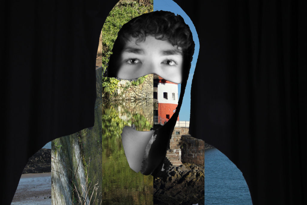
Luke Gram Inspired Edits

I edited two variations of the inspired image one with the mask visible and the other with only a part of my face visible. Personally I prefer the one with the mask visible as it divides my face and shows my neck which keeps the idea of a person as well as the image behind. I believe the variation without the mask dehumanises the subject and removes humanity from the identity.
How I Edited the Images
First, I had to open both of the images I needed to create this edit as seen below using photoshop.
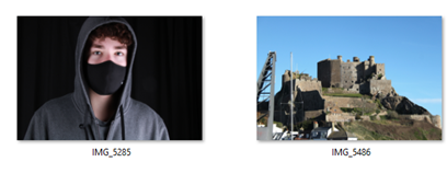
I then dragged the image on the left onto the image on the right and adjusted the size of the image on the left to perfectly fit the one on the right whilst assuring to keep the aspect ration of the image. I then used the quick selection and magic wand tool to remove the parts of the image on the left that I wanted to remove for example my jumper and mask and then deleted those selected sections to reveal the other image beneath. Finally, I used the quick selection tool to select any parts of my jumper and hood that were not deleted when I previously deleted the sections i wanted to be replaced with the other photo.
Finalised Edits
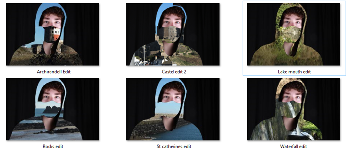
Above are my 6 finalised edits inspired by Luke Gram which I have edited them all the same to create a series of similar images. Out of all of them, my favourite outcome is the Lake Mouth edit because the trees and bushes are being perfectly reflected on the lake from the angle I took the photo from creating a straight line going through the centre of the image. This line creates the illusion of a mouth under the mask.
Pablo Picasso
How I Took the Images
I took the images in the photography studio and I got the Picasso light artwork effect by setting the camera to take photos on a slow shutter speed of about 10-15 seconds. After setting up the shutter speed and pressing the button to take the photo, I first shined my phone light on my face from the bottom, sides and then top to illuminate my face for around 3-5 seconds. I then waved my phone light around for the remainder of the time before the image was taken. I experimented with random movements but also with circles to try and frame my face with a circle of light as well as illuminating my face once at the beginning, twice at the beginning and the end and none at all. I found that the best outcome was by illuminating my face just at the start. For the image that has a purple outline, I had some help from one of my friends Matthew. When I was illuminating my face and drawing he had his phone on a purple image and was moving it slowly to outline my body.
Finalised Edits
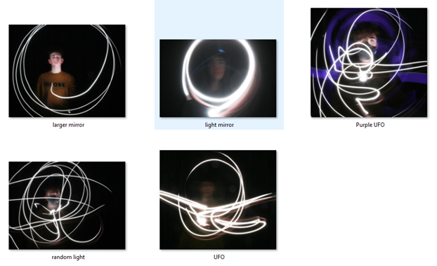
To edit the images above I just boosted the brightness slightly to give the light drawing a more vibrant and neon-like look and to illuminate my face slightly more.
Finalised Image
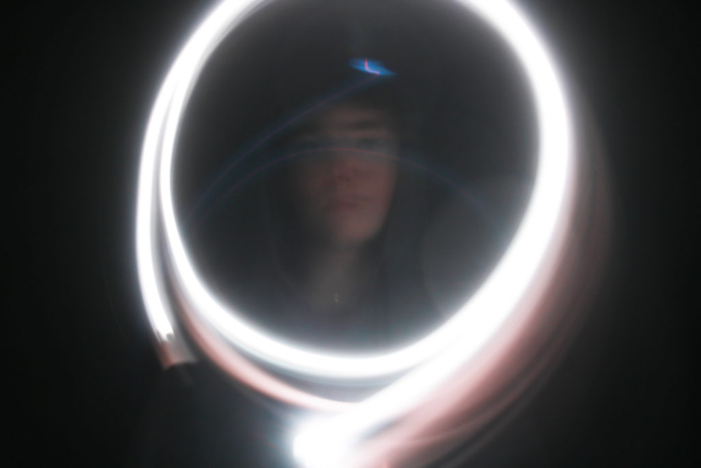
The image below is my favourite outcome from the light painting photoshoot I took because the image below showcases both the bright light artwork but also my face which is being framed perfectly by the circles of light. To me the image resembles a mirror in which I am seeing my identity.
Kensuke Koike

For the Kensuke Koike inspired outcome, I used all of the images I edited for Luke Gram and sliced them and put them together to look similar to the work of Kensuke Koike.
How I Edited the Images
Firstly, I put all of the edited images in the same document perfectly on top of each other. Next I unlocked the background layer meaning I had layers 0,1,2,3,4 and 5. Then I created a new layer (layer 6). Next I worked out the size of the image and divided by the number of images I had which was 6. I then went on layer 6 and created a rectangle from the top left corner of the image sized 792 pixel width and 3168 pixel height. I then duplicated the layer that had the first rectangle on 5 times and after duplicating moved them next to each other covering the whole image. Finally I dragged the images individually above the separate rectangle layers and created clipping masks for all of them.
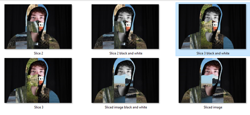
I created 3 sliced finalised images and made all three of them have a second variation of the original but my face and neck were black and white.
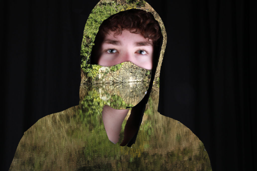
Finalised Image
My finalised image to do with Kensuke Koike is the image below. I chose this image because it has a wide variety of colours and scenes and out of the 5 other ones I believe the combination of the range of colours and the face and neck black and white contrast positively which in my eyes looks the best.
