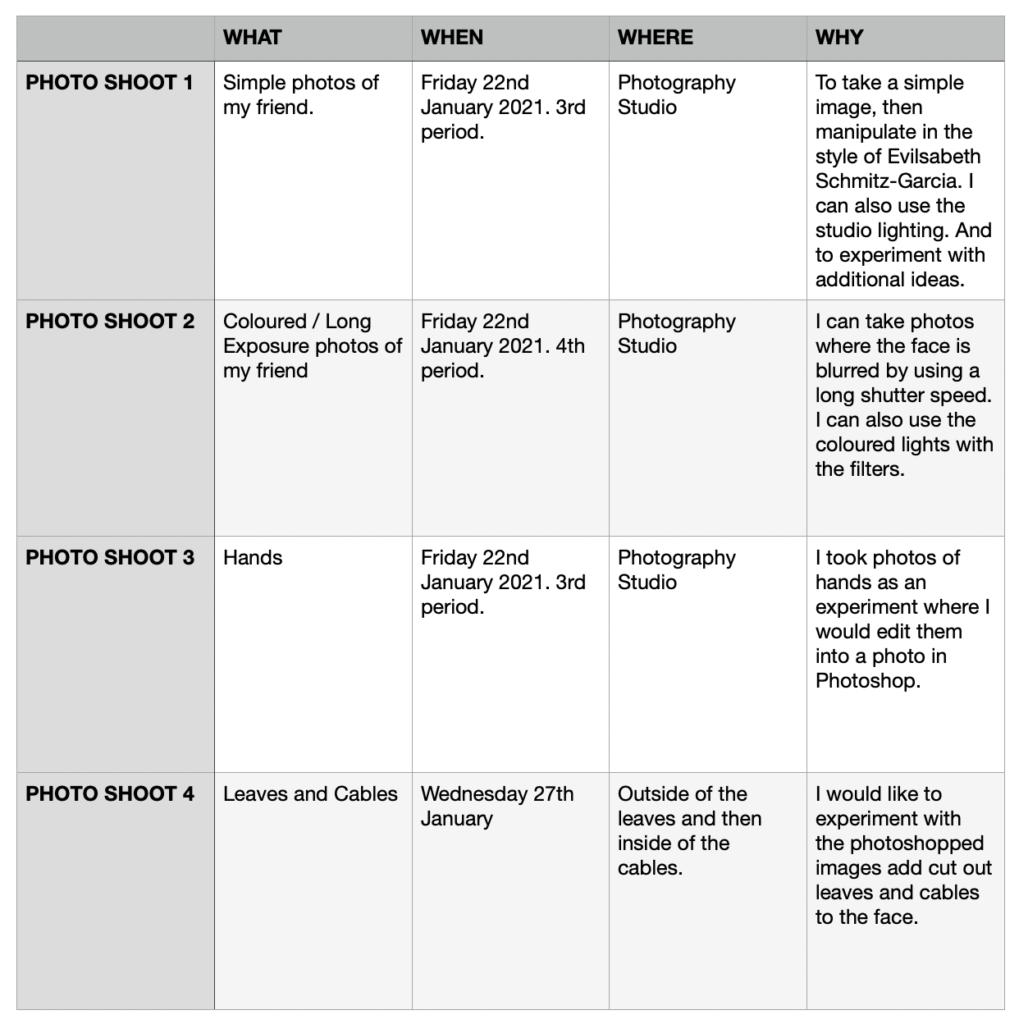
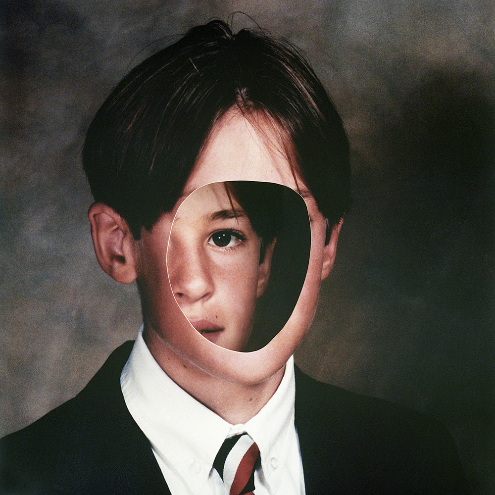
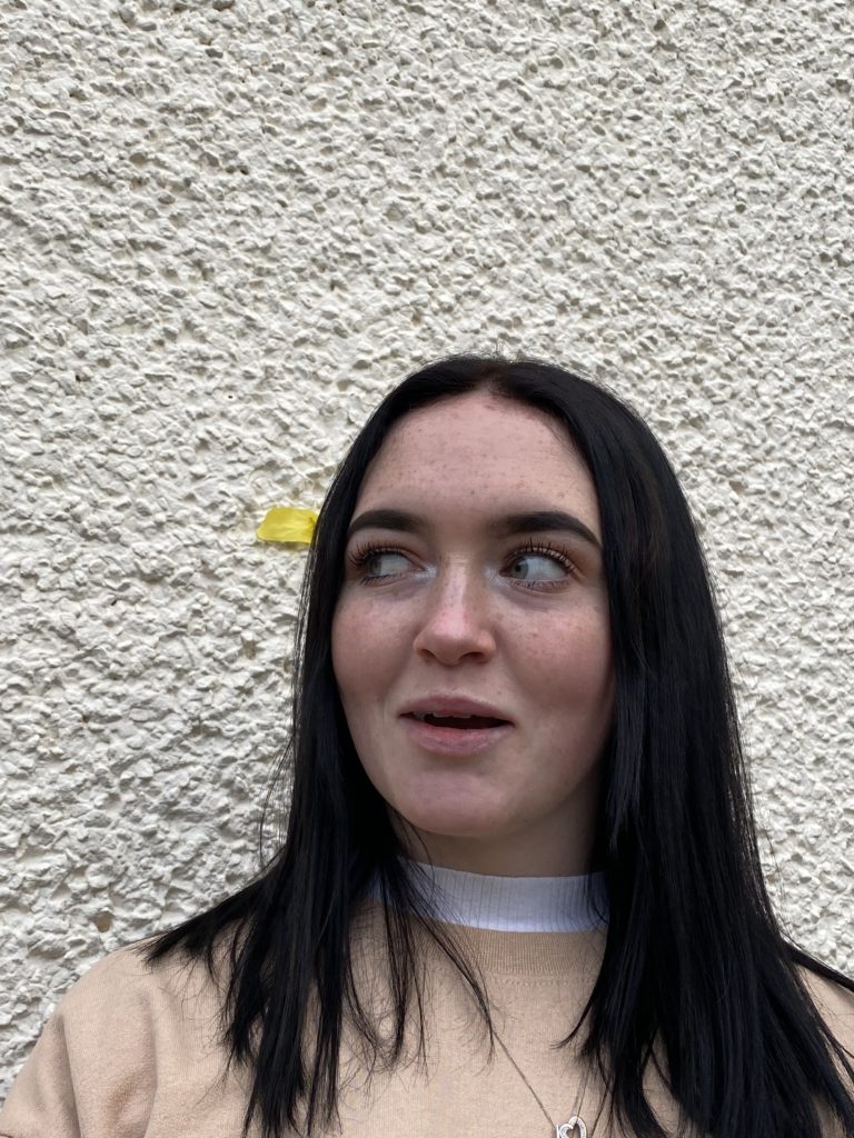
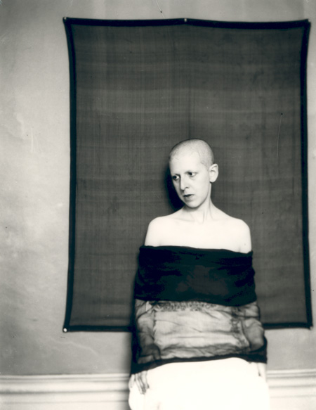
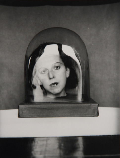
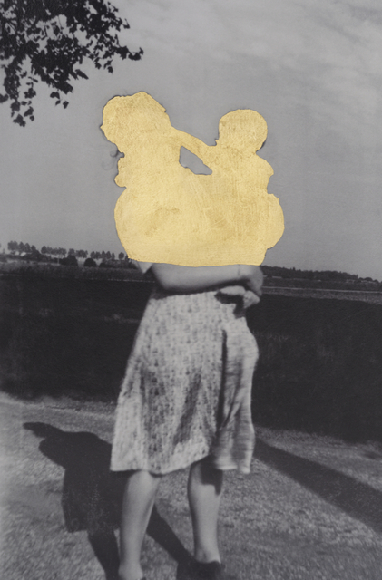
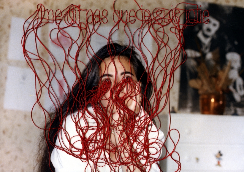
I plan to merge these photos together in Photoshop, create a hole in the head, or use a scanner to disfigure them in the style of Evilsabeth Schmitz-Garcia’s work.
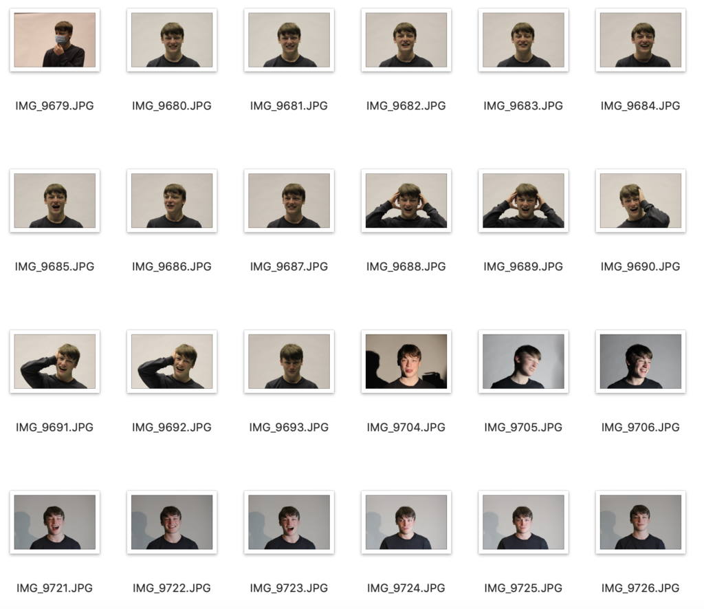
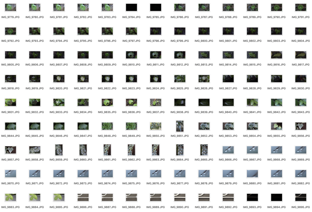
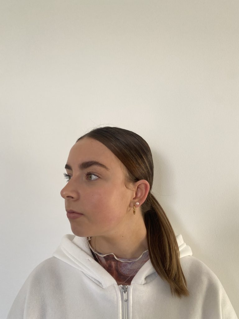
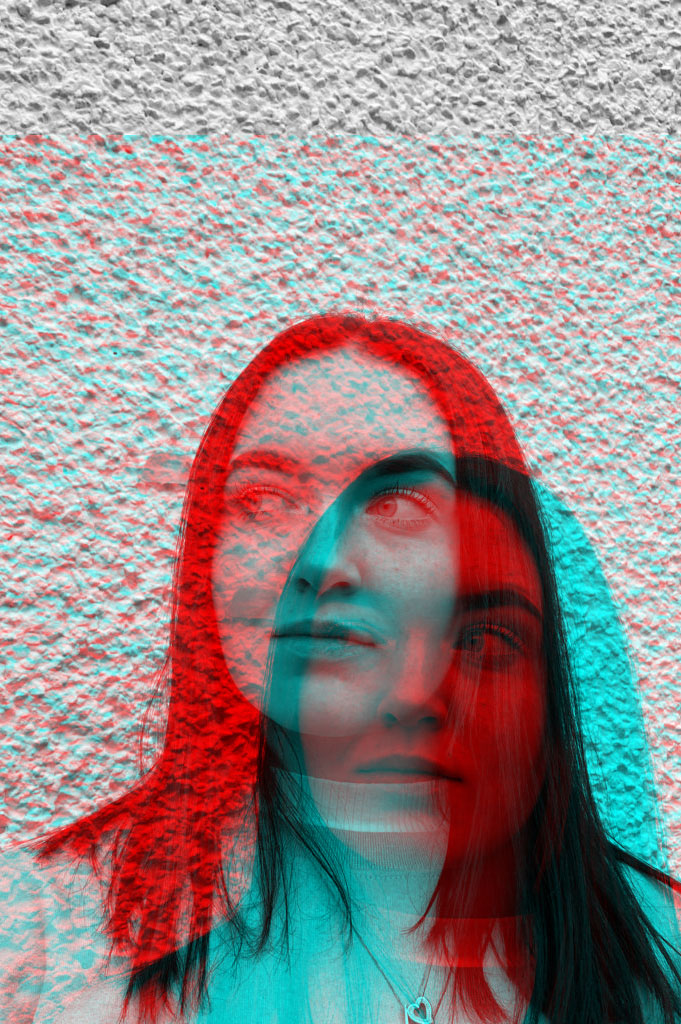
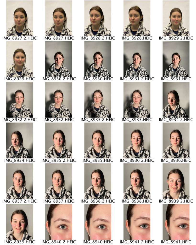
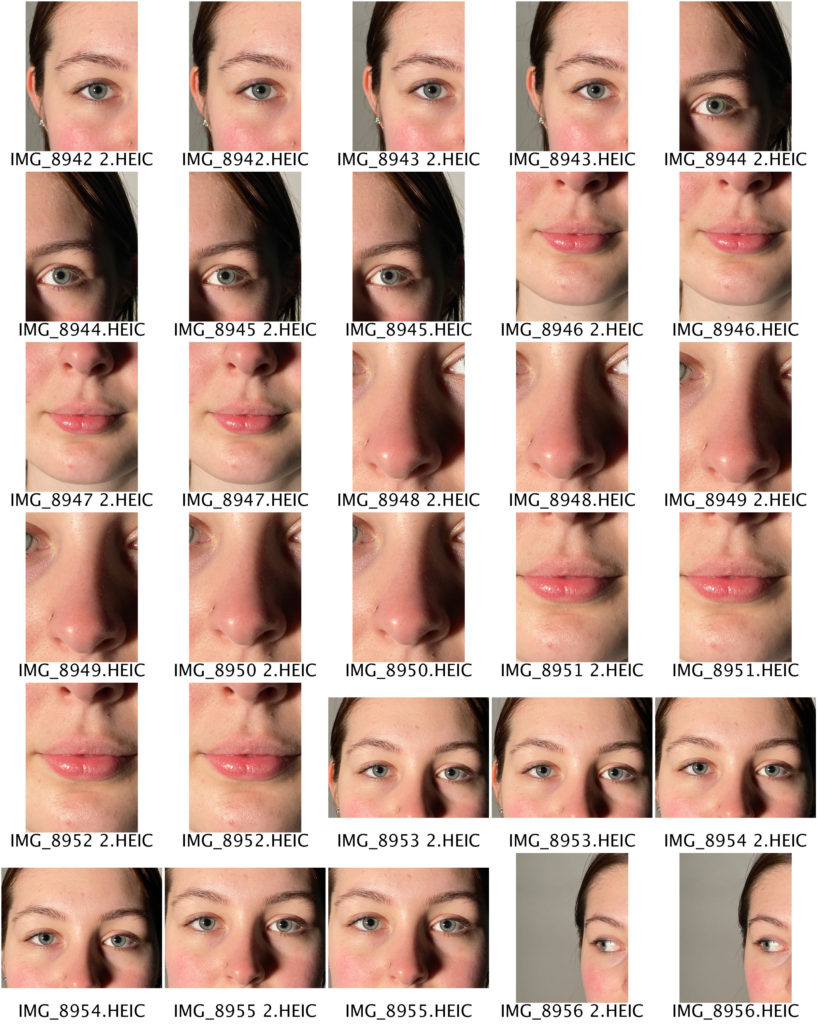
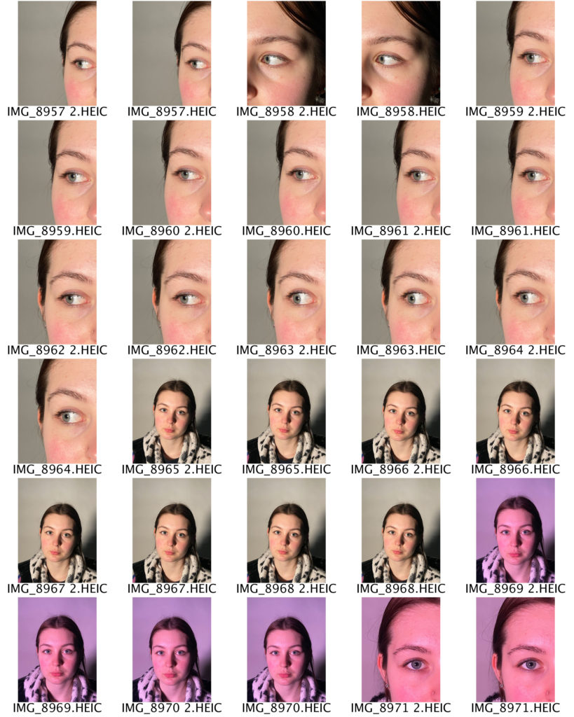
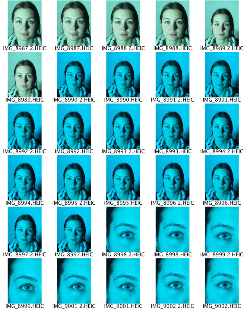
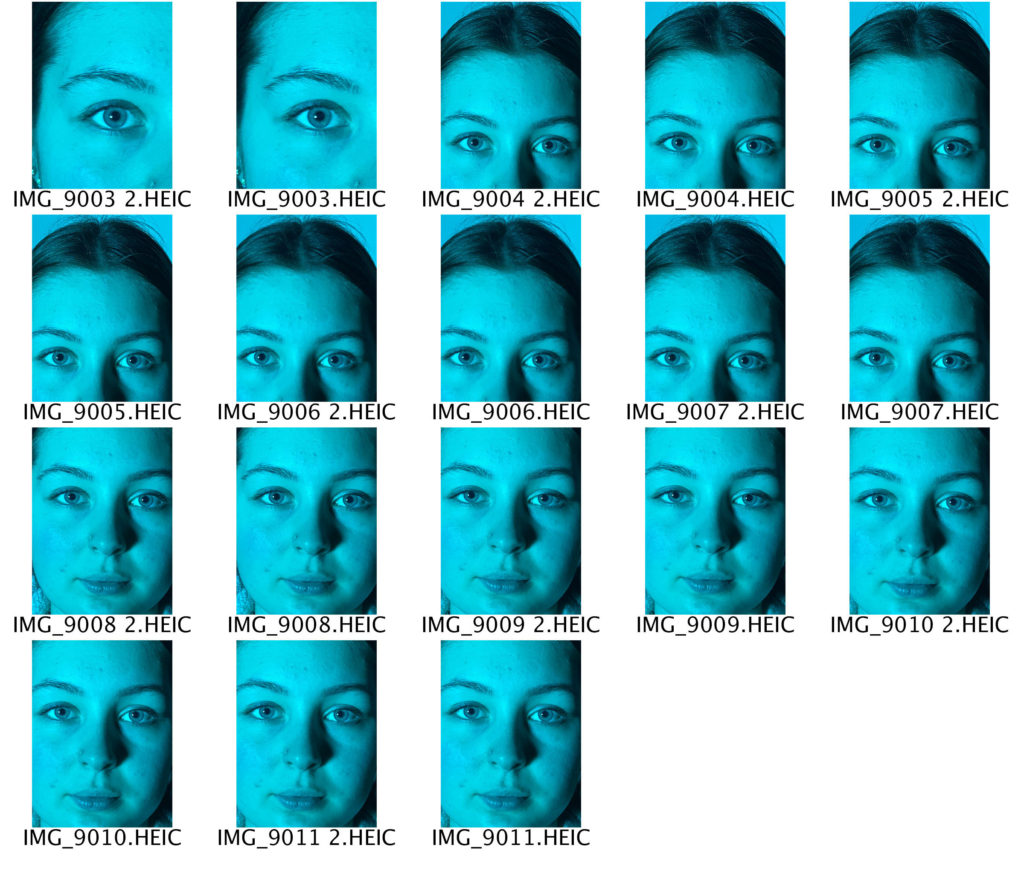
Photo Shoot 2 – Colour / Blur Photos
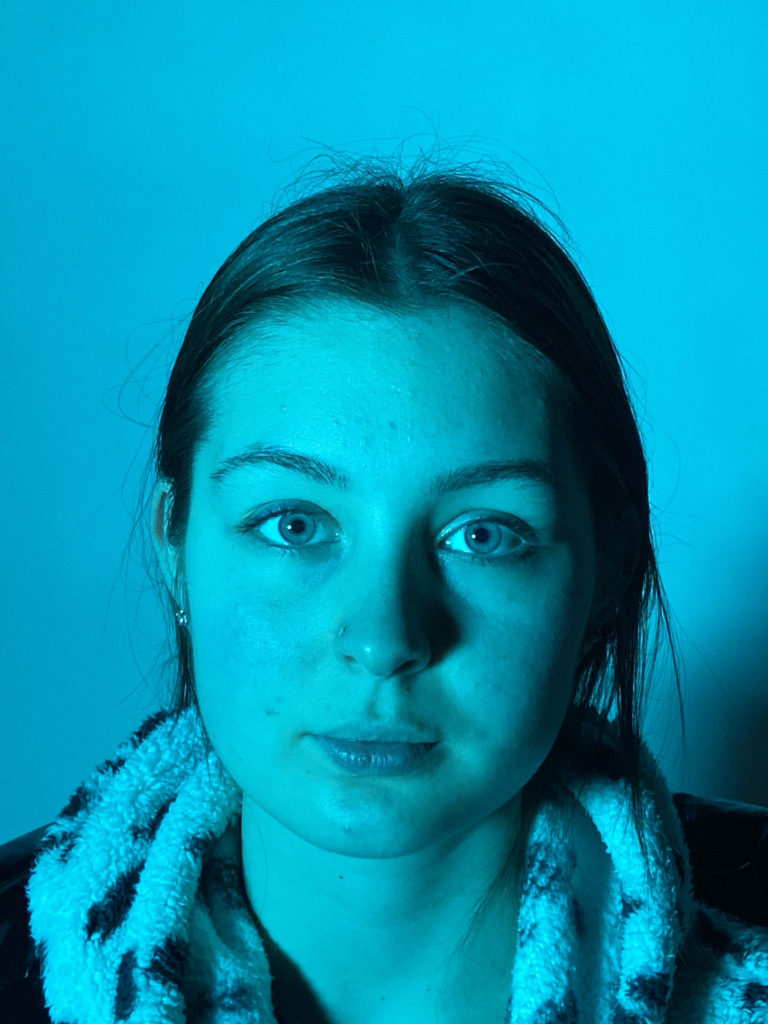
I use different colour lights to experiment which produces better tonal values and highlights.
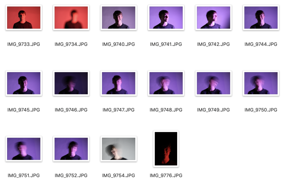
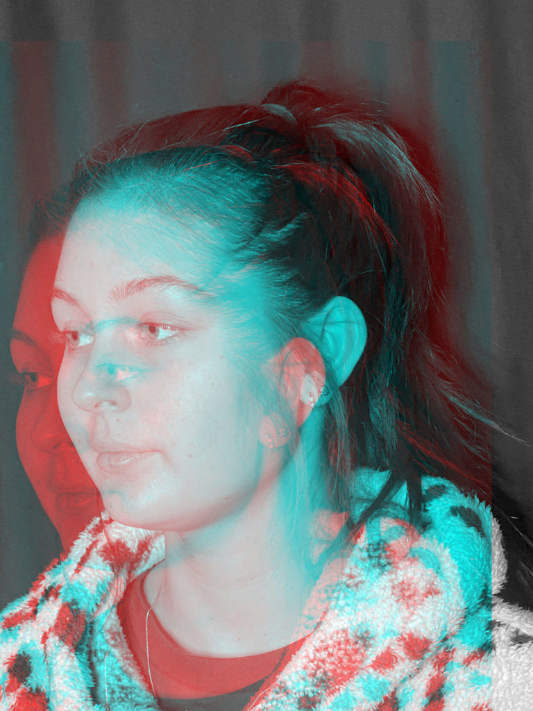
Photo Shoot 3 – Hands
I plan to edit the background out in Photoshop, then add it to another photo.
Photo Shoot 4– Leaves And Cables
I looked for leaves and cables that would be a material to edit coming out of the face when I edit it in Photoshop in the style of Birthe Piontek.
Birthe Piontek is a Vancouver-based photographer is most widely recognised for her intimate, narrative-driven portraits.
Most of her work has a straightforward approach. In her recent series “Mimesis” she’s uses images that have a meaning and background to create collages which displays her personal portraits with an investigation into the complexity of human identity.
Piontek searches for found images on Ebay, in thrift stores and flea markets. She primarily looks for images like studio portraits and other non-candid scenarios in which the subject has direct eye contact with the camera.
She knows little about the people in the photographs, she uses them as source material to create her own fictions about their identities, she said, “I usually spend quite a bit of time with the image, looking at it and familiarising myself with it.”
Once she likes the outcome of a photograph, Piontek scans it, then reproduces the image, in many cases working from its copy. She begins manipulating the copy, sometimes cutting into it and incorporating other materials like glass, paint, foil and fabric to give the image an entirely new form.
I would like to experiment in Photoshop in the style of Birthe Piontek. I would like my final outcome to be like the first image in this post, where the face out of the head.
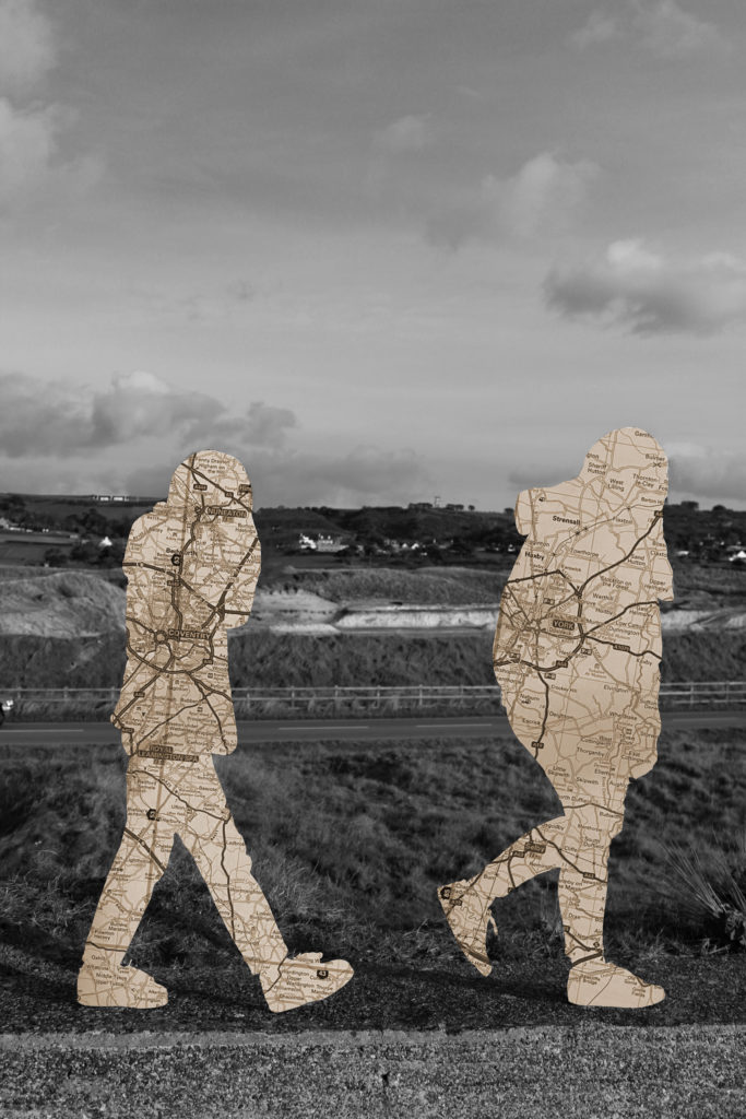
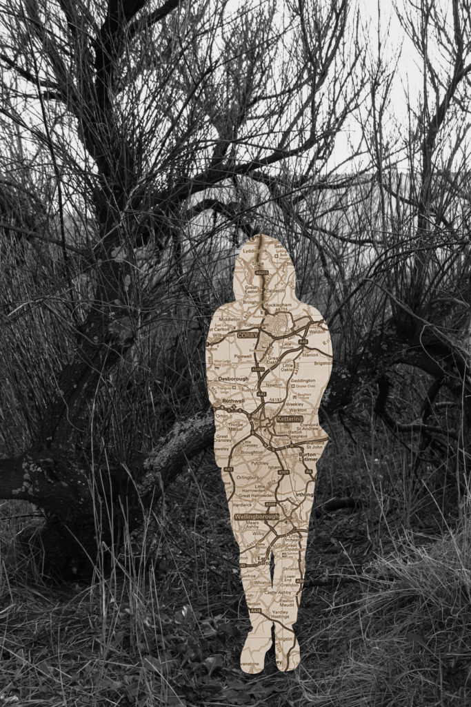
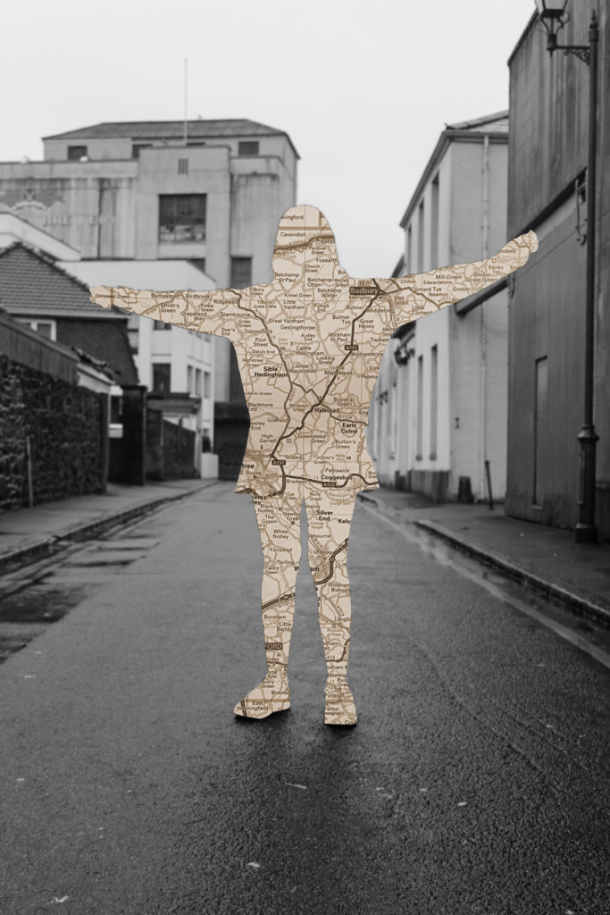
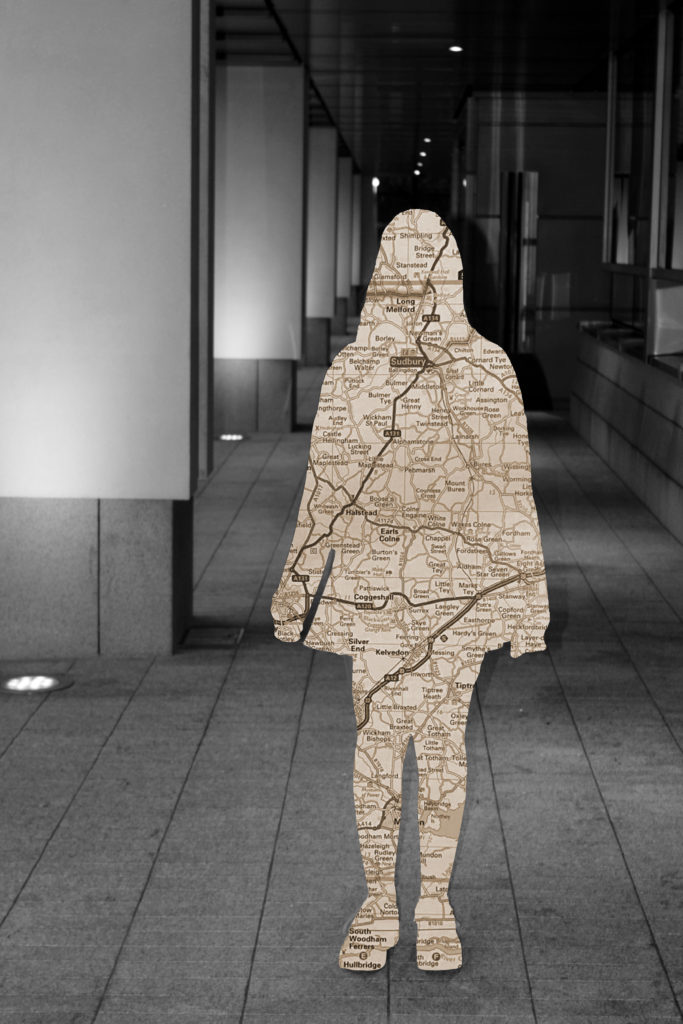
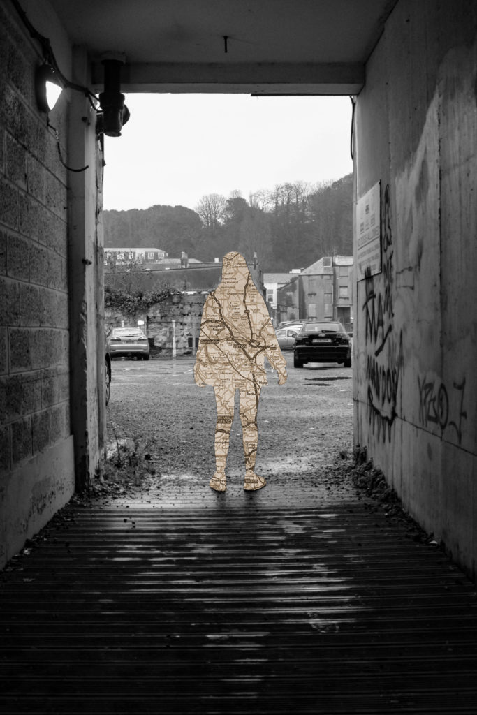
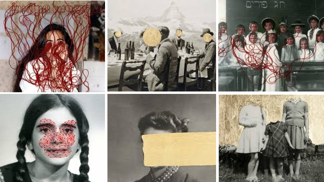
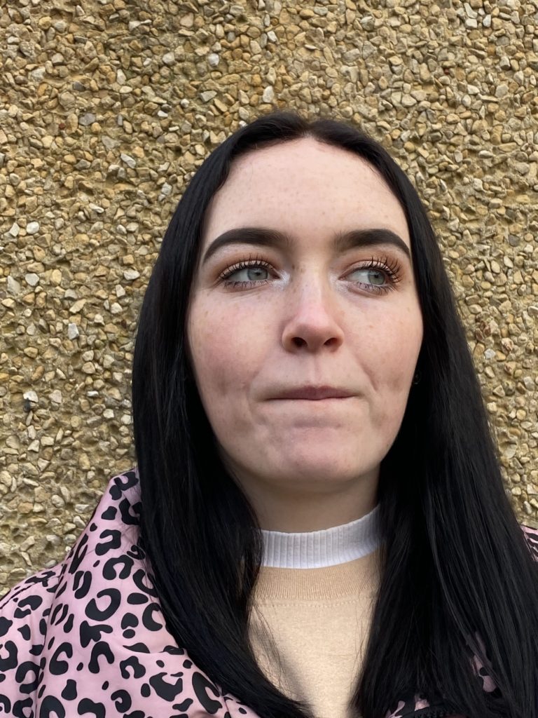
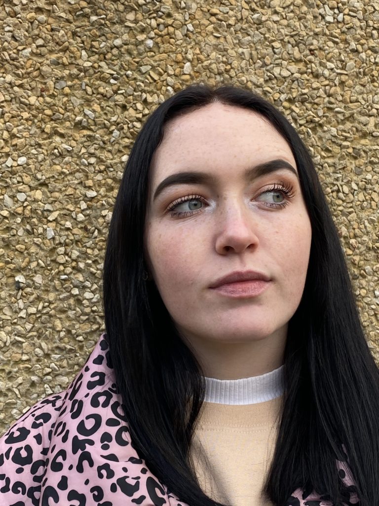
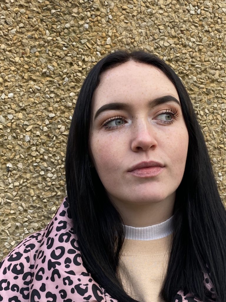
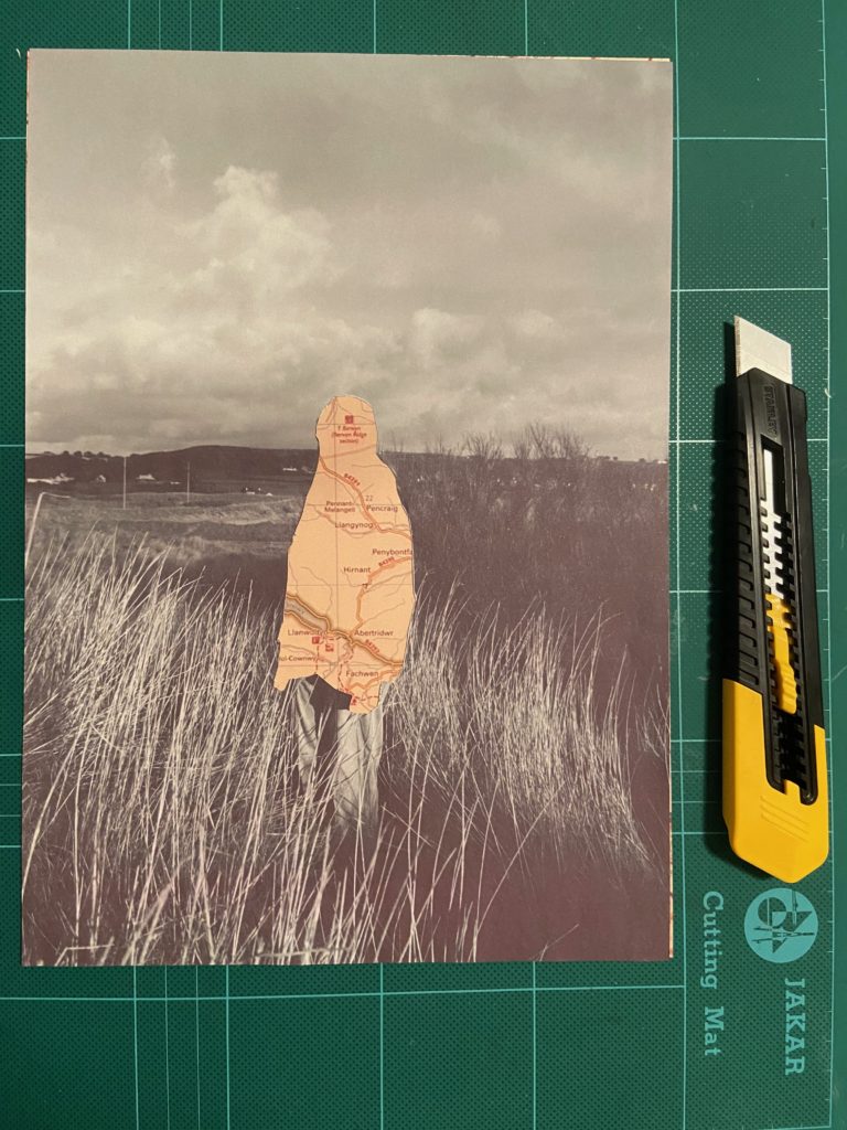
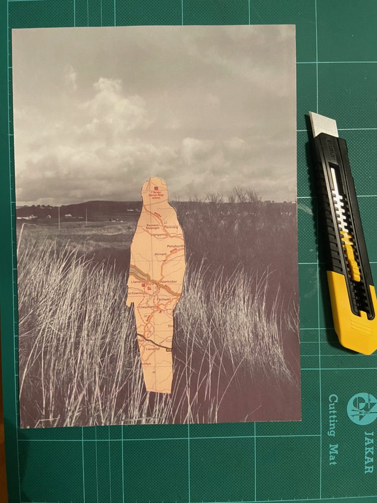
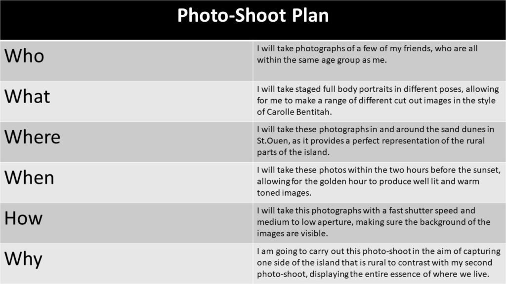
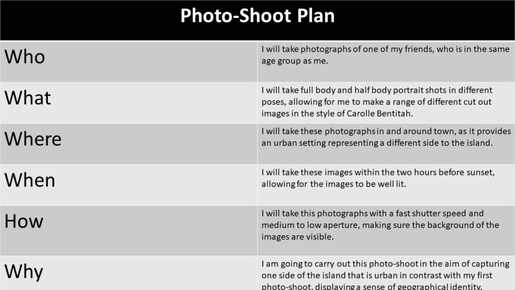
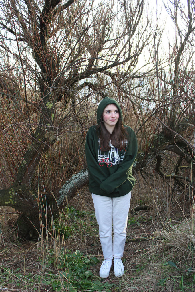
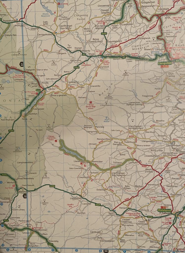
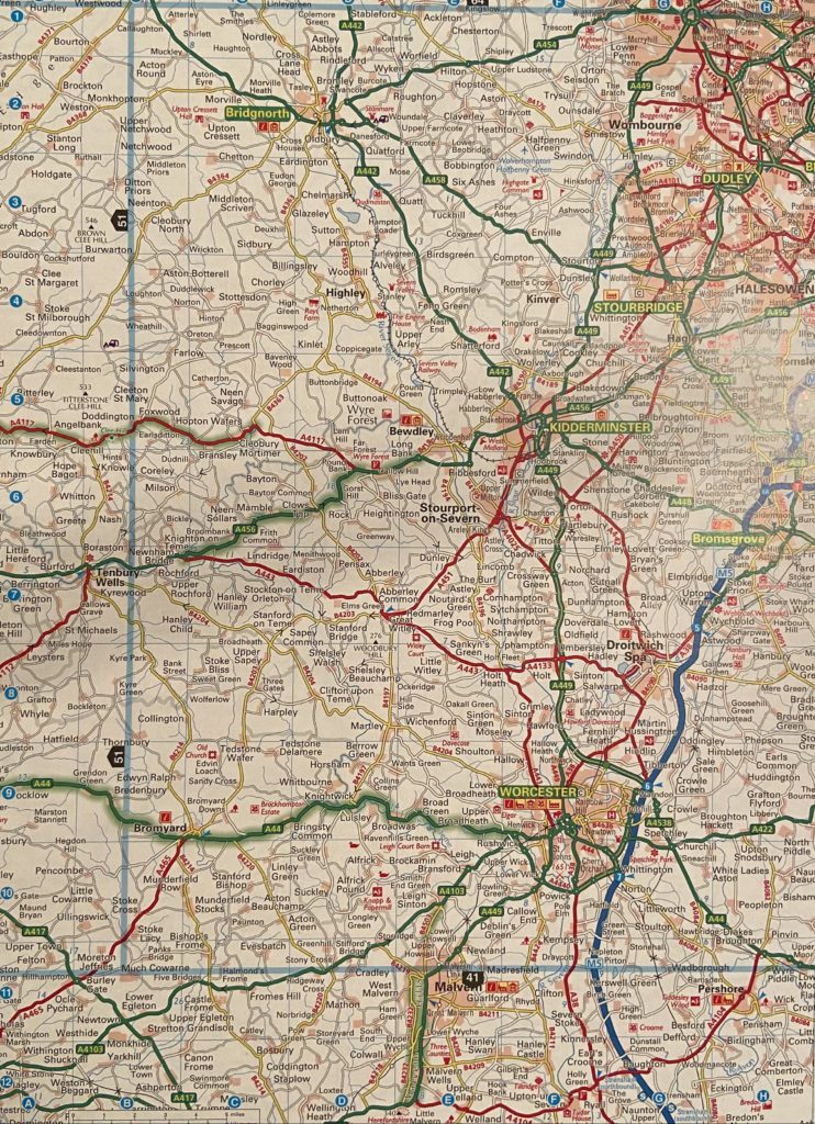
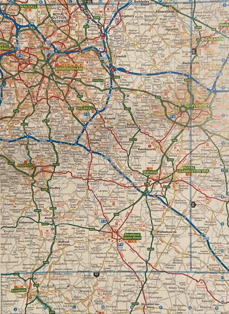
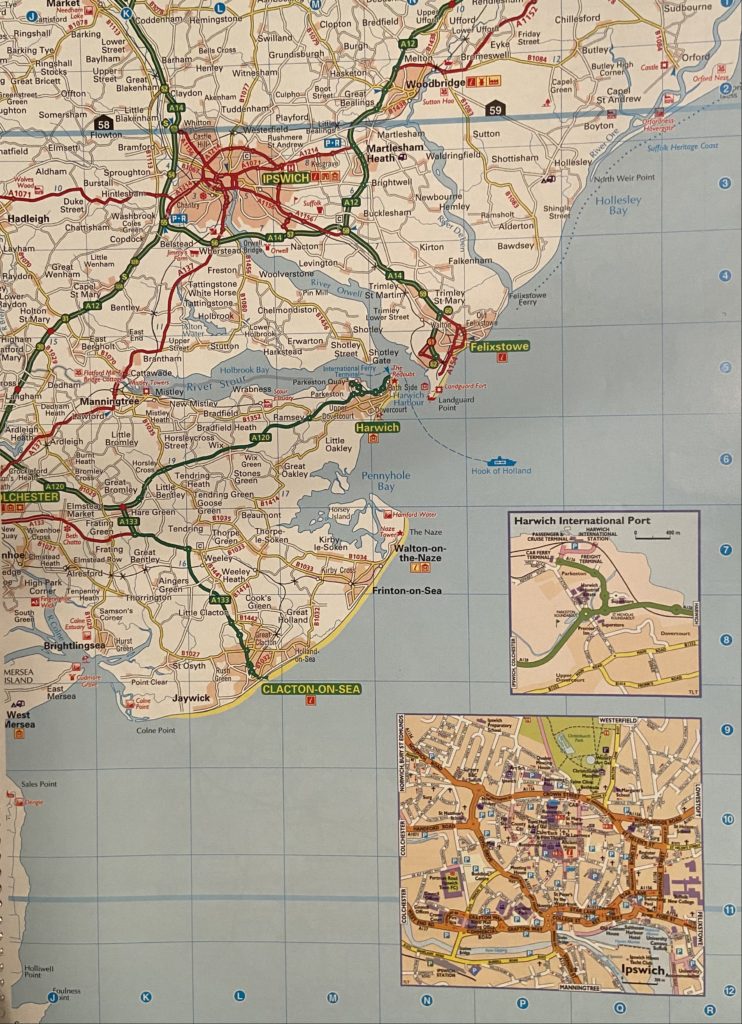
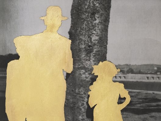
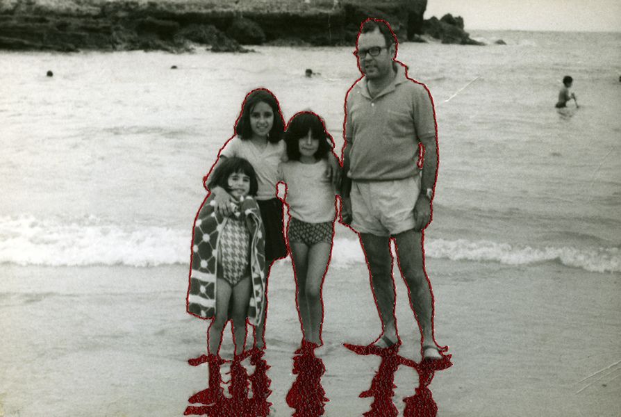
For my final Images I have edited four photographs from each photo-shoot and edited them to resemble Carolle Benitah’s work. Here I am looking at the theme of geographical identity by using photographs of my friends who’s families originated from all over the UK then moved to Jersey. I did this as I wanted to show how our small island is capable of occupying a mass amount of identities that have been shaped and influenced by different types of cultures and economic environments. In addition, I also wanted to signify the way in which Jersey has unified so many people from these drastically changing backgrounds. With this aim in mind, I have used Benitah’s style of edited and cut out the subjects of the photographs and replaced them with map images, edited into a sepia tone, containing the places their families were originally from.
This image displays two of my friends with St. Ouen as the background setting representing the geographical identity of Jersey. The subject on the left, Robyn, has family that before moving to Jersey lived in Coventry, which is displayed within the map replacing her silhouette. Macy, the subject on the left, has family originally from areas in and around York, also presented in the map of her cut out.
This image of my friend India, within the rural setting of St. Ouen, showcases her geographical identity by displaying a map of Birmingham and its outskirts. This is as this was the place in which some of her family lived in before Jersey.
This Image with the background of an unruly tree located in St. Ouen, displays again my friend Robyn as the subject with the area of Coventry as her geographical identity. I believe this setting worked well to display my take on identity as we often refer to our backgrounds as our ‘roots’ and I believe that the roads within the maps best represent this, in both the literal and metaphorical sense.
This image displays three of my friends with St. Ouen as the background setting, showing Jersey’s rural side. On the left again is my friend Macy with a map of the areas surrounding York to showcase her heritage. The subject in the center is my friend Bella with North wales signifying her background.
Identity to me is the idea of how you present yourself as your own person, shaped by family, past events and simply how you view yourself. Over time, the broadness of how people present their identity has expanded.
Carolle Benitah
Benitah was a French visual artist who worked for ten years as a fashion designer before turning to photography in 2001, exploring memory, family and the passage of time. Often pairing old family snapshots with handmade accents, such as embroidery, beading and ink drawings, Benitah seeks to reinterpret her own history as daughter, wife, and mother.
Through covering faces and different features, the people in the photographs have had their identity’s almost stripped from them. I chose to study Benitah as I feel that her art best represents the concept I hope to capture within this project.
all photos by Carolle Benitah
Initial idea
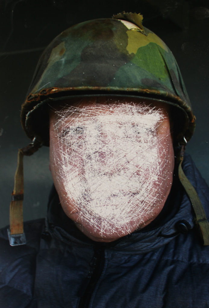
To me, knowing and having your own identity is the most important thing to a person. However, there are some cases where your identity is ignored and covered. I will be exploring a veterans past events within the army and how serving effected the lack of identity he had. To mimic Benitah’s work, I will be editing my photos in with the purpose of concealing his face to convey the concealed identity he had during his war career.
My Response
Photo shoot 1
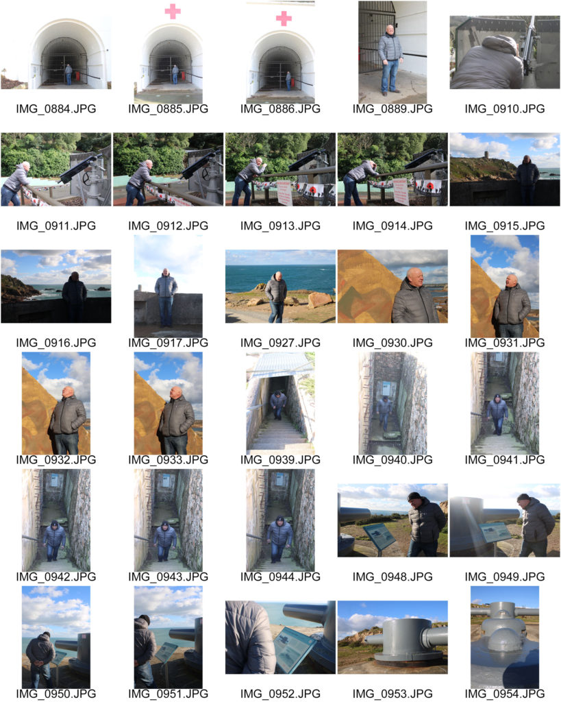
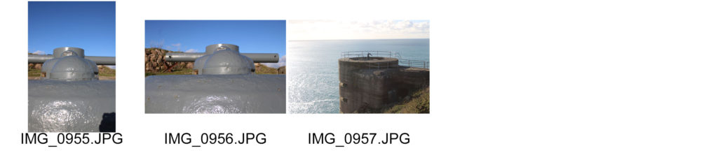
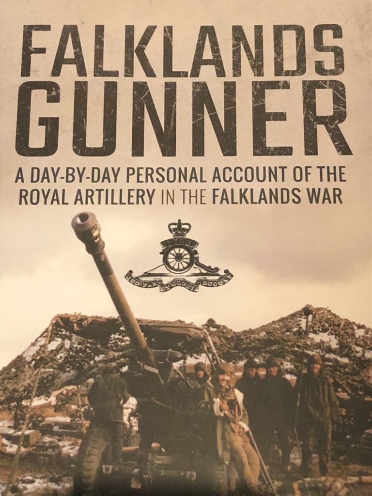
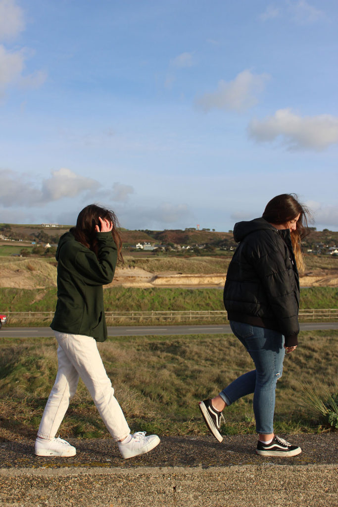
For my first photo shoot, I will incorporate both geographical ideas into one. As the veteran carried out his training in England, there are no staple landmarks at our disposal. Instead we will go to multiple locations which are landmarks for the occupation in WWII. We will visit where the Royal Artillery regiment were located during the war as that is the regiment the model was apart if when fighting in the Falkland war. We will carry out the photo shoot when the weather is clear.
Photo shoot 2
Whilst out completing the first photo shoot, we will also take the opportunity to take portraits of the model with various background. This will hopefully be on the same day so then the weather is consistent over the photo shoots.
Editing and choosing photos
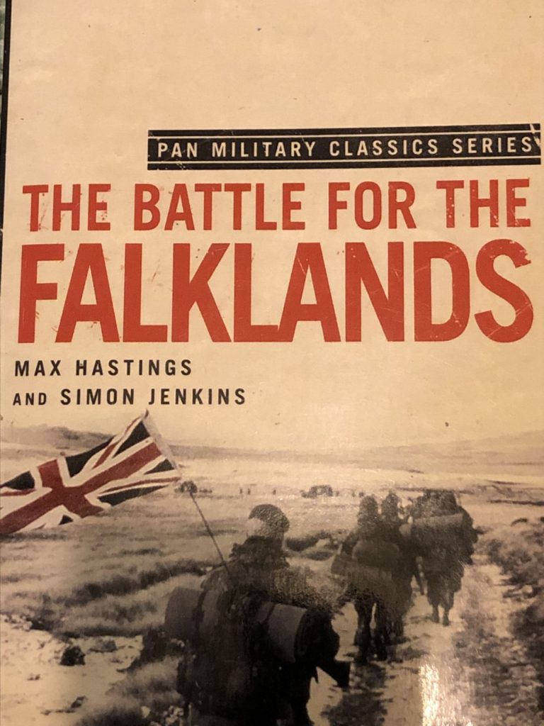
I took photos of book covers to in cooperate with editing my final photos. I also found the newspaper article announcing his leave and thought i could create a comparison concept.
Hand Edits
Original photos
Photoshop editing
original photo
Original photo
Photo evaluation
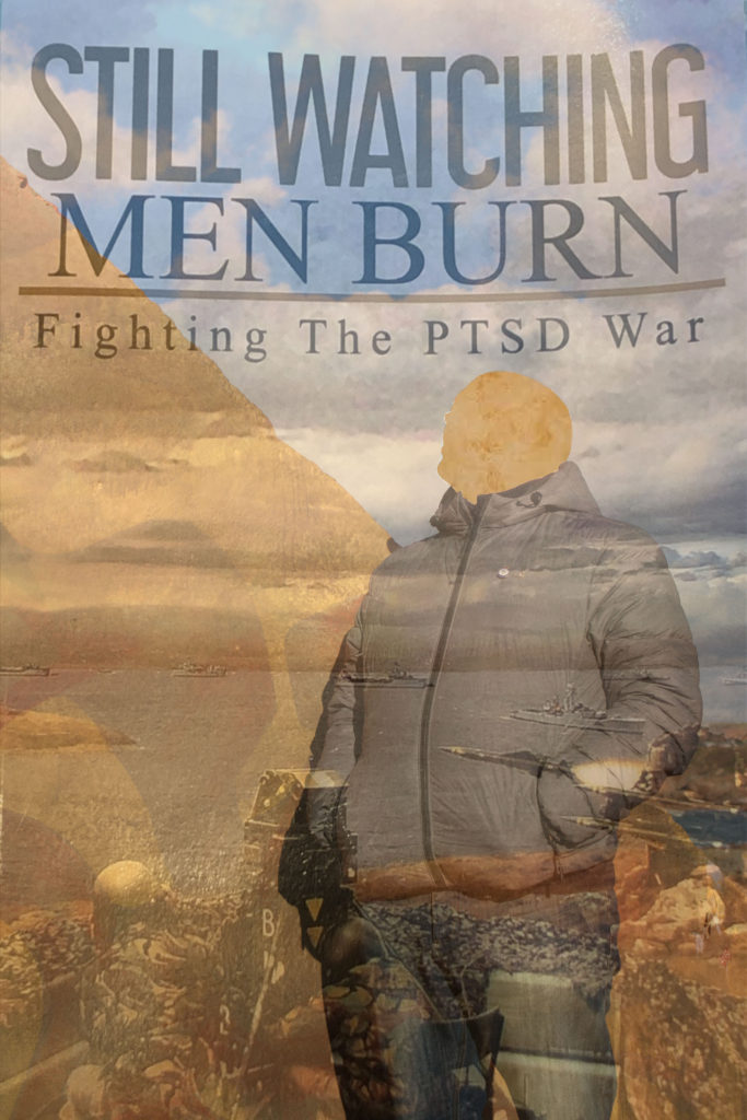
i chose this image as one of my final photos because not only it explores the lack of identity within the model, it ties in with the after effects of war on mental health. I feel like this links in with identity as the ‘PTSD war’ reflects on how veterans are still apart of a constant battle which has been burnt into their perspective of who they are. I used a cutting tool to remove the face in response to Benitah’s work. This works well as the missing face can be seen in many ways. For me, when i see the missing face, i think of the fact that the veteran didn’t have a clear grasp of his identity in the past and it is reflected onto his present self, being in a state of feeling stuck in his past, preventing him to reinvent his new identity.
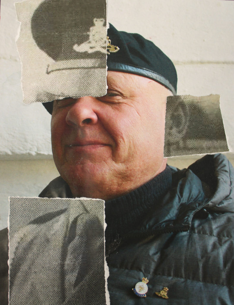
As a starting photo, i chose a photo of the model looking up. This is because the book cover i used to edit, contains an image from the war at the bottom of the cover. The fact that the veteran is looking away from the past image conveys resistance of him looking back at his old, hidden identity and wanting to look beyond the low point in hopes of reinvention in the future.
To edit this photo, i started by printing off the original image onto gloss paper as the texture would make it easier to smudge the paints over. This photo was taken at a bunker site at the same place equipment was kept involving the Royal Artillery. This location is important to the purpose of my editing. When smudging the paint, it looked to me like the model we being blended into the location ( that being a site for the RA ). This presents identity in a peculiar way as i tried to present that his identity will always be blended to the RA. The editing style was inspired by the way Benitah hand edited her photos through sewing and painting.
Being apart of the RA was very important to veteran as even though he was struggling with his identity as well as others. He loved the feeling of being apart of something bigger than himself. This is why i kept the image with a bright tone and used white paint to show that even through the hard moments, this particular event also had positive effect of how he reflects on his growth and how far is identity has developed.
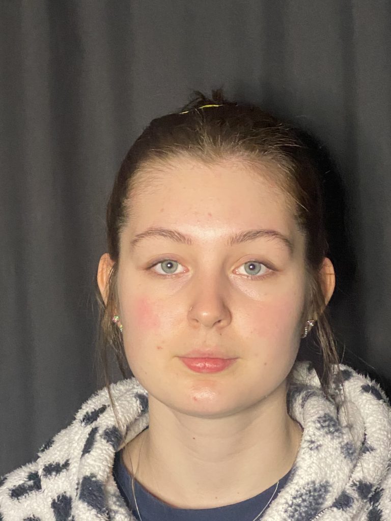
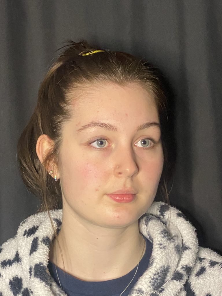
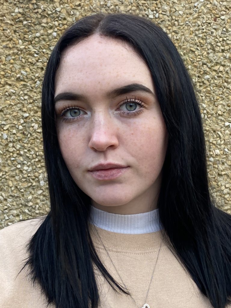
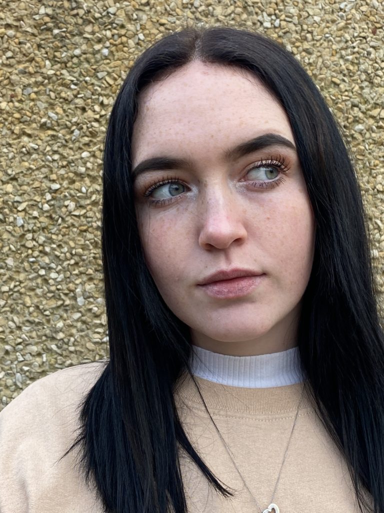
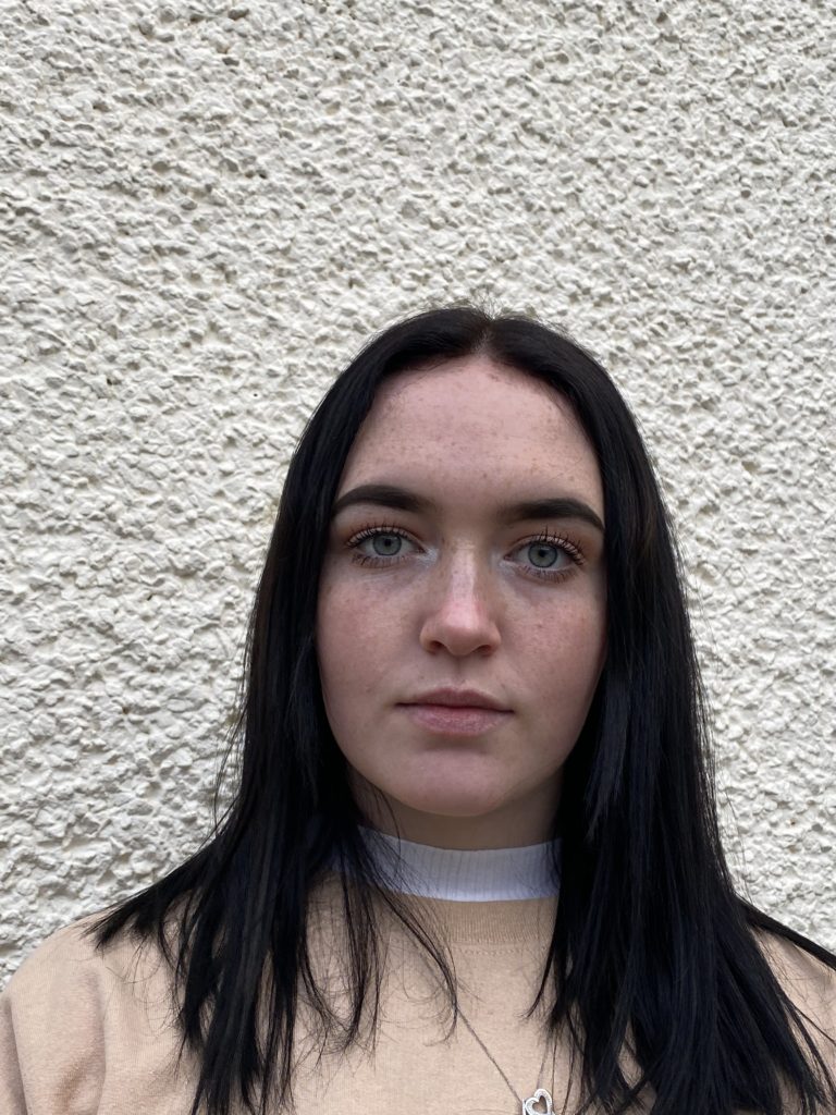
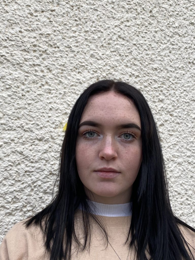
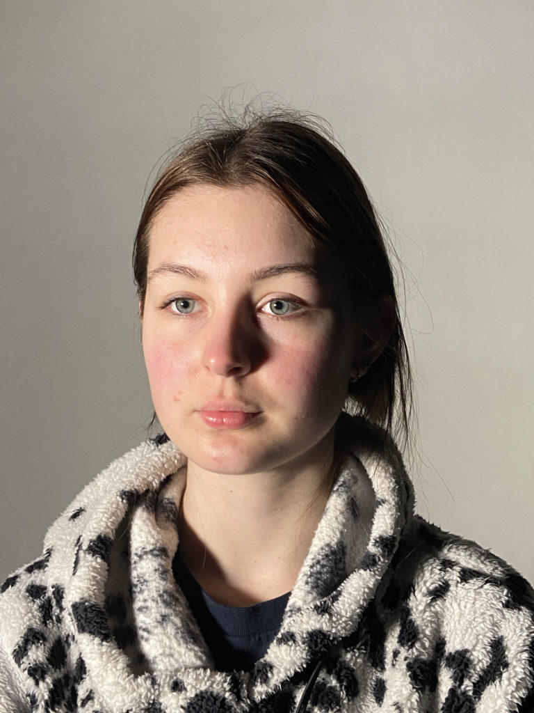
These photos i’m going to take have been self inspired through doing research on several different artist and taking ideas from individual ones. I have decided to take head shot photographs and i’m going to work and edit them in Photoshop to change them and adapt them to the topic of identity. With these images below i’m am going to use Photoshop to disguise the models face to hide their identity.
Idea 1:
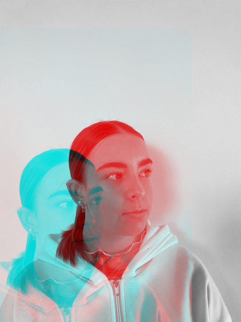
For this idea I decided to open up several of my best images in Photoshop. First of all I started by duplicating the layer then went to the blending options and unticked the green and red colours. Finally I moved one of the layers to a slight angle and it created this effect. I feel that this worked well as it hides the identity of the model as it shows a second picture of the same person creating the thought of mystery
Idea 2:
For this idea I decided to use Photoshop to crop the photographs to a square. Then I duplicated the layer and converted it to a smart object this therefor this allowed me to use the filters and develop my photos using the mosaic filter.Overall I feel that this worked well however it may have been better if I changed the photos to black and white by desaturating them in Photoshop first before i started to edit the images.
Idea 3:
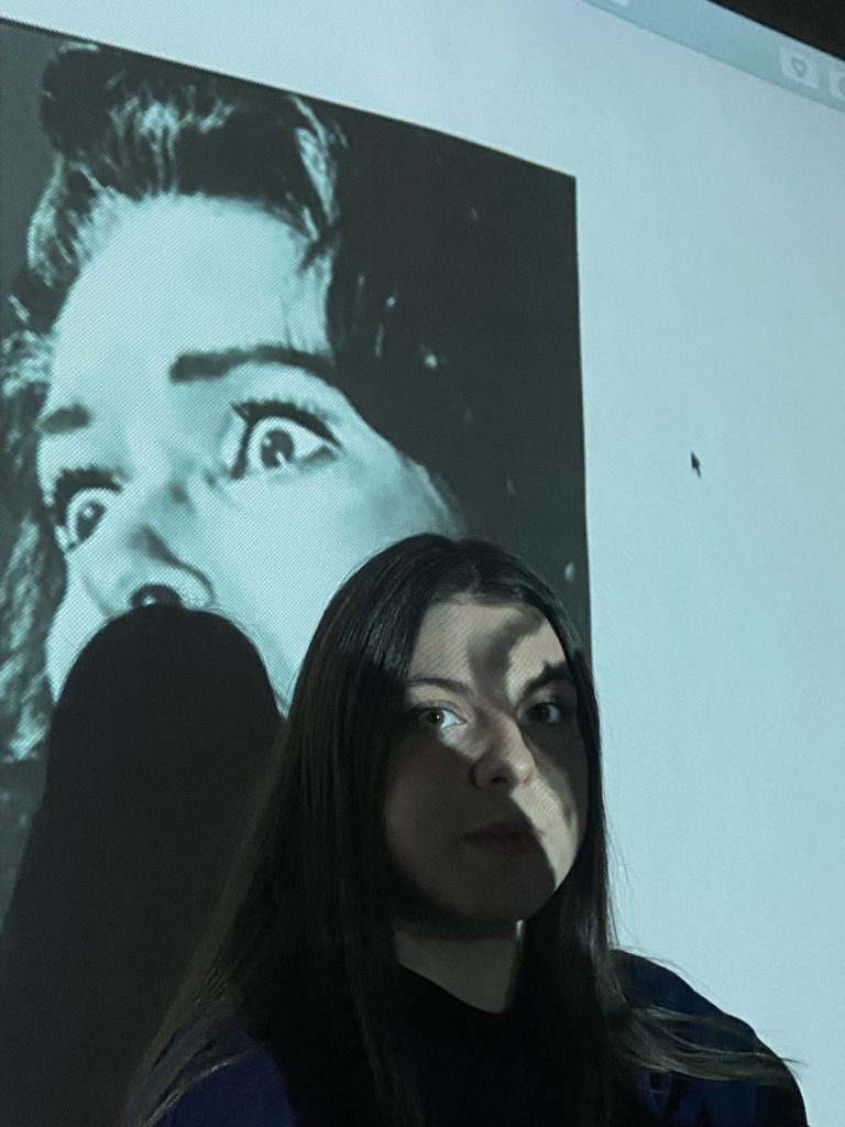
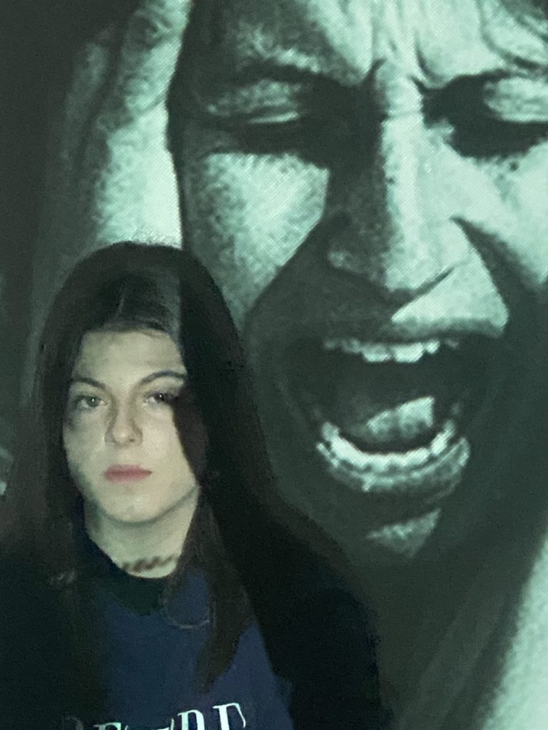
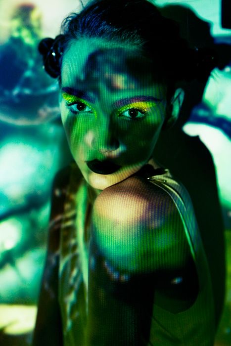
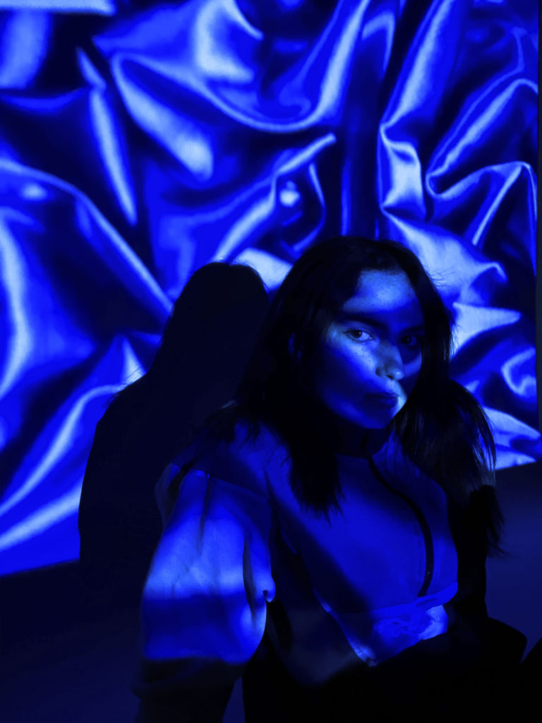
For these images below I tried to experiment by using a hand held projector which I feel worked well to a certain extent as they way in which the projected disguises the models face reflects that it could be hiding her identity. However if I was to do this again I would project different images onto the wall as the ones in which I chose were all quite dark making the tones not stand out as well as they could have been.
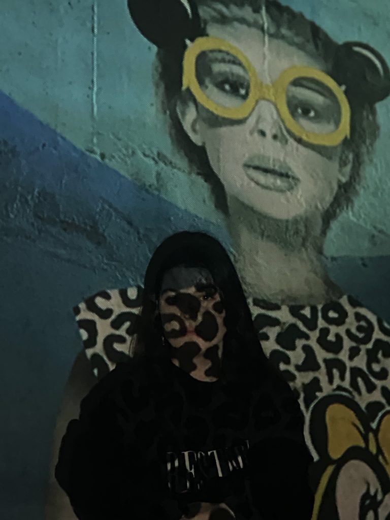
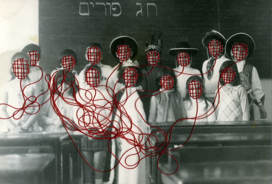
My idea for my second shoot is to explore the theme of gender identity. In order to portray this theme effectively, my plan is to use a handheld projector to project different images onto my subject’s face and body. After I have printed these images out, I will use a needle and various colours of thread to sew around different parts of the photograph. I think that this will be a successful way to show the concept of gender identity because I will be able to portray how people can choose to hide behind their presumed ‘identity’ in order to conceal who they really are. Additionally, it will also be able to show how members of society can sometimes project their views and opinions on others.
INSPIRATION
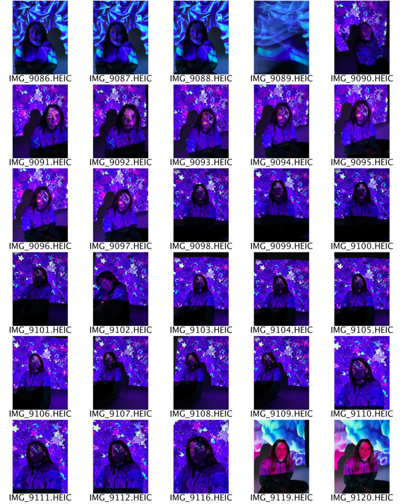
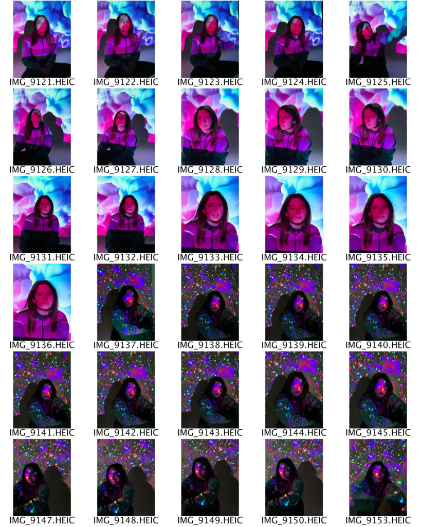
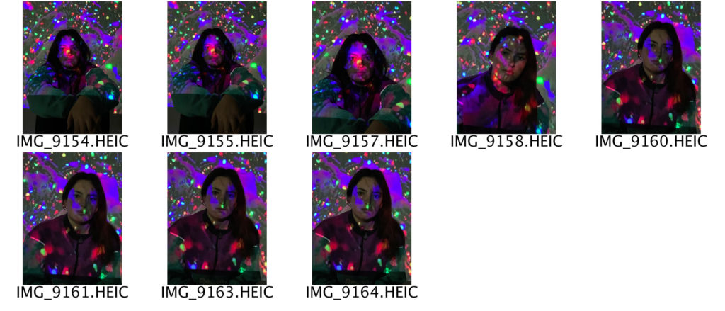
FIRST CONTACT SHEETS
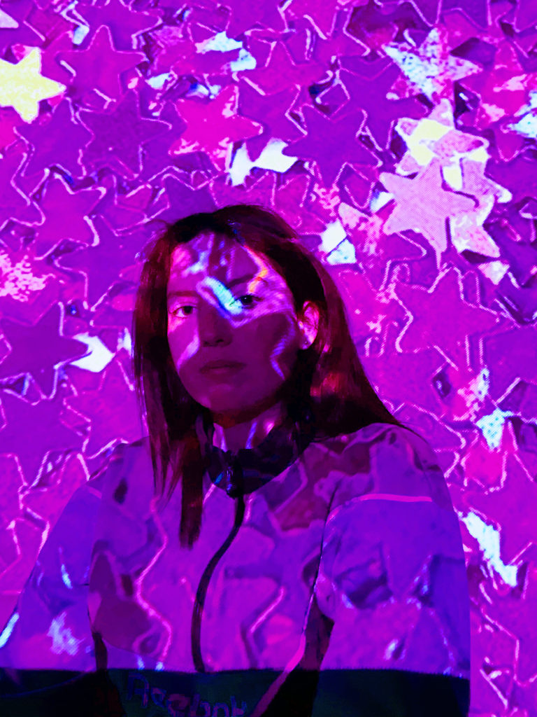
For this shoot I used a handheld projector against a plain white background, which helped to create my desired three dimensional effect. I chose and downloaded different images from the internet to project onto my subject because I wanted a range of dark and light tones. Additionally, the different images create contrasting moods and feelings. In order to ensure that my images are the best quality possible, I will edit and adjust some of the colouring on PhotoShop, as well as the sharpness and shadows.
EDITING PROCESS
PHOTOSHOP EDITING
To start with, I adjusted the brightness and contrast on all of my base images until I got an end result that I was happy with. I did this by selecting the image tab at the top of the screen and clicking adjustments, then brightness/contrast. For my second and fourth images, I brought the brightness most of the way down so that the shadows across my subject’s face would be more noticeable. Next, I decided to adjust the vibrance of my images, by selecting the image tab, then adjustments, then vibrance. I did this because I wanted all the colours in my photographs to be brighter. Then, I adjusted the saturation by selecting the image tab, then adjustments, then hue/saturation. I increased the saturation the most in my fourth image, as I wanted the viewer to be able to see the orange-toned colours more clearly. After that, I wanted to change the colour balance of my images. I did this by selecting the image tab, then adjustments, then colour balance. I slid my mouse across all three of the different colour scales until I was happy with the result, and the right colours had been emphasised.
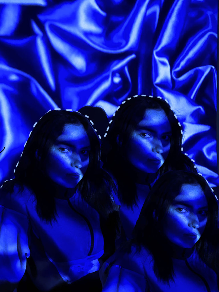
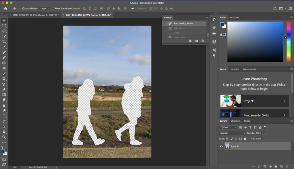
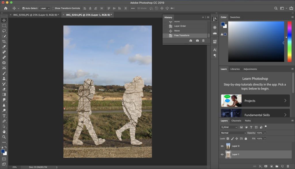
After I had made all the adjustments to my base images, I selected the one which I liked the most to use for my final image. I chose my second image and opened it in PhotoShop. I decided I wanted to duplicate my subject and have three of her all next to one another. To do this I selected the layer on the right hand side of my screen and duplicated it by pressing control c. Now that I had two layers I selected the new one and used the object selection tool to pick out my subject. I then copied the area outlined by the object selection tool and pasted it onto my background layer. I did this once more to get three subjects, and I then moved and adjusted them until I got an end result that I was happy with.
After I had finished duplicating my subject and arranged them into the position I wanted, I decided to add something else to my image so that it wouldn’t just be plain. I selected the brush tool and changed the size and hardness using the corresponding scales at the top of my screen. I then selected the soft round brush from the different options. I used the eyedropper tool to sample one of the colours from my image; I chose a pale blue colour which is as close to white as I could find. I began to trace the outline of my subjects with the brush, making small horizontal dashes which were close together. To finish, I adjusted the sharpness of the photograph by selecting the filter tab, then sharpen.
My idea for this first shoot is to explore the concept of identity loss. In order to portray this theme effectively, my plan is to create a collage of my subject’s face using different materials such as old photographs, newspaper and magazine clippings, and paint. I think that this will be a successful way of showing identity loss as the end result will be an accumulation of many different factors, but it will also show how confusing identity can sometimes be, and that it is not just made up of one thing. Additionally, it will allow me to present various creative skills and ideas.
INSPIRATION
FIRST CONTACT SHEETS
For this shoot I took some normal headshots which I will use as the base / background for my collage. I took these using different colour plastic sheets over an L.E.D light so that I would have a variety of images to work with. I then photographed close up images of my subject’s face, which I will cut out and arrange in different shapes, patterns, and orders over the base to create the look that I am aiming for. I will edit some of the photographs on PhotoShop into a black and white effect so each collage has a unique look and feel.
EDITING PROCESS
COLLAGE MAKING
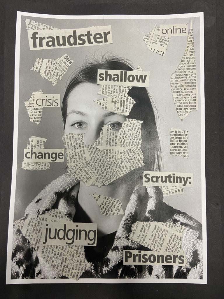
Firstly, I printed out some of the various close-up images I took of my subject’s face, and cut them up into squares and rectangles. I then printed out the pre-selected three black and white base photos. I experimented with placing and layering the close-up images on the bases, using a mixture of black and white, normal, and the two different colour options. I did this for about half an hour before I decided to try another idea, as I didn’t feel that it was going to plan. I looked through different newspapers to try and find different buzzwords which could relate to identity loss. The words that I found were; ‘nightmares, prisoners, shallow, change, madness, crisis, online, oddity, scrutiny, fraudster, images, judging‘. I then ripped out pages of the newspaper which were covered in text to use to mask my subject’s face. I experimented with the placement of the newspaper, originally deciding to cover their whole face, but after trying several different options, I decided to only cover the bottom half and a little bit on the right hand side, leaving their eyes completely exposed. After I had glued down the newspaper, I arranged the cut out words around my subject’s face and tested different angles and placements until I was happy with the final result. I then cut out a piece of plain black card which I used to back my piece.
I will test and try out different methods of editing my photographs, in order to see which best suits my ideas of identity and place, using Carolle Benitah as inspiration.
Photoshop Experimentation
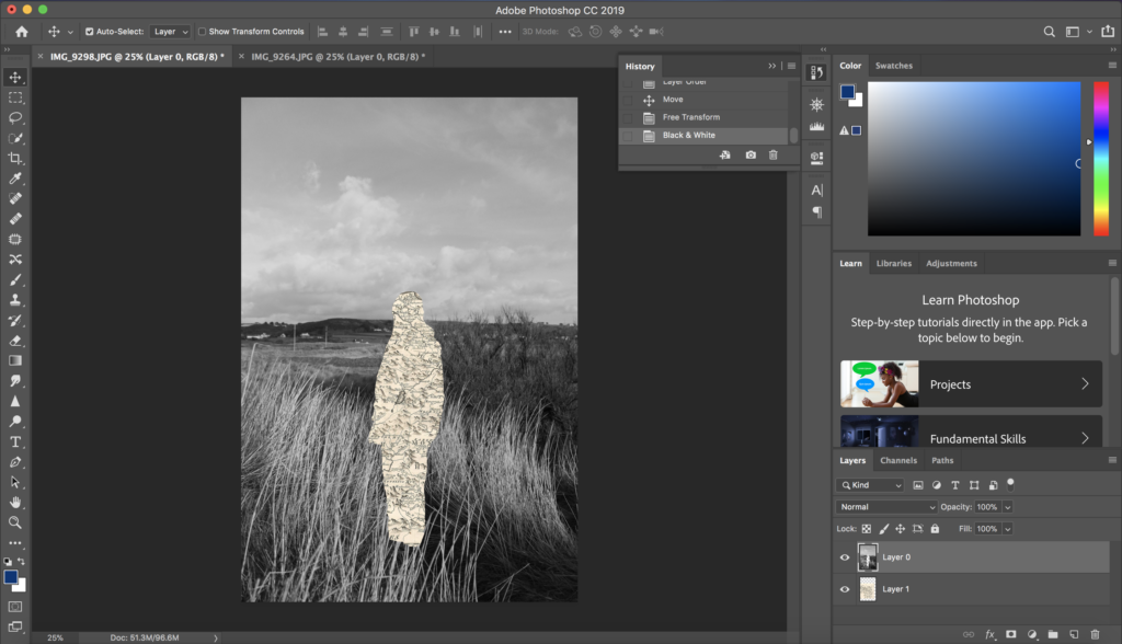
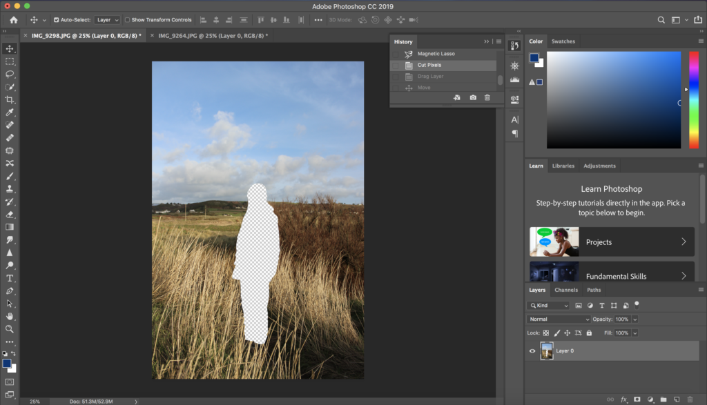
In Photoshop I attempted to practice editing my photographs in the style of Carolle Benitah. I did this by using the magnetic lasso tool to cut out the shape of the subject in the image, and then layering a plain sepia toned piece of paper underneath it, to show a link to her themes of loss of identity. I then also converted the original image into black and white, also similar to Benitah’s work, allowing for a contrast between the image and the cut out section.
Next, I followed the same method of cutting out the subject with the magnetic lasso tool, in the style of Benitah, but instead of layering a plain background underneath I played around with my idea of identity and place and used sepia toned maps instead. These map images used link to the subject in the image, as it displays the place their families came from before Jersey.
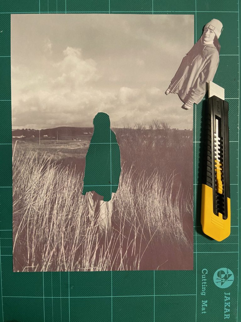
Hand Experimentation
I also tried printing off my photographs in a black and white, then cutting out the subjects by hand using a craft knife, as this is similar to the method Benitah used to create her final pieces. I then printed of my map images that relate to the subjects identity, and layered them underneath the cut out sections.
I think for my final pieces I will use the Photoshop method of editing my images. This is as even though the hand cutting out method links more to Benitah, I will be able to produce a more precise and neater final product with Photoshop.
I decided to use Carolle Benitah’s work as inspiration to showcase the theme of geographical identity, with images taken around Jersey and people who’s families are not originally from here, like most people who live in Jersey, and have moved from various places. With this I aim to express how this one small island has brought together a wide range of identities that have been sculpted by different cultures, accents and beliefs into one place we all call home.
Photo-Shoot One
Plan
Contact Sheets
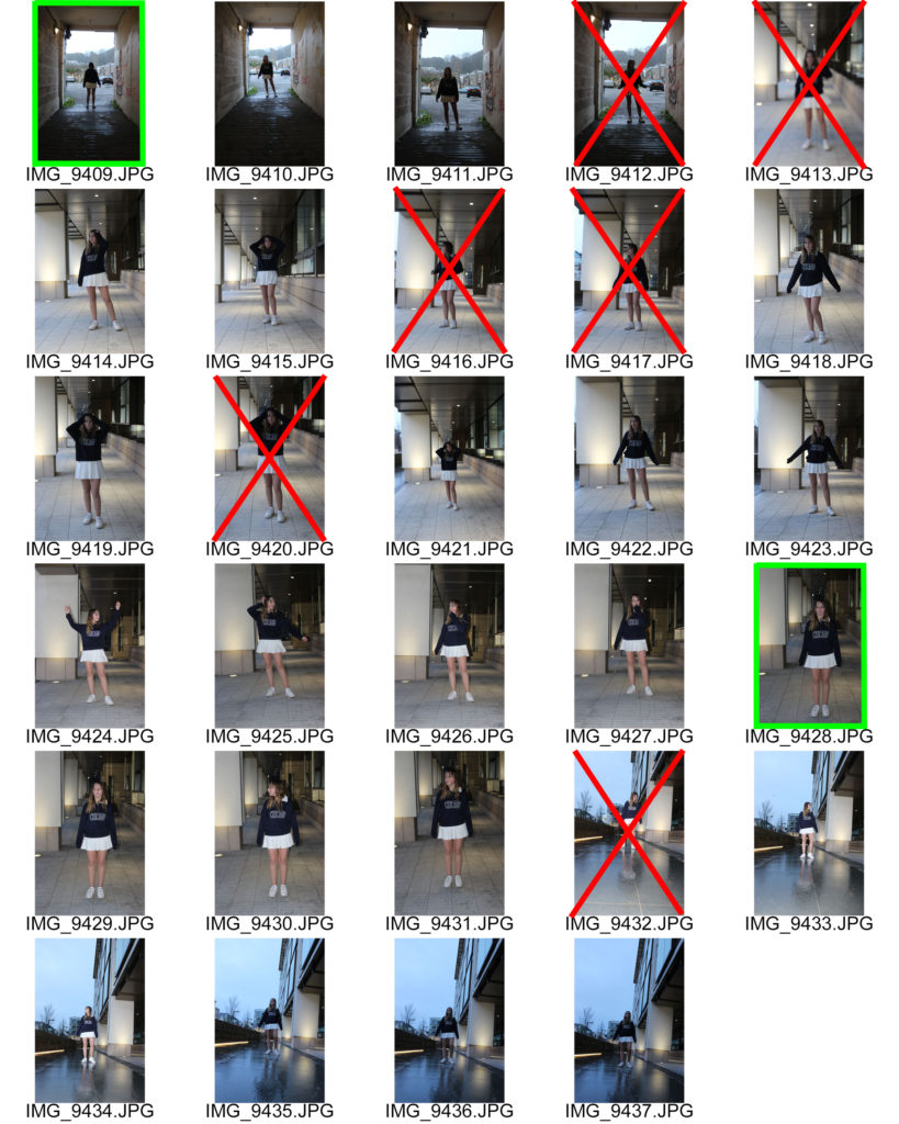
Here I have crossed out images in red that are not good enough to edit or use for my final pieces, as they are either too blurry, or under or over exposed. I have also highlighted images in green the photographs I believe will work well for my final pieces, due to the quality, variation in people and poses, and representation of the rural side of Jersey.
Photo-Shoot Two
Plan
Contact Sheets
Here I have crossed out images in red that are not good enough to edit or use for my final pieces, as they are either too blurry, or under or over exposed. I have also highlighted images in green the photographs I believe will work well for my final pieces, due to the quality and representation of the urban side of Jersey.
Initial Image Selection
For my photographs which will later be edited into my final pieces, I chose four images from each photo-shoot to give a balanced view of the island. I believe that these are my best images and will work well when edited in the style of Carolle Benitah, as they display backgrounds that clearly represent the identity of Jersey, as the subjects will represent their own.
Map Images
I took at least two map images for each of the subjects featured in my photographs which display the place where their families came from before moving to jersey. I am doing this as I believe that Jersey is built from people who originate from all over and have many different backgrounds, allowing for our island to be diverse in culture and history.
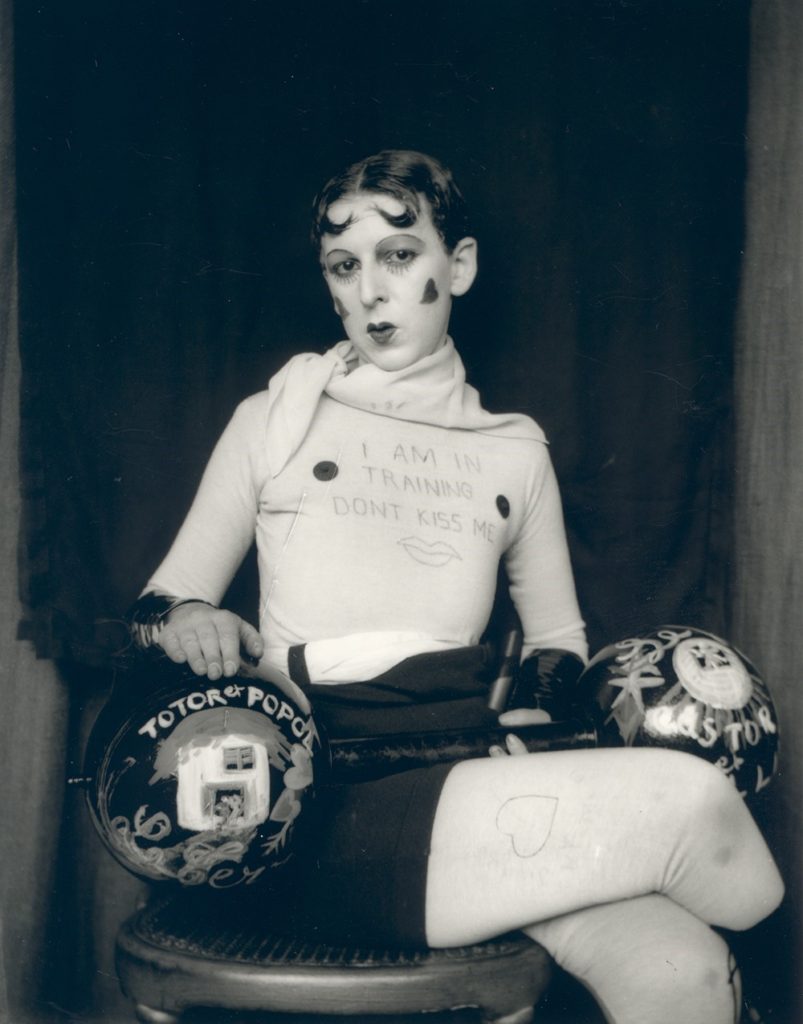
Claude Cahun, a French photographer, sculpture and writer born in 1894 to the name Lucy Renee Mathilde Schwob, was best known for their self-portraits, which often showcased a range of personalities. Cahun first began producing self portrait photographs at the age of 18 in 1912, and later took on the sexually ambiguous pseudonym in 1917, as she continued to combat the ideals of gender norms in her photography. Later moving to Paris alongside her longterm partner Marcel Moore, who she often collaborated with, Cahun continued to work on her surrealist portfolio.
In 1937 Cahun and Moore migrated to Jersey, just before the start of World War Two and the island’s German occupation. During this time the two soon became activists, in the effort to spread reports of Nazi crimes by creating anti-German fliers, criticising their authority, and placing them around the island. However, due to this they were later arrested and sentenced to death for their actions in 1944, although this was never carried out fortunately. Ten years later Cahun sadly died due to bad health, caused by her treatment in prison.
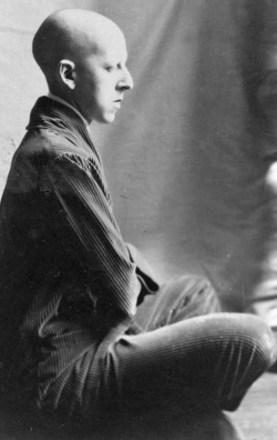
This black and white photograph, taken by Claude Cahun in 1927, displays a self-portrait of the photographer in which she has taken on the persona of a strong man or body builder that you may find at a circus or fair, during that time period. Here the pale white clothing, that matches the colour of her skin, contrasts dramatically with the dark black background behind her. This contrast between light and dark is also creating from the use of the dark dumbbell prop. The framing of this image by Cahun can be said to appear confining, as Cahun has placed herself so that she takes up most of the frame leaving little empty space.
The lighting used for this self-portrait appears to be two-point lighting, this is as there are only a small amount of shadows in the image but still a strong contrast between light and dark. Furthermore, it could be said that Cahun used a low aperture for this photograph, due to the fact that the foreground and background seem to have the same amount of focus placed on them. The ISO used for this image appears to be on a medium setting, allowing for there not to be too much light flooding in from the harsh lighting, but enough for the dark contrasting background to be visible.
In addition, this persona of a strongman or body builder does not portray all the masculine stereotypes that are associated with this type of person, but however showcases a more effeminate one. This is displayed through the Oscar Wilde type parting in the hair, the crossed leg pose and the hearts painted on the cheeks. This only further shows how Cahun challenged gender normativity by showing that she was able to switch her apparent gender at will comfortably.
Carolle Benitah
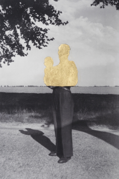
Carolle Benitah, born in 1965, is a French photographer best known for using her old family photographs to tell the story of her identity. Benitah does this by embroidering and cutting out certain sections of the portrait images. Benitah sees this style of work as allowing herself to expose the failings of her life and identity, and reinterpret her history. This acts as a sort of therapy for Benitah as she claims “I make holes in paper until I am not hurting any more”.
This sepia and, black and piece created by Carolle Benitah displays an old family photo of Benitah’s containing the subject positioned in the centre of the image, which is similar to the way in which Cahun placed herself in her self-portrait. Leading lines in this photograph are created by the horizon line, the line dividing what appears to be a wall and the see, and also the split created by the contrast in tones on the subject. These allow for your eyes to be drawn horizontally across the image. Dissimilar to Cahun’s photograph, there is a large amount of empty space around the subject of the portrait, meaning more attention is allowed for the background, which is a landscape rather than a studio backdrop seen in Cahun’s image.
Whereas Cahun used what appeared to be two point studio lighting, here Benitah has chosen an image taken with natural lighting, which you can tell due to the outside location. In addition, it appears that this photograph was taken with a low aperture like Cahun’s, due to the fact that the foreground and background hold a similar amount of focus. The ISO used to capture this photograph can be said to be lower than the ISO used in Cahun’s portrait, this is due to the fact that the natural light would flood the lens, causing the image to be over exposed, if it were higher.
Conceptually this piece differs largely from Cahun’s on the theme of identity, as it seems to show a loss, lack or even rejection of identity. This is due to the cut out sections of the subjects in the image, which could be representing an attempt to erase that part of her history. On the other hand, Cahun appears to take a completely different approach by doing what seems to be an embrace of her ability of changing identities.