
IDENTITY AND PLACE
What is identity?
According to the Merriam-Webster dictionary, identity is;
The distinguishing character or personality of an individual
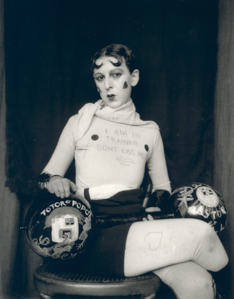
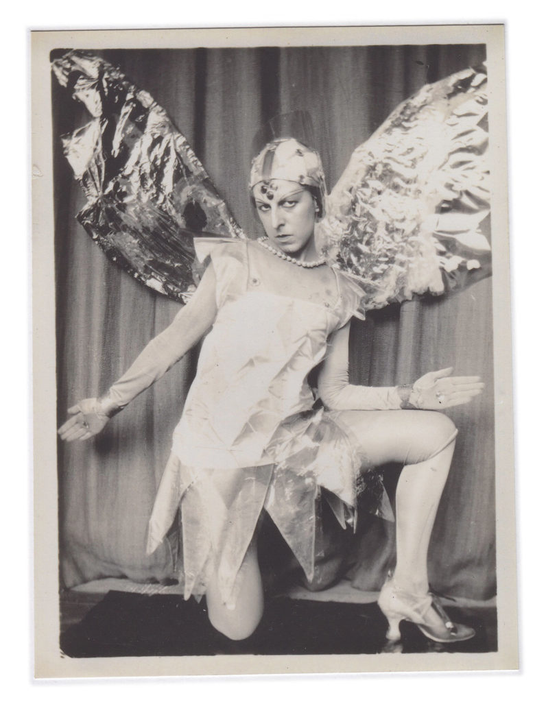
Claude Cahun
Claude Cahun, born Lucy Schwob was a innovative french photographer who came to jersey to escape growing antisemitism. Cahun was a lesbian who experimented greatly with the idea of gender in her photography. It is suggested that Cahun was transgender which is further supported by her hyper masculine look in her self portraits. Its evident that her ideas on gender and sexuality have greatly inspired her work

MIND MAP OF IDEAS
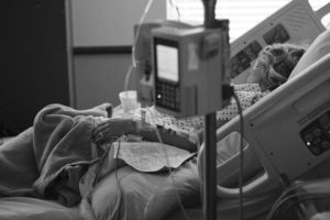
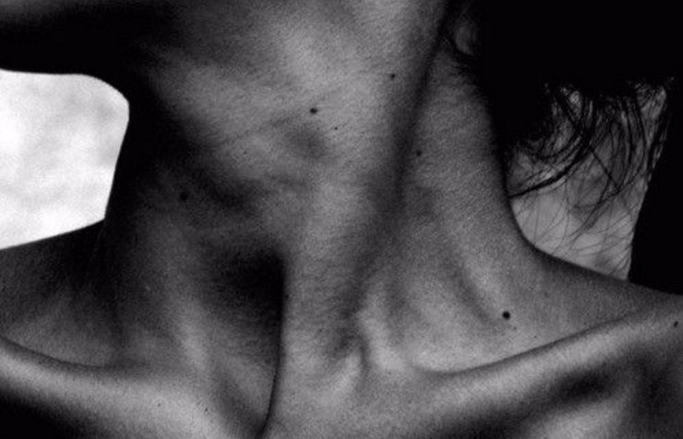
This project is based on the themes of identity and place. To explore this theme I am basing my project around body image as I feel that unfortunately its an issue that has a profound effect on many peoples identity. Whilst researching this topic I came across “The Epilogue” by Laia Abril which showcases the effects of eating disorders.
Comparing Cahun and Abril

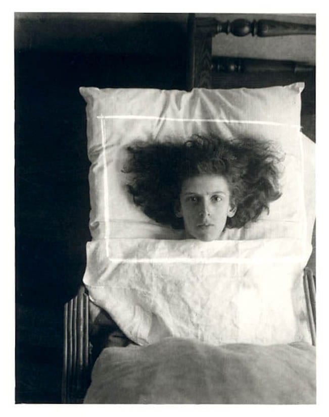
This photo by Cahun depicts her own head inside a glass jar. I’m not entirely sure how this was done but it seems that she has taken a photo of herself and put the physical copy inside a glass dome creating the effect that just her head is inside the dome. This early form of Photoshop sets Cahun apart from other artists of her time and makes her photography instantly recognisable. The head encased in glass give the photo an eerie feel which stays true to her other work. Cahun’s work are often self portraits and this one is no different however instead of picturing herself in a heavily emphasised masculine light she adds feminine touches such as lipstick and fashionably thin drawn on eyebrows. This connotes the idea that women are trapped by the patriarchy furthering her radical views on gender and women as a subordinate group. The glass surrounding her could signify how women are to be put on display and look beautiful but not actually do anything of substance. The lighting is quite natural, probably taken during the day as there is a steady stream of light coming in.
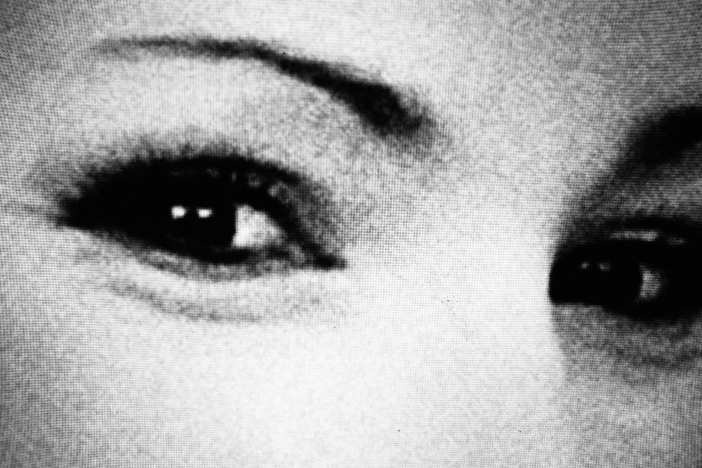
This photo comes from Abrils collection “Femincides” the word used for a sex based hate crime, and documents the sex based murders of 5 women in Reunion island. It is a portrait of a woman’s face cropped so as to focus just on the eyes. It is likely that this was done because of the idea that the eyes are the window to the soul and so by doing this creates an idea of honesty. Like Cahun’s photo, an effort has been made to increase the look of femininity through use of make up with mascara and plucked eyebrows. Like Cahun’s, this photo is in black and white but unlike Cahun’s this was done purposefully to create a more jarring look and to further accentuate the fact that this woman was murdered. The graininess of the photo paired with the black and white is very similar to photos of victims in true crime documentaries
MOODBOARD

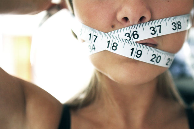
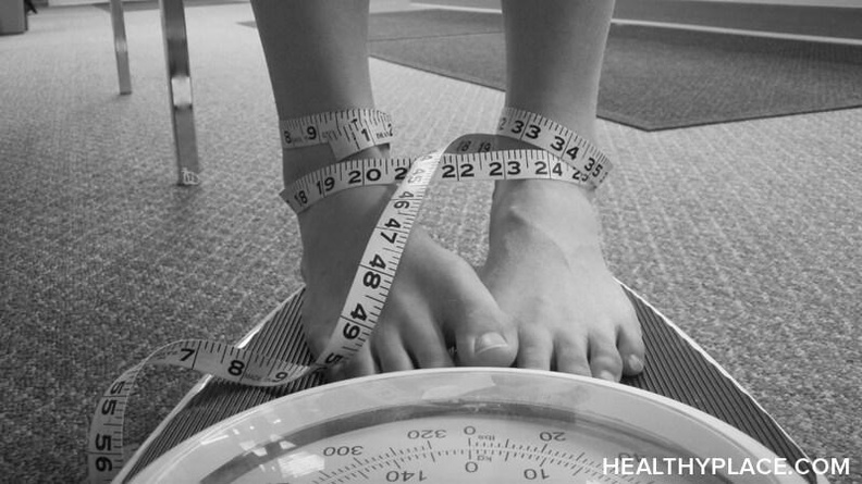
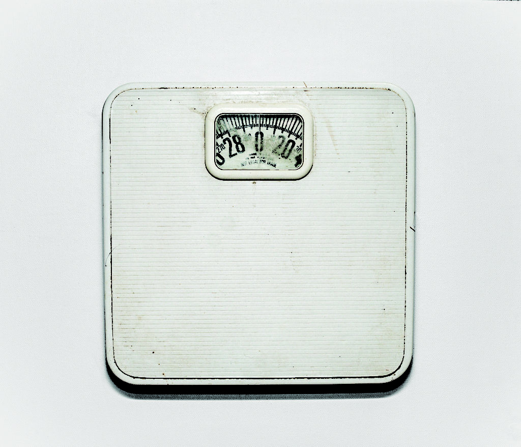
The Epilogue mixes together photos of ordinary objects around the house of a victim of bulimia as well as photos of severely underweight bodies. The above photo is of the scales belonging to Cammy Robinson who passed away due to her struggle with bulimia. On seeing this image I decided to base my project on objects that link to body image rather than taking photos of malnourished people as I feel like the image of the scales can be equally harrowing and I am to evoke emotion rather than just shock.
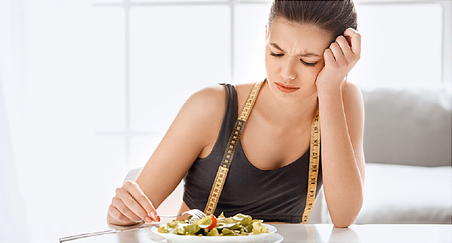
My idea at the moment is to take a head-shot of someone- (preferably a female in late teens as although eating disorders effect all genders they’re most prevalent in teenage girls) and surround the photo with photos of scales with different weights.
MOCK UPS
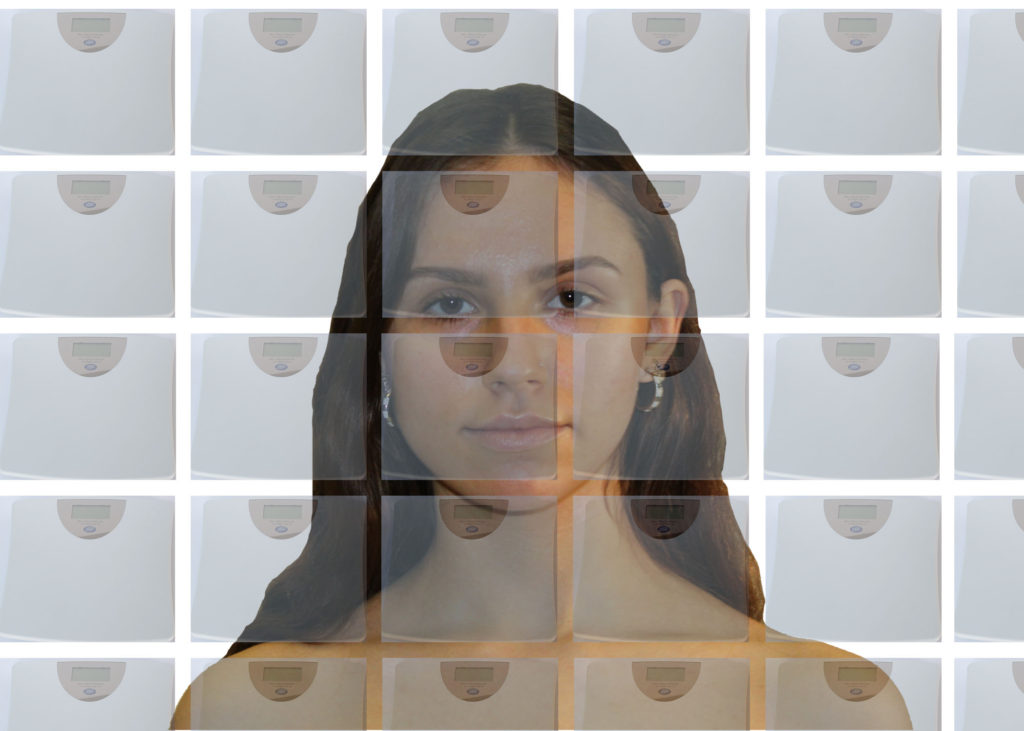
On Photoshop using stock images from google I made a mock-up of a potential final image
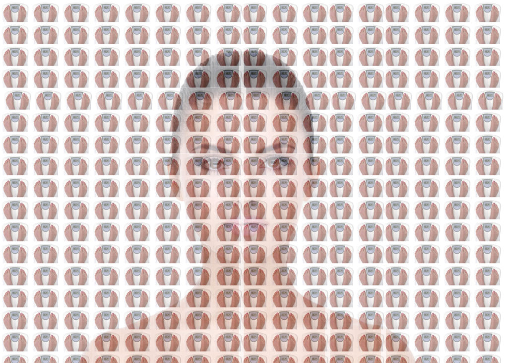
Reflecting on this image I wouldn’t want to include feet in the photo as I think it distracts from the seriousness of the project. I would also make the head-shot more visible either by making the scales around the model more transparent or removing them completely.
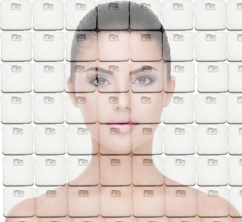
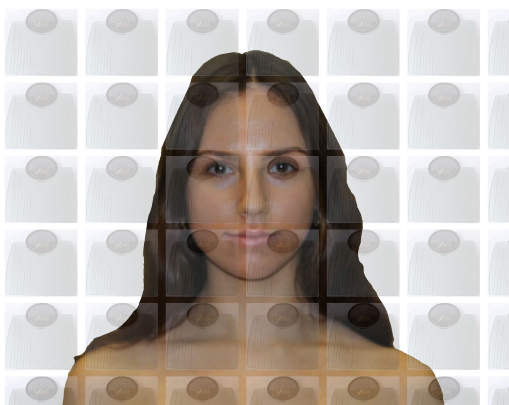
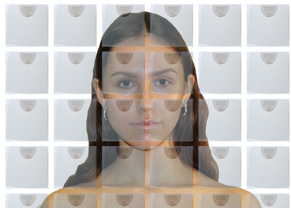
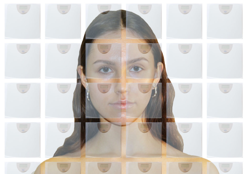
I had another go at mocking up an image but this time used the scales used in Laia Abril’s epilogue without feet. The plain backdrop of the white scales makes the image look stark and clinical which is the aesthetic look i am trying to achieve. The white of the scales also make the model more visible compared to my previous mock up. I really like how this image has turned out and I plan to create a similar version with my own photographs.
SHOOT PLAN
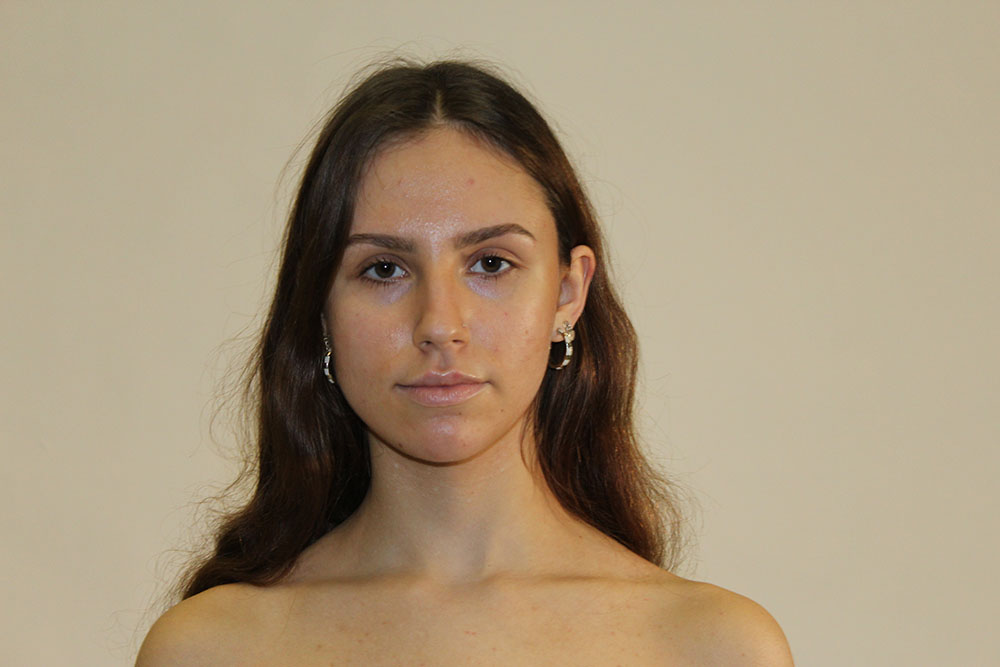
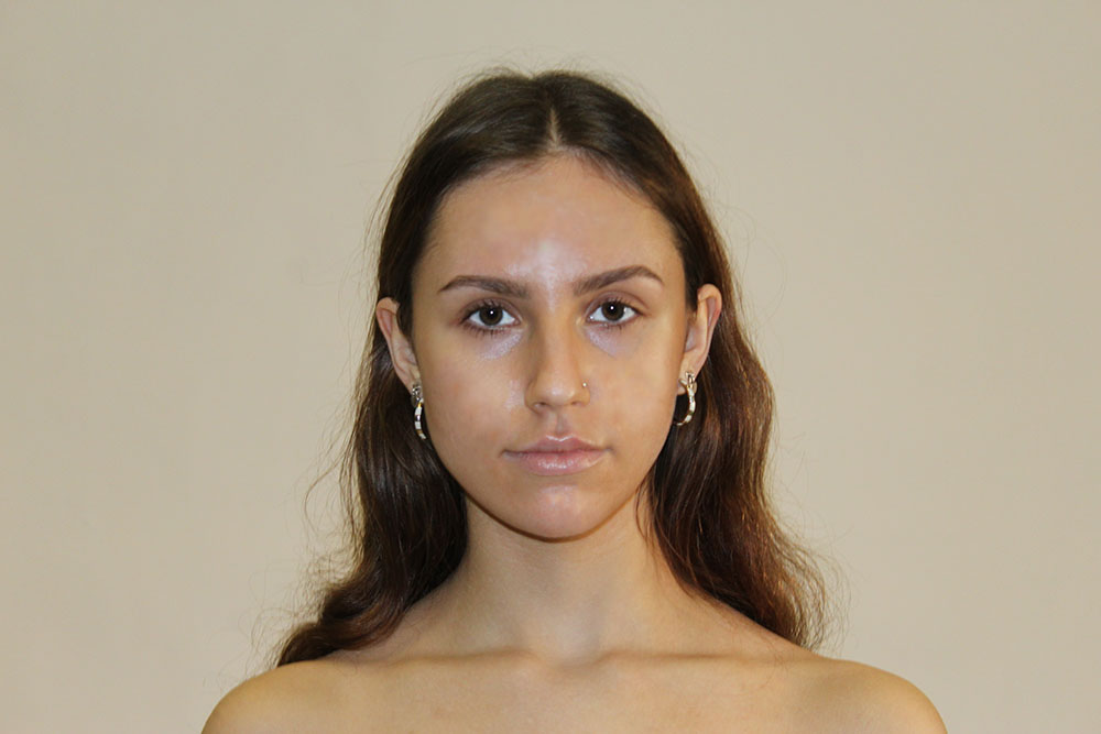
| WHAT | WHEN | WHERE | WHY | OTHER NOTES |
| Zuzanna-model for shoot | 19/01/21 10:15 am | Photography studio- using white backdrop | Centrepiece of portrait | Reminder to bring tube top to show shoulders |
| Scales- | 21/01/21 4:00pm | At home- diy white backdrop using card | To be multiplied and used as overlay for portrait | Borrowing scales- WHITE to blend in with rest of portrait |
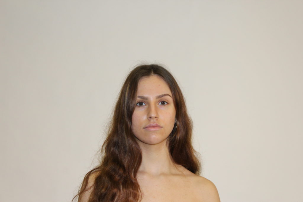
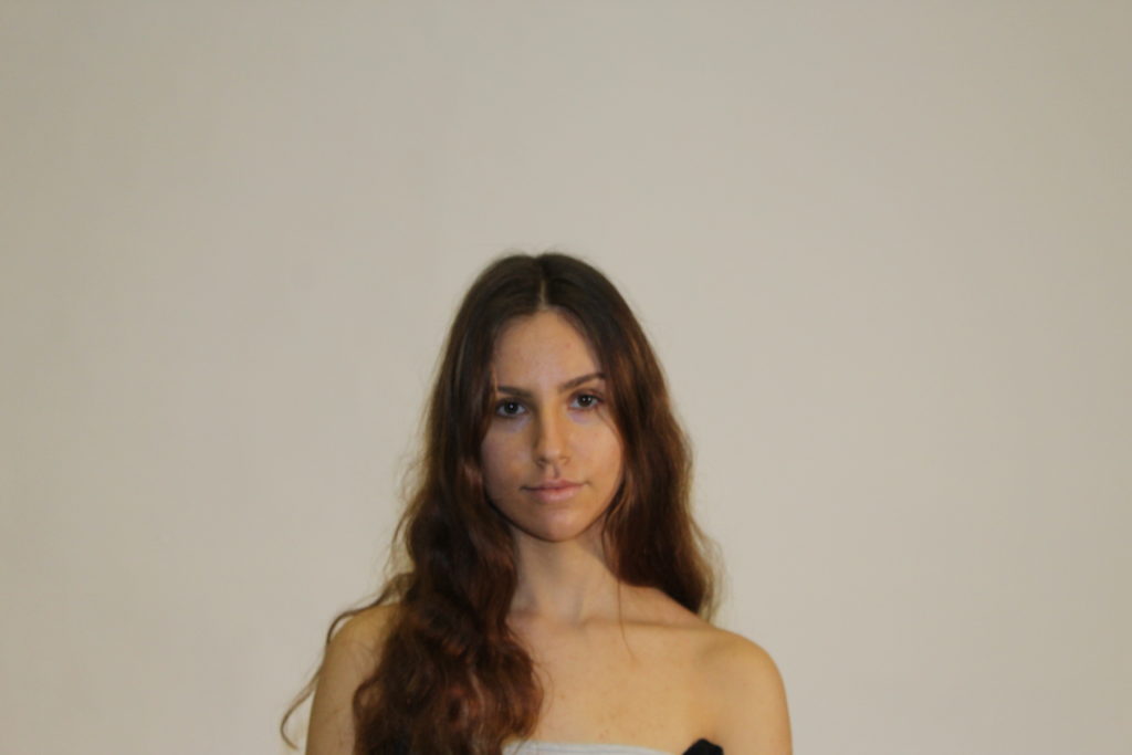
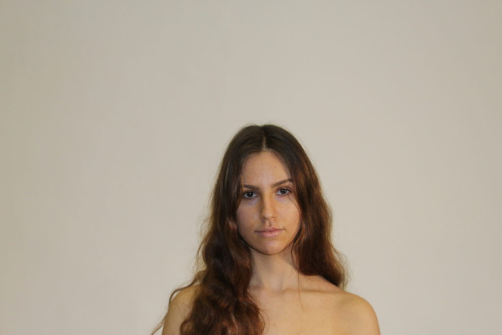
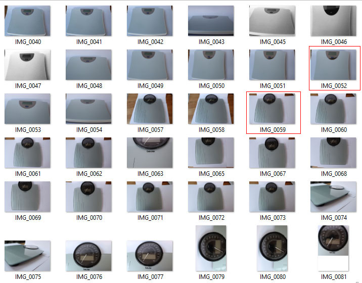
CONTACT SHEET
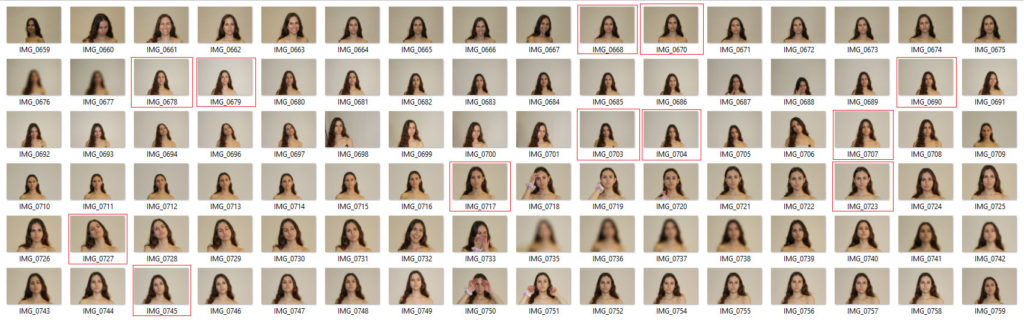
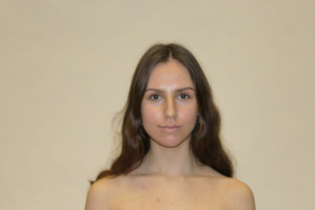
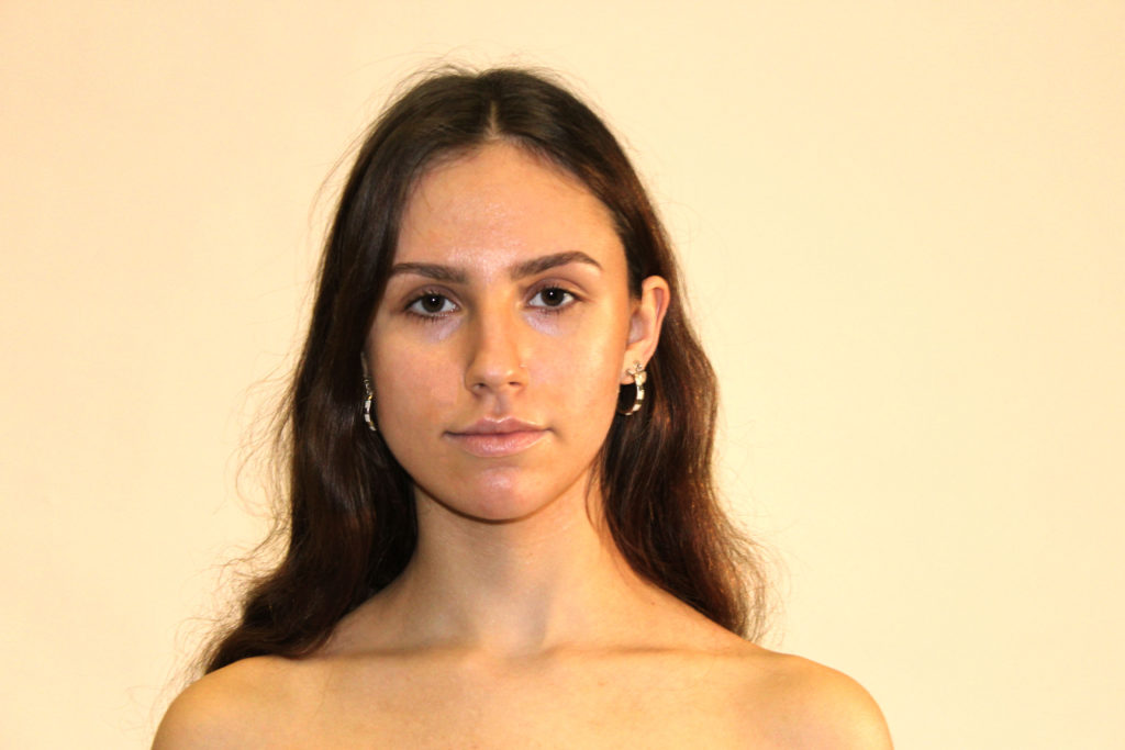
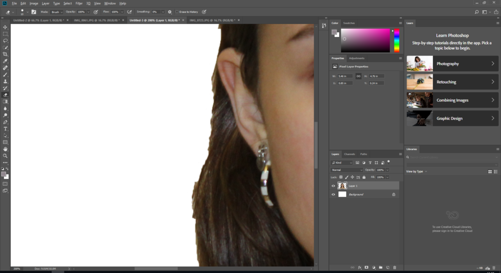
I had this shoot in the photography studio so that I could have a good white backdrop that would be easy to Photoshop with. I used 1 barns-door light to make the images clear but also not have the images look too artificial as the projects focus of body image is very natural. I felt this photo shoot went really well and I left the shoot with some really good photos that I think will work well put into Photoshop. Some of the photos are not as sharp as I wanted and are a tad blurry whilst others I purposefully made excessively blurry as I would like to try layering a sharp image over a blurry image for a dramatic effect. In quite a few of the photos, the models top is visible but I will crop this out in Photoshop when I use them. The photos in red outline are my favorite and will be put into another contact sheet in order to finish my selection process and choose my final image.
third 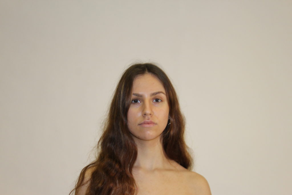

second 
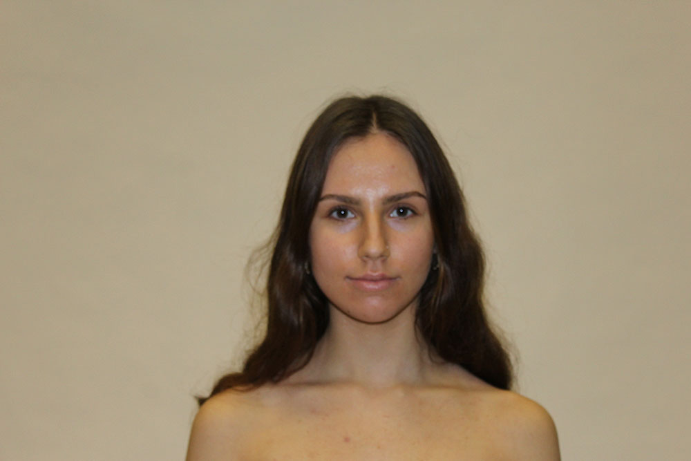
best image 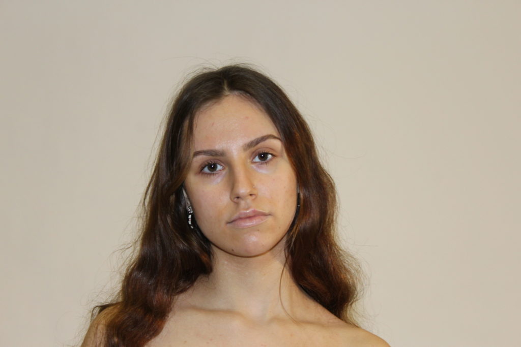
After selecting my favourite images I used photoshop to tidy them up. Using the spot healing brush I removed blemishes from the skin. I also tidied up messy hair by sampling background colour using the eye dropper tool.
SECOND SHOOT
The second shoot took place at my house. I crafted a white infinity backdrop using white A3 card. I borrowed two different scales, one being a more neutral, traditional scale more like the set of scales featured in Laia Abril’s Epilogue, and the other being more modern and grey toned which I was unsure about using as I didn’t know how well the colour would blend with the more beige toned photos of my model.
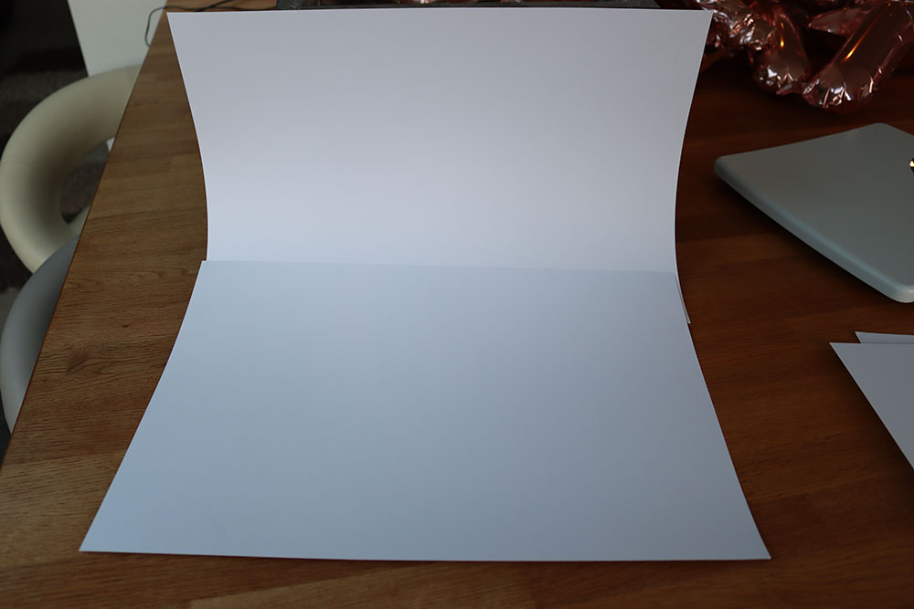
The DIY infinity backdrop 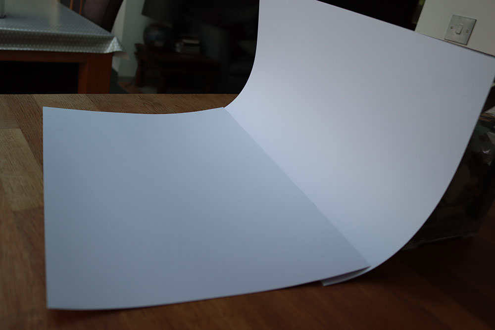
NEW IDEA
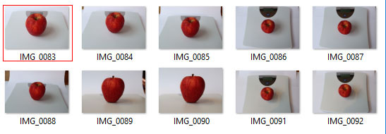
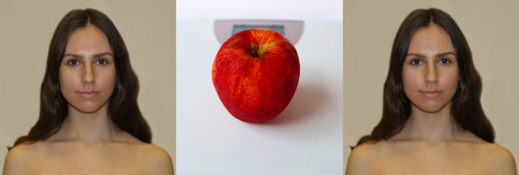
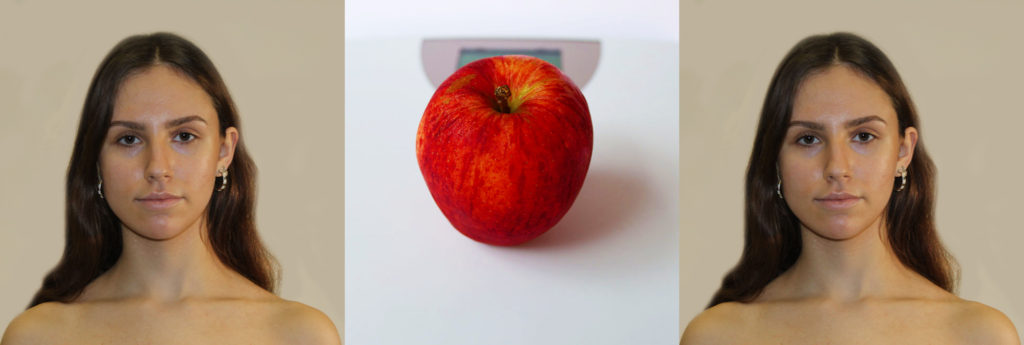
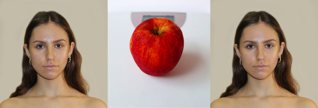
Whilst conducting my second photoshoot I saw an apple in the fruit bowl and had the idea to take a series of shots of the apple on the scales to add a bit of colour to the project. I realised that this would perhaps distract from the focal image of the model as I felt the feet in my first mock up did so I have created an alternative idea. I have decided to do a series of photos in the style of the Kuleshov effect in order to evoke more emotion from the images. To do this I am going to use two of the same portrait images of my model with a photo of the apple between the two.
MORE EDITING
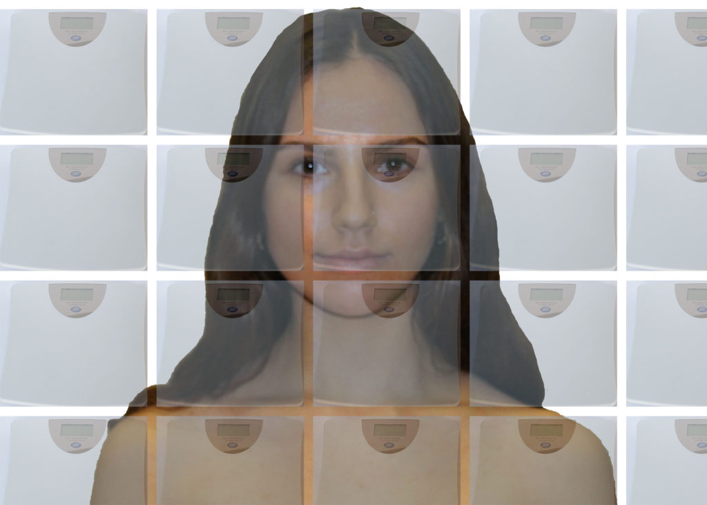
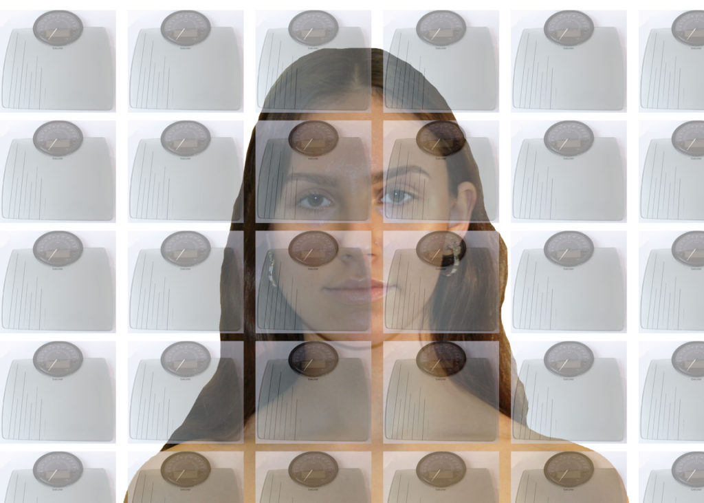
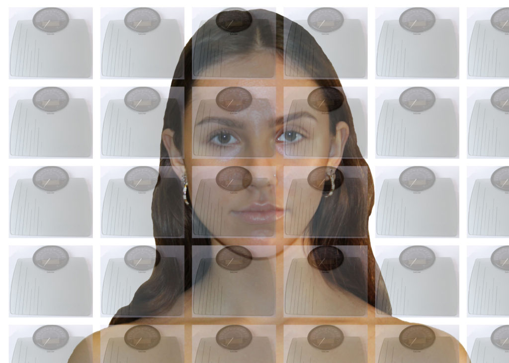
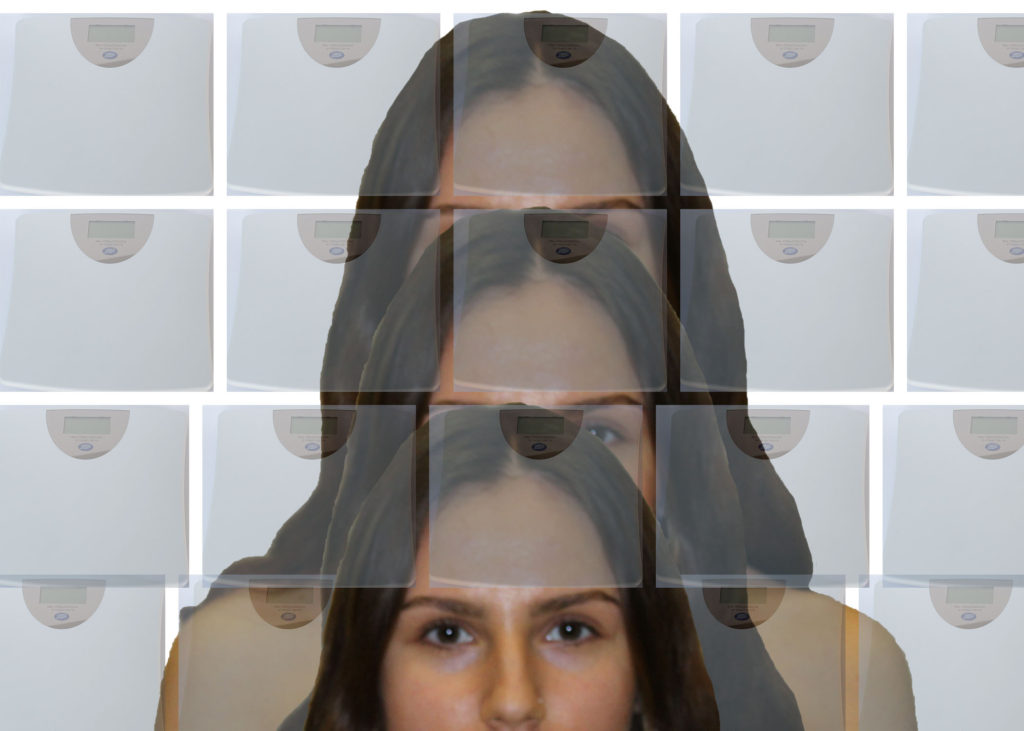
To create my final pieces I had two different methods. The first was very similar to my second mock up. I used the quick selection tool to get a rough outline of my model which I then pasted on to a new photoshop document. Because this was done very roughly a lot of the hair that I had previously tidied up had become very messy and choppy again. To fix this I used the eraser tool to smooth the hair out and make it look more natural. After this I opened my best white scale image onto photoshop lowered the opacity so that the model underneath would be visible. I then used the rectangular marquee tool to cut out the scales in a way that kept it looking sharp and clean and pasted it onto the open document that already contained my model. I made multiple copies of the scales to layer over the model and then adjusted brightness, contrast and vibrancy to make the end image look better. After completing my first image I repeated the process but using the grey scales instead of the white. I did this for each of my selected photos with varied sized scales resulting in at least 2 versions per model. Whilst doing this process I accidently duplicated the model instead of just the scales but really liked the effect it made so have kept it as a final image. Creating my Kuleshov tableaus was more difficult as it needed to be much more precise. The first thing I did was open one of my model photos and crop it to a square taking note of the size of the width and length of the photo. I then created a new document using measurements taken from the model photo, the length of the original photo and width three times the width of the original. I dragged the photo I had onto this open document and then dragged on my chosen apple photo. This posed a problem as the apple photo was much smaller than the one of my model. To solve this I used ctrt T bring it up to size making sure to hold shift so as to retain the shape. I then copied and pasted the model to put on the other size. After this I had a small amount of white space that I then cropped out, completing the image. I did this with each model photo.
FINAL IMAGES

COMPARISION TO CAHUN
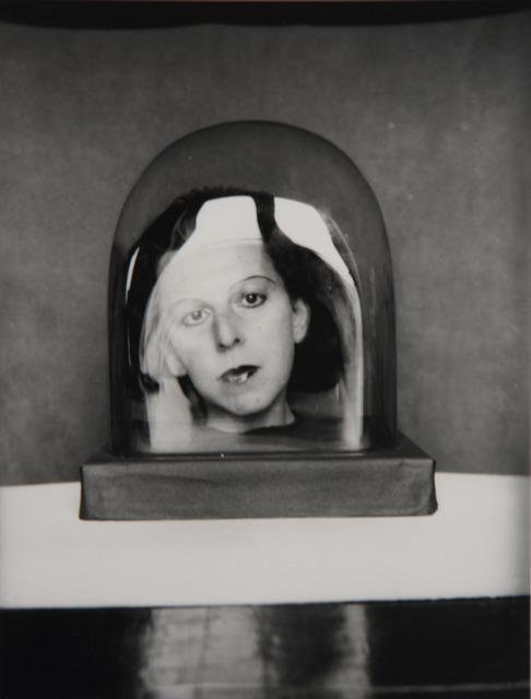
My image uses artificial light to create a light and airy feel whilst Cahun seems to use natural light with a darker tone.
My image uses very light, washed out colours in order to convey the feelings of depression that comes with eating disorders whilst Cahun’s is in black and white. Although this probably wasn’t a conscious decision as the only way photos would get colour back then was through tinting, the black and white suits the photo well, showing the dark undercurrents of the photo.
Both photos are very centrally positioned, using faces as a focal image in order to draw attention to them
Both photos convey a feeling of being trapped. In my photo this is shown through the repetition of the scales which allegorically represent an eating disorder that completely controls and traps victims whilst the glass jar around Cahuns head could represent how the patriarchy has trapped her and forced her to repress herself.
CONCLUSION
In conclusion I feel like I managed to create a good set of images that have strong links to Claude Cahun and Laia Abril while still managing to present my own unique ideas around identity. I hope that the message in my photos is helpful to anyone suffering with an eating disorder and help people without one gain a greater understanding of the topic. I have really enjoyed doing this project as it introduced me to some brilliant photographers and also allowed me to express myself through photography, something I feel I haven’t done before.
Here you go:
On the whole this was a successful unit for you. You approached the concept with clarity and ambition, producing some well-conceived final outcomes.
Compare your marks to the MARKING CRITERIA.
An area for improvement…
• Cross reference your research eg Claude Cahun and surrealism in photography eg Man Ray
• Develop your analysis …explore CONCEPT AND CONTEXT more thoroughly
Now you have time to adapt this unit and complete all the other sections of the portrait project by Feb half term…you can add more images to the print folder too eg your best studio shots / environmental portraits / headhshots etc
Well done and good luck with the rest of the project!