Plan
What:
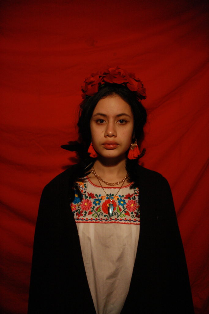
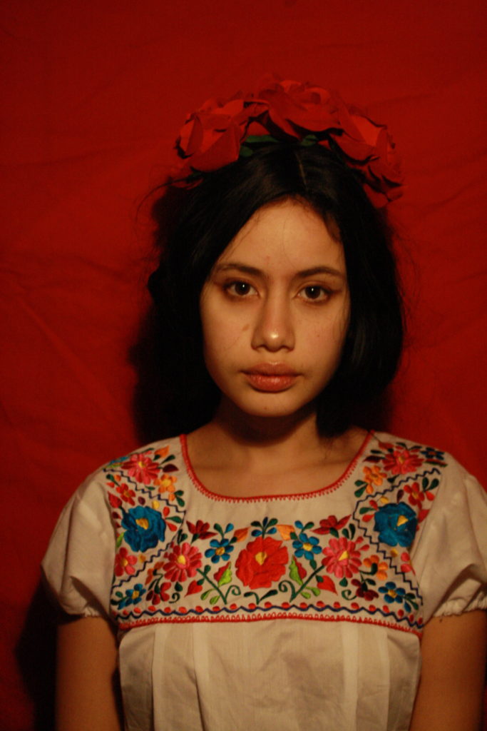
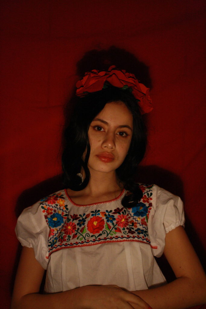
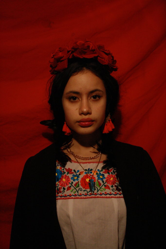
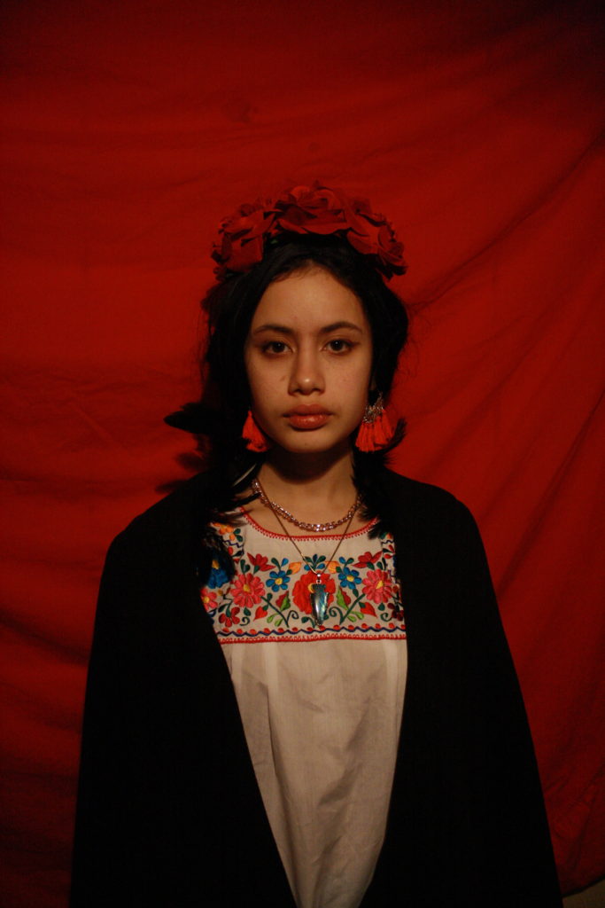
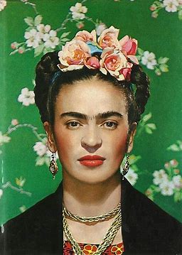
A reecreation (with my personal touch) of the cover of Vogue magazine where Frida Kahlo appeared in 1938
When:
Wednesday 20th of January
Where:
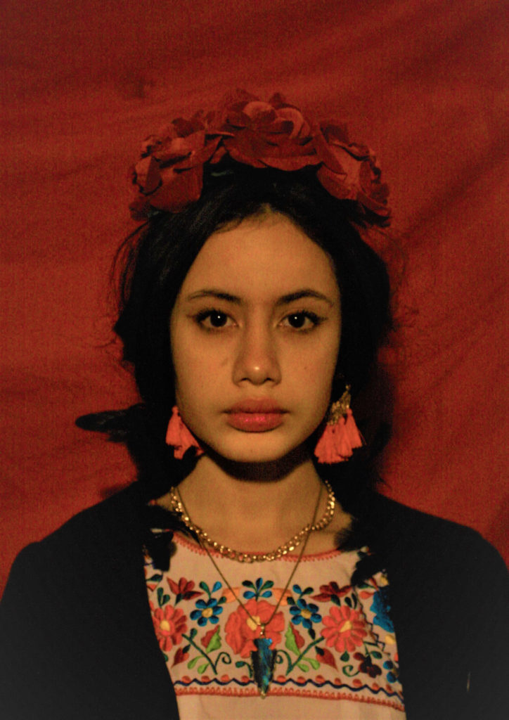
The place was not the most important so I decided to do it at home and as a background a red sheet to add color to the image.
Why:
To represent this iconic person who is part of my culture
Contact Sheets


First Selection
Comparison
This image is more similar than my second shoot. I am placed in the middle of my image like that of Frida Kahlo. Our facial expression is a bit the same, we stare at the camera with a monotonous look a little empty. you can see a slight smile in the corner. What I love about Frida’s facial expression is that she looks confident even she poses in the room, she knows what she is doing. This expression is unique. Let’s go to the small details now, as we can see is that the backgrounds are not the same colour. Is done on purpose. The background of the photo of Frida Kahlo is green a colour that is part of the Mexican flag and the other two colours are white and red so I decided to put a red background to “continue the flag”. Even if we have almost the same outfit, there are some small details that are not the same example: the flowers that I wear are big and red while hers are small and pink those little flowers that are even on the bottom. Frida Kahlo has a traditional Mexican hairstyle while I have a more modern one. It is these little details like that that make the photo something beautiful.

