
Image 1:

The lighting use in this photograph is natural light from the outside and is not controlled in any way. The aperture in the image is higher because that way there is more of the landscape in the image, also the image is not over or under exposed and looks like a normal image. There is not much depth of field in this image because the background is just the plain grey sky, this adds an element of simplicity to the image and adds to the isolated mood with the cool tones in the photo. The photo has a range of cool and warm tones coming mainly from the sky and the land in the photo. This creates the centre horizontal split and makes it have more of an impact as it creates a juxtaposition between the two. Overall it is a cooler image as it is darker and the grey sky takes up the top two thirds of the photo. The photo is quite 2D as the land and house is in the foreground of the image and the sky is the background which makes it seem empty and isolated. The building being a house adds an element of character to the photo because it is someone’s home which is the centre of this photo which personalises it. The house being positioned in the centre surrounded by the emptiness creates a sense of calming.
Image 2:
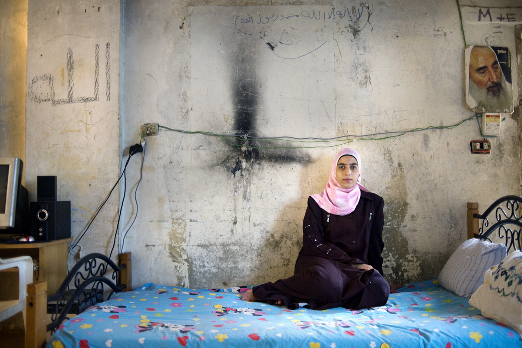
The lighting used in this photo seems to be artificial lighting because the shadow behind the subject (the girl) is very harsh and the light seems to be white studio lights as they are reflecting off the concrete wall and lighten the room. There seems to be a mix with natural light coming from above the photo. The overall image is bright which is due to the lower aperture which is allowing more light to go into the camera lens creating a bright image. The photo is shallow and has very little depth of field because the image stops at the wall, however the bed and the girl are closer to the camera which creates a difference with the background bringing them into the fore ground and giving the photo more shape. The photo has a large range of tones due to the lighting used as it has created darker and lighter tones. The layout between the objects in the photo and the girl are placed surrounding her but in an overwhelming way like they are controlling her. Linking to the context of identity this image shows a sense of loss of identity or identity theft because the things around her are very simple and dull which creates a gloomy mood. this could also relate to the location of the image as it is taken from a home in the middle east which is a less fortunate, poorer country which cannot necessarily afford things they want or added extras and focus on the most important needs such as food and shelter.
Comparison:
Both photos are quite grey and have a similar dull atmosphere shown in different ways. They both share a sense of isolation, Image 1 is showing isolation as a personality in a more positive way, whereas Image 2 is showing isolation from herself and her identity in a negative way. The depth of field in both are shallow but in different way because Image 1 is a very 2D image and is flat but Image 2 has different shapes and is more 3D because the objects that surround the photo give it shape and the wall has different tones and is not completely flat. Image 1 is spilt into two with a harsh horizon in the centre of the photo, whereas Image 2 is not split and works with all the elements together.