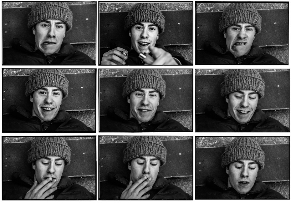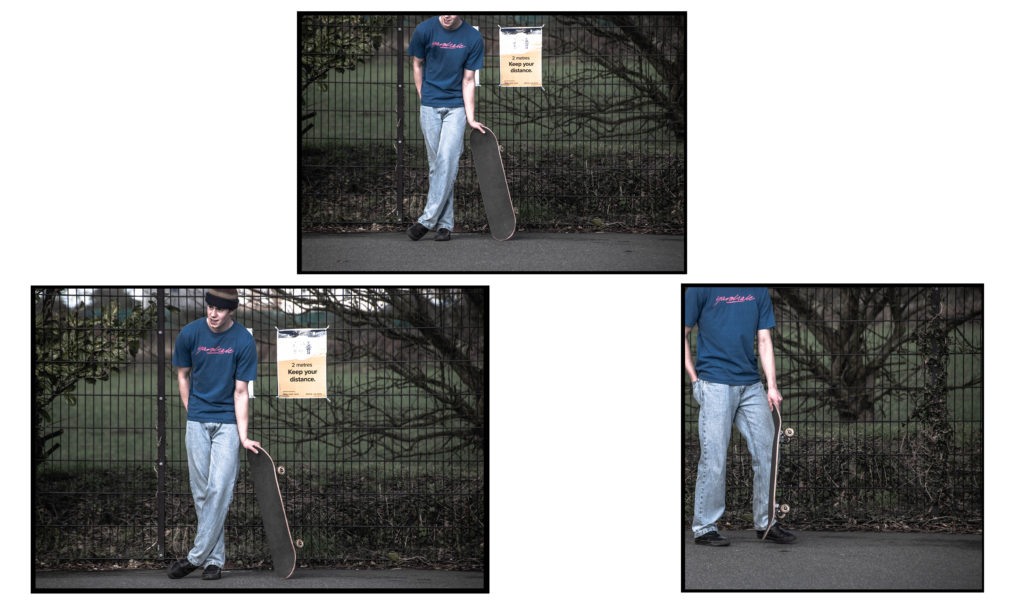


The above are my final displays I decided on.
I grouped some similar images into diptychs and triptychs according to colour scheme, physical similarities. I also used similar bordering and presentation methods that J Grant Brittain uses.
The following is an image comparison between one of my pieces and one of J Grant Brittain’s pieces.

J Grant Brittain 
Michael Kenealy
The above images both focus on the identity of the subject by portraying their personality through capturing their facial expressions. Both images are desaturated and have high contrast to accentuate shadows around the face and therefore accentuating the facial features of the subjects. Both images are collaged into sets of 9 coinciding images. Both images feature a mixture of compositions where the subject interacts with the lens and some where the subject ignores the camera.
Grants image is shot with fluorescent lighting in a professional environment whereas my composition is shot with natural lighting in a less professional environment. This also creates difference in the texture of the images, mine has a rougher texture whereas Grants image has a smoother texture to it.

For the above composition I shot the skateboarder in front of an urban graffiti background in a skatepark, I focused on showcasing his culture and style like J Grant Brittain. The gaze and side angle shot creates a sense of confidence, control and passion the skateboarder portrays to his environment.
I shot the image in black and white and used high contrast and clarity to accentuate the features of the subject for example the area around his eye feature high contrast and clarity which captures that emotion in his eyes. The high clarity and contrast also gives the image a sharp and rough texture.
I used a wide aperture to obtain a sharp focus on the subjects face and separate him from the background and create a slight bokeh effect. I used the grid on my camera to frame my subjects head in the centre of the shot.
In conclusion I believe I captured the identity through his cultural passion for skateboarding well with stylistic, J Grant Brittain type images and presented them in an artistic way.

Mike: some interesting imagery here…but you may need to re-select your final outcomes I think.
The strongest images are actually the unconventional / heavily cropped angles as opposed to the straight forward portraits.
(These could be re-constituted for the HEADSHOTS task)
Also…look at the work of
Danny Evans : https://www.gallery.je/skateboarders-by-danny-evans%20/2019/
Plus : Craig Stecyk, Larry Clark , Glen Friedman etc and Danny Lyons too for some great work on sub-cultures / groups / gangs…as there is a real aesthetic going on here that you have picked up on and recognised, but could push a bit further too i think.