Photo-shoot 2

Photo-Shoot Plan

Who – A male 17 year old – My boyfriend.

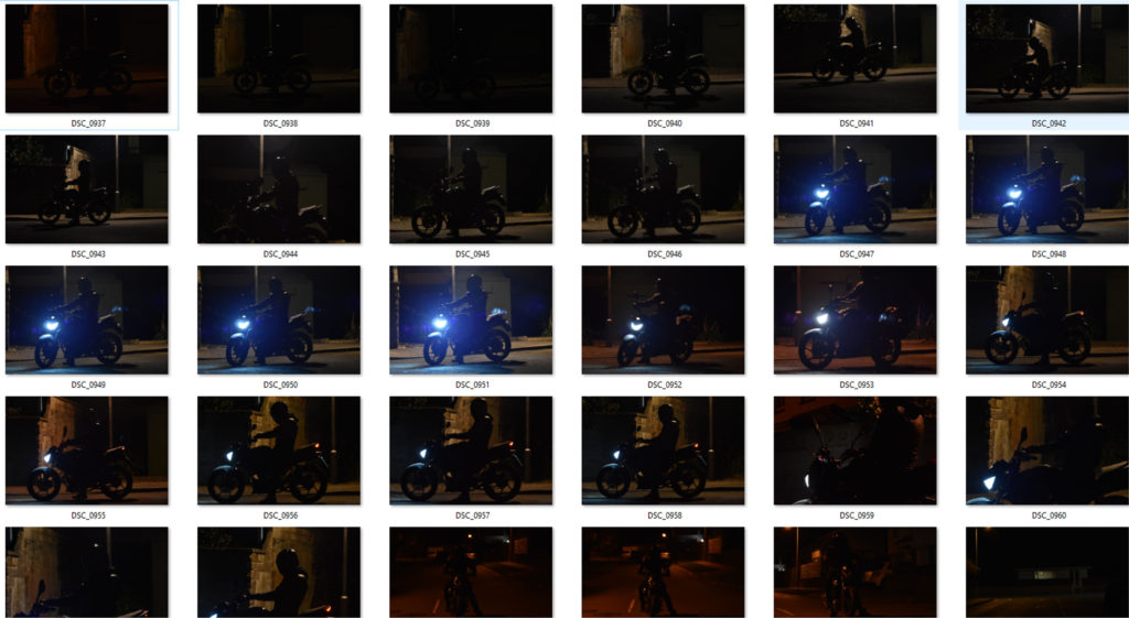
What – A photo-shoot of my boyfriend gaming, in his car and on his motorbike.

Why – This photo-shoot is taken to capture a teenage boys lifestyle that society stereotypes to be. It shows what his identity is likely to be and what he (his age group) are known to do in their life.

Where – At my house and on the street roads of St. Brelade.

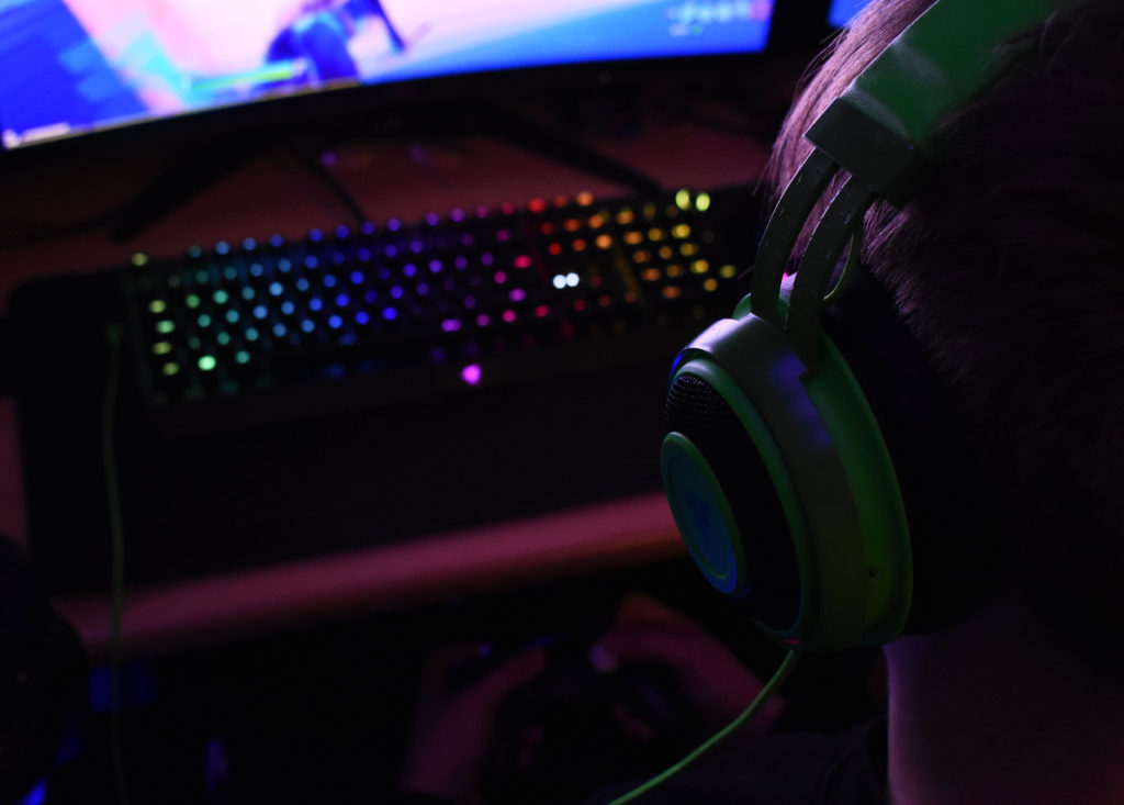
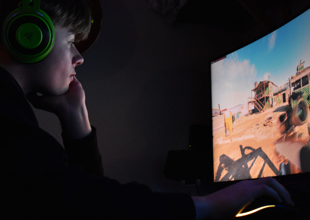
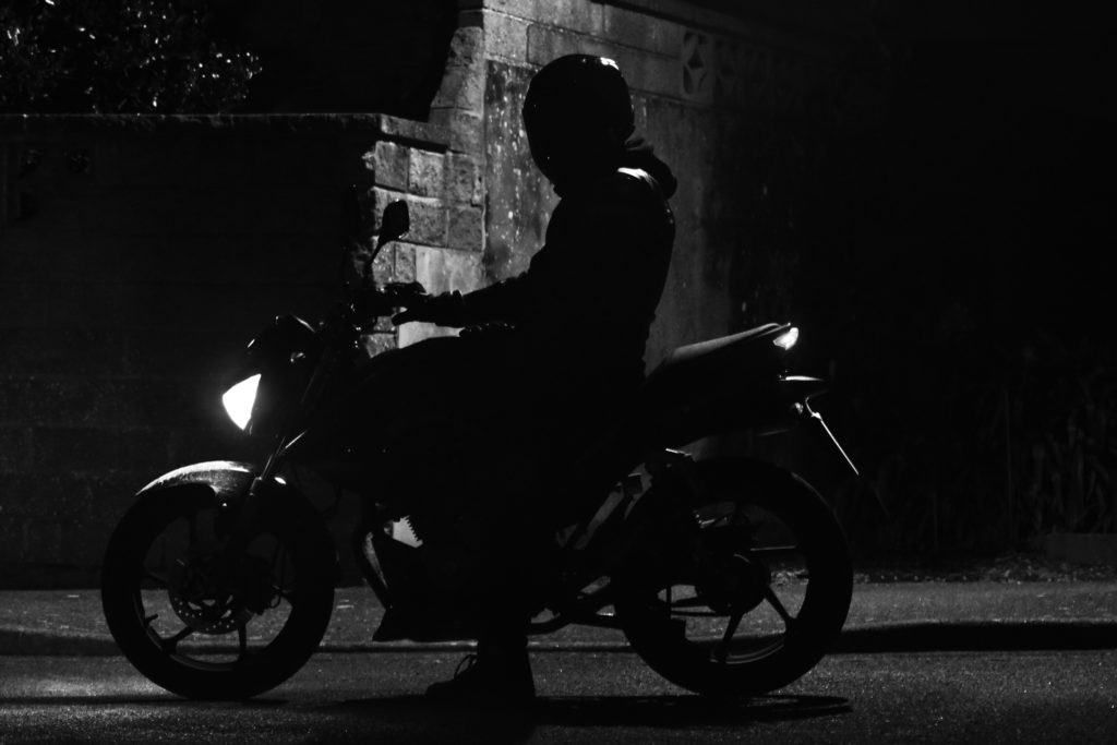
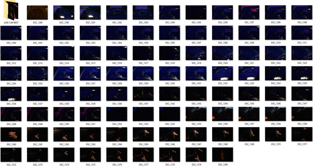
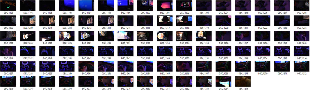
How was the photo taken – For the gaming photos , using LED lights for a glow effect and a spot light to create more light in the room was how the photos are seen. Camera settings were used at a low exposure and 400/600 ISO was used. For the car images, a light inside the car was used to mainly pin point the objective that I was photographing. A high ISO – 1600/3400 was used to actually see the image as it was low light in the day as well as a low exposure – 1/50 – 1/40. For the motorbike photos the same camera settings applied as it was low light in the day. A single street light was used to create a silhouette figure of the bike and my model. (all black).

When – Late evening / 22nd and 23rd of January

Contact Sheets

Car contact sheet
Gaming contact sheet
Motorbike contact sheet

Editing Techniques Shown

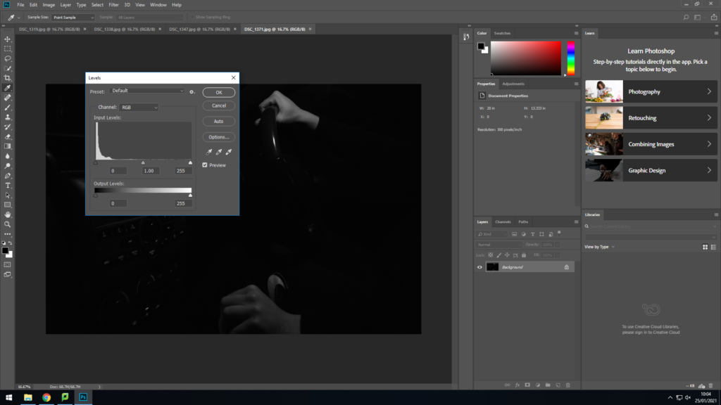
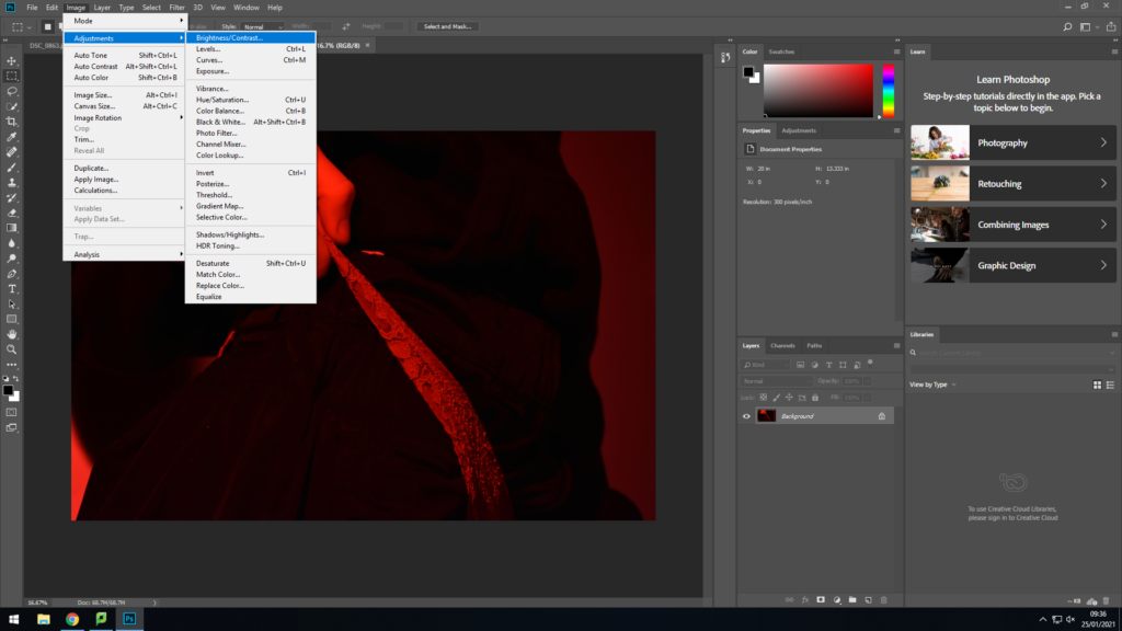
For both motorbike and car images I changed them into black and white photographs. I increased the contrast levels and either increased or decreased the level of black or white depending on how much you could see the image. I also used the dodge tool to emphasis the light features in the face for the car photos and the highlights of the motorbike.

Changing the vibrance level of the picture increased the glow that was coming off the LED lights in the background outside of the image. The light coming off the monitor in front of his face projected a white glow on the front of his face which I lowered in highlights and shadows in adjustments in photoshop.

Best/Final Outcomes

These gaming images relate to this teenage boys identity as gaming is a big part of his life. Its something he loves and enjoys doing. Modern day teen boys are known for there love f the online gaming world. Where hours and days would be spent online. This hobby may be his safe place, a place where he enjoys himself with no worries. The bright colours found all around the images represent his love and passion for gaming and how it fills a hole in his identity. The concentrating expression on the face in the portraits above gives off the impression that he is completely zoned out, as if no one is around him.

These photographs were taken at very low light in the day, nearly no light at all. Using only a single spot light in the car , editing on photoshop was needed to be done to see the images clearly. These photographs have an old style to them, as if they were taken in the 1960’s. The light parts of the face and hand are the main features that contribute to the photo for making it look the was it looks. The body of the boy blends in with the blackness of the background and the rest of the car to emphasis his facial expression. The seriousness of his face and the way only one hand tightly grips the wheel of not just the car but the motorbike too, implies his love for vehicles and what he feels almost proud of.

Linking To A Photographer

This old fashioned look with these dull black and white photos links to Bruce Davidson’s work. This is seen below…

The Renowned, Unknown Bruce Davidson - The New York Times
Image By Bruce Davidson
Image By Me

These two images placed together seem to have the same sort of lighting as light in Bruce’s work hits mainly the face and coat of the lady and man on the bus. Both images seem to have the same tonal range of black and white as well as sharp lines found between contrasting parts of the images between black and white.

Apart from the images physically linking together, Bruce Davidson over the years of work has taken photos of teen life in the mid/late 19 hundreds. This links to my work as the whole concept of the photo-shoot is to show a moderns teen boy’s life and what his personal identity is.

EVALUATE AND CRITIQUE

If I was to do this photo-shoot again with the car and bike theme I would use more natural light to bring out the dark areas to make it more of a modern day photo rather than replicating an old style of work from years ago. I might have used more colour in my work to connect to my models lifestyle and his identity to others and himself.

Final Presentation

The above are my final displays I decided on.

I grouped some similar images into diptychs and triptychs according to colour scheme, physical similarities. I also used similar bordering and presentation methods that J Grant Brittain uses.

The following is an image comparison between one of my pieces and one of J Grant Brittain’s pieces.

The above images both focus on the identity of the subject by portraying their personality through capturing their facial expressions. Both images are desaturated and have high contrast to accentuate shadows around the face and therefore accentuating the facial features of the subjects. Both images are collaged into sets of 9 coinciding images. Both images feature a mixture of compositions where the subject interacts with the lens and some where the subject ignores the camera.

Grants image is shot with fluorescent lighting in a professional environment whereas my composition is shot with natural lighting in a less professional environment. This also creates difference in the texture of the images, mine has a rougher texture whereas Grants image has a smoother texture to it.

This image has an empty alt attribute; its file name is DSC_0084-1-1024x753.jpg

For the above composition I shot the skateboarder in front of an urban graffiti background in a skatepark, I focused on showcasing his culture and style like J Grant Brittain. The gaze and side angle shot creates a sense of confidence, control and passion the skateboarder portrays to his environment.

I shot the image in black and white and used high contrast and clarity to accentuate the features of the subject for example the area around his eye feature high contrast and clarity which captures that emotion in his eyes. The high clarity and contrast also gives the image a sharp and rough texture.

I used a wide aperture to obtain a sharp focus on the subjects face and separate him from the background and create a slight bokeh effect. I used the grid on my camera to frame my subjects head in the centre of the shot.

In conclusion I believe I captured the identity through his cultural passion for skateboarding well with stylistic, J Grant Brittain type images and presented them in an artistic way.

Luke Gram, Picasso and Kensuke Koike (CC)

Luke Gram

Luke Gram is a Canadian Photographer who creates serene images by combining landscape imagery with silhouettes. His technique of editing his photographs is known as double exposure. Gram travels the world to take photos of landscape and portrait imagery and shares his story on Instagram.

Dreamy Multiple Exposure Photography By Luke Gram - IGNANT

Picasso

Pablo Picasso was a Spanish painter, sculptor, printmaker and theatre designer who spent most of his life in France. He is most famous as a painter because of his paintings such as the Weeping Woman, The Old Guitarist and Girl Before a Mirror.

Pablo Picasso 1881–1973 | Tate
The Weeping Woman (1937)
Old Guitarist by Pablo Picasso
The Old Guitarist (1903)
Girl Before A Mirror by Pablo Picasso
Girl Before a Mirror (1932)

Pablo Picasso began to experiment with new things such as light painting as you can see below which began in 1949.

Light Painting Photos by Pablo Picasso

Kensuke Koike

Kensuke Koike is a Japanese contemporary visual artist who buys images and then distorts them by cutting out sections and replacing, rotating and cutting our sections of the images.

Kensuke Koike: Nothing Added, Nothing Removed - IGNANT
Kensuke Koike and Thomas Sauvin's No More No Less | 1854 Photography
Kensuke Koike: Nothing Added, Nothing Removed - IGNANT

My Ideas

I really like the idea of replacing the silhouette of a person with an image linking to personal identity. I also like the idea of Picasso’s light painting because it can be used to present personal identity using words or drawings that could be completely planned or random. Lastly, Kensuke Koike’s method of showing identity is very interesting and I want to attempt to recreate this using the images I will edit from Luke Gram.

Comparison

Luke Gram’s way of expressing identity is through linking people back to nature. He removes their features and replaces it with a scene that everyone can relate to and enjoy. However, Pablo Picasso shows his personal identity by drawing images with light which would not have been seen if he had not been using his camera. I also believe that Kensuke Koike’s method of representing identity is very unique and interesting because it shows a false identity and different emotions and ‘people’ in one persons identity. I believe Luke Gram is expressing the general link of humanity to nature but Picasso and Koike express personal identity and how it differs with everyone.

Claude Cahun (CC)

Claude Cahun: The trans artist years ahead of her time - BBC Culture
Claude Cahun: A Very Curious Spirit | AnOther

Who Was Claude Cahun?

Claude Cahun was a French, Lesbian Photographer who was born in 1894 and died in 1954. Cahun was born Lucy Renee Mathilde Schwob and was famous for her self portraits that showcased a variety of personalities and identities. Cahun moved to Jersey in 1937 with her partner and was on the island during the German Occupation when she and her partner produced anti-German propaganda.

photo-shoot 1 – Best/Final Outcomes

PERSONAL RESPONSES TO FINAL IMAGES

My final images link to the concept of body image. These photographs act out what the typical stereotype teenage girl should be wearing. The baggy clothes express what the girl wants to look like, who she wants to show her identity as and what she wants to wear. But in todays society , people are so hung up on appearance and looks, outfits can define someone as a person. Wearing tight underwear and bras that fill out ladies breasts is what they are expected to wear , that’s what people (men or women) are happy and excited to see. There’s barely nothing on personality anymore. These problems all over the world lead to many issues such as eating disorders, anxiety, depression.

My images in colour represent anger, fear, hate as for the colour theme being red. My final image, a collab of three images, are changed to black and white to express the dullness and fear that this girl feels in herself for wearing somethings that she is tricked into having to wear by society. Her hands placed around her waist as if she isn’t happy with her body indicates that wearing this sort of clothing makes her unhappy.

Linking To A Photographer

Laia Abril’s photography links to my photo-shoot as part of her work she bases around body image and eating disorders. These people that are either underweight or have eating disorders reflects on their identity and how they see themselves differently to others. This image below I tried to recreate with my own photography…

Laia’s work being very colourless made me change my image into black and white for them to relate to each other better. A white background in both images and an unseen face of a figure of a lady makes the image more effective as we as viewers can only guess what the model feels judging off body gestures and colour.

Evaluate and Critique

If I was to do this photo-shoot again , I would firstly present my final outcome with a better presentation, for example … Laia Abril has shown her work in a book. If I had more time I would have taken images of a mirror and presented my images onto mirrors to replicate the unhappy body image of my models self.

photo-shoot 1 – plan and contact sheet

Photo-Shoot Plan

Who – My female friend

What – Images of a girls body with underwear worn on the outside of clothing such as joggers and a jumper with pants and bra worn on top of them.

Why – This photo-shoot i took is to capture a female expressing her feelings about her body image to others. It also taken to show what society expect females should be wearing , how others (men or women) foresee what females look good in.

Where – In the schools photography studio.

How was the photo taken – A set up in the studio with two spot lights either side of my model , one slightly in front of the other and a main light 45 degrees from my model. The back drop was a white infinity backdrop. Camera settings were ….. 400 ISO…. 1/100 and 1/125 Exposure….. White balance – incandescent.

When – during school time (Thursday 21st January)

Contact Sheet

Editing Techniques Shown

To get rid of the logo that clearly stands out in the image , i used the spot healing brush tool, as well as turning the image into black and white in my final outcome. (Image , adjustments , black and white)

Most of my images had little editing such as changing the brightness and contrast levels. This gives a more effective glow to the highlights of the photograph.

analysis and evaluation

The Process

To start off this whole process I researched in depth the true meaning of identity. I then created a mood board of images that caught my eye, and a mind map of types of identity that I could explore.

Afterwards I researched specific photographers that explore identity. I made mood boards of the photographers that I liked and researched them in more detail. I then made a new blog post doing a comparison of Claude Cahun and a photographer of my choice, Zarita Zevallos. Next, I completed a case study on Claude Cahun, where I created a mood board of her work and analysed one of her images.

After I felt I had researched into identity enough I started looking at my own photographers to take inspiration from. After some research I decided I wanted to use Lissa Rivera for my artist reference, as I felt her images were eye catching and interesting. I then planned out my photoshoot by deciding who, what and where to take my images. Next, I carried out the photo shoot. After taking my images I selected my favourite images from the shoot and edited them the way I liked. After that I made a blog post for my final ideas.

Identity : Image Analysis

Image 1:

Alec Soth | Sleeping by the Mississippi
Alec Soth ~ Johnny Cash’s Boyhood Home, Dyress, AK, 2002

The lighting use in this photograph is natural light from the outside and is not controlled in any way. The aperture in the image is higher because that way there is more of the landscape in the image, also the image is not over or under exposed and looks like a normal image. There is not much depth of field in this image because the background is just the plain grey sky, this adds an element of simplicity to the image and adds to the isolated mood with the cool tones in the photo. The photo has a range of cool and warm tones coming mainly from the sky and the land in the photo. This creates the centre horizontal split and makes it have more of an impact as it creates a juxtaposition between the two. Overall it is a cooler image as it is darker and the grey sky takes up the top two thirds of the photo. The photo is quite 2D as the land and house is in the foreground of the image and the sky is the background which makes it seem empty and isolated. The building being a house adds an element of character to the photo because it is someone’s home which is the centre of this photo which personalises it. The house being positioned in the centre surrounded by the emptiness creates a sense of calming.

Image 2:

a girl and her room — Cordella Magazine
Rania Matar ~ A Girl and Her Room

The lighting used in this photo seems to be artificial lighting because the shadow behind the subject (the girl) is very harsh and the light seems to be white studio lights as they are reflecting off the concrete wall and lighten the room. There seems to be a mix with natural light coming from above the photo. The overall image is bright which is due to the lower aperture which is allowing more light to go into the camera lens creating a bright image. The photo is shallow and has very little depth of field because the image stops at the wall, however the bed and the girl are closer to the camera which creates a difference with the background bringing them into the fore ground and giving the photo more shape. The photo has a large range of tones due to the lighting used as it has created darker and lighter tones. The layout between the objects in the photo and the girl are placed surrounding her but in an overwhelming way like they are controlling her. Linking to the context of identity this image shows a sense of loss of identity or identity theft because the things around her are very simple and dull which creates a gloomy mood. this could also relate to the location of the image as it is taken from a home in the middle east which is a less fortunate, poorer country which cannot necessarily afford things they want or added extras and focus on the most important needs such as food and shelter.

Comparison:

Both photos are quite grey and have a similar dull atmosphere shown in different ways. They both share a sense of isolation, Image 1 is showing isolation as a personality in a more positive way, whereas Image 2 is showing isolation from herself and her identity in a negative way. The depth of field in both are shallow but in different way because Image 1 is a very 2D image and is flat but Image 2 has different shapes and is more 3D because the objects that surround the photo give it shape and the wall has different tones and is not completely flat. Image 1 is spilt into two with a harsh horizon in the centre of the photo, whereas Image 2 is not split and works with all the elements together.