Francesca Woodman

Francesca Woodman, Born in New York in 1958, was an American photographer famous for her monochrome photography of both herself and other female models. The main common feature in Woodman’s work is her use of movement captured by long exposure, creating a ghostly affect. Her videography has been featured in exhibitions around the world, like the Helsinki City Art Museum in Finland, the Tate Modern in London and the Cisneros Fontanals Art Foundation in Miami. Woodman continued her inspirational work that brought mental health issues to life until she died at the age of 22 in 1981.
Examples of Francesca Woodman’s work
https://www.tate.org.uk/art/artists/francesca-woodman-10512/finding-francesca


Analysis of Francesca Woodman’s work

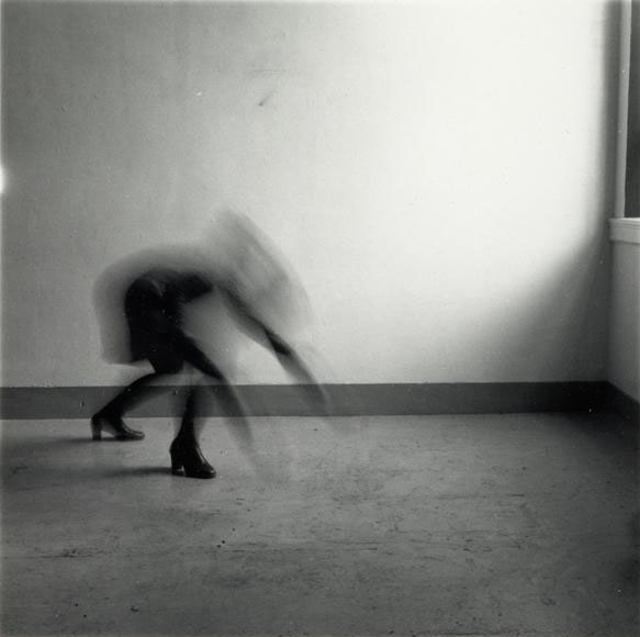
This image, titled “Space 2, Providence, Rhode Island” depicts Woodman’s underlying sense of human fragility. This depiction of mental health struggle is exaggerated to prove that although through first glance a person may look okay, however their mental illness consumes their entire existence in many cases.
The moody and ominous lighting is provided by natural sunlight shining through the window in a downwards direction. Although the shadows casted are harsh and dark, the edges on the shadows are blurred and hazy, proving the lighting to be slightly soft. The darkest areas of the photograph can be seen in the shadows and the ghostly figure, these areas are juxtaposed against the brighter areas such as the light casted onto the walls through the window.
The straight, thick lining along the floor could be said to be seen as a leading line as it directs the viewers eyes to the mysterious figure towards the middle-left of the image from either side of the photograph.
Although there is no representation of repetition in this image, there is a strong sense of echo, displayed by the delayed movement of the model. This is due to the use of long-exposure by which the camera lens is open for a longer period of time in order to capture the late movement within the picture. The method of long exposure provides an eerie tone to the photograph.
There is a combination of both organic and geometric shapes within this image. Straight-edged shapes can be seen in the lining of the floor and the triangular-shaped shadow in the bottom-right hand corner of the photograph. On the other hand, organic and curved shapes can be seen in the indistinct figure just off the centre of the image, as her back is curved.
It is difficult to work out the depth of field within this photograph as the majority of the background is empty, negative space. This means that there is little comparison in focus between the foreground and background. However I believe there is a narrow depth of field as the edges of the image are slightly blurred.
There is little representation of texture shown in this image as that is not the main focus of Francesca Woodman’s work, although if I had to comment on texture I would say it is smooth as there is no rough or jagged edges seen in the image.
There is a range of tones from dark to light in this image which creates an uneasy atmosphere for the viewer. the darkest tones can be seen in the shadows and in the model crouching in the left thirds of the image. The lighter tones can be seen in around the window, as the natural sunlight beams in and highlights a small section of the photograph. This image tends towards darkness as the majority of the image is in darkness.
There is no colour in this image because of Francesca Woodman’s common theme of greyscale aesthetic within her series of images. The lack of colour brings to light a visual representation of how many people view mental illness as seeing life ‘without colour’. I believe that if this image was taken in colour it would take away the sense of mystery and doomy ambience of the photograph.
The composition of the image is very simple, as the background is very empty and there is a singular focal point in the photograph. I would say this image is unbalanced as the camera is set at a leaning angle rather than central and the focal point is not dead-centre in the photo. There is no influence of geometric-shaped positioning which makes the image harder to comprehend and understand and the rule of thirds is not used either.
Francesca Woodman inspired photoshoot moodboard

