Claude Cahun

During the 5 year occupation of Jersey by the Germans during the second World War, amongst many terrible things that happened, many antagonists where deported to camps or imprisoned. 75 years ago the island was liberated by allied forces. The last antagonist prisoners to walk free days before the liberation were the Les mesdames who are regarded as local heroes for contributing to the liberation of Jersey.

Lucy Schwob better known by their pseudonym, Claude Cahun was the better known half of the Les mesdames, which was the name that Jersey islanders gave her and her step-sister/lover Suzanne Malherbe (known by her pseudonym Marcel Moore).

Claude came to Jersey from Paris with Marcel in 1937. The couple sought Jersey out for two reasons; because of the jubilant memories of childhood holidays to the neighbouring island, and it was a familiar place to escape the abhorrent fascism and antisemitism that was terrorizing Europe in the ’30s as Claud was Jewish on her fathers side. 

Cahun was a French surrealist photographer, writer, and sculptor. A consistent element present in her work is her unconventional exploration and representation of the concept of Identity. Claud explored her identity in a way where she challenged preconceived notions of sexuality and gender of the time. Claude presented this in her works where she would photograph self portraits where stereotypical gender characteristics where aggravated, for example the following piece where she can be seen composing her appearance as a masculine “circus strongman” while still conveying typical feminine appearance stereotypes such as the bold lipstick:

Claud Cahun

Cahun believed that gender was exchangeable. Assuming different identities was her strong suit.
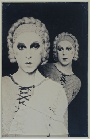
Claude Cahun

In the above image Claude represents the idea of multiple coexisting personalities by photographing a self portrait by creating a double exposure which is done by shooting an image on film and then shooting another with the subject repositioned on the same segment of film. She has used harsher fluorescent lighting in this image which has created a over-exposed, porcelain looking facial composure whilst accentuating the shadows around her jaw eyes, this could’ve been a way of exploring her identity by ridiculing the identity she was portraying by exaggerating the stereotypical feminine beauty aesthetic of the time being the over-powdered face and eccentric makeup. She also creates greater depth and form in the composition by separating the subject from the background by using a dark negative background and high contrast which opposes the light foreground giving the image an unconventional portraiture look.

Claude Cahun: Jersey’s queer, anti-Nazi freedom fighter

http://www.jeudepaume.org/index.php?page=article&idArt=1480

CONTROLLED CONDITIONS Identity PLAN & Photoshoot

Shoot 1Shoot 2
What​Photographs with a mirror andreflection.​Photographs through glass or other translucent objects.​
Where​Both indoors and outdoors fornatural and indoor lighting.​Indoors with studio-like lighting.​
When​On a weekend around midday foroptimal lighting.​Any day.​
Who​A friend.​Myself.
Why​To create reflection- This will create’another image’ in the reflectionwhich will represent the way you are seen by others.​To create distortion- This willrepresent how a person viewsthemselves which is incorrect andexaggerated to the way you areviewed by others.​

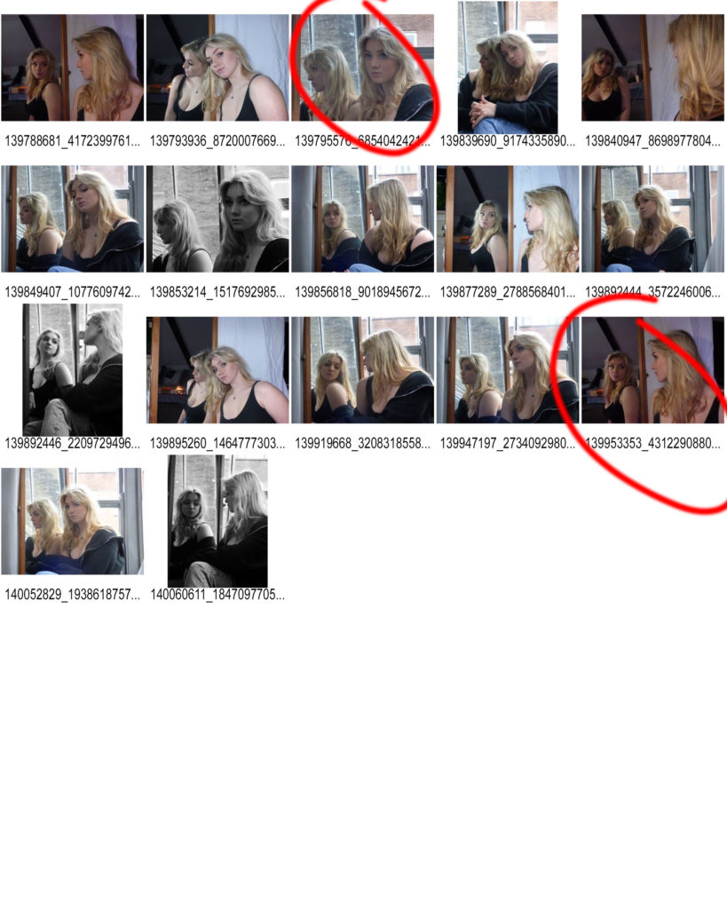
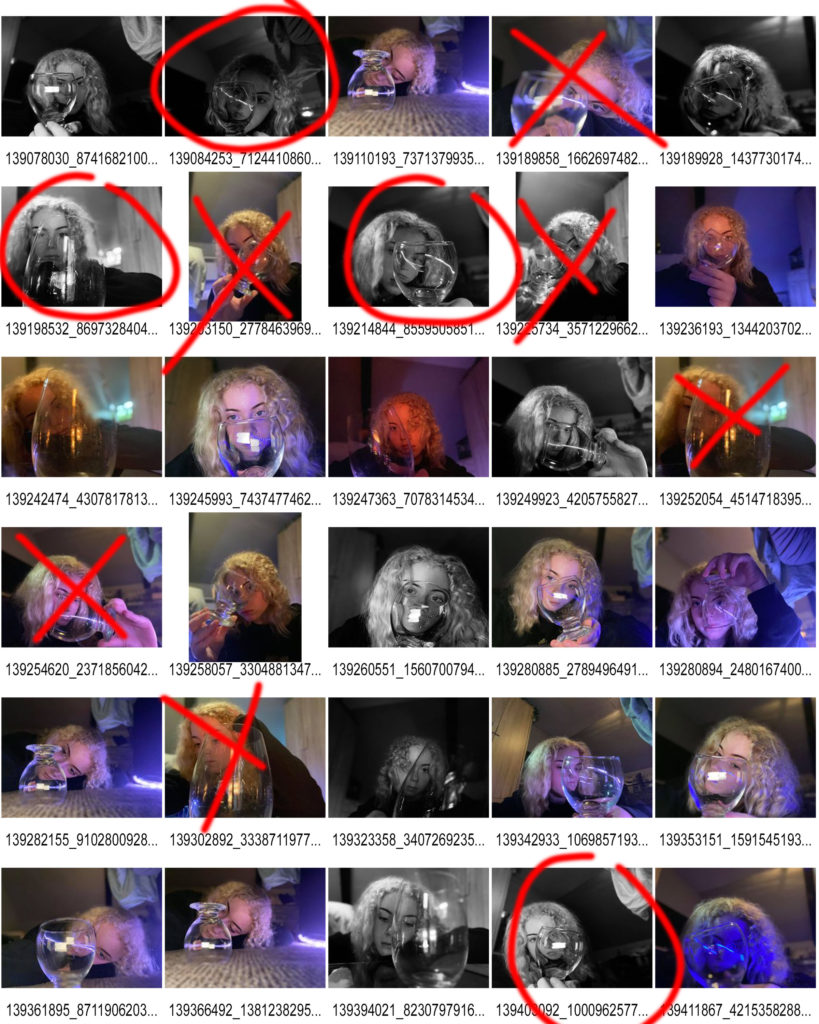
Unfortunately there was a technical error, therefore I cannot post my raw images here. However I do have my slightly adjusted images:

Above is my first selection, the first thing I did was turn the images black and white. This was not only to create a visual link to Claude Cahun’s work, but it also makes the viewers focus on the subject of the photograph as well as its meaning. Bright colours can distract the viewer. Secondly, I cropped the images down to avoid unwanted objects and things in the background. And finally I adjusted the brightness and contrast to what I thought looked better.

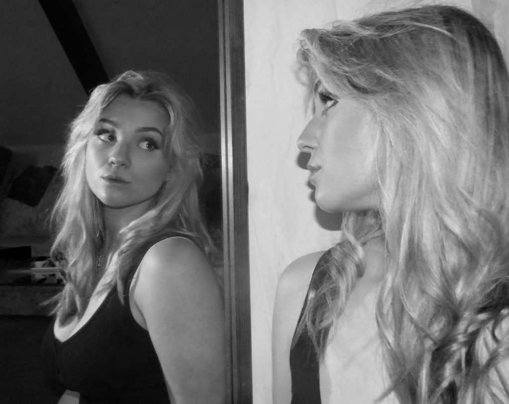
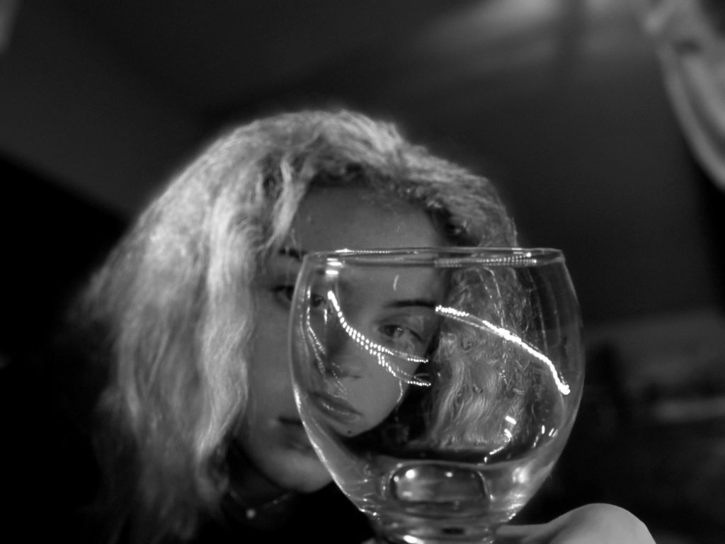
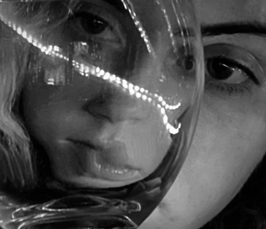
Above is my final selection from shoot one. These images both a strong contrast between one side an the other with a clear and straight centre point. The images also shows two angles of the same person which is what I was aiming for. My general idea when taking these photographs was to show that the way you view yourself differs from the way others view you- the opposing light and dark tones alongside the two different viewpoints in person and in the reflection convey the message well. I will continue to try various things with these images in my next blog to further link them to my chosen photographers.

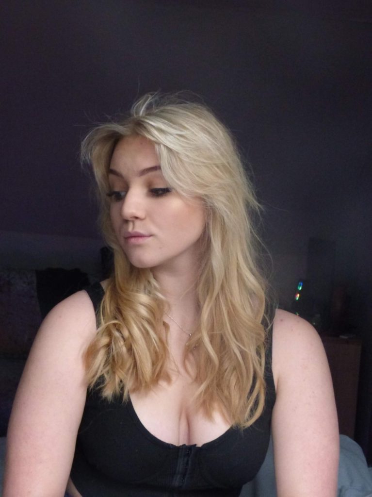
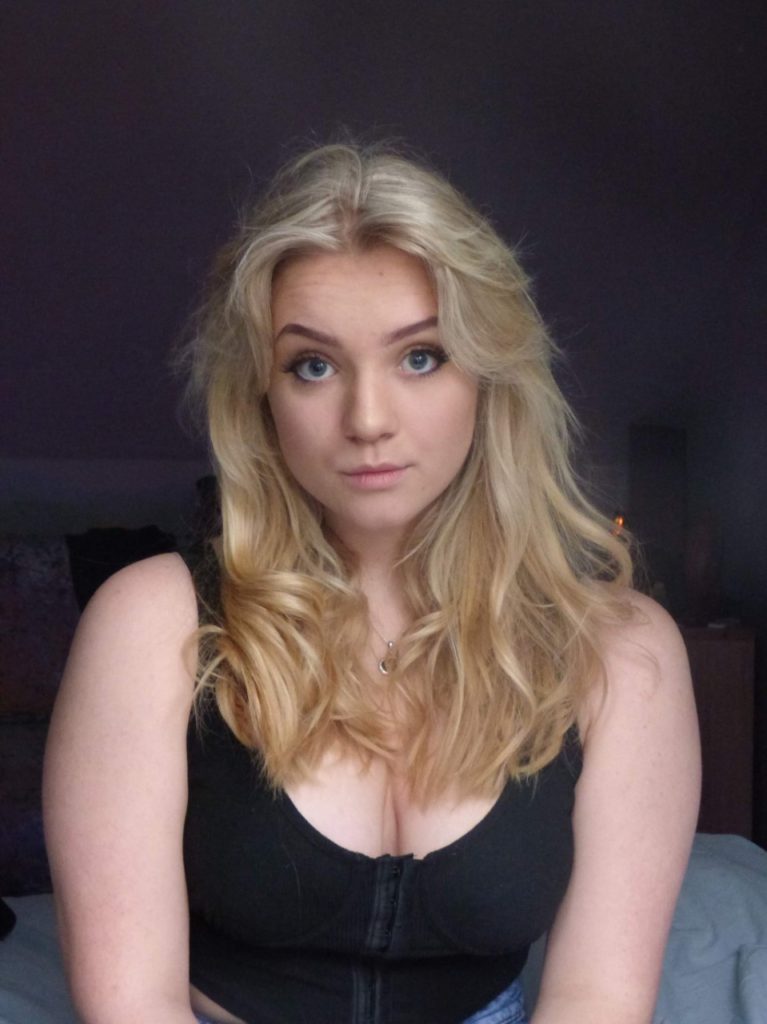
I also chose these photos to further edit in the style of Jesse Draxler. They are just simple portrait photos with different angles of the face.

With these images, I had already set the camera filter to black and white for the same reason in my selection of shoot 1.

When editing, I only cropped the image and slightly adjusted contrast and exposure. The reason for these images I took of myself are to display unrealistic distortions, and how people may view themselves which is only in their mind and not the way they are seen by others.

Identity and Place – Francesca Woodman Study

Francesca Woodman

Francesca Woodman: House #3, Providence, Rhode Island, 1976.jpg
“House #3, Providence, Rhode Island” – Francesca Woodman (1976)

Francesca Woodman, Born in New York in 1958, was an American photographer famous for her monochrome photography of both herself and other female models. The main common feature in Woodman’s work is her use of movement captured by long exposure, creating a ghostly affect. Her videography has been featured in exhibitions around the world, like the Helsinki City Art Museum in Finland, the Tate Modern in London and the Cisneros Fontanals Art Foundation in Miami. Woodman continued her inspirational work that brought mental health issues to life until she died at the age of 22 in 1981.

Examples of Francesca Woodman’s work

https://www.tate.org.uk/art/artists/francesca-woodman-10512/finding-francesca

“Space 2, Providence, Rhode Island” – Francesca Woodman (1976)
“Untitled, Providence, Rhode Island” – Francesca Woodman (from Polka Dots Series – 1976)
“Polka Dots, Providence, Rhode Island” – Francesca Woodman (1976)

Analysis of Francesca Woodman’s work

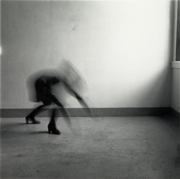
“Space 2, Providence, Rhode Island” – Francesca Woodman (1976)

This image, titled “Space 2, Providence, Rhode Island” depicts Woodman’s underlying sense of human fragility. This depiction of mental health struggle is exaggerated to prove that although through first glance a person may look okay, however their mental illness consumes their entire existence in many cases.

The moody and ominous lighting is provided by natural sunlight shining through the window in a downwards direction. Although the shadows casted are harsh and dark, the edges on the shadows are blurred and hazy, proving the lighting to be slightly soft. The darkest areas of the photograph can be seen in the shadows and the ghostly figure, these areas are juxtaposed against the brighter areas such as the light casted onto the walls through the window.

The straight, thick lining along the floor could be said to be seen as a leading line as it directs the viewers eyes to the mysterious figure towards the middle-left of the image from either side of the photograph.

Although there is no representation of repetition in this image, there is a strong sense of echo, displayed by the delayed movement of the model. This is due to the use of long-exposure by which the camera lens is open for a longer period of time in order to capture the late movement within the picture. The method of long exposure provides an eerie tone to the photograph.

There is a combination of both organic and geometric shapes within this image. Straight-edged shapes can be seen in the lining of the floor and the triangular-shaped shadow in the bottom-right hand corner of the photograph. On the other hand, organic and curved shapes can be seen in the indistinct figure just off the centre of the image, as her back is curved.

It is difficult to work out the depth of field within this photograph as the majority of the background is empty, negative space. This means that there is little comparison in focus between the foreground and background. However I believe there is a narrow depth of field as the edges of the image are slightly blurred.

There is little representation of texture shown in this image as that is not the main focus of Francesca Woodman’s work, although if I had to comment on texture I would say it is smooth as there is no rough or jagged edges seen in the image.

There is a range of tones from dark to light in this image which creates an uneasy atmosphere for the viewer. the darkest tones can be seen in the shadows and in the model crouching in the left thirds of the image. The lighter tones can be seen in around the window, as the natural sunlight beams in and highlights a small section of the photograph. This image tends towards darkness as the majority of the image is in darkness.

There is no colour in this image because of Francesca Woodman’s common theme of greyscale aesthetic within her series of images. The lack of colour brings to light a visual representation of how many people view mental illness as seeing life ‘without colour’. I believe that if this image was taken in colour it would take away the sense of mystery and doomy ambience of the photograph.

The composition of the image is very simple, as the background is very empty and there is a singular focal point in the photograph. I would say this image is unbalanced as the camera is set at a leaning angle rather than central and the focal point is not dead-centre in the photo. There is no influence of geometric-shaped positioning which makes the image harder to comprehend and understand and the rule of thirds is not used either.

Francesca Woodman inspired photoshoot moodboard

Identity (CC)

What is Identity and how can it be influenced

Identity is the qualities, beliefs, personality, looks and/or expressions that make a person who they are. Identity is important because it is completely unique and no-one can have the same identity and feel the same way. Identity can be influenced by many things including people, places, memories, family and feelings.

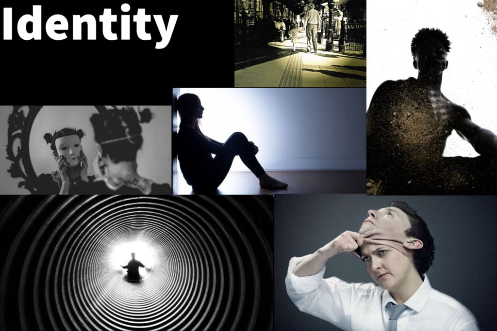
On the mood-board above, I have displayed the idea of being alone, family, mourning and a facade or false identity. I believe these topics are very powerful when looking at a project about personal identity because it is difficult to represent how we feel after events such as a loss of a loved one and what happens to us after that loss.

On my second mood-board I have displayed further ideas about being alone and losing a loved one but linked it to the idea of a grandparent being like a second mother or father to their grandchildren. I have also shown the idea of taking off a mask like facade to reveal the actual identity of a person.

CC – Claude Cahun – Identity

Claude Cahun - Archives of Women Artists, Research and Exhibitions

Who is Claude Cahun?

Claude Cahun was born Lucy Renee Mathilde Schwob on 25th October 1894, was a French lesbian photographer, sculptor and writer. Who died on the 8th December 1954.

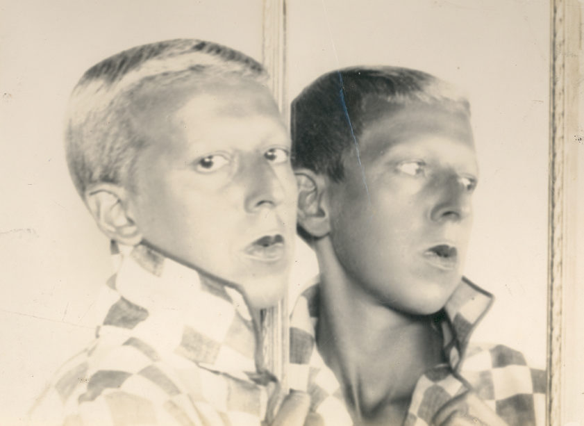
Schwob adopted the name Claude Cahun in 1917 and is best known for self-portraits, in which Cahun assumed a variety of characteristics.

Cahun’s work was both political and personal, she explained, “Masculine? Feminine? It depends on the situation. Neuter is the only gender that always suits me.”

My opinion

She has a unique style, which is extremely experimental, and shows gender identity. I like how it is unusual and different, making her photos question her self-identity and give an illusion of questionable choices.

Personally I like how she has merged images together and also objects before taking the photo. I would like to try and include this idea in my photography, where I merge faces together.