Inspiration – Ole Christiansen
“Ole Christiansen is known for his covers of Euroman and record covers of bands such as Sort Sol, TV2, Thomas Helmig and many others. His visual signature is unique and differs by a very graphic look.”- His profile from Profil : Ole Christiansen
Setup
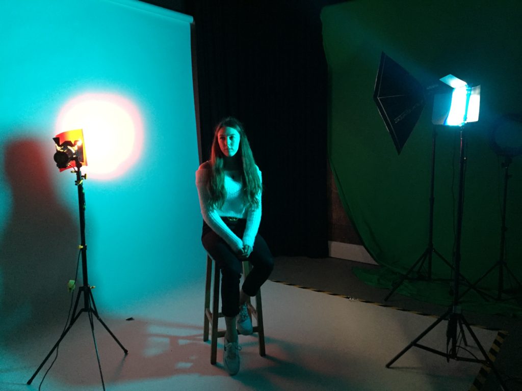
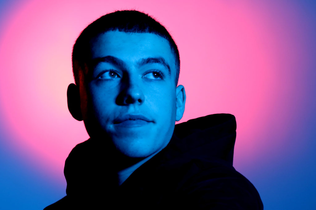
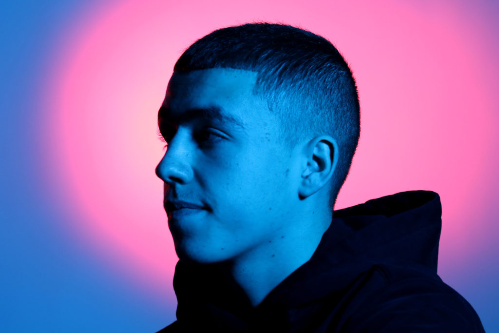
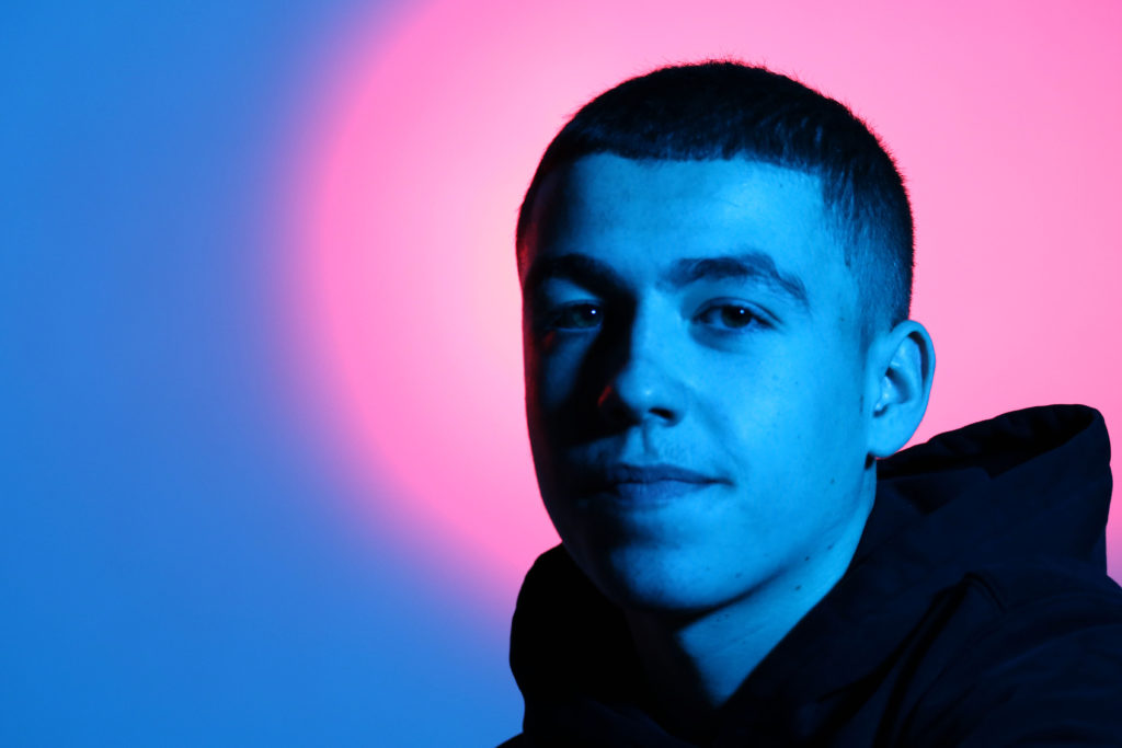
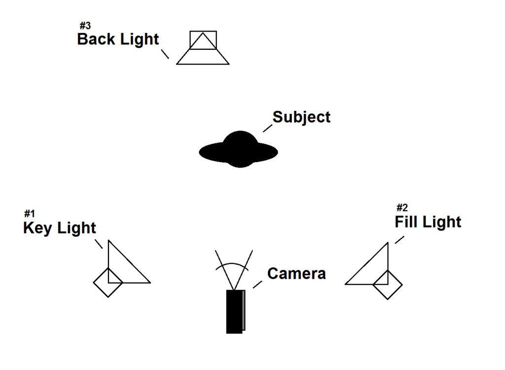
We had a blue gel on the key light so that the subject had a blue hue and a red gel over the back light so there was a red circle in the background which some could interpret as a halo.
The two colours merged together on the screen meaning there were no harsh lines and they made purple which allowed the colours to smoothly gradate.
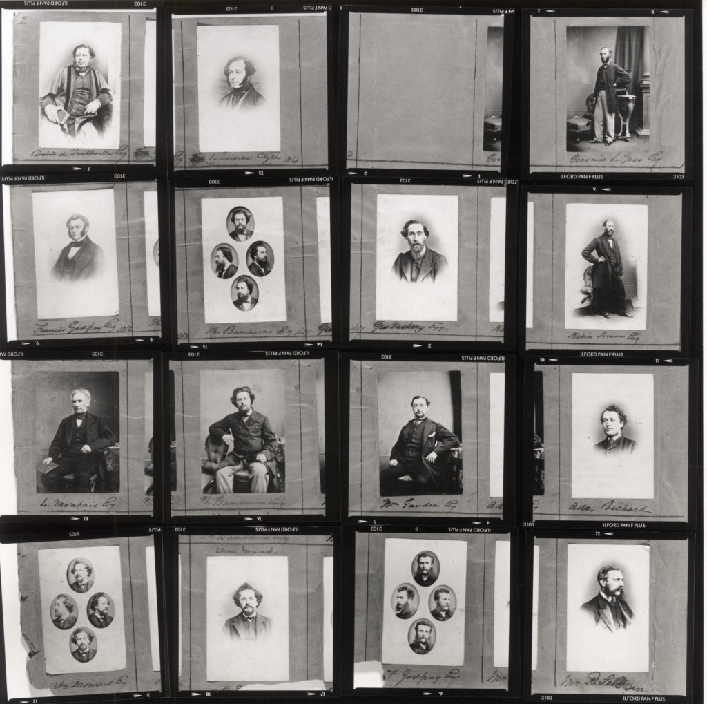
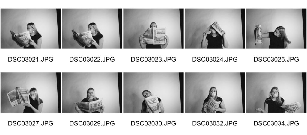
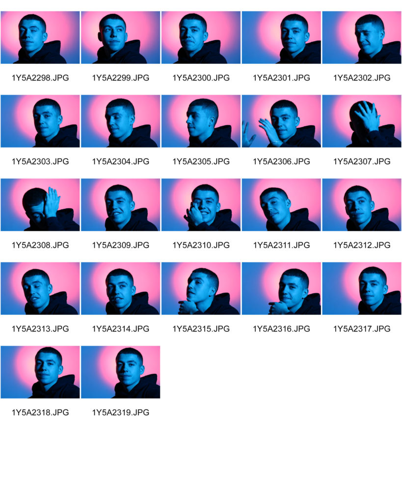
Contact sheet
Best Images
These are my most successful images because they aren’t blurry and have a balanced contrast of light and shadow.
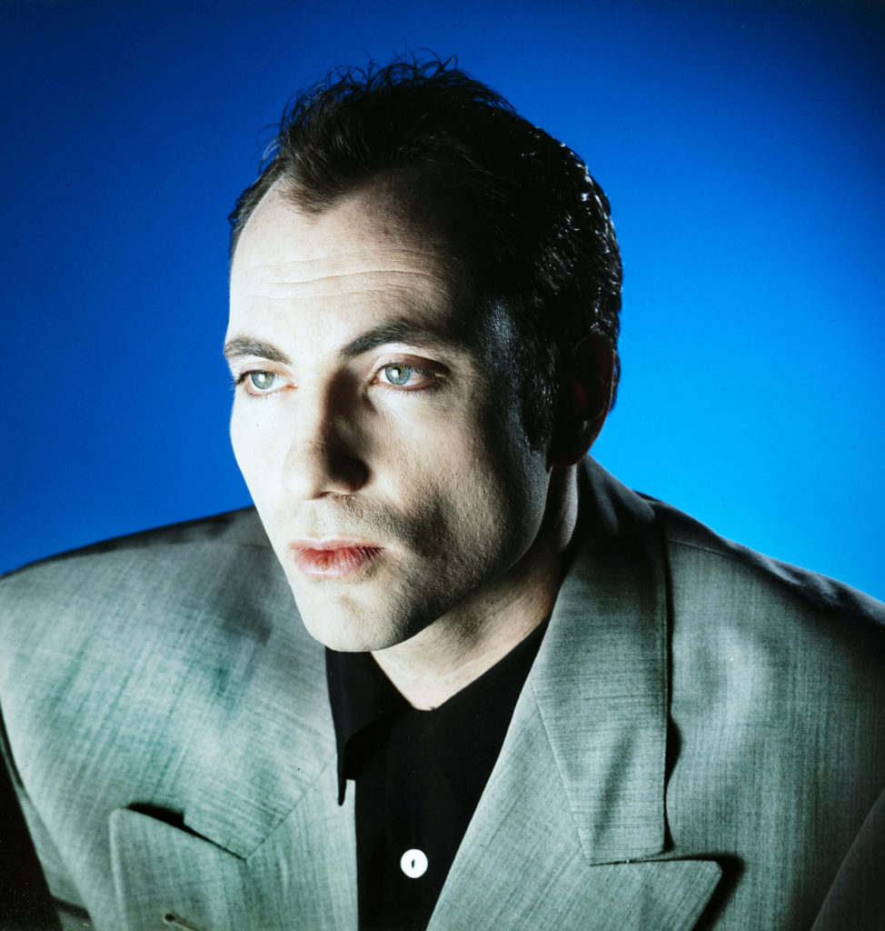
The first image I think, is my most successful image. It is also the photo that is most similar to Christiansen’s image that is displayed earlier on in the blog post.
The model is looking away from the camera into the distance and the light is focused on the center of his face creating a shadow on the left side of his face and neck.
Experimenting with Photoshop
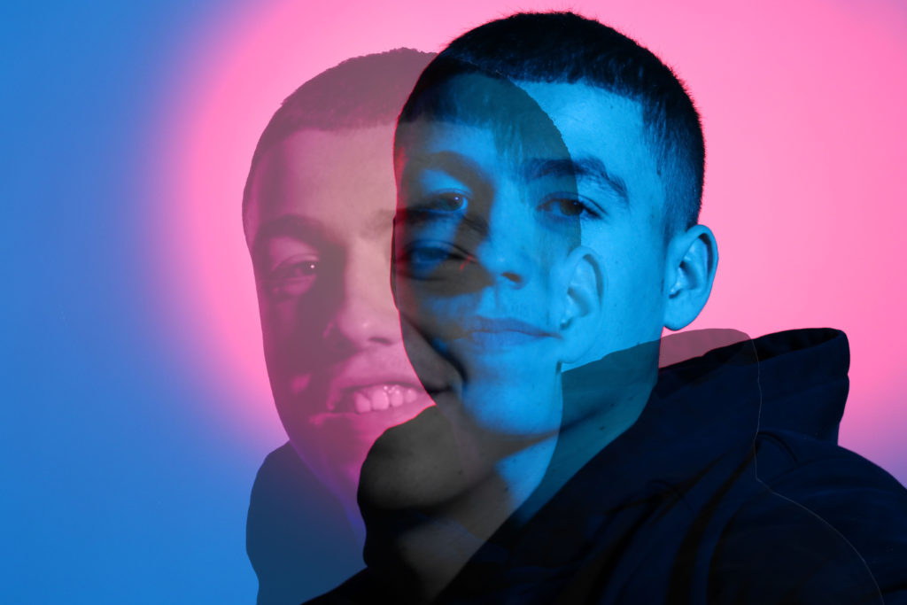
I wanted to layer two of my images so I went into Photoshop and used the magic eraser tool to get rid of the background of the image. Then I zoomed in so that the background was completely erased and only the models body was visible.
I used ctrl T and dragged the image onto the other and went through the options and the final blending option I chose was Luminosity with opacity at 72% and fill at 73%.
I’m very pleased with how the image turned out and how the two images blend in together. The two image contrast each other; the background image is of the model with a straight face, and the second image layered on top of that is of the model more relaxed with him leaning forward and smiling.

