Portrait and environmental Photography study

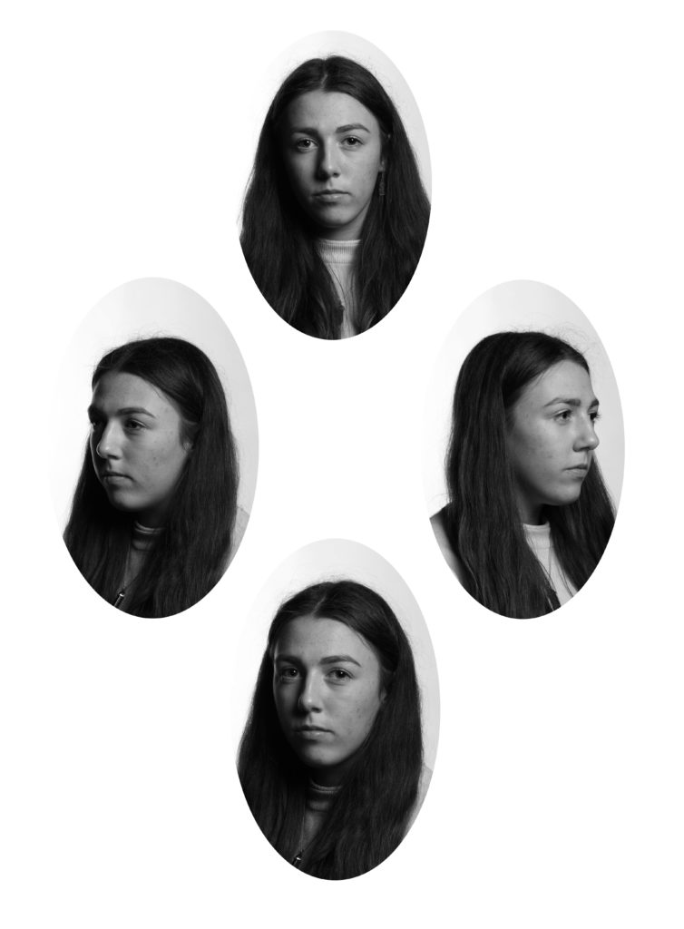
The first portrait image was taken by photography pioneer, Robert Cornelius, in 1839. The method of daguerreotype, used in the 1840’s and 1850’s, made portrait photography popular because of its relatively low cost and reduced sitting time for the subject, which lead to the rise in popularity of portrait photography. Portraiture aims to capture the personality of a person or group through creative methods such as lighting and backdrops. There is essentially four approaches in terms of portraiture, these include constructionist, environmental, candid and creative. These styles have been developed over time for different purposes, for example, technical, artistic or cultural.

Audrey Hepburn for a “Breakfast at Tiffany’s” press shoot – John Kobal (1961)

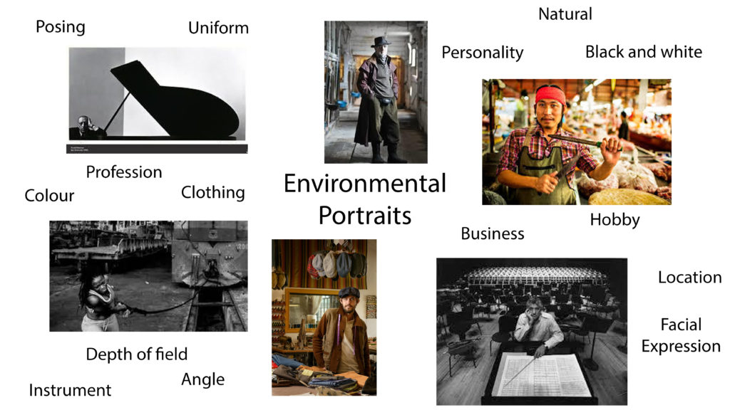
Environmental Portraits

“Otis James” – Benny Migliorino (date unknown)

An environmental portrait depicts the subject in a location associated with who they are. These photos could be taken in the subjects place of work, rest or play. The subject will often engage with the camera with a neutral pose or facial expression, with the photographers aim of portraying features such as their gender, class or lifestyle.

Analysis of an environmental portrait

American photojournalist W. Eugene Smith, New York City – Arnold Newman (1977)

Arnold Newman captured this environmental portrait of an American photojournalist, named Eugene Smith, in 1977. It provides the viewer with a deeper knowledge of Smith’s chaotic life, and the profession of a journalist in general.

This photograph is lit with a harsher, artificial light. This provides harsh shadows and bolder highlights. This lighting creates an extreme juxtaposition between the light and dark areas, with the lightest areas being the white sheets of paper and the darkest areas being Eugene Smith’s all-black outfit in the foreground and various black boxes in the background.

The lines in the image contrast against one another as the photo combines both curved and geometrical lines. There is no specific pattern using lines throughout the composition, however geometrical shapes such as squares and cubes are used.

There is no form of repetition used in the image as the background consists of pure chaos and pandemonium. The contrasting shapes and tones sit behind Eugene Smith, who wears an all-black outfit to provide some sort of uniformity to the image. Additionally, there is no use of echo or reflection in the image. However it can be argues that a repetition of geometric shapes can be seen in the photograph.

There is a wide depth of field in this image which provides a strong sense of depth. This allows for the viewer to focus on both the background and foreground. The wide depth means that the background can be easily seen which is essential for an environmental portrait. The strong sense of depth also allows every object in the background has a clear shape, which adds to the pandemonium of the image as a whole.

The majority of the shapes in the image are straight-edged geometric shapes. For example, there is a repeated pattern of squared shapes within the photo, these can be seen in the sheets of paper around the room and the Polaroid pictures on the back wall.

It is hard to tell the texture of the image as a multitude of surfaces are represented. For example, the soft texture of the sofa Smith is sitting on is contrasted with the sharp texture of the paper edges scattered around the room.

The constant contrast in the tones of the image create almost a stressful atmosphere to the image as the lack of uniformity from dark to light creates a disorganized look. I feel as though the image tends towards darkness as the larger shapes of the image are made of darker tones.

The monochromatic filter of the image allows for the contrasting tones to be further highlighted through shadow and light. I think this image was taken in black and white to give some form of tranquility amongst the chaos the photograph. If the image was in colour, the viewer may get distracted by too many aspects of the image and therefore lose interest.

The composition of the image is unorganized and unbalanced. There seems to be no use of technical organisation in the photograph as the various objects are randomly scattered around the room to represent the messy life of Eugene Smith. This means there is a lack of rule of thirds, which makes it difficult to understand the composition of the image.

Street Photography Photoshoot inspired by Elliott Erwitt

Photoshoot plan

Street Photography/Candid inspired photoshoot

I think the images highlighted in red are my least successful images for this photoshoot as they don’t focus on one person and are rather vague in terms of capturing identity. The last image highlighted in red also isn’t in focus, and Erwitt’s work focuses on a sharp, focused portrait or candid.

The images highlighted in green are my most successful images as they capture the identity of the person much better, as they are the main focal point for the image. I feel like these photographs also capture more interesting individuals because of their clothing or facial expression.

Photoshop Development

Original Image
Edited Image
Original Image
Edited Image
Original Image
Edited Image

To edit my images, I used a simple black and white filter and adjusted the brightness and contrast of the images. The use of the monochromatic theme makes the images more similar to the work of Elliott Erwitt, as the lack of colour is the motif of his work.

Comparison between mine and Elliott Erwitt’s work

‘Crowd at Armistice Day Parade, Pittsburgh’ – Elliot Erwitt (1950)
My Work

I feel there is both similarities and differences between my work and the work of Elliott Erwitt. In terms of differences, Erwitt’s work was produced many years ago, therefore there is a vintage feel to his work. On the other hand, my image has a clear modern look to it as it was taken in the present day, however I feel like the through editing, the use of the monochromatic filter helps to produce the illusion of the image being taken at an earlier date. Additionally, I feel like both mine and Erwitt’s work capture the theme of identity well through the clothing the people wear, as the older models both provide an older fashion

Henri Cartier-Bresson and Elliot Erwitt artist Study and comparison (Candid/Street photography)

“WEST GERMANY. West Berlin.The Berlin Wall” – Henri Cartier-Bresson (1962)

Henri Cartier-Bresson was born to a wealthy textile manufacturer in France in 1908. Because of this, he was supported financially by his parents to allow him to explore his photography career. He was a humanist photographer and was considered a master of candid photography. Cartier-Bresson first started discovering his love for photography in family holidays, and received his first Leica camera in 1931. His photos were first featured in an exhibit in the Julien Levy Gallery in New York in 1933. In 1952, Cartier-Bresson published his book of photographs named”Images on the sly” or “Hastily taken images”. Cartier-Bresson later retired in 1970, but continued to paint until he died in 2004.

Analysis of Henri Cartier-Bresson’s work

“Madrid” – Henri Cartier-Bresson (1933)

The lighting in this image is harsh, which allows for strong shadows and highlights to be created. The seemingly natural lighting is projected from the top right corner of the image, which casts shadows infront of the children. The harsh whiteness of the wall in the background juxtaposes with the dullness of the darker features of the people in the foreground, for example the clothing and the hair.

Although there is no repetition of line within the photograph, the leading line at the bottom of the wall leads the viewers eyes from one side of the image to the other, with the focal points of the people either side of this line.

There is a repetition of shape in this photograph which can be seen in the background of the image. The repeated, shady squares on the back wall of the image juxtapose the radiant white that they sit on. The use of black and white could be interpreted as a form of repetition, with the constant contrast between light and dark.

The majority of the shapes in this image are natural and organic, especially in the foreground of the photograph, however this is contrasted with the geometric squares repeated in the background.

The wide depth of field allows for the viewer to recognize the image as a whole, with both the background and foreground visible. The background is used as an empty space in order for the audience to focus on the figures in the foreground of the image.

The overall texture of the image has a smooth appearance as there is no representation of rough surfaces or texture. However this portrait image focuses more on tone and light rather than the texture of the photograph.

There is a strong contrast in tone in this photograph due to the use of the black and white filter on the image. Because of the monochrome appearance, the lack of colour means that the viewer can focus on the juxtaposition between light and dark.

The composition is unbalanced and unorganised, as the image was taken in the spur of the moment. There is a lack of use of thirds within the image as there is multiple focal points which don’t feature in the middle third of the photograph. However the focal points of the people act almost as a border around the bottom left and right thirds of the photo.

Elliot Erwitt

“Marilyn Monroe, New York – Elliott Erwitt (1956)

Elliott Erwitt, born in 1928 as a French-born American, is an advertsing and documentary photographer known for hus work of black and white candid photos in everyday settings. In 1939, Erwitt moved from Italy where he lived with his family, to the United States where he studied photography and filmmaking at Los Angeles City College at the New School for Social Research, he then graduated in 1950. In 1951, Erwitt was drafted intot he army, where he served as a photographer’s assisstant while stationed in France and Germany. Elliott Erwitt successfully started his career when a former director of the Farm Security Administration’ photography department hired him to produce a projects for the Standard Oil Company, he then became a freelance photographer to produce work for Collier’s, Look, Life and Holiday. Elliott Erwitwas then accepted as a member of Magnum Photos since 1954.

Analysis of Elliott Erwitt’s work

“Honfluer, France” – Elliott Erwitt (1968)

The harsh lighting projects harsh shadows and highlights in this image, which can be seen around the chair in the foreground of the image, aswell as around the features of the peoples faces such as under the eyes and around the jawline of the man in the backgrgound. As the image is taken inside, it is suggested that artficial lighting has been used to capture this photograph.

There is little use of line within this photograph, although the outline of the table and chairs can be said to act as leading lines, curving towards the boy in the middle third of the image, who acts as a focal point.

There is no use of repetition or echo within this photograph, as the composition is natural and has not be seen up by the photographer.

The shapes in this photograph are all natural and organic. The artificial shapes, such as the tables and chairs, have a curved outline to them. However these shapes have no relation to each other.

There is a very narrow depth of field in this photograph, as very little of the image is in focus. The only section which is in focus is the boy in the middle third of the image, which further proves this as the focal point.

Because of the even surfaces of the chairs and tables, the photograph overall has a smooth texture to it, however there is little to no use of texture in this image as this is not the main focus of the photographer.

There is a limited range of tone within this photograph as the image displays a black and white appearance. The lightest tones in this photograph can be seen in the clothing of the people, specifically the white shirt of the boy in the foreground. This is juxtaposed with the darker tones in the image, for example the chair in the foreground and the boy’s harsh, black jumper. Overall, this image tends towards darkness.

There is no use of colour in this image, which allows the viewer to focus on the use of tone and the narrow depth of field.

The composition of this photograph is unorganised and unbalanced. The majority of Erwitt’s work is taken of unusual features and personalities of the everyday settings. As he does this in the spur of the moment, his images lack compositional uniformity in order to understand the photograph better.

Comparison between Elliott Erwitt and Henri Cartier-Bresson

This image has an empty alt attribute; its file name is unnamed-1-2.jpg
Photograph by Henri Cartier-Bresson
This image has an empty alt attribute; its file name is EE_5-1024x676.jpg
Photograph by Elliott Erwitt

Elliott Erwitt and Henri Cartier-Bresson both share the use of monochromatic themes within their work, which allows the viewer to focus on other aspects of the image, such as tone or simply the message of the photograph. Both photographers also have a sense of almost aged photography as the use of black and white adds a vintage appearance. Both Erwitt and Cartier-Bresson take their images in the spur od the moment, which is why they are hard to understand compositionally.

On the other hand, I believe the main difference between Elliott Erwitt and Henri Cartier-Bresson’s work is the purpose of their photography. For example, Henri Cartier-Bresson acts on his humanist interest in order to take documentary-like photos, whereas Elliott Erwitt focuses more on capturing the abnormalities in everyday life.

HEAD SHOTS

Inspiration –

Henry Mullins was a profile picture photographer who producing over 9,000 portrait photos of islanders in Jersey between the time of 1852 – 1873. In this time period, the population of islanders was 55,000. He had a base studio known as the Royal Saloon at 7 Royal Square in Jersey where he would photograph Jersey political elite, mercantile families, military officers and professional classes. His portraits were printed in albums using egg whites to bind the photographic chemicals to the paper. To create the head shot he desired to get he would first take a portrait photo of someones feet/knees and above. Then he would simply cut around the body to create a photo of shoulders and above. These photos were placed together (mainly in a group of four different head shots) by the same person to create a diamond cameo …….

Portrait of Philip Baudains, Writer, Advocate, Constable and Deputy of St Helier. The four headshots are called a diamond with a cameo…
Henry Mullins Album showing his arrangements of portraits presented as cartes de visite

As we can see Henry’s work is based upon upper class workers who seem to be wealthy locals from Jersey. They are photographed wearing their best uniform next to posh and expensive furniture to show off their wealthiness for their profile pictures. Here are some of my own diamond cameo’s….

My Best Portraits –

Studio Set Up –

The studio set up involved a tripod for the camera, two flash head lights to cancel out the shadow that would appear in the background as well as to capture good lighting of the face. A white infinity backdrop is hung behind the model for a blank background.

Candid Photo-Shoot

Contact Sheet –

Best Photos –

These images relate to street photography in the sense that having to take images of people without them noticing. This captures them in that exact time with no interference of them knowing that they are getting photographed. This will indicate there exact expression and mood with everything happening naturally and no staging with what the image should look like. Candid Photography seems to be the type of photography that captures the person individually rather than more than one person.