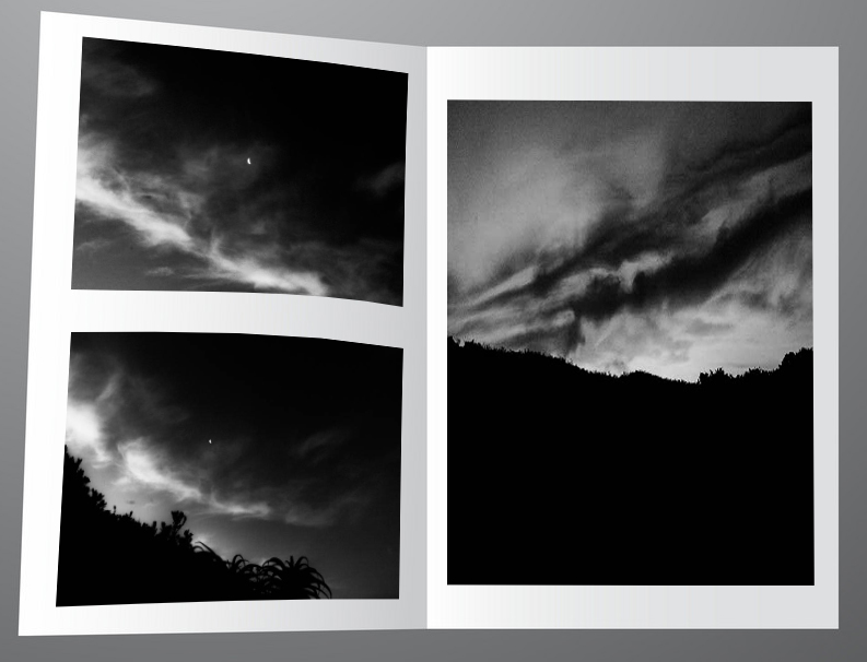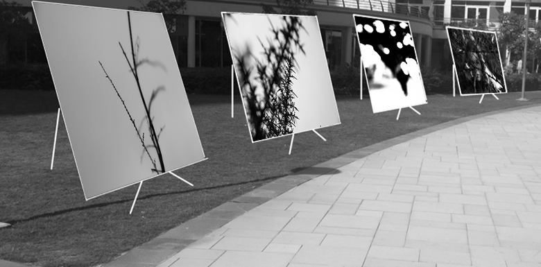
I grouped the above images together as they portray the same vertical leading line architecture both with each other, and with the gallery they are displayed in.

These images I decided to display in a digital zine format. They follow the same tonal and textual features showcasing the sandpapered clouds in a dark underexposed style.

The above images follow the same desaturated and geometric rectangle features which coincides with the gallery I chose which features grey walls and geometric rectangular architecture.

These images feature the same experimental focal style. They all have unconventional focus features with varying depths of field which made it suitable to use the immersive gallery which provides depth of field as some images look closer than the others.

The above images are curated together into that setting for the way they look like a portal into a different universe.
Method
I first gathered my my images according to how aesthetic they would look simultaneously, into five sub-galleries
I then chose a fitting empty background to stitch the clusters of images onto. I chose backgrounds that possessed similar shape and form of the images and also any other visual elements such as similar cloud patterns.
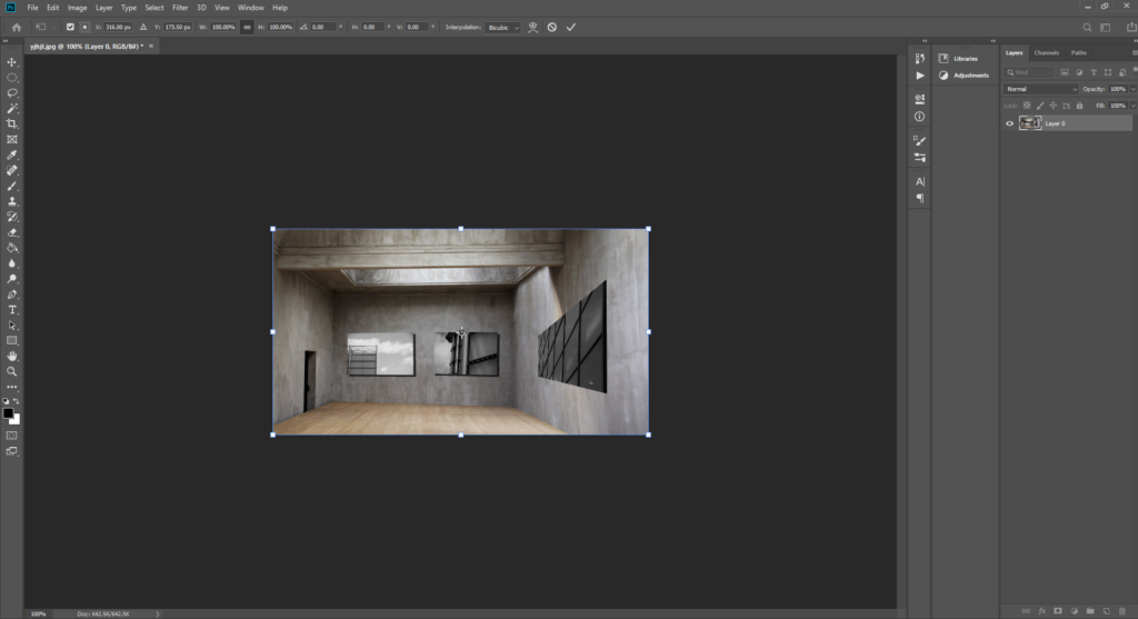
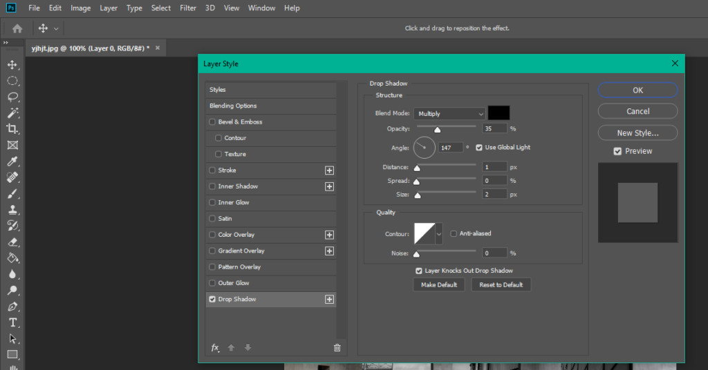
I then used photoshop to transpose these images onto the coinciding backgrounds by making use of free transform and warp to make the images look naturally apart of the background. I also added a drop-shadow to the images to help achieve this.


Excellent stuff!
Well done and keep working hard!