Arnold Newman 
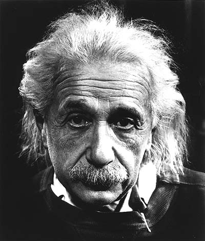
Philippe Halsman 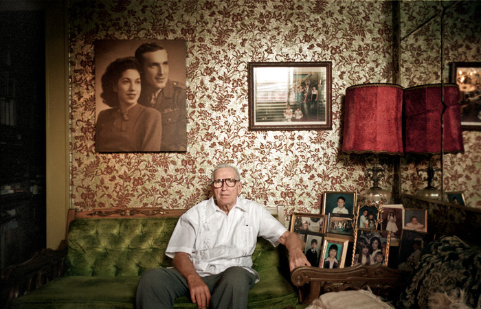
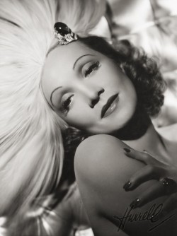
George Hurrell 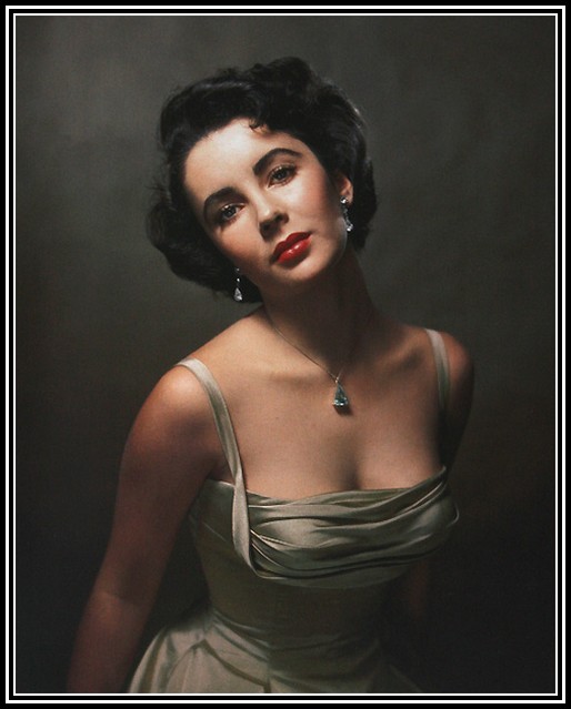
Philippe Halsman 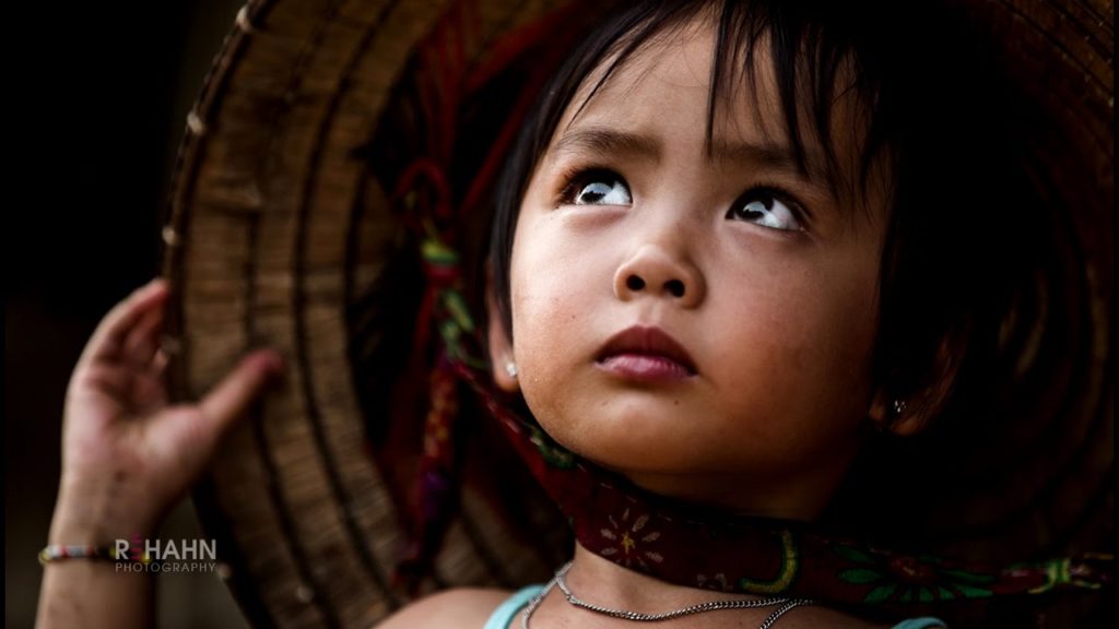
Réhahn 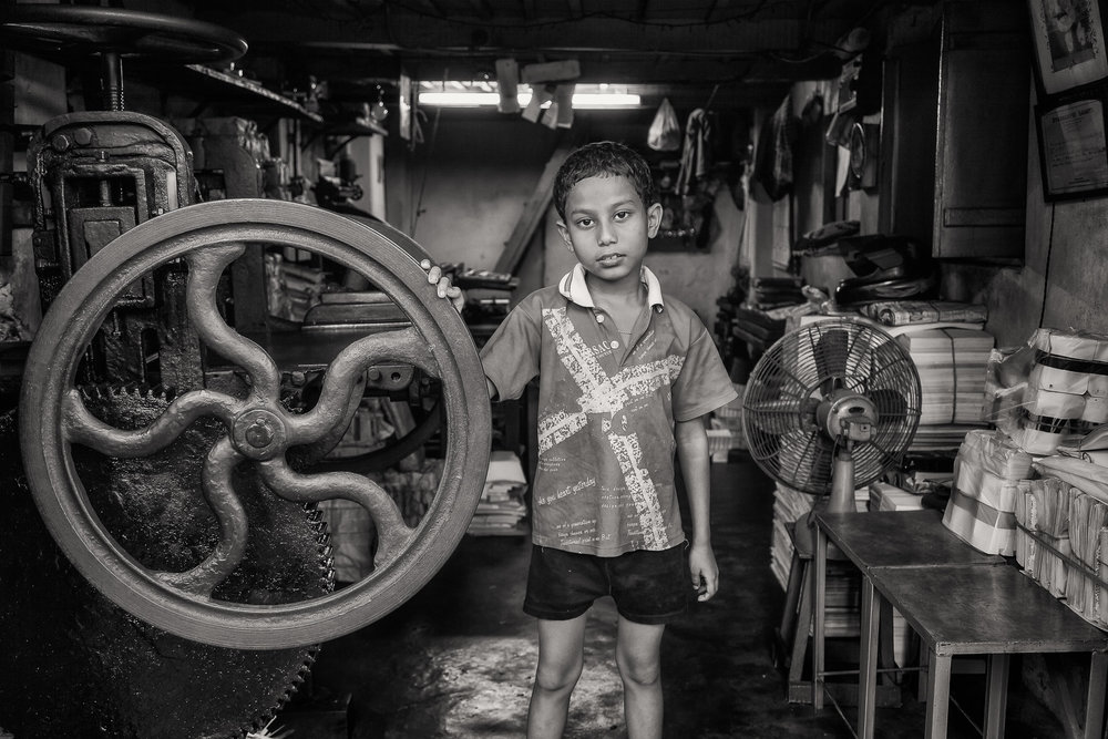
Kolkata, India. 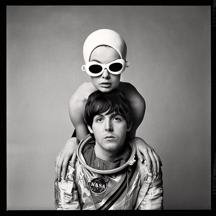
Richard Avedon. Paul McCartney. 1967
Daily Archives: November 2, 2020
Filters
portraiture introduction
Portrait photography, or portraiture, is a type of photography aimed toward capturing the personality of a person or group of people by using effective lighting, backdrops, and poses. There are many different types of portrait photography, including; traditional, lifestyle, environmental, candid, street, glamour, fine art, conceptual and surreal.
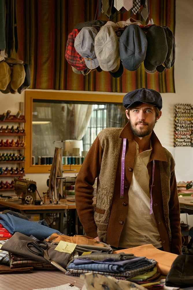
Benny Migliorino 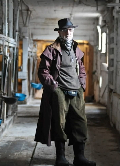
Unknown 
Steve McCurry 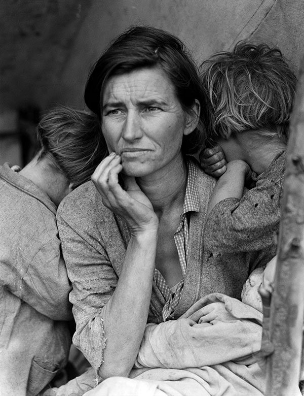
Dorothea Lange 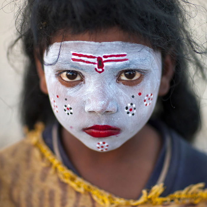
Eric Lafforgue 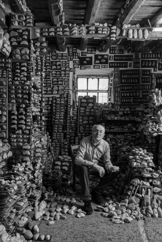
Unknown 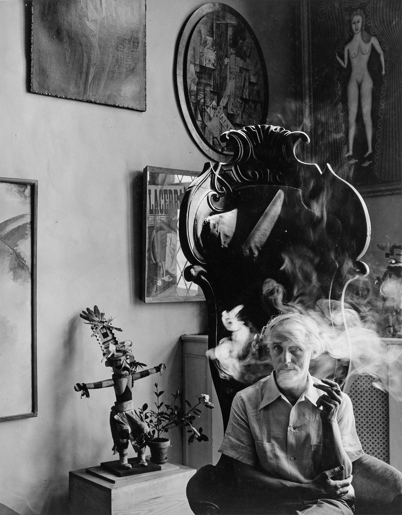
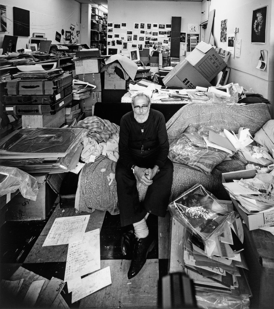
Arnold Newman 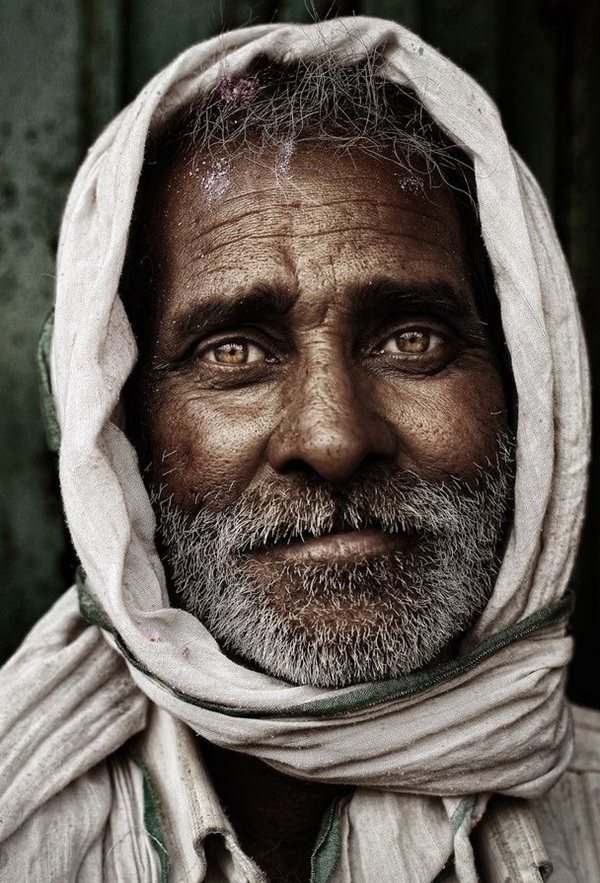
Unknown 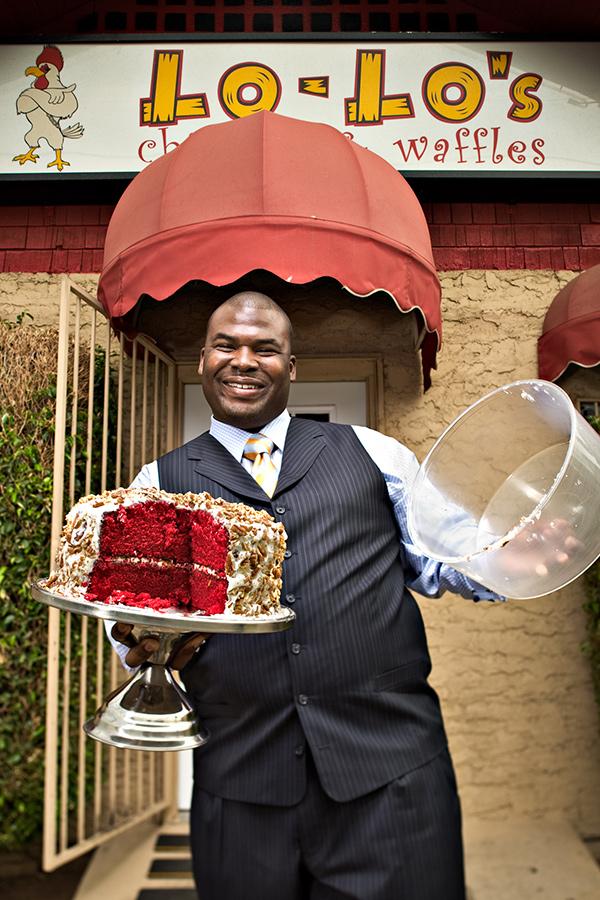
Giulio Sciorio
IMAGE ANALYSIS
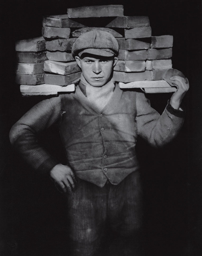
August Sander chose to photograph this bricklayer as a part of his work ‘The People of the 20th Century’. His aim was to show all walks of life including doctors, farmers, chefs etc., in a post – WWI Germany. Sander’s photographs were the first body of work to document a culture through photography. In this photograph, the main point of focus is the man’s head, as it is being framed by the layers of bricks stacked behind him. However it could be argued that the bricks are actually the main focal point, as the man’s face is blurred, which contrasts to the in-focus bricks behind him. The way that the bricklayer is holding himself suggests to the viewer that he is proud of his profession and lifestyle, as his stance is very intimidating and authoritative. The lighting in this image appears to be coming from the upper right hand corner, and is casting a shadow across the bricklayers body whilst also illuminating and highlighting his head and the bricks stacked behind him, which again draws the viewer’s eye to these particular points of focus. There is a varying range of shadows across the photograph, with dark shadows being casted across the lower half of the man’s body on the left side of the image, whilst the right side and upper half is well-lit.
PORTRAIT INTRO + ENVIRONMENTAL PORTRAITS
Definition:
‘Portrait photography, or portraiture, is a type of photography aimed toward capturing the personality of a person or group of people by using effective lighting, backdrops, and poses.’
Iconic portraiture mood board
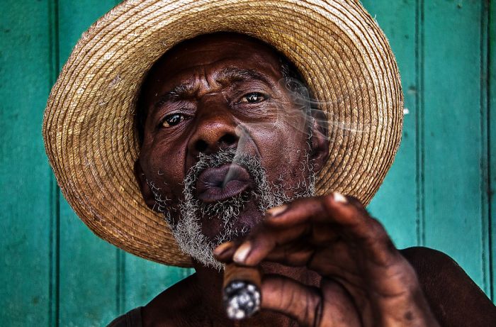
Rehahn 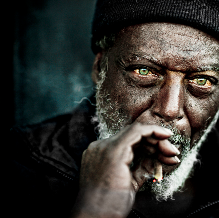
Lee Jeffries 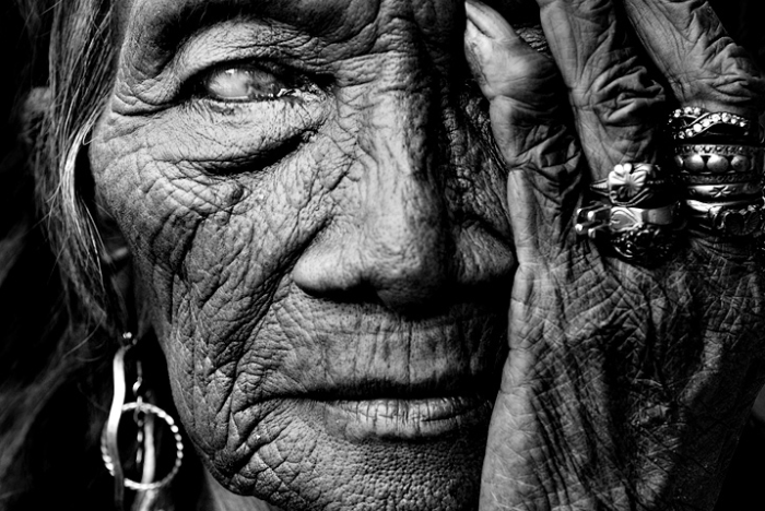
Manny Librodo 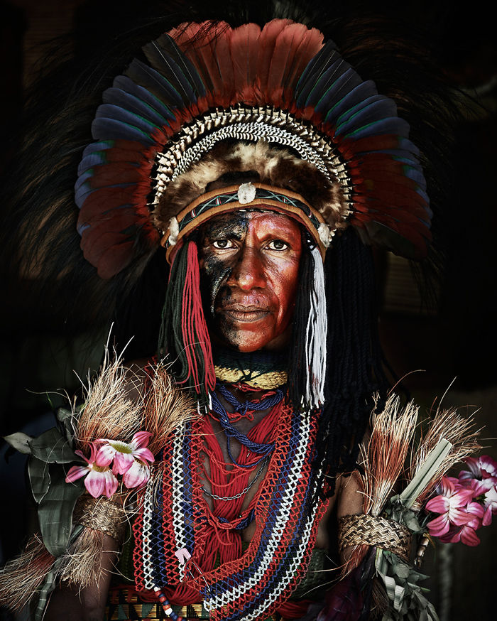
Jimmy Nelsson 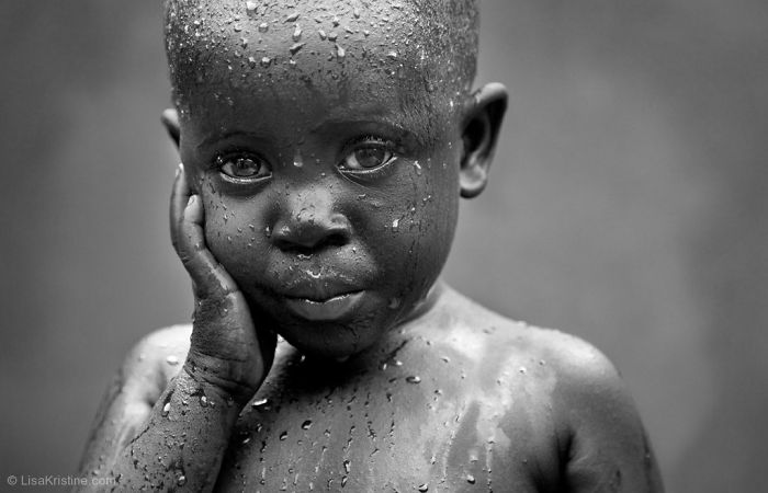
Lisa Kristine 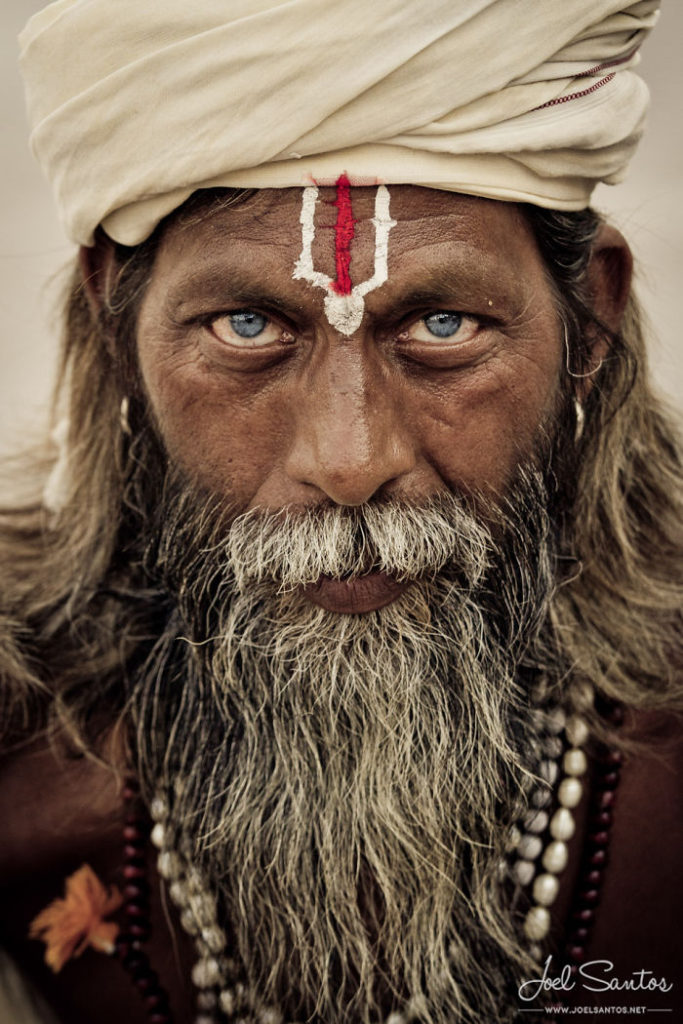
Joel Santos 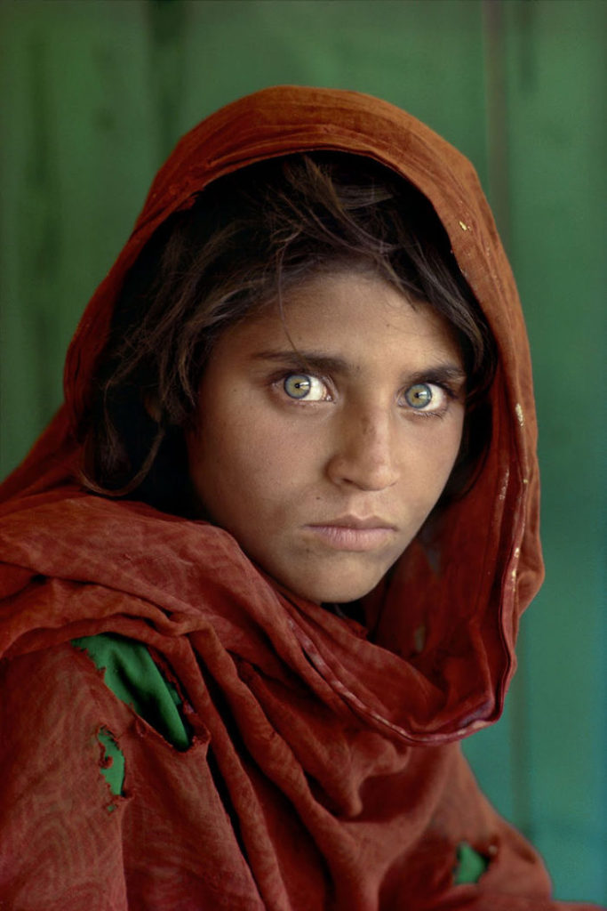
Steve McCurry 
Eric Lafforgue 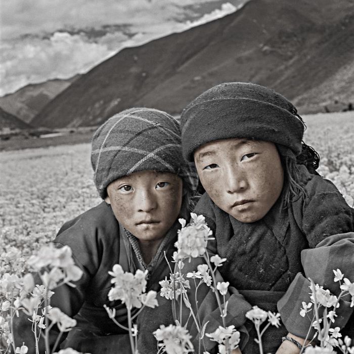
Phil Borges 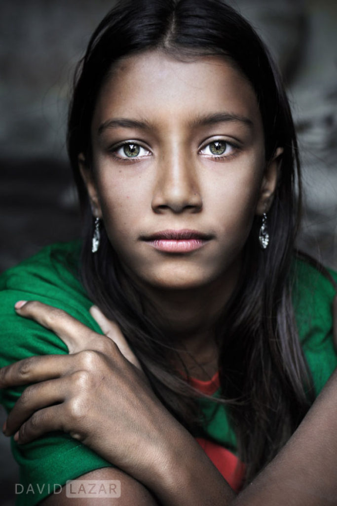
David Lazar
Contemporary Portrait Photography – a reference to an image created that reflects our values, challenges and perceptions today, a photograph from our own time.
Environmental portraiture is a portrait executed in the subject’s usual environment, for example their home or workplace, and typically illuminates the subject’s life and surroundings.
Analysis
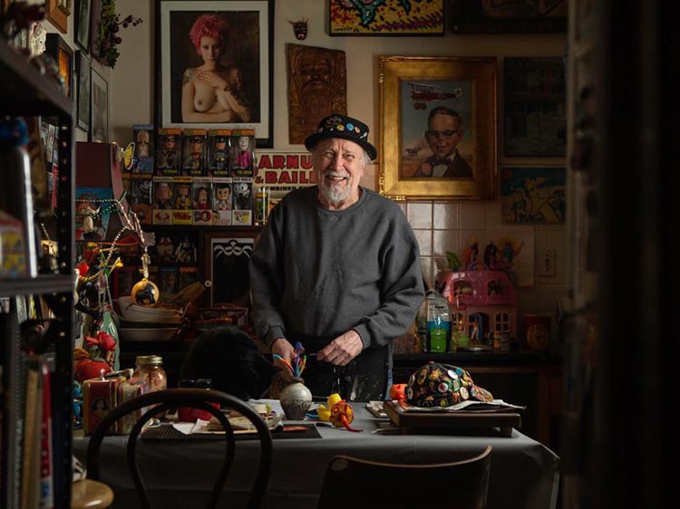
This is an environmental portrait of Chicago artist John A. Kurtz in his studio. The location of this photograph makes it an environmental portrait because its where he works and spends most of his time.
The composition and framing of this image draws the eves of the viewer to the center of the image where the subject is. This is through the use of out of focus furniture in the foreground, such as the door frame on the right and book shelf on the left. This gives the effect of looking through a gap to have a sneak peak of someones work life.
The darker shadows created by the furniture in the foreground create a vignette around the sides on the image, again drawing attention to the subject in the image. This effect was created by using a low aperture, probably around f/5.6. Along with this the ISO and shutter speed will have been tweaked to achieve a clear light image in the moderately dark room that it was shot in.
The colour palette of the photograph is mostly earthy colours. Shadows have been darkened and highlights have been lessened to create a more moody feel and tone to the image, but still keeping the vibrancy of the colourful objects on his desk.
When editing this image, the curves appears to have been changed to an s-curve, meaning the darks have been darkened, and the lights have been lightened, creating more contrast within the image.
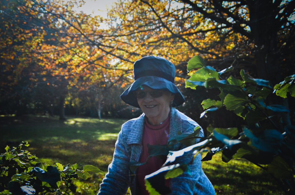
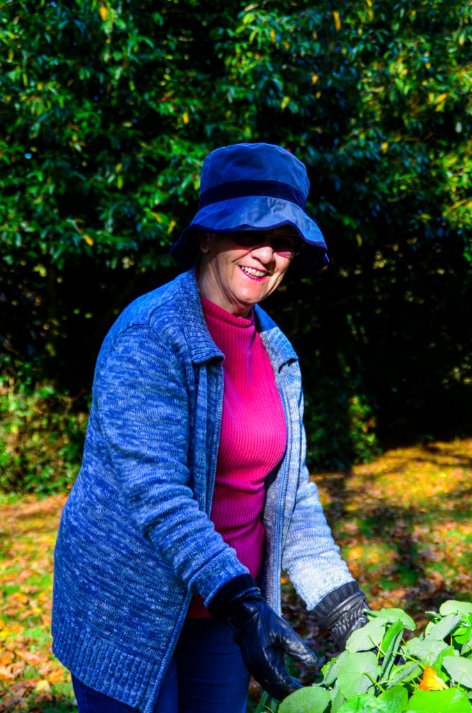
My Images
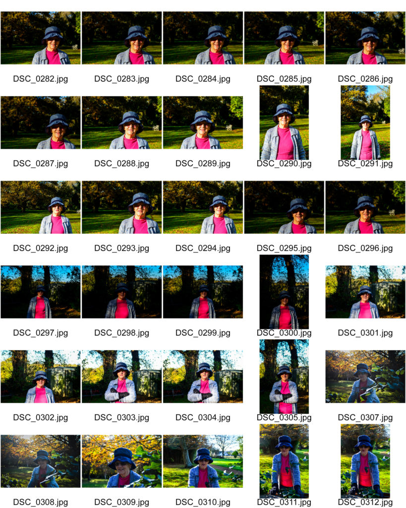
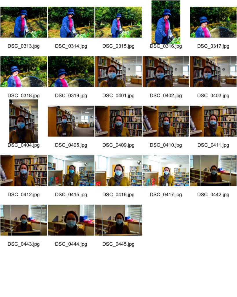
Favorite Images
surface and colour
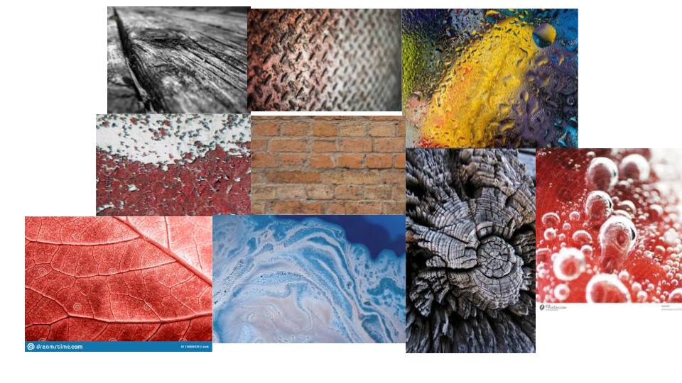
In this project I will be exploring the different surface/texture and colour schemes relating to photographers I have researched. Throughout a few photoshoots I will be focusing on using the ISO and white balance on my camera.
MOOD BOARD OF SURFACE AND COLOUR PHOTOS

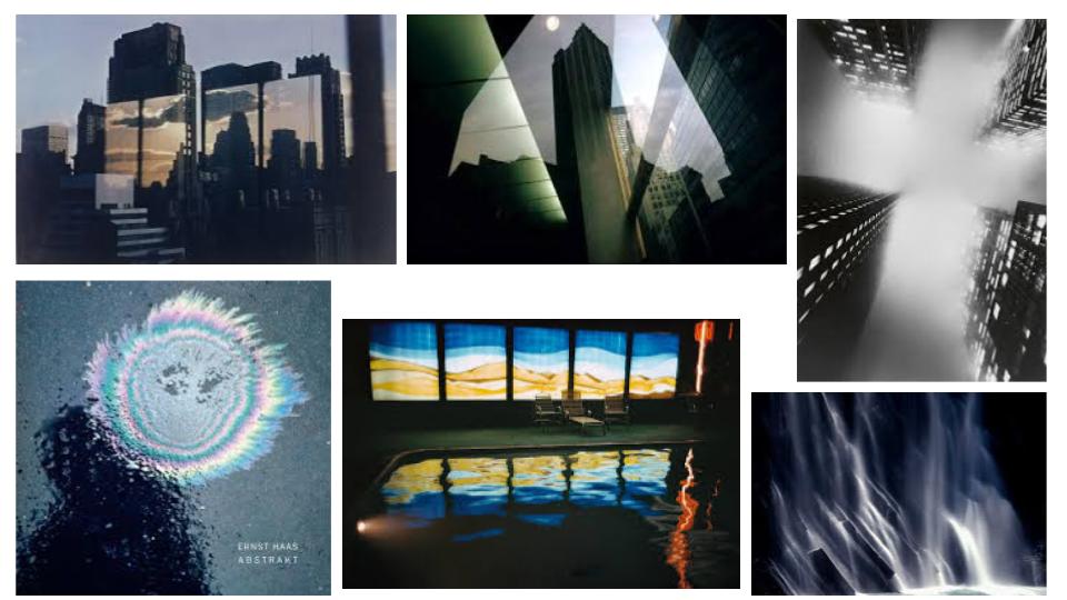
Ernst Haas
Haas was born in Vienna in 1921, and took up photography after the war. In 1986 Haas passed when living in the United States. In 1951 Haas moved to the USA and began experimenting with Kodachrome colour film. He went on to become the premier colour photographer of the 1950s. In 1962 a retrospective of his work was the first colour photography exhibition held at New York’s Museum of Modern Art.
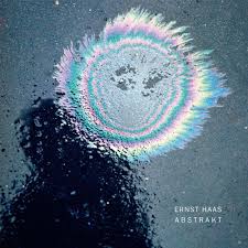
Analysis (Using The Formal Elements)
This oil spill on what it looks like a tarmac surface has natural soft light flooding in. A dark dull shadow is in the left of the image as for the coloured oil being the brightest section. The image itself does not contain any straight lines but consists of coloured circles surrounding themselves. There is a repeat of circles around each other which resembles repetition in this image. The shapes in this image contains big circles and little oblivious bubble circles which are representing rain drops on the surface. The feeling of this surface would be rough and wet as the rain drops and oil are liquid. And for the tarmac surface is known to be rough. Between the oil and the shadow the tonal range from light to dark is significantly spotted as the lightest part of the image meets the darkest area. The light in this image overalls the dark tones found as for the bright colours and the reflection of the water droplets. The image seems to be quite dull and shown as a sad mood as for the rain on a dull grey coloured background. But the colourful circles brighten up the image and gives it move of a exciting approach. The soft primary blue and yellow set the scene in the circles as the rest with more of a subtle pastel colour. The colour that fills up most of the image would be the shades of grey from the surface and shadow. The structure of this image is created un naturally as for the oil spill being deliberately placed there to create a contrast against the grey/black tarmac. The photographer has taken the image with the focal point, the oil spill, slightly above the centre of the image which gives the photo a more spontaneous nature.
Photoshoot Plan:
WHAT – I will be photographing water droplets and bubbles for my surface and texture shoot and for my colour shoot I will be taking photos of fruitNveg/flowers/chocolate.
WHERE – I will be at my house for the water drops to be on my bedroom window and for the bubbles to be created in my sink. For the colour shoot I will be going to the town market and rearranging fruit/flowers ect to a certain look.
Photoshoot – Surface:
My first shoot was taken in the theme of surface/ texture based off Ernst Haas photos. I used his repetition of the use of water in my photos to link back to his work and style.
Contact Sheet 1:
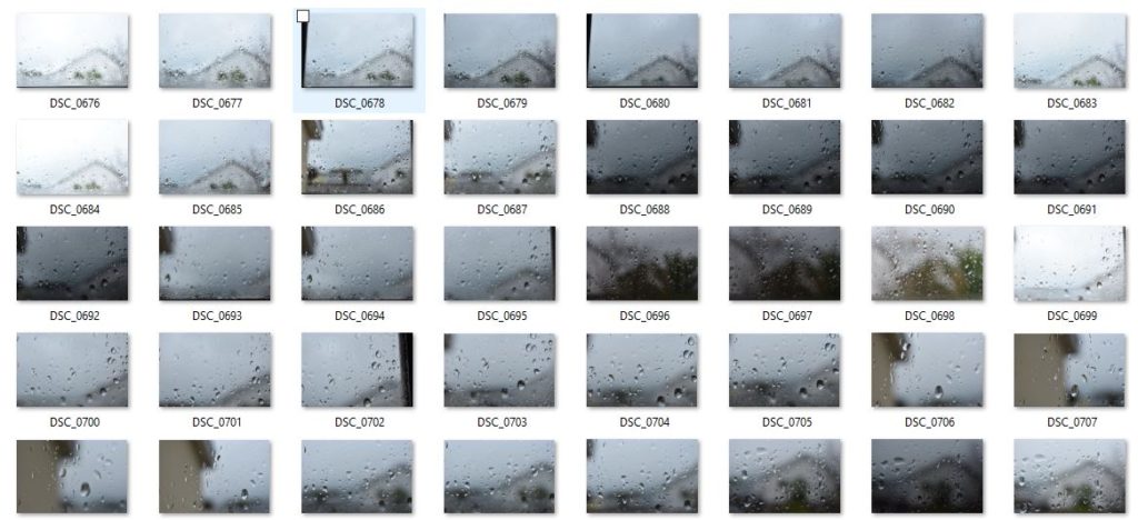


In these final photos I changed on photoshop the contrast level to be stronger as well as the exposure level lower to create a more visual effect on the water droplets.
Contact Sheet 2:

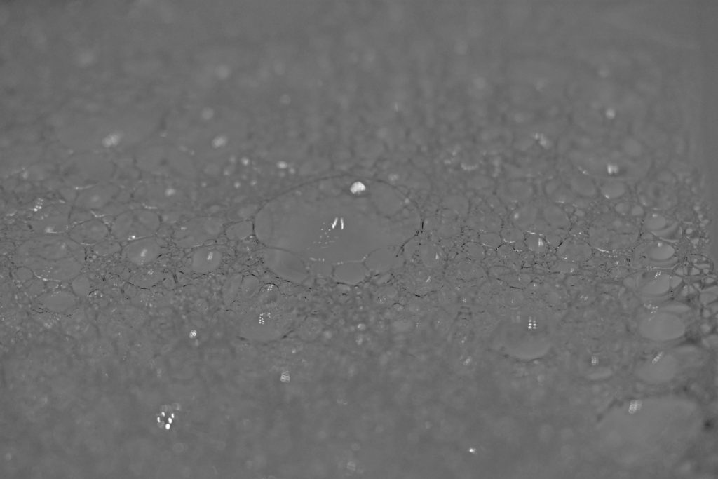
In the first image I have cropped the image to look at the most in focus part of the bubbles. I lowered the vibrance and heightened the saturation to create a warmth atmosphere. In photoshop I changed the last image into black and white and heightened the shadow level to make the bubble lines/curves more visible.
Photoshoot – Colour:
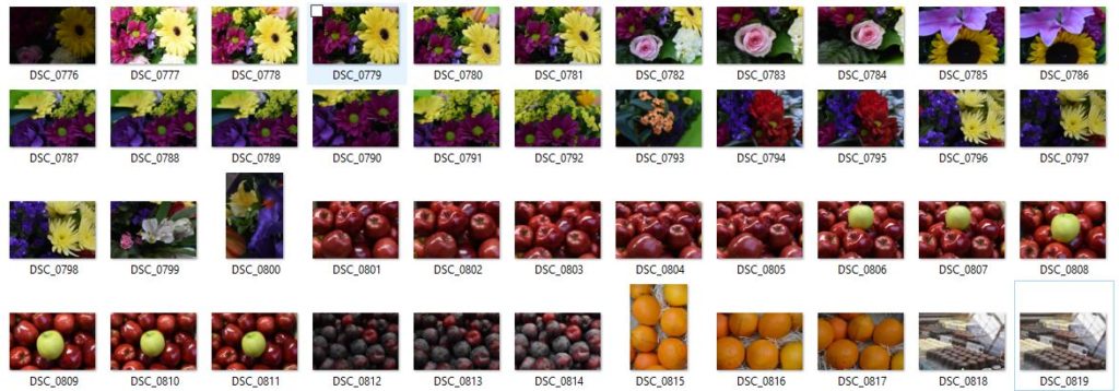
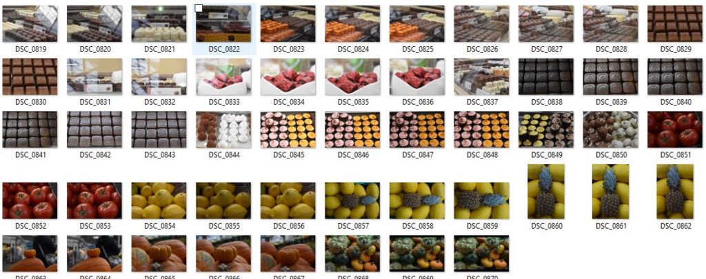
As for this photoshoot not relating to images from Ernst Haas , I have taken photos that relate to different themes of colour.
Contact Sheet 1:
Contact Sheet 2:
Best Colour Photos:
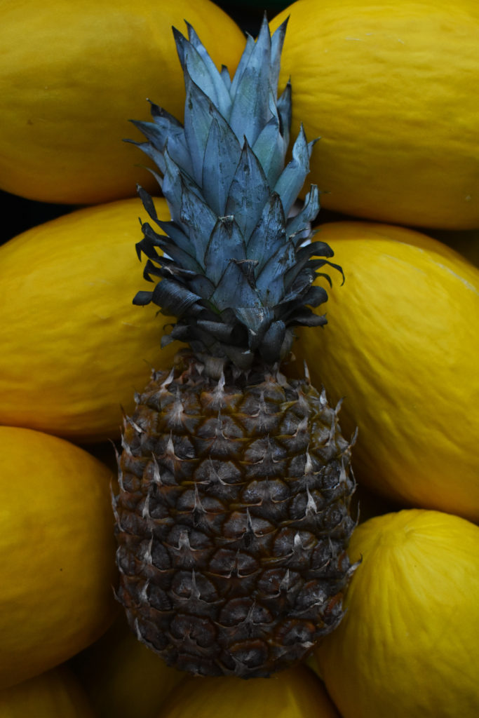

For my best photos out of my previous contact sheets i have adjusted them slightly to create a more intriguing look. For my first photo i have placed a pineapple among yellow watermelons for a strong contrast between the colours of yellow and cyan/green. To have the focal point on the pineapple I erased some black obvious specs on the watermelons and cropped the image to be more central. Finally I heightened the contrast levels and darkened the shadow level slightly as well as making a more vibrant appeal to the image. For my last image of the main feature (the pink rose) i tried to capture the different amounts of colour in one photo which created a bright and bold image.
