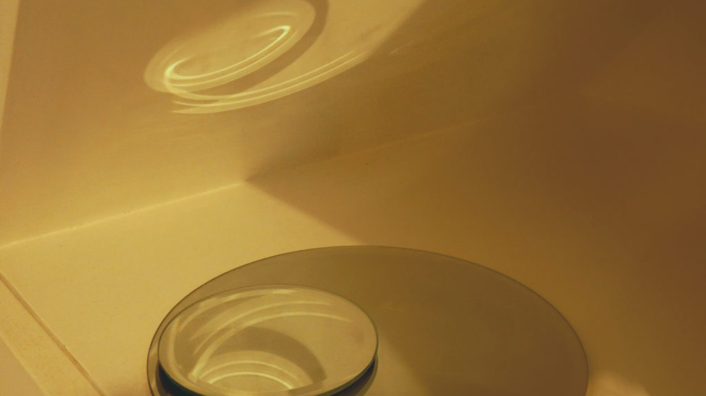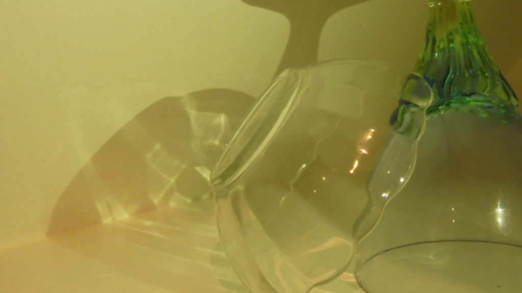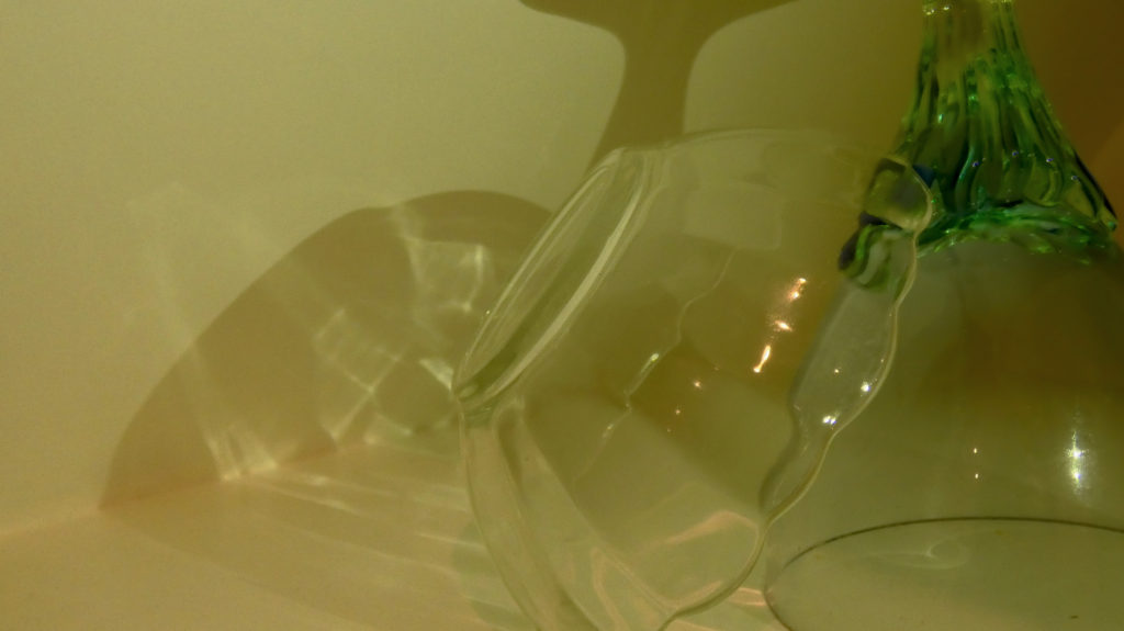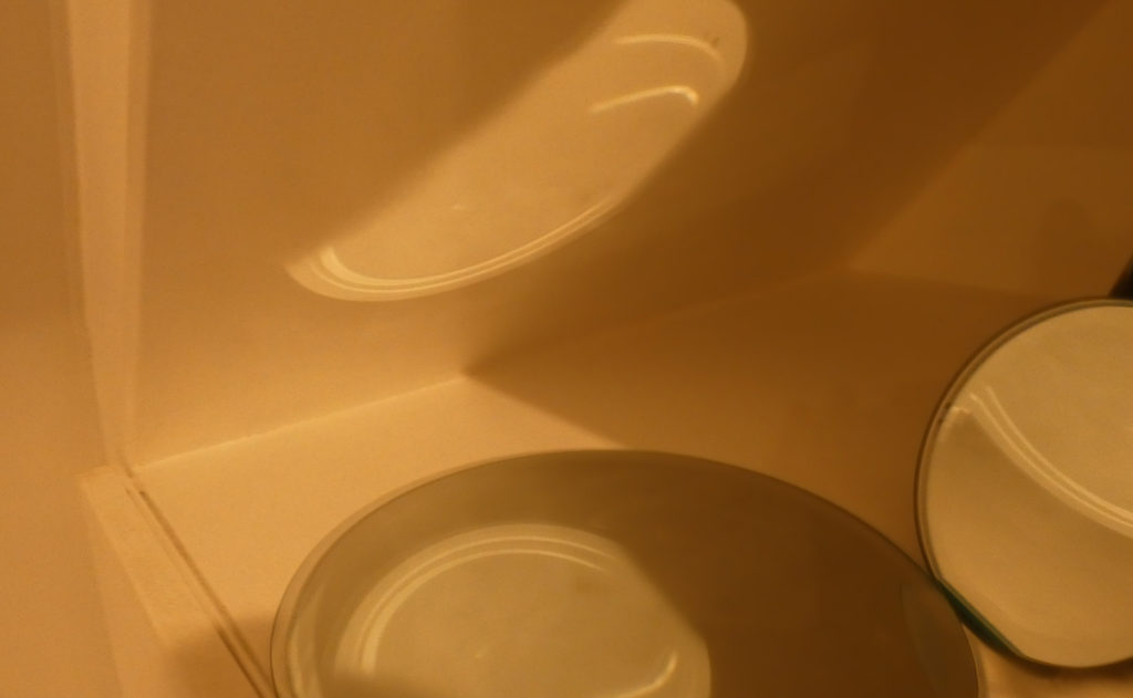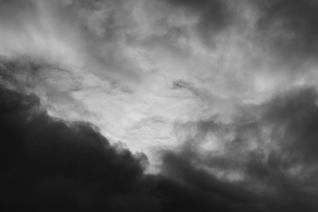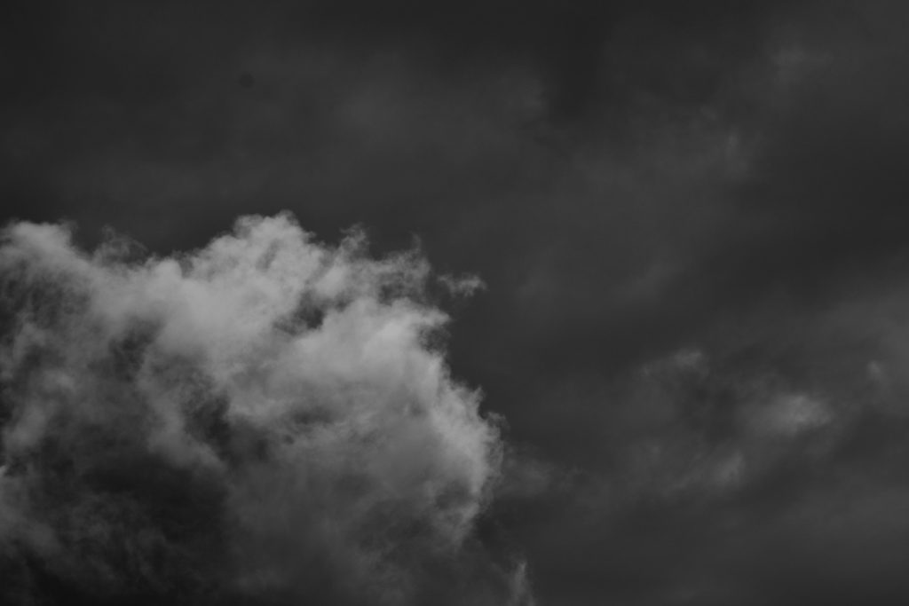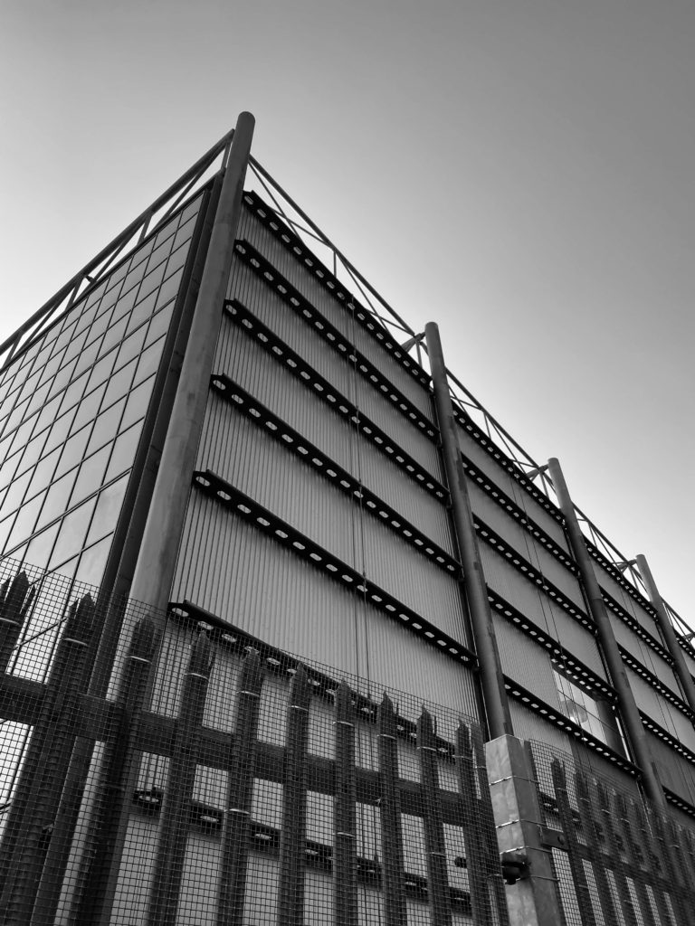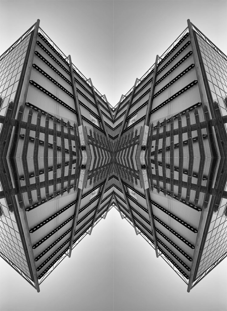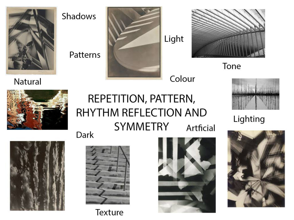
REPETITION, PATTERN, RHYTHM REFLECTION AND SYMMETRY

Alfred Stieglitz

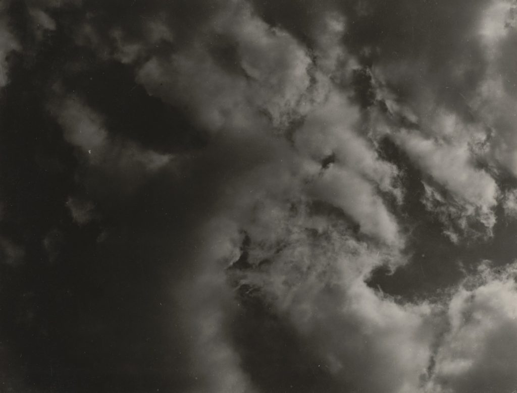
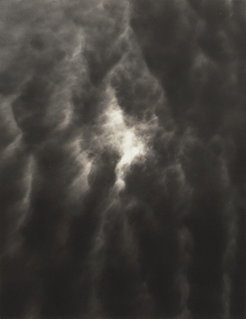
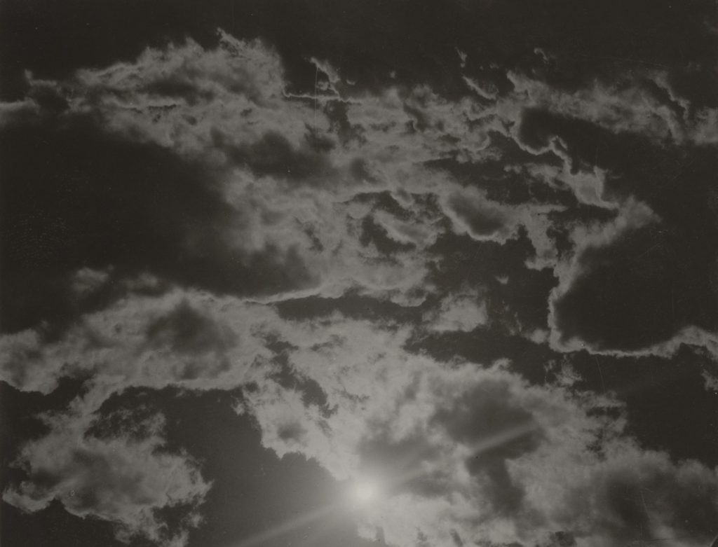
“Equivalent” – Alfred Stieglitz (1923)

Alfred Stieglitz, born in 1864, was an American photographer and art promoter who’s carer spanned across 50 years. Although Stieglitz didn’t study photography at collage, his became very successful in the photography world. He was known for the New York art galleries that he ran in the early 20th century, and regularly wrote for The American Amateur Photographer magazine. He won awards for his photographs at exhibitions, including the joint exhibition of the Boston Camera Club, Photographic Society of Philadelphia and the Society of Amateur Photographers of New York.

Analysis of Alfred Stieglitz’s work
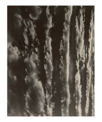
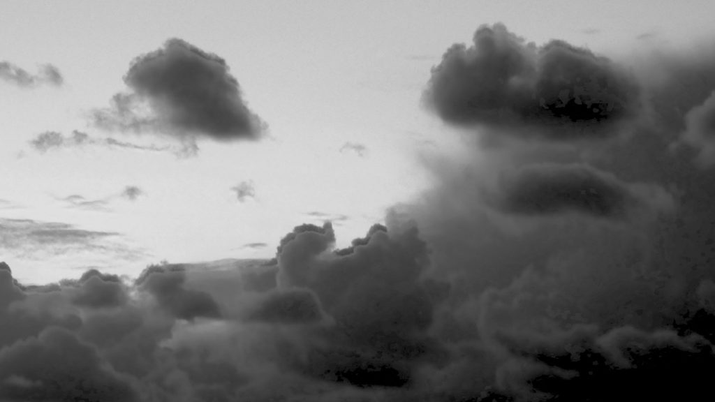
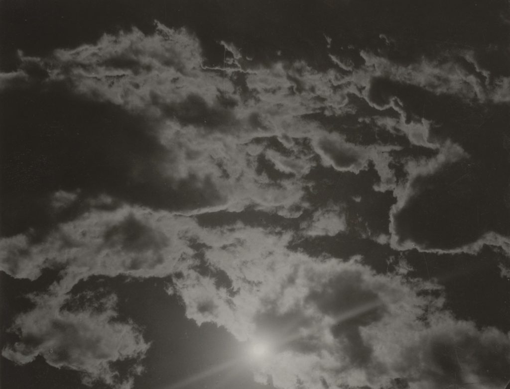
“Songs of the Sky” – Alfred Stieglitz (1924)

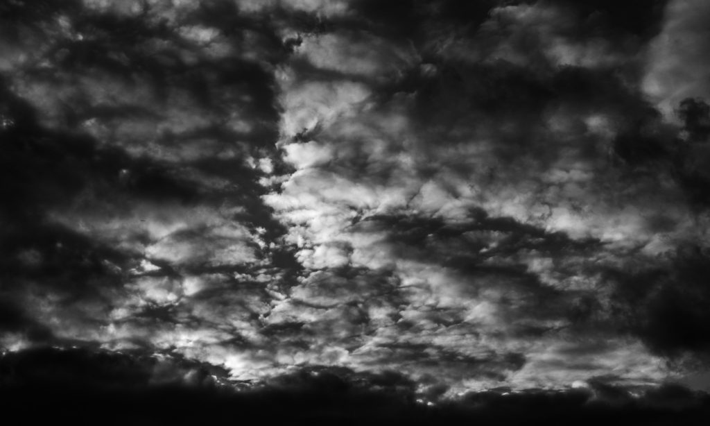
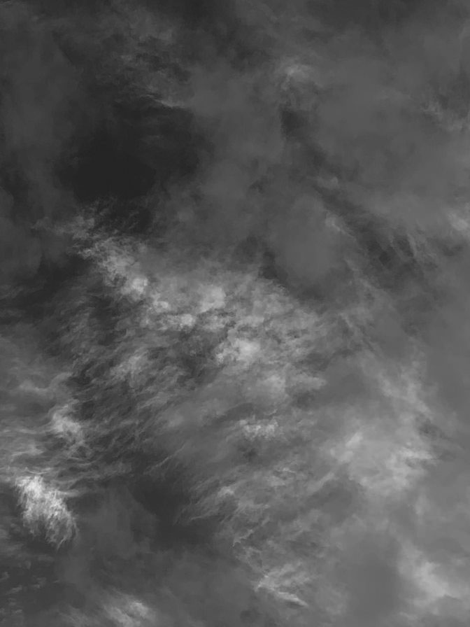
The natural lighting of the image allows the natural repetition of the clouds to be highlighted in its most natural form. The brightest areas are the pure, white clouds that separate the darkness of the sky. It is difficult to tell if the light source of the image is the sun or the moon, as the photograph lacks colour, however as the clouds are visibly bright, I believe the photo was taken in daylight.

The clouds act as leading lines in the photograph, as they direct the viewers eyes from the bottom third, to the top third of the image. The organic lines are thick and random, which gives the image an unorganised appearance.

The thick lines of clouds create a pattern of repetition within the image. The scattered lines form an upwards direction for the viewer, it creates almost an echo effect as the lines begin to fade as the ascend.

Although the structure of the image is very organic and natural, there is a sense of geometric lines within the clouds, as the repeated lines are not completely curved.

There is a wide depth of field in the photograph, this suggests a smaller aperture has been used to take this photo, and because of the image having under-exposed lighting. A higher ISO may have been used for this photograph to achieve the pure whiteness of the clouds, and a fast shutter speed may have been used so the movement of the clouds is not captured.

The photograph displays a softer texture because of the clouds. The delicate curves in the clouds lack sharpness, which provides the softer aesthetic.

There is a wide range of tones between light and dark in this photograph even though the image is monochromatic. The varying shades of black, white and grey allow the extreme contrast of light and dark to be highlighted in the photo.

The lack of colour in the image provides a more vintage aesthetic, and further accentuates the juxtaposition between light and dark. This is also provided with the extensive range of tones between black and white.

The composition of the photograph is organic and disorderly, as the clouds provide their own, upwards path. There is no distinct shapes formed in this image, which makes it difficult to understand the composition. However the clouds coincidentally form line shapes which are messy, rather than purely straight.

My response to Alfred Stieglitz’s work

Photoshoot plan:
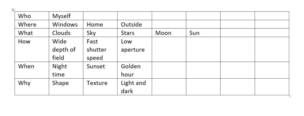
Alfred Stieglitz inspired photoshoot
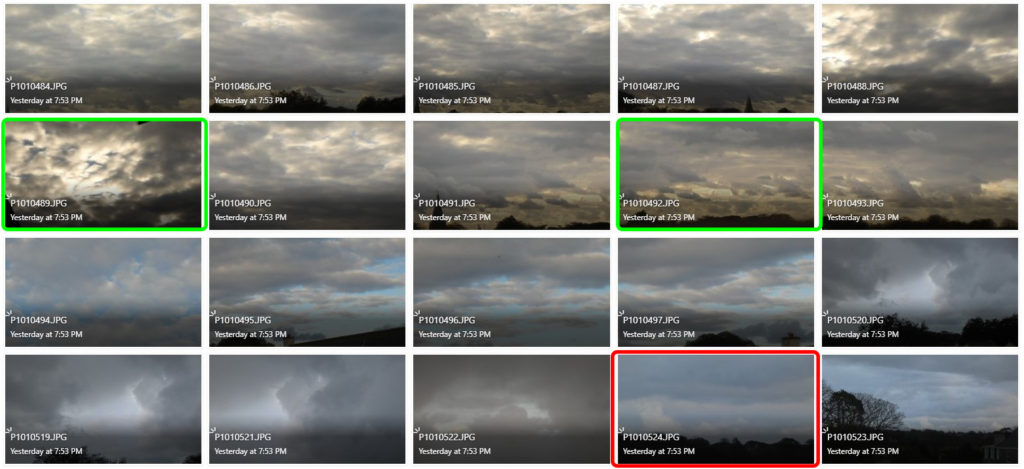
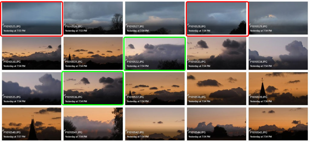
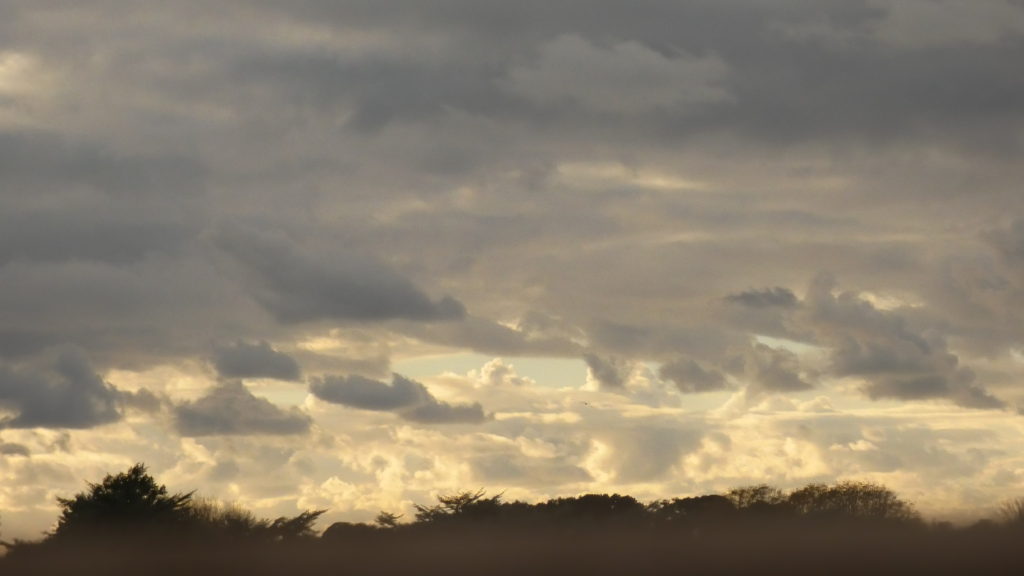
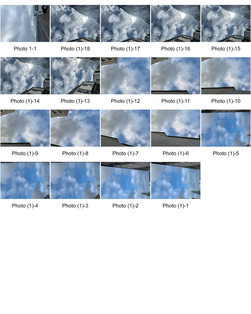
The images in green, in my opinion, are the most successful for this photoshoot as they project the contrast of light and dark in the sky as Stieglitz did in his work. They also capture the patterns of the clouds and the warming colours of the sunset.

The photographs in red are the least successful from this photoshoot as they are either under-exposed, or they don’t capture the patterns of clouds as seen in the work of Alfred Stieglitz.

Photoshop developments
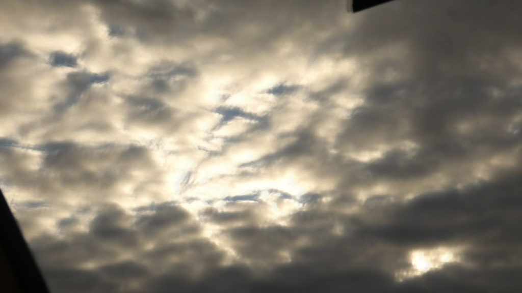
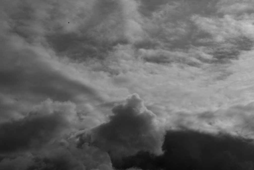
Original Image
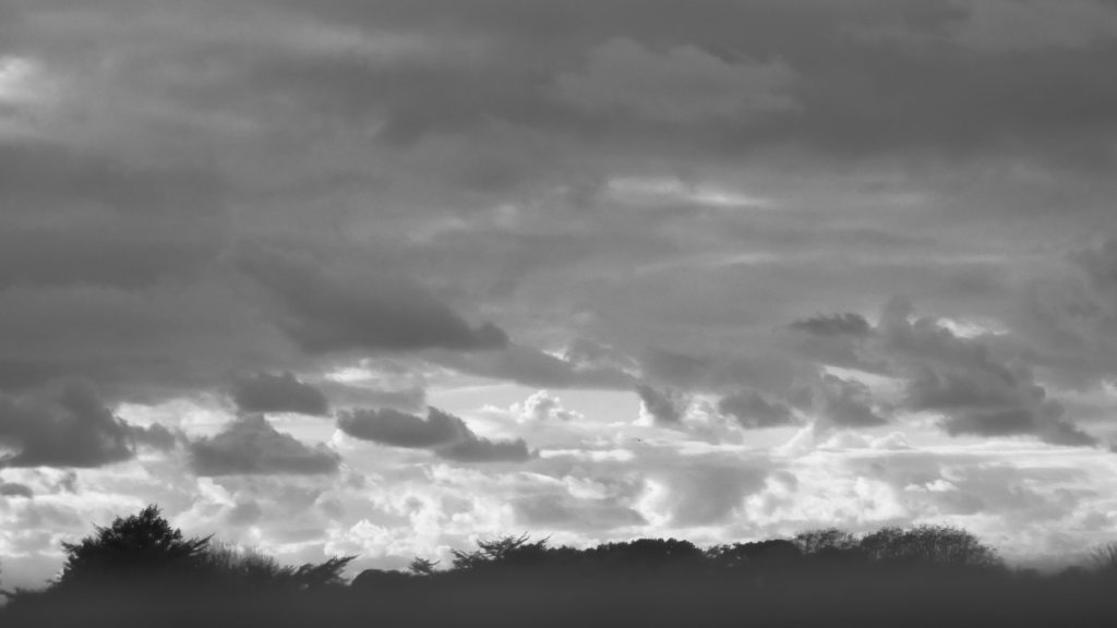
Edited using black and white filter and curve adjustments
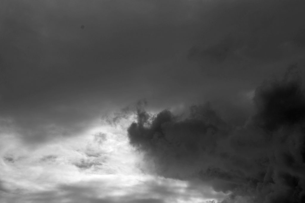
Original Image
Edited using black and white filter and levels adjustments
Original Image
Edited using black and white filter and curves adjustments

I believe my photographs share similarities with those of Alfred Stieglitz, as they capture the natural pattern of the clouds, as well as their bold tones. I used the black and white filter in the style of Steiglitz’s work, and then used curve and level adjustments in order to achieve the significant contrast between light and dark.

Jaromir Funke
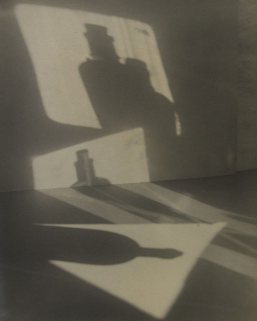
“Composition” – Jaromir Funke (1927)

Jaromir Funke, born in 1896 in the Czech Republic, was a leading figure in Czech photography throughout the 1920’s-1930’s. He was recognised for his work that focused on the use of light and shadows. He often used glass and mirrors to create patters and echoes in his unique photographs. During his career, Funke published editorials and critiques about photography. He became a freelance photographer in 1922 and two years later he, along with two other photographers, created the Czech Photographic Society. Jaromir Funke headed the photography department at the School of Arts and Crafts in Bratislava between 1931-1935, he then taught at the School of Graphic arts in Prague until 1944.  Funke later became an editor of the journal “Photographic Horizons” for several years. He published a number of works including “Od fotogrameuk emoci” which is understood to be his manifesto.

Analysis of Jaromir Funke’s work
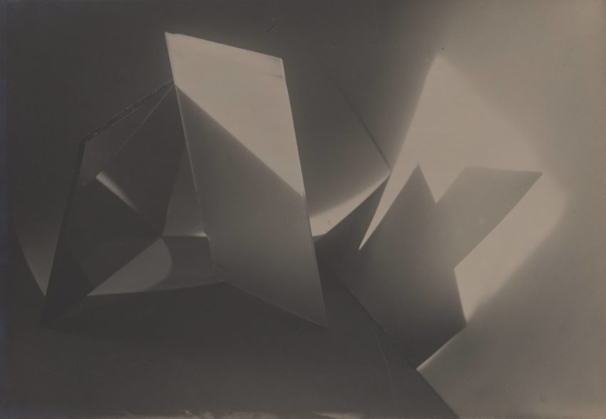
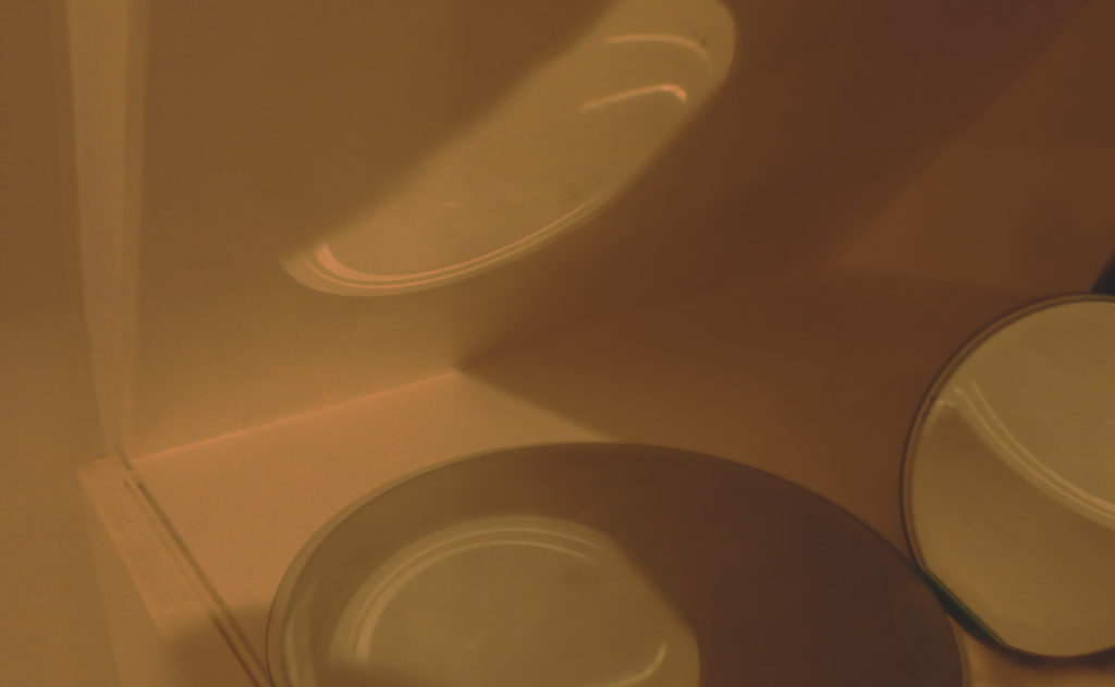
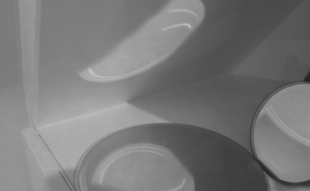
(Untitled) From the series “Abstract Photo” – Jaromir Funke (1927-1929)

The artificial lighting allows for the contrast between light and dark within the shadows and highlights. The lightest areas include the top corner of the paper and the light surrounding the shadows behind the paper. The lighting is rather harsh, as bold shadows are formed in juxtaposition to the illuminated shadows.

The lines in the image are straight and geometrical. The distinct edges of the paper cast organised and clear shapes into the background, these lines cross over each other and merge into one another.

It could be said that a repetition of line is used in this photograph, as there is a multitude of straight lines and shapes. However, these lines are not organised into a distinctive pattern. The shadows formed by the lighting could be seen as a form of echo in the photograph.

The shapes formed in the foreground image are geometrical, they form echos in the form of shadows onto the background of the photograph. The square-shaped mirrors form merged shapes in the background.

There is little sense of depth of field in the photograph as the whole image is rather grainy and slightly out of focus. However there is no difference in depth between the foreground and background, therefore the photograph has a wide depth of field. The image seems under-exposed, this suggests that a smaller aperture has been used.

Overall, the image tends towards darkness, which gives the image a gloomy aesthetic. There is minuscule range of tone between light and dark within photograph, there is no pure black and white in the image as the photograph has a slightly yellow hue to it, therefore the lightest tone is more of a cream colour rather than white.

There is no colour to this image. This allows the simplicity of light and shadows to be highlighted as well as the aspect of shape. However the artificial lighting provides a yellow-toned hue for the image, which gives the photograph a vintage appearance.

The mirrors in the photograph are organised so that their shadows blend into one another, creating a merged shape of the two. I would say the image is unbalanced as the mirrors are held at an angle, rather than straight on. The composition of the mirrors almost forms a pyramid shape as the mirrors lean against each other. There is no rule of thirds used in this image as the focal point of the mirrors is not central.

My response to Jaromir Funke’s work

Photoshoot plan:
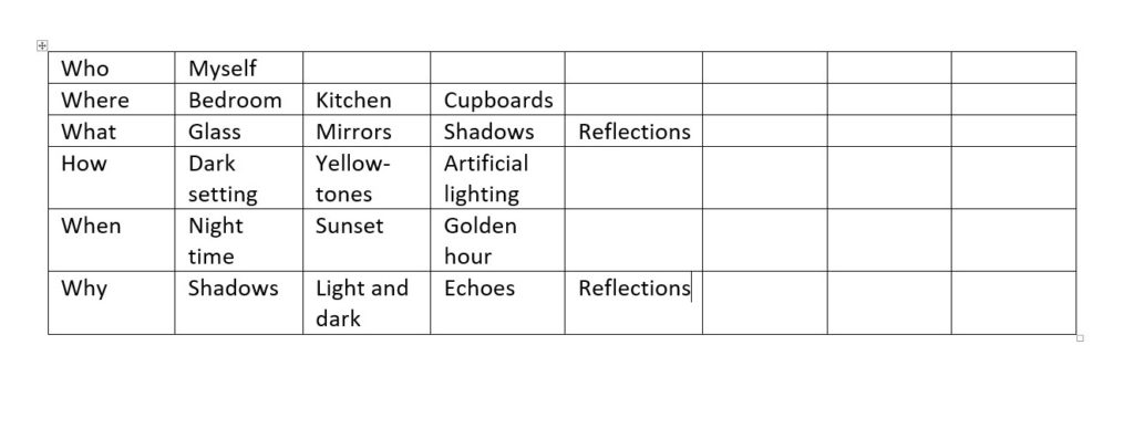
Jaromir Funke inspired photoshoot
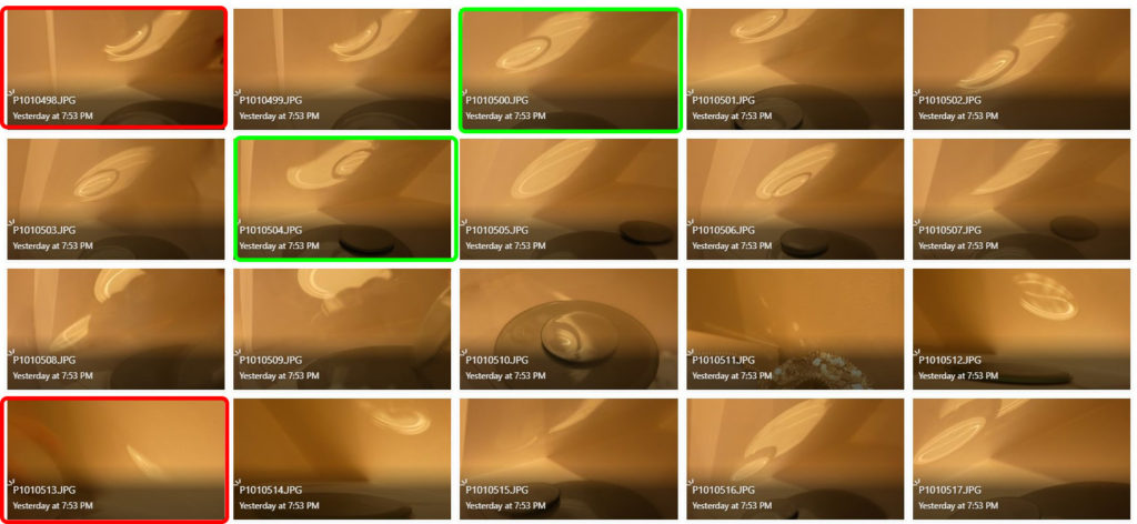
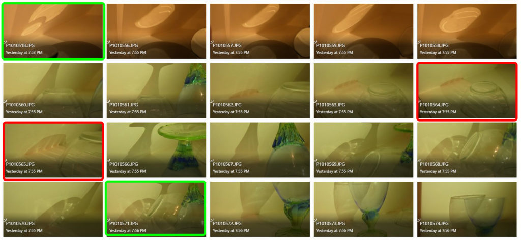
The images highlighted in green, in my opinion, are my most successful photographs because the mirrors/glass project contrasting, geometrical shadows onto the surface behind. They also capture the slightly discoloured hue of the lighting, which is seen in the work by Jaromir Funke.

The photographs highlighted in red are not as successful for multiple reasons. Some don’t capture the bold shadows that I wanted to achieve in my images and some are slightly out if focus, so the quality of the image isn’t as sharp as it should be.

Photoshop development
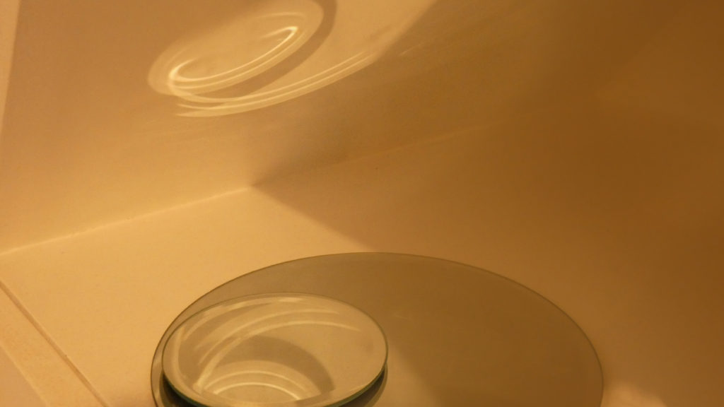
Original Image
Edited using curves and level adjustments
Original Image
Edited using saturation, exposure and curves adjustments
Original Image
Edited using brightness, contrast and curves adjustments
(Previous image) Edited using black and white filter and colour hue adjustments

I believe I have recreated Jaromir Funke’s work successfully whilst adding my own style to the images. My images share similarities with those of Funke, for example the simplicity of the objects chosen in order to create geometric echoes and shadows. However my images have an almost yellow hue to them, because of the artificial lighting used. I tried to remove this by making the image monochrome, which is why I believe my last edit is my most successful recreation.

Jaromir Funke

In 1924 he co founded the Czech Photographic Society with Josef Sudek and Adolf Schneeberger. Two years later he produced a series of Surrealist images of store windows (Glass and Reflection) based on the photographs of Eugène Atget. Funke served for several years as editor of the journal Fotograficky obzor.

His interest in modernist ideas led him to make studies of simple objects. As the decade progressed, he turned to the production of arranged still life emphasizing abstract form and the play of light and shadow. During this time he also produced several important series of photographs, including two inspired by the images of Eugène Atget: Reflexy (Reflections, 1929) and as trvá (Time Persists, 1930-34). 

Open the link to learn more

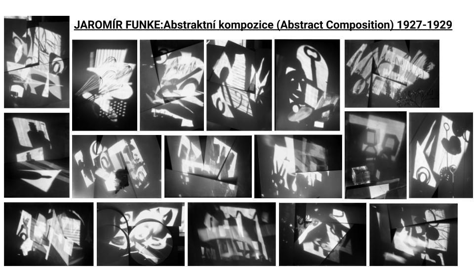
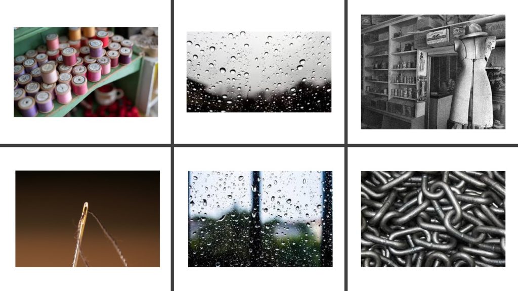
The series of photographs that inspired me is the Absrakni Kompozice (Abstract Composition) photos. In these images he focuses on shape, light and shadow. He uses a different objects to get a range of unique, interesting and abstract shapes. In the background of the the images he uses the material of paper to get structure in the background with the creases and edges of the paper. This also helps to have a solid white background.

Images from Abstraktní kompozice that inspired me:

Image Analysis

Jaromir Funke: Abstract Photo, 1928–29

In Abstraktní kompozice Funke focuses on the use of light in his photos creating light and darkshapes.

In this image in particular the lighting used seems to be natural and is positioned behind the camera facing forwards making anything in front cast a shadow. There is a large range of tones due to the contrast between the light and dark areas in the image which help make the shadows from the objects sharp and visual. The aperture and shutter speed in this image creates a crisp photo in the sense that the abstract shapes are clear and sharp but the image overall is under exposed which makes it seem blurry and more warm toned. There is various lines from the objects. The shadows created are very geometric and layer on top of each other creating a composition with the more organic curvy shapes. Overall it is quite warm toned as it is not a normal black and white photograph it is more of a black and off white colour due to the white balance.The middle of the photo is framed by the dark shadows around the light, creating a vignette.

Photo shoot 1

Photo shoot Plan:
WhoJaromir Funke takes photos of objects and light so I will not need anyone else in the photo however I will need someone to hold the objects.
What I am going to take photos of shadows from interesting objects with different silhouettes and shapes.   
WhyI am going to take these photos as it will closely interpret Funkes images with abstract forms and light and shadow.
WhenI will take these photos late afternoon so the sun is starting to set and it will be shining where I need it. Also the shadows will be strong as the sun should be quite bright at this time. The weather also is important as I will need it to be sunny.
WhereI will be using a plain white canvas for the background so it gives a solid colour for the background and I can move it to where the sun is shining for the best shadows.
HowI will place the canvas in front of the sunlight and get someone to hold the objects where I need them to be as I will be taking the photos and will not be able to hold the objects whilst photographing.

My response 1:

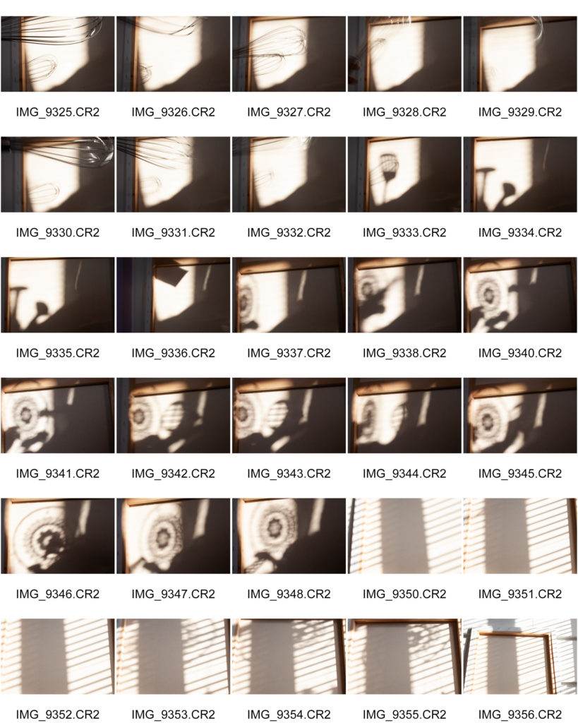
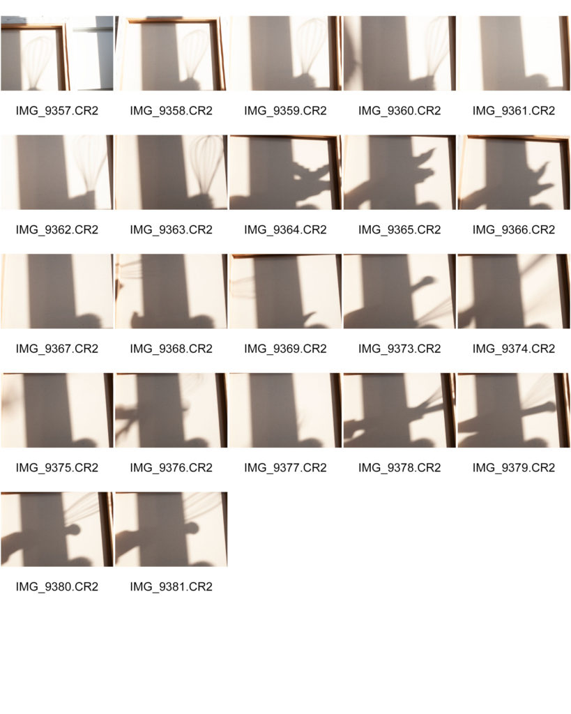
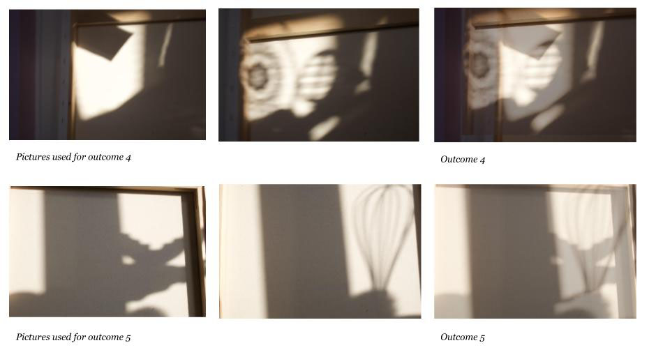
I chose to do this idea for my first photo shoot inspired by Jaromir Funke as I wanted to try and get the shapes he has used. In particular one of the objects I used was a whisk because in one of his photos he uses a couple of whisks to create multiple shadows and photographs the object in front of the camera. For these particular photos I set the shutter speed lower so the camera would capture the movement of the whisk and would give it a blurry affect. I used the natural light from the sun coming through the window to create a soft, yellow shadow. If I were to do this photo shoot again I would perhaps use artificial lighting so that the shadows would be harsher like Funke’s images. I used a canvas for the background of the image as it was plain but also gave the image a slight yellow cast with the light settings on the camera.

Photo shoot 2

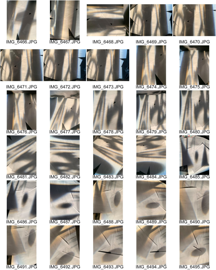
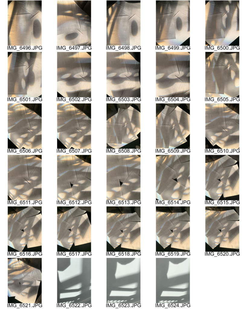
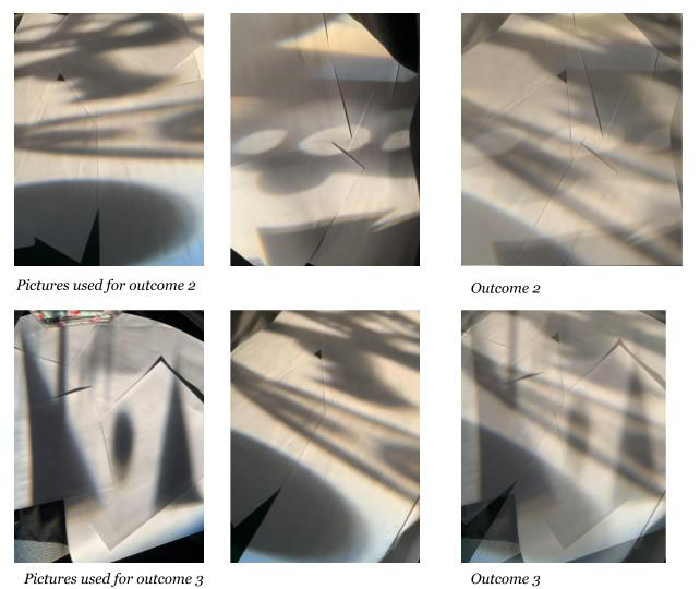
I chose to do a second photoshoot following Jaromir Funkes’ images closer so that I could get the same abstract effect as him. For this photoshoot I used plain white paper to set the background of the photo and as an area to cast the shadows onto. I also incorporated a black curtain into the background so that I could create a vignette effect, having the black background around the sides of the photo framing the centre which is brighter. The lighting used was artificial lighting coming from a projector, I used this to have a more yellow light rather than white lighting and so that the shadows would be harsher. Additionally it was easy to control where the light and the shadows were in the images because I was able to place the objects in various places on the projector glass and it would reflect with the shadows of the objects. The lighting used also created soft and harsh shadows making shadow shapes contrast.

Final outcomes

When editing my images I wanted to make them busier and edit the shadows so that they were harsher and bolder. To make the images busier I combined them together layering 2-4 images over each other altering the opacity of each photo so certain photos were more visible then others. I also cropped and adjusted the positioning/rotation of the photos either choosing certain parts of photos to layer or crop the final outcome. When editing the lighting and colour of the images, I used adjustments on photoshop and altered the exposure, contrast, levels, vibrance, saturation and more.

Ray Metzker

Ray Metzker quietly made extraordinary and influential photographs over the course of a five decade career. Today, he is recognized as one of the great masters of American photography.

 September 10, 1931-October 9, 2014

Image Analysis

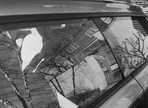
Ray Metzker (title unknown)

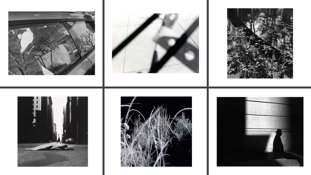
Metzker used the car window as a mirror in this image; that could have confused the viewer because they may initially see the image that is reflected on the car window, but not necessarily the car itself.

Plan

Shoot one

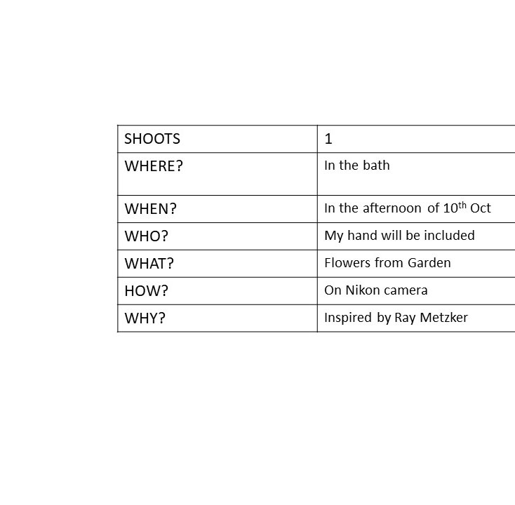
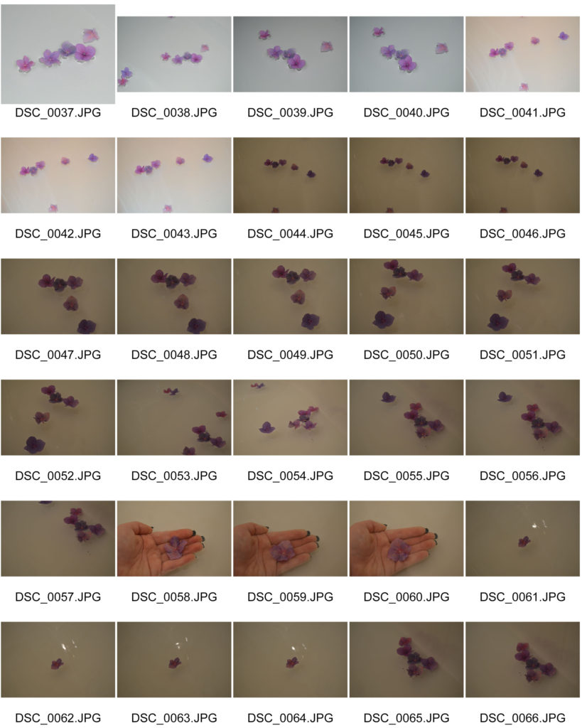
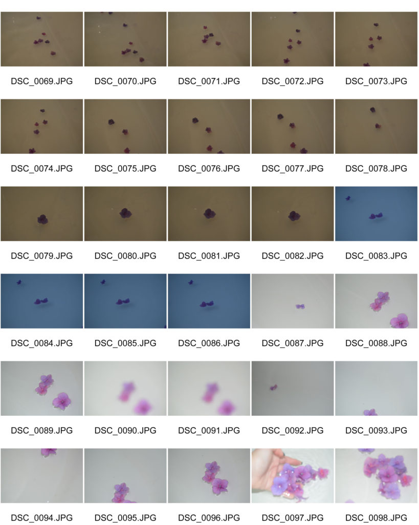
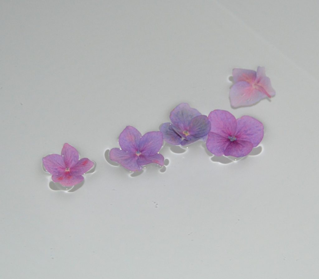
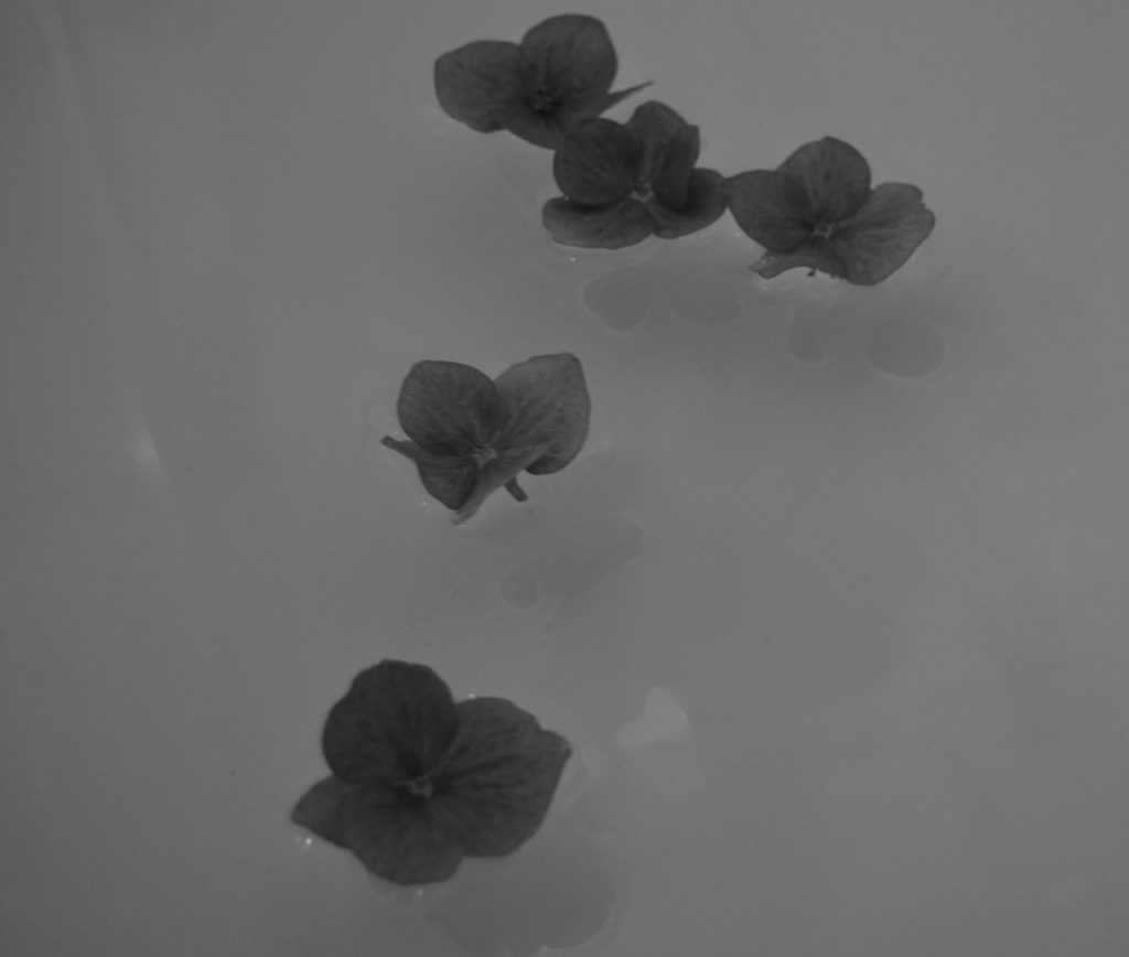
For the first shoot I was inspired by the image below. Instead of focusing on the reflection, I tried to focus on the flowers themselves so I just put them in the water and left them to float and I just took the pictures as they bobbed around.

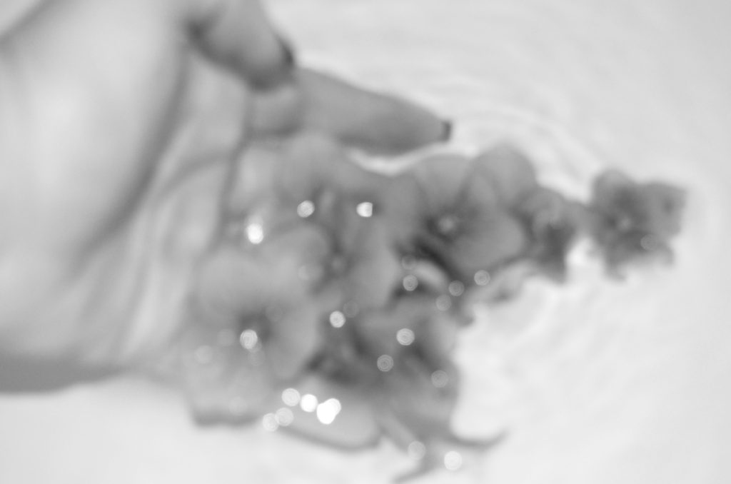
For a couple of the images, i had my hand underneath them. I did this because in many of Metzker’s images, there are a lot of people and/or shadows of people which some could interpret that there’s no part of this world that hasn’t been disturbed or effected by the human race.

Favourite Images

Edits

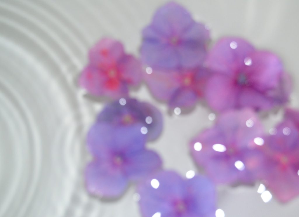
Although Metzker’s work is mainly in black and white, I wanted to show the difference by making one of the images have the blue hue rather than fully black and white and one with all colour.

Favourite Image

This is my favourite image because it’s blurred, however the viewer can still tell what the image is. In the image, the flowers have darker details which are bolder and more apparent in the centre of the hand, this is because this is what my camera focused on while I took it.

Repetition, Pattern, Rhythm Reflection and Symmetry – Patterns In The Sky

Moodboard

Alfred Stieglitz – Equivalents

Alfred Stieglitz (1864-1946) was an American photographer who in the summer of 1922 began photographing abstract formations of clouds in the sky. Stieglitz called these images ‘Equivalents’ and argued that visual art could evoke the same emotions and have equally as much power as music. Music was clearly an inspiration. Instead of describing the visible surfaces of things, Stieglitz wanted his work to express pure emotion, representing the artist’s own inner state. What I really enjoy about his work is his use of muted grey and white tones, I believe they create an atmospheric and dramatic image. Additionally, I want to reflect the depth of Stieglitz’s work as he captures the clouds in repetitive patterns which stretch over the foreground and background of his images. This creates a deep depth of field as it alludes to the idea that more clouds continue behind the ones captured in the images.
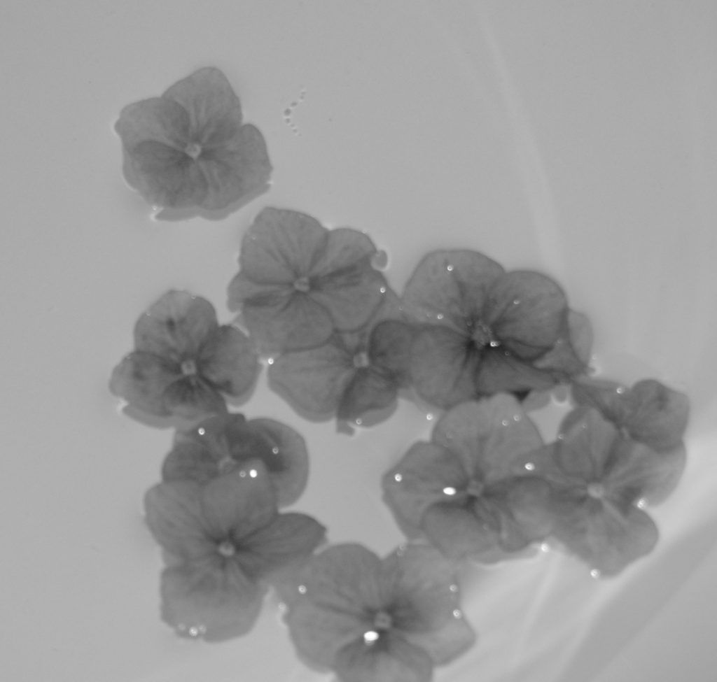
Photo shoot Plan

Who – My plan is not to capture any people as the subjects of these images as they are based on Alfred Stieglitz’s ‘Equivalents’ work. The only person involved in the shoot will be myself taking the photographs.

What – My focus in this photo shoot will be capturing the abstract patterns made by clouds in the sky, I will attempt to photograph the light and shadow created by the clouds, similar to Stieglitz.

Where – I plan on taking these photos in my garden as it gets a lot of sunlight in the evenings so I will be able to experiment with the placement of the sun. I also plan on capturing some images of the sky in St Helier as there is lots of room to move around in order to photograph from different angles and perspectives.

When – On Wednesday 14th October I am planning on doing this photo shoot as the weather is meant to be sunny with clouds in the sky. I also want to take these images late afternoon as the sun will be lower in the sky which will create a more dramatic contrast between the shadows behind the clouds and the clouds themselves.

Why – I want to reflect Alfred Stieglitz’s work ‘Equivalents’ by photographing the obscure shapes made by clouds, I also want to mirror Stieglitz’s intentions on his images evoking emotion and representing visual art as more than just a nice thing to look at.

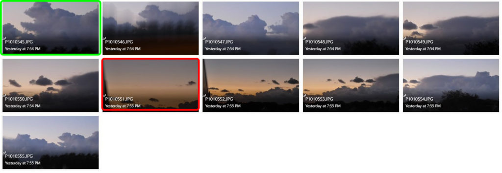
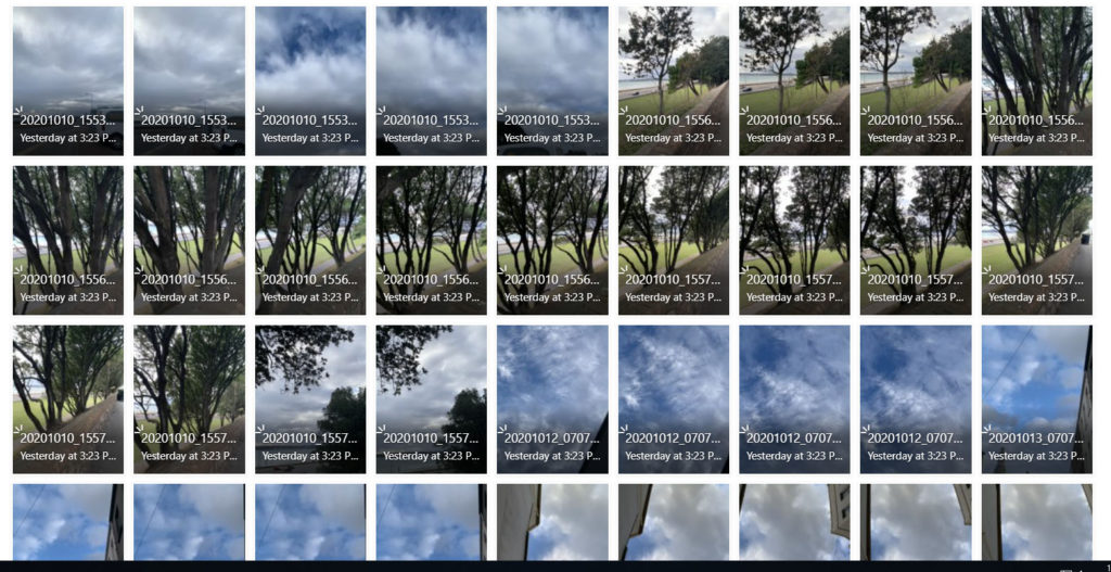
Contact Sheets

Edited Images

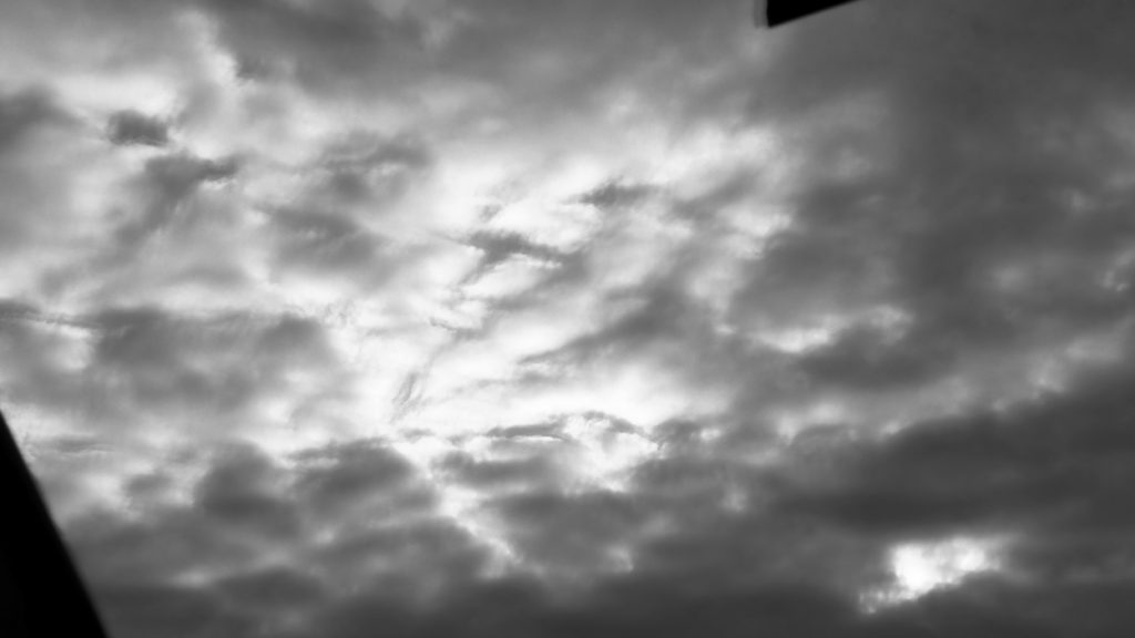
I edited these selected images on Photoshop in order to reflect Stieglitz’s work. First, I adjusted the images to black and white as many of Stieglitz’s photos were taken in the 1920’s, hence the unsaturated filter. Secondly, I used the ‘brightness/contrast’ tool to increase the contrast of my photographs and decrease the brightness, I did this to enhance the highlights of my images by darkening the shadows surrounding the clouds, similar to Stieglitz. Lastly, I experimented with the ‘levels’ tool to move and stretch the brightness levels of my photos, this allowed me to mirror Stieglitz’s dull and heavily shadowed work.

Final Images

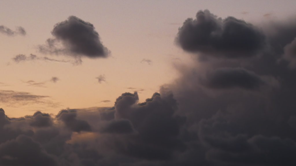
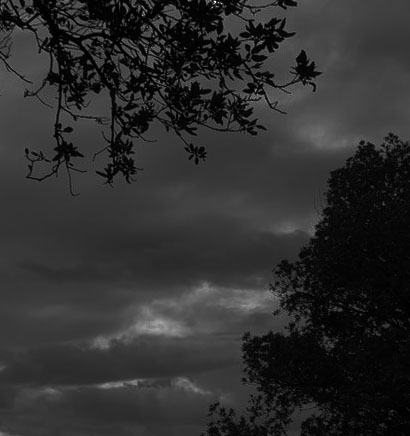
I have selected these two photos as my final images because I believe they reflect Stieglitz’s ‘Equivalents’ series whilst also incorporating my style of photography. One thing I really like about my first image is how I have captured the repetition of horizontal lines created by the clouds. I believe this forms a large depth of field which gives the impression of a never-ending blanket of clouds which stretches far beyond what’s seen in frame. Furthermore, my first image holds a fluffy texture due to the soft natural lighting that falls behind the clouds. This delicate texture reflects Stieglitz’s work as he captured photographs which contained muted tones, creating a smooth effect for the observer. Additionally, the repeated organic shapes of the clouds in this image create a sense of movement and rhythm, as if the blanket of clouds is travelling across the frame. Lastly, in this first image, I enjoy how I have photographed a highly shadowed image similar to Stieglitz. The thin bursts of highlights between the gloomy clouds draw the observers attention as they contrast greatly with the surrounding darkness.

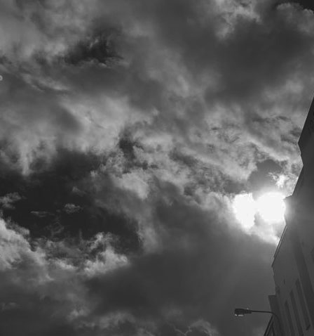
In addition, I really like how in my second final image I have captured a dramatic contrast between light and shade. The harsh black and white tones of this photograph juxtapose each other very effectively. I believe the bright white light draws focus to the centre of the image as it is engulfed in dark shadows which allows the highlights to stand out more. This alludes to the idea of heaven and hell, as the pure white light is shining above a dull blackened sky, connoting the idea of goodness coming from within. Moreover, when capturing this image I increased the shutter speed to under expose my photo. I believe this has contributed to the dim tones which mirror Stieglitz’s series of images. Additionally, the texture of this image is quite soft due to the curved natural shapes of the clouds repeated throughout the photograph. In the top right of this image there are a lot of grey tones outlined by white highlights, this furthers the soft texture and creates a cotton-wool-like effect. Lastly, this image holds a large depth of field as the central point where the light is shining through alludes to the idea of more brightness hiding behind the dark clouds, out of the observer’s view.

Repetition photoshop

Original Photo
Edited Photo

PROCESS:

First I increased the canvas size so that it would be easier to fit my overall reflected images. Then I opened the photo in which I wanted to work with and I duplicated the original layer. After that I pressed (ctrl+T) and shift to keep the image the same proportion as well as convert it to the other side of the campus. Next I duplicated both layer one and two and pressed ctrl + T to reflect it to the bottom half of the canvas.Overall i feel that this worked well as it allows you to see the image in a different perspective.

SELECTING AND FINALISING AND DISPLAYING…

My favorite sets of images:

Group 1:

These images group together because of the warm, earthy colours. They also display thoughts of isolation and staying at home through abstract photography.

Group 2:

These images group together because they all have high contrast between the lights and the shadows. They also have an eerie feel when displayed together.

Group 3:

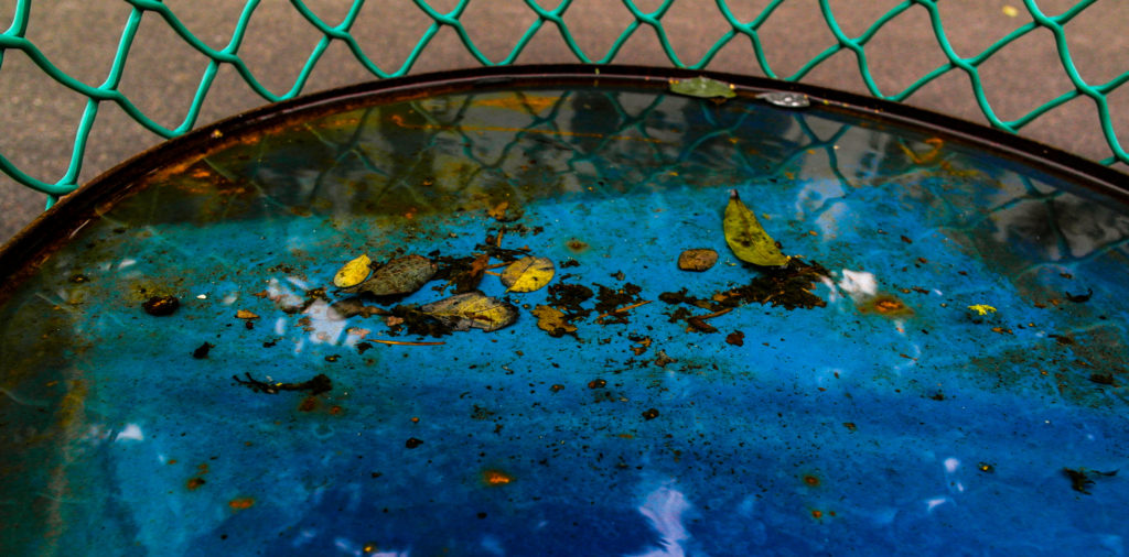
These images group together because they all are of water and water reflections. They also all have quite earthy colours with increased saturation.

Group 4:

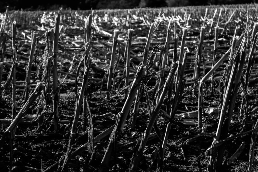
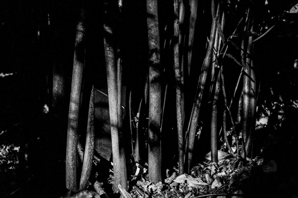
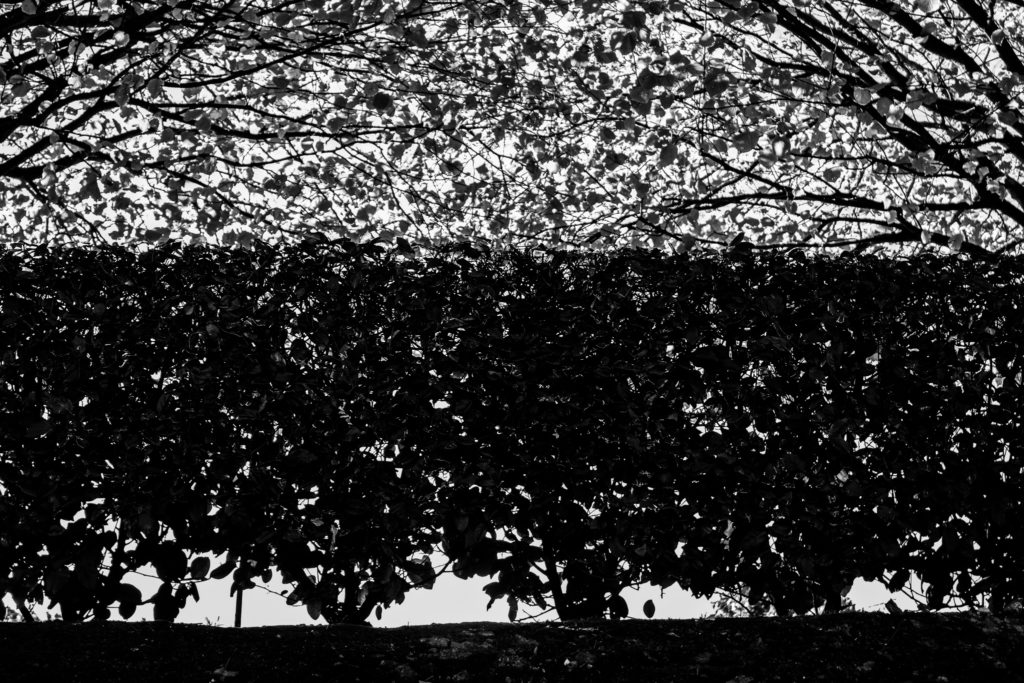
These images group together because they all are of natural forms in black and white. They also have a large tonal range between the highlights and the shadows.

Final Gallery

I chose these images because i think they best display my use of black and white photography to show contrast and texture in natural forms. These images work well together in response to Harry Callahan because of their similarity to his photographs by using black and white photography of natural forms.

Method

  • Find an image on the internet of an empty gallery – i chose a plain black and white gallery as it compliments the images i have chosen to display.
  • Select a group of your most successful images that look good displayed together and bring them into Photoshop in different layers.
  • One by one, resize the images to the desired size, using Ctrl and dragging the corners of the image to change the angle of the image to match the angle of the wall that its placed on.
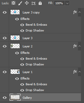
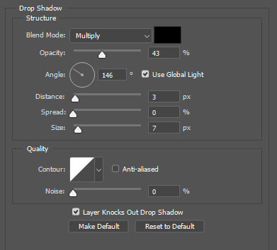
  • Then right click on the image – blending options – drop shadow, then change the values and angle of the shadow to fir the gallery that the images are in, taking into account the position of the lights in the room.

REPETITION, PATTERN, RHYTHM REFLECTION AND SYMMETRY –

Alfred Stieglitz – patterns in the sky

He was an American photographer and modern art promoter who was instrumental over his fifty-year career in making photography an accepted art form. In addition to his photography, Stieglitz was known for the New York art galleries that he ran in the early part of the 20th century, where he introduced avant-garde to many European artists to the U.S.

The Key Set: 1918–1937
patterns in the sky 1918-1937

Harry Callahan – natural forms

Callahan left almost no written records—no diaries, letters, scrapbooks or teaching notes. His technical photographic method was to go out almost every morning, walk through the city he lived in and take numerous pictures. He then spent almost every afternoon making proof prints of that day’s best negatives. Yet, for all his photographic activity, Callahan, at his own estimation, produced no more than half a dozen final images a year. He worked with multiple exposures-double and triple exposure, blurs, large and small format film.

An Intuitive Approach: Harry Callahan's Depiction of Nature |  Huxley-Parlour Gallery
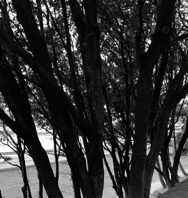
Trees at lake shore (1912-1999)

Compare and contrast-

Technical– The lighting in both photos have light and dark tones and different sections of the photo are in contrast with each other. In Alfred’s photo the clouds are very dark and grey as they are surrounding the small spot of sunlight that’s trying to shine through. The photo looks like it was taken in natural light as it’s of the sky which is a natural environment. Whereas the Harry’s photo contains extremely sharp contrasts between the black and white. The trees are completely black and the background surrounding them is white which makes the shape of the trees very visible. Both photos look like they’d be taken on a high shutter speed as no movement would be in the photos and neither photos look blurry. Harry’s photo is taken with a wide lens whereas Alfred’s photo is quite zoomed in to capture the sun peaking through. Both photos probably had to be on quite a high IOS level in order to capture the sunlight coming through the clouds(in Alfred’s photo) and the white background behind the trees(in Harry’s photo).

VISUAL- Both photos are of the natural environment but in a different form. Alfred’s photo is of the sky which both dark and light tones without any particular shape as it’s photographing the clouds and sun. The only repetition there is the clouds whereas in Harry’s photo repetition is clearly shown through the trees. In Alfred’s photo the shape of the trees are very defined because of the background being white which creates a very sharp contrast.

CONTEXTUAL- There isn’t much historical context behind both photos and not a personal meaning either. I think that both photos where just taken in order to show the different ways an abstract photo may be presented , as they chose to do that through nature.

CONCEPTUAL- I think that neither photographs have a meaning as it isn’t a photo that’s trying to get a message across to viewers as both of the photographs aren’t powerful enough. I think that both artists wanted to photograph the idea of ‘abstract’ in their own way.

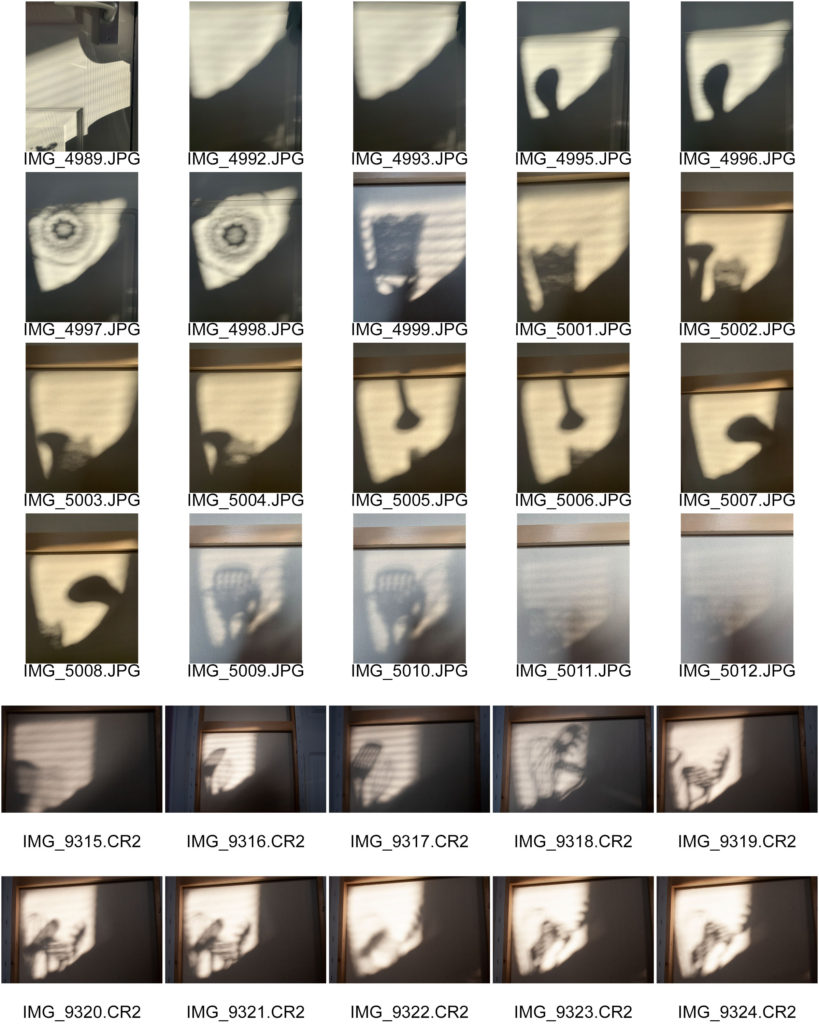
MY RESPONSE- contact sheets;

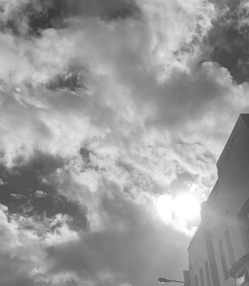
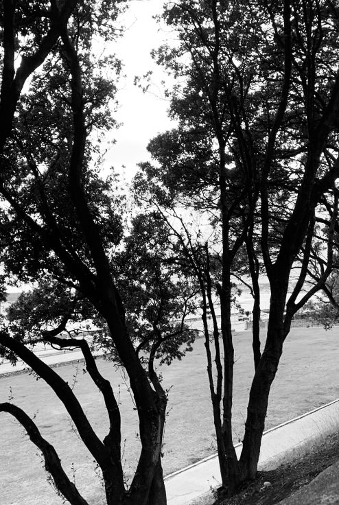
Plan- I went out during the day when the sky wasn’t all blue and clear but neither when it was so cloudy you couldn’t see the sun. I wanted to capture the sun peaking and shining through the clouds. I then went out closer to the beach because that’s where the sky is the most open without any tall buildings surrounding it and I photographed the trees near it. I took photos of them because I knew when I edit them on Photoshop they would turn out similar to Harry’s style and they were very symmetrical due to the way I photographed them.

Evaluation

I took photos of the sky during the day time as Alfred’s photos are taken in the daylight and not at night. If I was to take the photos at night you wouldn’t be able to see the clouds. I waited till the sky was filled with dull clouds and photographed them from a low angle to create the perspective of looking up. I waited till the sun came out too in order to capture it peaking and shining through the clouds in the way that Alfred does. I also took photos of the nature when I found repetitive sections of it, such as trees being behind each other in a repetitive order.

My favourite images in black and white and cropped

Overall I like how my photos turned out because I captured the sun coming through the clouds which creates a similar effect to Alfred and I think my photos turned out in a style similar to his. I also like how the second group of photos I took of the nature turned out because by turning them black and white , the background goes much lighter than the trees as they get completely darker and the shape of them becomes much more defined. The trees also turned out quite symmetrical and repetitive which makes it even more similar to Harry’s work.

Image Display

Selection Process

First I looked at all my abstract photos and decided one which ones were the best. I choose the ones that were the most colourful and used the rule of thirds as they tended to look better as it had more composition. For the other images I used other good images that I’ve taken to fill in the blanks.
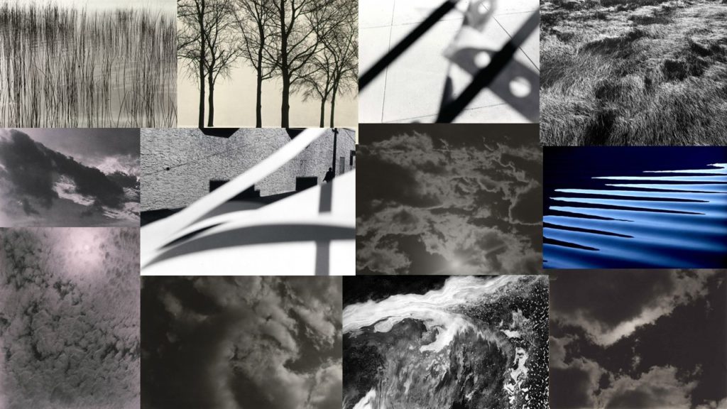
Editing

After, I edited them and boosted the saturation by about +10 to make it ‘pop’ and cropped it to line up with the rule of thirds, to make it more visually pleasing.

Displaying

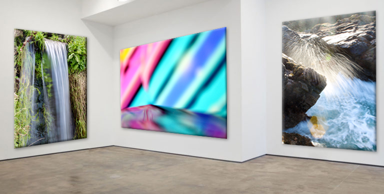
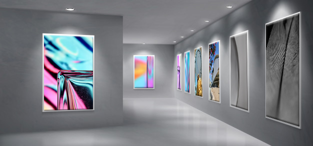
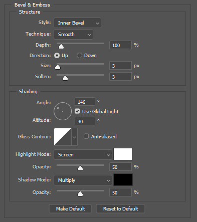
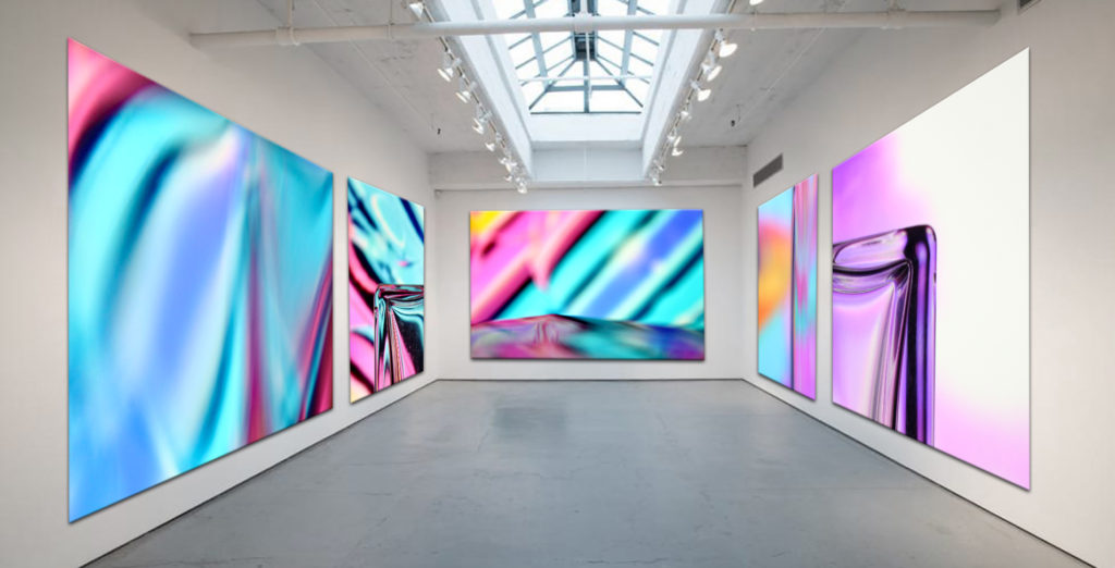
To Finalise the images I found 2 different art blank picture galleries on Google. I grouped my photos into two groups, portrait and landscape. The gallery with the large wall would be for landscape photos, and the other for portrait photos. I put my abstract photos into the galleries, I put the image onto the canvas in the gallery, where I wanted it to be, then in Free Transform mode I pressed CTRL and dragged on the corner of each edge of the image and moved it to the corresponding corner of canvas space in the gallery to match the perspective of the gallery and its 3D walls. After the image was properly on the canvas, I added Drop Shadow and angled it to the same as the direction in the base image. Then, I added bevels to the image to make it look 3D to make it realistic. To add the effects I right clicked the layer then went to blending options. As there were blank spaces in the gallery I put in other good photos that I’ve taken.

Evaluation

I really like how it turned out, as they look realistic and they all fit in naturally. The drop shadows and bevels really worked well. Overall, it was relatively simple but took a long time to added all the images in.
Only abstract photos.
REPETITION, PATTERN, RHYTHM REFLECTION AND SYMMETRY

Ray Metzker

WOWA
Ray Metzker– from ‘Pictus Interruptus‘ 1976-1980

This image has a shallow depth of field as it is very 2D as in the background there is not much going on and it is plain. The image creates a sense of layering as the objects’ shadow is blurry, due to the large aperture, this makes it clear that it is separate to the rest. The white balance in this image has created cool tones as the photo appears very white and grey.

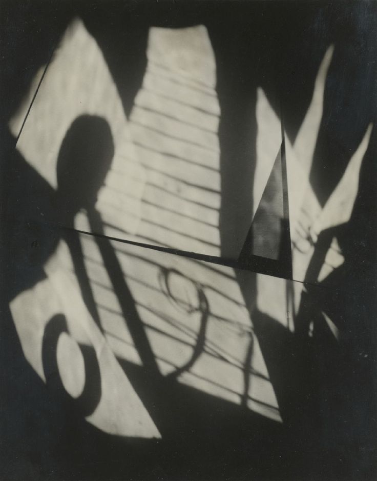
Jaromir Funke

In this image Funke has used a small aperture to create a slight vignette around the outer portions of the picture making the centre lighter. This creates a deep depth of field because it creates a ‘tunnel effect’ which makes the image look like it goes on further away and makes the centre of the image the viewpoint. The image is also sharp as the shadows are clear shapes. The white balance in this image has created warm tones as the white areas of the photo appear more cream with warmer tones.

Jaromir Funke – ARTPIL
Jaromir Funke-1929

Similarities

Both images have natural lighting coming from behind the camera intensively creating contrast between light and dark areas in the images. They are both black and white which creates a large tonal range as the light has made these with the different shadows. Both photographers have placed objects in front of the light to create a range of harsh and soft shadows with different abstract shapes. Both images show a slow shutter speed was used as the photo seems slightly underexposed.