looking and seeing

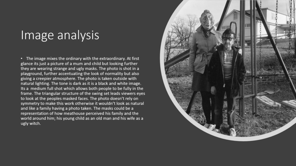
Ralph Eugene Meatyard

Ralph Eugene Meatyard Sets the Stage | UKNow
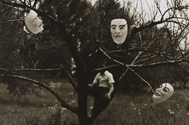
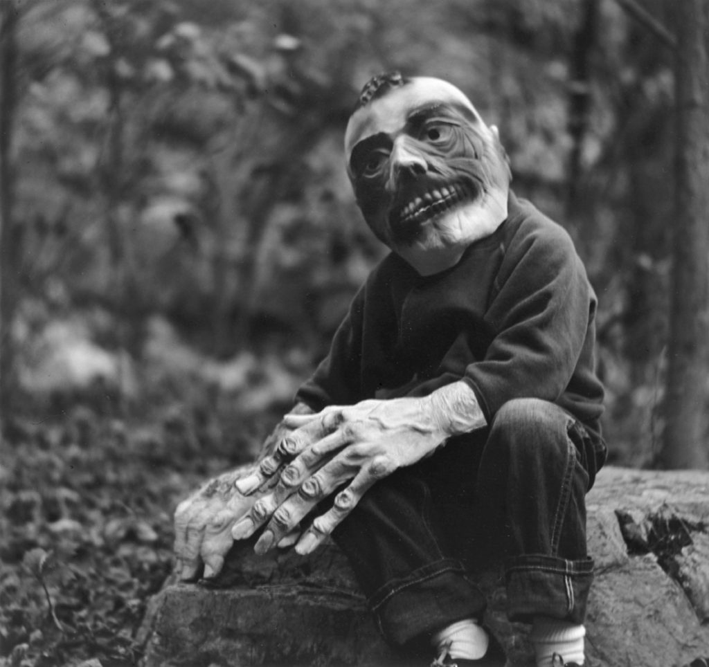
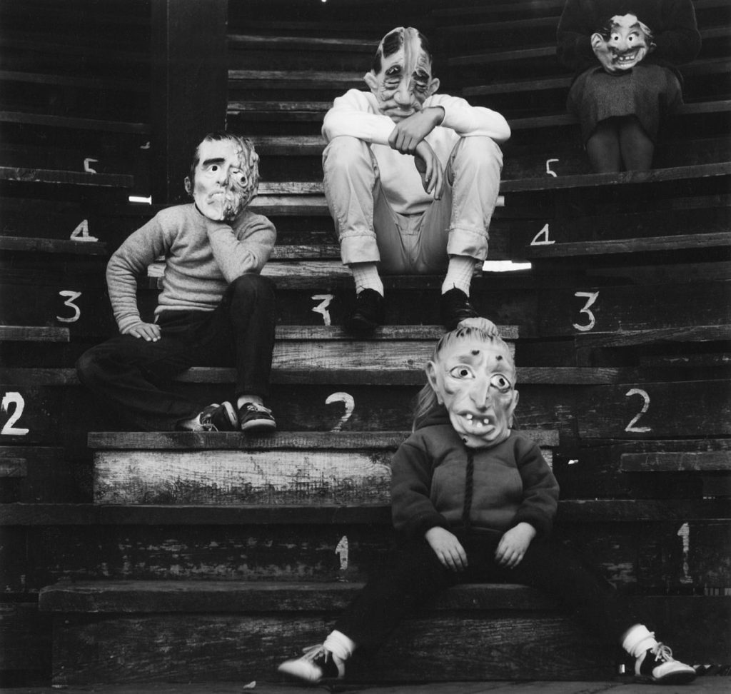
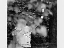
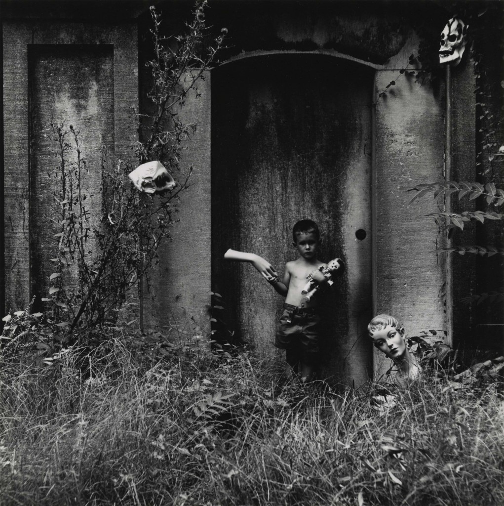
“Untitled” work from 1963 by Ralph Eugene Meatyard. Courtesy of Fraenkel Gallery.

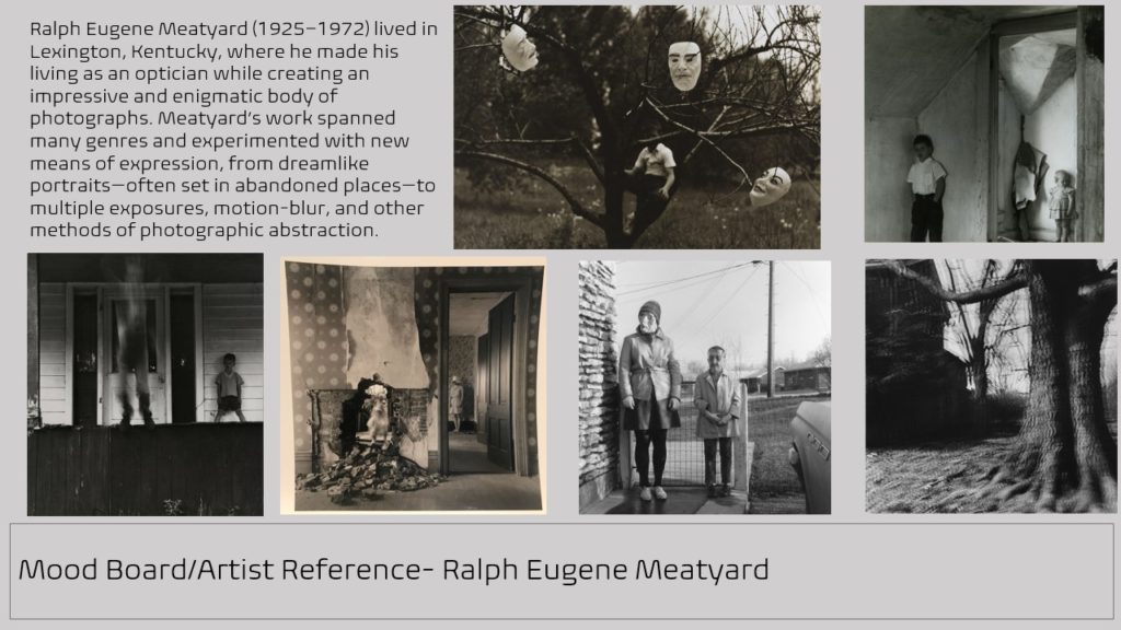
Ralph Eugene Meatyard (1925–1972) lived in Lexington, Kentucky, where he made his living as an optician while creating an impressive and enigmatic body of photographs. 

This photographer experiments with the focus on his work. In this image he focused his camera and most likely has used f.2 to focus on the masks and the branches on the trees. The background isn’t in focus and the boy sitting on the tree is slightly blurry. In this photo Ralph might have also changed the exposure as the masks and the boys shirt are much lighter than the tree which makes them stand out right away.

Uta Barth

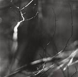
no title]', Uta Barth, 1995–7 | Tate
unknown

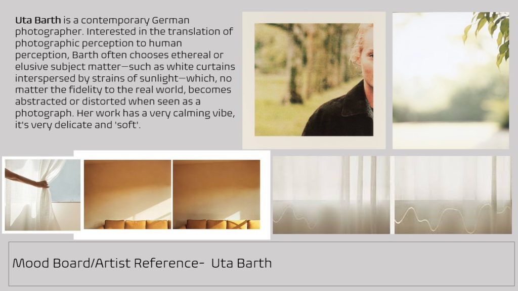
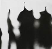
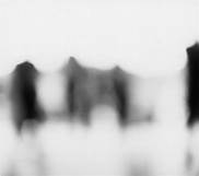
 She is interested in drawing attention to the viewer’s perception and separating the image from the thing depicted. Her images can appear quite abstract, partly through the use of deliberately blurred information. In this film she describes her interest in “light, perception and this visual acuity to the mundane, fleeting, ephemeral, everyday kind of information.”

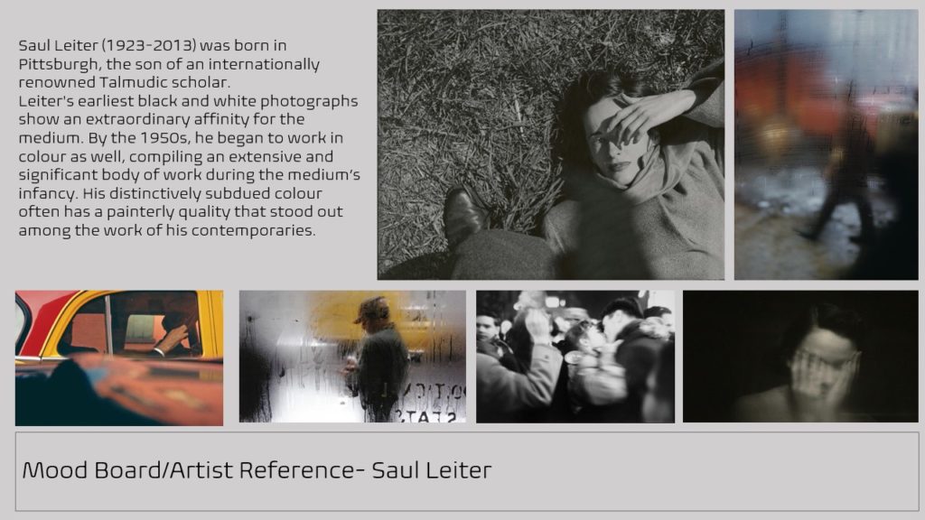
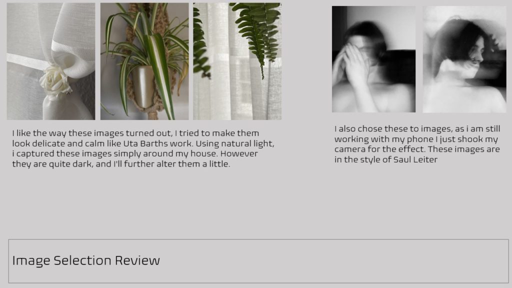
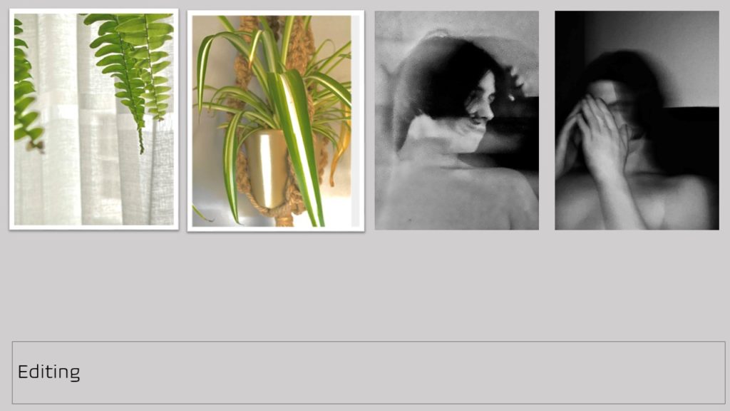
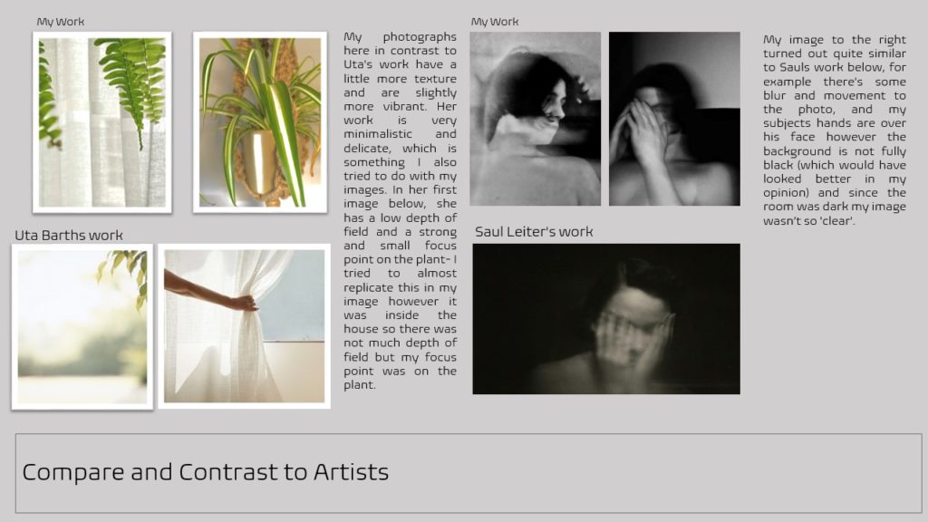
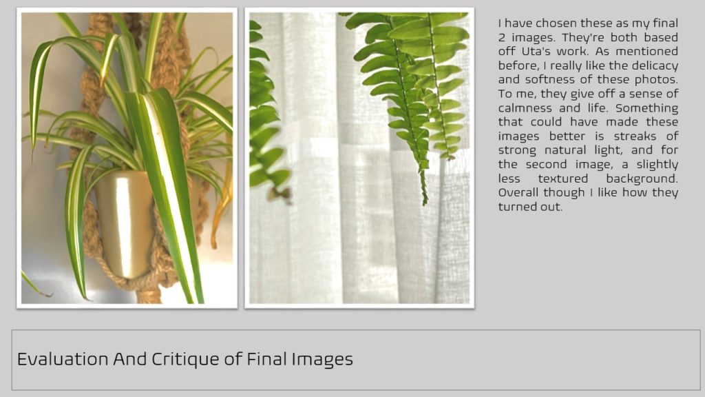
Regarded for her “empty” images that border on painterly abstraction, the artist carefully renders blurred backgrounds, cropped frames and the natural qualities of light to capture incidental and fleeting moments, those which exist almost exclusively within our periphery. Looking at her work I think she uses f.32 all her work is out of focus. For this image I think she used f.2 as the persons hand is in focus and the main first eye-catching aspect. Even though the background is blurred out you can still make out that it’s people walking across the road or street. This gives an abstract touch to the photo as it makes the viewer try to figure out what they’re looking at and what it may be.

Exploring different aperture settings 

Fundamentals of Photography – Photographing the world

When taking photos it’s important to explore and change the aperture settings. Changing the focus helps with capturing what you want to be the main focus of the image. For example, the lower your aperture is (from f/1.8 to f/5.6) the closest objects to you will be in focus or the main subject and they may appear much darker as little light is coming in very fast, whereas if your taking your photos with your aperture on a higher setting (from f/8 to f/32) everything will be in focus or sometimes the whole image may be slightly out of focus and completely white as the lens is letting much more light come in.

Changing your aperture creates different depth of fields and even any movement in your photos may cause a blur.  As aperture changes in size, it alters the overall amount of light that reaches your camera sensor and therefore the brightness of your image.

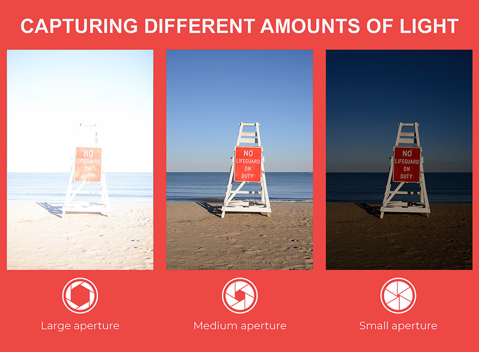
Here’s another example of how the aperture affects the light settings-
What is Aperture? Understanding Aperture in Photography

As you can see the smaller your aperture is the less light is captured through the lens making the photo much darker. The larger your aperture is the more light is captured which makes your photo very exposed to light and they appear very bright and almost white.

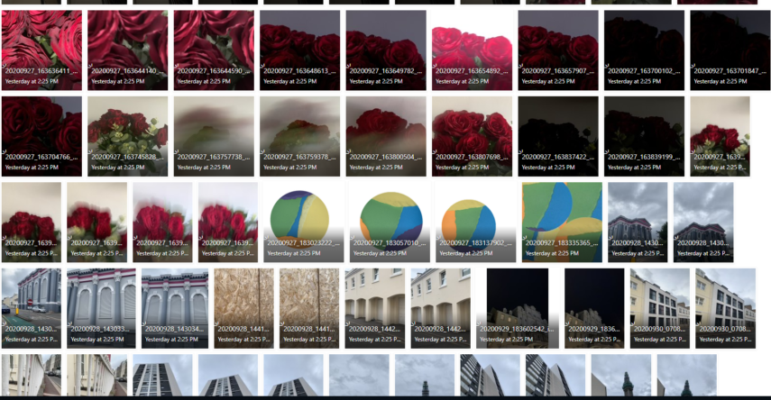
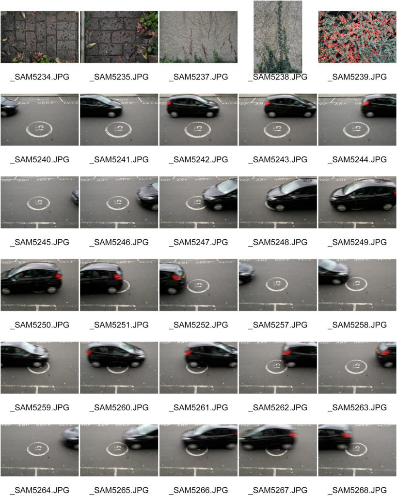
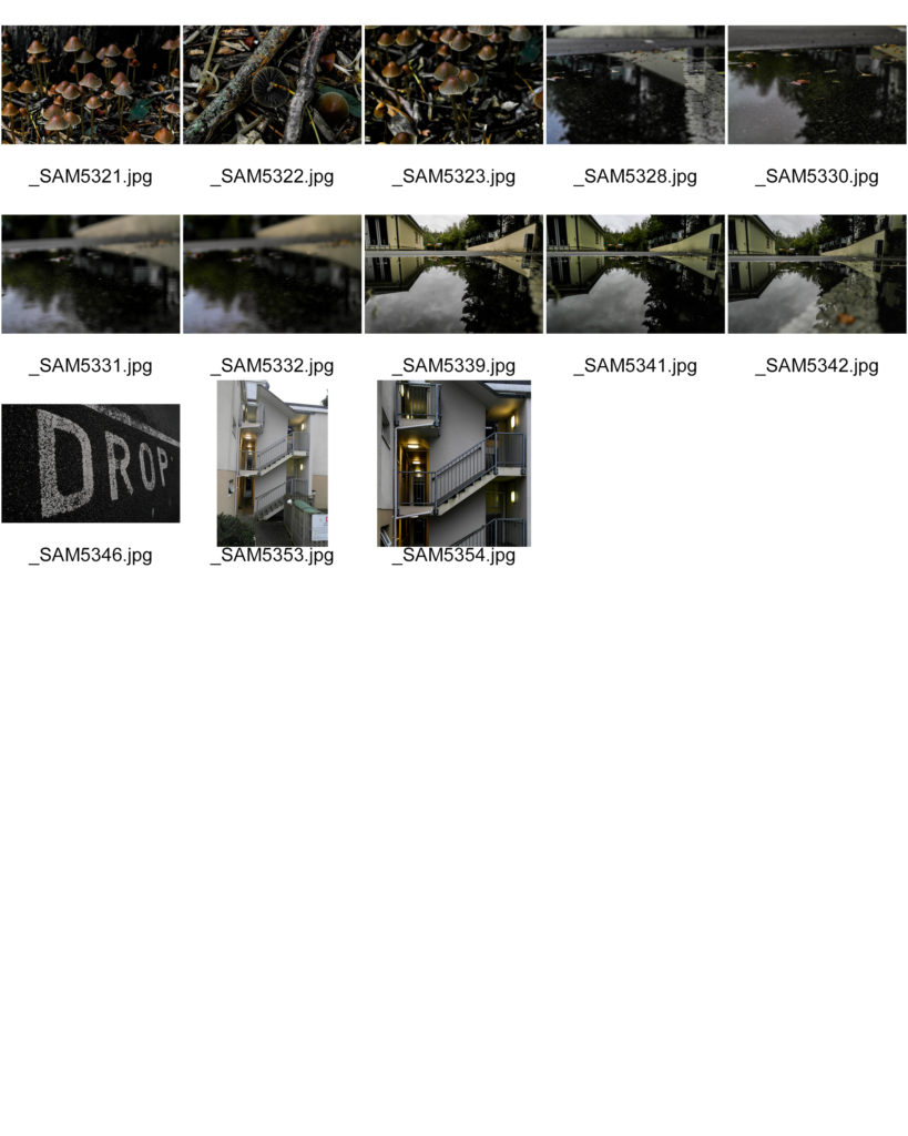
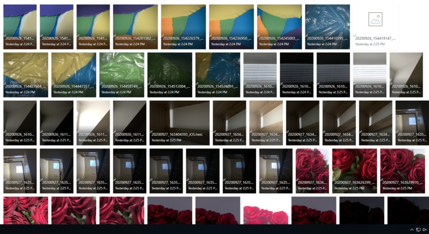
MY CONTACT SHEETS-
RESPONSE-

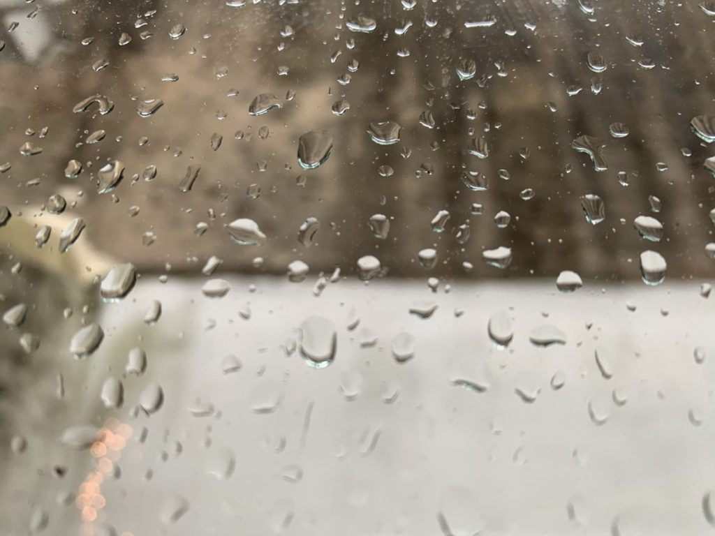
ADJUSTING FOCUS-
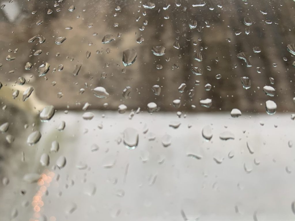
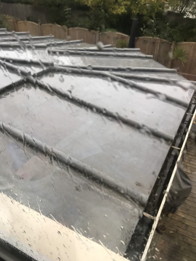
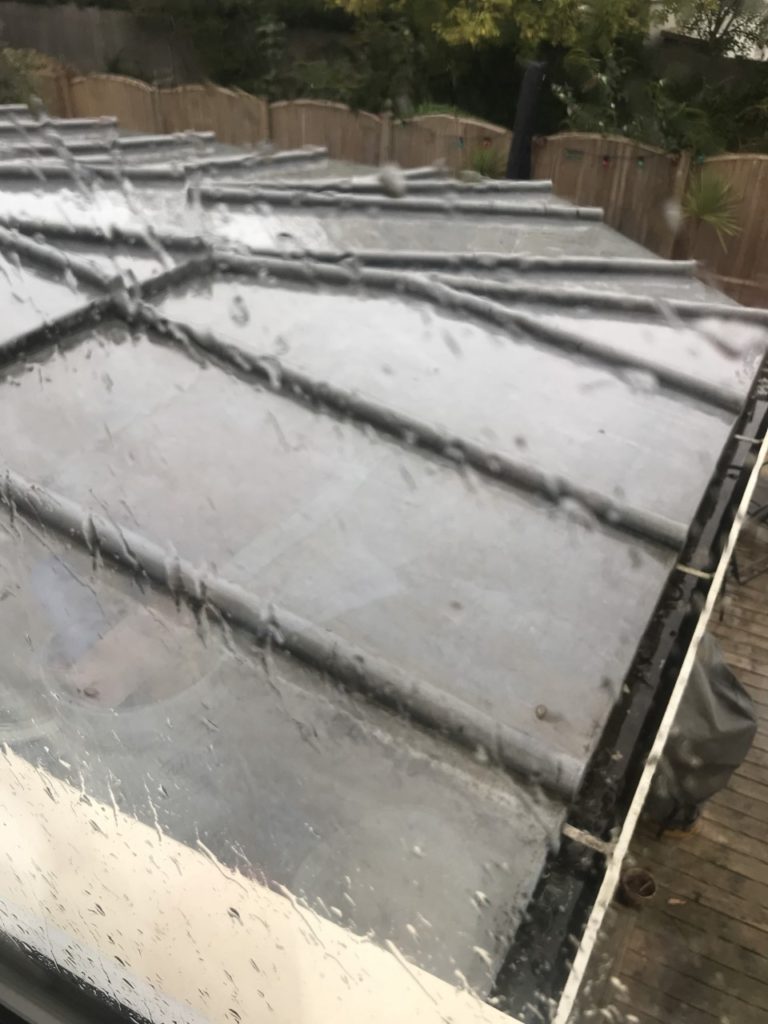
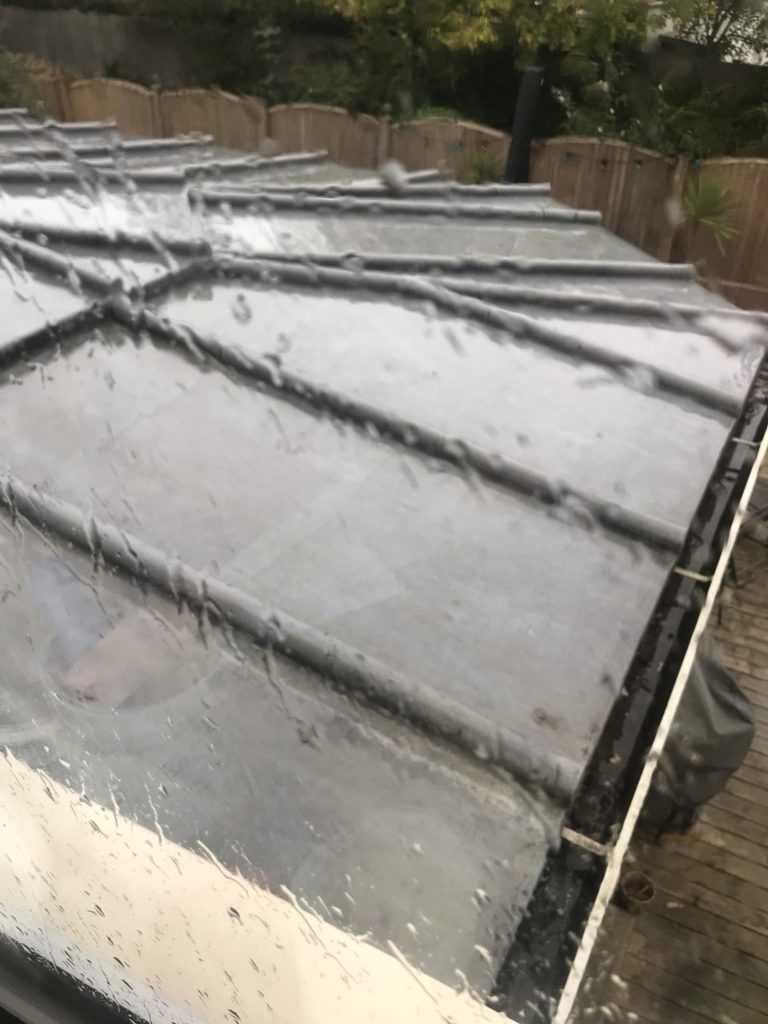
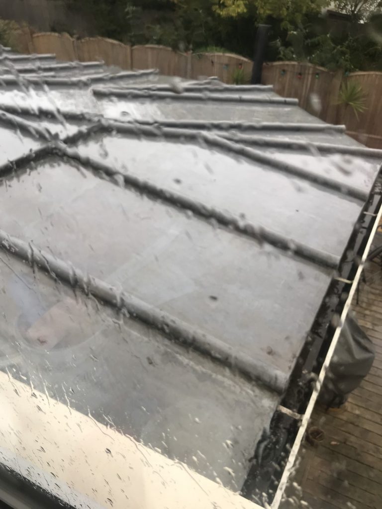
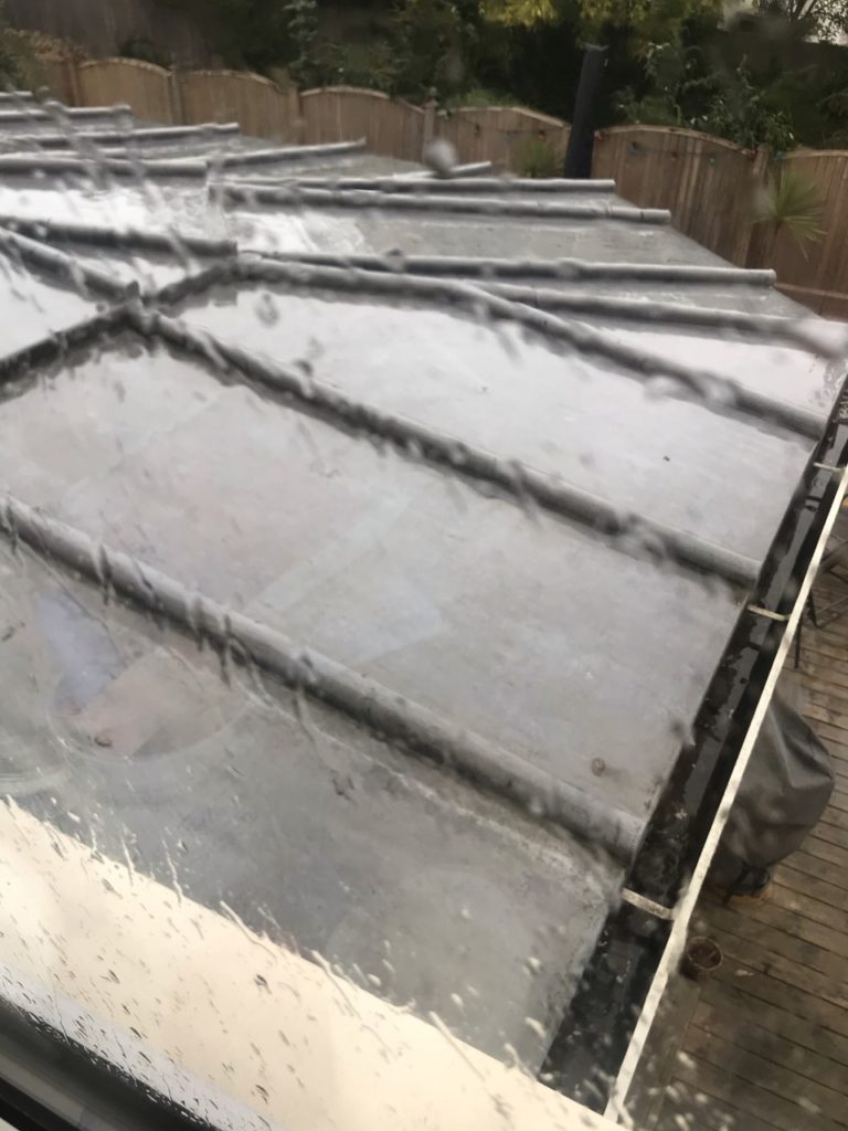
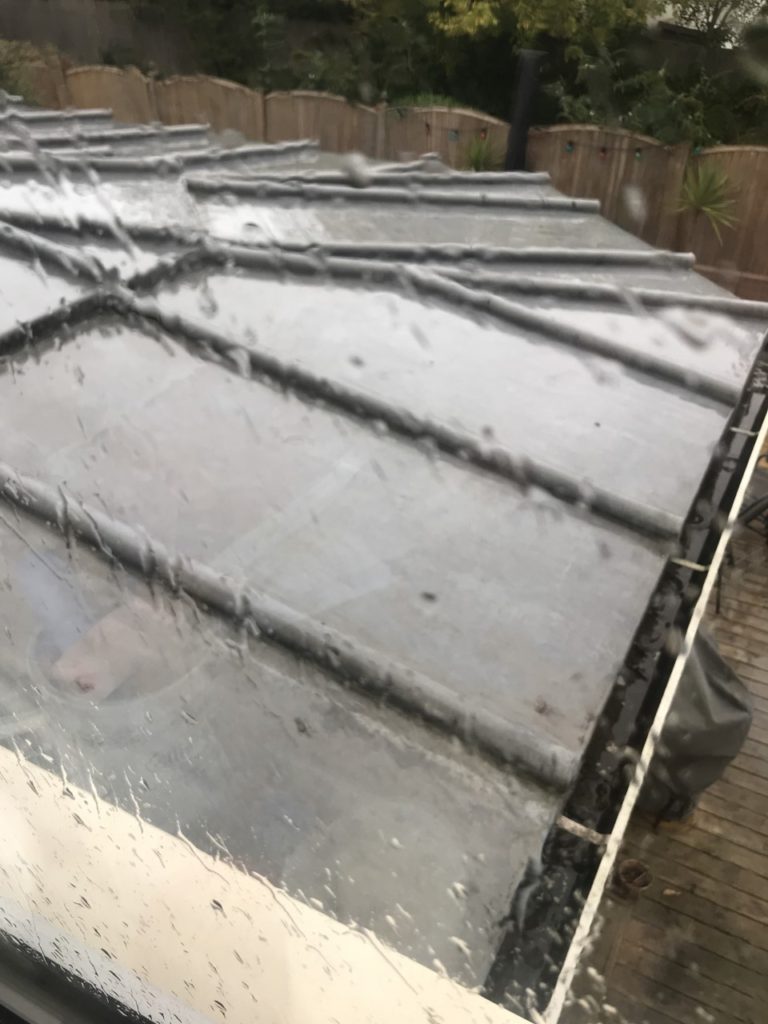
I focused the camera on the raindrops to make the background blurry and out of focus, I did this by using f/2.8 which concentrates on the closest thing/object to the lens.

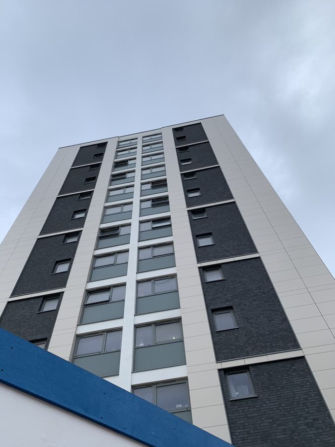
MINIMALISM- in different aperture
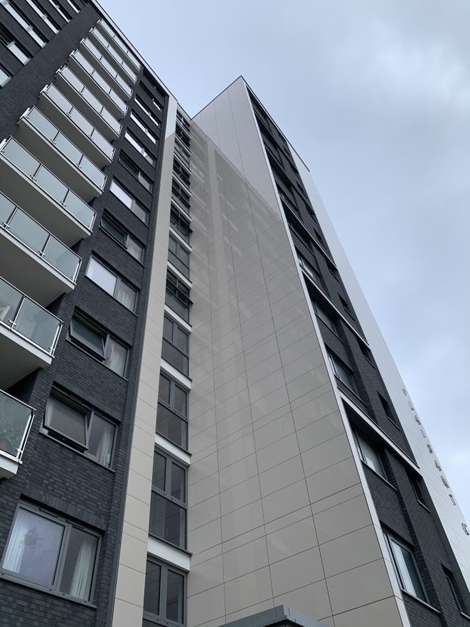
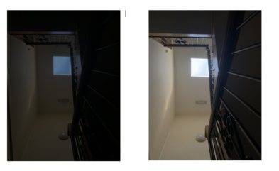
You can see the difference in the lighting of the photos when I changed the aperture settings and the two photos look completely different. I used a small aperture for the first photo and you can straight away see that the photo is much darker and you can see the sky more clearer as it’s bluer. I then used a larger aperture for the second photo and the photograph turned out much lighter and the sky turned out more white than blue as there was more light getting captured. I photographed this from a staircase looking completely upwards.

COLOUR AND CROPPING
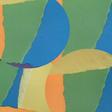
I ripped the different coloured paper into different shapes and then photographed them layered on top of each other as you can see in my contact sheets. I next cropped the image on photoshop into a circle and layered the four different images with each other to create a multicoloured abstract photograph.

APERTURE SETTINGS-

Process- I photographed a rose in different apertures to see how they would look like in different lighting and if the colour would be more enhanced or dull. As you can see when I used a smaller aperture the photo turned out almost black as very little light was coming through and being captured, you can slightly see small tones of red. Compared to when I used a larger aperture the photo was much more bright and the roses were very visible but slightly blurry as I used a slower shutter speed.
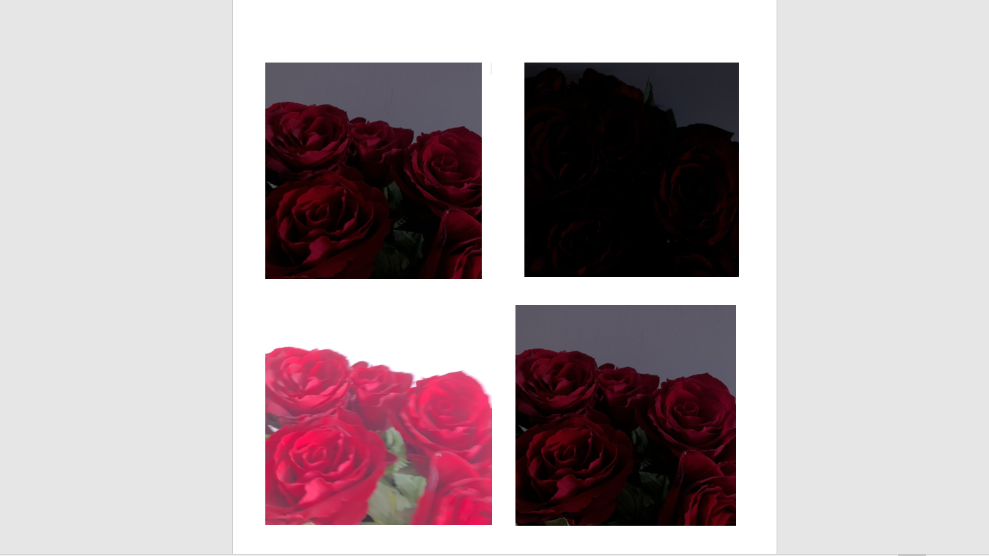
EVALUATION of my work- overall I wanted to explore a few different sectors of abstract photography to see what looks the best in various exposures. I used different aperture settings and found out that it can completely change how your photo looks.

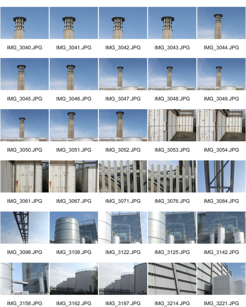
CONTACT SHEET

A contact sheet contains thumbnails of all images from a shoot. They are made to allow the photographer to view a mini – preview of all the film to determine their best photos that they want to print.

Contact sheets are useful because a photographer can quickly scan over a series of images to find their best ones saving them a lot of time. It is also helpful as a professional photographer can provide there clients with a contact sheet of there images and the client can pick their favourites.
MY CONTACT SHEET

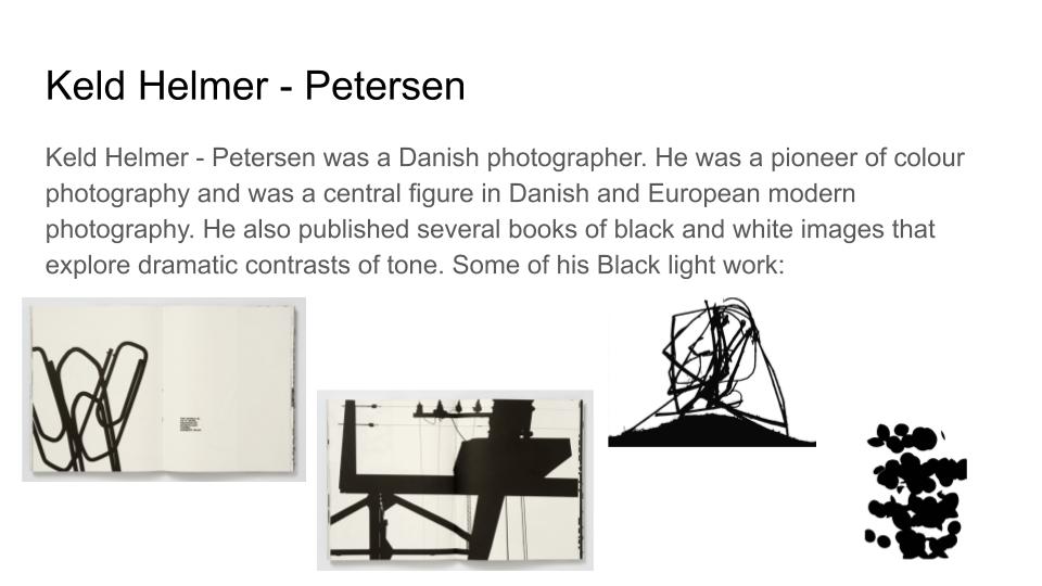
Keld helmer-petersen- Black light

Keld Helmer-Petersen was a Danish photographer who achieved widespread international recognition in the 1940’s and 1950’s for his abstract colour photographs. He is one of the most influential Danish photographers in the 20th century. His career spanned 70 years and he had strong interest in modern architecture, industrial areas and structures. His efforts have put a mark on photography as an artistic expression. With his keen eye for things that are generally overlooked, Keld Helmer-Peterson opened a door to the hidden beauty of a world we thought we knew so well.
High Contrast Images-Black lighting

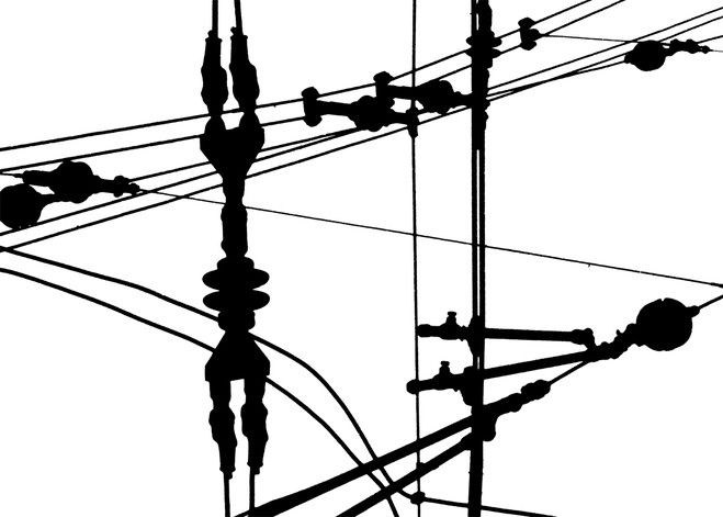
Keld Helmer-Petersen published several books of black and white images that explore dramatic contrasts of tone. In some, we are only presented with images that are black and white.  All mid tones have been removed. He created and found these images, using both cameras and flat bed scanners to achieve the effects he was looking for. These books are beautifully designed and encourage us to consider the space around the image and the accompanying text as integral to the meaning of the work.

Keld Helmer-Petersen’s Image

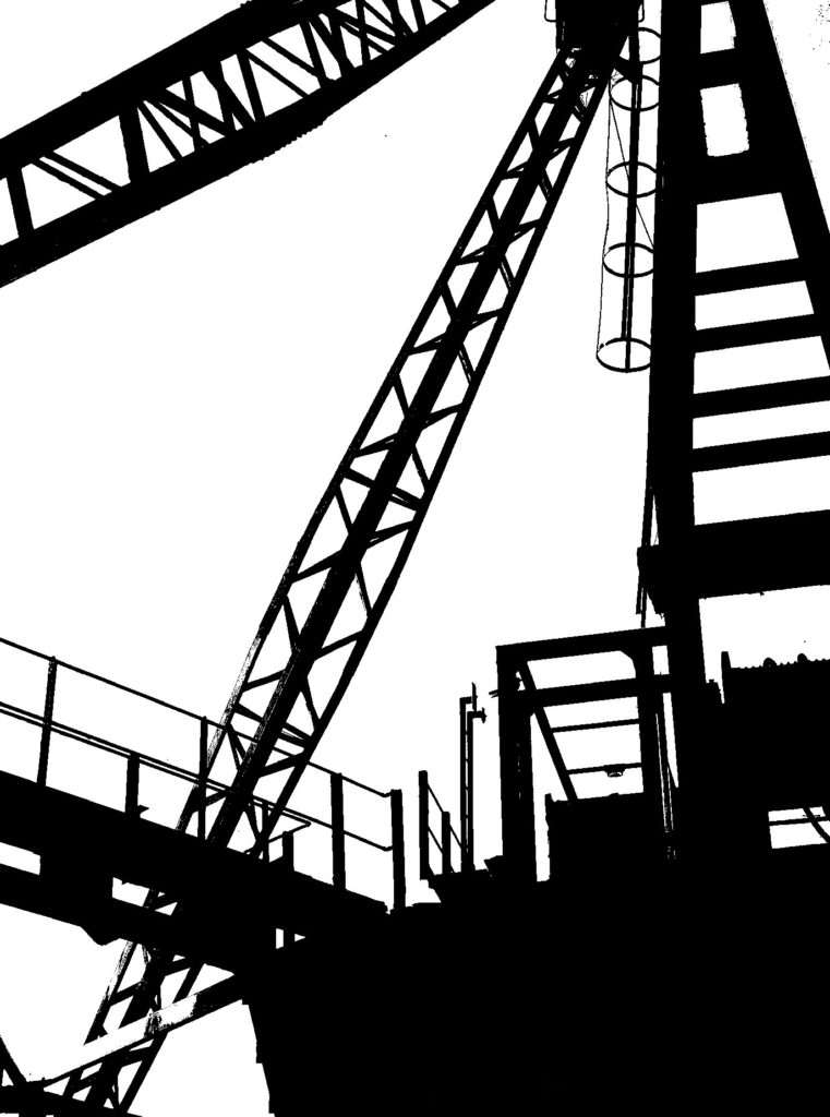
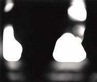
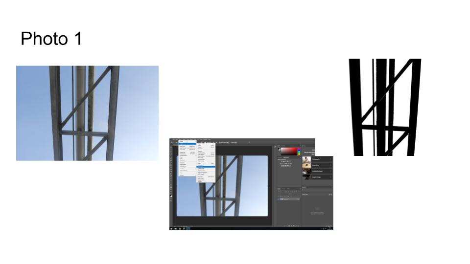
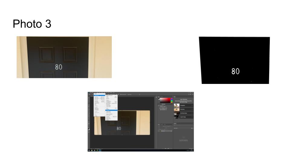
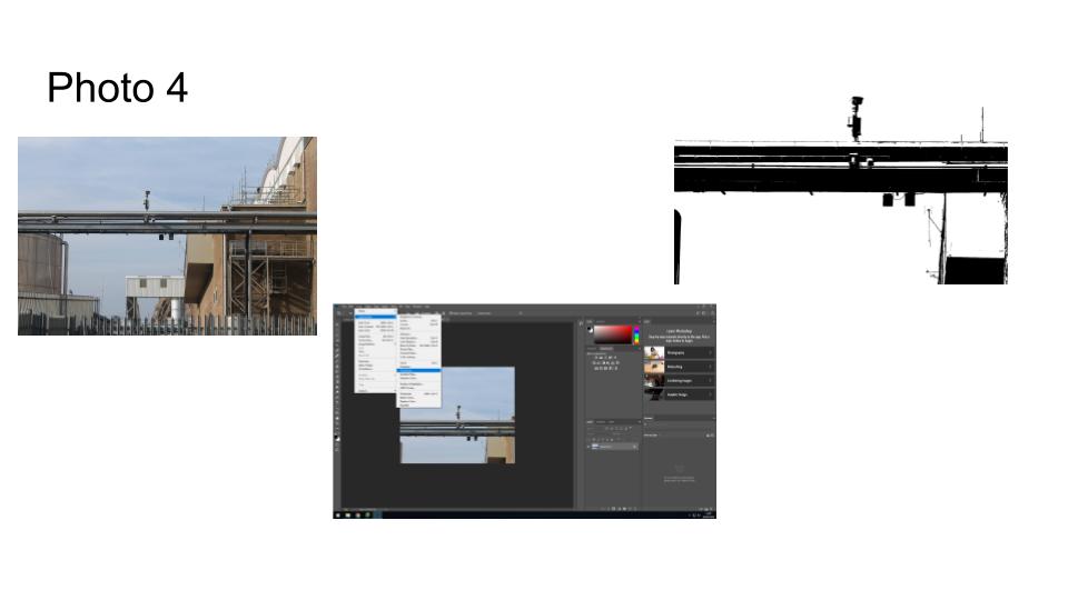
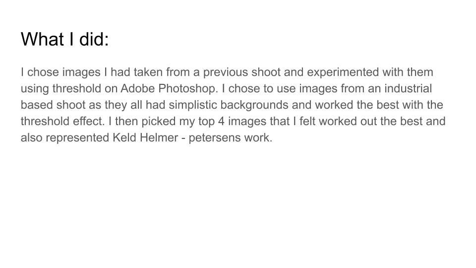
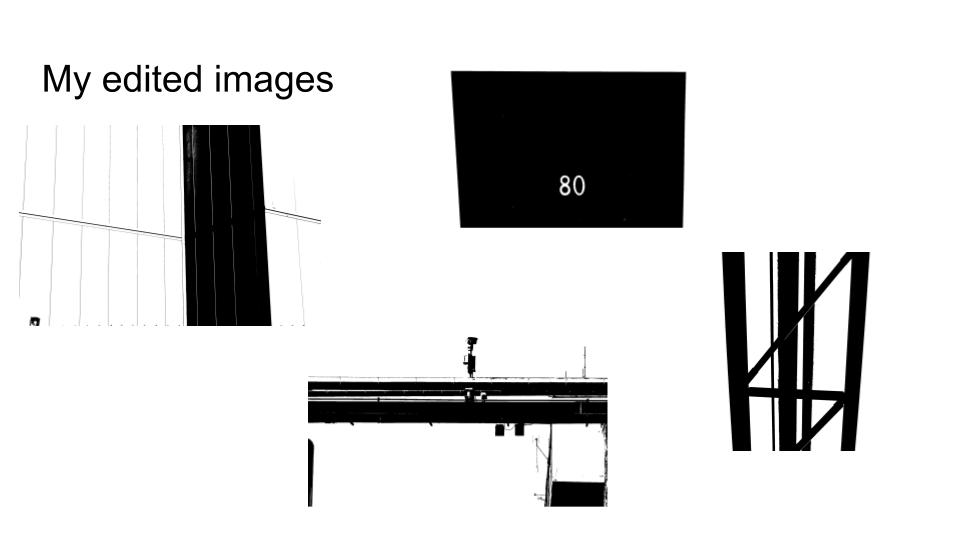
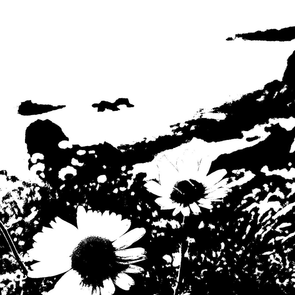
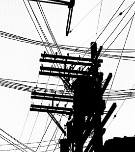
This image looks like it has been taken of an industrial area/structure. I took inspiration from this image to create my own images below. I took an image of an industrial structure and used the threshold tool on Photoshop to try and recreate the dramatic contrast in Keld Helmer-Petersens work.

My Images

Before and After

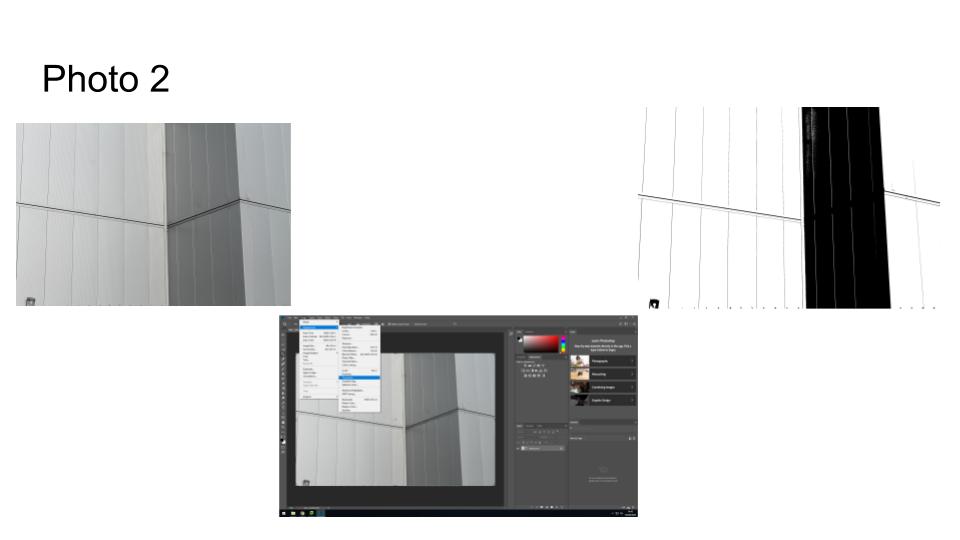
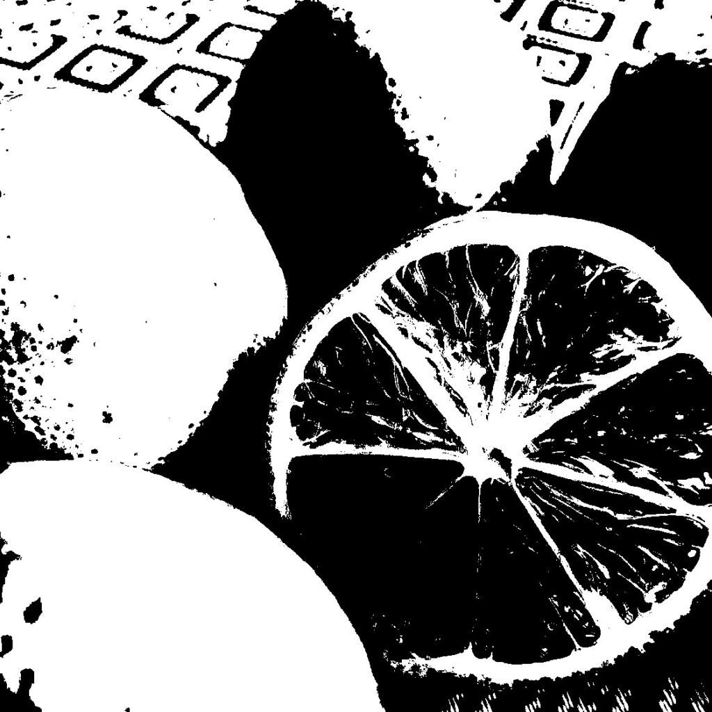
I created this black light effect image in response to Keld Helmer-Petersen by opening Photoshop going to image adjustments and changing the image to black and white and then adjusting the threshold to the level I wanted it at.

paper paper paper

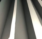
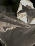
For this photo, i started by folding the paper and standing it up at a ‘zig-zag’ pattern. I used artificial lighting from a phone torch to take control over how the shadows fall over the ridges. This photo stands out to me as the clean folds in the paper enhances the shadows that i was attempting to emphasize.

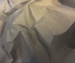
for this photo, I crumpled up a piece of paper, I used artificial lighting from the overhead lights in the class room, this made it harder to use the lighting to compliment the creases so once I put it into photo shop, I adjusted the light and dark tones to bring out the creases that were harder to determine in the original photo.

In this photo, I layered a paper plane over the same crumbled paper, I did this to make the photo more complex and interesting, I used a phone touch as a light source to help differentiate the two papers through directing it into the space between.

looking and seeing

Ralph Eugene Meatyard

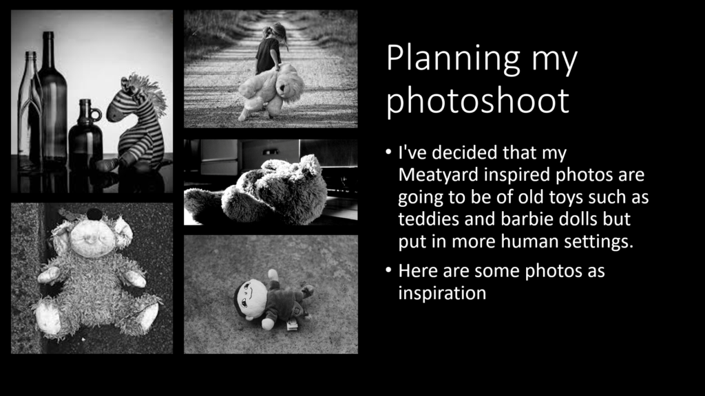
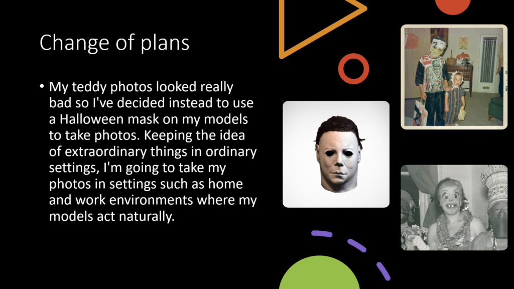
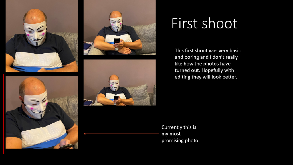
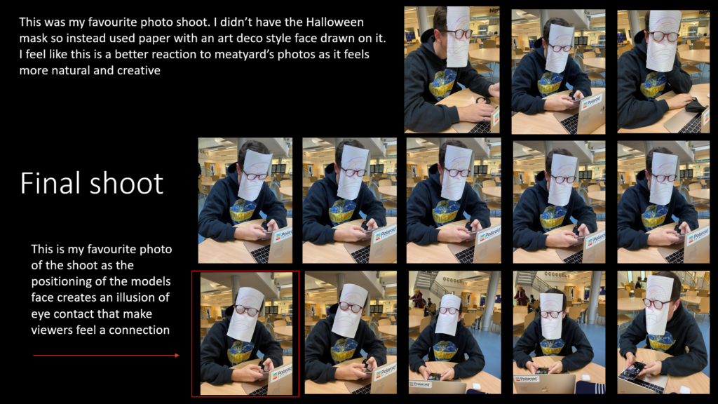
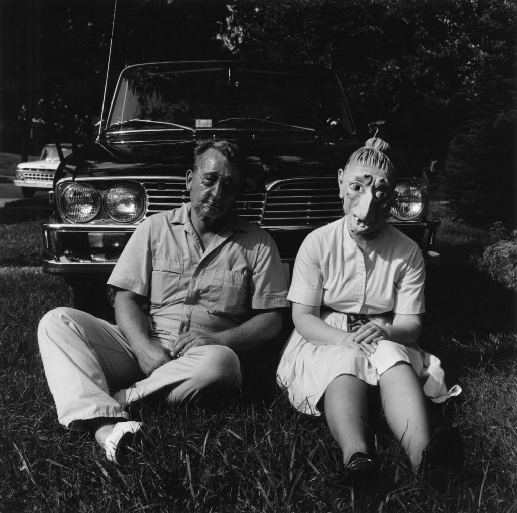
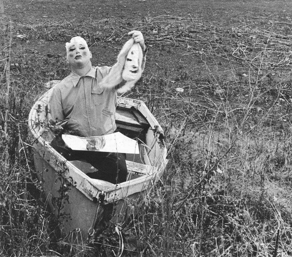
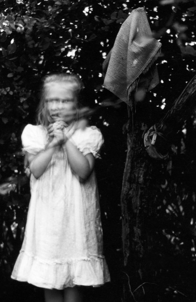
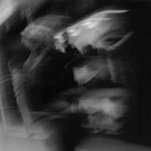
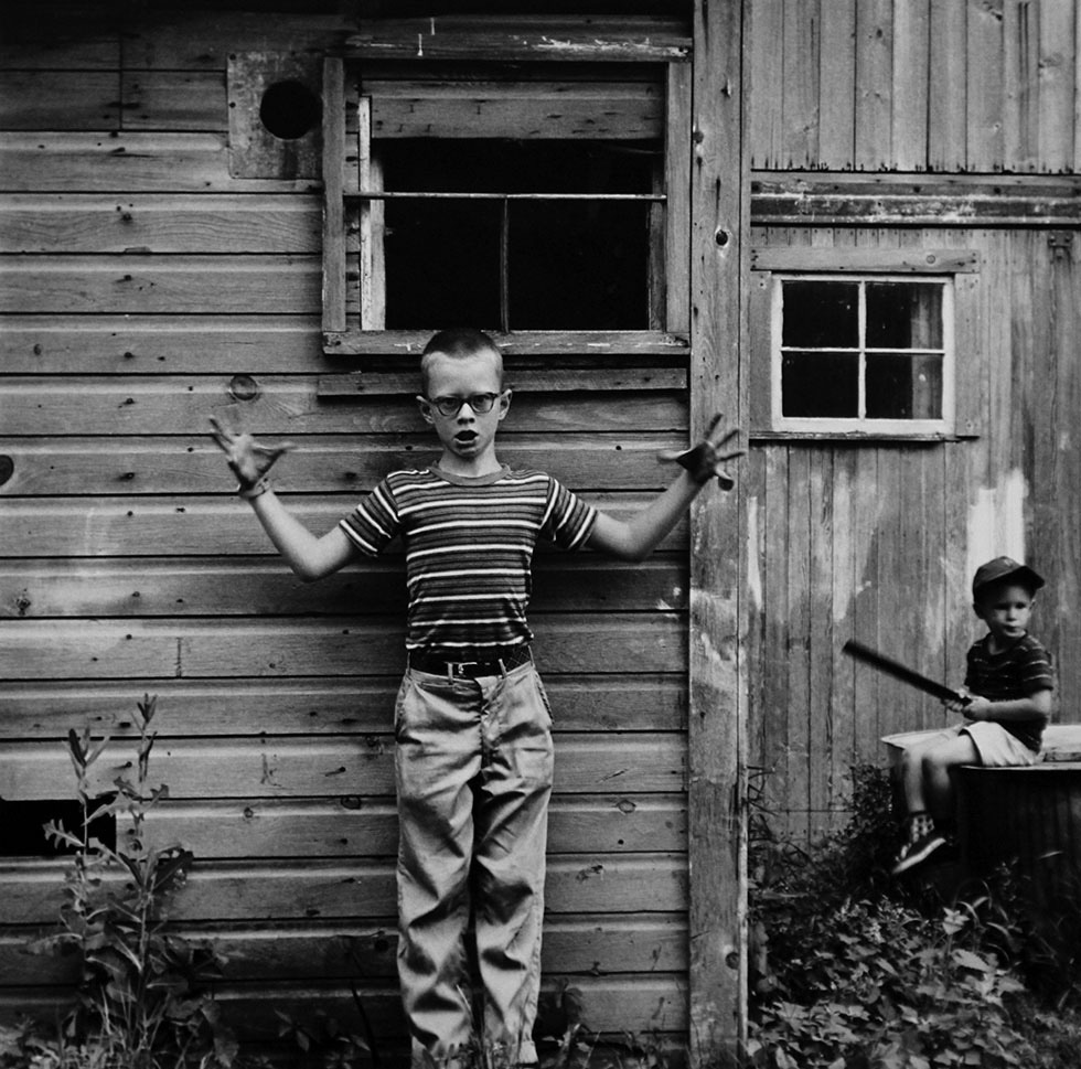
Ralph Eugene Meatyard was an American Photographer who lived during the mid 20th century. He experimented with many forms of photography by using different exposures and motion blur. In his work Meatyard captures dark and eerie scenes using people in frightening ways.

Focus

Response

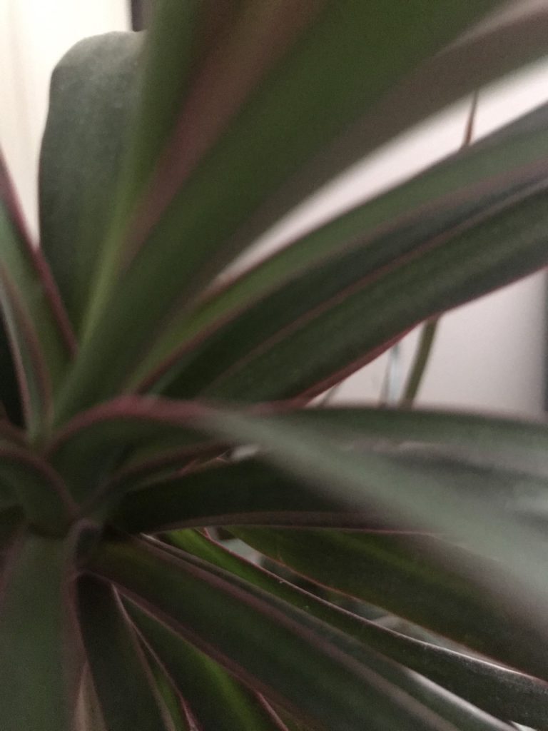
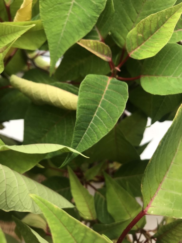
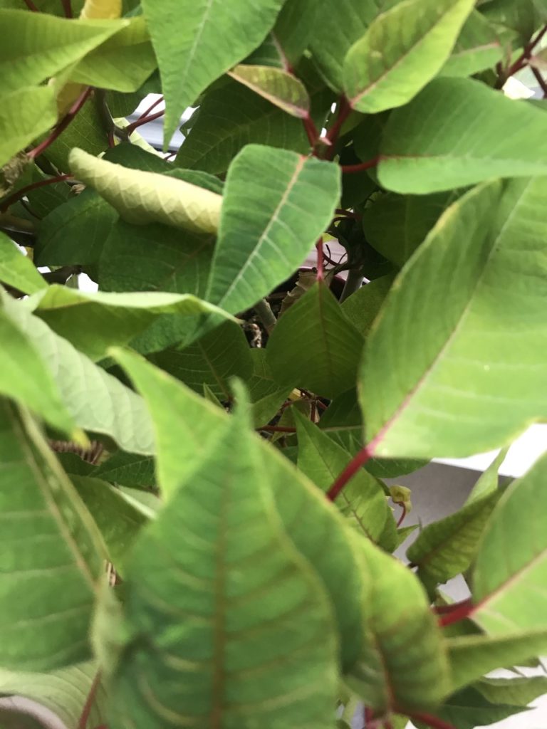
In my photographs i tried to focus in on certain parts of what i was photographing. I did this to try create the same effect that Meatyard crated in his work.

BLACK LIGHT

Keld Helmer-Petersen

Keld Helmer-Petersen was born on August 23, 1920 in Copenhagen, Denmark. Keld Helmer-Peterseis studied at the Institute of Design in Chicago . He received a Leica camera as a present thanks to this he started taking  photographs.
He prefers to take pictures of industrial areas, cityscapes and nature. He is known for his abstract colour photographs but he also likes working with black and white images.

My images :

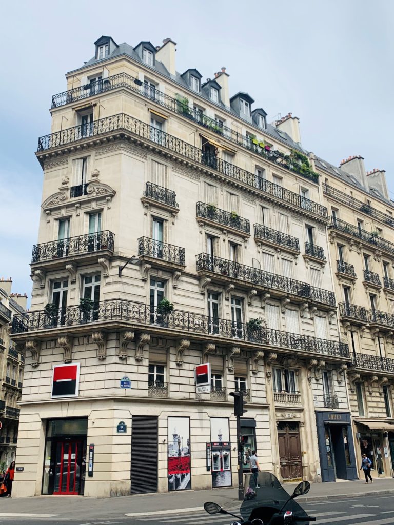
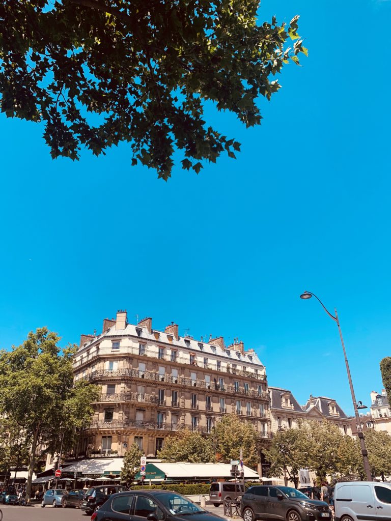
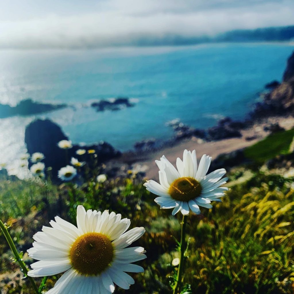
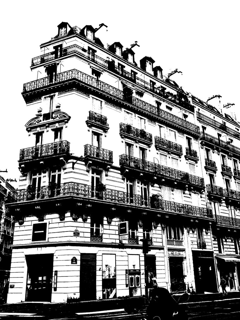
I decided to choose old images of Paris and things we can see
in our daily life that i had on my gallery . I think that they will be interesting with black lights .

with BLACK LIGHTS

We can notice that the pictures of paris looks they are drawn which indeed creates a cool effect. The black lights are embedded in the details we can see it very well in the lemons.

Surface and Colour

Photographer inspiration

Raw Images

Selected Edited Images

Favorite Images

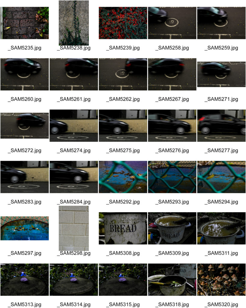
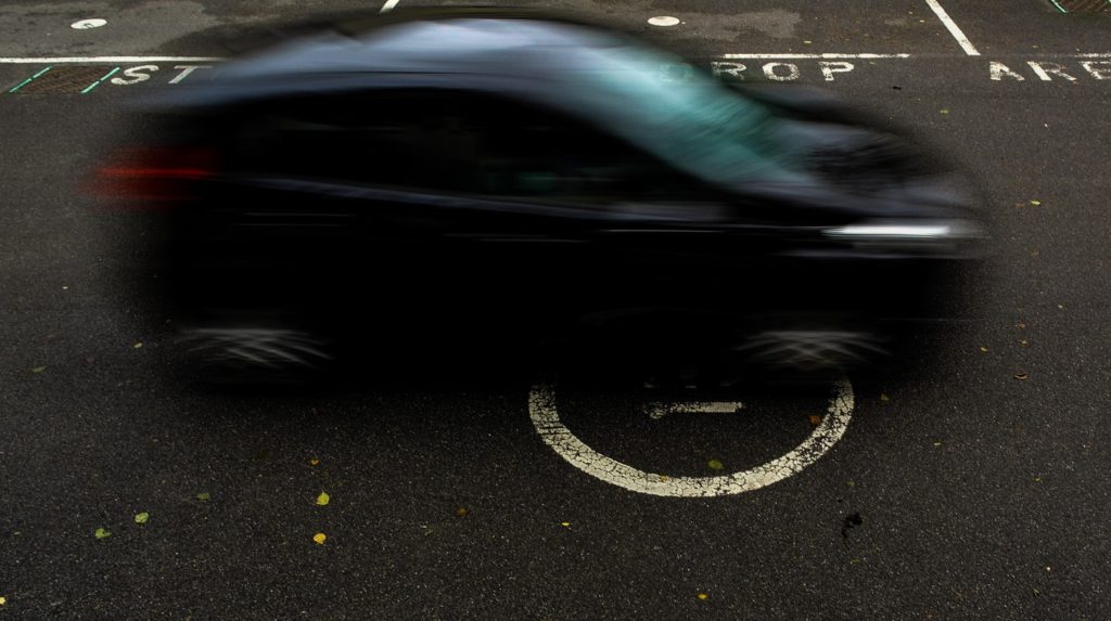
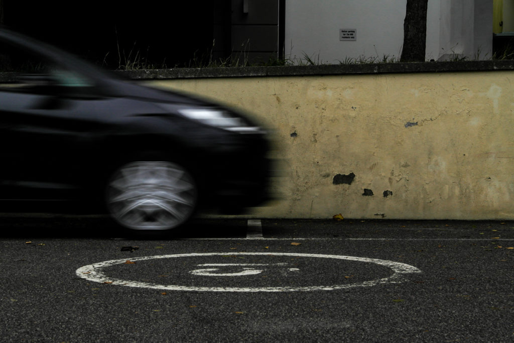
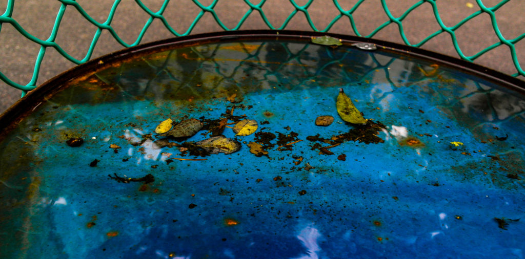
These final images best show the exploration of surface and colour throughout my photo shoots.

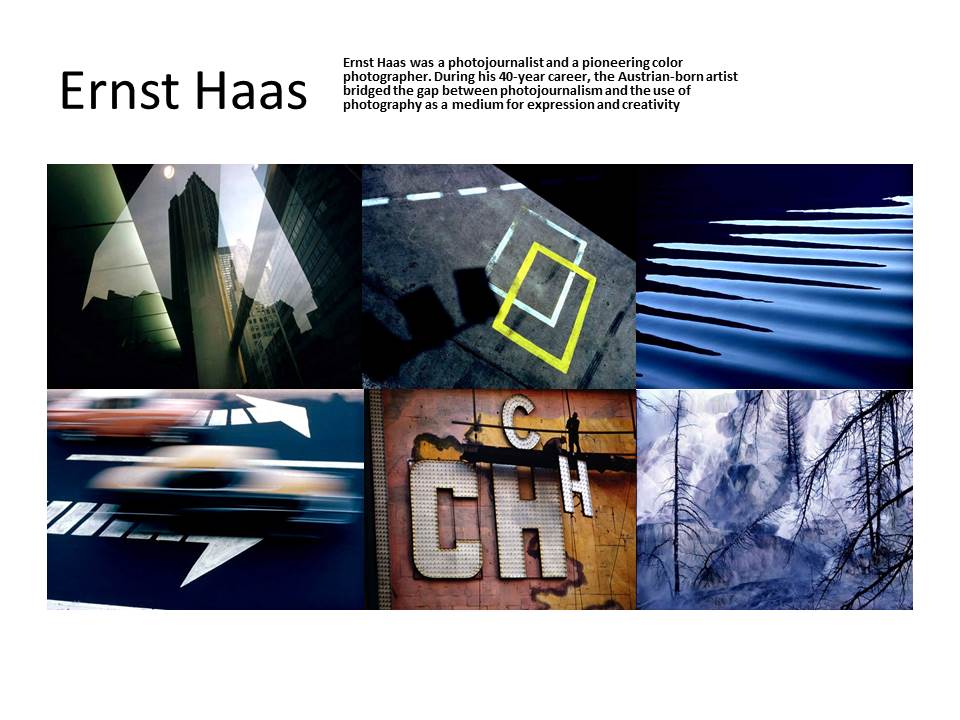
The first two images of cars directly respond to Ernst Haas’s photograph of moving cars with a slow shutter speed.

The next image responds to Ernst’s water photography, while showing vibrant colours under the surface of the water. I used Adobe light room to enhance the contrast and saturation of the image to bring out the bright colours of the barrel and the leaves in the water.

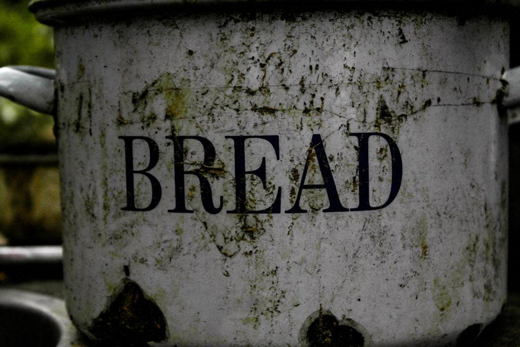
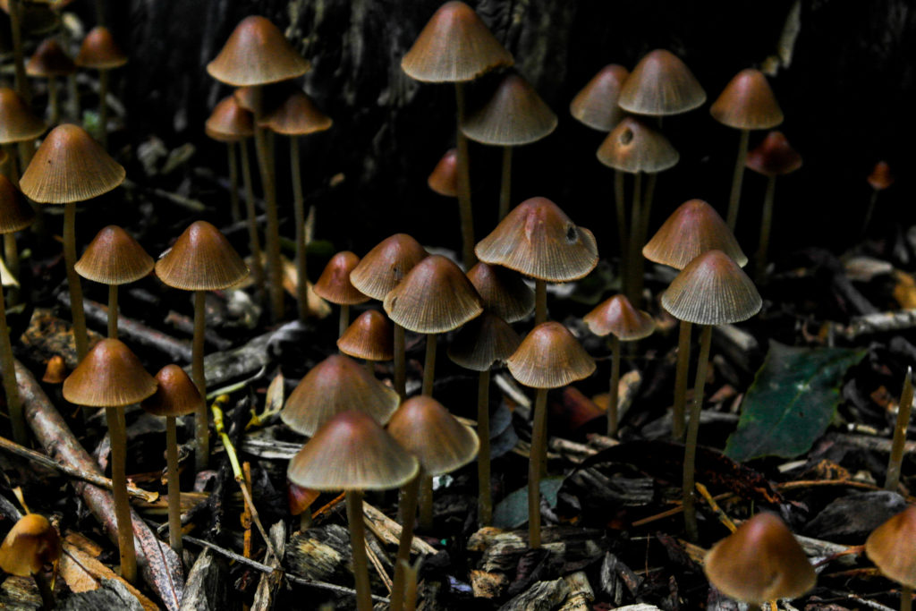
The remaining two images show examples of varying surfaces and textures in photographs, along with the contrast between the bright brown mushrooms and the dark, earthy background.