Jaroslav Rossler
Jaroslav Rossler was born in Czechia, in 1902. A great example of photography in the eyes of “The Formal Elements” is Rossler’s work as he finds the beauty in the simplicity of objects. At 21 years old he started his journey in photography. Creating typographic layout for magazines was a big part of his career. Jaroslav Rossler’s work was heavily influenced by futurism and cubism, this lead him into creating his art of abstract photography.

My Inspiration from Jaroslav Rossler
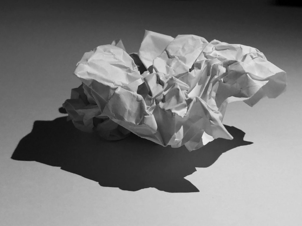
I took inspiration from Rossler’s work to approach the theme of “The Formal Elements”. I did this by taking a photoshoot of different pieces of paper at different angles and backgrounds to capture the sharp crisp edges of the paper as well as the contrasting deep shadows.
(these are found in my “Paper paper paper” blog)
My Best Photo Out of the Photoshoot Before And After Photoshop


Using The Formal Elements To Analyse My Work
Light – The lighting in this image is artificial by our phone torches whilst the rest of the room is blacked out to create the best shadow effect. The light falls from the top right of the image onto the crinkles of the paper and the background. The lighting is also quite harsh on most of the image as we can see the contrast between the deep under shadow and the highlights of the paper ball.
Line – The lines created by the creases/folds and crinkles in the ball of paper are all very thin and most are straight. Curves and thick lines do occur in the bigger folds in the paper ball. The outlining of the main under shadow of the paper ball is directed to the left indicating that the lighting is coming from the top right hand corner of the image.
Repetition – There is no repetition found in this image
Shape – The only main shape that can be seen straight away is the bottom shadow as it is outlined and one colour, black.
Space – Simple but effective with a wide background and a solid foreground. Quite empty and pain space without the paper ball being there.
Texture – This paper ball is a rough surface to feel and look at with the edges being sharp and pointy.
Value/Tone – The tonal range from light to dark is strong in depth in nearly every part of the image. The most effective contrasting light to dark area of the image is where the under shadow is. The lightest area of the image would be the tips of the paper where the light hits first as well as the bottom of the image where no shadow is formed. The image has a monochrome appearance where the light and dark balance each other out due to the contrast between the shadows.
Colour – In the image we can see that it has been changed to pure black and white. The balance between the colours black and white is even.
Composition – The focal point of the image is the paper and it ignores the rule of thirds as the paper ball is central.
