
When selecting my final photos, i segregated my black and white photos from my colour ones. I did this as i thought that grouping the different colour scales were more appropriate to display them as they shared a reoccurring tone.
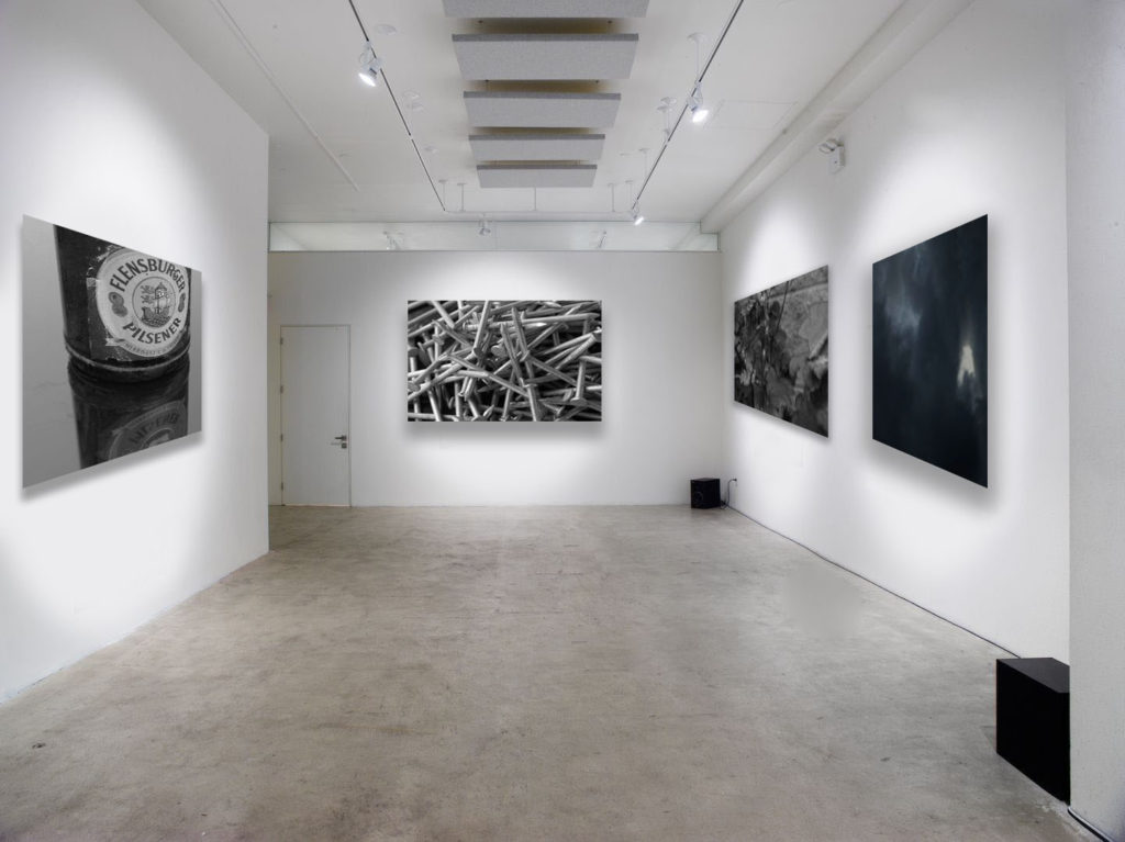
Displayed in my black and white gallery are two of my final photos from my ‘The World Is Beautiful’ project. i selected these two as i feel that they strongly capture the essence this movement was working towards, making overlooked objects look fascinating and beautiful. I paired these photos with one from ‘Looking And Seeing’ and ‘Repetition, Pattern, Rhythm, Reflection And Symmetry’ which both capture natural objects and occurrences. Grouping these four images together emphasises that both man-made and natural objects are fascinating.
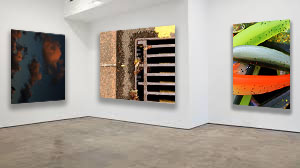
When choosing my colour photos, i gathered what i felt were the sharpest and most vibrant photos. Even though the photo of clouds isn’t vibrant, I felt like is showed a good representation that there are a wider range of coloured images then just vibrant and bold colours.
One main aspect I focused on while displaying my colour gallery was the plain gallery to use as the background. To me, this was key as the selected photos are vibrant and dominant photos, so placing them close together will clash the colours and tones. I used this leveled gallery display to isolate the photos, meaning that they’re least likely to clash as they aren’t as close together.
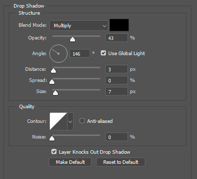
When uploading and displaying my photos, i used the distance, spread and size bars shown above. These bars adjust the drop shadow around the photos, making the final gallery more realistic and 3D. This makes it easier to imagine what my photos would actually look like in an art gallery.