Saul Leiter
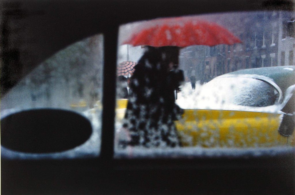
Saul Leiter (1923-2013) was an American photographer who focussed on street photography and abstract expressionism. He started out as a painter so was heavily influenced by colour, shape and using his camera to create his abstract vision of reality. Leiter was well-known for his black and white work, however in around the 1990’s his personal colour photography was discovered, it still has an impact and inspires people today.
Leiter’s work holds lots of warm saturated colours which usually come from the artificial light of cars and shop windows. Additionally, he uses a range of focal lengths to show depth in his images. I really like his style of photography and the way he captures vibrant images in low light situations, it suggests he uses a high ISO so his lens is more sensitive to light. Furthermore, Leiter’s work differs in texture in each image, for example the image in the top right holds a sharp texture as the focal point is on the rain in the foreground. However, if we look at the bottom left image Leiter has created a softer texture by blurring the photograph, possibly using a shorter aperture.
Photo shoot Plan
Who – For one of my shoots I plan on capturing images of my mum with an umbrella, taken through the car window.
What – I have an idea to photograph vivid colours from street lights, shop windows, a red umbrella and neon signs. Also, I wish to capture raindrops as the fall down my car window.
Where – For the location of my photo shoot I plan on driving around St Helier to photograph the streets of town at night. This will hopefully reflect Leiter’s street photography with the vibrant colours reflecting from shop windows and signs.
When – I plan to do this photo shoot on Monday 5th October once the sun has set. It is due to rain that evening which will allow me to capture the raindrops on my car windows and on the street pavements.
Why – The reason for my shoot is to experiment with ISO and White Balance to see how it effects the colour of images. My photographs will be inspired by Saul Leiter’s work, capturing rain on windows and people with vibrant umbrellas.
My Response – Contact Sheets
Edited Images
I edited these images on Photoshop and focused on enhancing the bold colours and high contrast. I used the ‘Vibrance’ tool to heighten the saturation of my images in order to reflect the work of Saul Leiter. Additionally, I experimented with the ‘Brightness/Contrast’ tool so I could explore different ways of drawing the observer’s attention towards my chosen focal point, using bright highlights and very dark shadows to catch their eye.
Final Images
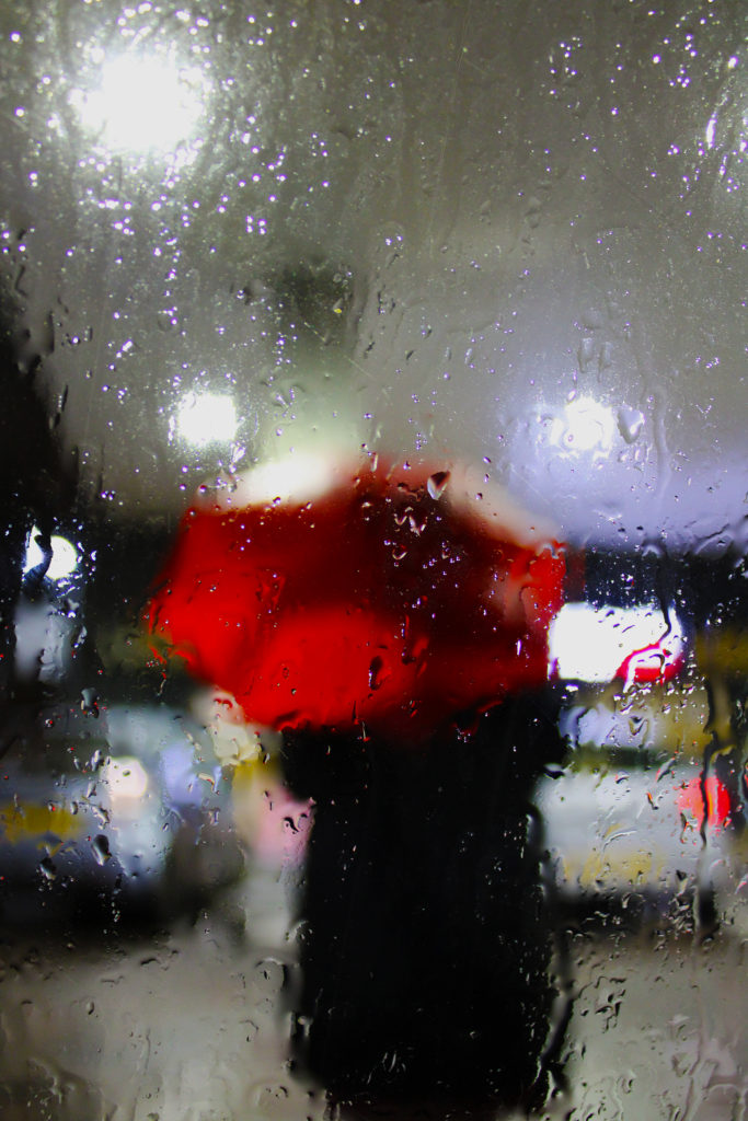
I have chosen these 5 final images as I believe their vivid colours complement each other well. Additionally, I really like the vibrant pink tones in the first image as I believe they provide a warm temperature to the image which reflects Leiter’s work. I enhanced this by increasing the saturation and contrast of the image to allow the bold fuchsia colours to stand out more against the black shadowed pavement. My first image also holds lots of artificial light from a neon shop sign. This bold lighting reflects off the puddles and creates an abstract composition with two beams of light forming leading lines down the image. Also, I like the way this image has an unbalanced rigid texture because of the irregular dips in the pavement. My second image reflects Leiter’s ‘Red Umbrella’ work. I really like the way the image has two obscure focal points, one being the clearly focused raindrops on the window, and the other being the bold red umbrella that is blurred in the centre. I used a shorter aperture to capture this image and have payed attention to the rule of thirds in my composition as the photo could be split into 3 separate sections.
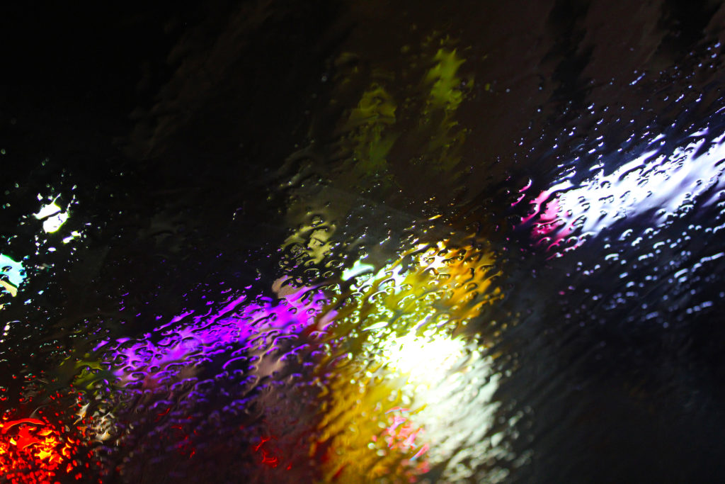
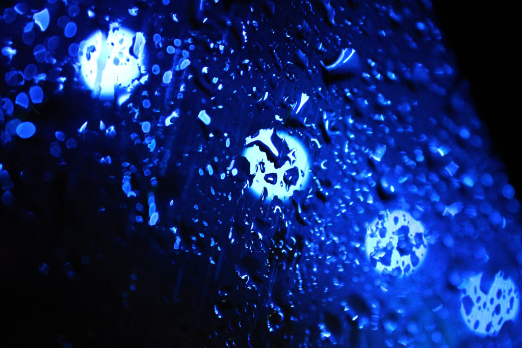
In my third and fourth images I have been inspired by Leiter’s work where he captures rain on windows. I experimented with the white balance of these images when taking them because the abstract artificial lights behind the rain made it easier to explore the different settings. The first ‘rain on window’ image has a clear focal point just below centre, which is created by the strong leading lines of water flowing down the glass. Furthermore, the warm orange and pink tones blurred behind the rain create a shallow depth of field. In the second image, the blue hues that dominate the photo produce a cold icy temperature which contrasts to Leiter’s warm cosy work. I wanted to create this contrast to experiment with different colour temperatures to see how they added or took away from my images. I really like the repetition in this image with the four fluorescent circles of light as I believe they contrast with the dark blue shadows in the image. These two images also seem have a bumpy uneven texture as the raindrops create strange 3D-like effect. I have chosen the fifth photo as one of my final images because of its obscure out of focus nature and the warm colours which are reminiscent of Leiter’s work. I really like the soft texture this image holds because of its blurred effect, I created this by switching my camera to manual focus in order to capture an unfocused photograph. I also think the clear focal point of the red umbrella draws the observer’s attention to the centre of the image, allowing them to take in every warm colour surrounding the subject.


