


In Photoshop I duplicated my photograph and layered it on top of the background photograph. I then changed the opacity of the image layered on top so both pictures could be seen.
This black and white photograph taken by Jaromir Funke, showcases a geometric image containing a sphere and cube object. Here Funke has used these objects to cause the light to be reflected creating sharp and interesting shadows. These shadows result in geometric and directional lines, that lead your eyes towards the focal point which I believe is the cube in the center. In addition, the texture of this piece appears to be quite smooth and delicate due to the simplicity of the shapes and materials used, and the layout.
Furthermore, I believe the lighting in this image is artificial and harsh, because of the large contrast between the shadows and the reflected light, which seems to have been positioned in order to create the geometric and sharp shadow lines. Also, I think that for this photo Funke used a small or medium aperture as everything in the image has almost the same amount of focus, for example the cube in the center is slightly more focused than the sphere. Moreover, the shutter speed used for the image appears to be fast, as it displays a sharp and clear photograph.
Here you can see Funke’s influence of pictorialism, an approach to photography that emphasizes the beauty of the subject matter, through his use of typically mundane objects and romanticising them. It can also be said that he does this in the style of an abstract and documentary photographer.
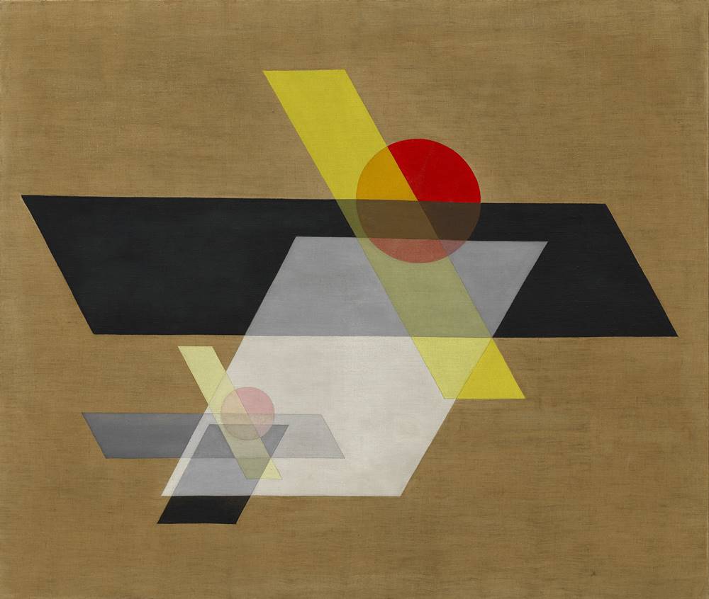
In this colour composition, by Laszlo Moholy Nagy displays geometric shapes in different colours and shades overlapping, on top of a brown background. These shapes create vertical and horizontal leading lines across the piece, drawing your eye towards the large, black parallelogram in the center, which is what I believe to be the focal point. You could describe this image as peaceful and organised, as opposed to cluttered due to the fact that Nagy has chosen to leave quite a bit of empty space around the sides of the composition. Furthermore, the texture of this piece is smooth, which could be due to the aspects of transparency of some of the shapes.
Here Nagy has foregrounded his aim to create art ‘that did not exist before us and that cannot continue after us’ and that is not just a passing fashion, through is unique and abstract style.
These two images immediately display similarities through the use of geometric shapes in their pieces, as here, Funke has used a clear cube and a sphere to cause the light to be reflected creating sharp and interesting shadows. Furthermore, Nagy has used similar shapes as Funke in this piece, such as circles and parallelograms overlapping, resulting in the same geometric style. However ,Nagy has used colours in his piece to create strong, distinct lines and shapes, whereas Funke relies on the light and shadows to make these bold leading lines, as his image is in black and white. The Texture in both pieces appear to be smooth, as in Funke’s photograph the objects and surfaces with light reflected onto them are simplistic, just like the shapes in Nagy’s composition.
However, in Funke’s image you can see that he has chosen to take the photograph in hard lighting, allowing for dramatic shadows to be cast. Although, due to the fact that the piece from Nagy is a painting, lighting does not need to be considered, although the overall tone of the image is dark because of its earthy colours and shades.
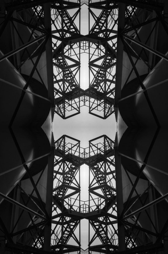
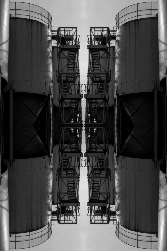
For these reflected image edits I used Photoshop to create a kaleidoscope effect on two photographs from my Albert Renger-Patzsch project. In order to do this I:


Saul Leiter (1923-2013) was an American photographer who focussed on street photography and abstract expressionism. He started out as a painter so was heavily influenced by colour, shape and using his camera to create his abstract vision of reality. Leiter was well-known for his black and white work, however in around the 1990’s his personal colour photography was discovered, it still has an impact and inspires people today.


Leiter’s work holds lots of warm saturated colours which usually come from the artificial light of cars and shop windows. Additionally, he uses a range of focal lengths to show depth in his images. I really like his style of photography and the way he captures vibrant images in low light situations, it suggests he uses a high ISO so his lens is more sensitive to light. Furthermore, Leiter’s work differs in texture in each image, for example the image in the top right holds a sharp texture as the focal point is on the rain in the foreground. However, if we look at the bottom left image Leiter has created a softer texture by blurring the photograph, possibly using a shorter aperture.
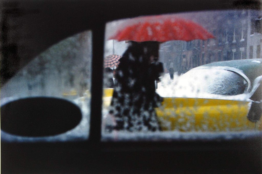
Who – For one of my shoots I plan on capturing images of my mum with an umbrella, taken through the car window.
What – I have an idea to photograph vivid colours from street lights, shop windows, a red umbrella and neon signs. Also, I wish to capture raindrops as the fall down my car window.
Where – For the location of my photo shoot I plan on driving around St Helier to photograph the streets of town at night. This will hopefully reflect Leiter’s street photography with the vibrant colours reflecting from shop windows and signs.
When – I plan to do this photo shoot on Monday 5th October once the sun has set. It is due to rain that evening which will allow me to capture the raindrops on my car windows and on the street pavements.
Why – The reason for my shoot is to experiment with ISO and White Balance to see how it effects the colour of images. My photographs will be inspired by Saul Leiter’s work, capturing rain on windows and people with vibrant umbrellas.


I edited these images on Photoshop and focused on enhancing the bold colours and high contrast. I used the ‘Vibrance’ tool to heighten the saturation of my images in order to reflect the work of Saul Leiter. Additionally, I experimented with the ‘Brightness/Contrast’ tool so I could explore different ways of drawing the observer’s attention towards my chosen focal point, using bright highlights and very dark shadows to catch their eye.

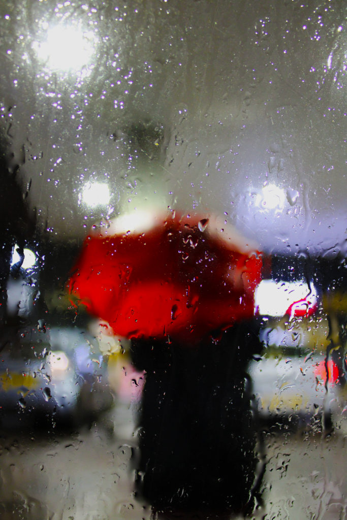

I have chosen these 5 final images as I believe their vivid colours complement each other well. Additionally, I really like the vibrant pink tones in the first image as I believe they provide a warm temperature to the image which reflects Leiter’s work. I enhanced this by increasing the saturation and contrast of the image to allow the bold fuchsia colours to stand out more against the black shadowed pavement. My first image also holds lots of artificial light from a neon shop sign. This bold lighting reflects off the puddles and creates an abstract composition with two beams of light forming leading lines down the image. Also, I like the way this image has an unbalanced rigid texture because of the irregular dips in the pavement. My second image reflects Leiter’s ‘Red Umbrella’ work. I really like the way the image has two obscure focal points, one being the clearly focused raindrops on the window, and the other being the bold red umbrella that is blurred in the centre. I used a shorter aperture to capture this image and have payed attention to the rule of thirds in my composition as the photo could be split into 3 separate sections.
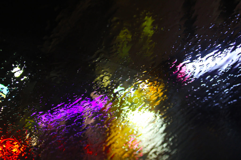
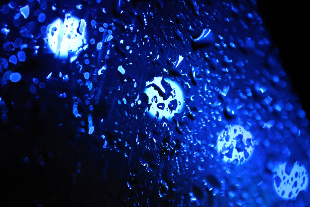
In my third and fourth images I have been inspired by Leiter’s work where he captures rain on windows. I experimented with the white balance of these images when taking them because the abstract artificial lights behind the rain made it easier to explore the different settings. The first ‘rain on window’ image has a clear focal point just below centre, which is created by the strong leading lines of water flowing down the glass. Furthermore, the warm orange and pink tones blurred behind the rain create a shallow depth of field. In the second image, the blue hues that dominate the photo produce a cold icy temperature which contrasts to Leiter’s warm cosy work. I wanted to create this contrast to experiment with different colour temperatures to see how they added or took away from my images. I really like the repetition in this image with the four fluorescent circles of light as I believe they contrast with the dark blue shadows in the image. These two images also seem have a bumpy uneven texture as the raindrops create strange 3D-like effect. I have chosen the fifth photo as one of my final images because of its obscure out of focus nature and the warm colours which are reminiscent of Leiter’s work. I really like the soft texture this image holds because of its blurred effect, I created this by switching my camera to manual focus in order to capture an unfocused photograph. I also think the clear focal point of the red umbrella draws the observer’s attention to the centre of the image, allowing them to take in every warm colour surrounding the subject.
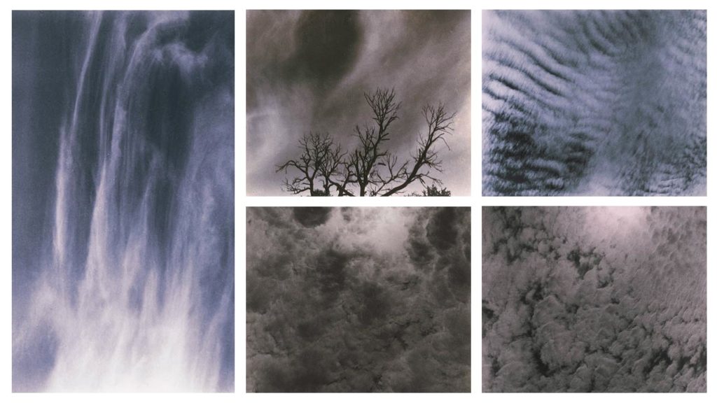
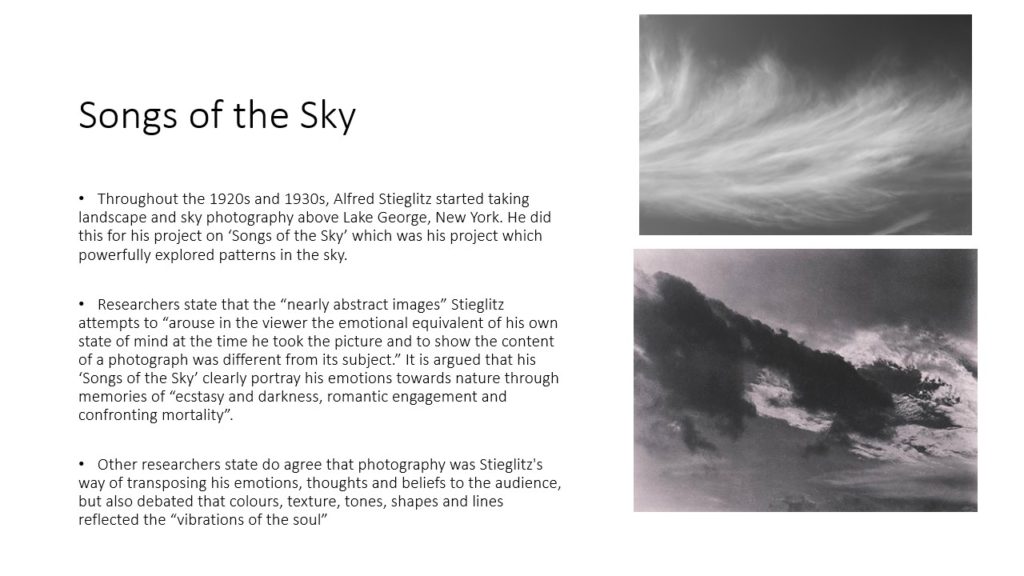
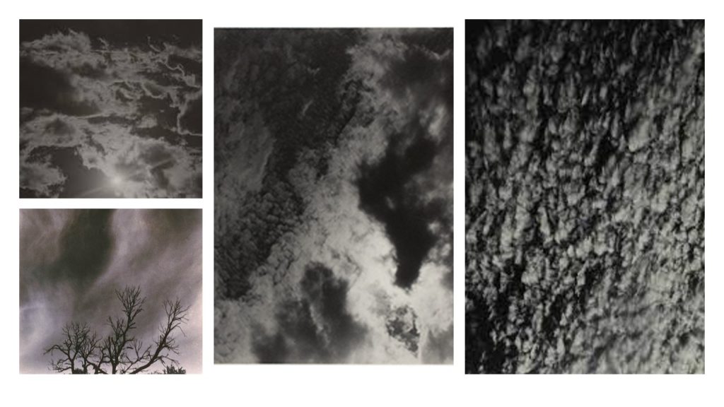
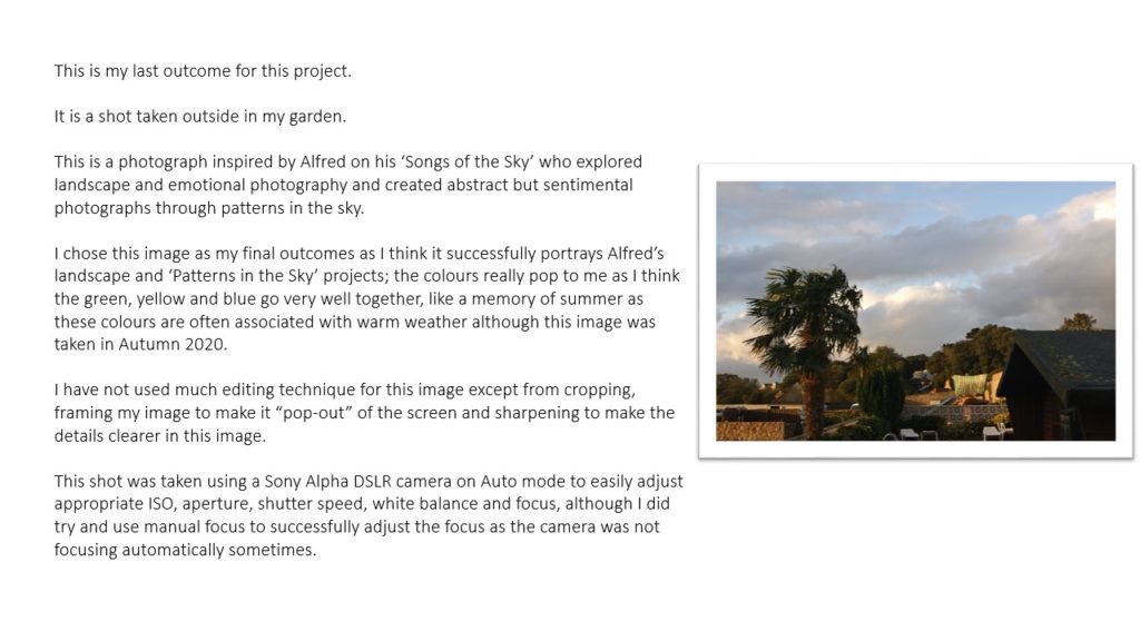
Alfred Stieglitz – patterns in the sky
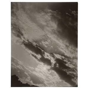
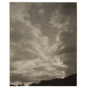
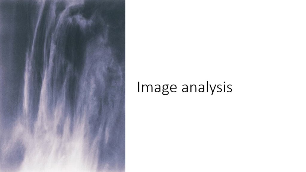
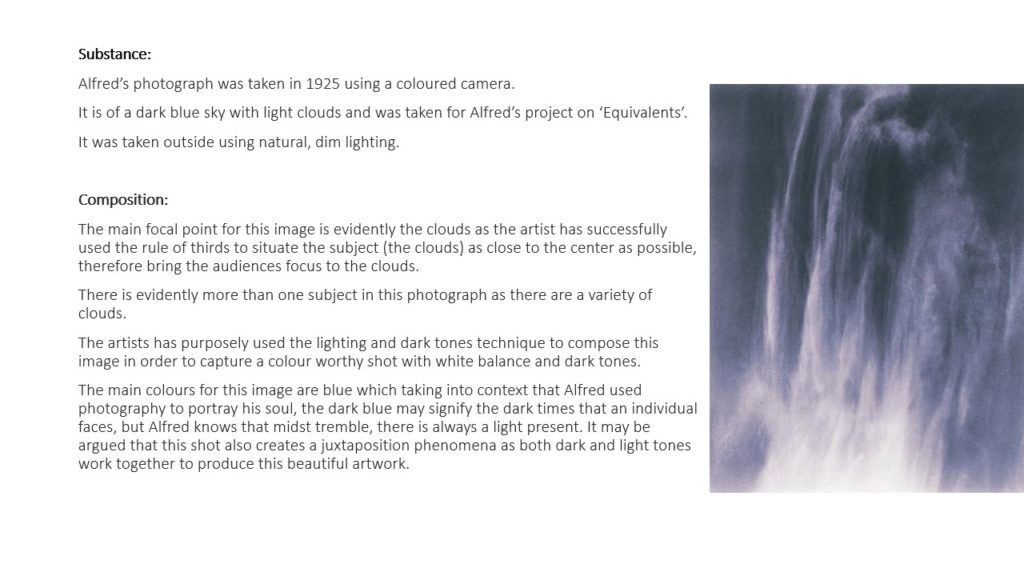
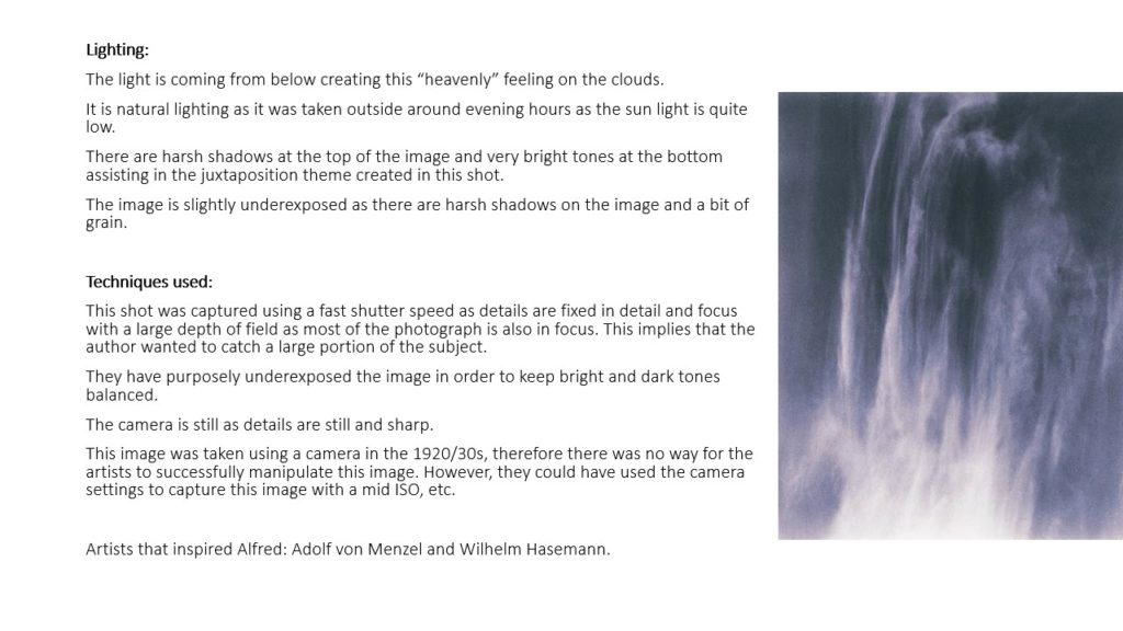
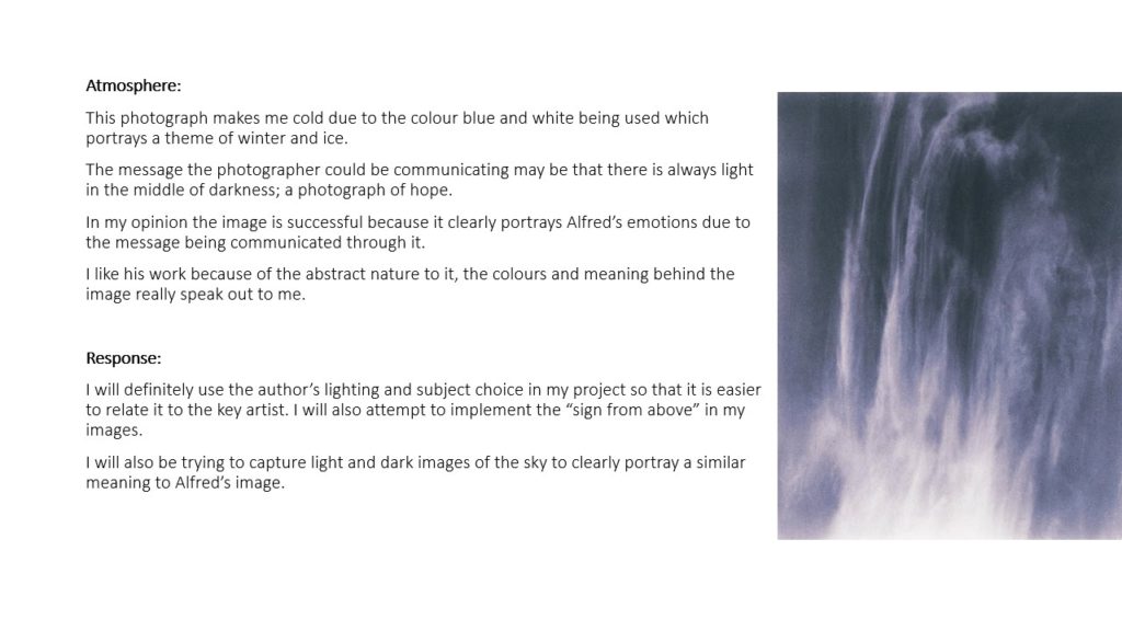
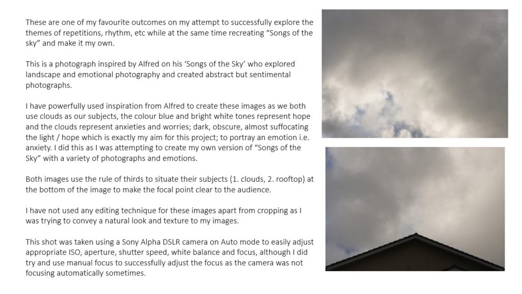
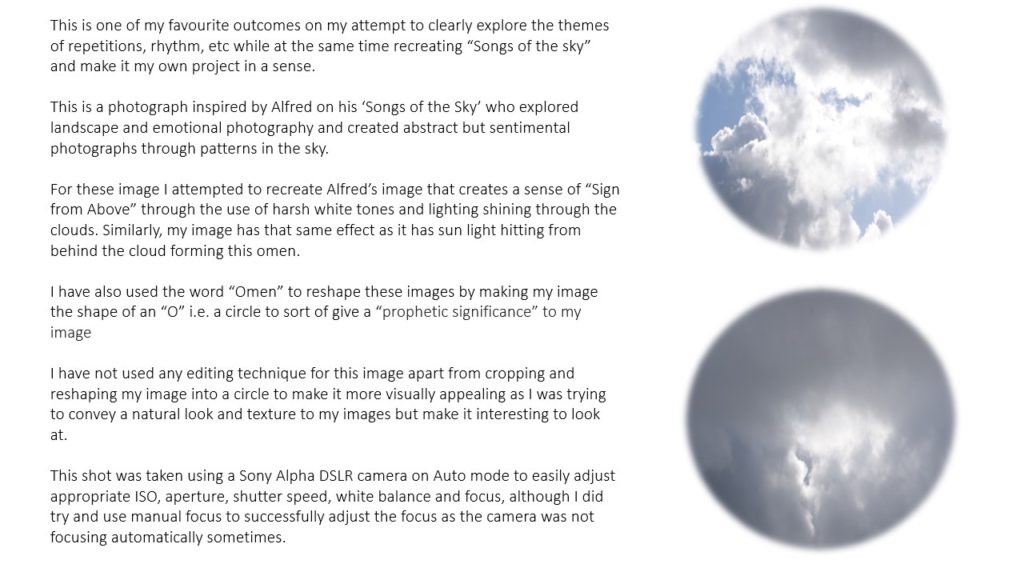
Alfred Stieglitz recognized his achievement in maintaining the realism of photography while addressing the goals of modernism, Duncan Phillips considered Stieglitz’s photographs of clouds important in joining photographic objectivity and personal emotion in his images. Stieglitz photographed clouds from 1922 into the thirties. A symbolic aesthetic underlies these images, which became increasingly abstract equivalents of his own experiences, thoughts, and emotions.
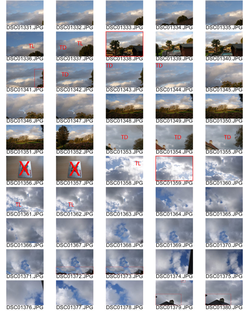
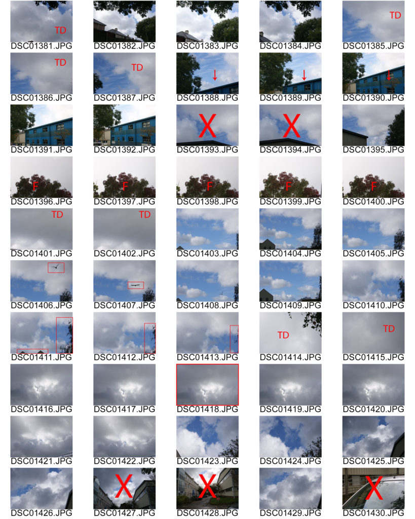
contact sheets
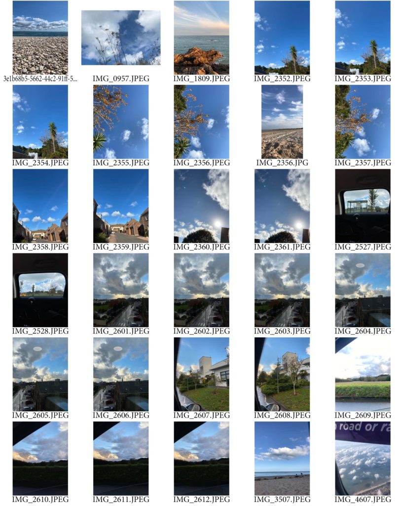
my photos inspired by Stieglitz
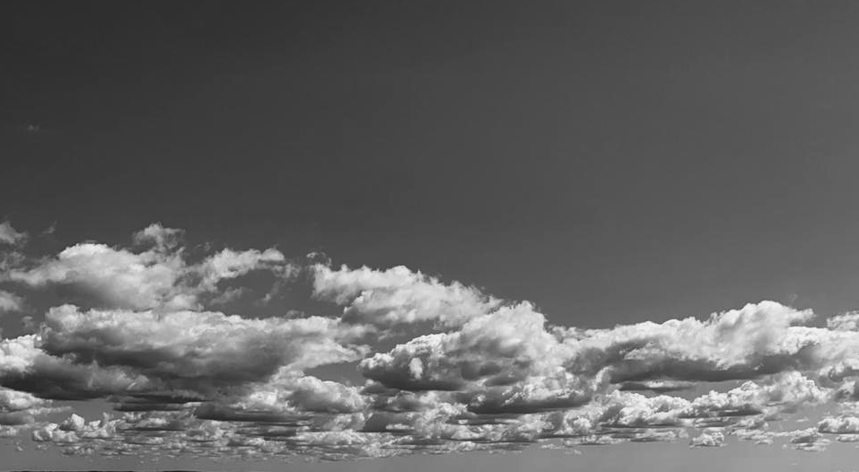
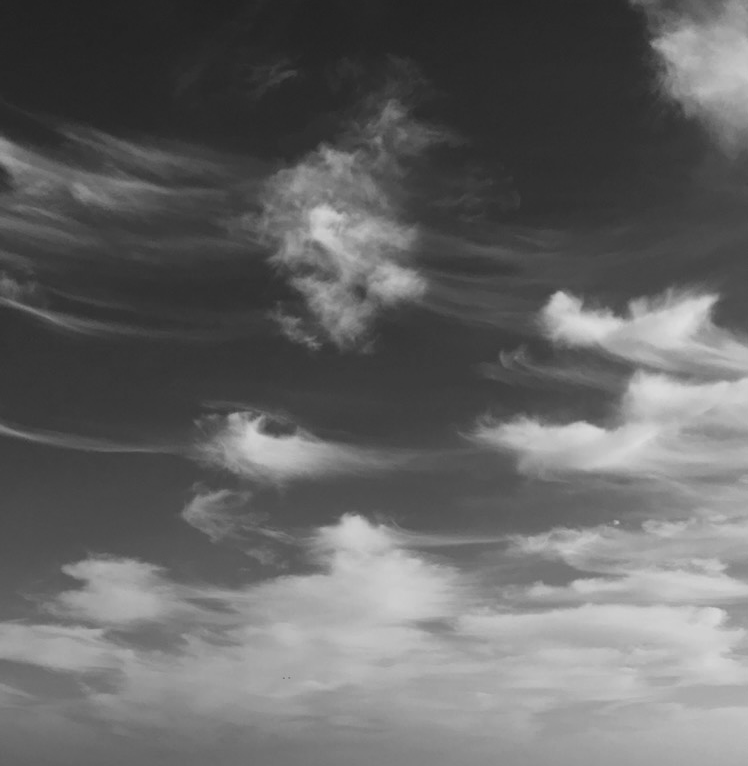
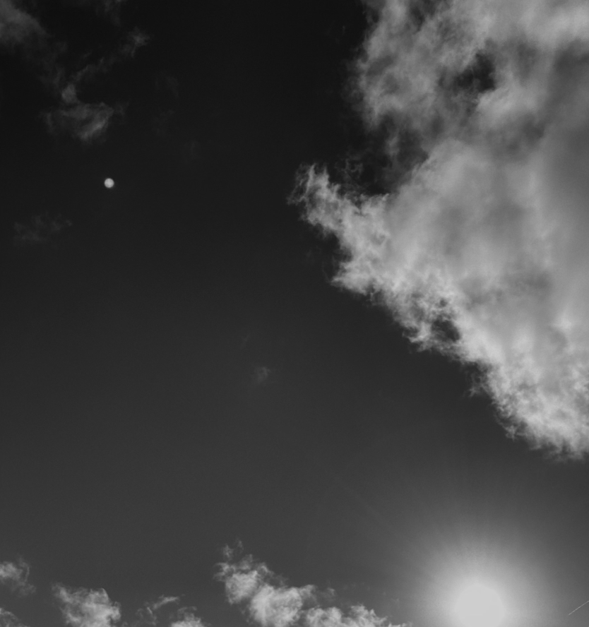
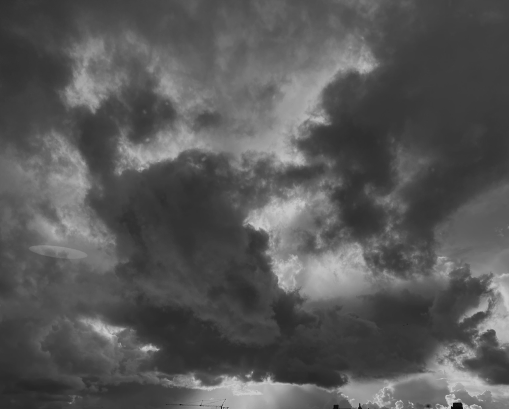
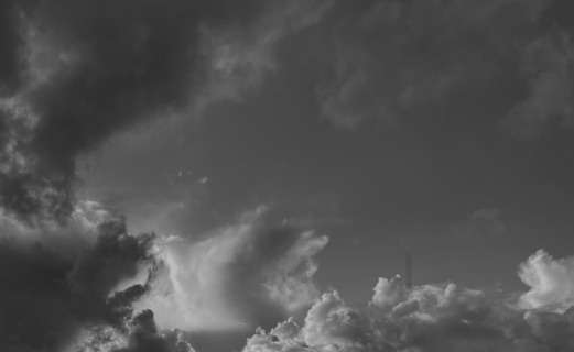
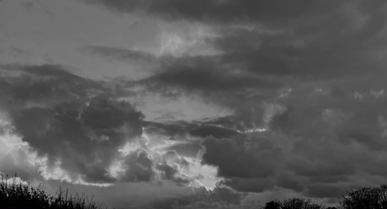
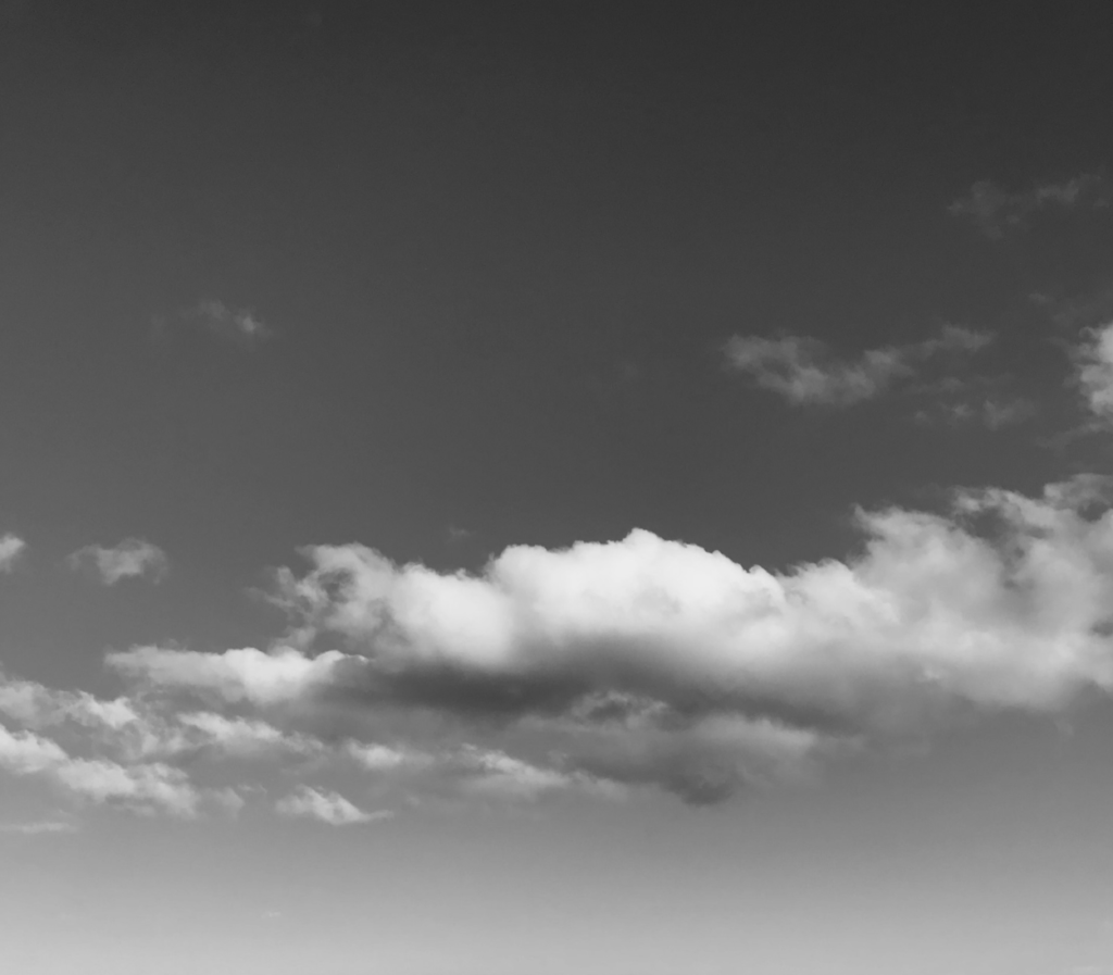
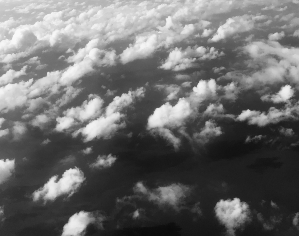
I liked the outcome of this photo shoot. I edited the images, making them black and white, lowered the exposure and made the clouds look more defined by upping the contrast to match Alfred Stieglitz- Patterns in the Sky.
What I like most about these photos is the contrast between the highlights and shadows and the way they contrast against each other, these photographs were taken in natural day light. I like, in some images, you can see the sunlight bursting through the clouds, or in some way trapped behind it. I like how in each picture the clouds are never the same, making each image different to another, this relates to how he saw his photographs as abstract equivalents of his own experiences, thoughts, and emotions, and how everyone’s thoughts and feelings are different, just like each pattern in the sky.
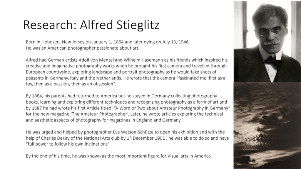
Alfred Stieglitz is one of the most significant contributors to the history of photography. Stieglitz contributed not only scientific and artistic photographic studies, but also introduced modern art to America and furthered the theory of photography as art.
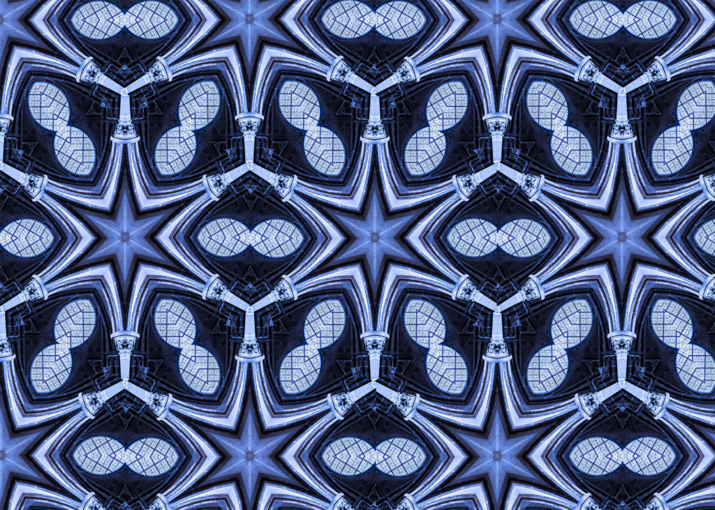
Process
I imported an image I thought would look interesting in a reflected manner into photoshop. I chose an image of a church window with two rising parallel pillars either side of it.
I then used “ctrl + T” to enable free transform. I then rotated my image by 60 degrees by changing the angle in the top hotbar.
I then moved my image to the edge of the canvas to isolate an isosceles triangle. Once happy with the triangle I made it a seperate layer.
I then enlarged the canvas by 400%.
I then flipped the isosceles triangle on a vertical axis and lined it up with the original one to make an equilateral triangle.
I then flattened the layers and rotated the equilateral triangle around the same anchor point by 60 degrees. I then repeated this step to make a hexagon. I then filled in the rest of the image with the hexagons.