Frank Hallam-Day
Image Analysis
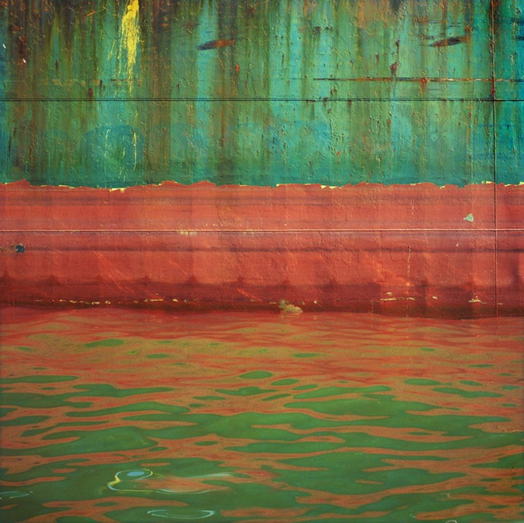
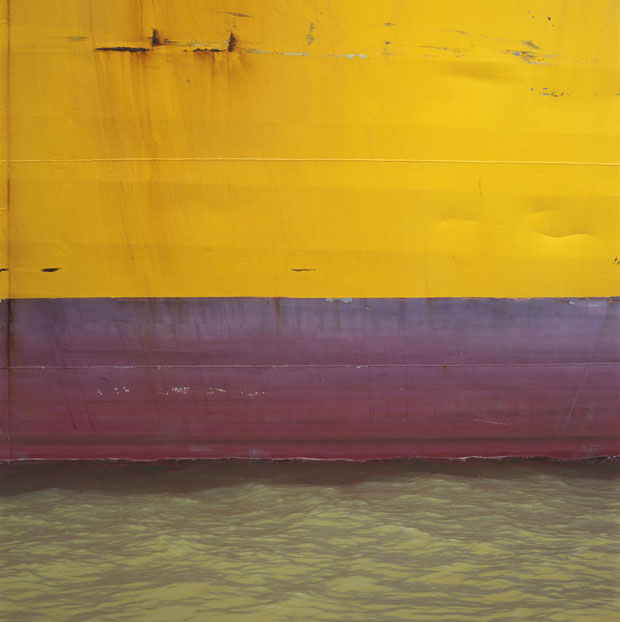
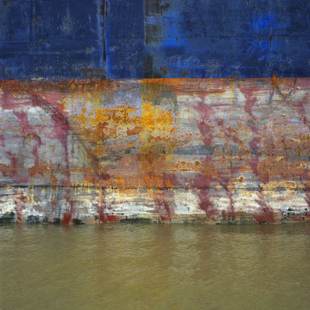
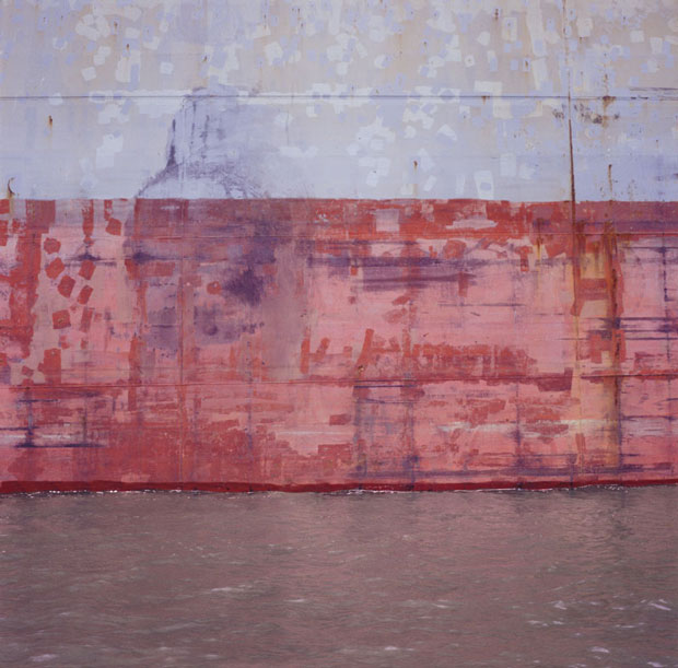
In this image Day uses a lot of lines and shapes. His work is very flat due to the composition being straight and the lines being horizontal. The colours Day uses are very bright and vibrant, these are seen throughout the image because the colours reflect onto the sea. In his work no shadows or lighter areas can be seen meaning that the image has no depth and is one dimensional. There is contrast in the photo between the side of the ship and the ocean, the side of the ship has rough, jagged and straight lines whereas the water has more rounded flowing lines that aren’t as straight. The texture of the image is rough on top due to the rust and the peeling paint, however on the bottom it has a less rough texture on the bottom due to the water and the reflection in it. There is also a repetition of horizontal lines and colours throughout the photo because of the reflection in the water.
Response
Evaluation
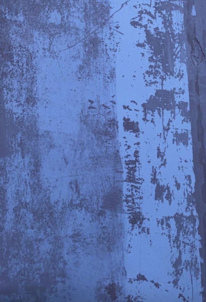
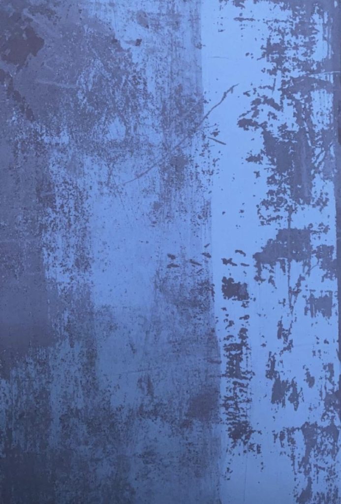
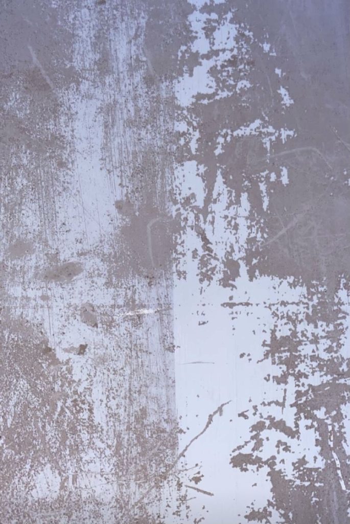
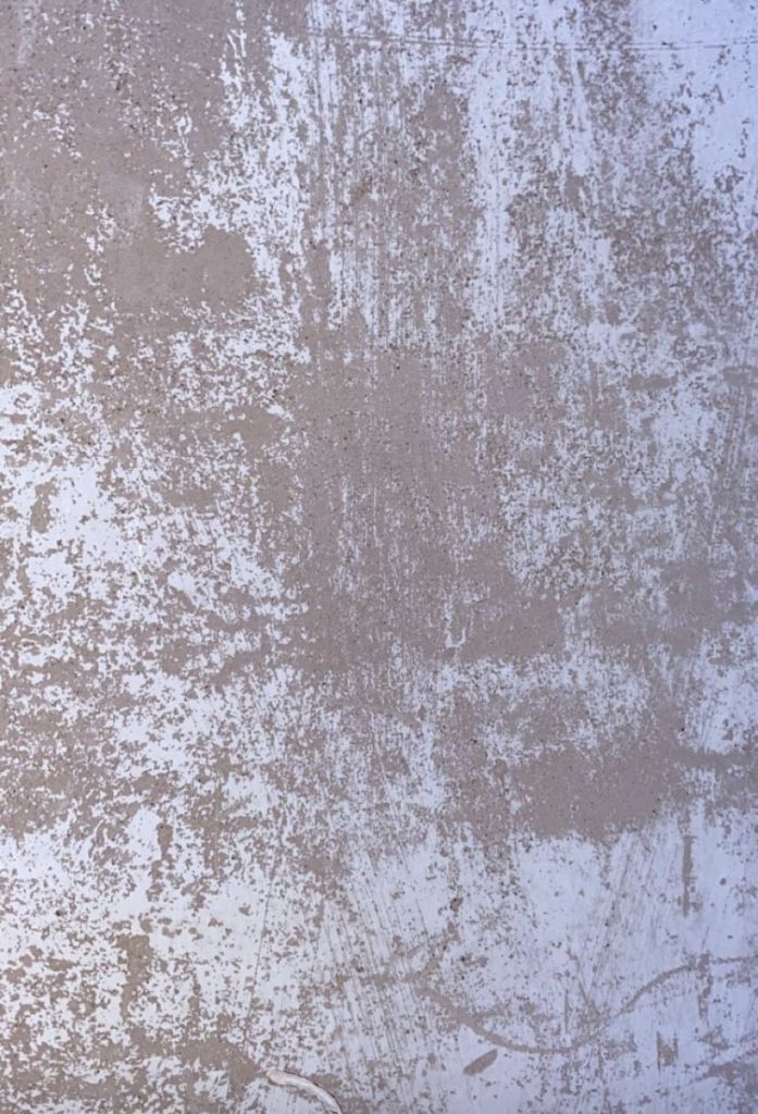
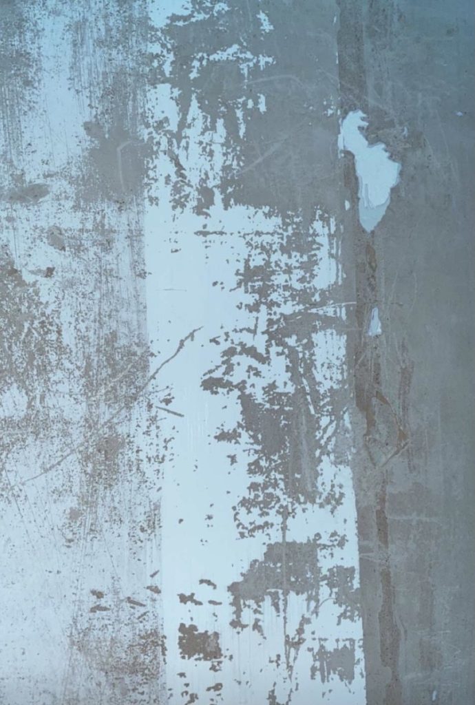
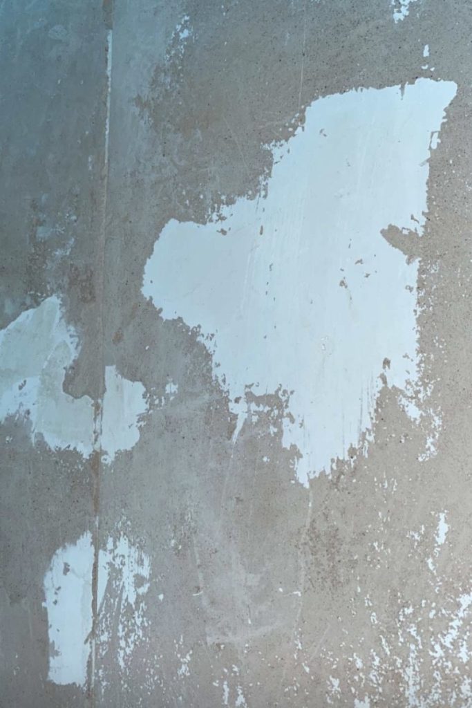
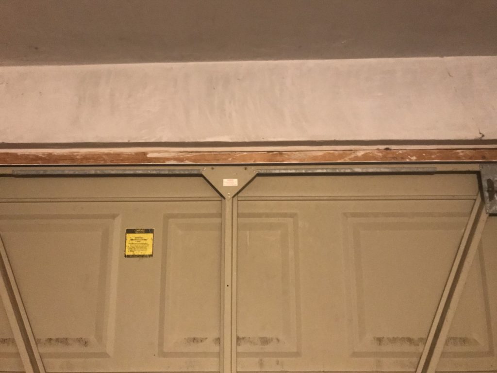
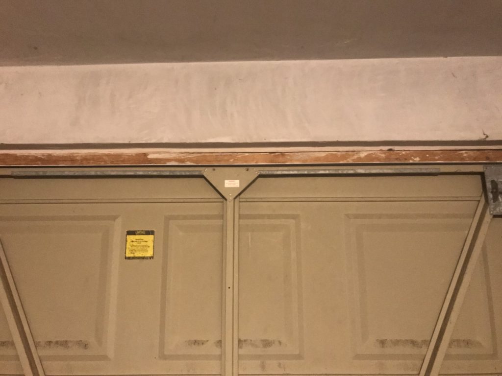
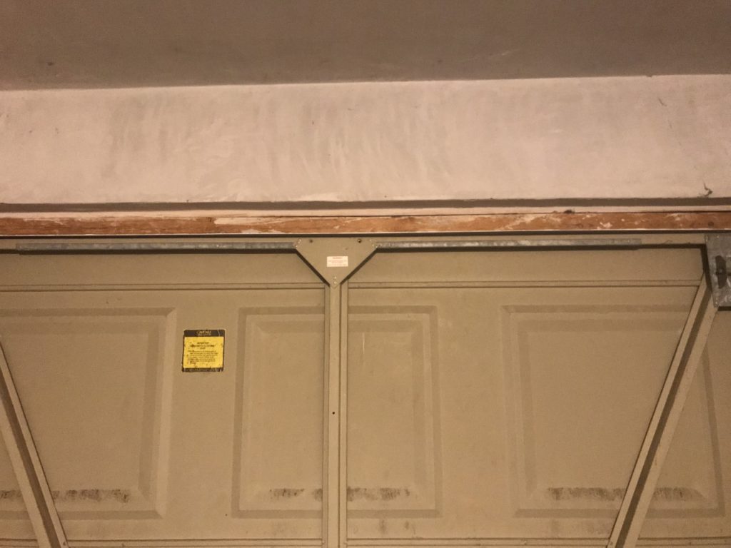
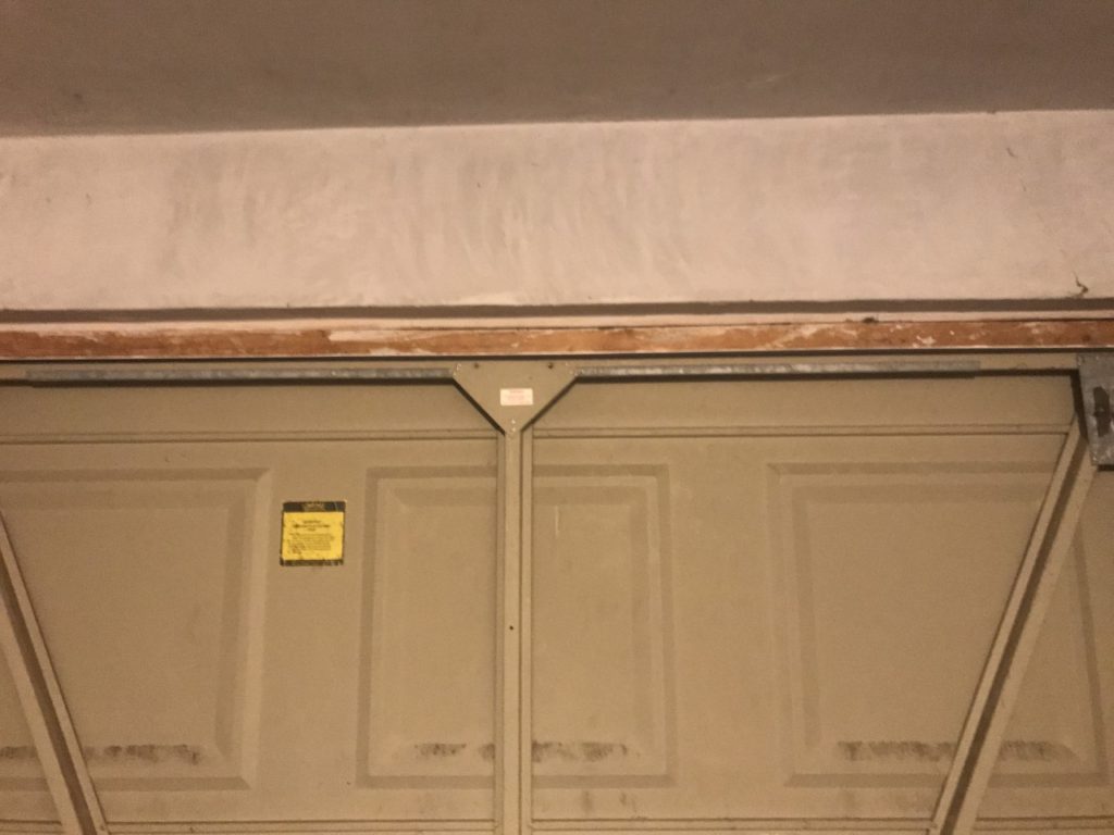
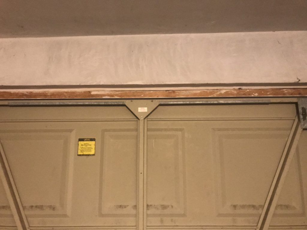
In my work i tried to capture lines and proportions in the same way that Hallam-Day does. I took photos of a stripped wall that had a lot of marks and lines, I also chose these because they have a very flat look to them which Hallam-Days work has.
Final image


