Selecting and finalising and displaying…

Over the next two weeks you will be…

  1. selecting your most successful images (from the abstract unit)
  2. finalising your most successful images (from the abstract unit)
  3. displaying your most successful images (from the abstract unit)

So…you must create a set of blog posts that clearly shows your thought process, selection criteria, image enhancement and manipulation, and how you intend to display your final image / set of images.

Selection Criteria

Focus…is the image(s) in focus ?

Exposure….is the images(s) correctly exposed ?

Evidence of learning…does the image refer to at least one of the formal elements?

Connection to a chosen photographer…how close is the relationship ?

Unique / interesting…how sophisticated / complex is your image(s)

Examples
This image has an empty alt attribute; its file name is image-107.jpeg
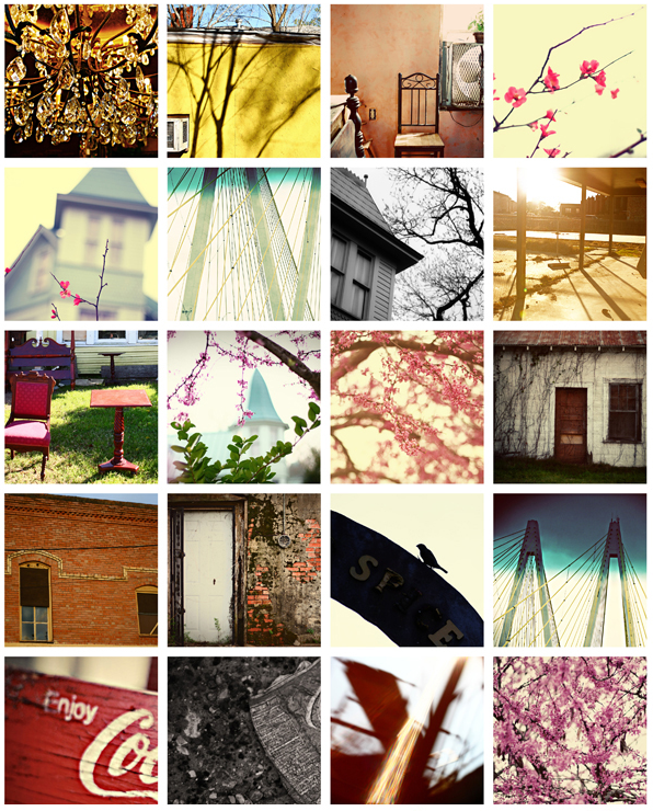
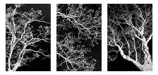
3 images that go together = a triptych
This image has an empty alt attribute; its file name is image-587.png
A grid / gallery of images can work really well…

Research and explore alternative approaches to presenting your final images. This should be an integral part of your concept…not a gimmick…ultimately, the quality of your photography will be the primary focus and your mark will reflect this…

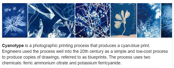
Cyanotype
https://www.amazon.com/SunPrint-W330-Paper-Kit/dp/B001KOGY3M

Virtual Gallery (use Adobe Photoshop)

Image result for photo gallery
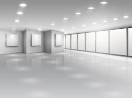
Download a photo of an empty gallery…then insert your images and place them on the walls. Adjust the perspective, size and shape using CTRL T (free transform) You can also add things like a drop shadow to make the image look more realistic…
Copeland Gallery | Copeland Park & Bussey Building
You can use this one…
Empty gallery interior with light windows - Download Free Vectors, Clipart  Graphics & Vector Art
…or this one

Always follow the 10 Step Process and create multiple blog posts for each unit to ensure you tackle all Assessment Objectives thoroughly :

  1. Mood-board, definition and introduction (AO1)
  2. Mind-map of ideas (AO1)
  3. Artist References / Case Studies (must include image analysis) (AO1)
  4. Photo-shoot Action Plan (AO3)
  5. Multiple Photoshoots + contact sheets (AO3)
  6. Image Selection, sub selection, review and refine ideas (AO2)
  7. Image Editing/ manipulation / experimentation (AO2)
  8. Presentation of final outcomes (AO4)
  9. Compare and contrast your work to your artist reference(AO1)
  10. Evaluation and Critique (AO1+AO4)
SURFACE AND COLOUR

Luigi Ghirri

Luigi Ghirri: Impossible Landscapes at Matthew Marks Gallery - Center for  Italian Modern Art
Exhibition: Photographer Luigi Ghirri and Sculptor Paolo Icaro at  Fondazione Querini Stampalia - Where Venice

Luigi Ghirri was a Italian photagrapher born the 5 January 1943 at  Scandiano in Italy . His work was most of the time made in Europe, and most of it focused on a small area of northern Italy . He prefersr to photograph this themes: maps, landscapes, windows, still lifes, interiors, fog, the seaside

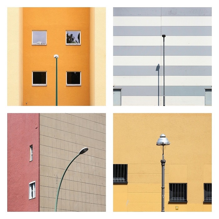
Julian Schulze

Julian Schulze Photography
Synergy Effects (Part 3) on Behance

Julian Schulze born 1986 in Hannover . He’s art is focused on geometric abstraction and minimalistic compositions. All of his images were taken in Berlin and Munich. He uses colours and the composition of geometric patterns .He also loves bold colours and colour combinations “I like the simple things in everyday life” He says .

Their Ideas but in my own Style

I chose to inspire me from the two artists . What like of the images of Julian Schulze is the colors he uses and his images look like they taken from a polaroid . I enjoy Luigi Ghirri because his pictures look like vacation photos they are calm and mysterious  and I think it could be really fun to try to mixt them together in my own style .

What I did

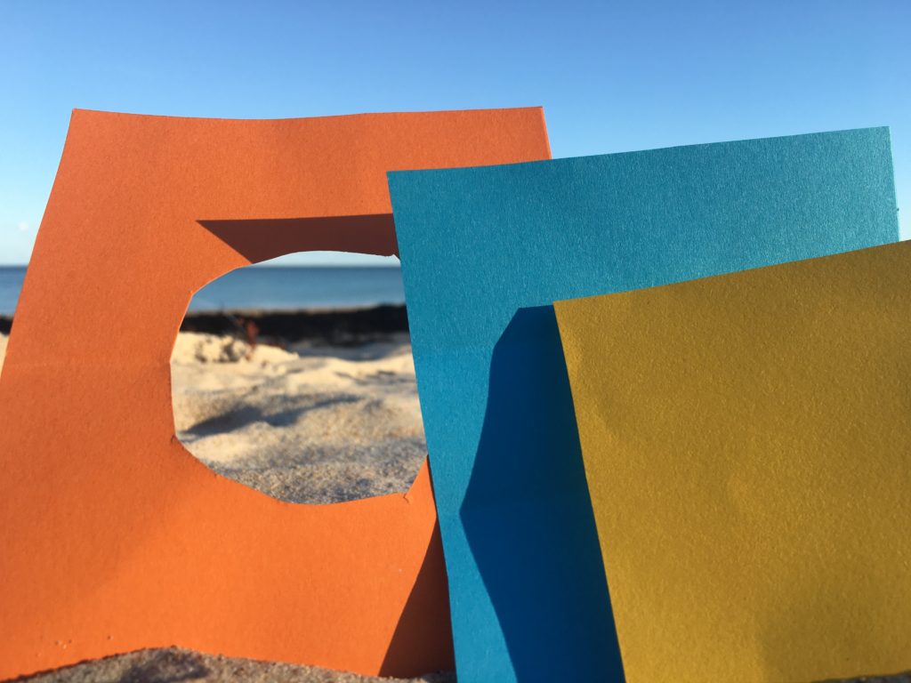
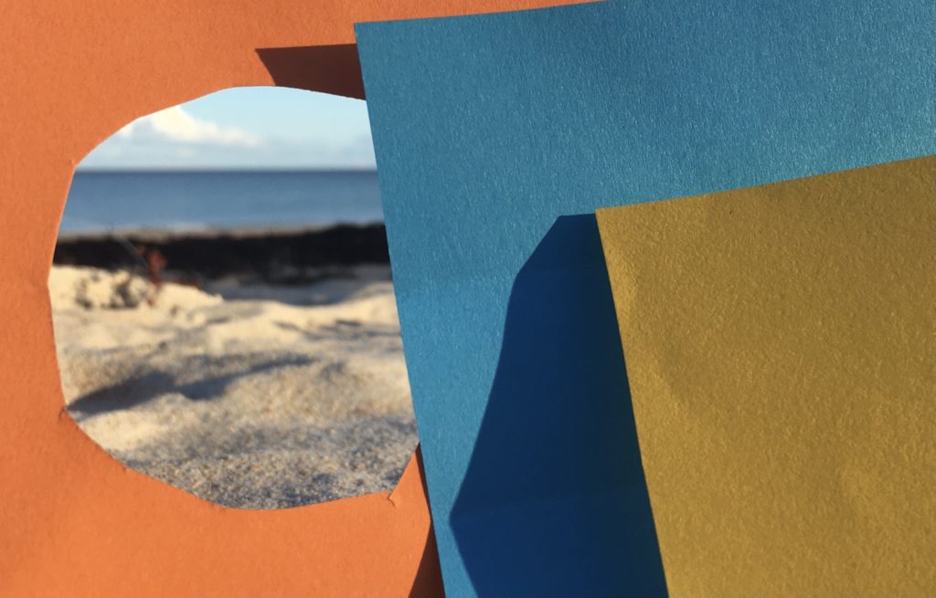
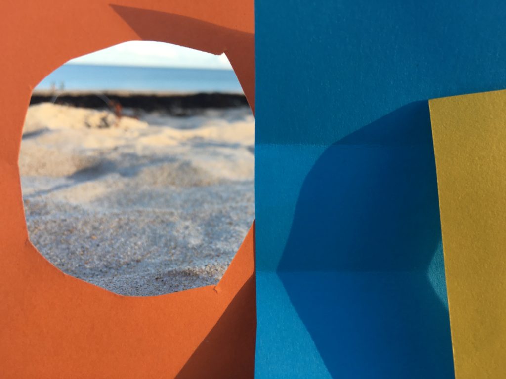
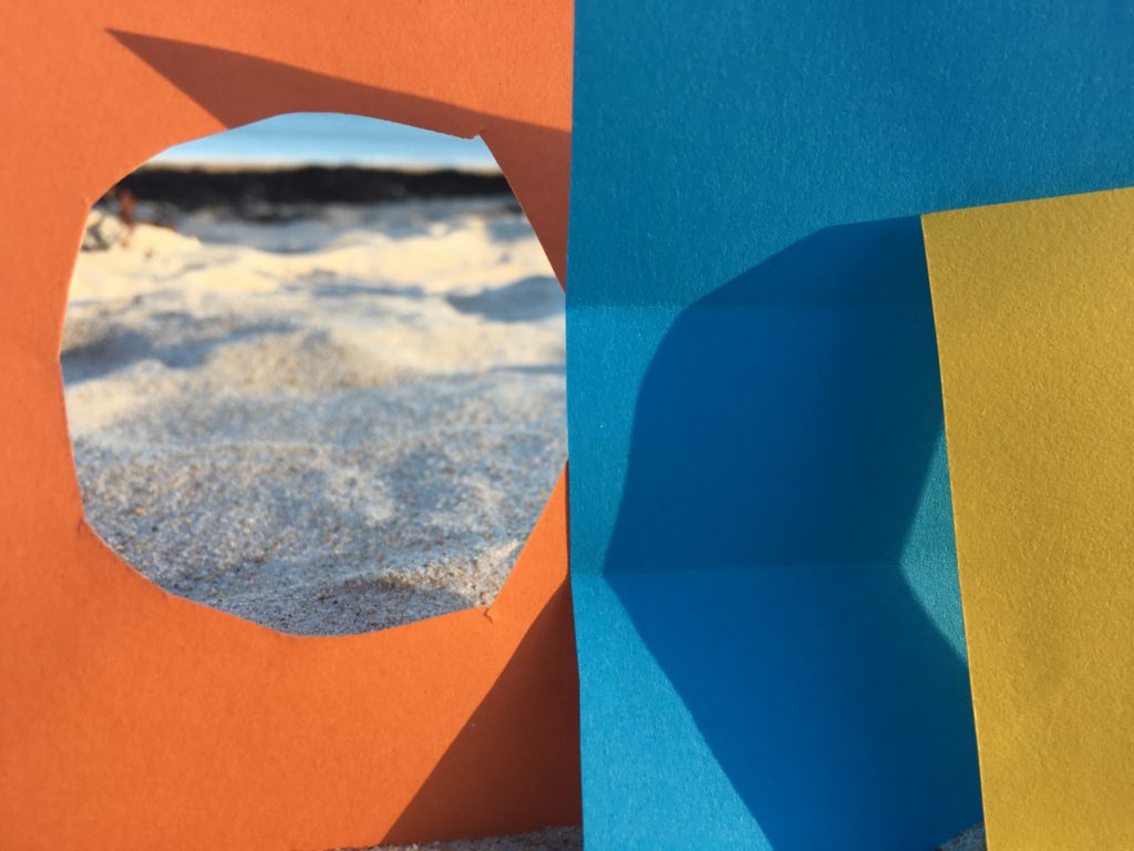
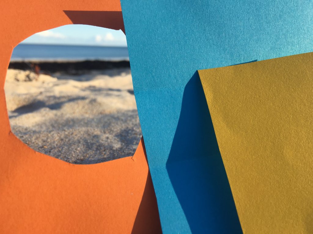
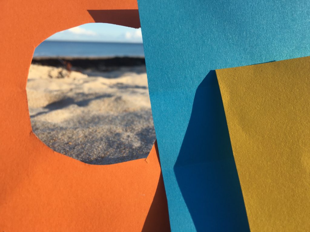
I cut three colore paper and put it above the sand on the beach to make it look like in a vacation . I wanted squares because it remind me Julian Schulze’s pictures.

My pictures

My favourite picture

I really like the shadows on the paper it creates a nice contrast. And I really like the hole on my orange paper because it looks like in way freedom.

repetition, pattern, rhythm, reflection and SYMMETRY

  1. I it in Photoshop to as an original size
  2. I copied the image by selecting Image> All
  3. I then went to Image> Canvas size and doubled the width of the canvas and put the photo to the side with the line of symmetry in the middle.
  4. Then i pasted the same image next to it.
  5. I flipped the copy image and aligned it next to the original, then flattened it to create a new image once it was aligned how i wanted it.
  6. I selected Image> All and clicked copy again with the new image.
  7. Repeated step 3, but now doubling the canvas length, moving the photo the the line of symmetry was in the middle of the canvas.
  8. Repeated step 4 and 5.

REPETITION, PATTERN, RHYTHM, REFLECTION AND SYMMETRY – 1

Alvin Langdon Coburn photo compared to Alfred Stieglitz

COMPARISON

As you can see Both of these photographs lack colour as they have been adapted to black and white which highlights the tones and shadows. Additionally they both have unique pattern that are different as well as reposition of the same objects in the photos. For example in Alfred Stieglitz you can clearly see the repetition of clouds in the sky as well as in Alvin Langdon Coburn’s photo you can see the symmetry of the glass/mirror object which appears to be the main focus of this photograph.

However there are also multiple differences in these photos which can be seen through Coburn’s use of vertical and horizontal harsh lines throughout his image. Whereas Alfred Stieglitz did not use lines in his photography as he chose to picture a realistic object such as clouds which have a relaxed contrast to them as they are not in strictly straight lines.

REPETITION, PATTERN, RHYTHM REFLECTION AND SYMMETRY

Nick Albertson - Masking Tape, 2013
Nick Albertson – Masking tape – 2013
Harry Callahan | Biography & Art Works | Huxley-Parlour Gallery
Harry Callahan – Chicago C. – 1950

At first glace, its difficult to distinguish the object used in Alberson’s piece, this is due to his framing techniques. In his photos, Albertson zooms and crops his photos to give them a frame, the example piece above shows strips of masking tape. The fact that it’s a unnoticeable object, makes the photo more interesting and opens up a topic of interpretation. However, at first glance as Callahan’s work, it is easily noticeable that he has photographed a group of bare trees with a snowy ground.

These two photos also differentiate in a less noticeable way. As these photos were taken 60 years apart, it is safe to assume that the development and editing processes are very different. Callahan’s process most likely consisted of developing the photo in a dark room, this is because this process was the most popular way of developing in the time era. Whereas, Albertson’s piece was most likely taken with a modernised digital camera, with editing facilities to crop and enhance the photo.