
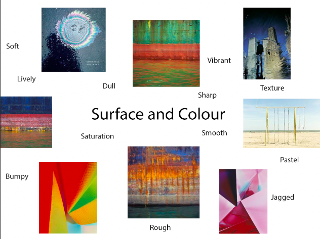
The aspect of “Surface and Colour” involves the changing of ISO settings on a camera in order to alter the saturation of the photograph, or exaggerate the contrasting surfaces of the photograph.
Eileen Quinlan

Eileen Quinlan was born in 1972 in Boston, Massachusetts. Quinlan is a self-described still-life photographer who is often regarded as one of many artists who revisits late modernism. Eileen Quinlan received her Bachelor of Fine Arts in 1996 from the School of the Museum of Fine Arts, when she attended Tufts University in Boston. She then achieved her Master of Fine Arts in 2005, from Colombia University. Before developing her distinctive style, Quinlan explored elements of both landscape and portrait photography, until she got into the photographic style she uses now. In the early days of her career, she began experimenting with the use of smoke in her abstract photos, this then paved the way for her signature style now.
Analysis of Eileen Quinlan’s work:
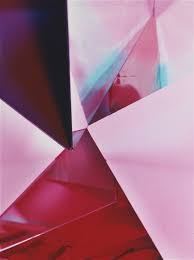
Light- I think artificial lighting has been used in this image in order to achieve the strong, contrasting shades. The darkest areas of the image are in towards the bottom left and top right of the image, the lightest parts of the softer shades of pink surrounding the dark areas.
Line- There is a pattern of straight lines in the image, they cross over each other in diagonal directions. The lines separate the different shades in the image.
Repetition- There is a repetition of straight lines in the image to give the image a geometrical composition. There is also a repetition of colour in the photograph, as the colour of pink is repeated but contrasted with the use of different shades.
Shape- The artificial set up of the image creates geometrical shapes in the photo. There is an echo of straight-edged triangular shapes in the image.
Space- The photograph has a wide depth of field in the photo as all parts of the image are in focus. However the image is rather flat so it is difficult to compare the depth of the background and foreground.
Texture- There is a range of textures to the photo, as different shades of pink has a smooth texture, especially the lighter shades. On the other hand, the folds in the darker shades give off a rougher texture.
Value/Tone- There is a range of tones in the image that vary from light to dark in this photograph. The constant use of pink changes tone in multiple areas of the image to create a juxtaposition of colour.
Colour- The tone of colour in the image is very vibrant, especially in the darker shades of pink, which is combined with lighter shades of pink in a geometrical pattern. There is also a section of blue in the image to contrast the shades of pink altogether.
Composition- The artificial composition of the image provides geometrical shapes, especially triangles. There is no rule of thirds used in the image and there is also no focal point, in my opinion.
My response to Eileen Quinlan’s work:
Photoshoot plan-

Eileen Quinlan inspired photoshoot-


Photoshop Development:


To edit my photos, I used the colour mixer and photo filter to add a pink hue to image, to make it more similar to the work of Eileen Quinlan.
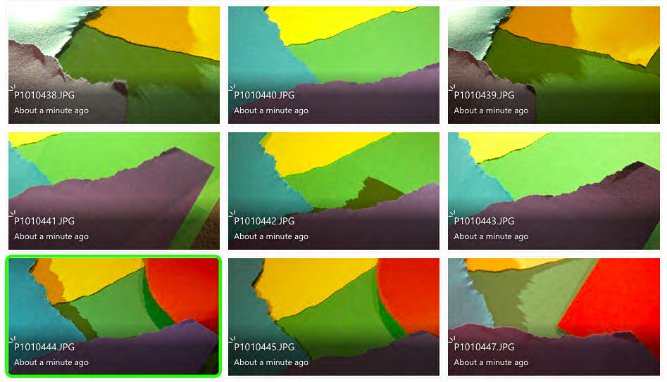
I used paper to recreate Quinlan’s work, by layering, ripping and cutting the paper to form geometrical shapes in the style of Eileen Quinlan’s style.
Ernst Haas

Ernst Haas, an Australian-American born in 1921, was both a photojournalist and colour photographer. Haas was an early innovator for colour photographer, who’s images were featured in magazines such as “Life” and “Vogue”. Haas’ work was also featured in the fist single-artist exhibition of colour photography at the Museum of Modern Art in New York. In 1971, he published his photography book, “The Creation”, which was one of the most successful photography books and sold 350,000 copies.
Analysis of Ernst Haas’ work:

Light- The lighting used in this image is seemingly natural, and appears to be taken in daylight on a rainy day. The light catches the colours swirling in a circular formation on the wet road, and also casts a brooding shadow next to the oil spill.
Line- There is little example of patterns of lines in this image, however the oil spill provides an echo of circular lines that almost hypnotise the viewer.
Repetition- There is of circles that create a tunnel-like affect from the oil puddled on the road. The circles echo in a mesmerising formation.
Shape- The geometric shape formed in this image os the repetition of multi-coloured circles forming due to the oil on the road. The shape of the circle is organic and not artificially set up by the photographer.
Space- There is a wide depth of field to the image as the whole photograph is in focus. The negative space around the focal point draws the viewers eyes to the oil spill, rather than the area around it. The reflective water on the ground gives the image a shiny appearance.
Texture- There is a range of textures in the image, as the water on the ground gives off a shiny, smooth texture, however the bumpy surface of the tarmac makes the texture more rough.
Value/Tone- There is a varied tone to the photograph, as the ground around the oil is dull and dark, however the splash of oil adds a contrasting pop of colour to the image. The colours of the oil spill are vibrant and give off a tie-dye look. The darkest area of the image is the shadow formed next to the oil.
Colour- The majority of colour featured in the image is in the oil spill. The colours tunnel into a spiral affect and reflect vibrant patterns of circles. These colours are juxtaposed against the gloomy, dark ground.
Composition- The organic composition features a geometric, circular pattern in the top right third of the image, this is used as the focal point to the viewer as it is the signifying contrast in the photograph.
My response to Ernst Haas’ work:
Photoshoot plan-

Ernst Haas inspired photoshoot-
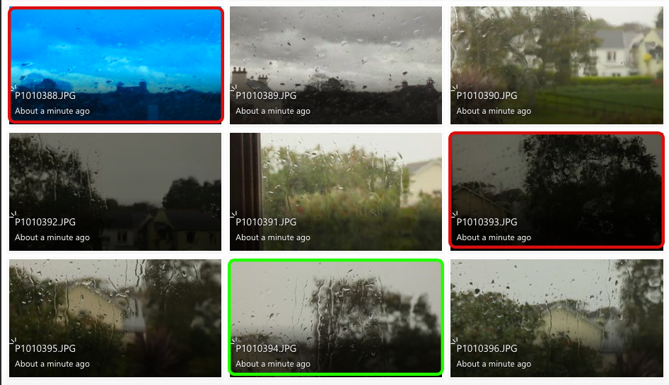
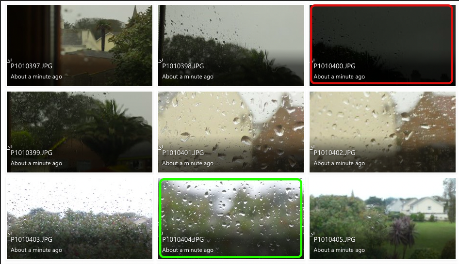


The photos highlighted in red are my least successful images because they are either too over-exposed or too under-exposed. This is because the change in ISO and white balanced has decreased/increased the amount of light entering the lens, this makes the images too dark or too light.
The images highlighted in green are my most successful images because they relate to Ernst Haas’ work the best. I tried to capture the change in texture with the raindrops falling onto different surfaces. I also wanted to recreate Haas’ work with the reflections in puddles also.
Photoshop Development:
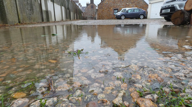


I believe I have recreated Ernst Haas’ work well with the use of capturing reflections and contrasting textures. I adjusted curve levels in these images to intensify the contrast between light and dark. I cropped the images in order to create a focal point for the viewer. I feel like my first edited image is my most successful because it uses Haas’ method of reflection to create a mirror-like affect.