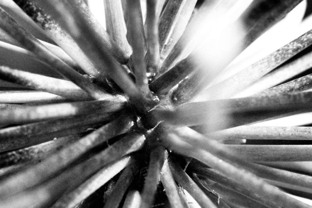
Saul Leiter was a American photographer and painter whose work in the 1940s and 1950s was an important contribution to what came to be recognized as the New York school of photography. He enjoyed taking night photography, colour photography and depth of field photography, which is shown in the photo above. In the image above the tones are very neutral due to the black and white adjustment which has be made. You can clearly see the different focuses of the photos as one twig is very clear compared to the background which is blurred.
Uta Barth
Uta Barth’s photography is a German-american photographer who mainly takes photography of optical illusions, perception and non-place. Her work emerged in the late 1980’s to 1990’s , which included her inverting the notion of background and foreground. This may have changed the viewers perception of her work due to the optical illusions as well as the different focuses. For example in the image above it shows that the background is out of focus, whereas the figures of people are still in focus. I find her work very compelling as it attracts all of you attention to certain parts of the photograph.
Ralph Eugene Meatyard
A second artist which I decided to look at is Ralph Eugene Meatyard who is an american photographer. I feel that the image above creates a darkening mood as the baby dolls are highlighted due to the fact that they are the main focus of the image. However the figures in the back also add to this as you can still identify that they are young children who are wearing intimidating masks over their faces. Additionally the way the photograph has been changed to black and white adds to the darkening mood that has already been created, as the tones have been enhanced because of the lighting.
MY PHOTOS
MY BEST IMAGES
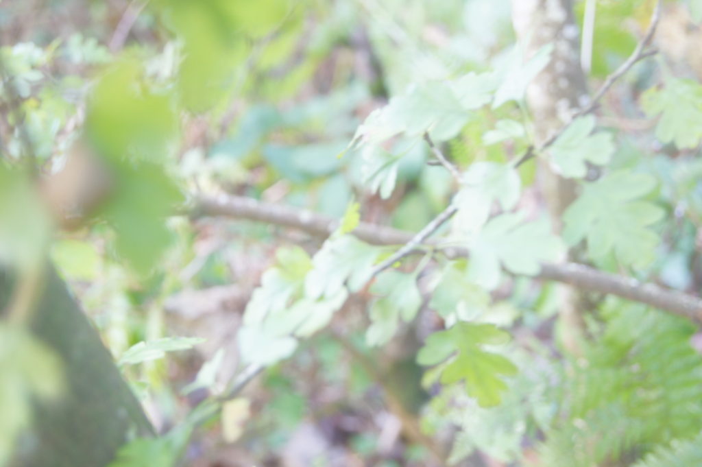
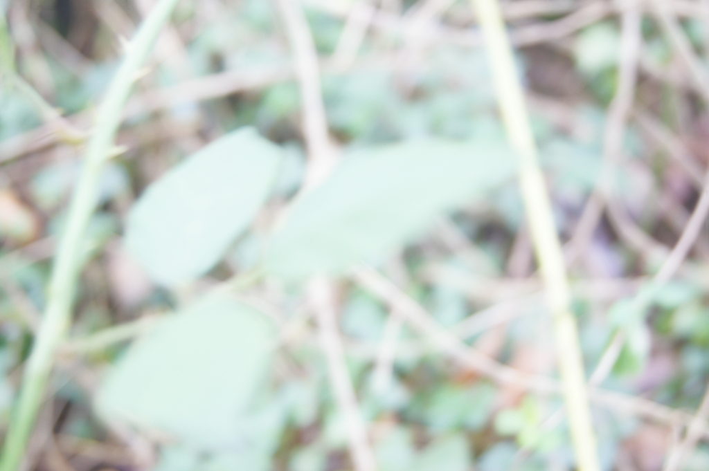
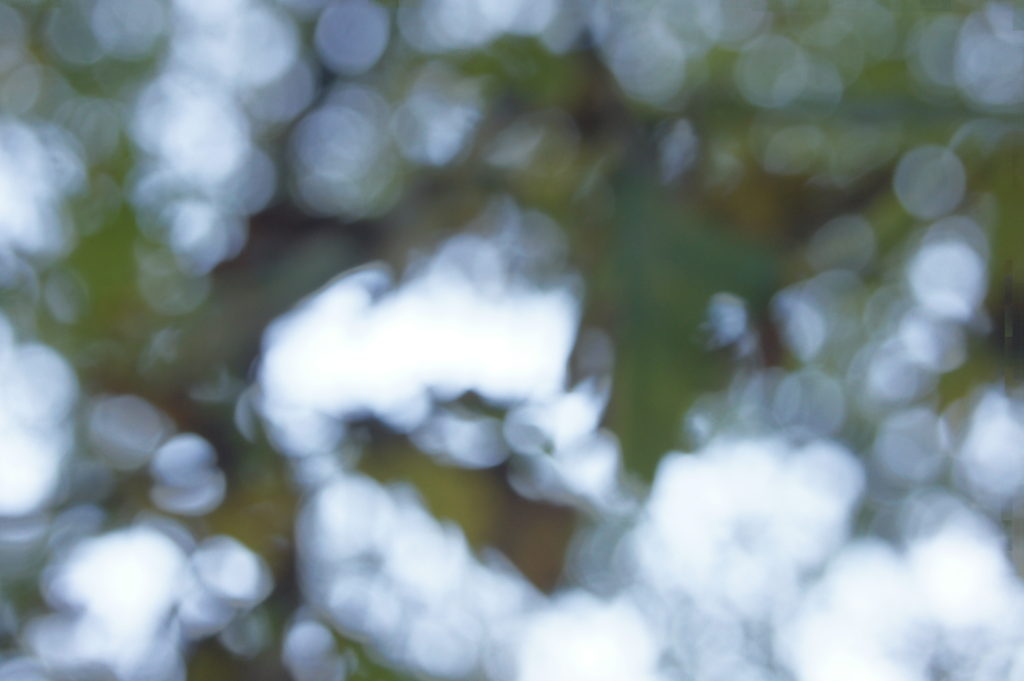
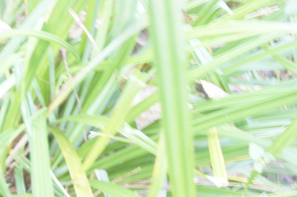
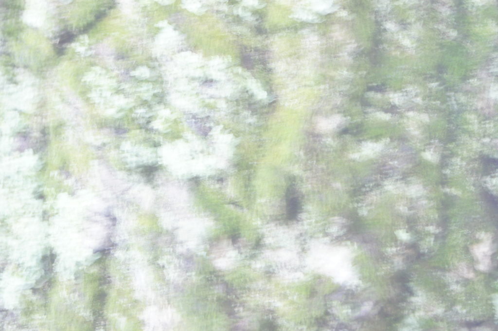
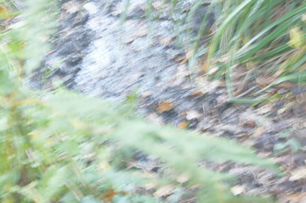
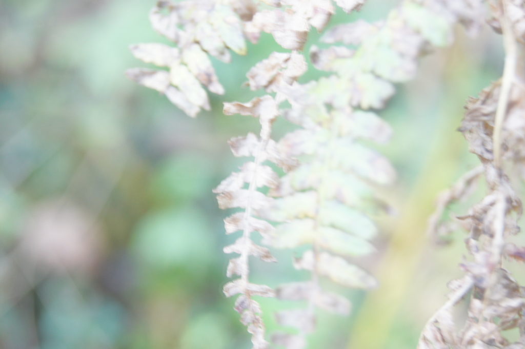
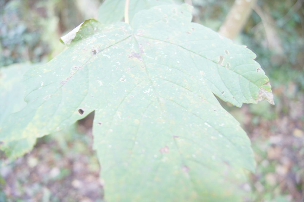
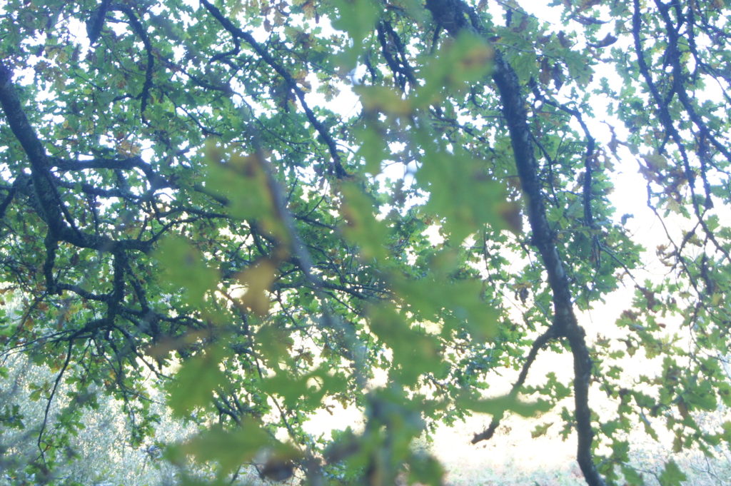
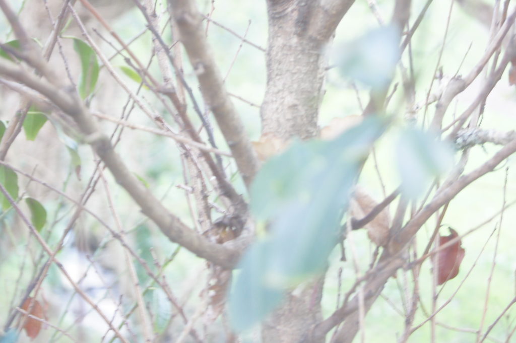
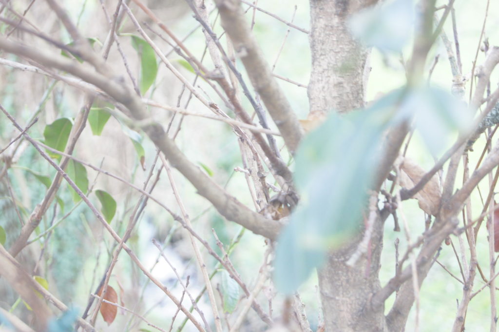
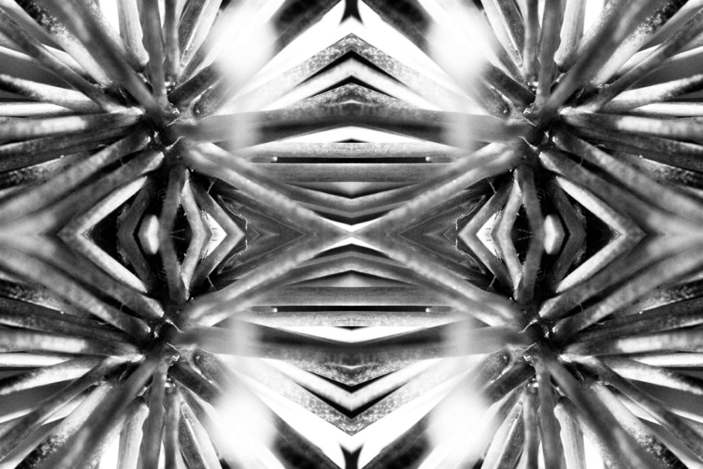
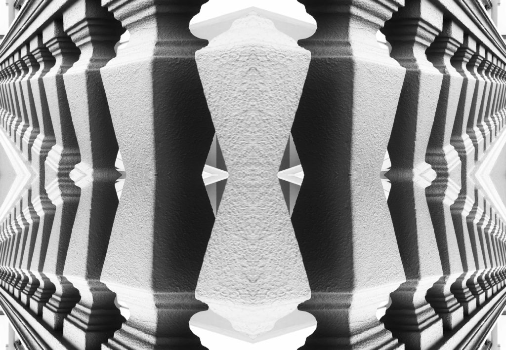
I feel that these are the best images which I took as they reflect Uta Barth’s work the best as it focuses on certain objects which in this case were leaves and blurred the background adding contrast to the photographs. I done this by experimenting with the aperture as well as the iso on the camera. The lighting off all of my photos in this shoot are natural as they were taken in natural settings which enhances them.
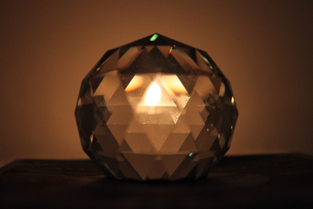
The aspect of “Surface and Colour” involves the changing of ISO settings on a camera in order to alter the saturation of the photograph, or exaggerate the contrasting surfaces of the photograph.
Eileen Quinlan
“Sophia” – Eileen Quinlan (2012)
Eileen Quinlan was born in 1972 in Boston, Massachusetts. Quinlan is a self-described still-life photographer who is often regarded as one of many artists who revisits late modernism. Eileen Quinlan received her Bachelor of Fine Arts in 1996 from the School of the Museum of Fine Arts, when she attended Tufts University in Boston. She then achieved her Master of Fine Arts in 2005, from Colombia University. Before developing her distinctive style, Quinlan explored elements of both landscape and portrait photography, until she got into the photographic style she uses now. In the early days of her career, she began experimenting with the use of smoke in her abstract photos, this then paved the way for her signature style now.
Analysis of Eileen Quinlan’s work:
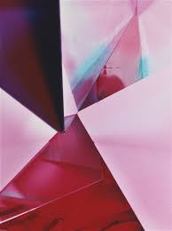
“Red Edges” – Eileen Quinlan (2007)
Light- I think artificial lighting has been used in this image in order to achieve the strong, contrasting shades. The darkest areas of the image are in towards the bottom left and top right of the image, the lightest parts of the softer shades of pink surrounding the dark areas.
Line- There is a pattern of straight lines in the image, they cross over each other in diagonal directions. The lines separate the different shades in the image.
Repetition- There is a repetition of straight lines in the image to give the image a geometrical composition. There is also a repetition of colour in the photograph, as the colour of pink is repeated but contrasted with the use of different shades.
Shape- The artificial set up of the image creates geometrical shapes in the photo. There is an echo of straight-edged triangular shapes in the image.
Space- The photograph has a wide depth of field in the photo as all parts of the image are in focus. However the image is rather flat so it is difficult to compare the depth of the background and foreground.
Texture- There is a range of textures to the photo, as different shades of pink has a smooth texture, especially the lighter shades. On the other hand, the folds in the darker shades give off a rougher texture.
Value/Tone- There is a range of tones in the image that vary from light to dark in this photograph. The constant use of pink changes tone in multiple areas of the image to create a juxtaposition of colour.
Colour- The tone of colour in the image is very vibrant, especially in the darker shades of pink, which is combined with lighter shades of pink in a geometrical pattern. There is also a section of blue in the image to contrast the shades of pink altogether.
Composition- The artificial composition of the image provides geometrical shapes, especially triangles. There is no rule of thirds used in the image and there is also no focal point, in my opinion.
My response to Eileen Quinlan’s work:
Photoshoot plan-
Eileen Quinlan inspired photoshoot-
Photoshop Development:
Original ImageEdited using Photoshop
To edit my photos, I used the colour mixer and photo filter to add a pink hue to image, to make it more similar to the work of Eileen Quinlan.
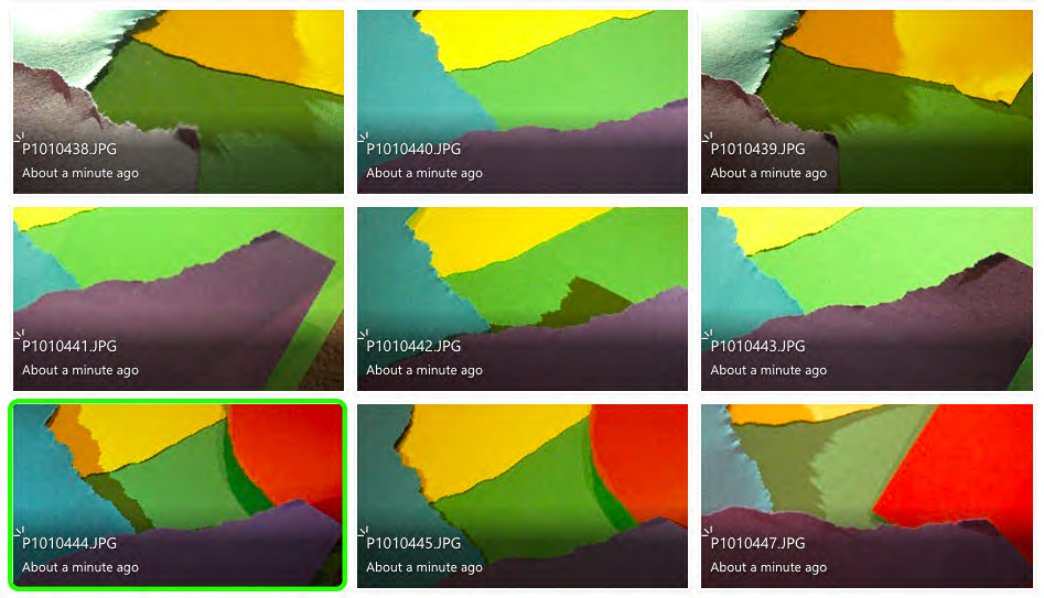
I used paper to recreate Quinlan’s work, by layering, ripping and cutting the paper to form geometrical shapes in the style of Eileen Quinlan’s style.
Ernst Haas
“Twin Towers Reflection, New York City, New York” – Ernst Haas (1975)
Ernst Haas, an Australian-American born in 1921, was both a photojournalist and colour photographer. Haas was an early innovator for colour photographer, who’s images were featured in magazines such as “Life” and “Vogue”. Haas’ work was also featured in the fist single-artist exhibition of colour photography at the Museum of Modern Art in New York. In 1971, he published his photography book, “The Creation”, which was one of the most successful photography books and sold 350,000 copies.
Analysis of Ernst Haas’ work:
“Oil Spill, NYC” – Ernst Haas (1952)
Light- The lighting used in this image is seemingly natural, and appears to be taken in daylight on a rainy day. The light catches the colours swirling in a circular formation on the wet road, and also casts a brooding shadow next to the oil spill.
Line- There is little example of patterns of lines in this image, however the oil spill provides an echo of circular lines that almost hypnotise the viewer.
Repetition- There is of circles that create a tunnel-like affect from the oil puddled on the road. The circles echo in a mesmerising formation.
Shape- The geometric shape formed in this image os the repetition of multi-coloured circles forming due to the oil on the road. The shape of the circle is organic and not artificially set up by the photographer.
Space- There is a wide depth of field to the image as the whole photograph is in focus. The negative space around the focal point draws the viewers eyes to the oil spill, rather than the area around it. The reflective water on the ground gives the image a shiny appearance.
Texture- There is a range of textures in the image, as the water on the ground gives off a shiny, smooth texture, however the bumpy surface of the tarmac makes the texture more rough.
Value/Tone- There is a varied tone to the photograph, as the ground around the oil is dull and dark, however the splash of oil adds a contrasting pop of colour to the image. The colours of the oil spill are vibrant and give off a tie-dye look. The darkest area of the image is the shadow formed next to the oil.
Colour- The majority of colour featured in the image is in the oil spill. The colours tunnel into a spiral affect and reflect vibrant patterns of circles. These colours are juxtaposed against the gloomy, dark ground.
Composition- The organic composition features a geometric, circular pattern in the top right third of the image, this is used as the focal point to the viewer as it is the signifying contrast in the photograph.
My response to Ernst Haas’ work:
Photoshoot plan-
Ernst Haas inspired photoshoot-
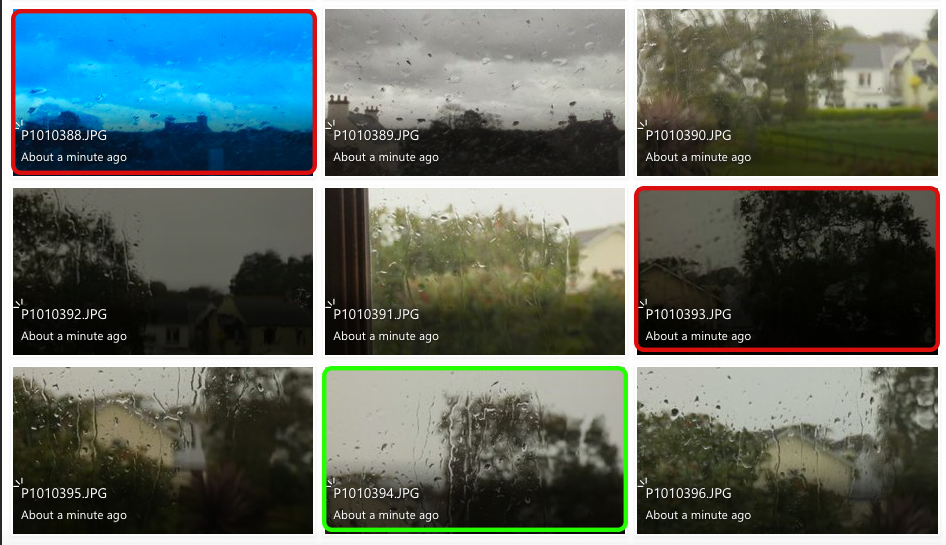
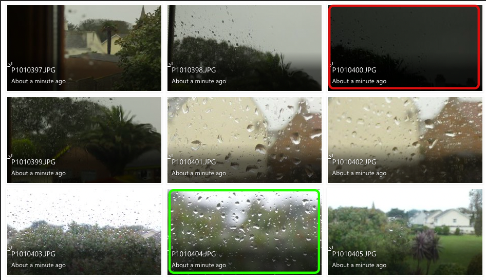
The photos highlighted in red are my least successful images because they are either too over-exposed or too under-exposed. This is because the change in ISO and white balanced has decreased/increased the amount of light entering the lens, this makes the images too dark or too light.
The images highlighted in green are my most successful images because they relate to Ernst Haas’ work the best. I tried to capture the change in texture with the raindrops falling onto different surfaces. I also wanted to recreate Haas’ work with the reflections in puddles also.
Photoshop Development:
Original Image
Edited using cropping, black and white filter and curve adjustments.
Original Image
Edited using black and white filter and levels adjustments
Original ImageEdited using cropping, black and white filter, and curves adjustments
I believe I have recreated Ernst Haas’ work well with the use of capturing reflections and contrasting textures. I adjusted curve levels in these images to intensify the contrast between light and dark. I cropped the images in order to create a focal point for the viewer. I feel like my first edited image is my most successful because it uses Haas’ method of reflection to create a mirror-like affect.
– Select : all – Edit : copy – Image : canvas size – Change the reflection to how I want the image to look and change width or length accordingly by doubling the original number – Edit : paste – Edit : transform : flip vertical – Flatten image
I have chosen to compare a natural form image by Harry Callahan to an abstract image by Nick Albertson. Harry Callahan was an American photographer who was well-known for both his colour and black & white photographs. His work focuses on repetition, patterns and textures while also containing a high contrast between shadows and highlights. Nick Albertson is an American visual artist who uses mundane utilitarian objects to create abstract structural forms, photographing them using repetition, light and shadow.
There are many similarities between these two images, one being both photographers capture of vertical lines. Harry Callahan photographs the straight leading lines of pond reeds which reflect off the waters surface, creating a highly textured image with movement and rhythm. Additionally, Nick Albertson captures his vertical lines in the thick red tape, which stretch a uniform pattern from the top to the bottom of the image. These orderly lines create an abstract atmosphere in the image as the placing of the subjects are systematic and rigid, which contrasts with the obvious movement in Callahan’s work. There is also immense amounts of repetition in both images as the leading vertical lines echo throughout the photographs. Moreover, both images hold a sharp texture as they appear to have pointed edges and harsh lighting.
However, there are also many differences within these images. For example, Callahan’s photograph is of a natural form in its organic environment, whereas Albertson has captured a man-made form in an abstract ambiguous way. Furthermore, Callahan photographs his images in black & white whereas Albertson has bright saturation. The dominant colour red that Albertson captures creates a bold eye catching image and its vibrancy draws attention from the observer. Contrastingly, Callahan’s black and white image holds dark shadows which contrast greatly with the bright white highlights reflecting from the water. This creates a mysterious, enigmatic atmosphere within the photo as the shadowed reeds look silhouette-like against the water. In addition, these images are taken with very different lighting. Callahan uses natural light to capture his image as he is photographing the environment presently, without disturbing or changing it. However, Albertson uses harsh studio lighting in order to capture the everyday object in an abstract way. This artificial lighting choice adds to the unnaturalness and ambiguity of the image and shows how the composition of any mundane object, depending on perspective, can change how people identify it.
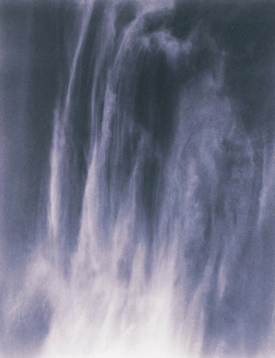
These two images from Ernst Haas and Alfred Stieglitz have a lot of similar features as well as many differences.
Alfred was born in 1864, which means that photography was a lot different to when Ernst was taking photographs as he was born in 1921. One key difference that can be seen is that Alfred took many of his photographs in gray scale, where as Ernst took lots of his photos in full colour.
Despite Alfred shooting his photographs in black and white, there is still a blue hue/tint to the image. This is similar to the Ernst image on the left as it also has a blue hue to it. This makes both images have a cold feeling to them. The cold blue tones also show the weather at the the time the photographs were shot. For example the blue tint to the cloud formations on the right show that there may have been a cold breeze in the air, and the blue hue in the left image emphasizes the coldness of the running water in the photograph. In both of the images, it adds more atmosphere and feeling to the photographs.
The lighting in both of these images seem similar. This is because there is a natural light source that can not be seen in the shot. In both images, the highlights and most exposed parts of the image is towards the bottom of the photograph. This emphasizes the depth of the images, as well as creating contrast between the front of the waterfall/cloud forms and the back of them.
The shutter speed of the Ernst image on the left is quite high, about 1/60-1/20. This is to create a smooth motion blur of the water falling down the rocks. This allows for the whole rock behind the water to be seen, and for it to be in focus by using a high aperture, eg. f22. This creates a similar effect to Alfred’s image on the right. This is because the cloud is stretched out as if it is flowing. Despite this image having a fast shutter speed, the cloud shape creates the effect of movement.
Both images create straight, directional lines from the top to the bottom of the frame. This again adds to the effect of movement within the photograph. Both images also have a darker background, adding more depth and contrast to the image.
Although both images look fairly similar, the camera angle, positioning and framing of the images are very different. Ernst’s image on the left seems to be taken from eye level, looking parallel to the floor directly towards the waterfall. The framing of the waterfall centered. Ernst has also stood a distance away from the waterfall and zoomed in with a lens, cutting off the edges and top of the waterfall, making the overall size of the waterfall unknown. Alfred’s image on the right has been taken from the ground looking up at a very high angle to capture the cloud. The cloud is centered in the middle of the frame, also slightly zoomed in but most edges of the cloud can be seen, giving a bit of scale to the image.
There is no official context to either of these images, but they are both of natural forms which create similar shapes and lines and they both seem to express nature.
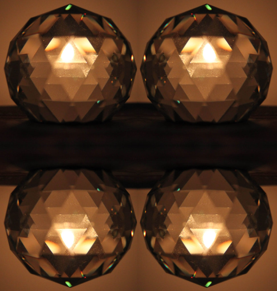
Both of these photographs are devoid of any colour and shot in black and white, making them appear old and dated. Additionally, they both are very abstract in nature, with Coburn photographing glass, crystalline shapes with the use of kaleidoscopic contraption, and Stieglitz photographing the patterns that he sees in the clouds above him. However, there are some major differences between the two images. For example, Coburn’s photograph consists of harsh, straight lines which run across the entirety of the image, with the leading, geometrical shapes drawing the viewer’s eye into the centre of the image. On the other hand, Stieglitz’s composition is made up of soft, organic, and curved lines which show the natural direction the wind in the sky. It is a much more relaxing photograph to look at, because it is pure and real, unlike Coburn’s image which had to be manhandled and manipulated in order to achieve. Technically, the lighting in both of the photographs are similar, with each of them being lit in a low light. However, it is clear that Stieglitz’s image was taken using a natural light source as the photograph is of the sky, and Coburn’s lighting was most likely artificial in order for him to ensure that the reflections were placed precisely where he wanted them to be. Also, in Stieglitz’s photograph, there appears to be a lot more empty and negative space compared to Coburn’s, whose subject takes up the entire frame.
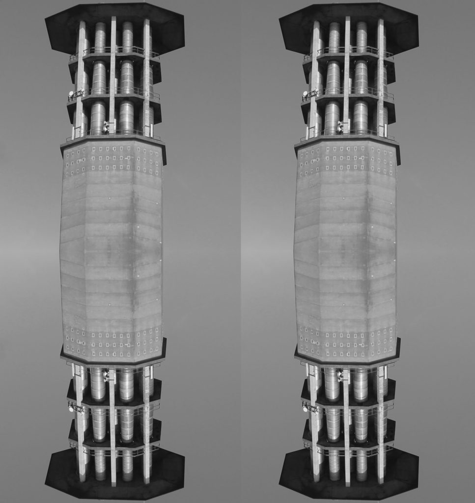
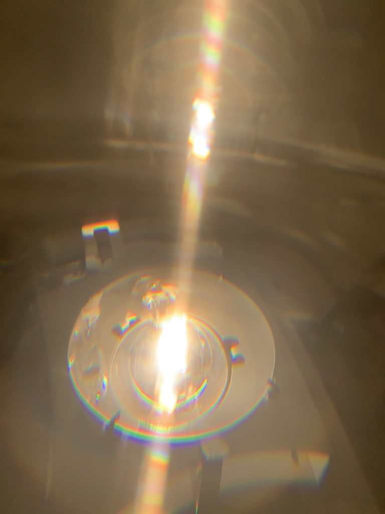
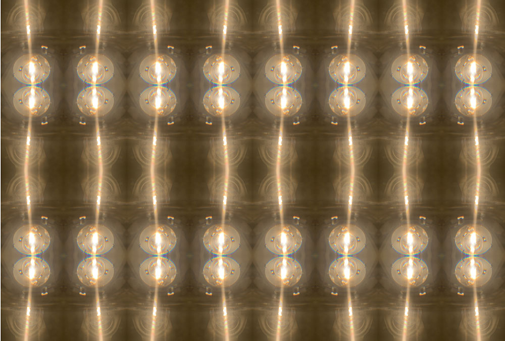
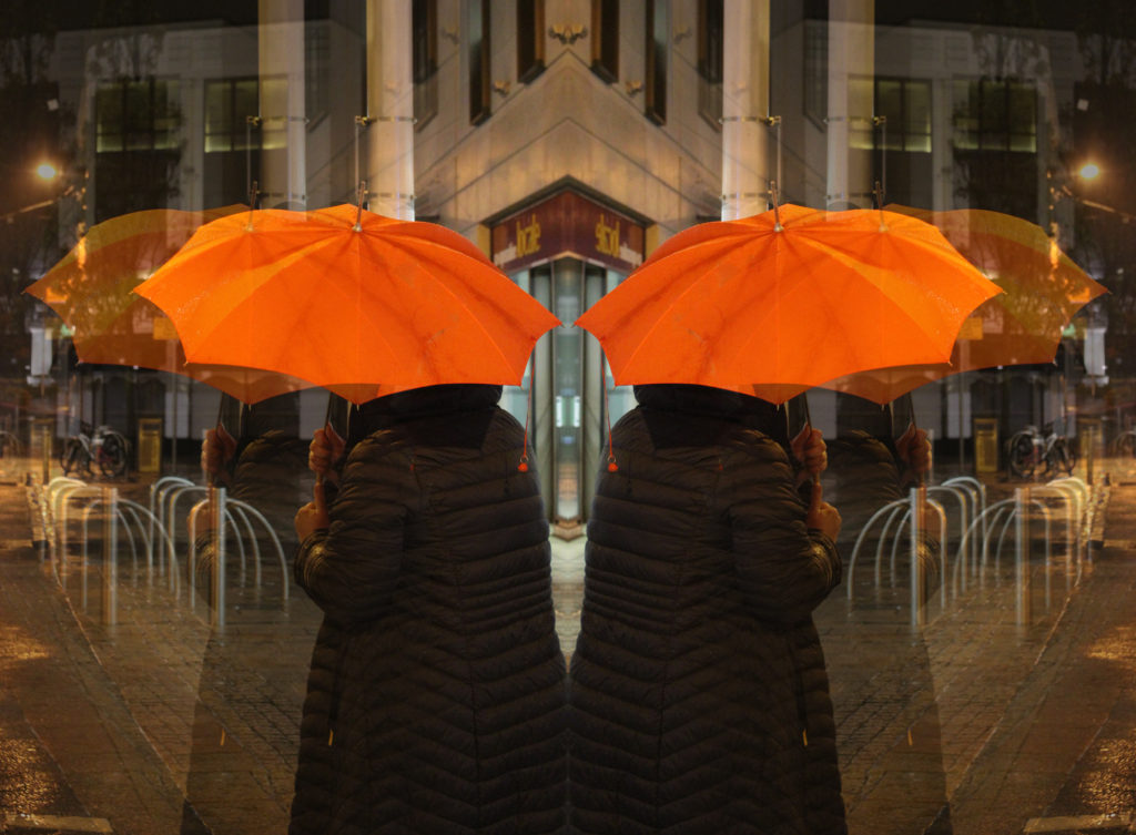
Firstly I selected the image (by pressing Ctrl A) and copied it. Then going onto the image tab I increased the canvas size width by doubling the measurement. After I pasted the copied image and then transformed the image and flipped it horizontally. I then copied the new image and doubled the canvas height then flipped the new image vertically. Repeated this a few times to get the final outcome.
In today’s lesson we experimented with Photoshop by creating a reflected image. First, I increased the canvas size of my image so I could copy and paste it next to the original photograph. Next, I used the ‘transform’ tool to flip the copied image horizontally so it gave the impression of the woman standing back to back with another. Additionally, I pasted the original image again to experiment with the opacity of the photograph and to create an echoed effect on the image. I copied this more opaque image and flipped it on the opposite side. Lastly, I flattened the image so all the layers became one. I really like how this abstract image came out as I believe it shows movement and rhythm, as if the woman is walking backwards into the other.
I firstly opened the image in Photoshop. I then selected the image and copied it. Then I edited the size of the canvas to double the width of the image. Then i pasted the image so two of the same image are side by side. Then I flipped the image horizontally so the background from on the side meeting both images were the same. I then flattened the image so that the two previous layers became one single layer. Next I copied the image again and extended the canvas vertically doubling the height. I then pasted the image and flipped the image vertically. Finally I cropped the thin white border around the image and saved it.


![no title]', Uta Barth, 1995–7 | Tate](https://encrypted-tbn0.gstatic.com/images?q=tbn%3AANd9GcQNRmGcz9fN-0_4SupX-L72Ypx_CnHG5JvOAyx0cJZwXrIvqCs%3Ahttps%3A%2F%2Fwww.tate.org.uk%2Fart%2Fimages%2Fwork%2FP%2FP78%2FP78225_10.jpg&usqp=CAU)