Minimalism
Minimalism as a combination of these two subjects, and is often used together in most photos.
The surface is important because, it is what creates the shadows and and highlights. It also makes it more unique as it can be dull or shiny, maybe even reflections.
The colour aspect is more about the tonal wheel, as the shadows make a light colour appear darker. This can be used to make a layered like image was depth of field is used effectively.
Julian Schulze
Julian Schulze was born in Hannover and is a Berlin based photographer. He is mainly focused on abstract and surreal genre of photography. He loves bold colours as well as colour combinations and compositions.
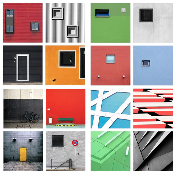
Julian Schulze is a master of minimalist photography, as he creates eye-catching and impressive minimalist compositions where each shot is composed using light, shadow, and colour to create a 2D or 3D scene.
Schulze describes himself as “focused on geometric abstraction and minimalistic work”
Kevin Saint Grey
Kevin Saint Grey’s techniques are normally symmetry and long-exposure, and he manages to get amazing, creative photographs, by using camera movements while exploring unique angles while shooting architecture.
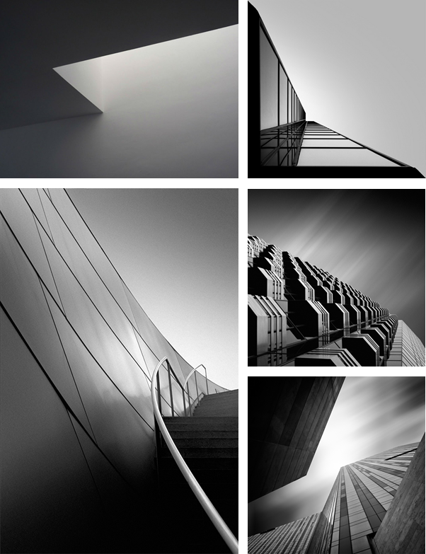
Kevin Saint Grey is a primarily black and white LA based photographer with a minimalist approach to his subjects which creates a drastic contrast.
He shoots mostly landscape and architecture, and his work distinguishes itself for the serendipity of black and white, “humanness” and silent images.
My Colour Photos
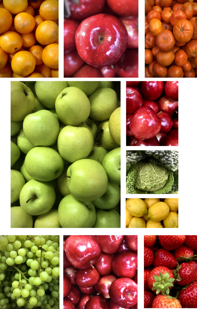
I like how they are vibrant as they make the image pop. I have used lots of repetition in my images, as I took them at the market in town. The images have a good amount of depth and definition. The light is artificial and coming from above, which is why the apples have a shine on them, and also because they were polished. This makes the subject more appealing.
My Minimalistic Photos
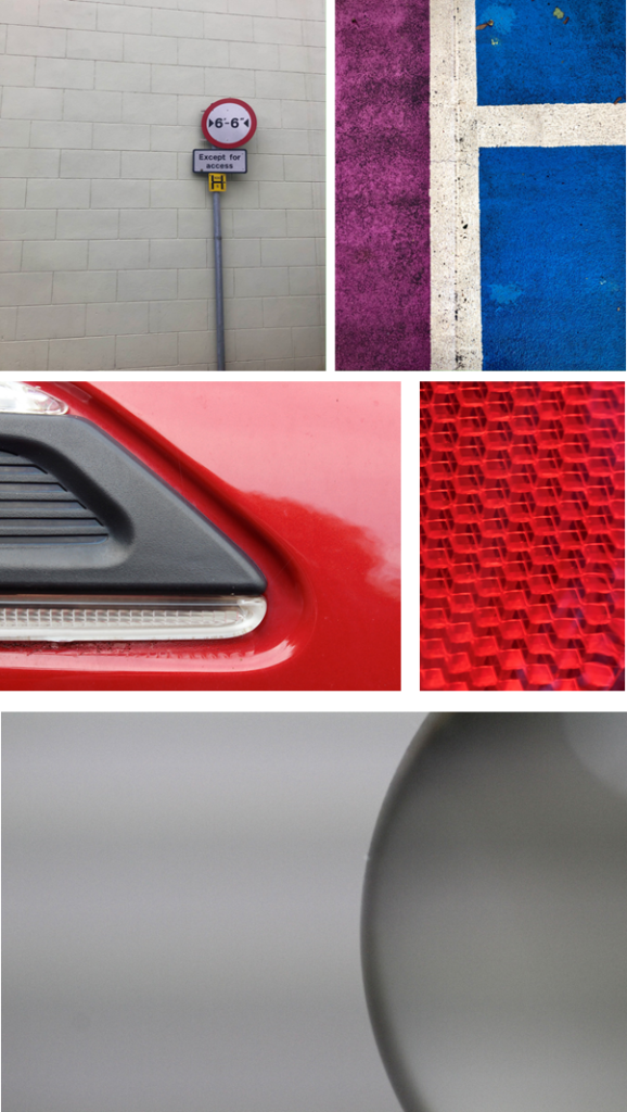
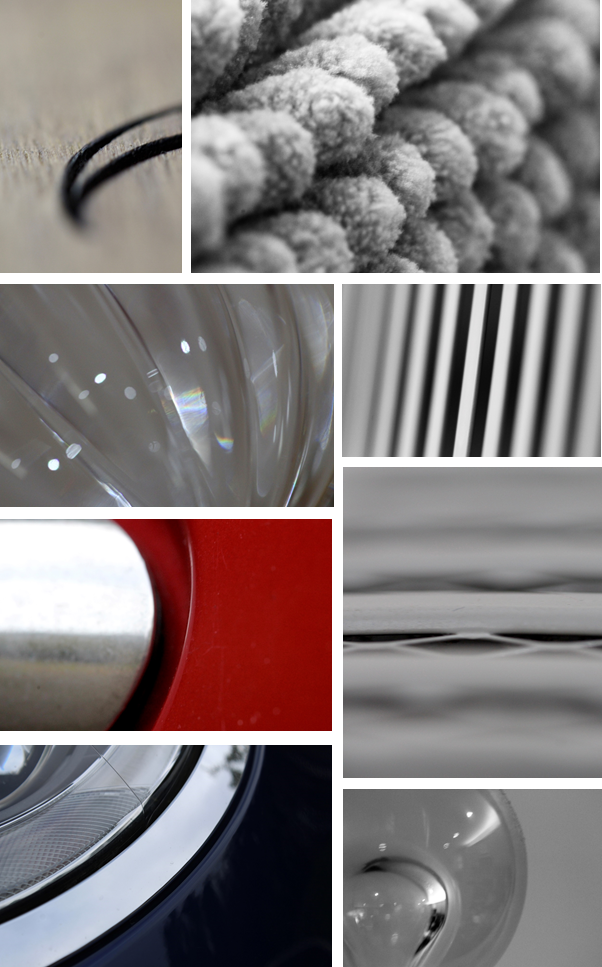
The first two minimalist photos both use the rule of thirds. The image on the left is only focusing on one subject, which is the sign on the pole, the wall behind is very dull, which is why it is classed as minimalist. The photo on the right is of the pattern on the floor in a car park. It uses vibe rent colours the clash together making it more visually pleasing.
The rest of the photos are taken of objects, although not the full object is in the frame as it creates a minimalistic effect. I only focused in on the small simple details.
My Surface Photos
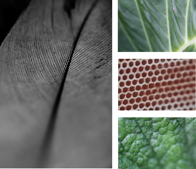
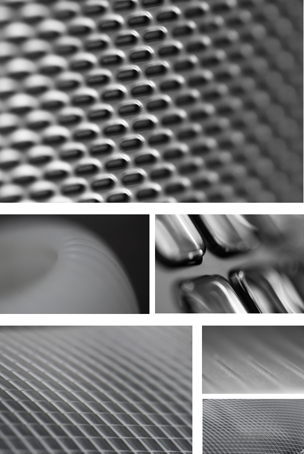
To capture the surface on these objects I used macro lens so I could zoom in closed to get very detail. All the images show repetition of patterns I found most of these patterns on natural objects like feathers and leaves, although I did take a photo of a matchbox to get the image with lots of dots. Then focused on a reflection strip in a cars headlights to get some crosshatched detail.
