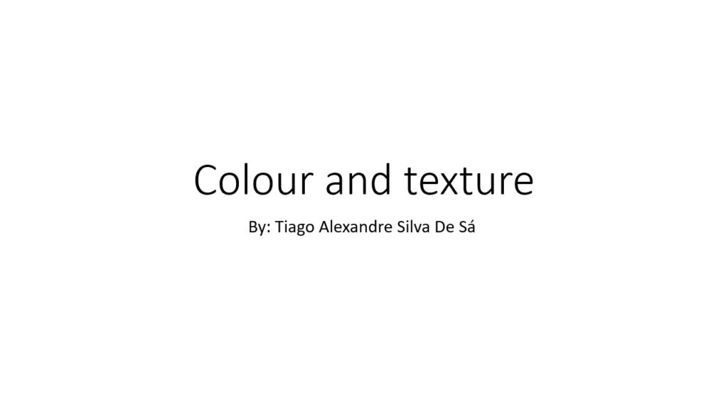
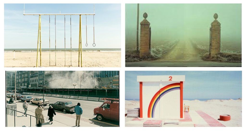



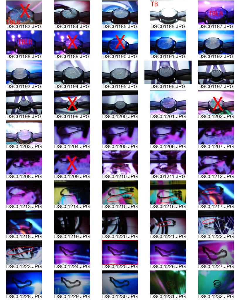
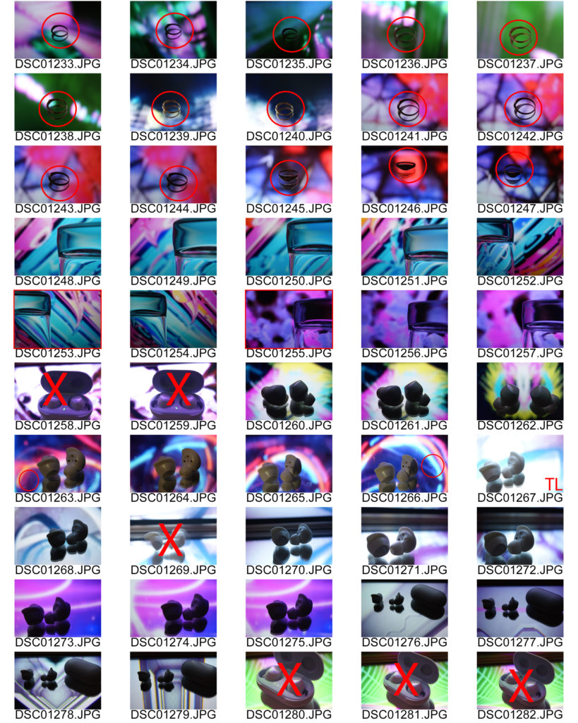
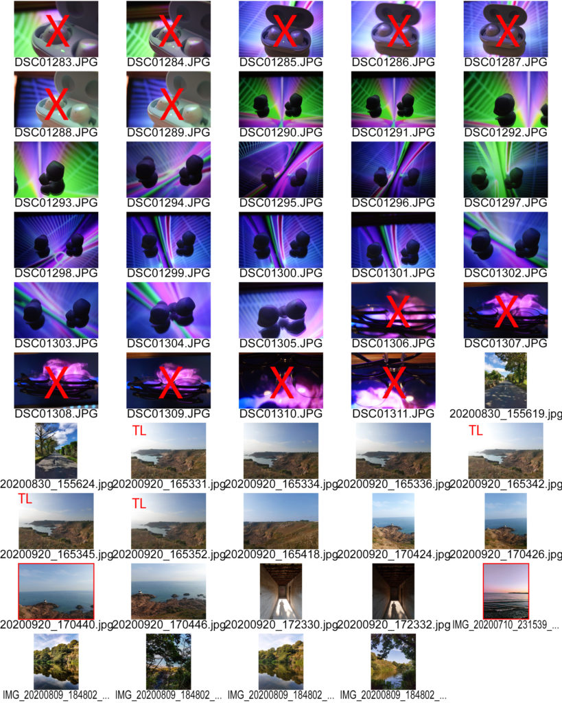
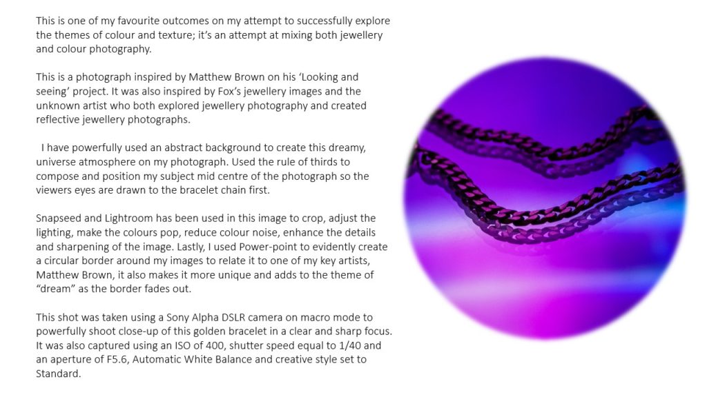
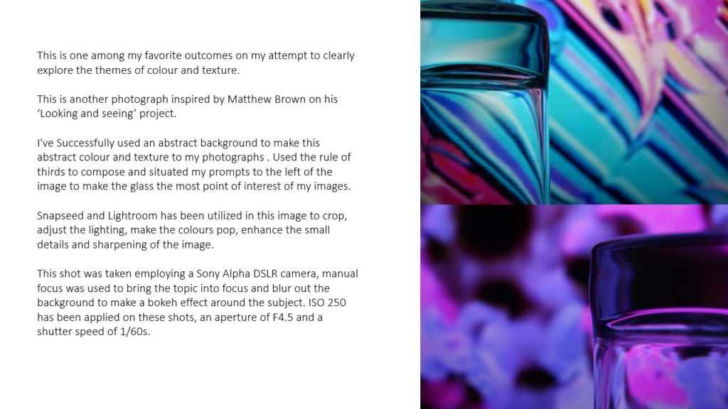
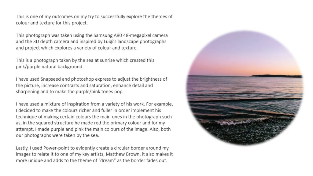
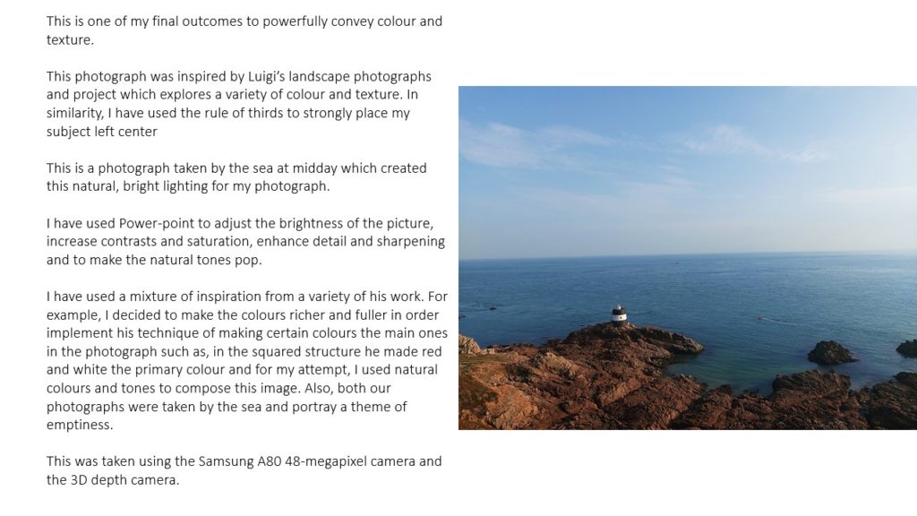


For this project I will be exploring the different ways I can capture varying textures and colour schemes in an expressionistic consuetude. I will also be focusing on using ISO and white balance in an unconventional and creative manner.




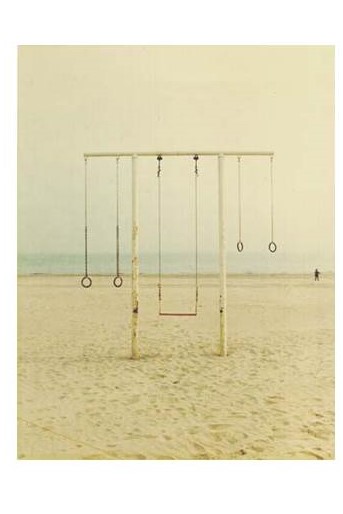
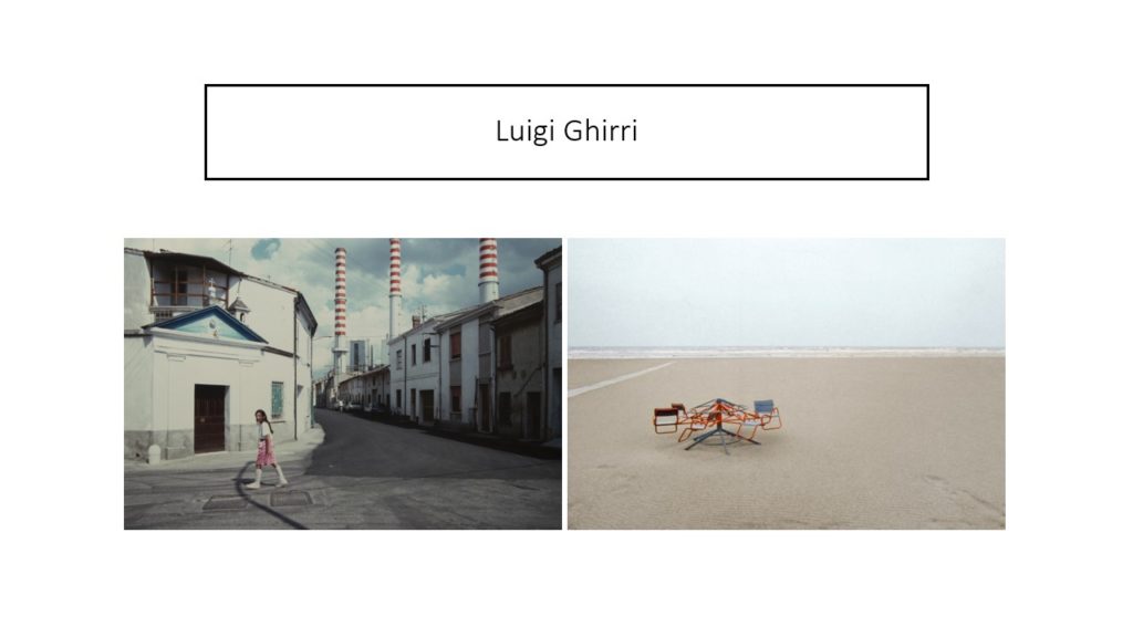
Luigi Ghirri
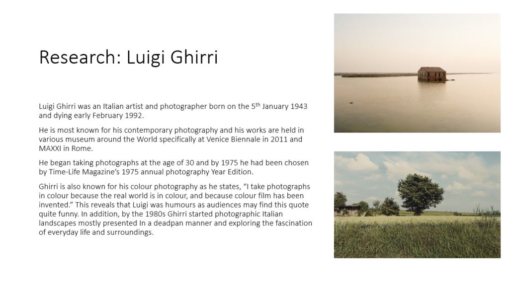
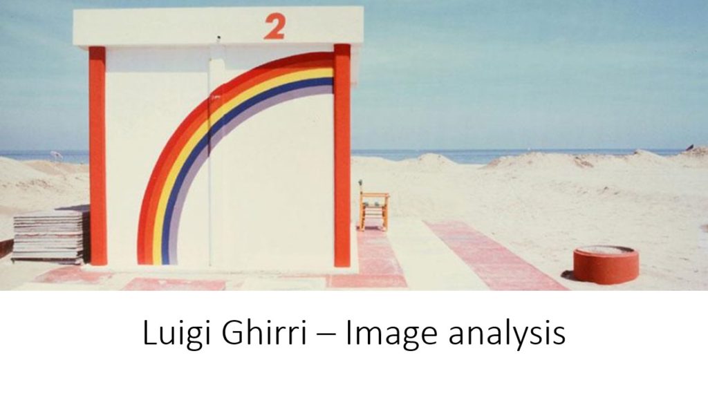
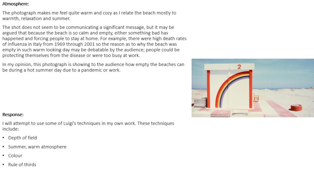
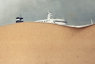
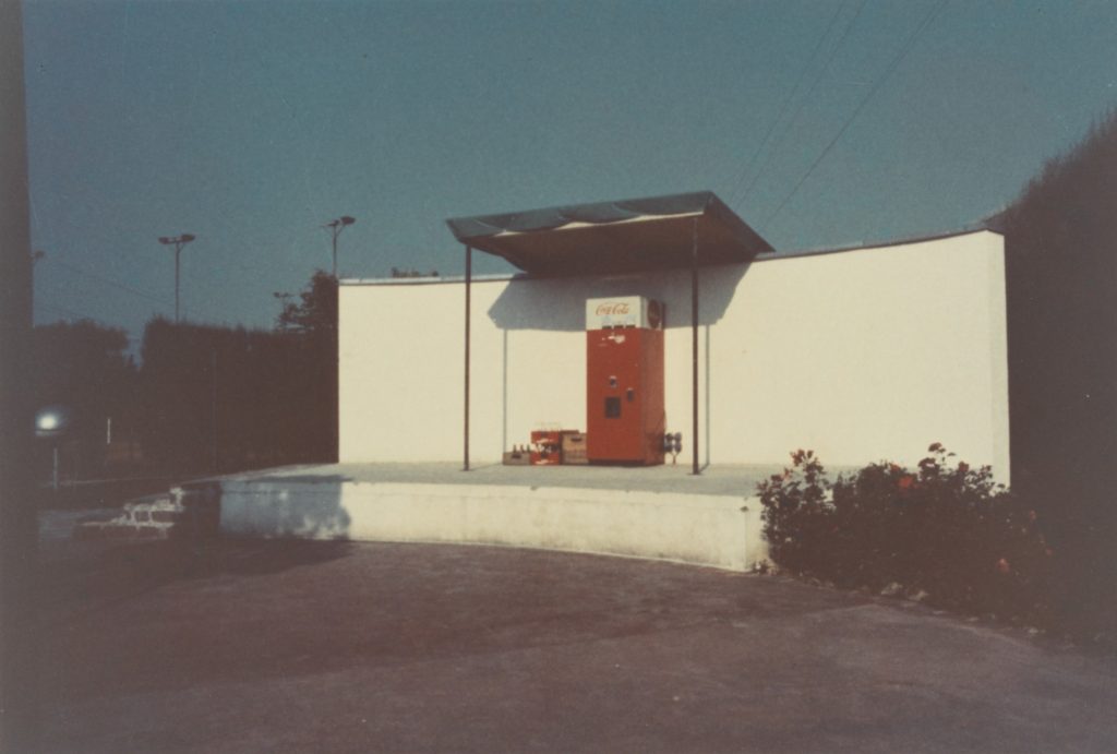
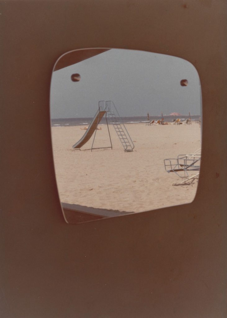
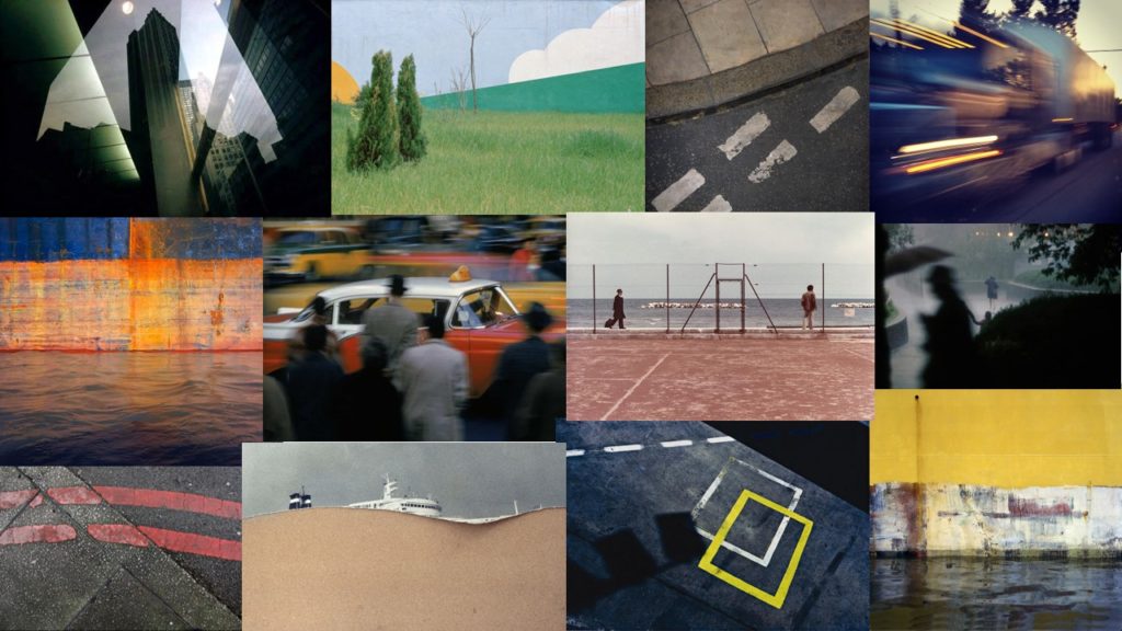
Luigi was an Italian photographer born 1943. He was a pioneer in his field and he focused on the contrast between fiction and reality.
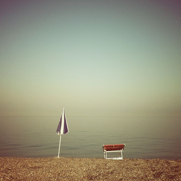
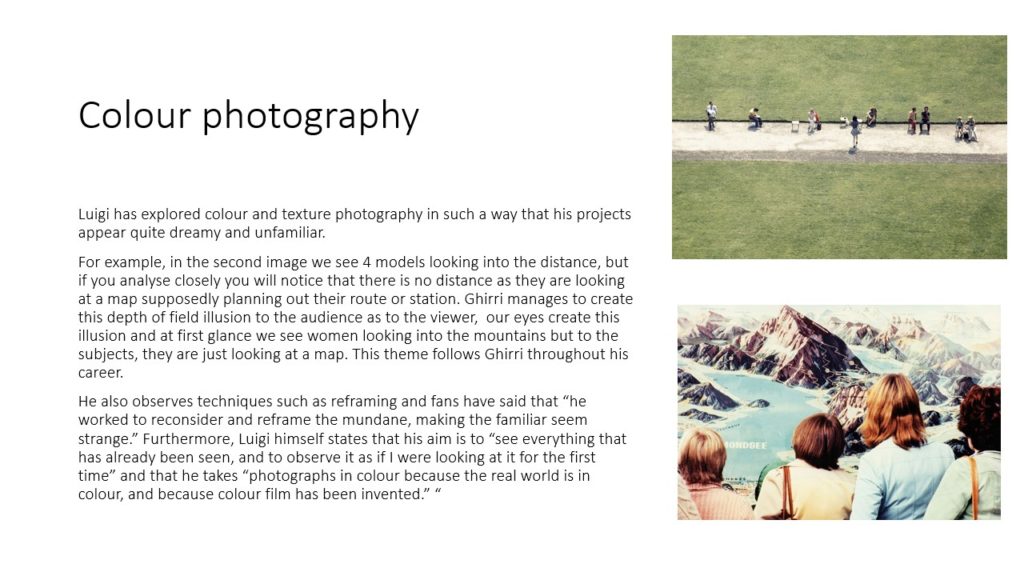
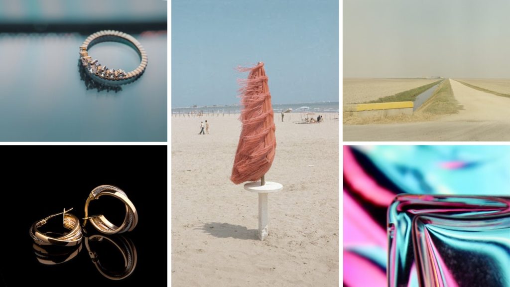
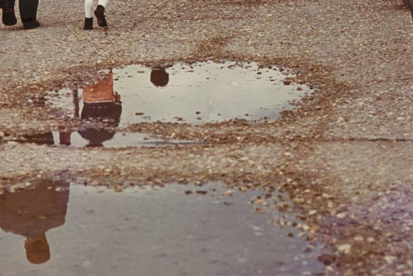
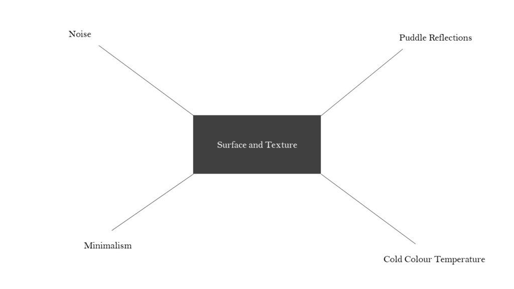
He creates minimalist compositions which focus on a consistent colour temperature and texture. The unique attitude in his work consists of very interesting textures created by a flat contrast. He experiments with the light sensitivity of his film which creates a fine grain on his images which also adds to the unique unprecedented texture of his compositions. He shoots untarnished, condensed backgrounds to accentuate the surface texture of the image. The flat contrast adds a faded look to his images.
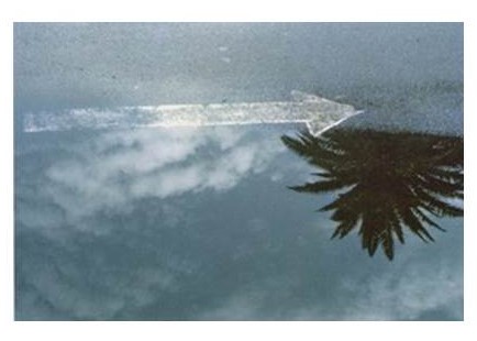
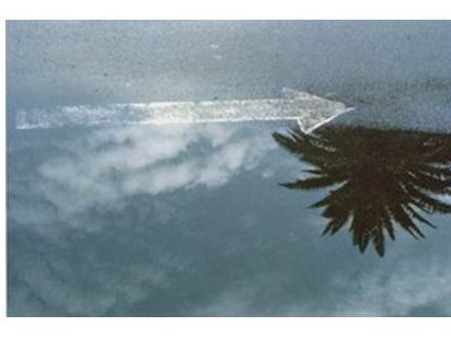
In the above image we can see Luigi also experiments with reflective surfaces to further the idea of the unprecedented surface texture present in his images. In the above image Luigi uses a specific white balance to create a cold colour temperature in the image. This temperature, combined with the puddle which is associated with rain, gives the image a bleak feeling. He also uses a flat contrast to add a faded look and texture to the image. He uses the puddle to create depth in his image and add a unique perspective to how we view the world and its textures. He also experiments with ISO to great a grain in the image to again boost the idea of unconventional surface textures. He uses natural lighting which is not too harsh to maintain the flat contrast in his works.
Aaron Siskind and the Boyle Family
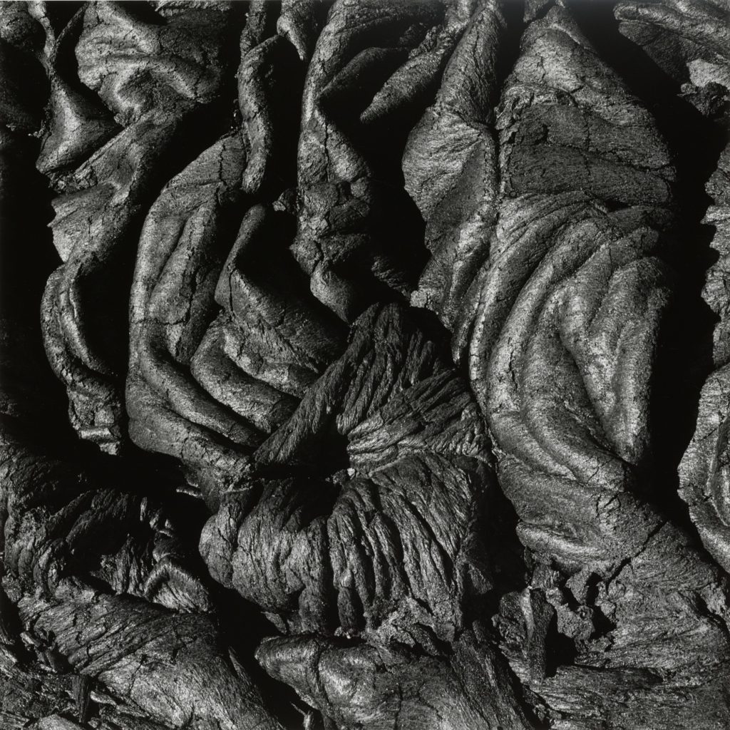
Aaron Siskind was an American photographer born 1903. Looking at Aarons work in the context of Texture and colour, his pieces relate very well. He creates compositions that focus on the detail of things and he brings their texture into light. and creating
The Boyle family is a group of collaborative artists based in London who where popular in the 60s for their minimalistic macro photography. They created work with the focus point of flat surface texture based images.
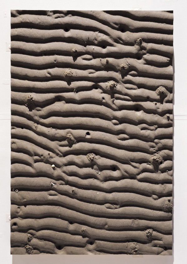
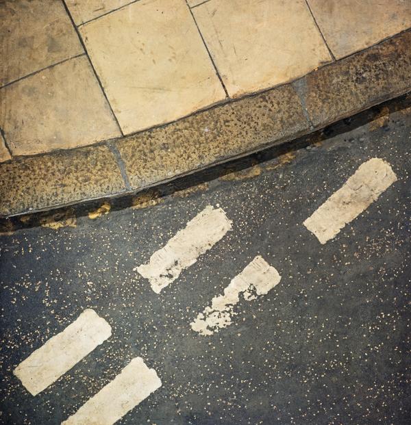
Photo Shoot Plan
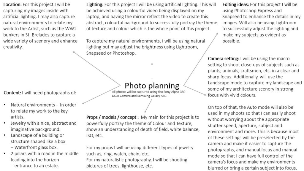
Shoot puddles, road imperfections/markings and minimal style objects around my countryside neighbourhood and in urban built-up areas. Use ISO in a creative way – use extremely high ISO to give my images grainy texture. Use white-balance creatively – give the images gloomy cold tonal temperature. Focus on surface texture.
Contact Sheets
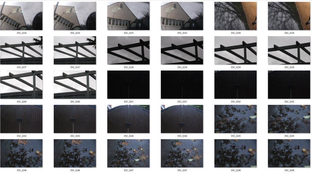
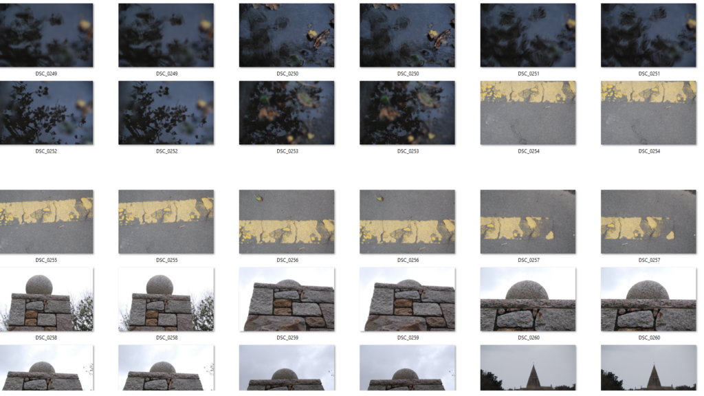
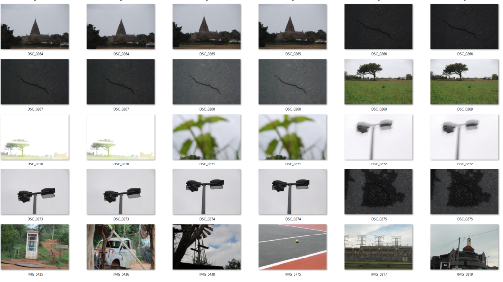
My Compositions Focused on Surface Texture and Flat Tonal Range/Colour Schemes
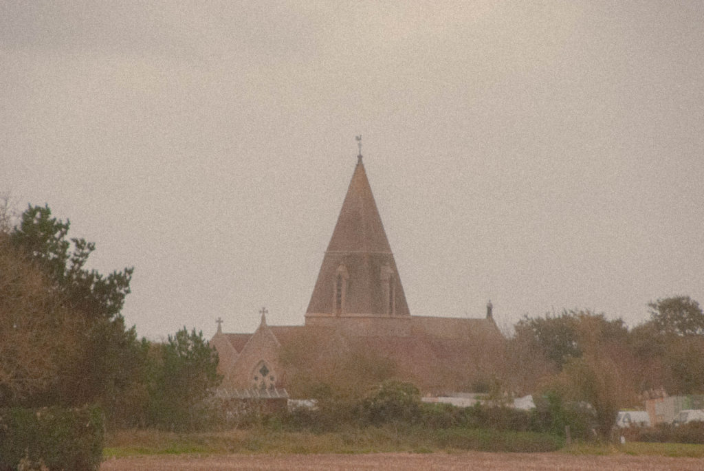
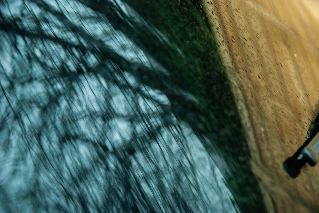

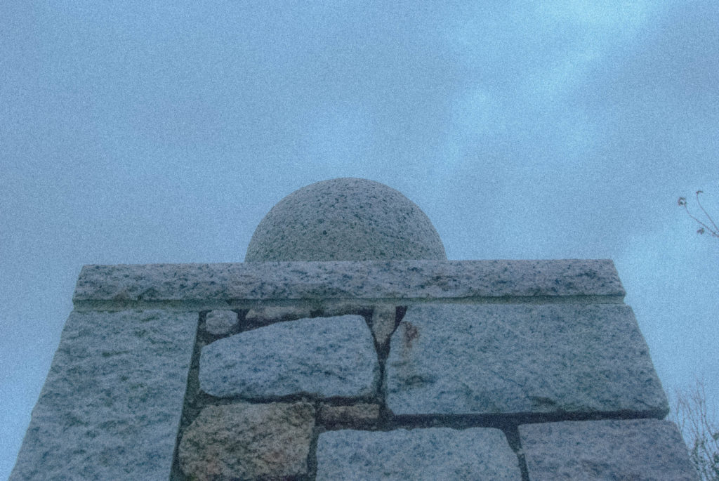
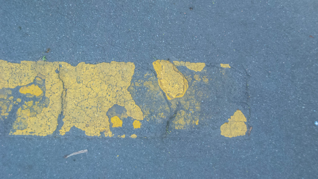
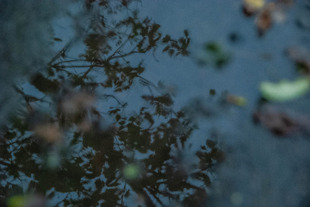
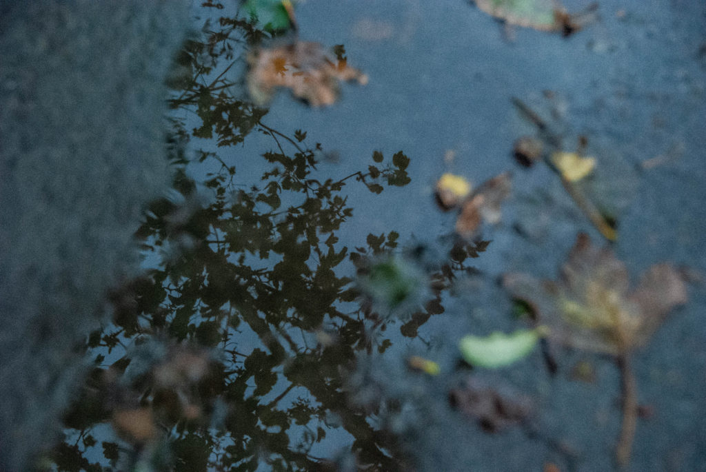
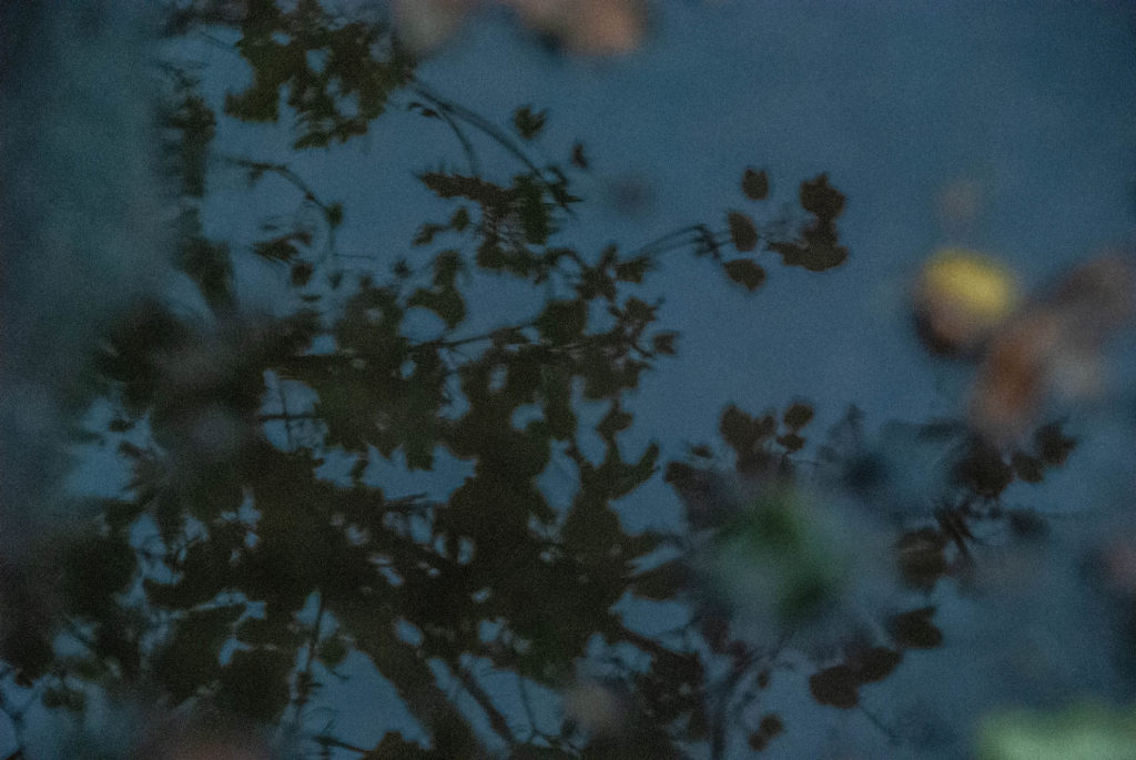

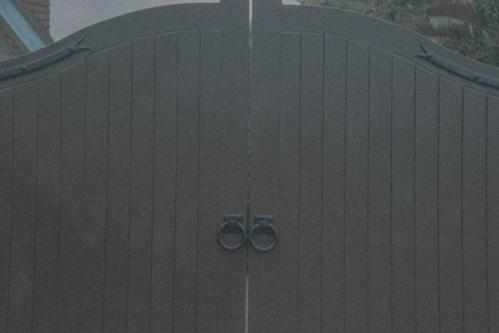

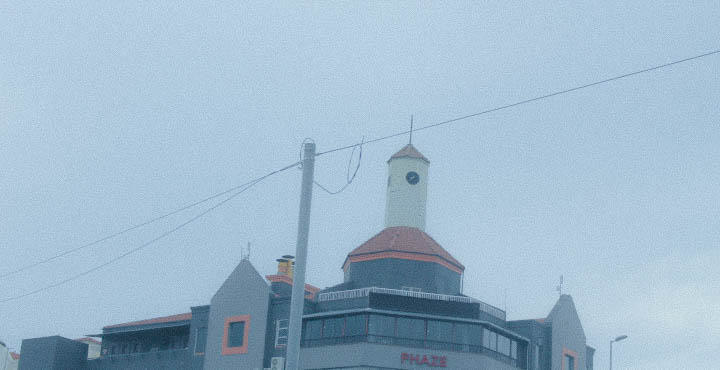
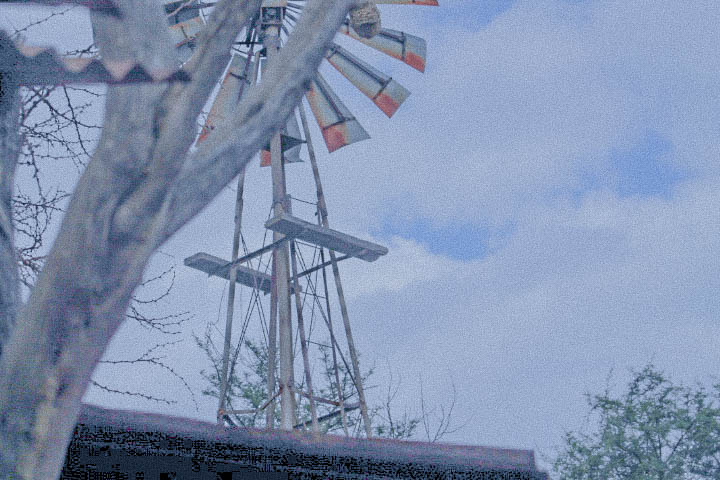
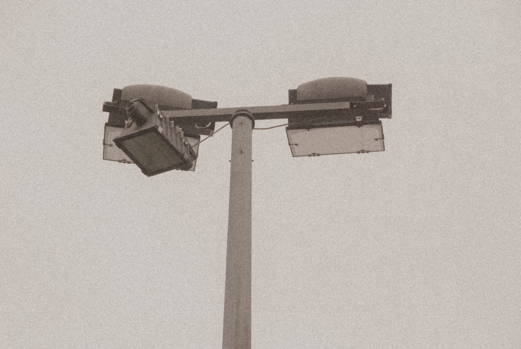
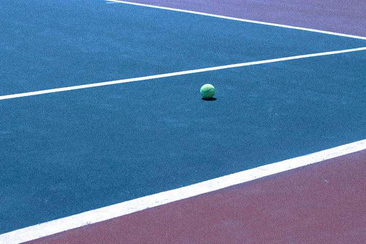
Taking inspiration from Luigi, when shooting my images I focused on using ISO in an unconventional way to create a grainy surface texture. I also used white balance to create a flat colour contrast.
I also took inspiration from my second reference and created detailed compositions highlighting texture in our world and creating a sense that one could rub their hand over my images and feel the road imperfections.
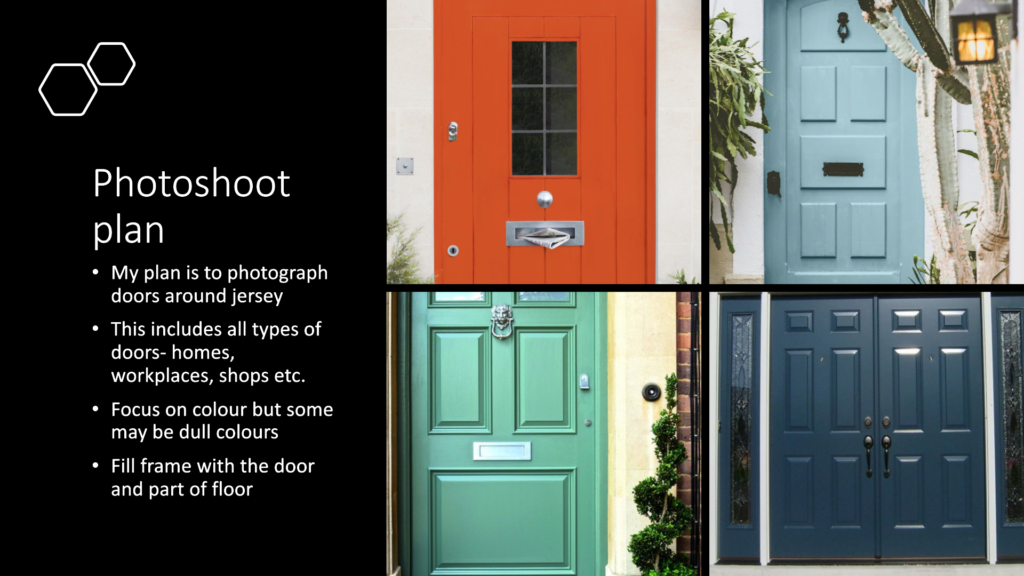
| shoot 1 | shoot 2 | |
| who | N/A | N/A |
| what | doors | doors |
| where | town | the market |
| when | Monday after school | Tuesday after work |
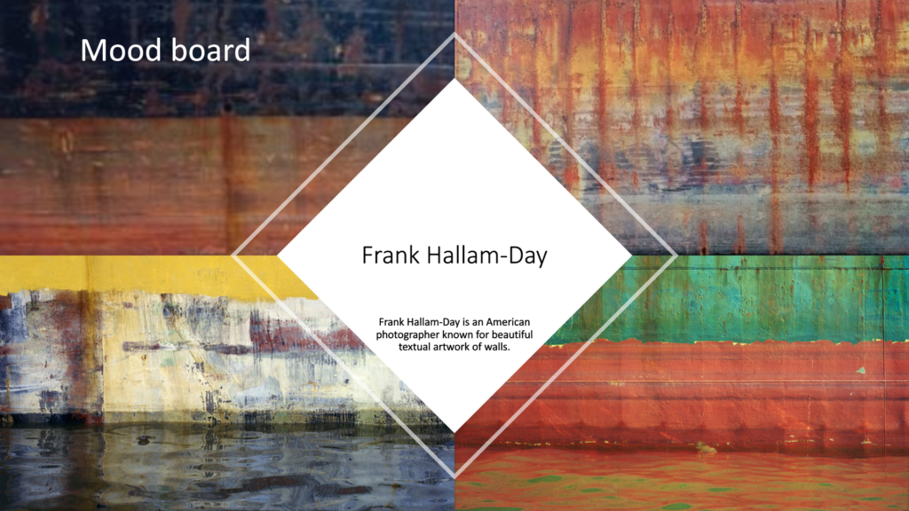
| why | to replicate Hallam-Day’s photos | to replicate Hallam-Day’s photos |
| how | camera on phone | camera on phone |
SHOOT 1


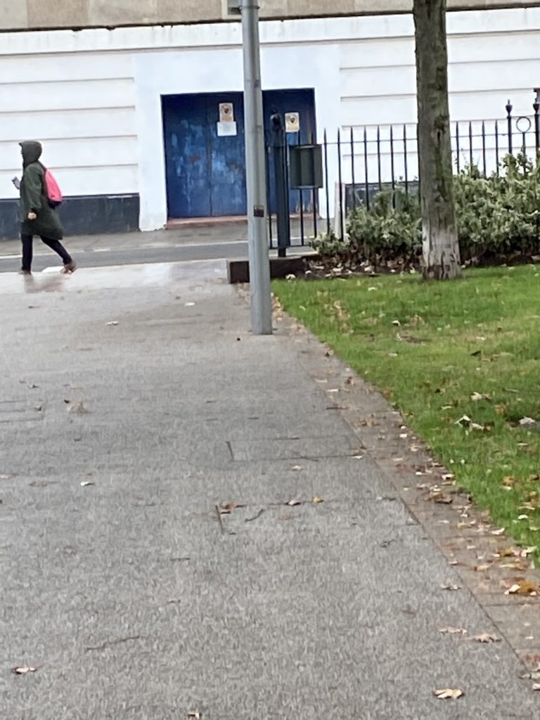
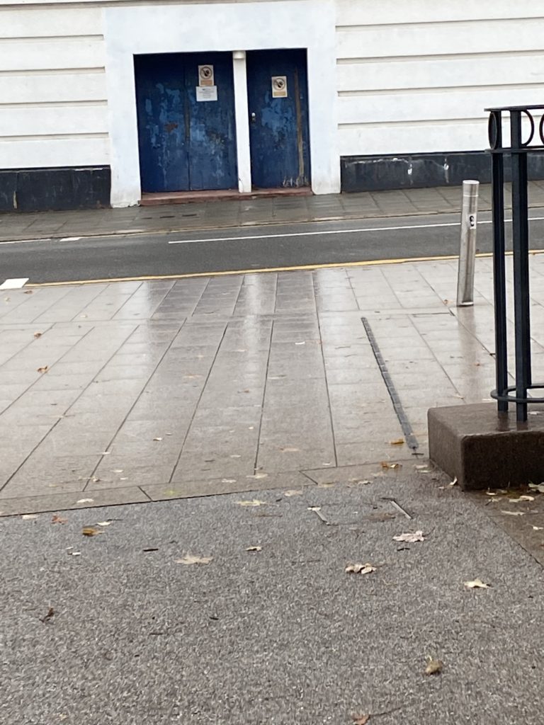
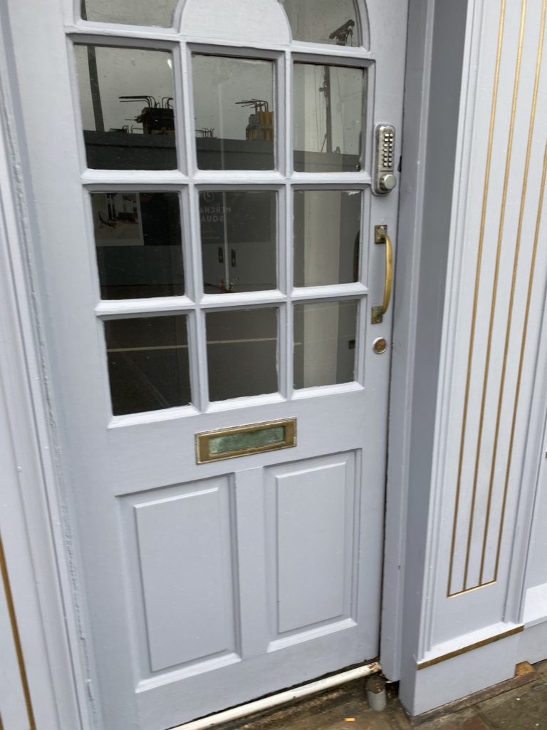

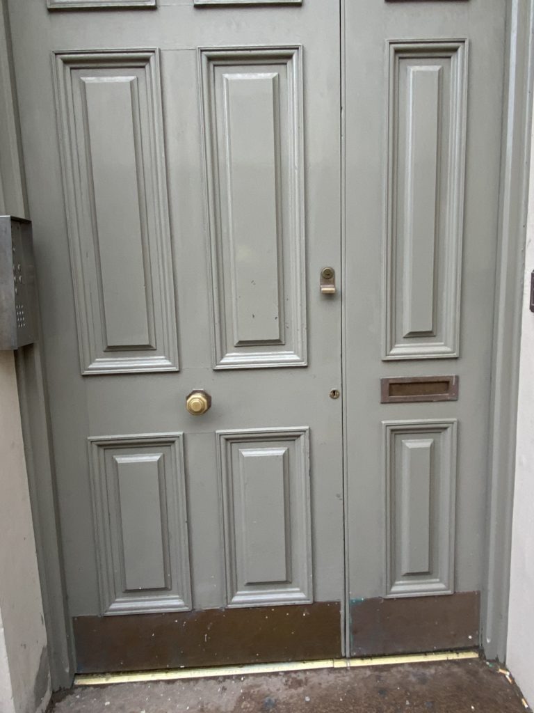
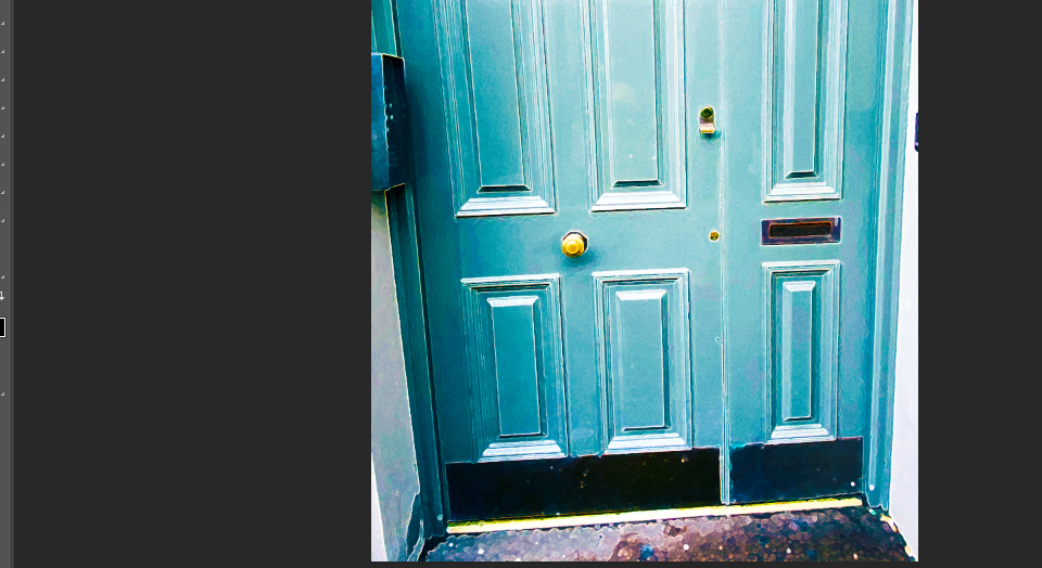
I think that these photos stay true to Hallam-Days original images as they blend town life with busted doors. I would have liked to take more but I looked weird taking photos of people’s houses and shops in town so was limited to only a few photos
SHOOT 2
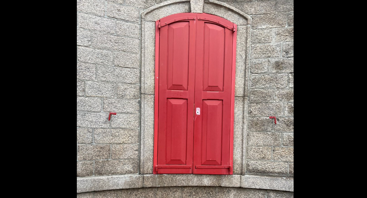
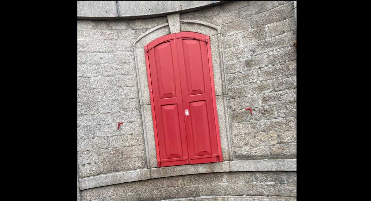
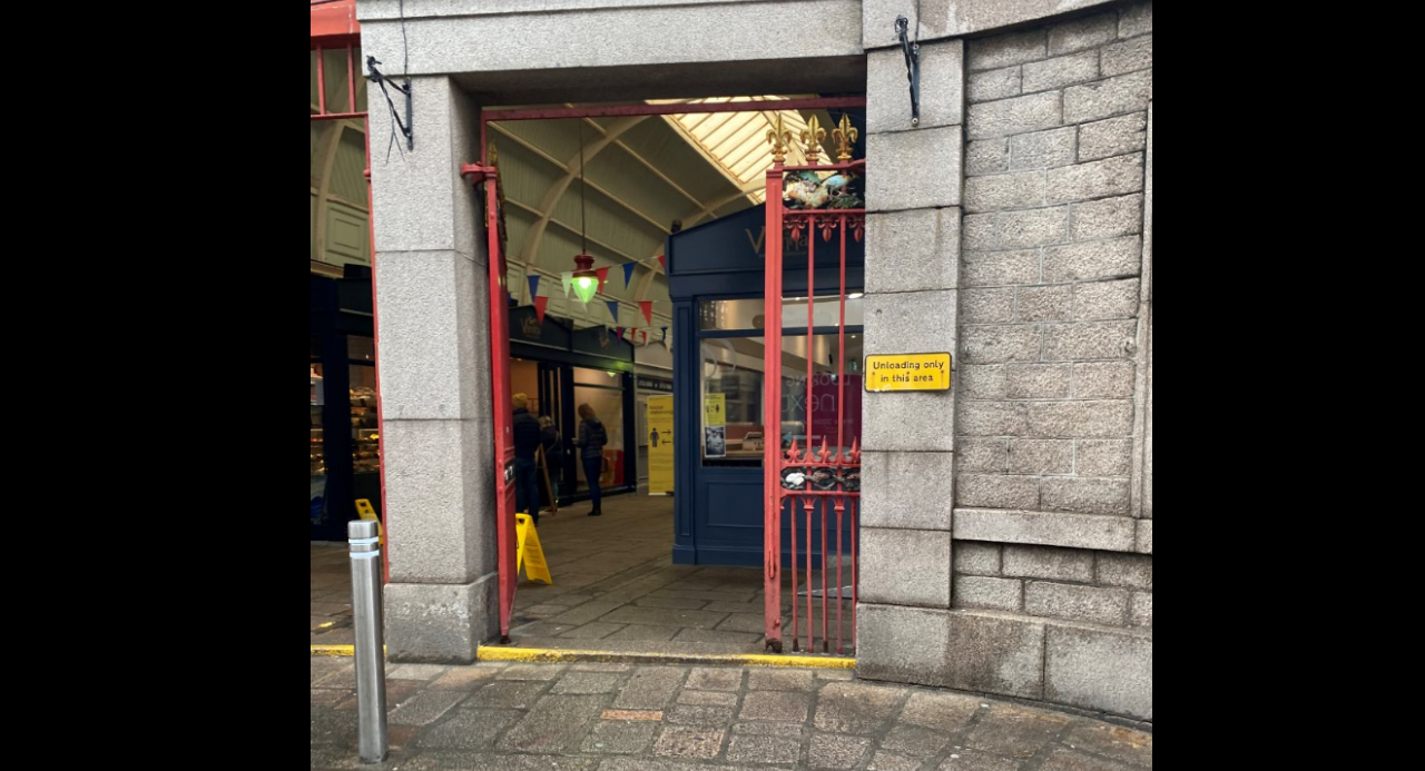
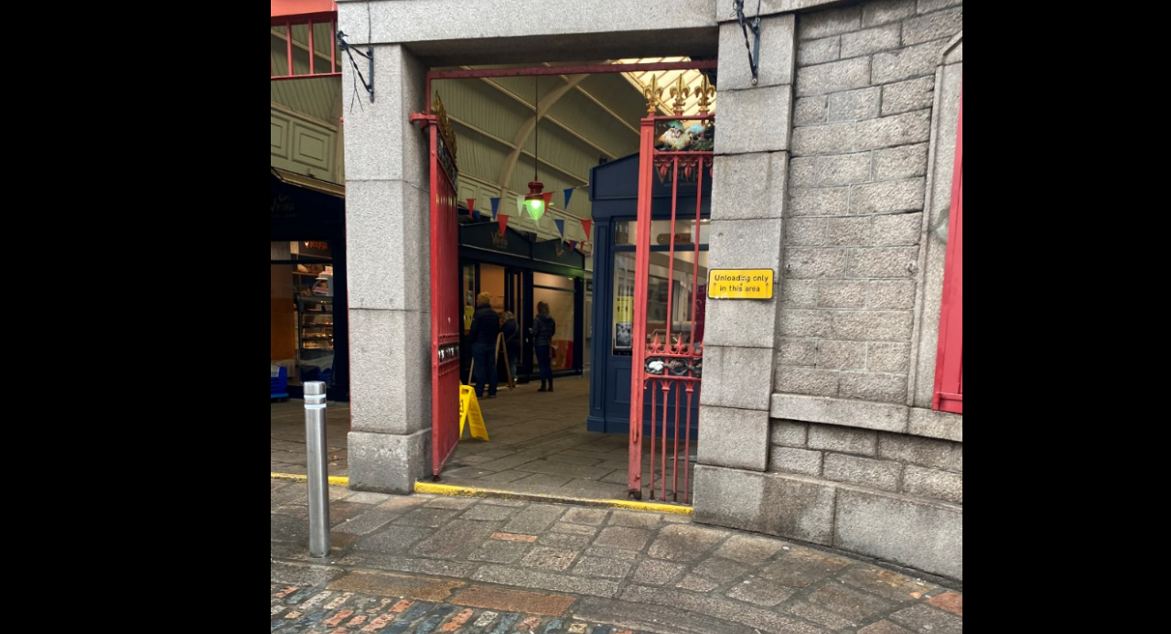
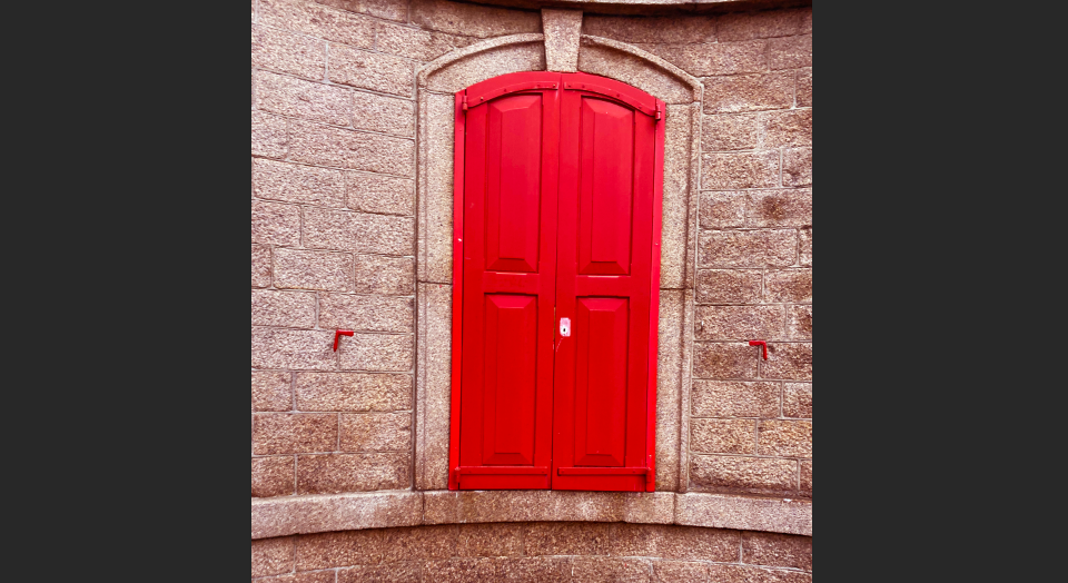
This shoot produced a few nice photos however I had the same issue as the first photo shoot in which I looked really weird taking photos of doors in town so couldn’t take as many as I would have wanted.
EDITING
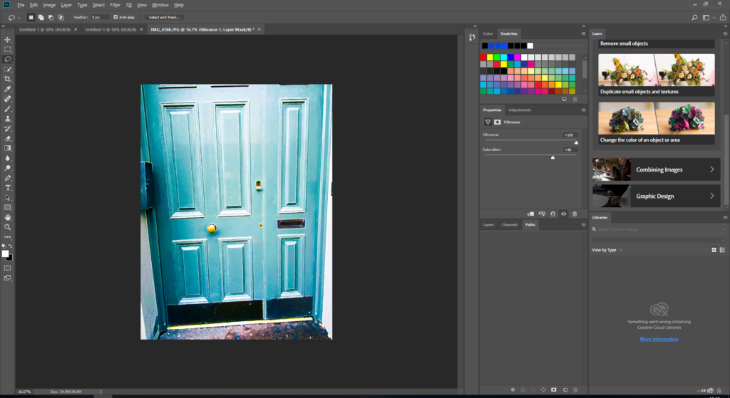
To make the photo more like Hallam-Days, I wanted it to be a really vibrant and blue so using Photoshop I made the vibrancy and saturation really high and also put the blue and cyan out of balance to make the colour really stand out.
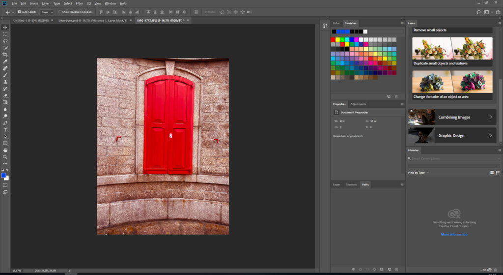
For the door in the market I used the same photo shopping techniques but with red instead of blue and cyan.
FINAL IMAGES
COMPARISON TO HALLAM-DAY’S WORK
In conclusion, my photos had some similarities to Hallam-Days. The use of surfaces as the subject was one of these. I think that i managed to follow his grungy style but i think that his photos were more naturally colourful whilst I had to edit a lot of my colour in.
EVALUATION AND CRITIQUES
I really liked my photos and felt that the editing process really added a lot to them however it would have been better if I had more photos to choose from .Next time I will take more photos so that I have more photos to choose so will ultimately have better photos.
Ernst Haas was an Austrian-American photographer, born in 1921, who is known for being a pioneer of colour photography opposing the better liked black and white style at the time. With these photos he was able to capture an aspect of movement in his images, by using a slow shutter speed which creates a blurred effect. Haas stated that he was ‘Bored with obvious reality’, and chose to use his photography as a way of transforming this into a subjective point of view.


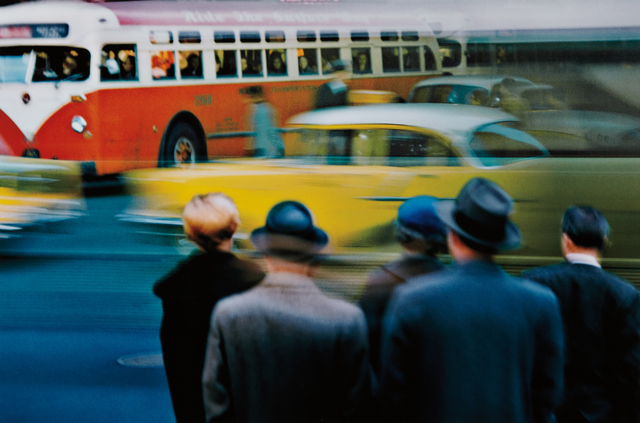
This colour photograph taken by Ernst Haas displays a busy street containing moving cars and busses in primary colours, in the background, which contrast with the crowd of people in dark monochrome clothes, in the foreground. The blurred streaks from the passing yellow cars create directional, horizontal lines, that lead your eye across the image, from the foreground to the red bus in the background. You can see that Haas has framed this image to leave very little empty space, resulting in a crowded photograph.
In additions, the lighting of this image appears to be natural as it was taken outside, allowing for a small amount of shadows, meaning it was most likely during the middle of the day. Here, Haas has used a slow shutter speed to create a blur affect, to add the aspect of motion to his images. Due to the fact that most of this image is in focus, I can say that Haas used a small aperture, allowing for a wide depth of field.
From this photo you can see that Haas has taken this photograph with the aim of capturing his subjective point of view, similar to his other photographs, as the motion created by the slow shutter speed allows you to feel that you are presently there experiencing that moment for yourself.
In order to take photos in the style of Ernst Haas, using the slow shutter speed skill, I will aim to take photographs of passing cars along the Five Mile Road in St. Ouen. I will focus on capturing images containing primary colours, similar to Haas, by taking photos of coloured cars. To achieve the blurred affect I will use the Shutter Priority setting on my camera, allowing me to adjust the shutter speed as I see fit.
For my first shoot I took slow shutter speed images of cars going past along the road, through the window of my car. This is as the raindrops on the window created a texture layered over the image.
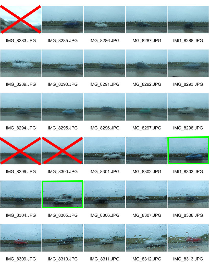
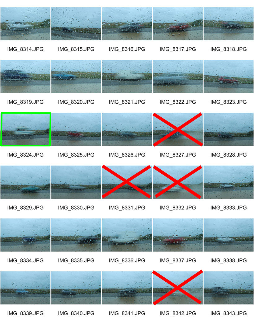
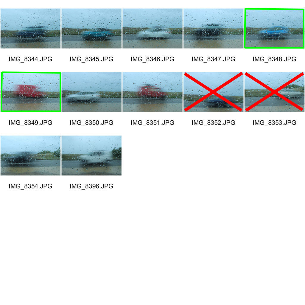
For my second shoot, I also took slow shutter speed photos of cars going past, however this time outside instead of through the widow. This allowed for the blurring of the cars to create strong, directional, horizontal lines moving across the image, similar to Haas’ work.
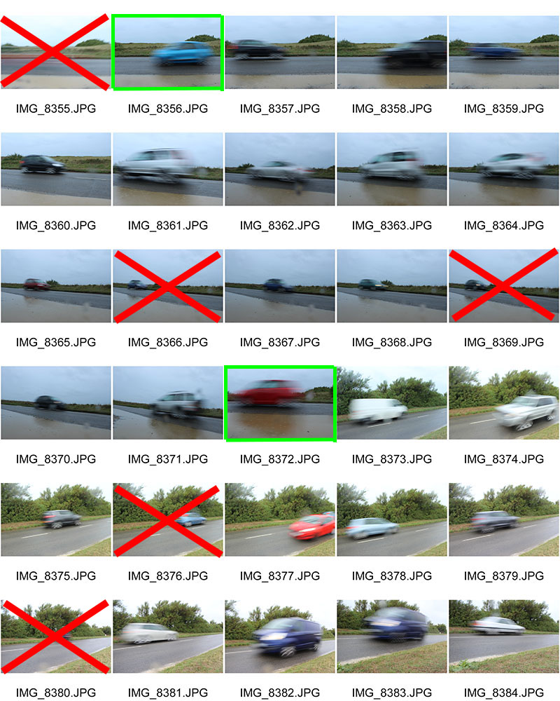

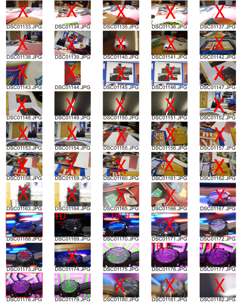
Here in these contact sheets I have highlighted the images I will edit in Photoshop in green, and crossed out the images that were perhaps too blurry or over exposed in red.
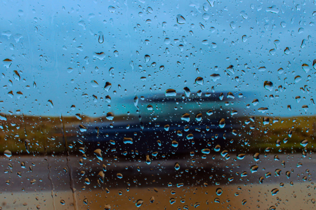
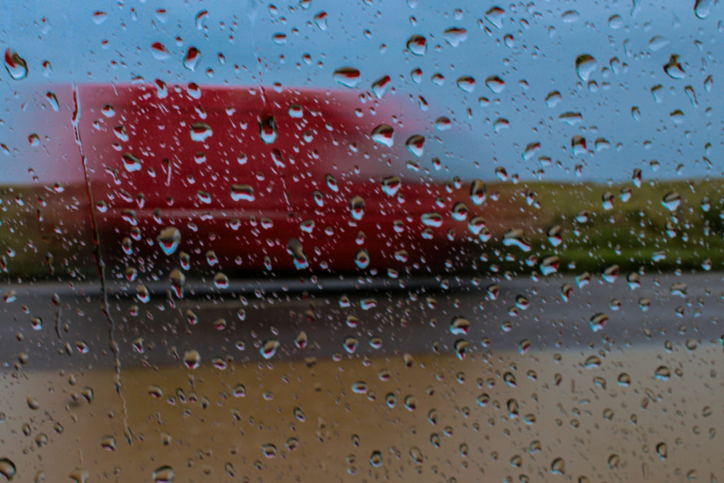


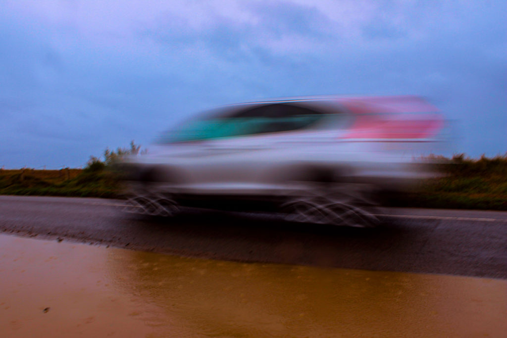


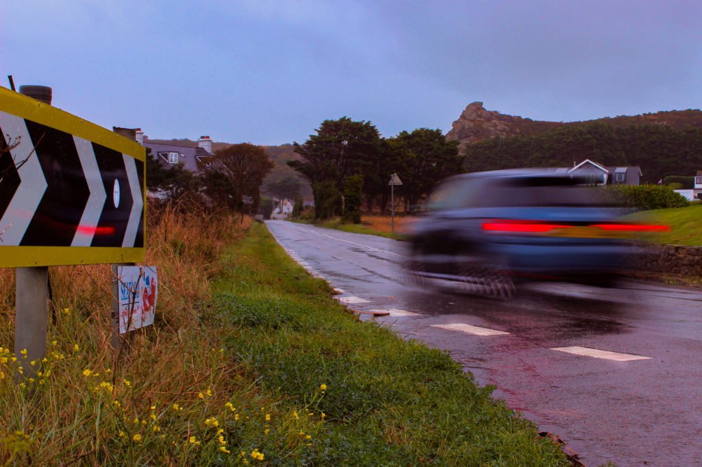

In photoshop I took five images from each shoot and edited them in a manner so they would look similar to the works of Haas. In order to do this I had to increase the vibrance and saturation to replicate Haas’ use of vivid colours in his compositions. I also used the channel mixer and colour balance to make these images appear warmer and less over exposed, due to the rainy conditions they were taken in, whilst also increasing the contrast for a more dramatic piece.
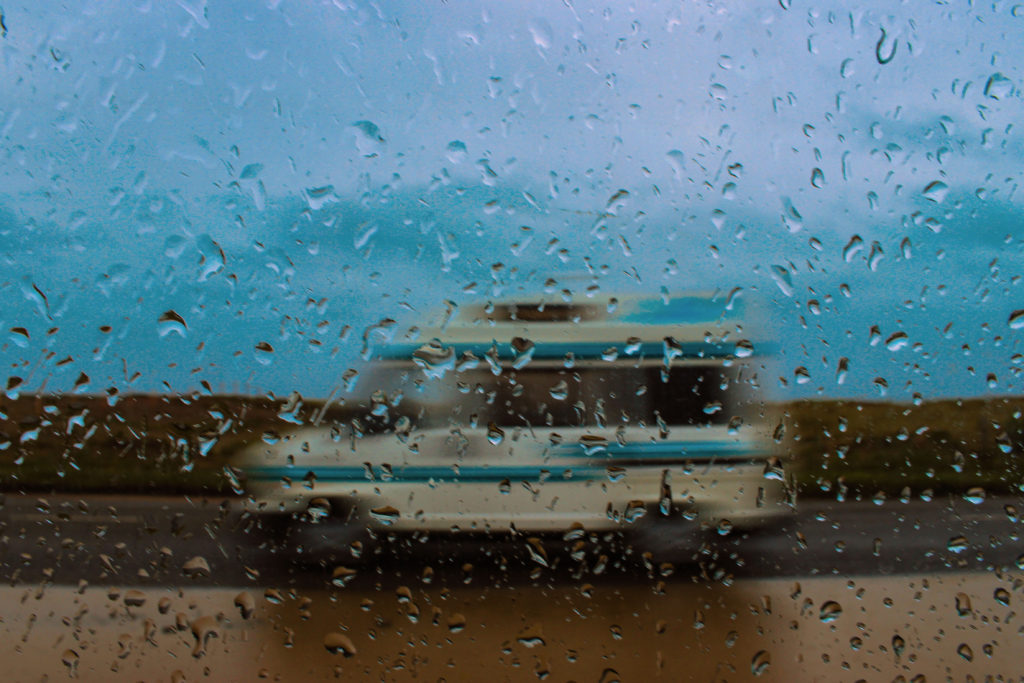
I think that this is my best image from this project as the stripes on the van allow for strong, directional leading lines across the photograph. Also, it replicates Haas’ use of primary colours slightly, with the incorporation of blue in the sky and on the van. In addition, I think that the raindrops add a nice aspect of texture, causing it to be a more interesting image.
In order to achieve better quality images for this style of photography, next time I could go into town to take these photos, as it creates more of a crowded scene, like Haas’ work, and includes more architecture. Also, I could use a tripod so that the only blur I capture in the images are from the motion around me and not the movement of my camera.
Keld Helmer Petersen.
– Petersen was a danish photographer who’s work was widely recognized 1940s and 1950s.
– His career ran for about 70 years, with his interests remaining in modern architecture, industrial areas and structures.
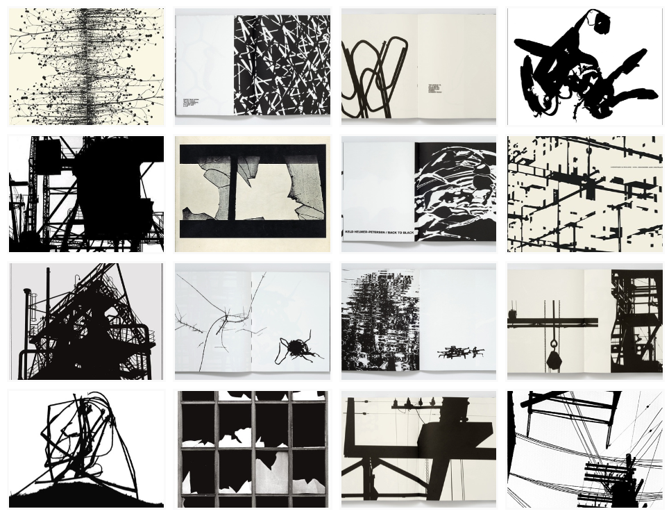
– I chose 4 of my favourite photos from previous work to experiment with to edit in photo shop
– In Photoshop, I selected the image tab, then clicked the option, Adjustments, and finally the threshold option.
– I then used the level slider to experiment with the contrast between black and white gradient.
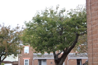
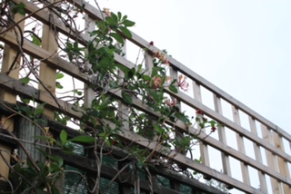
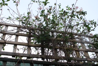
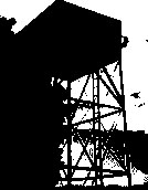
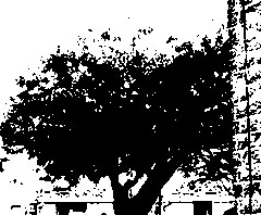
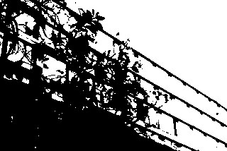
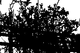
-I like the simplicity of presenting a photo as plainly black an white with no grey scale.
– However, the editing makes it harder to differentiate between the objects and we cant see any depth in the photos.
Nick Albertson
Compare
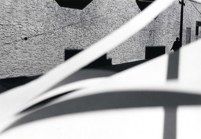
Both images show strong lighting from where the camera is pointing having a tonal range going from light at the front to dark at the back. Both photos use a fast shutter speed at the images are in focus and not blurry from movement, with Albertson’s and Metzker’s photos both use straight lines going across the photo of just making a rectangular or square shapes which all spaces are in a 2D layout making the image look flat. The photos produced by these photographers reflect the year/years these photos have been taken where Albertson’s image looks slightly futuristic whereas Metzker’s igmage looks old and in time frame.
Ray Metzker
Contrast
In Albertson’s photo he bases his image on colour whereas Metzker uses black and white tones instead, the focus of the photo in Metzker is behind the white lines focused on the wall which is the opposite to Abertson’s as he focuses at the centre at the front. With Abertson’s photo he uses set lighting which he prepares for his photos which is different to Metzker as he uses natural lighting and doesn’t adjust the scenery except with an object to put in front of the camera such as a piece of paper to change the boring streets into something that is irregular whereas Albertson doesn’t block the camera and focuses on one centre object.
Ernst Haas compared to Nick Albertson
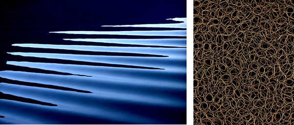
Haas takes more identifiable images, for example, a zoomed in shot of horizontal ripples on the surface of the water to create an abstract scene, where as Albertson only takes extremely close up images, to a point where you can identify what the subject is, which makes the image more fascinating as you question what the image is of.
Both images are visually appalling, as they both use circles, which is a clam looking shape as the are no pointy corners or sharp lines.
The lighting is more noticeable in Haas’s image, as there is a lot more definition due to a high contrast in the tones, because the water is at different levels, as it is 3D. On the other hand, Albertson’s image uses a black background so it is hard to tell where the light is coming from and if it is natural or artificial.
The lines on Haas’s image are horizontal and angled at a 45 degrees from the light, to create highlights and shadows in the corners of the images. The repetition adds more depth as you and see the ripples behind each other. Where as, Albertson’s photo was taken from a birds eye view directly above all the rubber bands to create a frantic and rushed mood as all the lines overlap each other.
Both images have little composition, they have a “less descriptive, more creative” approach. Which means that the image is mainly based off of it looks rather that it background and history.
The technology was different in the mid 20th century compared to the early 21st century, which is why Haas’s image has a lower quality as they only had 10mm-40mm lens which is why it is a little bit pixelated.
Haas’s image uses a fast shutter speed to capture the motion in a still frame. It also makes the image a bit under exposed as it isn’t letting in a lot light in as the hole which lets light enter the camera is small and closed up. The image has a cold tone as the colour blue is the most dominant.
Albertson’s image uses a high aperture to keep everything in focus, which makes it more chaotic as there is more to focus on in the image. Additionally, he uses a low ISO to reduce grain to create a cleaner image.
Harry Callahan

Alfred Stieglitz
Callahan’s primary subjects were landscapes, city-scapes, and varied, unconventional portraits.
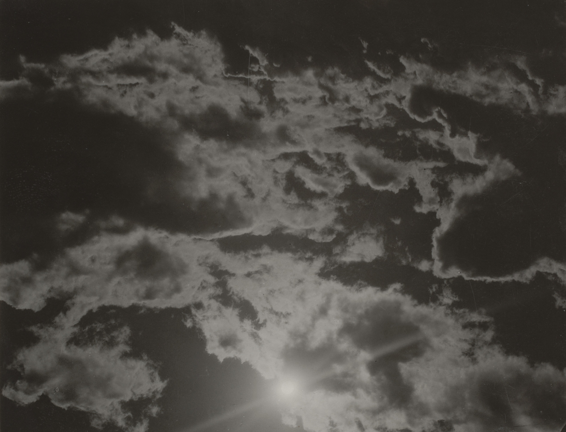
Stieglitz pointed his lens toward the clouds above Lake George, New York. He eventually made more than two hundred photographs in the series he initially called Songs of the Sky and later Equivalents.
While both photographs are in black and white, Callahan’s image has a harsh contrast between a bright white and a deep black, compared to Stieglitz’s photo, where there is a range of grey scale tones.
Stieglitz attempted to awaken in the viewer the emotional equivalent of his own state of mind at the time he took the picture and to show that the content of a photograph was different from its subject, similar to Callahan who once said “The difference between the casual impression and the intensified image is about as great as that separating the average business letter from a poem,” in 1964. “If you choose your subject selectively, intuitively, the camera can write poetry.” Both photographers are implying how you view the image, emotionally, is very different to the subject of the photograph.
Both images are of natural forms in natural day light, both have repetition of the same natural form, Callahan’s being trees and Stieglitz’s clouds.
In Callahan’s photograph, the lighting is the same all over the image, compared to the lighting in Stieglitz’s image, where the clouds naturally create a darker shadow, then they break, letting a burst of bright sunlight enter the captured photograph and reflect against the lens of the camera.

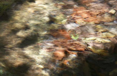
When looking at these two images from afar, the biggest difference you will notice visually is that one is coloured and the other is not, however I chose these two images to compare because one clear similarity to me is when closer, you can see that both images have a similar flow to them. Both look almost as if they are flowing towards whoever is looking at the image.
They both have strong dark points however Ernst’s has slightly less contrast. There are clear shadows and highlights in these two images and they both look more ‘bunched up’ at the top of the image creating a depth of field.
Both images are a form of nature, Harry’s being some type of grass and Ernst’s being water. The different shapes, flows and shadows allows people to interpret different things about them.
A difference between these two images is that Harry’s is much sharper, the flow of the grass/lines is much thinner and stronger where as Ernst’s image, although flows in a similar way, almost shows motion blur and is a lot smoother.
Keld Helmer-Petersen
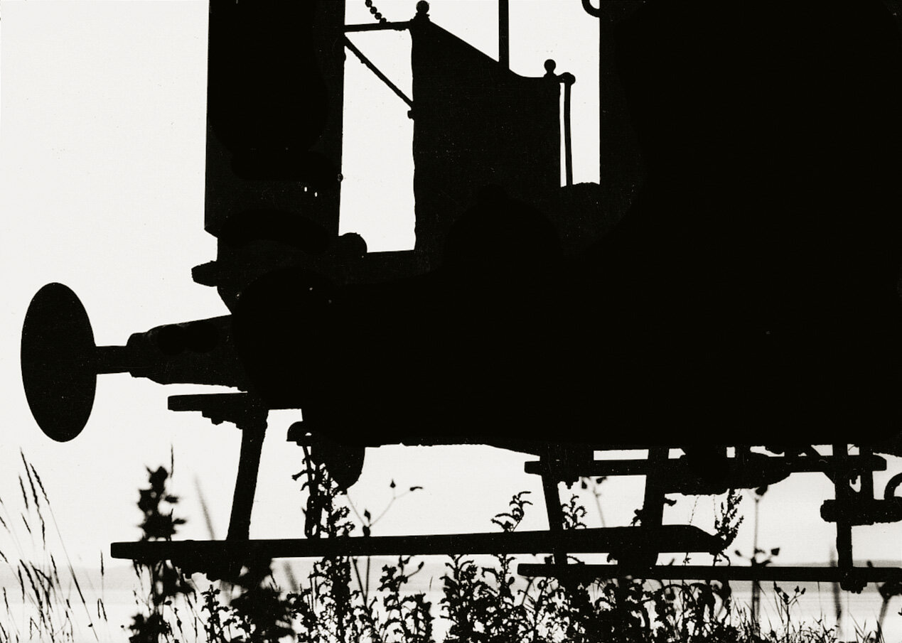
Keld Helmer-Petersen was a Danish photographer who became very popular and internationally recognized in the 1940’s and 1950’s. He was praised for his abstract and colour photographs and his career lasted about 70 years and he had a very strong interest in modern architecture. This included very industrial and structural areas. He contrasted the images to be very black and white which later in the project i will interpret myself.
.jpg)
Original Images
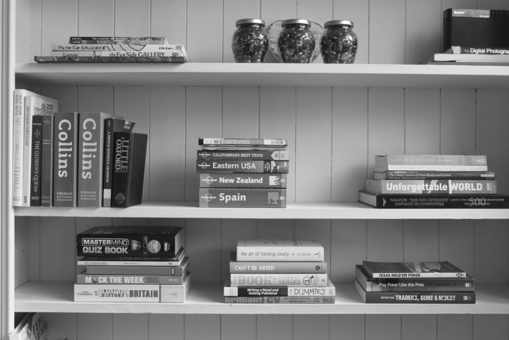
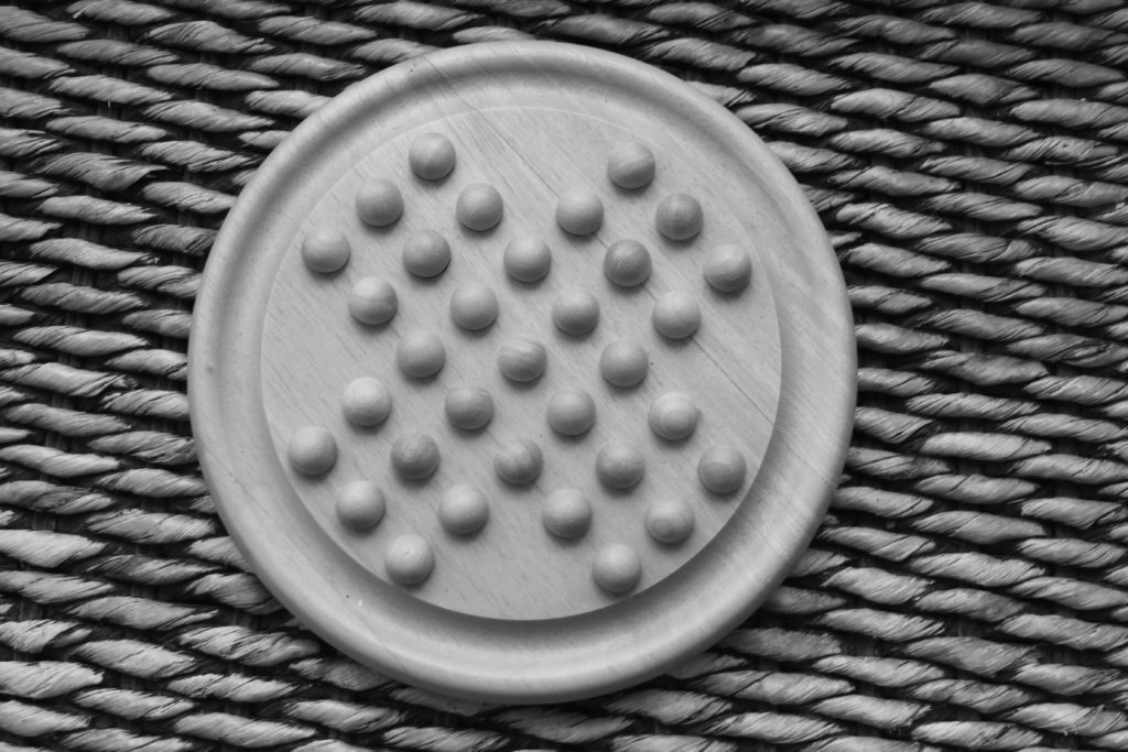
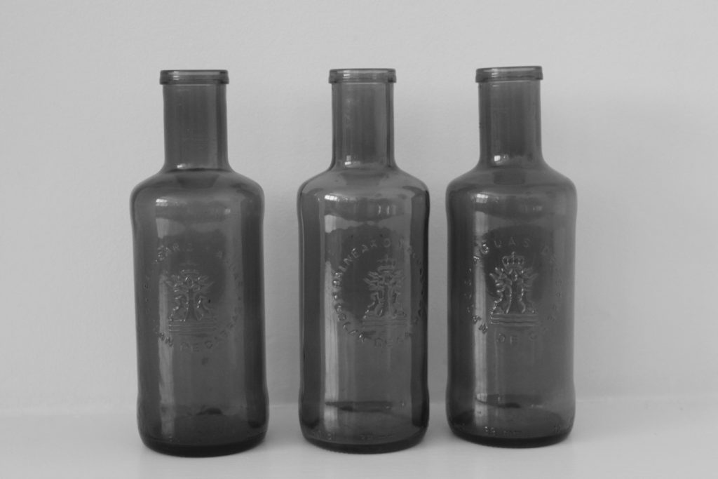

My Interpretation
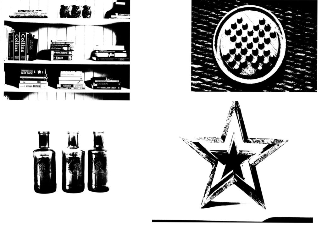
The vivid and opposing contrast of the black and white in the images creates a very dark and shadow filled world. It seems very ghostly and empty. The way the images have very distinctive edges and empty spaces reminds me of threshold artwork.


Improved Interpretation – Originals
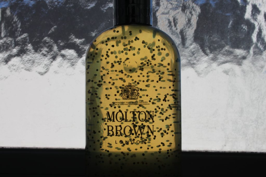
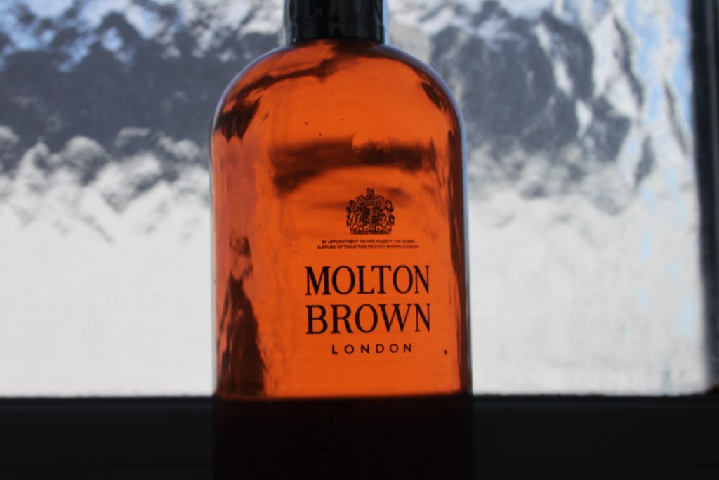
Improved Edit
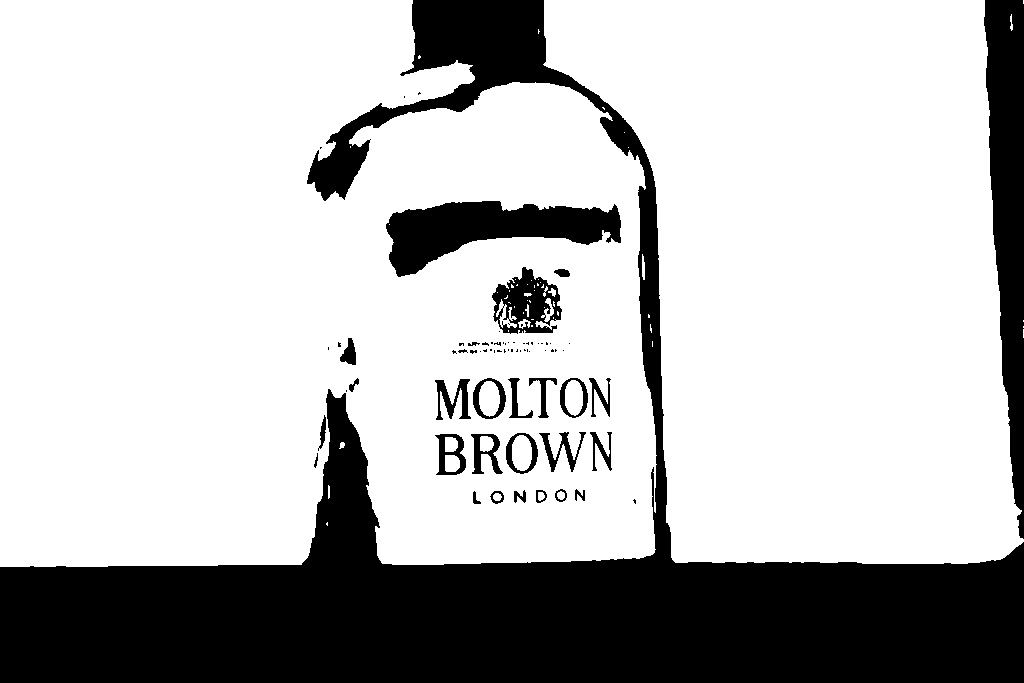
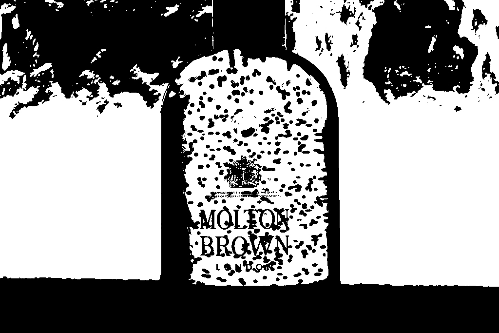
In my first interpretation, the edited images look very similar and still a lot like the original photos. In my second interpretation of the black light project, I have taken the images in a room in shadow looking at a bright window. This means that the background is more white and the contrast between the background and the object is very visible. This makes both images look very different to my previous images as they look very art like and similar to threshold artwork. In the image above, I have used more of the threshold tool to pick out and show the individual particles in the bottle of the soap bottle. By making the particles visible in the image, I have accidentally created a black patchy surface in the top third of the image.