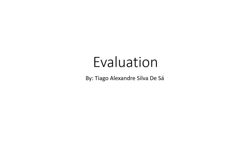
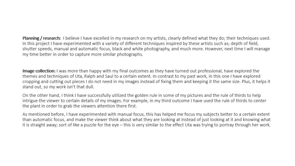


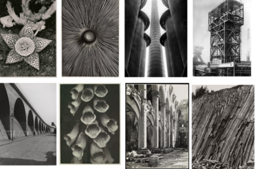
Introduction – He was a German photographer and a pioneering figure in the New objectivity movement, which sought to engage with the world as clearly and precisely as possible. He wanted to produce his own recording of the world. Most of his work was in black and white and there’s no sight of humans or life in any of his photography. He mainly photographed wildlife, images of traditional craftsmen, formal studies of mechanical equipment, commercial still lifes, and landscape and architectural studies.
Most of his photos include objects being repeated in the natural environment. He uses a mix of tones for every image- some include warm tones and others are much darker with harsher tones.
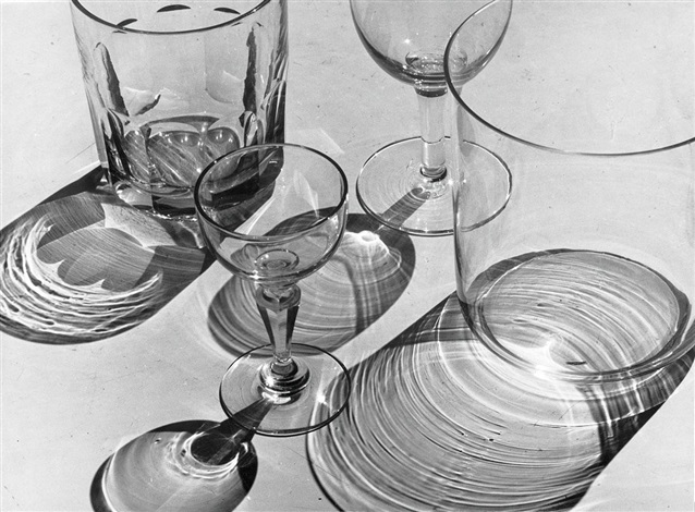
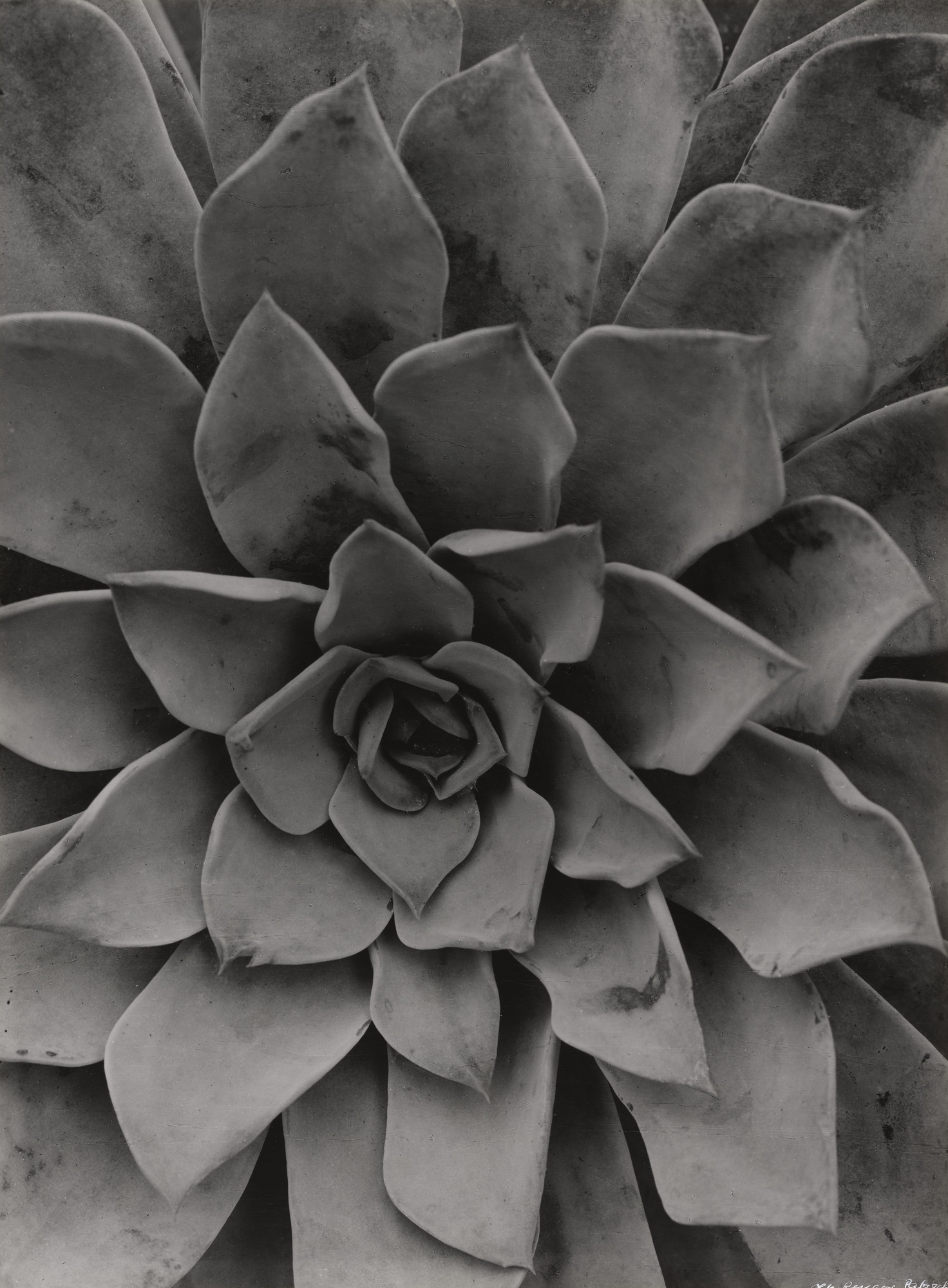
IMAGE ANALYSIS/ COMPARISON;
SIMILARITIES-Both photos are in black and white and have a range of different mid-tones. They’re both photographs of something artificial and not abstract. Both of these photos don’t have a distracting background as the photo of the plant is so close up you can’t see anything behind it and the photo of the glasses is taken in front of a white background- this makes the objects stand out a lot more and the tone and colour around the cups is made to appear much harsher.
DIFFERENCES– One photograph is of a plant and to do with nature whereas the other image is different types of glasses as the shadows of them are being reflected beneath them. Another difference is that the photo of the plant is very close up and zoomed in when the other is quite far and you can see the whole shape and size of each glass. The photograph of the plant is portrait in comparison to the glass photograph which is landscape. The photograph of the glasses looks like it would have set up lighting behind it to create the shadow effect whereas the plant photo is more in the natural light hence why it’s less bright.
CONTACT SHEET-
A contact sheet is a piece of photographic paper on to which several or all of the negatives on a film have been contact-printed. This allows you to view all of your photographs. The purpose of a contact sheet is to be able to quickly scan a series of images to find the keepers or the ones chose to be enlarged.
MY PHOTOS-
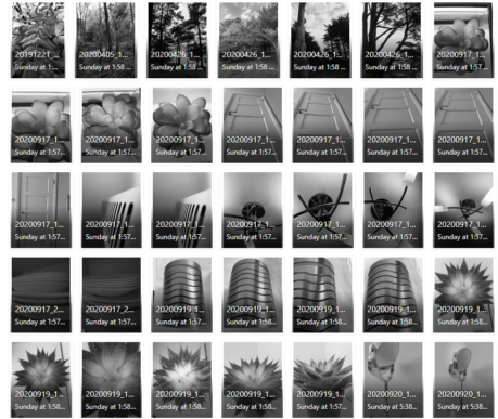
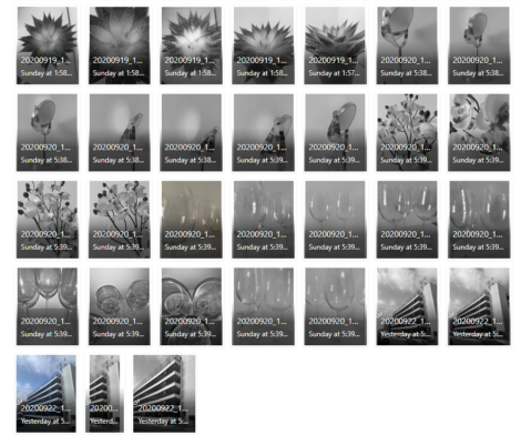
Process of my work–
I took photos of nature, objects such as wine glasses and a building (car park) to explore all different kind of scenes to photograph as ALBERT RENGER-PATZSCH does. I tried to photograph things that had repetitive shapes or were in an interesting position to explore the different shadows/ tones I could create.
Here are some of my favourite photos;


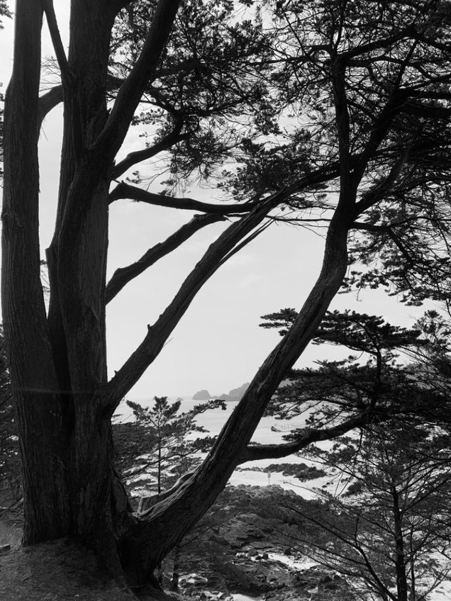

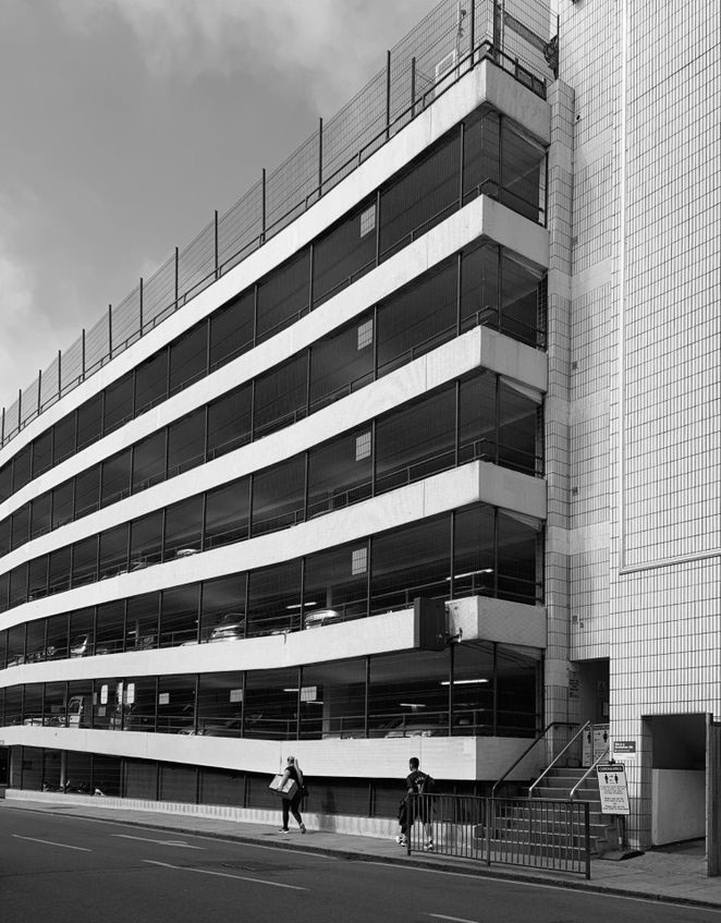
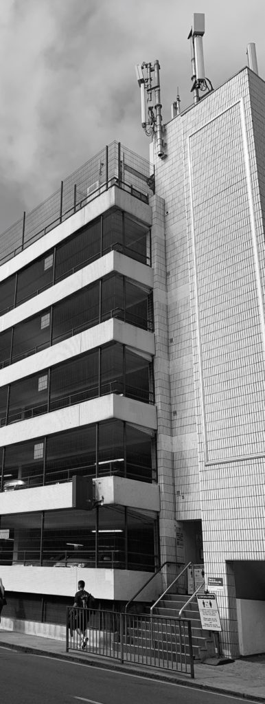

EVALUATION– these are my favourite photographs I took because I wanted to look at the nature side and the architecture side. I tried to photos in a similar way that Albert does which is focusing on repetitive patterns or far away shots of nature.
I really like how my photos in the woods turned out because by taking them in black and white you can really see the details and contrast between all the different tones. I took most of them far away so that the whole shape of the tree was visible as the more I would photograph the more the trees would be lined up in a repetitive pattern. I was inspired by one of his photos which shows how the trees kept going and going which created an illusion of the woods getting smaller as you looked into the photo.
I like how the photos of the car park turned out because you can remarkably see the contrast between the colours white and black as the design of the car park is going up in blocks in a repeated pattern. I cropped one of the images down to only focus on that specific segment to really make the pattern the main focus of the photo. I shot it at a slightly lower angle as I wanted to create an illusion of the car park being a lot larger and getting the full shape of it photographed- as Albert usually takes photo of building from a lower angle. The reason I didn’t choose the other car park photos was that cars got in the frame and I wanted to focus on just the building.
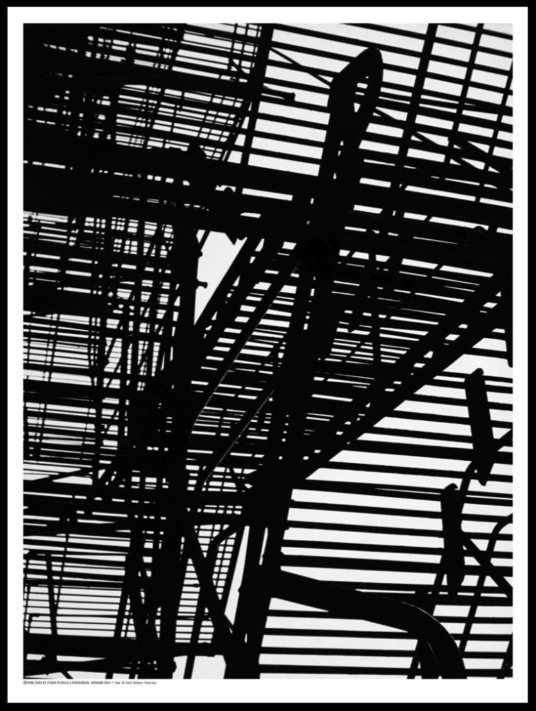
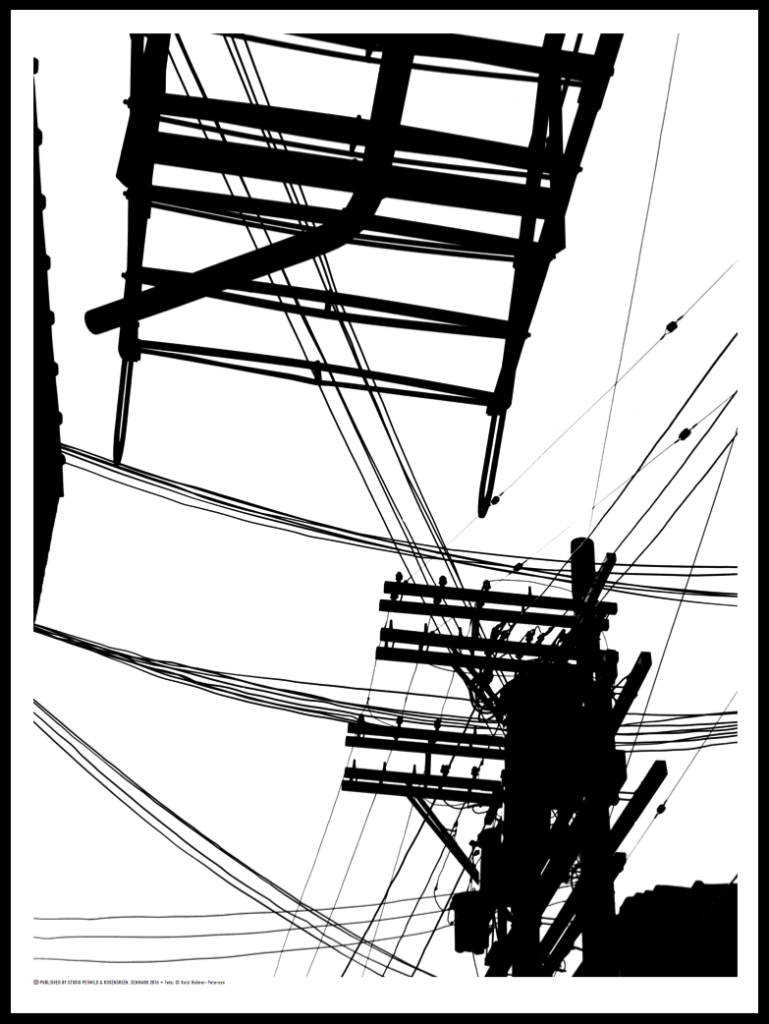
Keld Helmer-Petersen was one of the most influential Danish photographers in the 20th Century. He was an international pioneer for colour photography, however he also published several books of high contrast black and white images. Helmer-Petersen had a strong interest in industrial buildings and modern architecture, much of his work is centered around man-made structures. This is similar to the work of Albert Reneger-Patzsch, who inspired Helmer-Petersen greatly. His work also focuses on minimalism, using harsh tones of black and white and no mid tones.
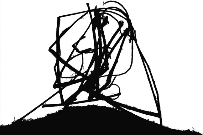
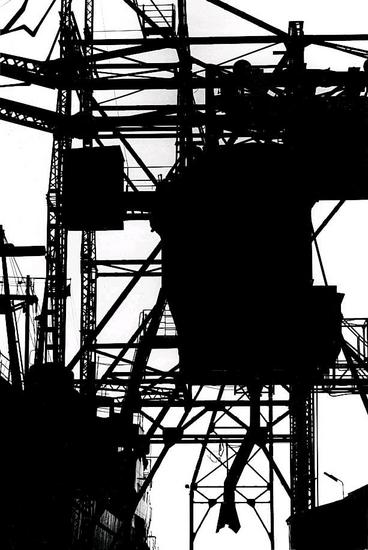
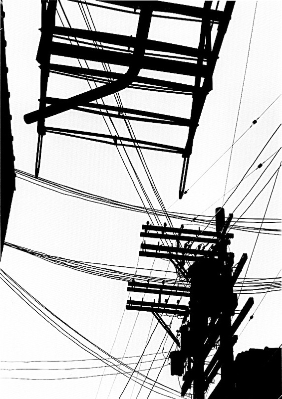
What I really enjoy about Helmer-Petersen’s work is the dramatic contrast in his images. I believe it creates a sense of mystery as the high juxtaposition between black and white presents the industrial structures as silhouettes, alluding to the idea that the man-made world is dark and enigmatic. Additionally, I really like the bold straight lines in his work which repeat in each image. I think they display stillness and solitude in his work, which mixed with the shallow depth of field, create clear focal points for the observer.
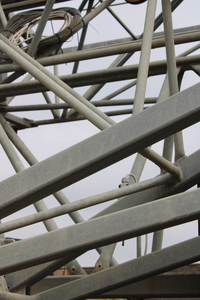
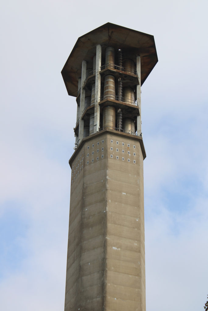


I have chosen these 5 images to edit in the style of Keld Helmer-Petersen because I believe their blank backgrounds and architectural subjects reflect Helmer-Petersen’s minimalist Black Light images. Furthermore, I think these photos hold similar bold straight lines to his work and will work well when edited with high contrast. Although Helmer-Petersen’s images are focused on industrial buildings, I want to also experiment with a nature image to compare the difference between having a dark background to a light. I believe the image will still reflect his work as it will hold minimalistic qualities in its blank background and high contrast between the highlights and shadows.

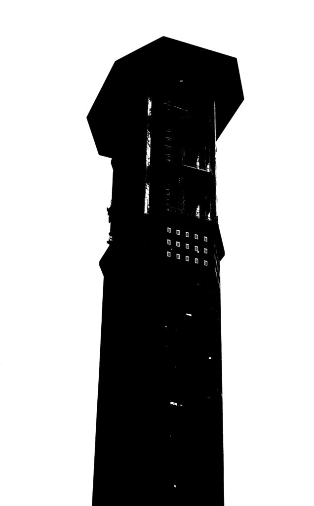
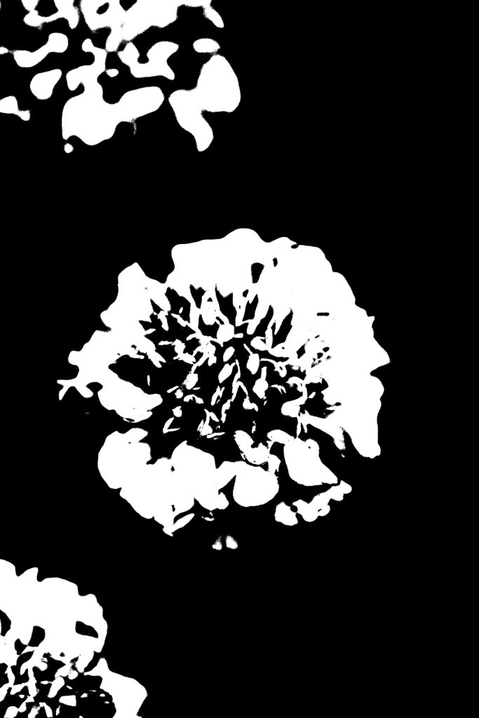
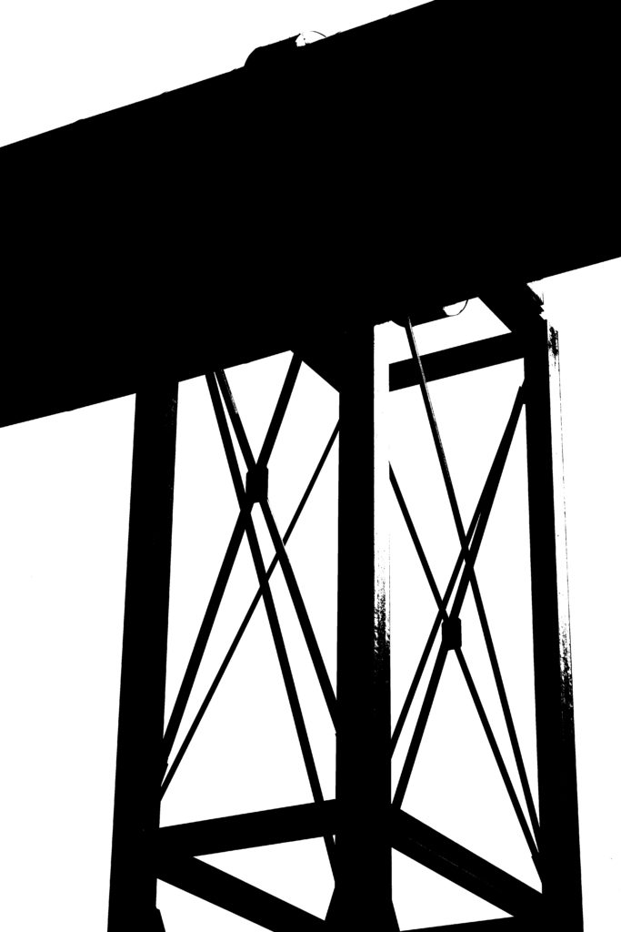

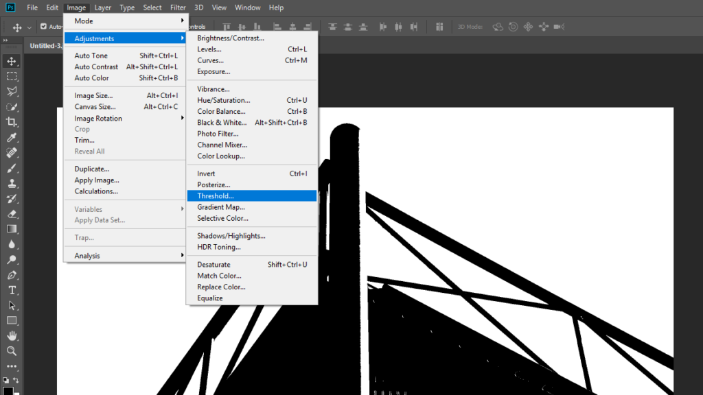
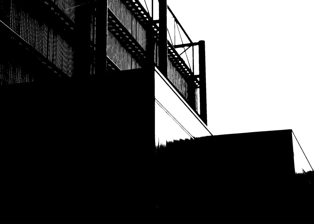
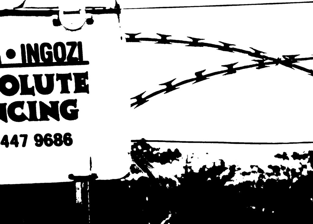
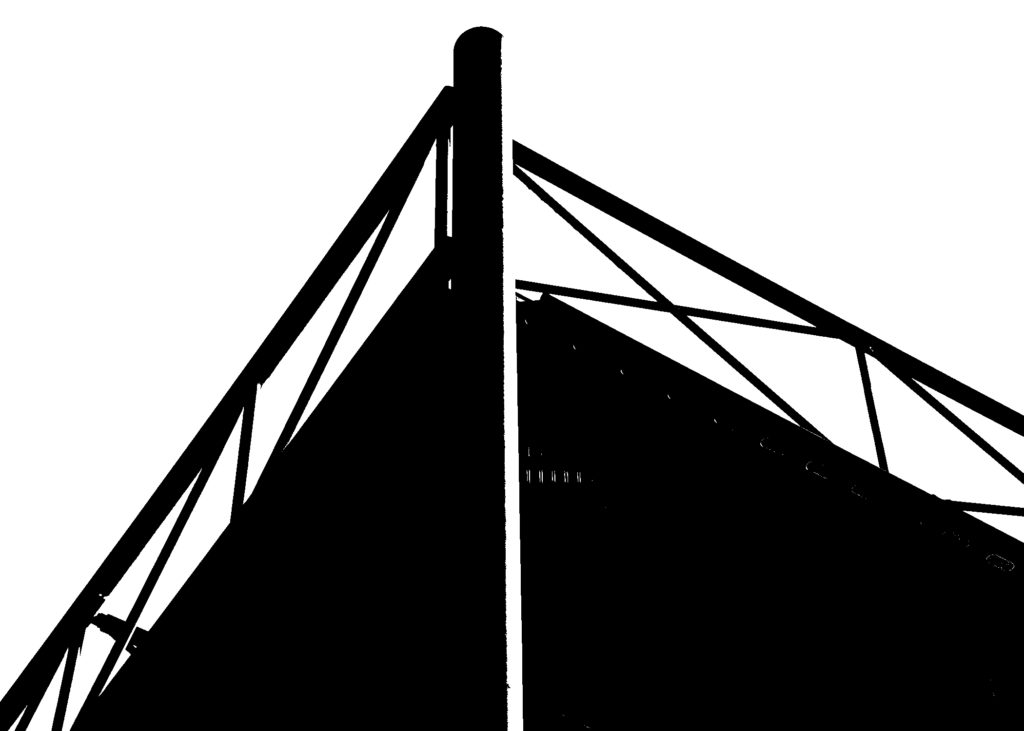
I edited my final images on Photoshop using the threshold tool to overly enhance the contrast and to change the photos to black and white. I really like how abstract my images have come out, I think the bold black lines draw the observer’s attention to the uniform structures which create an animation-like effect in the images. Moreover, I believe these edited photos reflect Helmer-Petersen’s work immensely as they replicate the silhouettes and juxtaposition seen in his images. In addition, I think the experimentation with the nature image, using a dark background and having a white focal point, provides a different approach to Helmer-Petersen’s work while still reflecting his harsh contrast and sharp black & white tones. Lastly, I really like the shallow depth of field in these images, it exaggerates the negative space surrounding the geometric structures in the foreground and the static atmosphere of the photographs.
Keld Helmer-Petersen

Petersen is seen as one of the best photographers in the 20th century. His career spanned 70 years and he had strong interest in modern architecture, industrial areas and structures. He started photographing in the late 1930s and first made his name with 122 Colour Photographs in 1948.
Keld Helmer-Petersen’s black and white images explore dramatic contrasts of tone. In some, we are only presented with images that are black and white. All mid tones have been removed. He created and found these images, using both cameras and flat bed scanners to achieve the effects he was looking for.
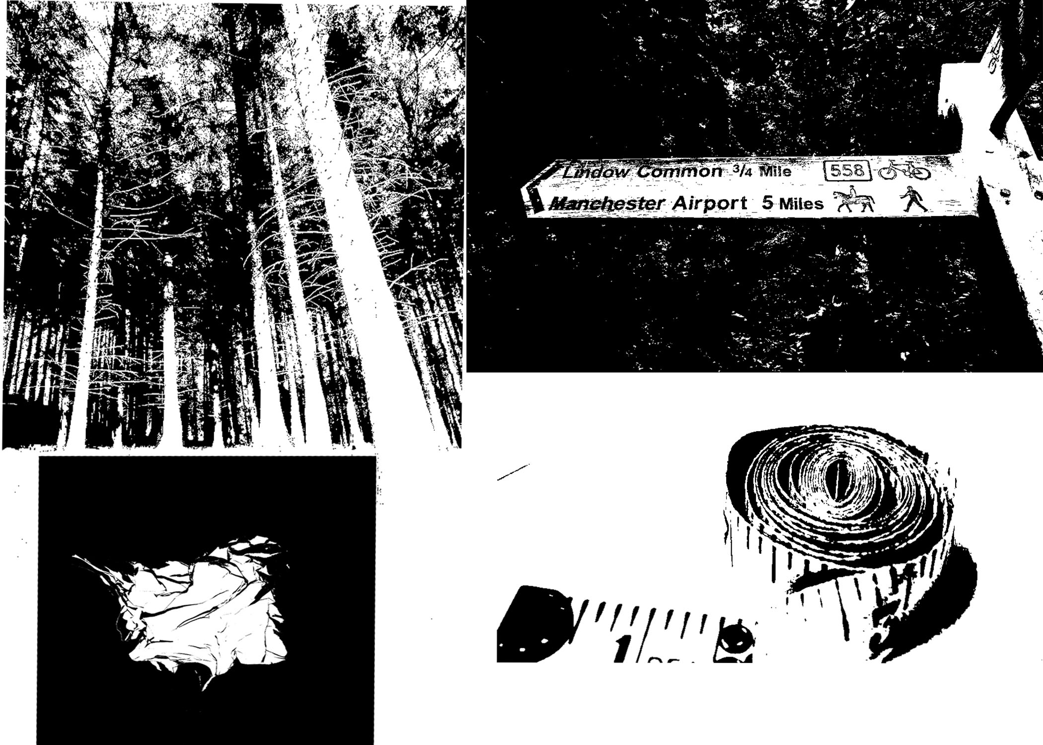
My version
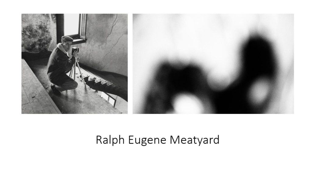
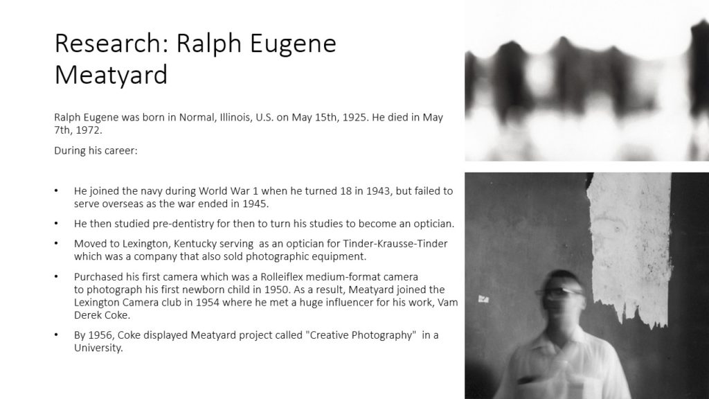
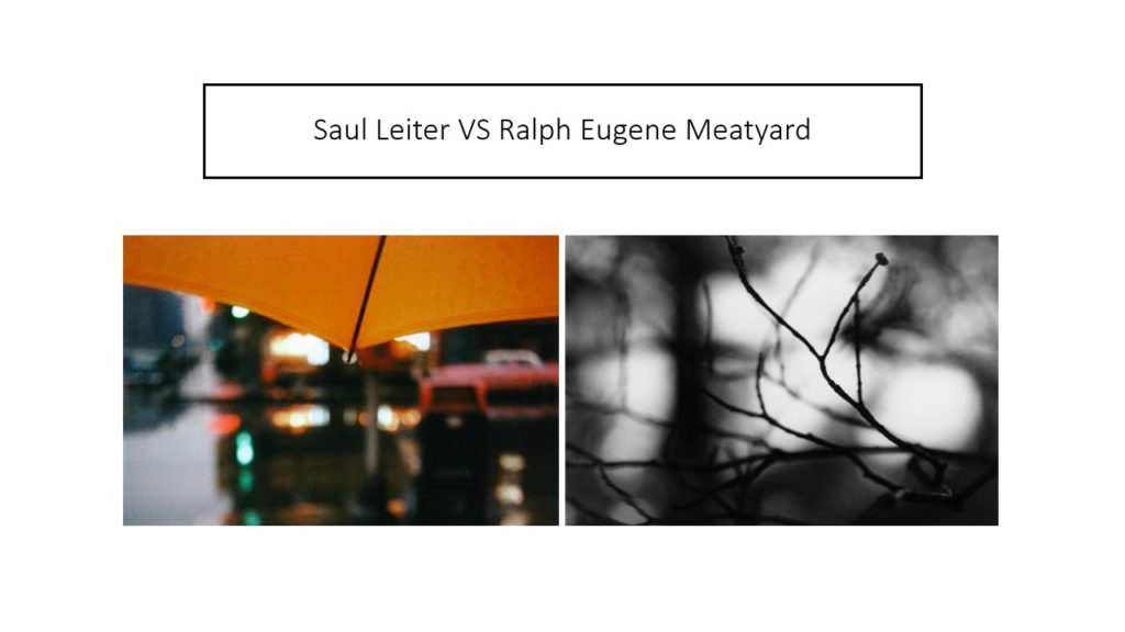
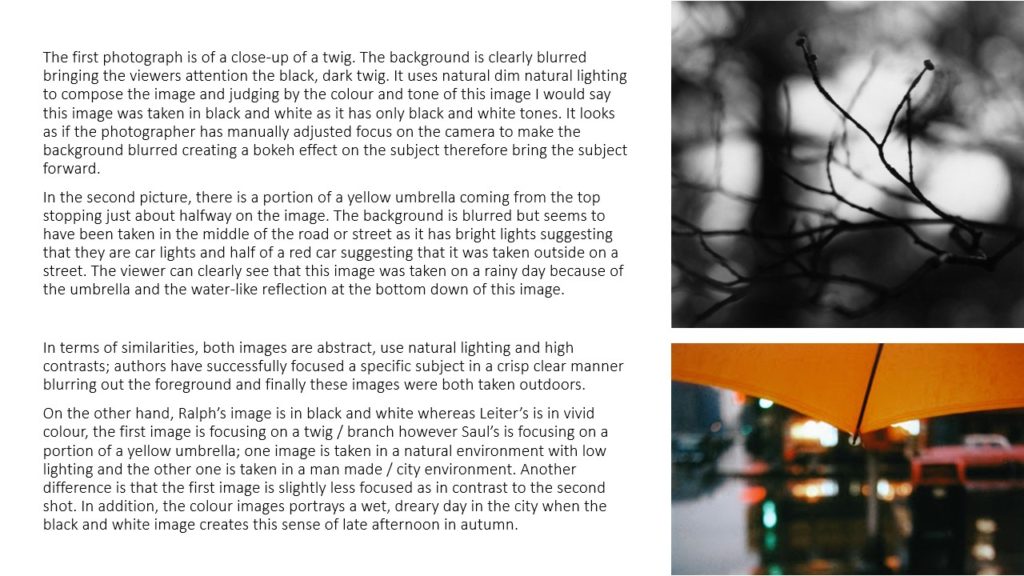
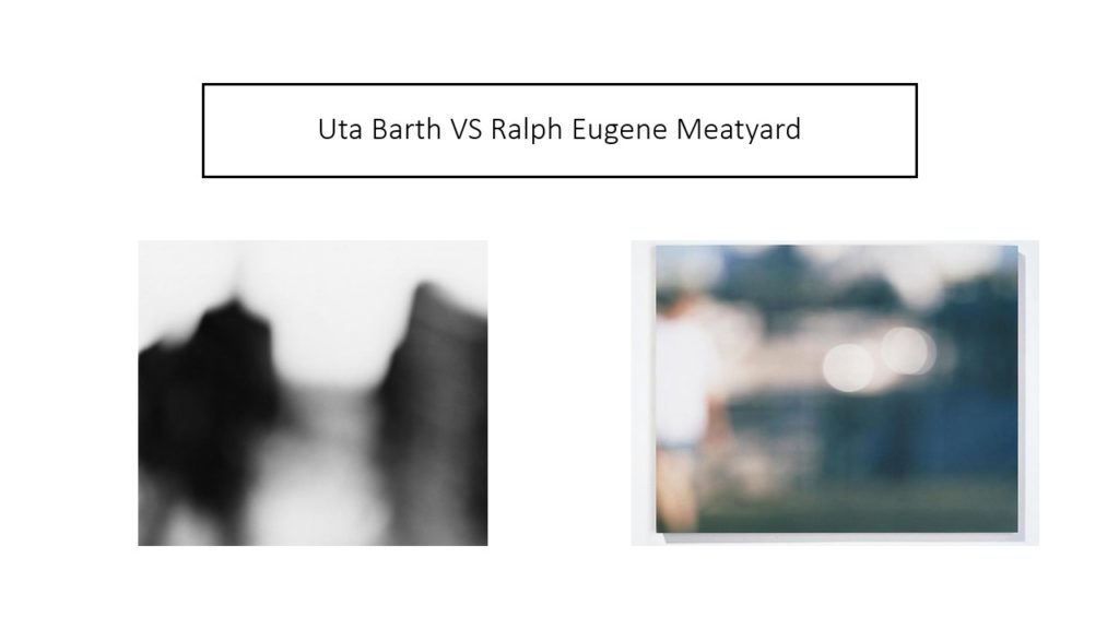
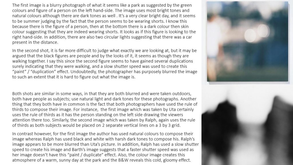
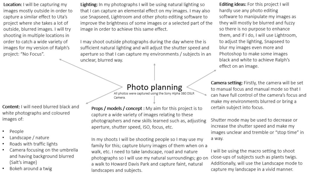
Artist Research-Ralph Eugene Meatyard

Meatyard was born in 1925 in Illinois,USA. When he turned 18 he left to join the Navy as he was 18 during world war 2. Once he returned from fighting, he began to train to be an optician.
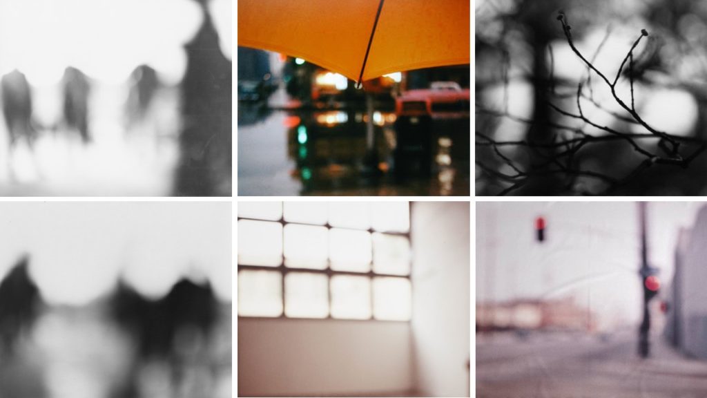
Meatyard purchased his first camera in 1950 to photograph his newborn first child. Once his children were older and he had a larger understanding of his camera, he began to take more images of his children and also took images so blurry many couldn’t figure out what it actually was.
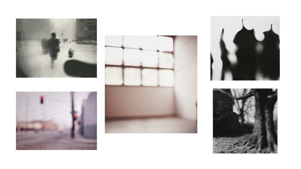
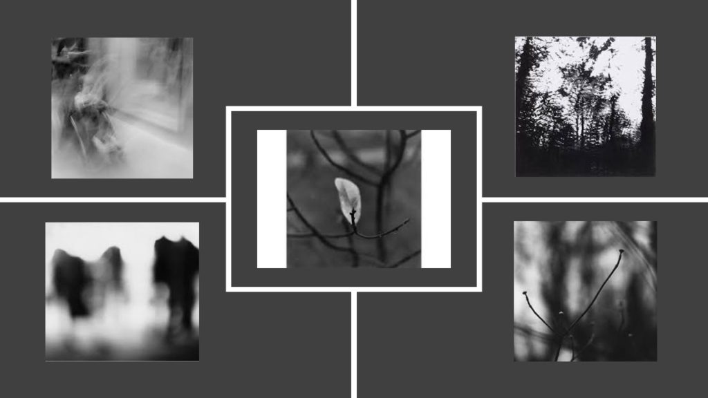
Inspiration
SHOOT
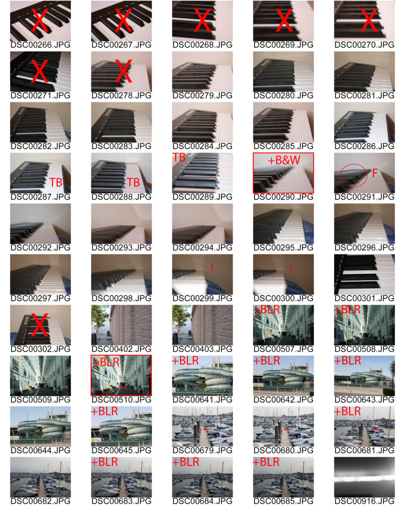
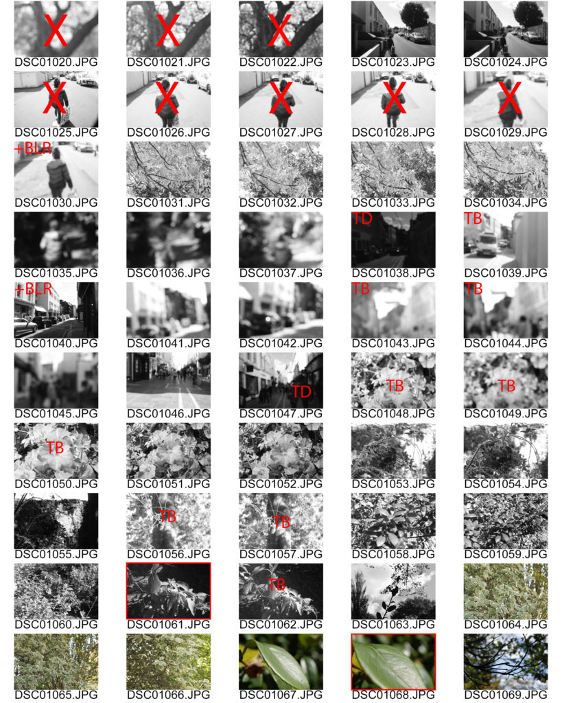
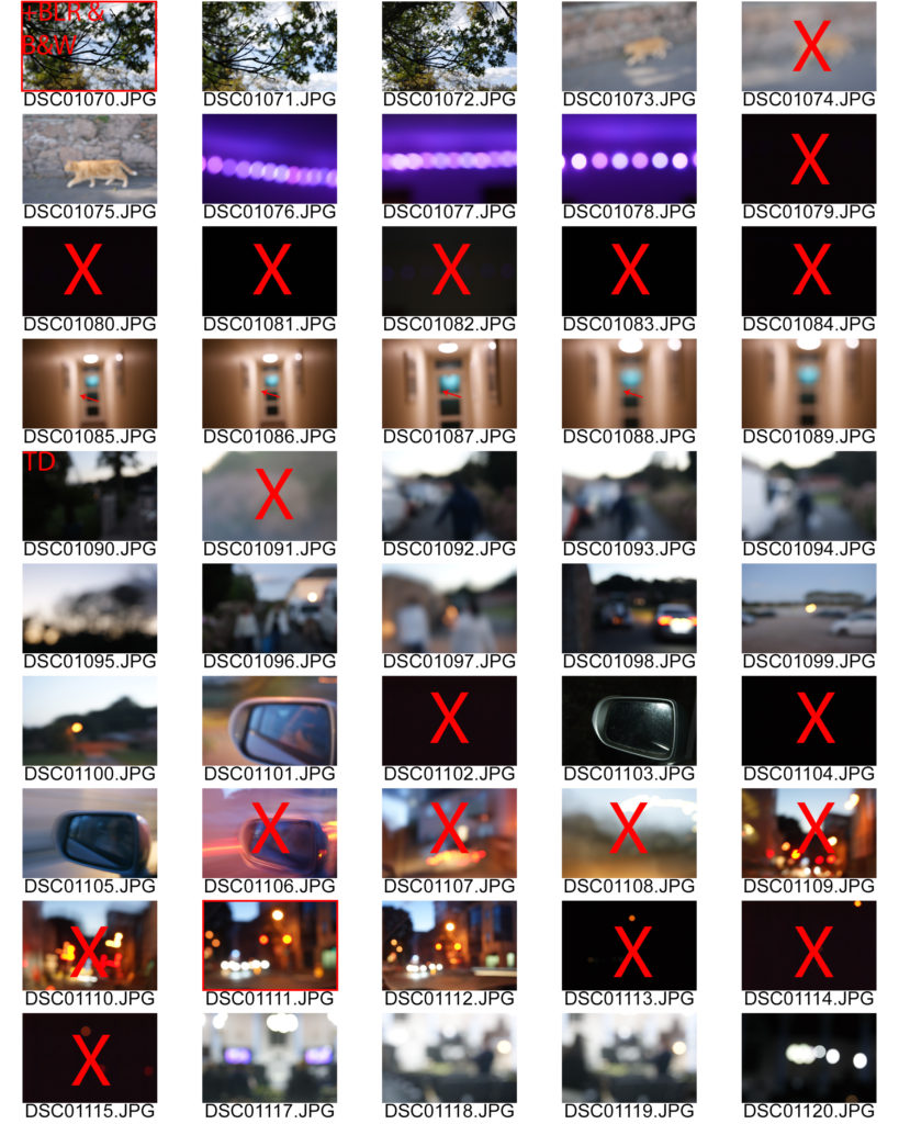
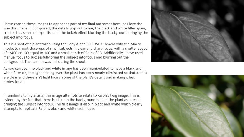
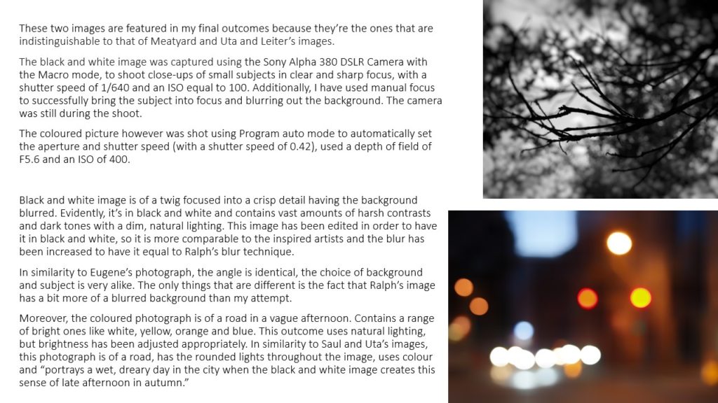
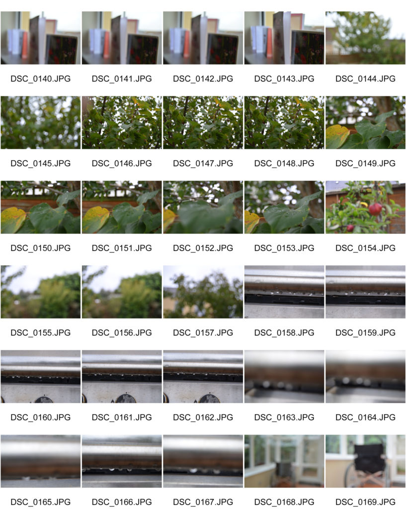
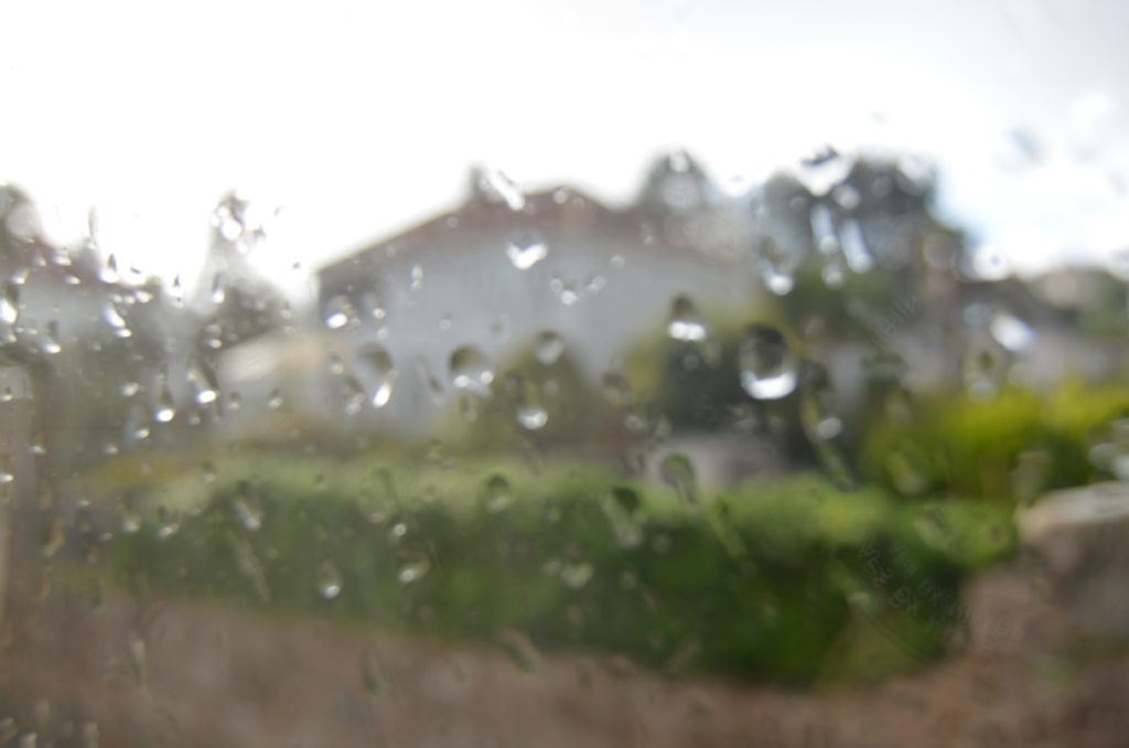
For this shoot I wanted to try and figure out which parts of the image I wanted in/out of focus. I had only been taught how to manually use my camera, so I was pleased with how they turned out.

Successful outcomes (unedited)




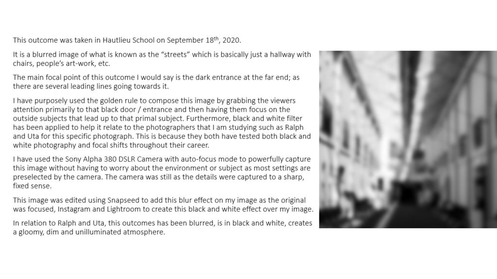
Successful edits
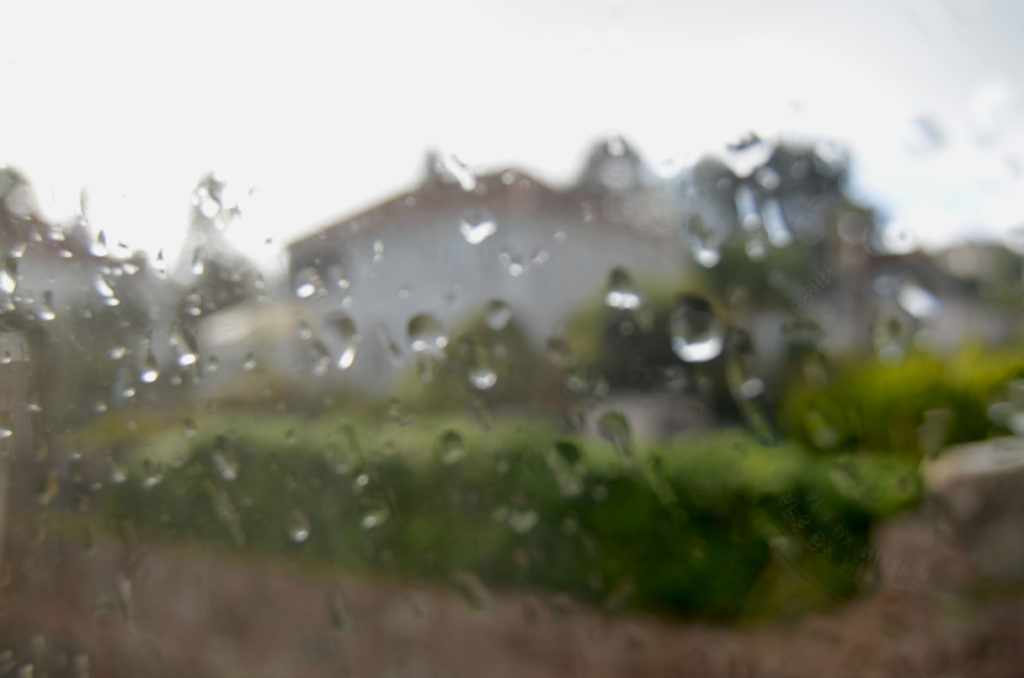


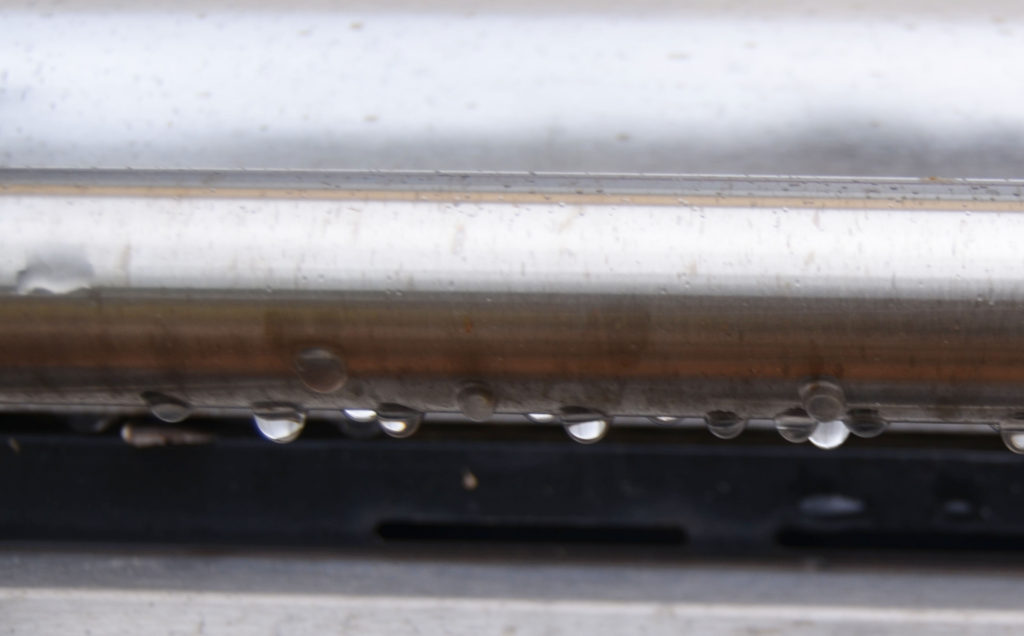
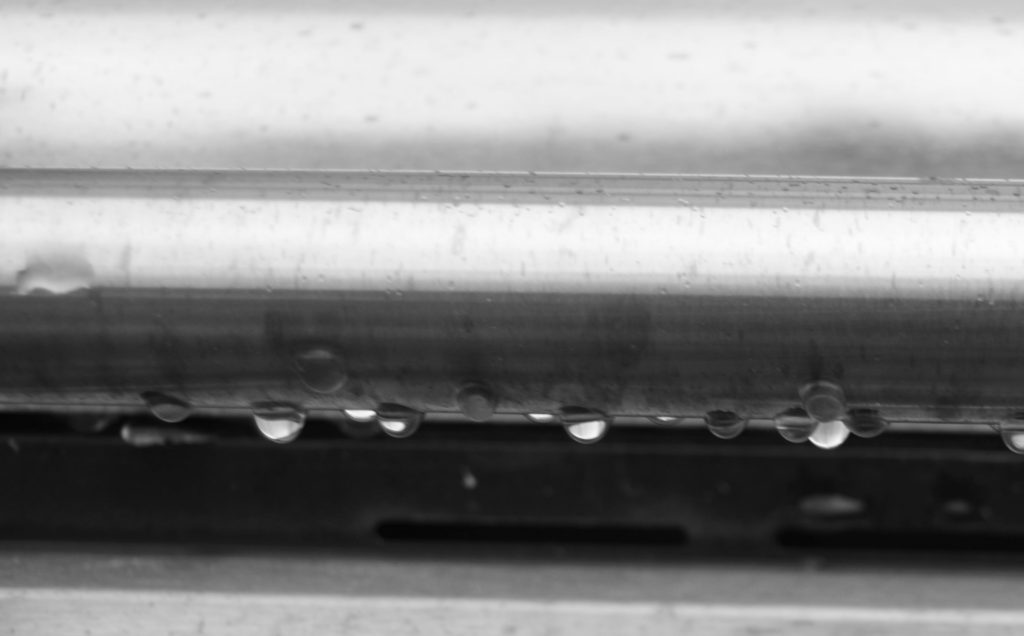




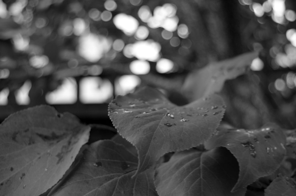

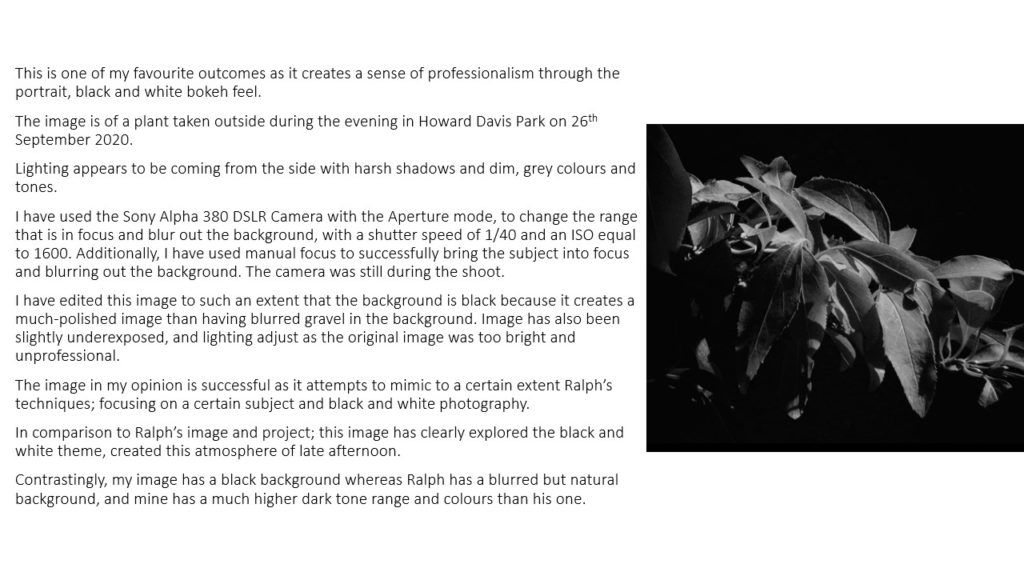
Favourite image

This is my favourite image because I like the fact that you can still see the contrast in colours of the wheelchair; especially the metal because the sun had caused the top of the frame to be a silver colour and the bottom to be a slightly brass/copper colour. This allows the viewer to think about which colours are in the image and look outside what is in the centre of the image.
I made sure that the image was blurred to stick with the inspiration of Ralph Eugene Meatyard. I like the fact that you can still vaguely see the different textures of the wheelchair. The room I was in was very light and I thought that it worked with the dark colours of the central features like the chair, wheels and handles of the wheelchair.
Introduction
Keld Helmer-Petersen was a Danish photographer who liked to experiment with the contrast of black and white expression influenced constructivist artists and their fascination with industry’s machines and architecture’s constructions. Keld’s approach to photography was by and large experimental and explorative. He worked on the boarders of what we consider to be photography. Throughout his career he worked with cameraless photography which was a technique in which objects are placed directly on light sensitive photographic paper. He used to walk down pavements with his head down making discoveries of damaged roads, houses or pavements which resulted in works such as the series Deformationer.
Original Photos
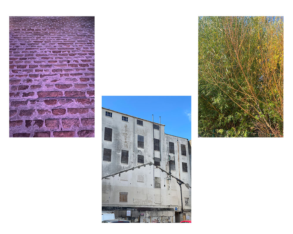
Edited Photos

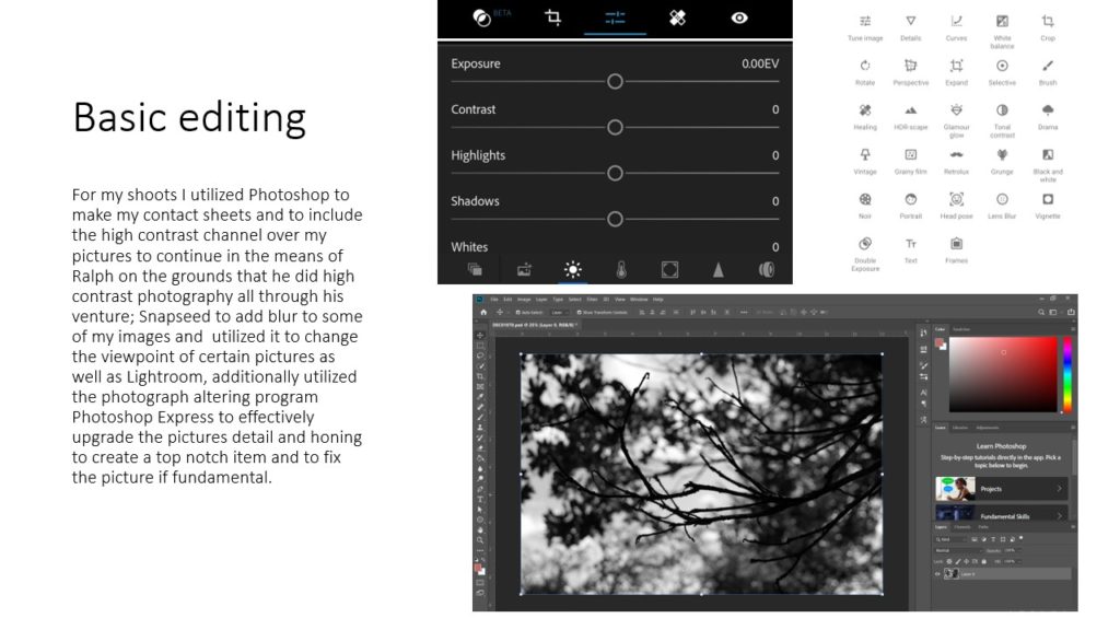
The process I went through with making this was that I had all my photos on a separate file and edited them in order to make them have a bold contrast I achieved this by going onto image, clicking on adjustment then I went onto threshold which enabled me to adjust the threshold for my pictures, making the black and white have an intense contrast. After I done this, I opened a new file onto my photoshop and selected my images then copy and pasted them onto my new file, to have my edited pictures on the same file.
Evaluation
The evaluation that I made for my final images that I edited, was that I thought the images came out great involving the technique that Keld Helmer-Petersen uses for his photography. This is because in my images, they are flat and have bold contrasts of black and white on them having the object in any of the images stand out. Moreover, in the image of the Brewery in which I had edited, I thought this came out to be the best edit out of them all as the windows in which where bordered up and the outlines of the building highly stood out due to the building being white, the sky turning out white also made the image appealing as it seems like this could have been a sketch and not a picture.
Keld Helmer Peterson
A Danish photographer who was considered a pioneer in abstract photography in the 40s and 50s.
Keld experimented with the contrast in graphic black and white expression.
He was influenced greatly by constructivist artists and industrial machines/architecture.
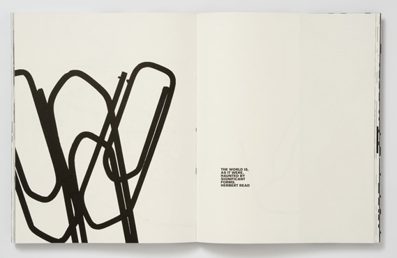
Below we can see some of his compositions from his “Black Light” album where he experimented with extreme contrast to create abstract black on white compositions.

Process:
I chose 4 images that I thought would create a graphical black on white composition when edited. I opted for interesting industrial and man made elements with simplistic backgrounds.
I then added greater contrast to the image. Following this I used the threshold tool in photoshop to exaggerate the tonal range and create an abstract composition.
My Images

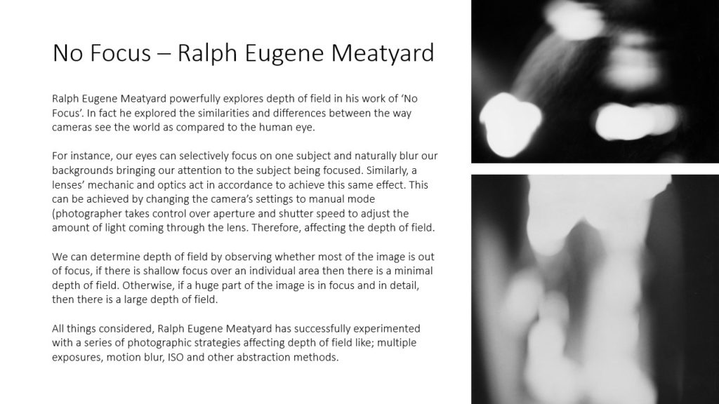
Ralph Eugene Meatyard’s (1925 – 1972) photography spanned many genres, but mainly focused on abstract photography. He shot all his images in black and white, lots of his photography is focused on children and adults in worn down areas with face masks on. He used different exposures, apparatuses and motion blur to create an uneasy feeling and a sense of confusion as the viewer has no context of the image and its purpose. Many of the subjects of the images are moving and are not in focus, and sometimes over exposed.
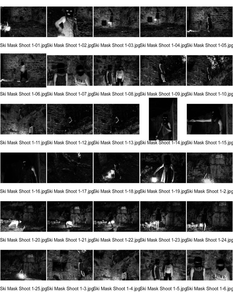

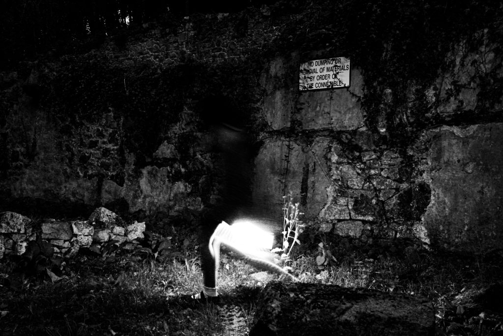
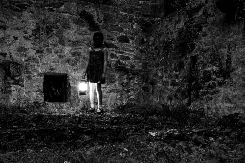
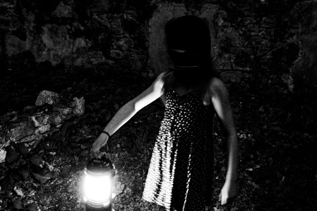
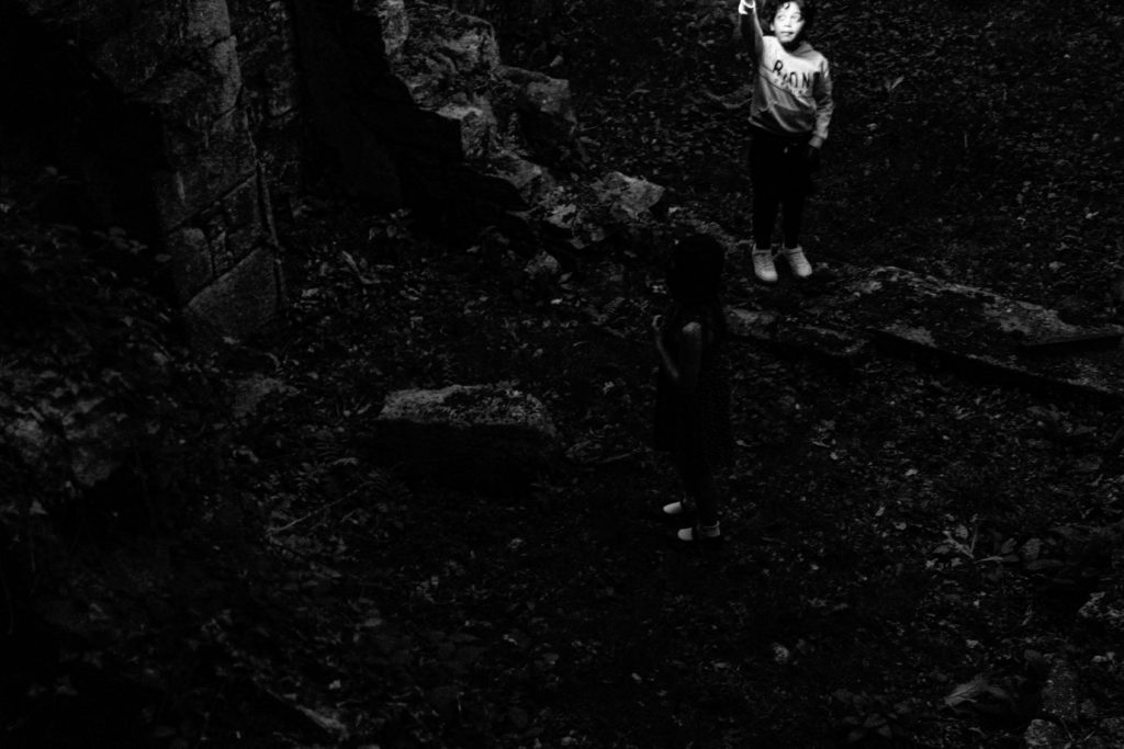
I chose these final images as my best finished photographs because of the similar style to Ralph Eugene Meatyard such as these images:
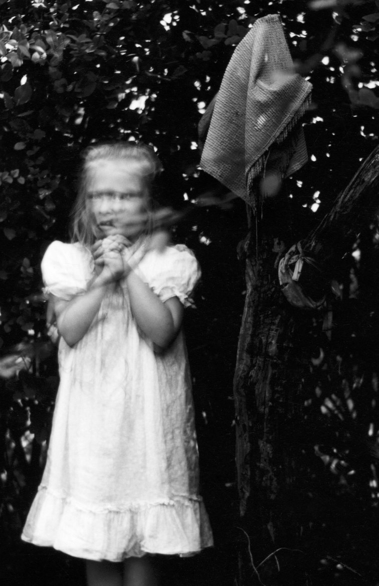
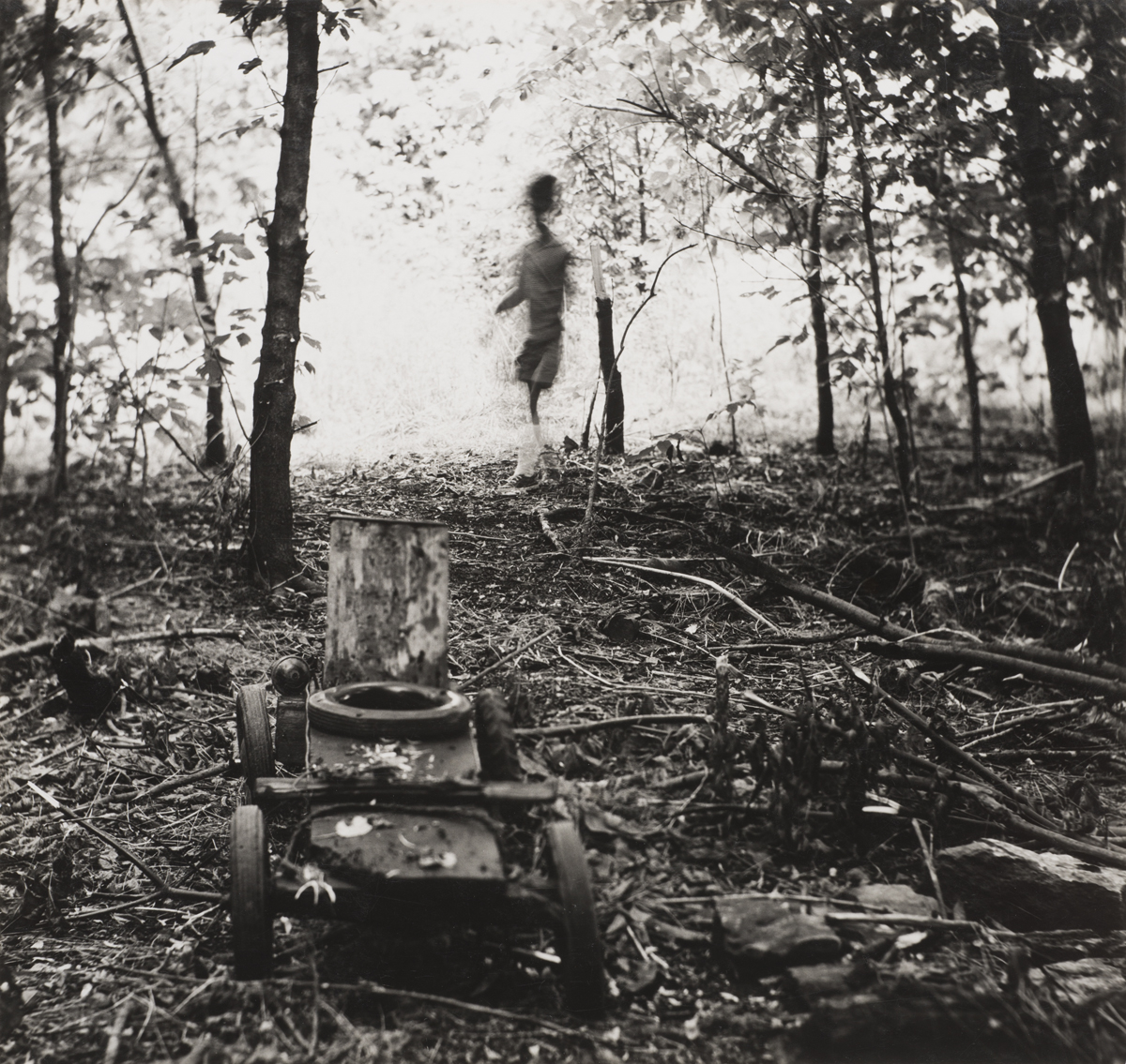
My final images resemble Meatyards work because of the strong black and white tonal contrasts with dark blacks and bright whites. In many of my images the subjects face is bury, much like Meatyards images.
The subjects face is also covered in the images, similar to some subjects of Meatyards images wearing masks.
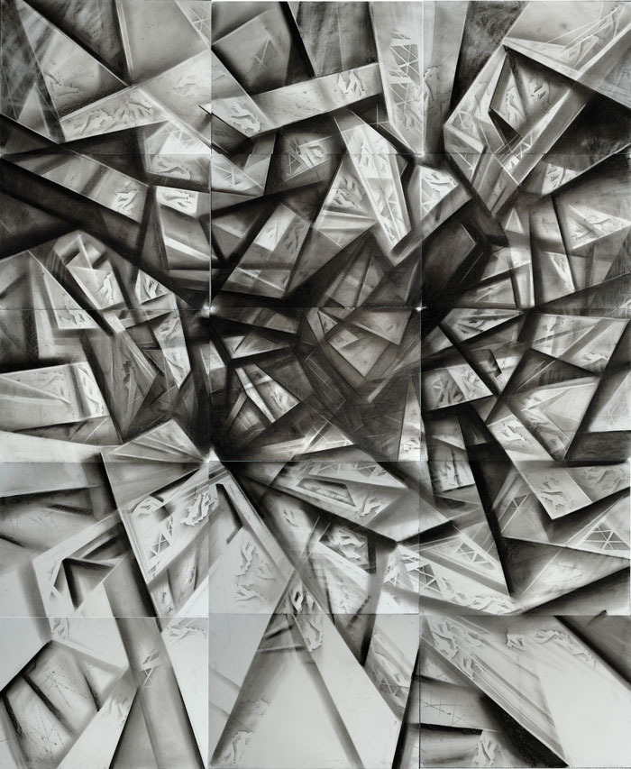
This project is inspired by the work of Vjeko Sager who created art by cutting lines into a piece of paper and raising the shapes up.
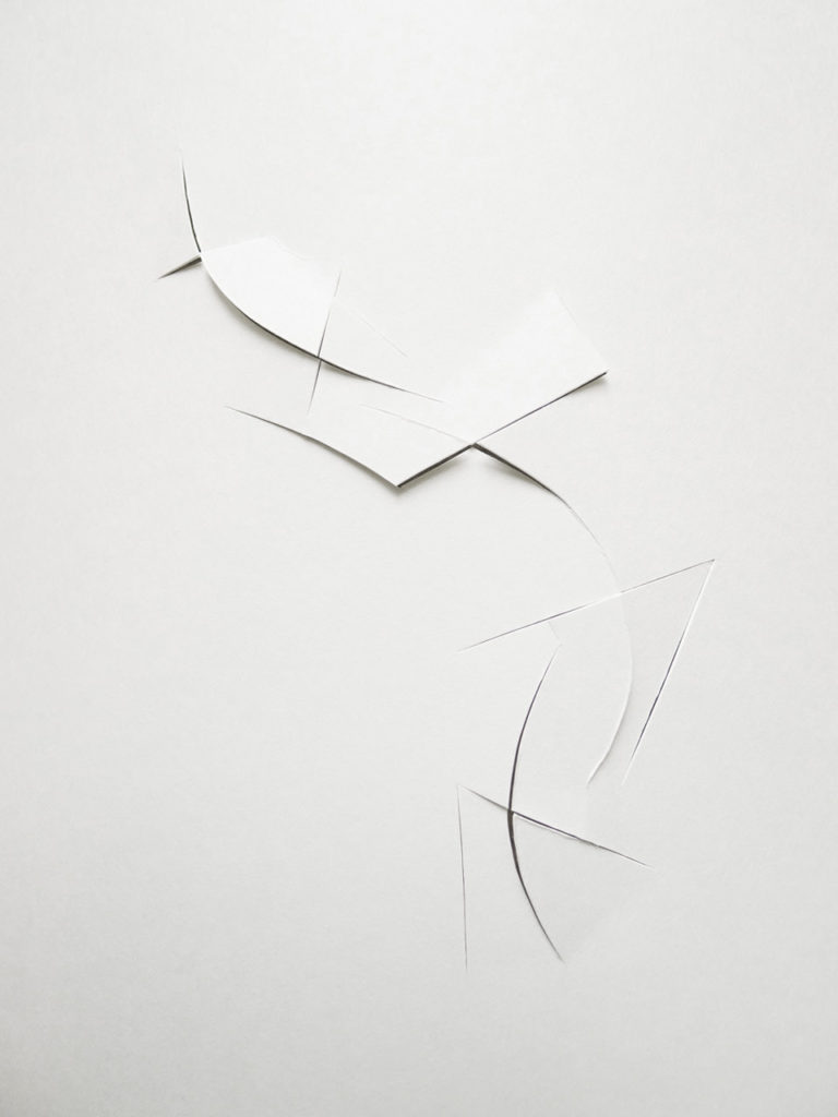

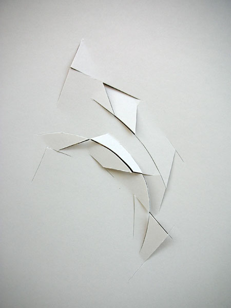
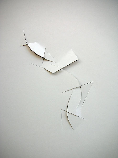
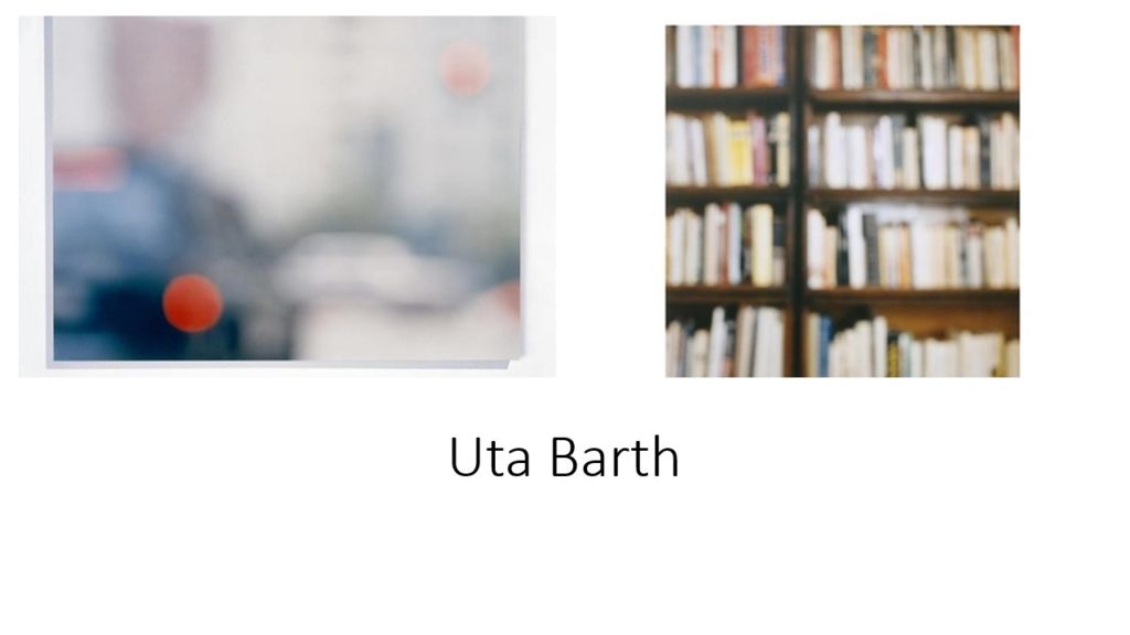
To create my own unique version of this I have decided to center my project entirely around paper. To do this I am going to create a sharp looking origami using plain paper and overlaying it on top of open books to add depth to the photos.

I crossed out the photo in red as it was far too overexposed which made the paper origami blend in too much with the background. The images with green around them are the photos i’d like to explore further.
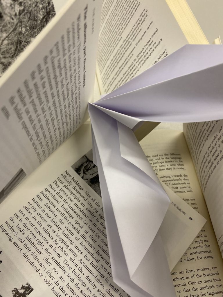


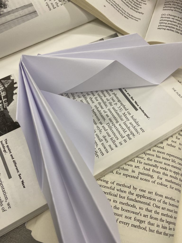
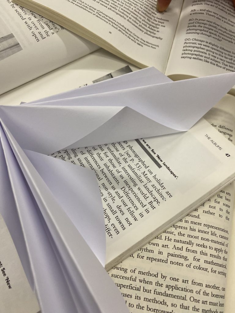

Some of these images need cropping to remove the background
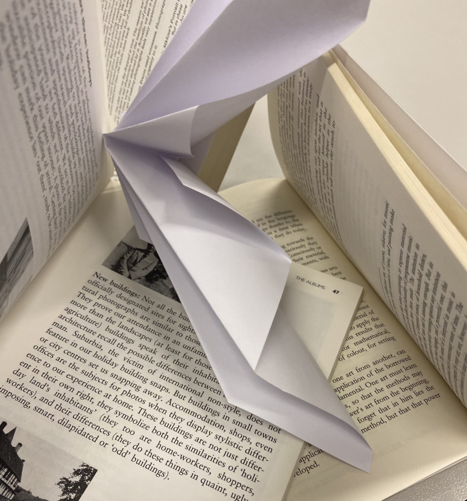
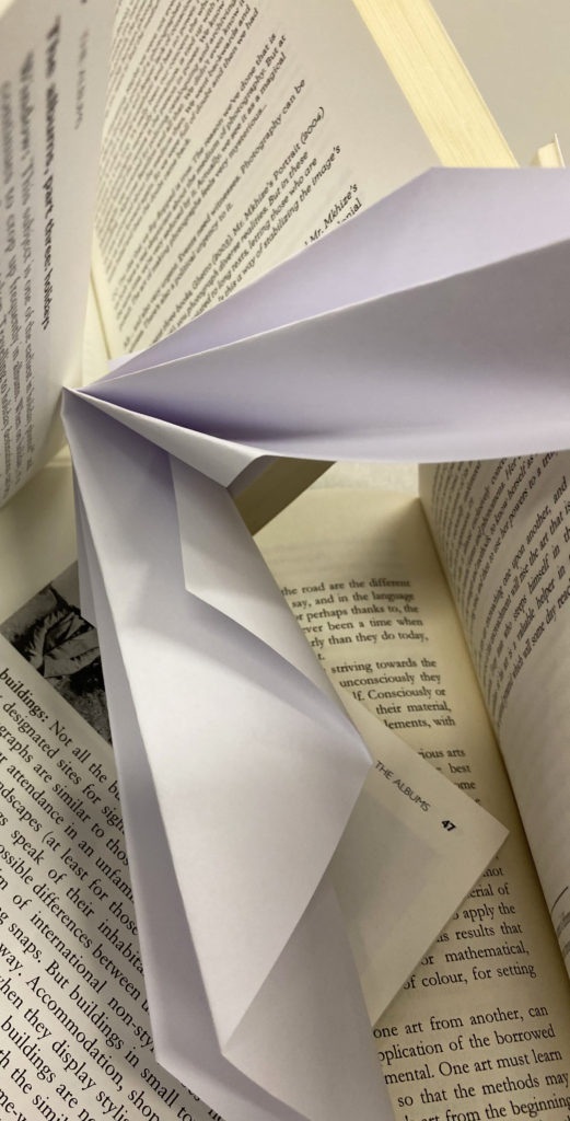
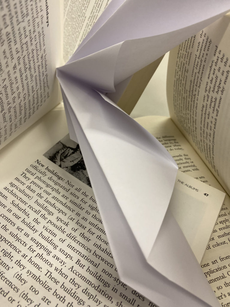
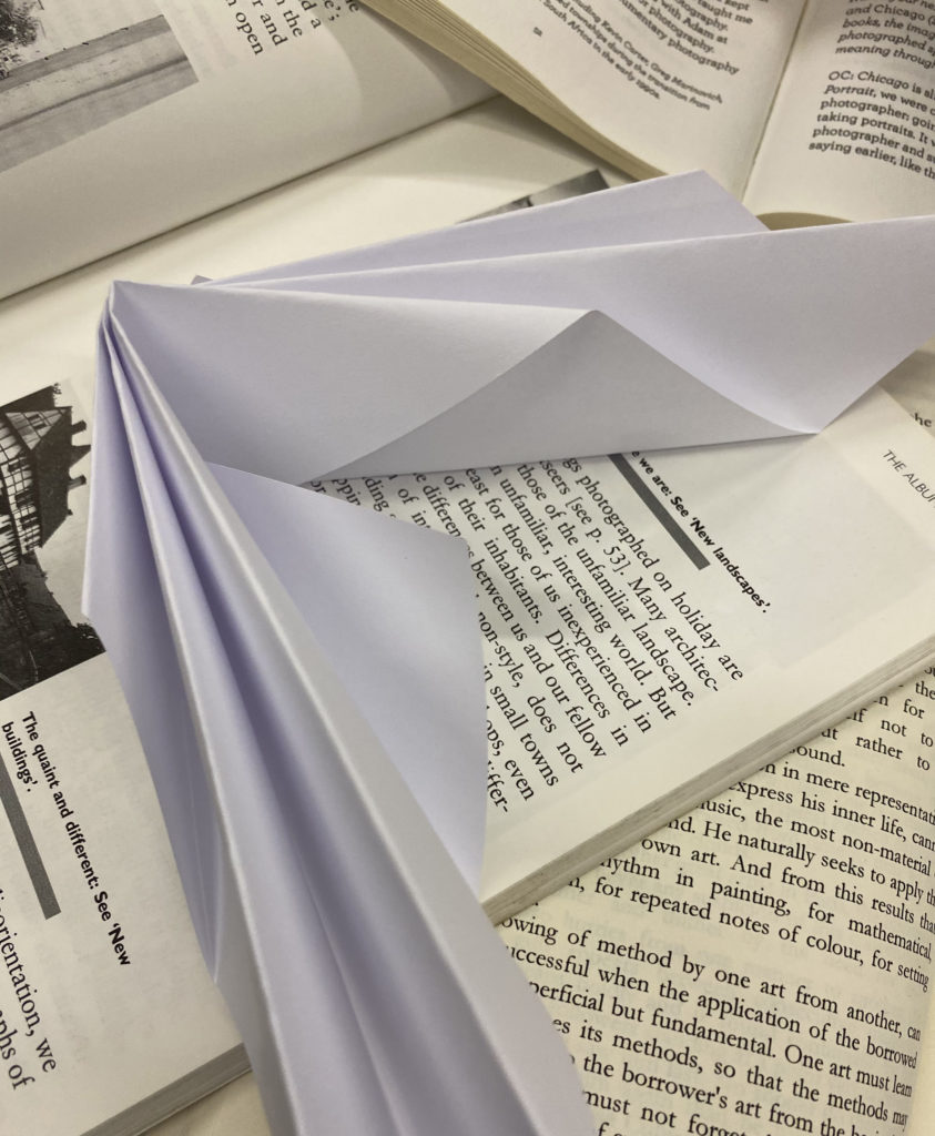
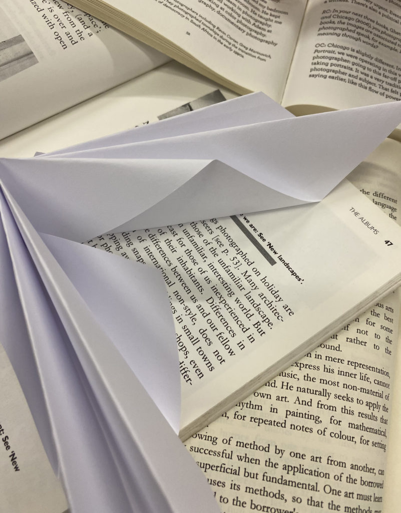
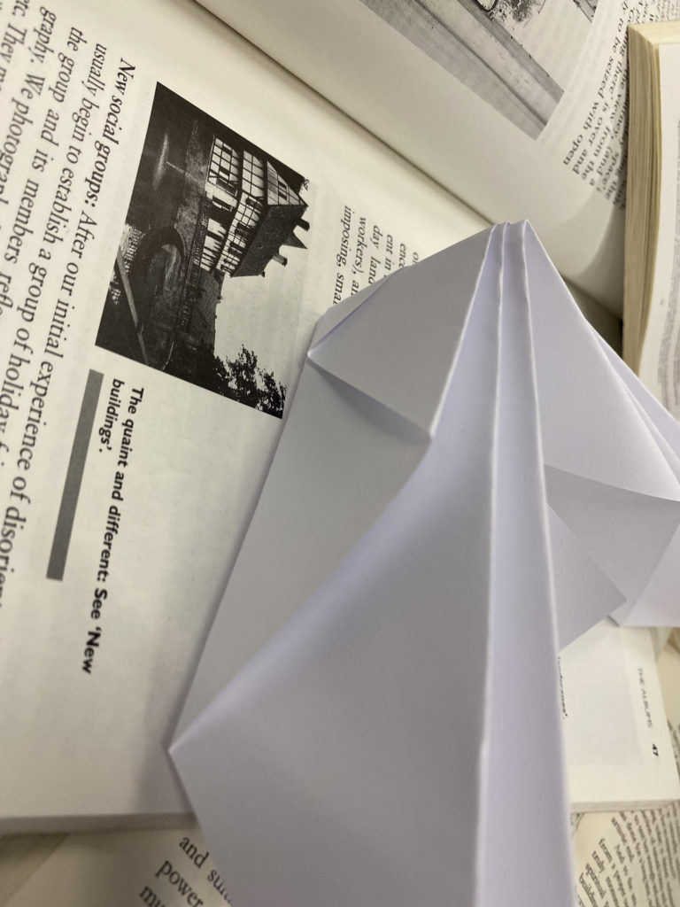
These images have been cropped to remove background distractions such as hands or the grey worktable underneath the book. I experimented with changing aspects such as contrast and exposure but I didn’t like the way it made the images look so decided to leave it unedited
THE FORMAL ELEMENTS
Light- I used natural light to keep the image soft but could have used artificial light from my iphone’s torch as a spotlight to create a more dramatic effect with dark shadowing
Lines- the creased lines on the side of the origami lead viewers eyes directly to parts of the book. To create meaning I could have had it point to a word in the book
Repetition- There is not much repetition in the photos themselves, however, when displayed together like this there is the repetition of the paper itself which is more aesthetically appealing than just a singular image
Tone- The images are very bright with a lot of available light that doesn’t really contrast with the white of the books and paper origami
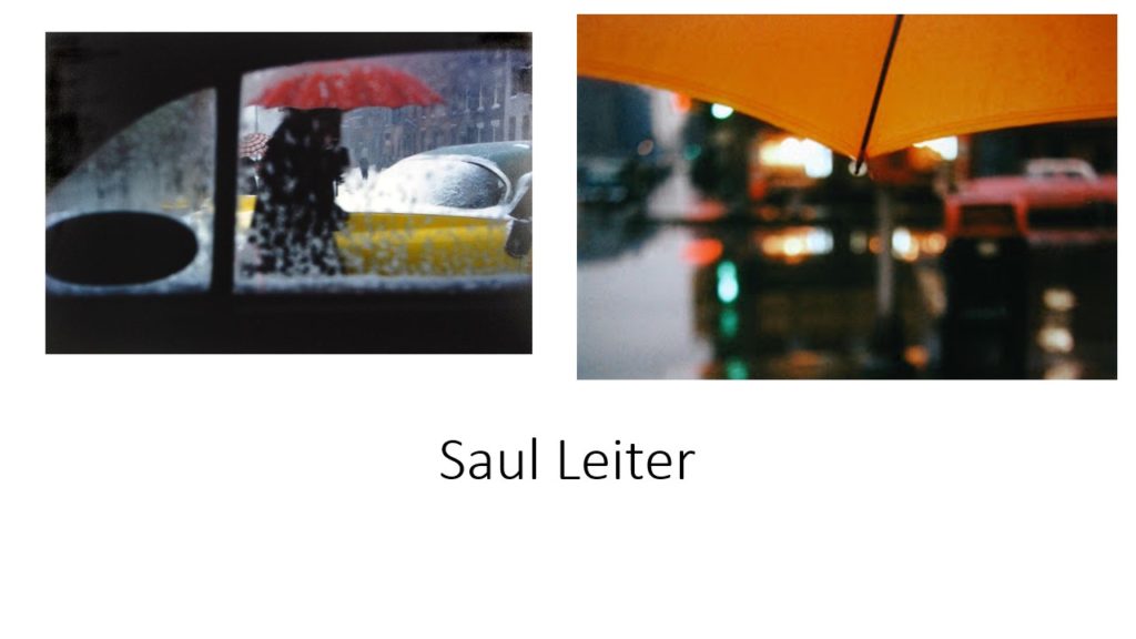
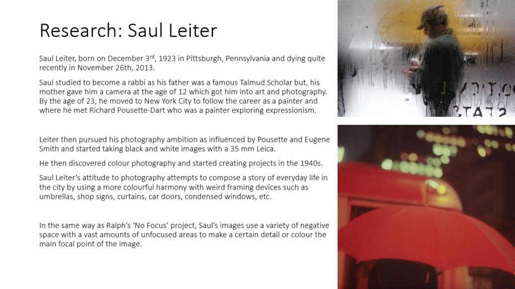
Keld Helmer-Petersen was a danish photographer renowned for his abstract photography, often upping the contrast of his photos for a more dramatic affect

MY RESPONSE
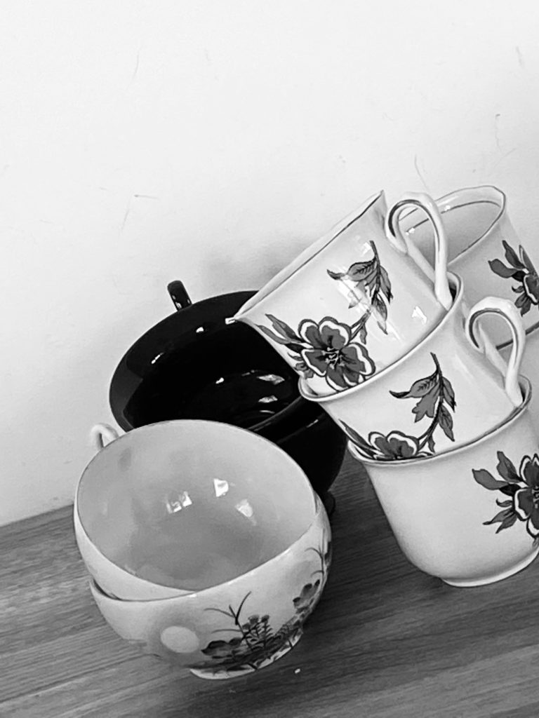
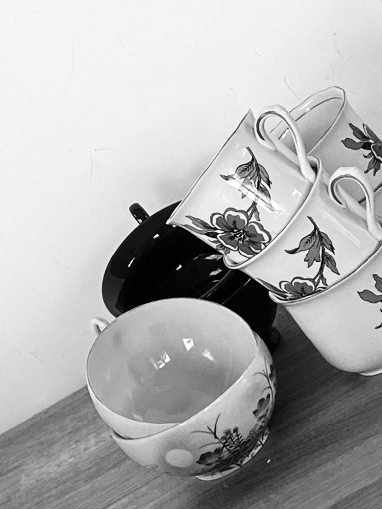
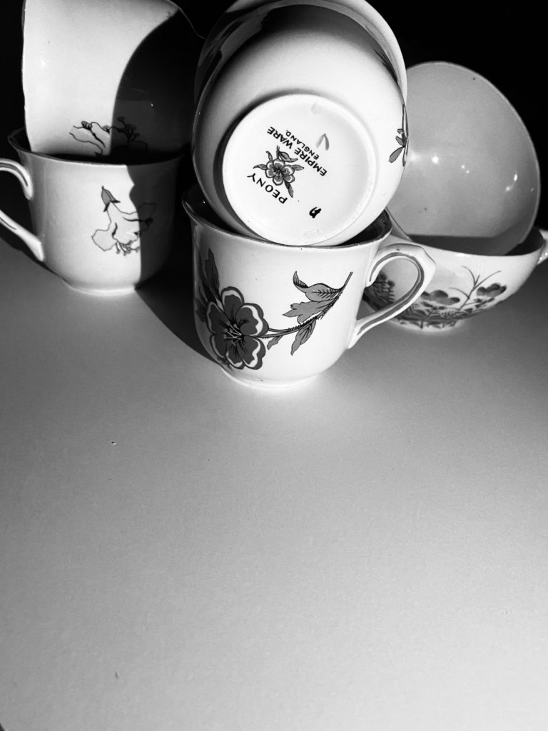
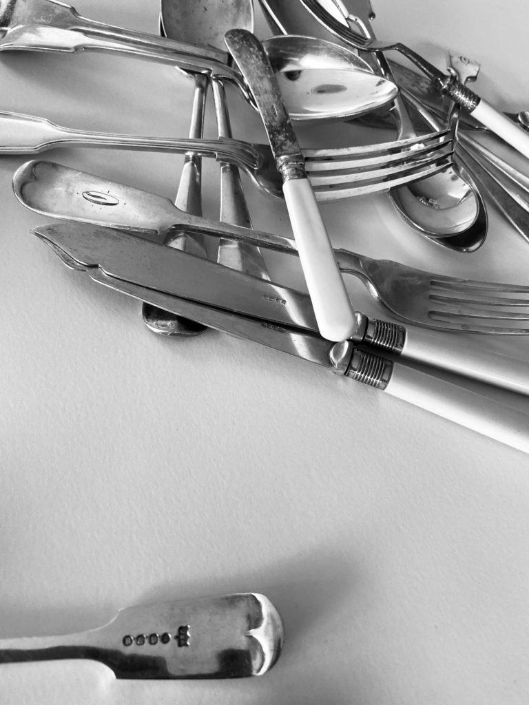

To replicate Helmer-Petersons work, I used adobe Photoshop and used the threshold tool to achieve a high contrast look. My favorite photo is of the cuttlery in the top left hand corner. Next time I would like to try this on less delicate objects, like industrial buildings