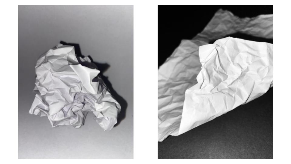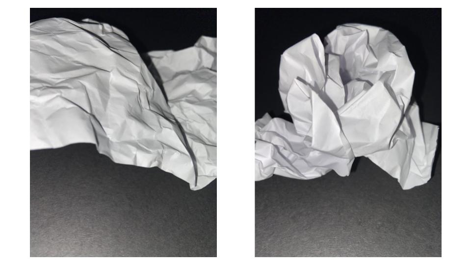

Light – The light in all of these photographs is artificial as it is coming from the torch feature on a phone. I wanted the lighting to be harsh so that you could see the clear lines in the paper made by the folding. I also wanted to include some shadows so that the white paper would appear to contrast it. I wanted the brightest part of the photograph to be the closet part to the camera, so I directed the light onto that specific place.
Line – I made the lines in the paper by folding and scrunching. I wanted there to be a mixture of both straight, harsh lines and soft, curved lines.
Repetition – In some of my photographs, there are lines and shapes that are repeated, as I folded the paper symmetrically several times.
Shape – There are a lot of geometric shapes in my photographs. For example, in the fourth picture, you can see several triangle shapes made by the straight edges of my folding.
Space – In the last three photographs, they appear shallow as the paper is very close to the camera. However in the first photograph, the paper is sat at a distance, creating a deeper look with the shadows behind it. There is also a lot of negative space in the background which has been left empty and bare.
Texture – The scrunched and folded paper would create a rough and coarse feeling.
Value/Tone – The paper is the brightest part of all my photographs, as the artificial light from the phone illuminates it against the black background. For the first picture, although the background is white, it isn’t as bright as the paper itself.
Colour – I chose to keep my photographs in simple black and white because I think that it shows the contrast between light and dark more clearly. I also think that if I had introduced any sort of colour, the creases in the paper wouldn’t be as apparent.
Composition – I placed the object mostly in the centre of my photographs so that it would appear even and balanced.

A competent post. Just requires a relevant photographic reference to support your work.