Albert Renger-Patzsch
– Renger-Patzsch was born in Wurzburg, on June 22nd, 1897. He was German photographer who began making photos at the age of twelve.
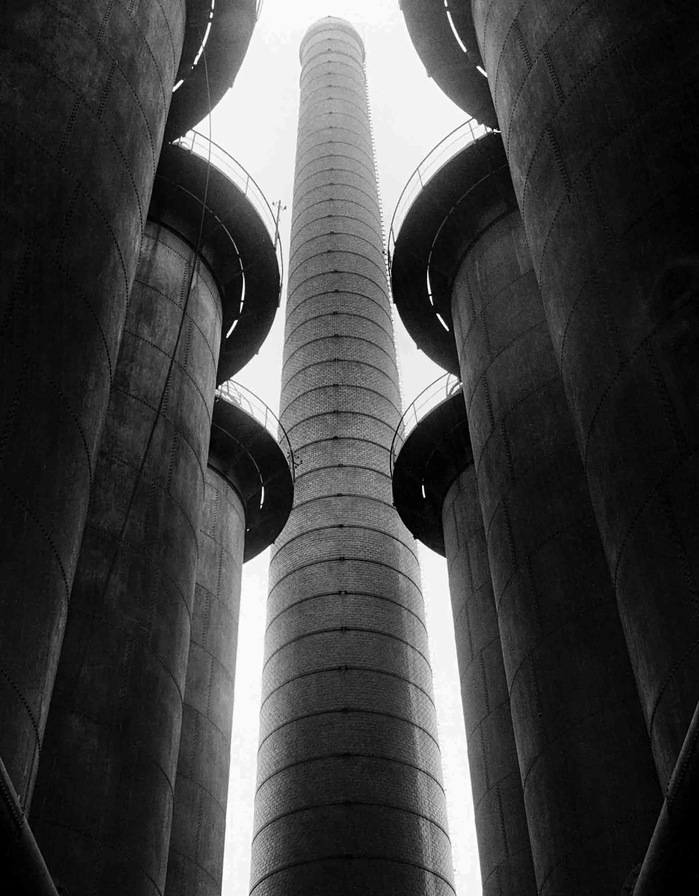
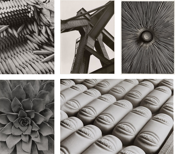
– In 1928 Reger-Patzsch published The World Is Beautiful, a collection of 100 images, which had lots of detail, mostly patterns in nature and man made structures.
– He likes to take photos of highly detailed and complex flowers and other nature plants. Additionally, he prefers to take photos of unique architecture.

– His nature photography captures what the eye can’t see. He captures each fold in and every detail in each picture.
– Renger-Patzsch makes his images black and white, which gives the image a high contrast, and reveals the tones more.
– The black and white makes it so that you focus on the geometric patterns rather than the colours.
– Lots of Renger-Patzsch’s images use leading lines, framing, repetition and rhythm. Which gives off a more visually pleasing image.

Image Comparison
– Both these images were taken by Albert Renger-Patzsch.

- Firstly, the trees are natural and randomly positioned, where as the spades are carefully positioned.
- There is more depth in the photo with the trees, as it fog makes the trees fade away.
- The photo with the trees uses natural light, where as the photo of the spades is most likely artificial light.
- Both photos have repetition of the subject.
- The whole of each spade is in shot, however in the other photo, the top of the trees are cut off, this shows how big the trees are in comparison to the spades.
My Photos


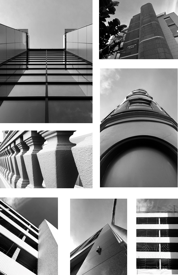
Architectural Photos
– Firstly, I took photos of buildings that have detailed symmetry and patterns from the windows.
– I made sure that the sky was in all of them and i commonly used the line of thirds technique to make them to create a unique appearance.
Nature Photos
– I used a macro lens to get a close up shot of the objects I photographed. It made it so you can see every detail on the focus.
– It created a shallow depth of field, as I used a low f/number. This makes us focus on a specific object as the background is blurred.
– I took lots of photos of leaves as there have many natural patterns. Also, I took a close up of a feather, which as a repeated pattern with smaller lines coming off the central line.
Overall I made all the photos black and white, as it is in the style of Albert Renger-Patschz. The black and white effect, created a high contrast and made all the patterns more visible.

Confident work. Very strong architectural and botanical imagery. You might want to look at the work of Karl Blossfeldt and/or Imogen Cunningham. All you preliminary photos could have been organised as contact sheets?