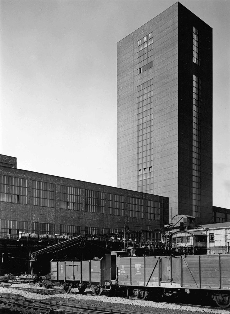
Albert Renger-Patzsch was born in 1897 and died in 1966 and was a German photographer who mostly shot in black and white and was associated with the New Objectivity
New Objectivity was a movement in German art in the 1920’s as a reaction against expressionism. It was a return to focus more on the objective world, instead of abstract or romantic. Some other artists that were associated with New Objectivity were Max Beckmann, Otto Dix, George Grosz, Christian Schad, Rudolf Schlichter and Jeanne Mammen.
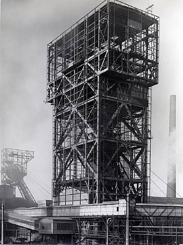
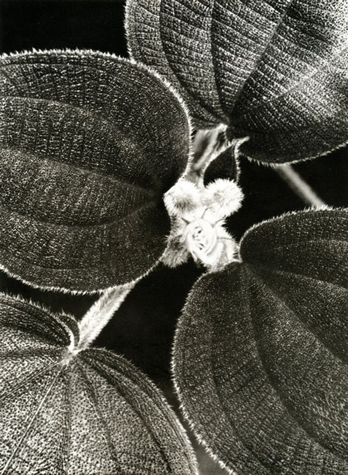
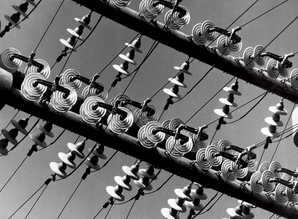
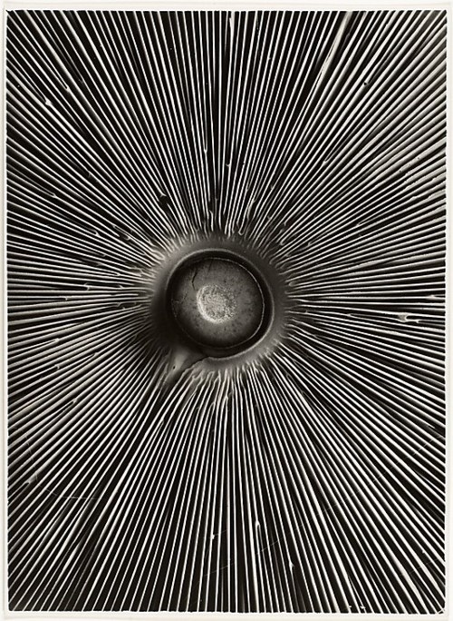
He made a book in 1928, ‘Die Welt ist schön‘, which translates to The ‘World is Beautiful’, which is a collection of hundreds of his photographs of industrial buildings and areas, mass produced objects and natural forms. These were all in black and white, usually with great contrast between the darks and lights in the image. Lots of his images also focused on geometric shapes and repetition throughout the image.
Image Analysis
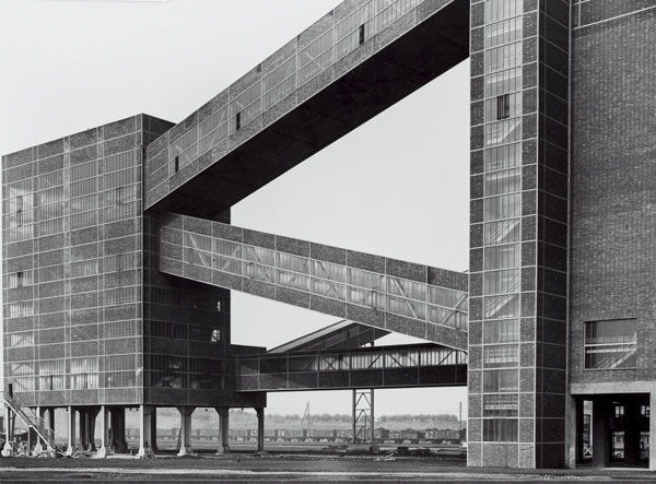
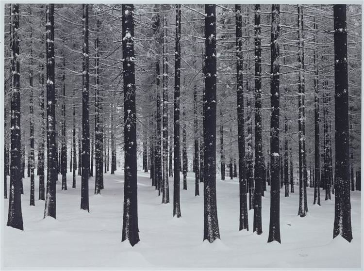
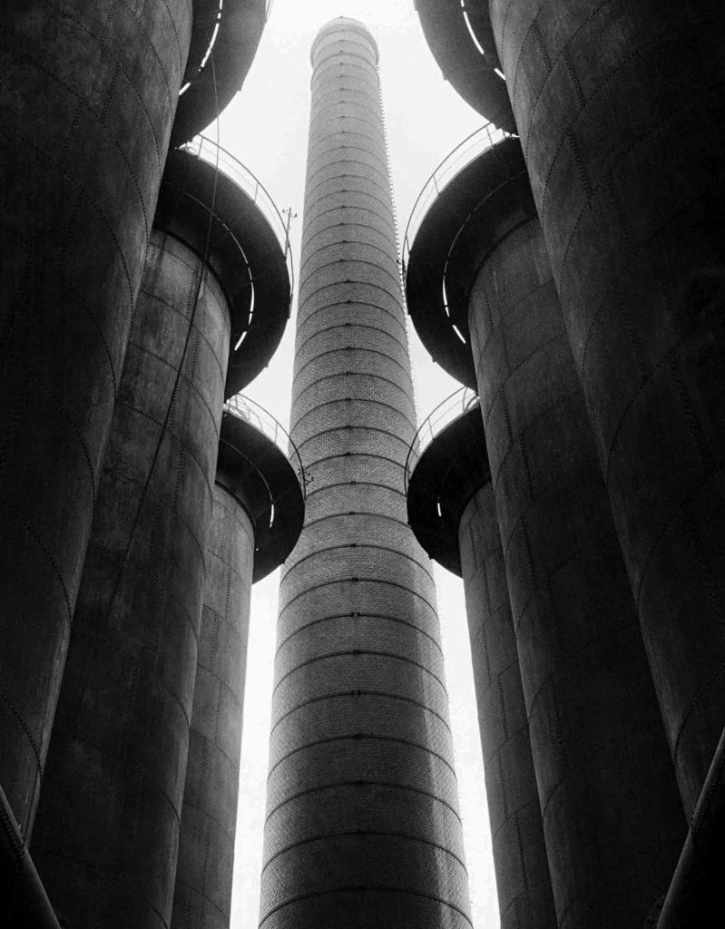
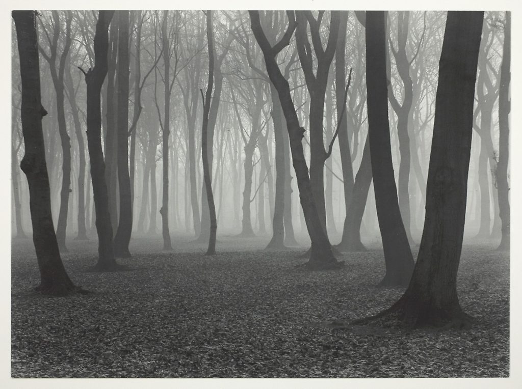
These are both images that Albert Renger-Patzsch took as a part of his ‘The World Is Beautiful’ collection.
One is an image of an industrial building, and one is an image of a deep natural woodland area, but they have many similarities aswel as differences.
Both images are taken in black and white which emphasizes the shadows created by the objects in the frame. This is seen in the dark shadows underneath the tops of the towers in the image on the left, as well and the gradient from light to dark grays on the rounded edge of the towers. These dark shadows are similar to the natural image on the right as the darkness of the trees create a silhouette against the light, foggy background, creating a high contrast between the focus objects and the background, which is also seen in the image on the left. The image on the left is very geometric with the towers and buildings completely vertical and straight in the frame. Where as the image on the right is more organic as the trees are all varying at the angle they are leaning, with different bumps and curves on each of them. The framing of the image on left is so that the image is almost completely symmetrical, which links to the idea of a man made factory creating hundreds of the same product. The image of the right is much less symmetrical and uneven, which shows the randomness of nature. Both images use layers and camera positioning to create a sense of depth. In the image on he left, the camera is focusing on a taller building behind 6 other smaller buildings which create a ‘tunnel’ towards the larger one. The bigger tower also has a lighter tone showing that it is further away from the camera than the other towers. Although both images are in black and white, the one on the right has more warm tones than the image on the left. The left image also has a higher contrast between the buildings and the sky because the whites of the sky are brighter with a higher exposure. This makes the right image more inviting as it gives off more warm as well as natural feelings. The photograph on the right was shot at chest height looking parallel to the ground to see into the woods through the trees, but the photograph on the left was shot from the ground looking up up at the buildings. This angle accentuates the size and scale of the buildings giving them more depth, as well as creating an immersive feeling of being surrounded by the buildings.
My images – Contact Sheets
A contact sheet is a way of displaying images from when film photography was commonly used. It is a sheet of printing paper that displays a whole shoot of multiple images. They provide a quick way to look at lots of images quickly in the same place.
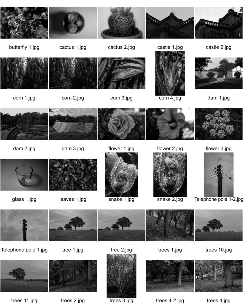
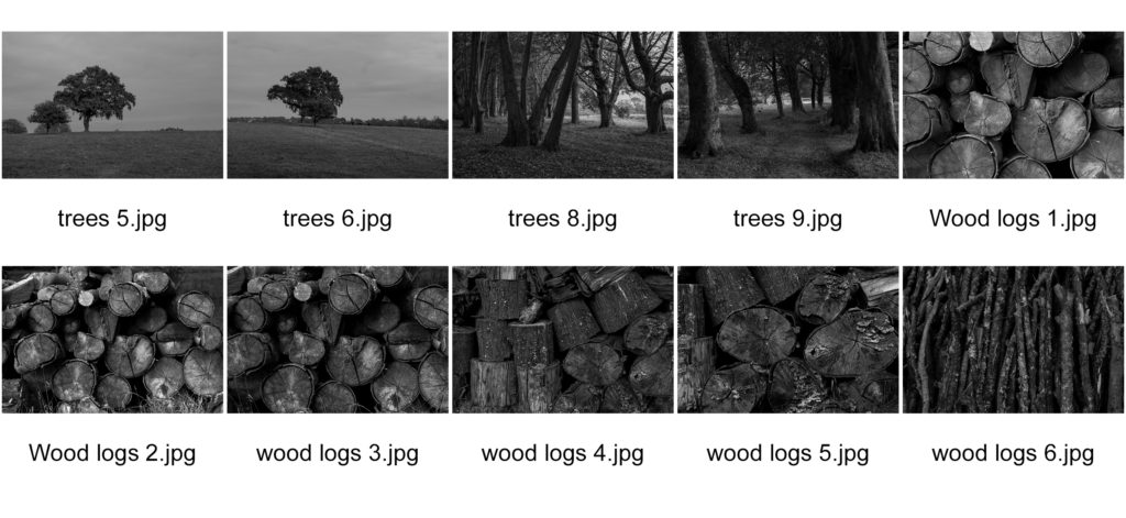
Contact sheets were originally useful to quickly scan through a group of photographs to find the best ones to enlarge. Now it is used to quickly find the best ones to further edit and improve.
Favorite Images

