


















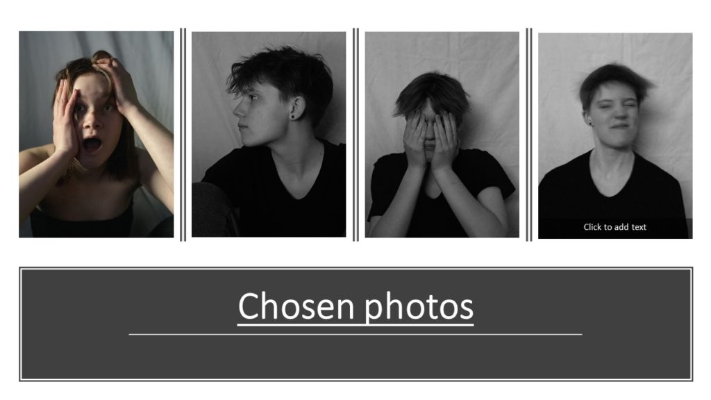
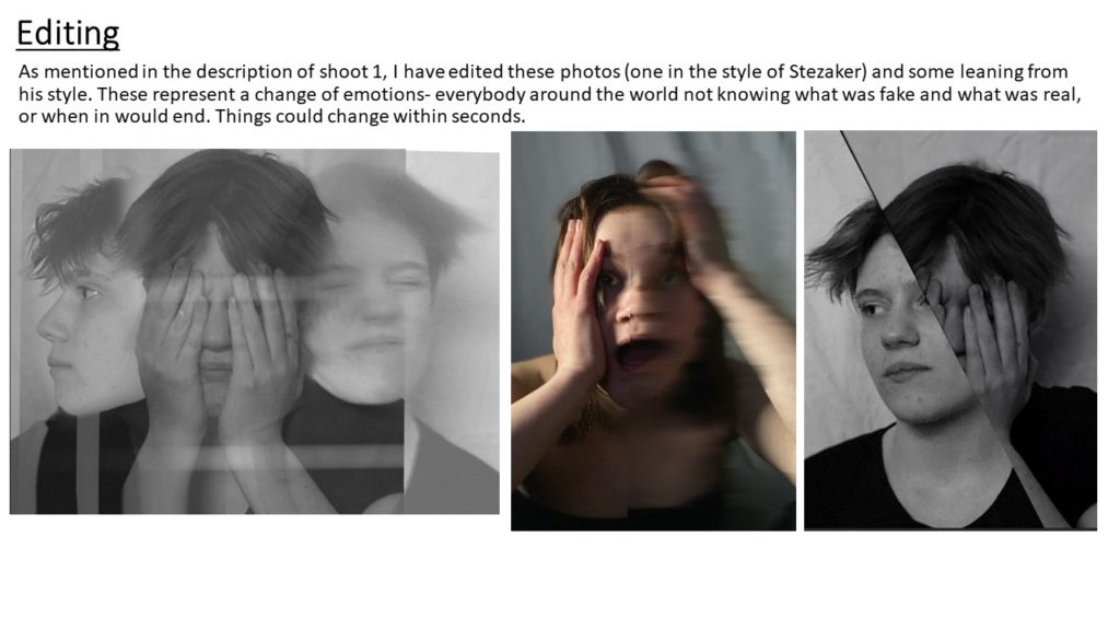


Light: the brightest areas of the photos are the centre of the objects as with the boats it’s inside the boat unless it’s on it’s side then it’s the side facing up. The shadows face different ways whether the light is coming from the left, right, centre or even from the bottom. The shadow is always seen as we wanted a contrast of tones across our photos. We used a semi harsh artificial light to cast where we want the shadow to be and sometimes we would use two lights to strengthen the lights.
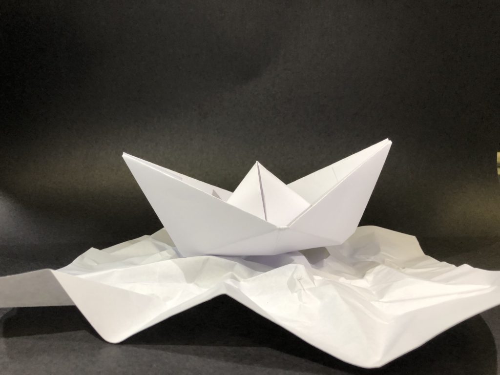
Line: There are multiple lines that intercept each other, some are straight lines coming from different directions on the boat whereas the lines on the paper underneath are very angular and unpredictable.
Repetition: There’s repetition in da boat with the angles reflected vertically giving the boat symmetrical structure whereas the piece of paper underneath is random giving the image a chaotic feel to it.
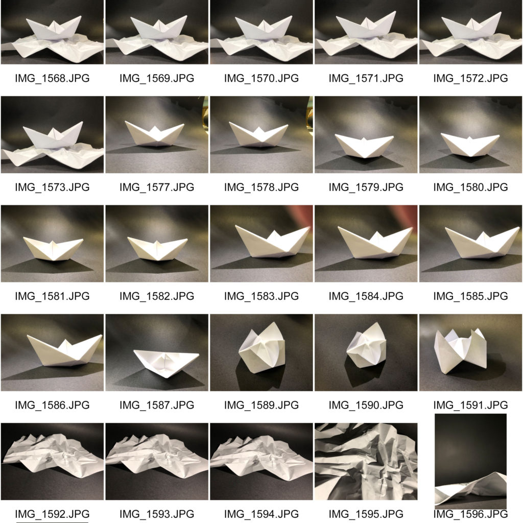
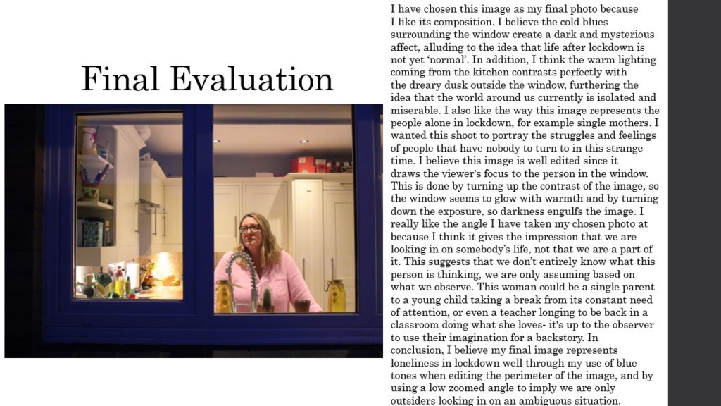
Shape: The edges from the image is very straight and sharp which relates to each other because they cross over each other without loosing the direction they’re going in.
Space: The image is very shallow as it only has a mid ground and a background with small open spaces behind the boat and piece of paper underneath it.

Texture: In the photo you can see that it has a very smooth texture on the boat as you can see that there are no bumps or lumps on it where as the piece of paper underneath would have a bumpy texture as the folds give it a creased took.
Value/Tone: Black and white tones can be seen throughout the image going from the lightest at the centre going darker with shadows of the boat and piece of paper.
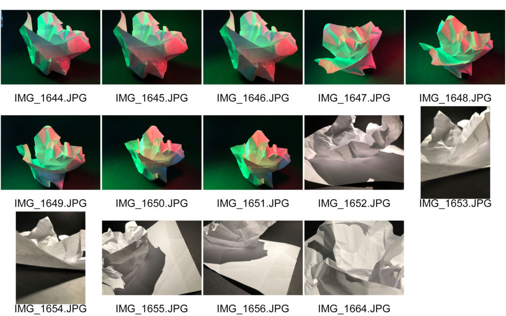
Colour: In the focus image it doesn’t use colour except the yellow light going across the image reflecting off the black background. In other photos we used colour which the saturation has been toned down to give a more diluted colour.
Composition: The boat and paper have been arranged in the centre with the boat as the focus of the photo and the paper underneath to represent the sea.


