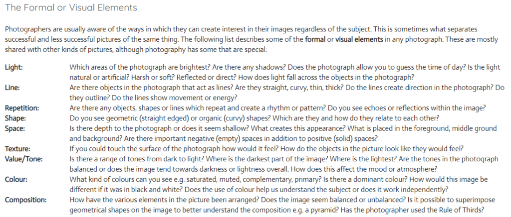
| Photographs consist of formal and visual elements and have their own ‘grammar’. These formal and visual elements (such as line, shape, repetition, rhythm, balance etc.) are shared with other works of art. But photographs also have a specific grammar – flatness, frame, time, focus etc. ‘Mistakes’ in photography are often associated with (breaking) the ‘rules’ and expectations of this grammar e.g. out of focus, subject cropped, blur etc. Some photographers enjoy making beautiful images but others are more critical of what beauty means in today’s world.Photographers have to impose order, bring structure to what they photograph. It is inevitable. A photograph without structure is like a sentence without grammar—it is incomprehensible, even inconceivable. — Stephen Shore |
This way of thinking about photographs has come to seem a bit old fashioned due to competing theories of photographic meaning, Postmodernism and digital culture. It is certainly true that formalist readings of photographs alone can never do full justice to the complex webs of meaning generated by photographic images. Photographs aren’t neutral. They don’t show us things as they are, although they’re pretty good at pretending they do. Photographs are ideological constructs, a fancy way of saying that they don’t simply show us what is ‘true’ or ‘real’.
However, one might argue that photo literacy in part depends on an understanding of the formal or visual elements, some of which are borrowed from the visual arts, with others appearing to be specific to photography. As in any language, ‘grammar’ gets you so far, helps you appreciate the structure and ‘rules’ governing particular modes of expression. A knowledge of the ‘grammar’ of photography is therefore part of the analytical and creative toolkit of any photography student.

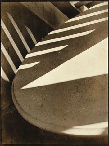
The photograph below is by Paul Strand. It is entitled ‘Abstraction, Twin Lakes, Connecticut’ and was made in 1916. You can read more about the image here. The photographer created a picture that draws attention to the Formal Elements. Spending some time really exploring photographs in terms of the formal elements is an important process in the development of visual literacy.

Link to excellent BBC Resource / formal elements and more…

Analysing and Interpreting Robert Frank – Trolley, New Orleans


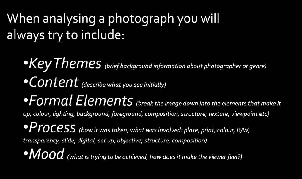
A guide to evaluating a Photograph: Key Themes, Content, Formal Elements, Process & Mood.
Key Themes – brief background information about the photographer or genre
Gain insight from title of image, date of image etc. Background research etc.
Content – Describe what you see! Look at the subject of the photograph.
What is it? What is it about? What is happening? What is in the foreground, midground, background? Where and when was it taken?
What do you think the relationship is between the photographer and the subject/s is? What has the photographer titled the image and why? Does the title change the way we see the image? Is it staged? Is it real?
Is it a realistic depiction? Has it been manipulated in anyway? If so, where and why? What is the theme of the photograph? What message does the photograph communicate?
Formal Elements – break the image down into the elements that make it up.
Colour, lighting, composition, structure, mood etc.
Colour – Is the photograph colour or black and white? Is there a reason for this? How does this affect the mood? What colours are depicted?
Lighting – is it photographed in a studio? Is it using studio lighting? Natural lighting? Has the photographer waited for the right natural light? Has the photographer positioned themselves? Vantage point. Is the lighting subtle? Is it strong? If so why and who has the lighting been used? Effectively or not? Does the lighting help the image? Why? Create mood/atmosphere? Dark, light?
Tone – Is the photograph high or low contrast? How and why? What tonal values.
Line/Composition – What sort of lines are there in the image? Leading lines? How have they been positioned in relation to the rest of the image? Is this on purpose? (the viewfinder or cropped afterwards?) What effect does this have?
Shape/Composition – What sort of shapes are there in the image? Do they remind you of anything? Do you think the photographer meant this? Is there symmetry? Is it structured in anyway? Rule of thirds? ‘S’ shape? ‘J’ shape. Golden Spiral, Golden Ratio, Fibonacci? Is it minimal? Simple? Complex? Confused?
Process – how the photograph has been taken, developed, manipulated and printed
Was the image taken inside or out? What time of day? Light sources? Evidence. Materials or tools used (props, objects, studio etc) Has the image been manipulation post production? How and why? B&W or colour? Plate, C print, large format, medium format, pin hole, slide, digital print, projection etc. Date may help.
Mood – look at the mood and feeling of the image
Is the photographer attempting to capture a moment/atmosphere/emotion? Explain why you think this. Is there a narrative/story? How does the image make you feel? Why do you feel like this? How and why?
USEFUL VOCABULARY
Colour
Intense Saturated Bright Luminous Secondary
Clash Mixed Soft Cold Opaque
Tint Deep Pale Translucent Dull
Pastel Transparent Glowing Primary Vibrant
Harmonious Pure Warm Dark
Tone
Dark Harsh Bright Fade Intense
Contrast Fair Smooth Crisp Gradation
Sombre
Composition
Background Distant Middle Ground Blurred
Shape Scale Perspective Confused
Foreground Space Form Proportion
Symmetry Structured
Light
Artificial Gentle Natural Dapple Harsh
Night Dark Haze Shading Highlight
Shadow Evening Intense Soft Light
Source Midday Tone Directional Bright
Focussed
Mood/Feeling
Alive Disturbing Sad Atmospheric Exciting
Humorous Delicate Expressive Depressing Happy
Energised Shocking Questioning Thought provoking
Powerful
