pLEMONT BUNKER SHOOT

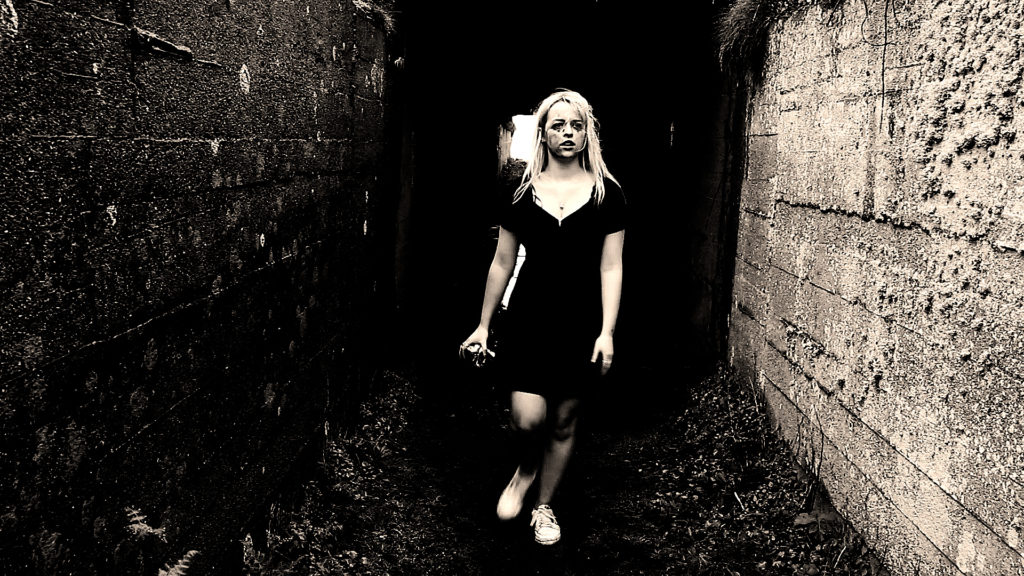
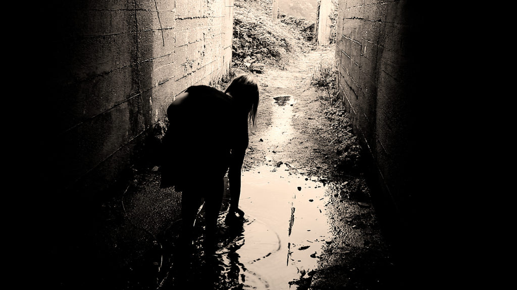
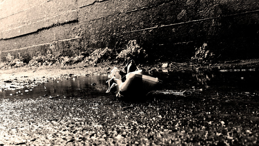
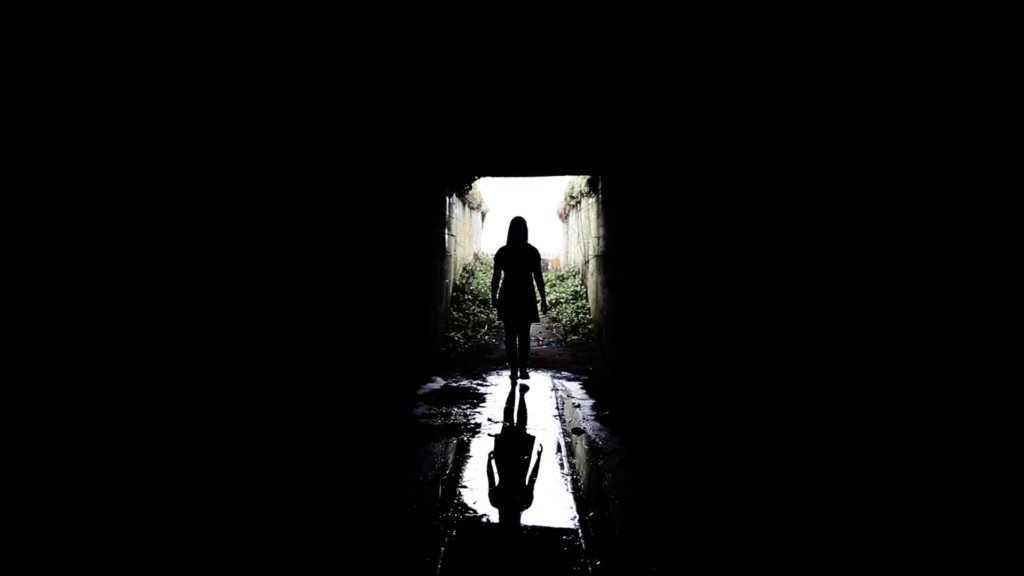
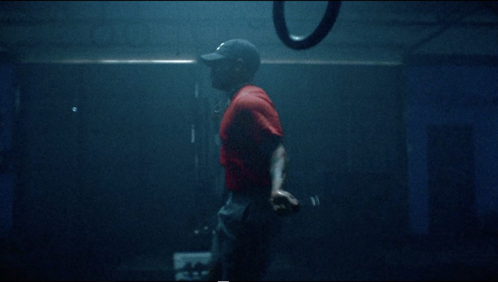
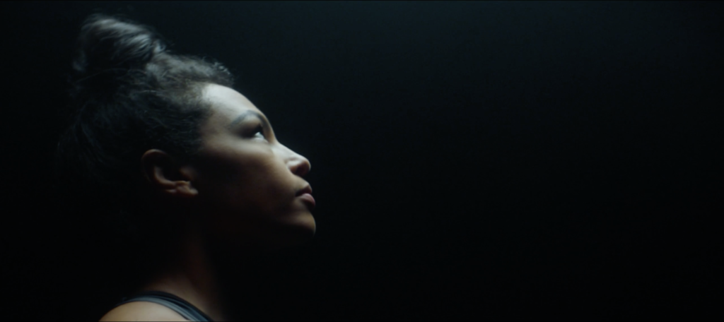
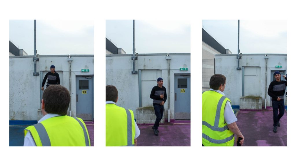
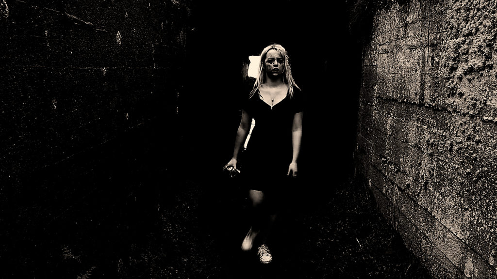
When I went to the large bunker at the bottom of Plemont, the weather became a damaging factor and I was worried that the rain and the wind would make the tripod fall over as well as break the camera. Although I managed to deal with the weather and if anything it added to effect of the film by making me look more exhausted resulting in a creepier look to the film. I also liked the way that the rain dripped and echoed inside of the bunker as it made my film more ominous when editing the audio although I struggled to single out this one sound as the wind was very strong.

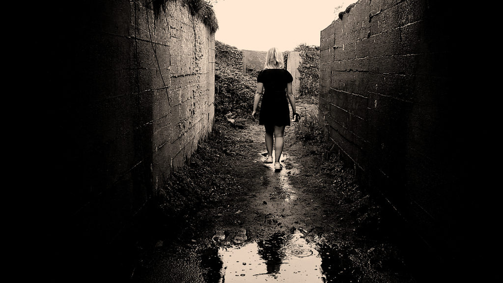
This part of the film related to the them of freedoms and limitations the most and expressed it better than any other part. The drastic contrast between light and dark adds to the thought of oppositions. Being in the dark means lack of knowledge or being hidden from the truth whereas putting light on the situation adds meaning and truth just the same with freedoms and limitations.

My specific inspiration for these scene was Duane Michals. Duane Michals first made significant, creative strides in the field of photography during the 1960s. In an era heavily influenced by photojournalism, Michals manipulated the medium to communicate narratives. The sequences, for which he is widely known, appropriate cinema’s frame-by-frame format. Michals has also incorporated text as a key component in his works. I like the way that Michals presents his work as dark and ominous as that’s the way I like to go about presenting my work also. I like the theme of black white where shadow and light appears to be a lot more dramatic than it would be if the photograph or film was in colour. Whether the spirit/ghost is visible in the photo or if there is a feeling of the supernatural lurking around the photo, I think Michals work represents the unsettling feeling of uncertainty. His work links to my theme of Freedoms and Limitations as there’s the idea that the angel/devil near the bed had the freedom to do what they want without consequences but as had the limitations of not having a normal human life.
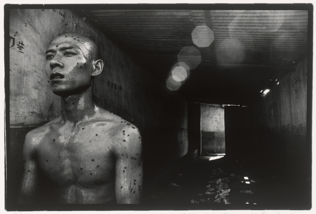
My other inspiration was Zhang Huan. Zhang Huan is a Chinese artist based in Shanghai and New York City. He began his career as a painter and then transitioned to performance art before making a comeback to painting. He is primarily known for his performance work, but also makes photographs and sculpture. He is usually photographed by the photographer Rong Rong. Both of the artists work combined creates an inspirational flow for which I will consider incorporating into my film. In relation to Freedoms and Limitation it is clear that the photographs below connect greatly to the theme. The photography is clearly showing some people being completely trapped and chained by the society in which they live in. Whereas some of the photos show the complete exposure to the real world and freedom to explore nature and the imagination. I like the amount of depth the photos explore and the rawness; it has an unsettling element to it which I’d like to display within my own work. I also like the way the photographs are displayed as worn out photographs; it makes the viewer feel as if that they are viewing has some historical importance or that the photograph is deemed as special or one of a kind. The photograph above has also given me some inspiration for my film. I was thinking that if I wasn’t to present there beginning or the end of my film in my bedroom, I was going to use a bunker to have an element of darkness as well as to show one of the girls in my film to have a life which isn’t glamorous compared to the other character. I think the image has a lot of depth to it as the door towards the background shows the light coming through indicating that there’s a way out from the bunker which could be seen as metaphorical for a way to escape the darkness and move towards something to improve a persons life. Which all links to freedoms and limitations.

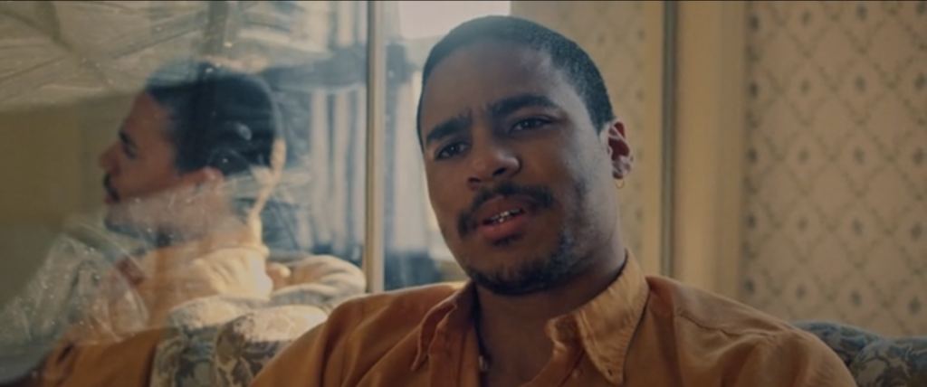
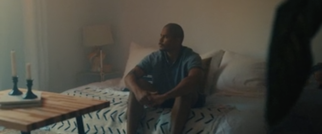
My other inspiration is Michael Chaves, specially the music video he helped Billie Eilish make called Bury A Friend and the movie The Conjuring 3. When looking at Bury A Friend, from the album “When We All Fall Asleep Where Do We Go?”, I think the concept of nightmares and horror links in nicely as well as the title pf the song quite literally linking to death; intertwining with graves, spirits and ghosts. My idea of making peoples spirits/alter self come to life makes me think of the demonic character Billie Eilish is trying to portray. I was thinking of having two main people in the film like the music video where the man on the bed is unconscious but talking whilst dreaming in this dimly lit building and Billie Eilish being the monster in his bedroom watching him, under his bed and lurking around the hallways of his building. I also think the lyrics in the song itself have a lot of meaning and would help me to move forward with the theme of Freedoms and Limitations. The freedom to express your darkest thoughts and make them come to life but the limitations of how far you can express what you’re thinking without making your ideas too dark as well as the limitations of not having full control of what your thinking or feeling.

Editing and Experimenting

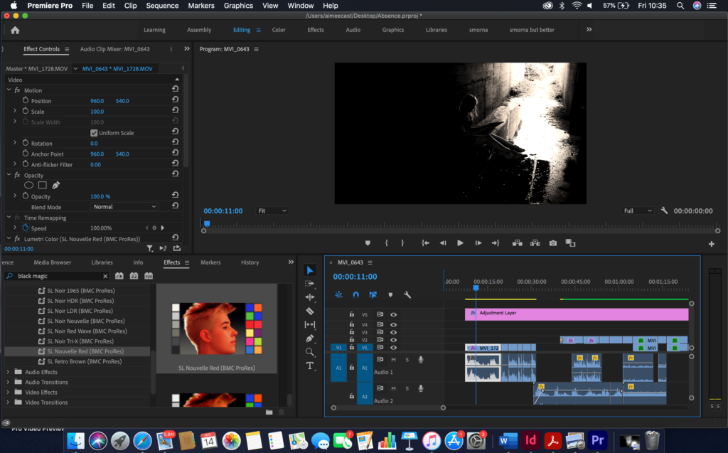
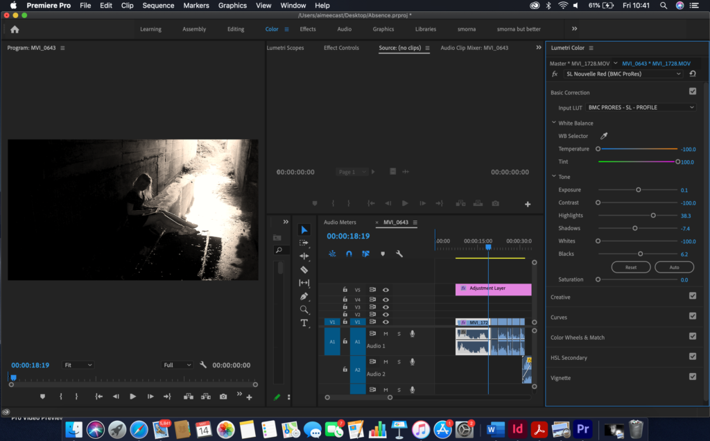
Whilst editing, I found myself experimenting a lot with the shadows and the black of the footage. I did this to make the footage look creepier than it usually would. I thought the effect of heightening the shadows was an important effect when it comes to the final film. The drastic contrast between light and dark adds to the thought of oppositions. Being in the dark means lack of knowledge or being hidden from the truth whereas putting light on the situation adds meaning and truth just the same with freedoms and limitations. I also put an adjustment layer to make sure the footage lined up properly when it came to the different tones being affected by the light. As for the audio I spliced it up carefully and layered the sound for a spookier effect.
Evaluating

Although this was by far the most difficult shoot to do, it came out the best and it was my favourite one to film. I loved the look of all the shots and how shadowed all of the bunker was. Whilst trying to find a bunker that I could actually go in it started raining and the wind started picking up. I went to a total of five bunkers until I found one that had an area that I could venture into. The slope to the bottom of Plemont was extremely steep and muddy and I nearly slipped multiple times whilst get drenched and getting pushed by the wind but I managed to get down there eventually. I tried to film with multiple cameras to get different angles of what I was doing. This turned out well mostly but some of the footage got corrupted as well as the card becoming full whilst I was in the middle of filming. But, overall, I’m very happy with the results.

Evaluation of my Final Film

Watch the film here on stream

Watch the film here on youtube

Reflection

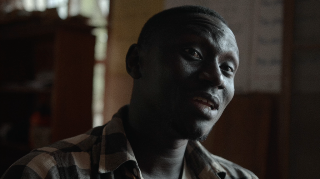
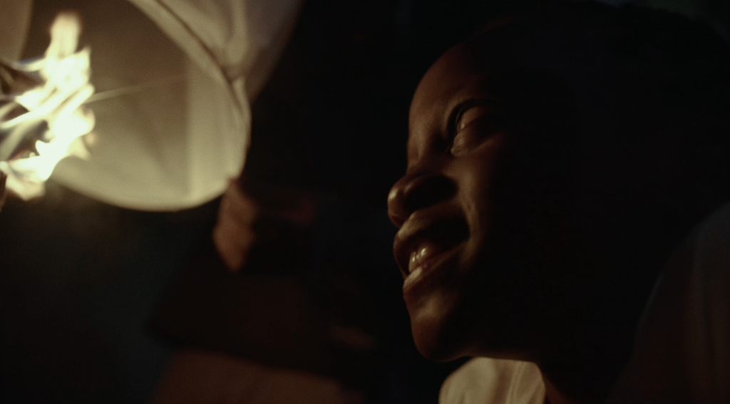
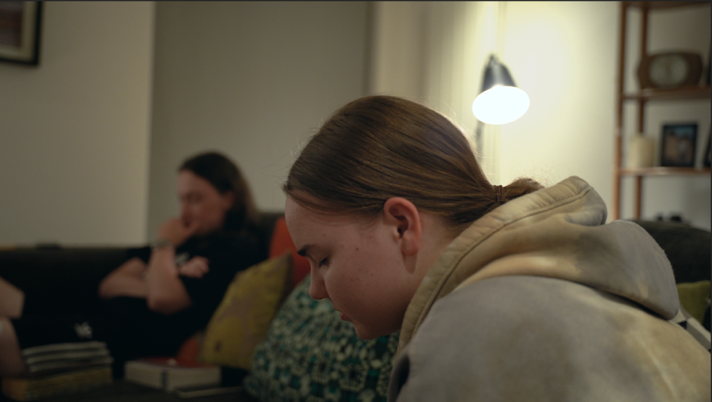
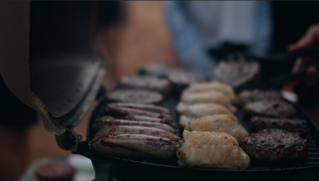
Overall, I am pleased with the final outcome of my film. I think the film reacts appropriately to the exam brief and the theme ‘Freedom and Limitations’ as it explores the way Freedom Church and the Church as a whole handled the covid 19 pandemic and how the restrictions enforced as a result of the contagious virus did not stop them from worshiping and being free in the knowledge that God was not affected by lockdown. I feel that once edited together in a sequence that flows well, the clips I had filmed accurately represented and tell the story of freedom and Limitations in the church, I feel that the clips well compliment the voice over being heard on screen. The use of titles and visual words on screen help to effectively tell the story and keep the audience engaged as the film becomes more dynamic and varied in the media used to convey the important message. From my original statement of intent, the main message of ”The building may be in lockdown but the church is not’ was still conveyed and that was the goal. However I decided to hone in on a more specific area and not just church in general, the idea of Church online being able to reach a wide audience, how God is not affected by covid and seeking Jesus in the everyday opportunities is what I ended up focusing on.

Things to consider for next time: use a wider variety of actors e.g. better balance or male to female, and ethnicities. I like the way I used quite a young cast with the intent of being more relevant to the younger generation, however the majority of the film include males which doesn’t show much diversity.

Link to artist’s work and exam theme

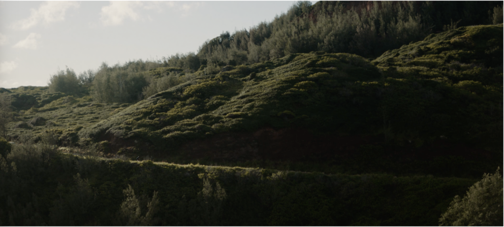
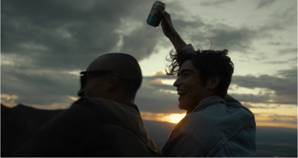
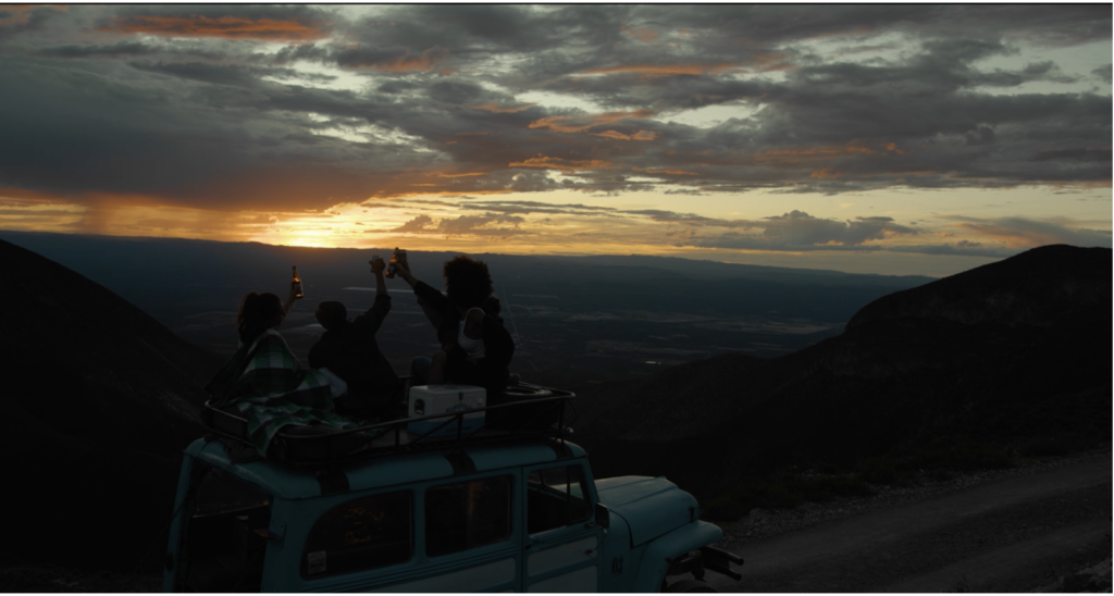
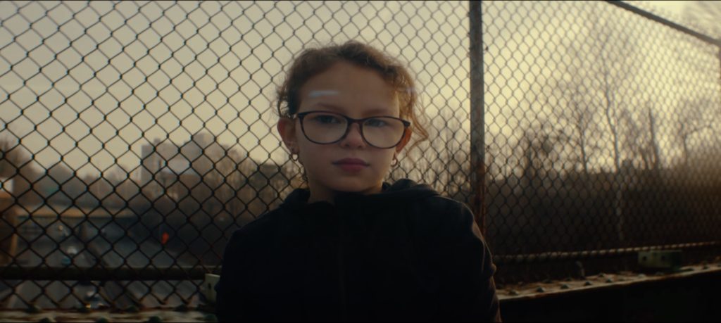
In reference to the artists/filmmakers who I have studied. I think I have successfully produced a film using cinematography and directing techniques commonly used by cinematographers and directors Mark Bone and Danny Gevirtz. I filmed all the shots myself and chose a handheld approach when possible as both Mark and Danny often choose handheld over stabled shots. I used a large mixture of both 25fps and 100fps and used them for a desired effect and to create meaning, I chose different frame rates to show difference in pace which makes the film more engaging. In this film I also put a large emphasis on lighting and during each shoot tried to make my lighting the best it could be as both Mark and Danny have very ‘cinematic films’ because their scenes are alway lit well. Both of the filmmakers I researched like to backlight their subjects which is why I used the same technique in many of the different scenes in my film.

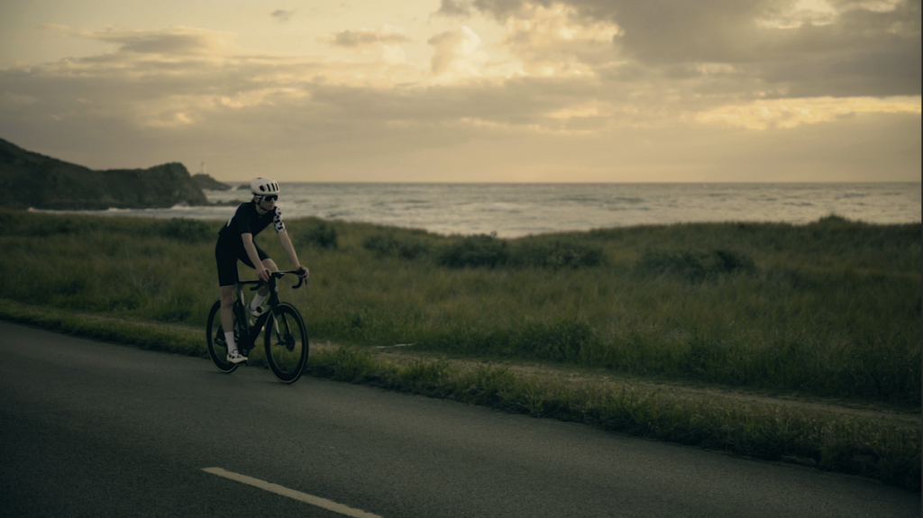
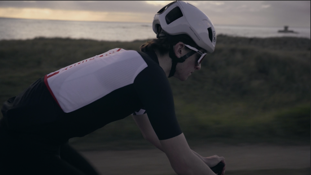
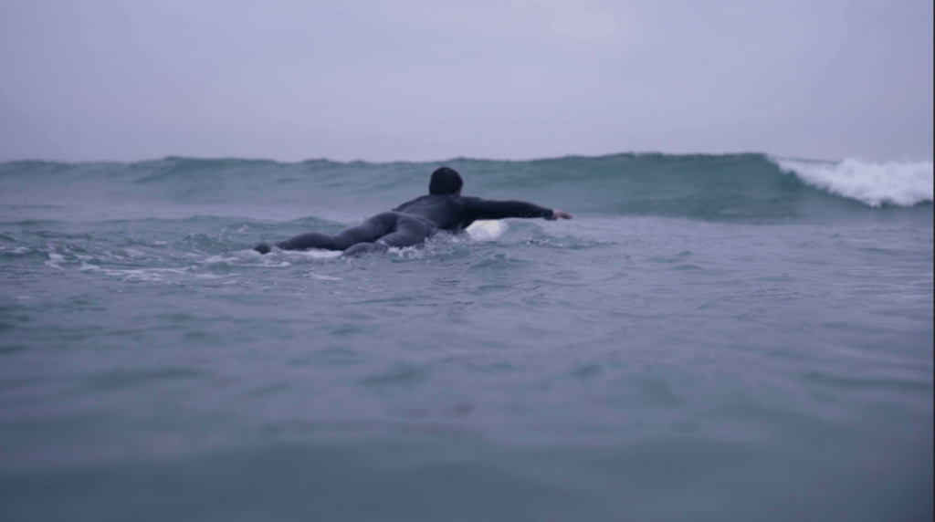
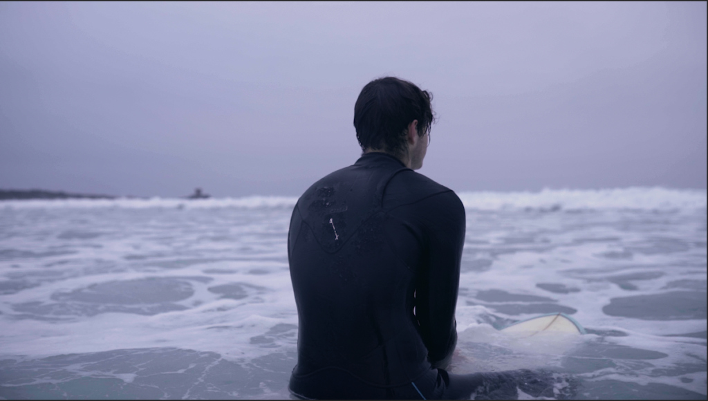
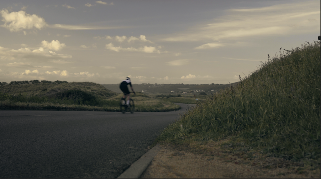
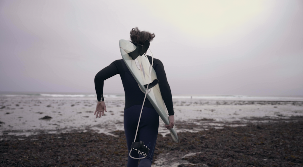
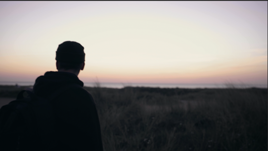
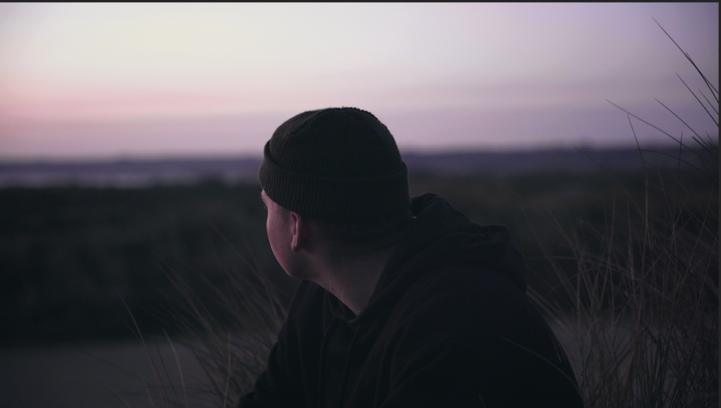
My film ‘Jesus is greater than / > Lockdown’ shares many aspects relating to the exam theme ‘Freedom and limitations’. My film explores the limitations the church faced because of Covid 19 but in light of that recognising the freedom Christians have because of the faith and knowledge they have, knowing God’s love for them and that nothing can get in the way his love, not even the corona virus. I also wanted to show freedom and limitations my filming a lot outside. The three activities shown in the, surfing, cycling and walking through the sanddunes are all outdoor activies which we were freely aloud to do in Covid. I wanted to also show that we can have joy and be free in the natural free things god has given us like nature. The use of predominantly young people in the film makes my 6.5 minute piece more relatable and the idea of young christians going about normal activities while still worshiping Jesus helps to show that christians are not completely different and weird people but are like most others but instead have freedom in Jesus.
Analysis of best scenes/images

Looking at both my work and the work of my researched filmmakers, Danny’s especially I feel the vibe and mood of the images are quite similar. I have aired more on the side of making my scenes feel slightly warmer like his and there is a lot of handheld shaky footage which makes it feel more authentic.

In terms of the overall film and way I have put my story together. I feel that I have created a powerful film which is inspiring and engaging however, there are somethings I could have done better to make the film better. Both Mark and Danny use multiple different songs for different moods or sections of the film. They spend more time cutting and sequencing effectively to match the music whereas I have only cut to one piece of music.

michael marten inspired photoshoot

I started my photo book development by starting with a Michael Marten inspired photoshoot. I based my photoshoot at Le Braye beach where the waves are smaller and more calm. I was initially inspired by the image below and its powerful tidal message. My main idea was to start my photoshoot at the bottom of the sand dune succession transition; the sea. Images from this shoot will begin the story line of my book. I would similarly like to use a model (myself) to act as the sculpture of the figure in Michael Martens image below.

CAMERA SETTINGS

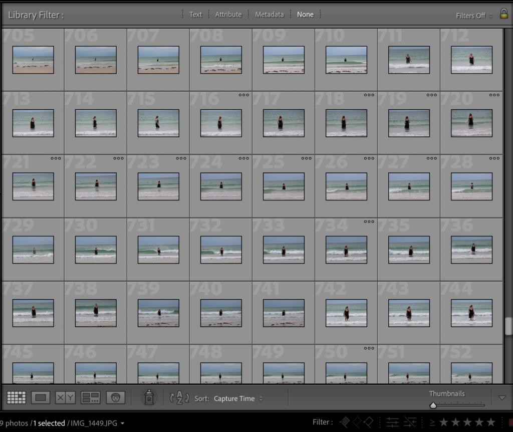
I set up my camera on a tripod to make sure all of my images where in focus. I would also use the self timer tool on the camera as I would be the model in the images. I planned on wearing a black dress and continuing that outfit throughout all of my images, again using myself as the model. The camera setting were very difficult to set up due to the movement of myself and the waves, so I had to use the autofocus tool in order to make sure all of my images came out clear with myself as the focus. Within my images, I had some of my lying down in the sand as if I was dragging myself out of the water. I think this would be a interesting concept as I am crawling my way through dunes. I also took some of myself in the sea, similar to the Michael Martens image below.

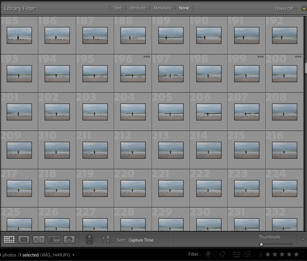
After taking all of my images onto Lightroom, I was able to start picking and rejecting images using the P and X keys. Many of the images wherent up to scratch as it was extremely difficult to take images of myself as the model. I think that the images that came out good where extremely beautiful and really exaggerated the movement of the tides. I think that the black dress contrased will to the sand and sea as the darkness of it brought attention to me as well as the landscape around.

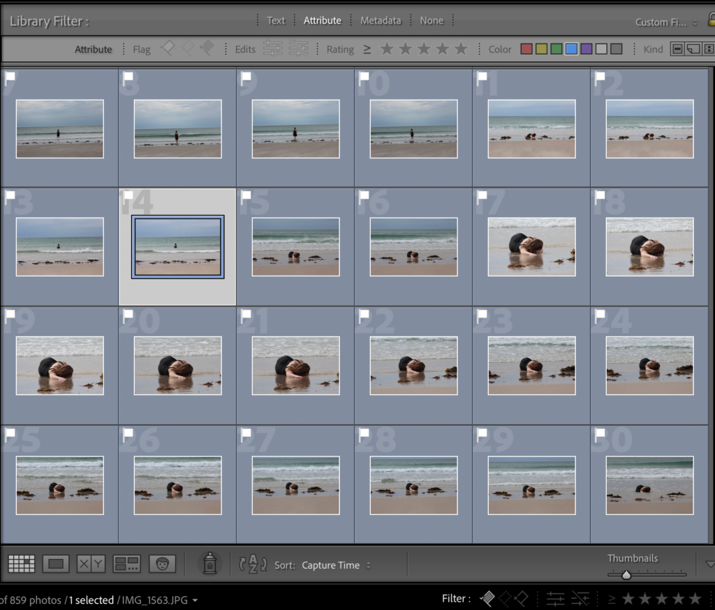
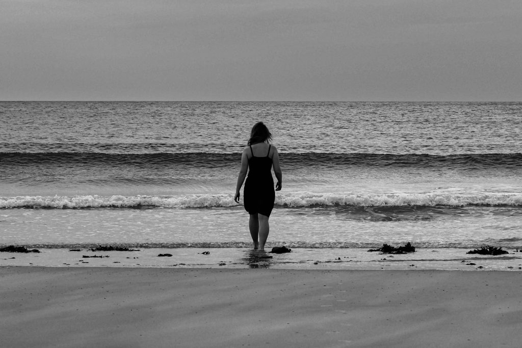
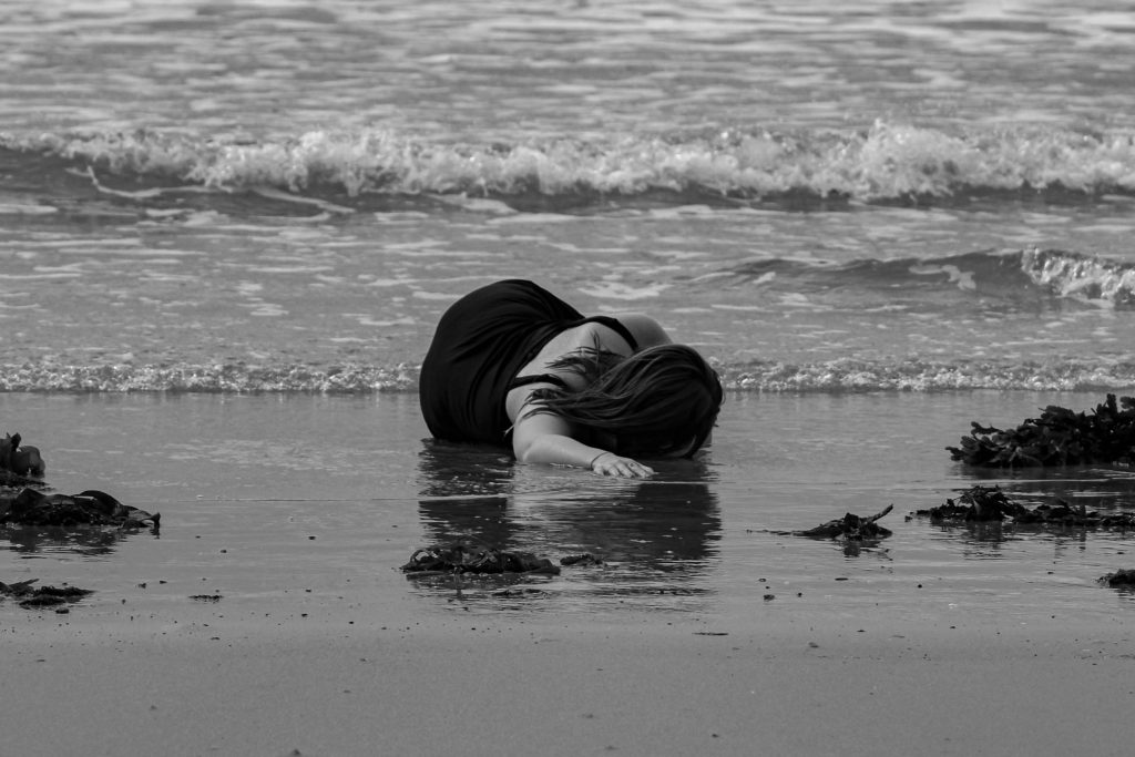
After flagging and rejecting my images, I went through and rated all of them out of 5 in order to start refining my decisions and options. I also used the compare tool ( shown in the image below) on Lightroom so that I was able to look at two similar images to decide which one had better composition and focus. I later decided on te two images below to start the first pages of my photobook. I think that their symmetry and focal points where the best and that they made very interesting and elegant images. I gave them 5/5 stars and used the filter tool on Lightrrom so that I could only view them, which would make the editing process much easier to do.

During the editing process I decided to make the images Black and white like I specified in my planning. I cropped the images to my desired proportions and angled the images so that the horizon line was exactly horizontal (image on the left). I started by editing the image on the left by increasing the exposure and contrast to accentuate the highlights and shadows in the black and white. In both images I centres myself directly in the middle, bringing focus to the model. I also increased the black so that the dress I was wearing was more visible. I copied and pasted the editing process onto the image on the right to keep the tones consistent within each photograph, I plan to to this to the rest of my images.

FINAL IMAGES

photobook planning

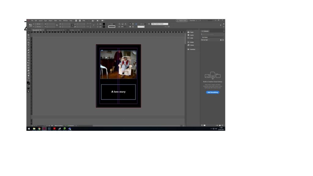
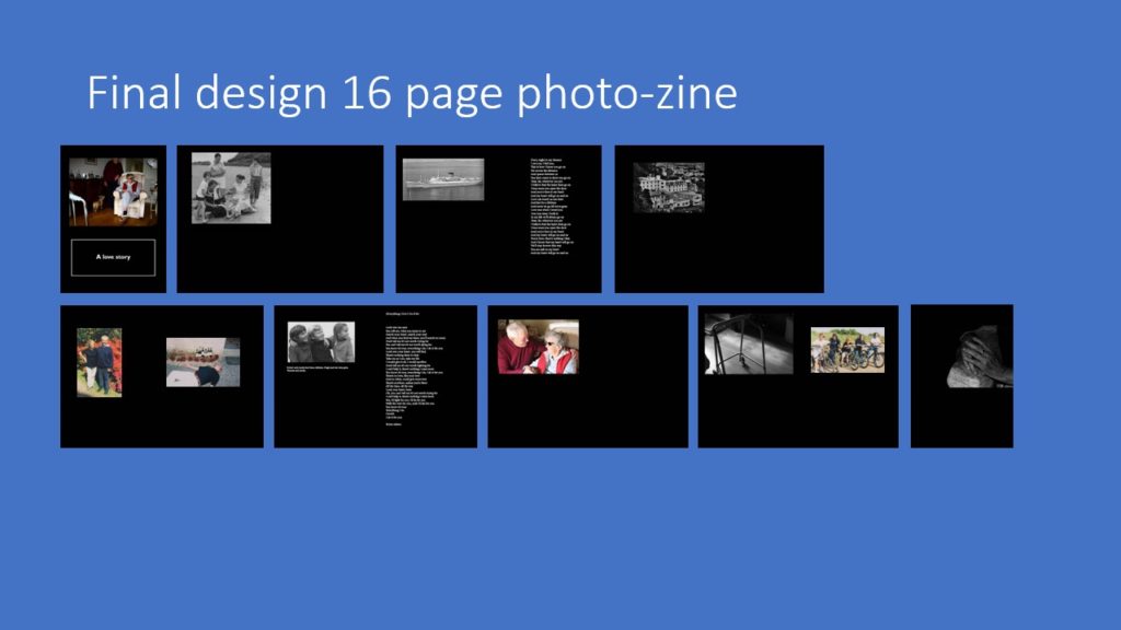
BOOK SPECIFICATION

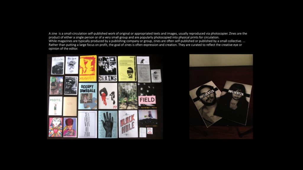
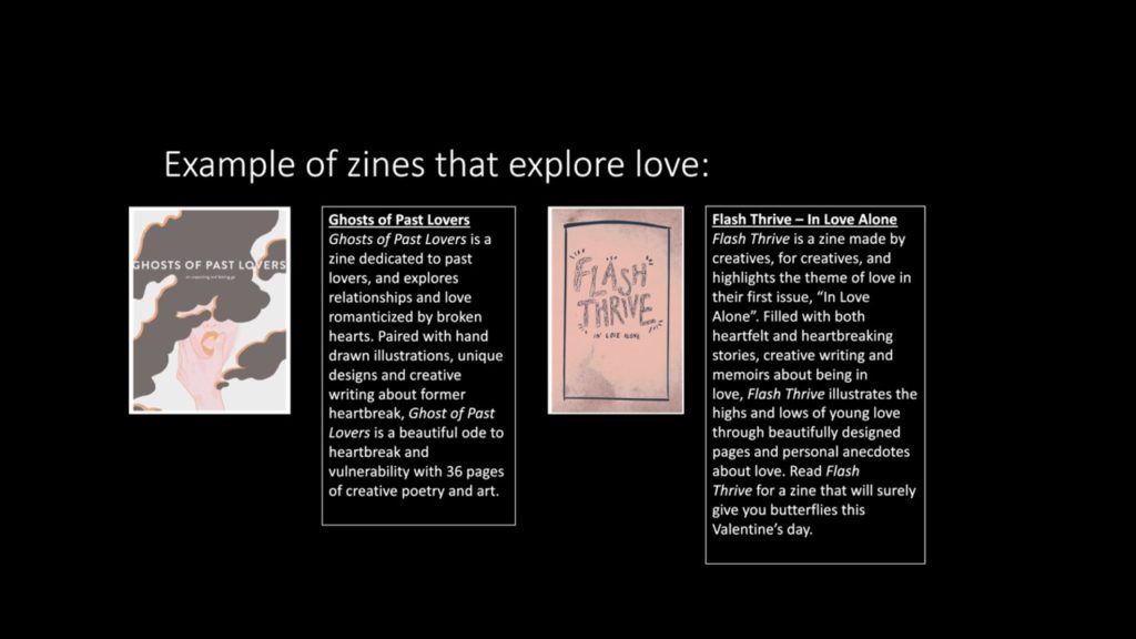
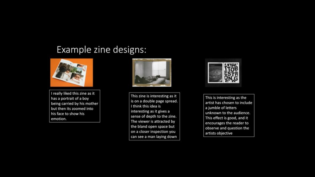
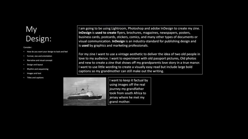
In my photo book, I’d like to explore with idea of transition within nature. My main idea is to look that the sand dune succession on the coast of jersey. On an island we are very lucky to have the landscape that we do. from the sea its self, the landscape transitions from beach, to dunes, to the woods. Throught my book I would like to use a model to act in each other different section on the dunes. St Ouens beach goes through a series of phases to become dunes. Primary succession can happen when bare sand is colonised by plants. Over time, the sand builds up into sand dunes, raising the ground above the height of sea level. Succession in sand dunes is sometimes called a psammosere.
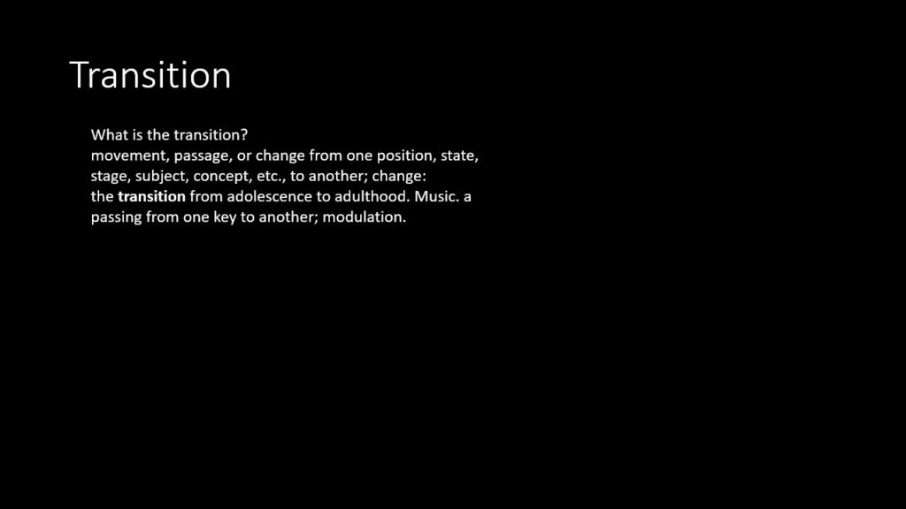
Within my book, that I will create using bookwright and blurb, I will explore all sections of the sand dunes in order to see the full TRANSITION of the coastal succession. I would like to keep all artificial features out of my images, like buildings and roads to make the images as natural as possible, focusing on the dunes and sea. I’d like there to be one image from each part of the dunes/beach/woods. I think the transition of the coast is extremely beautiful and inspirational

  • How you want your book to look and feel. It could possibly have a textured surface, like canvas to mimic the texture of marram grass, a plant that grows on the dunes.
  • Paper and ink. matte images and matte pages.
  • Format, size and orientation. small square
  • Binding and cover.
  • Title : some of my ideas have been succession or psammosere; a seral community, an ecological succession that began life on newly exposed coastal sand. Most common psammoseres are sand dune systems.
  • Structure and architecture: I would like a organised sequence of images, starting with the sea and ending in the woods, so that there is a clear TRANSITION of the coastal landscape. One image per page preferably, and all the images will be the same size. Most of the images will be edited in the same way to keep consistency and authenticity.

Design and layout. Editing and sequencing. There will be one image per page in the same orientation, mainly landscape and not portrait. I would like my photos to be in back and white, so the viewer can focus on the landscape. I think that having the images in black really draws attention to the contrasts in the landscape, and accentuated the highlights and shadows in each image. Systematic sequencing will be very important to create a smooth transition from image to image and scene to scene. I would like to have one image on each double page spread, again creating further focal point to the images in the book.

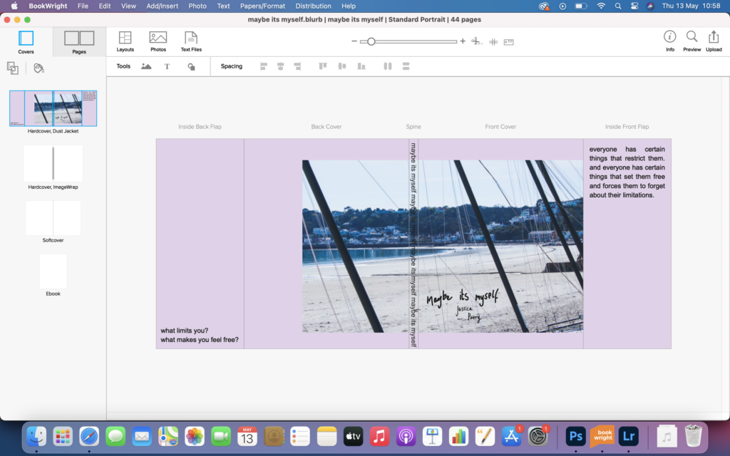
Images. New photographic responses will be created during photo-shoots. I will include a model within my images to exaggerate the movement of the wind, waves etc. images will be in black and white like I’ve said before. I’d possible like to include a coloured image of the sand dunes on the cover of my book to add context and contrast to the images in the book. It will also make to viewer think about what colours the black and white images may have.

text. I dont plan on having any letters, documents, poems, text messages in my book, however I may include how each natural structure is formed in the dunes. These may caption each photograph in my book. There will be short caption to each image, explaining what coastal feature is in the image, like a story line to sand dune succession however, depending on how each image looks on the page, I may not include captions at all.

MY IMAGES WILL GO IN THE ORDER OF SAND DUNE SUCCESSION IN THE ORDER:

  • the sea
  • the beach
  • the embryo dunes
  • the grey dunes (higher dunes)
  • possibly a dune slack (pond)
  • the woods

2. Produce a mood-board of design ideas for inspiration. Look at BLURB online book making website, photo books from photographers or see previous books produced by Hautlieu students on the table in class:

photobook evaluation

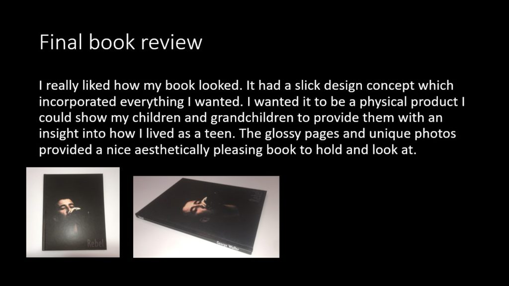
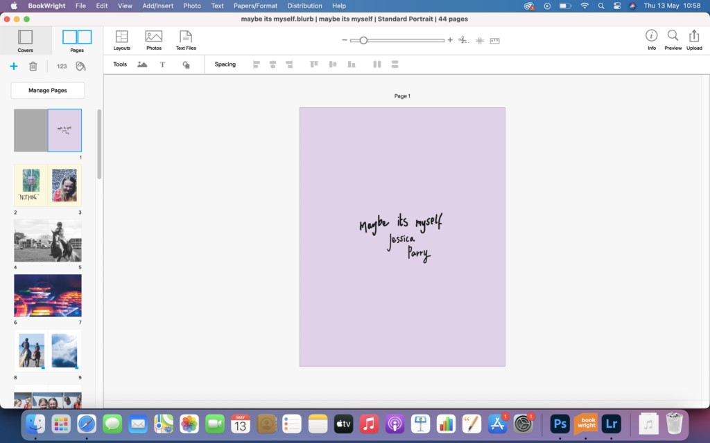
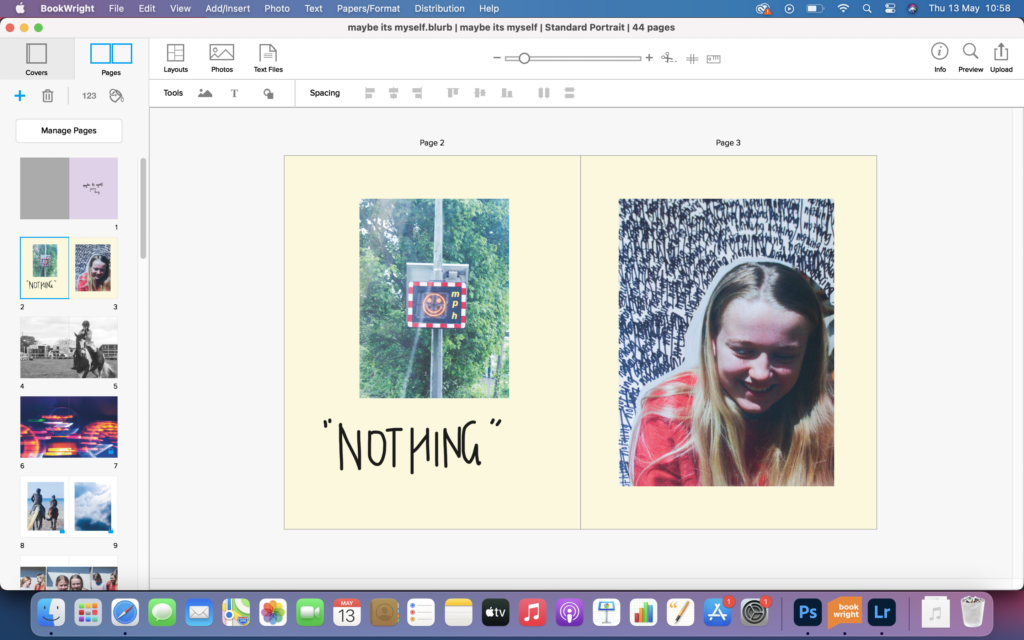
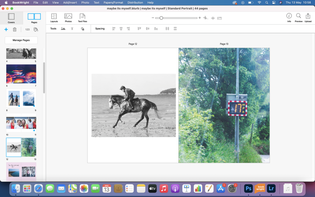
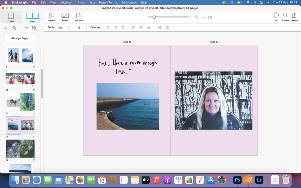
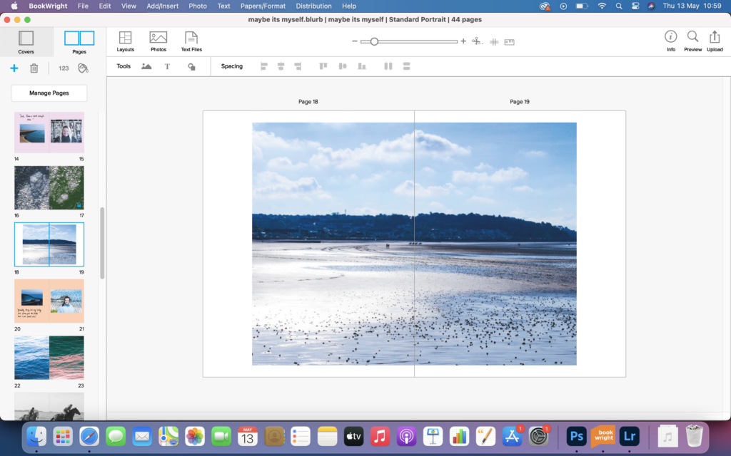
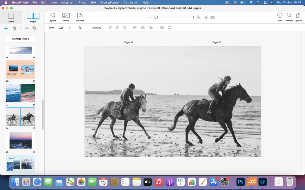
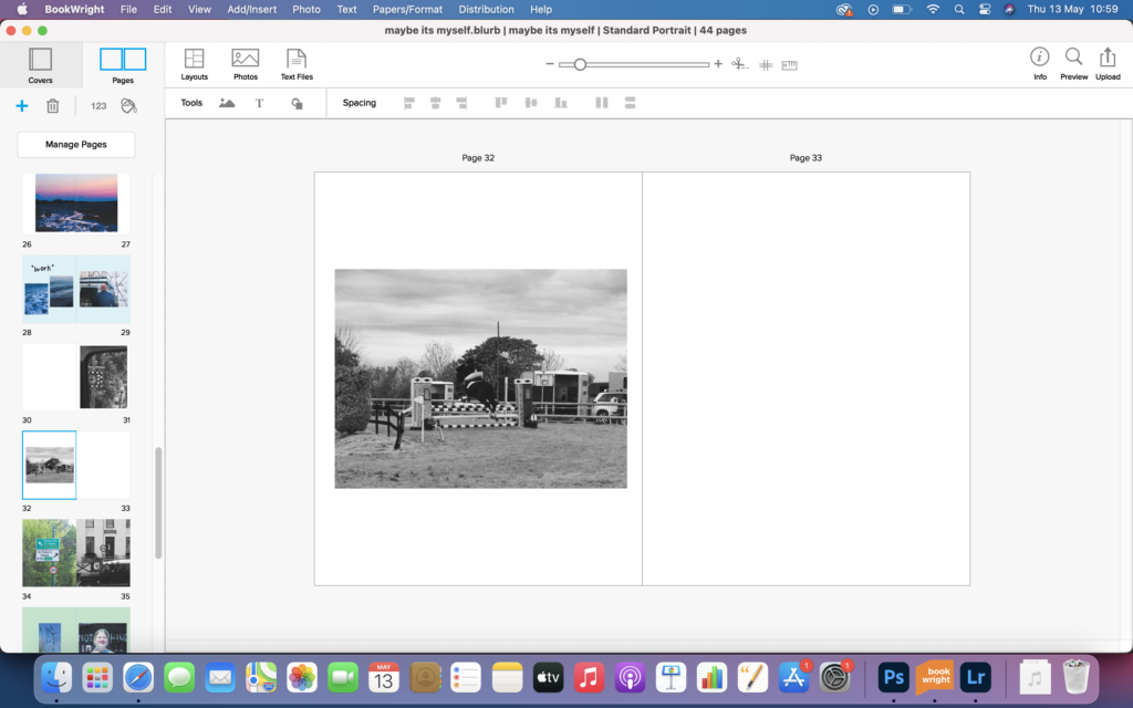
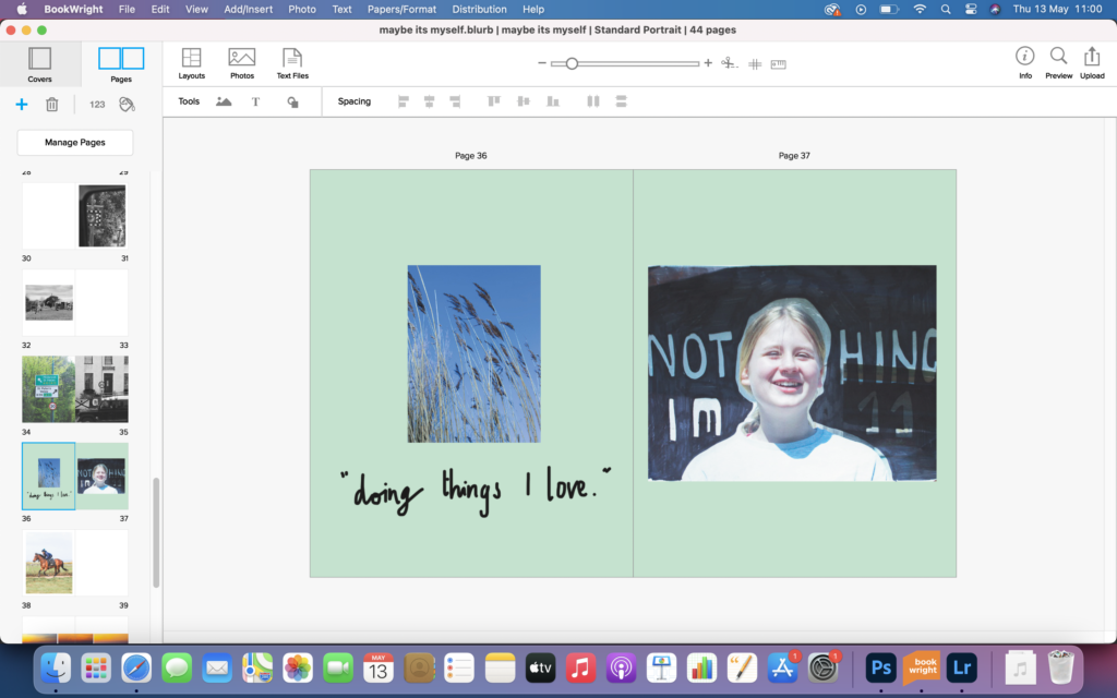
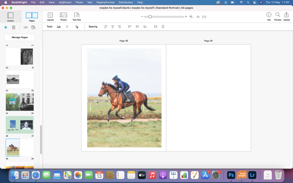
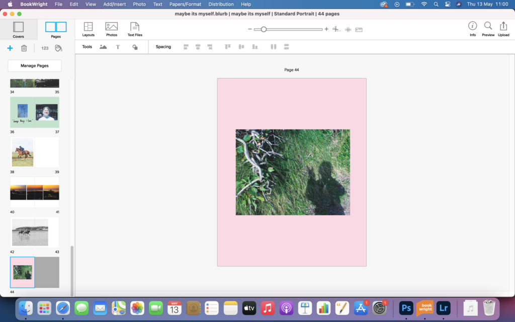
Overall I feel this photobook turned out how I wanted it to. It was set out to capture freedom and limitation, and I feel it has done that, with the images of horses galloping on the beach, hinting at freedom and with the images speed signs, hinting at limitations. I wanted the book to be free flowing and to have ability to be picked up and opened at any page, I feel I have done this as it has no narrative or real set out structure, just pictures on a page, that can be interpreted by all. This project was interesting and allowed me to gain a good insight into what myself and others feel limit and make them feel free. Things are so very different to what meets the eye.

photobook and evaluation

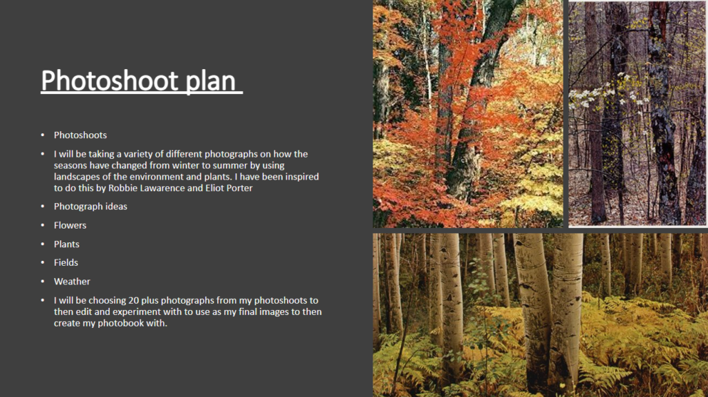
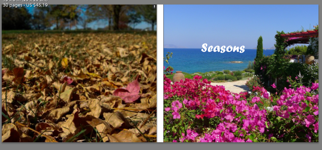
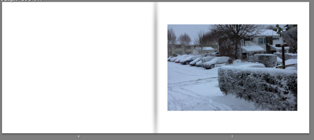
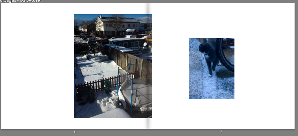
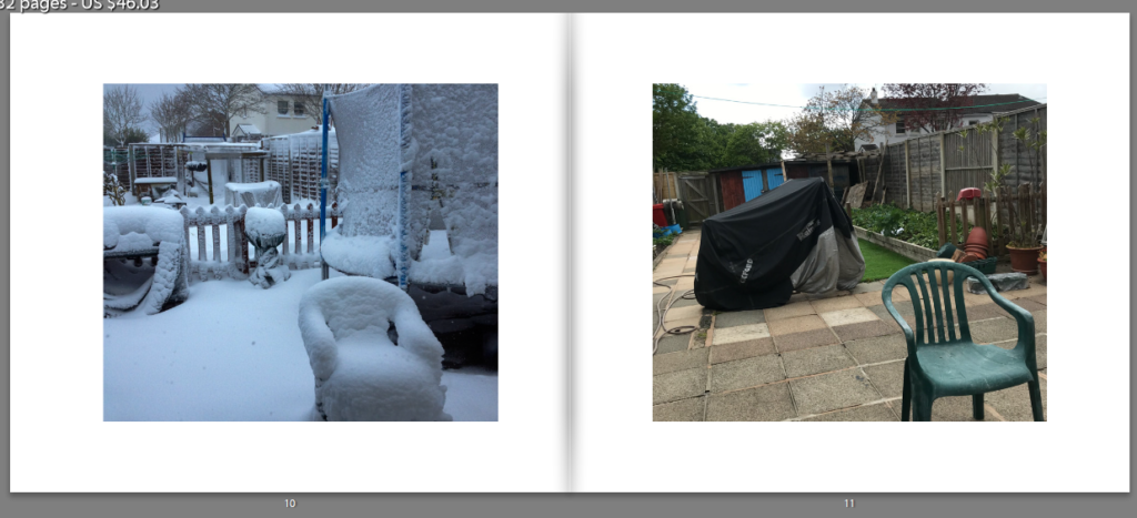
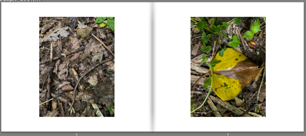
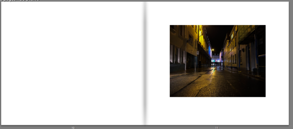
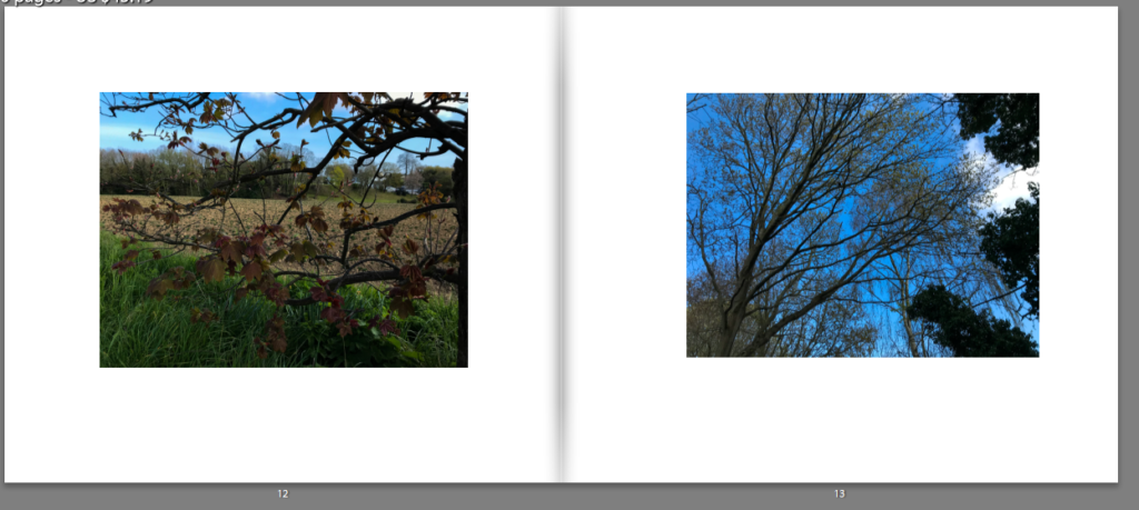
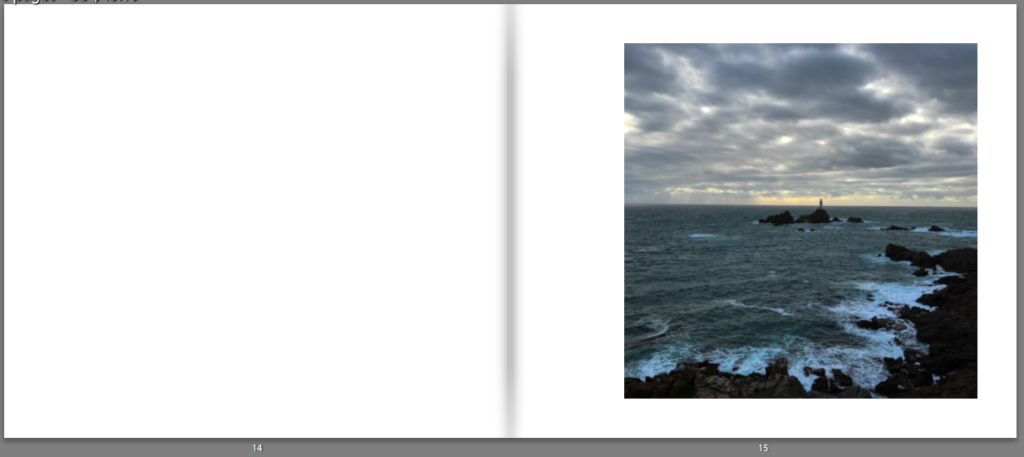
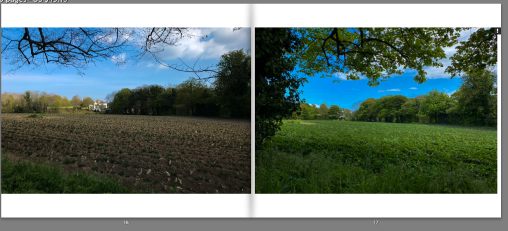
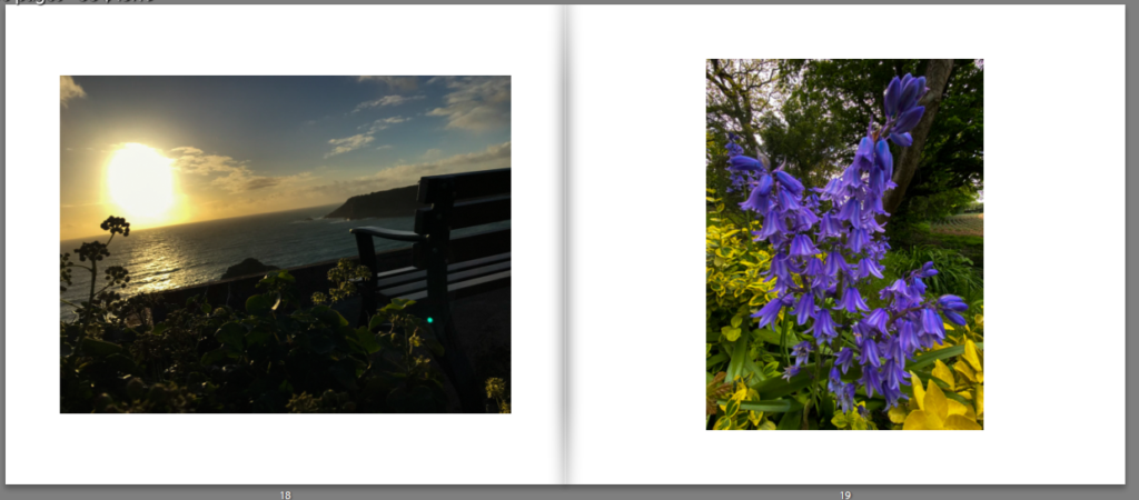
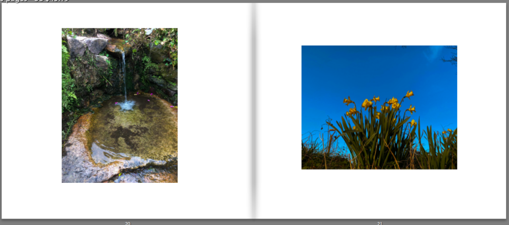
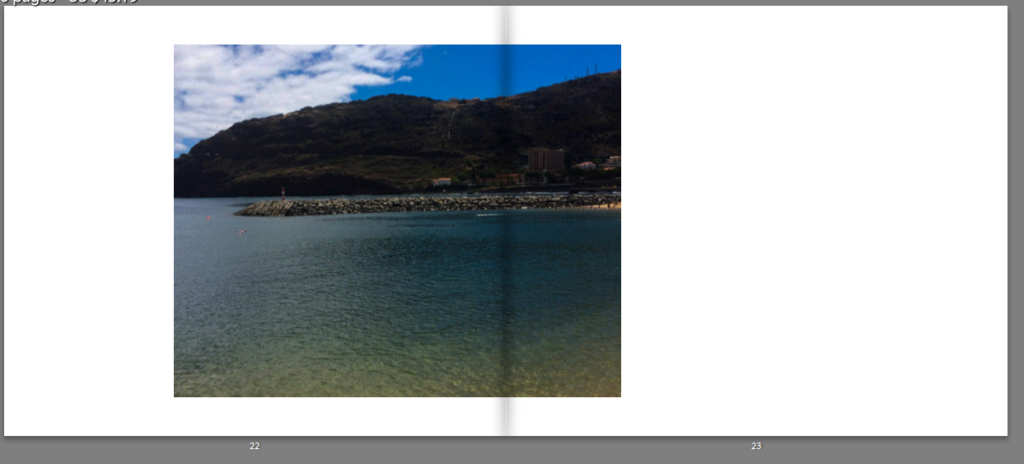
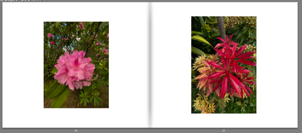
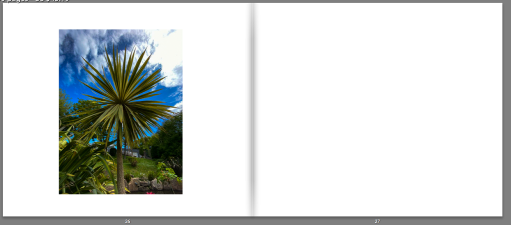
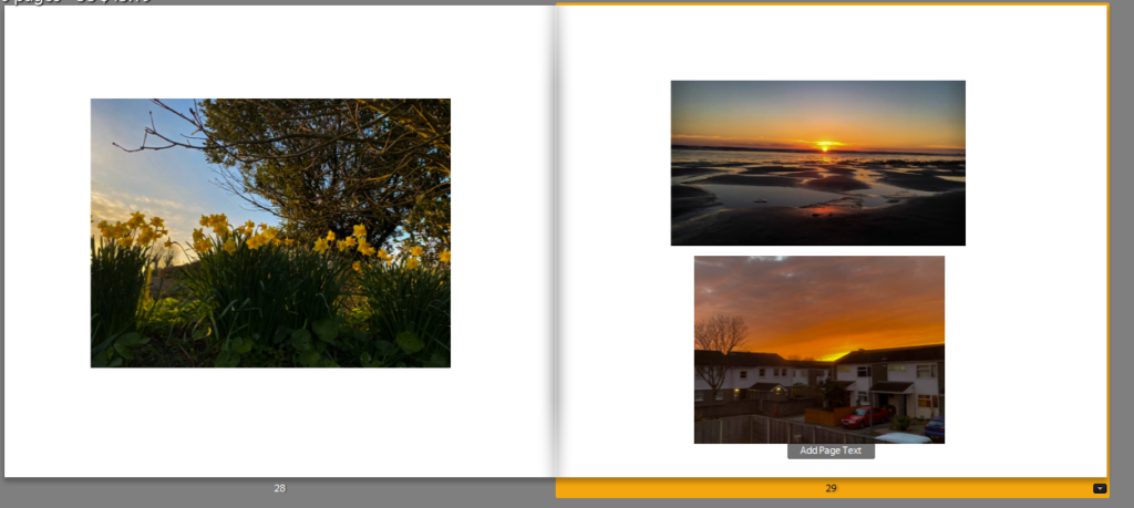
Overall, I think that my photobook has turned out successfully. this is because of the variety of photographs I captured during the seasons of the year. there is a mixture of different angles, colours and locations within the photobook. I was influenced by Robbie Lawrence as I looked in dept. at his work in my artists study. his work influenced me with my editing and photography style through my photobook. Elliot Porter influenced me to capture a variety of different and unusual photographs which I believe makes his work interesting and engaging. however, a drawback of my photobook is that I feel like I could of taken more photographs to make it longer to show the change in seasons in more dept. Nevertheless, in my opinion I feel that my photobook is engaging and eye catching for the viewers and has come out positively.