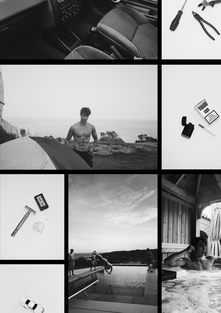
FINAL PRINTS


I CHOSE THESE IMAGES BECAUSE I THOUGHT THEY WERE DIFFERENT AND HAD SOME REALLY COOL ACTIN SHOTS OF DEAN.
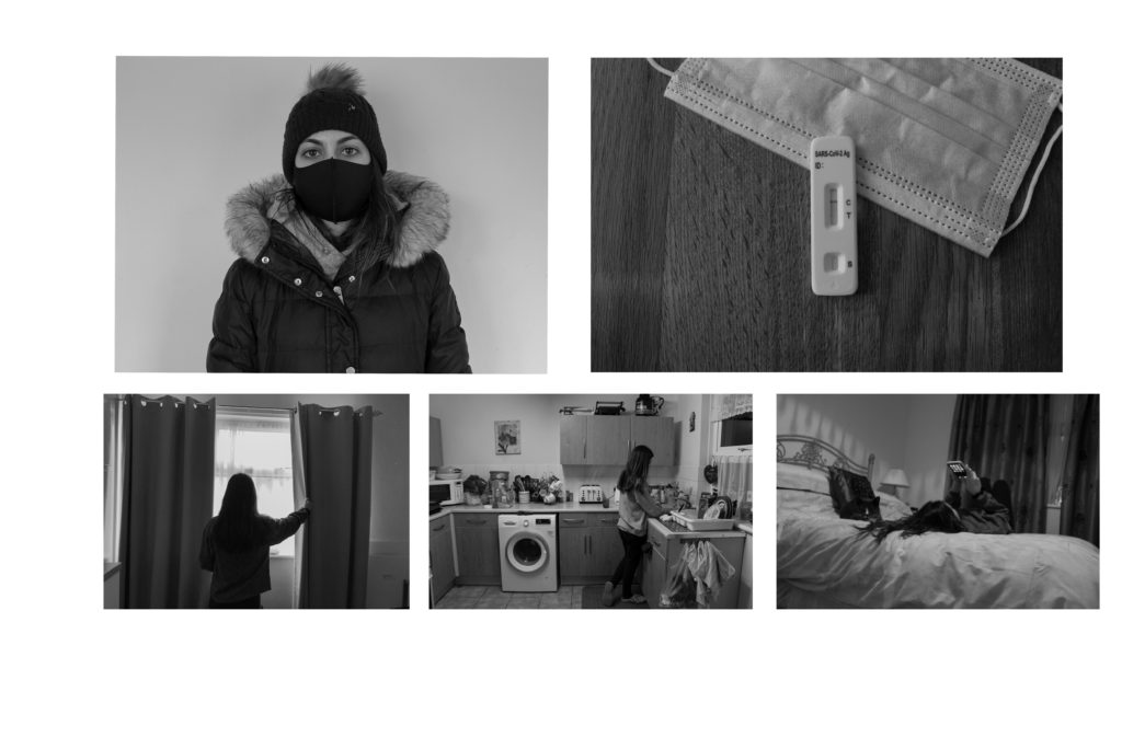
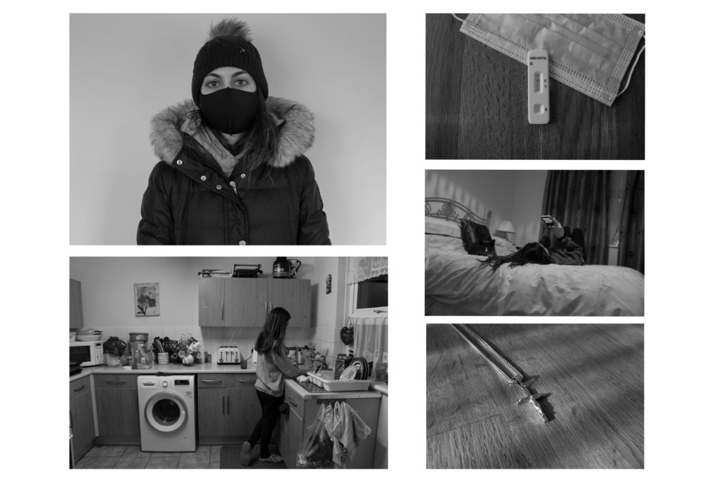
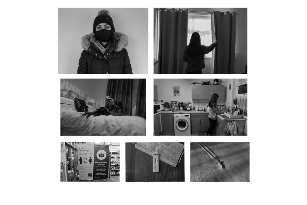
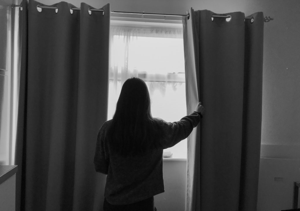
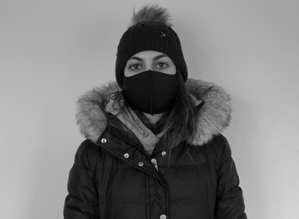
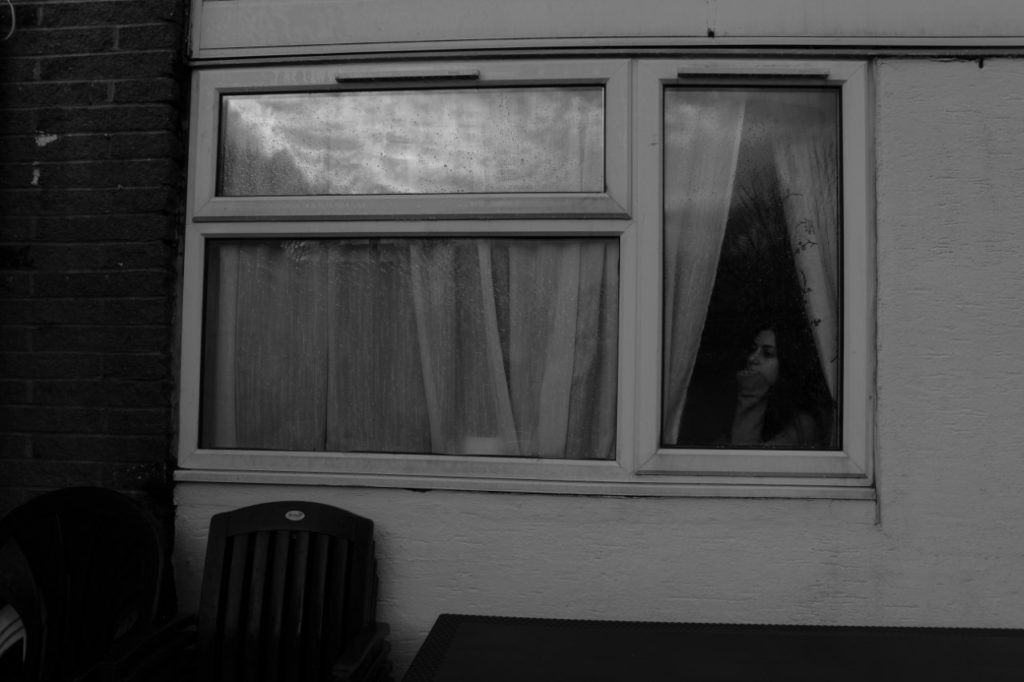
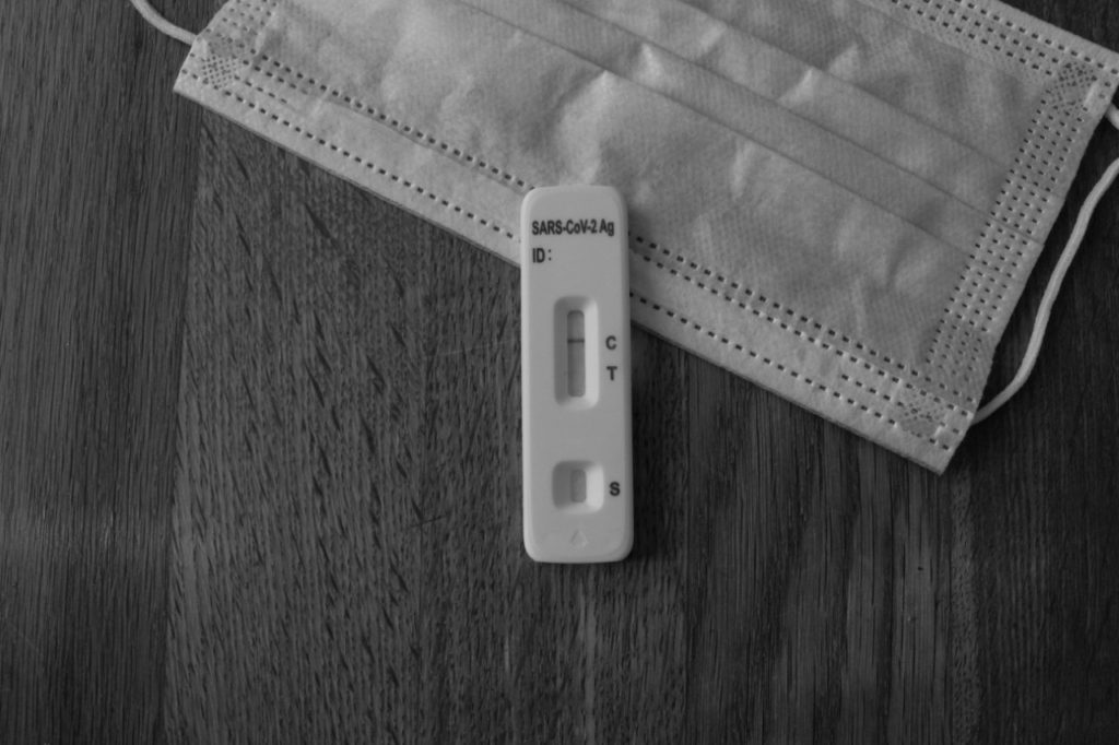
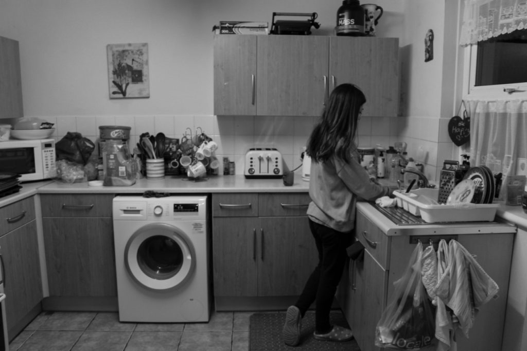
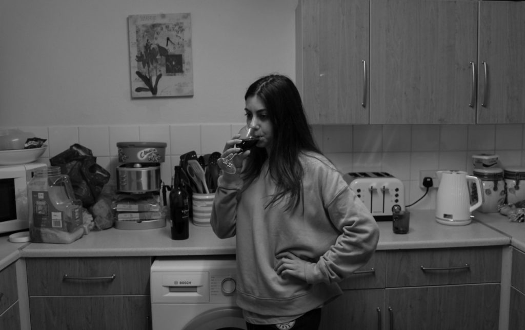
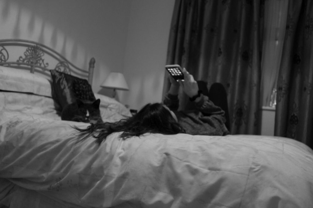
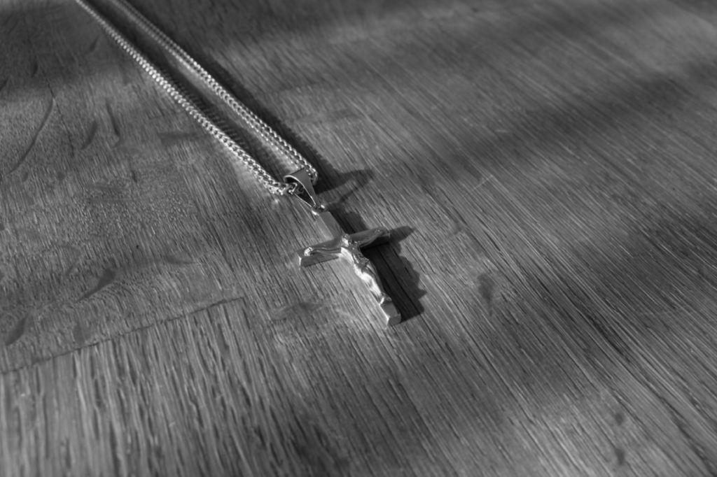
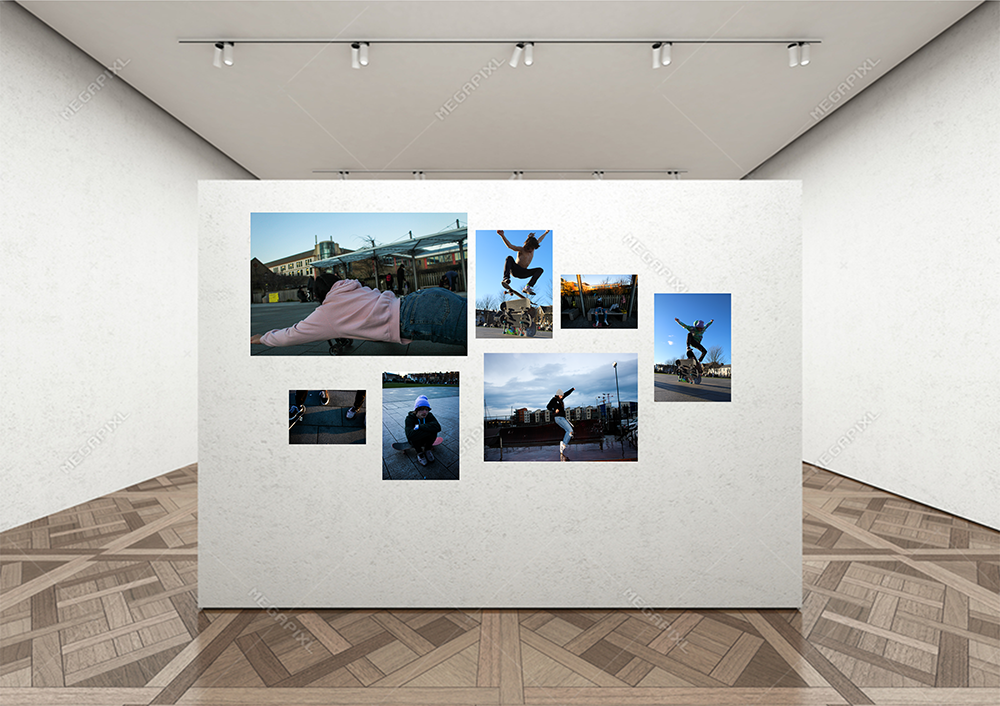
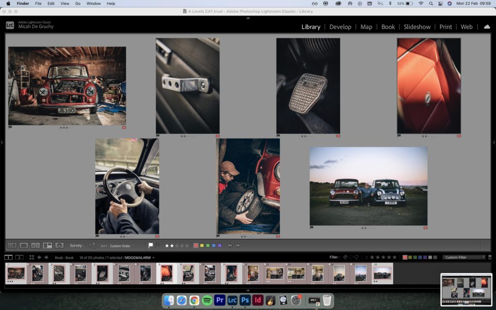
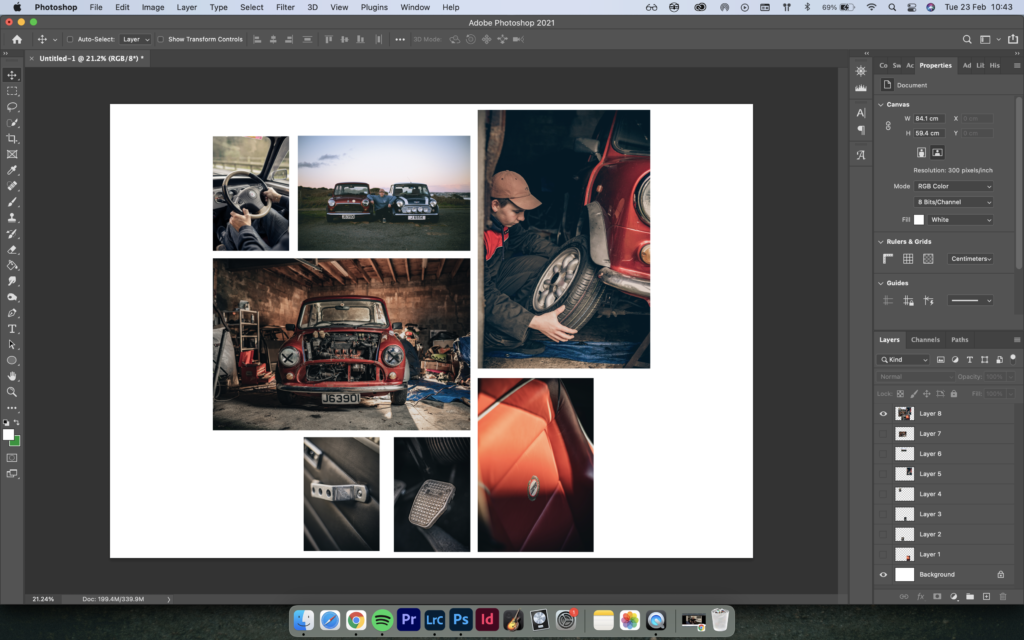
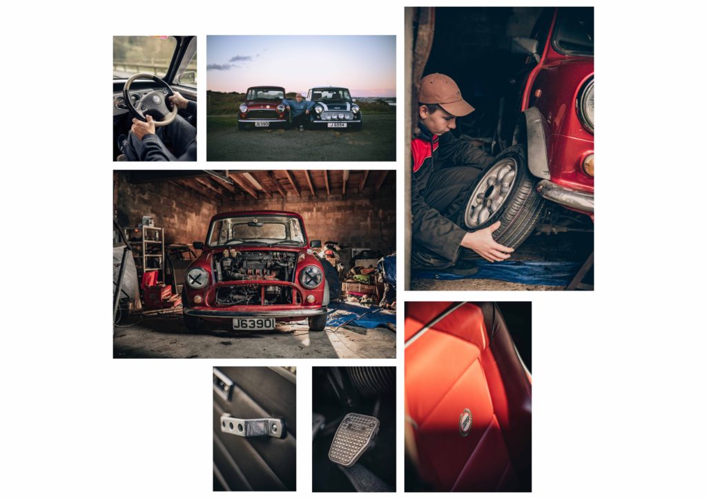
After finishing my photobook, I have selected a range of (5-7) final prints. here are a couple ways and ideas of how I’d like to present them. In photoshop I have produced a mock display ( of a document sized A1: 594 x 841mm) using different image sizes, for example: A3 x 2, A4 x 2, A5 x 3 images I would like to use are below:

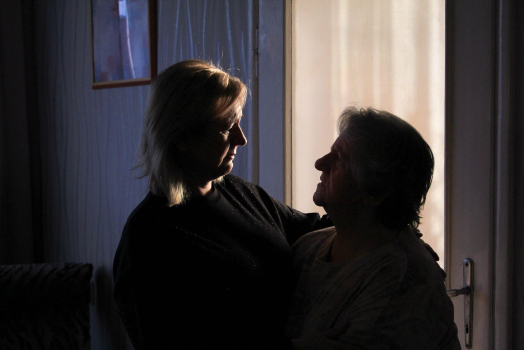


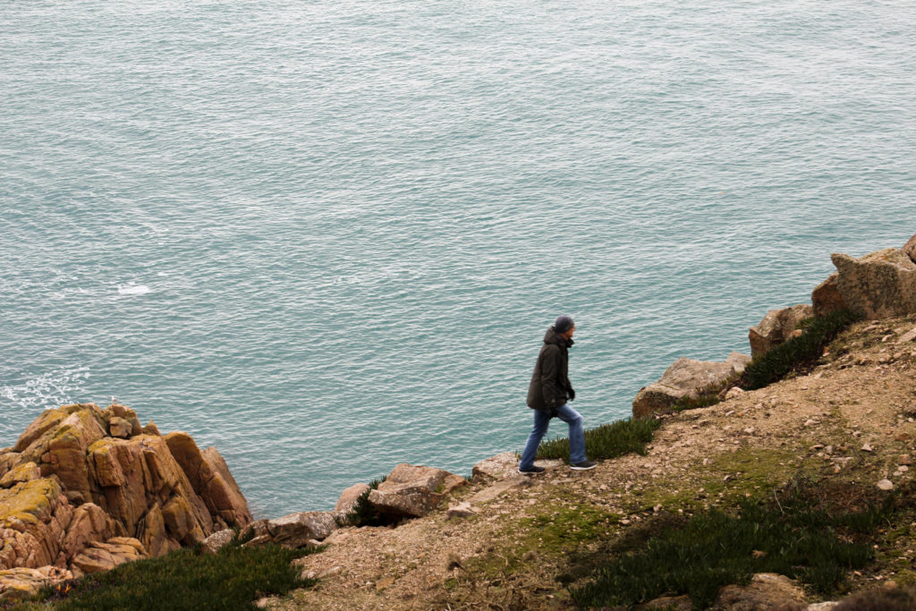

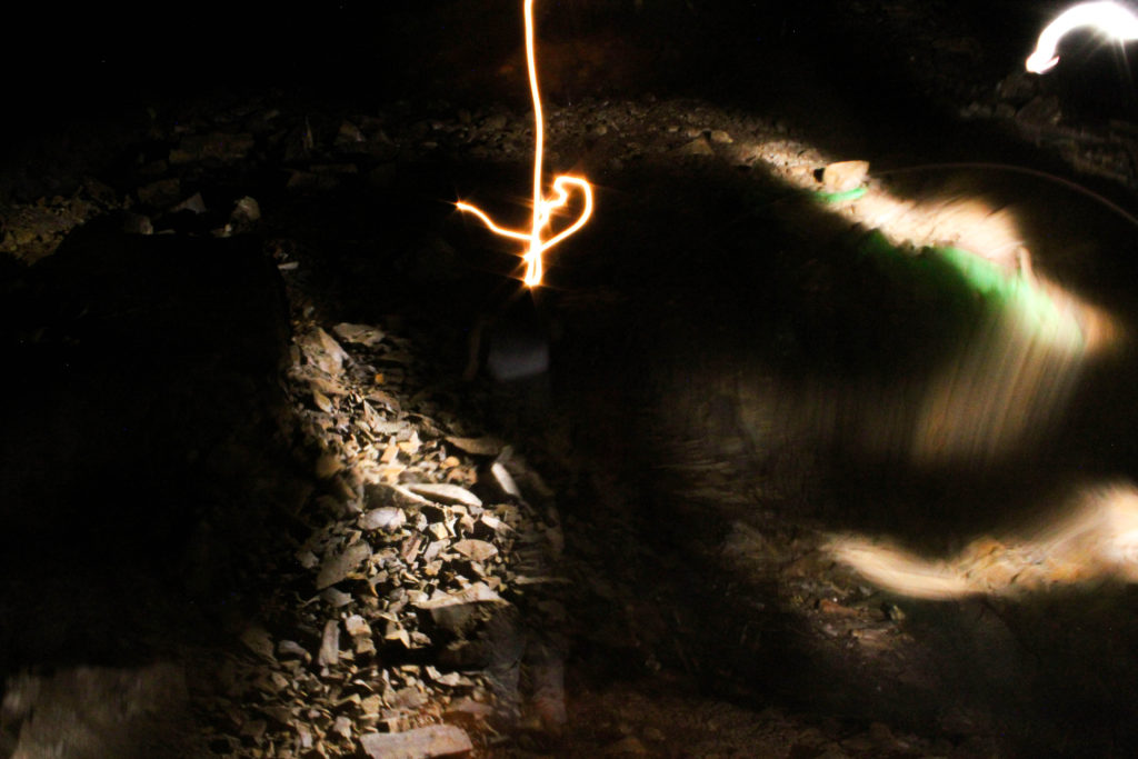
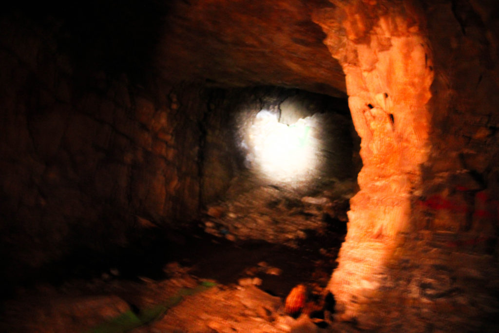
COMPOSITION IDEAS:
I chose 8 images from my book that I wanted to use. I thought about the colours and the composition of each image and how they will compliment each other. I really enjoyed the layout of composition 2 and I will use this layout for my final print design.
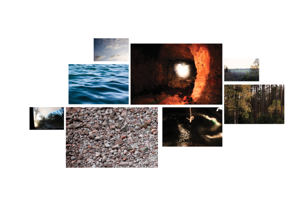


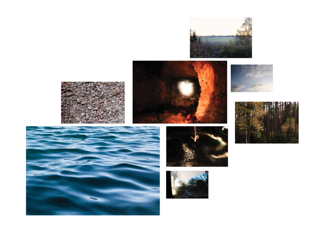
PREPARE AND SAVE IMAGES FOR PRINTING:
In Photoshop resize each high-res image (4000 pixels) to correct print size.
A4: 297x420mm x 3 – sky – car – forest
A3: 210x297mm x 3 – sea – cave – sunrise
A2: 148x210mm x 2 – orange cave – rocks
LARGER PRINTS: A2
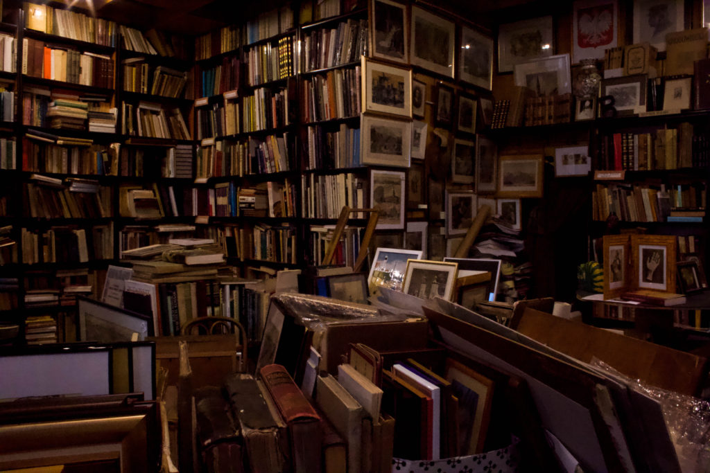
I am going to print this image as a larger print, I like its jumbled compostiotion and patterns.
CREATING THE LAYOUTS
FINAL LAYOUTS
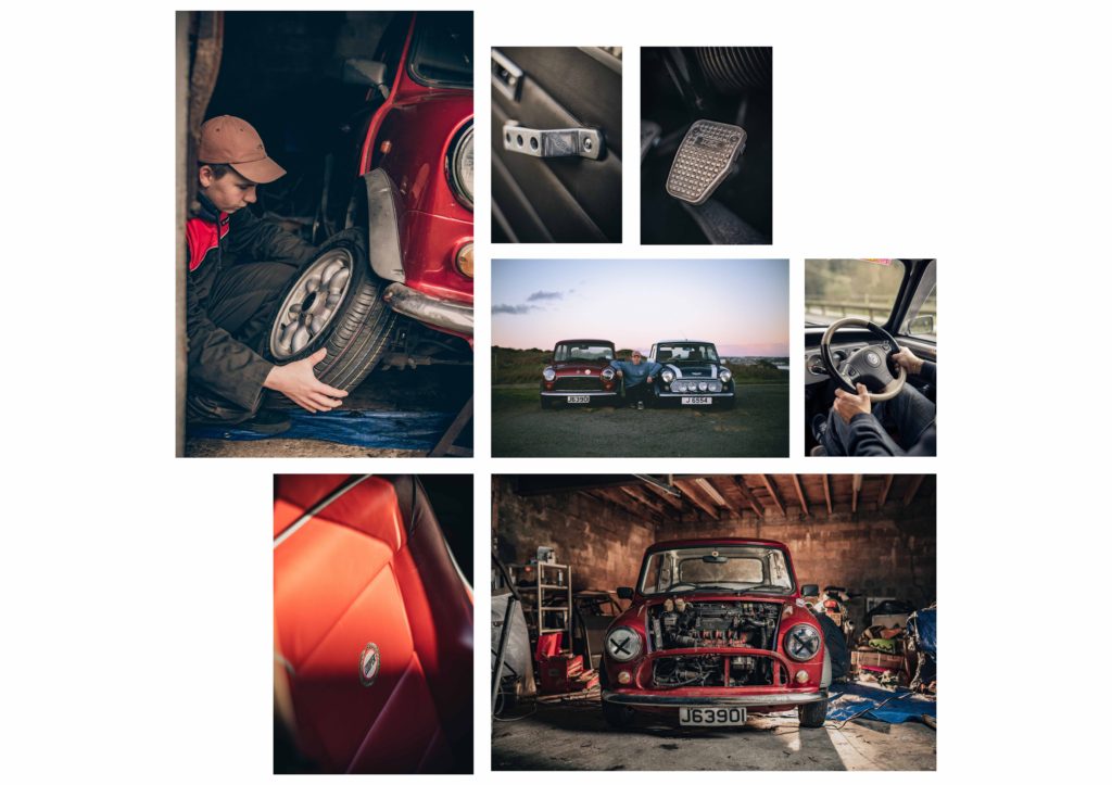
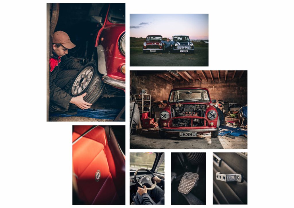
BEST IMAGES FOR PRINT
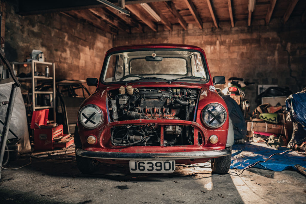


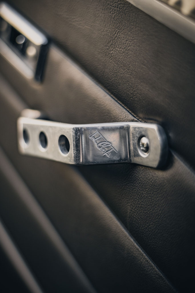



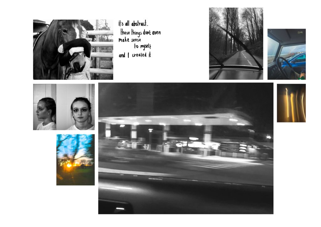
I added the text to allow for the viewer to start to understand what my project is about and can allow to interpret the images however they like.
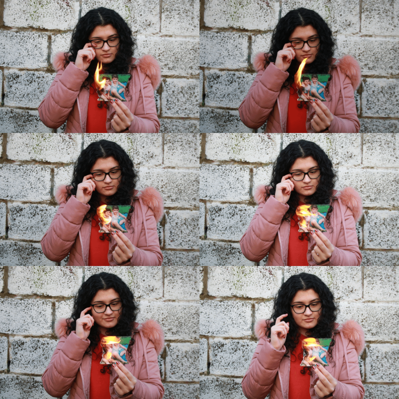
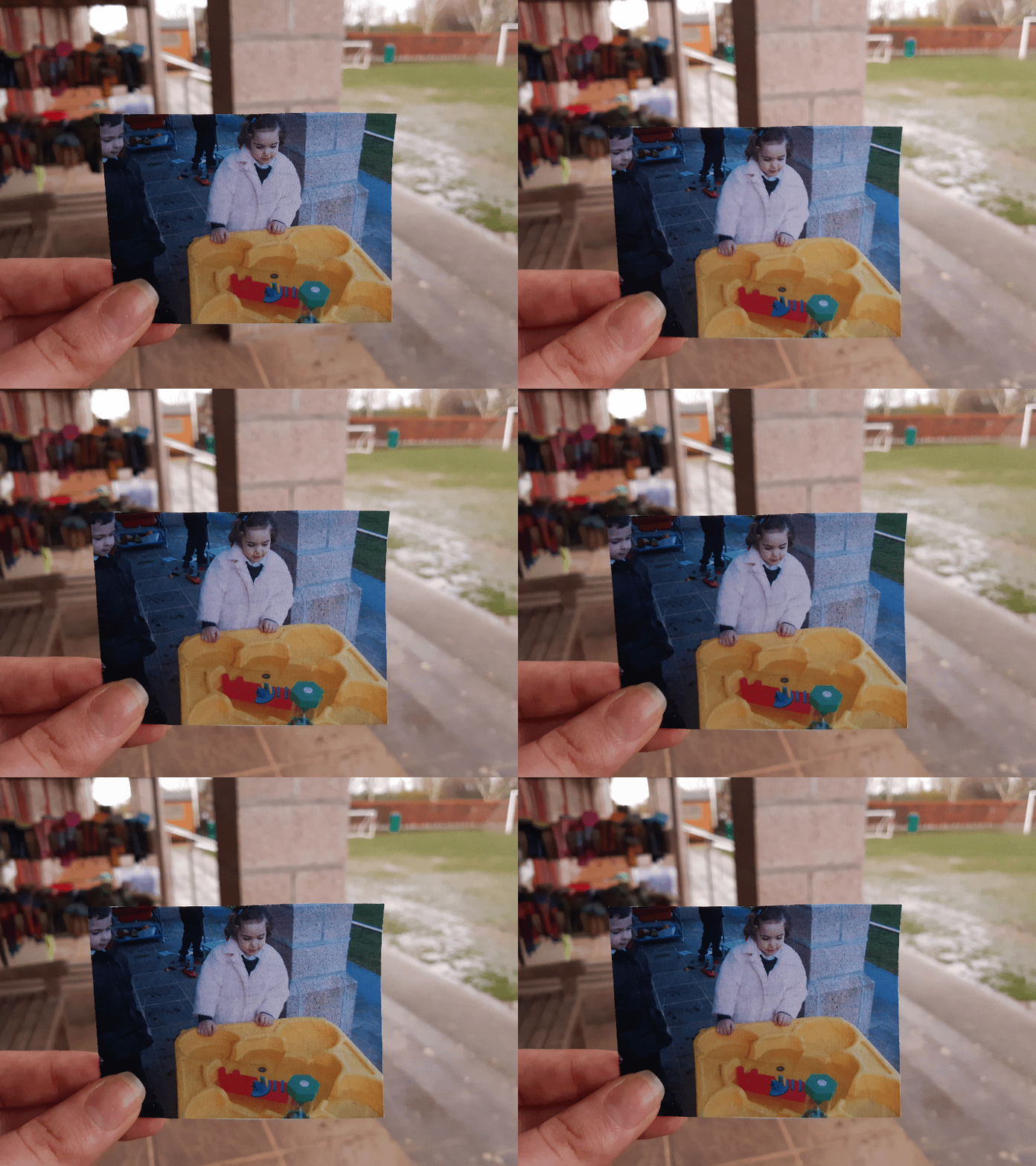
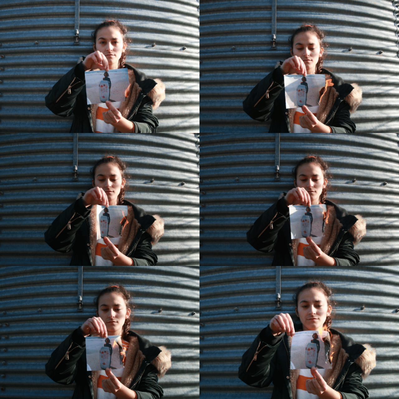
Overall I am very pleased with my film, I think that it’s much stronger than my old project. This film is much more vivid with emotion and meaning. I think that the fact that I could layer multiple layers of audio and visuals, helped me to create a narrative as I could tell my story in multiple ways which isn’t possible with a photobook.
One of my favourite parts of the film is the use of motion pictures, as I think this gave the idea that this is a video, as one could see the flame burning; however, the fact that you can see the individual frames in the motion picture gives it an old film feel, similar to how the first films looked like. This worked well with the use of all the final prints as a motion picture as I used this to give the film structure. This worked especially in my use of my echo of “2024″ as I used dissolves and both the audio and video dissolved at the same time which I think created a dramatic echo and fade out.
My main struggle during the film was fitting the videos to start and stop at times that matched with my audios, which was difficult at times as I would have to constantly rearrange some clips as I sometimes needed them to align to the music, such as a note change or the start of a new audio clip. For this I decided to add gaps into the film on certain words of my audios which helped give them a more dramatic meaning; an example being the “covid situation and how its brought us so much instability”
I think the use of my lockdown audio clips throughout the film worked well as it gave the piece substance and made my piece more personal; I also believe the fact that my voice is of a young adult matches my images with the idea that my childhood years are quickly ending and lockdown has brought more sadness and speed onto this as it took away everything that childhood was supposed to be; happiness, fun and carefree days which have instead been replaced by more stress and loneliness.
I believe that I have improved with my film making skills from the last project as I managed to layer more audios together and learn how to fade items in and out which helped give my piece a more clean and polished look. I think that this film will serve as a good reminder of how my life was during a lockdown and allow me to look back on 2020 with my thoughts which will be useful way to remember.
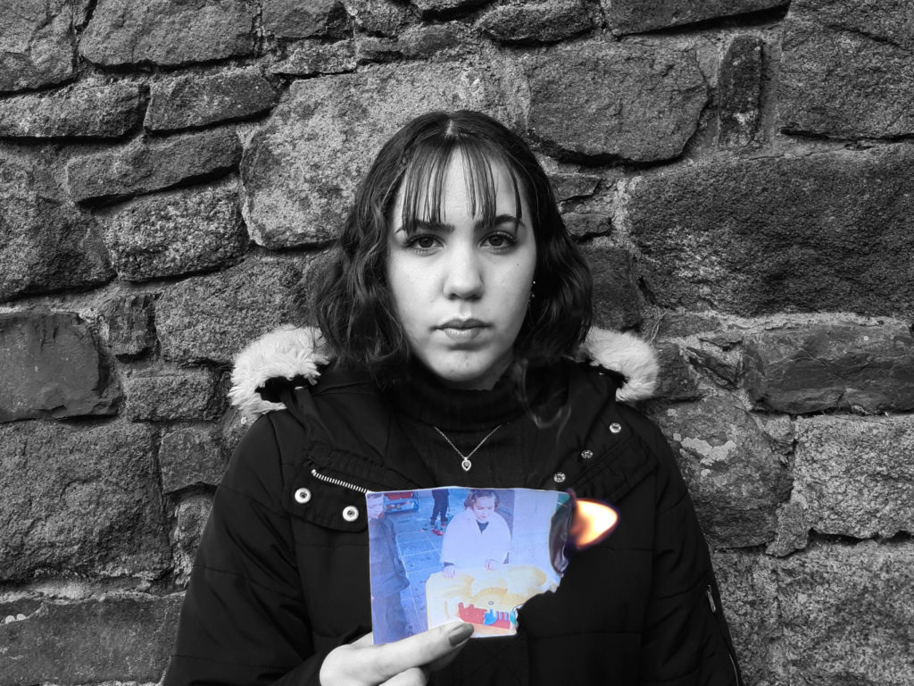
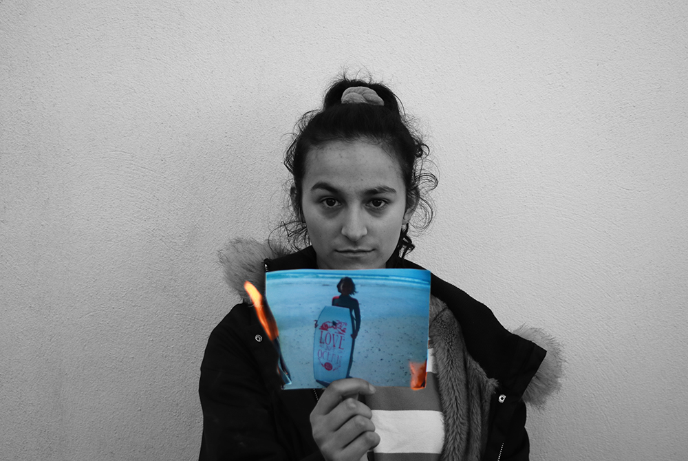
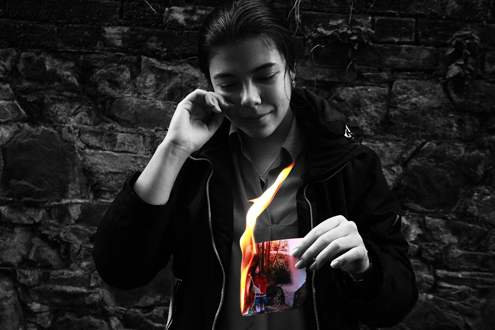


I am very pleased with my final images as I think they work very eloquently together as there are contrasts between light and dark in this set, which I think serves as a metaphor for our younger and present selves as these are two different people now and our childhood is fading as we are now becoming adults. This is again shown through the use of contrast between the colour and the monochrome scheme in each image as it shows that we are loosing these memories and this way of thinking. I plan to present these in window mounts with both, these images and the burnt pictures which I hope will be quite dramatic and powerful.