History and Background of Photo montage

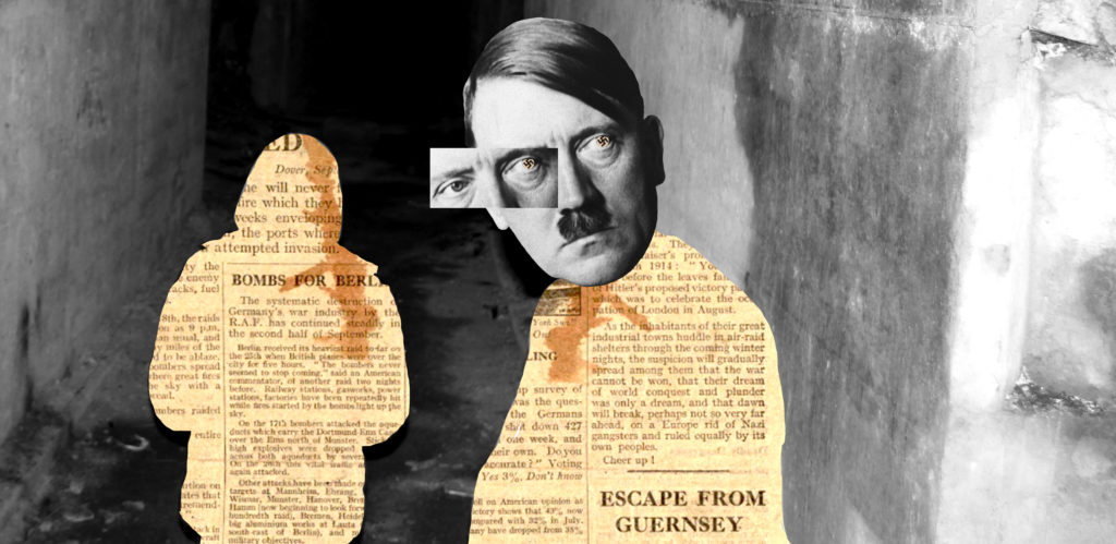
Photo montage is a combination of images designed to send a message to their audience. This can be done physically using magazines and newspapers by cutting, rearranging and gluing images close together, however this can also be done digitally.

Photo montage was originally called “combination printing”. In 1916 George Grosz and John Heartfield started to place pictures together this later developed in what we call “photo montage” today. This term became more publicly known after World War 1, (around 1918/1919), this was used as propaganda or a way for people to express themselves. Photo montage was also used to Protest against World War.

Later on, in 1923, a Russian constructivist called Aleksander Rodchenko started to experiment with Photomontage by creating thought-provoking and socially engaging images. 

Other artists such as a German artist called John Heartfield, started to reconstruct images which he got from the media in order to protest against the German fascist regimes. Also artists such as Paul Kennard, who explored the controversy in police brutality, economic inequality and many more. 

Examples of Early 20th Century Photo Montage 

MoodBoard 

Photo Montage (Research)

For this project I decided to follow David Hockney’s work on photo montage.

David Hockney

David Hockney was born on the 9th July 1937, he is known for being an English painter, stage designer, print maker and photographer.

As a young artist his paintings were mainly about literacy learning, here he also started to in cooperate his homosexuality in his art, this was present in the painting “We Two Boys Clinging Together

He studied in Bradford College of Art from the years of 1953-1957, although at this time most men was obliged to join the army, Hockney decided to spend his 2 mandatory years helping at the hospital.

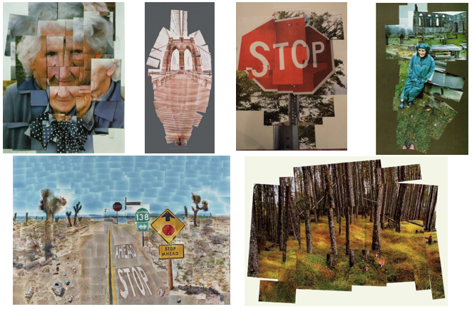
Later on in his career he started to gather Polaroid pictures that he had taken and make them into a bigger picture, this began his path into photo montage.

These are just a few examples of his work on photo montage:

Analysis one of his pieces


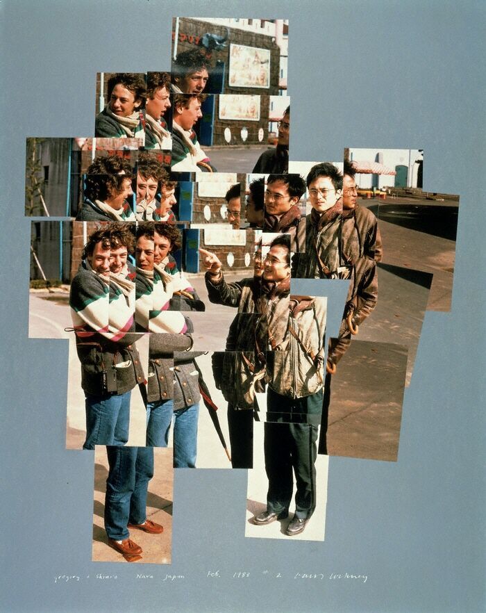
This image is an example of how David Hockney took the idea of photo montage and interpreted it into his own work.

Visual: The colour scheme is mainly an autumnal theme with browns, oranges and green. The shape of the image is 3D due to the overlapping of images, this shows the “photmontage” effect in the photograph, this also shows the scattered layout of the image as this disorientated set up allows the audience to see multiple “scenes” in one image. Here due to the distance of which the photo was taken, I suspect that many of these photos were cropped in order to create this scattered arrangement. This also allows the image not to be over crowded as although there are alot of images these have been cropped to make this effective. Their is no certain viewpoint in the image for the eye as the audiences eye will continuously be moving in order to comprehend the photograph which is what David Hockney wanted. Their is definitely a surface illusion as although this is one image, there are many facial reactions and as the images purposely dont match it brings the audiences’ attention upon the various scenarios. And again due to the disorientated layout their is no clear foreground, midground and background; however it is clear that the main focus of the image are on these two men

Conceptual: I believe that the main idea of this image made by David hockney is to share a small story though the multiple photos in photograph. The two men, although unclear, seem to be having a good time due to their smiles in facial expression. This photo can have various meanings, it could symbolise the support of homosexuality, friendship, memories being made or even just two people enjoying each others company. In my opinion I think this image represents the 1980s due to the “warm tone memory” effect and the displeasing jumpers.

Technical: Here, Hockney had used natural lighting in his images, this helps give a natural look to the image, this technique is also effective as when it’s more sunny the photos would have more brightness in the image which makes the images stand out. The focal point are the two men however due to the amount of photos taken the focal point varies. The images are clear and dont seem to have any motion blur. The image seems to be in higher sensitivity with a coarser grain, I think this gives the image an older feel. Texture is present on the pavement which helps to add to add a more detailed image. The temperature is warm which helps to again evokes an old memory effect. There also seems to be a slight orange autumnal color cast.

Photography – Image analysis exercise

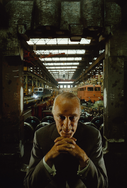
Emotional response: This photograph taken by Arnold Newman makes me feel intimidated as the portrait shot in this photo is glaring straight into the lens of the camera. When I first glanced at this photograph I noticed that there was an opposition of man vs nature as the deteriorated walls around the man possibly show an internal conflict with the man as he had to battle through the war by being a jew.

Technical aspects: At first glance of looking at this photograph bI can notice that in the foreground studio lighting is used to target light areas on certain parts of the man creating dramatic shadows underneath the eyes which increases the level of intimidation as this is a straight on shot. However in the background natural ambient lighting is used to light up the setting in this image. An average sized aperture would have been used in this photograph to capture different levels of lighting on the focal point and the scenery around. The camera used to take this photograph has captured a wide range of depth of field as seen in the foreground the image remains in sharp detail and moving towards the background it becomes increasingly blurry. This photograph would have been shot with a fast shutter speed as limited light was allowed into the lens as seen in the foreground as it remains relatively dark.

Visual aspects: A slight element of chiaroscuro can be seen in the foreground as the difference between the dark’s and lights can be spotted clearly throughout the image. Also the texture in the foreground is maintained sharp as noticed on the decayed walls surrounding the central portrait. In this photograph there’s also a pattern of leading lines that draw my eyes through the different depth of fields beginning with the foreground where the portrait which is the main focal point stands as it’s the closest thing to the lens therefore the focus used on the camera has picked up the most detail in this area. This photograph does not follow the Rule of Thirds as the focal point consisting of the portrait is remained in the central area of the image therefore when glancing at the image my eyes are drawn to this area and aren’t led elsewhere.

Contextual/Conceptual: This image was taken by a photographer called Arnold Newman in 1963 of a portrait of a jew named Alfred Krupp. This photographer has included a dark mysterious background which emphasizes the past of Krupp. The photographer has put him closely to the camera in the foreground with a decayed background which indicates the past he’s had behind him with heavily includes World War 2. If you look closely you can see railway tracks and trains which suggests that the Nazi’s would have used these trains to send the Jews to concentration camps such as Auschwitz.

Image Analysis

Image result for arnold newman alfred krupp
Technical – Low light at the bottom of the photo and majority of the natural light coming in from the top and in the background.
Visual – Symmetry between the pillars on the left and right, framing the subject. Also there is a contrast in colour between the foreground and background where the foreground has minimal colour and its mainly dark and grey but the background has blue, orange, light and dark
Contextual – Subject was heavily afflicted with the Nazi party during WW2 and the photographer was a Jewish American. The conflict between Jews and Nazis adds great meaning to this photo and increases its impact. Krupp was arrested soon after this photo for his war crimes.
Conceptual – Newman was a political photographer and in this photo he was trying to expose Krupp and show everyone that this man is evil (through the expression on his face).


Image Analysis Exercise:

Alfried Krupp, industrialist. Essen, Germany, 1963.

Technical- The lighting in this image is mostly industrial fluorescent lights, coming from the large panels overhead and behind, in the factory background. Krupp is also lit from the sides, which creates a more dramatic tone and reveals dark shadows around his eyes and highlights his wrinkles and every crease in his face. This adds a sense of fear to his figure and the overall image, as this sort of lighting is usually associated with evil and demonic imagery. The dark shadows around his eyes provide contrast with the harshly bright lighting around his face.

The sitter is in sharp focus so that every part of his face is magnified and noticeable, whilst the rest of the background is blurred very slightly, becoming more blurred as the eye goes further into the background. This makes the sitting figure of Krupp the main focus of the image and it is what the reader’s eye is most drawn to, but also it can be seen in a more figurative sense: the actions of his past may be becoming blurred and forgotten (as he was released from jail after only 3 of his 12-year sentence for Nazi war crimes in the second world war), but they still are a part of him, of the menacing man in the centre of the image.

Visual- The whole image is tinted green, which adds another level to how the sitter is presented as evil, due to the green colouring making Krupp look sickly and presents as a sign of ill-health, disfiguring him and making him seem inhuman, almost. The whole image feels cold and the colouring makes it look like the image was taken underground, which reflects how Krupp concealed his involvement in Nazi Germany and how his past was buried “underground.”

The texture of the image is also worth mentioning. Due to Krupp’s face being in sharp focus, his skin is very clear for the onlooker, and his aged skin and wrinkles are obvious. For example, the lines around his eyes are deepened by the shadows cast around his eyes, which makes him look threatening and unpleasant. Also providing texture to the image is the background, which seems to be a factory or other industrial setting. The railway tracks and cars behind him appear as harsh and forceful in contrast with the simple concrete pillars framing Krupp, and additionally, they seem to stretch on quite far behind him, perhaps alluding to his influence and how he managed to get out of serving his full jail sentence.

Contextual- The image shows Alfred Krupp, a German industrialist who was notorious for utilising Jews as slave-labour for his factories during the Second World War to provide arms for the Nazis. He was convicted of crimes against humanity during the Nuremberg and sentenced to 12 years in prison, but was released after only 3 years. The photographer, Arnold Newman, was an American Jew who was asked by Krupp and his company to shoot a portrait of him, and although he initially refused, he eventually accepted, promising to make Krupp look evil and like the devil incarnate. He was then almost refused by the Krupp corporation, believing him to look “too Jewish”, but he convinced them to let him shoot the portrait after showing them his extensive portfolio of the many celebrities he had already shot. He then worked around Krupp and his security, manipulating the light and the setting to produce this image of Krupp as an evil and malevolent man, without their knowledge.

Conceptual- Newman intended to show Krupp, and therefore also any other of the Second World War war criminals, as evil, no matter how they got off having to pay the price for their actions. The fact that he is Jewish is also of note, because it shows his personal viewpoint, and the camera lens is transformed into his own eyes, and the onlooker sees Krupp as though through Newman’s gaze.

LINKShttps://www.nytimes.com/2018/11/26/lens/examining-arnold-newmans-environmental-portraits.html https://kamo.photography/blog/photographing-evil-story-arnold-newman-alfred-krupp/

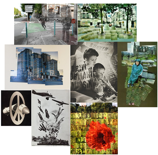
Photo Analysis – Arnold Newman

Image result for portrait of Alfred Krupp

Technical: The lighting seems to be both artificial and natural. The natural lighting seems to be coming from the windows on the roof , however the lighting that has been placed above
Alfred Krupp seems to be artificial. There seems to be a bit of motion blur of the moving trains in the background and the light which slightly deflect the focus of the reader. The temperature of the image is leaning towards the warmer side.

Contextual: Alfred Krupp was allegedly involved in the usage of slave labour in order to create Nazi weapons, this makes me think that he is a heartless business man, this matched with his suit and lighting shows the audience of what the true reality of this image represents.
When Krupp’s saw this image he was “livid” as this portrayed Krupp in a negative way which Arnold Newman, as a jew used photography as a source of revenge and a way to spread awareness of this terrible scene.

Visual: The general colour of the image seems to be dark and gloomy which adds a sense of mystery and deviance. The tone of the picture is prefomenantely dark as the only source of light is in the windows of the background. The main focus on the image is on Krupp and the view of the image then follows in the shape of a triangle. Tension is very much present in this image due Krupp as he seems to be trying to close a crucial business deal.
After observing the image for a while the audience can start to see that most things in the picture are slightly off center, from his hands, the ceiling windows and even the two pillars on the sides of the images all give an idea that something isnt quite right and that Krupp isn’t as perfect as he thinks he is.

Conceptual: Overall I personally feel as though the image represents the idea that not everything is what it sees and although at first glance everything looks normal, when you start to pay attention to the little details the image really starts to show Krupp’s in his true colours. I also think that the dark looking train station reflects Krupp’s work as he was part of something terrible which he shouldn’t have been able to do.