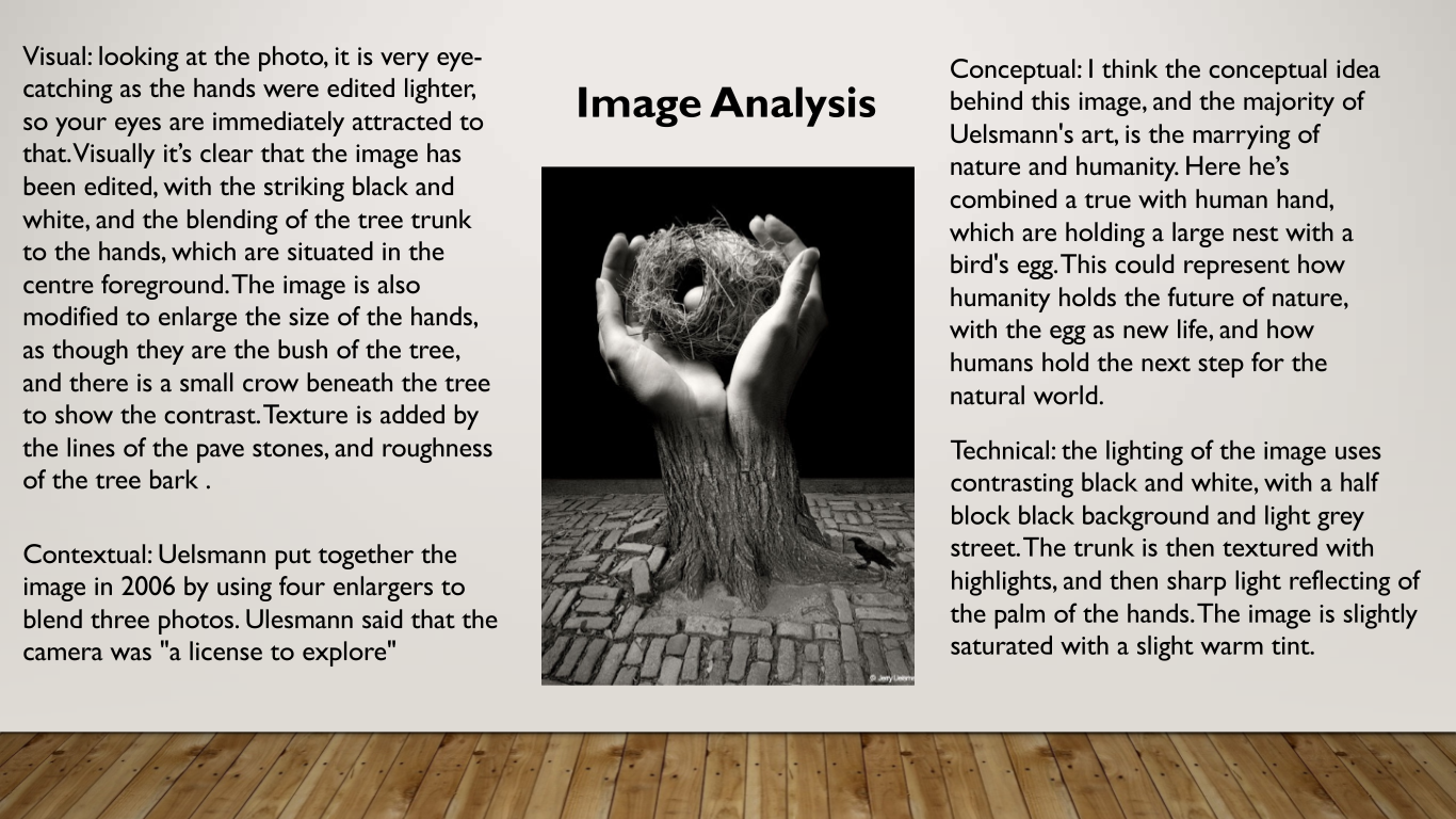
Lighting Studio

Once you have been instructed on how to use the lighting studio safely and respectfully, you will be able to use the studio during lesson times or in study periods. You must book the facility in advance via one of your teachers JAC / MM / MVT.

You must always leave the studio in a clean and tidy, safe manner. All equipment must be switched off and packed away. Any damage must be reported and logged.

Portrait Studio Shoot

Image result for photo lighting studio
Typical Studio set up with continous lighting (soft box diffuser) and white infinity screen

Types of lighting available

  • Continous lighting (spot / flood)
  • Flash head
  • Soft box
  • Reflectors and coloured gels
Image result for single point lighting portrait effects
Chiarascuro effects and single point lighting
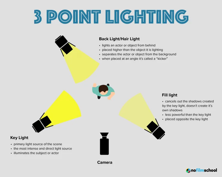
Image result for 2 point lighting studio diagram

Still Life Photography and using the product table / copy stand

Image result for manfrotto product table photography
Product table set-up, with back light and infinity screen
Image result for copy stand photography
Copy-stand set up

Still-life Studio Shoot:

Each group of two students work on one station each ie. Continuous Light and Flash Lights and swap halfway through

You can choose to photograph each object individually or group together several objects for a more complex still life arrangements.

Technical stuff

Continuous Lights – photograph objects three dimensionally

Camera setting: Manual Mode
ISO: 100
White Balance: Daylight
Aperture: F/16
Shutter: 0.5 sec to 0.8 sec (depending on reflection of each object)
Lights in room must be switched off to avoid reflections

Continuous Lights – portrait

Camera setting: Manual Mode
ISO: 100
White Balance: Daylight Shutter Speed 1/125 sec Aperture f/16

Flash Lights – photograph images, documents, books, newspapers, etc or portraits

Camera setting: Manual Mode
ISO: 100
White Balance: Daylight
Aperture: F/16
Shutter: 1/125-1/200 (depending on reflection of each object)
Flash heads set to power output: 2.0
Use pilot light for focusing

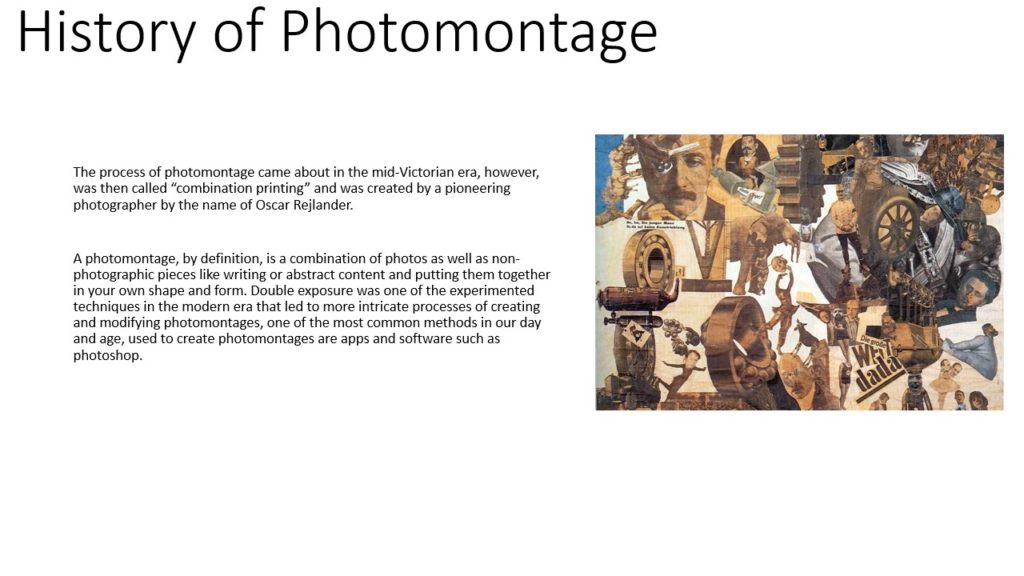
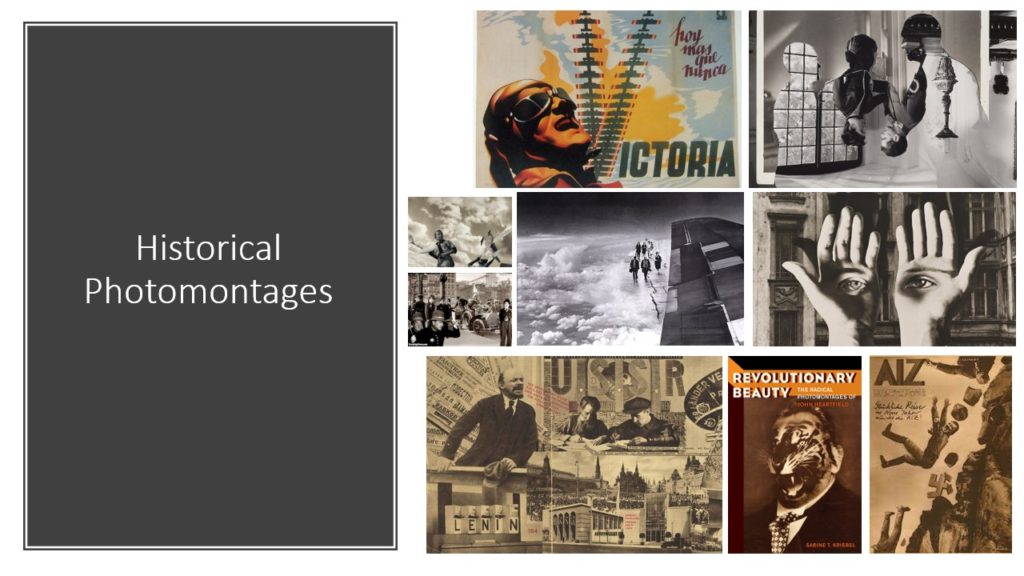
Photomontage Case Study 2

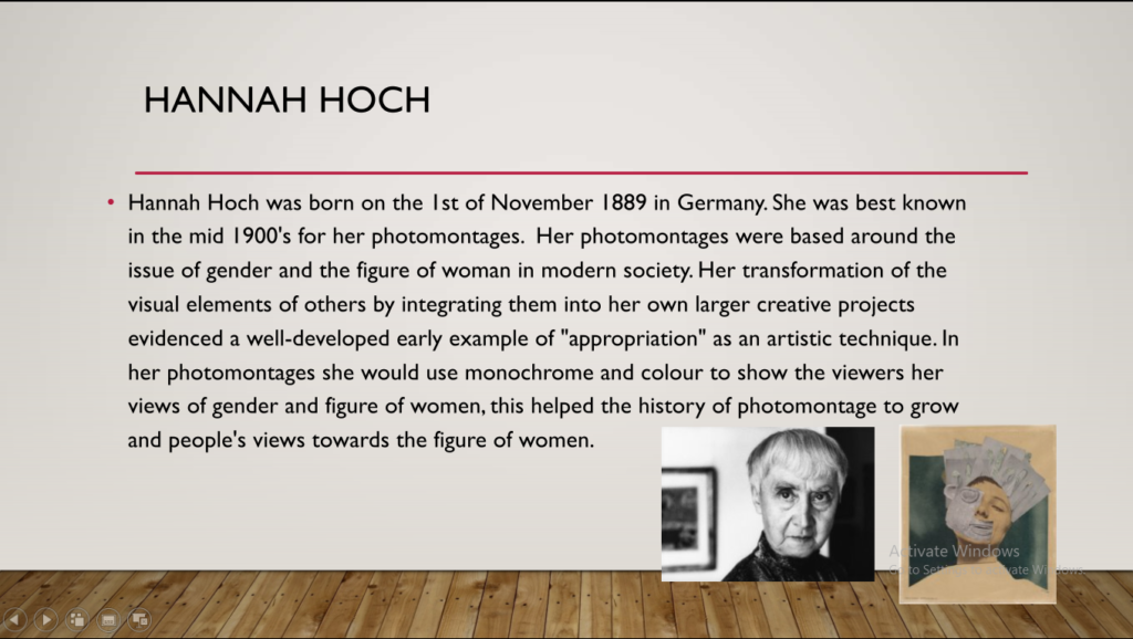
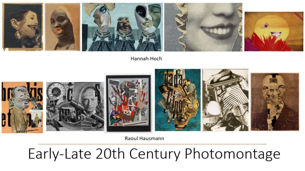
Hannah Höch

Hannah Höch was a famous German DADA artist and is highly recognised as being one of the originators of photomontage during the Weimar period (1918-1933 where Jews, liberals, socialists and others were blamed for undermining war efforts).

She combined text and images from modern media to criticise social constructs for women, popular culture and the failings of the Weimar republic.

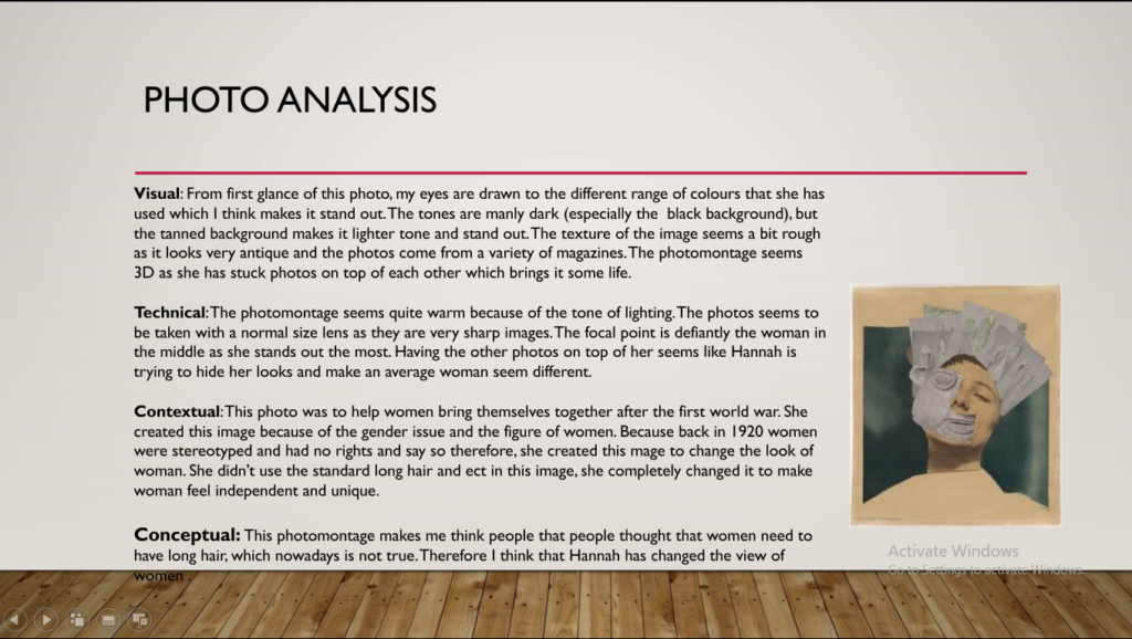
Photo analysis:

Image result for Heads of state hannah hoch
Heads of state (1918-20)

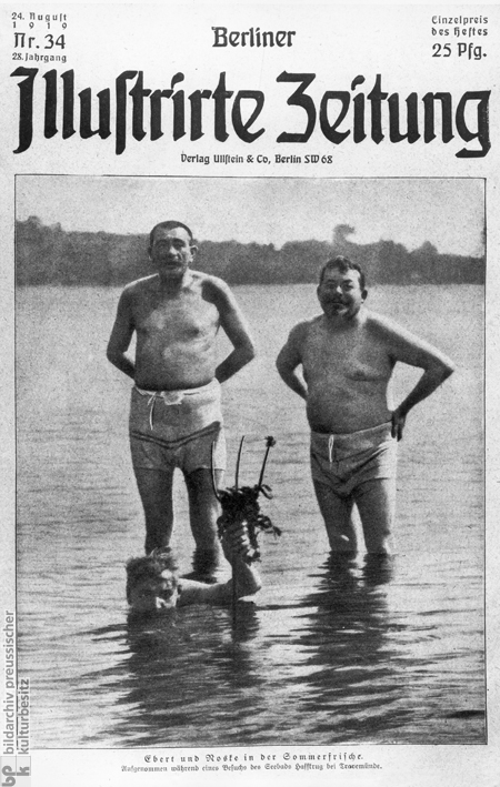
The collage is built using a photograph from the newspaper of the German president at the time, Friedrich Ebert (pictured on the left) and his Minister of Defense, Gustav Noske (pictured on the right). The two men are wearing their bathing suits in the images and are placed out of context to depict them as foolish.

Image result for friedrich ebert
The newspaper Höch took the images from.

She placed these figures on top of an embroidery-style background with images of a woman surrounded by flowers and butterflies. She demeans these high-authority figures by placing them on this background, depicting them foolishly. The message sent through this montage is powerful; Höch is criticising the government. In her montage, there’s a lack of colour, Höch puts the figures in a surrealist environment as a way of ridiculing them for avoiding political and financial issues facing the German population at the time.


Photo Analysis

Image result for arnold newman alfred krupp
Arnold Newman – Alfred Krupp, ex-Nazi

Visual

Arnold used natural lighting from the train station ceiling windows, giving an eerie and sinister lighting of Krupp’s face, and creating a shadow below his eyes and nose to add to his intimidating demeanour. It is clearly a specifically structure image, with Krupp in the foreground, staring at the camera in the centre, in a clearly planned position; he is framed using two concrete pillars on either side of him, taking up around half of the image, leaving the upper half to show the environment.

Contextual/Conceptual

Alfred Krupp was involved in the usage of slave labour in order to create Nazi weapons, so through his photography Arnold was able to present Krupp as a heartless, evil business man, showing the audience the reality.
When given the opportunity to have a sense of personal revenge against the Nazis, Arnold told others that his aim was to make Krupp look like the devil.

Technical

The image had a green tint, making the image seem cold which fits in with the entire feel of the image. The brightness is low to contrasts between Krupp’s face and his surroundings. The photo was also taken quite close up, using a wide angle with the camera focused on Krupp, with the background blurred.

Photomontage case study

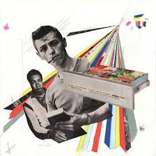
Jesse Draxler

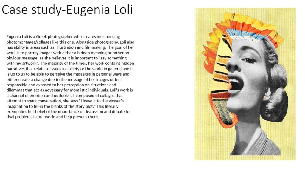
Jesse Draxler is an modern photomontage artist, born in 1981 in Wisconsin, USA. Many of his images are disturbing to he spectator and Draxler tends to deconstruct the classic idea of beauty through different techniques, either cutting up images digitally, making handmade collages or spilling ink over images in order to entice the viewer and make them wonder what’s beneath. He focuses mainly on editing portraits of people.

Image result for jesse draxler

Image analysis

Draxler focuses on creating highly contrasting black and white images due to the fact he’s colour-blind and it allows him to express his work freely. He also felt that once he removed colour, his work became more conceptual and allowing for a stronger emotive response from spectators.

The layering of abstract shapes creates a human-like figure, perplexing the viewer. Elements of the original model for the photo are present throughout the image, making the viewer wonder why they’ve been covered. Is it a lack of identity? If so why? Is it the conditioning of society that’s stopping them expressing themselves?

The use of greyscale in the background and throughout the image aids in this questioning, as greyscale creates and maintains a melancholic atmosphere caused by the image. It also helps Draxler to create contours and layer the shapes whilst avoiding clashing that can be caused through coloured images. The lack of warm colours (ie-red and yellow) implies an absence of emotion in the subject, such as happiness and joy.

Photoshop skills

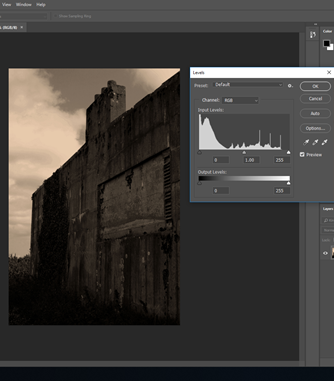
  • Lowering brightness and increasing contrast
  • Edited to be a monochrome image
  • Use of levels to create a more defined image.
  • An added colour filter (orange) to create an antique feel.
  • Increased exposure brings out the highlights of the image, however, I feel it takes the focus away from the bunker. It could prove useful for future editing.
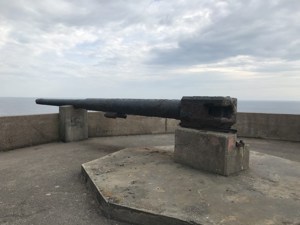
  • Experimenting with layers and opacity. I cut out the image of the bunker I’d edited to look old and applying it to the original image.
  • Also began to reintegrate the original greens of the ivy into the image to separate ‘old’ from ‘new’

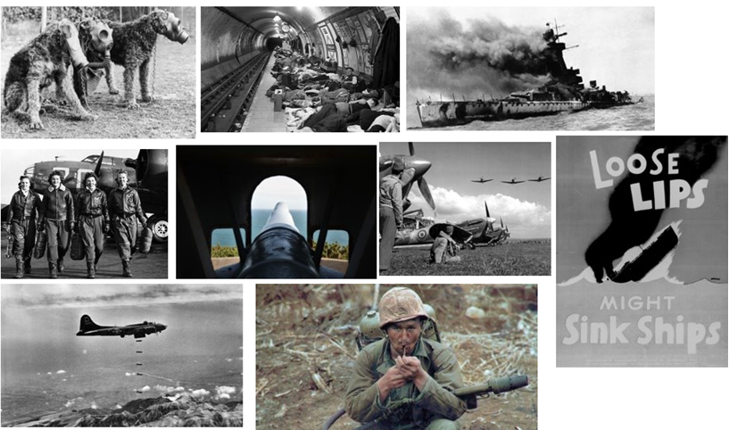
Layering, Opacity control, Free transform, and blending these images to create a photomontage.

Method

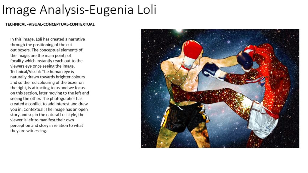
I started by cutting the gun and metal rods out and placing them on a separate layer. I added each image beneath this layer but on top of the background and changed the size using free transform (CTRL+T). I lowered the opacity of each image and erased parts of the photos, where an image from a top layer was present. I chose black and white images and edited the ones that weren’t in order to help with the blending.

occupation and liberation

Paul Virilio

Background

 Paul Virilio was born on the 4 January 1932 and he died on the 10 of September 2018. He was born in Paris in 1932 to an Italian communist father and a Catholic mother. The second world war made a big impression on Paul as the city of Nates became a port for the German Army and was invaded by British and American planes.  He was a French cultural theorist, urbanest, and aesthetic philosopher. He is best known for his writings about technology as it has developed in relation to speed and power, with diverse references to architecture, the arts, the city and the military.
Bunker Archaeology

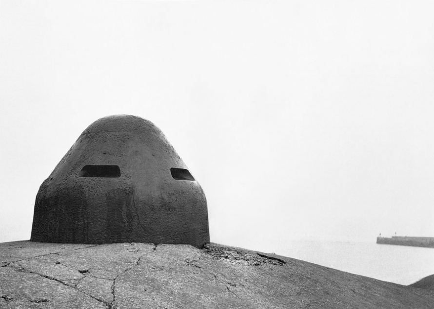
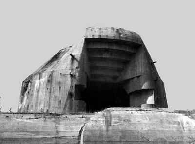
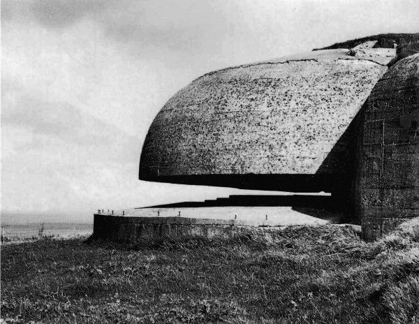
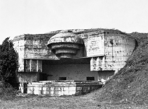
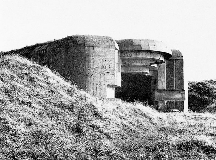
Paul published a book where he photographs German bunkers from world war 2 on the coast of France. He started an investigation into the Atlantic Wall which is a collection of bunkers and gun placements. The investigation lasted 20 years and the result was his book Bunker Archaeology which includes photographs, architectural plans, coastal maps and essays where he analyses and discusses the relationship between space, memory and experience.​

Bunker Archaeology Photographs 

Most of Pauls photographs are black and white landscape shots of the German bunkers. The photographs are mainly of the outside of the bunkers and show us the structure of the building. His photographs are taken from midground at a distance so that he can capture the whole building and some if its surroundings which gives his photographs more context. The photographs look harsh as there a both naturally lit areas and shadows. I think this helps the photographs give an accurate portrayal of what the bunkers look like. ​

Paul Virilio Photographs​

My Photographs

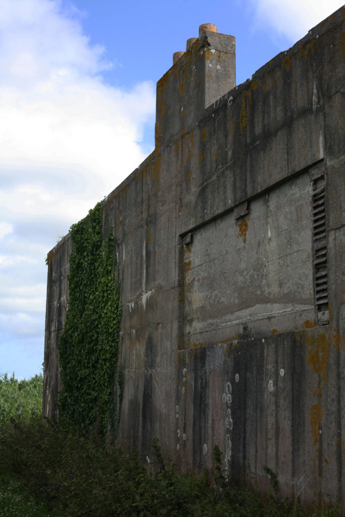
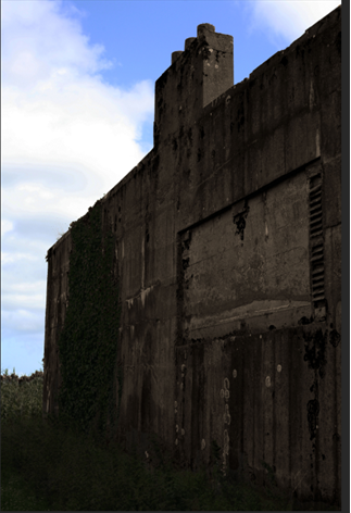
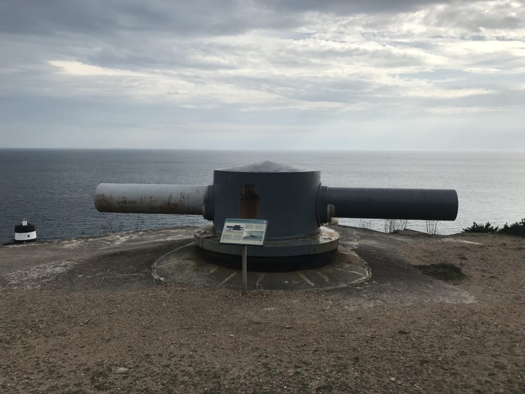
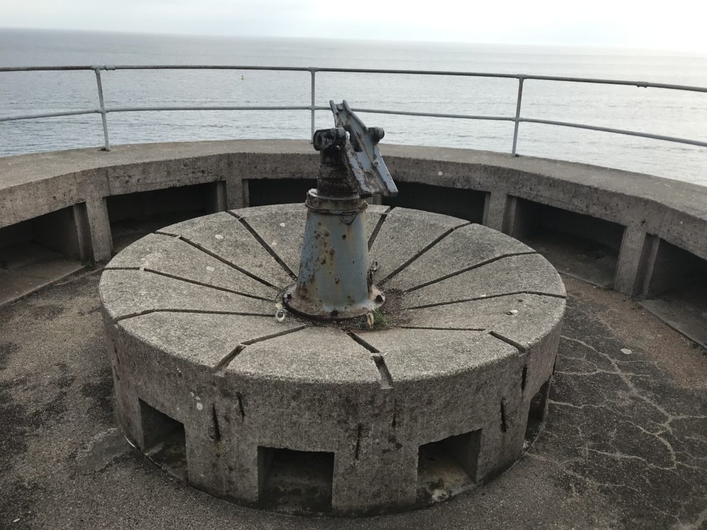
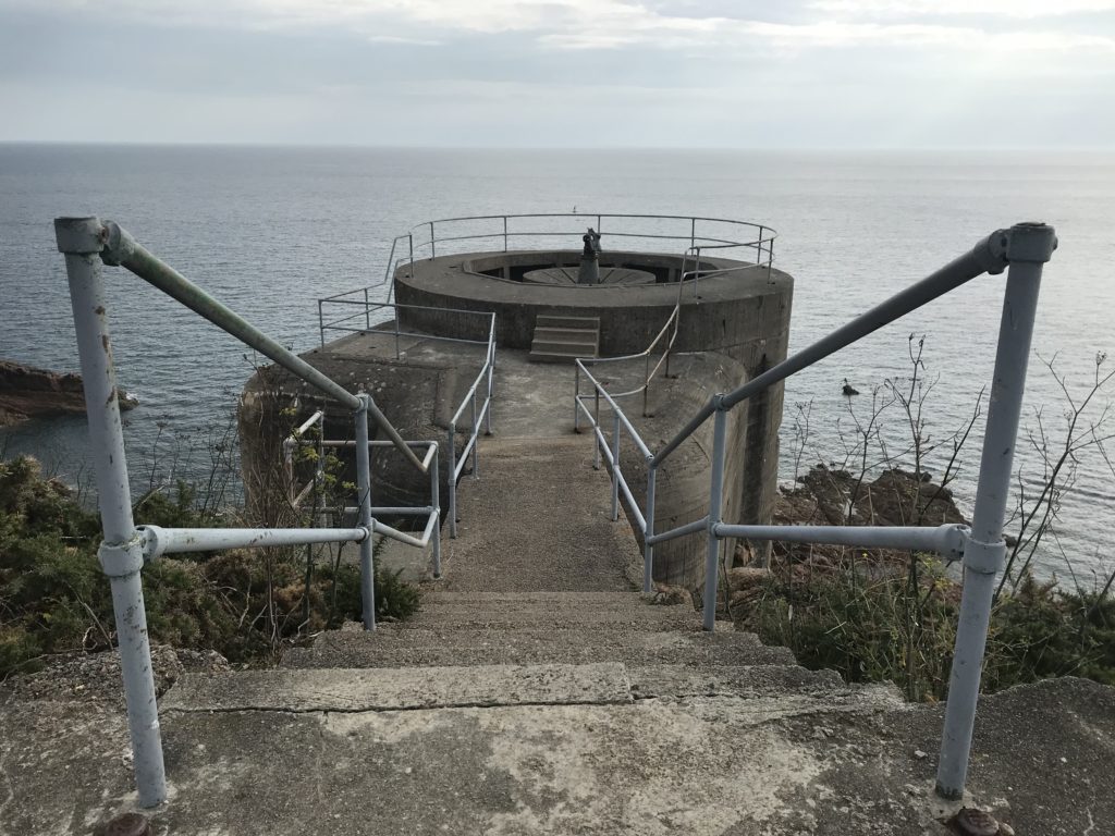
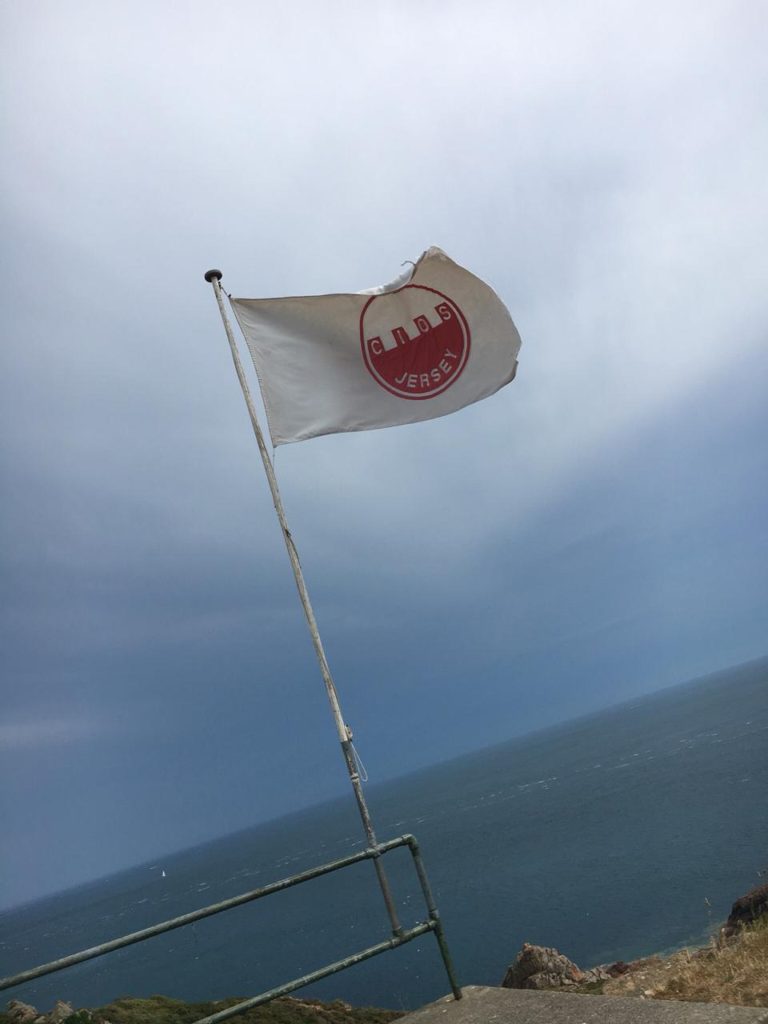
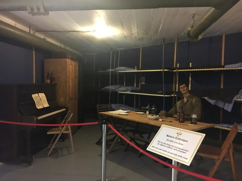
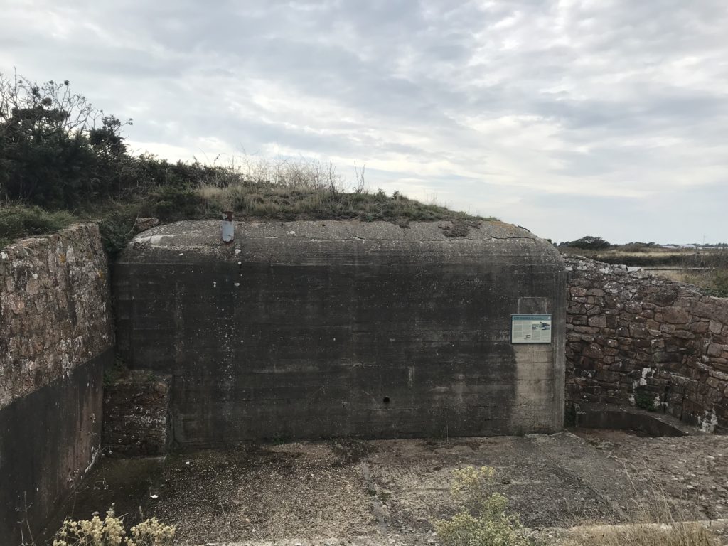
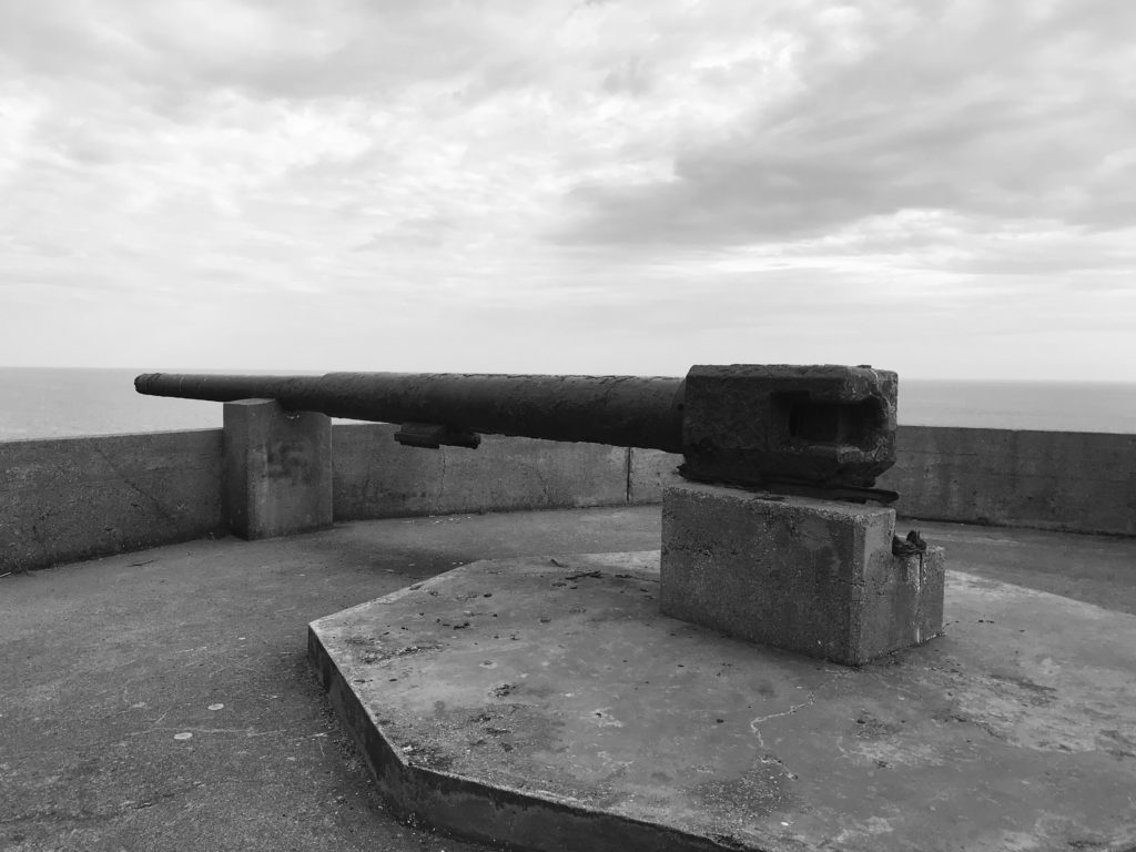
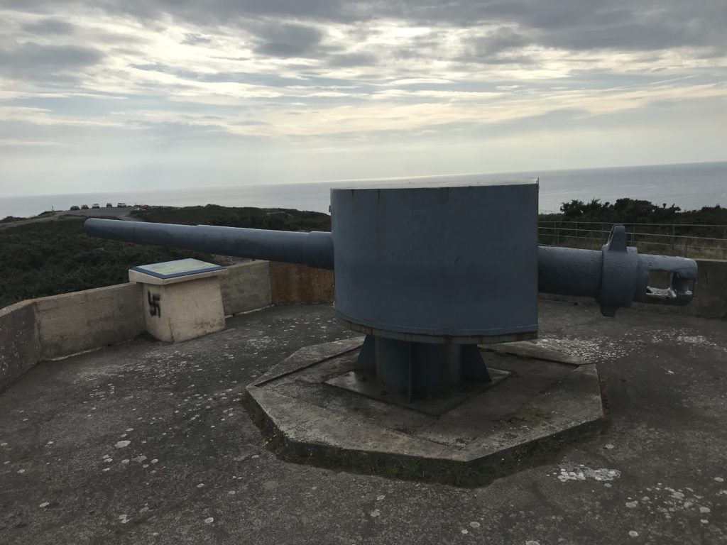
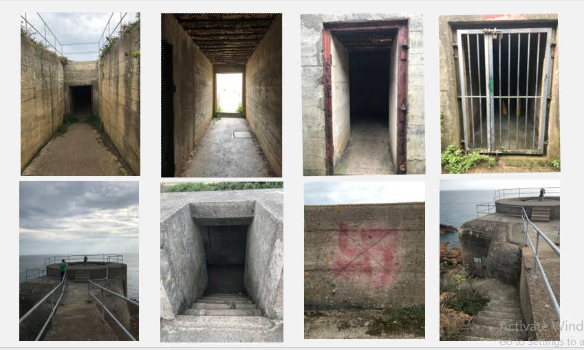
After looking at Paul’s photographs I tried to create similar ones by photographing some bunkers we have in Jersey. I choose to keep my photographs in colour because I think it draws the attention of the viewer and helps them to better connect with the photograph. I think Paul’s photographs are distant and ghastly which is a true representation of what the war was like. Paul focused on the structure of the building, I took photographs of both the inside and outside of the bunkers and also took close ups of areas of the bunkers I found interesting. I think this gives the view a better understanding and allows them picture what it was like as I have taken a wider range of photographs with different points of view.

Batterie Lothringen – Noirmont Point, St Brelade. https://www.cios.org.je/bunkers/batterie-lothringen/
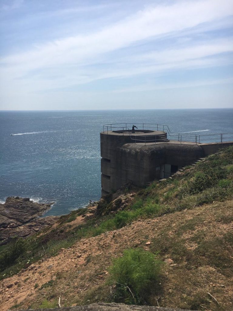
Batterie Lothringen was a World War 2 costal artillery battery in St Brelades. The battery site is located at the end of Noirmont Point, a rock headland which overlooks St Aubin Bay, Elizabeth Castle and the harbour of St Helier. It was part of the Atlantic wall system.

Editing

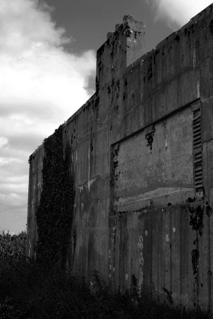
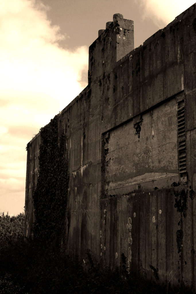
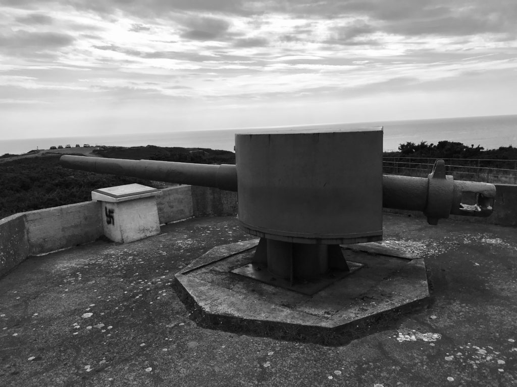
I edited my photographs by turning them monochrome and adjusting the brightness and contrast to get them as close as possible to Paul’s photographs. To do this I used Adobe photoshop. I think this made them look harsh and antique which relates to World War.

Final Photo Evaluation

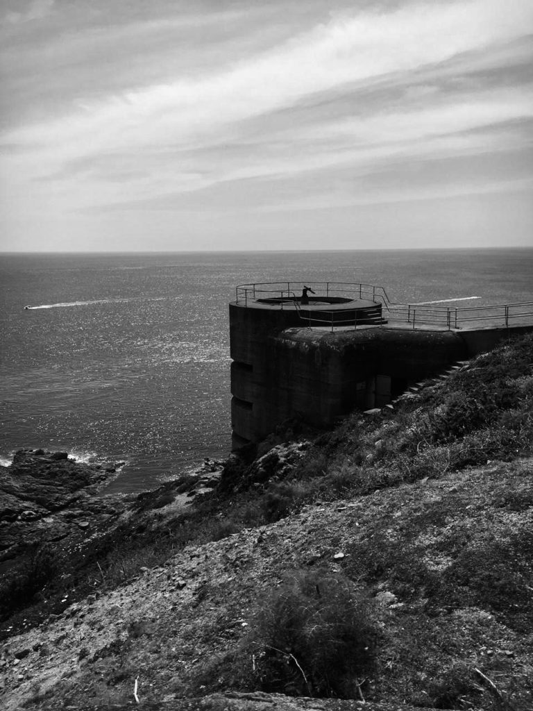
I have picked this photograph because I think it is the best photograph I took of the bunkers. It is very similar to Paul’s photographs as it shows the bunker and it also shows the surroundings. I’ve taken this photo at a distance at a high ground view. The main difference is that you can’t see the whole of the bunker structure in the photograph and you can see more of the surroundings than the bunkers itself. However, I think you can see just enough to recognise what it is and it is still the main view point to the photograph. I have chosen to change the photograph to monochrome because I think it is better suited to what we are trying to represent and Paul’s photographs are also black and white. I decided to take the picture in portrait because the structure of the building is narrow and long.