My Best images:
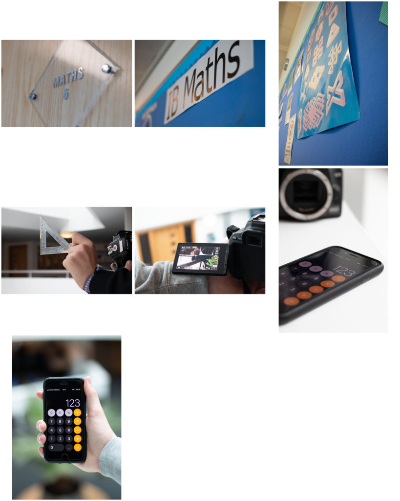
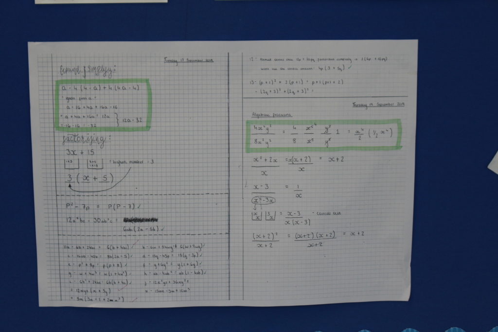
These are my favorite images because I used a wide aperture of 1.8 to get the background blurred and get a shallow depth of field. I also like the way that I have focused on the math words.

My Best images:

These are my favorite images because I used a wide aperture of 1.8 to get the background blurred and get a shallow depth of field. I also like the way that I have focused on the math words.

Remember to show your Photo-Shoot Planning and clearly explain :

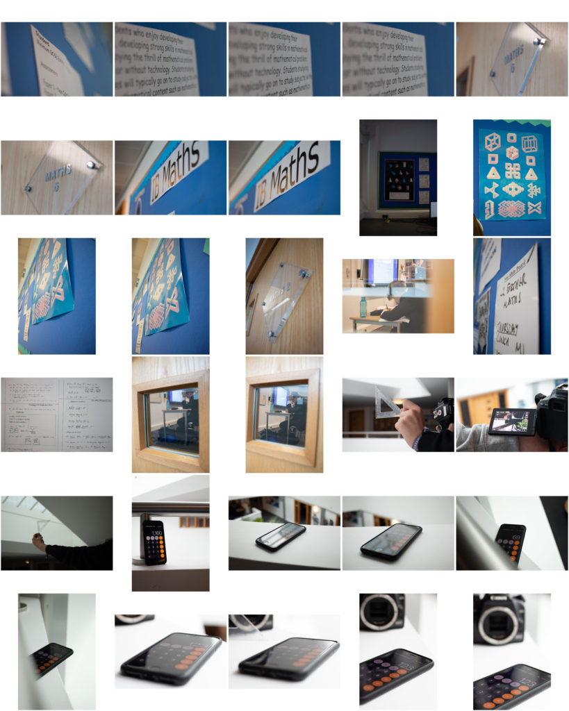
These are all the photos I took during my shoot. When I took the photos I used manual focus.



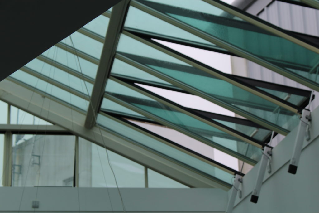



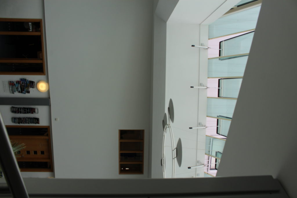

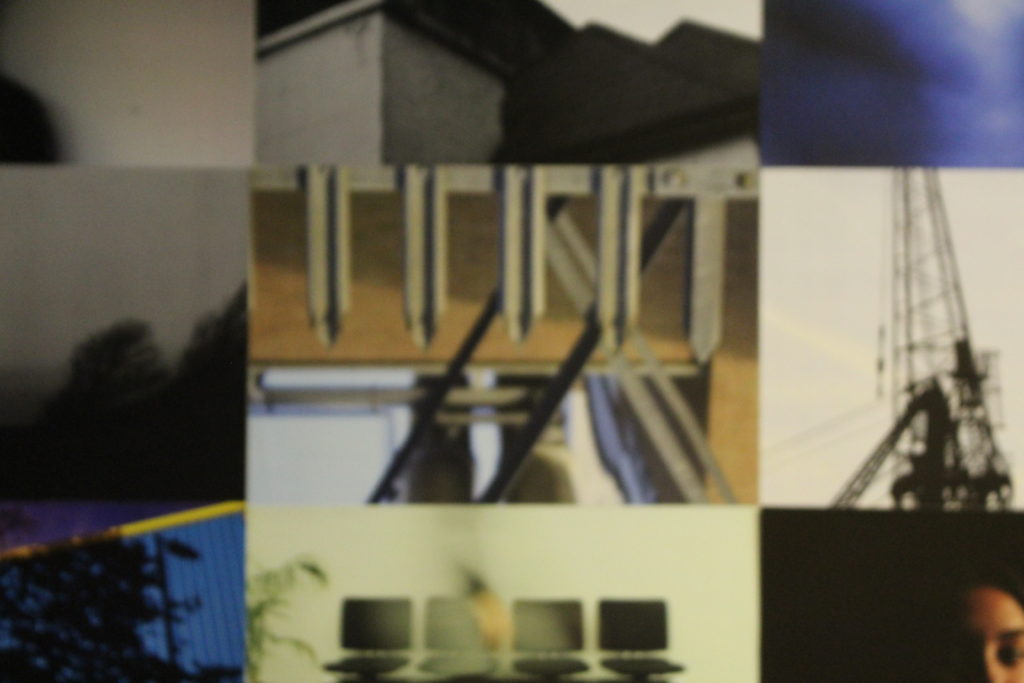
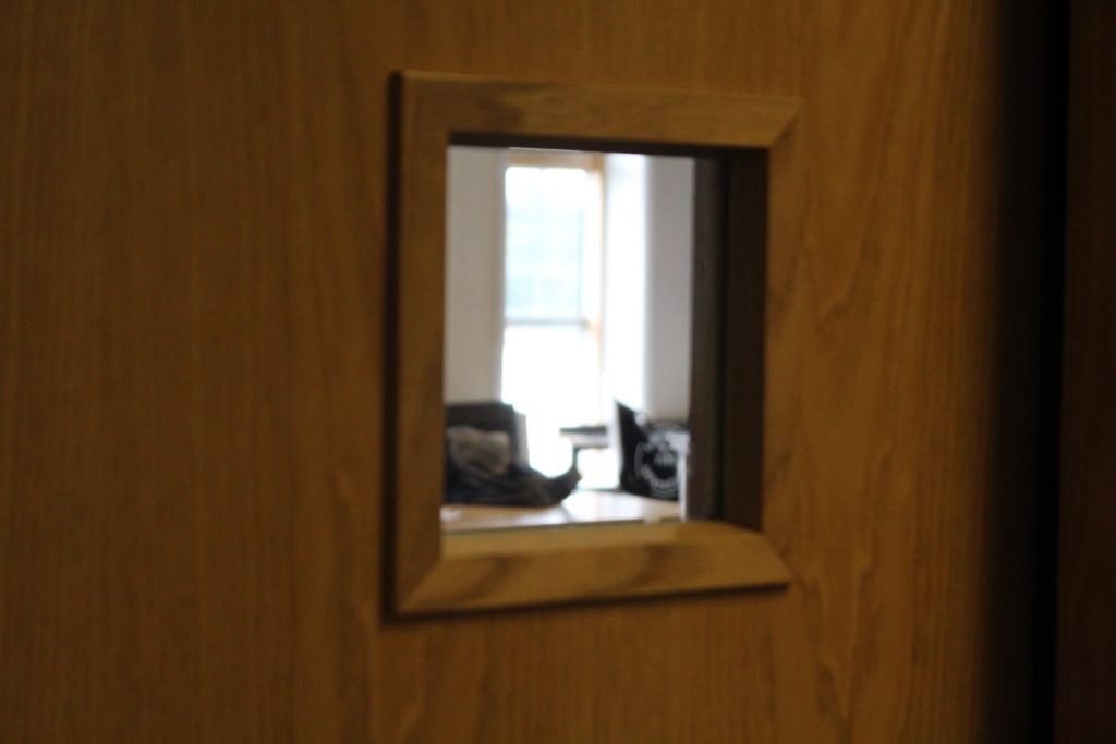
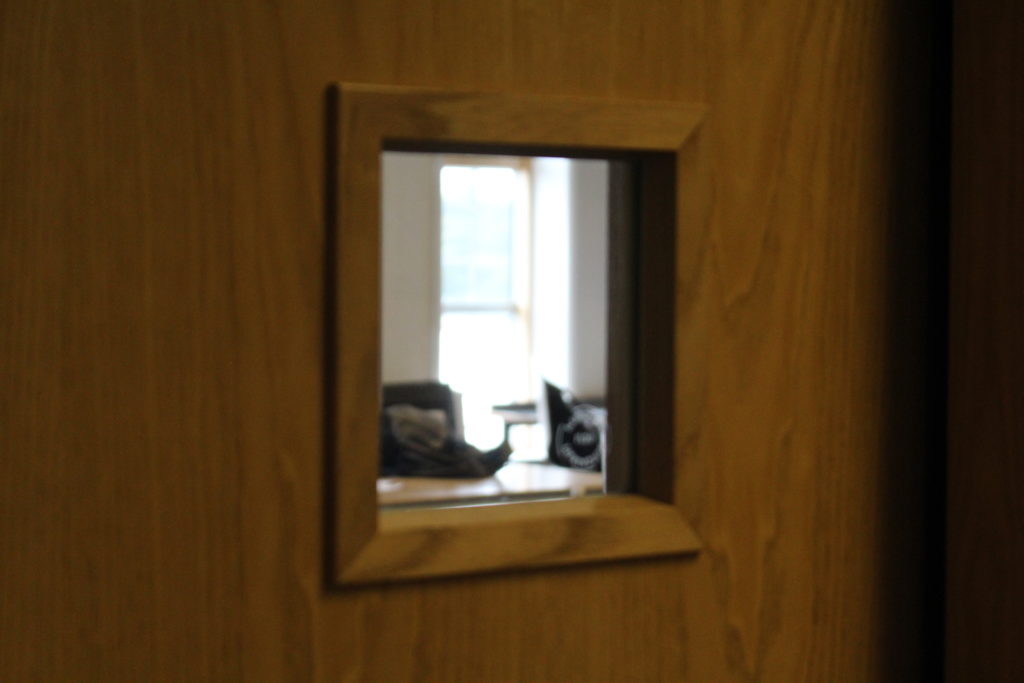

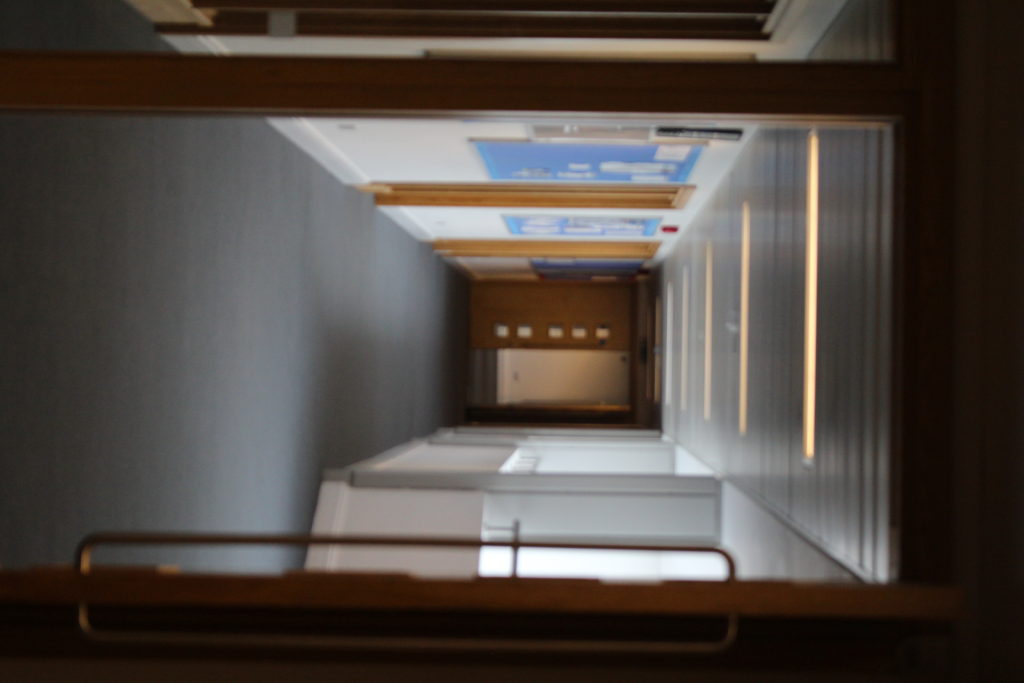

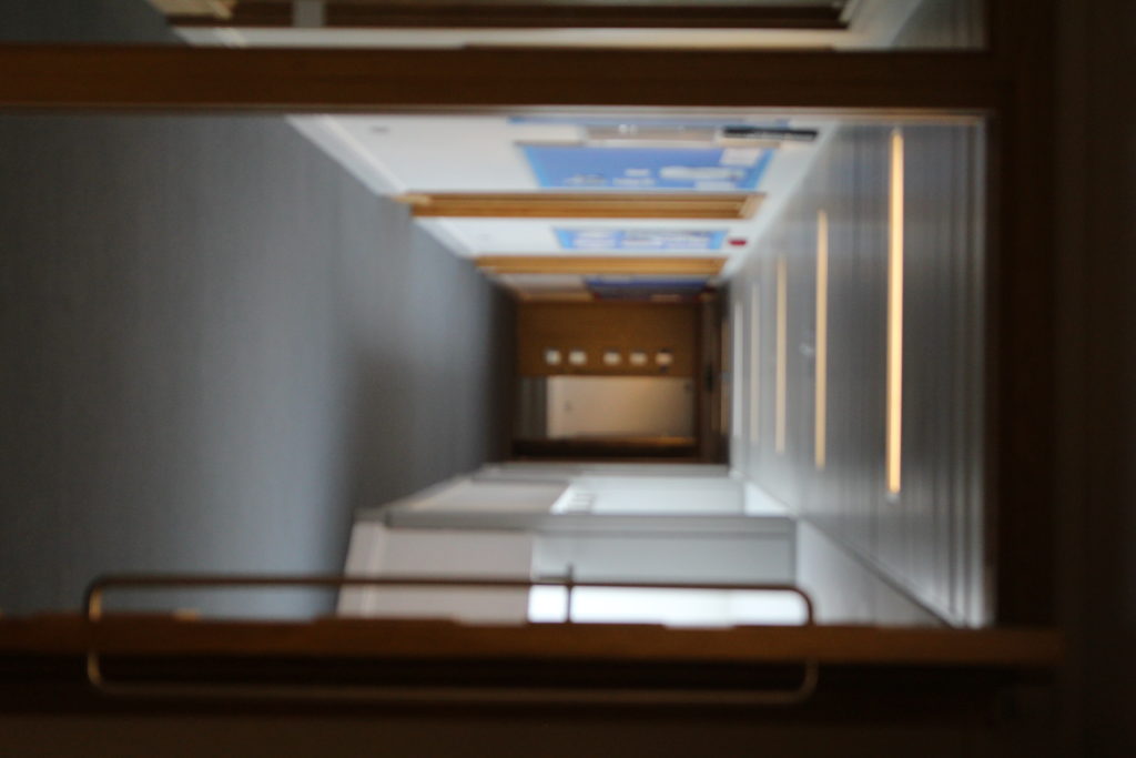
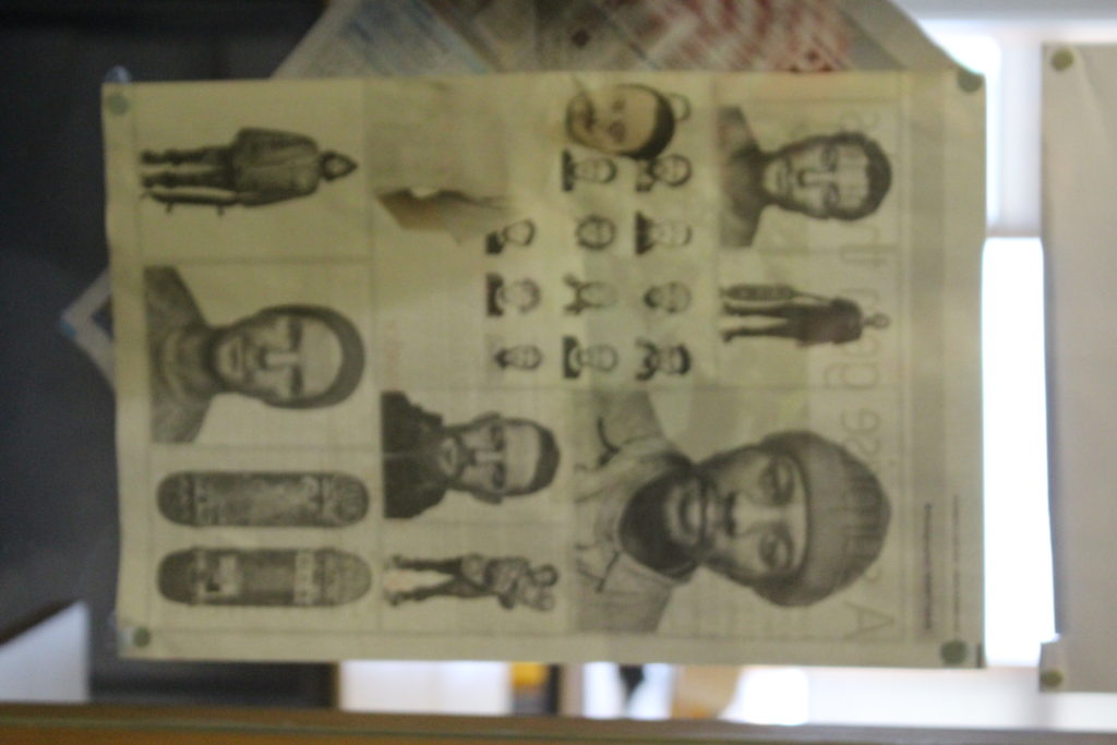
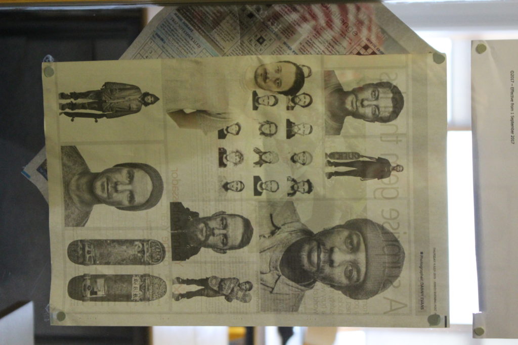


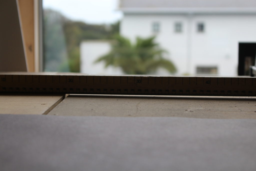
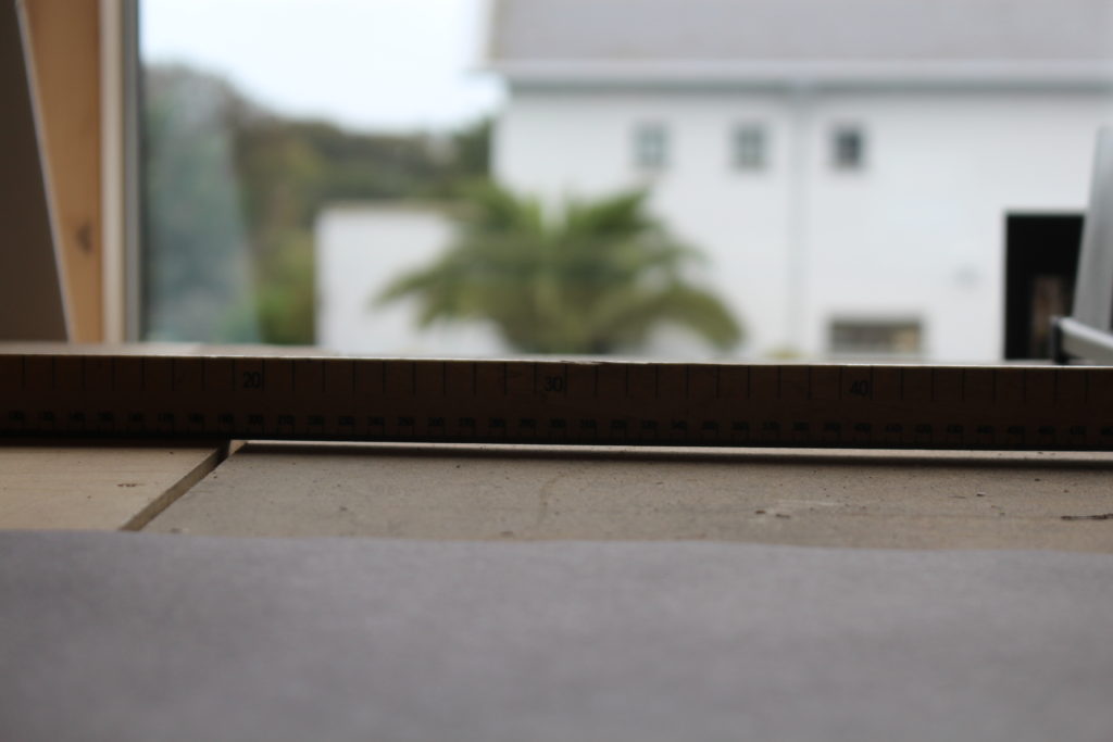


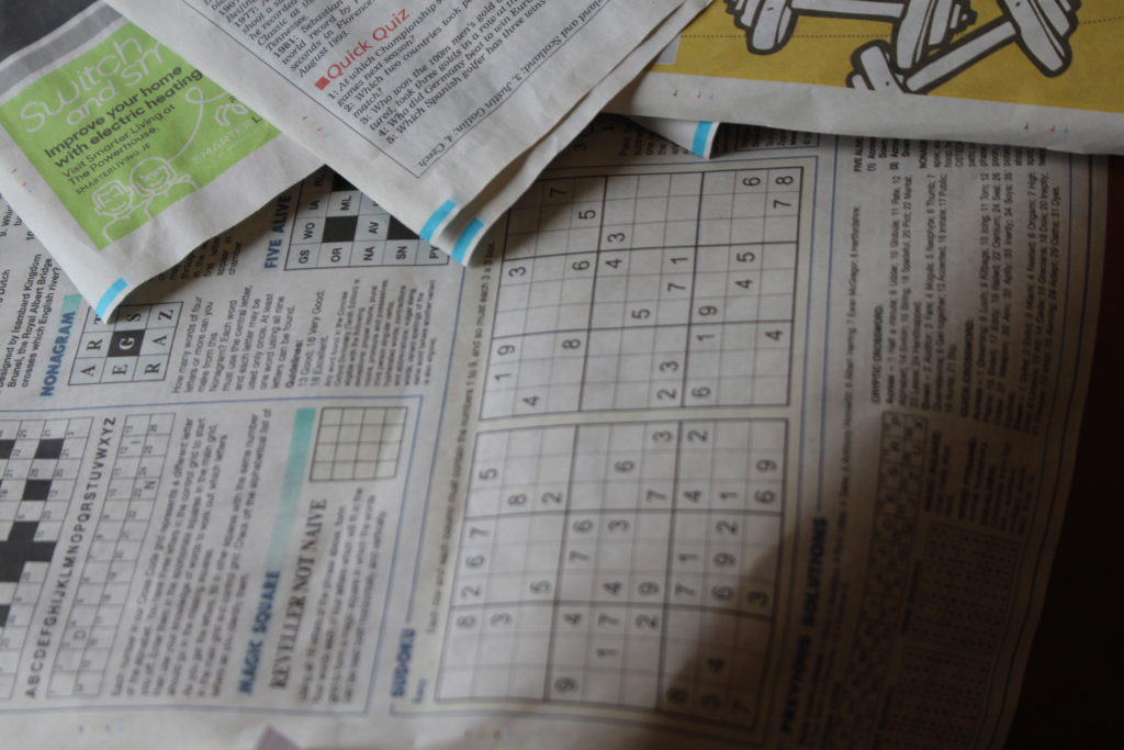
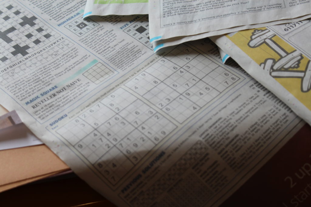
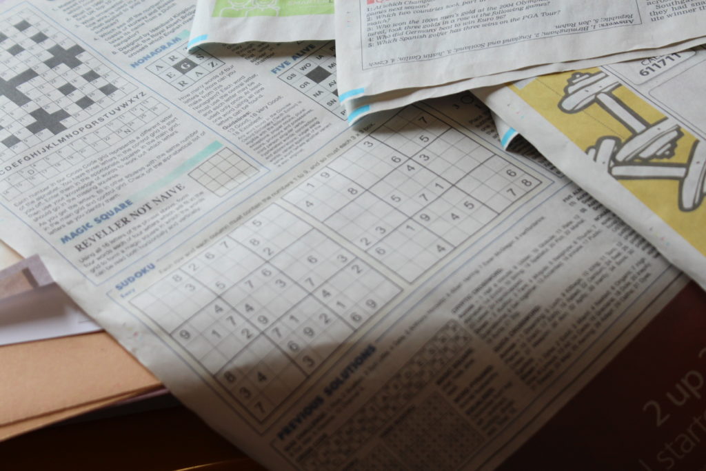
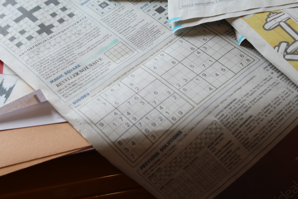
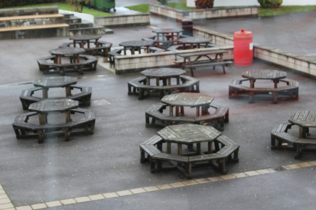
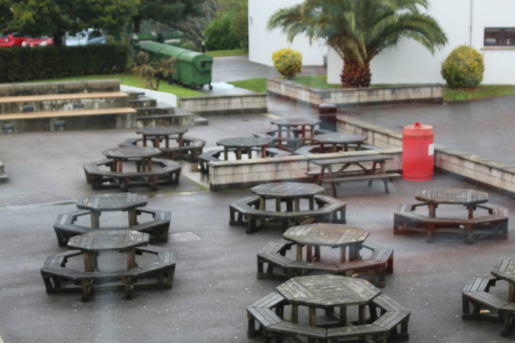

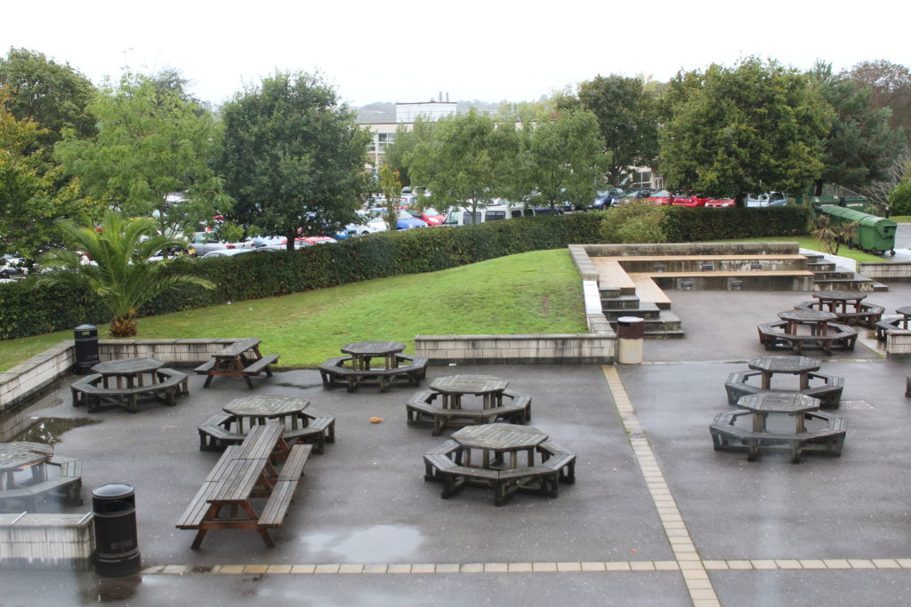
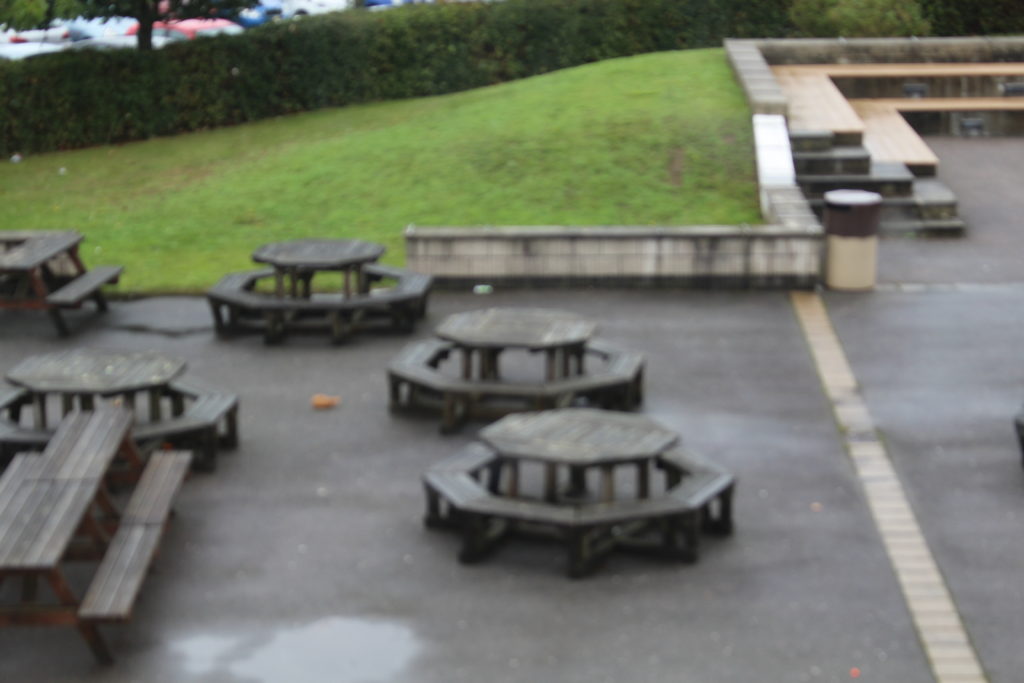

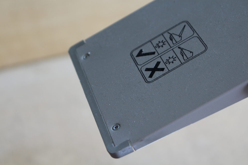


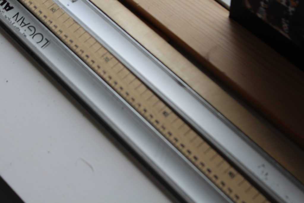


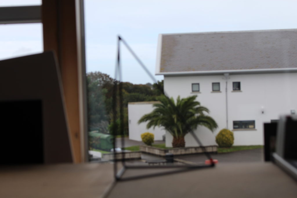
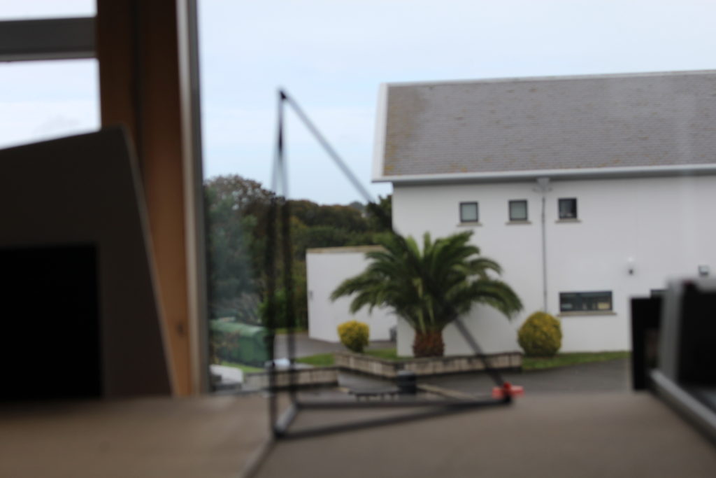
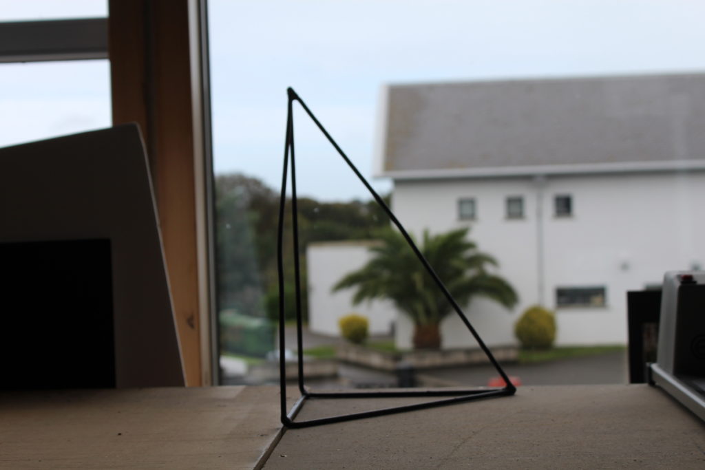

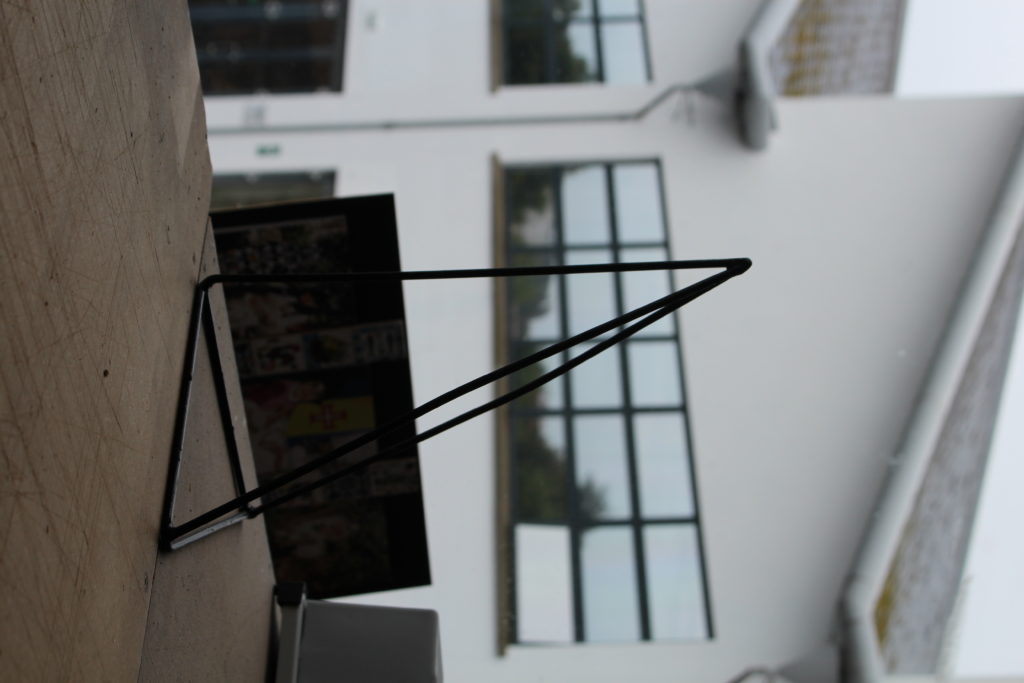
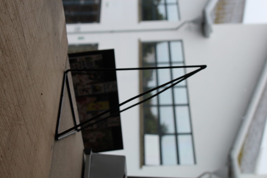
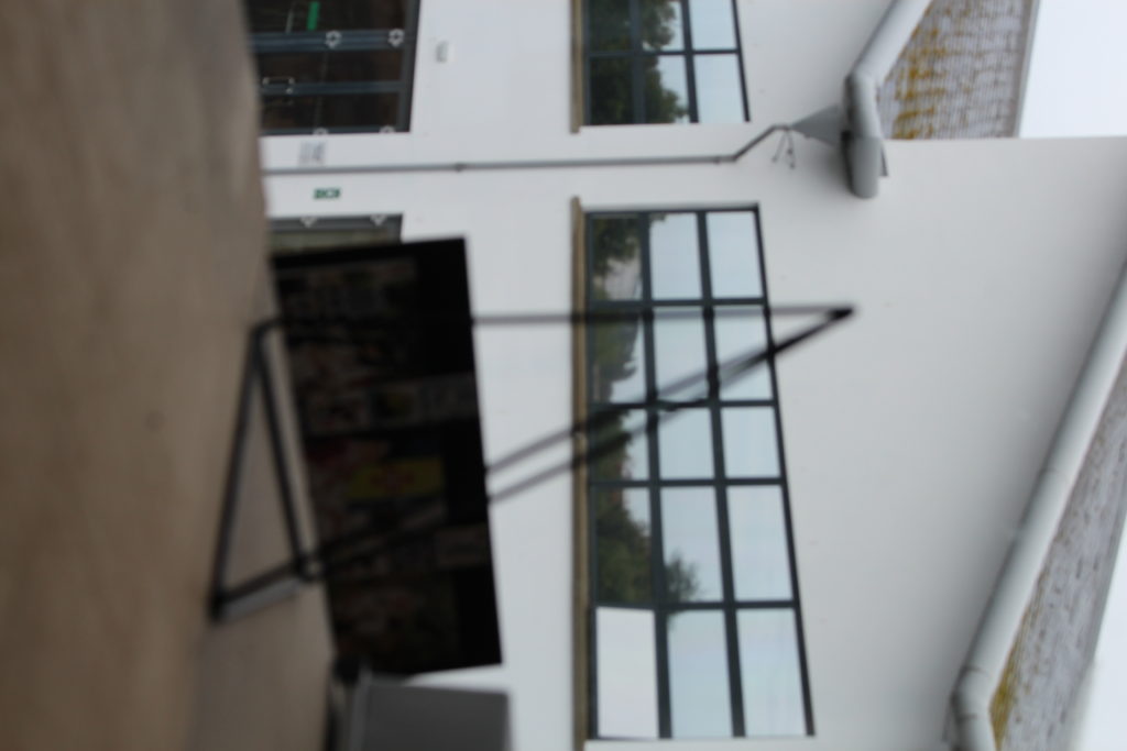

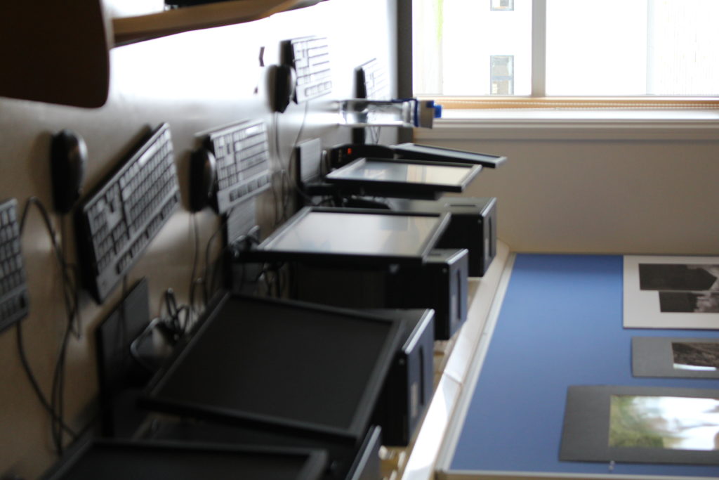
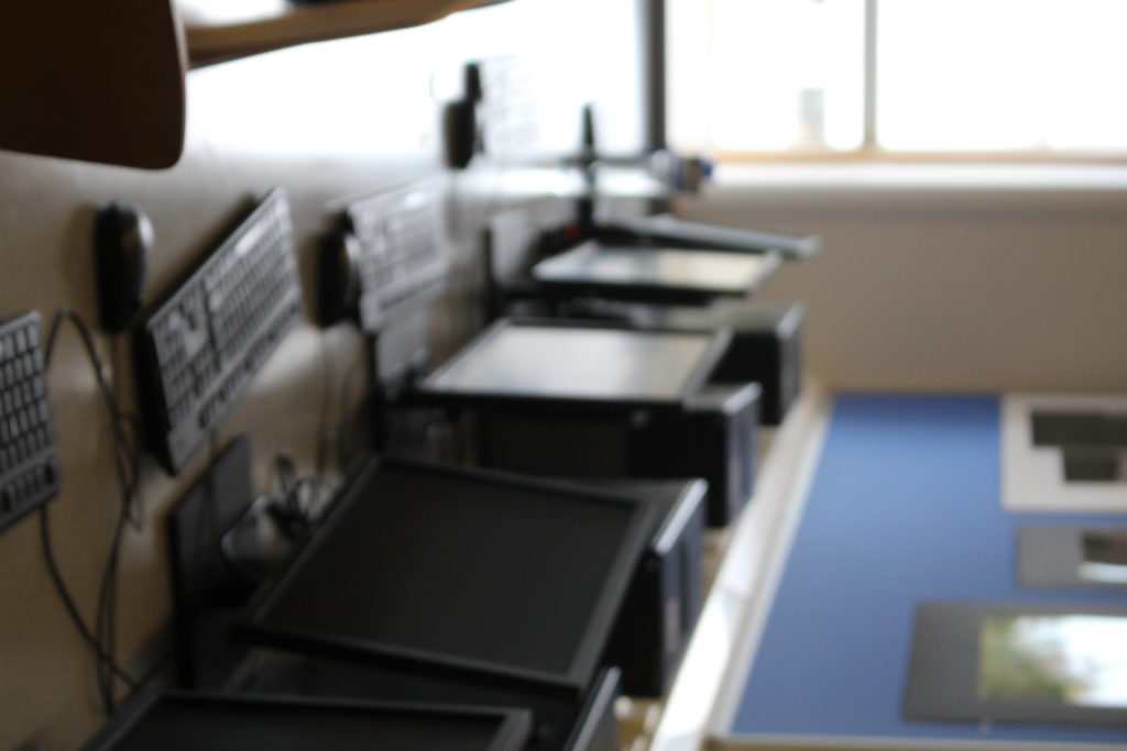

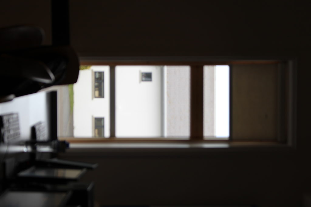
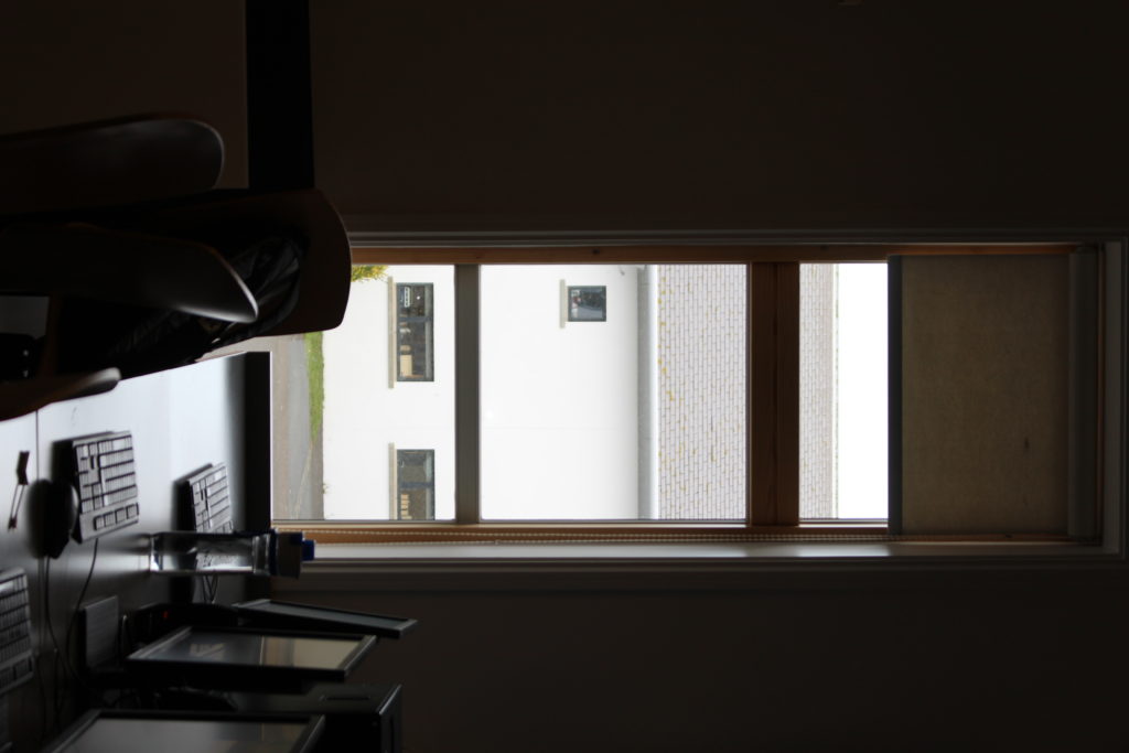
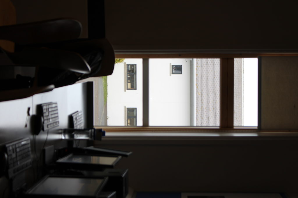
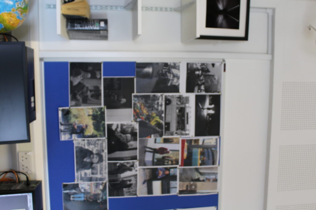
These are the best photos from my shoot. These are the best because, they are the most focused, aesthetically pleasing, and interesting.
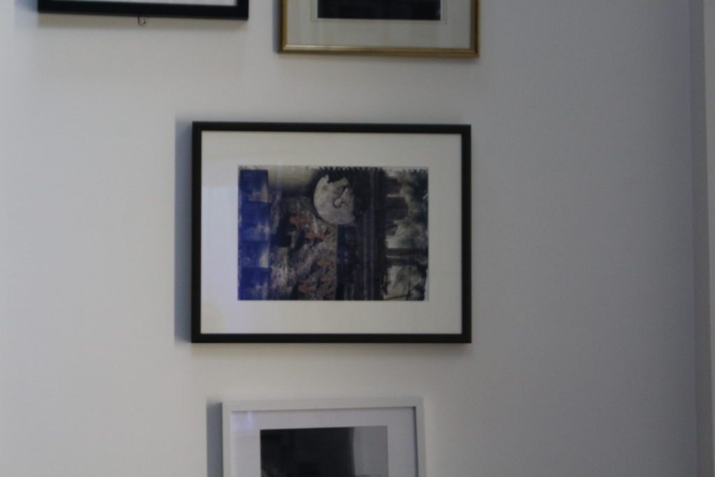
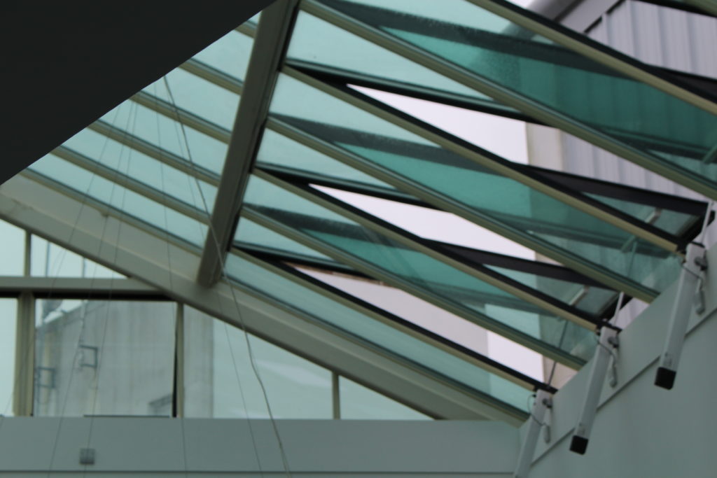

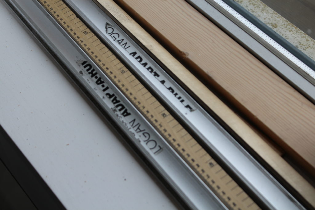
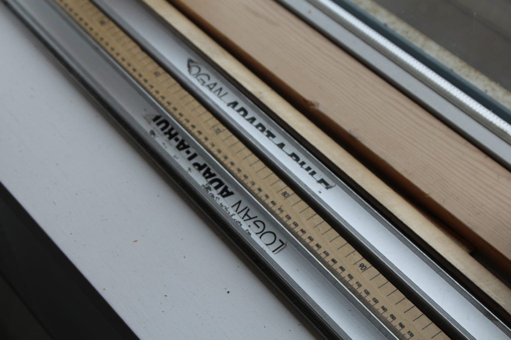


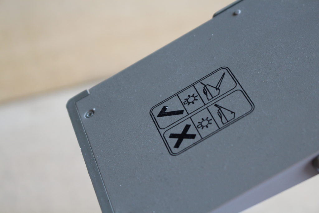


I decided to edit 3 of the photos, to enhance the photo.
PHOTO ONE
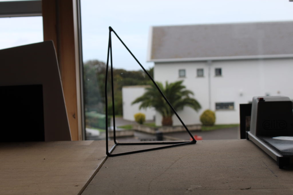
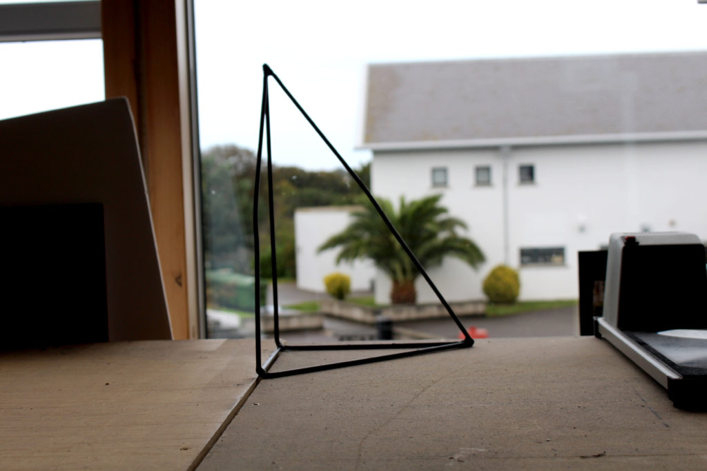
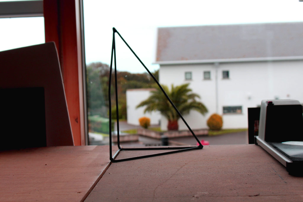
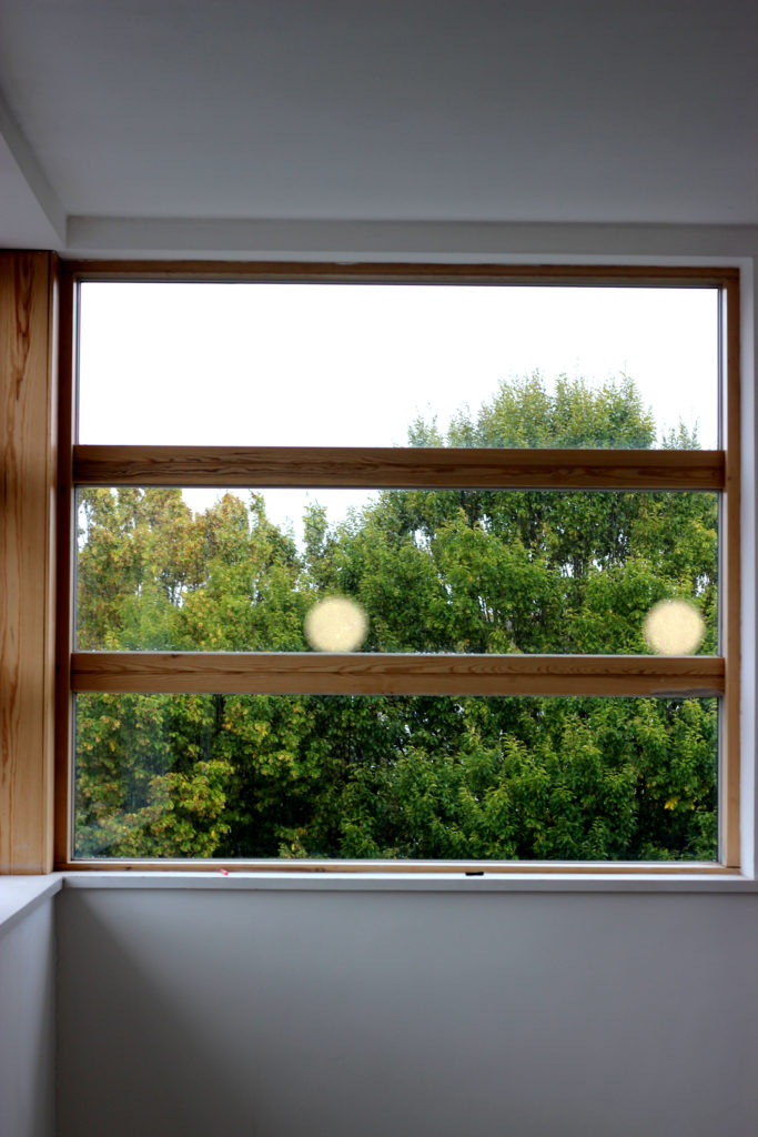
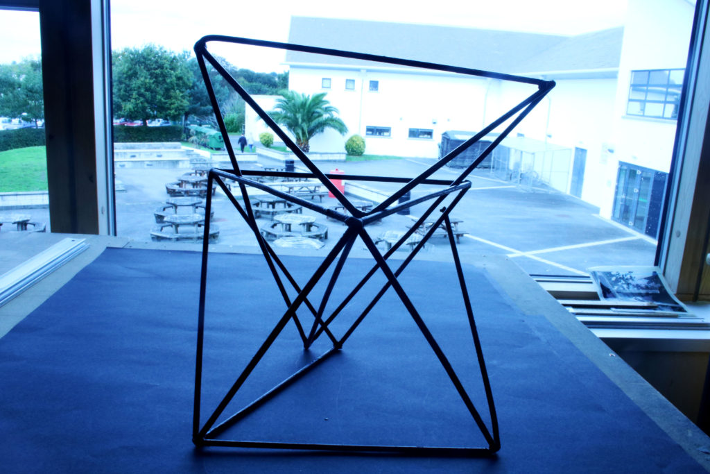
I really like this photo, because I like how the 3D triangle frames the view outside of the window. This photo is very aesthetically pleasing as all the background is out of focus, but the foreground is, and that what I like about the photo, mainly.
PHOTO TWO
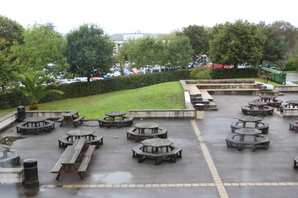
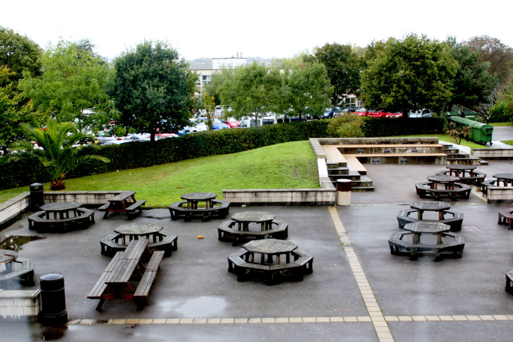
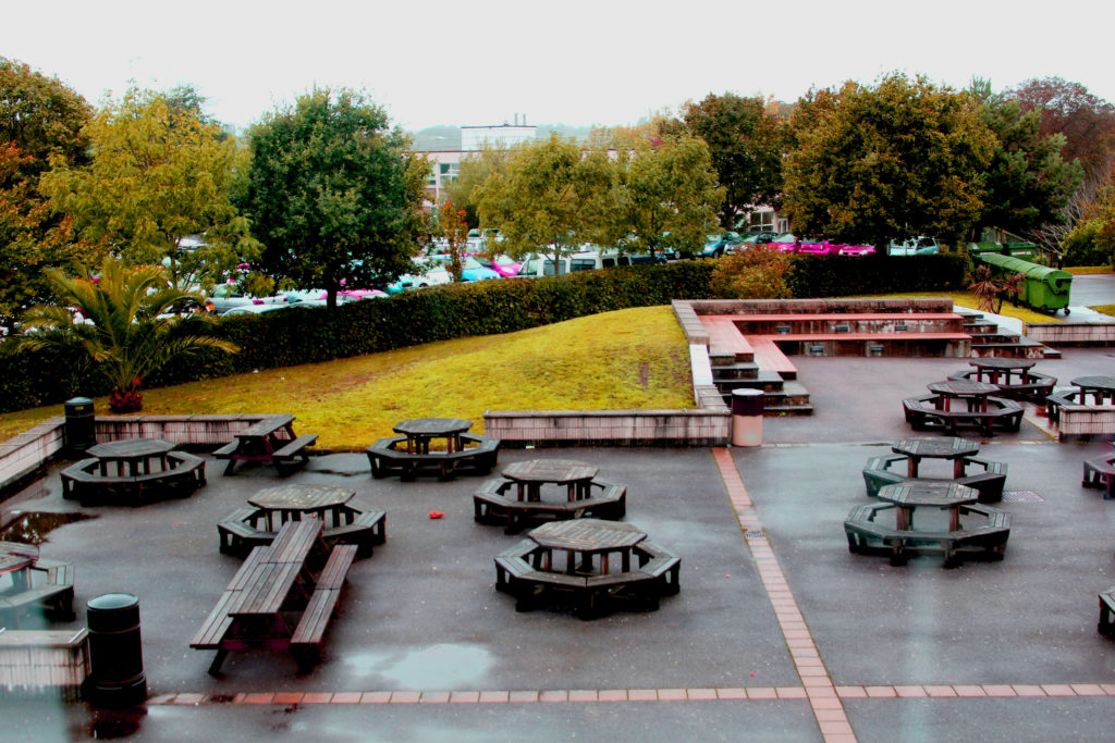
I really like this photo, because I like the shape of the tables and the lines on the ground and how they cross.

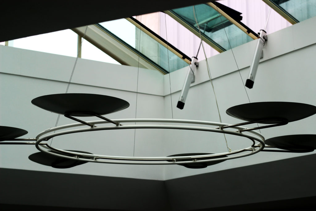
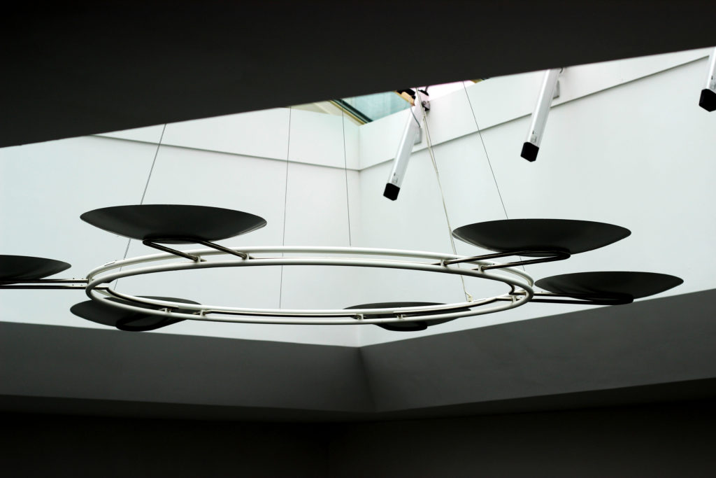
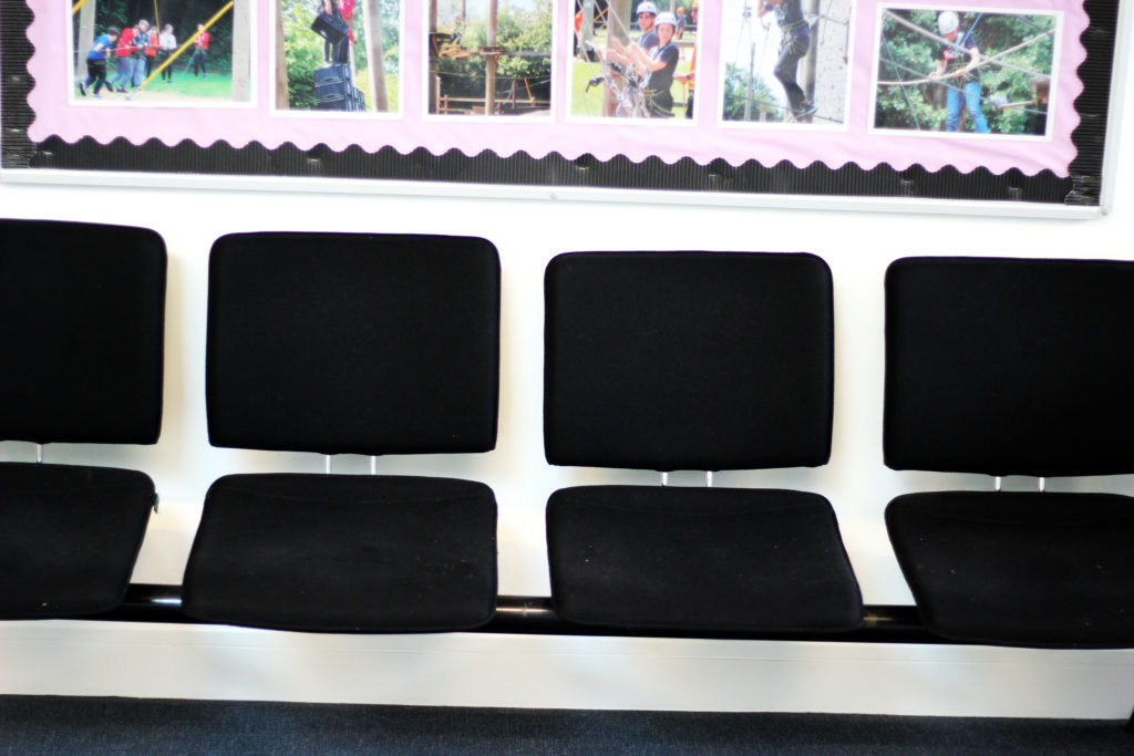
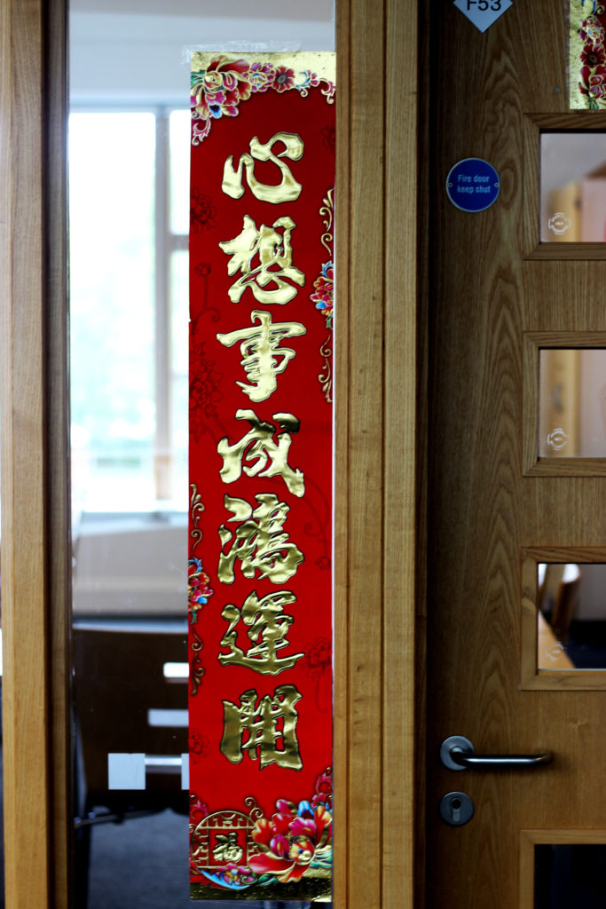
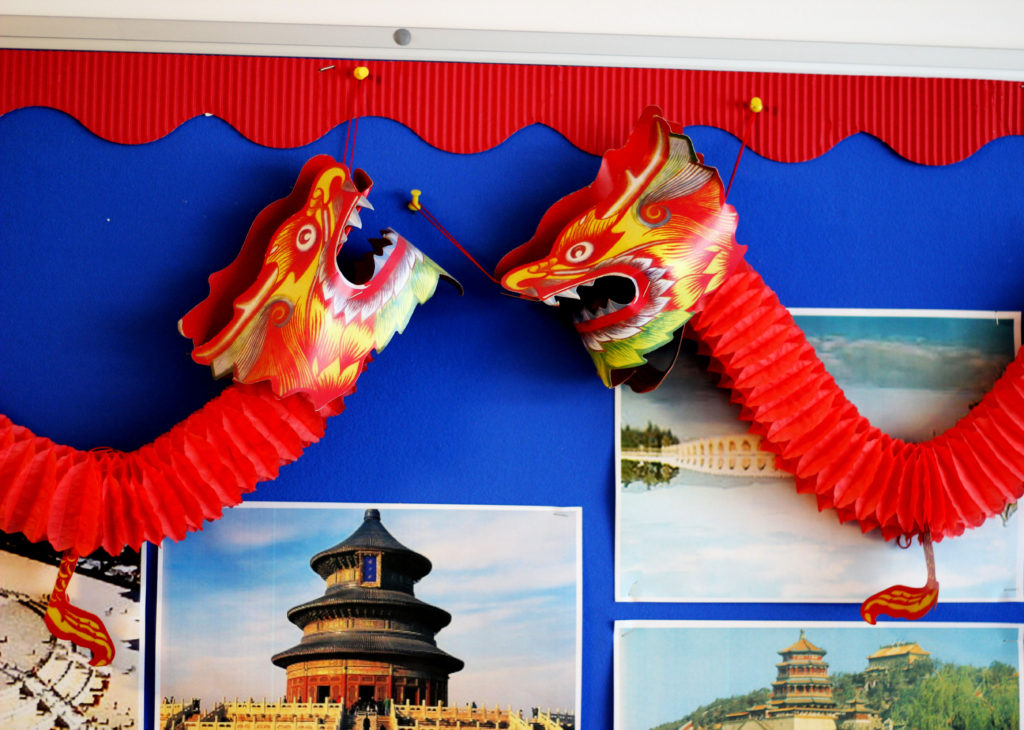
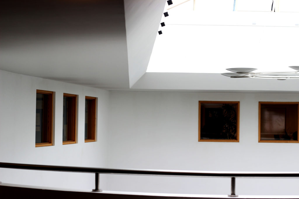
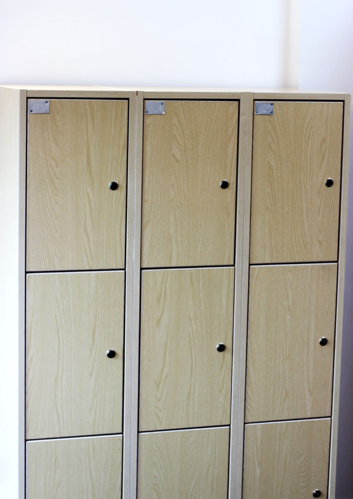
In my collection, I focused on the non- conventional aspects of the theme ‘Mathematics’ and instead focused on capturing a range of different shapes and patterns within my work to create aesthetically pleasing photos. We used the manual focus setting on the camera to take this series of images to help improve our camera skills and techniques.
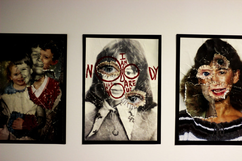
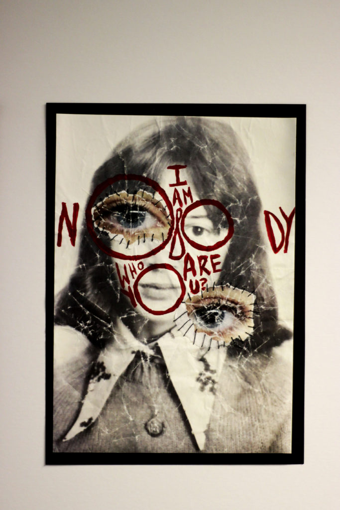
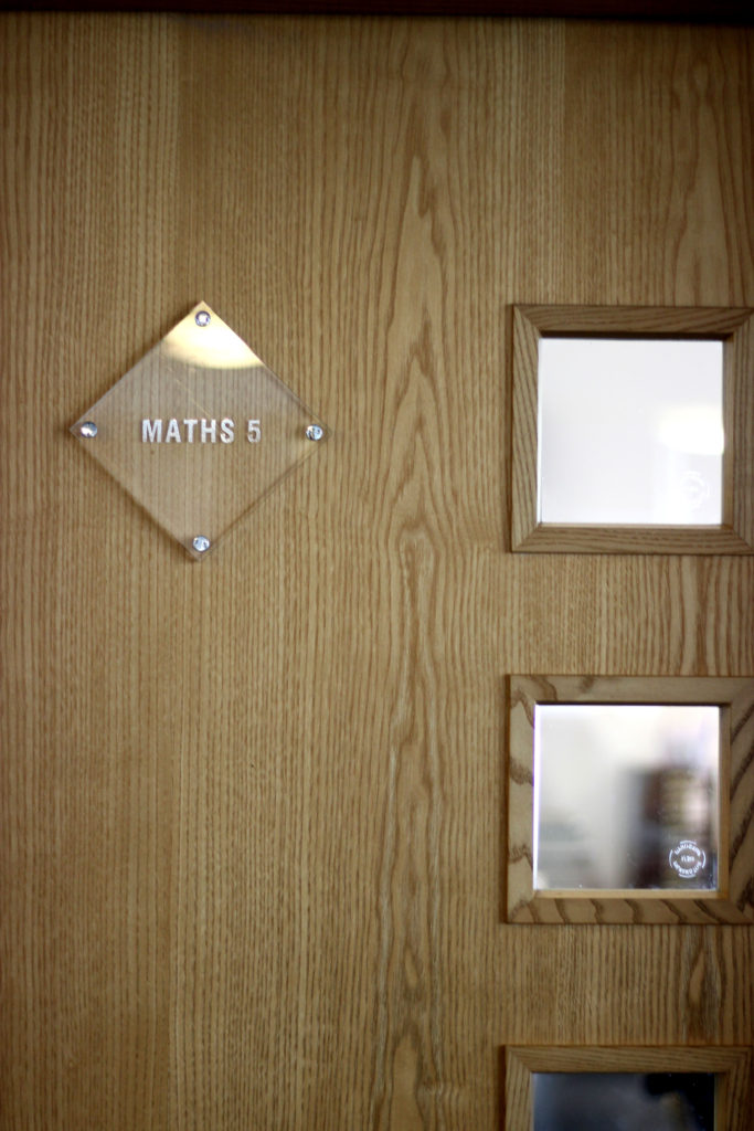

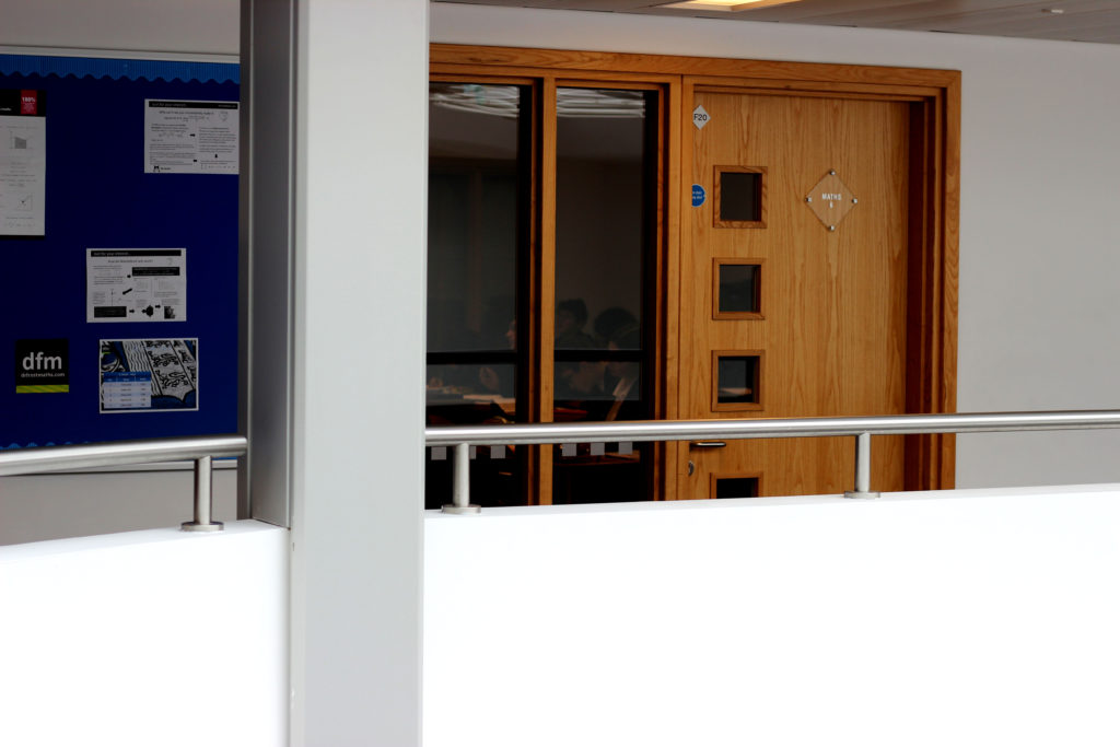
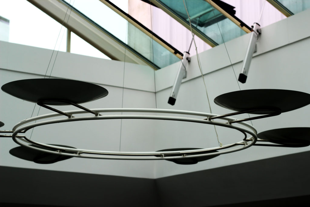






My Favorite Outcomes:
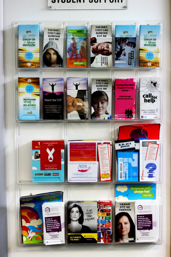
The reason why I think this image works so effectively is due to the aesthetically pleasing pattern created by the range of magazines. In addition, the vibrancy of the different tones all compliment each other. This photo was taken from a straight on angle and I captured it in natural lighting . Furthermore, the concept of the different rectangular and square shapes created links to the stimuli of ‘Mathematics’.

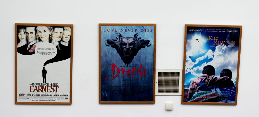
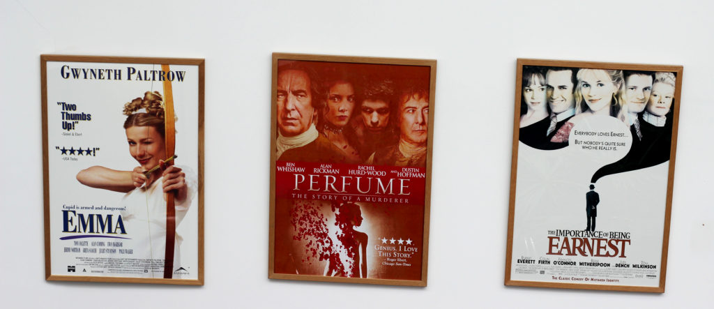
I particularly like this image due to the layout of the different posters next to each other. In addition, the plain, bright background allows the viewer to focus on the colorful posters as the main aspect in the image. The simplicity of this photo works effectively and it creates identical rectangular frames from the outlines of the posters, therefore linking to the mathematics theme.
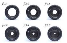
An aperture is a hole or an opening through which light travels. More specifically, the aperture and focal length of an optical system determine the cone angle of a bundle of rays that come to a focus in the image plane. It is calibrated in f/stops and is generally written as numbers such as 1.4, 2, 2.8, 4, 5.6, 8, 11 and 16.
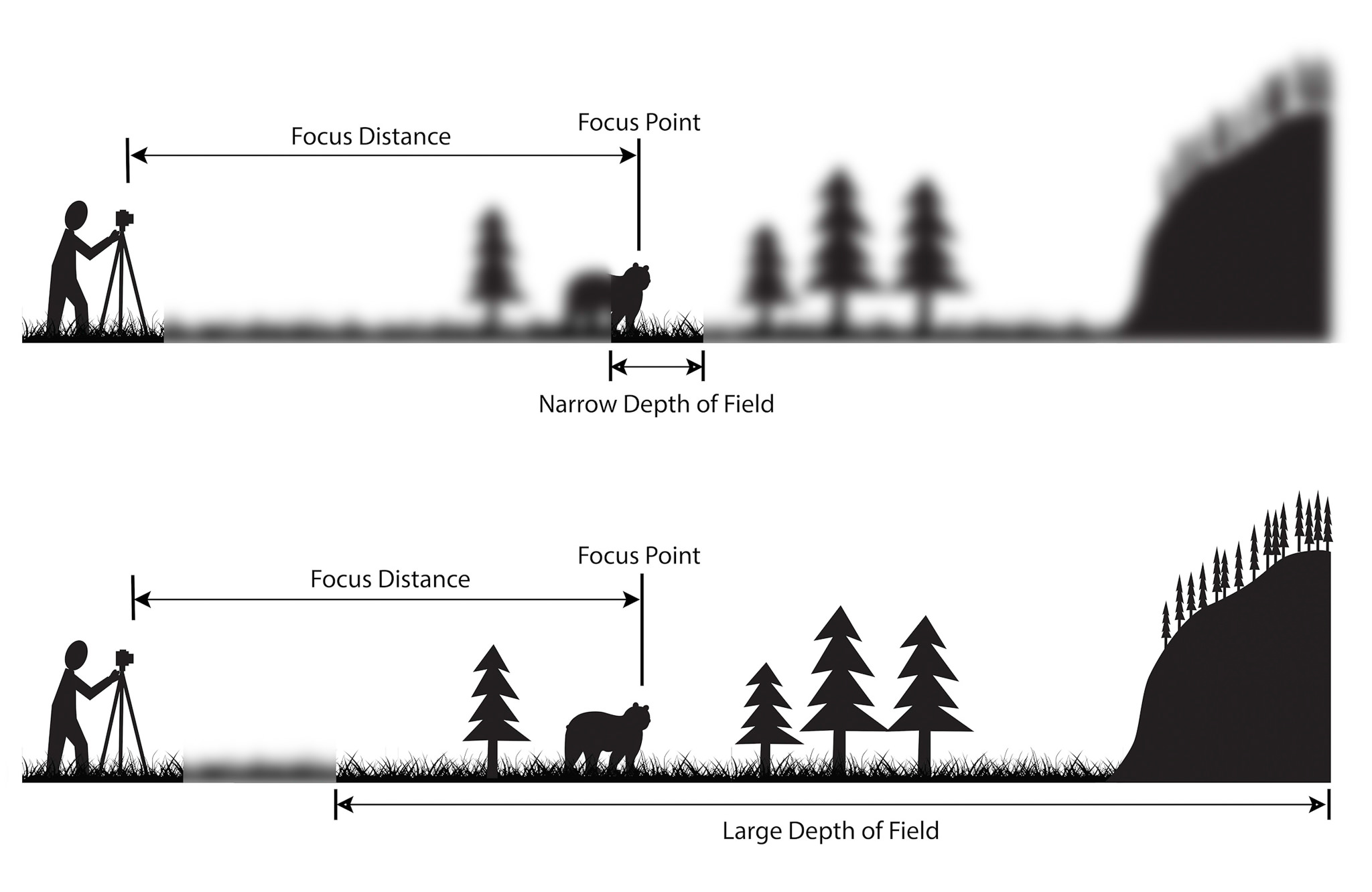
Depth of field is the distance between the closest and farthest objects in a photo that appears acceptably sharp. Now your camera can only focus sharply at one point. But the transition from sharp to unsharp is gradual.
The depth of field can be calculated based on focal length, distance to subject, the acceptable circle of confusion size, and aperture.
My Outcomes:




Favorite Outcome:
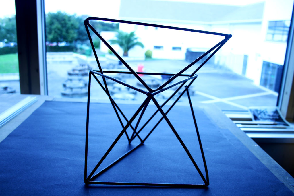
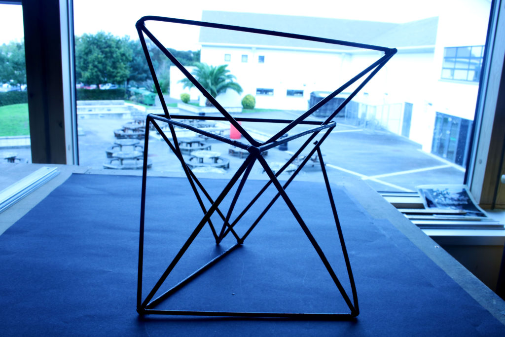
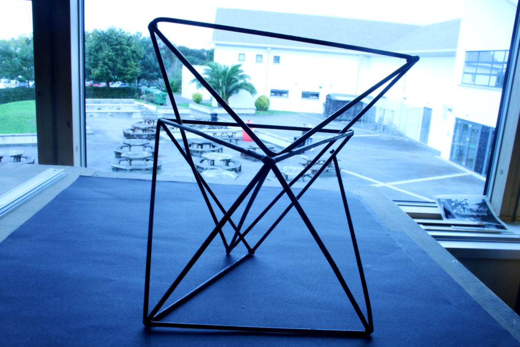
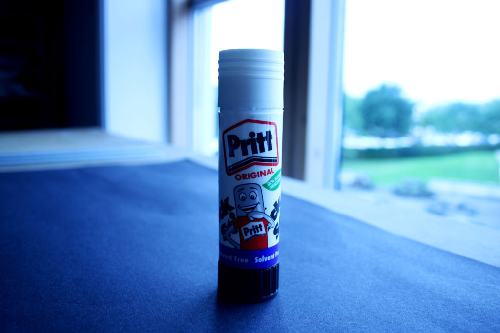
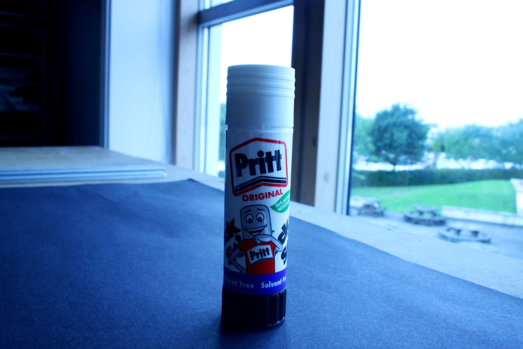
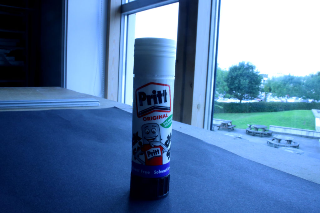
To create this image, I set my camera setting to AV and adjusted it to F stop setting 4. This is my favorite outcome out of my collection as it is an example of a shallow depth of field as it is focusing on the object as the main aspect in the image, drawing the viewers attention to the center. In addition, the object is portrayed as sharp and crisp and the dark tones of it also contributes to this.
White balance (WB) is the process of removing unrealistic color casts, so that objects which appear white in person are rendered white in your photo. Proper camera white balance has to take into account the color temperature of a light source, which refers to the relative warmth or coolness of white light.
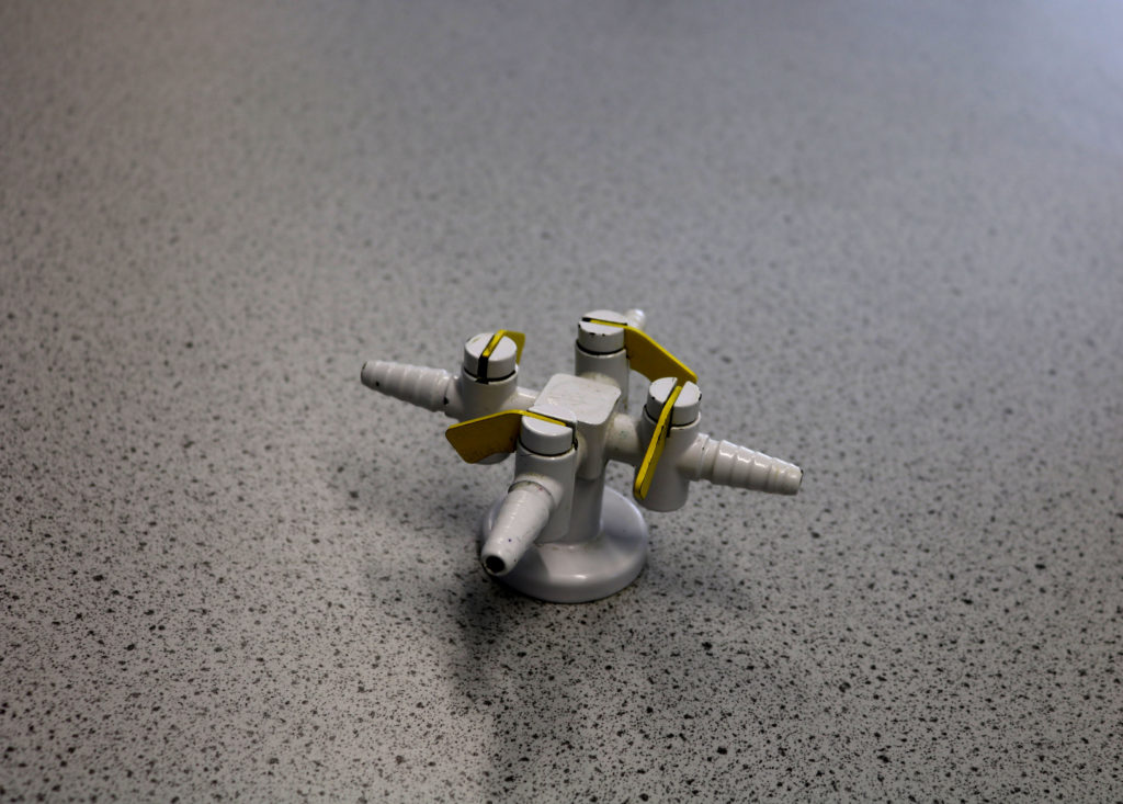
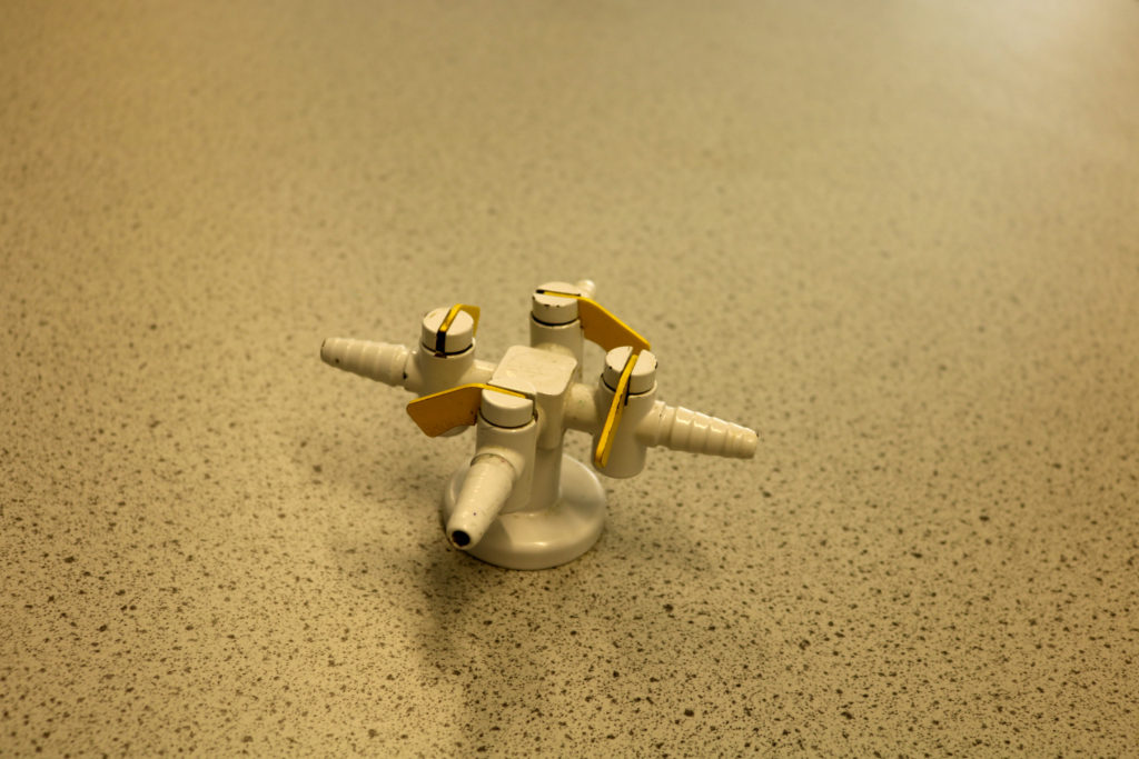
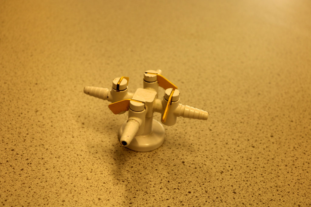
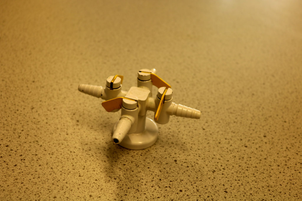
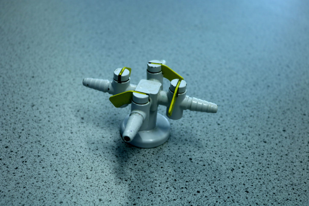
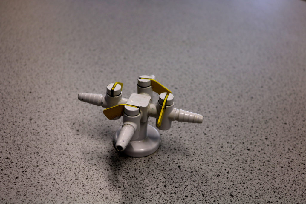
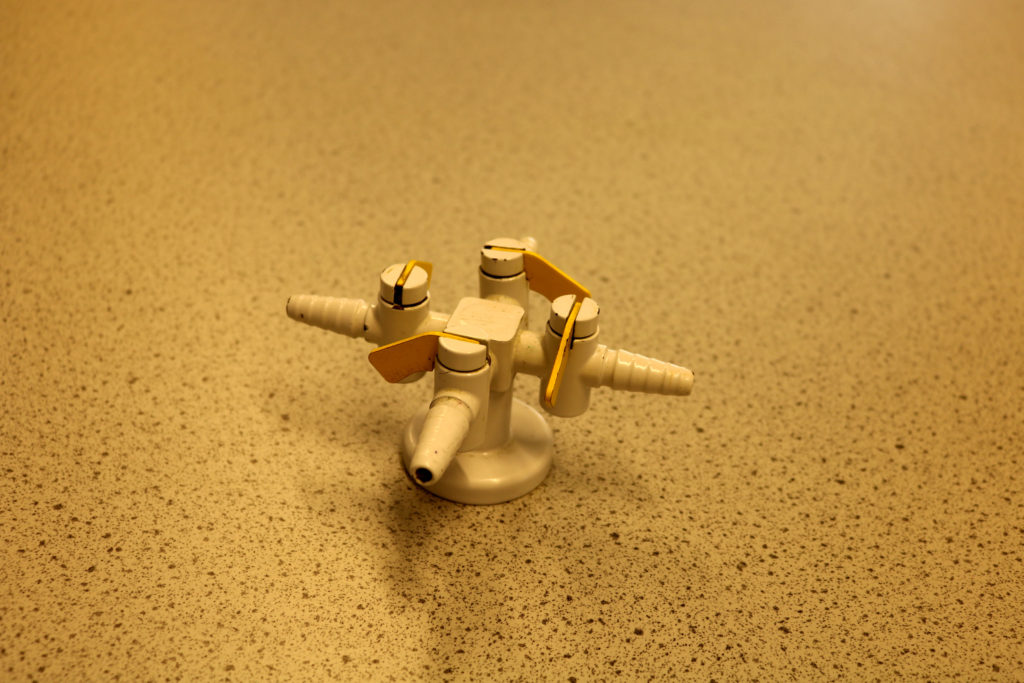
In this photo shoot, we adjusted the color balance settings on the camera by putting the camera into full auto mode, then selecting WB and adjusting the different white balances. The different settings included auto, daylight, shade, cloudy, tungsten light, white fluorescent light and flash. The theme we were following for this particular set of images was ‘Science’.
My Outcomes:
3. Create a blog post that defines and explains what Romanticism is in Landscape Photography…include examples and make reference to Romanticism in other art-forms eg painting
Try to get out in the morning / evening light or even at night and capture interesting light effects, colours, mist, fog, and shadows too…
Possible locations include : woods, forests, sand dunes, beaches, fields, valley settings, cliff and coastal areas, sea-scapes (looking out to sea), church-grounds etc
We will be looking at Romanticism as a starting point and if you click here you will have a better understanding of some of the roots of landscape in contemporary photography….
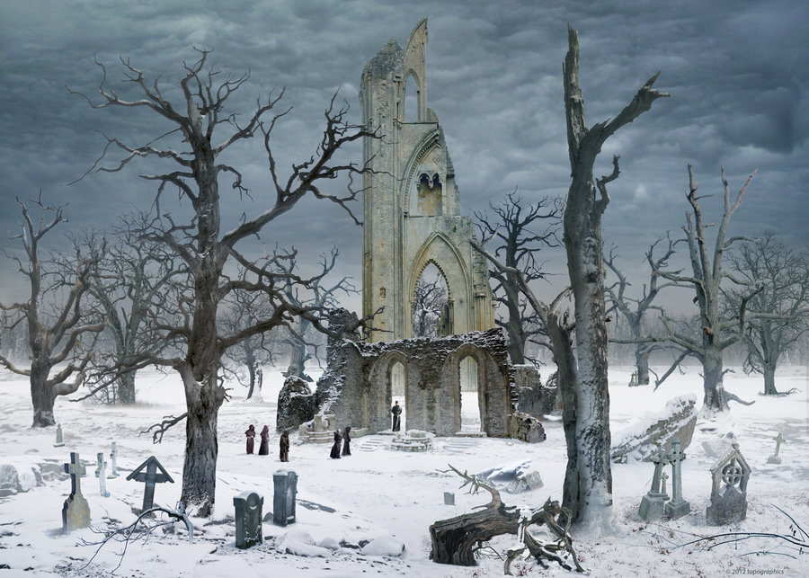
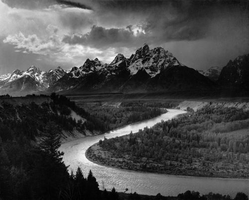
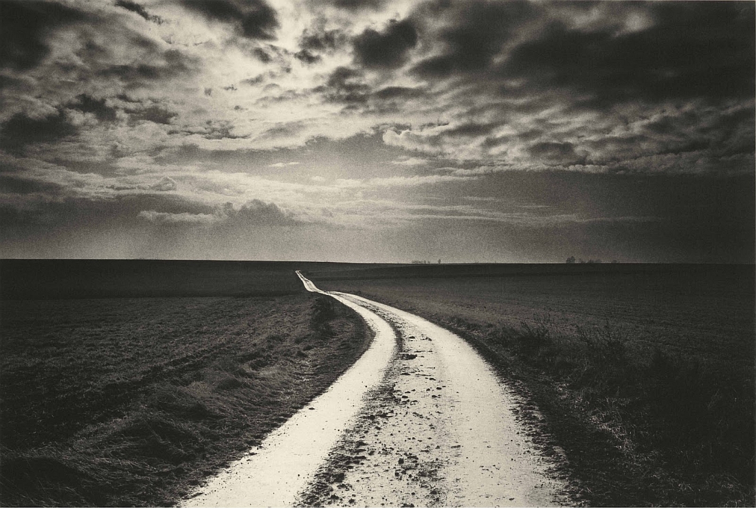
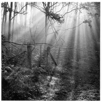
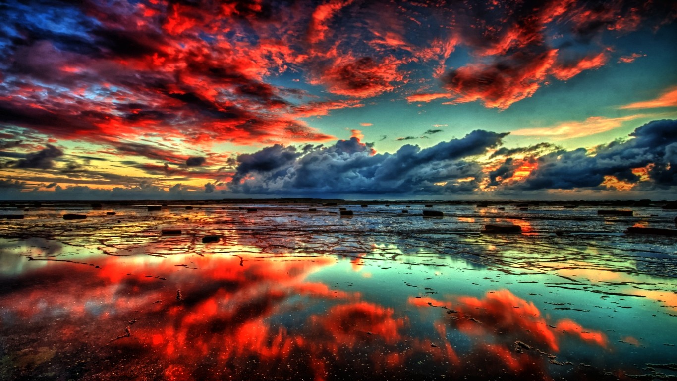
The focus of your study and research this week is natural landscapes and the notion of ROMANTICISM in Landscape Art and then later, Photography.
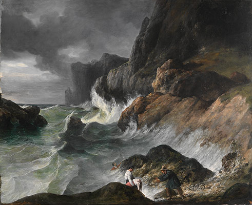
The Age of The Enlightenment (1700-1800ish)
VS
The Age of Romanticism (1800-1900ish)
“Writers and artists rejected rationalism for the same reason that rationalism was rejected by the movement as a whole- it was in rejection of Enlightenment, which had sucked emotion from writing, politics, art, etc. Writers and artists in the Romantic period favored depicting emotions such as trepidation, horror, and wild untamed nature.”
“The ideals of these two intellectual movements were very different from one another. The Enlightenment thinkers believed very strongly in rationality and science. … By contrast, the Romantics rejected the whole idea of reason and science. They felt that a scientific worldview was cold and sterile.”
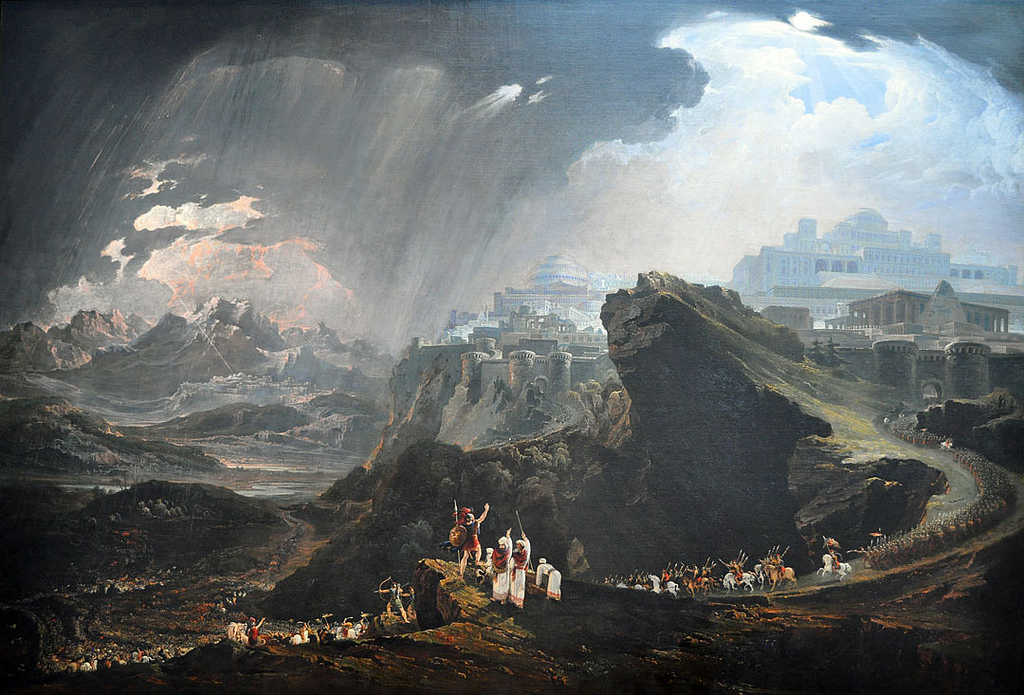
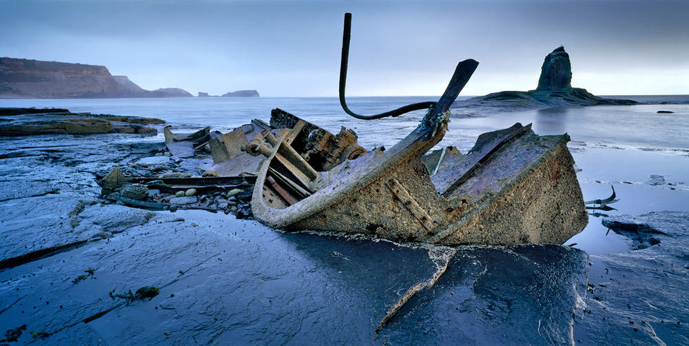
Blog Post 1+2: Define, describe and explain Romanticism (in landscape photography). Include a mood-board of appropriate images. Include at least 1 x hyperlink to an appropriate and relevant website. Embed an appropriate and relevant video / podcast.
Blog Post 3: Create an in-depth case study that analyses and interprets the work of a key landscape photographer…
For example : Ansel Adams / f/64 group / Edward Weston / Fay Godwin / Minor White etc
Remember you MUST use TECHNICAL / VISUAL / CONTEXTUAL / CONCEPTUAL to analyse effectively a key image…
Blog Post 4: add your contact sheet / select your best 5-10 images / 1 x final image / include edits and screen shots to show process
Exposure bracketing means that you take two more pictures: one slightly under-exposed (usually by dialing in a negative exposure compensation, say -1/3EV), and the second one slightly over-exposed (usually by dialing in a positive exposure compensation, say +1/3EV), again according to your camera’s light meter.
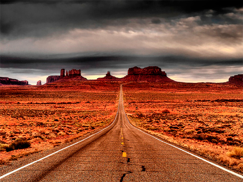
HDR stands for high dynamic range, and it essentially takes a series of images, each shot with a different exposure from darkest to lightest. HDR combines the best parts of the three overexposed, underexposed, and balanced shots to create a dramatic image with beautiful shadowing and highlights
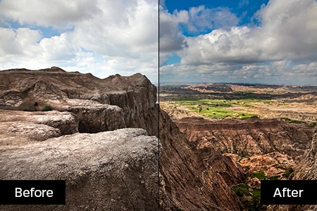
HDR adjustments in Adobe Lightroom click here
HDR adjustments in Adobe Photoshop click here
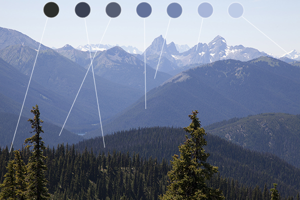
Atmospheric Perspective
VS

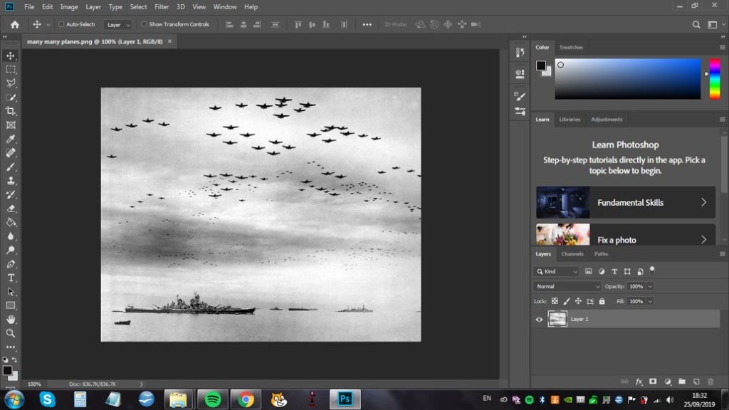
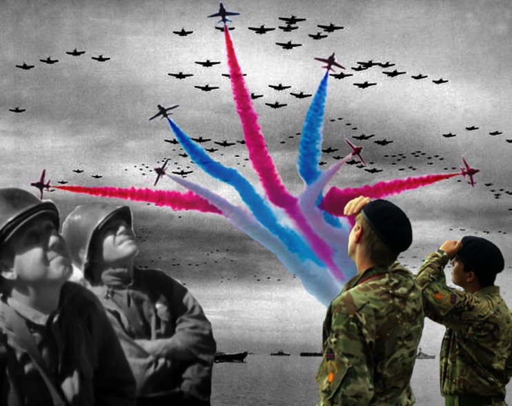
I used this found image for the background because it represented the battle of Britain and how the people of the time would have seen it, from below looking up above. I adjusted the brightness and contrast to make the planes stand out more, as well as the boats, and the levels to make it contrast even more.
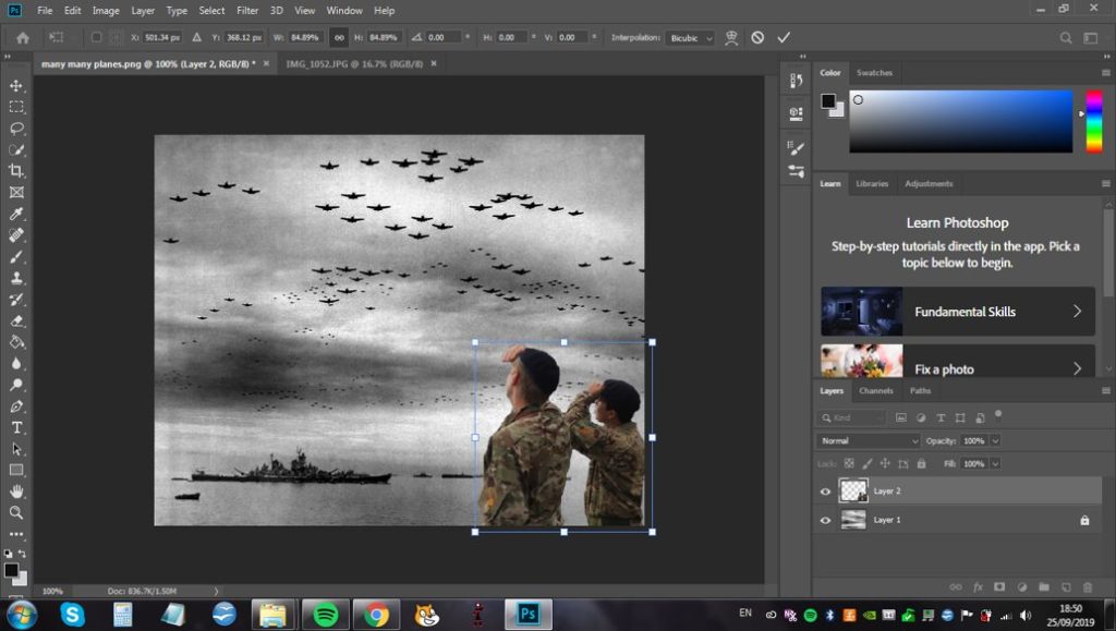
With the eraser tool I added this image of my own and resized it to fit where I intended it to. I adjusted the levels as well, in order to make the green of the camouflage stand out more and contrast against the black and white of the background. This was additionally to represent the past and present coming together in the image.
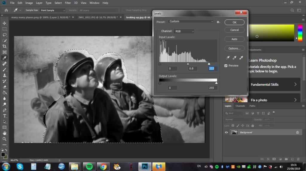
Using a different found image I adjusted the levels and exposure to increase the contrast of the black and white in the image, then cut it out and layered it onto the previous image. I used this image because it mirrored the position the previous two figures were in and stays with the concept of the past and present coming together.
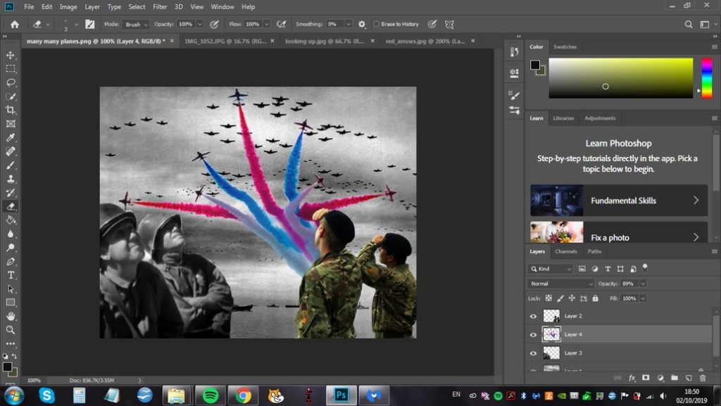
Finally I added this image of the Red Arrows to add another section of colour to the image and to tie together the different types of planes. I increased the saturation and intensity of the smoke colours and reduced the opacity before layering it behind the two figures on the right to complete the photomontage.
