




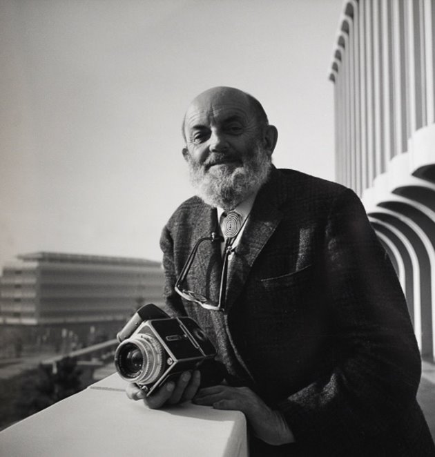
Ansel Adams was an influential landscape photographer most widely known for his black and white images of the American West. He helped develop a method of understanding and using tonal range called the Zone System, and his images are well-known for their wide range of dark shadows and bright white highlights.

He became a pioneer in Romaticised landscape photography, taking many series of images in the American West, particularly Yosemite National Park and the mountainous structures found there.
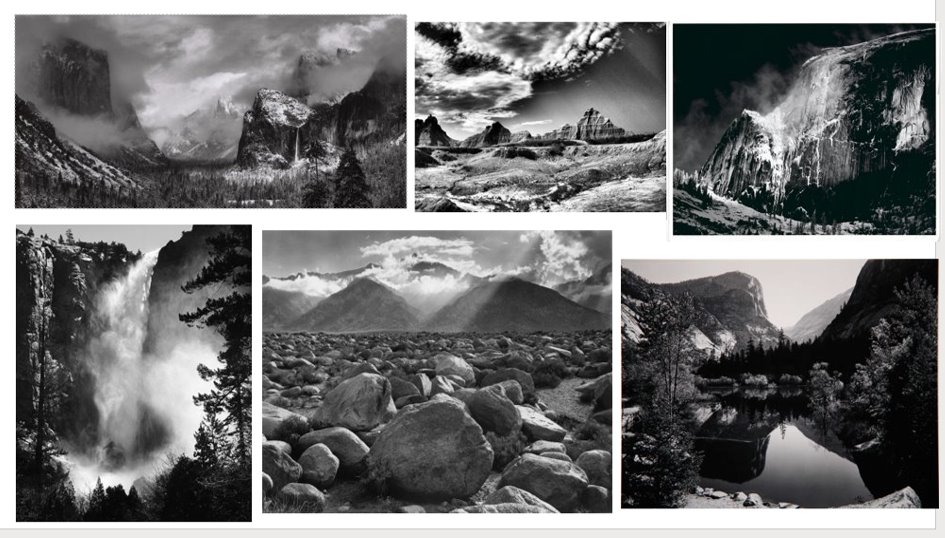
Key Image Analysis:
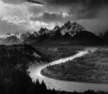
TECHNICAL:
Adams uses natural lighting and a high tonal range to have a highly contrasted image and make the photo more intense. The high tonal range causes the sunlight reflecting off the river to stand out as bright, as well as increase the shadows in the dark rock on the mountains and the darker trees in the foreground. He has most likely used a tripod and a slow shutter speed to capture all this detail and focus the entire image, creating the high tonal range that can be seen here.
VISUAL:
This image has a range of different textures, from the water in the river to the hard rock mountain and the trees and scrub-land , as well as the clouds in the sky, which creates balance throughout the image and stays with the theme of the harmony of nature that the Romantic photographers strove for.
CONCEPTUAL:
The ideals of Romanticism in art and photography are that nature is powerful, beautiful and unpredictable. This is reflected in the almost heavenly light coming from behind the mountain, which imposes over the whole scene and creates a sense of majesty.
CONTEXTUAL:
Adams himself spent a lot of his life taking photographs in this region of the American West and he was inspired by the untouched landscapes and the power of nature there. This is represented through the use of photography as his own view, and of the camera lens as his own gaze.
Romanticism as a movement started in late 18th century Europe as a response to and rejecting the Age of Enlightenment and the focus on logic and reason that it brought, as opposed to the Romantic emphasis on emotional sensitivity, imagination and the sense of spirituality or religion. Romanticism in art used nature as inspiration and broke from the traditional use of Bible scenes in painting, instead looking at nature as the “dwelling place of God.” From a non-religious standpoint, Romantic artists portrayed nature as beautiful, powerful and occasionally destructive.
Romantic photographers drew from these ideas in their work, capturing the landscape as unpredictable and uncontrollable. Mostly it simply relies on the landscape to tell the story, but sometimes humans and animals are involved in the narrative as well.
The Romantic movement in photography was also heavily inspired by the old Romantic painters and their work, often taking some aspects of paintings directly and transferring them into photography, so therefore to be a successful Romantic photographer, it is important to recognise the themes of Romantic paintings in the 18th century.
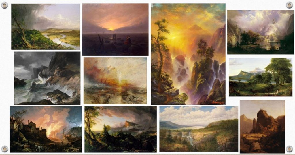
This clearly shows the common themes of using nature in its unspoilt and pure form, as well as natural lighting and conveying various emotions through the visual art.
LINKS:
https://www.nephotographyguild.com/2018/01/romanticism-landscape-photographer

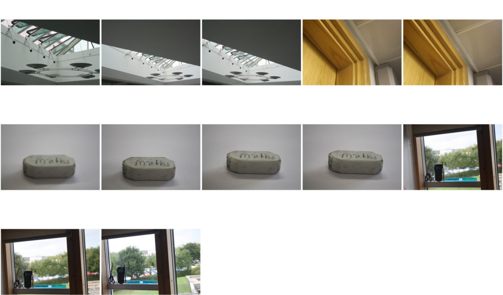


The topic of landscape photography is one of the most popular forms of photography as it involves such a wide variety of styles, locations and editing types. On the whole, it includes an image of a natural landscape without the bare minimum signs of human involvement, therefore no cars of modern buildings would be seen.
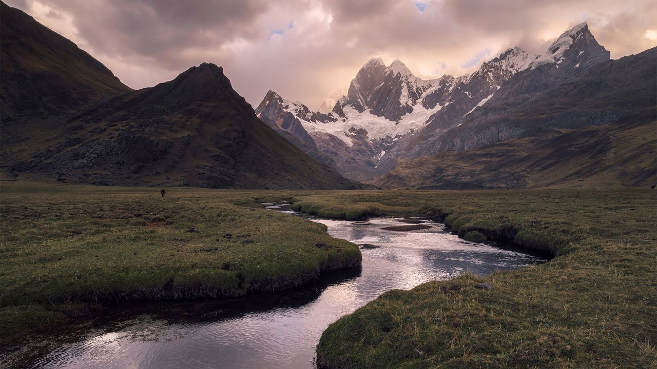

This could involve a seascape, as pictured above, mountains, great plains, or simply the view from one’s window. Landscape photography in general tends to convey the vastness of nature and its beauty, normally in colour but also in black and white.


Image 1: I like this image as it is clear from the start the it represents “Mathematics”, the glass over the wood adds a 3D effect; however I will need to crop it so that the image is more centered.
Image 2: Due to the use of the green box this contrasts with the black and white of the paper and writing which is why I like it.
Image 3: I like the contrast against the large black poster to the 3 small white posters, however I should have focused on making sure that all 4 posters could be seen.

below are my favourite photos from the shoot.

This was my favourite photo because i used the manual focus to make make the shape as clear as possible. i allowed light come through the lens by using the aperture. i made the shape the focus point of the image because the theme was maths. i took the photo at a mid range so you could then see the background and a good overall view.