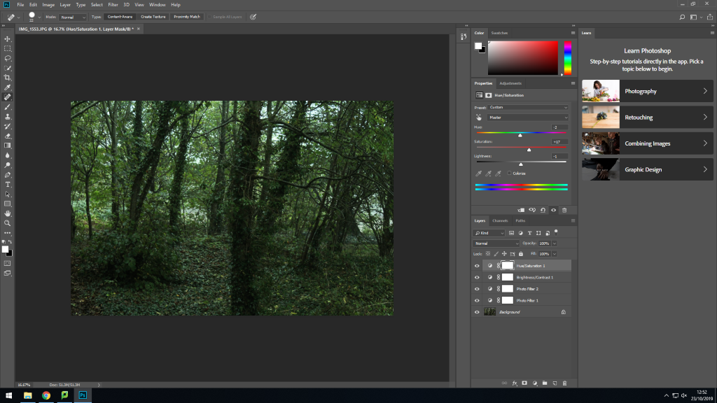
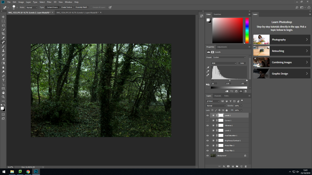

What I liked about this image were the trees in the foreground and the background, I felt that the staggered positioning gave the image depth and the impression that the onlooker is actually in the forest. To edit it I increased the green in the image to emphasise the natural setting and the complete lack of any human impact in this scene.


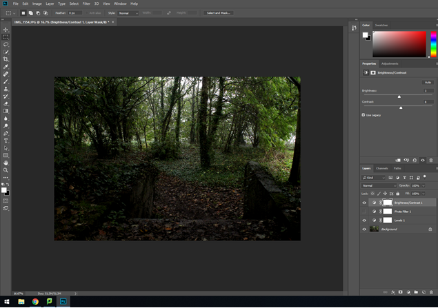
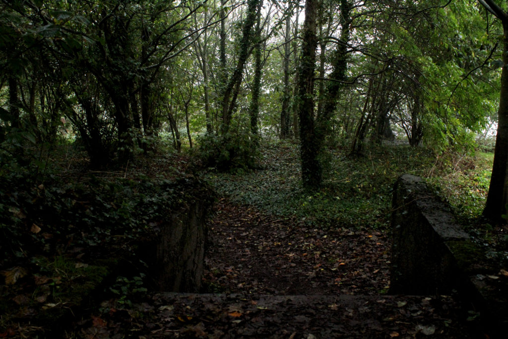
With this image, I wanted to increase the contrast between the completely natural and wild background and the straight lines of the concrete stairs in the foreground. Again, I increased the green hue and saturation of the image and I additionally adjusted the levels to change the darkness, specifically of the stairs and the tree trunks.
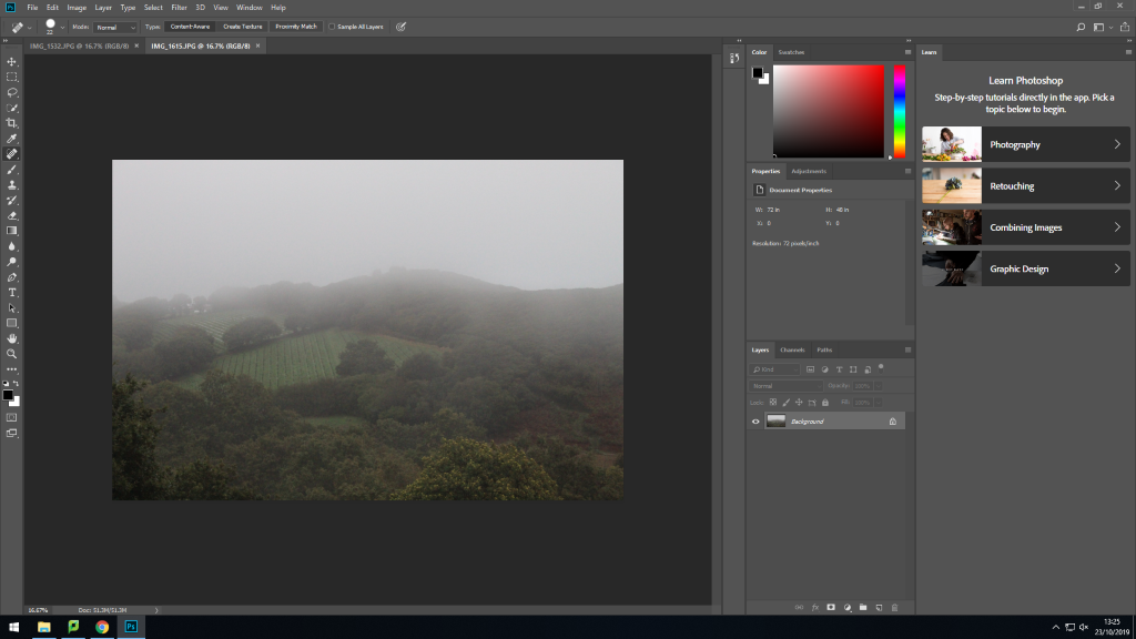
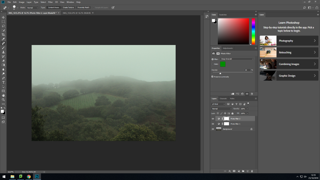
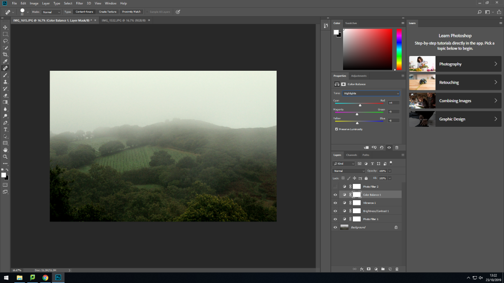
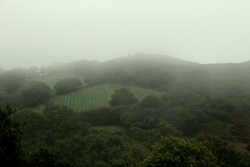
For this image I really liked the opposing lines in the two fields next to each other, I felt that it added texture to the image, along with the trees and the foggy and overcast sky. I really like the weather in this image as it added an air of mystery to the otherwise normal fields, and it provided a nice contrast against the constant green below, stopping it from becoming overwhelmingly green. I especially liked how the low clouds obscure the horizon line just a little bit in this image.
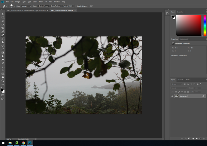
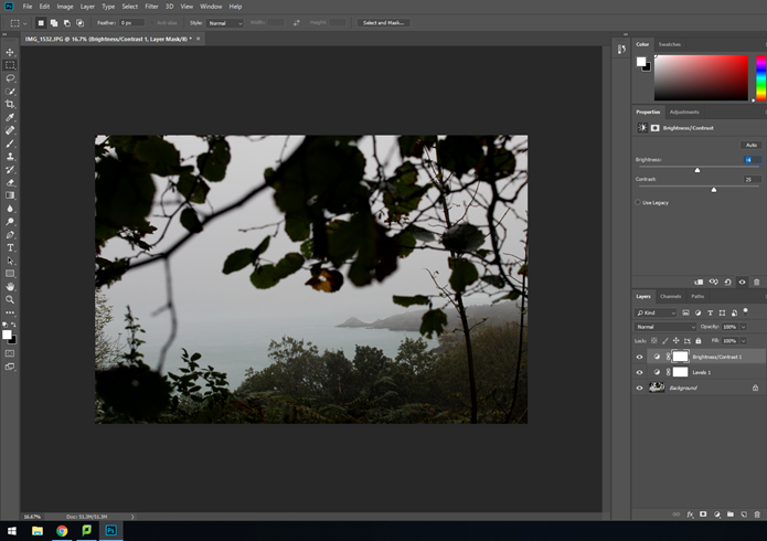
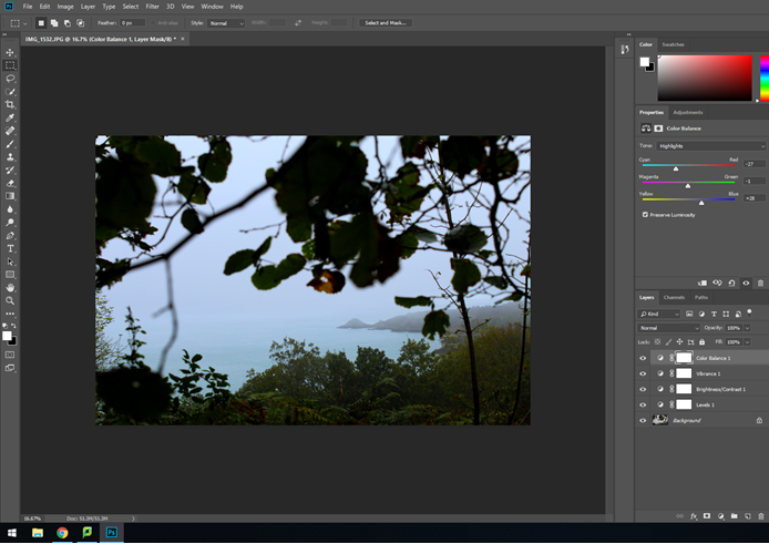
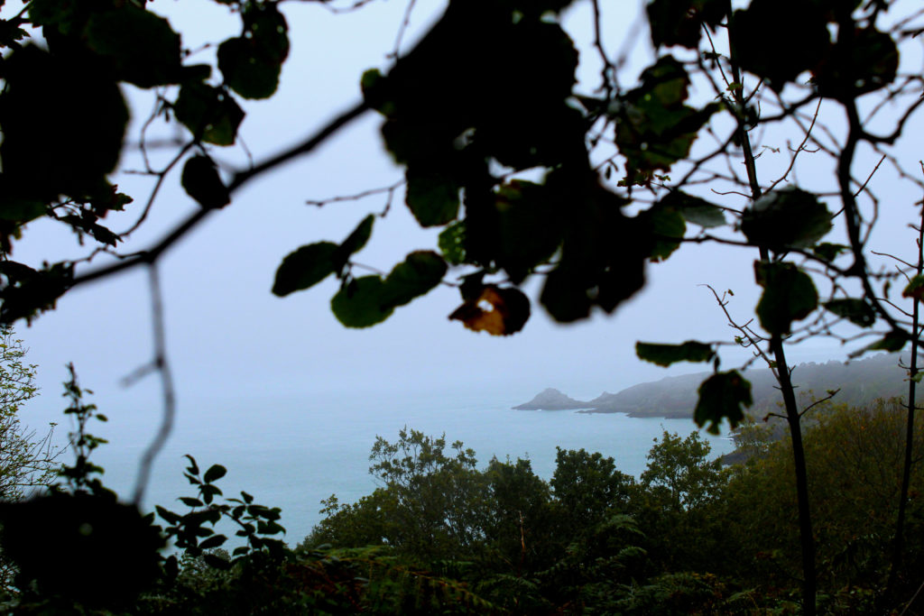
This image is one of my favourites on this shoot due to the out-of-focus leaves hanging down from above and obscuring the view slightly. I feel like this adds to the view that the camera lens is representing the human gaze , and adds interest to the image, which otherwise would have been mainly white and pale blue due to the overcast and foggy sky. When editing this image I increased the contrast between the dark bushes in the foreground and the clear and pale sky in the background, as well as making the bushes and the leaves above themselves darker, just enough to make the image seem moodier. I also increased the saturation of the greenery and the sea in the background.

