Urban landscapes: The new topographics

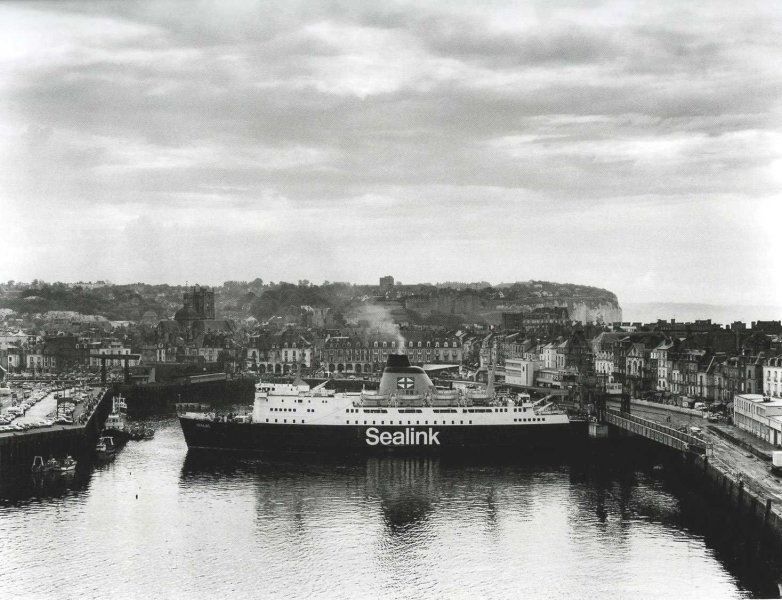
Urban landscape photography is a development from traditional landscape photography where, instead of focusing on a natural landscape with minimal human impact, the photographer captures images of a town or city, showcasing the maximum of human impact. This can be done either from within the city itself, as a cityscape, or as a bird’s eye view from above.

It can be black and white or in full colour, depending on the photographer’s choice. Here are some examples of some more modern urban landscape photography:

Image result for datar mission photography
Image result for mission photographique datar

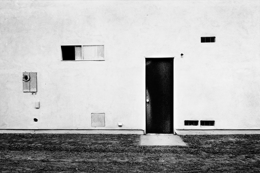
“New Topographics: Photographs of a Man-Altered Landscape” was an exhibition that used this new style of photography and completely altered the whole genre of landscape photography, not just in North America, but also in Europe and the rest of the world also. The show opened in 1975 in New York and remained open for the public to view until 1976.

It was curated by William Jenkins and featured the key photographers Robert Adams, Lewis Baltz, Nicholas Nixon, Frank Gohlke, Joe Deal, John Schott, Stephen Shore and Henry Wessel Jr. They photographed a series of images, normally of abandoned industrial buildings or town across the USA and Europe, with most photographers (except for Stephen Shore) shooting in black and white.

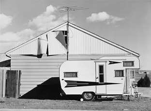
Examples from the New Topographics exhibition

They were attempting to find and showcase “the beauty in the banal”, how the modern landscape was rapidly changing and becoming more industrial and how this vast industrialization across the world contains its own type of beauty.

nicholas nixon

who is NICHOLAS NIXON and what does he do?

NICHOLAS NIXON was born in 1947, in Michigan. NIXON is known for his black and white photographs of cityscapes and portraits, trying to capture emotion, that can effect his viewers. He was influenced by 2 photographers called, EDWARD WESTON and WALKER EVANS, and worked with large-format cameras. NIXON was part of the group ‘the new topographics’, who photographed urban landscapes to display how industrial and manmade building have taken over the natural landscapes.

my favourite photographs from NICHOLAS NIXON

These photographs are my favourite, because I like how NIXON has captured repetition of the houses and how unnatural they look, compared to the free flowing elements that occur in nature. When I go to take photographs, I am definitely going to look at capturing this, and I think it looks impressive.

analysis of NICHOLAS NIXONS piece

technical

The lighting of this photo is natural, as NIXON has taken this photograph in the outdoors and has probably not used any additional lighting techniques. If you look closely, you can see how the natural light hits some of the cabins and illuminates some of the features, eg the windows. The lighting of photograph is flat, as it is quite plain. The tonal range is large, as there are very dark blacks and very light whites, and this links in with the contrast, in the sense that it is very strong.

visual

This piece was taken in black and white, and I find it makes the photograph look very effective and simple. The way that NIXON took this image means that the background, the mountain range, is viewed as being 2D, as it is flat and has no definition. Whereas the cabins are viewed as being 3D, as the edges are defined, some are illuminated, and some are shadowed. NIXON has captured this landscape very carefully, as he has thought about the composition. It is clever how the mountain range is free flowing and natural, and the cabins are angled and structured. NIXON has deliberately juxtaposed these 2 elements together to show how nature is controlled by industrial buildings, that mankind has created.

contextual and conceptual

This piece links to the era contextually, in which it was taken, in the sense that NIXON captured both a natural landscape and an urbanised and industrialised landscape in one photograph, which references the time of the industrial revolution. This is because during the industrial revolution natural scapes were industrialised by manmade buildings, which NIXON and the ‘new topographics‘ enjoyed to photograph to portray their thoughts on the enlightenment.

romanticism final outcomes and evaluation

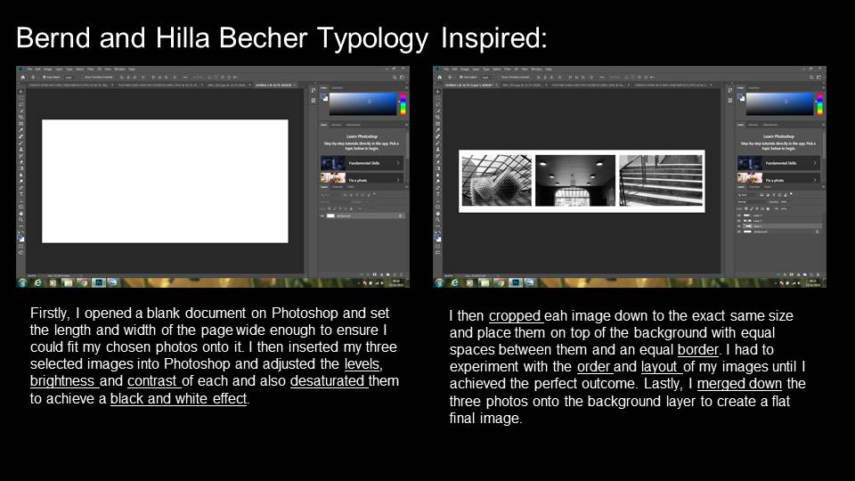
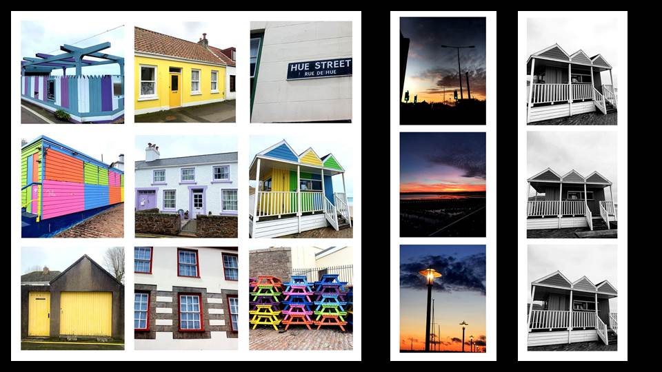
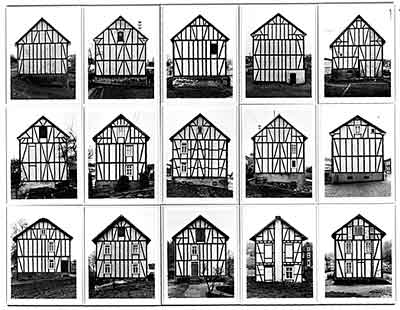
Below are my favourite outcomes from this shoot, either because they are personally eye-catching or they are directly inspired by the photographer I was inspired by, MINOR WHITE

outcome 1

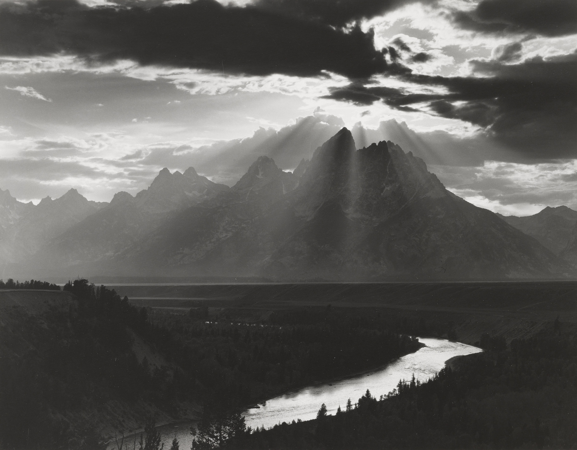
I have chosen this as one of my favourite outcomes because I feel it is directly inspired MINOR WHITE, in the sense I have tried to gain the same tonal range he has captured, meaning this photograph has intense blacks, bright white and every tone in between. I also feel it is similar to a photograph of WHITES, pictured below, as they both have a similar sky and the way light scatters is similar too.

Image result for minor white
MINOR WHITEs photograph that is similar to mine

outcome 2

I have chosen this as one of my favourite outcomes because I feel it closely relates to the theme of romanticism, in the sense that the landscape is idyllic and awe inspiring. I like how subtle the oranges are in the sky and the way the cloud sit and diagonally drag from left to right. The light sky then is balanced out by the dark sand, which I personally find very eye-catching. The bottom half of the image is linear, whereas the sky is more free flowing, which I find interesting too.

outcome 3

I have chosen this as one of my favourite outcomes because of the intense colours and the reflection on sand is very eye-catching. The cloud arrangement is particularly intricate, and it is interesting when the light hits the clouds too. I enjoy the dramatic darks and how they balance and contrast with the vibrant oranges and yellows.

evaluation

Overall I am happy with all of my photographs I have taken and all of my final outcomes, as they are what I imagined them to be. I am also impressed with my photographs that were inspired by MINOR WHITE, in the sense that I think his work is incredible and for my pieces to hold the dramatic mood, is what I was hoping for. If I were to do this shoot again, I think I would try to capture a few more elements and at few different angles, because then I would have vaster range of photographs.

The New Topographics

What is it?

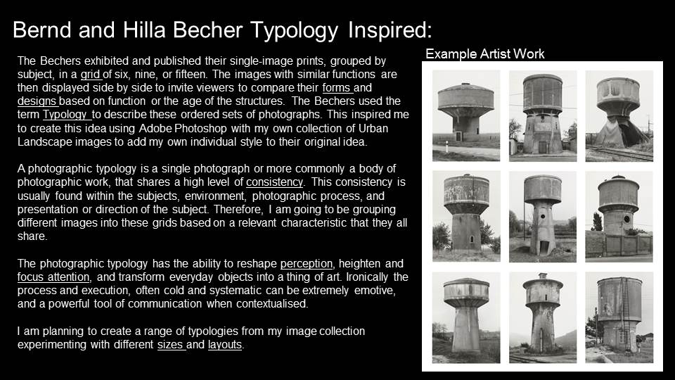
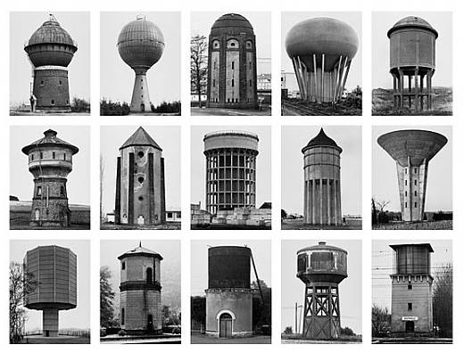
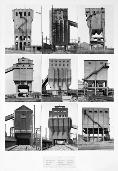
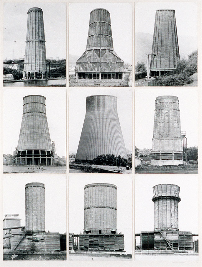
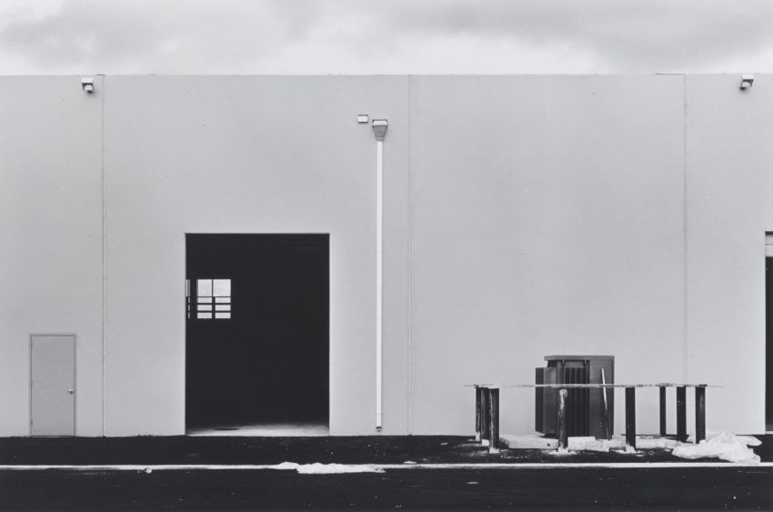
New topographics a term created by William Jenkins in 1975 to describe a group of American photographers (Robert Adams and Lewis Baltz for example) whose photos had a particular aesthetic, they were presented formally and they were mostly black and white prints of the urban landscape. Photographers liked the simplicity of the New Topographics, photographers such as Bernd and Hilla Becher. For more than 40 years they have been making pictures in a symmetrical and perfect way/manner. From the beginning, their work has been rejected by curators of photography for being ‘inartistic’. It made no difference to the Bechers as they never looked up to art photographers for inspiration. The New Topographic photographer tried to ex[press how that you cannot separate “nature” from humans.This means that no matter what humans create on top of the land or destroy on it, some sort of nature will be surrounding what is destroyed or created.

Key Artists

The Bechers (Typology)

Lewis Baltz

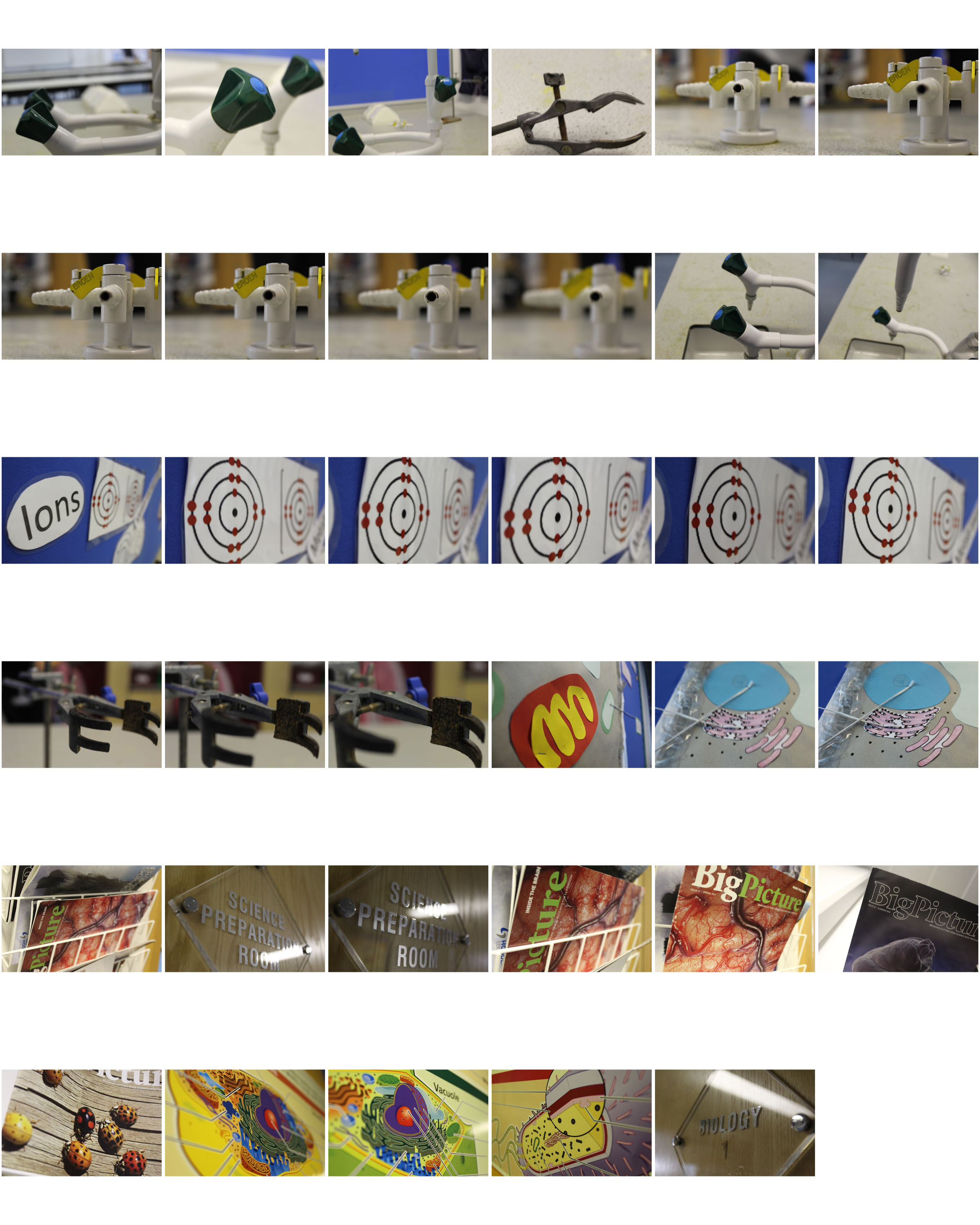
Science Aperture/Depth of Field

I like this photo as the aperture allowed me to focus and highlight the lettering on this gas tap, and blur out the nozzles and background
This is a simple aperture technique to focus on he center of the lens, with the text on the middle magazine highlighted
This is a similar depth of field as the last, with the nucleus form and strong label lines in focus and slowly losing focus into the further background
I chose this photo as the aperture allowed me to focus on the lettering, with the shine on the glass adding light to the image

Stephen Shore

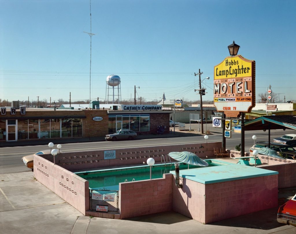
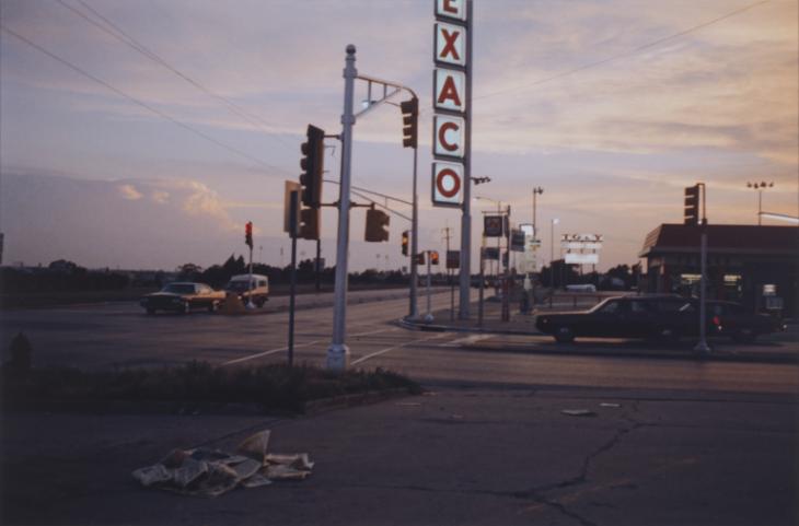
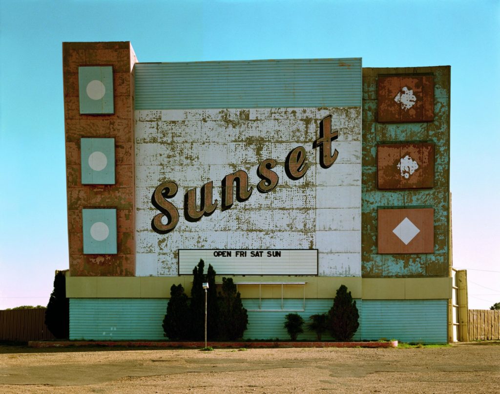
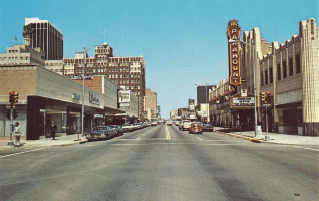
In 1973 Stephen Shore left New York to photograph USA to create a book called Uncommon Places. After his book he was in his mid-20s and was already famous. A dozen years earlier, he had sold some of his photographs to the Museum of Modern Art. Then he started spending time in Andy Warhol’s Factory, where he lighted shows for the Velvet Underground and started looking at Warhol’s general deadpan aesthetic, with its everyday things.

Photo Analysis

Technical

  • Lighting – the lighting is natural daylight and due to the clear sky the photo is highly exposed. The light sky contrasts with the darker signs and the saturation looks like it’s been increased due to the colour of the signs being so intense.
  • Aperture – the photo looks like it’s been sharpened.
  • ISO – the light sensitivity looks low due to the image looking sharp.
  • Shutter Speed – The photo seems to have some motion blue due to some moving objects, such as the car4 as it is moving too fast.
  • White Balance – The colour seems accurate on this photo but the colour stands out more and is more vibrant due to the dull looking roads and pavements.

Visual

  • Some of the colours look saturated and vibrant and there are mostly lighter looking tones, rather than dark, to make the image more visually awakening. There are mostly smoother looking textures when you first look at the photo but if you look closer you can see all of the details on the pavement.

Contextual/Conceptual

The red, white and blue colours are consistent in this photo because the colours are meant to represent America

KELD HELMER-PETERSEN

Image result for keld helmer

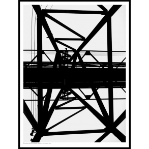
Helmer-Petersen was a Danish photographer. He got famous by his creative color photographs, he also published several books of black and white images that explore dramatic contrasts of tone. In some, only images that are black and white are presented. All mid tones have been removed. He created and found these images, using both cameras and flat bed scanners to achieve the effects he was looking for. These books are beautifully designed and encourage us to consider the space around the image and the accompanying text as integral to the meaning of the work.

Week 7 : Black Light / keld Helmer-Petersen

This week we will be focusing on selecting your best images from your first 2 x landscape photo-shoots and then enhancing, manipulating, printing and displaying your final images. Some of you will be adding to these this week.

Keld Helmer-Petersen was a Danish photographer who was inspired by Albert Renger-Patzsch, the experiments at The Bauhaus in Germany and by Harry Callahan and Aaron Siskind at the Art Institute of Chicago. He achieved fame for his colour photographs but he also published several books of black and white images that explore dramatic contrasts of tone. In some, we are only presented with images that are black and white. All mid tones have been removed. He created and found these images, using both cameras and flat bed scanners to achieve the effects he was looking for. These books are beautifully designed and encourage us to consider the space around the image and the accompanying text as integral to the meaning of the work.

Picture

Your task:

  • Create a blog post about Keld Helmer-Petersen
  • Include a selection of images relating to his work with high contrast black and white images (including the books he designed and which feature his work).
  • Choose a set of images from one of your URBAN PHOTO-SHOOTS
  • Edit them using the THRESHOLD TOOL in Adobe Photoshop as shown below…
  • Print the images A4 size to Printer : Photography
  • Share what you learned about how to create and manipulate the images for your outcomes and evaluate the final product. What worked well? What could have been even better?

Example

Edited images

Extension Task

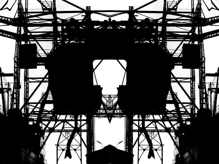
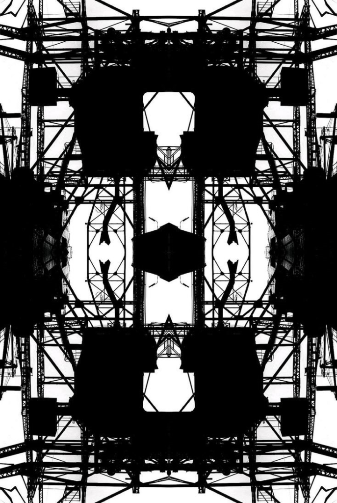
  • Multiply, flip and mirror your image to create a kaleidoscopic / abstract / symmetrical design…
  • Adobe Photoshop > open image > canvas size > double the width value > set anchor to the left > select the image using the marquee tool > click ctrl j > then click ctrl t whilst holding down the shift key > drag the image over to the right side of the canvas and position > click enter > use the cursor keys to line up your image and achieve symmetry > then go to LAYER > FLATTEN IMAGE
  • Repeat the process so that you mirror your design underneath your current image
  • Show your process…
Original image
Mirror image x 1
Mirror image x 4

Romanticism

Romanticism is an artistic and intellectual movement, which began in the late 18th and early 19th century Europe. It was a reaction against the realism of modern science. It is a strongly emotional and evocative artistic style, that shows vivid imagination.

Images in romanticism are quite often empty, avoiding life. However some photographers use humans and animals to tell the story. Sometimes it can include dark and stormy weather, with a foreboding spirit about it. The most important feature in a romantic landscape is the emotion that inspires the viewer.
A romantic photographer is someone who projects their inner being, emotions and experiences outward through the lens. Romanticism is about resonance, longing and evocation. Nature was a source of inspiration in the visual arts of the romantic movement. Romantic artists depicted nature to be beautiful, powerful and unpredictable.