
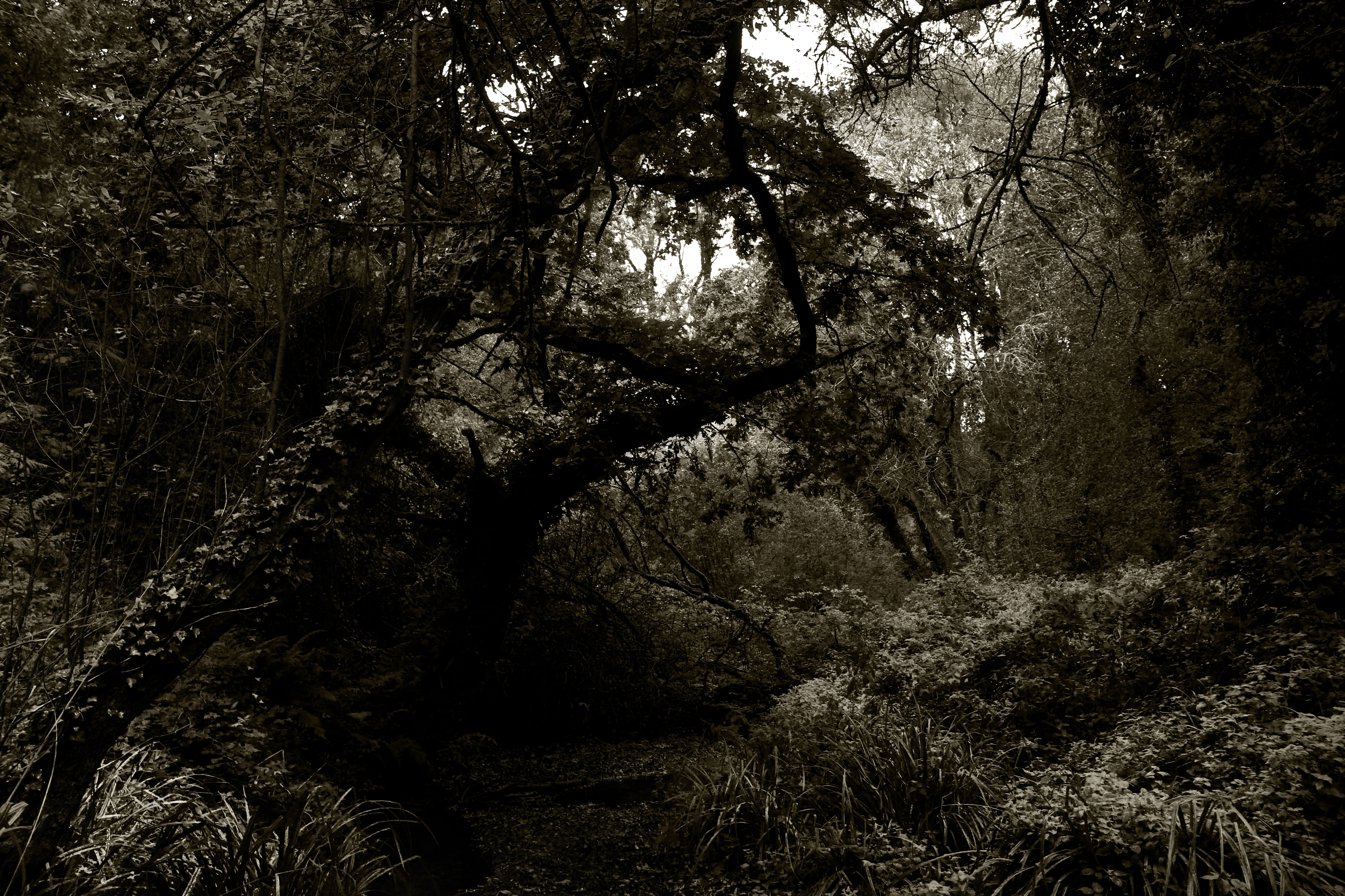

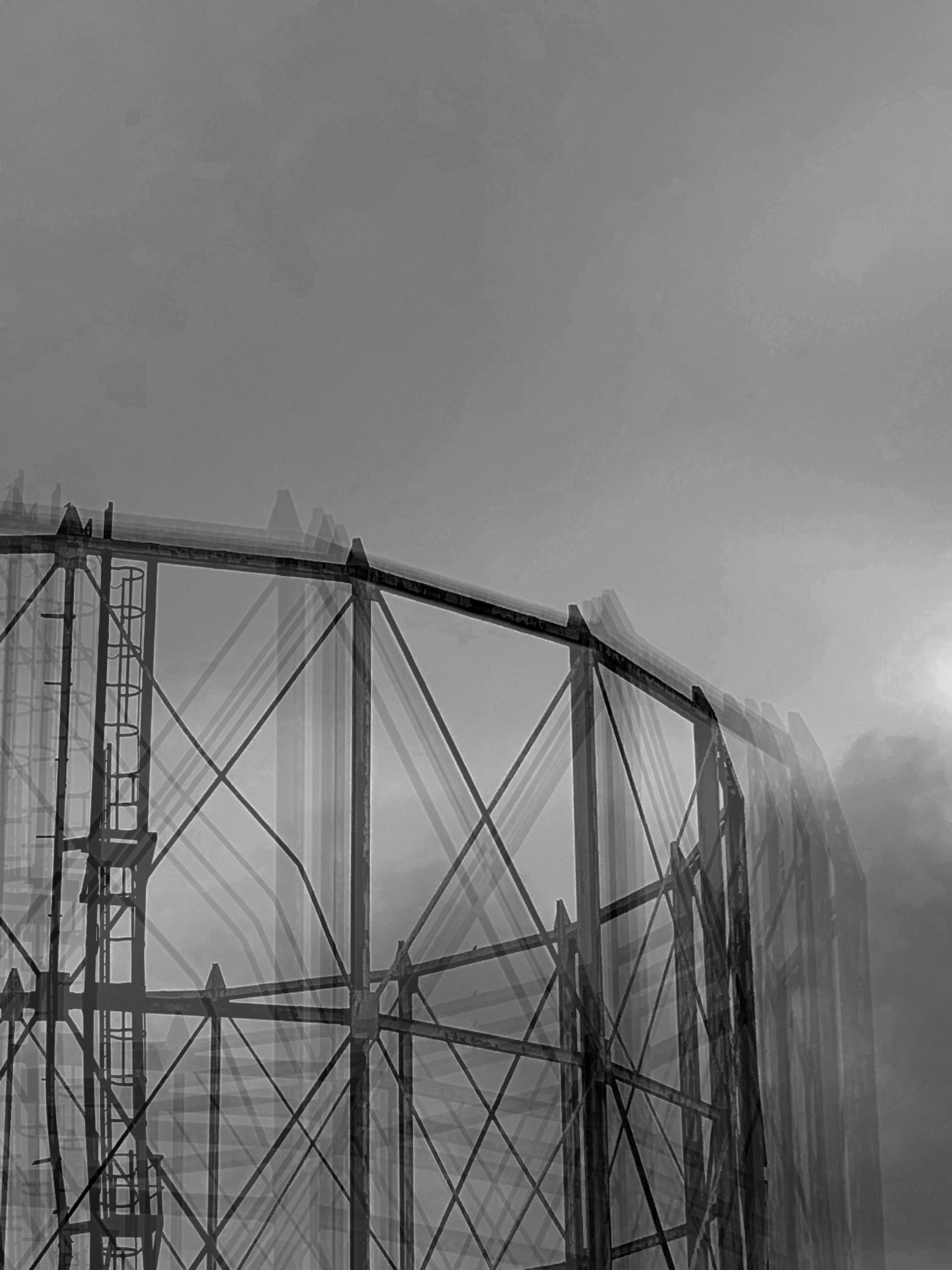


who is KELD HELMER-PETERSEN and what do they do?
KELD HELMER-PETERSEN is a Danish modern photographer, who captured city scapes, industrial buildings, and nature. They tended to photograph patterns and structures. HELMER-PETERSEN published books that held their creations, that were mostly abstract, which lack context.
my experiments
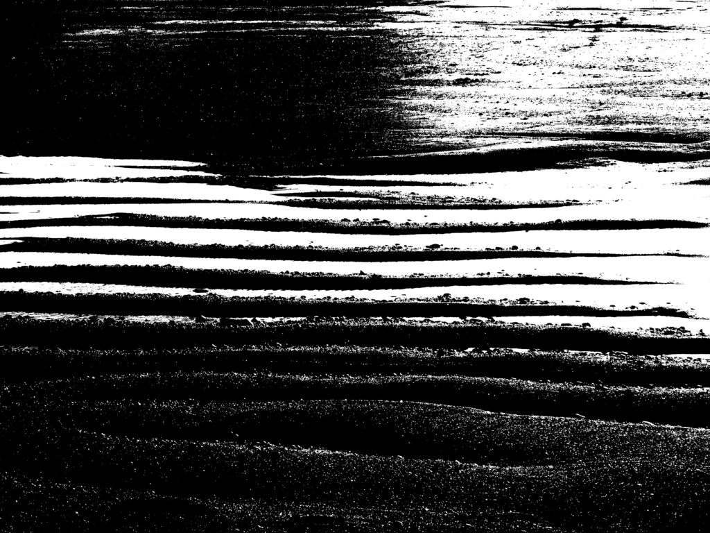
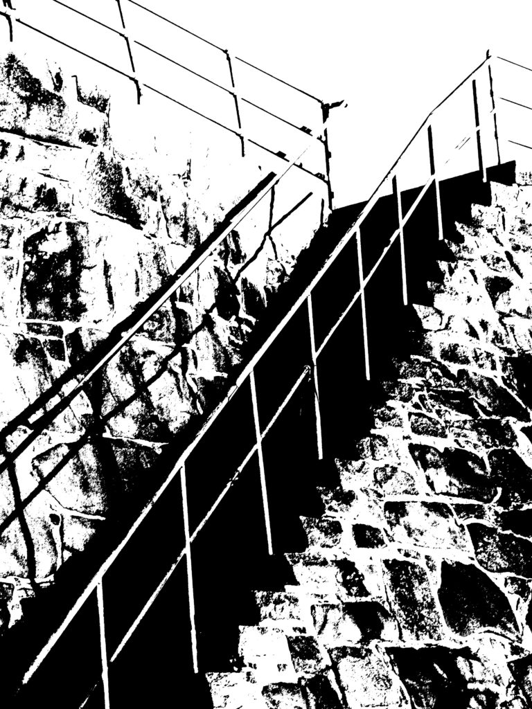
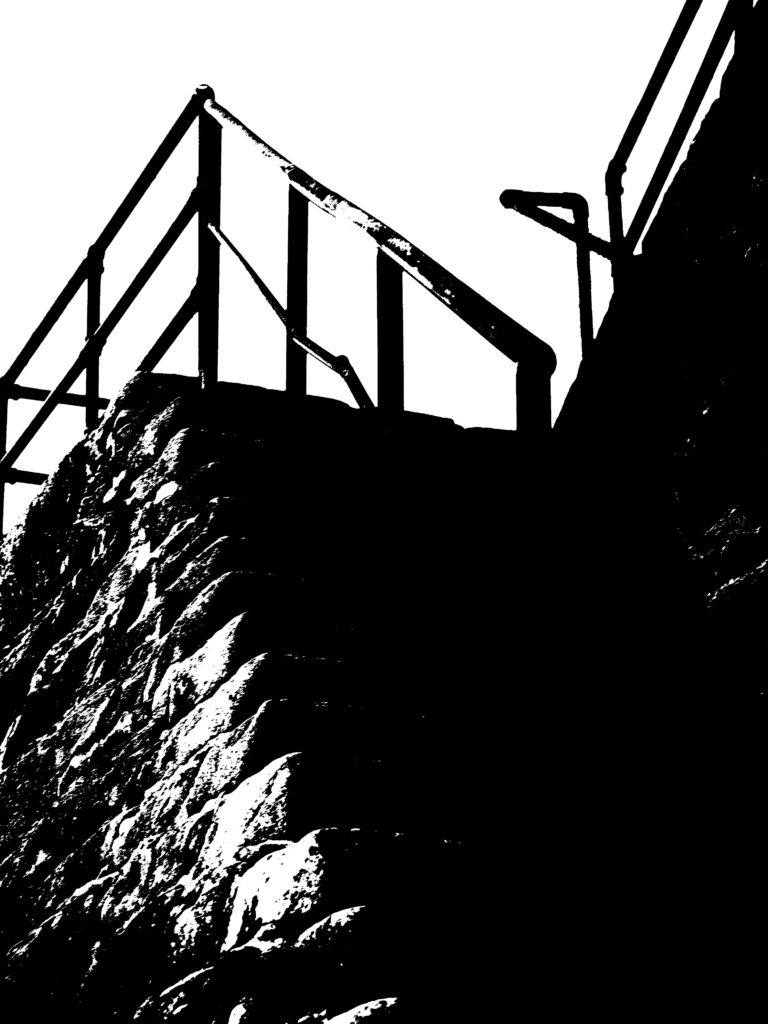
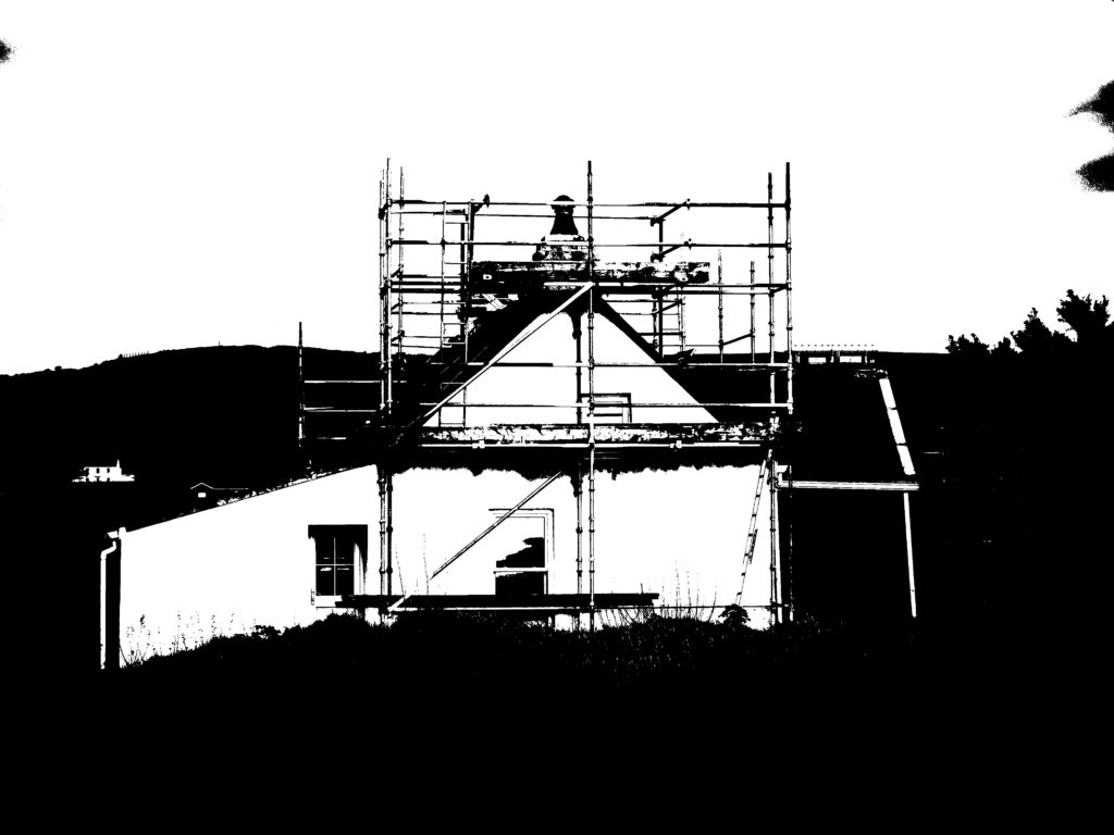
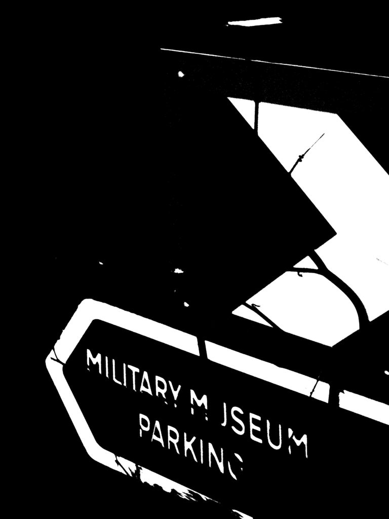

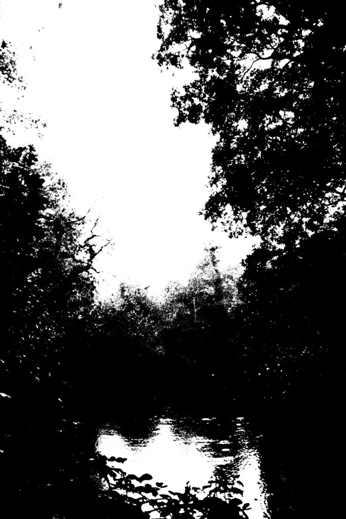
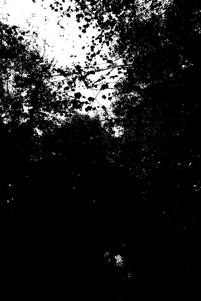
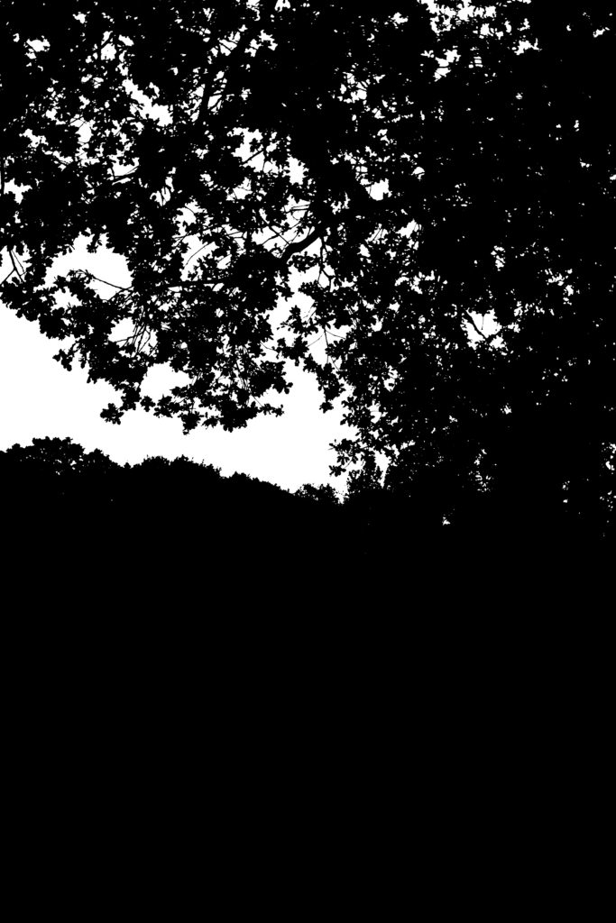

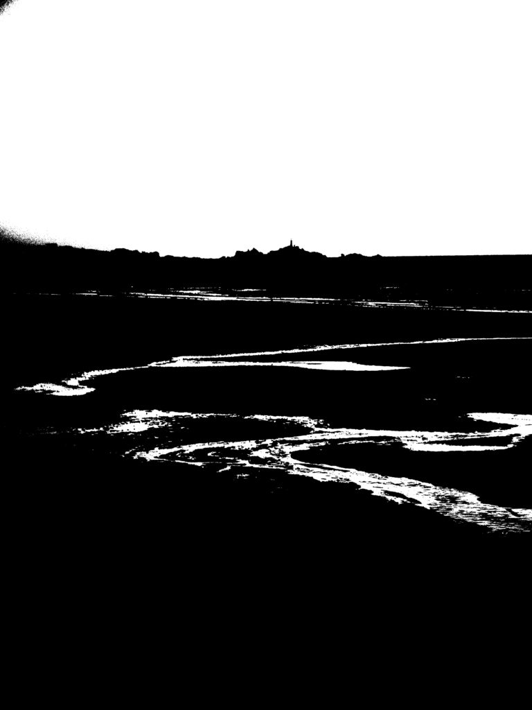
my favourite outcomes


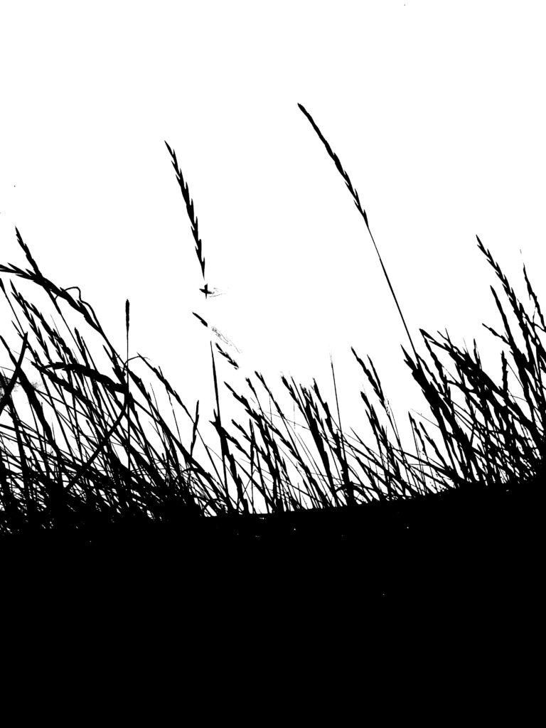
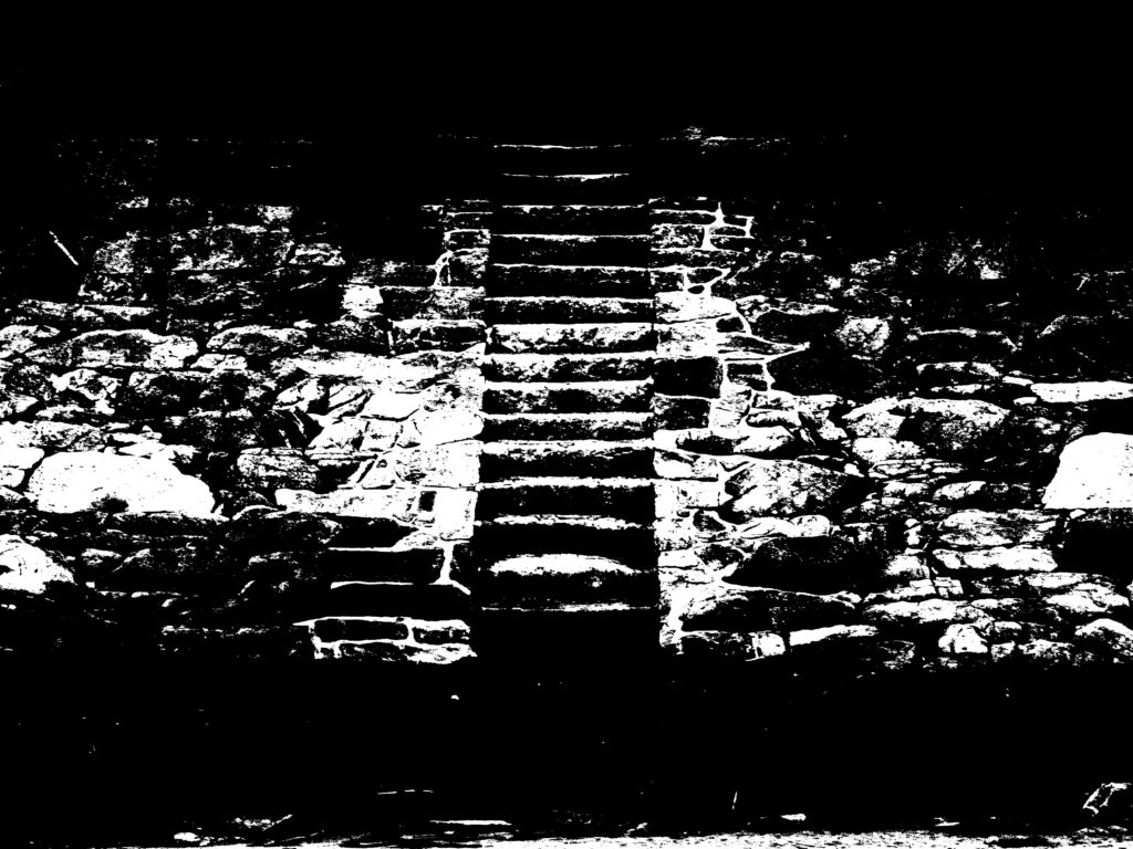
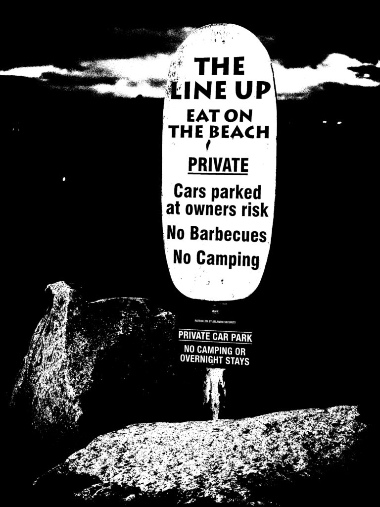
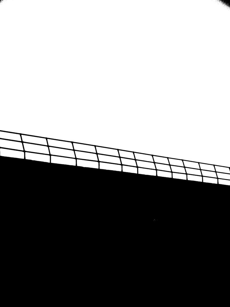
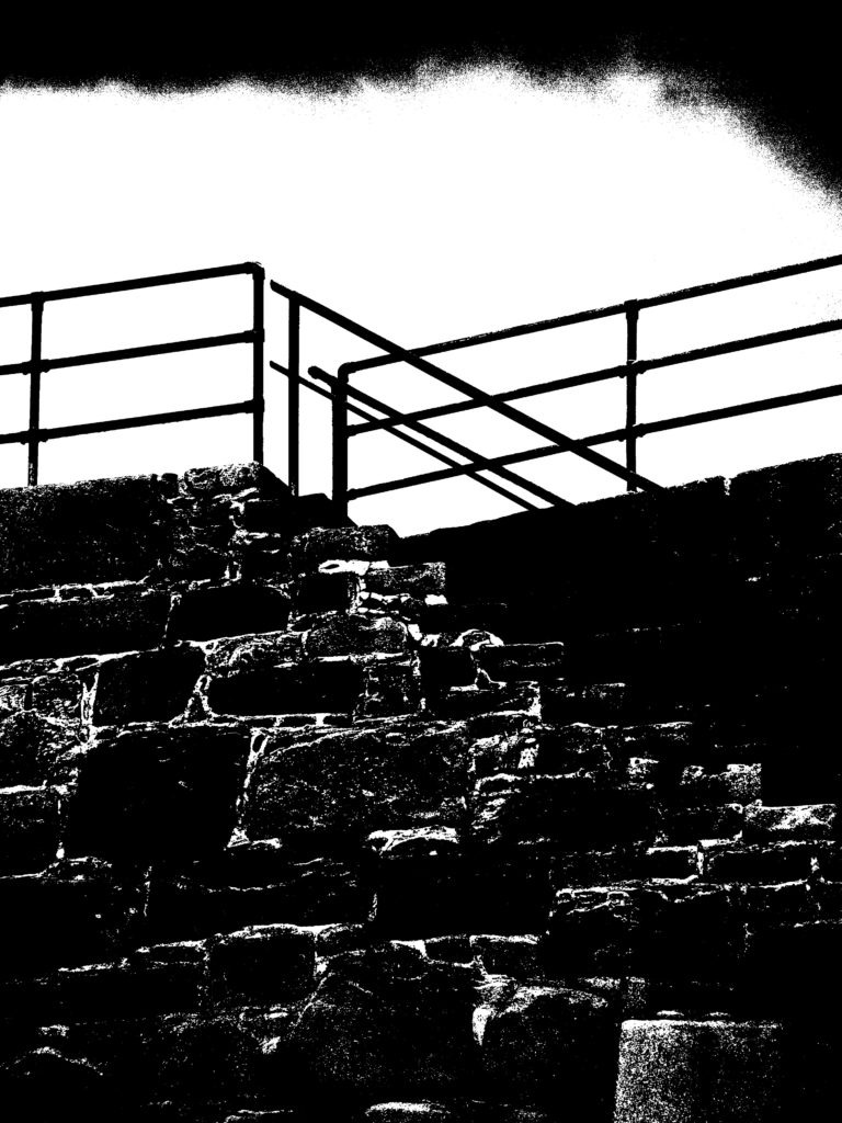
I picked these 4 as my favourite outcomes, because they are simple and easy to view. I like how minimalistic they are and outlines of really detailed photographs. I would definitely use this method in the future, as it is very easy to do and the outcomes are effective and impressive.
what are altered landscapes?
Altered landscapes are photographs of landscapes that are digitally or physically altered to create an entirely different photograph, that has a new intention and way of being interpreted. These photographs may end up becoming more abstract and modern looking, than the traditional landscape photography.
examples of altered landscapes
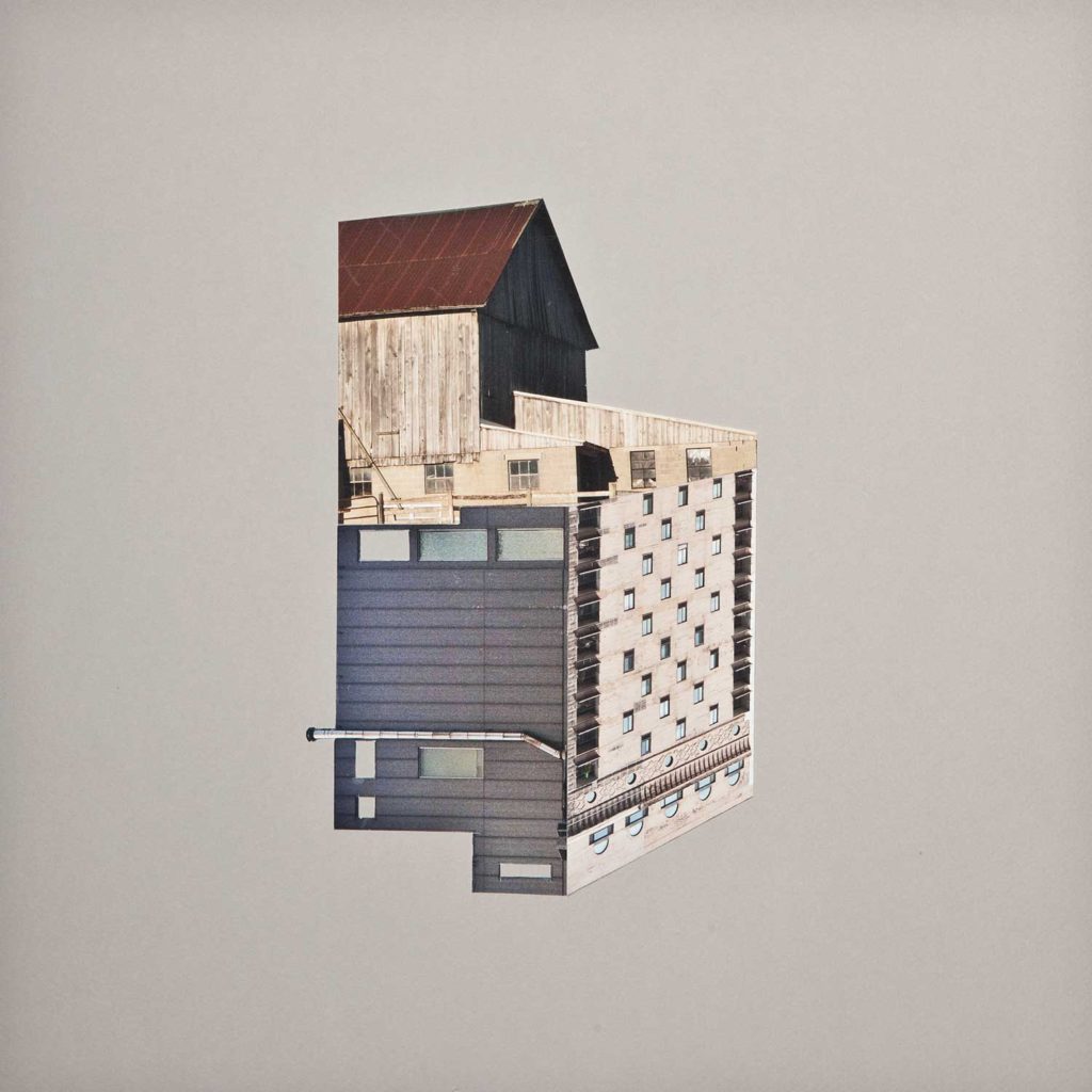
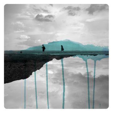
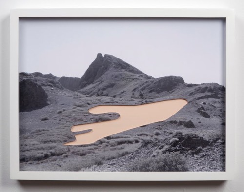


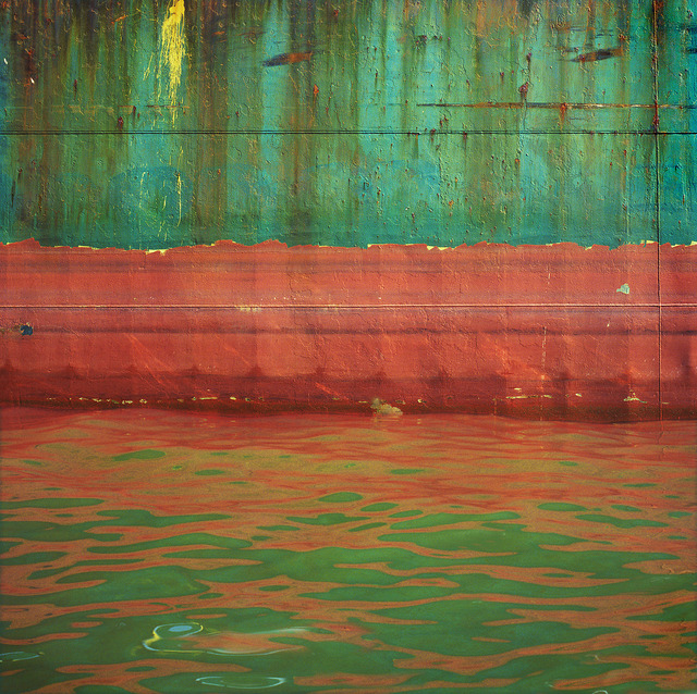
I have decided to look closer at the photographer, MICAH DANGES, as I like how they remove a part of the photograph, and replace it with a colour. I think it looks very effective and allows the viewer to use their imagination, as to what was in the area previously.
examples of MICAH DANGES work


my experiments, using MICAH DANGES techniques

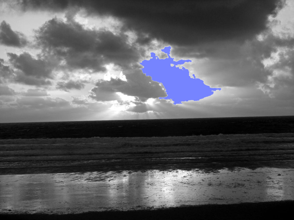
With this experiment, I used the magnetic lasso tool, which meant I could cut out an exact portion of my photograph, and fill it with a colour of choice. However I didn’t think this looked similar to what DANGES did, so I decided to try something different on the next experiment.
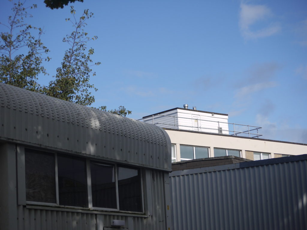

With this experiment, I just used the standard lasso tool, to remove a section of my photograph, and replace it with a colour, and similarly with my other experiment, I didn’t feel it was directly inspired by DANGES, as the coloured part didn’t relate to the photograph.
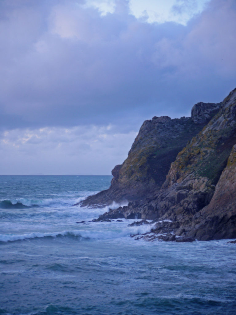
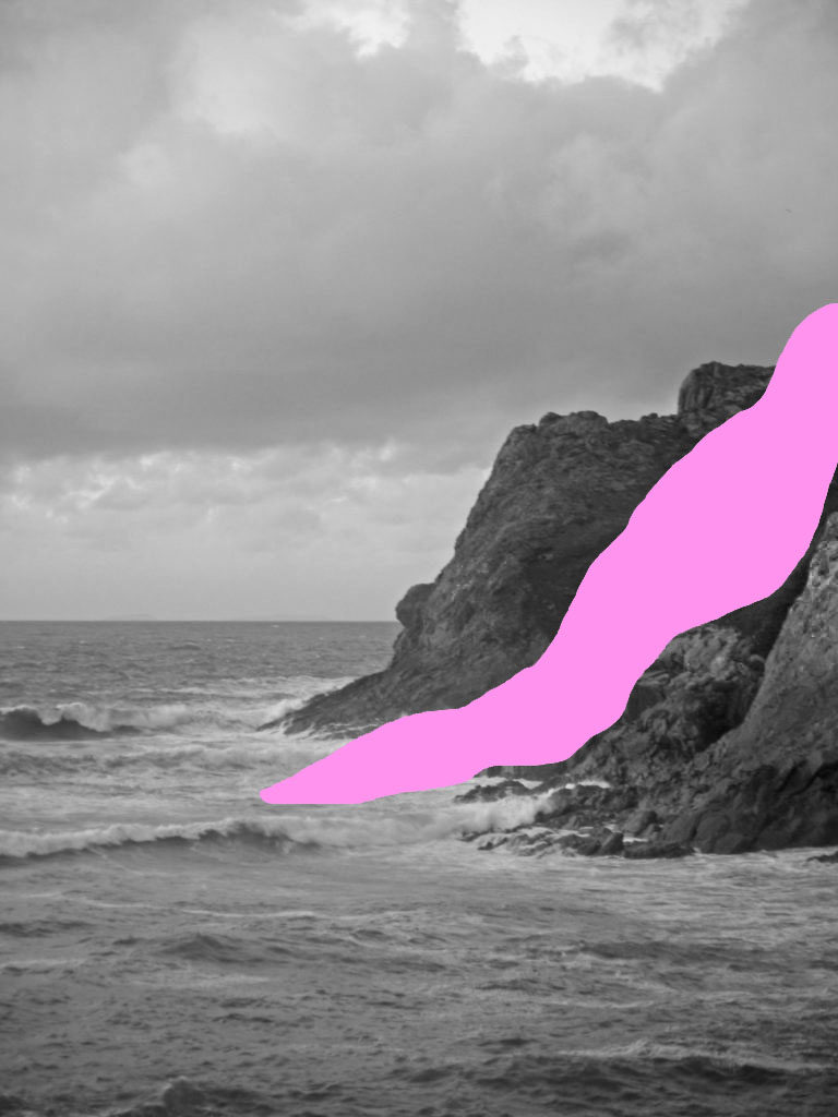
With this experiment, I decided to remove and replace a portion of the rock face, which I think worked particularly well, as the viewer has to work out and interpret what I have removed. I also think the colour that I have used complements the photograph too, and juxtaposes with the rough sea.
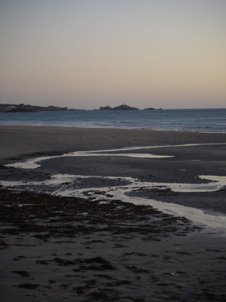
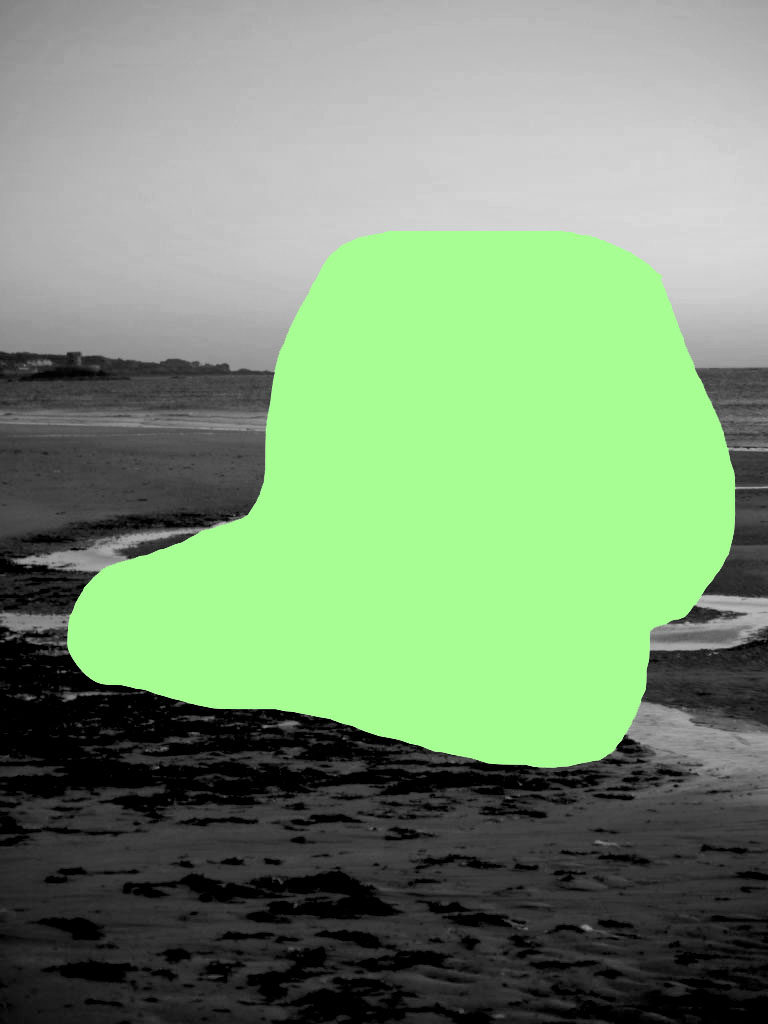
In this experiment, I used the lasso tool again, as I liked the freedom it gave me to remove a certain part of the photograph. I removed this area, because the viewer could interpret it any way, as anything could be behind the green area, which makes it quite interesting.

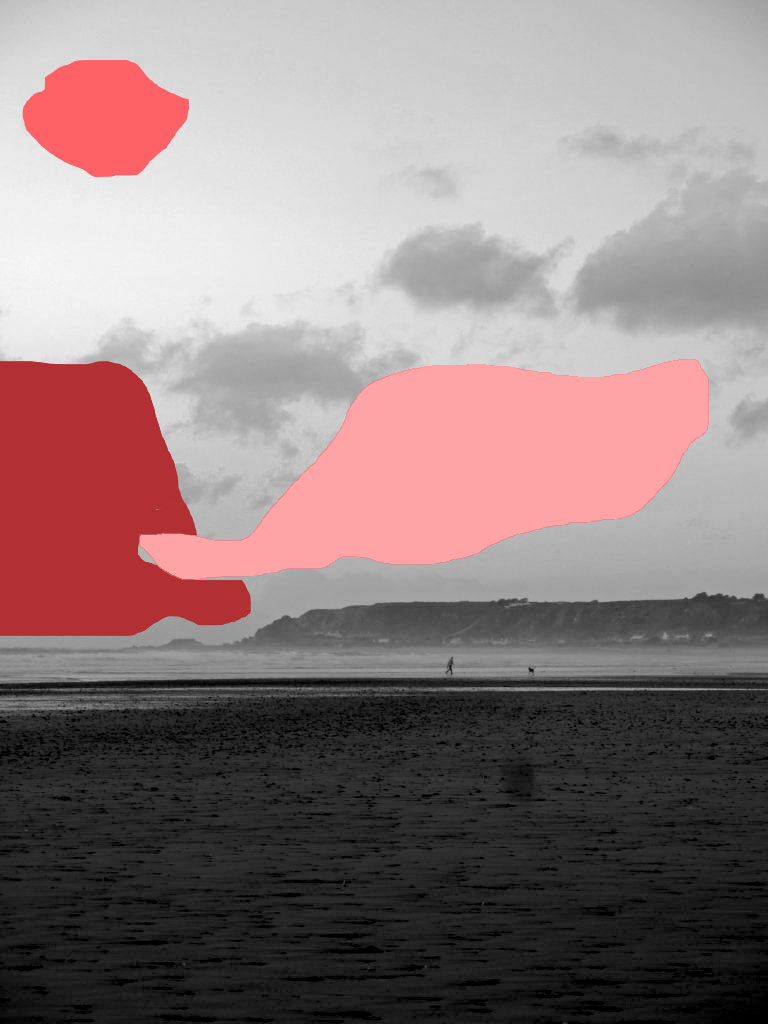
For this experiment, I tried out removing more than one area, however I don’t really like the outcome, as I think it looks more abstract with only one area removed. Because of this I decided to retry this experiment again.

For this experiment, I removed the area where the man and the dog were, and I like how it has turned out. This is because it could be interpreted that there is a figure in the foreground, or other objects, which would lead the viewer imagining what the object is, and why it has been covered. This is my favourite experiment outcome, because it is exactly what I imagined my outcomes to look like.
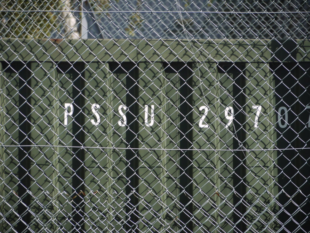
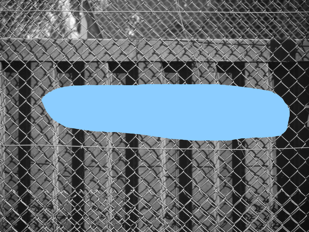
In this experiment I removed the letters with lasso tool, but I didn’t really like how it turned out. I also don’t think I would use urban landscape photographs in this experiment, as it doesn’t really fit what I am trying to achieve.
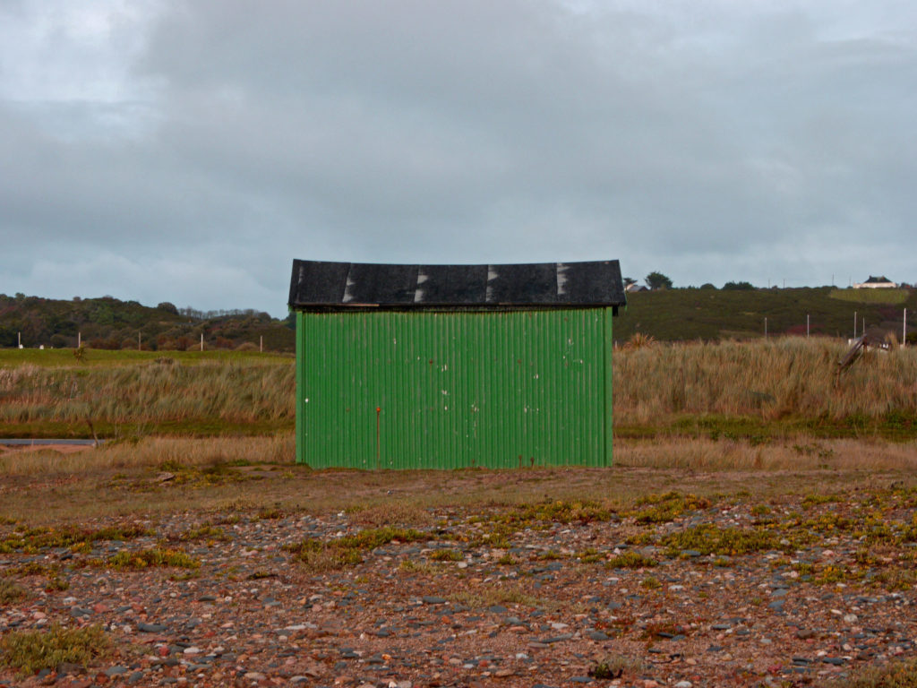

For this experiment, I tried to remove two parts of the photograph. I think it turned out better than my other outcome, where I removed multiple sections. This is because these parts look as if they are covering people or objects, which don’t want to be in the photograph, however the viewer could interpret in any way they could.

In this experiment, I decided to remove the shed, as I thought it would be interesting to cover the focus of the photograph, to allow the viewer to use their imagination and decide what the focus was themselves, whether it be a house, a car or a person.
Overall, I am impressed with my outcomes as they bring a totally different intention to all my photographs and allow them to be viewed in a different way, than they were previously.
PLAN-
Locations: building sites, back streets, look for debris on floor and litter, puddles/reflective surfaces
Lighting: either dark and moody, or at sunset so the light is saturated. Maybe at night? Streetlamps?
Techniques: play w/ depth of field and focus, exposure for dramatic lighting changes, high/low saturation of colour
Concept: show dereliction/abandonment of industrial zones, how people interact w/ them (or don’t), some images of St Helier from above to show a bird’s eye perspective and how little meaning it all has.

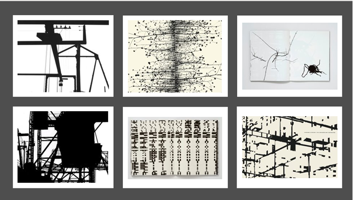
VISUAL: The colours within the images that Helmer creates are not diverse but in fact literally just black and white which creates a somewhat intriguing image since the objects in the photographs appear as silhouettes; making them hard to identify. There are also dramatic differences in tone as mentioned before, between the black and white which makes it strikingly aesthetic. The texture within these images are very flat and not grainy at all, which almost makes the photograph look animated and completely edited; not as if it had come from real life. The image is also not 3 dimensional but 2 dimensional since this image was created using a flatbed scanner. There seem to be patterns within Helmer’s work. There is always a certain type of aesthetic that Helmer goes for which is basically patterns of sometimes indistinguishable lines. There is no specific layout for his images, and I feel this is done purposefully in order to create a mysterious photo.
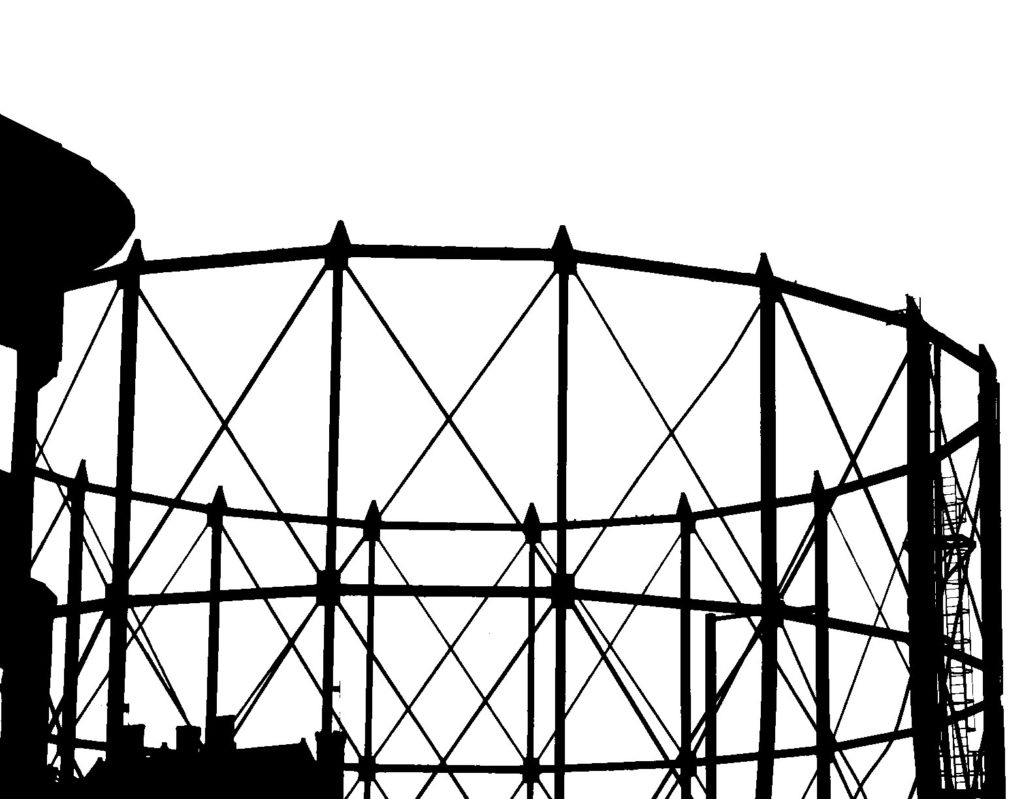
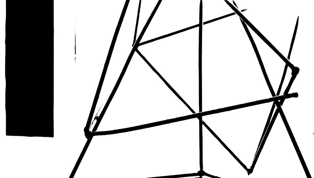
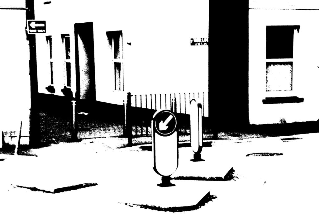
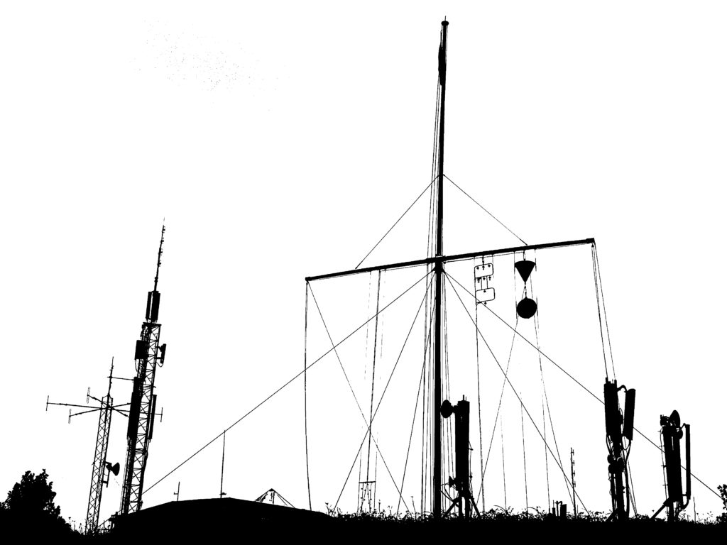
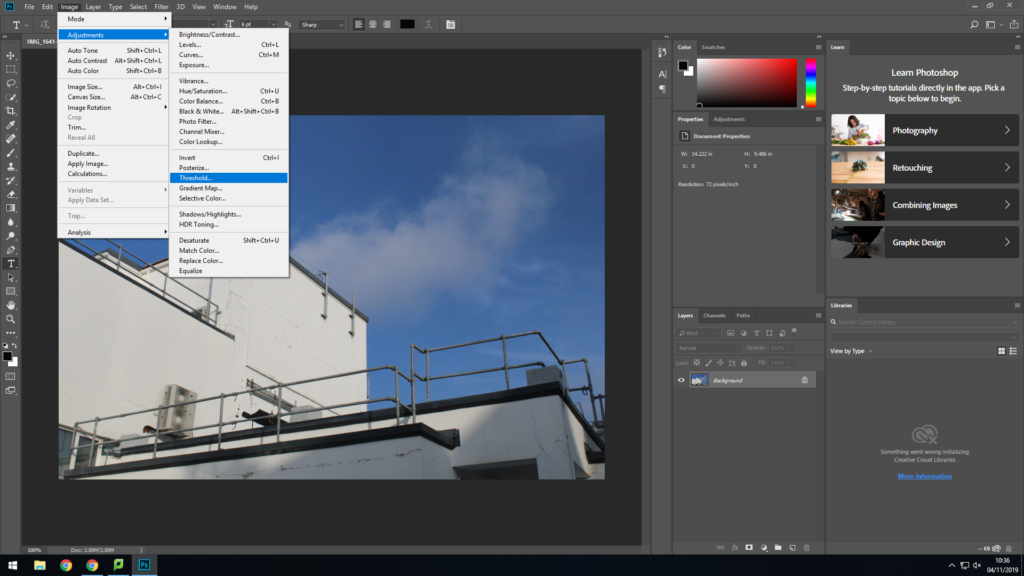
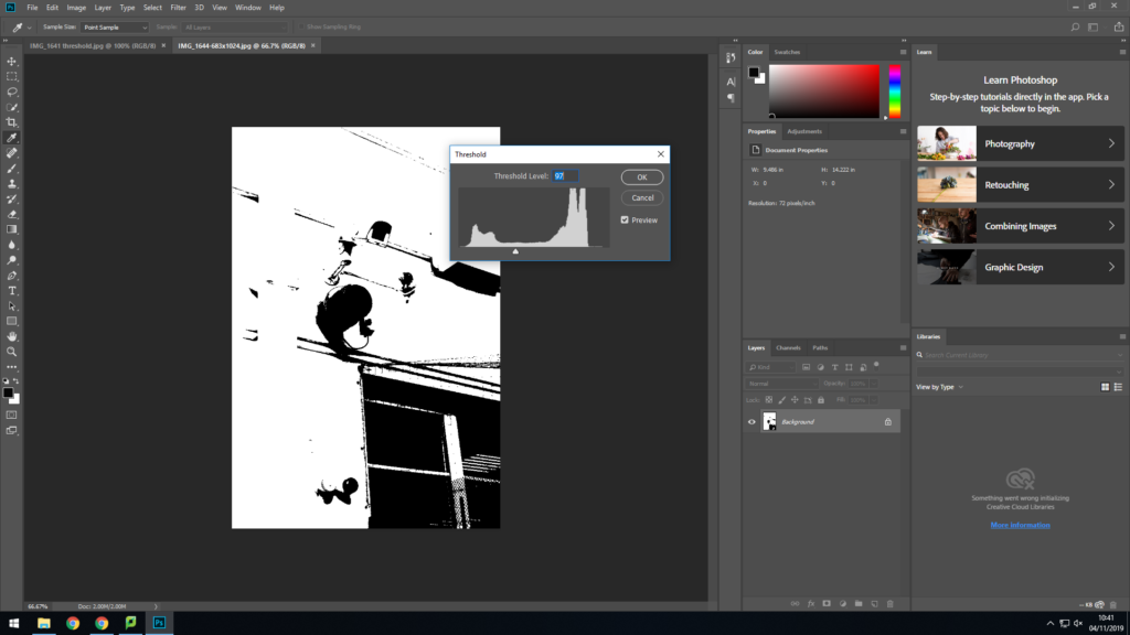
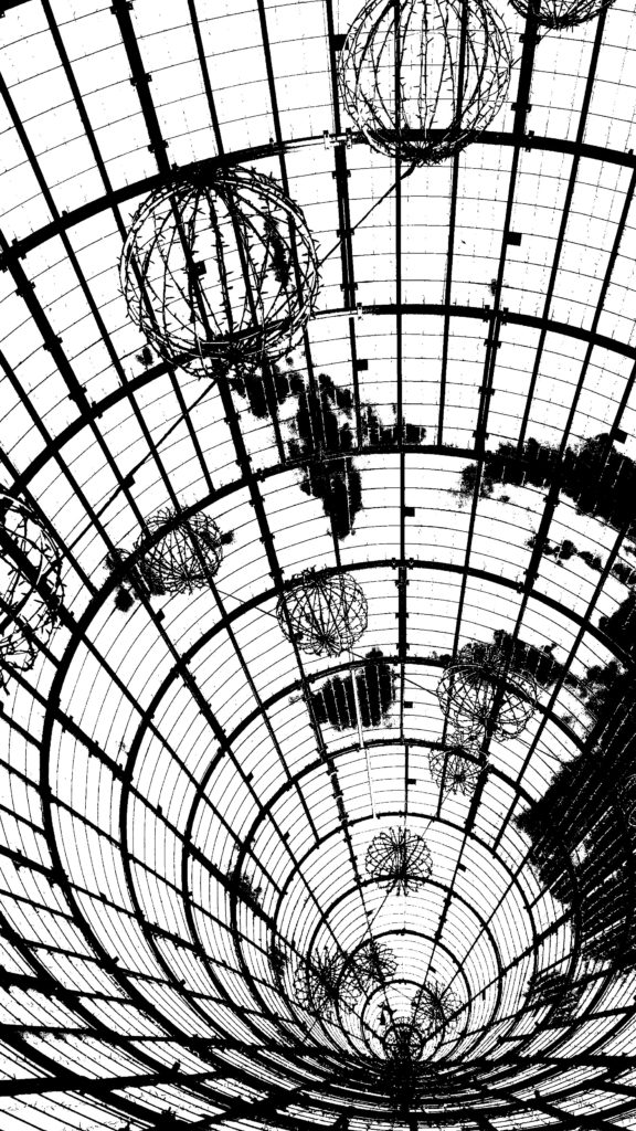
To create these images I took some urban landscape images that I thought would look aesthetically pleasing in the style of black light and also images that I thought matched Helmer-Peterson’s aesthetic. To edit these images, I went to photoshop, opened my image. Then, I went to image > adjustments > threshold. The threshold ‘meter’ then popped up onto the screen and then I moved it to where I found suitable. This was a fairly easy yet effective process.
YOUR FINAL BLOG POST(s) SHOULD CLEARLY SHOW 3-5 POSSIBLE FINAL OUTCOMES, INCLUDING YOUR PRESENTATION METHOD AND AN EVALUATION
We will demonstrate how to measure, cut and combine window mounts, but you should explore other possibilities too…
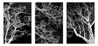
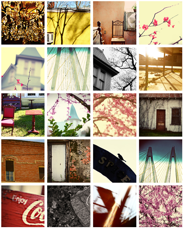
Research and explore alternative approaches to presenting your final images. This should be an integral part of your concept…not a gimmick…ultimately, the quality of your photography will be the primary focus and your mark will reflect this…


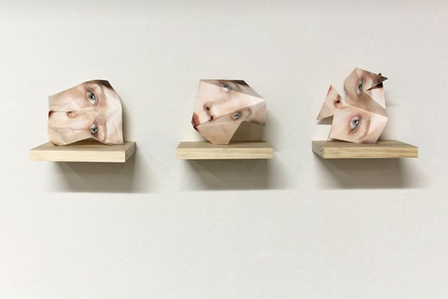





Print Deadline : Friday 25th October
Find the folder : M:\Departments\Photography\Students\Image Transfer\PRINTING
The four assessment objectives clearly outline expectations, so you must provide high quality evidence for each AO…
AO1 : Develop ideas through sustained and focused investigations, informed by contextual sources, demonstrating analytical and critical understanding
AO2 : Explore and select appropriate resources, media, techniques and processes, reviewing and refining ideas as work develops
AO3 : Recording ideas (taking photos) that are relevant to intentions, reflecting critically on work as it progresses
AO4 : Present a personal and meaningful response(s) that realises intentions, and makes connections with other artists
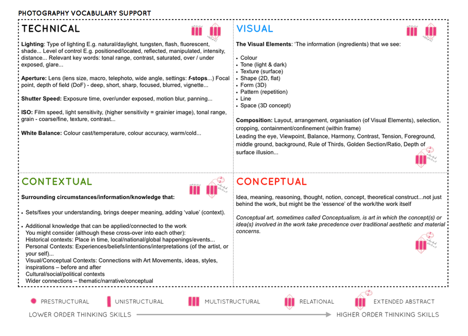
Ensure your process looks like this…
Helmer-Petersen was a Danish photographer who achieved widespread recognition in the 1940s and 1950s for his abstract colour photographs. However he also experimented with black and white photography, creating striking images. Some of them were extremely abstract, having been produced by removing the middle tones, leaving only the shape of what was photographed.
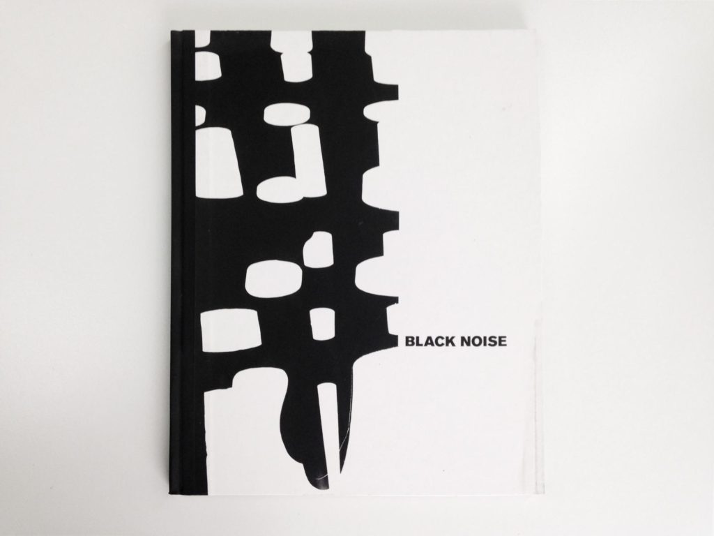
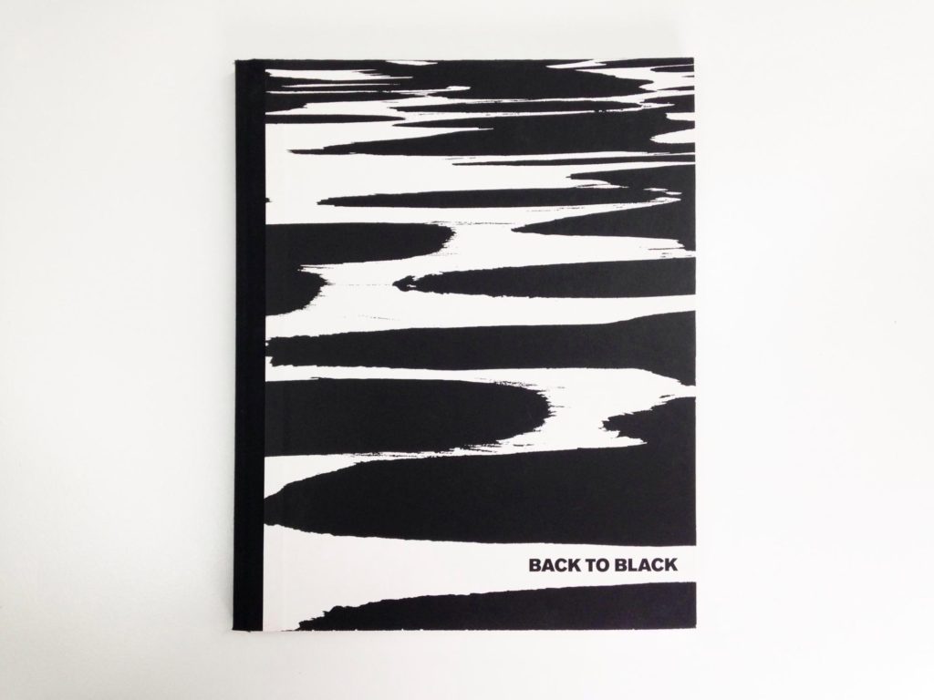
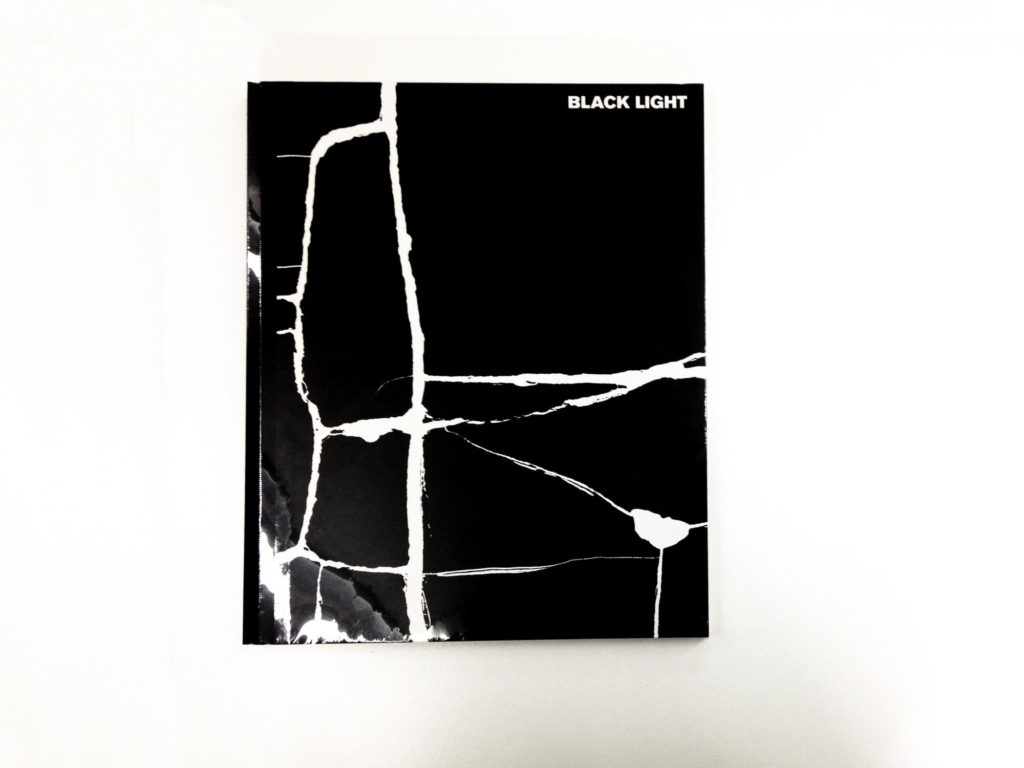
He released a series of books throughout the years including these black and white, dramatically toned images including (in order):
Experimenting in photoshop:
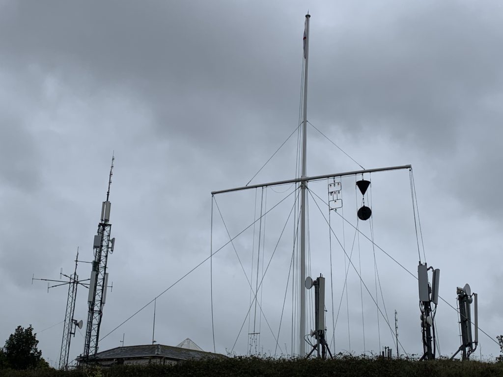
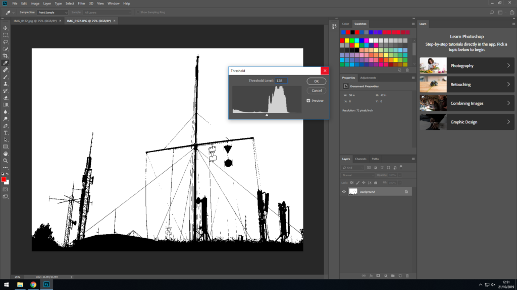
Using the threshold tool in Photoshop allowed me to create an contrasted image similar to that of Helmer-Peterson’s.
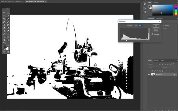
I experimented with other images, however the density of each image affected the threshold tool significantly, making the image much more abstract and difficult to comprehend, (as seen below):
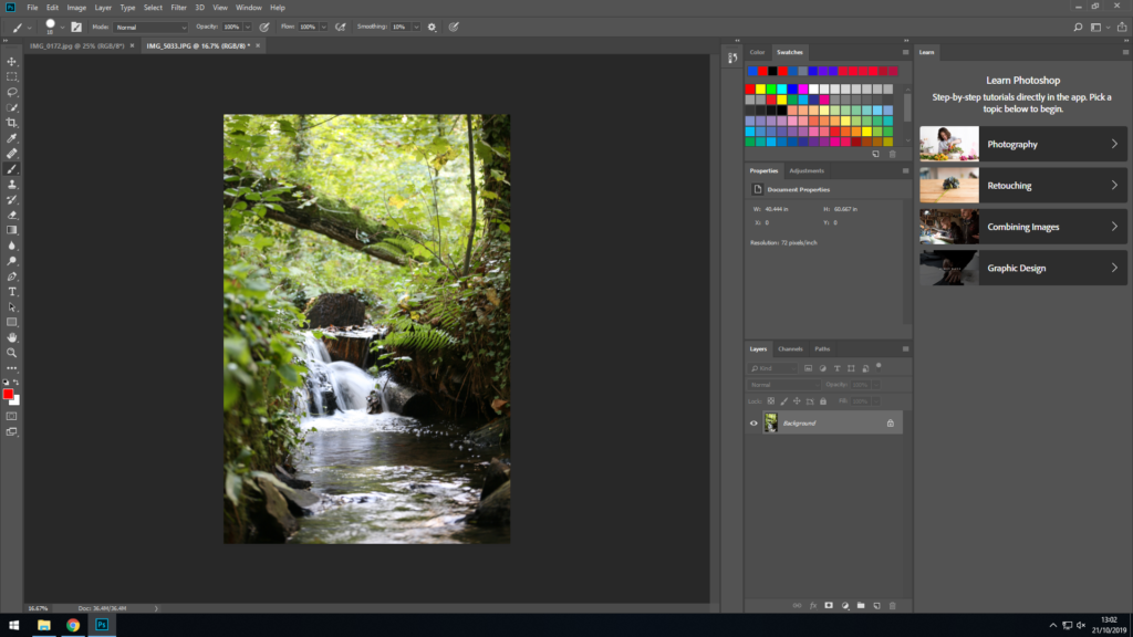
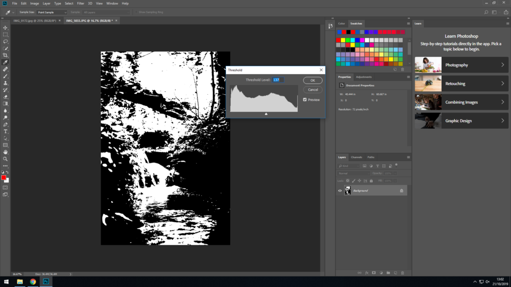
Natural aspects, such as dense trees and leaves also made the process difficult, hence why natural landscapes didn’t create the right result I was looking for during the experimentation process.
Final image chosen:
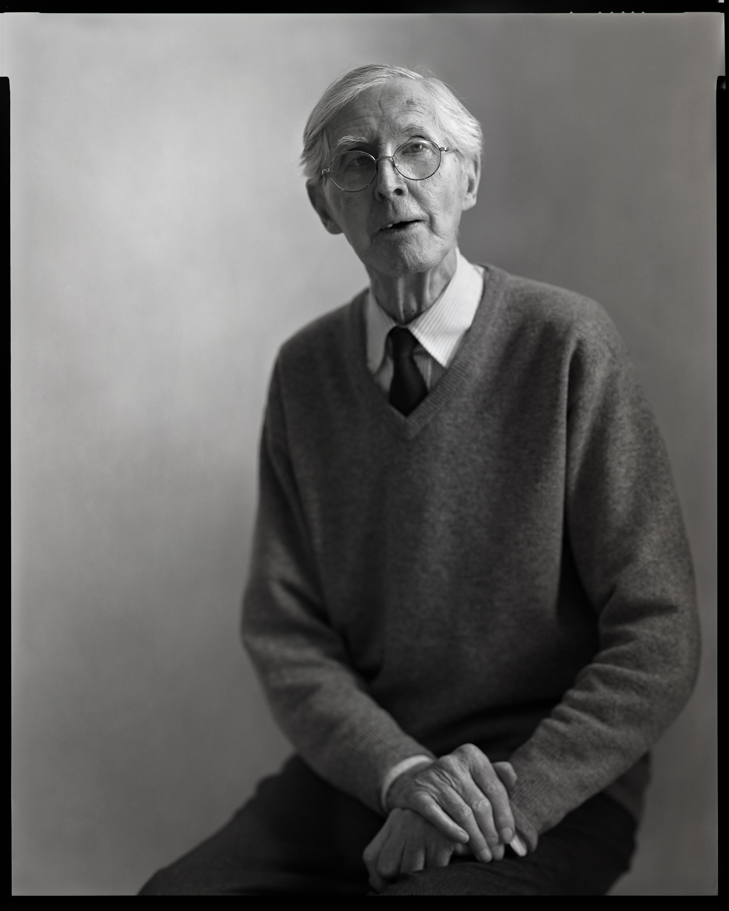
Keld Helmer-Petersen (1920-2013) was a Danish photographer who became internationally known and recognised for his abstract black and white photography. He grew up in Copenhagen and began his career in photography in 1938, later experimenting with the contrast in industrial areas and architectural constructions that he later became acclaimed for. He was inspired by both German and American Modernist photography of the time, both of which saw architecture as a structural device and the camera lens as a way of capturing the rapid changes in society.


His most well-known images and the style that he is credited for uses a very high contrast to remove any of the mid tones and transform the image to become almost unidentifiable as the object or scene that it captured. His images most often use strong lines and bold shapes to make for an interesting photograph, and for the most part, they were taken in highly industrial zones in urbanised cities.
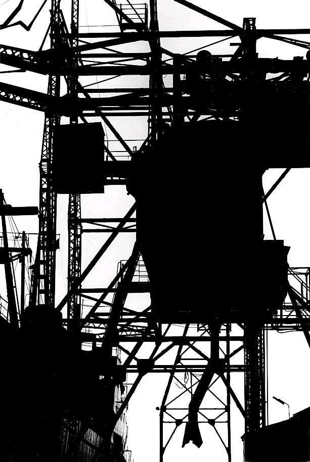
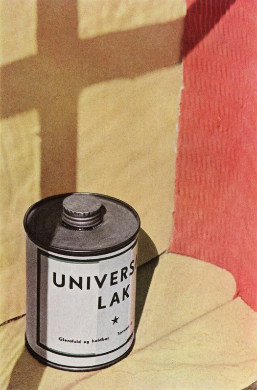
He first made his name in photography with his book 122 Colour Photographs in 1948, then went on to publish more, Frameworks: Photographs, 1950-1990 and Keld Helmer-Petersen: Photographs 1941-1995. Whilst he was very well known for his later black and white photgraphs, he actually began to achieve fame through the colour images in his first book, which stayed with the same themes of urbanism, minimalism and the modern world, but often focused more on specific details of normal objects than the iconic high contrast images he produced later.
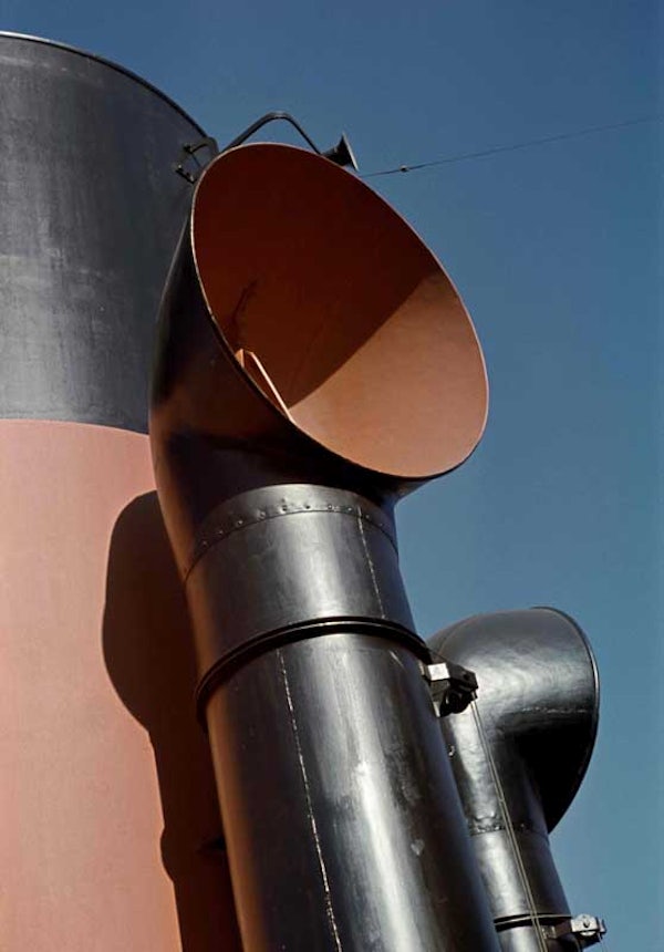

OWN IMAGES:
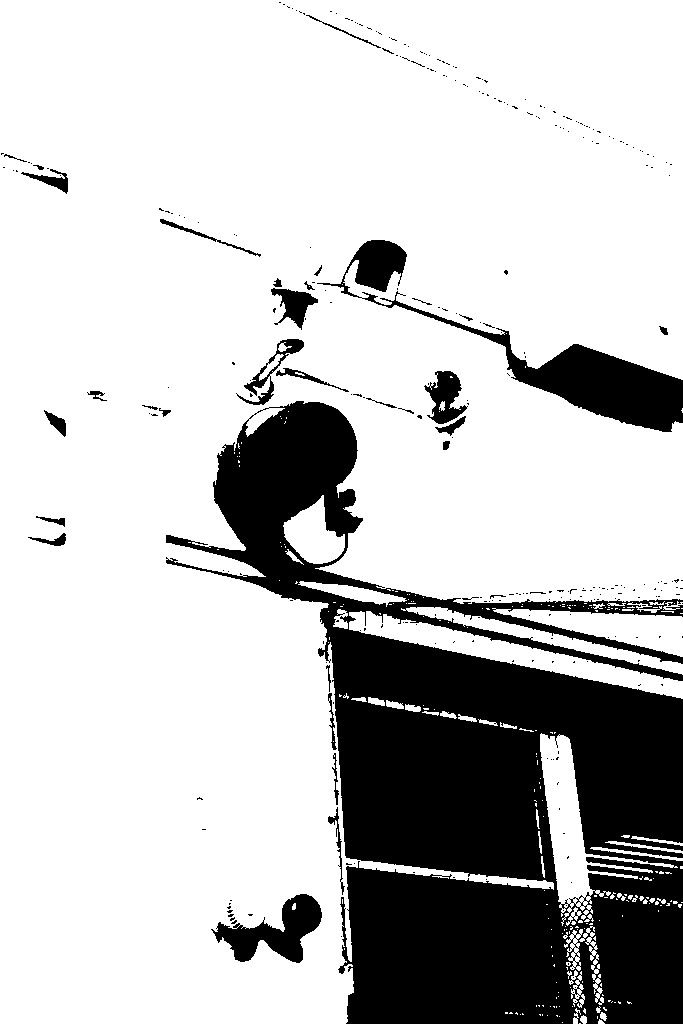

For this photo shoot the artist which we followed was Keld Helmer-Petersen.
Keld Helmer-Petersen was a Danish photographer,whose fame was surrounded in the years of 1940s-1950s for his abstract colour photographs.
Here are some examples of his work:
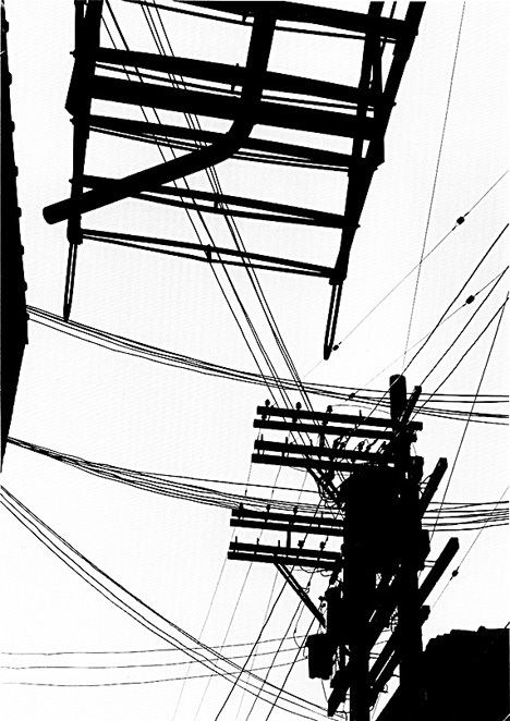


For the Black Light I chose my favourite images that I could find, here I tried to find some that have already got contrasting colours as I knew that this would look well.
Here using Adobe Photoshop, I started by finding my my chosen images then following the steps below it created the following effect.
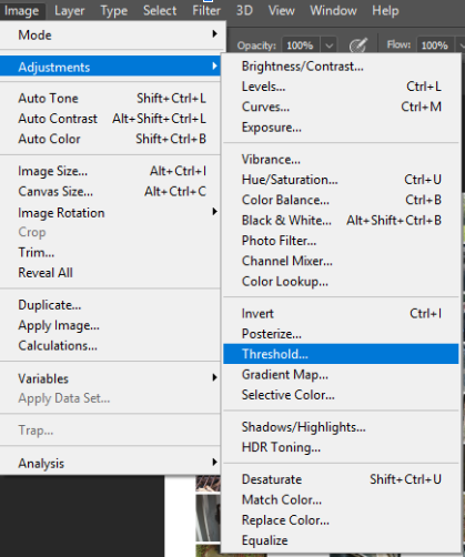
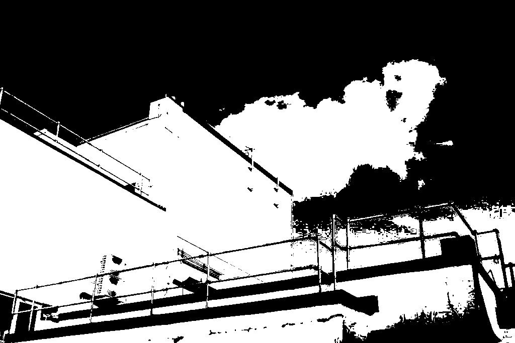
I then chose the Threshold that I worked best with my image.

I then rotated the image until I was happy with my result:
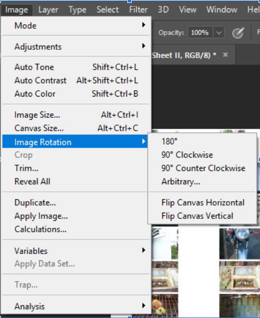
Here is the finished edit of my first image.
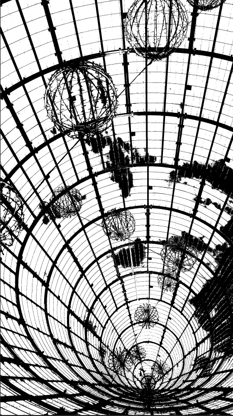
Here for the next few images I followed the same process to achieve my desired effect.
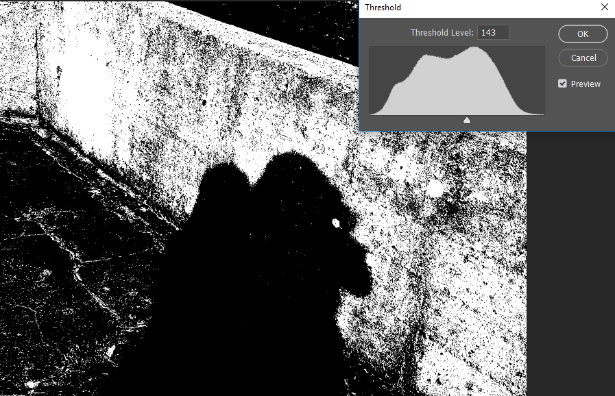

I quite like this image due to the silhouette and the contrast between the light shining on the wall and our shadows.
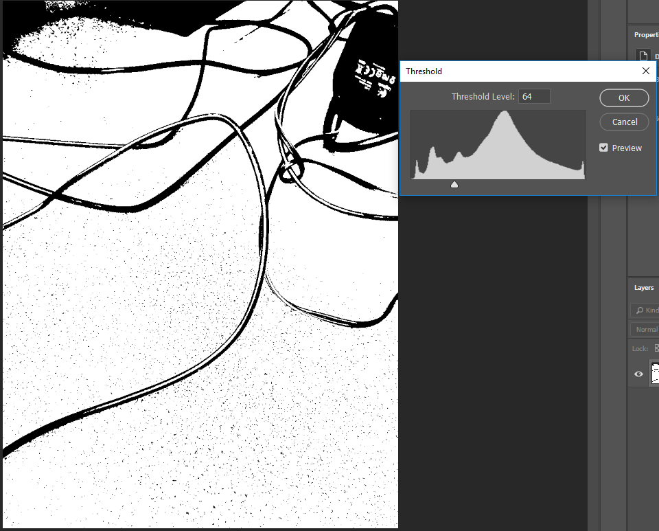
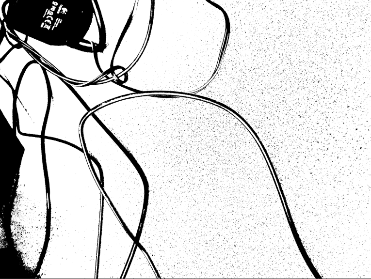
I again like this image due to the harsh contrast between the colours as this reminds me of the artists work.
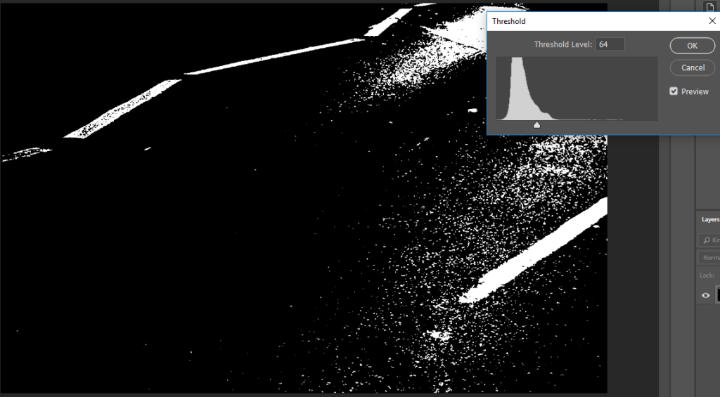
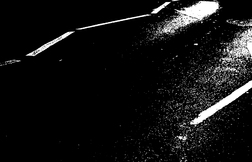
In this image I cropped out the car as I wanted to focus on the Road marks against the colours of the tarmac.
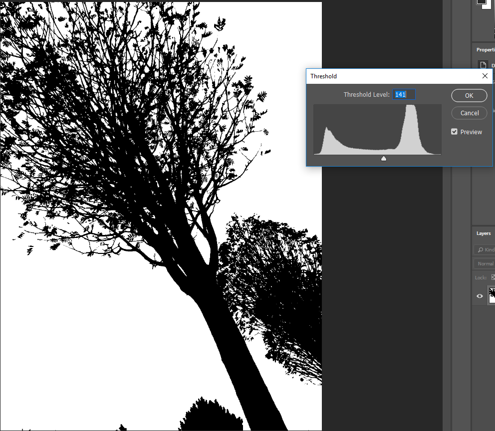

I chose this image as It was already taken at an angle and I liked the detailing that is shown through the branches and the leaves.
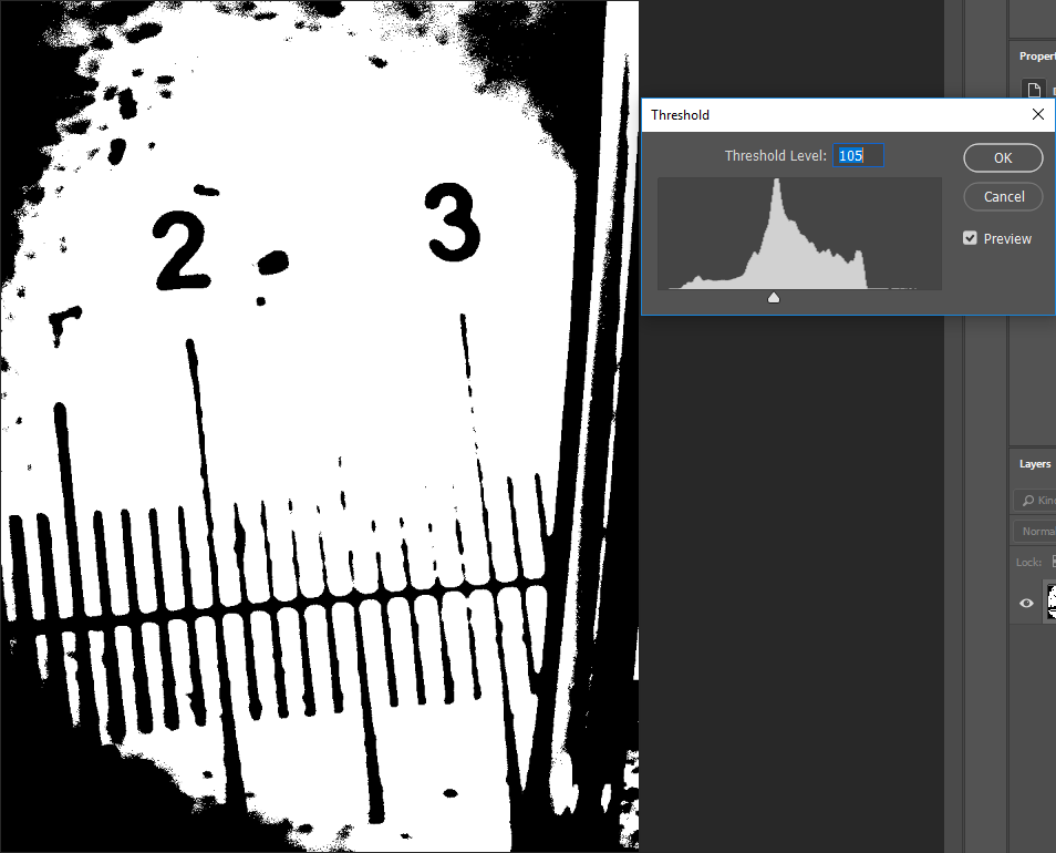

This picture was taken through a Light Microscope, I like the scale bar shown as it almost resembles a mouth.
Out of all of my image i had to come back to my first image, due to the image rotation, I think it makes the image resemble an optical illusion.
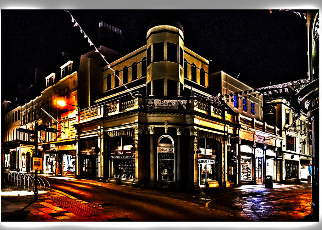
i took this photo in town. I found it incredibly good.