fILMING at La Rosiere Desalination Plant
First Attempt
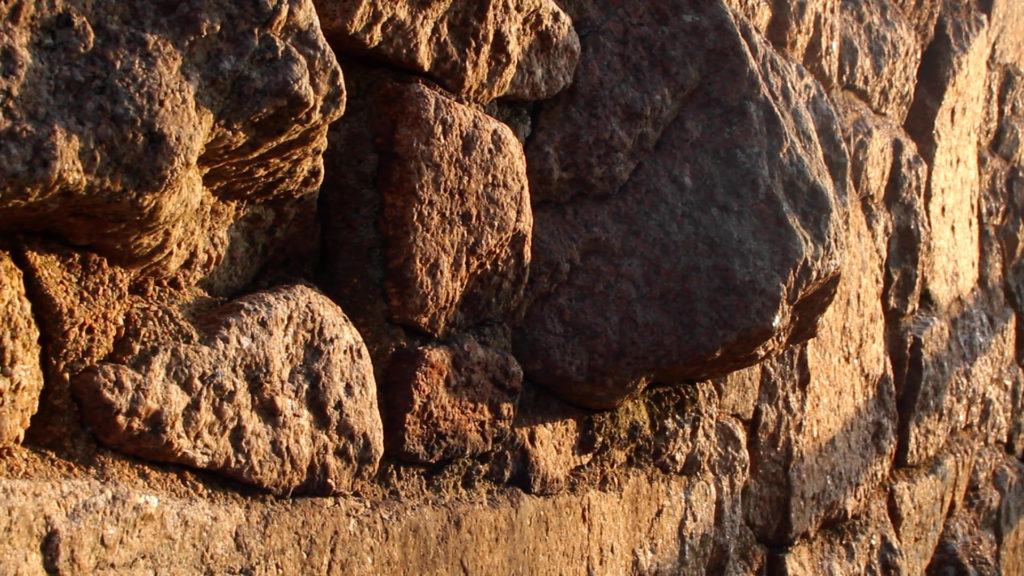
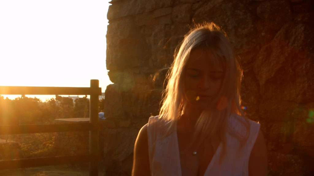
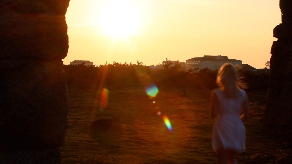
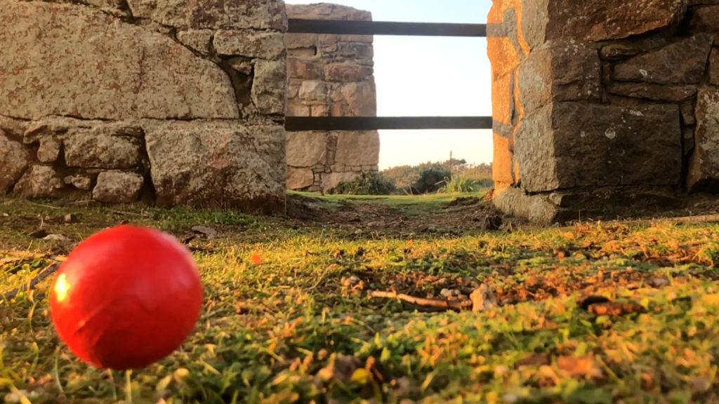
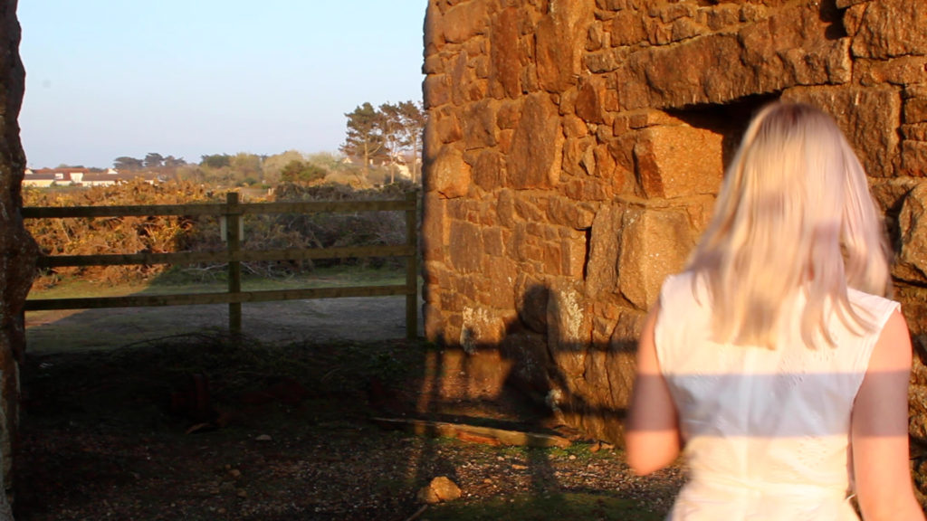
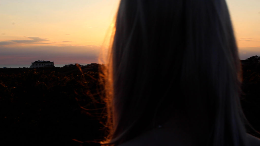
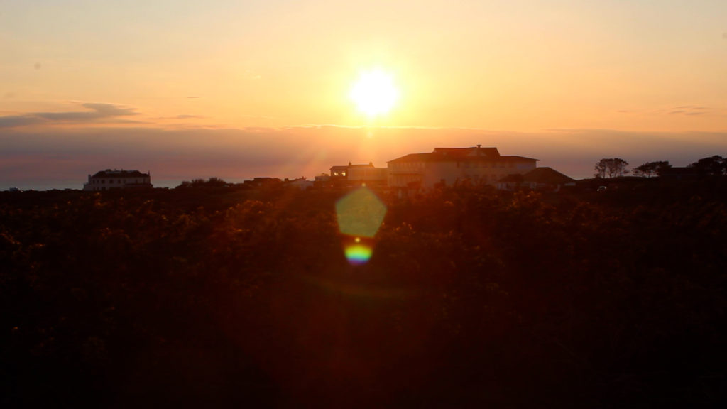
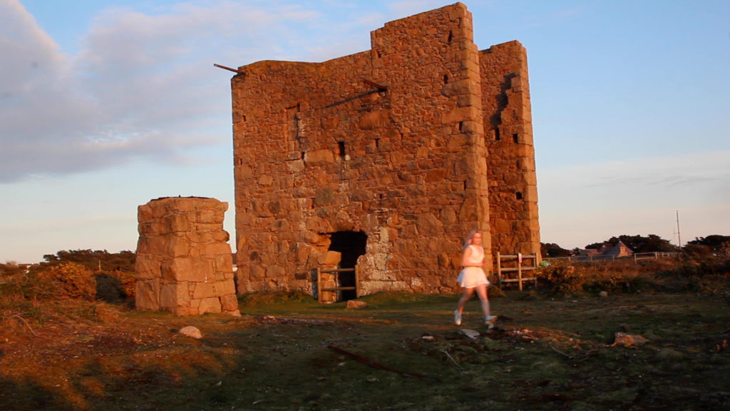
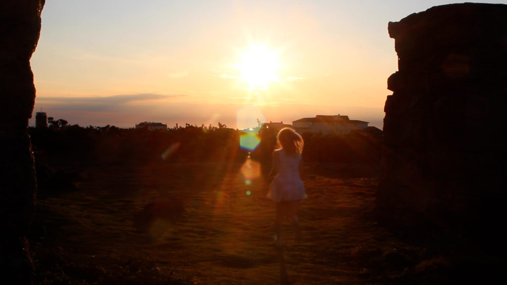
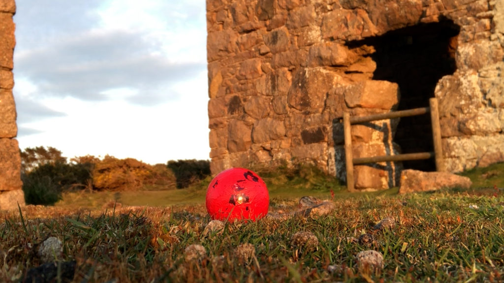
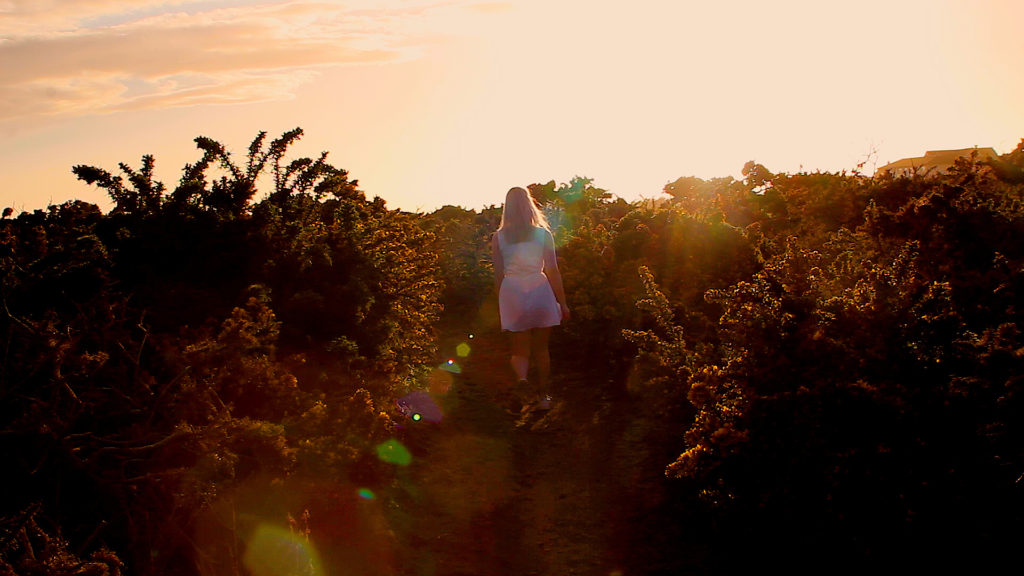
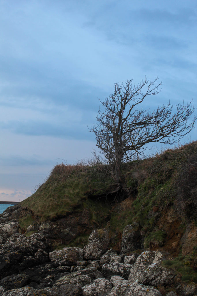
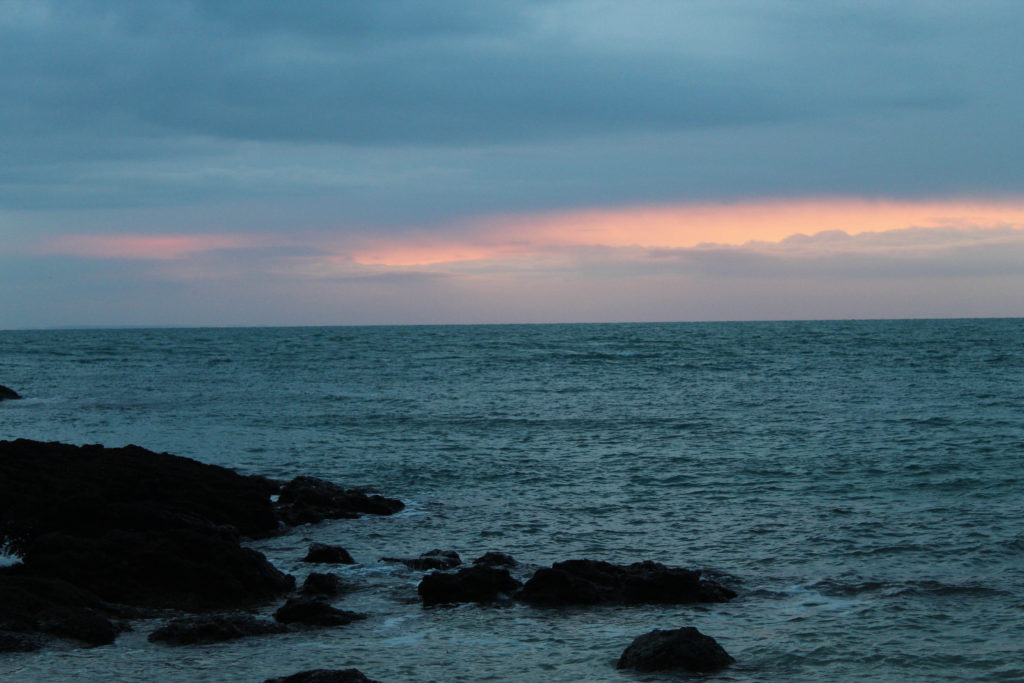
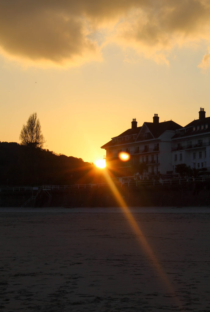
My first attempt to film some scenes in my film went moderately well but ill definitely go back to re-film certain shots to make sure everything is properly in frame. I went during the golden hour in Corbiere to have the lighting that I think would my film look the best it can. I need to get more shots of the red ball in order to tell the story well and get some shot of the girl in the black dress also to make myself push boundaries when it comes to the flashback towards the end of the film. I will go back at around 7pm, hoping that the forecast is similar to when I went the first time. I will also go film some other shots around Corbiere e.g. the pebble beach and the lighthouse. I wanted to film here because there are certain landmarks that make the viewer feel as if they’re watching something historical. For example the crumbing arch way demonstrating that the girl in the white dress is admiring things from the past, which is the whole point of my film; the girl trying appreciate what she never had before it was gone.
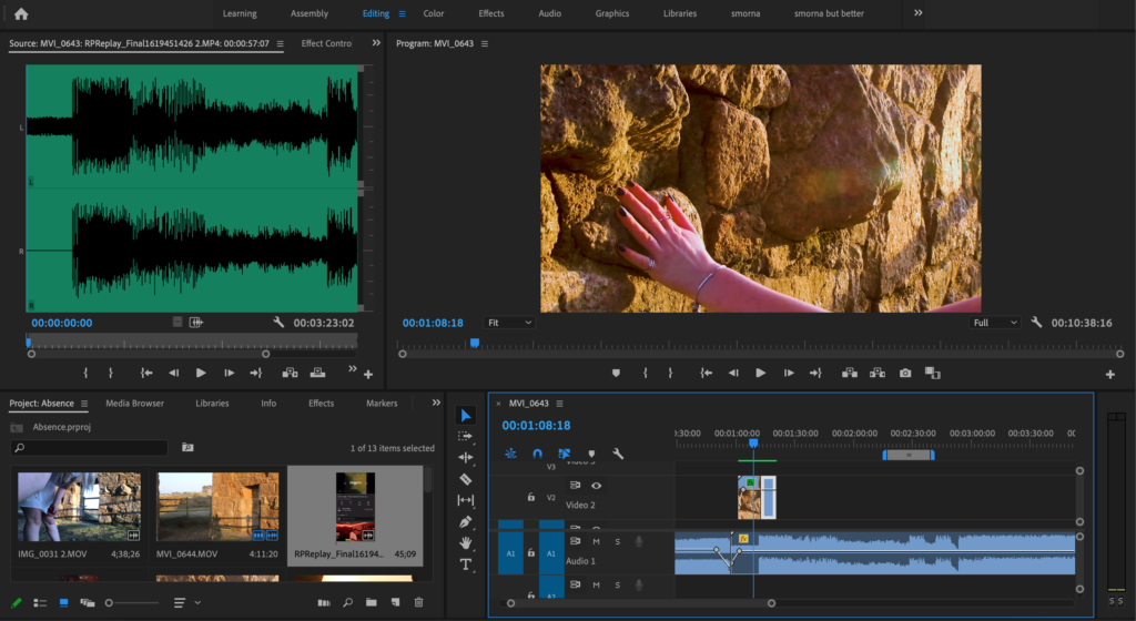
I managed to salvage two slips from the shoot and paired them with some music that I thought was appropriate for the type of scenery within the film. I edited the sound by fading in and out the sound waves and did a similar thing with fading from black to the footage in the actual clips.
Second Attempt
I was more inspired to make the footage more colourful which was inspired by specific photographers. A photographer that explores limitations, escapism and surrealism within reality is KangHee Kim. Kim studied painting at the Maryland Institute College of Art, graduating in 2014. It wasn’t until her senior year that she began using photography as a creative outlet, enjoying the freedom that came with the minimal equipment required. One of her ongoing series, Street Errands, began in 2016 and was born out of the mundane daily encounters of living in New York. “I realized, instead of waiting for miracles, I could instead create the magical moments in my imagination,” Kim says. “I construct my own form of escapism.” To create these photographs, she uses Photoshop to merge and manipulate multiple images from her travels in New York, California, Colorado, and Hawaii. Rather than preplan the scenes, Kim lets intuition guide her – creating cohesion with a uniform aesthetic and colour palette, and the returning motifs of moons, clouds, oceans, and skyscrapers.
Editing and Experimenting
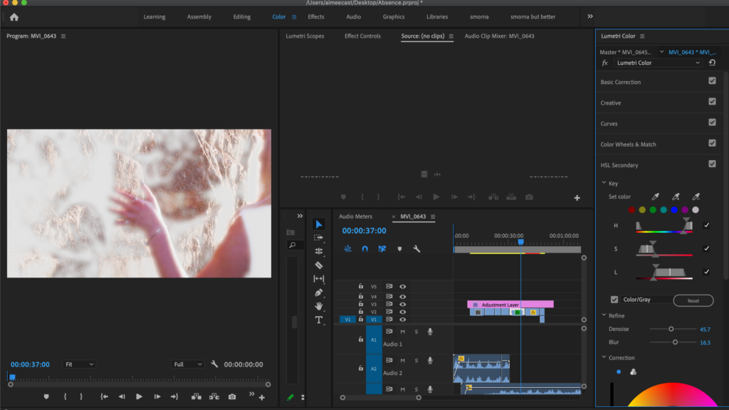
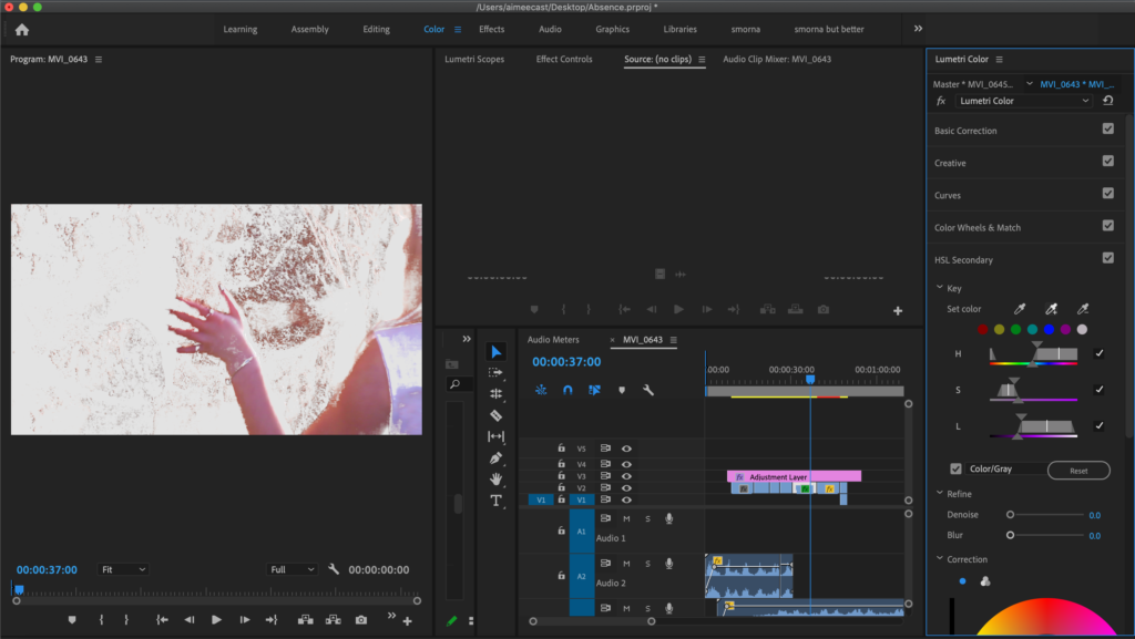
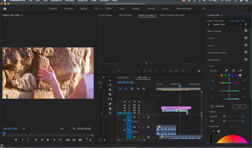
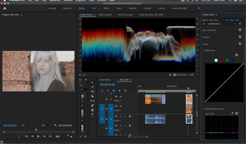
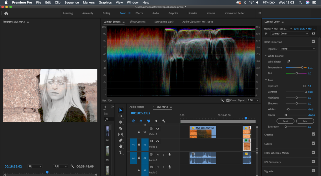
Whilst editing the saturation, shadows, highlight etc, I put an adjustment layer over the entire film and then individually edited the clips if they needed to be slightly more saturated or needed more contrast. For some of the clips I used the pen tool to mask the main focus of the clip as my camera wouldn’t allow me to adjust the depth of field too much whilst I was filming. I used the pipet tool to select the colour I wanted protect from the areas that weren’t masked e.g. my skin tones would be selected and I would add more to the different tones so all of my body was selected. I only did this for some clip that were slightly more still and didn’t have as much movement otherwise the tracker wouldn’t pick up where I was moving and wouldn’t change the depth of field. I also used the more advanced RGB tool on premier to get the colours that were more and less saturated to the correct colour, in other words it’s a colour correcting tool to make sure all the clips merge together smoothly between coloured clips. I tried to get all of the clips to look as if they were taken during golden hour as some of them were taken at different times or the cloud made the lighting not as good as it should’ve been.
Evaluating
Overall, I think that these shoots went moderately well. If I could do anything differently I would have gotten more angles from further away as well as some close up shots of my surroundings. I think that would have given the viewer a wider variety of things to grasp their attention other than the main character. I like the way I’ve edited this footage as the time of day made the makes the clips look really warm toned, which was the way I wanted it but I toned the warmth down I tiny bit to fit better with the rest of the film.
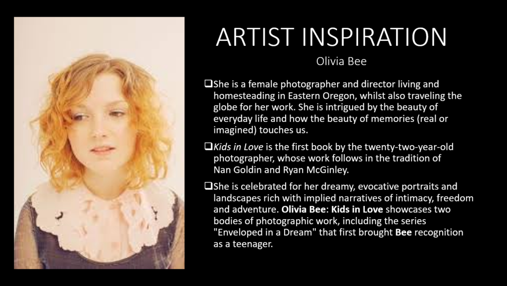
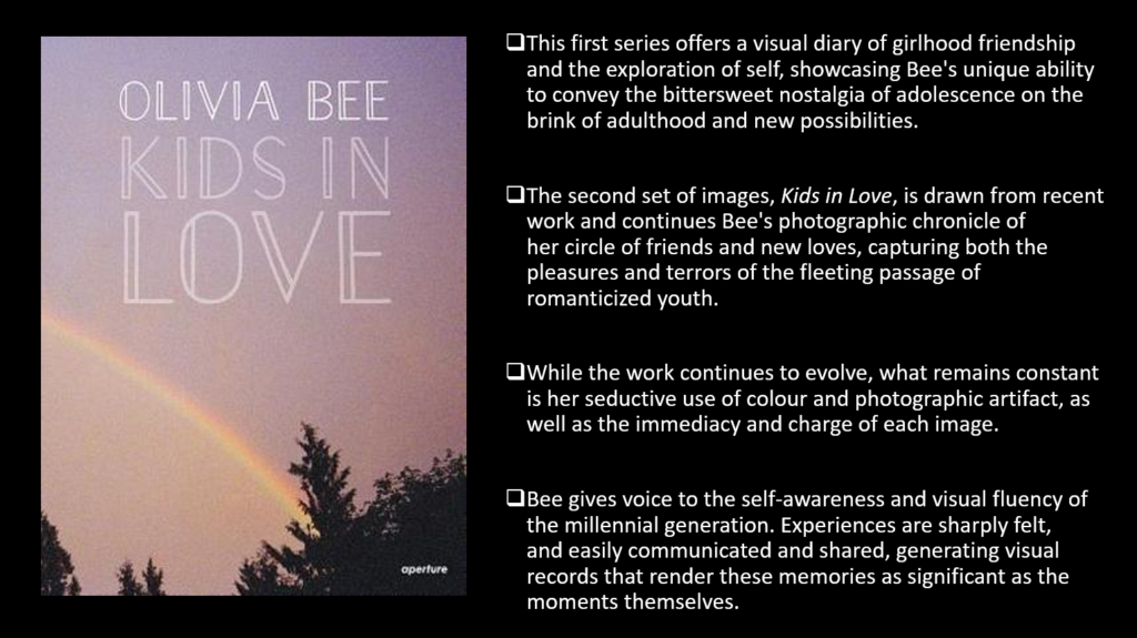
Artist inspiration


transition shoot #4- beach at sunrise
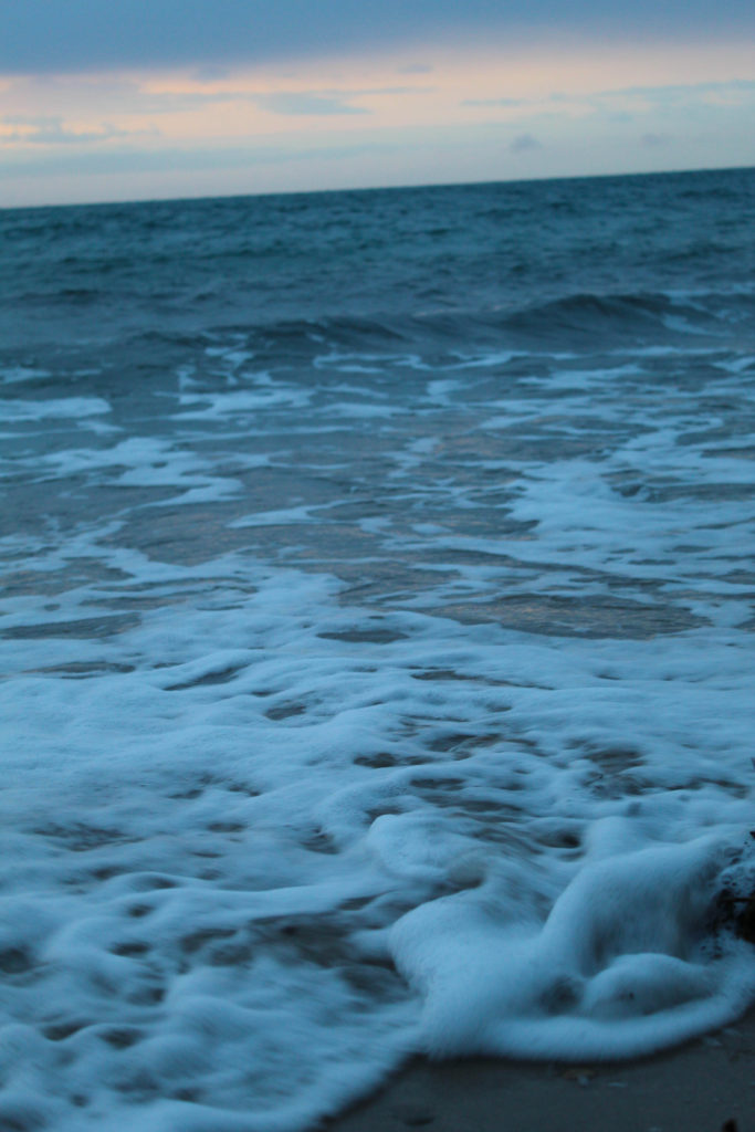
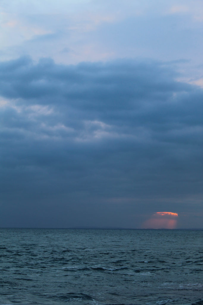
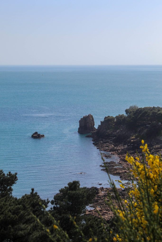
This shoot required a little more planning, as I knew that i needed more “winter” type images but as the weather kept getting warmer I wasn’t sure how to go about it, until I realised I could use the early morning light to show coldness in the same way I used the light at sunset to show warmth and summer. SO to achieve this I woke up before sunrise and went out to a secluded beach, La Coupe, where there should be a good view of the sunrise. Unfortunately there was quite a lot of cloud cover that morning, but I think it had the intended effect and overall I think it payed off.
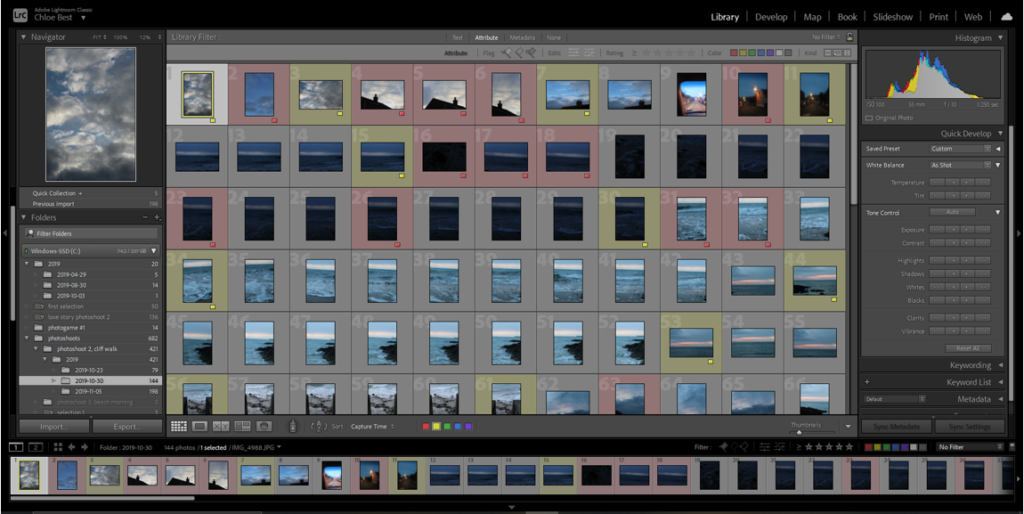
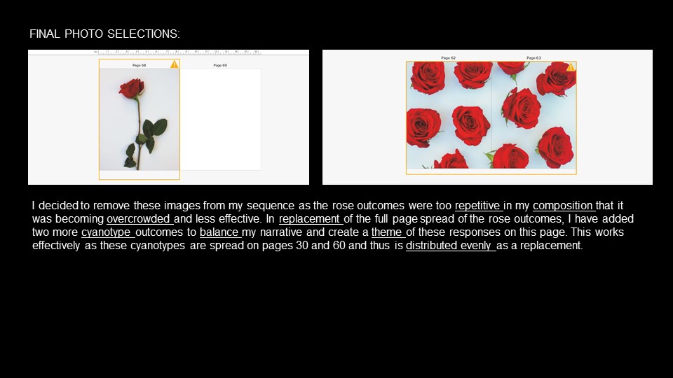
Initially i had about a hundred and fifty images, but a lot of them could be discarded because they were either too dark or too bright, so I ended up with 23 images going into the next stage.
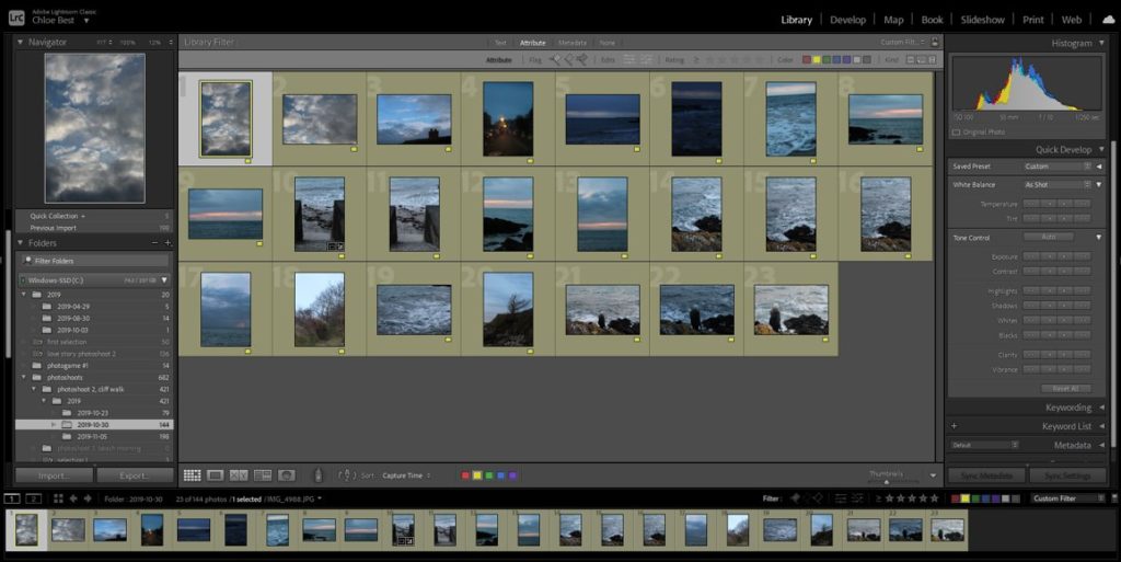
Then I went through and cut out the duplicate images using the “compare” function below to choose which image worked best out of all that were similar.
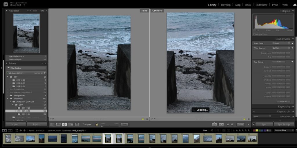
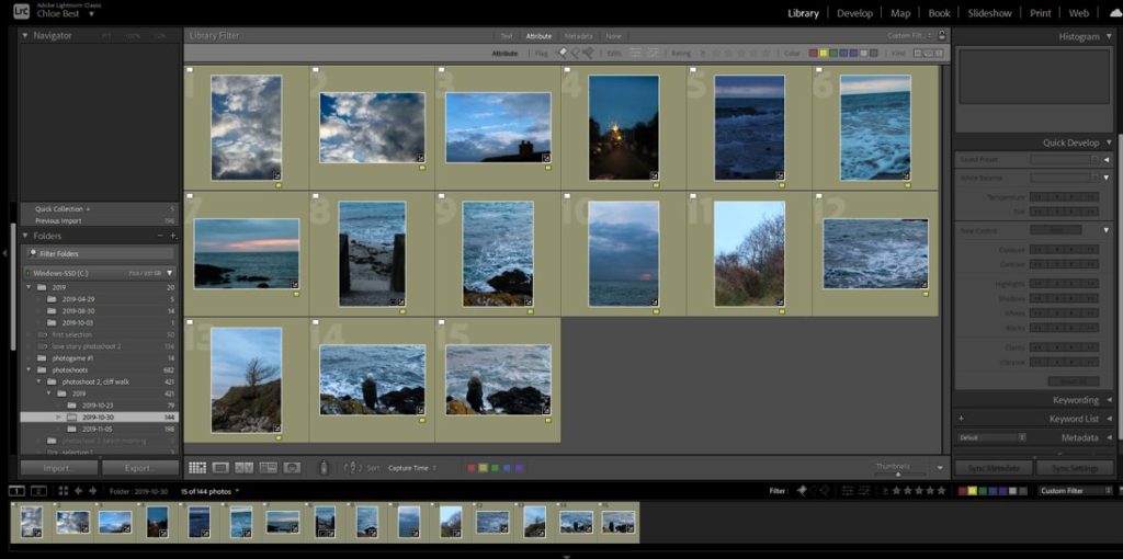
Finally I had fifteen images from this shoot (plus a couple taken the evening before that fit in with the rest of them) which I felt properly conveyed the sort of cold, wintery vibe I set out to produce, so I’m glad it worked out.
FINAL IMAGE SELECTION–
transition shoot #3- sunset beach portraits
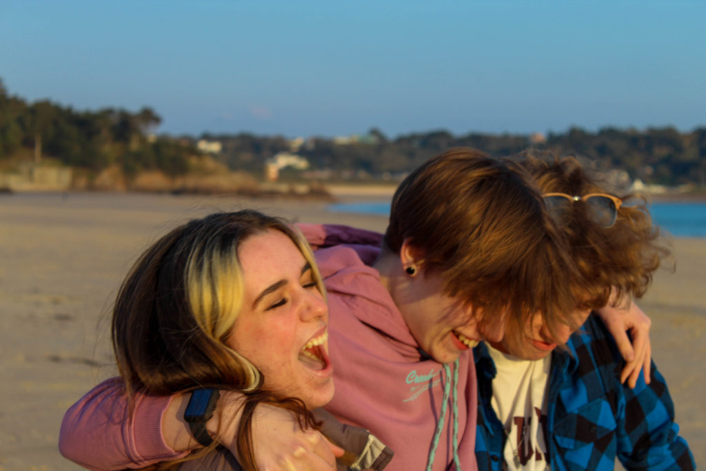
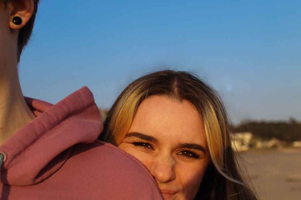
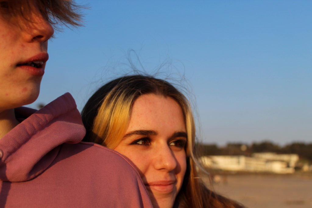
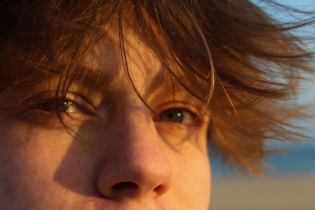
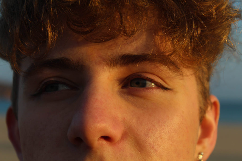
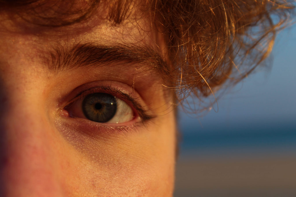
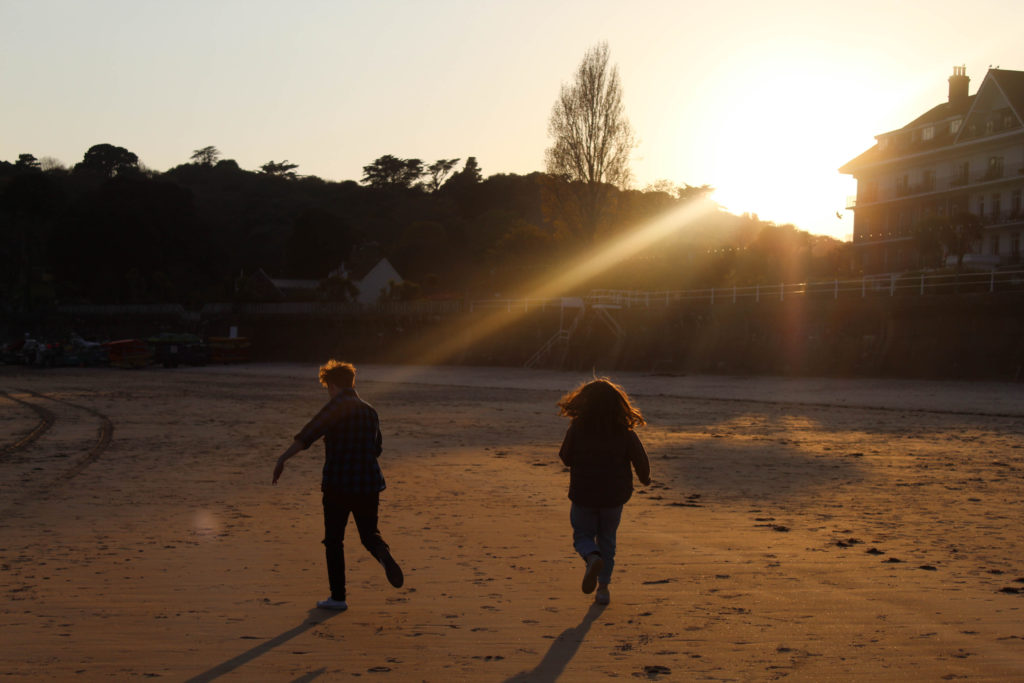
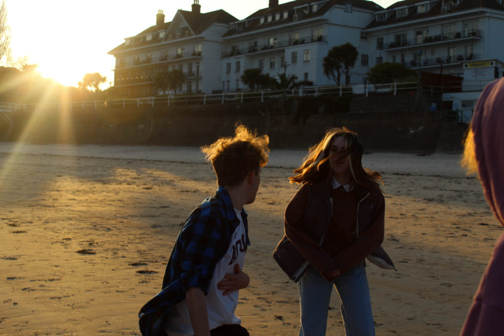
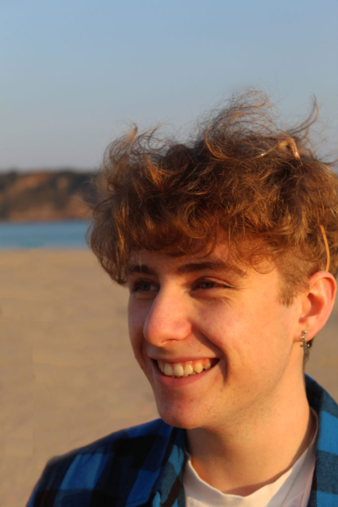
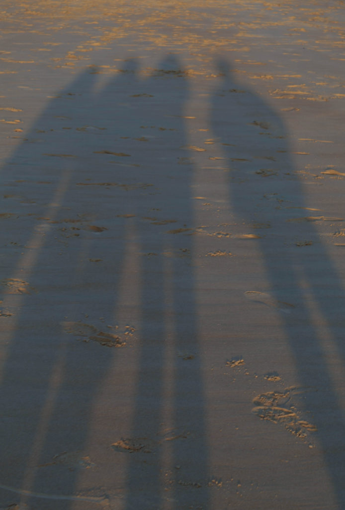
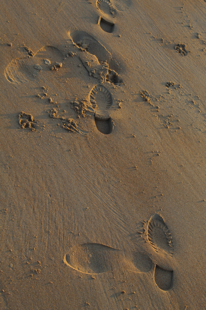
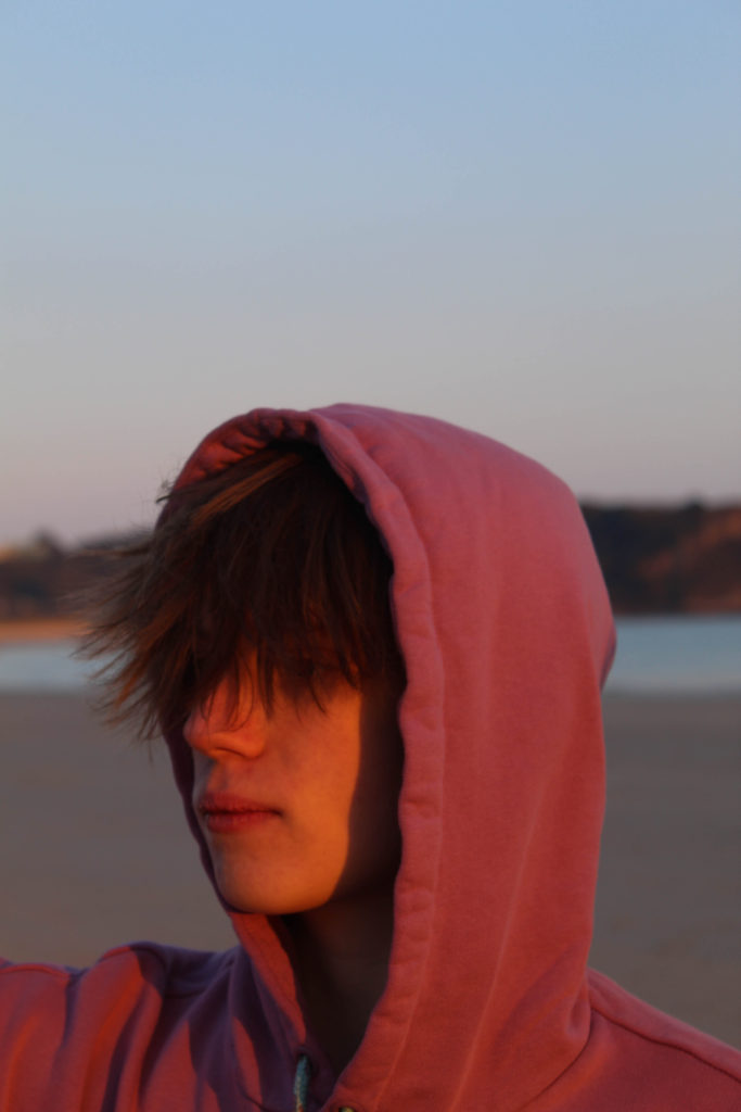
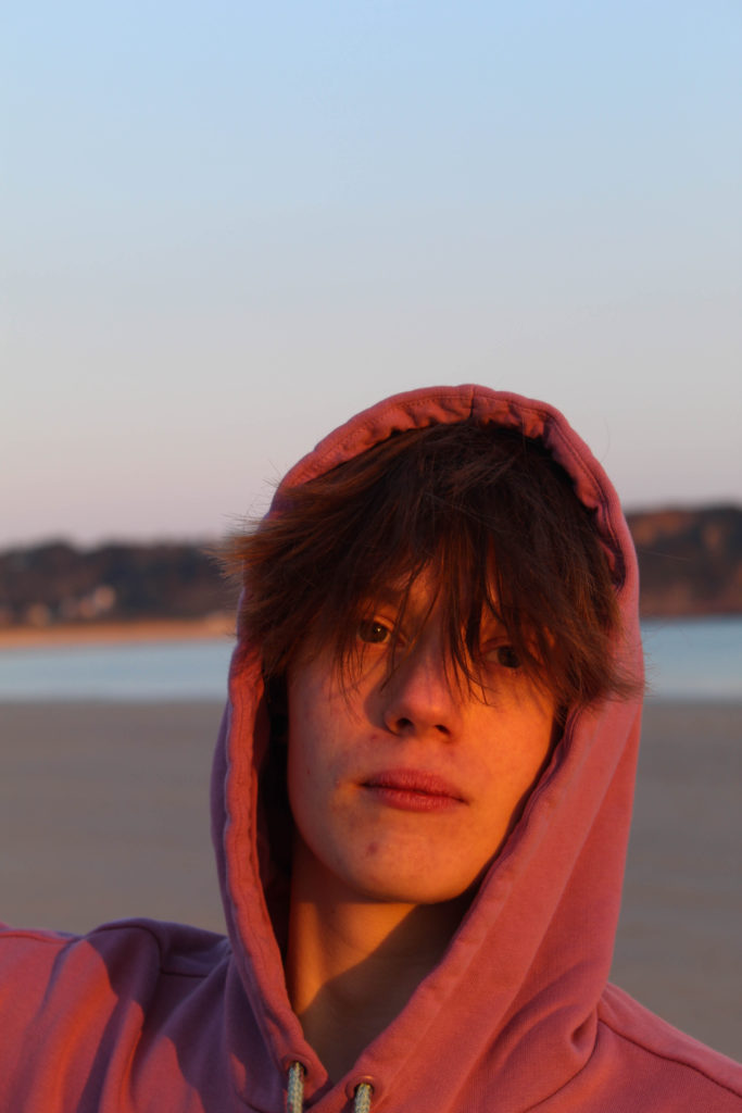
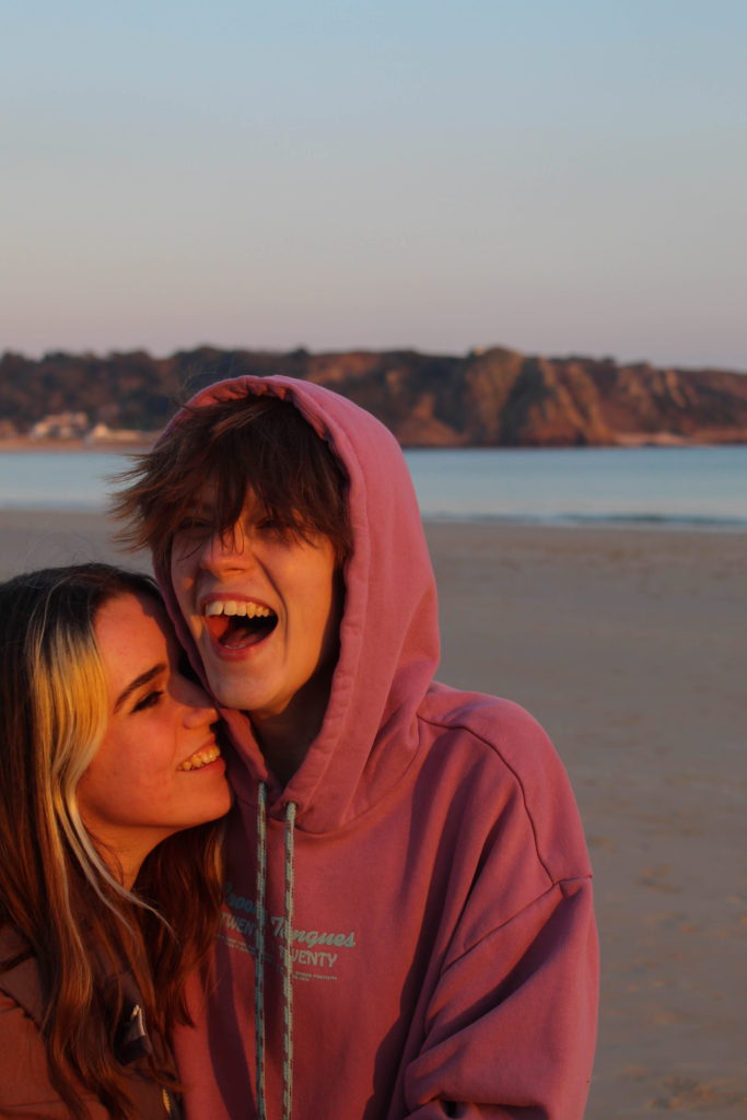
For this shoot I knew I needed to focus more on portraits, specifically of young people, and I wanted to take advantage of the good weather and the particular light during the few hours before sunset. I used a few of my friends and we went down to St Brelade’s in the evening.
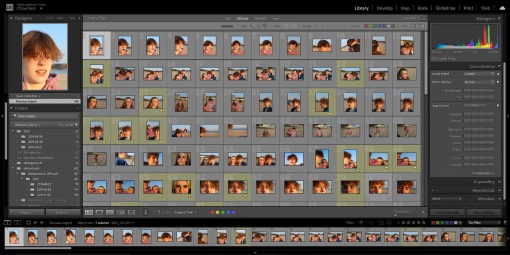
The bulk of the images totaled about two hundred images, so the process of going through them took a little more time. I used the same process as before, starting off my colour coding the images I wanted to carry on with in yellow, and then going through them at the next step and flagging them as “pick” or “reject”.
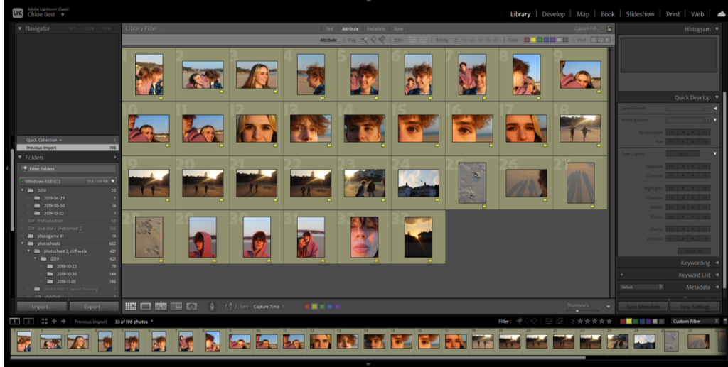
After filtering out the yellow images, I went through and flagged them as “pick” if i wanted to keep them. I based this on whether they were the best of two duplicates/similar looking images, whether they fit in with the idea of my final photobook in my head, and whether they used the same sort of technique and style as the artists I studied.
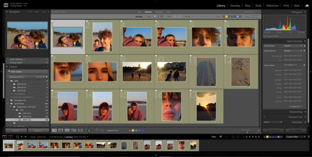
This left me with 16 final images to move on and begin editing.
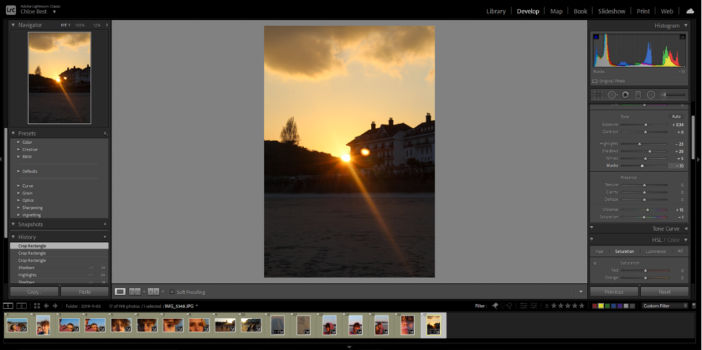
During the editing process I didn’t change much, only minor corrections which were easily made in Lightroom, then exported the images in with the rest of my final images from other shoots.
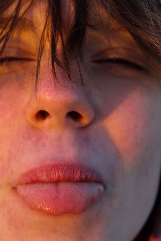
In the end, I think it was a good idea to take portraits with this light and in this location, and the candid nature of the images make them feel natural and conveys the emotions felt at the time pretty well, in my opinion. If I had to change anything I would probably have tried to do some more traditional, posed portraits, but I have more time to do this so it’s not a big issue.
FINAL IMAGES-
transition shoot #2- cliff walk
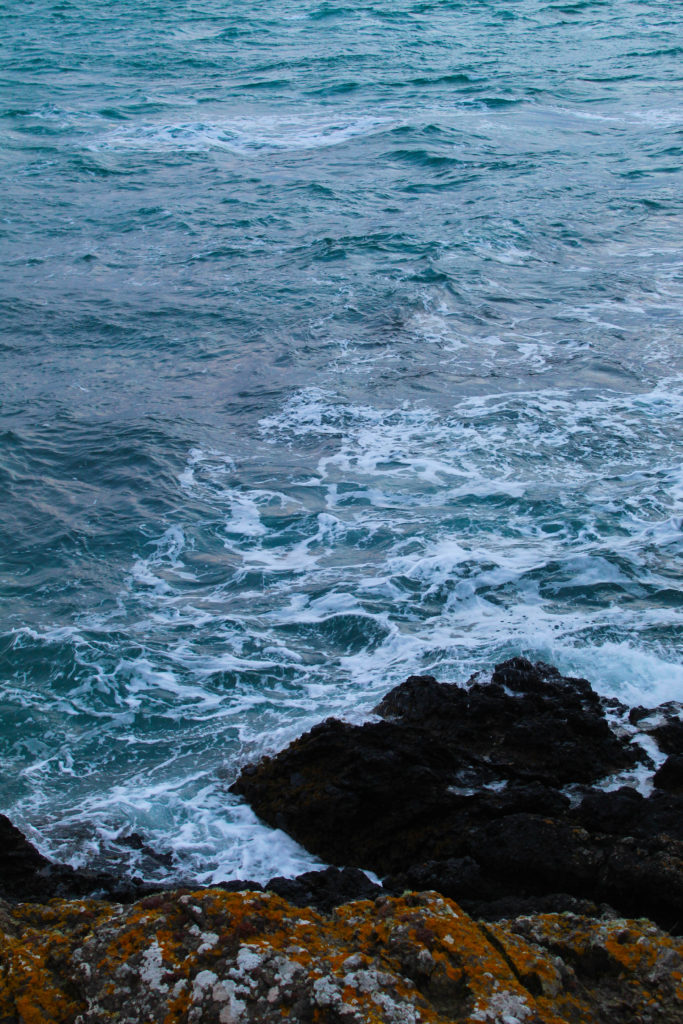
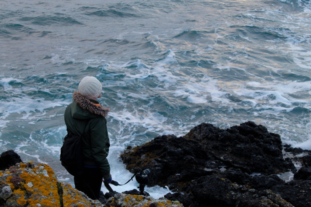
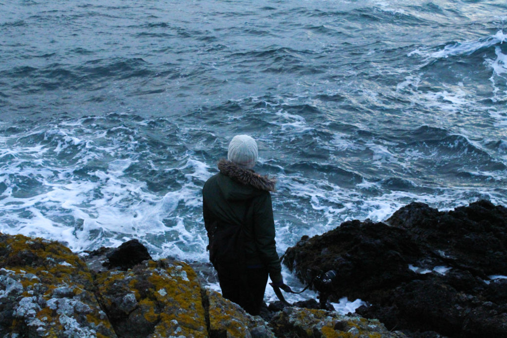
I went on a walk from Beauport to St Brelade’s and around the surrounding area, just after midday, in an attempt to take more landscape photos, as opposed to close-ups like I did in the previous shoot. I finished with about 80 photographs, which is less than I would have normally but I tried to focus on the images fitting in with the rest of my idea. Because of the weather and the time of day, these images will probably be used in the “summer” part of the book, nearer to the end.
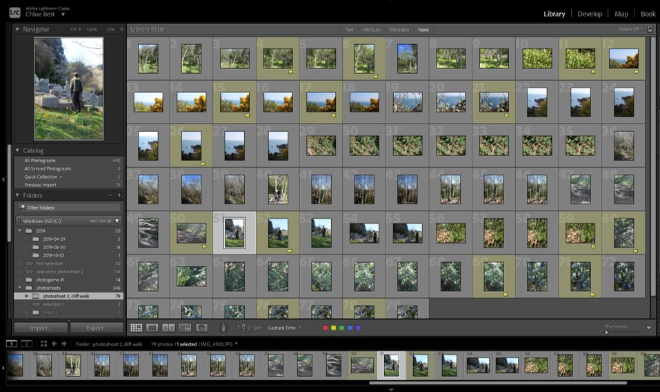
I went through and selected the pictures I immediately liked, leaving me with about sixteen. I chose them on the basis of whether they were technically good images, and also if i liked them personally, but I didn’t analyse them in too much detail.
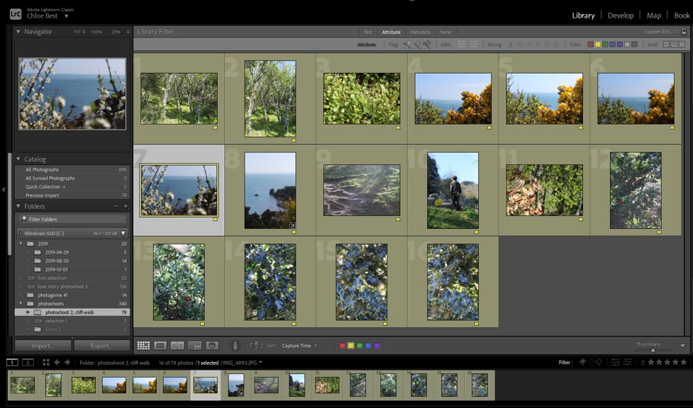
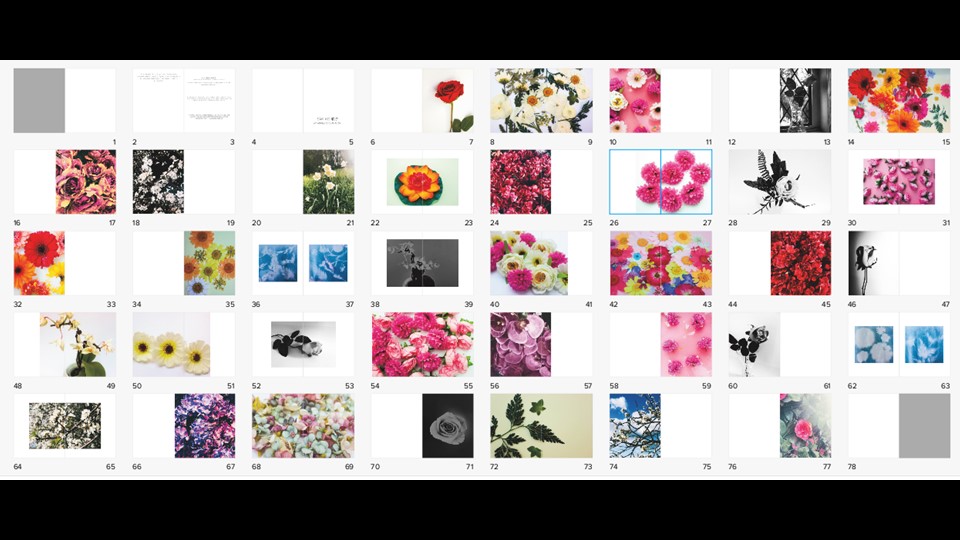
Next, i cut down on any duplicate images by using the “compare view” function in Lightroom, and thinking of how I would have to edit each image in the future. Like this I managed to end up with about ten images, shown below, to make whatever edits necessary and move to the group of final images from the other shoot(s).
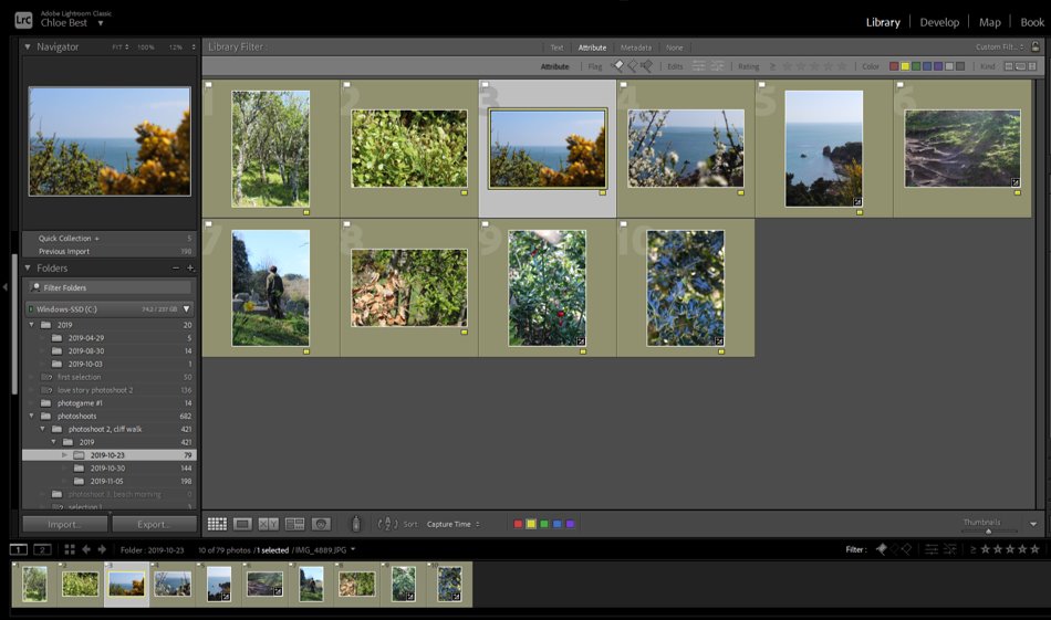
Overall I liked this shoot, I think it resulted in a fair amount of good quality images and I think it was successful as a whole.
FINAL IMAGE SELECTION-
Editing Process for all shoots
For all my photos I followed the same steps but just slightly adjusted it to best fit the image and lighting.
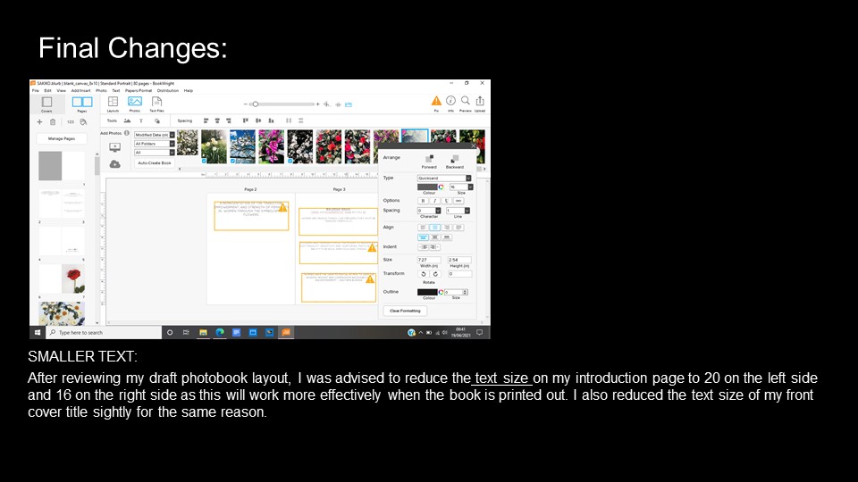
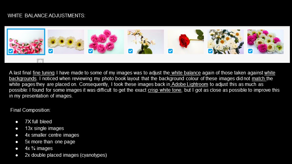
On Lightroom I began by selecting the photos that I wanted by giving them a 3 star rating if I wanted to use them then editing the best photos.
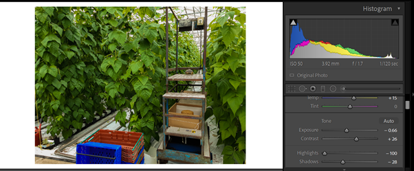
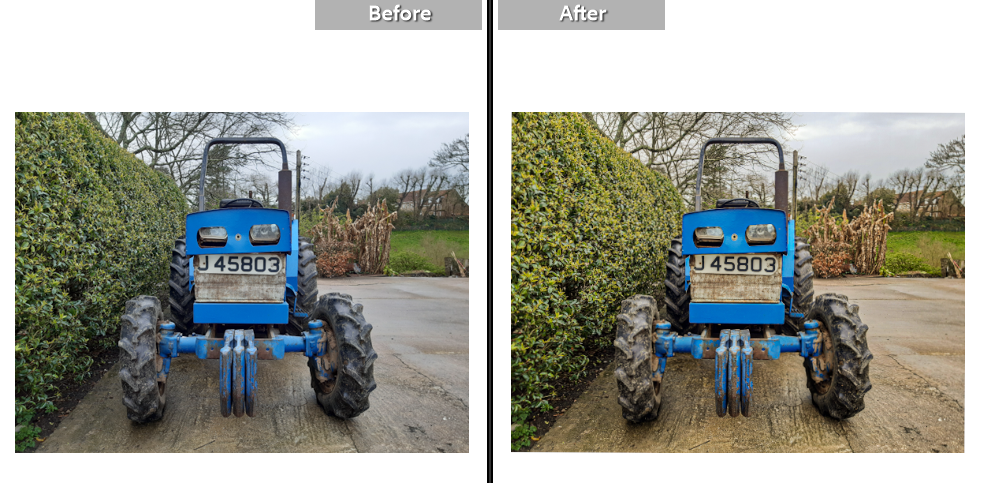
I started by increasing the temperature in the images to add to the memorable idea of the image. I then adjusted the exposure to work best with the contrast to help add more dimension to the photos. I also decreased the highlights to avoid making the photo too bright

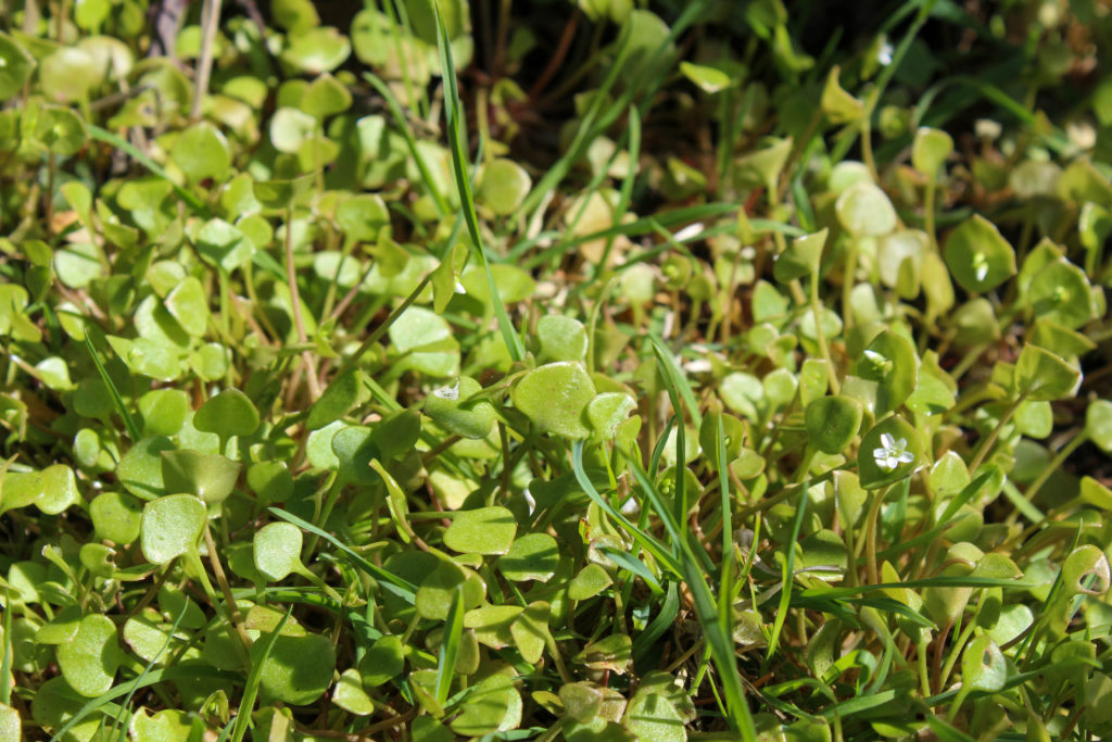
I then similarly played around with the whites and the blacks and adjusted them to best fit the image; this differed from image to image. I increased the texture to bring out the detailing in the leaves and the rust in the car and increased the dehaze to make the photos more clear. I added vibrance to make the other coloursz of my images pop out such as the red and the blues
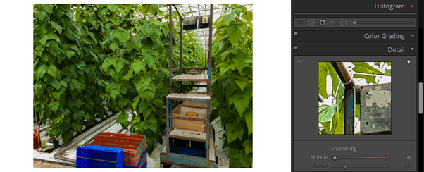
I finally added the slightest bit of sharpening to the images to again bring up the quality of the photo.
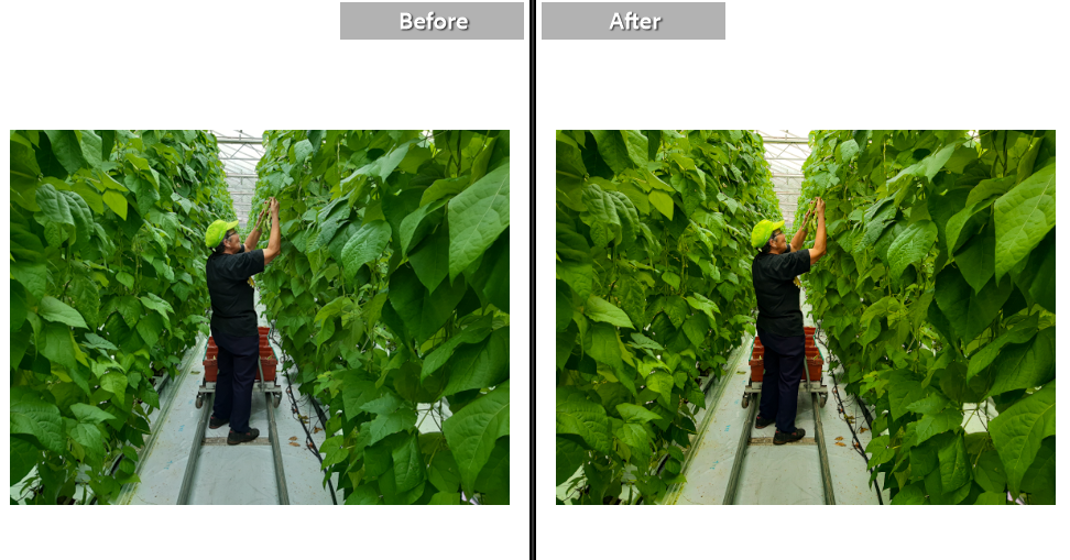
Before and Afters

Experimenting with Dance shoot
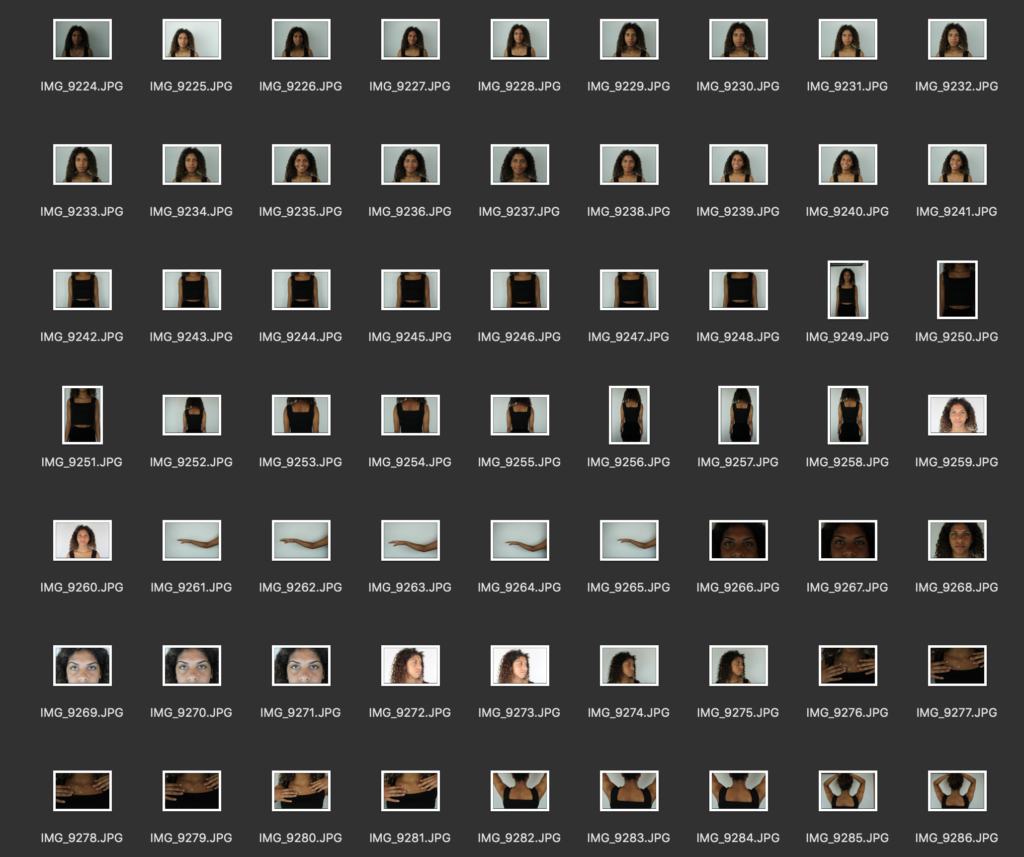
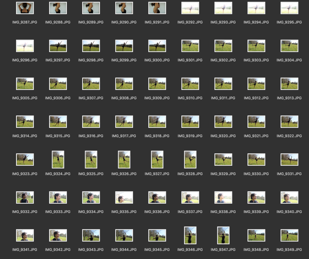
I took these images to experiment with different ideas, deciding what I wanted to photograph for my book. I focussed on the individuals body features and then on the dance positions, trying to capture the movement and motion by taking a picture every time the dancer raised her leg slightly higher into the position.

The unconscious mind
‘Exam’/ Controlled Conditions – 4,6 & 12th May.
Initial Idea –
For this project I aim to explore the exam title ‘Limitations’ and ‘Freedoms’. Upon my initial research, the term ‘Limitations’ has primarily negative connotations of being forced, or held against ones will (physically/ emotionally). In order to explore this title, I am going to focus on the unconscious mind and the limitations this poses to how we understand, present and define ourselves. For this project I am also aiming to cover some areas in relation to the exam title ‘Freedoms’ in order to create a juxtaposition in my photographic narrative, showing the possible positives and negatives of the unconscious mind.
Definition of Freedom –
noun: freedom
- The power or right to act, speak, or think as one wants.
- The state of not being imprisoned or enslaved.
Etymology of Freedom –
You’ll notice the word free in freedom. Free comes from the German frei, meaning, “to love.” The word friend shares this origin. You can think of freedom as the condition in which you have the choice to love any friend you wish.
The Latin libertas and Greek eleutheria both indicated a condition of independence, unlike a slave. … Freedom, however, comes from the same root as friend, an Indo-European word that meant “dear” or “beloved.” It meant a connection to other free people by bonds of kinship or affection, also unlike a slave.
Use over time –
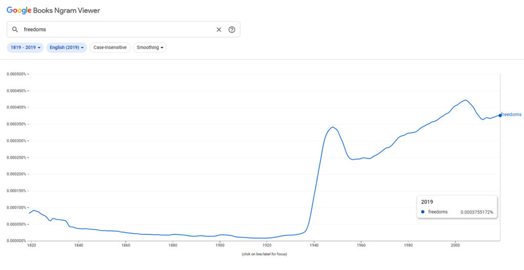
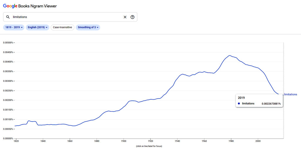
The use of the word ‘Freedoms’ is particularly interesting as there is a very clear increase in the usage of the word during the time of the second World War (1939-45), which is understandable as many people were fighting for their freedoms due to the increase in individualism throughout Europe. Similarly, this is also the time period whereby modernism and post-modernism movements were beginning to grow in popularity and variety.
Definition of Limitations –
noun, plural noun: limitations
- A limiting rule or circumstance; a restriction.
- (Law) A legally specified period beyond which an action may be defeated or a property right does not continue.
Etymology of Limitations –
Late 14c., from Old French limitacion “restriction, legal limitation,” and directly from Latin limitationem (nominative limitatio), noun of action from past-participle stem of limitare “to bound, limit, fix,” from limes “boundary, limit”
Use over time –
Statement of Intent –
For this project I aim to explore the exam title ‘Limitations’ and ‘Freedoms’. More specifically, I aim on exploring and representing the possible freedoms and limitations of the unconscious mind. In order to do this, I aim going to research and explore movements such as surrealism and postmodernism as I think these will be able to most accurately represent the unconscious mind due to their more conceptual and abstract nature. Possible routes or ideas for this specific theme could relate to an individuals point of view or a more generalised theme such as Lucid Dreaming, however, the overarching theme will remain focused on the motif of the unconscious mind.
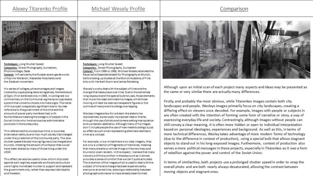
In order to explore this idea in relation to artists research and analysis, I am going to compare artists who use similar techniques relevant to my idea, such as Alexey Titarenko and Michael Wesely, who both focus on street/ street landscape photography, commonly using a prolonged exposure in order to create a dark theme of disorientation. By comparing two artists such as these, I will be able to narrow down possible ideas for my photoshoots, by taking common techniques and aspects and compiling them into one photoshoot inspired by both artists.
In terms of aesthetic and themes, my key idea is to use my images and photoshoots to create a clear aesthetic that is represented throughout my project. As a more specific aesthetic, I will most likely be exploring the gothic aesthetic in relation to both ‘Freedoms’ and ‘Limitations’ as this will allow the contrasting ideas to subtly link, therefore allowing my overall narrative to be smooth and clear.
The medium in which I aim to present my project is a photobook, this will allow me to control and create a clear structure to my images, forming a narrative which can be interpreted by each individual viewer. Similarly, a photobook will allow me to create clear and repetitive juxtapositions between the titles ‘Freedoms’ and ‘Limitations’. As well of this, I may print off some individual images for display and mounting alongside my photobook.
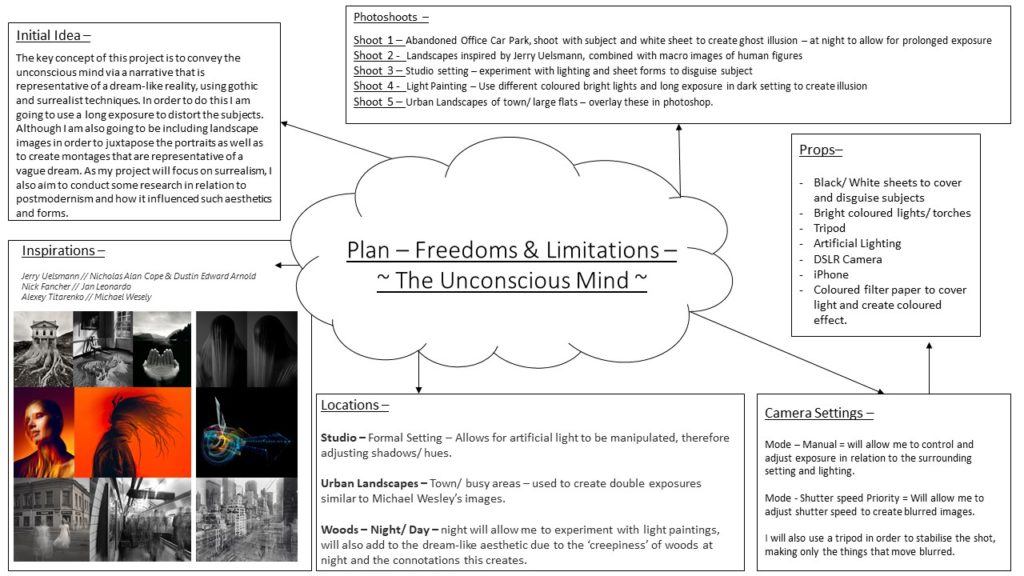
Plan –
Artists –
Jerry Uelsmann // Nicholas Alan Cope & Dustin Edward Arnold

Nick Fancher // Jan Leonardo

Alexey Titarenko // Michael Wesely
Art forms and Movements
Contemporary Art – A reference to Contemporary Art meaning “the art of today,” more broadly includes artwork produced during the late 20th and early 21st centuries. It generally defines art produced after the Modern Art movement to the present day. This genre of art does have its own approach or style that distinguishes it from others.
Surrealism – 20th-century avant-garde movement in art and literature which sought to release the creative potential of the unconscious mind, for example by the irrational juxtaposition of images. Therefore, as surrealism takes a key focus into and on the unconscious mind, this will be my main style used for my project.
Post-modernist Art – Unlike contemporary art, post-modernist pieces are often a lot harder to categorise as this form of art/ photography doesn’t have any cleat aspects and is more based on individuality and freedom of expression. Postmodernism as a movement takes a key focus on rebelling against stereotypes of conventions that are seen as dominant throughout society.
Focus Points –
.Lucid Dreaming // Negative Space // POV.
Starting Ideas/ Inspiration –
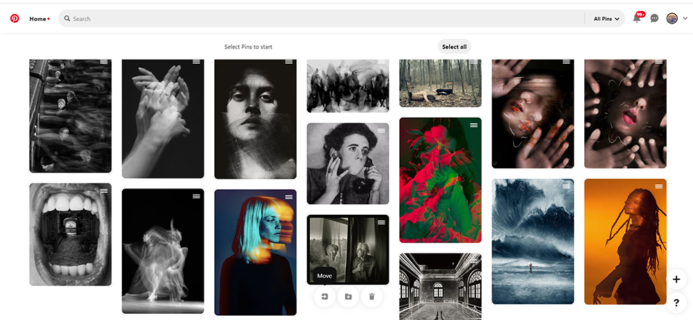
In order to gain a generalised inspiration and idea on the aesthetic of photos I want to produce for this project, I created a Pinterest-Board with multiple possible ideas I could explore for my photo-shoots. As seen below, may of these images convey aspects that are common within surrealist art and photography, which can also be further analysed via the postmodernist movement across the arts. As the primary focus of my project is the unconscious mind, I am going to take a key focus on portraiture, however use surrealist features in order to distort the image and almost disorientate the viewer, imitating the idea of an ‘unconscious mind’ being almost unattainable to interpret by our conscious selves.
Context/ History/ Understanding –
The Unconscious Mind –
The unconscious mind is a reservoir of feelings, thoughts, urges, and memories that are outside of our conscious awareness. The unconscious contains contents that are unacceptable or unpleasant, such as feelings of pain, anxiety, or conflict.
Google definition of ‘the unconscious mind’.
Unlike our conscious mind, which is often driven by fact, the unconscious mind is often driven by repressed emotions, feelings and past experiences. A Neurologist named Freud divided the human consciousness into three levels of awareness: the conscious, preconscious, and unconscious. The unconscious mind is still viewed by many psychological scientists as the shadow of a “real” conscious mind, in other words it is representative of our whole and true emotions.
History –
Unconscious aspects of mentality were referred to between 2,500 and 600 BC in the Hindu texts known as the Vedas, found today in Ayurvedic medicine. Although today’s ideas and understanding of the unconscious mind are far more advanced and scientific, it has been part of societal thought for many years.
Artist relation –
This can be linked to my artist Nicholas Alan Cope and Dustin Edward Arnold as ‘Vedas’ was the name of their specific project I research, making very clear relations to the unconscious mind, individuality and mentality relating to self-expression.
Photoshoots –
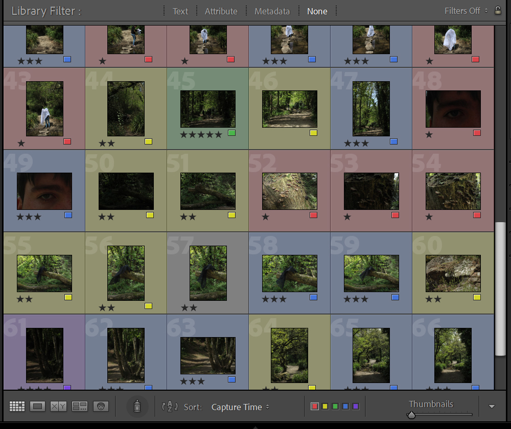
Key –
1 star = Red
2 star = Yellow
3 star = Blue
4 star = Purple
5 star = Green
Photoshoot 1 –
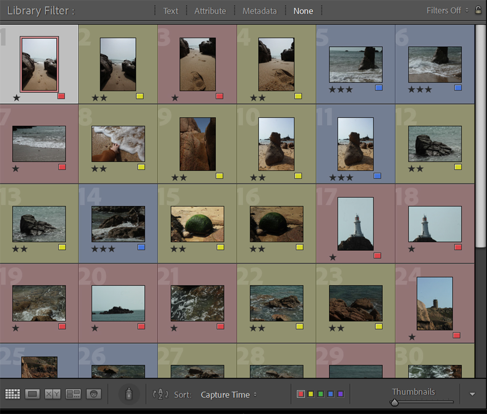
This photoshoot was taken before my main idea of focussing on the unconscious mind was formed, however, though I think it is key to show as it represents the development of my ideas. Although this previous idea, relating human form to landscapes, can be viewed as a similar topic, these images can also be used in relation to a response by Jerry Ueslmann.
Photoshoot 2 –
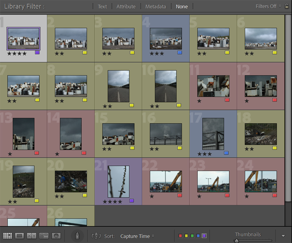
Similarly, this photo-shoot was also taken before my idea of the Unconscious mind had formed; here I focused on waste and how it impacts landscapes. However, I do think that this can be related to the unconscious mind as the images convey quite an eerie, abandoned feeling, creating a sense of apprehension among viewers. Similarly, there are no people present in the images, creating the feeling of an alternate reality created by ones unconscious mind.
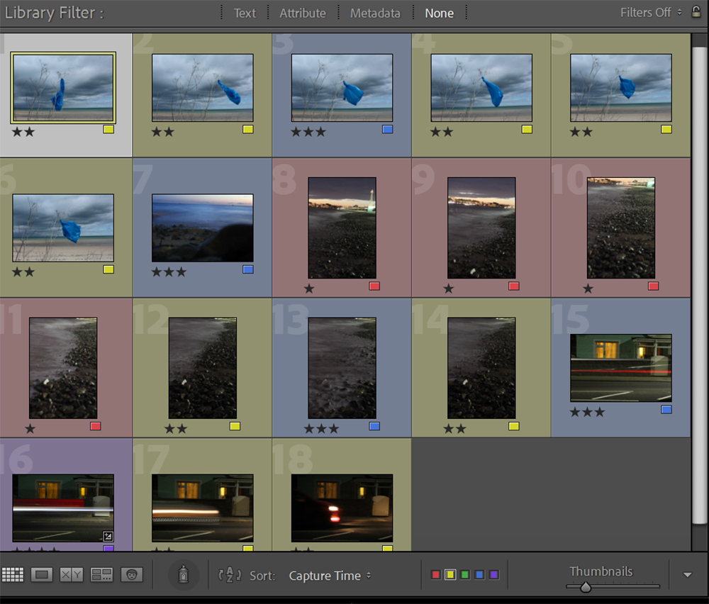
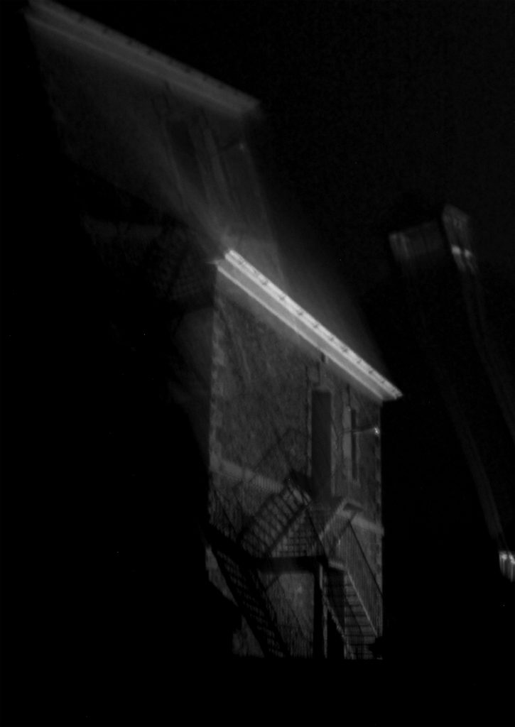
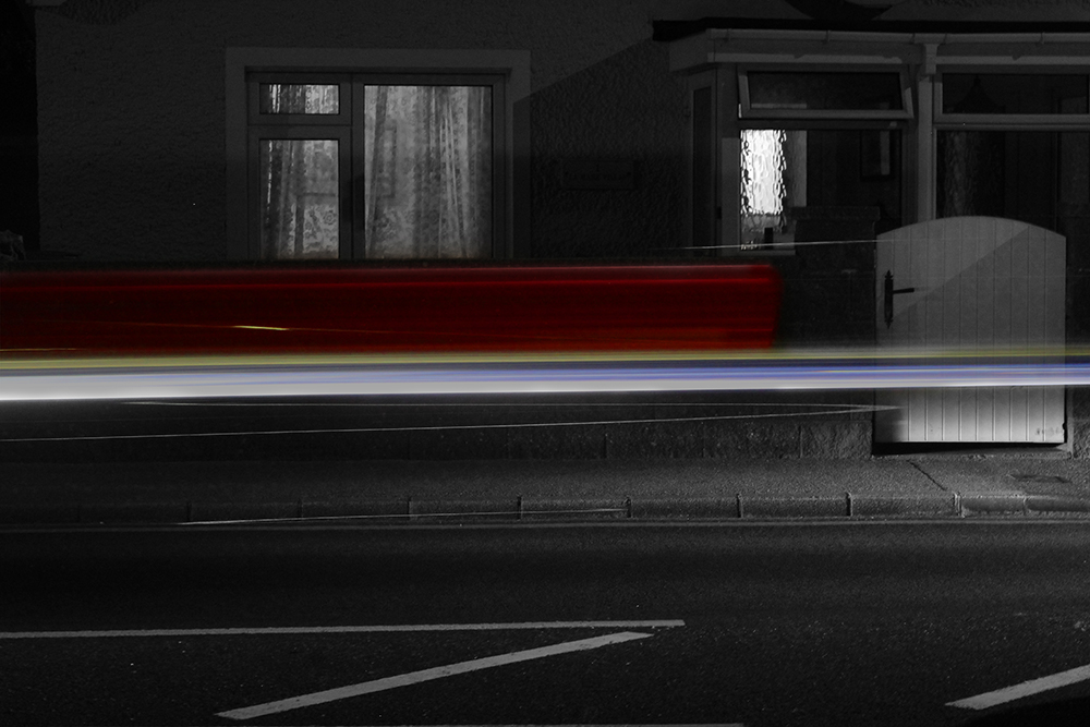
This photoshoot can be described similarly, and links in with my previous one in terms of aim. However, my ideas furthered as I discovered that I wanted to explore the unconscious mind, I tried to use my landscapes in order to create a surreal, dream-like state. For example, for the images of the sea I used a slow shutter speed, allowing the waves to appear as mist and for the cars to be blurred, with mainly only their lights being captured.
Photoshoot 3 –
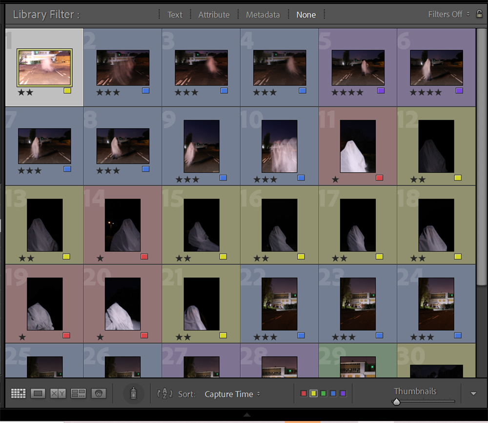
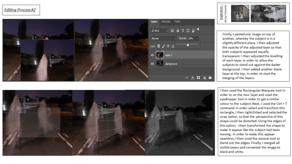
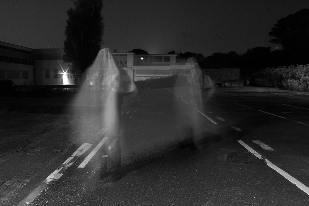
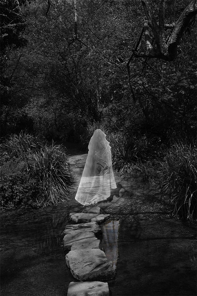
For my first photoshoot, I took inspiration mainly from Alexey Titarenko, using a combination of blurred subjects and creepy (abandoned/ desolate/ dark) landscapes and settings. In order to do this, I used my tripod in order to station my camera and a white sheet in order to disguise my subject, the further use of a prolonged exposure also enhanced the effect of the subject being ‘Ghost-like’.
Photoshoot 4 –
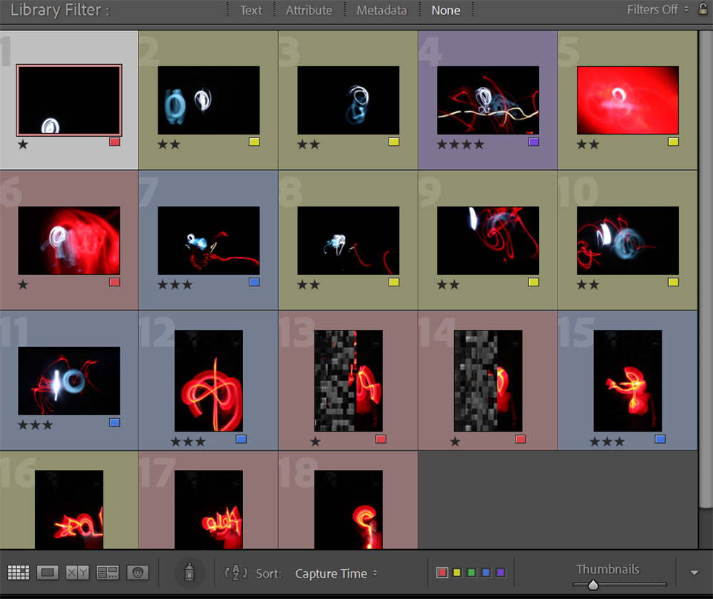
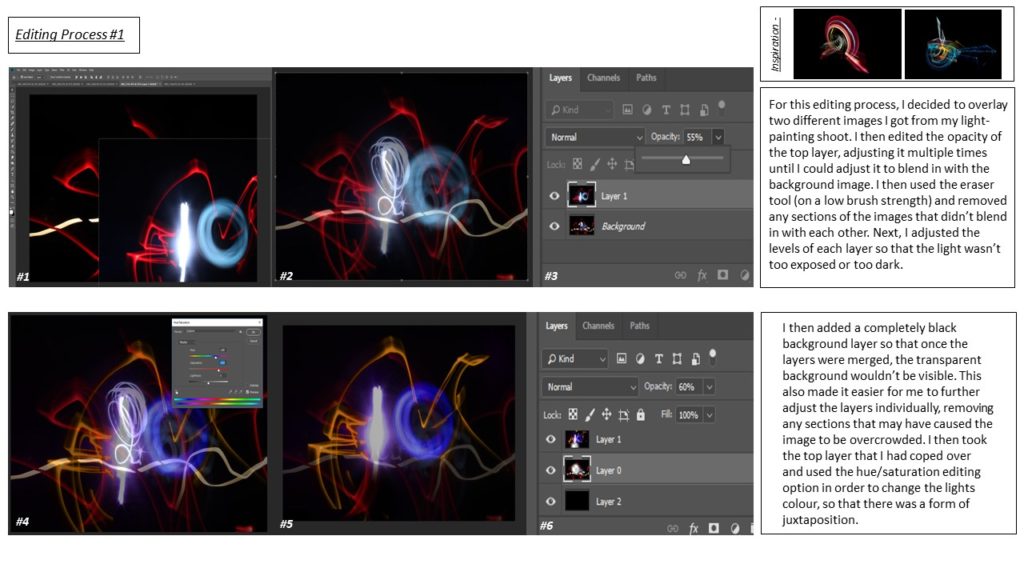
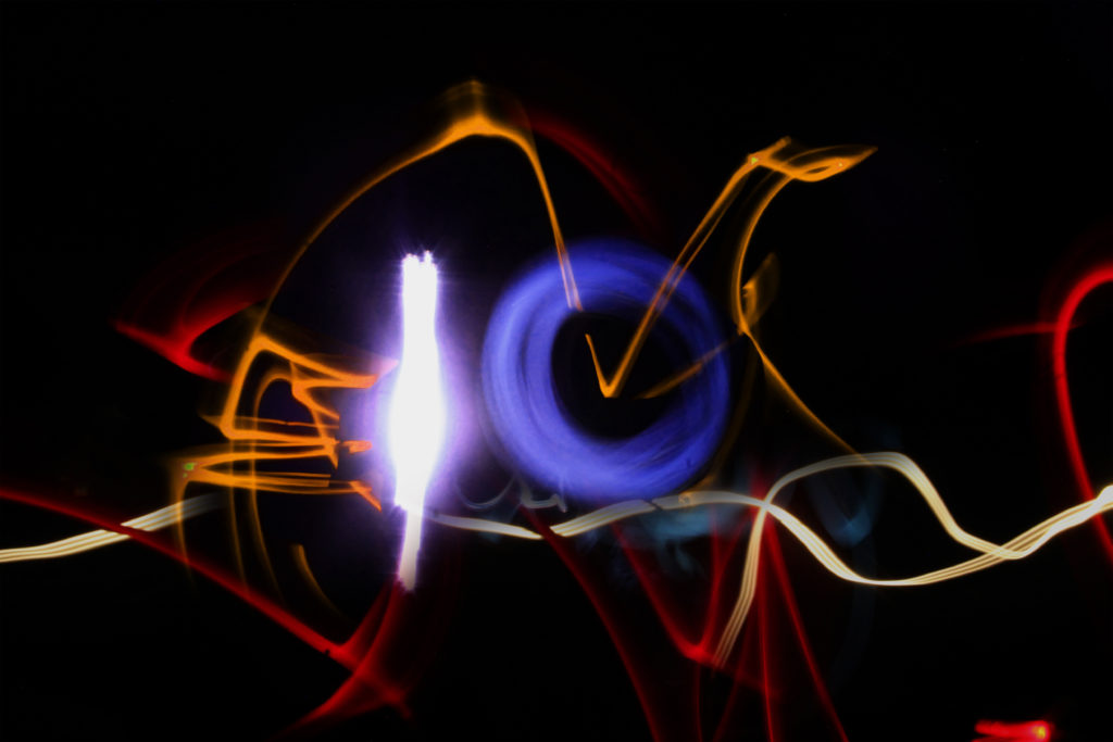
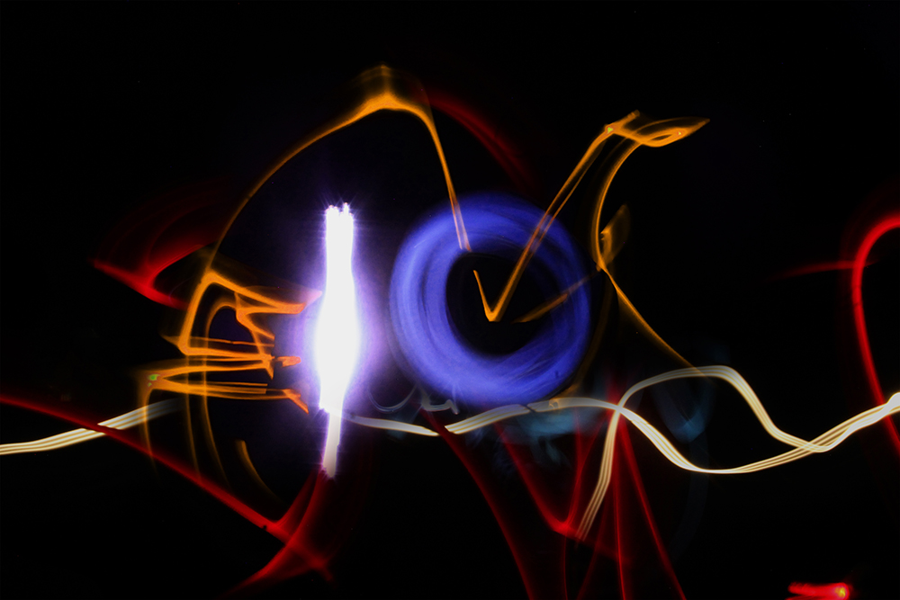
This photoshoot was inspired by Jan Leonardo, mainly using different lights and torches with a prolonged exposure in order to create the ‘light-painting’ effect. In photoshop, I plan on combining these images and adjusting the hue and opacity of each layer to create a montage effect but to also create the illusion of there being more lights in the image.
Photoshoot 5 –
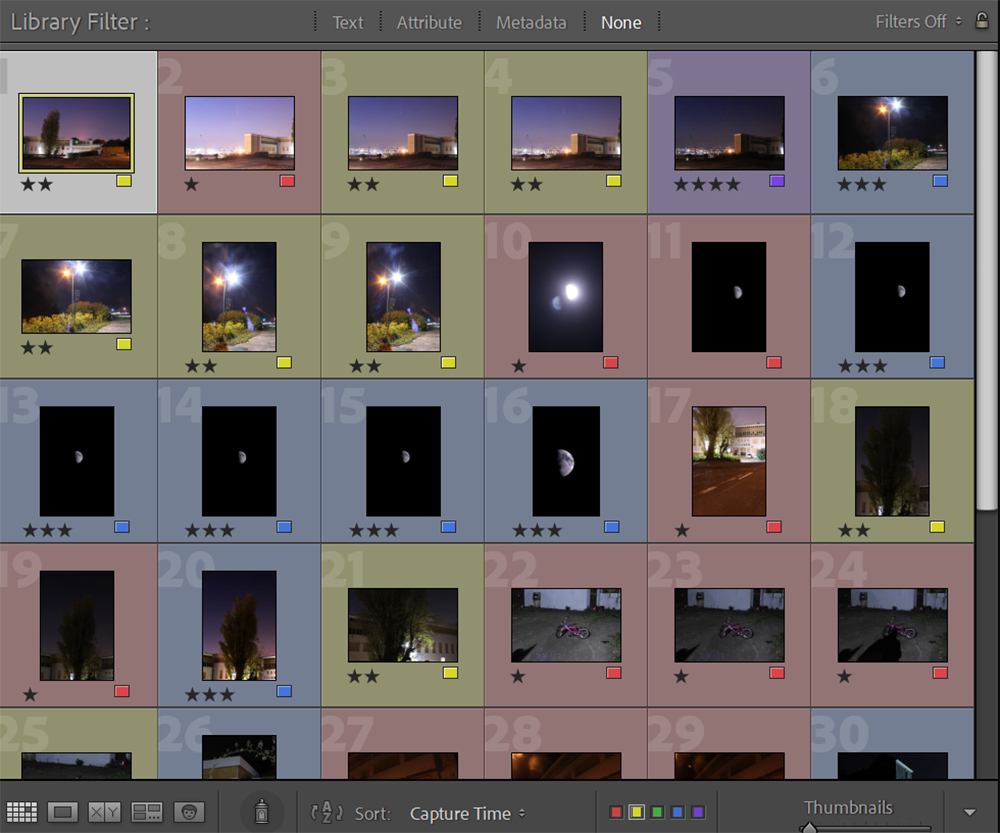
This photo-shoot was inspired by Jerry Uelsmann , I focused on many eerie landscapes or ones that may connote deep emotions such as the moon. I also tried to incorporate an element of negative space that could be interpreted as the unconscious mind. With an increased negative space, such as in the images of the moon, a bigger emphasis is place on the subject in the foreground (moon).
Photoshoot 6 –
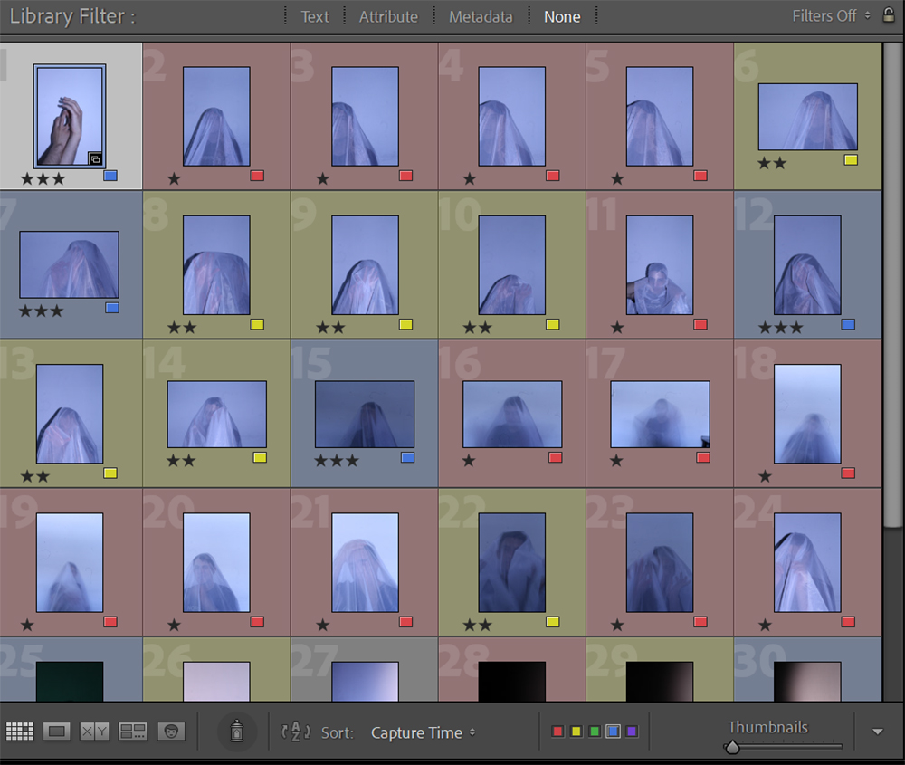
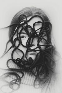
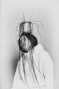
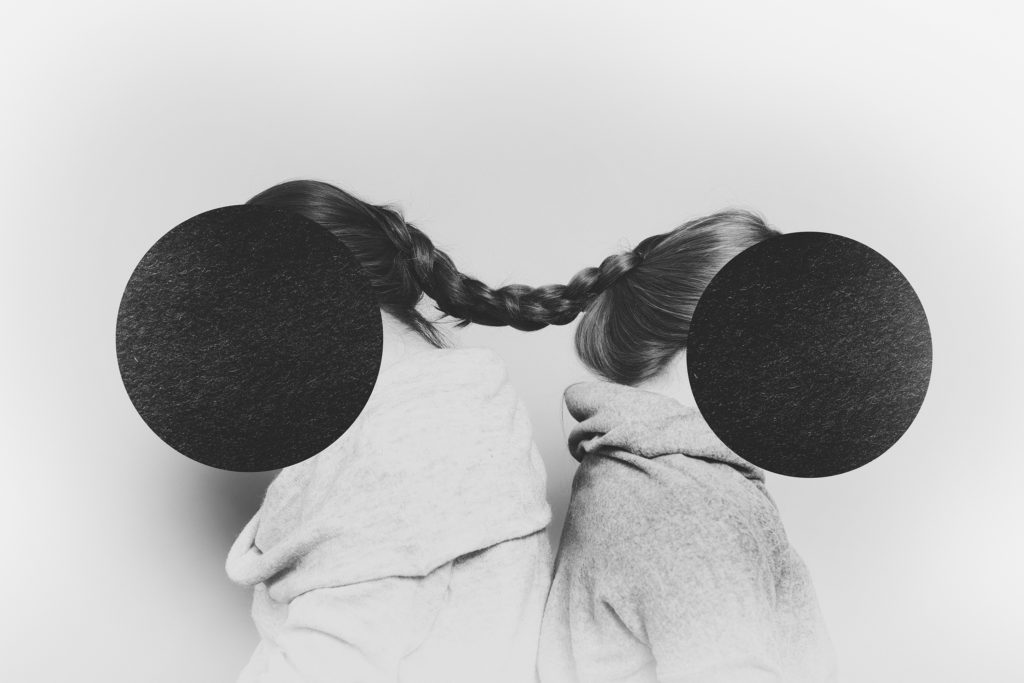
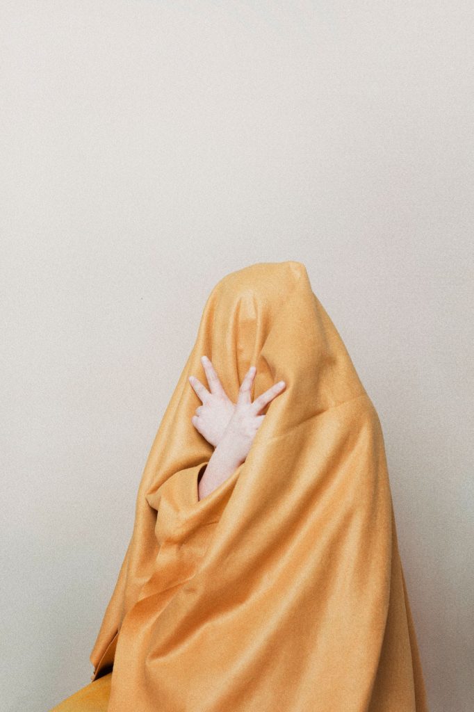
For this photo-shoot, I was mainly inspired by Nicholas Alan Cope & Dustin Edward Arnold project; ‘vedas’. In order to do this, I experimented with different subject poses and camera settings whilst being disguised by a translucent fabric.
Photoshoot 7 –
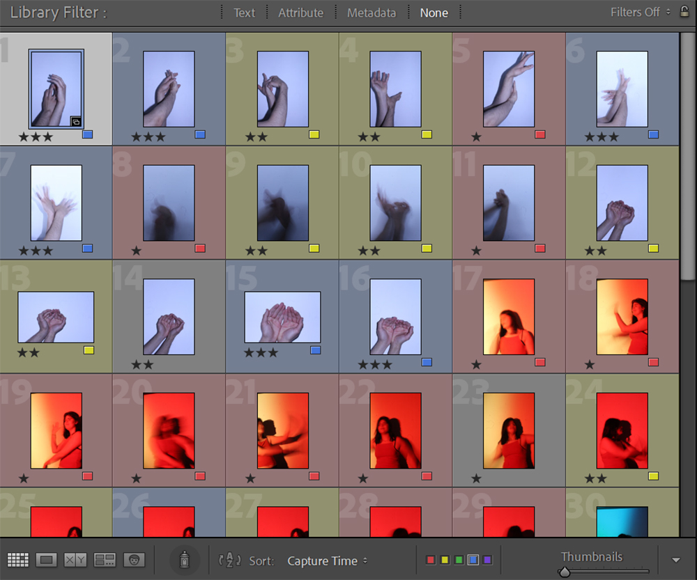
For this photoshoot, as I used a studio environment, I focused on Nick Fancher‘s style of photography; with a key focus on subject matter, human form and lighting. In order to get the correct lighting, I had to experiment with different camera settings, firstly using manual which allowed me to control most of the photographic aspects, and then shutter speed priority as that allowed me to balance lighting and exact time the lens was ‘open’/ exposed to light for.
Photoshoot 8 –
Although this photo-shoot wasn’t directly inspired by a particular artist, it could definitely be linked in with the work of Jerry Uelsmann, using a combination of landscape imagery in conjunction with human form, to create a double exposure. I decided to take these ones at St Catherine’s woods in order to explore the difference daylight and night lighting/ moonlight can have on images overall connotations. Similarly, I also tried to further link to the work of Nicholas Alan Cope & Dustin Edward Arnold by placing the black fabric on the fallen tree trunk, and allowing to move independently by the wind.

These are the images I took later on in the day, exploring the same location only with different lighting and mood due to the time of day (and possible connotations this could create in relation to the unconscious mind).
Editing Process –

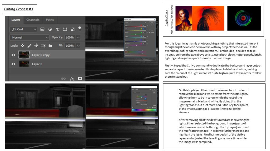

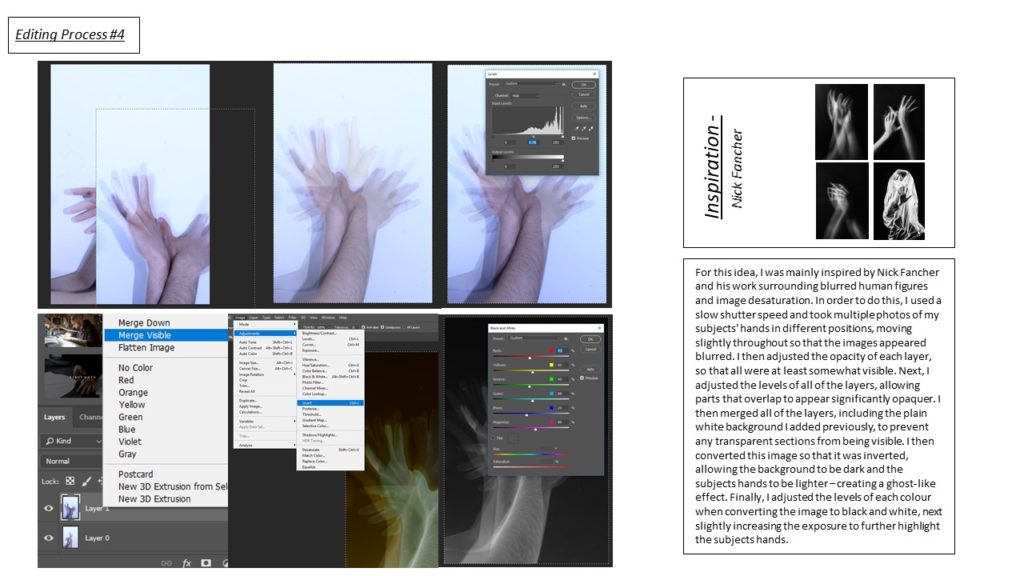
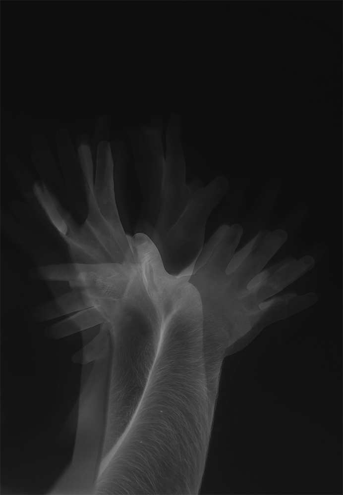
Final Images –

Inverted Overlay 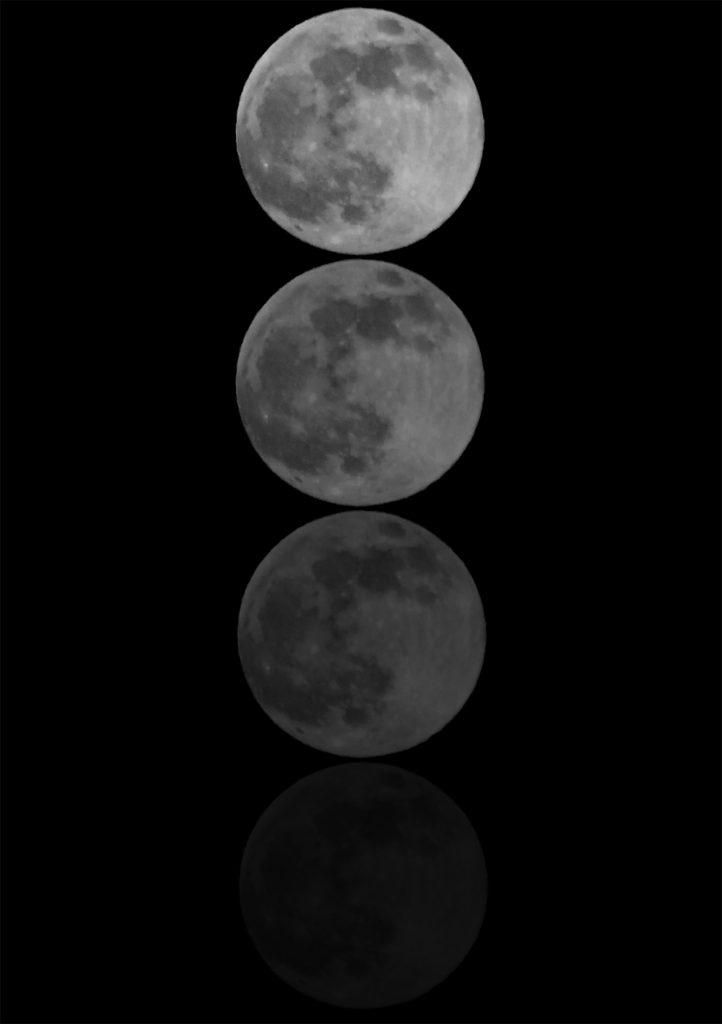

Double Exposure 
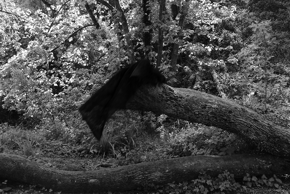

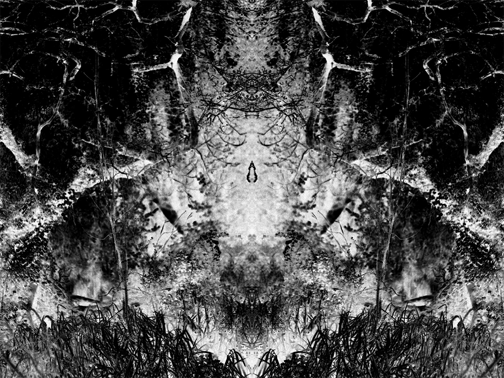
Inverted Mirror Image
Photobook Research –
The Dreaming
(Yasuhiro OGAWA Publisher: Sokyusha)
A stunning, somnolent journey through a monochrome world.
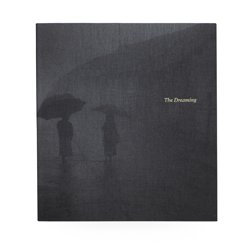
The black and white images create the world as seen from the eyes of a young adventurer overwhelmed by what he sees, who surrendered himself to the experiences and sights he was going to be met with. Ogawa’s photographs succeed in a difficult task: capturing the world as otherworldly and fascinating as it can truly be. In 2020, Ogawa Yasuhiro released The Dreaming. A book spanning 27 years and nine different countries.
I believe a lack of context is Ogawa’s sharpest tool, and it is with this that he brings you into a painterly world of familiar yet difficult to recall scenes, which is very similar to how we experience our dreams; once conscious, it is hard to recall precise details. Aside from this, the title also has clear and obvious connotations to the unconscious mind and the dream world. – Not until the 13th century was our word dream used in the sense of “a series of thoughts, images, or emotions occurring during sleep.” The word itself is considerably older. In Old English dream means “joy,” “noise,” or “music.” Yet the change in meaning did not come from the development of a more specialized sense.
The final image in the book is also very significant, as not only does it act as the closing scene, the end to the narrative, but it also creates further illusions towards a dream world. The artist’s viewpoint is high, unusually so as the top of a tree occupies the foreground, and the artist is also seemingly exposed to weather as white dashes of snow streak across parts of the frame. It is detached, hazy; as if you’re floating above the scene like an out of body experience. It creates a similar effect in much the same way a barely remembered dream does after one wakes. There is a realization that you’re was asleep, but that doesn’t make the dream seem any less real. The imagery of the train also signifies a journey, that a final destination will be reached and that there is a narrative.

My new book The Dreaming contains 86 black and white images selected from my 27 years’ career in photography and traveling. When I turned 50 last year, I decided to go through all the black & white negatives I had taken so far. Every moment of the journeys may have been vision of dreams – that’s what I thought when I tracked down my archive and such a thought gave me a hint to make this book.
Yasuhiro Ogawa
Layout –
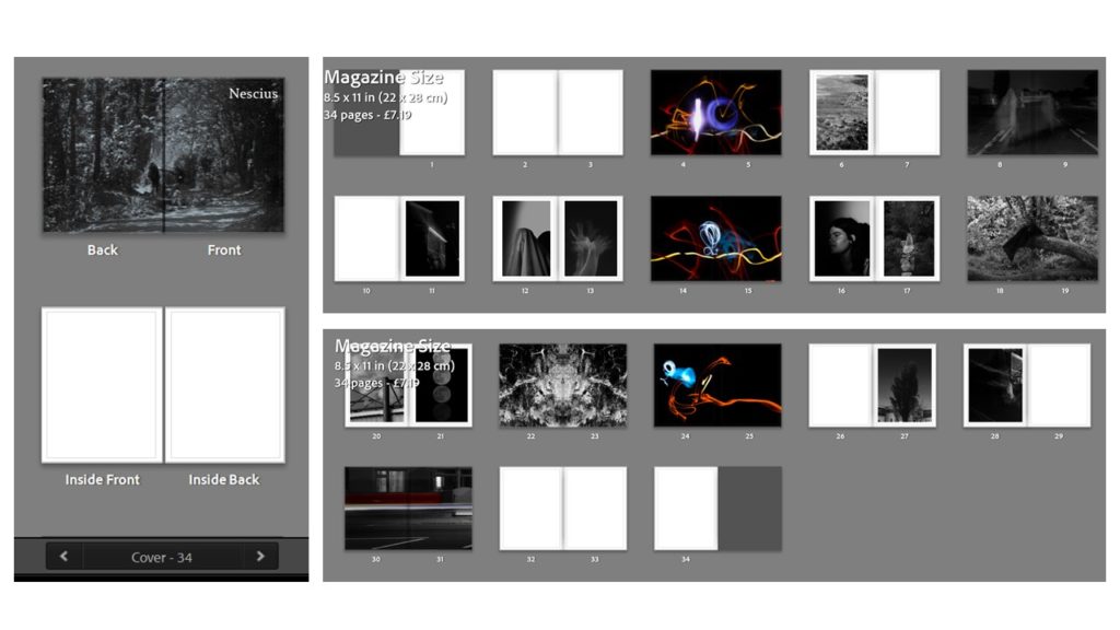
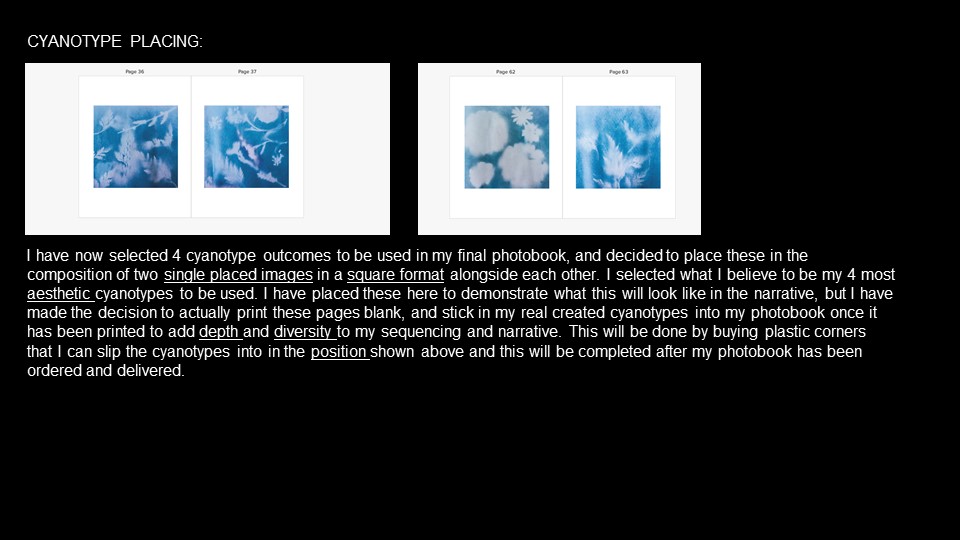
Type – Magazine Size // Style
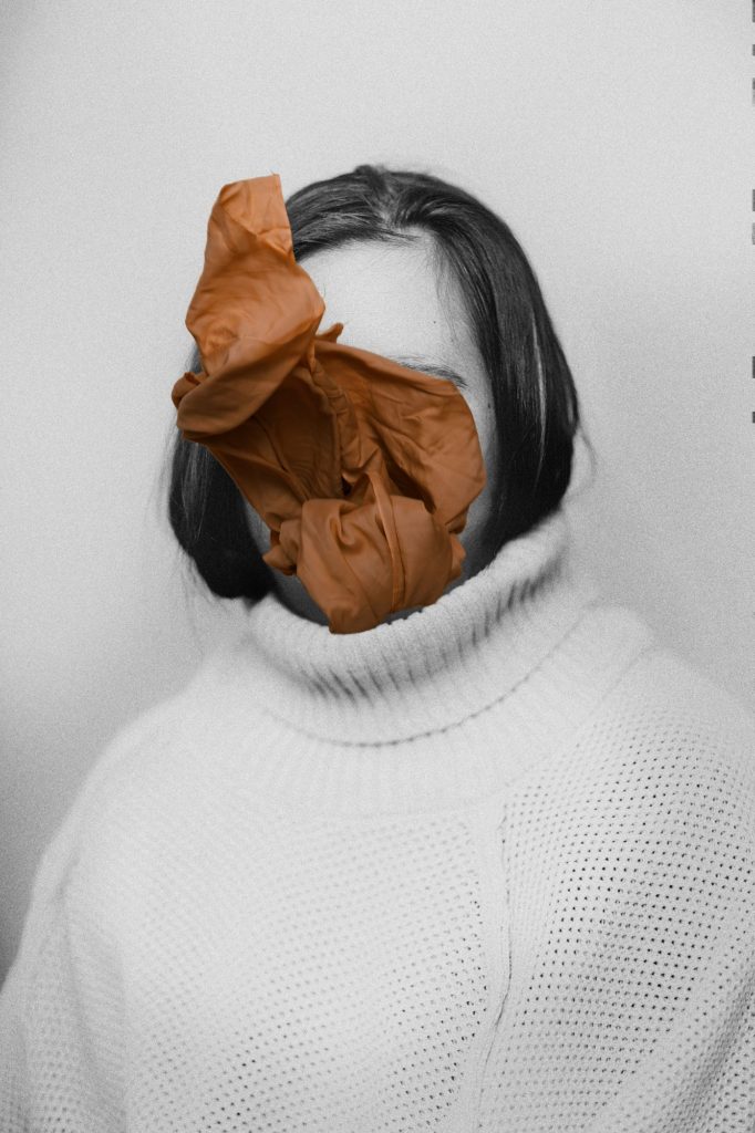
For the layout of my magazine, I tried multiple different styles and sequences. Firstly, the initial title was going to be something more simple such as ‘Unconscious’/ ‘Vision’, however, I decided to translate ‘Unconscious’ in to Latin to get ‘Nescius’. I also decided to set the front and back covers out as fell-bleeds as it prevents any juxtapositions being created, leaving a simple but effective look. Furthermore, I decided to use this particular image as my cover as it contains two subjects, one being led by the other, surrounding by dense trees and wooded area. I also decided to keep the first three pages clear, in order to allow the transition from the cover to the main narrative to be smoother. Throughout my narrative I also used three different images from my light-painting shoot, acting as links and support for the narrative. I also wanted to experiment with some juxtaposition pages, which could be used to create confusion, similar to that of dreams created by the unconscious mind. Similarly, in order to end the narrative I used my colour splash image, as it refers back to my black and white images as well as might light-painting ones, creating a form of ending to the sequence.
Favourite Pages –
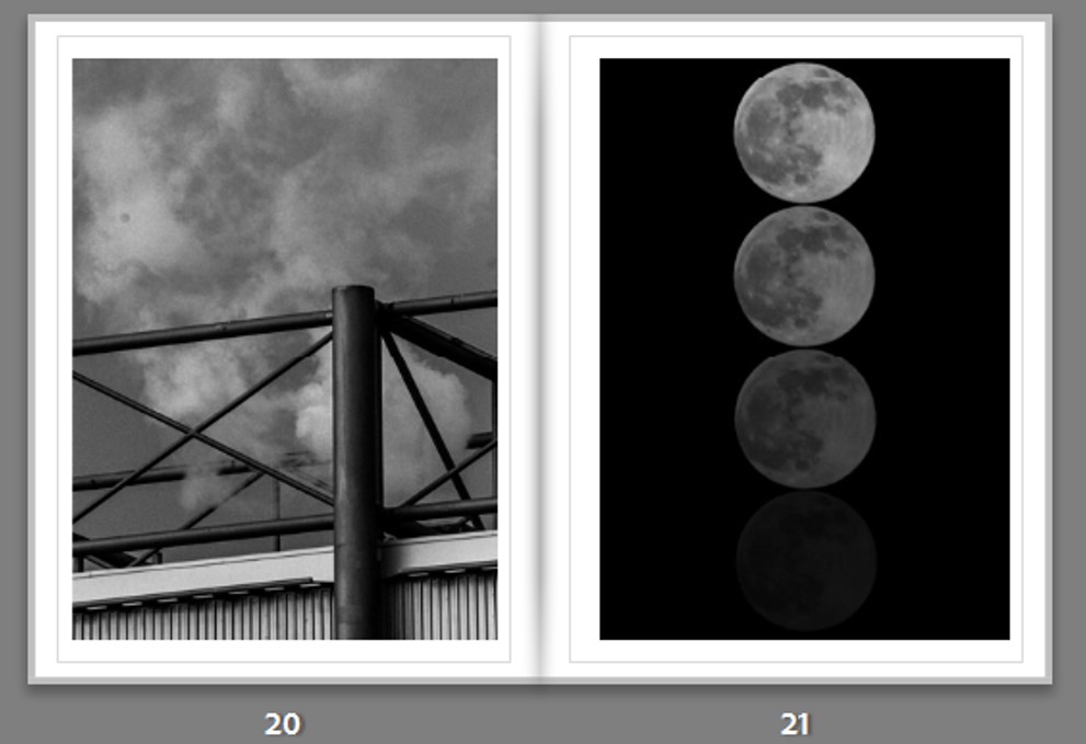

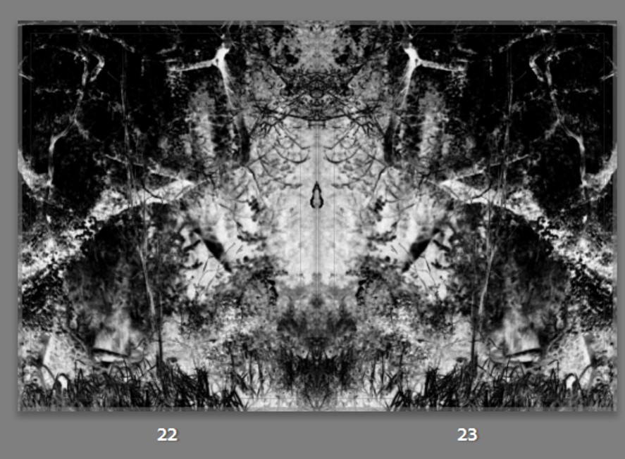
Gallery Layout –
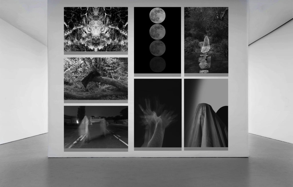
Evaluation –
- What Went Well
Final outcomes – I think that my final outcomes (displayed above) came out very well and are all symbolic of the surrealist aesthetic in relation to the unconscious mind. Similarly, I also think the organisation, editing and selecting of my photos also went well and ultimately helped me to have the best images. My plan and statement of intent also assisted me in developing my ideas and aims.
- Even Better If
In terms of improving this project, I think that thinking more thoroughly about my photo-shoots and my aim for them would have improved the overall outcome. Similarly, exploring different art and cultural movements such as postmodernism previous to my idea may have helped me in forming a project and setting me up for what I wished to create.
- Overall link to freedoms // limitations
The overall theme of this project was Freedoms and Limitations, which I believe I have successfully targeted through surrealist techniques in relation to the unconscious mind. For example, the key idea linking the two would be how our unconscious selves, or our dream selves, allow us to explore our identity and sort through our thoughts, creating dreams of events that would never be able to occur in real life. Contrastingly, this is the very same point that links the theme to limitations, as it is in our mind and our mind alone, limiting us to a single reality that cannot be explored outside of the unconscious self.
- Favourite outcomes


Marinka Masséus
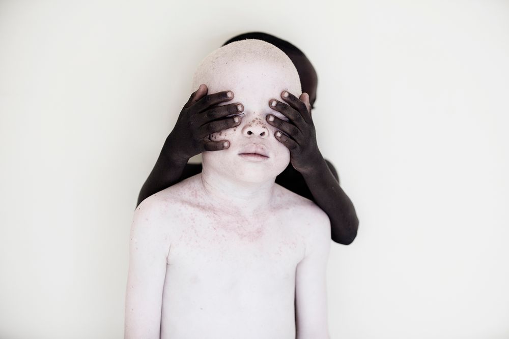
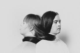
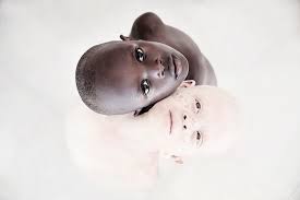
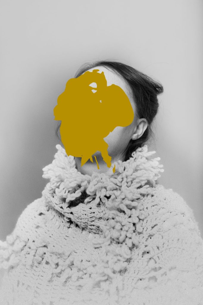
MARINKA MASSÉUS is a photographer who has investigated and photographed people with Downs Syndrome. Her project, Chosen [Not] To Be, captures how these people feel limited and separated from society. The images almost show how they can be strong and the centre of attention when most of the time are pushed aside.

To me this image is interesting, it doesn’t clearly link to those with Downs Syndrome, but if you think more closely, it does hide something, with the yellow spot. The way it relates to those with Downs Syndrome is how they are hidden away and not seen in the public eye as important. What is the significance of the spot? What is under the spot? There are many leading lines that draw the eye into the image, to the spot, increasing its importance.
In my project, during the experimenting/editing stage I am going to place elements that hide things. I am also going to experiment with drawing on print outs of the portraits I take, to add personal aspects to them, by using their limitations and freedoms to them. These print outs will then be rephotographed and placed in my book.


