Final environmental images-

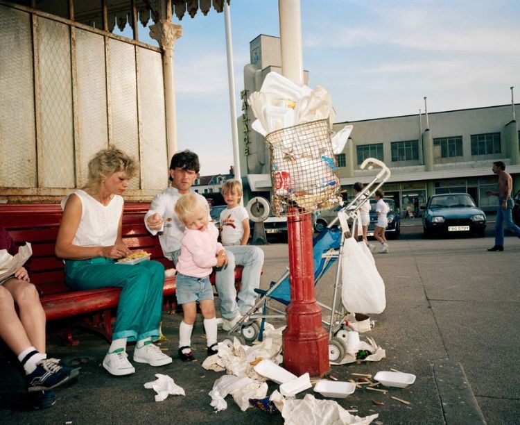
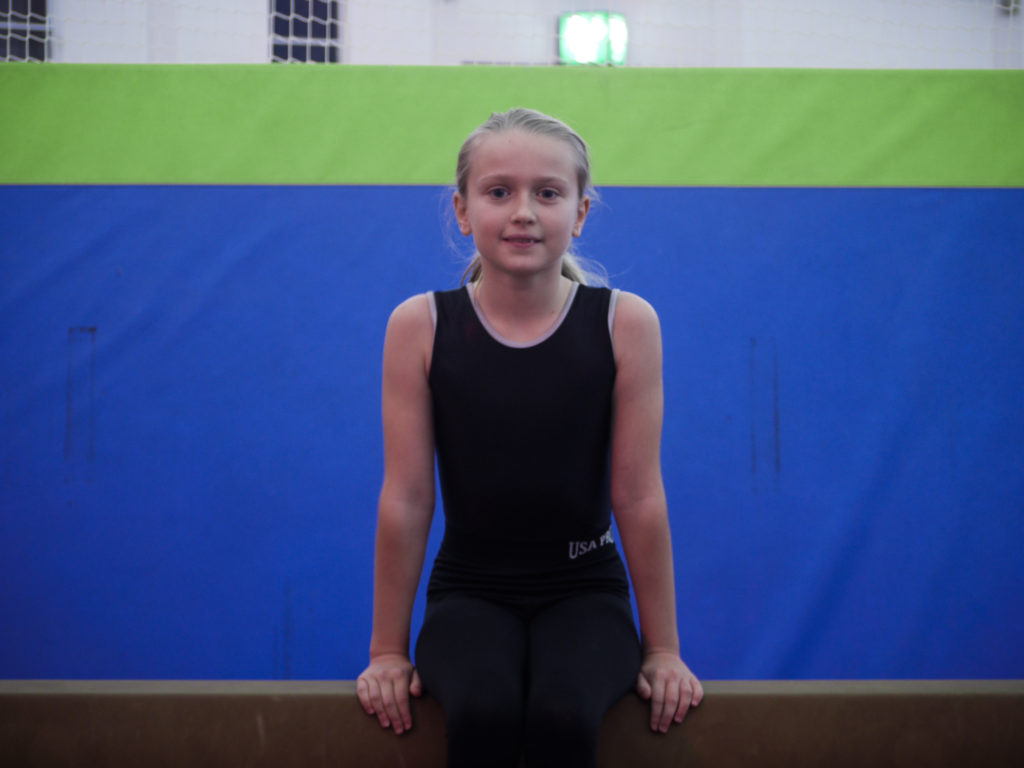
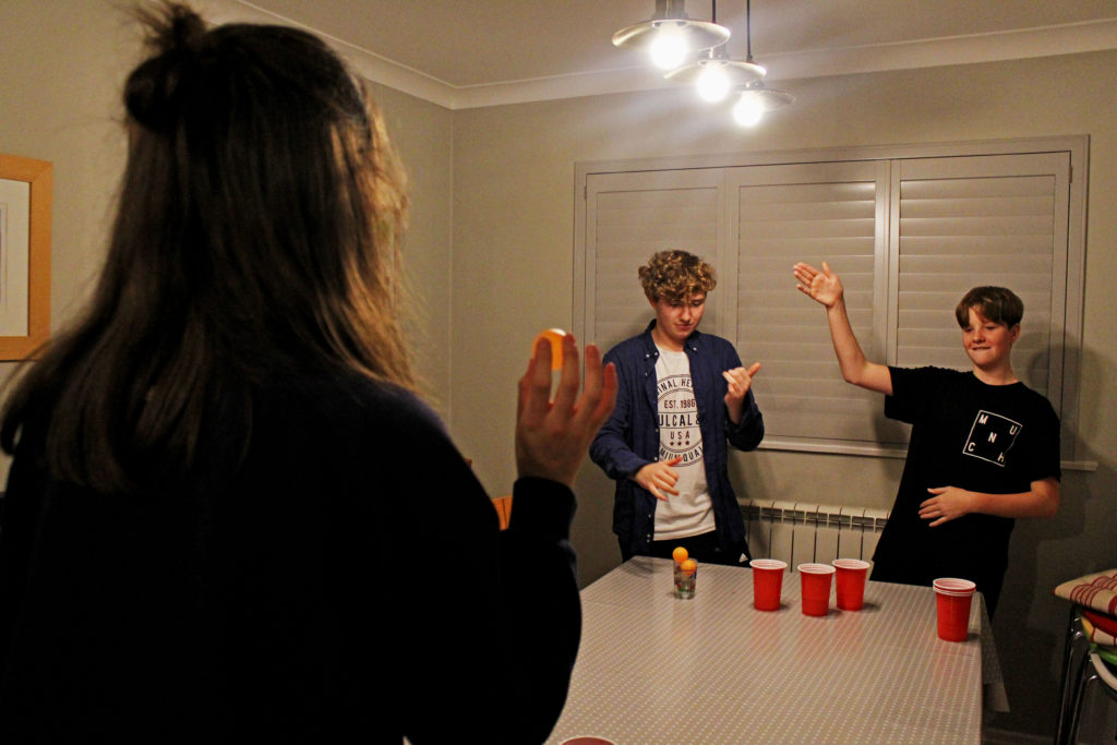
I only edited this set of images very slightly and subtly to keep the integrity of the original images and the true essence of each working environment.

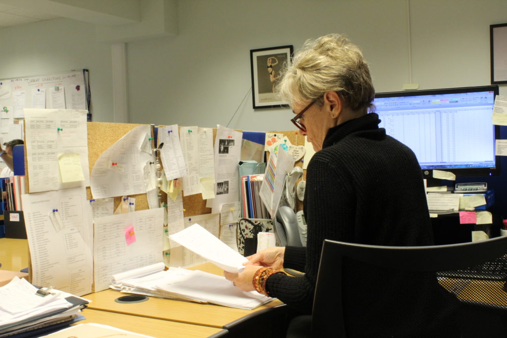
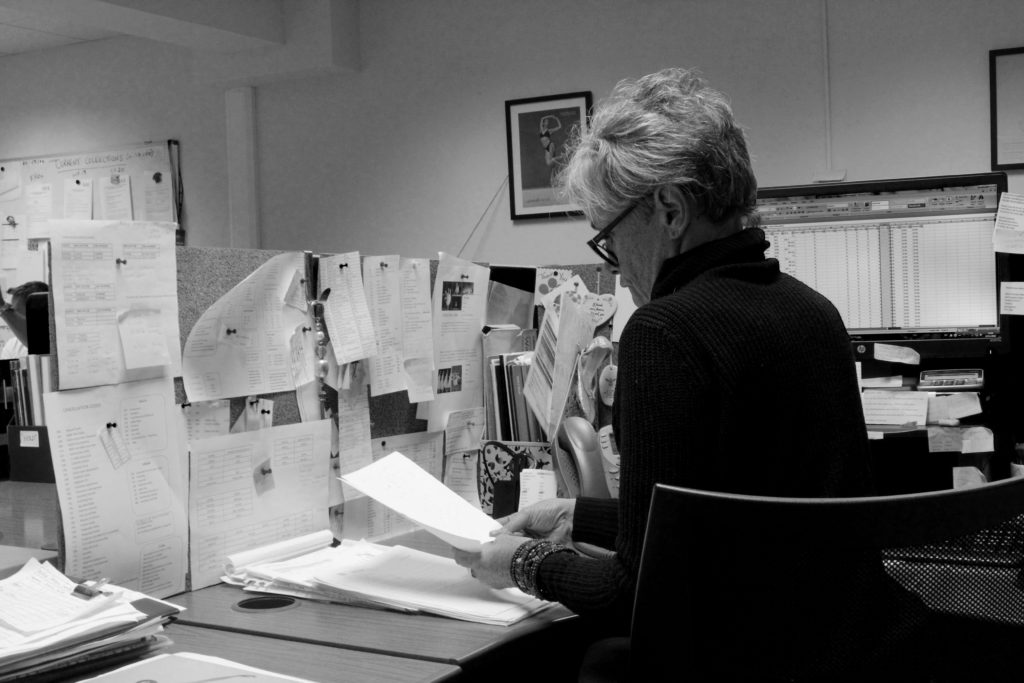
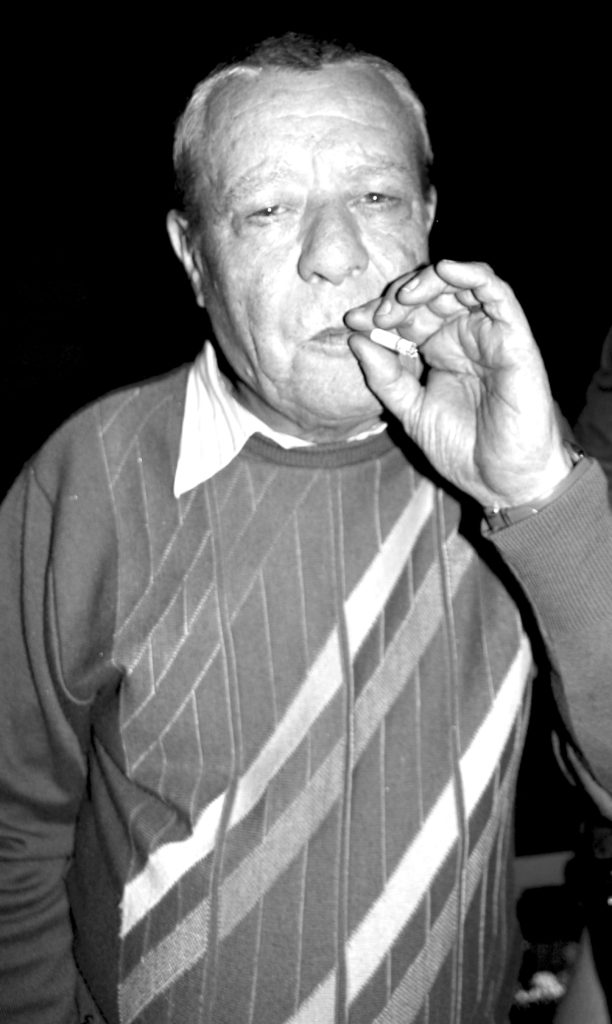
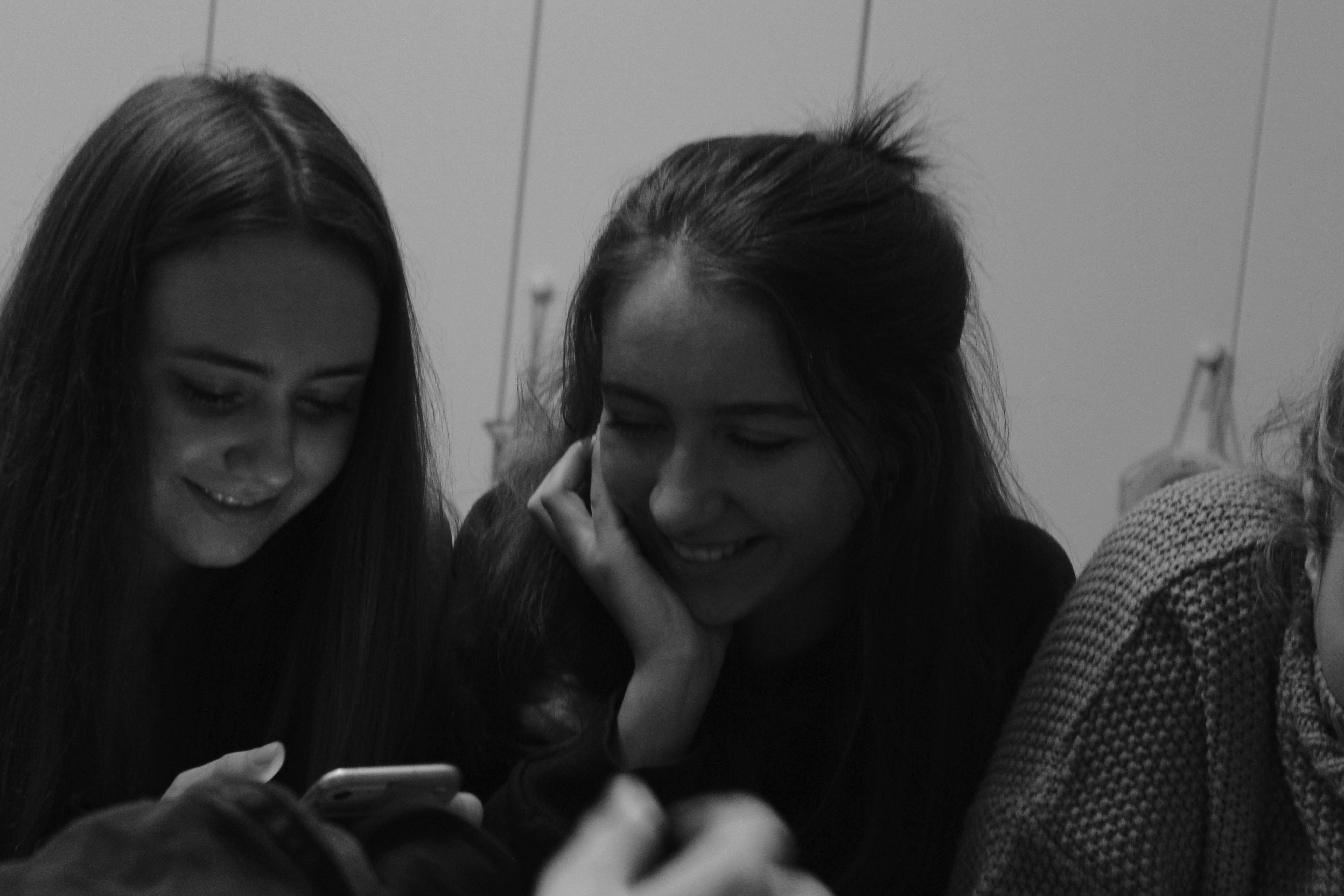
With this image I decided to make it black and white, to tone down the cluttered effect of all the different colours and also to reduce the yellow tone of the lighting. I then edited the brightness and contrast slightly, as well as the vibrancy and tone of certain colours, for example I lowered the vibrancy of the colours used in the pins on the desk wall in order to make them darker and have them stand out against the white papers.

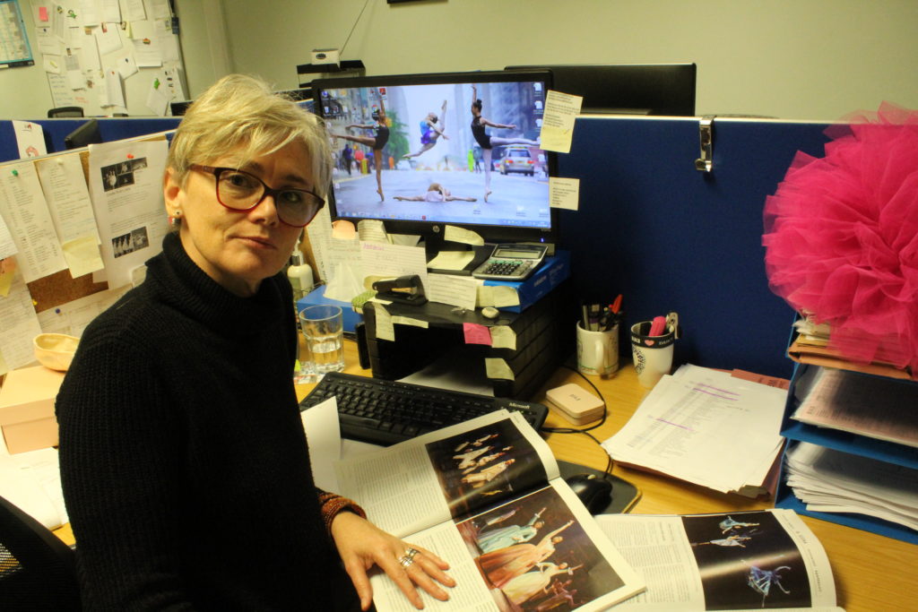
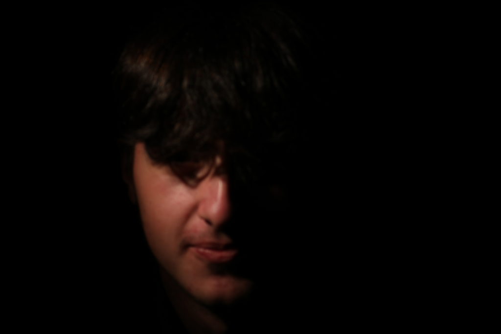
For the second image, I ended up having a slightly chiaroscuro effect, as half of my subject’s face is in shadow, but it is subtle enough as not to obscure the whole image. I had the subject stare directly down the lens to create a posed effect, as well as arranging the magazines to display some of the products that are sold and places they could be sold to. I chose to have the subject wear her glasses to add more structure to the face and tie in with the dark colour of the jumper.

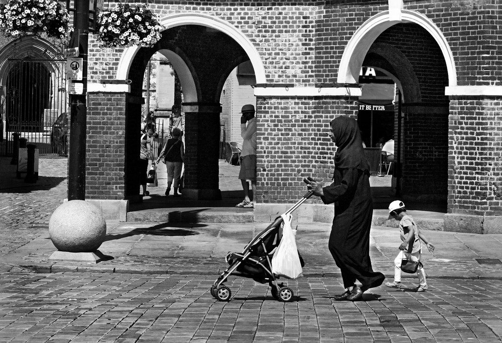
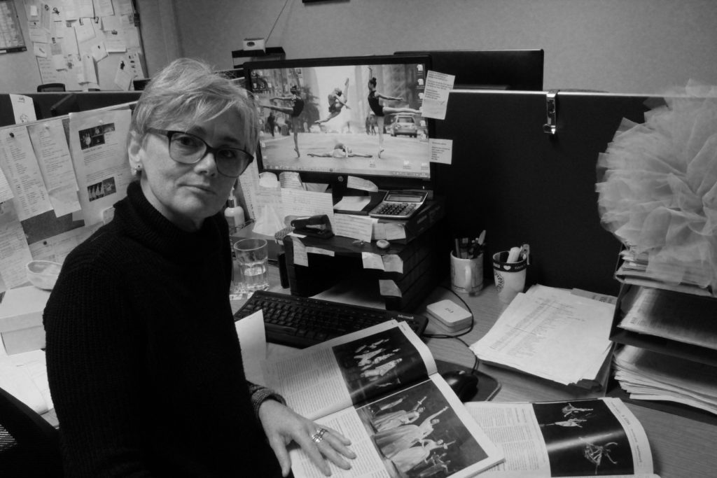
The black and white images above mirror the style of iconic environmental photographer Arnold Newman, so as to show how I used his work as inspiration for my own photoshoots.

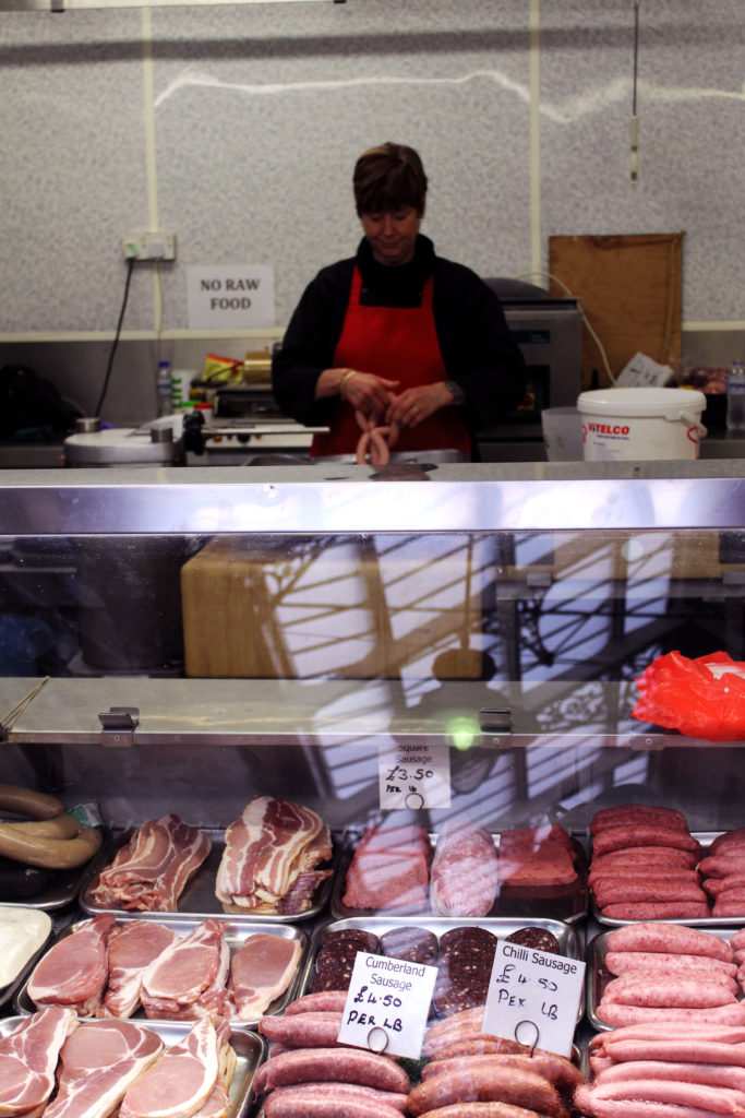
For this image I increased the magenta and red saturation and vibrancy to bring into focus the meat in the foreground and the woman’s apron. This emphasised her job as a butcher and made the image more pleasing to look at. I felt that the reflections of the glass worked nicely to add some highlights to contrast the (unfortunately) dark background of the image, which I was not able to change without drastically changing the colour palette of the photo.

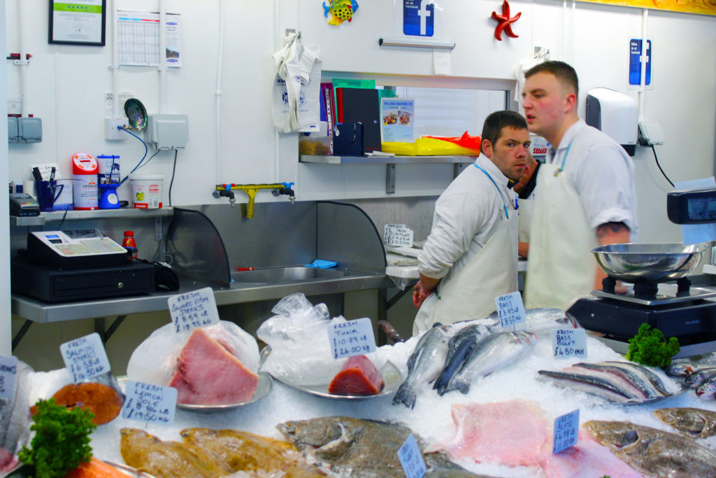
This image is mainly white, so when editing, I made the bright colours stand out, mainly to try and get the pink of the fish in more detail but also to enhance to vibrancy of the various backgrounds objects scattered around that show that this is a workplace. I like the composition of this image, as the fishmonger looking directly into the lens without a posed expression makes the image interesting, and the geometrical feature of all three workers in the same section of the image helps to brings attention to the main worker’s eyes and face.

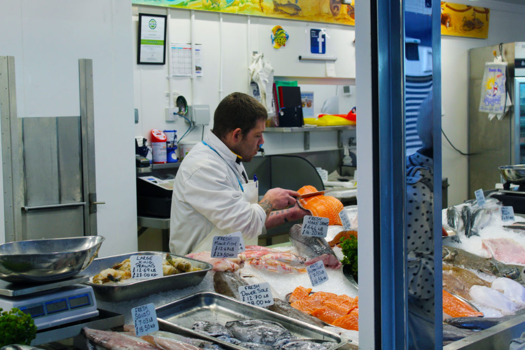
I edited this image in much the same way as the last one, except now I made the fish the man is cutting brighter and the most vibrant part of the photo. This drew attention to his knife and his actual job as a fishmonger, which is obviously the main focus of the image.

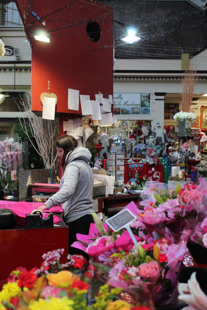
I edited this final image the least, as I felt that the cluttered effect created by the large amount of background objects helped to bring the subject out as the focus of the image, as it is the only vaguely clear part of the photo. I made the colours more vibrant and saturated, however I felt that the flowers were already bright enough so as not to need much editing. I tweaked the levels and contrast slightly also, in order to have the beam of light from above brighter and focus more of the person, as I saw that during the shoot and felt it would make for a good image.

Overall, I feel that I was successful in presenting a range of images of people in various occupations, posed in a manner that reflects their jobs and the way that they work, as well as sometimes adding a more candid feel to certain images by using different angles and capturing natural facial expressions. If I were to do this project again, I would have a selection of more clearly posed images alongside some natural, candid images for each person.

candid portraiture photography final outcomes and evaluation

Below are my favourite outcomes in response to the candid portraiture, as they are interesting and eyecatching.

final image one

This is one of my final outcomes because I enjoy the dramatic pose the individual is performing and the natural face they are making. The background is not distracting from the pose, meaning it is the most important thing in the image. If I were to take this photograph again, I would try to not cut off the feet, to allow for the photograph to be more aesthetically pleasing. I would also try to take a close up of the face, meaning I would have more of a selection when it came to picking my final images.

final image two

This is one of my final images, as I like the expression on the individuals face, as it is very strong and focused. I also like the way I have edited the background to make it more interesting and attractive. If I were to take this photograph again, I would try to make sure the face was more in focus, meaning I could gain a much stronger picture. I would also try to take this shot from different angles, as I seem to shoot from the same angle, meaning all my photographs look similar and that can be boring for the viewer.

final image three

This is one of my final images because I find have really captured a truly candid shot, as the expression on the individuals’ face is natural and silly. When planning this photoshoot I intended to capture photographs similar to this, as I wanted to capture joy and happiness on my individuals face. This photograph captures the same essence as one of ROBERT FRANKS photographs (displayed below), as they both display the same facial expression. Even though the face is not in focus, I think it still looks sharp as the background is in focus. If I were to take this photograph again, I would try to get more light into the individuals’ eye, as it is dull and not illuminated. To do this, I could have positioned myself in a better place, or increased the exposure a touch more, when I edited the photograph.

Image result for robert frank
robert franks image

whole shoot evaluation

Overall, i felt these pictures came out very well. Even though this was my first time using my camera to take pictures of people, I was impressed with my own camera skills. I don’t think many of my images related to ROBERT FRANK, as they didn’t all capture the same things he did. However, I really do like most of the photographs because of how bright, and interesting they are to look at. if I were to do this whole shoot again, I think I would try to capture my individual more times, even when walking around the gym, meaning I would have more images to choose from when picking out final images.

PHOTO SHOOT in studio

Best Outcome

After changing the ISO, shutter speed and aperture i was able to get some good quality pictures by allowing the perfect amount of light to come in. This photo is a close up photo mainly focusing on his face.

I have created a chiarascuro effect by casting light on one side of the face only. This is an effect that has been used by artists for many centuries and produces a dramatic effect in film too.

Henri Cartier-Bresson

Henri Cartier-Bresson was a French humanist photographer. He was considered by many to be a master of candid / street photography, and an early user of 35 mm film. He created the genre of street photography, and viewed photography as capturing a decisive moment. Cartier-Bresson was one of the founding members of Magnum Photos in 1947. Magnum Photos is an international photographic cooperative owned by its members, with offices in New York City, Paris, London and Tokyo.

Cartier – Bresson’s mostly works in black and white and focus’s on elements such as reflection, motion/movement and framing.

He founded the Magnum Photo Agency in 1947 along with 3 other photographers at the time. Magnum Photos now consists of around 80 members who all help run the agency. Magnum Photos also attained the copyrights to all of Cartier – Bresson’s work after he passed away at the age of 96.

Technical – The lighting in this image in reasonably high key with the bright white sky taking up half of the frame. The lighting is all natural with some extra light reflecting off of the water. The tonal range remains consistent with a small amount of contrast.
Visual – The choice of a black and white image adds to the emotional response created by the viewer and the buildings in the background, bridge in the middle of the shot and the boat in the foreground create a nice sense of depth. The image its self appear to obey to the rule of thirds. The position of the house which symbolises a safe place and then the forest which can symbolism danger and darkness on either side of the image creates a good sense of juxtaposition, especially since the women is running away from the house and towards the forest.
Contextual – This photo could be related to the romantic art movement with the connotations of the river, bridge and possibly a building of importance (church).
Conceptual – Bresson’s idea with this and many of his images was to ‘capture the moment’. He did this perfectly with this picture showing a women running, causing the viewer to question what she is running from.

Street photography

Street photography comes from taking photos of people or events close up and in the moment. Catching people off guard can often lead to a good street photograph or using a more subtle approach of taking photos of random people doing small, insignificant but interesting things.

These photos are example of Martin Parr’s street photography work. He adopts a heavy use of colours to emphasis his images and possibly increase the sense of chaos they often give off. Most of his work seems to be asking the question of what is actually going on as some appear rather bizarre and peculiar.

portrait

I decided to photograph this person as i felt his age and clothes gave a good vibe. He is a mail man at a finance firm in jersey. I found this interesting as all his colleagues were wearing suits and expensive watches but somehow he was chatting to them as if there was no barrier between the mail man and the directors. The cigarette in his mouth was a good focus for the lens. i choose to make one image black and white as it made the image timeless.

environmental portraiture photography final outcomes and evaluation

Below are my final outcomes in response to environmental portraiture, as they are interesting and eye catching.

final image one

This is one of my final images, as I think is very eye catching and the pose the individual is in is interesting, and also relates to the environment they are in, which is the gym. The eye contact is very strong, which I also think is a striking element part of this photograph and adds interest for the viewer. The composition is also strong to as the bar is framing the photograph. If I were to take this photograph again, I would shoot it in front of a better background, as this one is kind of distracting, and doesn’t really relate to the gym.

final image two

This is one of my final images, as I enjoy the linear aspects of the photograph as it is very aesthetically pleasing, and easy on the eye. The individual is captured straight on, which also is nice to look at and relates to documentary portraiture too. Overall I think this is a very nice photograph as there are no distractions, the individual is holding eye contact and the colours are prominent and bold. If I were to take this photograph again, I would try and get more of the legs in, as then it would include more of the linear aspects into the photograph.

final image three

This is one of my final images, as I find it has the best background, which relates to my individuals environment, because it shows most of the gym. Although the gyms layout is not very aesthetically pleasing, it shows the best response to the environmental portraiture. If I were to take this photograph again, I would focus more on the face as it is slightly blurred, which brings down the overall quality of the image.

whole shoot evaluation

Overall, I felt these photographs came out quite well. This was my first time using my camera to take pictures of people, so I was impressed with my own camera skills. I don’t think the closely related to ARNOLD NEWMAN, but I think that is because I was nervous to tell the individual to change their position and go to another area of the gym.

Image result for arnold newman
arnold newman image

If I were to conduct this shoot again, I would try to get more shots at different areas of the gym, meaning when it came to the selection process, I would have more of a choice of backgrounds. This means that I would have more of a varied array of photographs. I would also try and focus the camera better, as some of the photographs came out blurred. Next time, I would try to direct my individual in a more efficient way, as some of the photographs didn’t really come out well because the individual wasn’t where I wanted them to be.

Candid Edited

Unedited
This was my favourite candid image, as its clear that the image captured a pure, joyful moment . I only edited the lighting and contrast, as i thought the picture didnt need any major changes
Unedited
I made this image black and white as i think it created a causal and classic look, that the moment also exerted
Unedited
For this image i adjusted the contrast and lighting settings, but i also used an app called Picsart to add a thin white outline to the two people in the image, as i thought it added some definition to the characters positions. I like this image because it captured a genuine moment of celebration.
Unedited
I like this image because it captures the chilled vibe of the moment, showing 2 people dancing candidly. I edited the brightness of the lights to add a shine and adjusted the contrast and saturation

Adobe Photoshop Skills

Adobe Photoshop is an incredibly powerful program that allows you to do professional grade image manipulations and adjustments. It’s a critical tool for designers, web developers, graphic artists, photographers, and creative professionals.

Image Adjustment and enhancement

Adjust the Brightness slider to change the overall brightness of the image. Adjust the Contrast slider to increase or decrease image contrast. When you click OK. The adjustments will appear only on the selected layer.

Experiment by adjusting the sliders. The Vibrance slider affects the intensity of colors. It has the strongest effect on muted colors in the image.

The Saturation slider increases the color intensity of all colors in the image. by adjusting the Hue, Saturation, and Lightness sliders. Your changes will affect all the colors in the image.

The Hue slider changes the colors in an image. The  Saturation slider affects the intensity of colors in an image. The Lightness slider affects the brightness of colors in an image.

To affect only a specific color with these sliders, first go to the drop-down menu at the top left of the Hue/Saturation dialog box and choose a color range, like Yellows. Then adjust the Hue, Saturation, or Lightness sliders. These changes will only affect the selected color range, wherever that color appears in the image.

When you click OK. The adjustments will appear only on the selected layer.

Cropping methods

Where possible, you should always edit your photos non-destructively. This means that you can edit your image as much as you like, but can always undo any change, and always revert back to the original file if you need to.

The crop tool also enables you to straighten up the horizon in your shots. Click the Straighten button in the options bar and draw a straight line along the horizon in your image. Straighten works by rotating the image and cropping out the corners.

Whenever you’re cropping, make sure the Delete Cropped Pixels box is not checked. This enables you to crop non-destructively. You’ll only see the image as you’ve cropped it, but the extra pixels will not be discarded. If you want to change the crop later, you can.

Use of selection tools

It  provides selection tools for different kinds of selections. For example, the Magic Wand tool can select an area of similar colors with one click.

The Selection Brush tool lets you paint your selection. So in general you would use the Magic Wand and Quick Selection tools when you have clearly defined colors or tones. The Lasso tool basically lets you trace around an object to select it.

This basically makes your life much easier and helps improve the photo to your desire.

Cut-n-paste methods

This tool allows you to duplicate things.

Layers and blending methods

The way to do non-destructive editing in Photoshop is to use layers. Layers are like a series of transparent sheets stacked on top of your image. 

Ideally, every single edit should be saved on its own individual layer. This enables you to adjust the edits later, make them more or less visible, or remove them entirely by hiding or deleting the layer.

Adjustment Layers allow you to make changes to your image’s tone and color in a non-destructive way. Adjustment layers give you additional editing flexibility. They allow you to re-edit image adjustments you’ve made, and protect your original image from direct changes.

Currently, there are 27 Blending Modes in Photoshop. 30 Blending Modes if you include the two extra Blending Modes for the painting tools (Behind and Clear) and the extra Blending Mode for groups (Pass Through).

Some Blending Modes are:

  • Normal,
  • Dissolve,
  • Darken,
  • Multiply,
  • Color,
  • Burn,
  • Darker Color,
  • Lighten Screen,
  • Color Dodge,
  • Lighter Color,
  • Overlay,
  • Soft Light,
  • Hard Light,
  • Difference,
  • Exclusion,
  • Hue, Saturation,
  • Color, 
  •  Luminosity.