

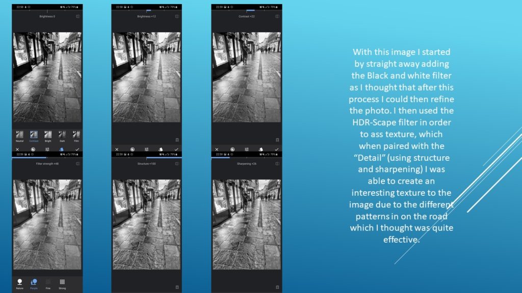
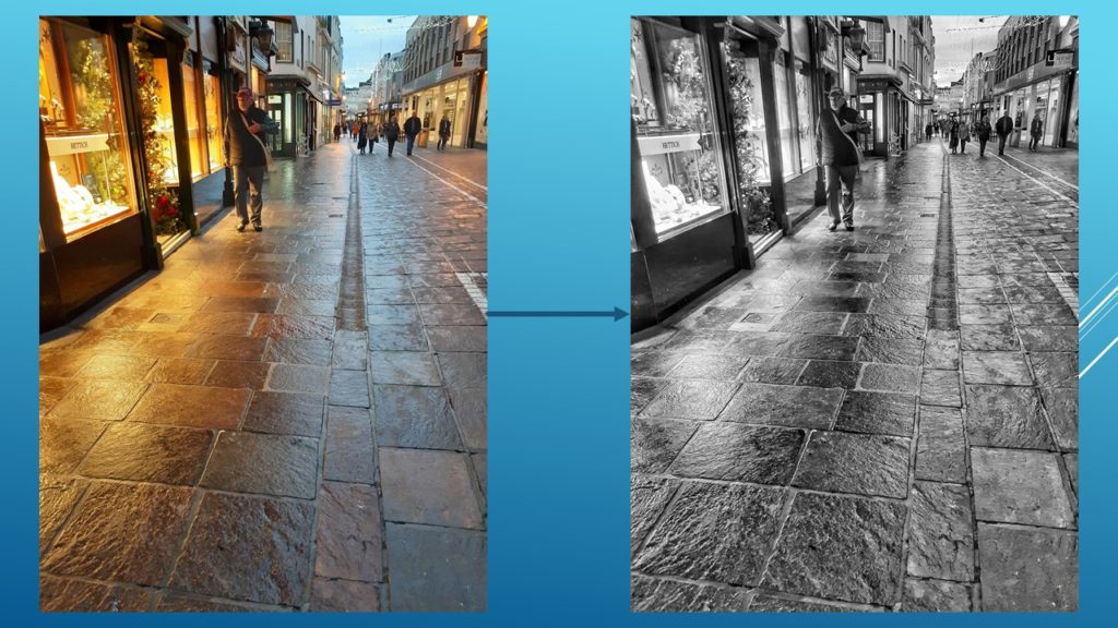
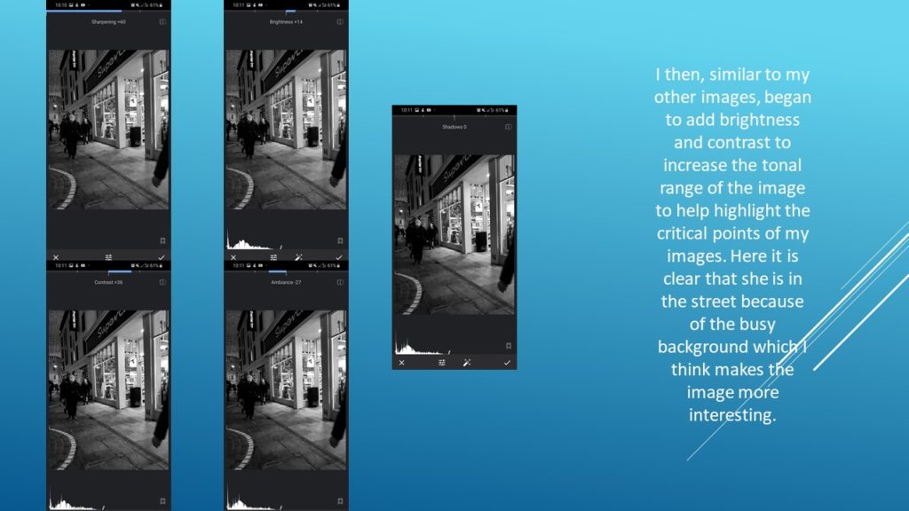
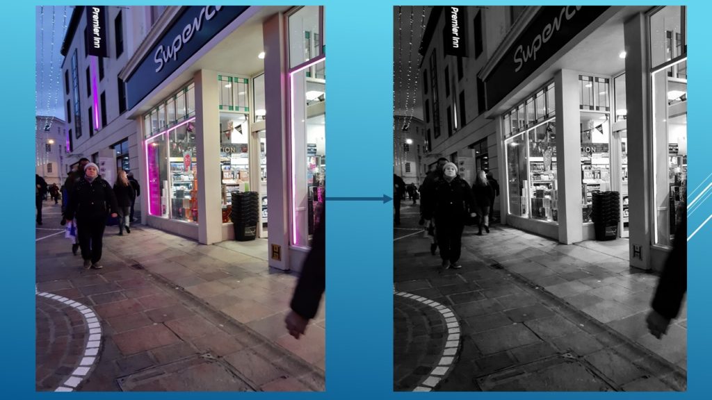
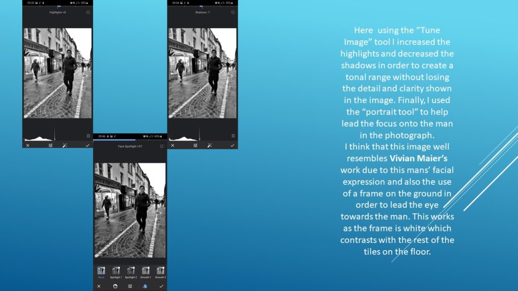
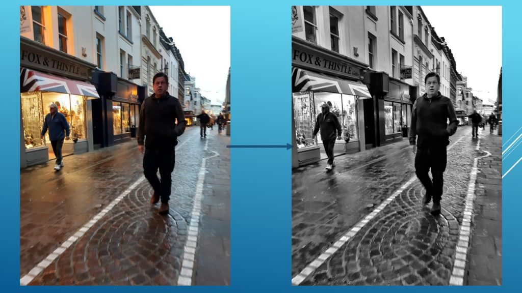
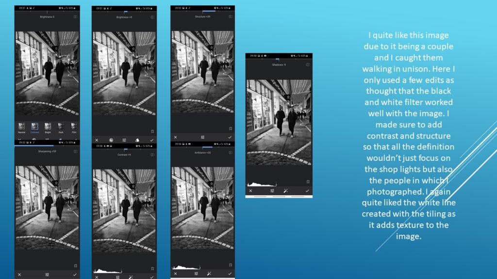

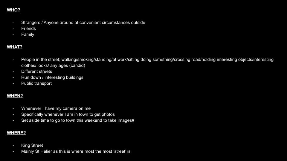
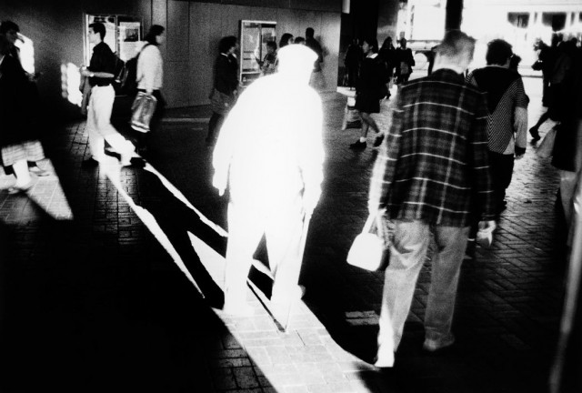
This was my favourite image following the work of Vivian Maier. The main thing that striked me about this image is the man’s expression, I found it interesting as it makes the audience wander what the man is thinking about or what he has seen. Here the repetition of the tiling created a semantic field which brings the attention onto the man in the photo. I think that the tonal range worked well as its clearly shown as the darkest point being the gap for the doorway near Fox and Whistle and the lightest points being the lights in the shop and the brightness in the sky.
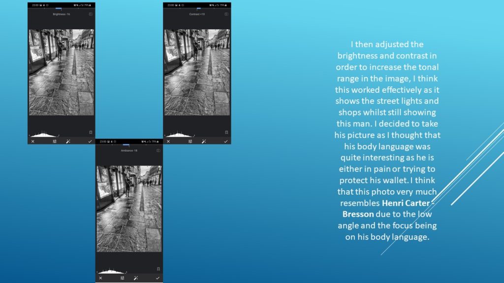
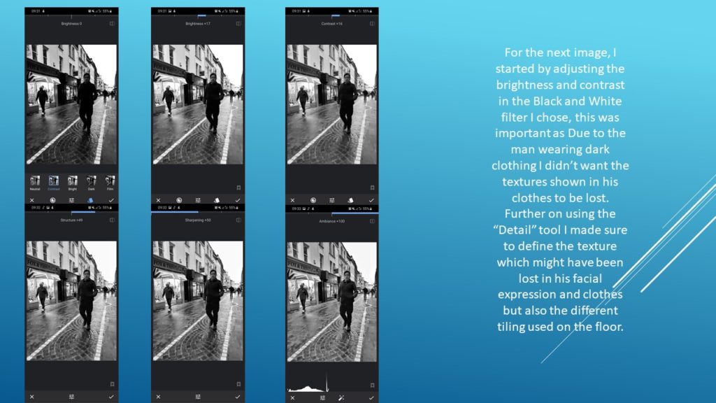
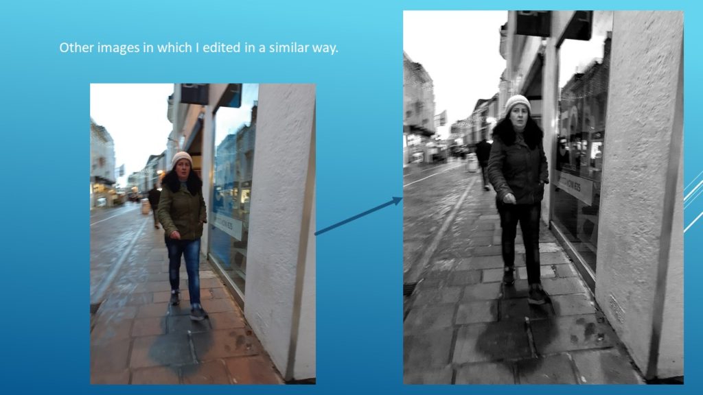
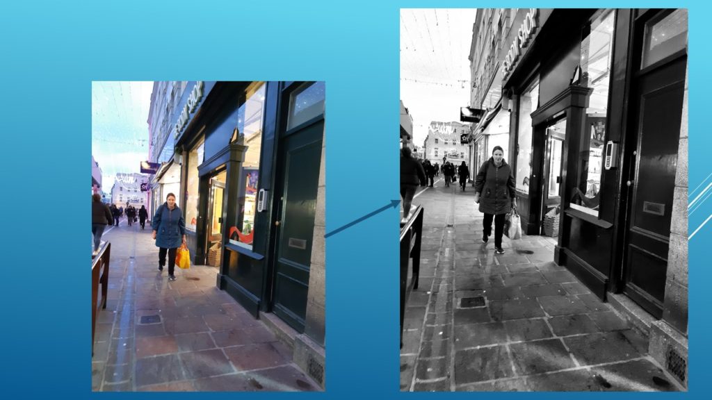
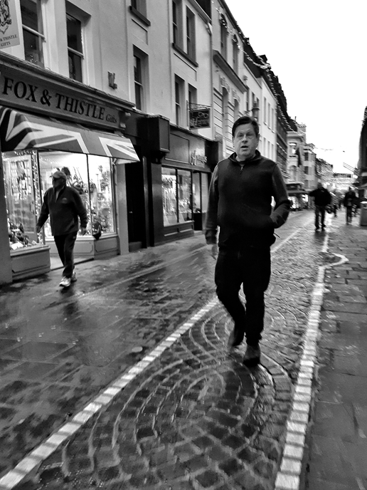
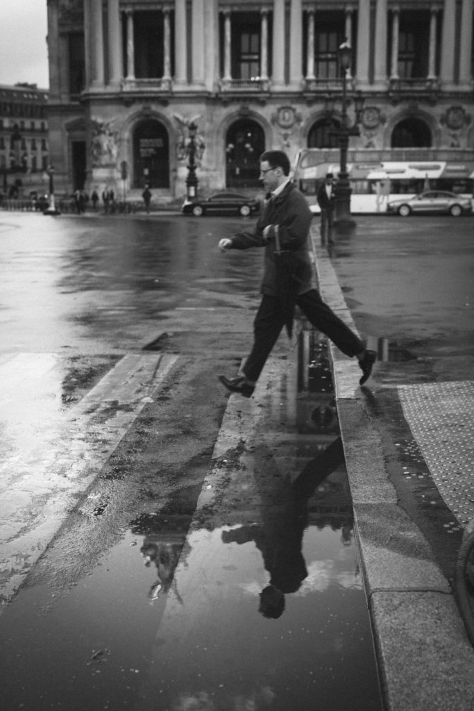
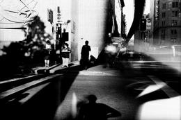
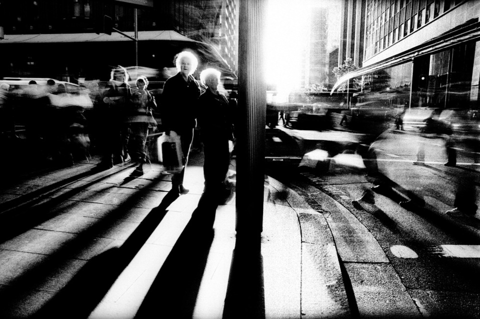
I think that this image well resembles Henri Carter – Bresson’s work. Here I wanted the main focus of the image to be on the texture of the ground and the man’s body language. Overall I think that this is a successful photograph as I tried to keep the angle in which this image was taken, similar to his work; however I still managed to capture the mans body language and his environment. I again quite like the repetition used with the tiling on the floor as although the eye is lead firstly to the different type of tiling on the floor it is then lead onto the man. I find that is resembles this image in which I analysed earlier.
Who
People/artists at my school in their natural environment. Most of my photos will be focused on one person in the image like the majority of Anthony Kurtz’ photos but there may be a few where there might be two or more as the art rooms can get quite busy depending on whether there are lessons happening at the time of the photoshoot.
What
The background behind them has to relate to their life/work somehow, whether its art on the wall behind them or just the art room itself.
When
In the day time as that’s when there is the most natural lighting coming in through the large windows. I would also like to go to the art room when it’s not as busy so around 3/4 so I can take photos of people when they are more focused on their work therefore they won’t be distracted by the camera.
Where
I will most likely take photos of my friends sitting at the table drawing or painting in their sketchbook. Some of the photos will be taken from lower angles and others at eye level to make the photo look even more natural.
Why
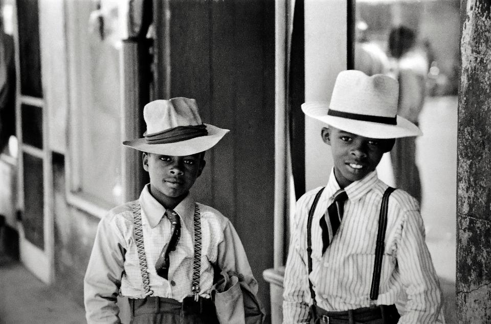
The art rooms are usually vibrant and would add a lot of colours to the photograph like some of Anthony Kurtz’ photos which I was inspired by. I also like how the art rooms are usually quite messy and don’t look like other rooms in the school and the untidiness relates to the majority of Anthony Kurtz’s photos as it expresses how hard work can still occur in cluttered environments.
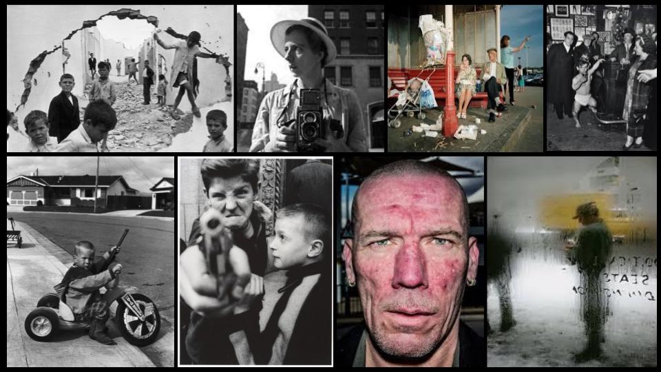
This is some of Anthony Kurtz’s work that inspired me with my photoshoot:
How
With a normal aperture and I may use a tripod to keep the camera steady. I won’t tell the people/models to pose as they’re meant to be in their natural environment and acting in their natural environment also. I’ll take some photos from lower angles to capture more of the persons body and to capture even more angles of the room the in the photos.
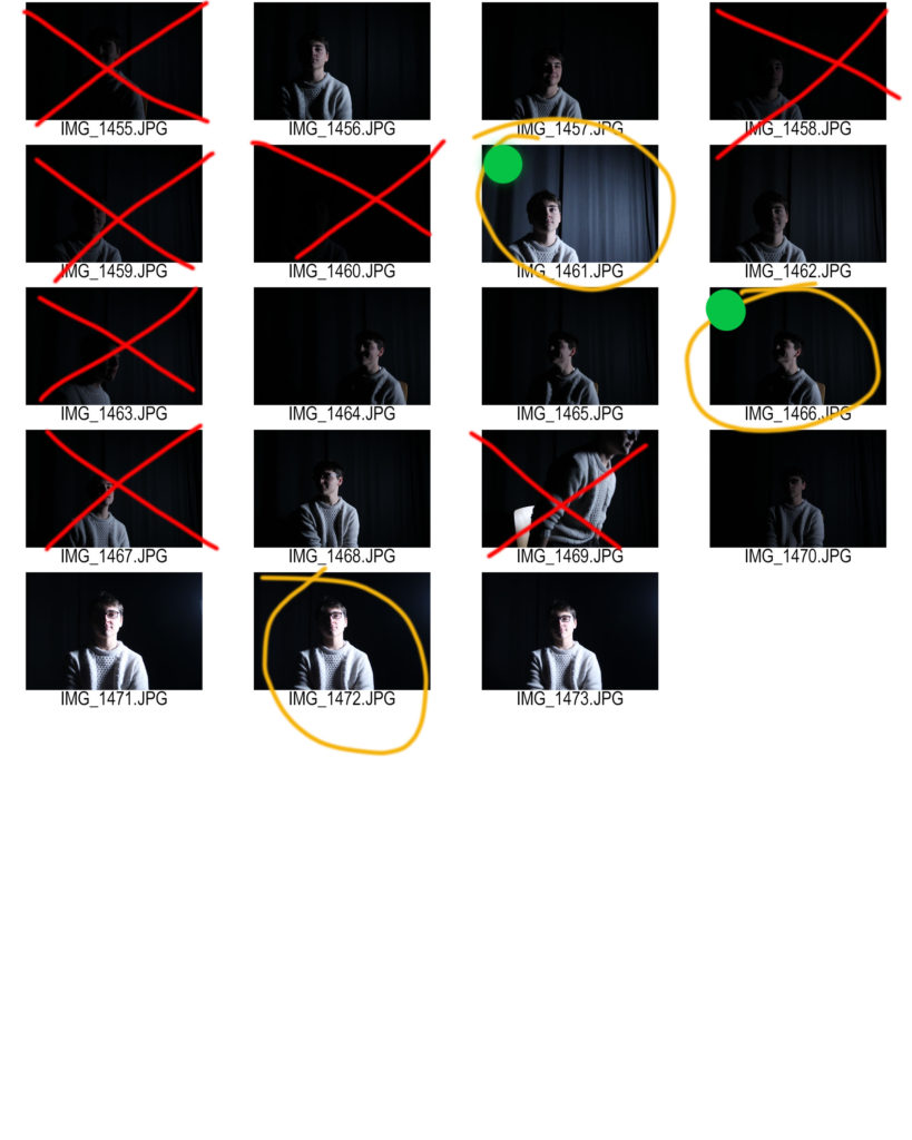
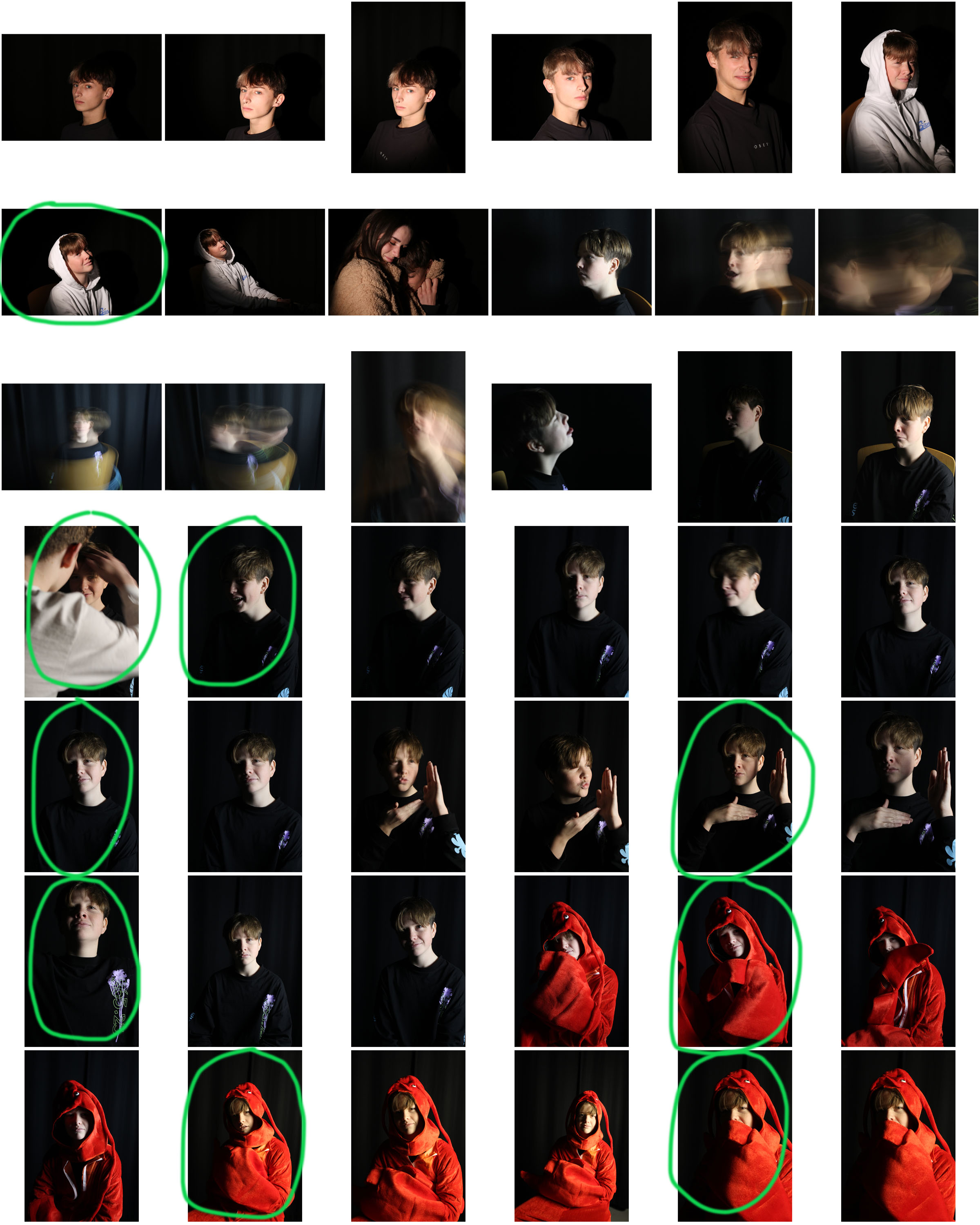
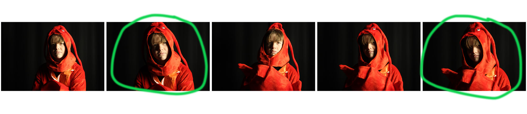
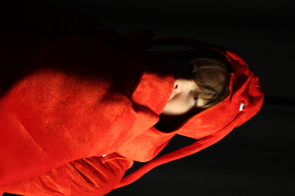
I took a small selection of images when experimenting with studio lighting, and from the ones I took there were definitely some missed attempts, which I have marked in red on the contact sheet above. The two final images have been marked in green, edited, and shown below:
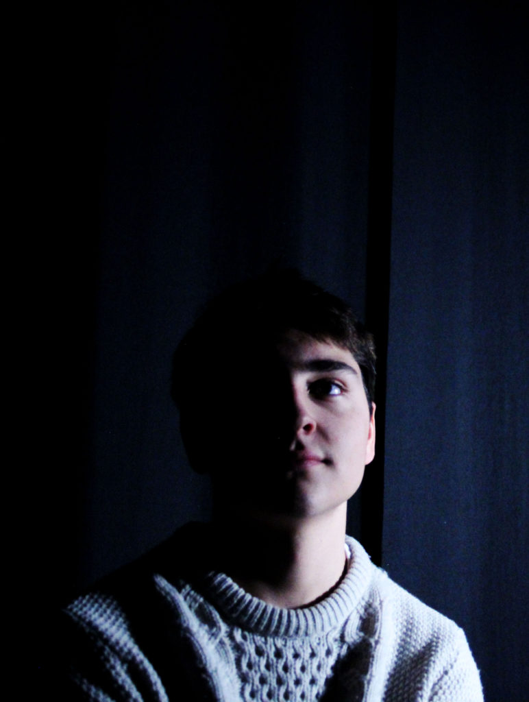
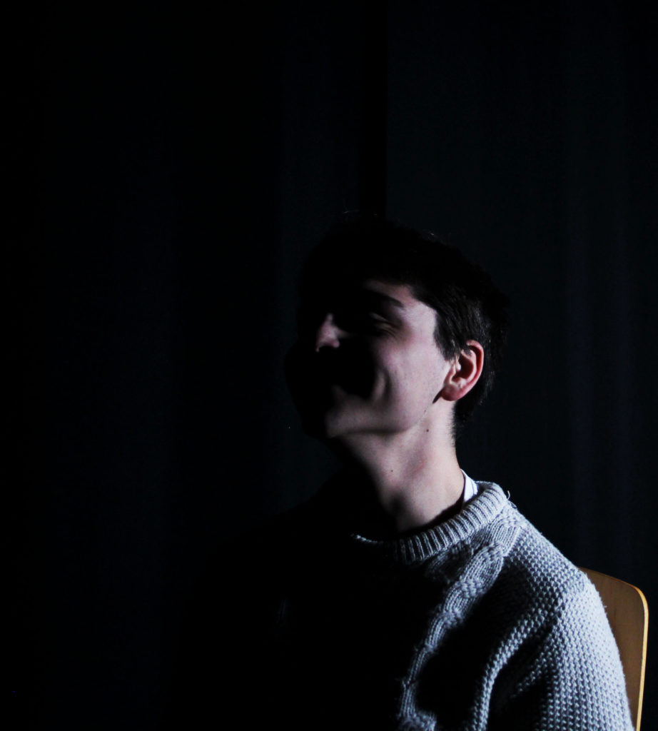
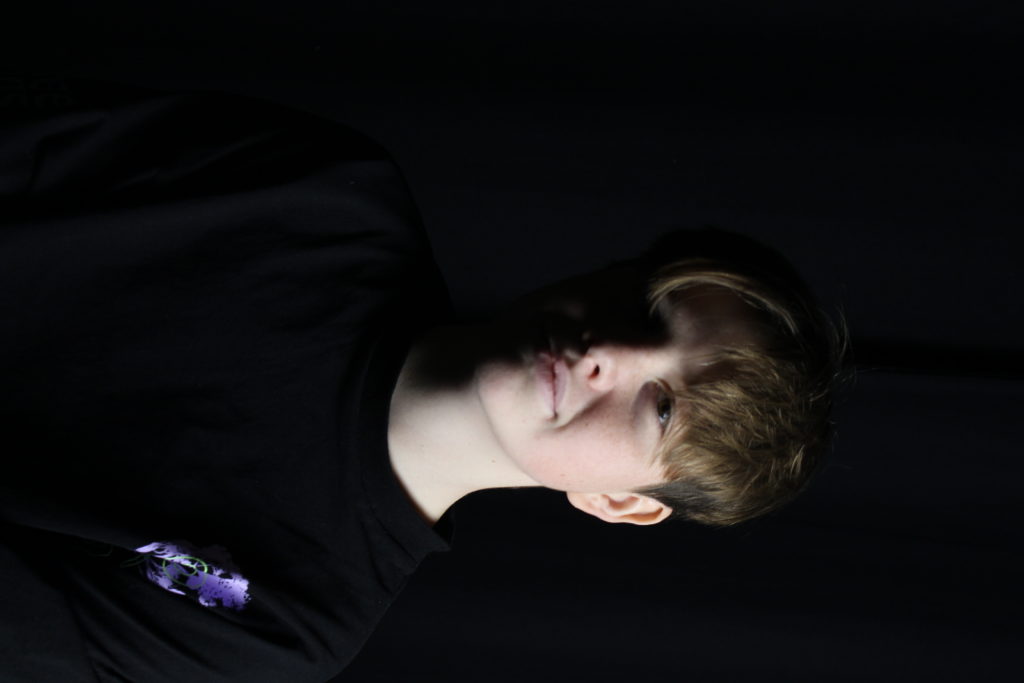
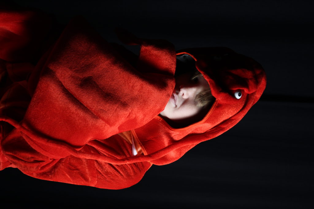
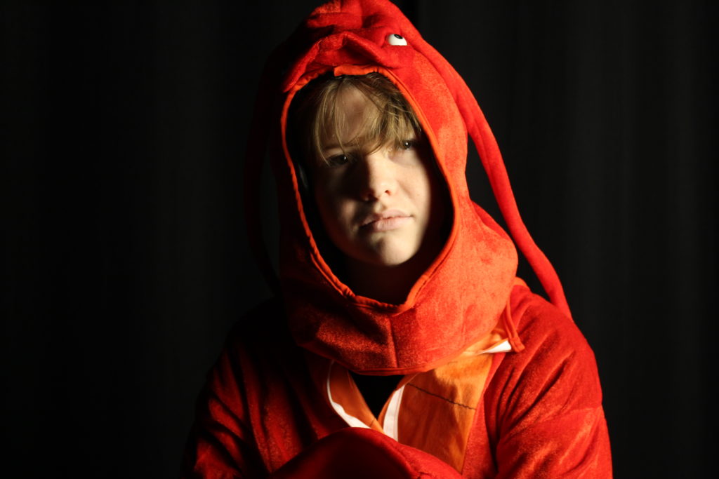
These two images I felt best showed how studio lighting can produce the chiaroscuro effect which is why I chose them.
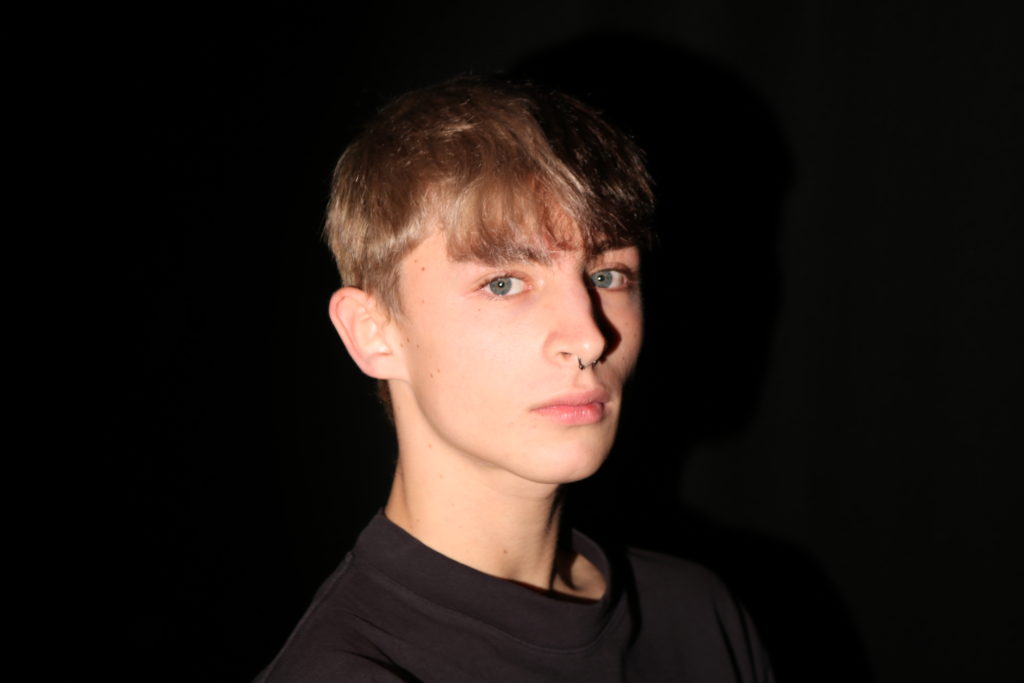
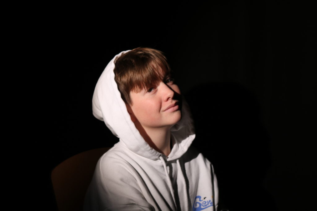
If I were to say how my first attempts at creating the chiaroscuro effect could be improved, I would say I have to create a greater contrast between the light and the darkness, as well as focus on making the background all blend together and disappear into a single block colour, perhaps using an infinity curve or have some people hold it tighter so it does not fold over and leave clear marks.
There are two main different types of light one can use as a photographer: natural and artificial. Natural light can be found outside or literally anywhere with access to the sky. Artificial light is best used in a closed and specialised environment, like a photography studio.
This way, the photographer can adjust the size and shape of the light, the hardness or softness and the angle of the light, as well as adding backdrops or infinity curves to smooth out the background of the image, or using soft-boxes, spotlights or flood lights.
One particular reason for using studio lighting is the possibility it gives for a chiaroscuro effect or Rembrandt lighting. The chiaroscuro technique is when part of the subject’s face is in shadow and completely obscured by darkness, and the other part is in bright light. This is not just a term used in photography, as this effect has been used in paintings and art for hundreds of years.
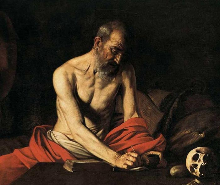
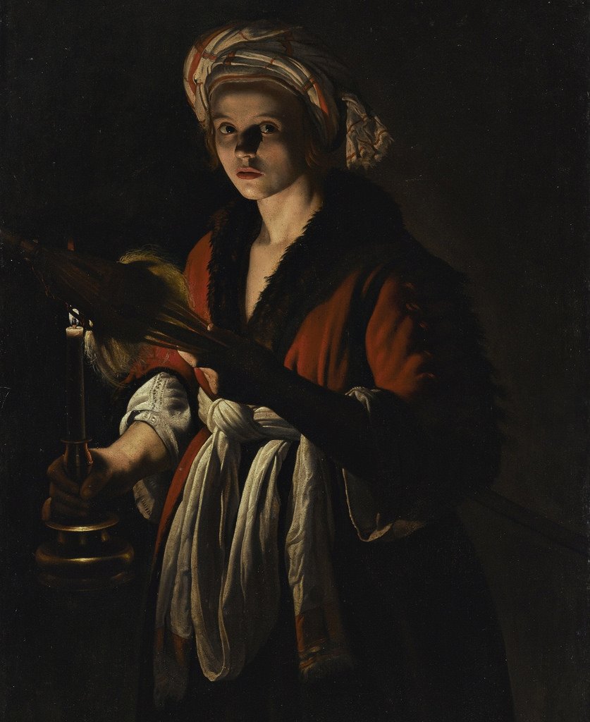
Both of these are strong examples of the chiarascuro effect, where part of a person’s face is obscured in darkness. The second painting, of the young woman, presents the Rembrandt lighting technique, where half of the subject’s face is lit and the other is not, except for a small triangle shape beneath the eye on the dark side.

In photography, this lighting style is achieved by using a strong key light directly at the person, as well as a reflector on the opposite side to achieve the triangle shape desired.
what is studio portraiture?
a versatile genre of photography that can include high key photographs, which are full of light, or low key photographs, which will be highly contrasted. studio portraits allow you to use lighting to enhance the images and create a more interesting and eye catching image. in the studio the light is completely controlled by the photographer, so we can change the lighting to allow for there to be lots of different moods to be captured.
mood board of studio portraiture
above are photographs from various photographers, that i would like to relate to and try to take some inspiration from. the ones annotated with a ‘+’ are from photographers that i would like to look at with more detail.
photographers i would like to look at further
One use of studio lighting is to create a chiaroscuro effect, similar to Rembrandt lighting. The chiaroscuro technique shadows part of the subject’s face, completely or, mostly obscured by darkness, with other part in bright light. This term is also used in paintings and art, which came hundreds of years before its use in photography.
This is a strong example of the classic use of Rembrandt lighting in classic art. Both of the woman’s face have dark and light areas, and the first lady has her face turned, but still shows a defined circular curve of darkness on her face
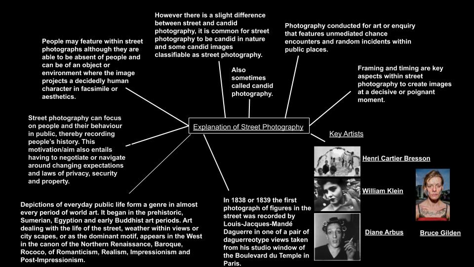
who is HENRI CARTIER-BRESSON and what do they do?
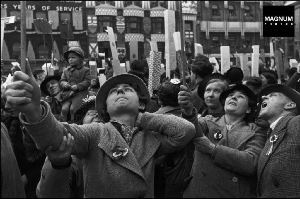
HENRI CARTIER-BRESSON is a french humanist photographer, who was born in 1908 and is considered the master of the candid portraiture genre. CARTIER-BRESSON also pioneered the genre of street photography too. He viewed photography as capturing a decisive moment. Their family supported financially, so they could pursue photography freely. In 1947, CARTIER-BRESSON along with a few other photographers founded Magnum Photos. They also achieved international recognition when they covered Gandhi’s funeral.
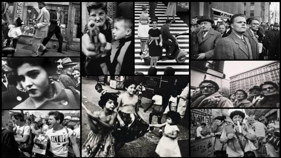
mood board of HENRI CARTIER-BRESSONS photographs
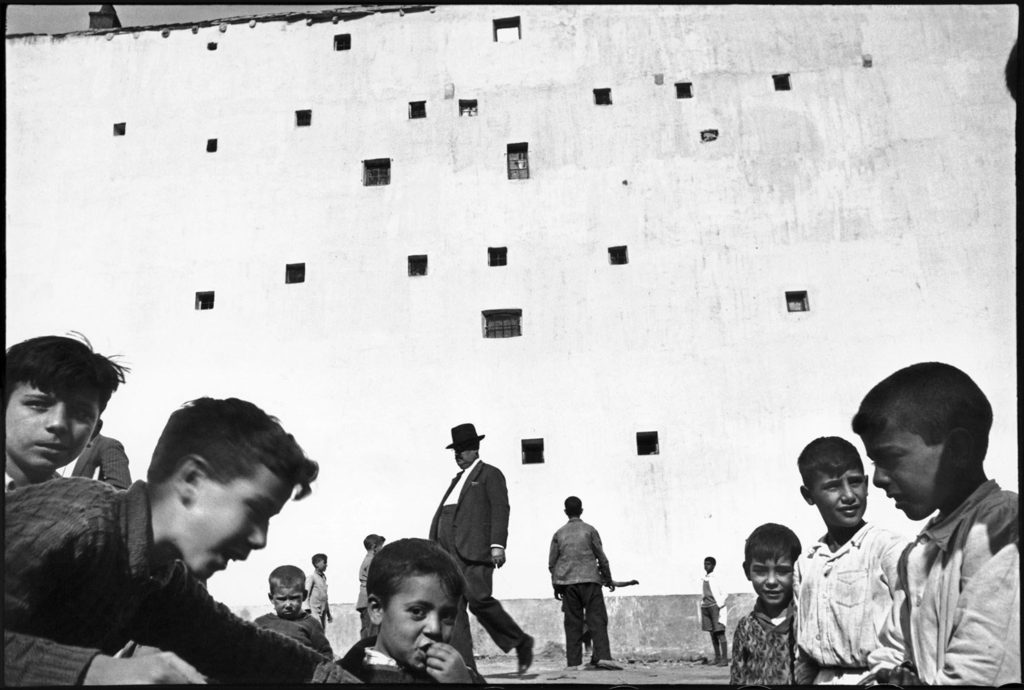
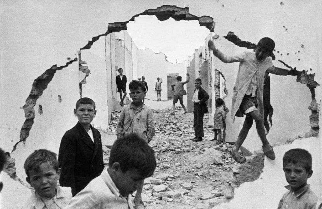
analysis of HENRI CARTIER-BRESSON image

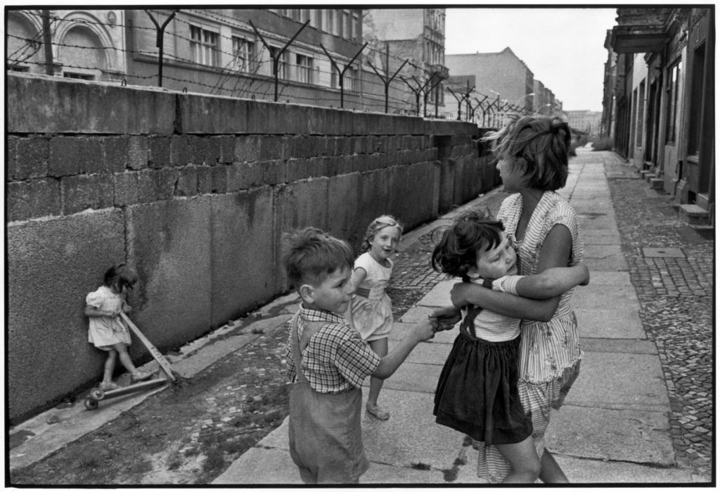
The lighting in this photograph is natural, as CARTIER-BRESSON has shot in a natural landscape, not in a studio location. The light is flat, as there are no harsh shadows, which would be created by harsh lighting. This photograph is overexposed as the whites are overblown and this means that the whites take over the darks. CARTIER-BRESSON would have been using a wide angled lens, as the shot is taken from close up, however, everything is well placed in the shot. The depth of field is sharp. CARTIER-BRESSON has shot in black and white, which makes the photograph look very poignant and melancholy. The photograph has a very strong tonal range, as there is a balance between lights and darks. The dark darks are very bold and stand out well on the light whites. All of the different textures, including the rubble on the ground, the cracks in the buildings, and the materials of the clothes, add to the photograph and its complexity. This complexity increases the interest of the photograph for the viewer. In the background, there is a repetition of the houses, as they are in lines and repeat until they can not be seen. The composition of the photograph is symmetrical, which adds to the overall aesthetics of the photograph, as when it looks balanced, it looks clean and easy on the eye. The figures are framed by a broken wall, which brings up the notion of ‘their world’ and ‘our world’, and how we are not allowed in. ‘Their world’ looks like dystopia compared to ours, as it is broken, and run down. The figures act as leading lines into ‘their world’, they guide the viewers’ eyes into and past the broken wall into a place of suffering. HENRI CARTIER-BRESSON took this photo in Seville in Spain in 1933. If you had not known the date this photograph was taken, you might have thought it was shot during the Spanish War, which was in 1936-9, due to the photograph being situated in a run down place. However, the fact it was taken in 1933 gives an eerie feel to the photograph as the figures are in an area ‘attacked’ by a war that hasn’t even happened yet.
HENRI CARTIER-BRESSONS contribution to magnum photo agency
CARTIER-BRESSON and the rest of the founders split assignments between the members of the agency. CARTIER-BRESSON covered many areas and achieved recognition. Magnums mission was to ‘feel the pulse’ of the times.
contrasting to TRENT PARKE
similarities
differences