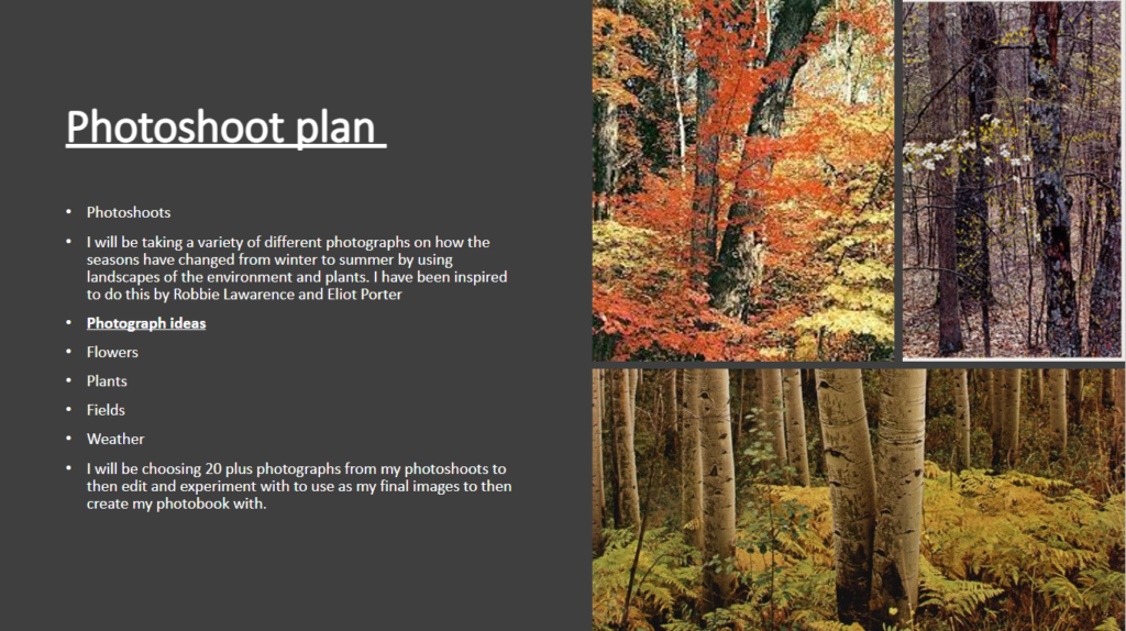
photoshoot plan


Rinko Kawauchi is a Japanese photographer whose work is defined by her almost poetic style and the peaceful subtle beauty they have. She works mainly in colour, but her images aren’t always particularly bold in their use of colour. What I take most from her work is how she transforms an otherwise ordinary moment from the most mundane of daily routines and turns it into something beautiful and incredibly artistic.
Her photobook “Illuminance” in particular interests me, not only because of her particular use of soft light, but also because of her use of juxtaposition in her photobook layout. She seems to have a clear idea of the form of her images, their lines and structure, and she is particularly adept at marching them up and creating this feeling of linking completely different images together through this. For example, the middle left image seems to be comparing a droplet of water on a leaf with a small diamond, perhaps revealing her own personal beliefs and view of the world at the same time.
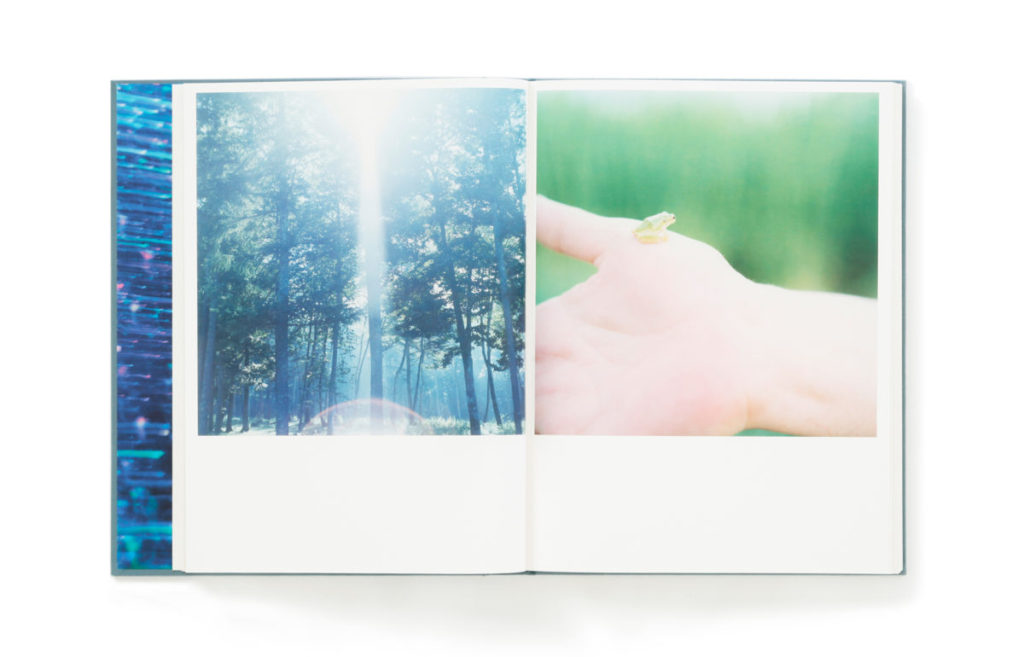
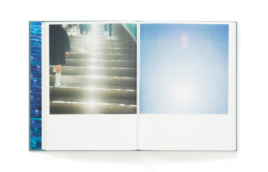
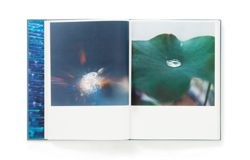
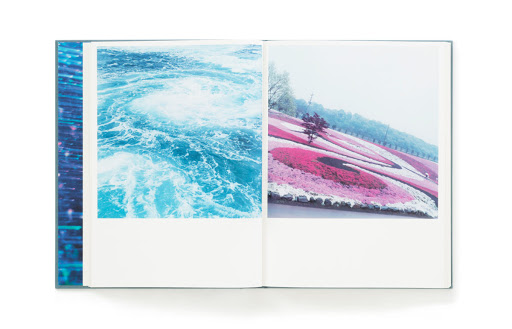

This sort of comparison between natural and manmade, between different landscapes and people and situations only connected by a similarity in their shape/form is something that i am planning to do within my own work. For example, a comparison between the figures of trees and of people seems like it would be quite effective and it is in my plan to do.
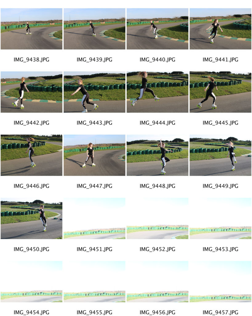
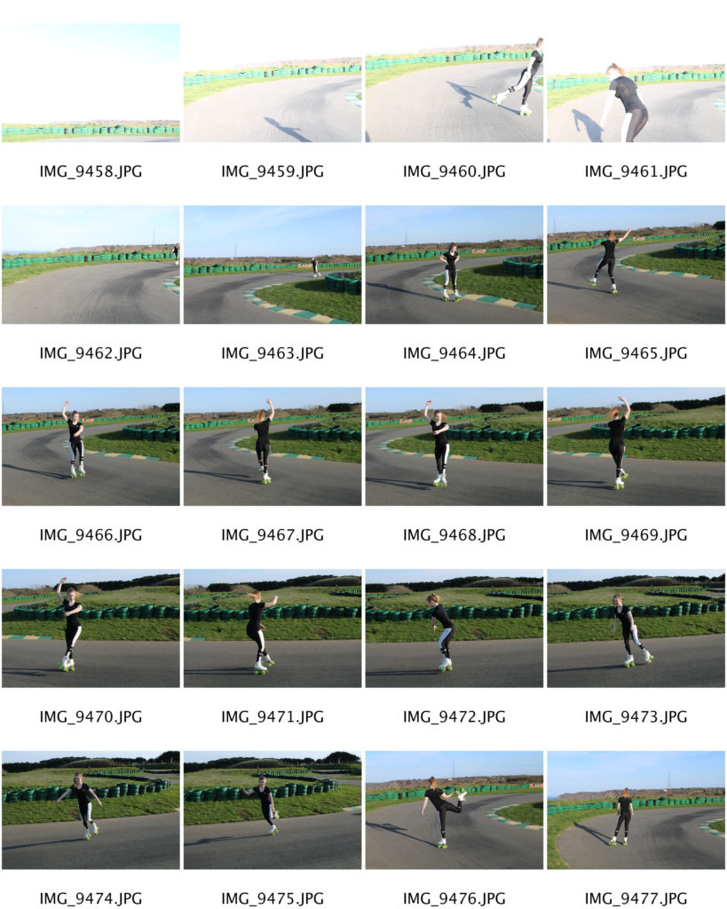
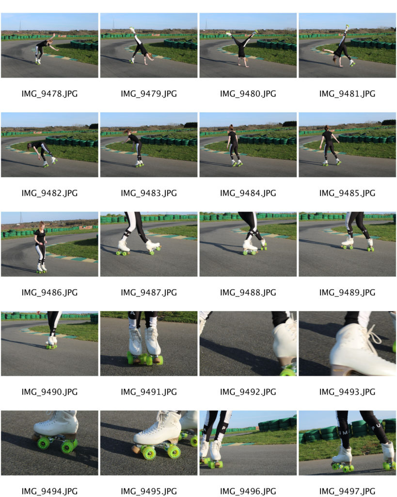
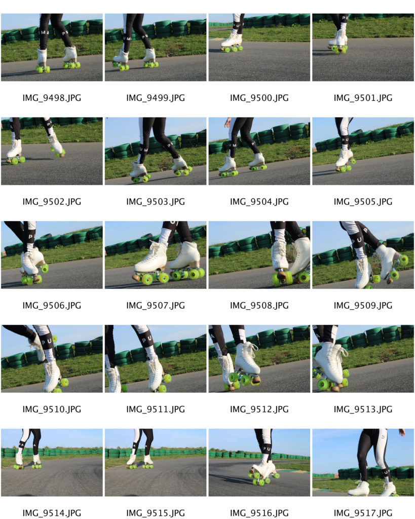
This is a collection of new images, containing aspects of skating that have meaning to the individual. For example, the medals from competitions she has competed in, along with photos from her childhood showing her at the competitions. There are also images of her outfits and team tracksuit showing her achievement representing the GB team. The images of her skating shows the place she goes to practice and feel free whilst doing what she loves. My next step is to select my strongest images and begin to edit them. This will enable me to start creating a sequence for my photo book.
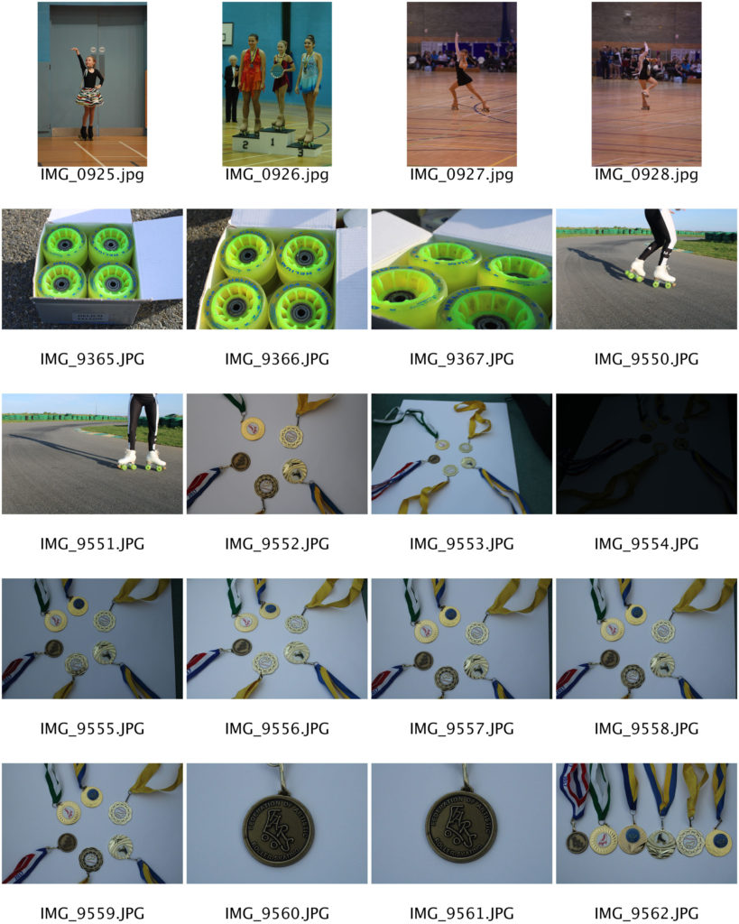
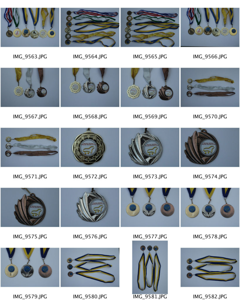
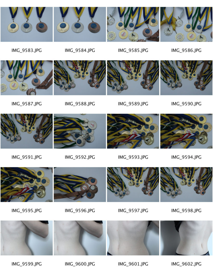
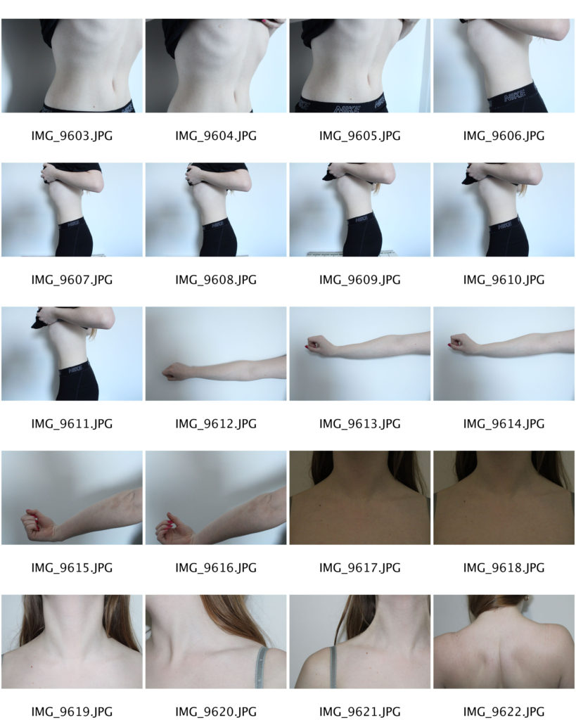
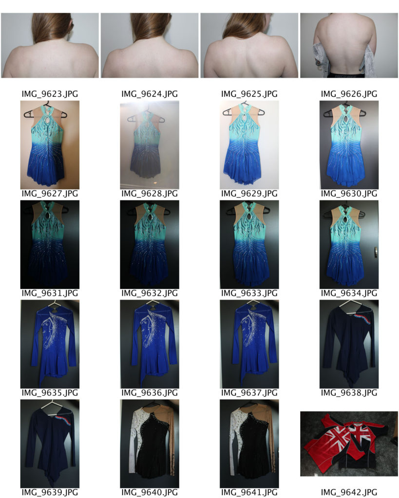
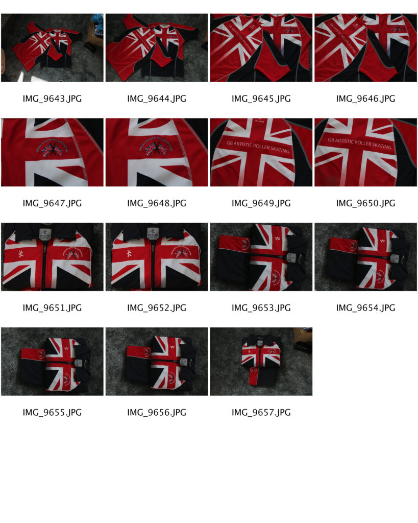
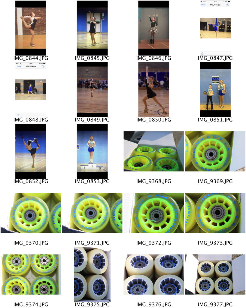
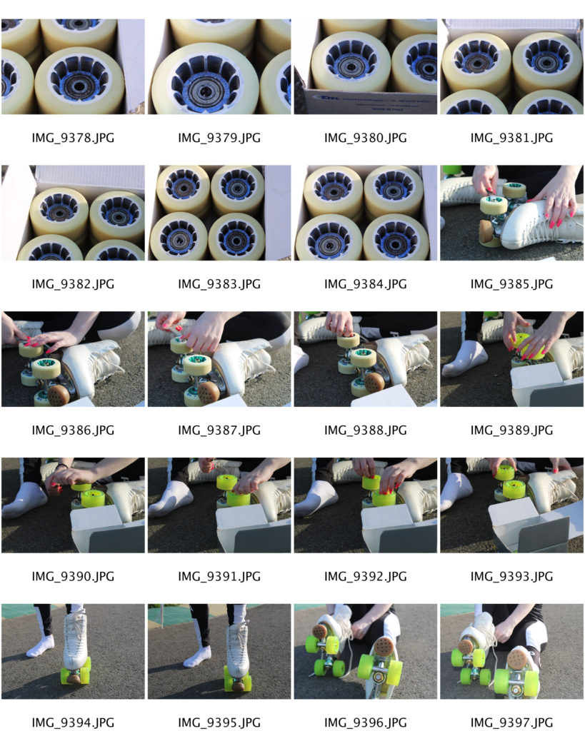
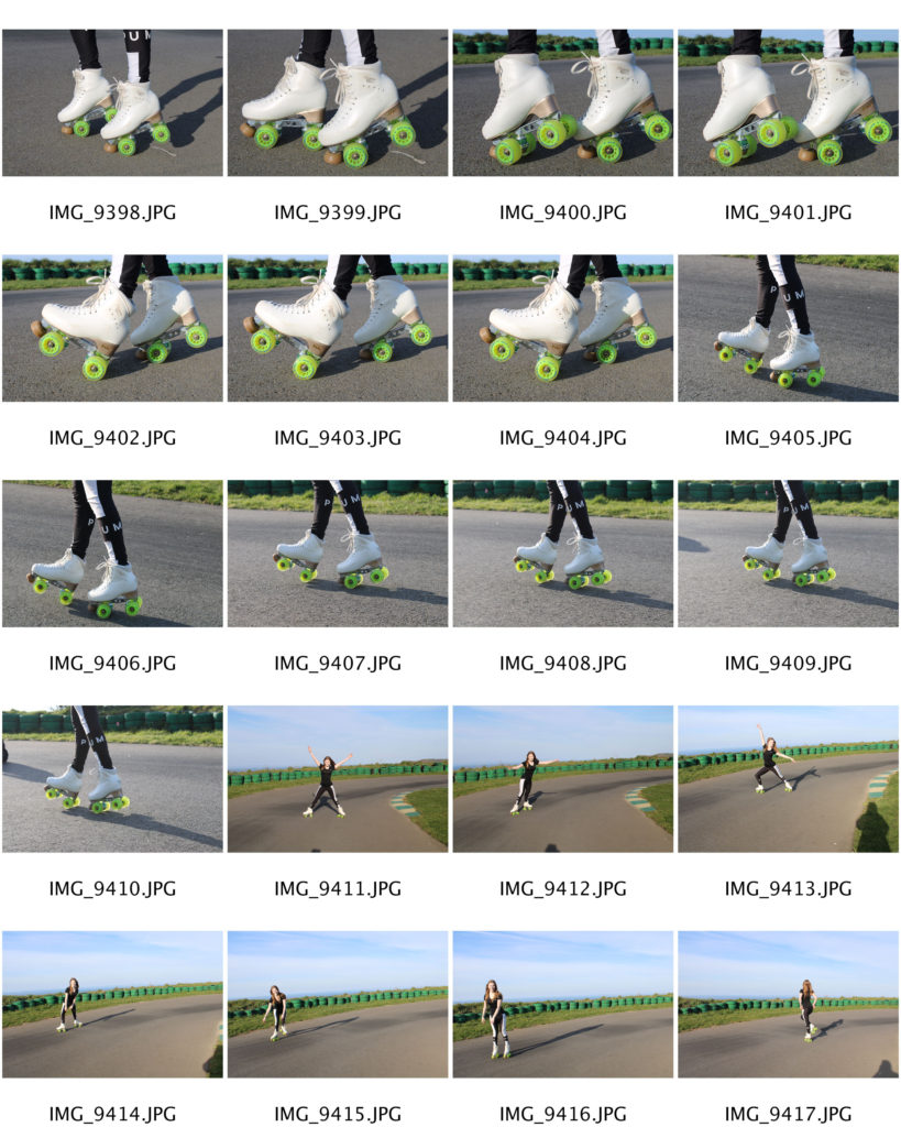
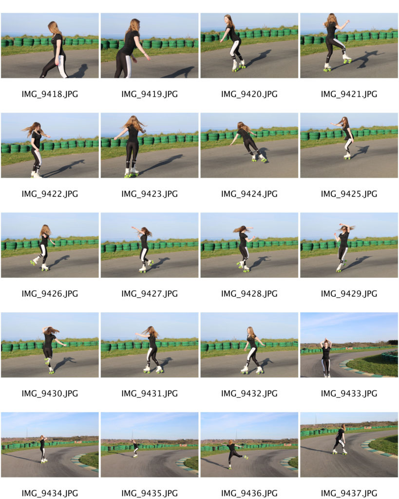
For my images, i intend to add a time stamp as they are mostly archived images, but also edit the colours too seem more ‘glowy’ and contrasted. I am deciding between editing all images on photoshop and adding my own timestamp, or using an application (HUJI) that will add a timestamp and change the contrast itself, and correct it after.

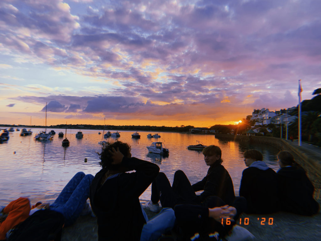
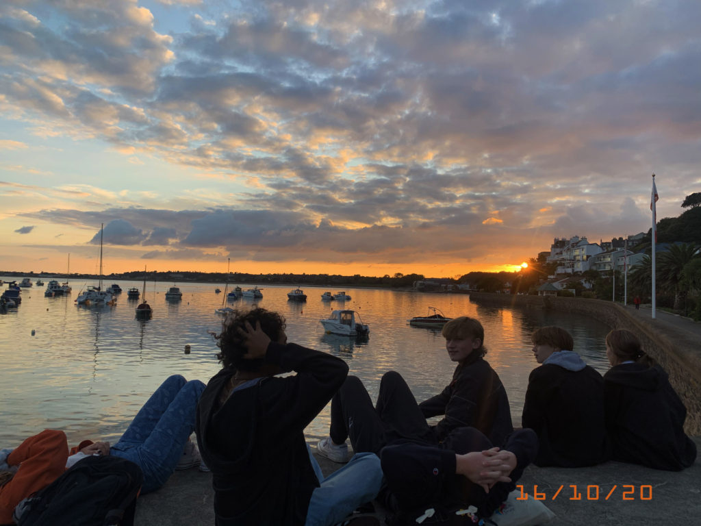

I think i will add the huji effect to all of my images and then edit them further in photoshop to colour correct it and bring it back closer to the original, but with the timestamp. However, for the images i’m using that are disposables, i may have to edit the originals in photoshop as i wish to keep their natural colour, and then use a timestamp as text under the image, as i will have to find the date they were originally taken, not developed.
Disposable examples:

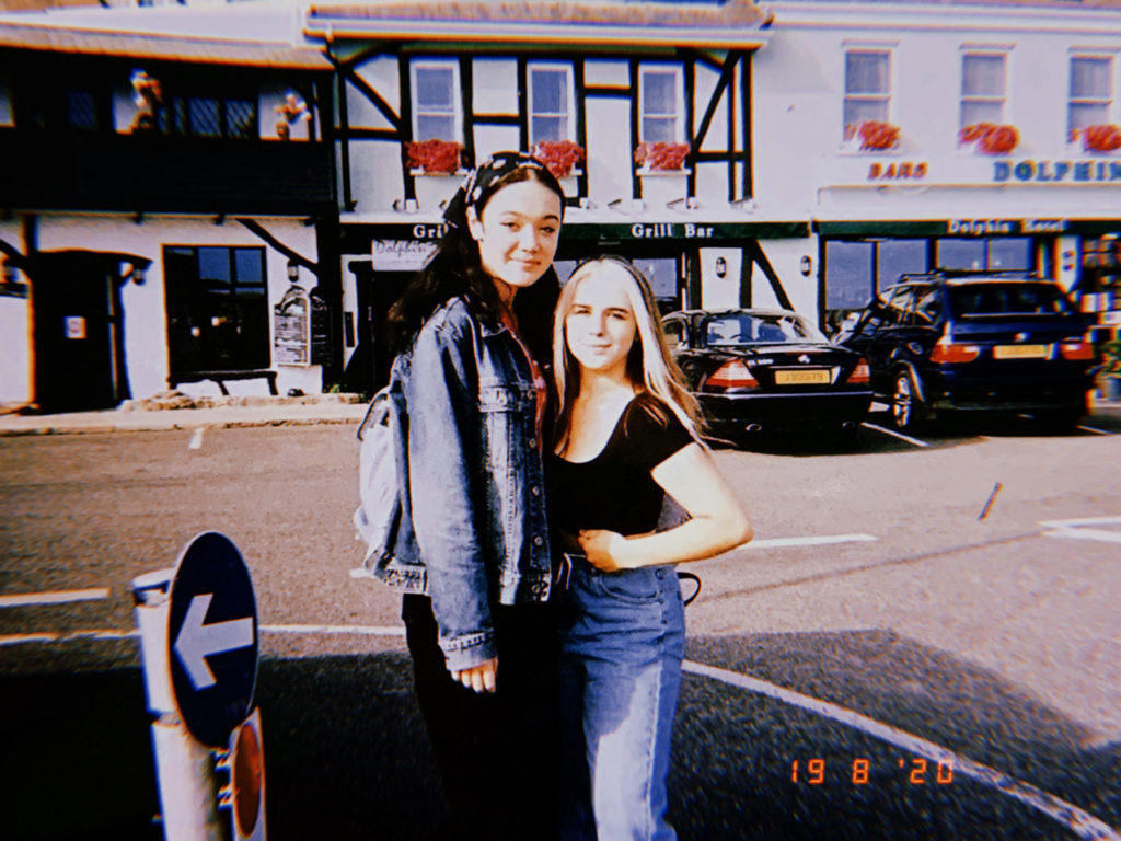
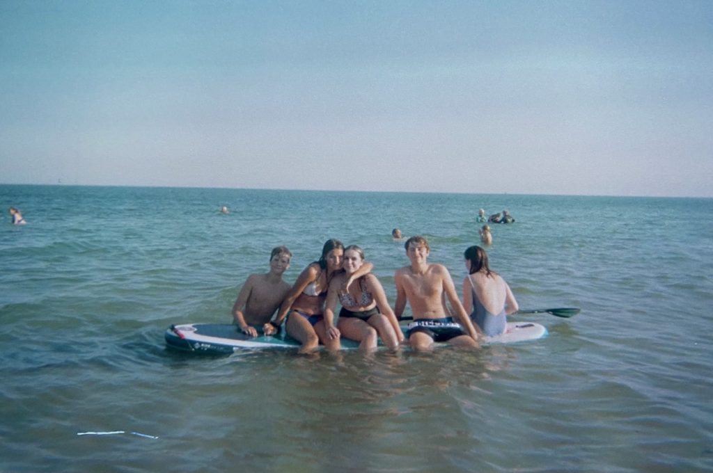


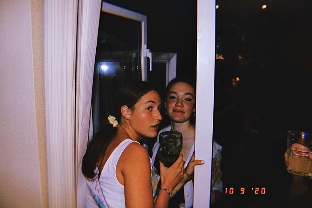
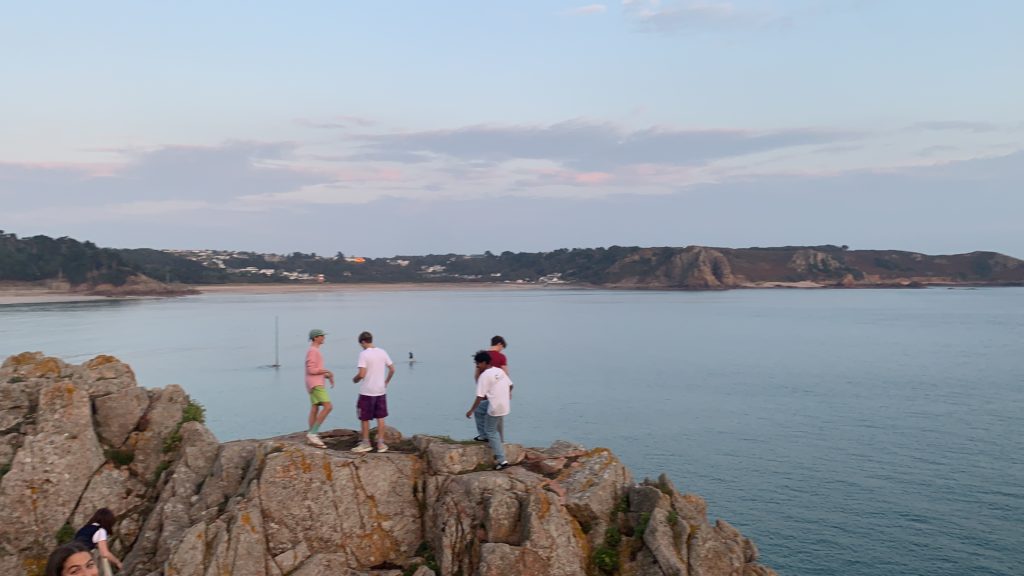
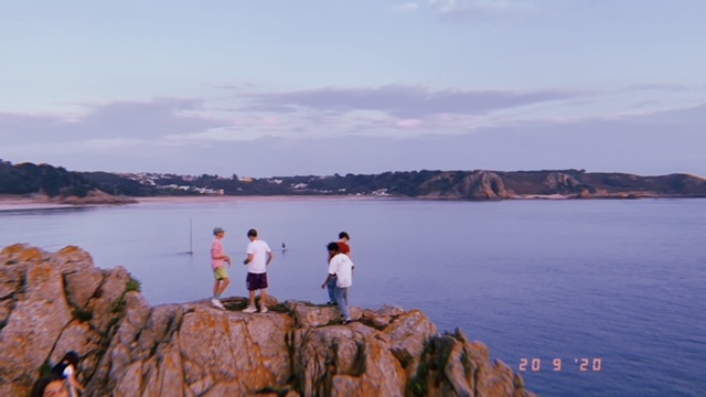
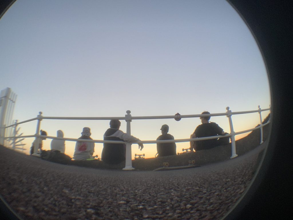

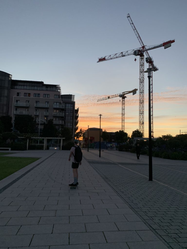
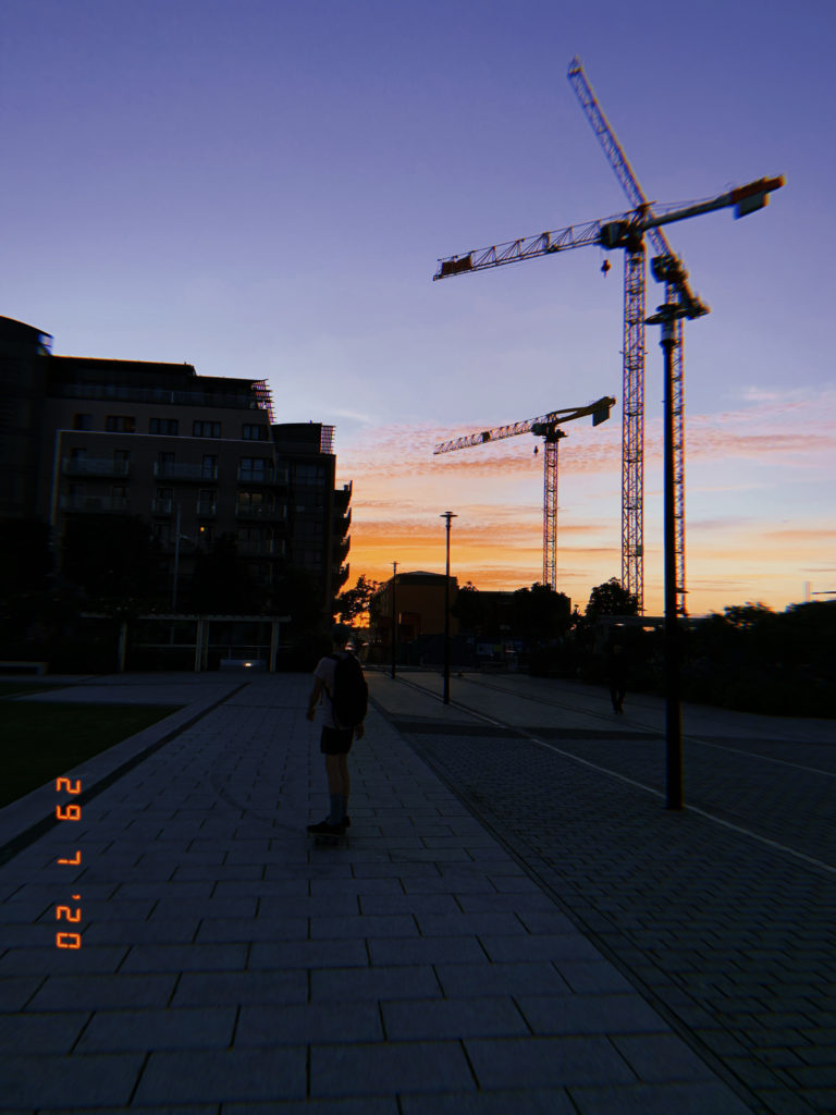
These are just my selected images from the two new shoots along with the unused images from the original layout plan I did.


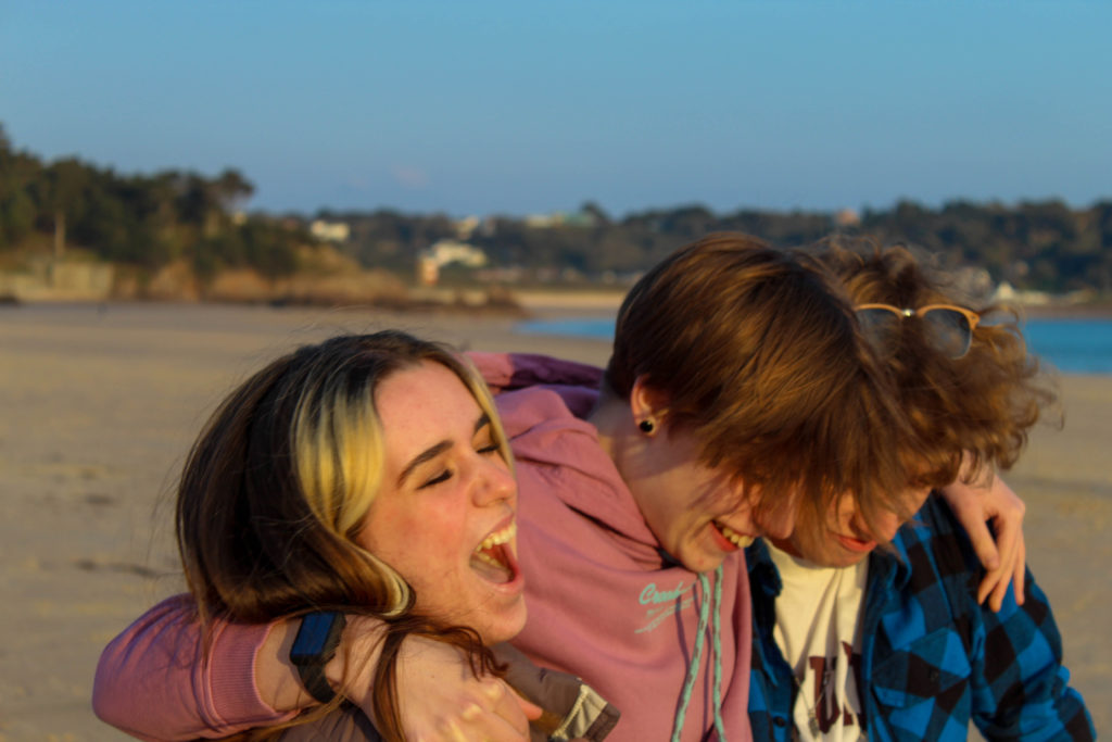
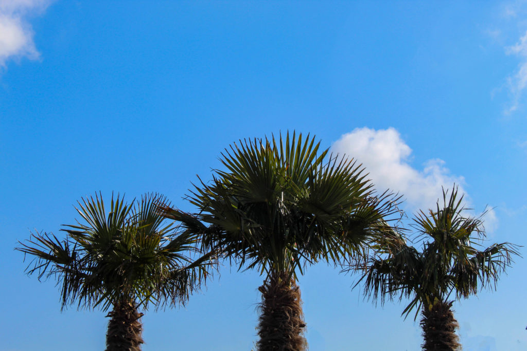
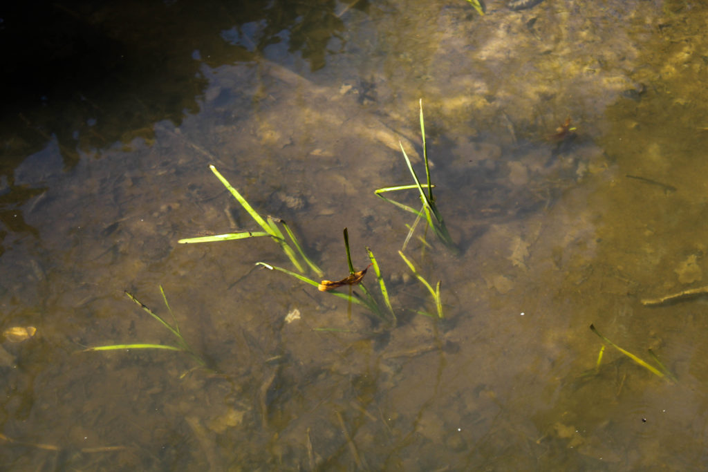
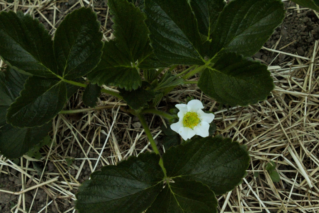
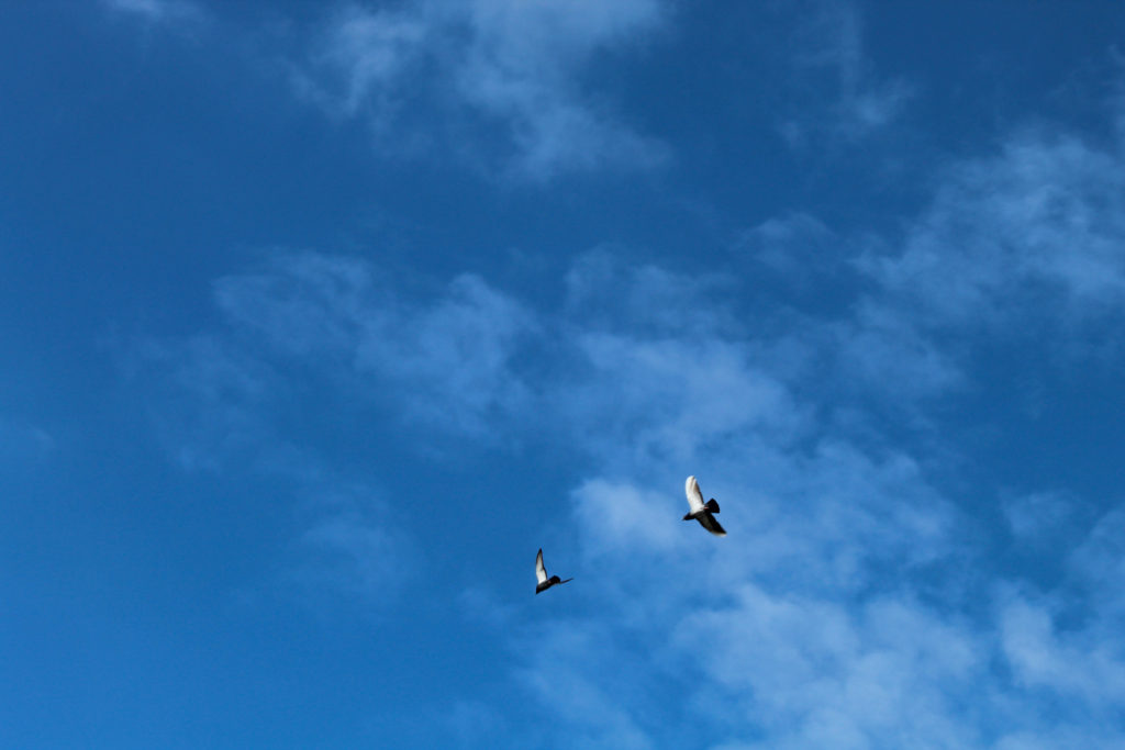

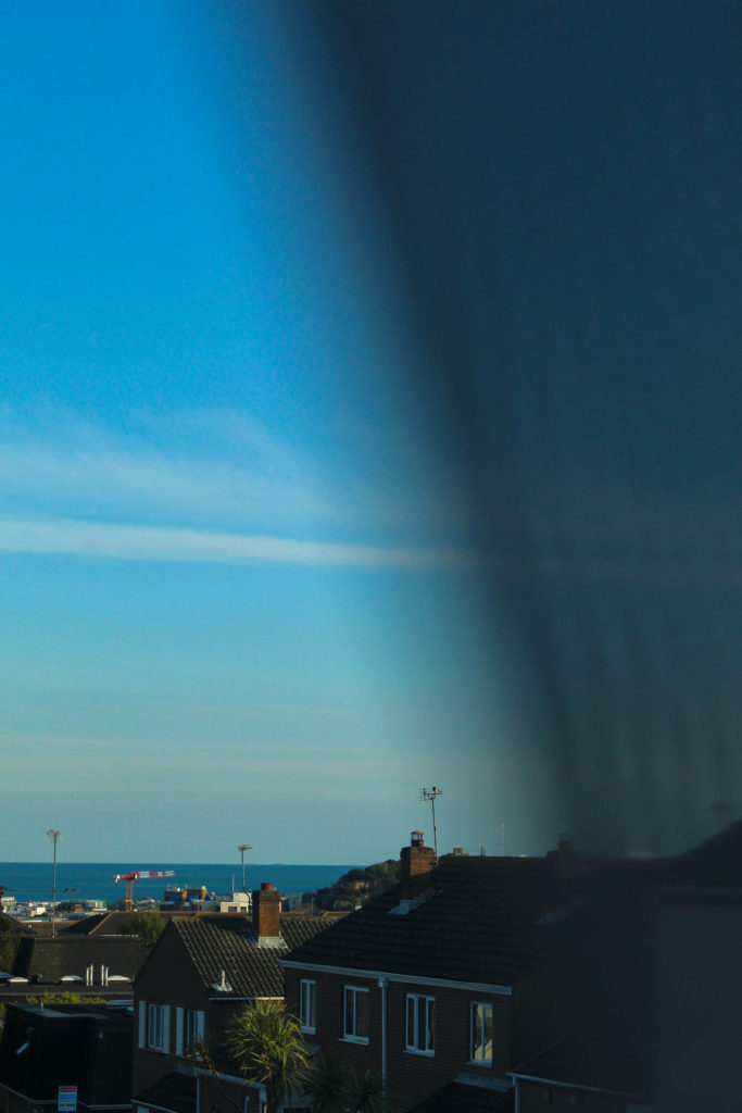
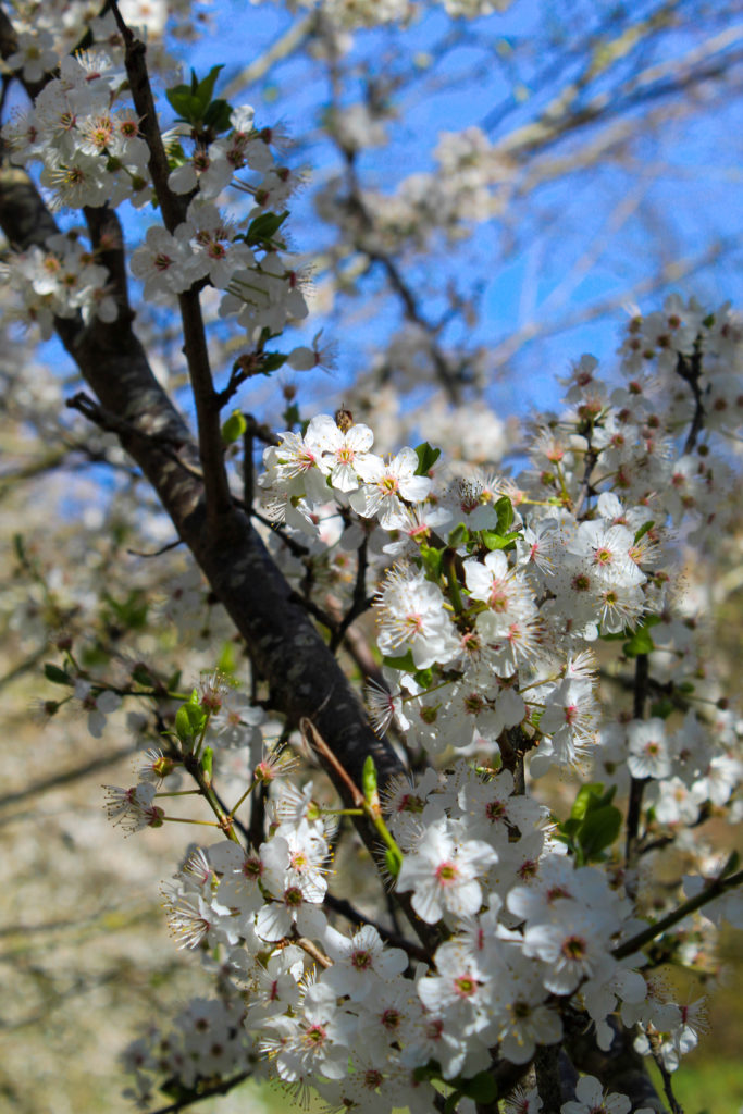

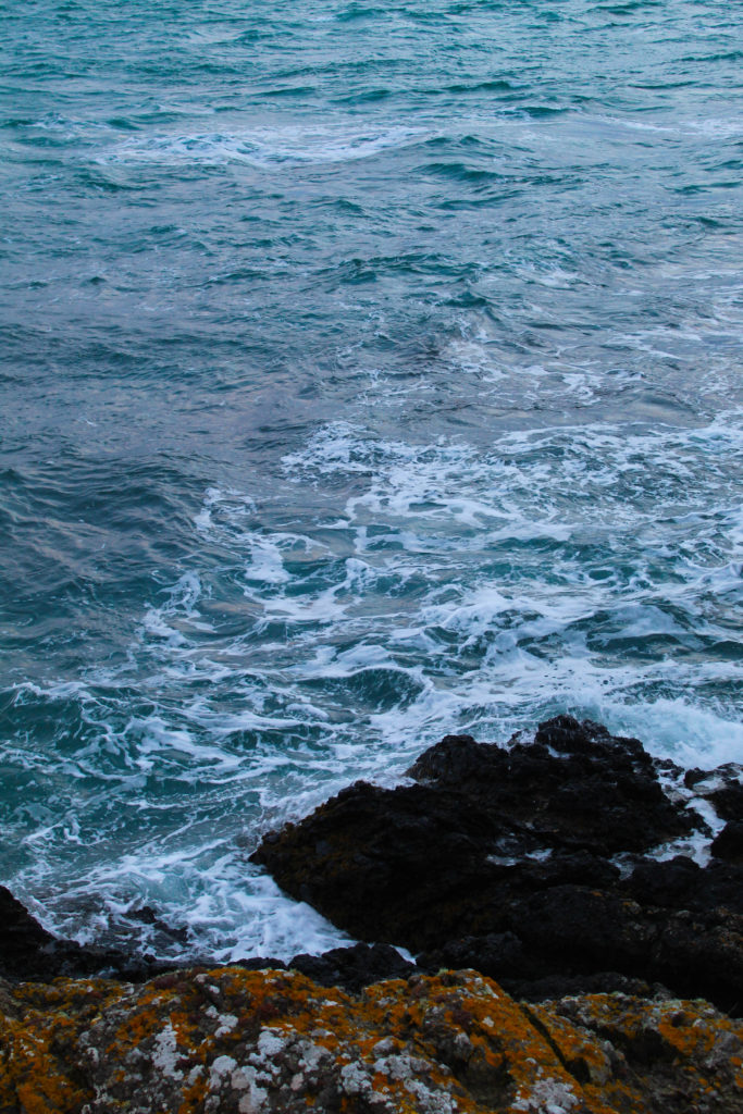
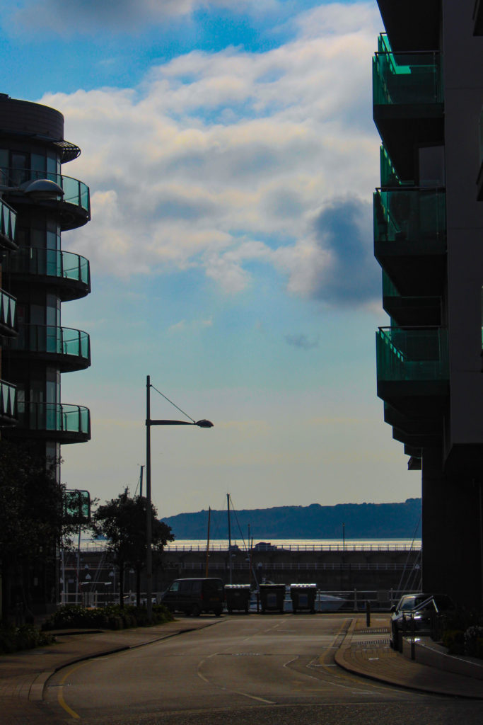

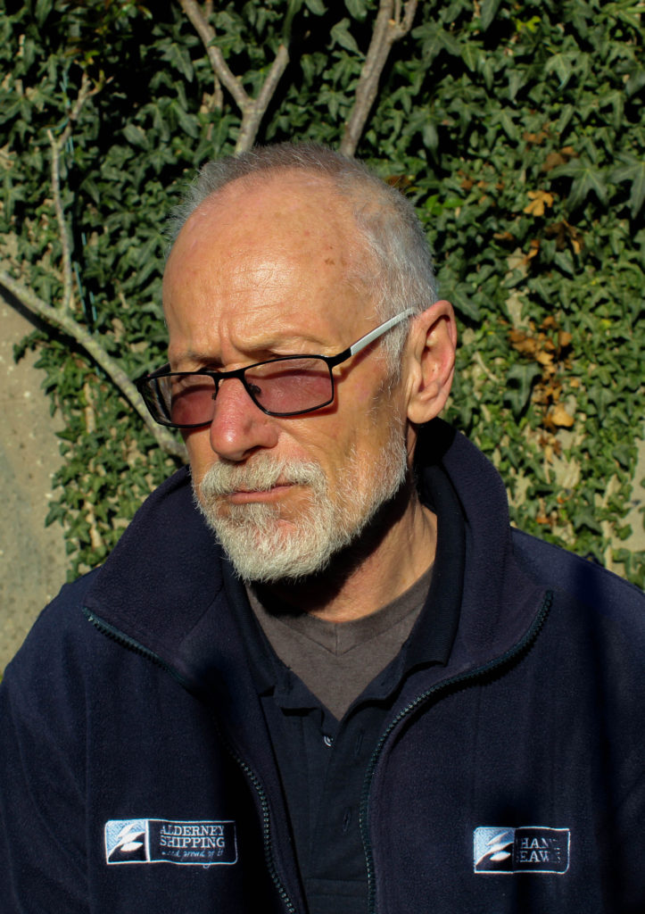
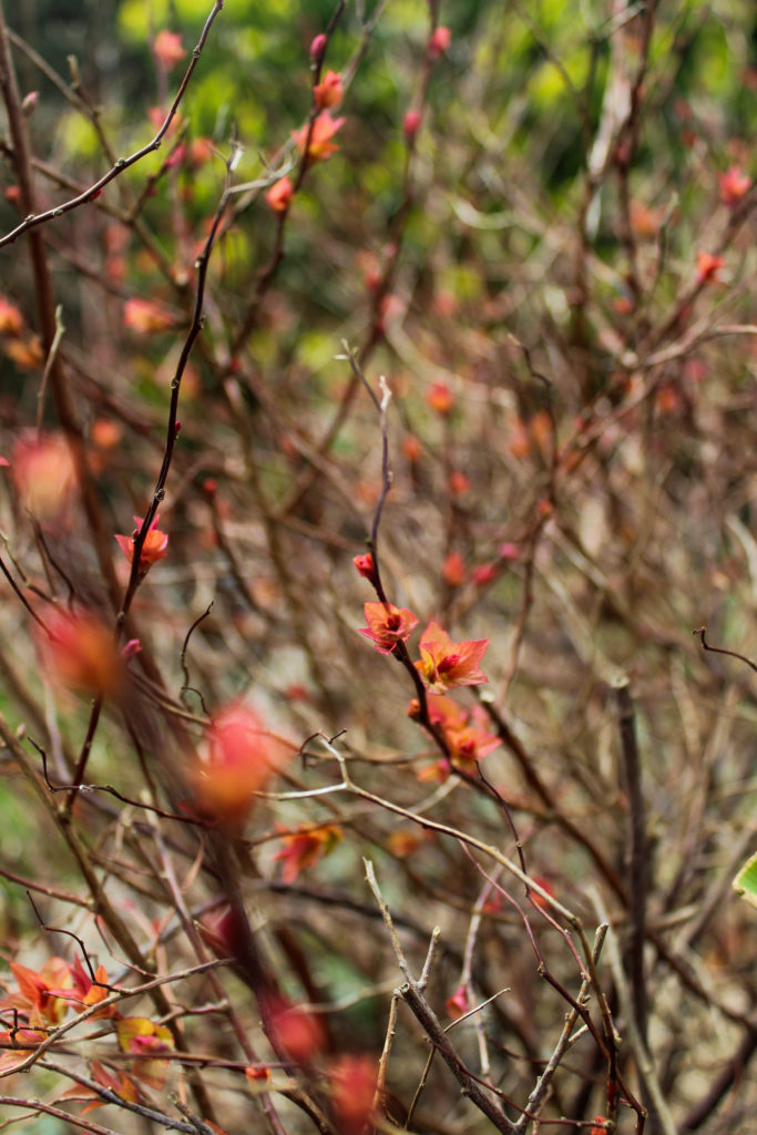


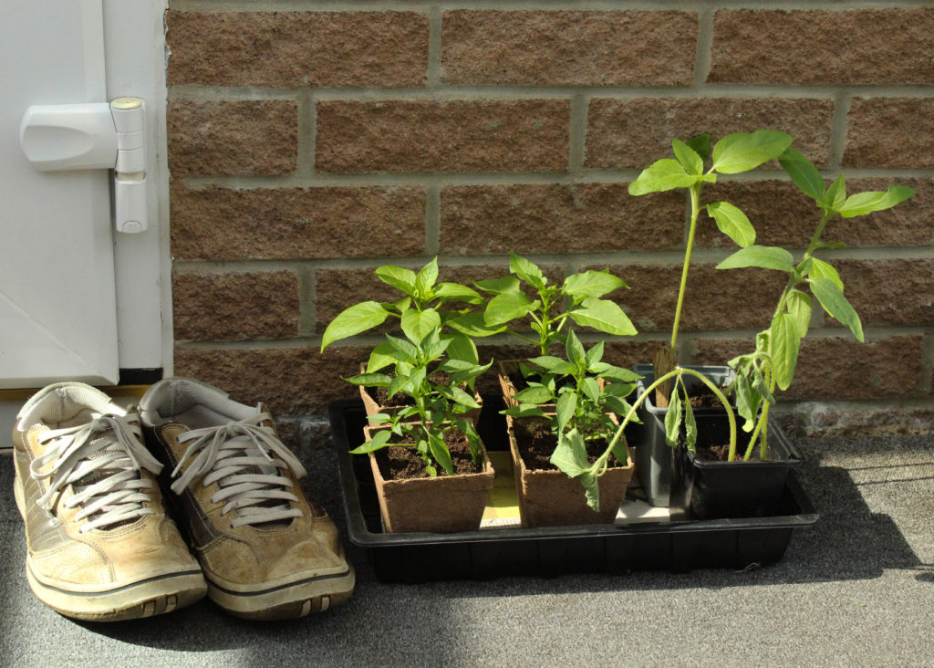
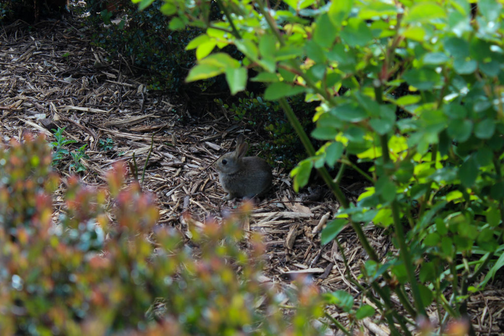
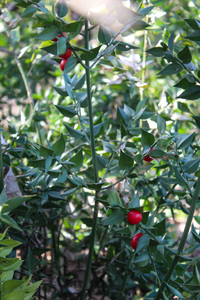
I’ve now gone through all of my shoots, paired/layed out all of the images I can and reviewed and removed any images that just don’t work with my project as a whole. I know that as I move on to actually creating the photobook I will probably cut a few more images out and re-work the layout as I go along, but that depends on whether they turn out differently in the final product than in the temporary blog post layout here.
All in all I’m okay with the selection and layout of images I have here and I think they showcase the best of the shoots I did. Moving forwards, I’m going to put them into the photobook and do some more experimentation with the order of the images and how it forms my narrative, as well as possibly adding text of some sort.
Examination dates: 15 hrs controlled test over 3 days
Groups 13A and Group 13B: 4, 6 and 12 May
Group 13C: 5, 13 and 14 May
Here is a simplified check list of what we expect to see posted on the blog from each individual student.
Research 1: – 1-2 blogposts
Mind-map & moodboards based on exam themes
Research 2: Artists References – 1 blog post per artist.
See here for more details and guidelines on how to produce a A-grade artists references. Follow instructions and make sure you include contextual analysis and references to literary sources/ hyperlinks.
Statement of intent – 1 blog post
Description of main idea including how you interpret chosen theme and how you intend to explore it. Use illustrations.
Planning – 1 blog post
Evidence of planning photoshoots and how you responded to artists references.
Recording – 1 -2 blog posts per photo-shoot
From each shoot select 8-12 images for further experimentation. Produce quality work from each shoot and analyse and evaluate your photos through annotation showing understanding of visual language using specialist terminology. Follow process of EDITING > EXPERIMENTING > EVALUATING
Final outcomes – 1 – 3 blog posts
– Final prints: show evidence of how you intend to present and display your final prints – make mock up in Photoshop – for example. a single image or diptych, triptych, predella, size A5, A4 or A3, typology-style grid, collage etc. Use images of a white gallery wall and superimpose your final images using Photoshop
– Photobook: If you have made a photobook – write a book specification and describe in detail what your book is about in terms of narrative, concept and design. Produce a seperate blog post with screen prints of design and layout for further annotation, commenting on pages/ spreads/ narrative/ sequencing/ juxtaposition etc. Make a hyperlink to book browser in Blurb. Follow instructions here:
– Film: Show evidence of storyboarding and produce screen as you progress for further annotation, commenting on editing and sequencing video and sound etc. Upload film via Youtune/ Microsoft Streaming. Follow instructions here:
Evaluation – 1 blog post
Write an overall final evaluation (250-500 words) that explain in some detail the following:
Check all Coursework is completed including print folder and previous modules including Personal Study. See Check list below.
Equipment: If you have borrowed any photographic equipment, cameras, lenses, batteries, tripod, and card readers please bring it no later on the last day of the exam!
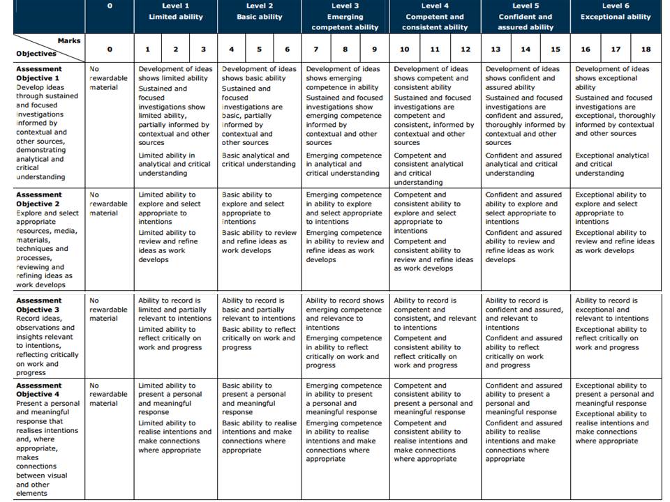
To achieve a top marks we need to see a coherent progression of quality work from start to finish following these steps:
LINK TO ONLINE BLURB BOOK
Your final blog post should be an online link to you BLURB book with an evaluation. If you have already written an evaluation as part of another blog post on your book design then add the online link to that blog post and change the date to make sure it sits at the top.
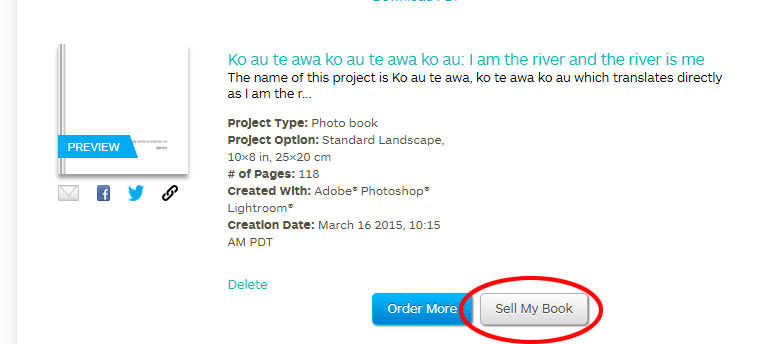
Log into your blurb account and click on Sell my book
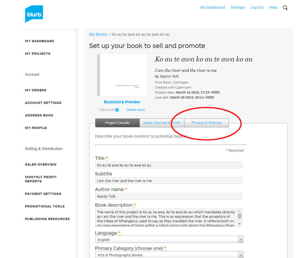
Click on Privacy & Sharing
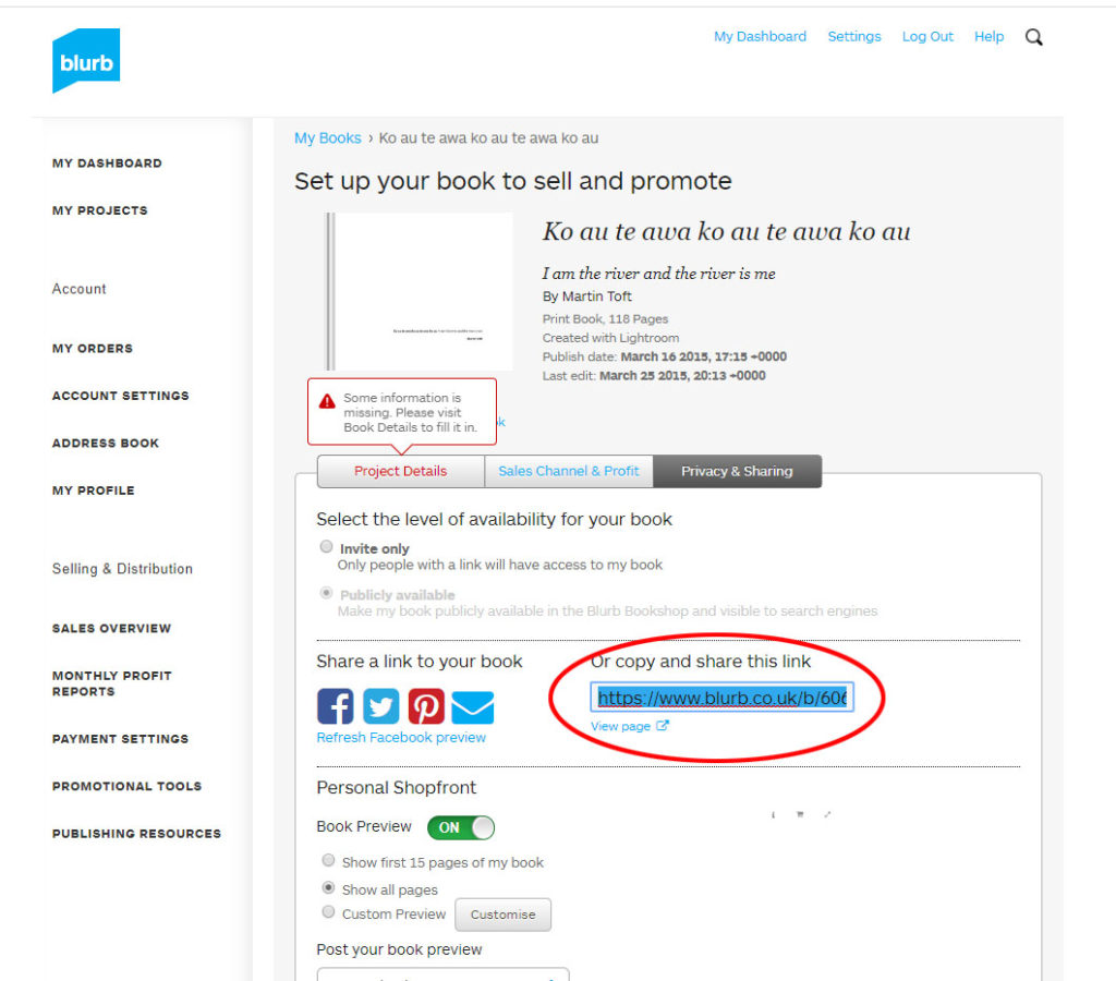
Copy link circled in red above.
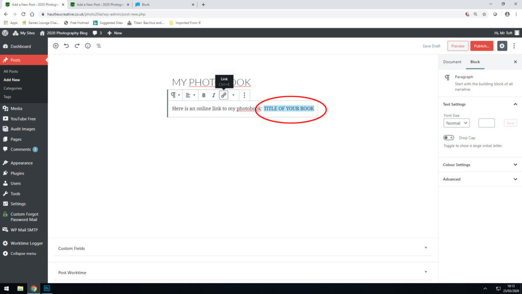
Make a new blog post: MY PHOTOBOOK and copy in link from Blurb into the title of your book using Link button above.
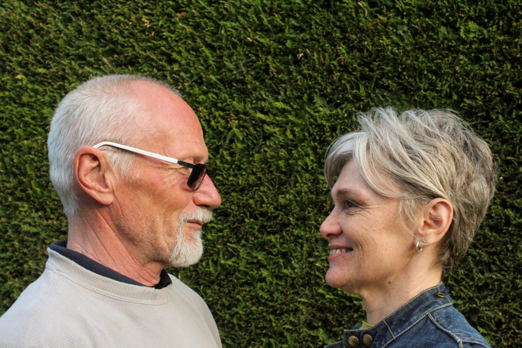
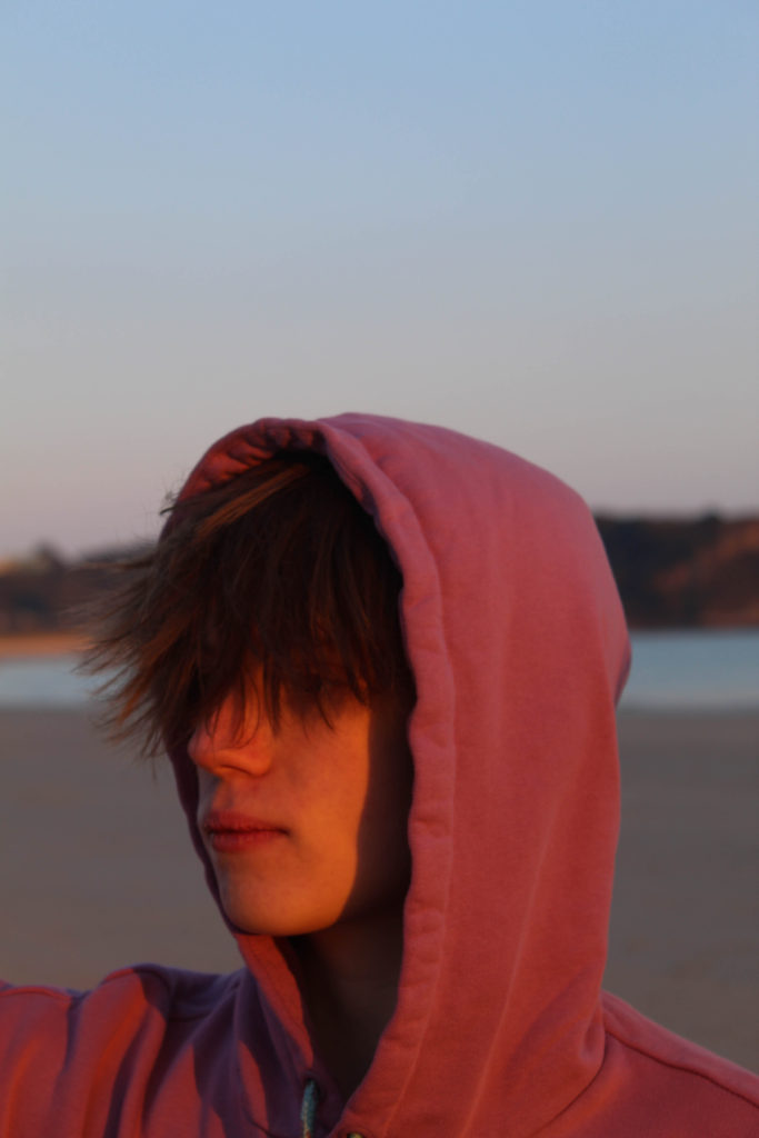
For this shoot i wanted the location to be in my garden because it was easier to control the background. I wanted to take pictures of my parents to contrast against the pictures of my friends in the later sections of the book. I used the same selection process in Lightroom with the colour labels, but this time it was easier to select my final images as I already knew what specific images i needed them to work with. I had individual portraits of my dad as well as both of my parents, and I also took a few images of the strawberry plants in the garden because they’re just begun to bloom properly.

I was working with fading sunlight at the time so I only took about 50-something images.
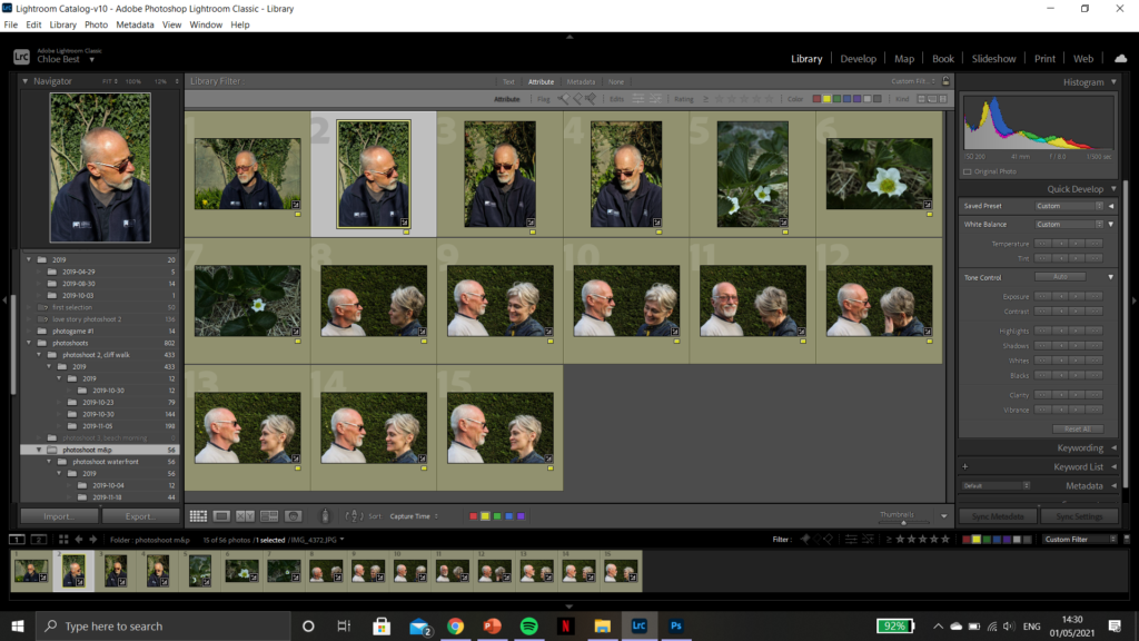
Then I got them down to 15 images that i felt were worth going through and editing. My editing process has also stayed pretty much exactly the same throughout the whole series: only correcting minor flaws and improving technicalities in the photos, as well as tweaking the colours slightly sometimes to fit better with the theme and the other images. Below are some examples of the before and after of a few images.
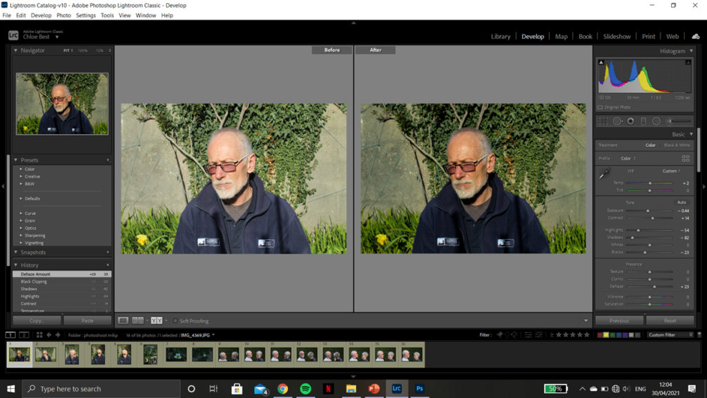
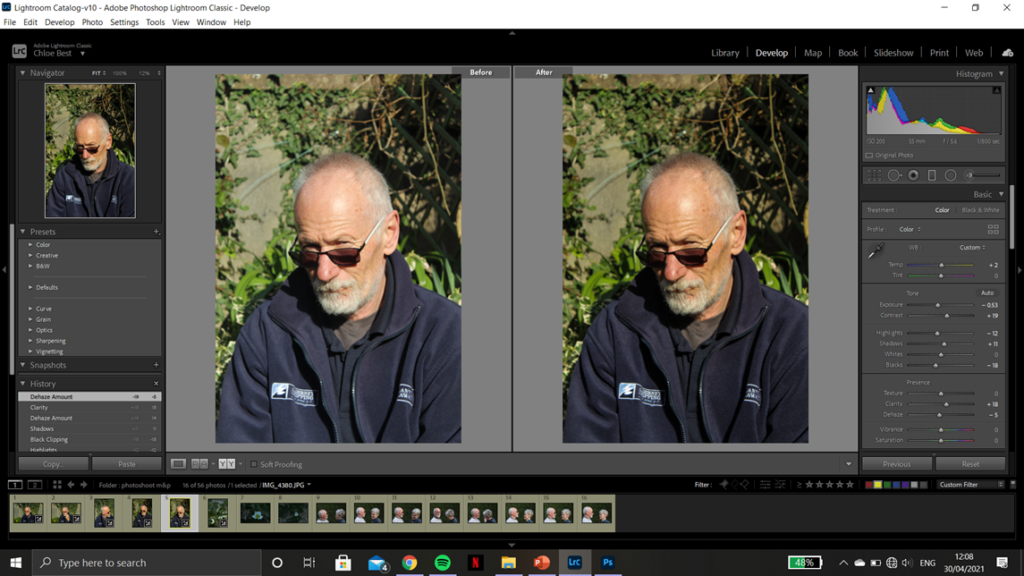
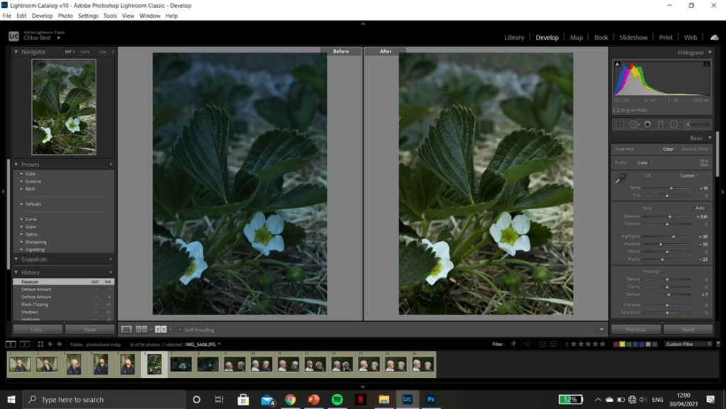
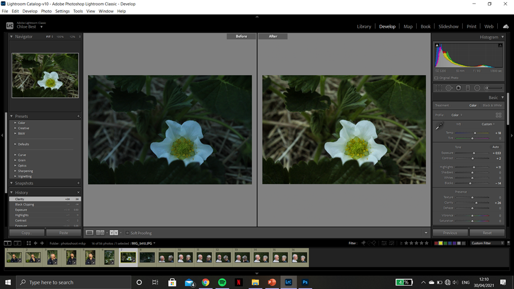
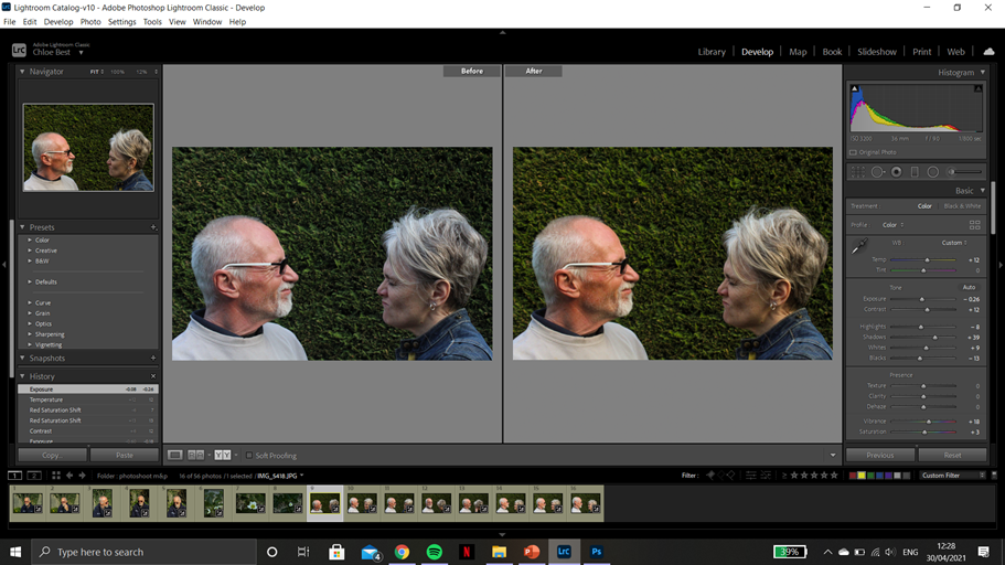
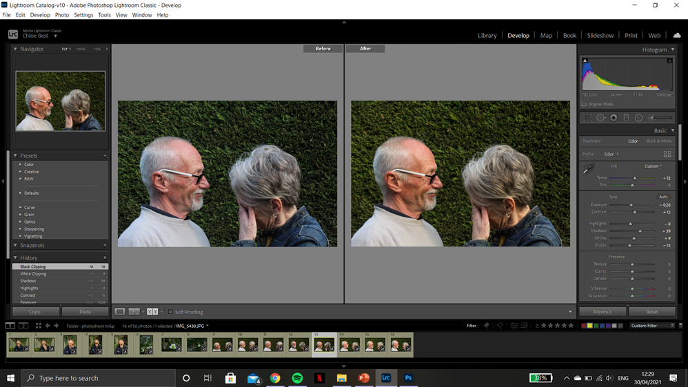
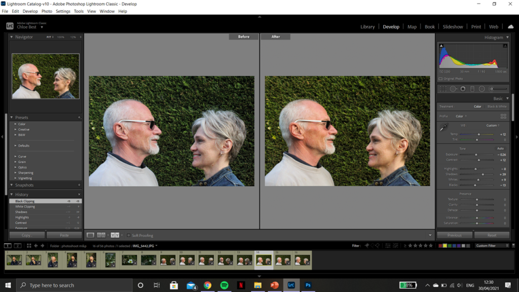
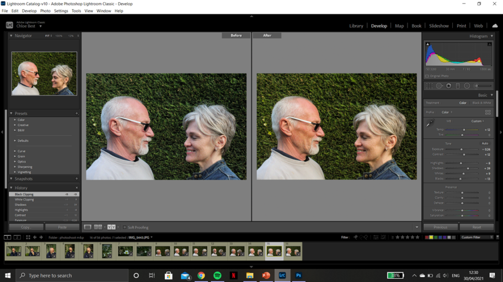

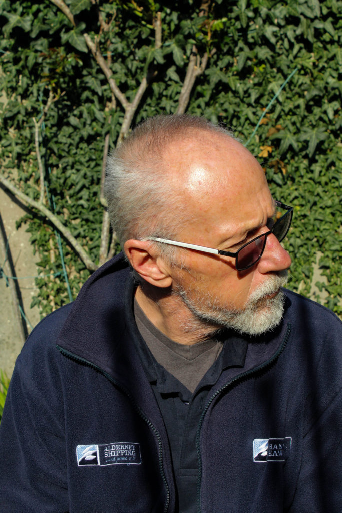

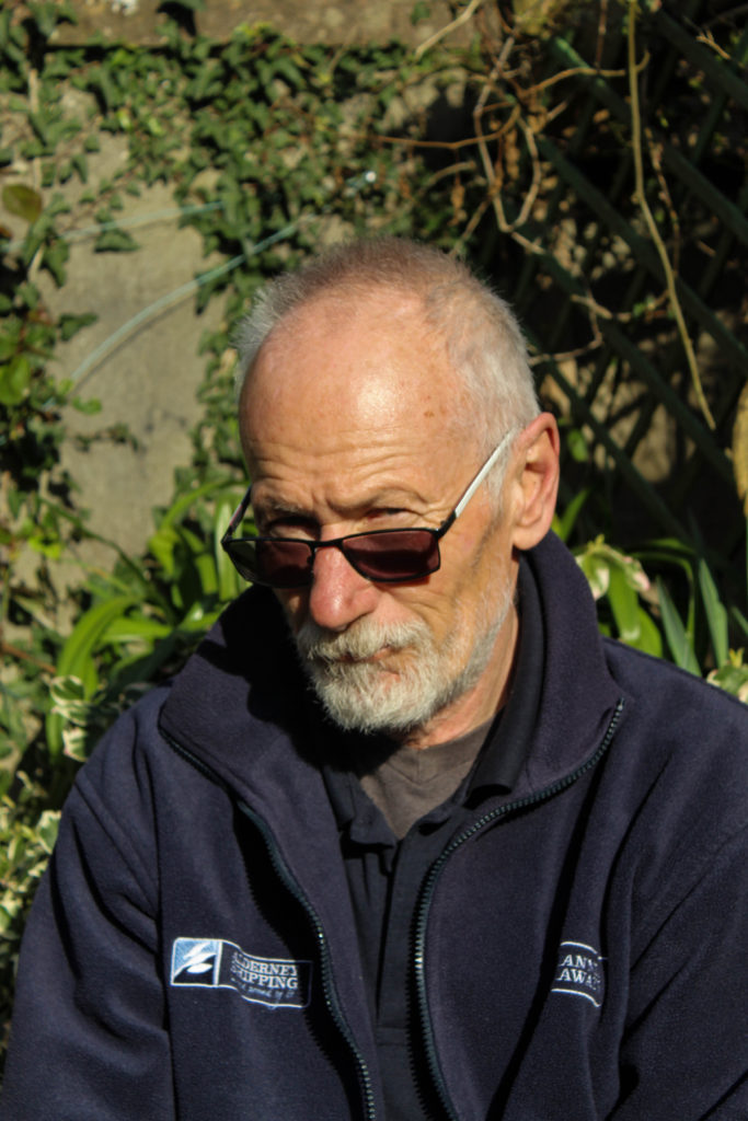
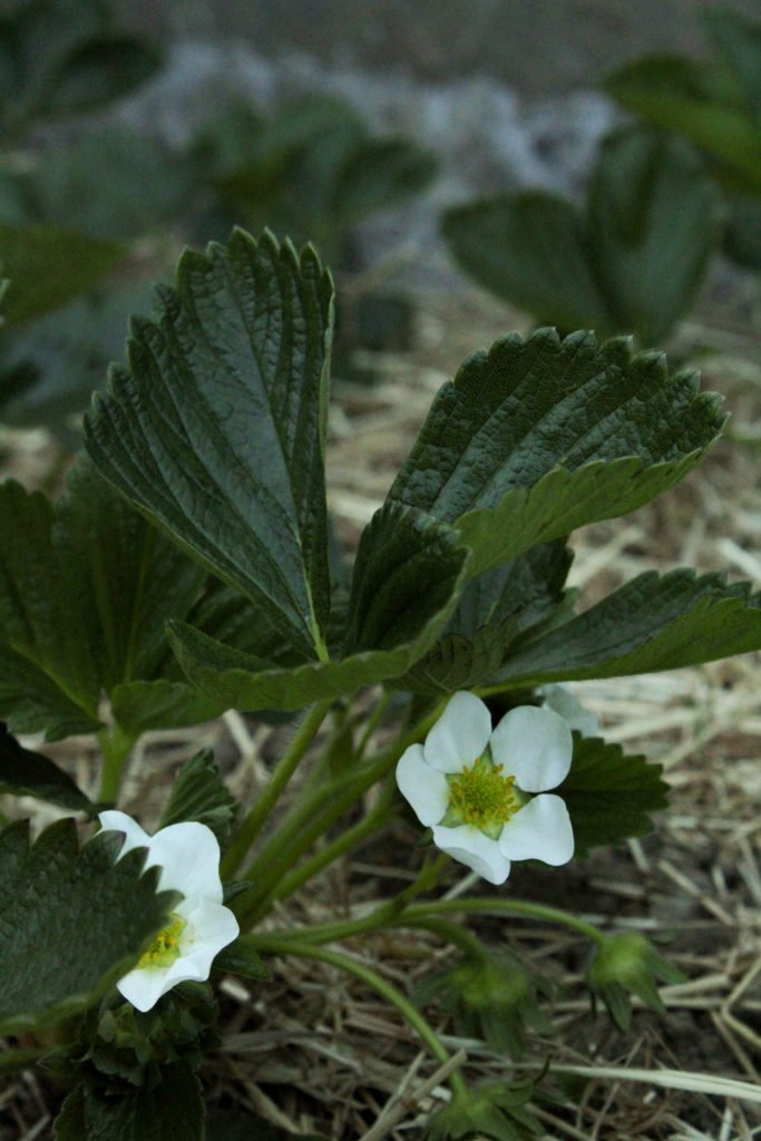

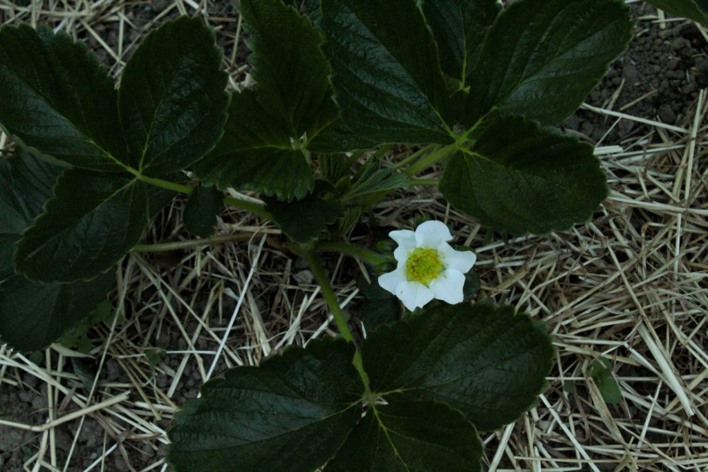

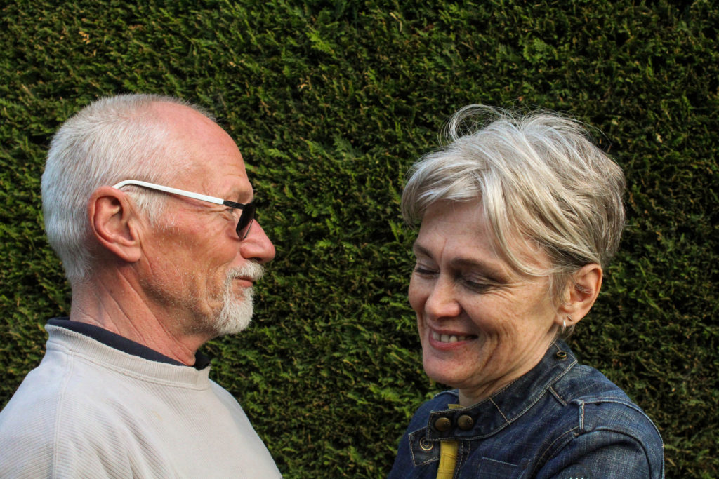
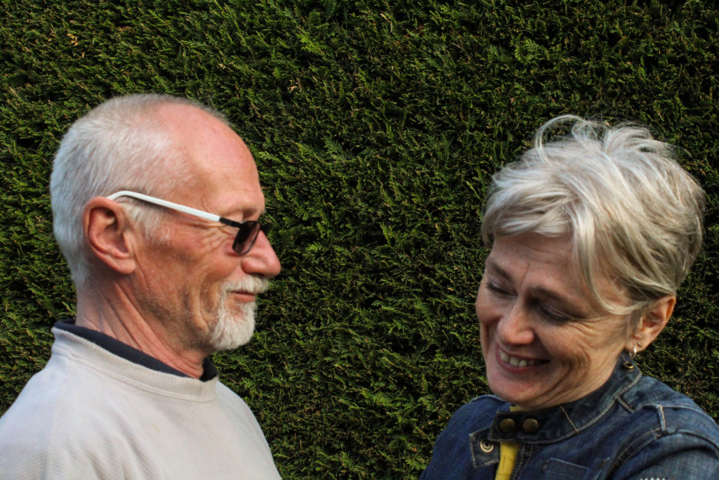
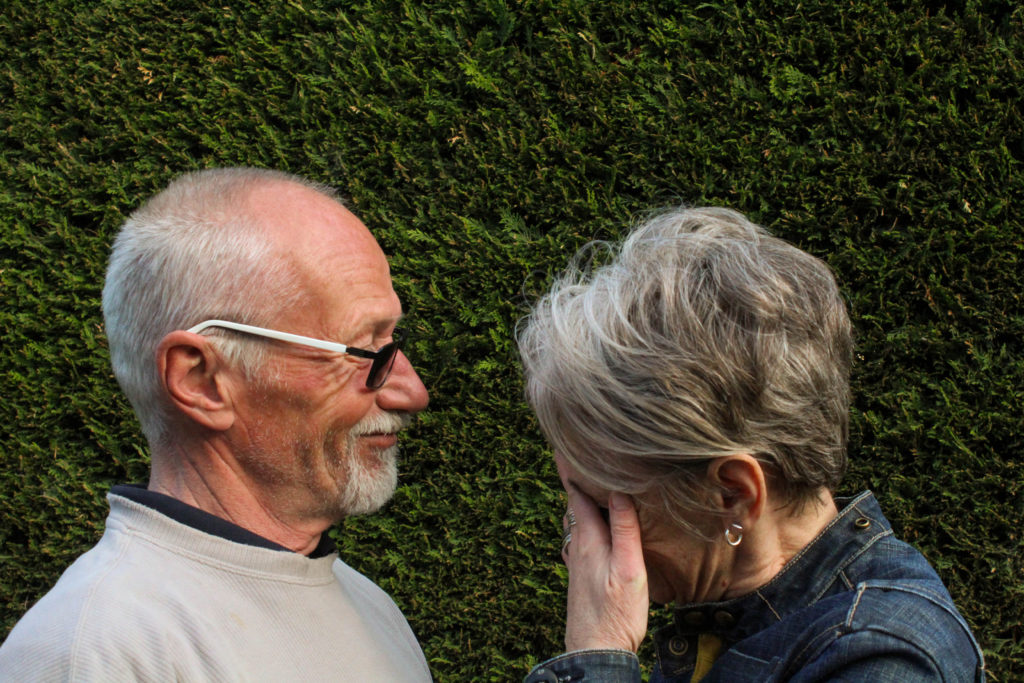
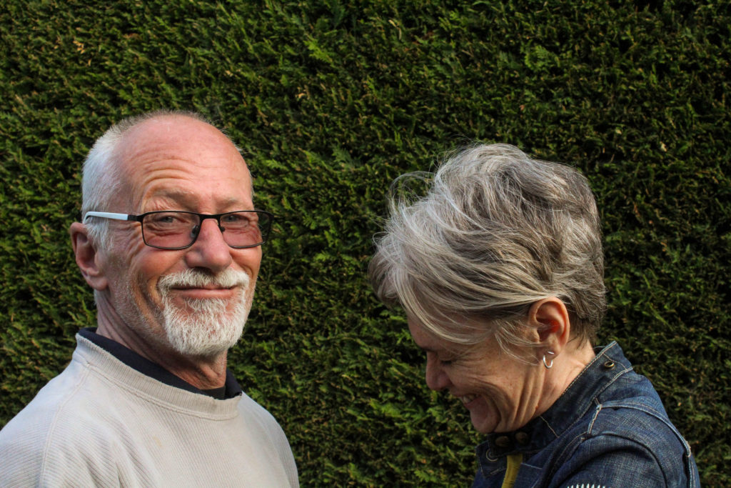
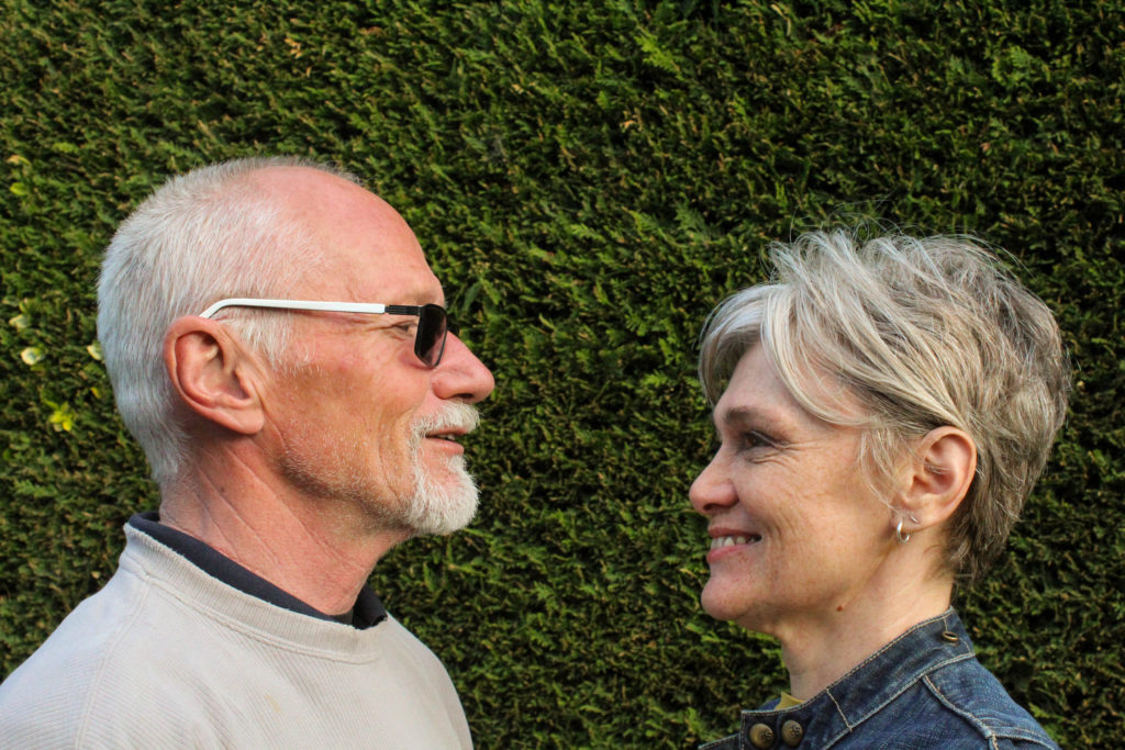
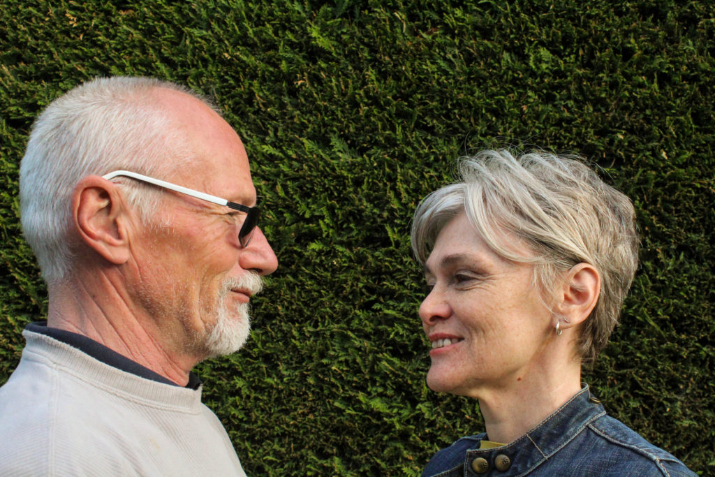
I’ll probably only use three or four of these images and will have to use trial and error to see which fits best, but the image below I know i’ll use for sure. Of the images taken with both of my parents there wasn’t one that had them both in the right position and properly focused, so I decided to use Photoshop and splice two image halves together. This was pretty simple and it didn’t take long to produce the final product, and i think the end result is fairly seamless and natural-looking.
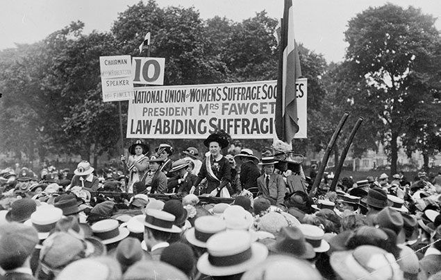
I wanted to create a mini project surrounding Femininity and the reality of being a women.
Feminism is a movement which is about of trying to get equal rights for women.
The wave started in the 19th to 20th century with the Women’s suffragette movement where their main focus surrounded getting women the right to vote.
These were my two artist inspirations:
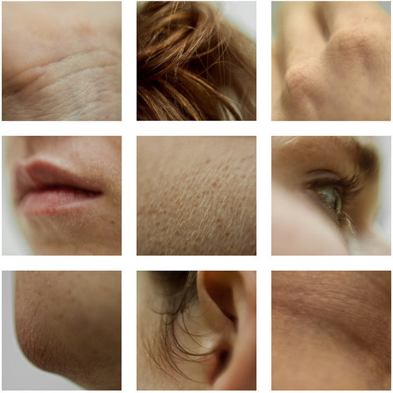
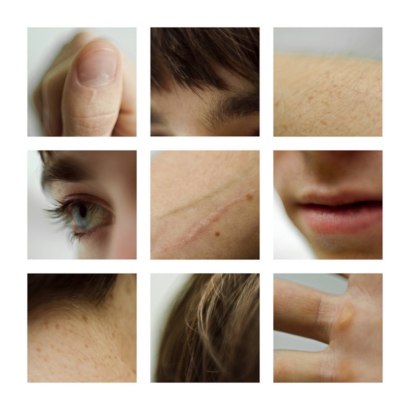
I chose Marek in order to photograph insecurities that many people have such as wrinkles, rosacea, hair and skin texture; I chose this as due to social media many of us constantly see airbrushed and photoshoped images which hide skin texture which can make many people insecure that they do not match the influencers body/skin. I wanted to enhance my skin texture and and “blemishes” in order to show the beauty and naturality of texture as everyone has it and it shouldn’t be something to be ashamed about.
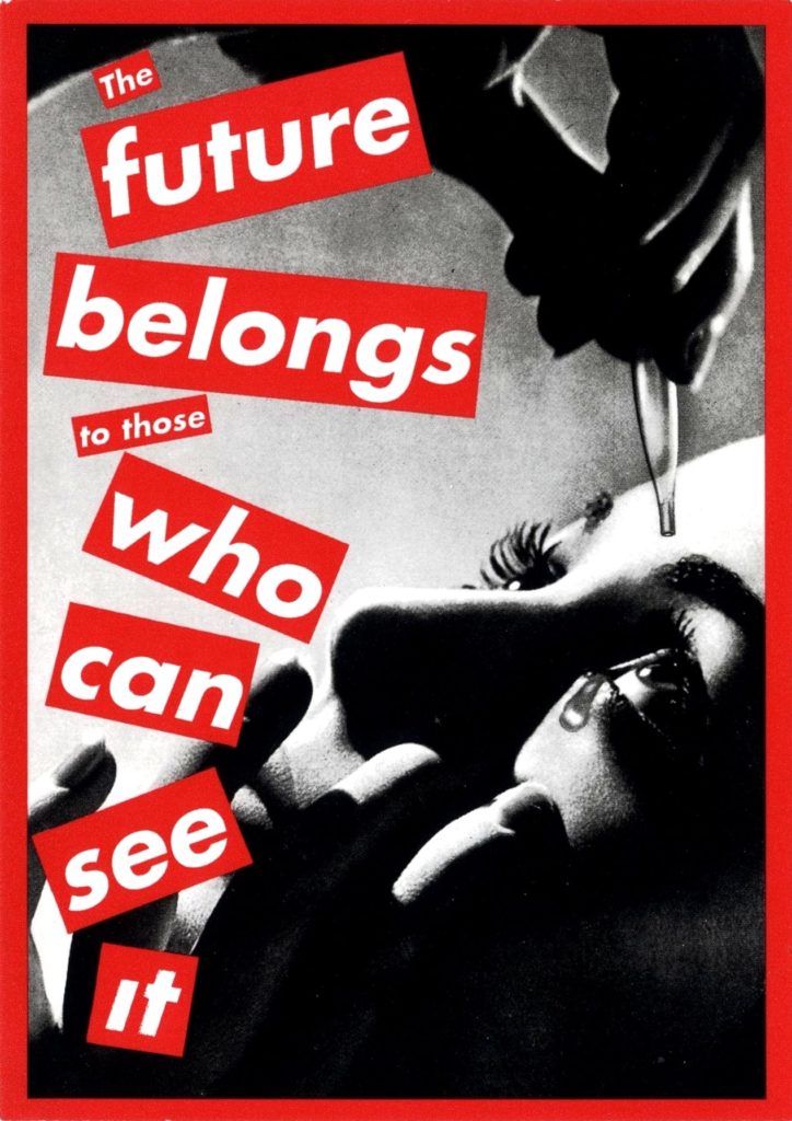
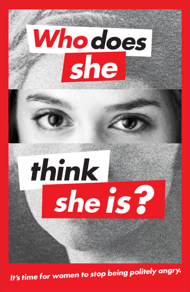
I choose Kruger due to her feminist influences ans the idea of giving people power. Her use of red and white lettering against monochromatic images really stood out for me as it helps get Kruger’s message across. I wanted my photo shoot to be empowering yet still show the struggles that women face in their every day to day.
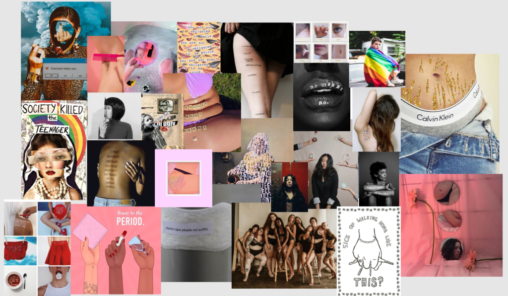
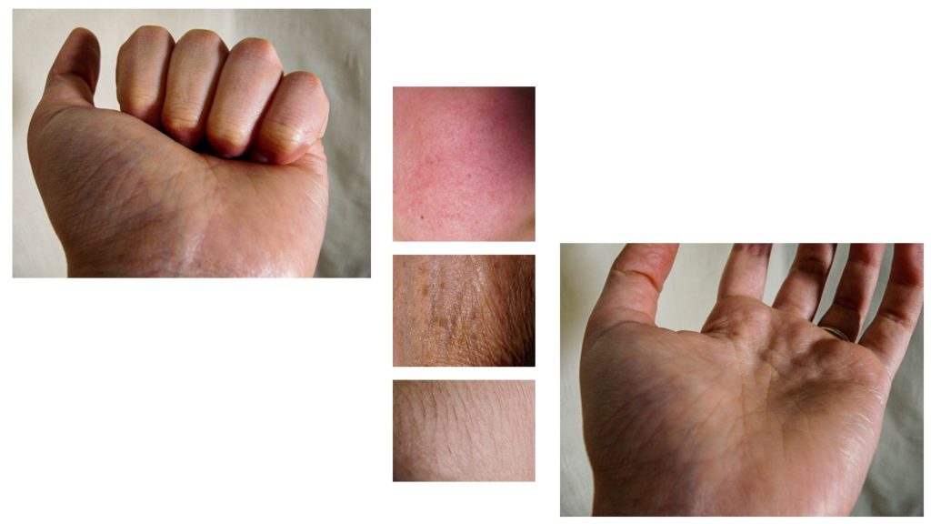
I think these images help to highlight the reality of skin and its different natures. I really liked these images as they help to show different elements of the human body and show “insecurities” which I find that with enough coverage people settle with reality and understand that not everyone does fit with societies standards but can still love their skin for everything that it does for them.
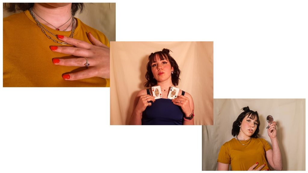
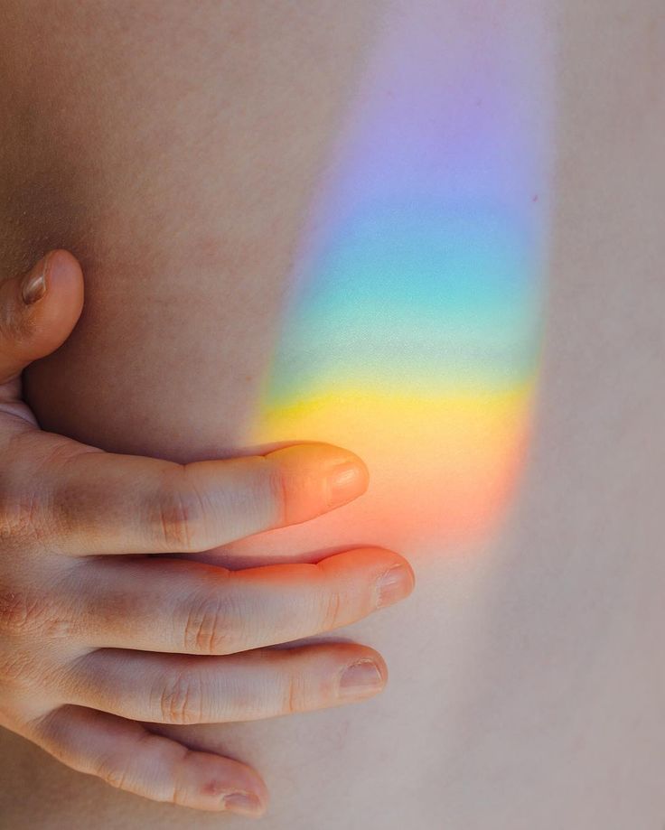
These were my portraits which have more subtle meanings. In the first image during the shoot i placed the nail varnish messily and wanted to photograph that to symbolise that not everything has to be or is perfect. I thought that the colour red was important to show power and confidence as people can create their own version of perfect. The second image shows A Queen and a King playing cards; this image helps to symbolise the patriarchal society and the divide their is between men and women; whether that be the pay gap or simply the way society treats people differently depending on their sex. The third image makes references to social media and society as in more ways than not many people find themselves obsessed with the way they look due to insecurities and the desire to fit in. I feel that as a women I need to check and make sure I look presentable so that I don’t get called out for “letting myself go” or “dressing inappropriately”.
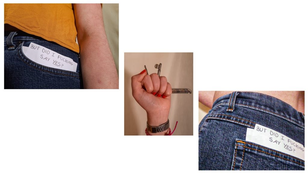
These final images have more of a powerful and clear meaning. The first and third images are references to sexual harassment and the rape culture that society has brought up. with the news showing that at least 97% of women have experienced sexual harassment I thought that these were important images. Society still tends to condone women for getting sexually harassed and abused with constant questions of “well what were you wearing?” and “what time where you out?”; whereas they were asking the wrong questions as it does not matter the piece of cloth in which people decide to wrap themselves in but rather the people who rape and abuse others and their rewarded attitudes. The use of the keys relates to the fear that many women face when walking alone, as they feel the need to carry around with them something to protect themselves so that men will not abuse them.
Overall, I am quite happy with my outcomes and the way they turned out as I think I have managed to touch on many important subjects through the use of experimentation with different objects and poses. I hope that this project inspires future projects in hopes to speak up about important topics and raise awareness of normal and natural bodies and skin and the issues that still apply to women in this patriarchal society.
This shoot was pretty short because I only wanted to fill in the gaps of some necessary images. I went down to the Waterfront green while it was sunny because the gaps i needed to fill in are in the “summer” part of the project, and i ended up with about 20-30 images to sort through in Lightroom.
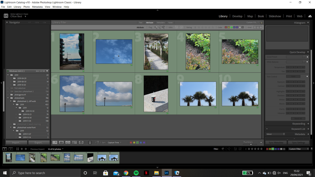
After going through them I ended up with 10 images to move on with. A couple are the same image in both portrait and landscape because I’m not sure which orientation fit best with the rest of the book layout, but I’ll decide which to keep after some experimentation. Below are the before and after screenshots from the editing process showcasing what adjustments I made and how they improved the image as a whole.
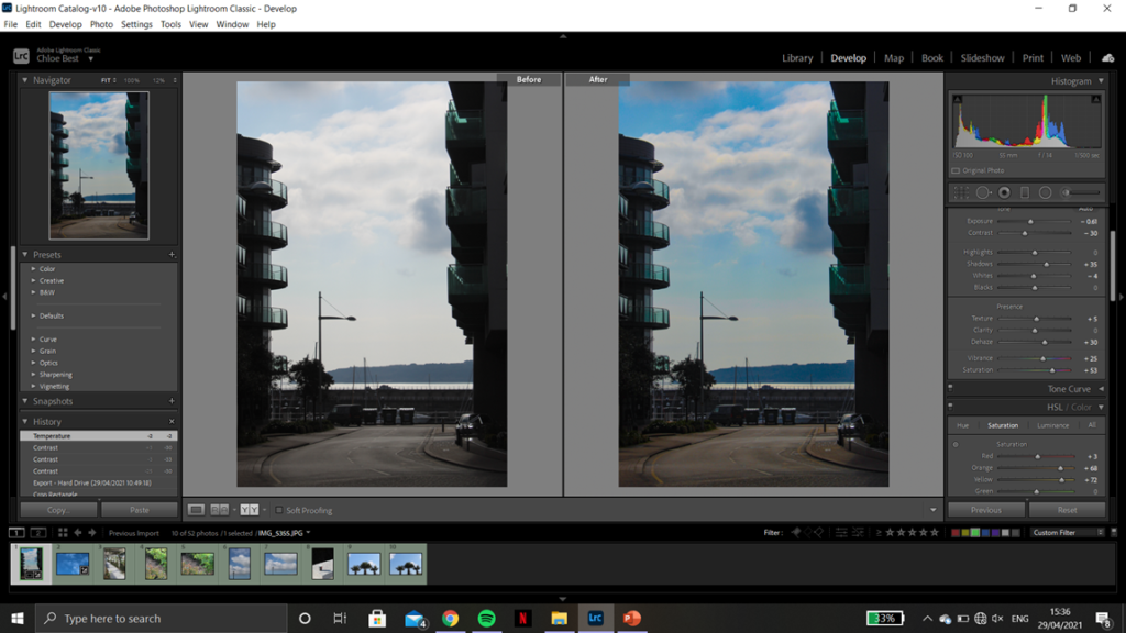

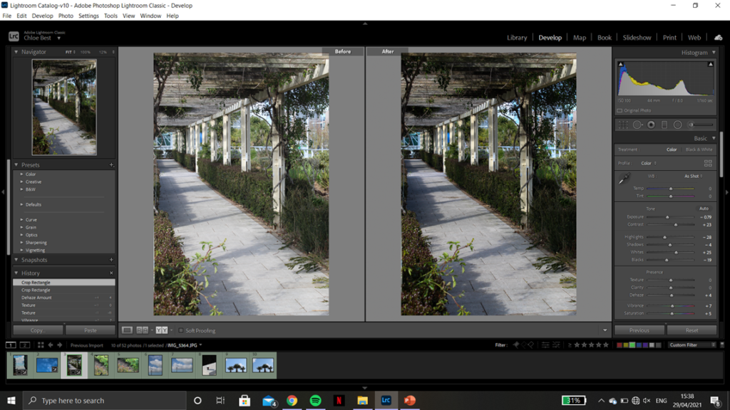
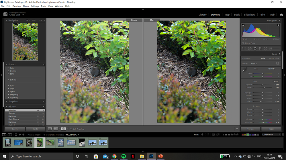
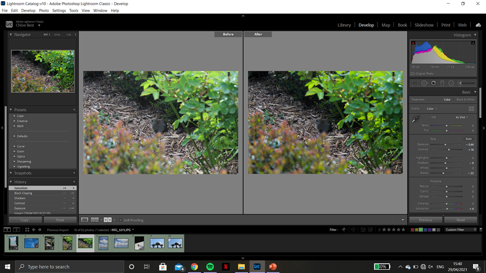
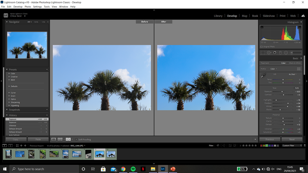
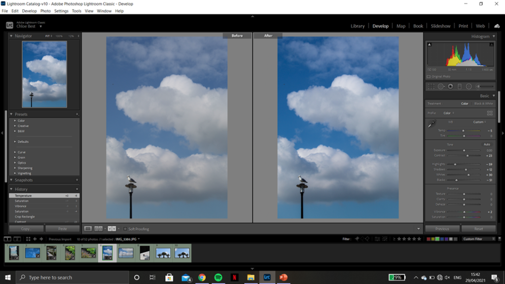
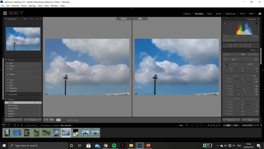
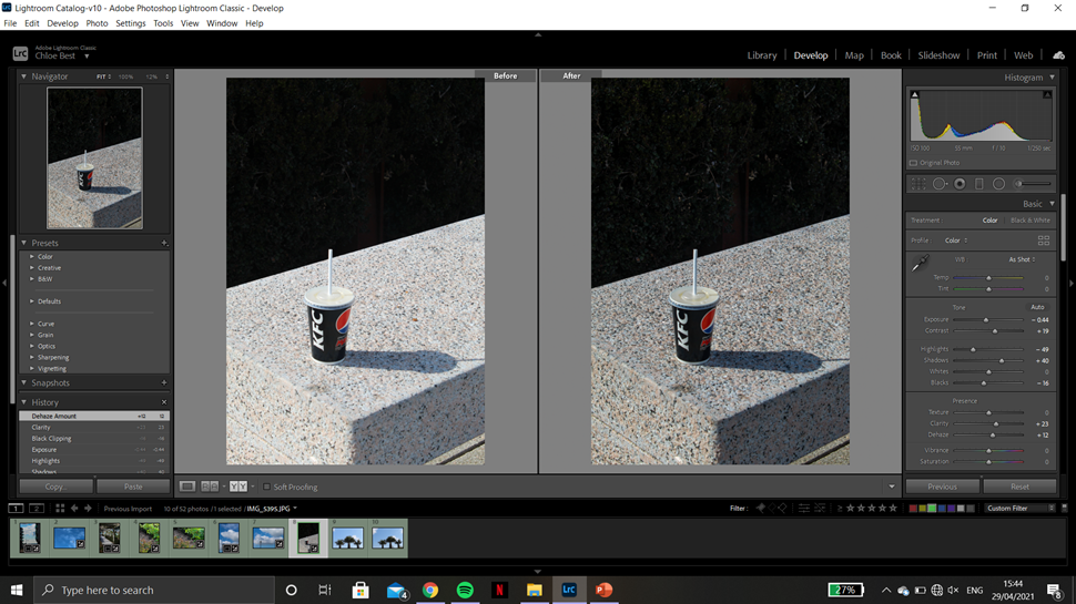
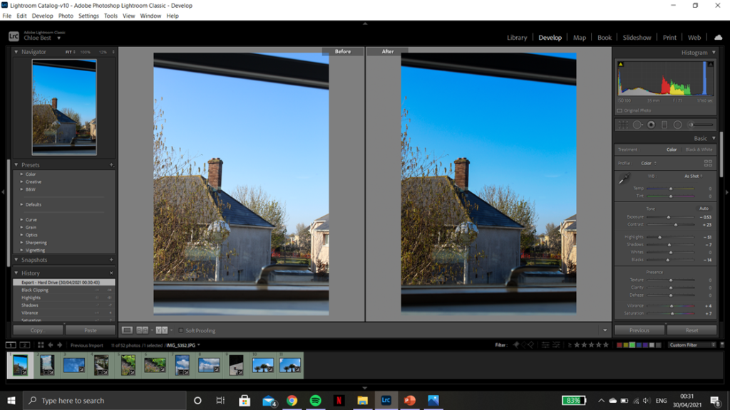

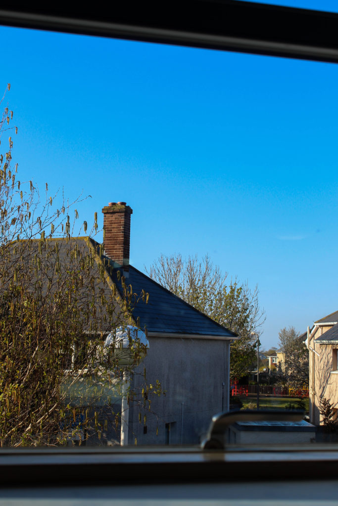
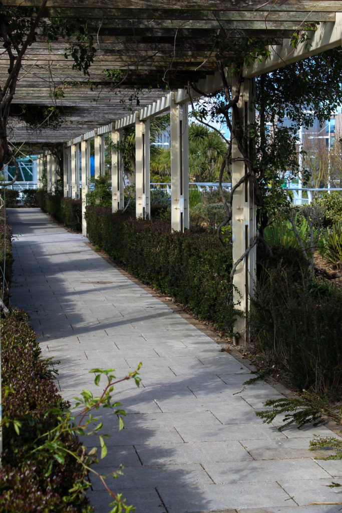


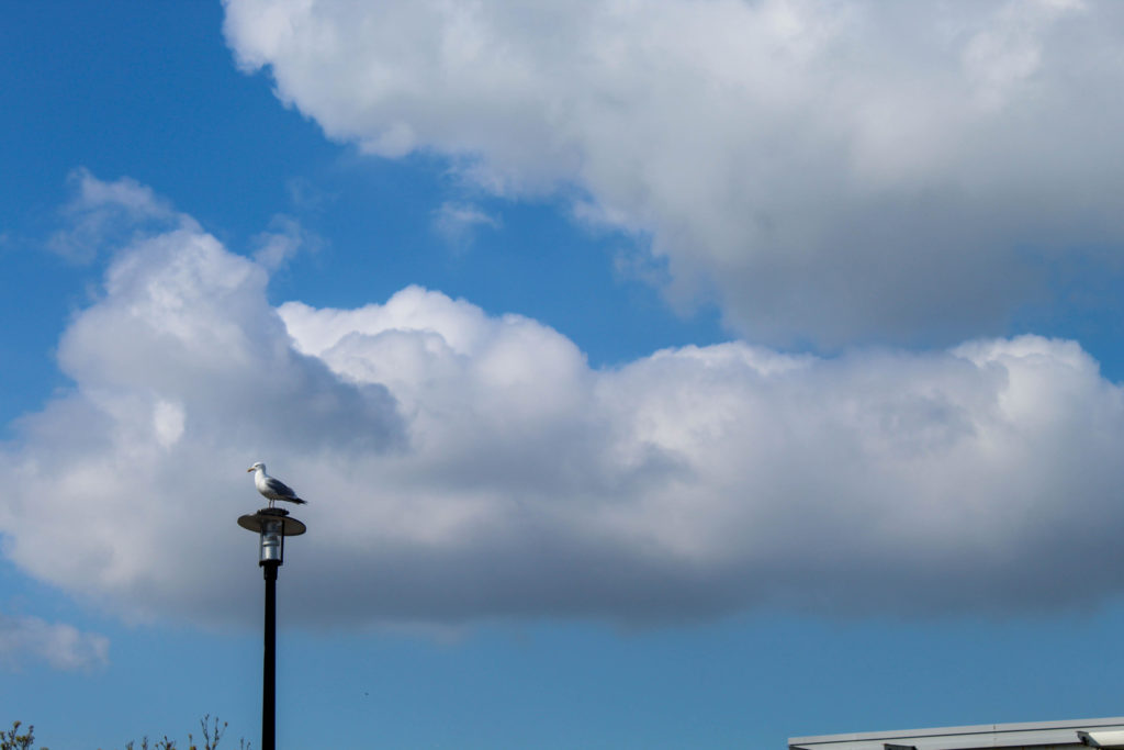


With the last image, I imported it into Photoshop t remove a few stray branches coming up from the bottom form surrounding trees. This was done using the spot healing and the healing tool to remove any distractions and keep the three trees as the main focus of the image.


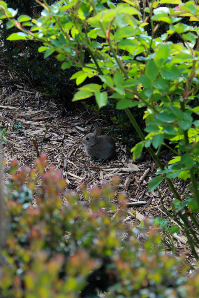
I liked this layout because it both images are similar in that the main focal point in the singular stem of a plant with a more crowded background, and also because it showed the transition from winter-type plants to more spring/summer flowers.
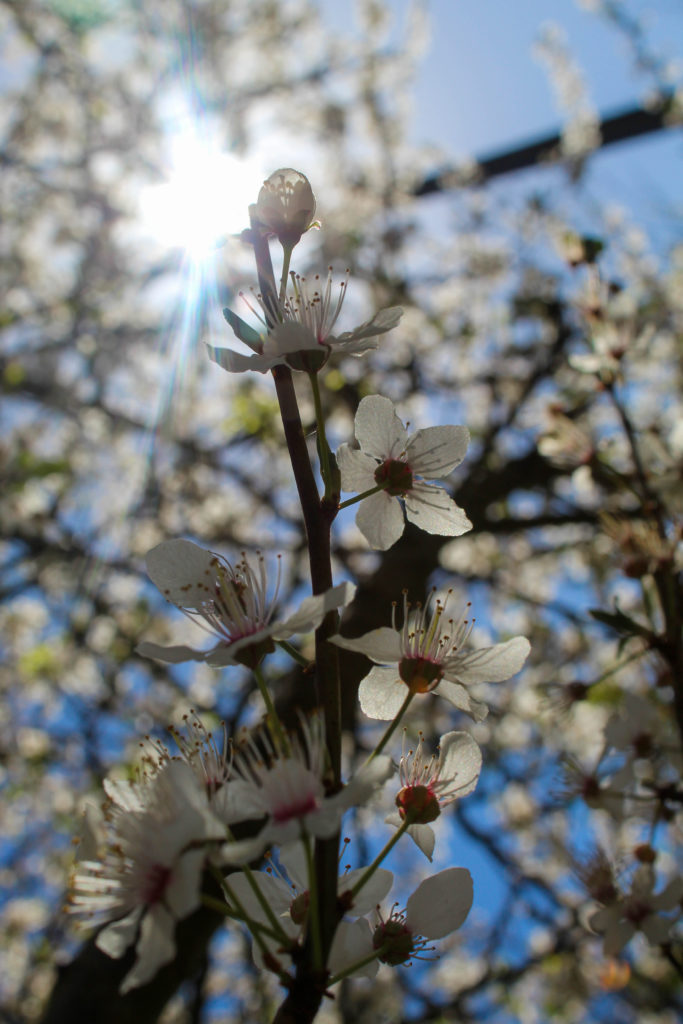
I think i prefer this layout because both images have similar colours and they are still the same sort of image in that they have the main focal point front and centre. However, they are both summer/spring feeling images and the left has a much more simple background, providing some contrast. Overall these two images together feels more cohesive and artistic than the previous pairing.
I think I’m going to use the other image from the old pairing as an individual image in the book, because I do quite like it.


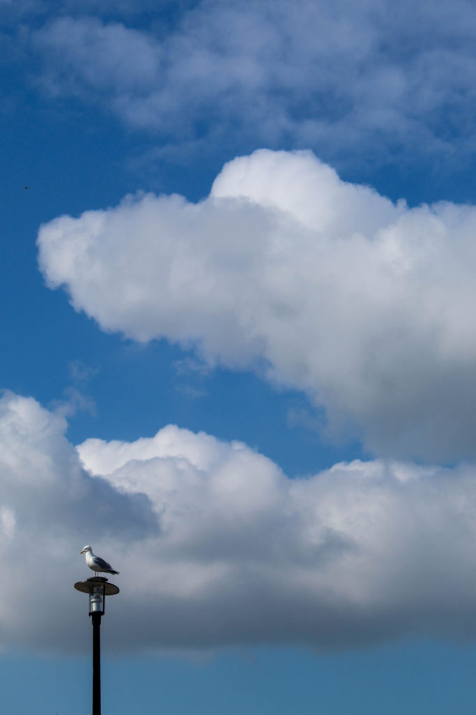
I paired these images together because they both had a sort of circular shape in the bottom corners, and they were both wintery and cold in feeling. However I don’t love how they work together which is why I’ll be trying out a couple other images instead.


I wanted to keep the image on the left from the previous layout because I think i have too many plant-based images otherwise, but it proved difficult to work with and I don’t think it would have worked well as a standalone image in the photobook. In the end I put it with the dark-clouds image but I don’t think it worked.
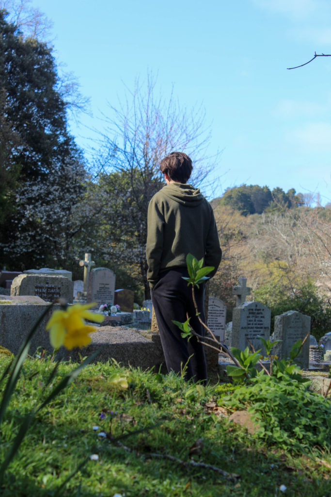
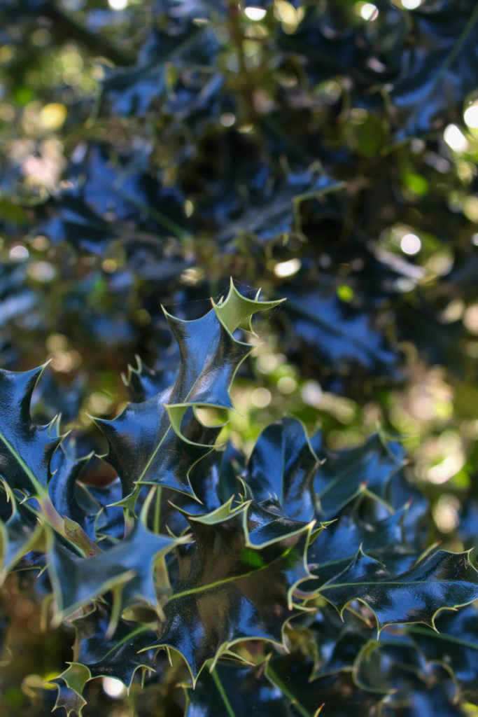
What i like about the image on the left is how the light reflected off the dark green leaves looks almost blue. I chose to try it with the image on the left because i felt there was a lot going on, particularly in the background, and the image on the left is fairly simple. Also, I class them both as winter photos as the right features the holly plant and the left is at a cemetery, symbolising how winter is traditionally thought of as a season of “death”.
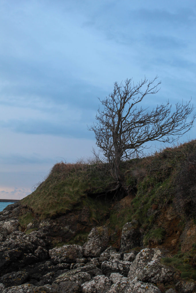
I kept this image as a standalone photo because I thought it would be a good opener to the book, but after working with some of the newer images I thought I should probably see how it looks with a pair.


I chose this image because they both have a similar “wintery” vibe to them, meaning they are both cool-toned, as well as the fact they are both fairly simple images with no crowding in the background or the foreground. However I think I’m going to keep this image as it is (standalone) because I still think it works well as an opener and I prefer it this way.