Category Archives: Uncategorized

Filters

Author:
Category:

Film Editing

After gathering my footage, I took to the software Premiere, a software that I have used previously, to put all of my footage together and edit it. Due to using this software in the past, I felt comfortable and at ease when using it and made my editing process that much easier.
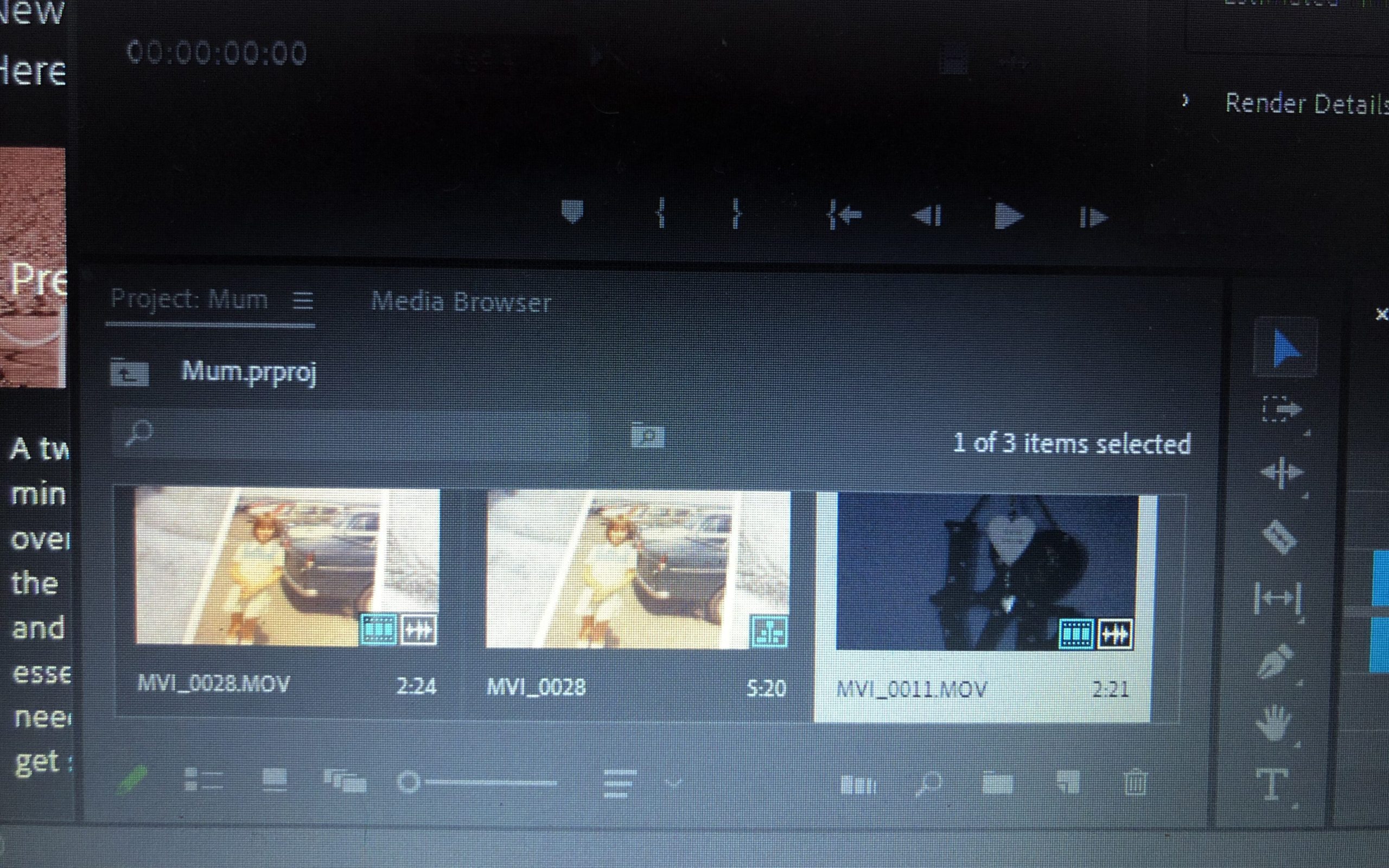
To begin with, I started by importing my footage intro Premiere. The screenshot above shows the library in which the footage sits in when editing. I normally import all of my footage (from my SD card) so that I can look through them all and select the footage that is most suitable and that I like the most.
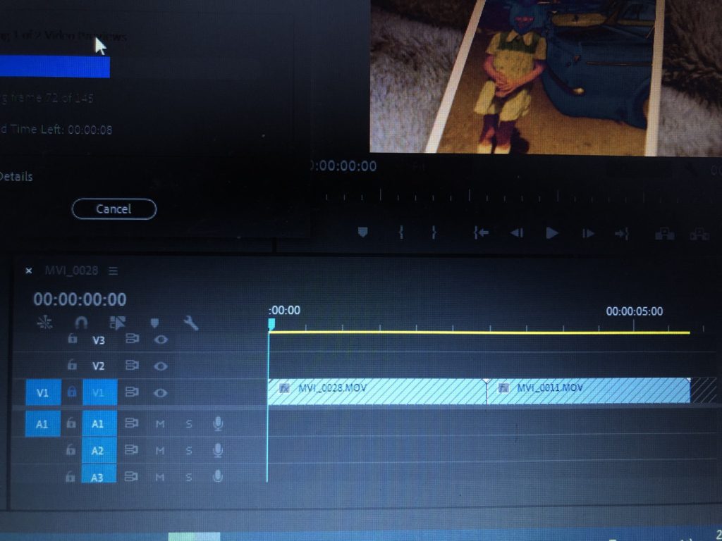
After importing and selecting the footage that I like best, I then take the footage from the library and drag it into the bar shown above. This allows you to see how the video plays and also puts it into different sections such as V1 (video 1) and A1 (audio 1). This allows you to maneuver around the different sections of audio/video without any confusion. This bar is where all your sections of video and audio lies, creating your film.

When adding my footage to the bar, the audio will come with it and appear in the A1 section. To get rid of the background audio (because I will be adding a different audio over the top), I lock the V1 section and then delete the A1 section. Locking the V1 section will allow no footage to be deleted when I’m deleting the audio from it.
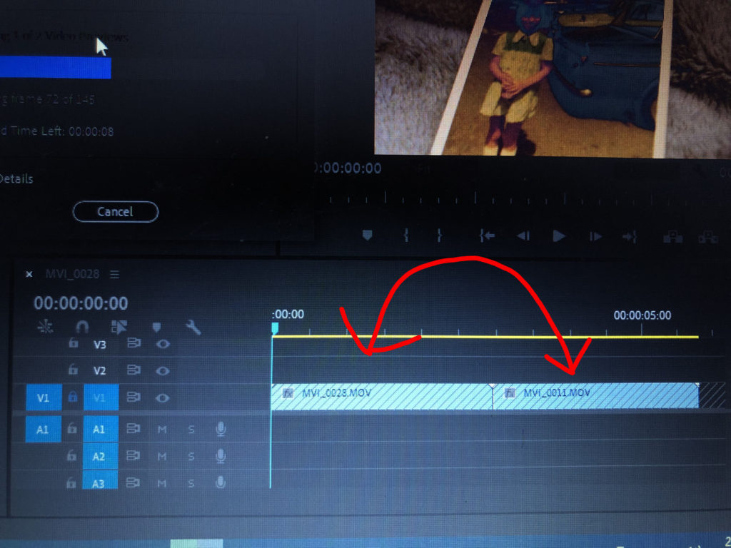
After uploading all of my footage that I am happy with, I then play around with the order of the videos. Sometimes certain videos don’t go well next to each other so I experiment by shifting the footage around to create a sequence that I am happy with. You can do this by unlocking the V1 area and simply dragging the different sections of footage to other areas. I feel as though experimentation is key to making a film or a photo book because you never know what you could create through experimentation, additionally you can point out the weaknesses of your film through this process. If I didn’t think that a piece of footage was suitable for my film anymore, I would simply delete it and insert another video that I feel would be more appropriate to my film.
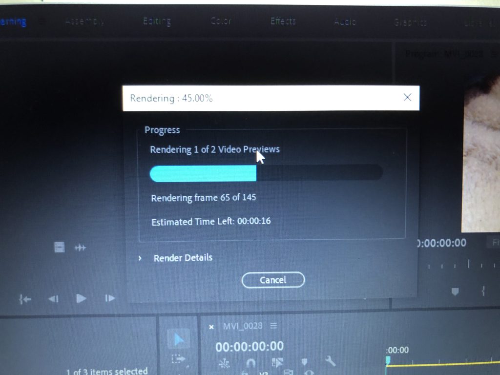
Also, after adding all of my footage, I would render my clips so that it ran smoothly and there were no sign of any glitches/jumps etc. This also allows the video to be exported easily and increases the quality of the video when it comes to exporting.
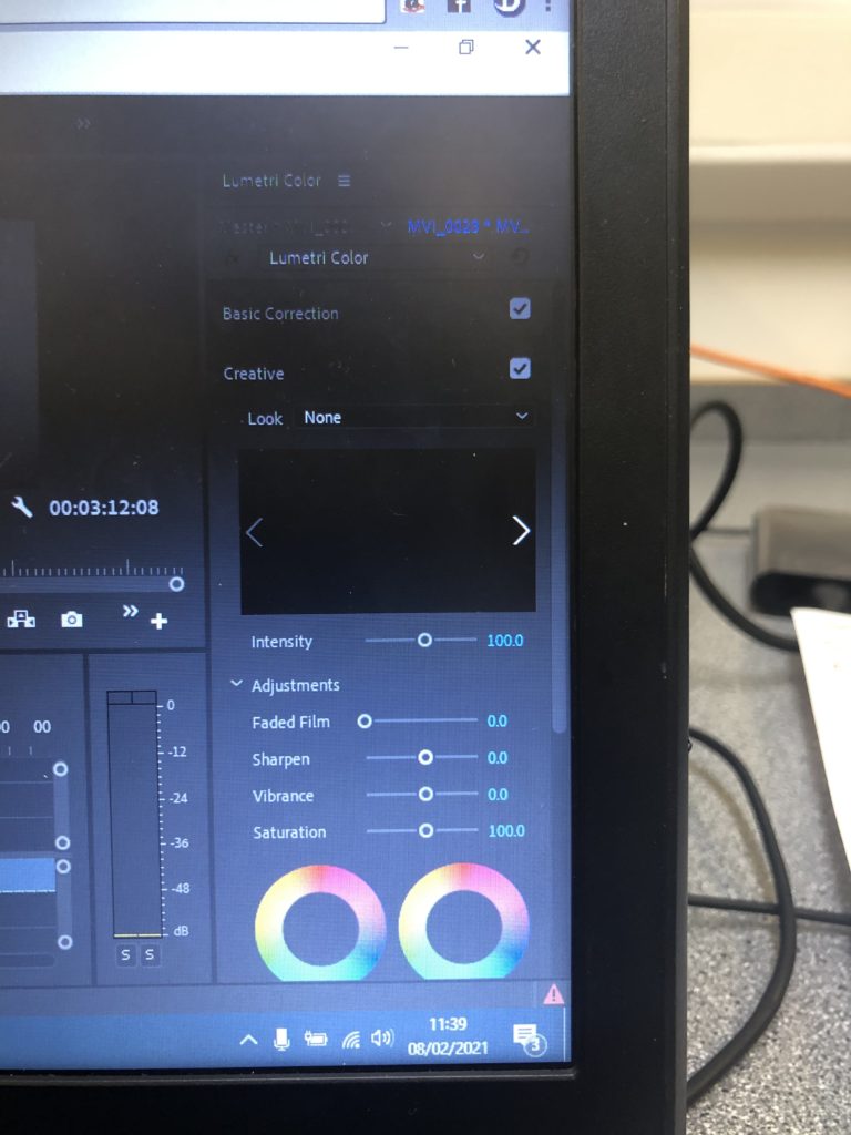
I wanted my film to be lacking in colour, with a lack of contrast etc to create a dull, sad and mundane atmosphere to my work. Therefore, I clicked the color tab at the top of the screen in the Premiere software and used the basic correction and the creative tab (as seen above). I experimented first with the saturation/vibrance/fade/brightness/exposure etc and eventually got to a colour that suited the overall vibe that I was looking for. The exposure varied in every clip depending on how dark it was, for example, if my clip was filmed in the dark I would increase the exposure more than usual. My saturation, sharpness and fade was all standardised however. In every clip I desaturated it to 51.9, I then increased the sharpness to 30.9 and then increased the fade of the clips to 42. I did this to every clip so that my whole film looked the same. When adding the effects, I made sure to also render the effects in and out so that again, there were no glitches and everything would run smoothly.
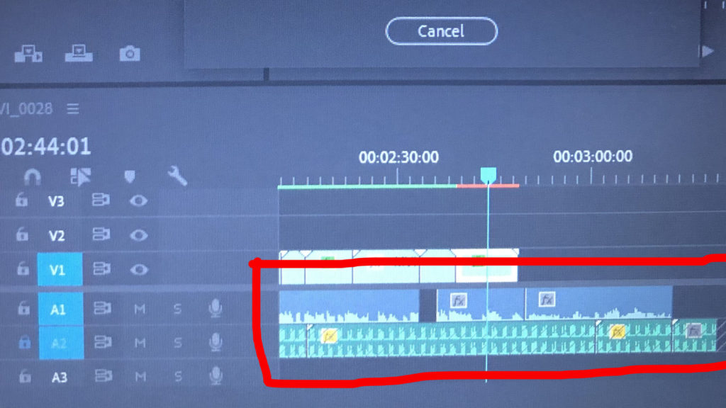
After I was happy with how my footage looked and ran, I then began focusing on my audio. My audio was filmed via video so that it would be easy to import, the importing process was the same as the videos. When adding my audio though, I made sure to lock my V1 so that no footage would be overlapped by the audio footage. After placing my audio in the A1 area, I then deleted the video footage so that the audio was the only thing left. I had around 10 minutes of audio so editing it was a long and time consuming process. I had to listen to the audio a various amount of times and cut out sections I thought were the most important.
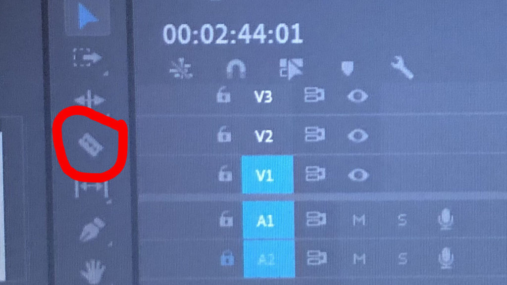
This tool was very helpful when it came to editing the audio. Since I had so much audio to listen to and edit, this cutting tool made it easy to quickly eliminate any sections of audio that I didn’t wish to keep. After chopping the audio and keeping the bits that I liked and that were relevant to the film, I was done with making my film. In addition to the audio of my Mum speaking, I also went to Sound.org – a website that provides a range of audios available to download. I felt as though some background noise was needed to provoke some emotion and to make the film more hard-hitting. So, I went to the website and found a slow heart beat sound, downloaded it and placed this into A2 (audio 2) – making sure to keep the video 1 and audio 1 locked just in case anything gets mixed up.
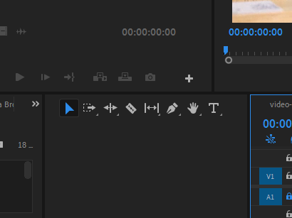
After all the video and audio editing was done, I wanted to make an outro that revealed the title of the video – ‘A Slow Progression’. I was looking at using the graphics that are available in premiere however nothing really grabbed my attention and there was nothing I really wanted. So, when the video became blank at the end, I selected the text tool (the ‘T’ above) and typed the title and placed it in the middle of the black screen creating an effect. I adjusted the text and size in the effect control panel.

Planning the Film

Story Board

Shot List

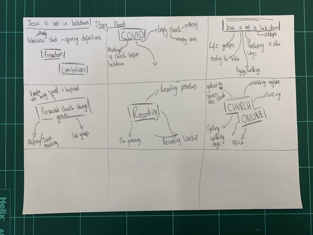
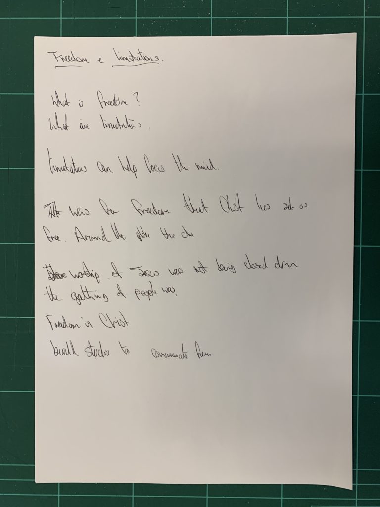
When planning this film, I made a basic story board with the ideas and topics I wanted to include, this helped me to be more productive, effective and efficient when planning and shooting the scenes.

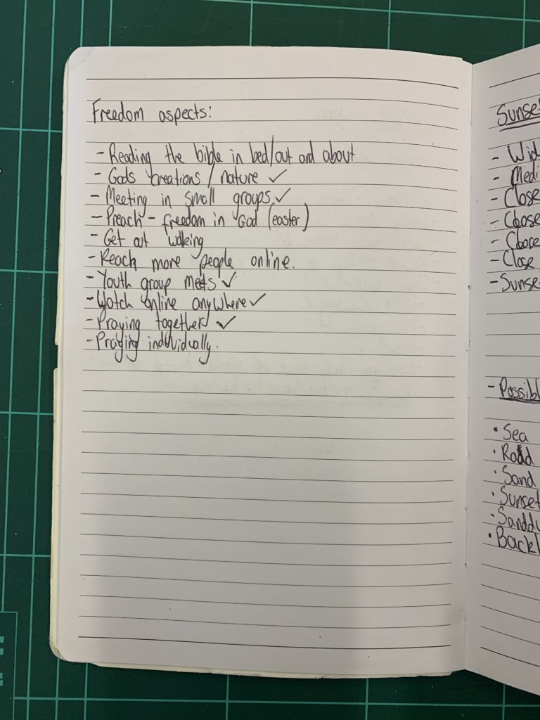
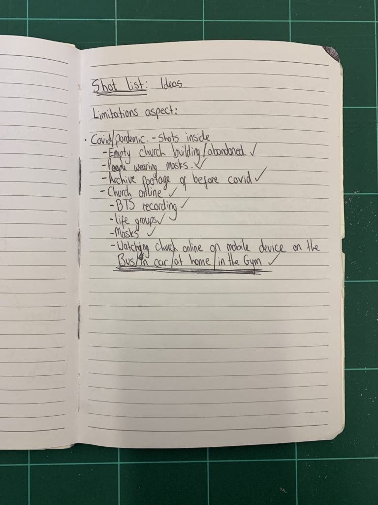
I created these two basic shot lists of the types of shots I wanted to represent the exam theme of Freedom and Limitations. This will help me to be more efficient on set when I am filming so I already have an idea of what to film before I get there. This will be vital as I plan on filming a lot at sunset so I will only have limited time to film the scenes.

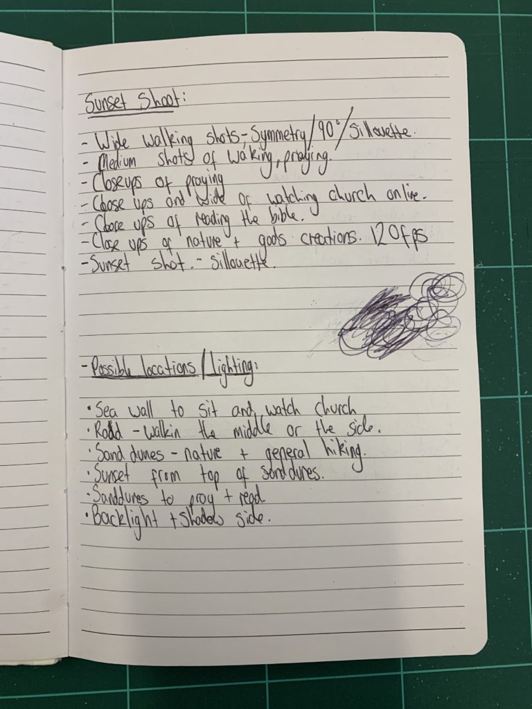
This more in depth shot list I planned for the specific location. When planning the shot list I thought about the different angles and content I wanted to achieve. I thought about the script and the theme of the film and how best I could convey the message using the cinematography. By having this detailed shot list I will be able to shoot productively on set and not waste mine and the actors time. It will also give me confidence that I know I will get everything I need and I will have spare time to shoot extra things if I want.

Idea and Script planning

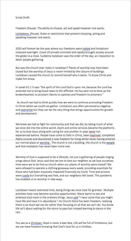
I planned out the idea of the script for the voice over and the topics I wanted to include. I thought about relevant events that have happened and how easy it would be for me to film those things. I wrote a basic draft script which I read through and changed things to make it easier to say, I also timed myself speaking so I knew a rough guide of how long the speech would be. Once I had done these things, my dad helped me change some things to better suit his style of speaking as he would be the one speaking in the voice over. As he is one of the Pastors of our church ‘Freedom Church’ he was able to help me change or correct things in a theological way. We then recorded the voice over in my chalet and filmed it at the same time.

in depth analysis of Rågsved

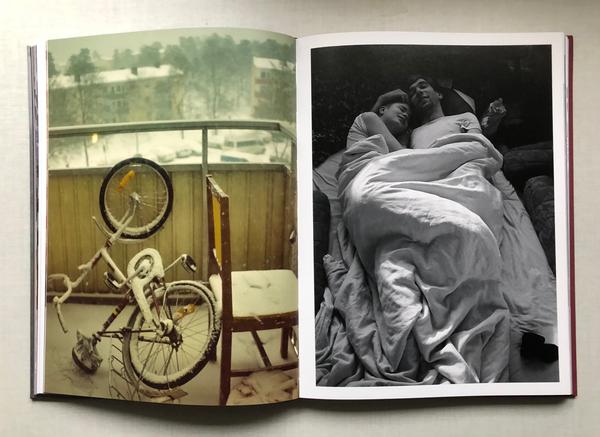
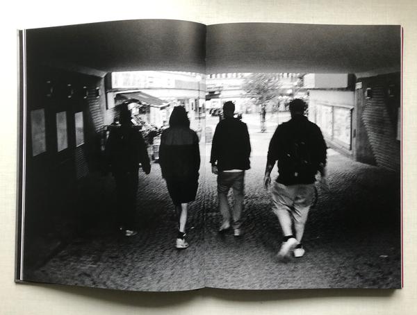
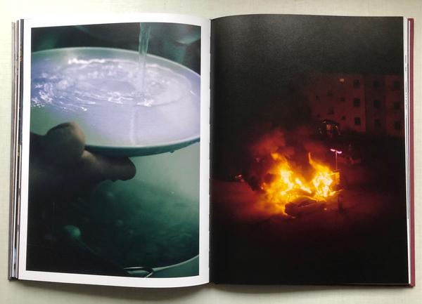
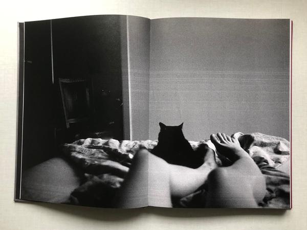
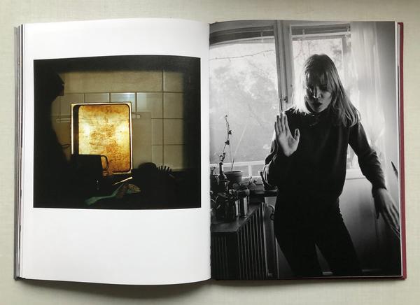
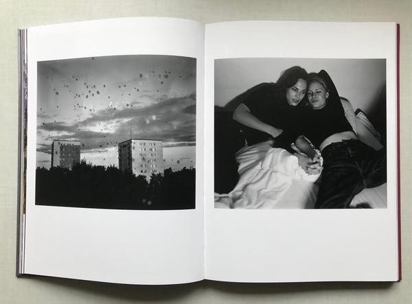
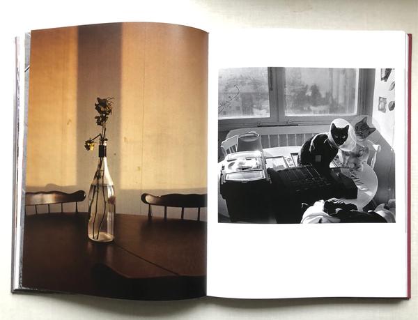
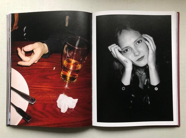
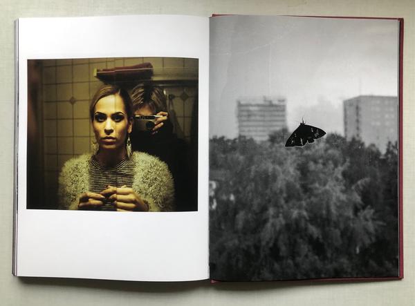
  • Format, size and orientation: Many of the images are portrait and many are landscape. There is a good mix throughout the book. The book itself is a portrait A4 book with 168 pages including 120 images, both black and white and colour.
  • Cover: The book is hard back and has an image wrap, with one black and white image making the whole front cover.
  • Title: RÅGSVED, the place where ANGELICA ELLIOTT moved after the loss of her boyfriend.
  • Narrative: The narrative of this book is of how ELLIOTT recovered after the loss of her boyfriend and how she found herself again while living in RÅGSVED.
  • Structure and architecture: I dont feel there is a repeating theme throughout the book, other than the fact that all the images are taken in RÅGSVED and tell the story of how ANGELICA ELLIOTT found herself again in this new place, her new home.
  • Design and layout: Throughout the book there is a mix of full bleeds, juxtaposing images, but there are no single images on double page spreads.
  • Editing and sequencing: ANGELICA ELLIOTT juxtaposed different images together, mostly a black and white image with a coloured image.

sophie calle

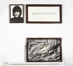
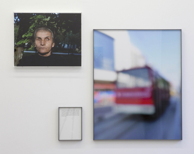
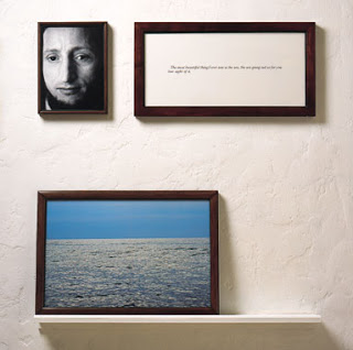
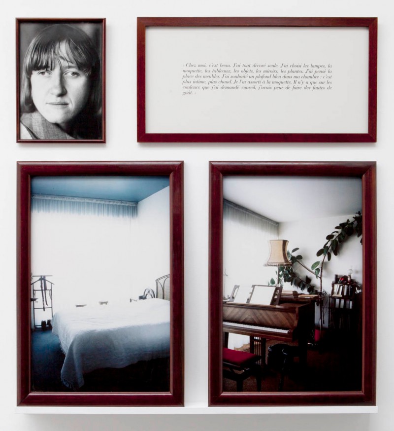
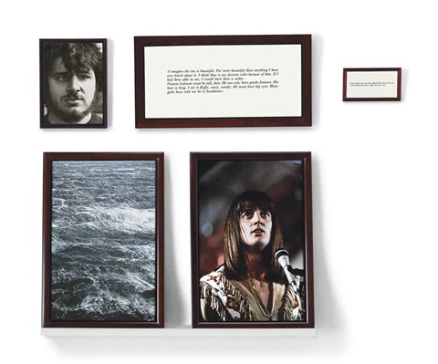
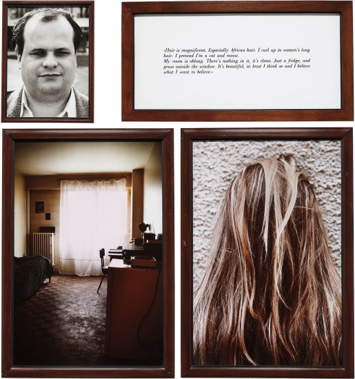
SOPHIE CALLE is a french photographer who also does writing, installation and conceptual art. Most of her work looks at identity, human vulnerability and intimacy. CALLE is known to regularly investigate and photograph strangers and their private lives. Her project ‘The Blind’ she did just this, and asked strangers, who were blind, to define beauty. This project included a portrait, an image of SOPHIE CALLEs’ interpretation of the strangers description of beauty, and a piece of text written by her.

I am using SOPHIE CALLE project, ‘The Blind’ to inspire my own projects, ‘maybe its myself’ and ‘freedom/limitation’. Both my film and photobook I use footage/images from the interviews of my family and friends, and images that represent my own limitations and freedoms. In my book, I am dedicating a double page spread to each person I interviewed, using a portrait, an image that i feel represents their thing that makes them feel free and a quote from their interview, which is handwritten.

Artist References – Danny Givertz

DANNY GEVIRTZ

Danny Gevirtz, is a commercial and documentary filmmaker from Philadelphia, USA. He currently lives in Maui with his girlfriend where he is currently working full time on Youtube. His youtube videos are very unique, educational and inspirational. Compared to other photographers and cinematographers who make content on youtube, Danny does everything his own way and doesn’t follow the usual trends. He doesn’t do camera or lens reviews but rather focuses on try to help and teach other aspiring filmmakers how to create cinematic stories by teaching cinematic lighting, camera and composition techniques. He has worked for big brands such as Nike and the Philadelphia Eagles. Danny has been a big inspiration of mine when is comes to filmmaking, I regularly watch his tutorials and other videos as I try to develop my own craft. I like the way he shoots and the videos he creates, his style is similar to mine and his videos are engaging.

HIS WORK

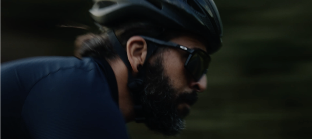
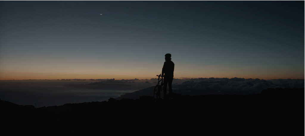
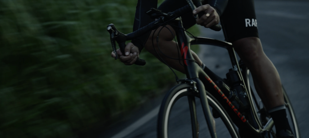
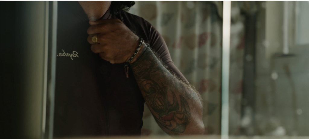
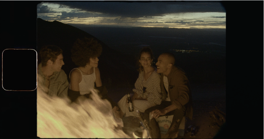
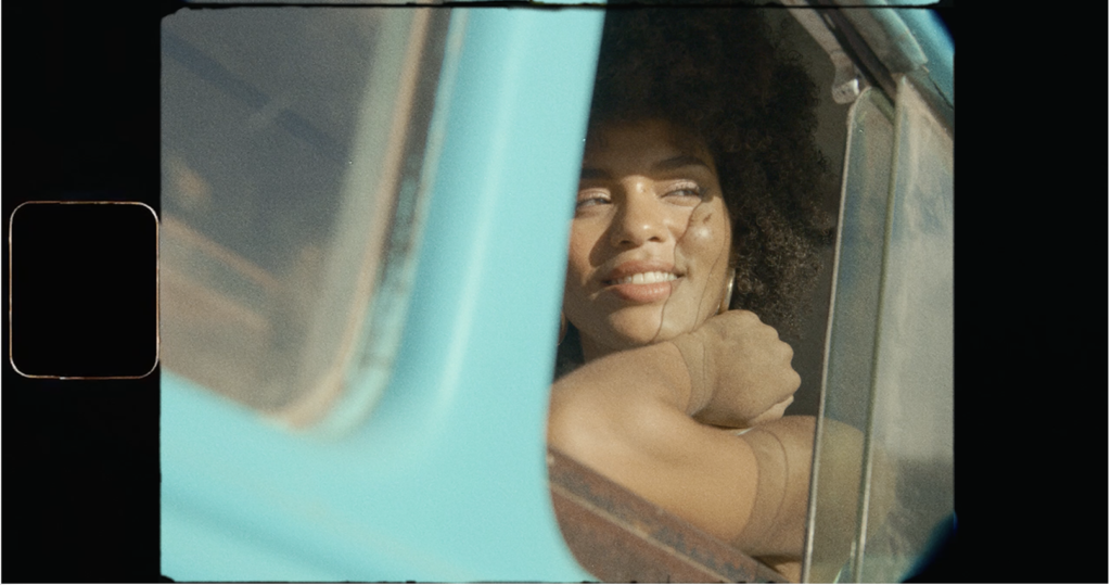
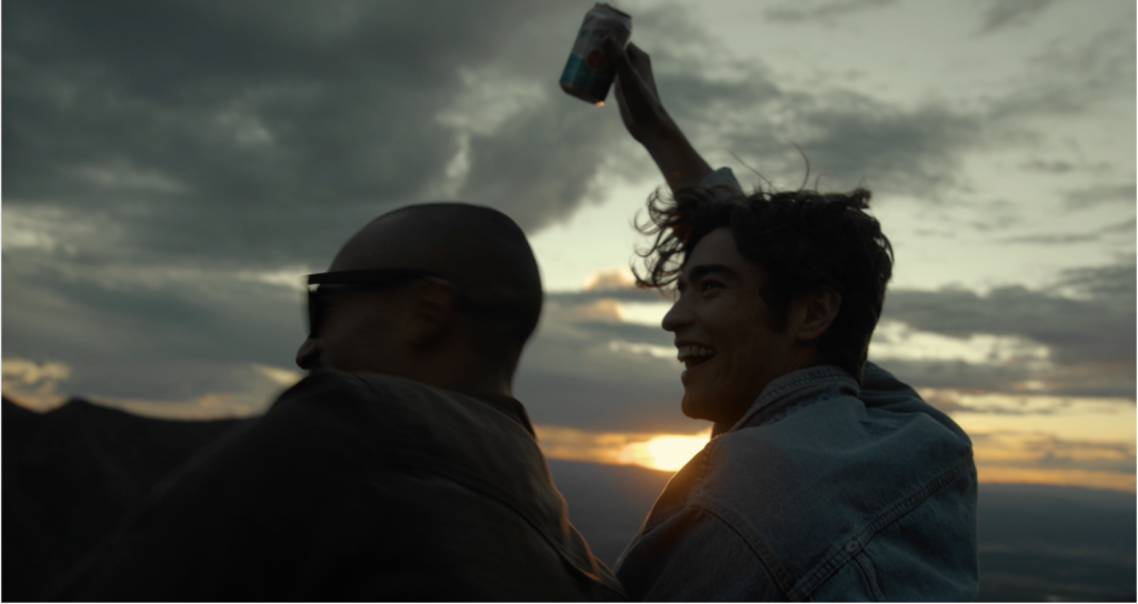
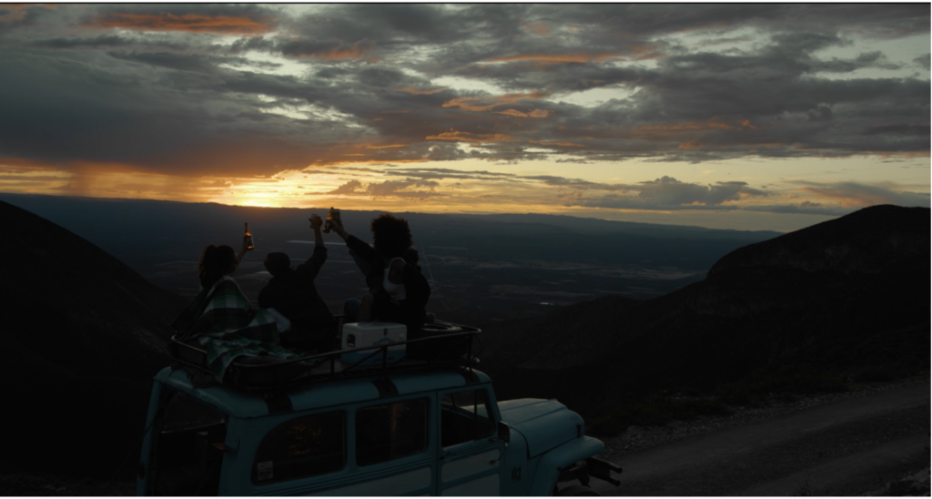
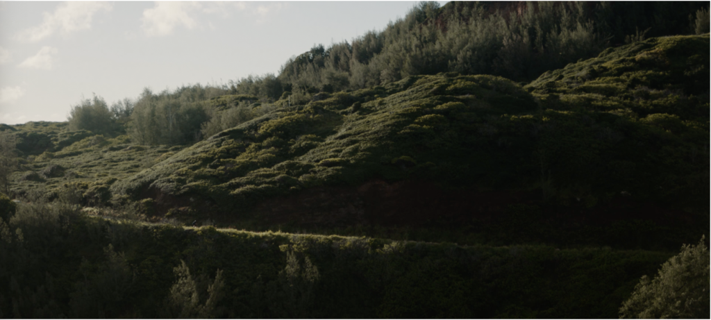
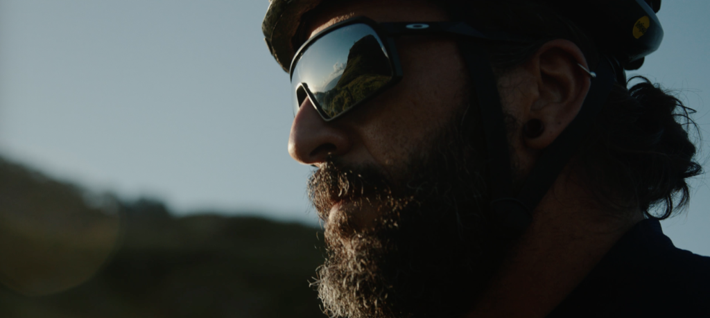
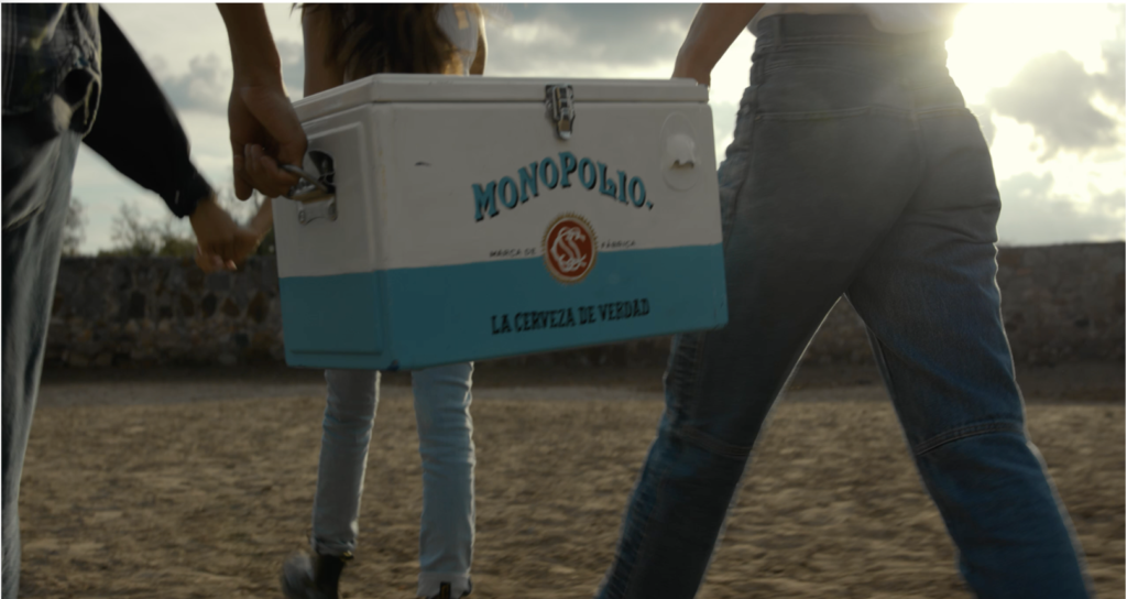
Danny has worked on commercial projects with brands like Nike, On running and Lululemon. He has a unique style of cinematography which is easily recognisable, his video work often features shooting at sunset or blue hour if the vibe of the video suits it. He shoots handheld a lot or static on a tripod on a canon C200 cinema camera or a Canon 1DX mk2 he will also choose to shoot at 24fps over 60fps and does not use a lot of slow motion. He has directed and filmed multiple commercials and short documentaries. The screen grabs below are from his most recent mini doc commercial ‘Rapha Rides Maui’ and some of his short documentaries and commercials including ‘Bad Mama’ which I will be doing my analysis on.

RAPHA RIDES MAUI

Watch the film here

MONOPOLIO BEER

Watch the commercial here

ODEKE

Watch the Film here

BAD MAMA – Analysis

Watch the film here

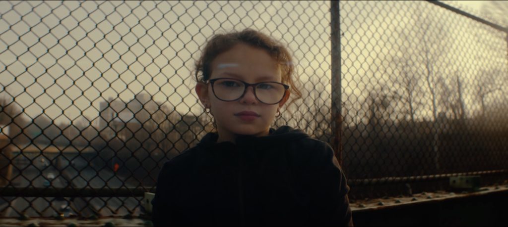
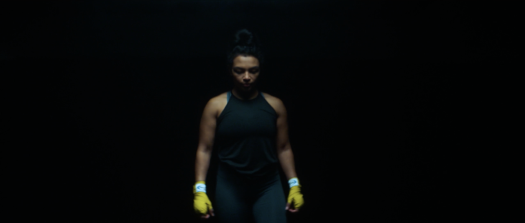
TECHNICAL/VISUAL: This screen shot from the film was one of my favourites because of the lighting and location. In terms of technicality, the whole film was shot on anamorphic lenses, these lenses are associated with the ‘filmic look’, they capture the image in a different format which needs to be de-squeezed in post production, as a result you get the widescreen cinematic look. Light streaks across the whole screen appear when light is shone straight into the lens, this is one of the best known characteristics of anamorphic lenses. This image has a light streak across the screen from the sun which gives the image more character and the cinematic feel. A wide aperture around f2.8 would have been used because the fence behind the subject is out of focus but the hands of the subject is in focus. Because Danny would have been using a wide aperture he would have set the ISO low but would have needed to use an ND filter because there would have been too much light. The use of a wide aperture helps to isolate the subject in frame and make the audience focus on what the cinematographer wants them to focus on. I like the setting of this scene. The use of the fence makes the scene feel more industrial and grungy which fits the theme of boxing, by backlighting the subject also gives the scene more contrast and makes it feel more moody. The fence also could represent the limitations and imprisonment that jamie felt when she was suffering abuse from her ex partner.
CONTEXT: Bad Mama is a short documentary shot, edited and directed by Danny Gevirtz and co-produced by Image Revolver. The mini doc is about single mum and professional MMA fighter Jamie Colleen who suffered from domestic abuse from her ex partner. She was homeless for a while as she tried to look after her daughter and get back on her feet. After 3 years of not fighting, she rose up from her lowest point she found a place at a local shelter where her daughter would be safe so that she could start to train again and return to professional MMA fighting. Domestic abuse is still a huge problem around the world and especially prominent with single mum’s falling victim. A few years ago Jamie shared her story sider when she began fighting again, she continues to fight now and is an activist for helping domestic abuse against women and children.

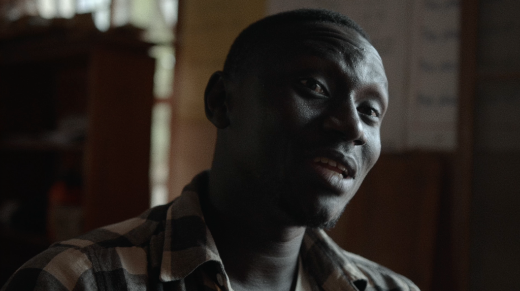
CONCEPT: Danny states in his explanation video of his film ‘Bad Mama’ that ‘So at the end of 2019, I had some free time and I had some bonus points left over from a local rental house, so I knew I wanted rent some gear and whip together a little mini documentary to help someone in my small circle, help tell their story’. He says that the first person he thought about was Jamie as he knew she had a powerful story and he wanted to make it known. She was onboard with the idea and as Danny spoke more with Jamie and her daughter he began to realise that what he thought he knew about her story had really only scratched the surface, this made him even more passionate about telling here story and helping others who may have had similar struggles. This film was what is known as a ‘passion project’ for Danny as he felt in his heart that he needed to tell this important message, as a result the budget was low, he used his own money and left over points to rent some extra gear and only had one day to record all the footage.

MY RESPONSE

I really like the work and content that Danny Gevirtz has produced. His commercials and documentaries are unique and have a very recognisable style. He stresses how important pre production is when speaking about his latest cycling video but sometimes having a more ‘run and gun’ approach can be more effective at times. He took more of a ‘run and gun’ approach to his film ‘Bad Mama’. In my film I want to emulate some of the techniques and styles of Danny. I plan to story board my film and have a solid idea of what it is I need to shoot, but when it comes to filming I want to be more relaxed and not follow a shot list religiously. I want to film large portions of the film at blue hour as the lighting is softer. A recognisable style of Danny’s that I want to take inspiration from is backlighting the subject to make the image feel more moody. His films feature voice overs to help tell the story and visuals are put up on screen to assist what is being heard. This is what I want to try and replicate.

Michael Marten

Michael Martens work has been an exteremly large influence for me. Michael Marten was born in London and began taking photographs as a young teen and since then he has been involved with photography. His first job was caption writer at the Camera Press photo agency. During 1973 Michael was one of a group who published ‘An Index of Possibilities’, an alternative encyclopedia of ideas. In 1979 he started the specialist photo agency, Science Photo Library. He has co-authored several books of scientific imagery, including ‘Worlds Within Worlds’ (1978) and ‘The Particle Odyssey’ (2002).

Since 2003 Michael has concentrated on landscape photography. His first major series was ‘Sea Change’ (2003-12). A second project, ‘Godrevy’, was exhibited and published in 2015. I was immediately mesmerized by his ‘Sea Change’ images that clearly have been made carefully over a long period of time. Even though they are not particularly edited, the contents of the photos is enough to create a beautiful contrast.

For eight years, Michael Marten has been roaming the British coastline, recording this lost-and-found littoral landscape. At the beginning of his project he became “a student of tides”. He began with the rudiments: the daily rhythms of flood and ebb; the lunar-monthly rhythms of high spring tides (occurring around the full and new moons) and low neap tides (when the moon is on the wax or wane); the existence of solar as well as lunar tidal pulls.

He studied how the sea bed, topography and barometric pressure can all locally affect tides, he aslo examined the tide tables issued by the UK Hydrographic Office, and he came to comprehend that tides might best be imagined not as lateral sloshings back and forth, but as sets of shifting gyres, rotating around a roving “amphidromic point”, known as the “point of no tide”.

“A sense of threat, as well as one of miracle, attends Marten’s images. The people who fill the beaches at low tide seem still to be there at high tide, invisibly in their fixed positions, swallowed by metres of sea. This, perhaps, is the most charismatic aspect of his work: the cognitive dissonance between the serene and the sinister.”

SEA CHANGE AS AN INSPIRATION

This book by Marten has really sparked my interest in making a series books, where perhaps, my model could be in the same or similar positions in different bodies of water or nature. I could have my model moving in to bodies of water such as the sea, similar to Antony Gormley’s work with sculpture work.

PHOTO ANALYSIS

CONTEXTAL/CONSEPTUAL:

Micheal Martin’s artwork has been extremely influential on the people living on the English coast, as it really remind people of the coast and tides natural beauty and power: “It is hard, in an era of anxiety at climate change and creeping sea levels, not to find in these images a fore-glimpse of future inundations; hard, in particular, not to be disturbed by the sight of Antony Gormley’s iron men on Liverpool’s vulnerable Crosby coast, standing calm, still and unperturbed as the rising water drowns them.”

TECHNICAL: 

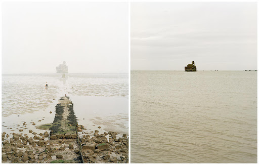
The lighting of this image is generally quite light, clearly taken with a dim, foggy but bright daylight setup. The fog contributes to a softer and warmer tones sky and sea as not much reflection between the two is visible. The image looks to have been reasonably exposed. The shadows aren’t too strong in the image, apart from the change in darkness between the wall in the first image and then the switch to the darker oil rig in the second image.

The aperture probably around f/11 in both images, as both the background and foreground are in perfect focus. The shutter speed seems to be average, maybe 1/125 as the image seems to be regularly exposed, but also quite focused and sharp. The ISO also seems to be low as the image was taken outside in daylight, so probably around ISO100.

VISUAL:

I really enjoy this image from Martens project Sea Change. The colours in these two images are immediately very striking, and contrast plays a huge part when comparing the two almost identical images. On the left you see a sort on wall or slipway that points directly to the oil rig that stands in the ocean. The rig is blurred by the fog while the rocks surrounding the wall are clear and contrasted. Then, when you look at the image on the right, the oil rig sits effortlessly on the ocean which is a warm sandy colour, like the beach underneath. The wall is not visible anymore as well as the beach and rocks which have been concealed by the flowing tide. The oil rigs in each image are almost centred in the frame, further implying they are in the same place and the tides have moved.

Statment of intent

My intention with this exam project is to incorporate all 3 exam topics together; freedoms, limitations and transitions. I feel quite inspired by Michael Martin tidal artwork and Grade Solomons dreamlike artwork, where they experiment with light and changing tides. I would like to work with the ideas of transitioning weather states and water forms, as well as experimenting with coloured light and daylight/nightlight to add a dream like or even nightmareish quality to my images. I have worked on creating a book before and feel it would be a great idea to use my skills and experience to create one again. I would make many changes to the layout of my book, including how and where images are placed. I feel like this would be a great was of presenting my sets of images as it brings a greater storyline and connection to them.

Similar to Michael Martin, id like to use the coast within my photographs, however, instead of waiting for the tides to move, I’d move my model instead, creating a complementary photograph to the image below. Taking on Solomons ideas about dreams and nightmares, I wish to include water as a symbol for deeper meaning within dreams. Dreaming , to myself and many others, can be a release from reality; somewhere where you have a freedom to feel and do what you want to, even though ones power over a dream may be limited.

“Water is a very powerful symbol in our dreams and dreams about water can mean many, many things. Water is shapeless, odourless, tasteless, vital to our life, and part of a never ending cycle. When you dream about water, you will likely find some very insightful information that will help you on your life path…Water can be both negative or positive in your dream, so it is important that you consider both possibilities and pay very close attention to the other dream symbols in the dream to fully understand it.”

“Water in a dream may symbolize emotions that run deep, or perhaps (if the water is muddy) feelings that are confused and unclear. Water may be cleansing and healing, or water could swallow you up and threaten to drown you much like an overwhelming emotion such as anger or pain”

In my photo book, I’d also like to explore with idea of transition within nature. My main idea is to look that the sand dune succession on the coast of jersey. On an island we are very lucky to have the landscape that we do. from the sea its self, the landscape transitions from beach, to dunes, to the woods. Throught my book I would like to use a model to act in each other different section on the dunes. St Ouens beach goes through a series of phases to become dunes. Primary succession can happen when bare sand is colonised by plants. Over time, the sand builds up into sand dunes, raising the ground above the height of sea level. Succession in sand dunes is sometimes called a psammosere.
When taking inspiration from Grade Solomon, It is easy to be mesmerised by his fantasy like images that have a beautiful but unrealistic quality about them. The coloured lights that he uses in his photographs seem to illuminate his outdoor scenes beautifully. Although when taking about dreams, colours and what people perceive has a massive influence on whats happening within those subconscious thoughts. I intend to use these colours in my photoshoots to create a more dream like quality to the images, and to have a deeper meaning to each image, colour also adds interesting shallows and highlights that may reflect on water surfaces, the surrounding nature and scene and the models body. Colours have significant meanings:

  • RED: can indicate something intense, vital, animated, feeling sexy or having sensual urges, feeling the need to go out, to feel assertive or forceful or having inflammation or injury.
  • ORANGE: you may get the feeling of shaking off shackles, widening your sphere of influence, restlessness, driven by desires and hopes, wanting more contact with others.
  • YELLOW: seeking solution, feeling hope about the future, trying to find a way out of certain circumstances or situations, needing a change for relief.
  • GREEN: need to establish yourself, wanting recognition, maintaining control of events, wanting what is due, wanting routine without changes, needing money for security, needing healing or better health.
  • BLUE: Tranquility, peace and quietness is what the color blue can be interpreted as in dreams. It also means needing rest, a relationship where the dreamer feels trusted and also feeling the need to belong.
  • VIOLET: mystic union with someone or something, magical state where wishes are fulfilled, intimate or erotic feelings and even heightened intuition.
  • BROWN: dreamer seeking physical comforts through food, sleep, sex etc. Dirty brown color meanings in dreams include illness, whereas natural wooden brown colors means that there is a concern about the home, family, children or a search for one’s roots and true self.
  • GRAY: symbolic of being neutral or an observer. Gray means shielding yourself from situations and commitments, and going through the motions without emotional involvement. It is also indicative of the person trying to escape anxious situations or an urge that the dreamer usually cannot identify.
  • BLACK: Shiny and luxurious black colors refer to going deep within oneself so that the new self can emerge. However, a dream wherein the dreamer moves into the darkness or blackness means that he is undergoing a personality change, or that certain situations in his life has made him feel threatened, or fate has dealt him/her a blow. The color black is also a representation of the unconscious.
  • WHITE: White in dreams can be interpreted as newness, new beginnings, new awareness, or feeling open and accepting, unprepared, alone or isolated.