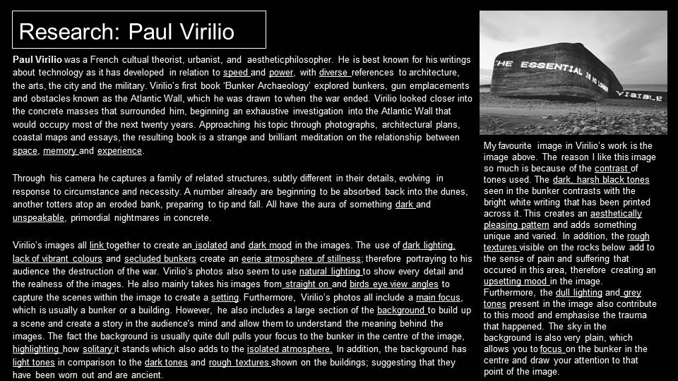


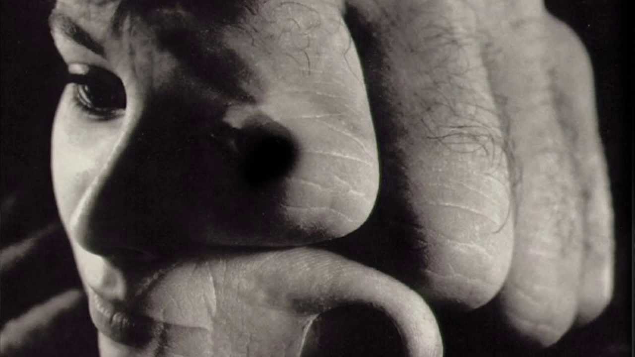
| The formal and visual elements that constitute part of the ‘grammar’ of photography (such as line, shape, repetition, rhythm, balance etc.) are shared with other works of art. But photographs also have a specific grammar – flatness, frame, time, focus etc. ‘Mistakes’ in photography are often associated with (breaking) the ‘rules’ and expectations of this grammar e.g. out of focus, subject cropped, blur etc. Because of the flattening effect of photographs, things in reality are juxtaposed in unusual ways. Things in the distance (in reality) can appear to be on the same level as things closer to the camera. Some photographers have exploited the inherent surreality of this effect, what we might think of as a deliberate attempt to disorientate the viewer for artistic purposes. Other photographers and artists are more interested in the accidental disorientation caused by this phenomenon, a feature of the equipment (or apparatus) being used. Take these examples by Henri Cartier-Bresson, Joel Meyerowitz, Saul Leiter and Matt Stuart. These photographers have exploited the flatness of photographs to make witty, gently surreal images that generate a smile in the mind. |
Some questions to consider:
Let’s take a look at some other photographers who seem interested in deliberately interrupting our view of the world. How do they deal with a whole range of stuff that gets in the way? Why are they attracted to interruptions, obscurity and ambiguity and how do they help us get to grips with how photographs work?
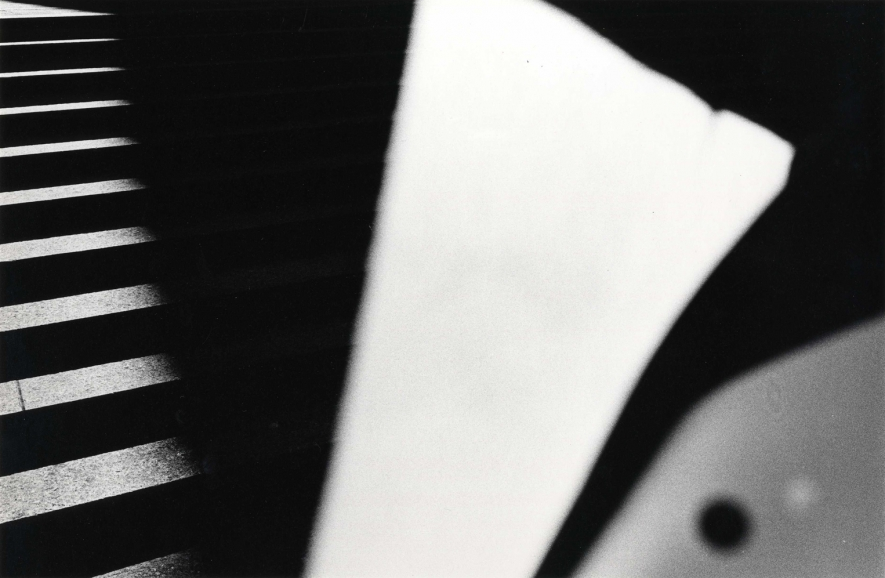
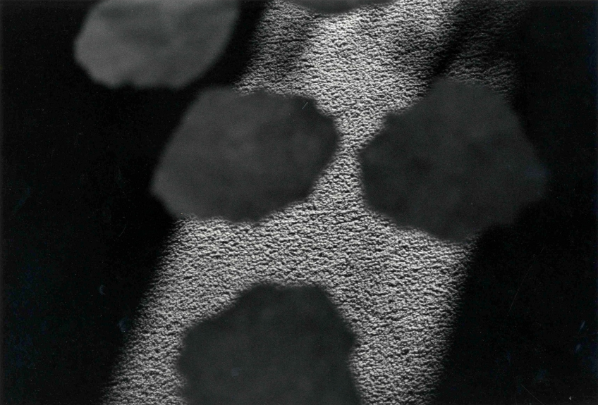
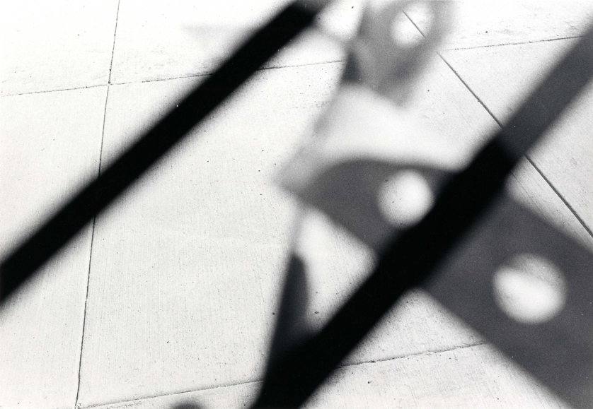
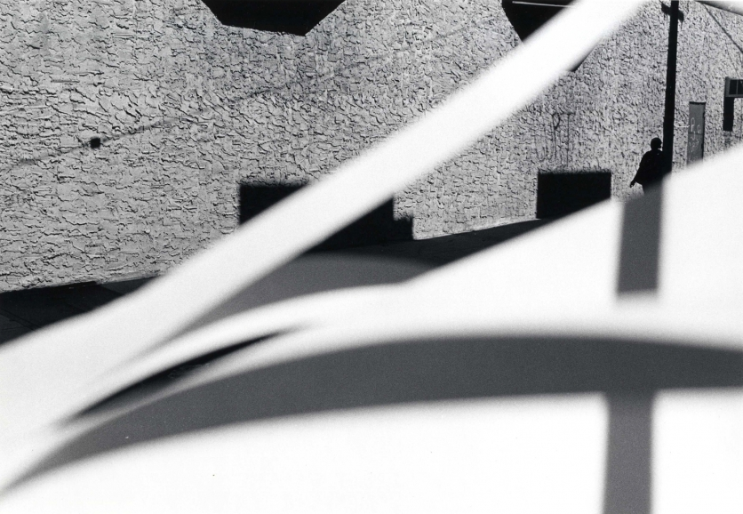
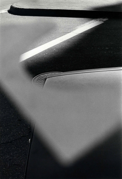
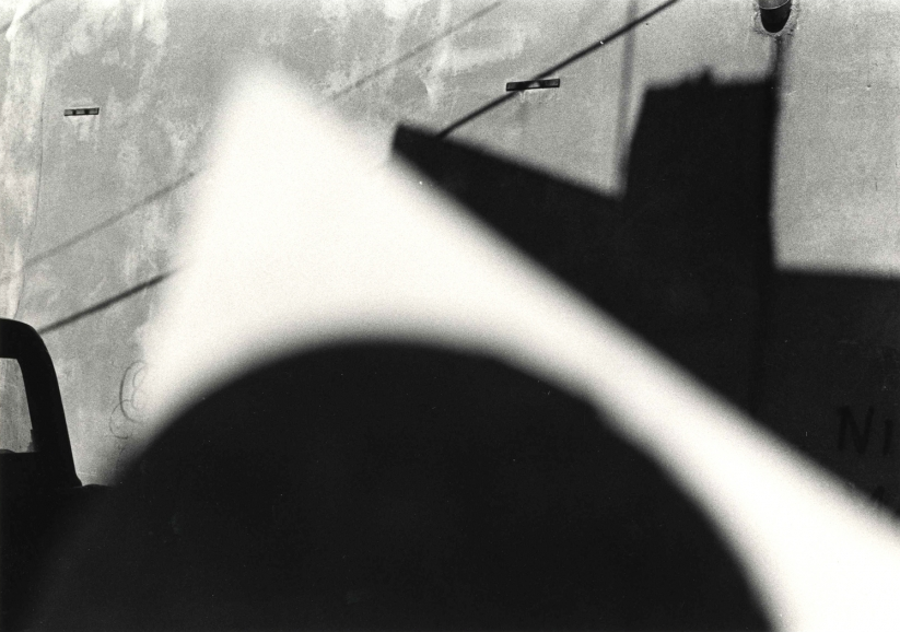
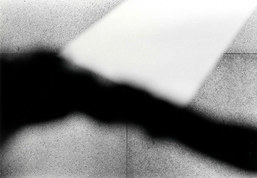
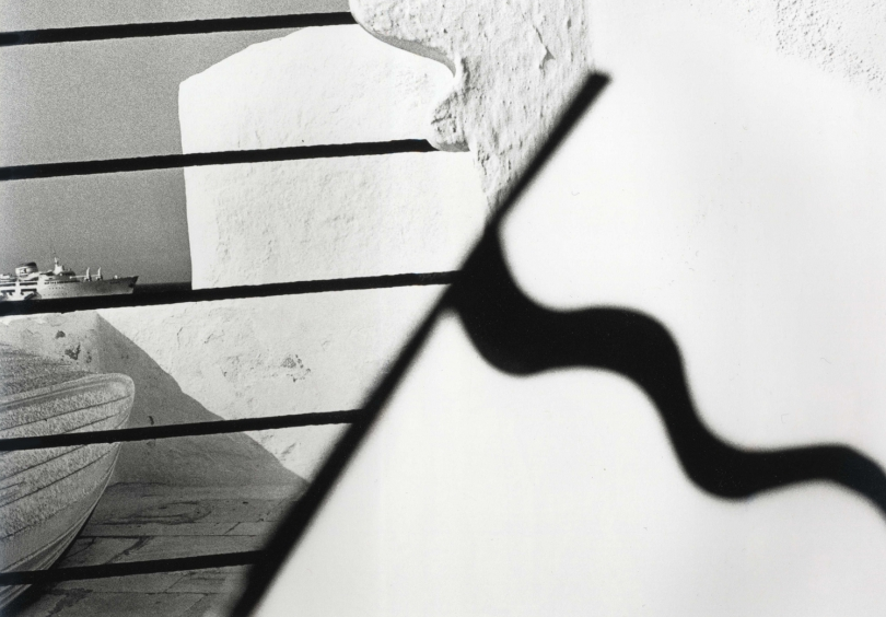
Metzker is known for his unconventional street photographs. More abstract than either Cartier-Bresson and Meyerowitz, Metzker exploits and exaggerates the properties of still photography – odd framing, multiple exposures, deep contrast, and, in this series, the interruption of various objects placed between the lens and the ‘subject’. Metzker seems to want to deliberately disorientate the viewer and question the indexical relationship between photography and the world.
It becomes clearer…that I am looking for the unknown which in fact disturbs, is foreign in subject but hauntingly right for the picture, the workings of which seem inexplicable, at the very least, a surprise.
— Ray Metzker
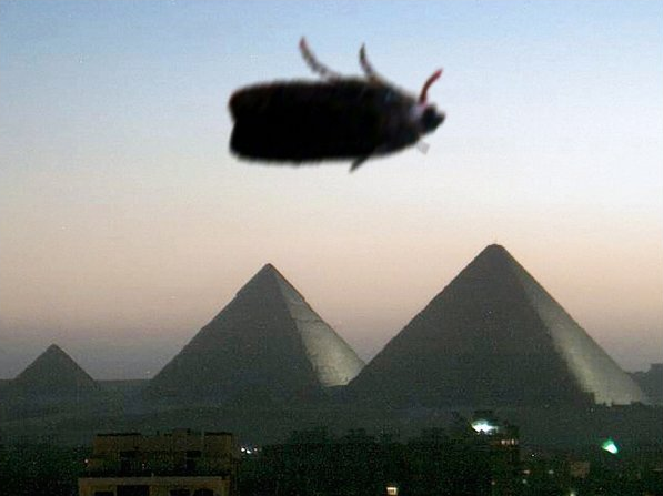
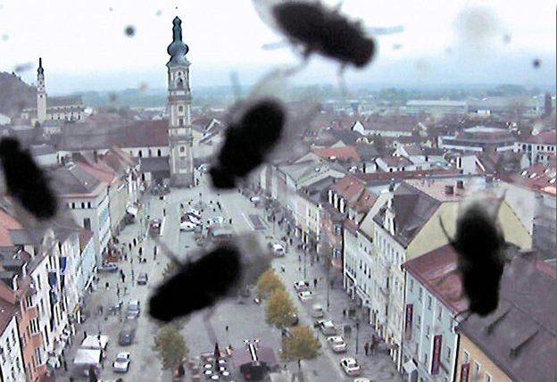
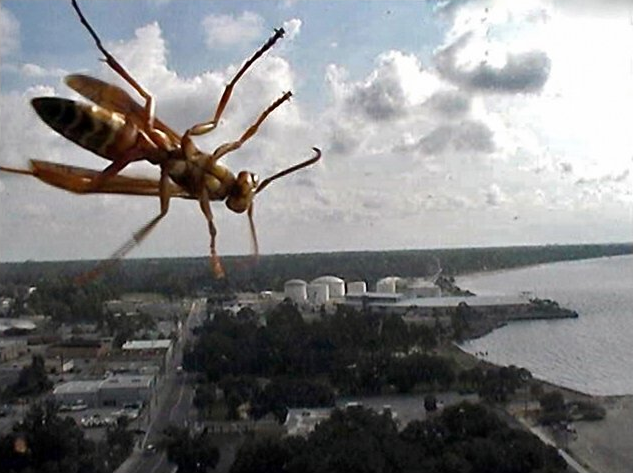
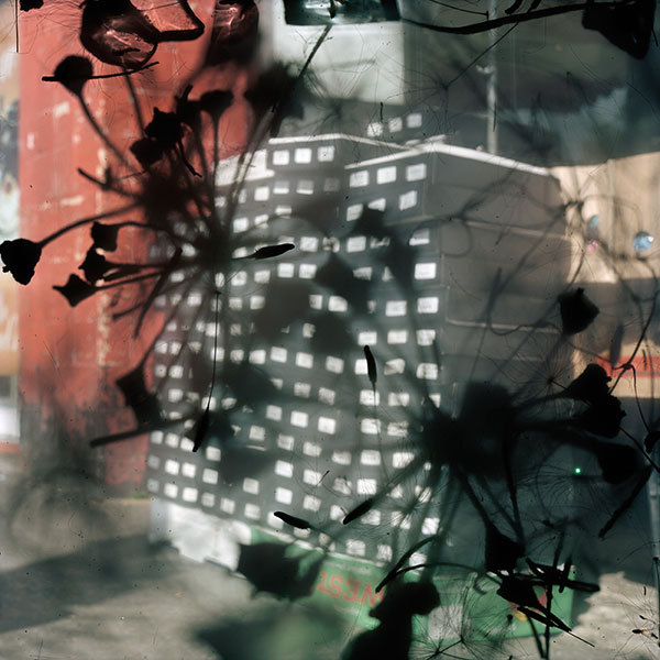
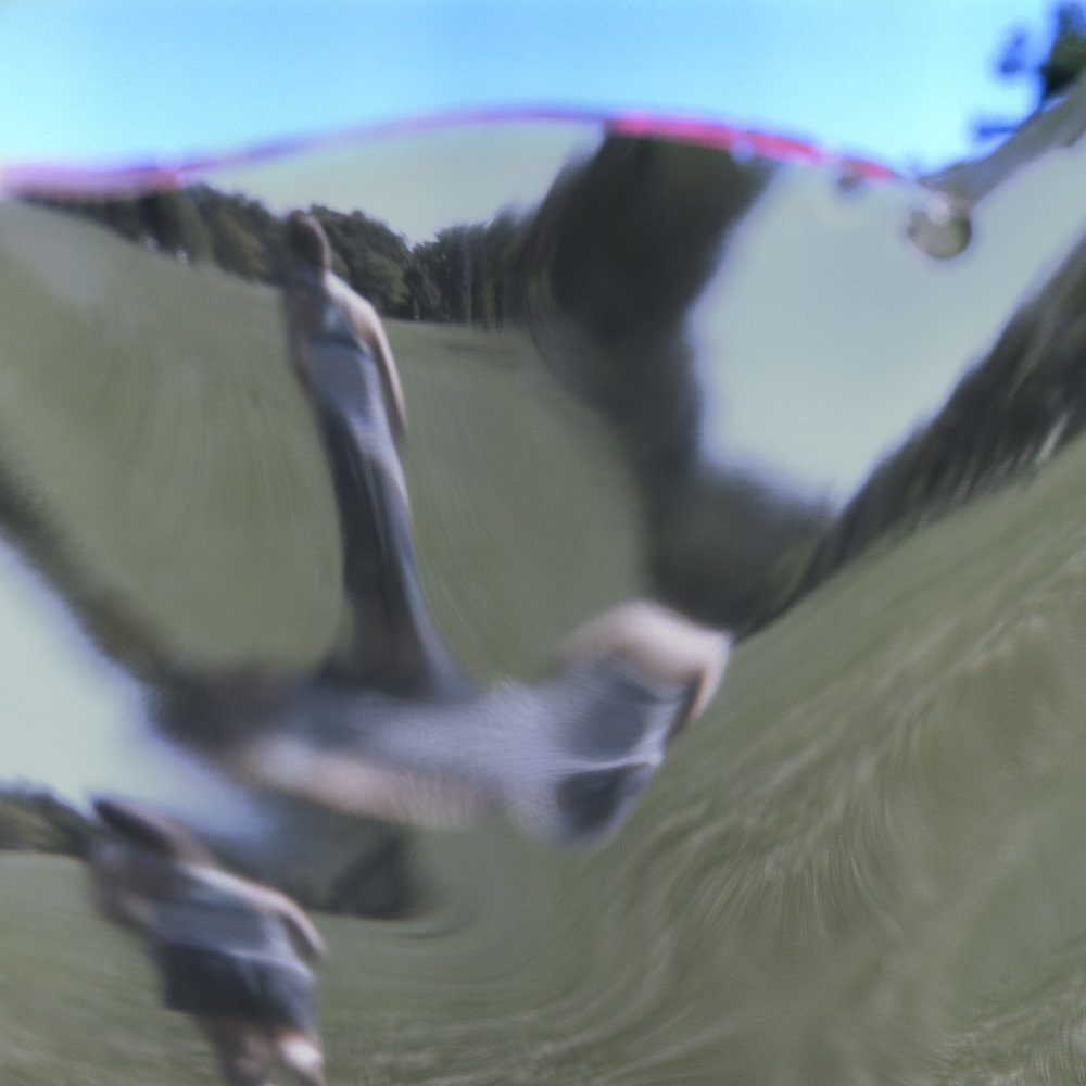
Caviezel takes images made by public video surveillance cameras that can be viewed live on the Internet. The ‘Animals’ series documents landscape views disrupted by birds and insects roosting on or crawling across the camera’s lens. He raises interesting questions about what the subject(s) of these photographs might be and what happens when nature and technology collide.
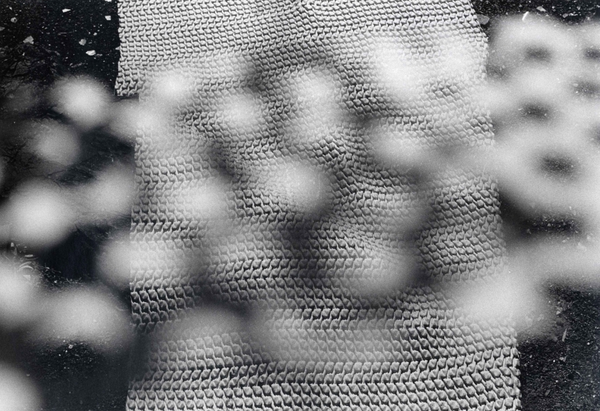
Stephen Gill is exactly the sort of photographer who might keep moths in his camera. Gill’s practice is rooted in the urban landscape of London’s East End. He has utilised a variety of strategies for capturing the beauty of mundane reality, offering viewers new visions and surprising perspectives. In this series he disrupts his chosen views by introducing small objects into the body of the camera itself. The resulting photographs are chance arrangements of photogram-like abstractions seemingly superimposed on unremarkable sections of the Hackney landscape.
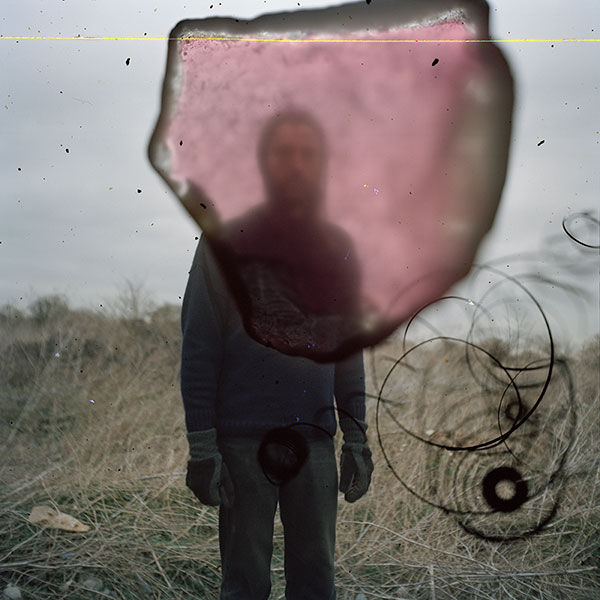
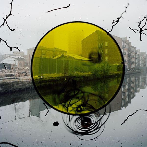
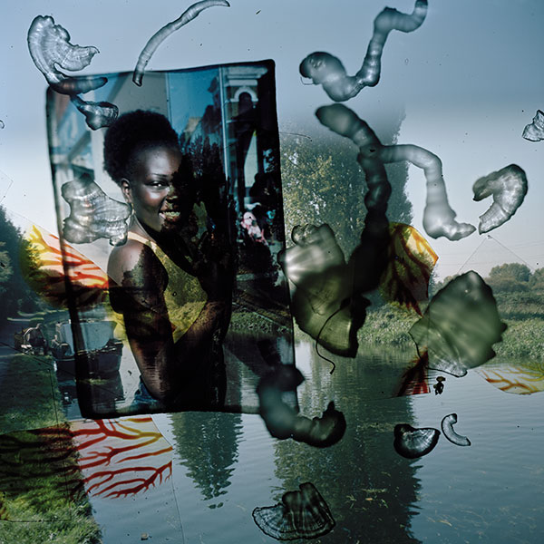
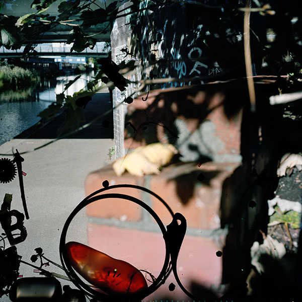
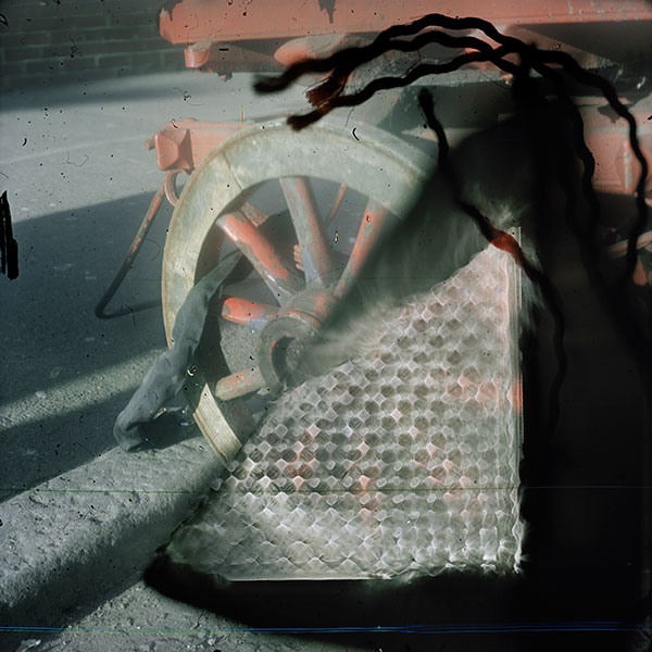

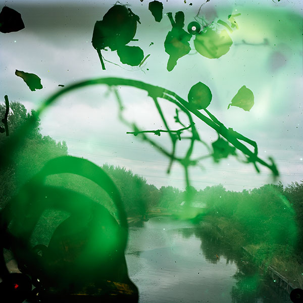
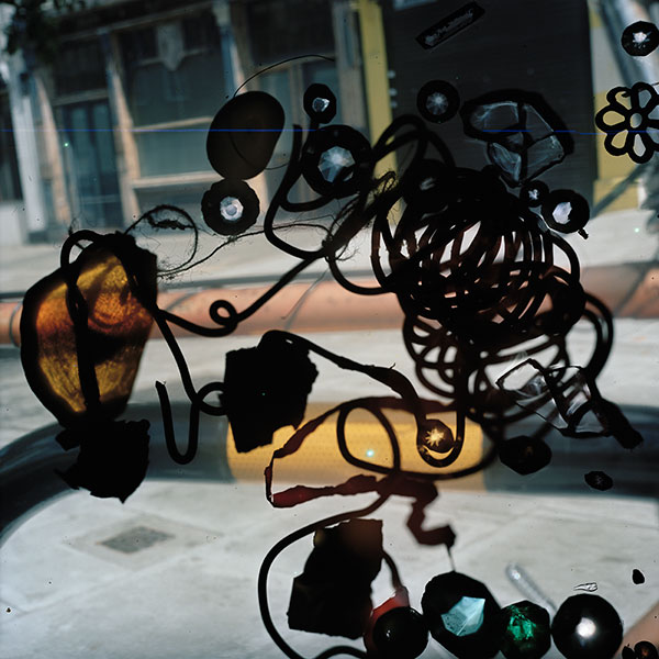

The photographs in this series were made in East London between 2009 and 2013. They feature objects and creatures that I sourced from the local surroundings and placed into the body of my camera. I hoped through this method to encourage the spirit of the place to clamber aboard the images and be encapsulated in the film emulsion, like objects embedded in amber. My aim was to evoke the feeling of the area at the same time as describing its appearance as the subject was both in front and behind the camera lens at the same moment.
I like to think of these photographs as in-camera photograms in which conflict or harmony has been randomly formed in the final image depending on where the objects landed.
— Stephen Gill
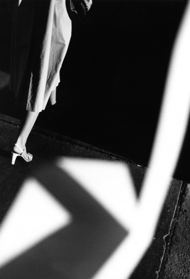
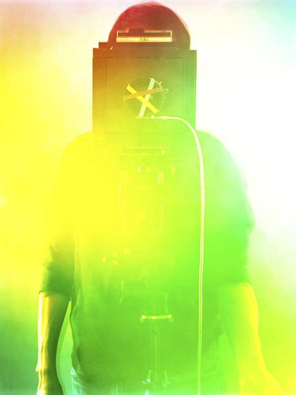
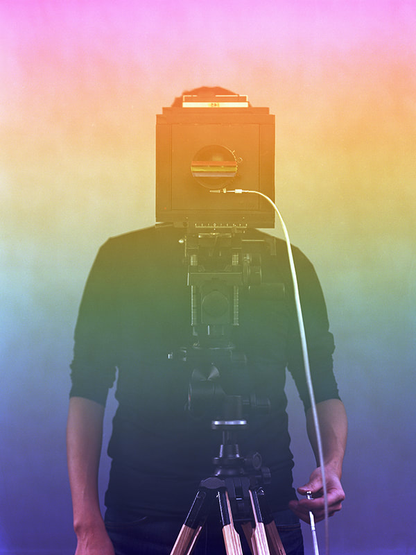
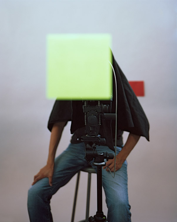
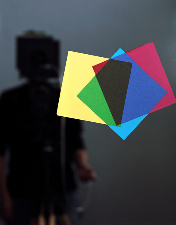
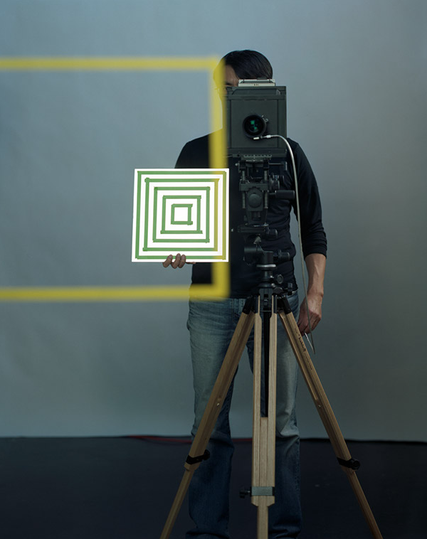
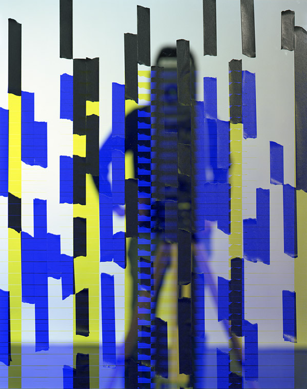
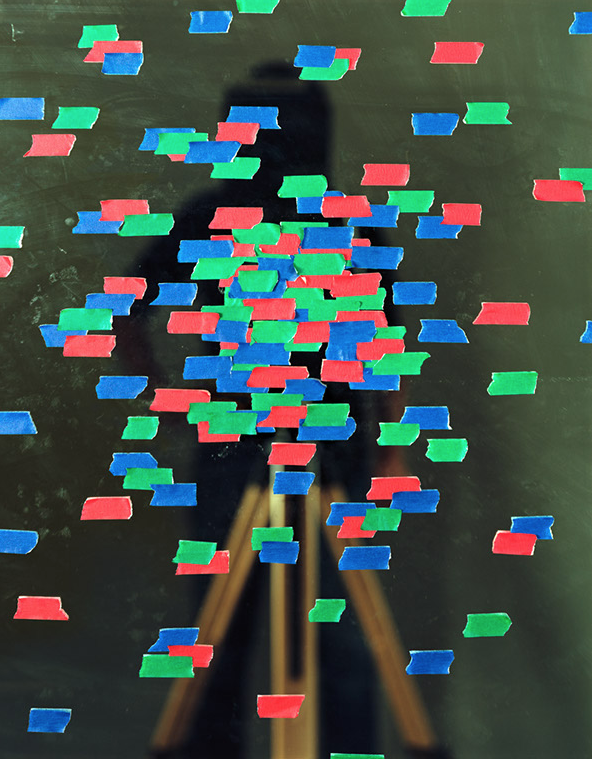
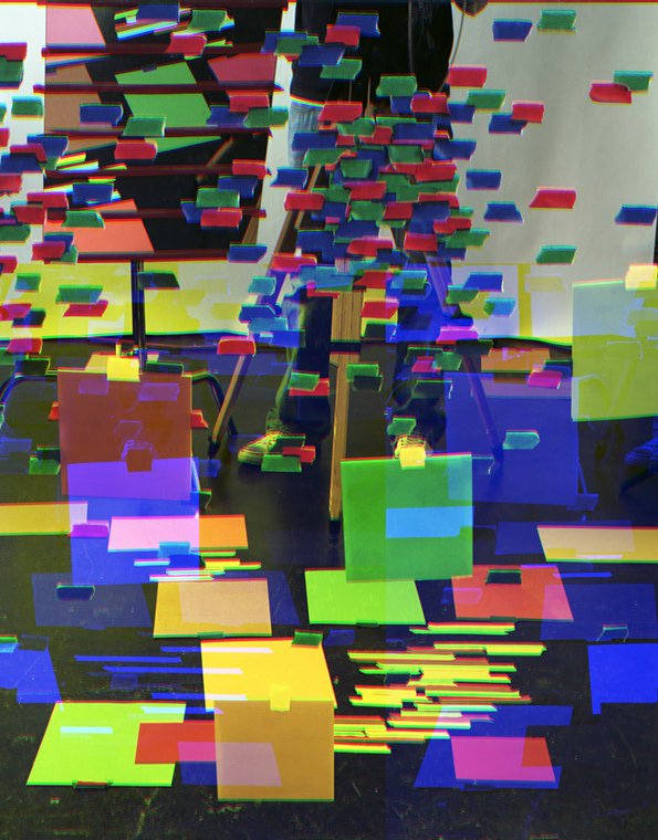
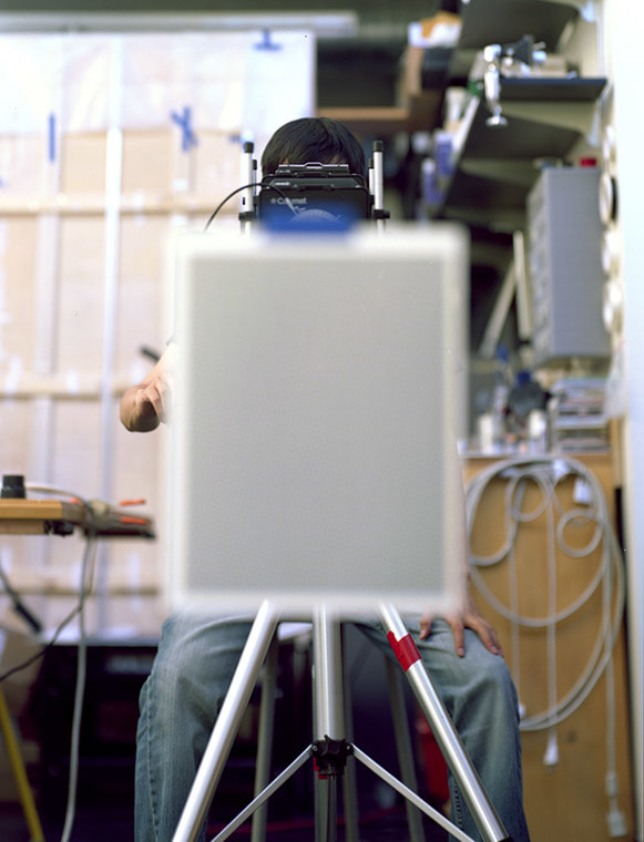
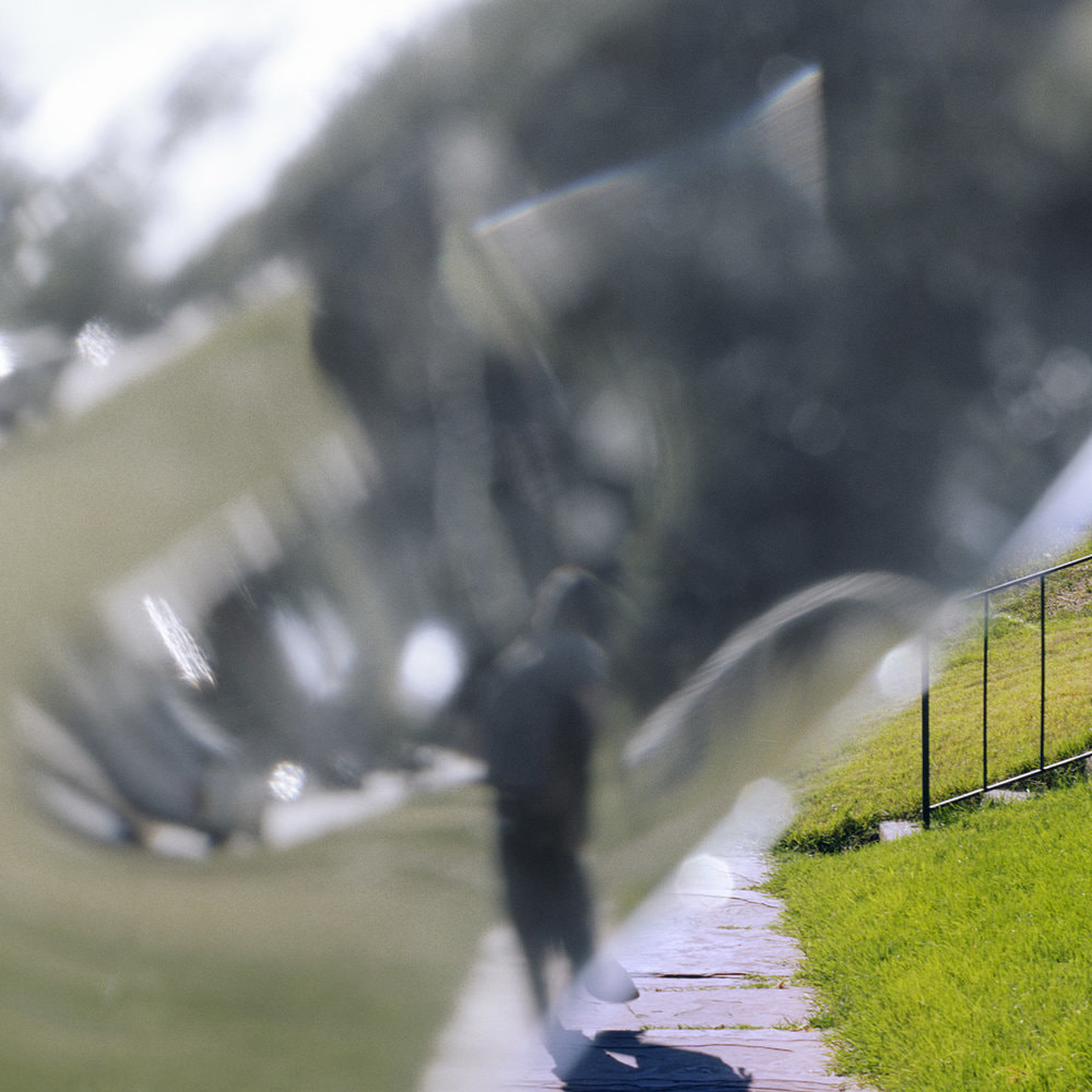
Miyoshi is fascinated by the relationship between analogue and digital photography, between the indexicality of light and the abstraction of pixels. In this series he uses a large format camera, a mirror and coloured tape, creating disrupted self-portraits. Our sense of spatial relationships is confused. Initially, we are unable to trust what we see. Slowly, we are able to disentangle the visual clues in order to make sense of the picture. In the process we are reminded of the elements of photographic grammar. Abstraction can often be more effective way to remind us that we are looking at a photograph, an artificial construct rather than a faithful facsimile of the world.

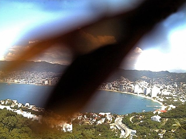
Diabuldo is Bipolar. This series of photographs is a deliberate attempt to capture the fracturing of reality that occurs when he experiences a manic episode. It is interesting, in the context of this project, that his chosen technique was to disrupt ordinary views with an object, itself a fractured optical device. In these pictures, we are looking at the world through two pieces of glass which return a recognisable but warped and disturbing view of the world. It’s a reminder that reality is largely subjective, affected by our mental states and relative wellbeing. We all see the world differently and photography can be a useful means to communicate our individual visions.
When I shot these photographs, I used a piece of broken glass brick to interrupt a sense of full verisimilitude in the images. The visual effect is meant to signify the trouble with getting back to a sense of “reality” that those faced with Bipolar constantly re-learn to achieve, each time they heal from a manic episode.
– Adrian Diubaldo
Make the following blog posts…
Development of your ideas by research and analysis / look at key photographers eg Ray Metzker
Photo shoot 1 /2 / 3
Experiment!
Show your outcomes…and evaluate the process


.jpg)


In her artist statement Montana based artist Sarah Eisenlohr explains that her collages use places of existence to create fictional ones in an effort to demonstrate the ways in which humans have transformed the earth. These scenes often carry undertones of spirituality and faith. “I consider the figures’ desire for shelter, warmth, and something stronger than themselves as symbols of serenity that I seek through spirituality, while the use of sublime in my work points to a relationship with the divine,”

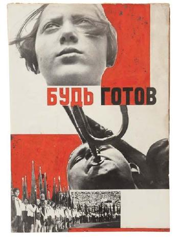
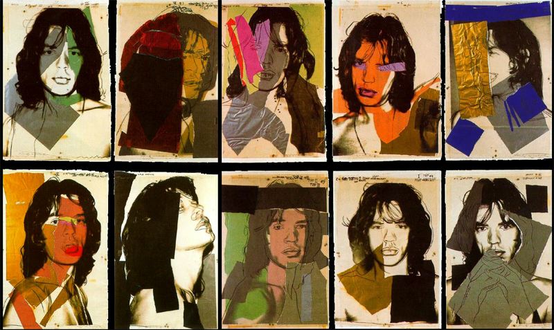
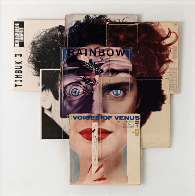
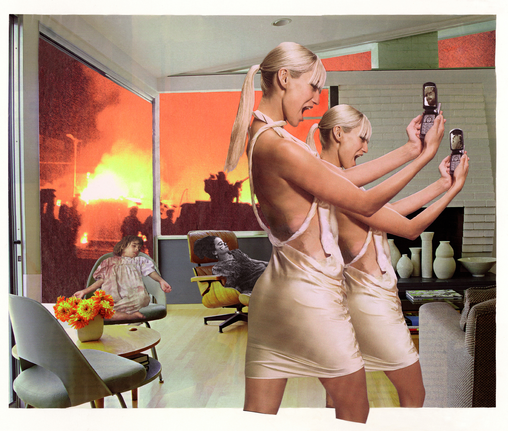
KEY COMPONENTS AND DISTINGUISHING FEATURES of PHOTO-MONTAGE
SOURCE MATERIAL YOU CAN USE
TECHNIQUES
By now you should have a student login, which gives you access to The Hautlieu Creative Blog too.
TASK 1 : UPLOAD YOUR SUMMER TASK TO THE BLOG
You will be shown how to navigate the blog and of course design and publish your own blog posts. Remember…your blog posts are the equivalent of submitted work that is ready for assessment and feedback by your teacher(s).
Each blog post should be considered, critical, creative and carefully constructed. Normally, you will be expected to complete blog posts that reflect your knowledge and understanding of the topics / skills that have been covered day by day / week by week.
It is YOUR responsibility to keep up with the workload, and pace your productivity in step with what is being taught each step of the way. You will receive feedback either directly in response to the blog posts you publish, or as a response to a set of tasks in the form of a TRACKING SHEET.
The TRACKING SHEET will include a list of tasks / skills / blog posts that you must produce…as well as deadlines, extension tasks and the marking criteria.
The occupational shots


The top 10 shots
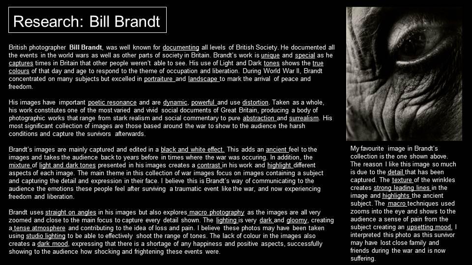
The photographer I chose to edit my images in the style of is Ansel Adams, who was recognised for his monochromatic landscape photos. He tended to use a full tonal range in his photographs, creating striking images such as the ones below.
Adams was an environmentalist, meaning he was passionate about protecting the wildlife and natural environment supporting it. He aimed to encourage the conservation of nature and the wilderness through the use of his camera and the photographs he produced with it, allowing people to see the true beauty of nature.
I like the idea of producing black and white images as it adds a timeless quality to the product. I felt it would be appropriate for this project as the occupation is a huge part of Jersey’s heritage and adds a powerful aspect to the final result.
Editing process
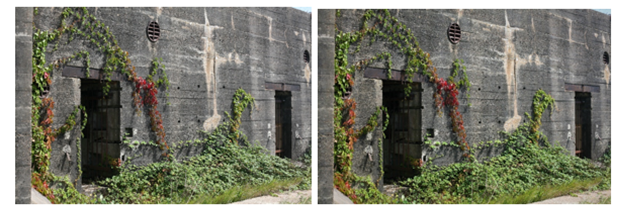
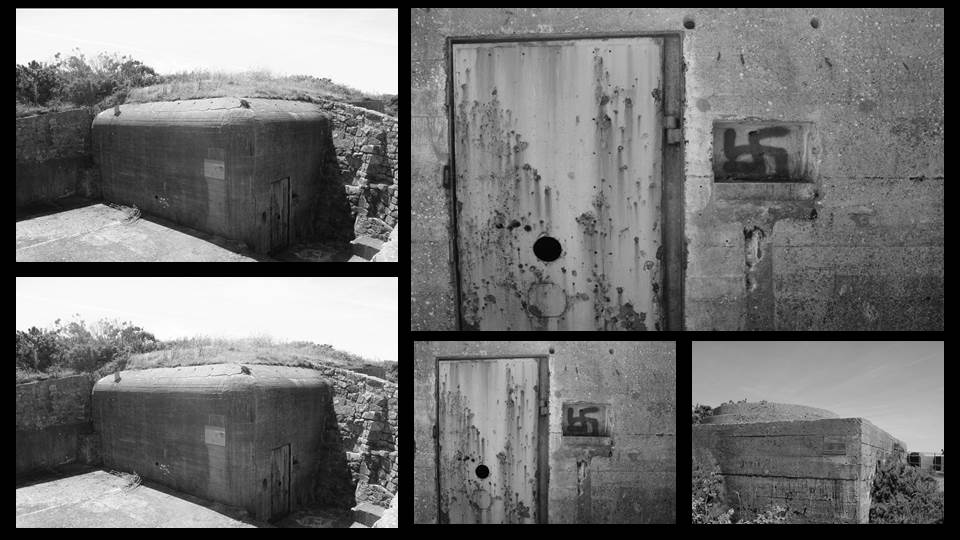
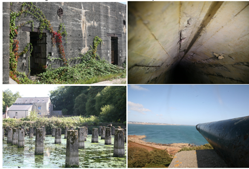
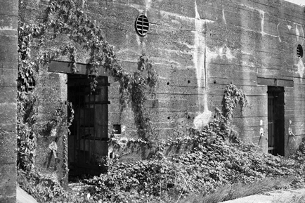
I didn’t change much apart from the colouring of the bunker so as to make the ivy more clear and the gate more defined.
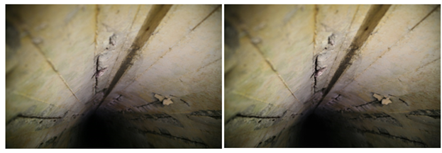
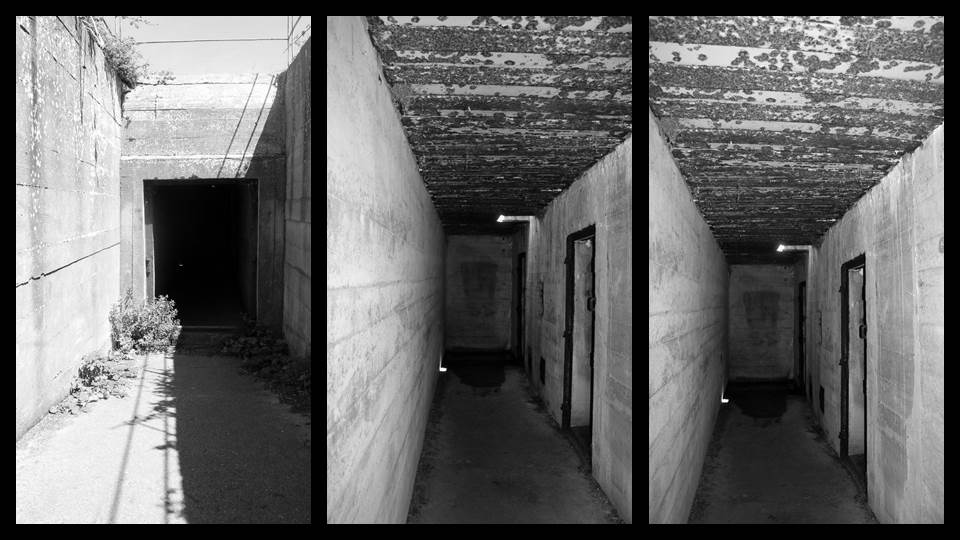
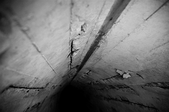
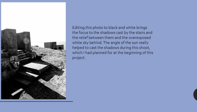
Whilst editing this image of a WWII tunnel I made the cracks and deterioration more defined. I also darkened the tunnel to give the image an eerier vibe.
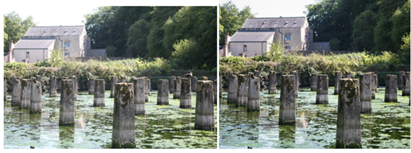
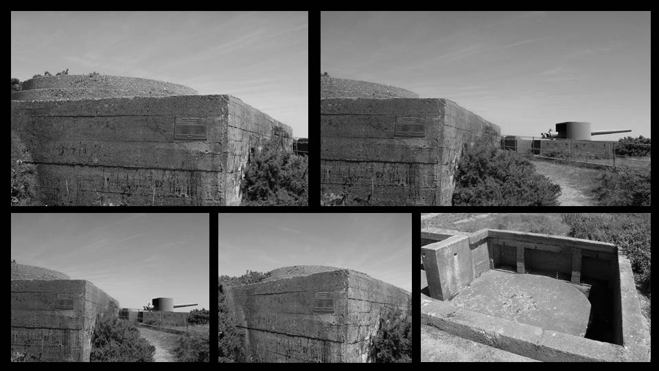
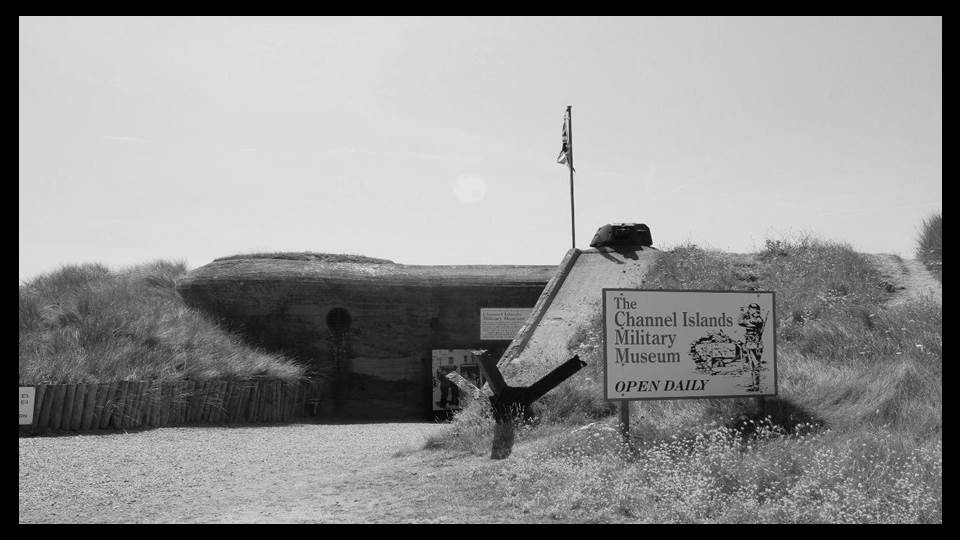
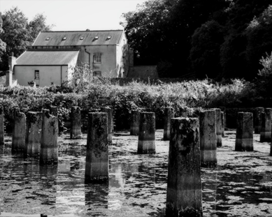
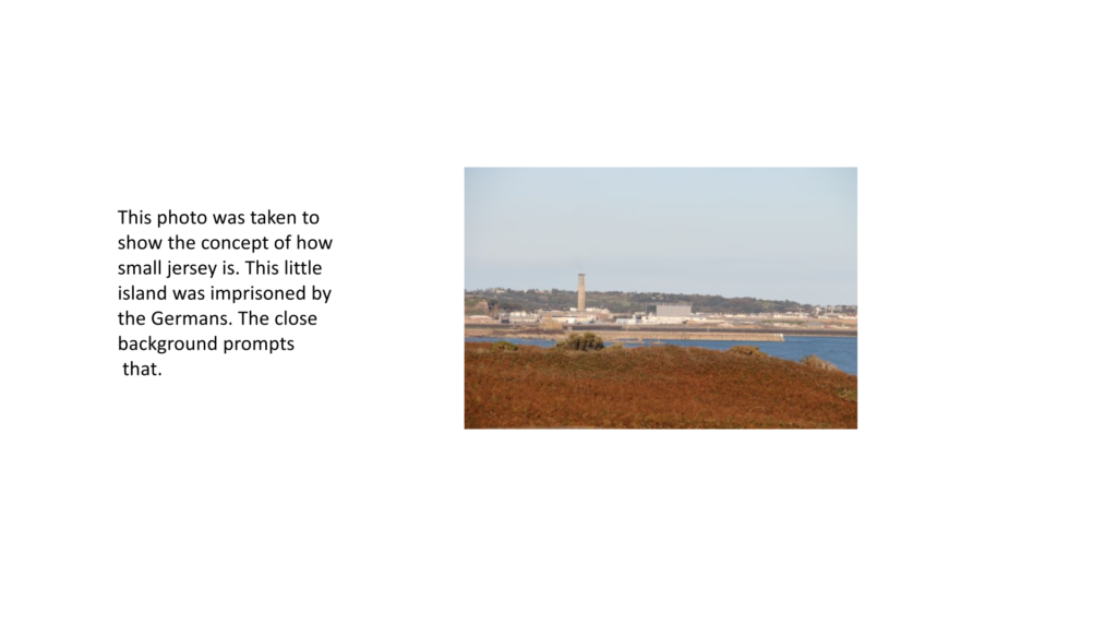
I cropped the image so as to keep the focus on the concrete pillars and the mill behind it, which had been previously used as a cooling matrix for the German generators. I also increased the clarity and colour of the image and decreased the light intensity as it defines the structures more.
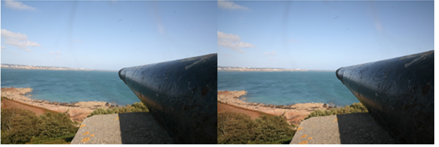
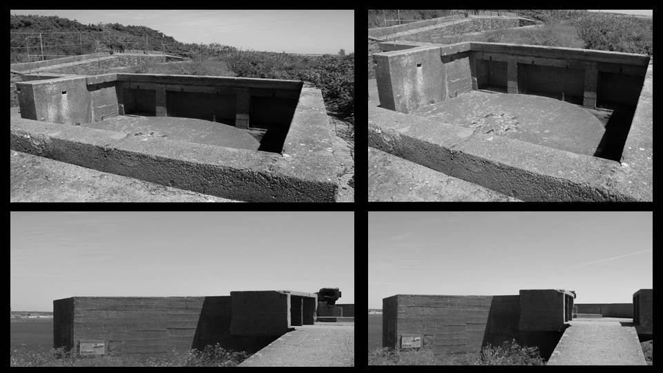
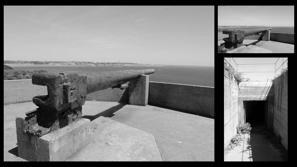
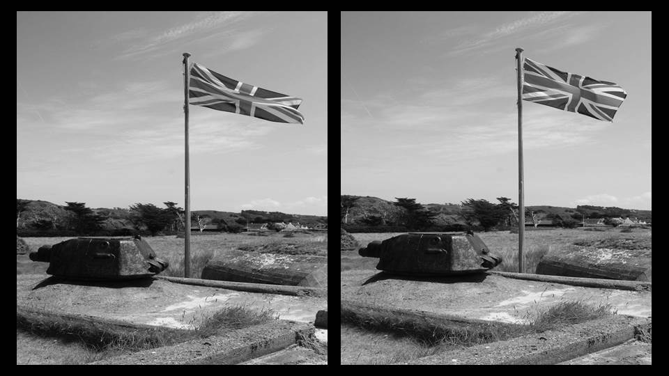
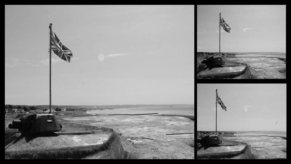
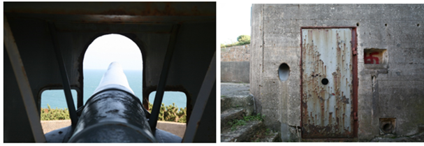
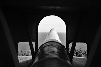
I rotated the image to straighten the coastline, making it centred and showing an accurate view of where the people behind the gun would be aiming.
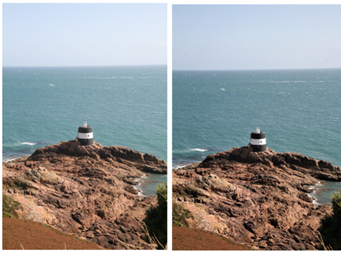
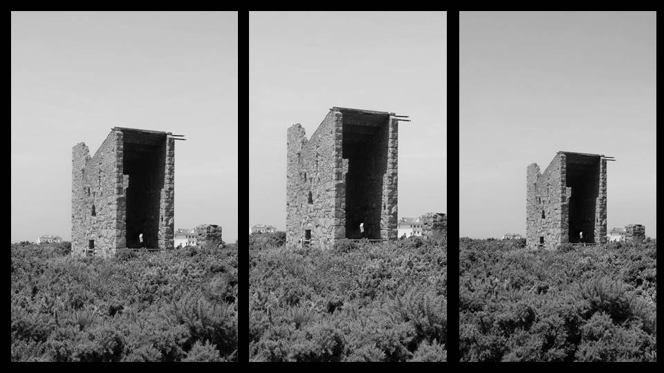
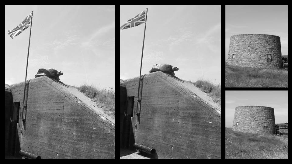
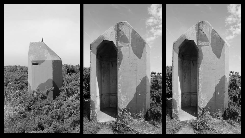
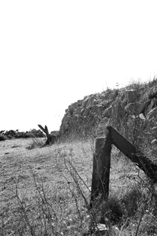
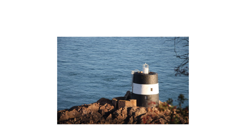
I cropped some of the foreground out and spot blemished parts of the grass that’s at the front of the shot. I then increased the clarity and decreased light intensity to keep the tower in focus.
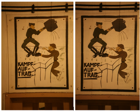
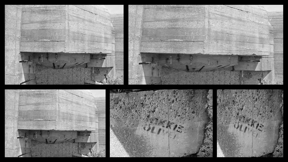
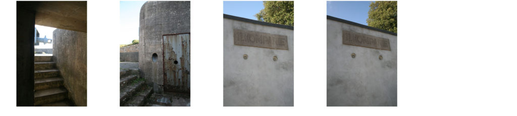
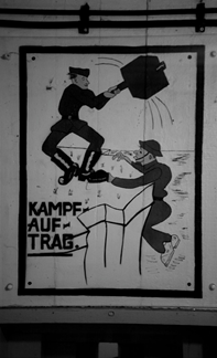
I cropped and rotated the image for aesthetic purposes, except I kept the top half of the machine gun port and the wires to show the German propaganda on a bunker wall, which had been common ground for the massacre of enemies.
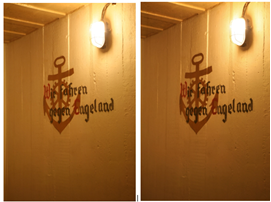
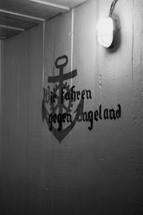
I decreased the light intensity and slightly rotated the photo to make the text straight and clear, which translates to “We drive against England”
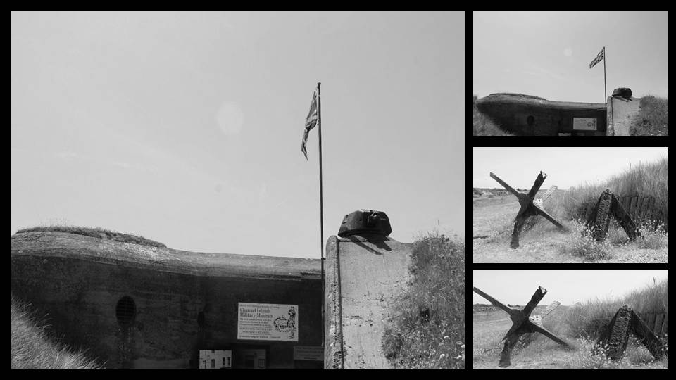
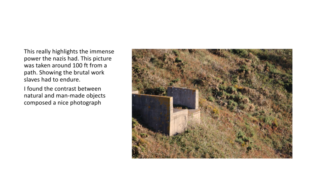
I increased the contrast of the image and the ting slightly to get more definition on the concrete pillars that were used to stop tanks from driving up during the occupation.
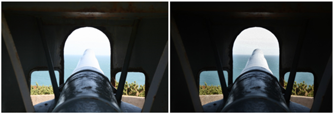
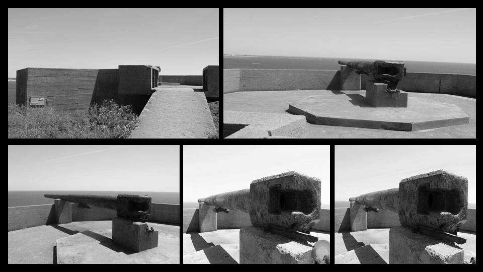
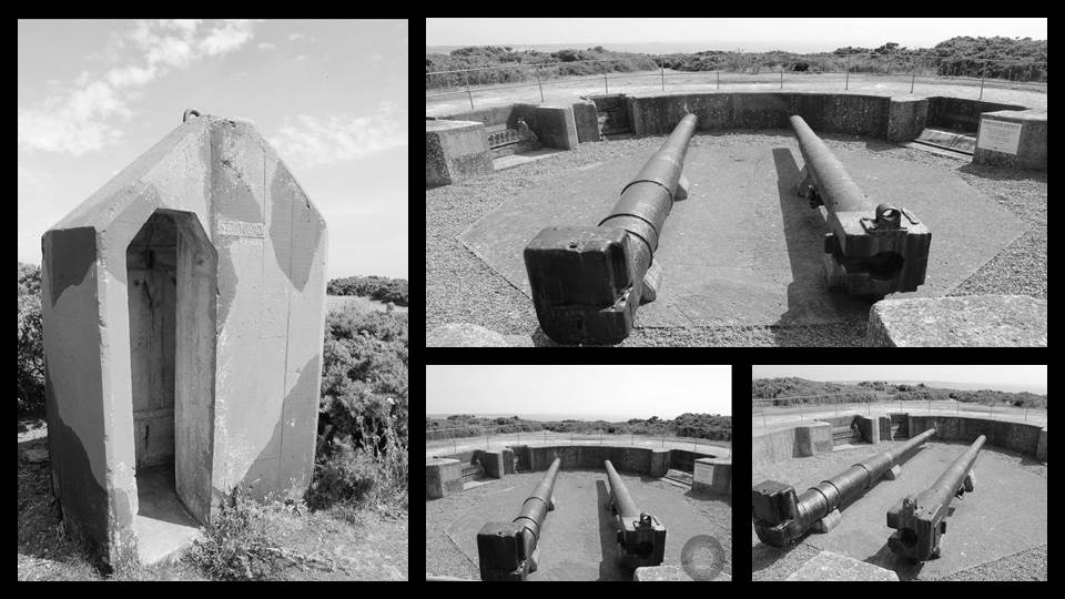
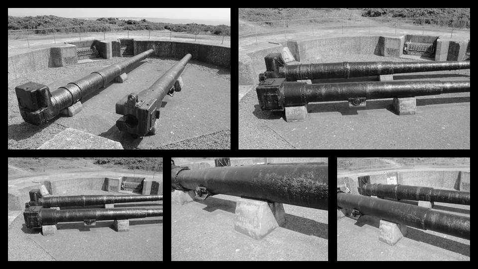
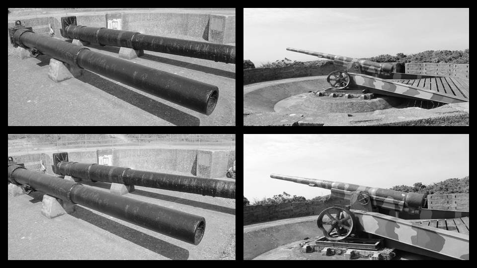
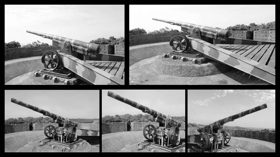
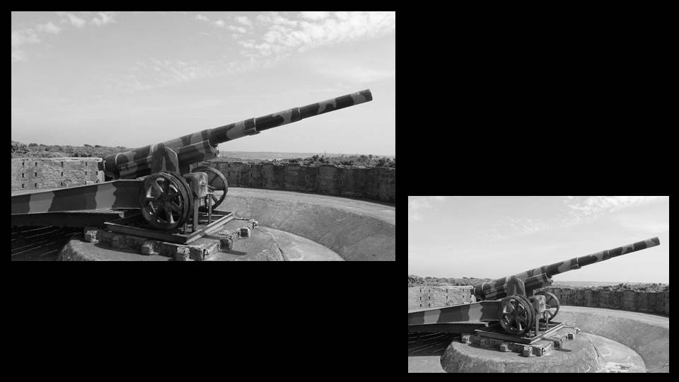
I increased the clarity of the image and decreased the light intensity in order to define the middle of the image, displaying the barrel of the gun.
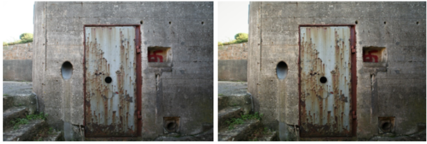
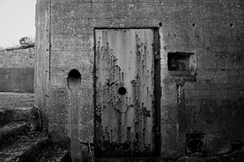
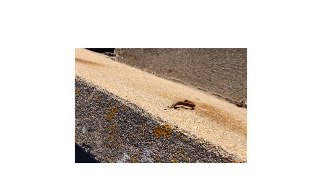
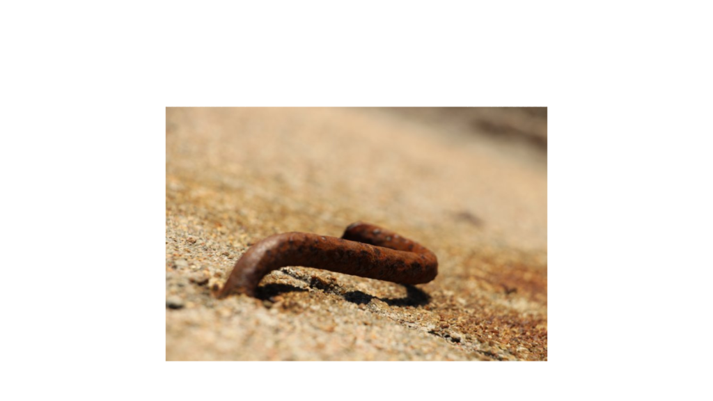
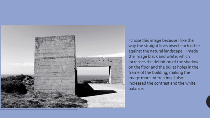
I increased the clarity and the warmth of the image to highlight the erosion present in the bunker door, showing how its been completely neglected after the occupation, due to the emotional attachment to it, which had been pejorative.
Final editing process
Here’s the final development of my images, in the style of Ansel Adams:
Project Evaluation:
This project on the occupation has allowed me to explore the symbolic power photography is capable of. Initially, I mostly began looking at the architectural aspects of bunkers from WWII; However, as I spent more time on the first shoot, I started to notice how something as simple as overgrown plants, rust and cobwebs could be representative of the grief and trauma caused by the occupation in the later years of the war, as it shows how derelict everything from that era (that had been constructed by the Germans) had become. This abandonment really resonated with me and gave me insight into the feelings of the islanders who fell victim to the tyrannical reign of their beloved island.
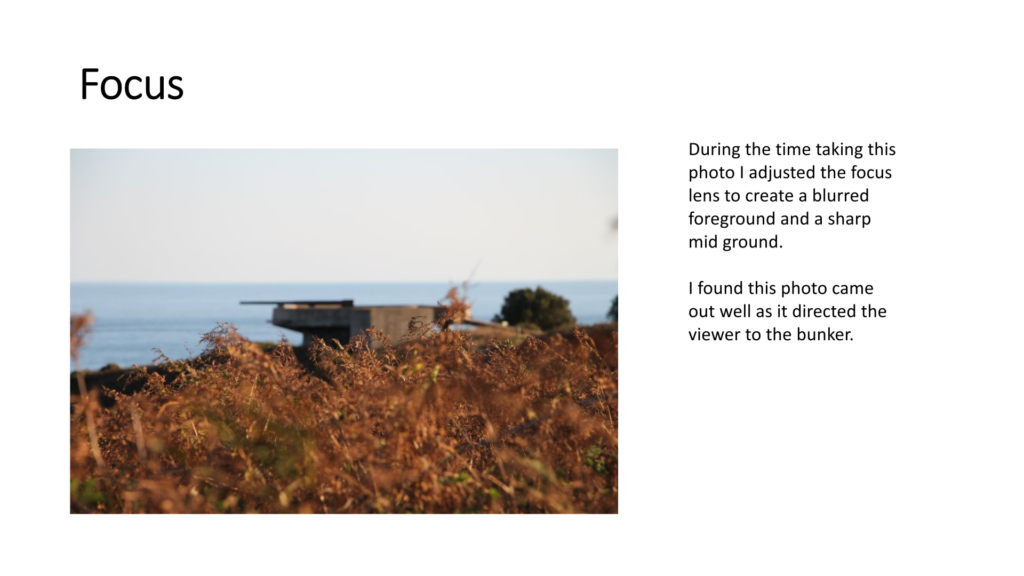
During the project, I experimented with levels, the depth of my images and took both landscape and portrait photos. I looked at how foreground affects the focus of a photo and began to consider how to change the perspective of an image.
Looking back at the photos I’d taken, if I was to do the project again, I would’ve taken a lot more photos as I hesitated at many of the shoots. I would evaluate my images before moving destination and I would take more time to get everything into focus. I would experiment more with natural light and artificial light to see how that could have changed the mood regarding each image.
I could’ve improved my collection of images by photographing old items and remains from that era or people who lived during that time or monuments with immense sentimental and emotional value as a way to humble the viewer of the image, reminding them of the ultimate torture society went through for those years.
Overall, I’m quite happy with how my project has developed leading to the final image I’ve edited and selected below.

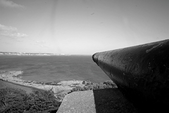
Personally, I feel as though this was the most successful image as it captures Jersey’s beautiful coast behind a mass structure built exclusively for malicious intent. Generally, I believe it allegorically represents how Jersey was occupied and the black and white editing of the image helps to date the gun emplacement back to the era in which the war took place, due to its “timeless quality” I had explored earlier in my research.
I think the way the barrel of the gun is directly in the middle of the image is a key reason why the photo works so well; It allows the viewer to gain the same perspective that a German soldier would have had. It also makes the viewer feel subordinate as the structure the feel like they’re standing behind had the power to carry out hundreds of massacres on Jersey and British allies, which can arouse feelings of grief, despite not actively being there to witness it. The symmetry of the metal bars on either side personally represents the islanders, who were regimented and controlled by Germany as they almost line up like bars of a cage.
The serenity of the sea in the background allows the viewer to see that the photo was not taken during the occupation but creates imagery, as they can picture the vessels that would have been out there, almost creating a sense of nostalgia.


The photographer, Arnold Newman, was an American Jew, giving the photo a string meaning because the main focus in the photo is Afried Krupp who was a German who was accused of slave labour (manufacturing trains) in the Nazi regime. The inspiration for the photo most likely came from this and the reason as to why he made the man in the image look so evil and why he made the photo look so ominous. The negative image Newman gave Krupp was to show Newmans hatred towards him and the Nazis overall.
Welcome to the course!
During your first lesson or two you will be expected to submit and display your summer task. As a group we will discuss the merits and limitations of the mini-projects, and your work will be assessed soon and you will receive feedback too. Your Summer Task will then form the start of your coursework (Component 1 / 50% of overall mark).
(If you have not completed a Summer Task as a new recruit…then you have until Friday 13th September to complete the task appropriately.)
We will also discuss your thoughts and feelings / knowledge and understanding of…
Photography’s function(s)
Photography as an art-form
Photography as a science
The difference between the study of photography and the practice of photography
Henri Cartier-Bresson once said…”Your first 10,000 photographs are your worst”
What do you think Cartier-Bresson meant by this…? Discuss
Other…
Blog Overview
Sharepoint Overview
Adobe Photoshop
Adobe Lightroom
Demonstrating a critical and contextual understanding of photography can be tricky, especially if the subject is relatively new to you in Year 12. The following activities have been designed to encourage you to reflect on what you know already about photography. Hopefully, some of the prompts will encourage you to further develop your understanding of photography through additional pondering and research.
In small groups, discuss the following questions and create a poster / brainstorm with your findings and answers…
Watch this short film in which the photographer William Klein discusses his contact sheets. Make some brief notes. What does he help us to understand about photography?


Evaluation:
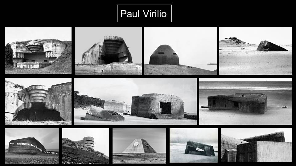
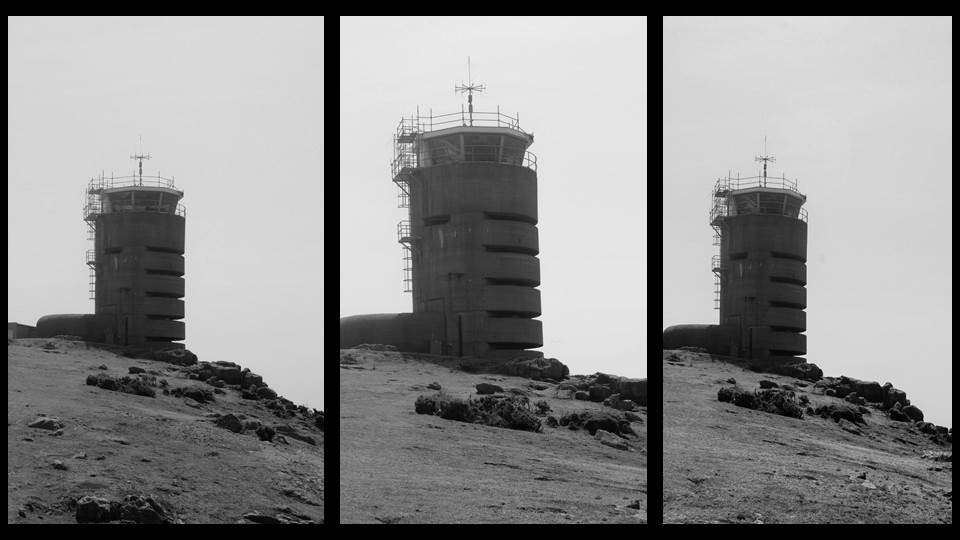
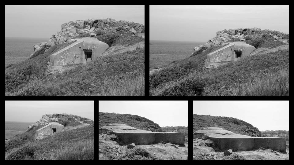
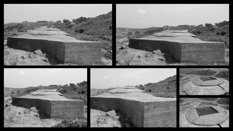
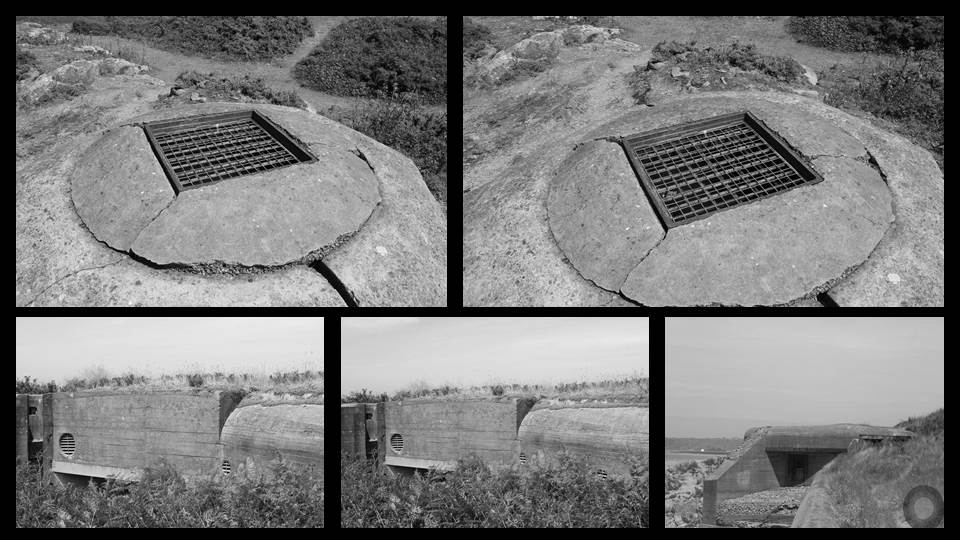
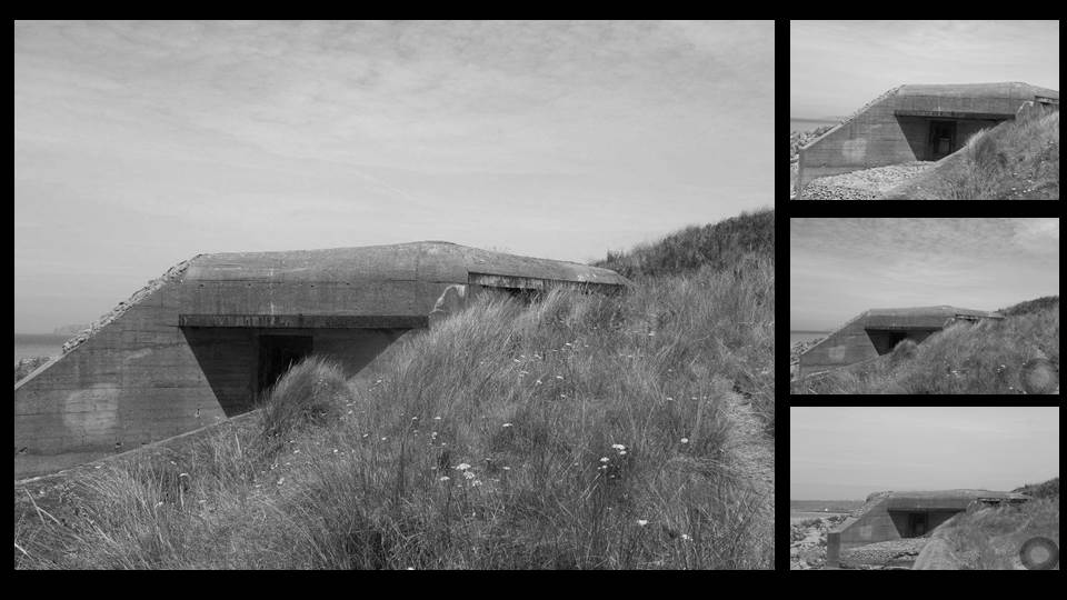
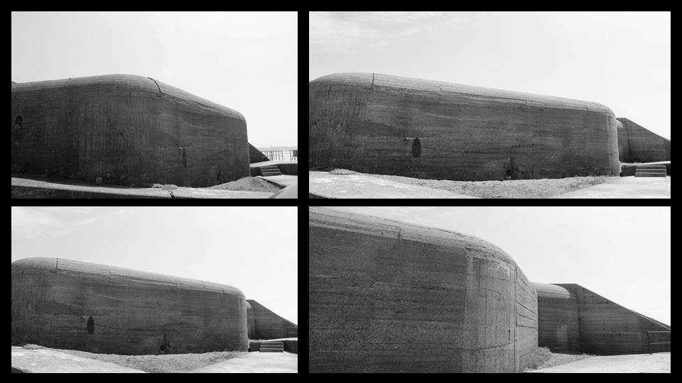
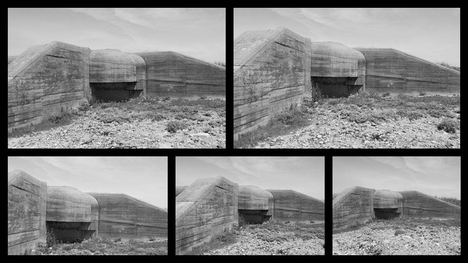
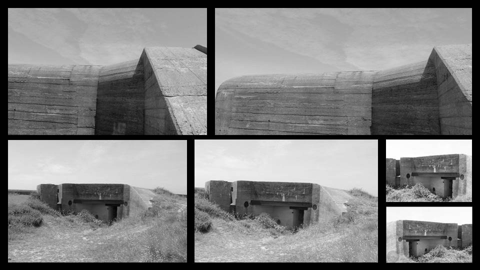
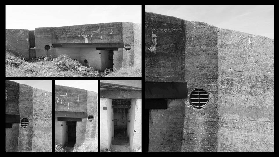
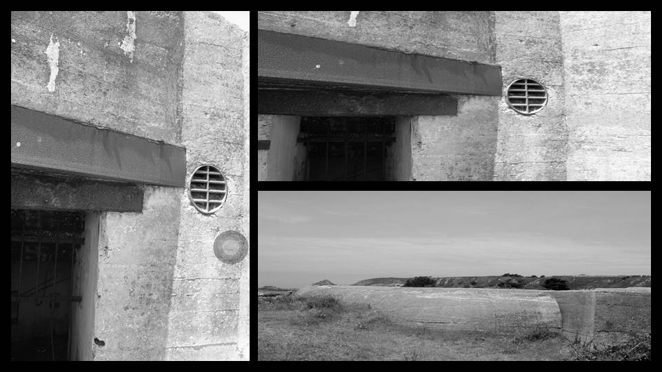
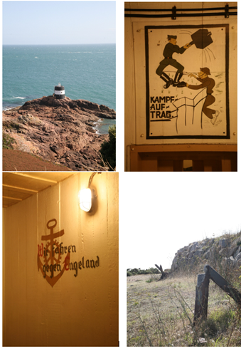
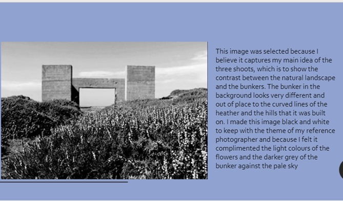
I believe that my work was successful in that it followed the style of the reference photographer, Virilio, but also I made time for some of my own personal ideas. My overall idea for the three shoots was inspiration taken from how I interpreted Virilio’s work, so the contrast between nature and the man made archaeology of the bunkers. I believe I was most successful in simulating Virilio’s style in the first shoot, and the last image of the 3rd shoot, as they are highly contrasted, in black and white, and use line to draw the eye to the image. I believe I was most successful in imitating Virilio’s use of contrast because I was able to use the sky and the natural lighting to my advantage and bring definition to the shadows and the highlights in each of the black and white images. I think that as I kept some of the images in colour, this reflects how I am able to use adapt own style and take my own ideas into the work of photography, even if the artist’s style is somewhat different. I also think that another area I was successful in was being able to frame the photographs in such a way that provided a background without completely overrunning the image with white, which was not how Virilio did it, and would have potentially ruined the images.
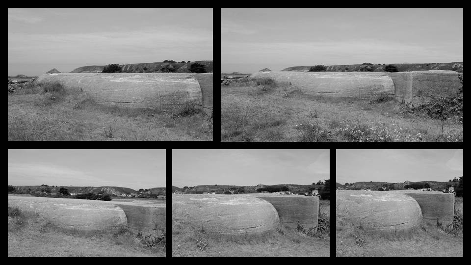
When I went out and actually took the pictures, I was attempting to think about how Virilio viewed war, how he had a personal experience of it, and how he viewed photography as a way of slowing down the rapid human thinking process and giving humanity more freedom through a simple series of still images. This led to a few of the final images being very similar to his style, and even the shoot by the bunker tower, which he had taken pictures of a tower exactly like it. I was trying to communicate the idea that over time, the bunkers had become part of the landscape and do not reflect the tragedy of recent history, as they would have done when Virilio did his series of bunker photographs, but that they show further back in history, and how the past can shape the landscape of the future. Additionally, I was trying to show how nature was taking over in some of the shoots, especially the final one, where the grass had almost completely obscured the bunker wall from view, from certain angles leaving only a few chimneys.
To improve the project I could have taken more shoots and attempted a wider variety of angles or styles of bunker to shoot in, which would have more effectively followed Virilio’s style. I see one reason to my success as the range of different bunker structures I visited: the tower, the square roofless bunker, the wall embedded into nature. This created more interest in my images as they are not all identical, and it also reflects the history of bunker archaeology, another area that the reference photographer was keen in and wrote about extensively.
To take the project to a higher level I could have done more research into how Virilio actually carried out his photographs, his mindset and his editing techniques, and applied them to my own work for a more authentic and accurate representation of his style. This would have involved reading more of his actual work and conducting more extensive research into his life and his work in photography.
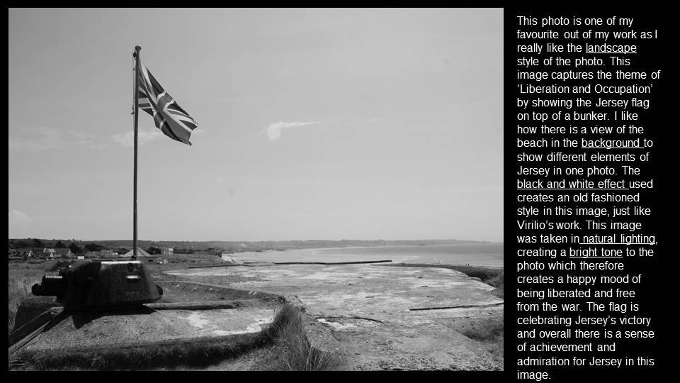
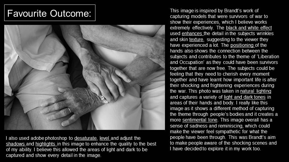
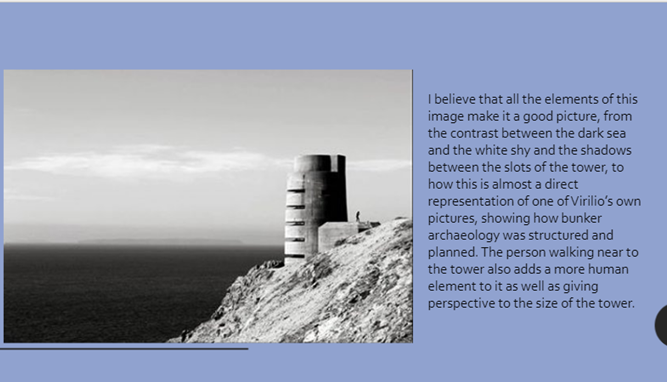
I chose this image as my best one because I believe that all of the elements tie together and show not only my own style and idea for these shoots, but also the style of the reference photographer, Virilio. The dual black and white background adds dimension and interest to the image, as most of my other images do not show the sea at all and it was a very important aspect of the Occupation and the bunkers (and the Nazis) actually being here on the island. The black and white is flipped in the right of the image, with the black shadow on the tower being on the top and the grey-white of the cliffs being on the bottom. This makes the image good to look at and provides contrast for the smaller shadows from in between the rectangular slots of the tower itself. This angle and editing was planned, but I did not plan for the person standing next to the tower, which is another reason why this is my best and favourite image, as I see the person as an addition to the idea of humanity and nature and also this adds a sense of reality, as this image could look rather dystopian to someone who was not familiar with the Occupation and how it affected everyone on the island. It also shows the size of the tower and therefore the vastness of the ocean behind it. I believe that my editing was also successful in this image as it follows Virilio’s style of a high contrast, black and white image, with dark shadows and bright white highlights. To improve this image I think that I could try without the person, as that would suit Virilio’s style better, but I do actually believe that it compliments my own style as well as his own, and makes this image my best.
This induction task is designed for students who wish to study AS Photography. The aim of this task is to ensure that the students who have chosen this option both understand the requirements of the course and start as early as possible in their journey towards completing it to a high level. The work you produce in this Induction Task will be used to stimulate a group discussion during the first session as well as form the beginning of Component 1 (coursework).
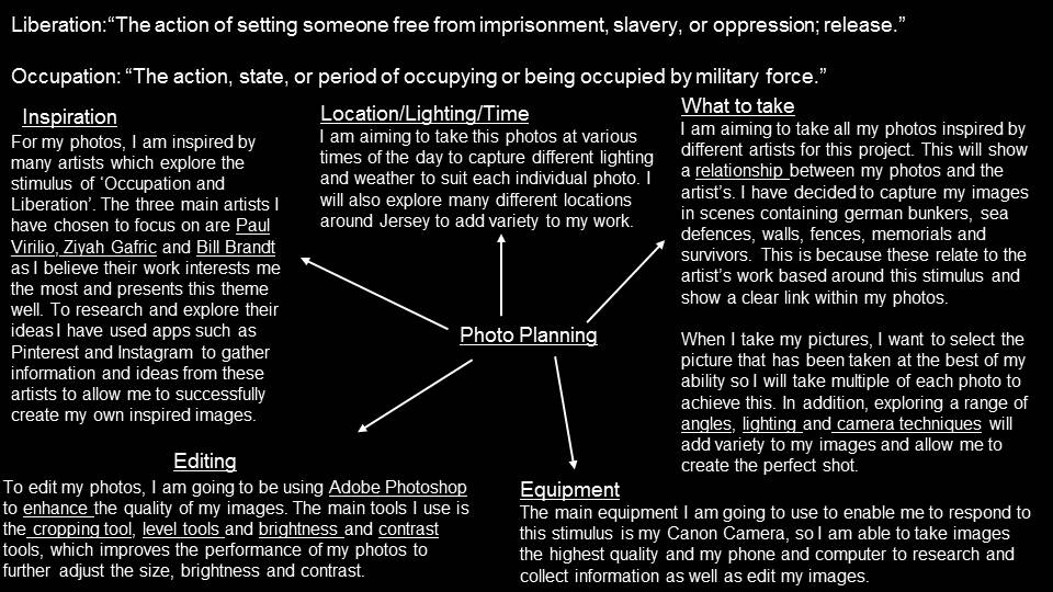
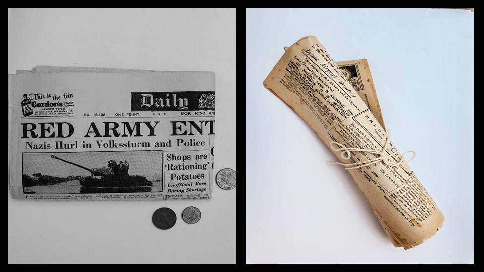
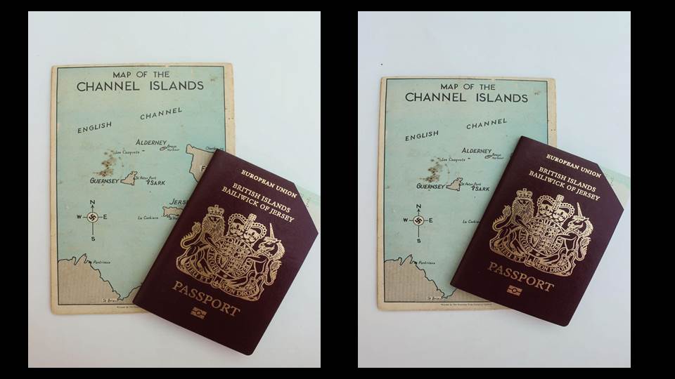
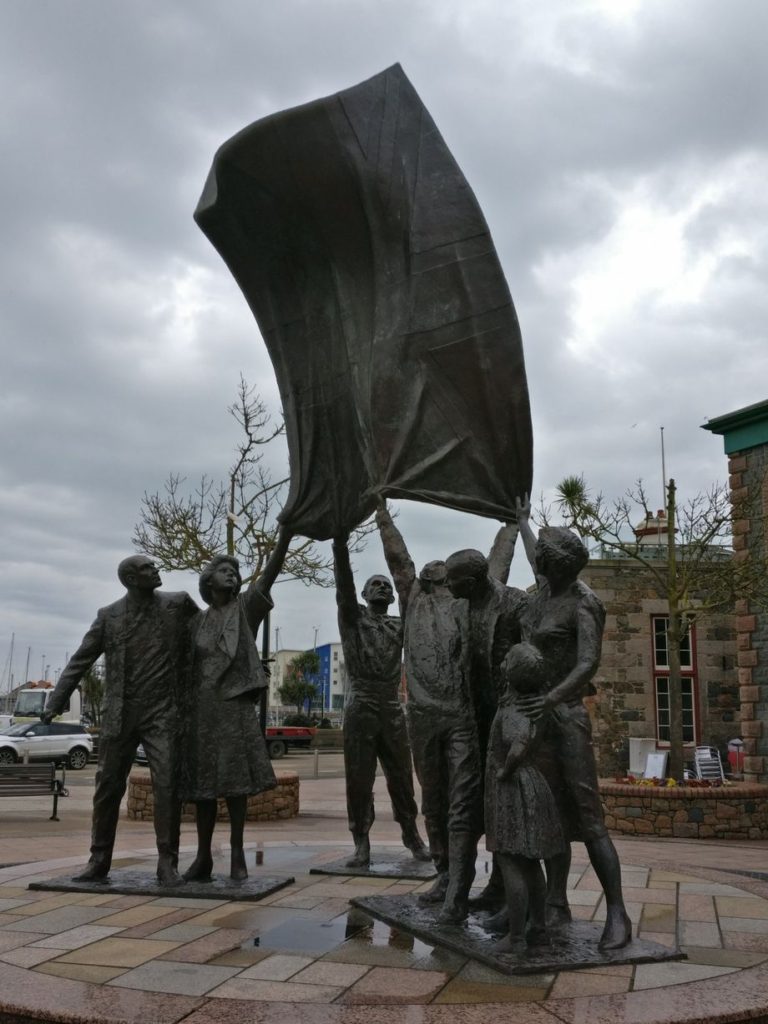
Stimulus : “Occupation and Liberation”

This task should be an ongoing investigation over the summer so expect to spend at least 2-3 hours a week over a four week period in order to develop your idea…
Aim to respond creatively to the stimulus… “Occupation and Liberation.”
Show how you can observe, interpret, define and most importantly photograph signs of occupation / liberation. You may want to explore visual aspects, or subtle and nuanced ways of photography various forms of occupation / liberation that have an emotional or personal edge. There are many possibilities…some more obvious than others.
You should / could start by photographing some of the following suggestions…
And aim to produce a set of photographic responses based on your own research of photographers from this selection…
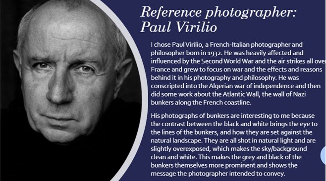
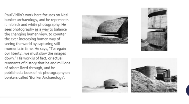
| Paul Virilio – Bunker Archaeology CLICK HERE for more… |

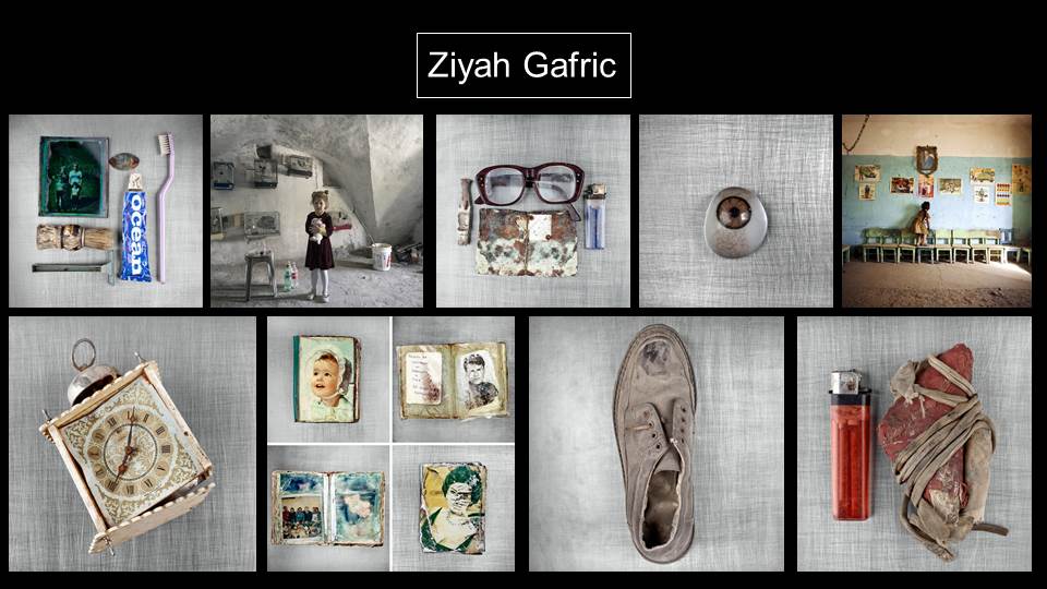
Ziyah Gafic – Relics of war CLICK HERE for more

Claude Cahun – Resistance artist CLICK HERE for more

What is required:
How to proceed:
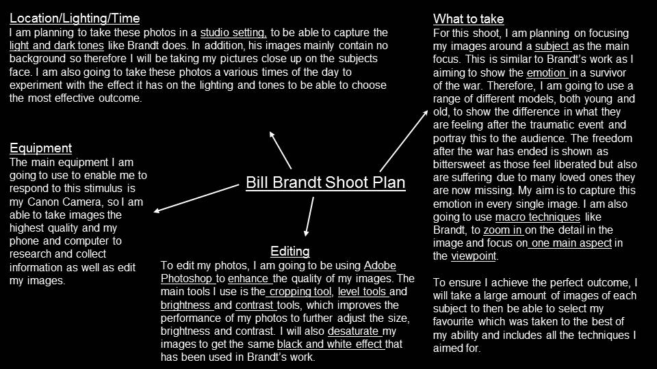
Research an artist reference, the background and life of the artist and explain why you have chosen that particular photographer. What do his / her photographs say to you? Look at composition and its visual elements e.g. line, form, shape, colour, tone, contrast, texture, depth, balance, space, perspective, viewpoint, foreground/ mid-ground/ background, rule of third. Look at the use of lighting e.g. natural lighting; sunlight, overcast, soft, harsh, directional, contrast and artificial lighting: studio, flash, spotlight, side-light, backlight, reflected light, shadows, chiaroscuro (light / darkness).
Use photographic language as above in your annotation and consider the artistic merits :
Technical , Visual , Conceptual and Contextual elements
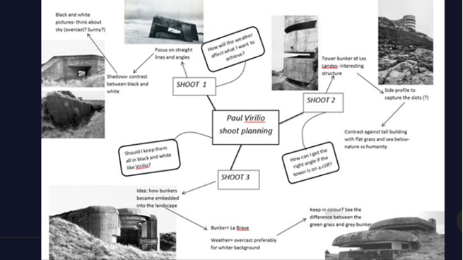
Planning: Once you have spent time evaluating the work of your chosen photographer, plan a shoot using the same techniques and mindset.
You must: Produce a mind map
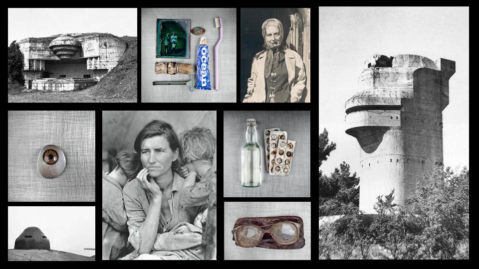
showing your thought process and with breadth of thinking, and a mood board
(collage of images) to illustrate the look and feel of your project.
You should: Start to write annotations of your thoughts,
how are you going to proceed with the project? What are your inspirations? Your
doubts? Your worries? How will you start? Consider as many experiments as you
can.
You Could: Add in photographic responses as you write the blog, showing how your ideas are developing. Show variations and experimentation of different shoots, different ideas.
Recording: After planning your idea, gather together what you need. When you take pictures try and think about everything that you see in the frame – what’s in the foreground, mid-ground, background. To achieve this you must think about composing your picture (use your zoom lens and/or distancing yourself from subject/object), focussing (sharp, soft focus), use creative exposure tools on camera like fast/slow shutter speed to either freeze or blur a sense of movement, different aperture settings to control the area of focus and sharpness in your picture. E.g. a high aperture setting like f5.6 will make the background soft and out of focus whereas an aperture of f16 will make everything in the picture sharp from foreground to background. Also by zooming in or using a telephoto lens you can throw the background out of focus, or conversely if using a wide-angle everything in the frame will be in focus. Crop your images carefully.
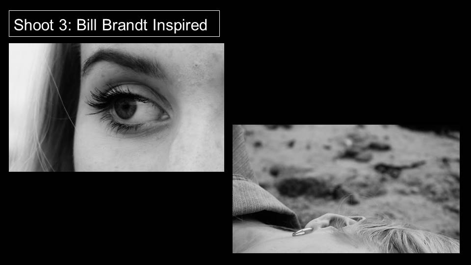
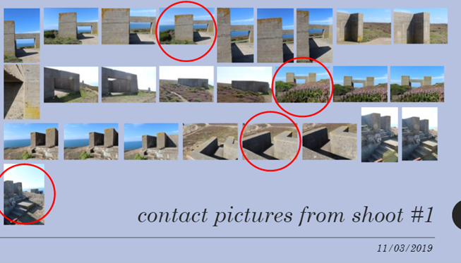
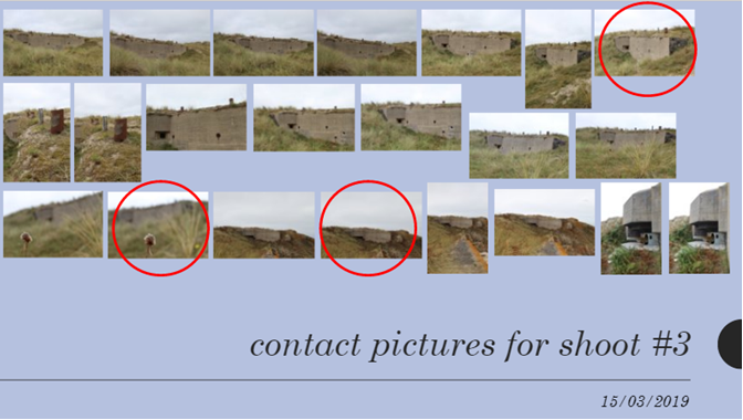
You must: Produce the contact prints from at least three shoots, each dated with your selections highlighted.
You
should:
Ensure the three shoots are as varied as possible, showing your ability to be
creative and that you can learn from the shooting process. Include the experience into your blog.
You could: Increase the number of shoots and once you
have highlighted your selection, give reasons for choice linking with the work
of the photographer.
Editing: Editing is one of the most important aspects of photographic practice so be critical and selective when you choose your final selection of 5 images and then your best photograph. Think about sequence and relation between images – does your series of images convey a sense of narrative (story) or are they repetitious? Sometimes less is more!
You Must: Gather your images and select your final selection approx 10 images, describe each of the images, artistically and share your thoughts on what why you took and then selected the image.
You should: Show your ability to correct the images using image manipulation software, such as Photoshop, consider the cropping, adjust levels, contrast, colour correction, B/W and balance of the image.
You could: Use Photoshop to enhance your creativity and expand on the possibilities that photography gives you, include screen grabs to illustrate the techniques you have used.
Presentation: Think about how you present your work in terms of layout, scale, colour and perspective. A Powerpoint presentation is ideal
The presentation of your photographs is just as important as your photographic images themselves. Consistency of layout throughout is paramount and try to make your work personal.
You must: Gather all of your work and present it in a logical manner
A grid format could work well for this exercise
You should: Produce an individual and comprehensive response to both your chosen artist and the inspirations that the artist has given you.
You could: Design within Adobe Photoshop or similar package, a theme to enhance the imagery and clarify the message of your response.
Evaluation: Reflect, contrast and compare the images and ideas that you have taken and write 500-1000 word account of how you made the photos, development of idea and what you were trying to achieve and communicate. This can be done throughout your layout as annotation or at the end as part of your final evaluation. Finally, choose your favourite image and present this separately from your series of images. Accompany this with a brief written analysis (250-500 words) explaining in some detail what it is that you think works well about this image.
You must: Evaluate your work, compare it with the work of your chosen artist reference and consider the areas that were most successful and why.
You should: Discuss the changes you could make to improve the project and analyze the reasons of your success and how you would add value.
You could: Show how you would take the project to a higher level and give examples of the methods and inspiration that you could employ to achieve this.
Make sure you bring with you: all of your work (that covers points 1-8 in your chosen digital format) including your best A4 printed image for your first photography lesson on Wednesday 4th September 2019.
USEFUL LINKS
https://www.theislandwiki.org/index.php/The_individual_towers
https://www.jerseywartunnels.com/?gclid=EAIaIQobChMI4OHfnNPQ4gIVWfhRCh3Y5gLyEAAYASAAEgIQyPD_BwE
Good luck and get creative!
Email // j.cole@hautlieu.sch.je
Web // www.hautlieucreative.co.uk