
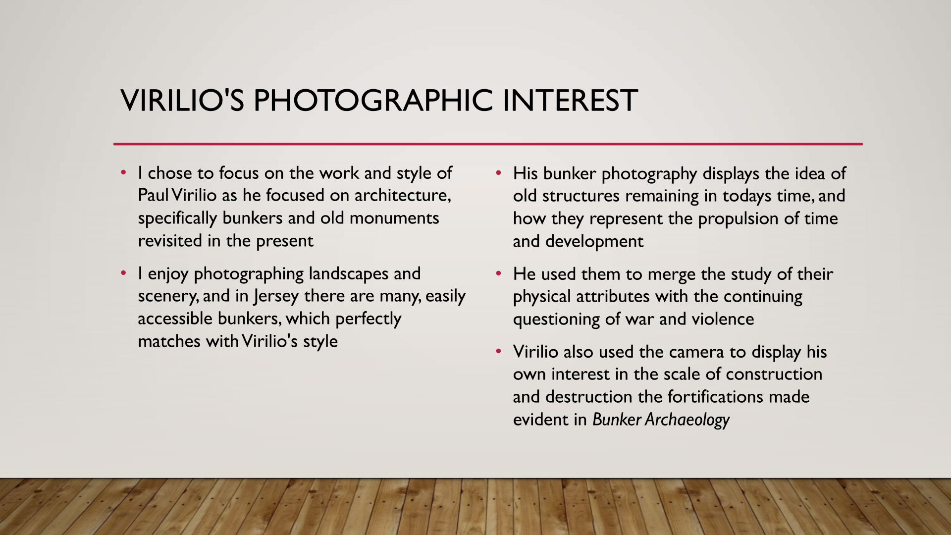
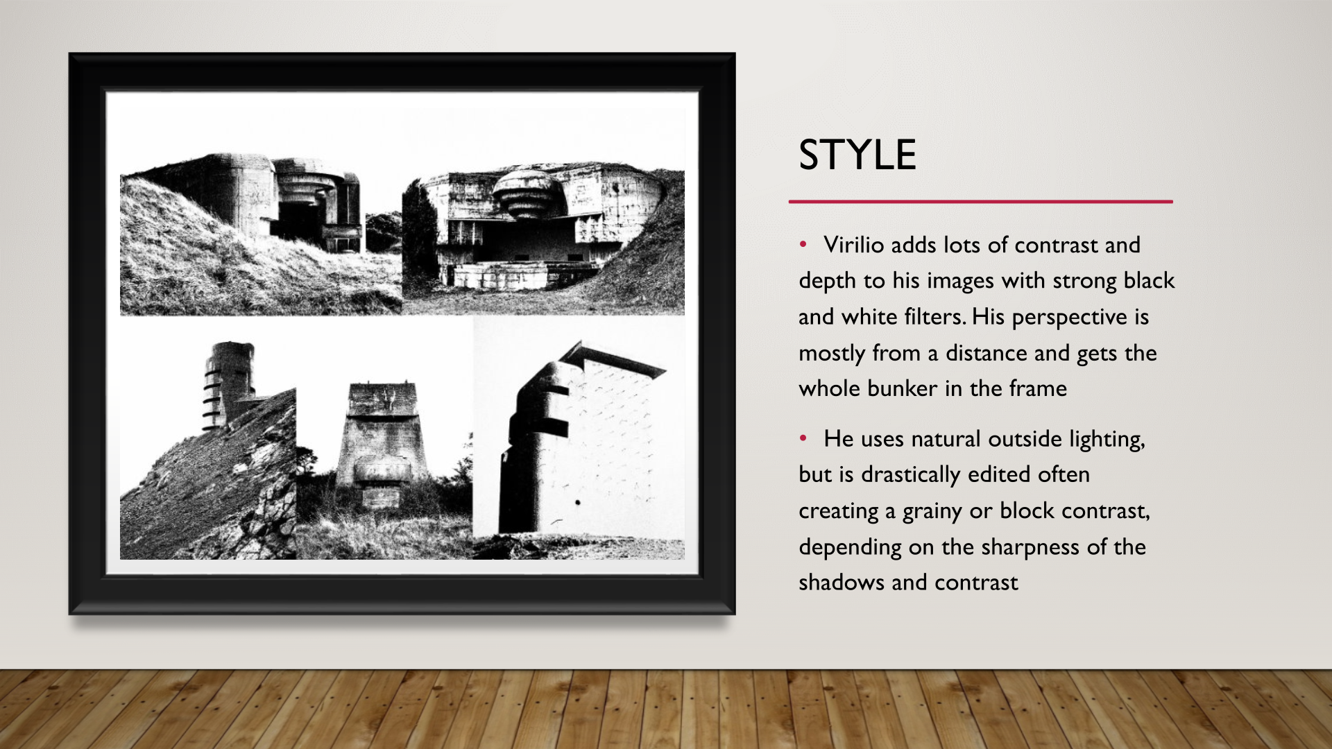

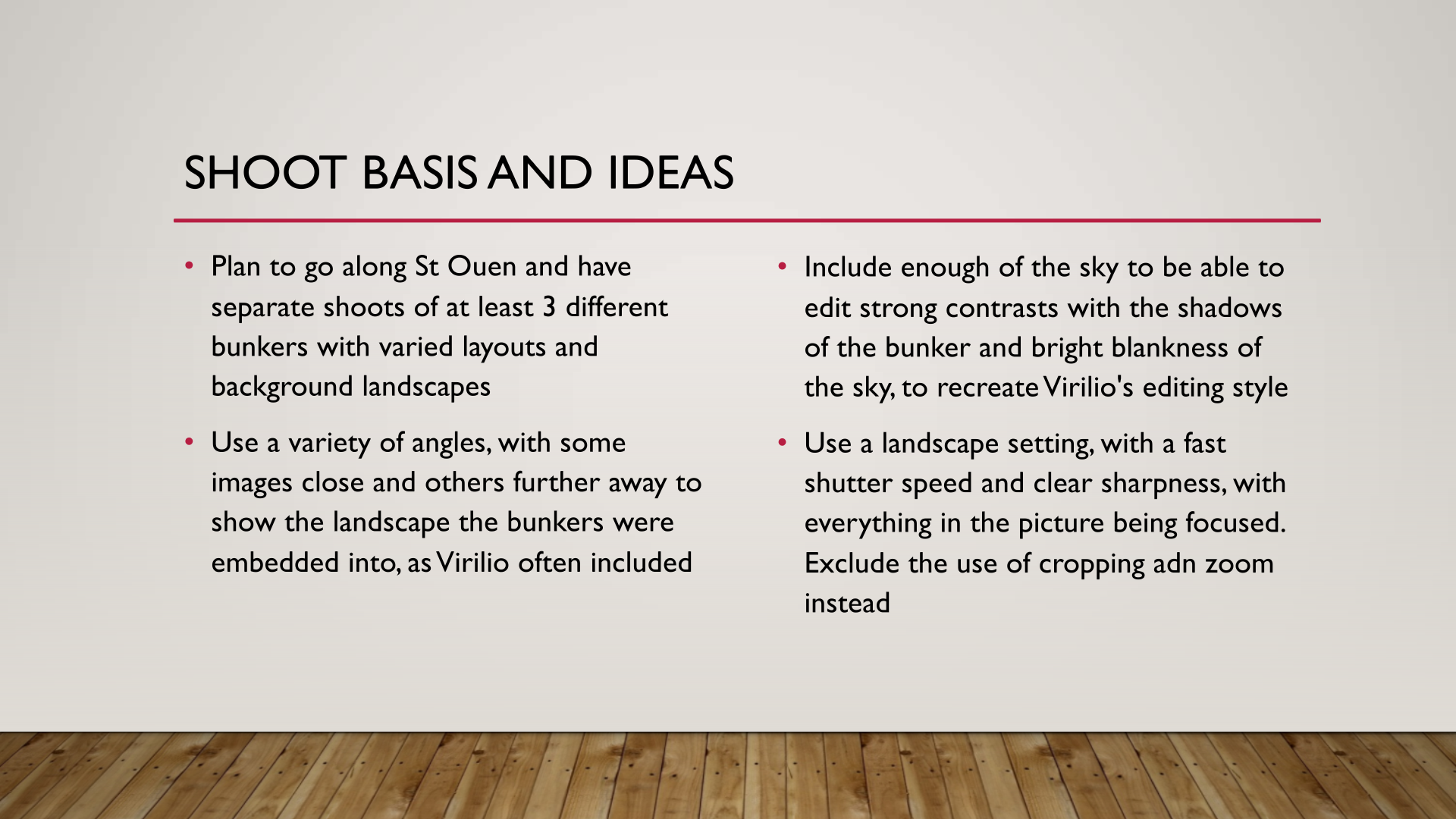
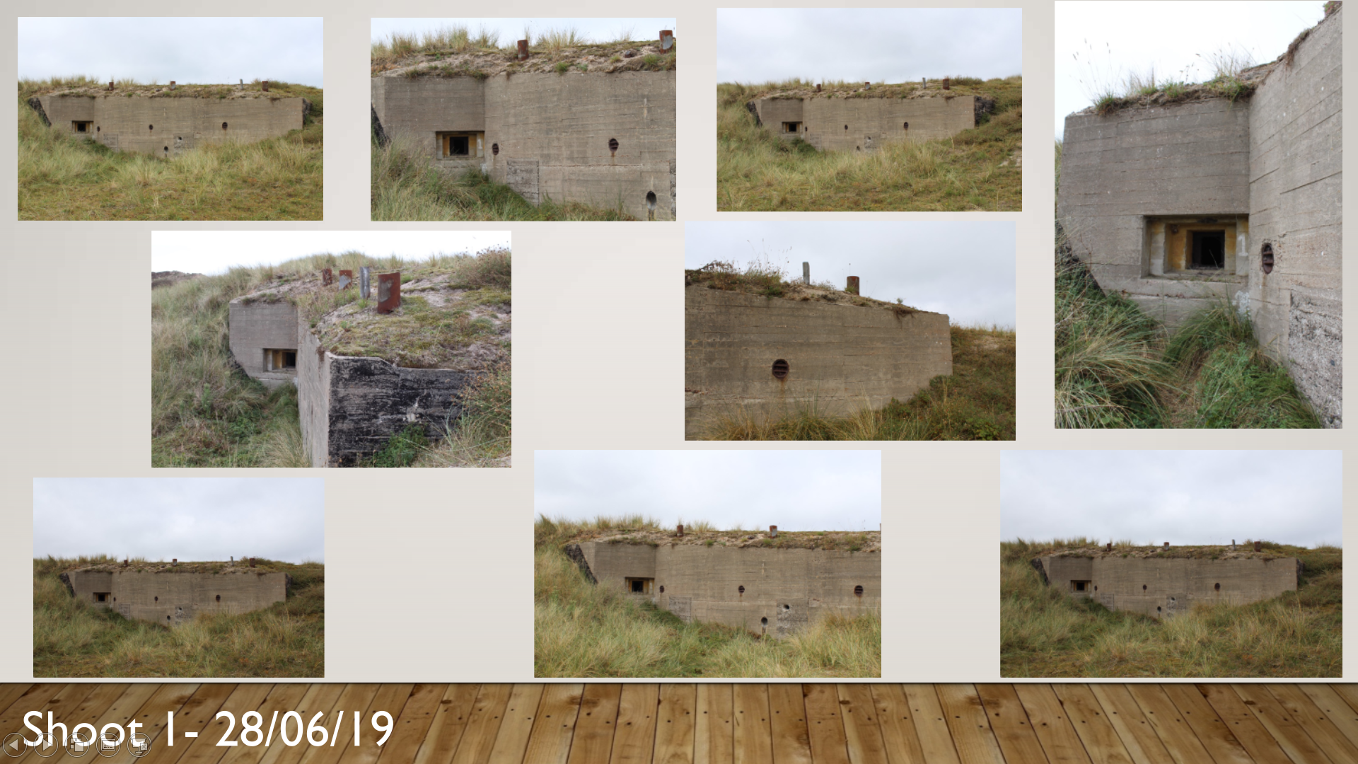






















CONTEXT:
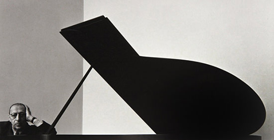
New York based freelance photographer and portraitist Arnold Newman is recognized as a pioneer of environmental portraiture, changing the ways photographers viewed portraiture in the 20th and 21st century. One of his most famous pieces, often described as a defiant stand agains people in power. One of these people was German industrialist Alfred Krupp, who, along with his father build an empire through their support of the Nazi party. Newman was commissioned to photograph Krupp by Newsweek magazine, however the photos portray the man to look menacing and intimidating.

TECHNICAL:
Arnold Newman uses the sparse natural lighting of the train station to create a ‘gloomy’ atmosphere in this photo, since the lighting the the building is dim and irregular. The photographer also avoids the use of flash which means the foreground, being Krupp’s portrait, is not illuminated. However the subject is surrounded by neutral white light from the left and right, increasing shadows on the centre of the mans face in a symmetrical manor. There is a shallow depth of field in the photo as the the focal point id the portrait in the foreground. you can also see there is not much grain visible, but Newman clearly uses a high contrast in the image, to imitate a sinister look of Krupp
VISUAL:
The colour, tone and white balance are very important in this photo in order to create an ‘evil’ look to the man in the foreground. By including a green tint to the shadows of the image, Newman manages to aid the theory of colour composition in the photograph. By having lighter whites, and contrasting warmer tones like oranges such as ones on the Mans face, bring out a focal point. These warm tones contrasting the darker green shadows lead the viewer’s eyes and draw attention to certain parts of the photo. One of the most important features is the use of line and shape. Newman incorporates symmetry and vertical lines to suggest the feeling of power, concrete pillars either side of Krupp. In this composition, the two halves of the image are almost mirror images of each other which creates a sense of harmony and aesthetic balance, however this is ironic since the foreground( portrait of Krupp) represents corruption and chaos.
CONCEPTUAL
Arnold Newman is a political photographer and was extremely clever in the positioning of Krupp in order to express a very strong image of him, and expose to the viewer the kind of person Krupp was. he specifically does this through the mans posture, with his hands under his chin and body leaning forward which suggests authority. The fact that the photographer is Jewish would also give motive to photograph this corrupt Nazi supporter in this way, and show what he personally sees through his own eyes through the camera itself.

EDITING
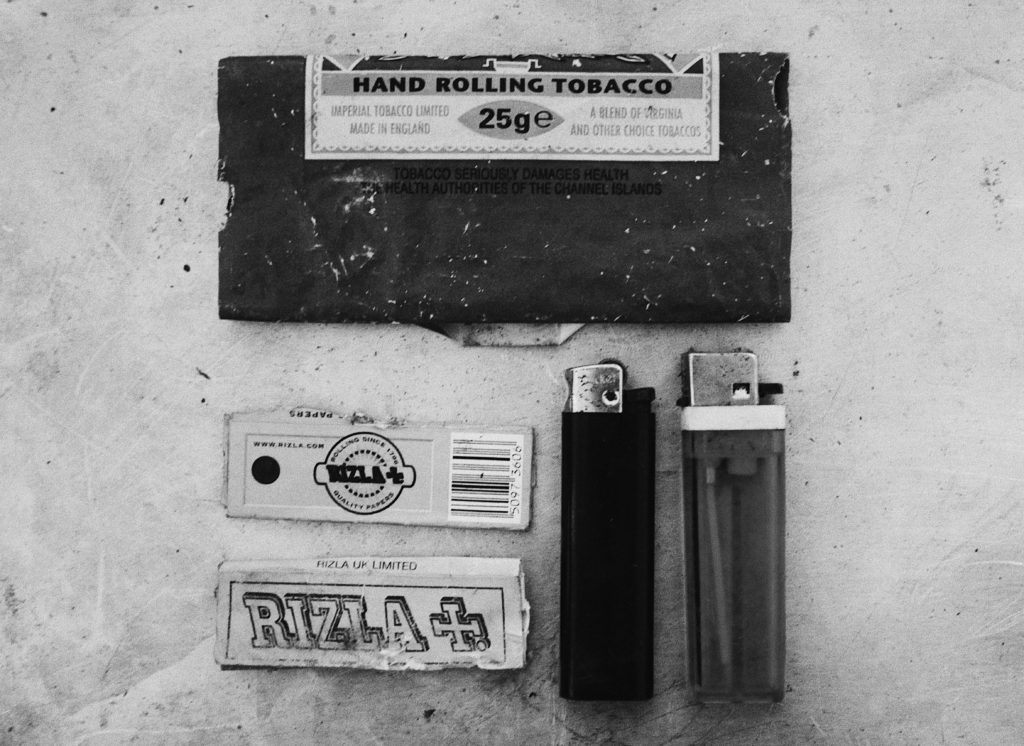
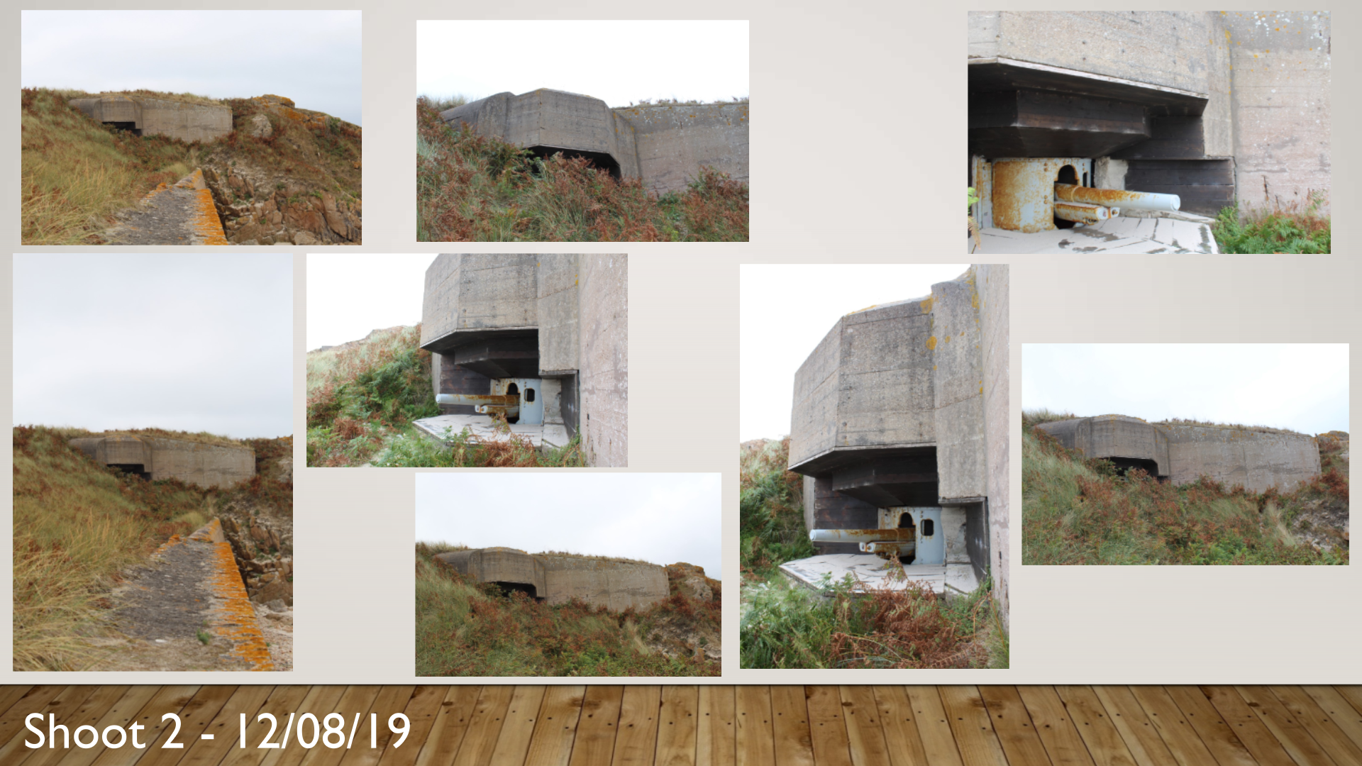
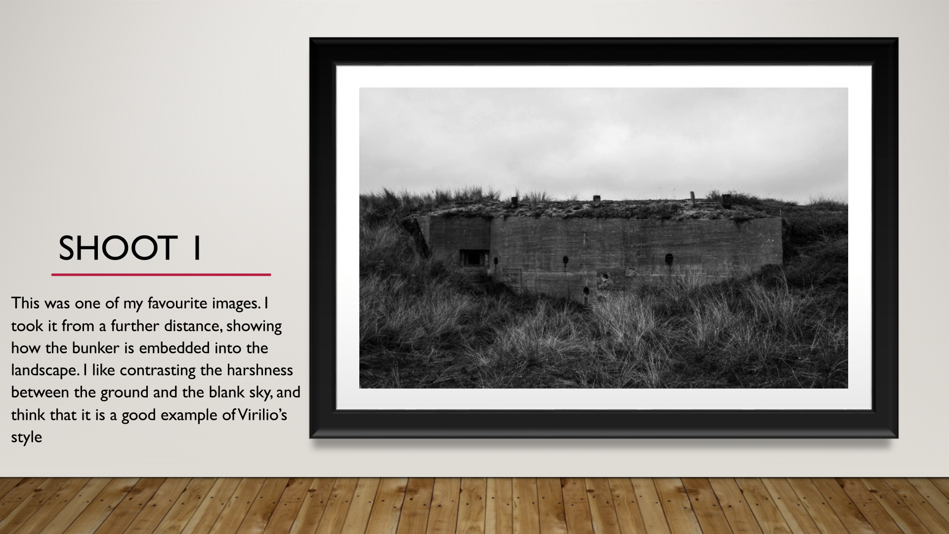
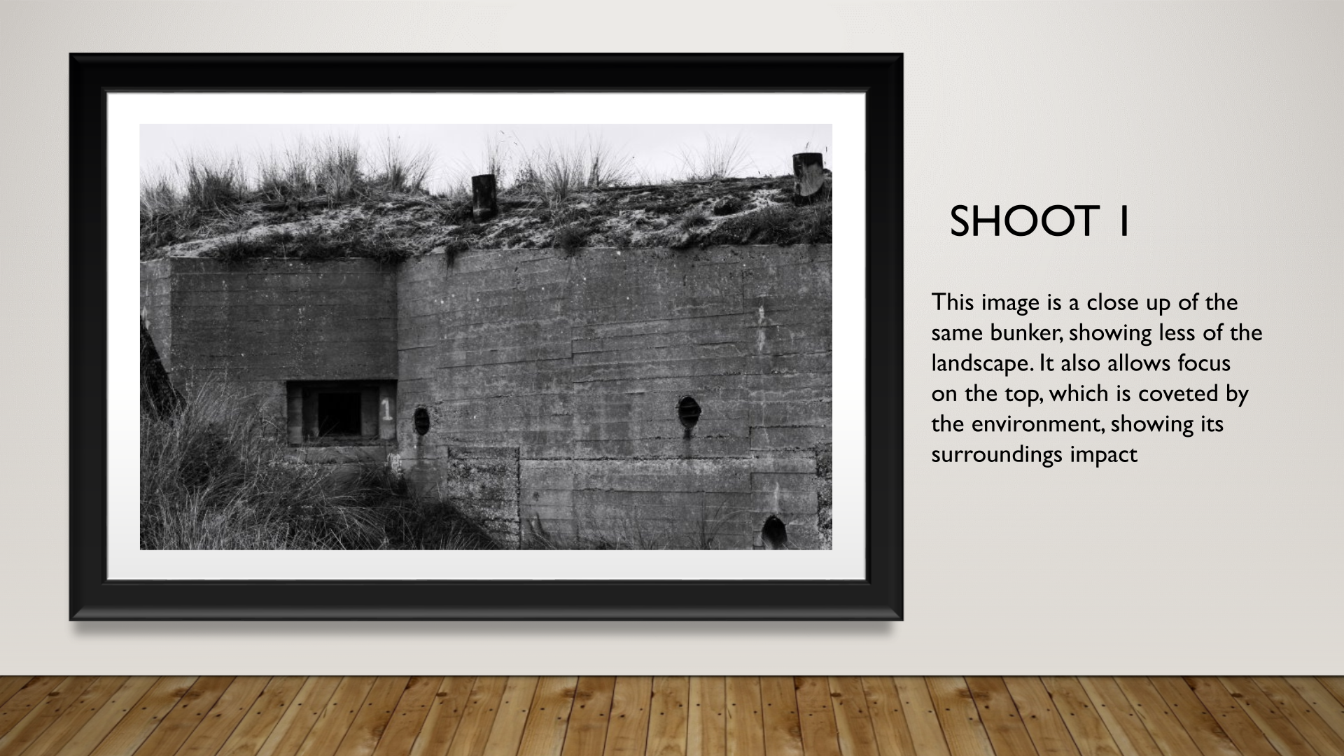
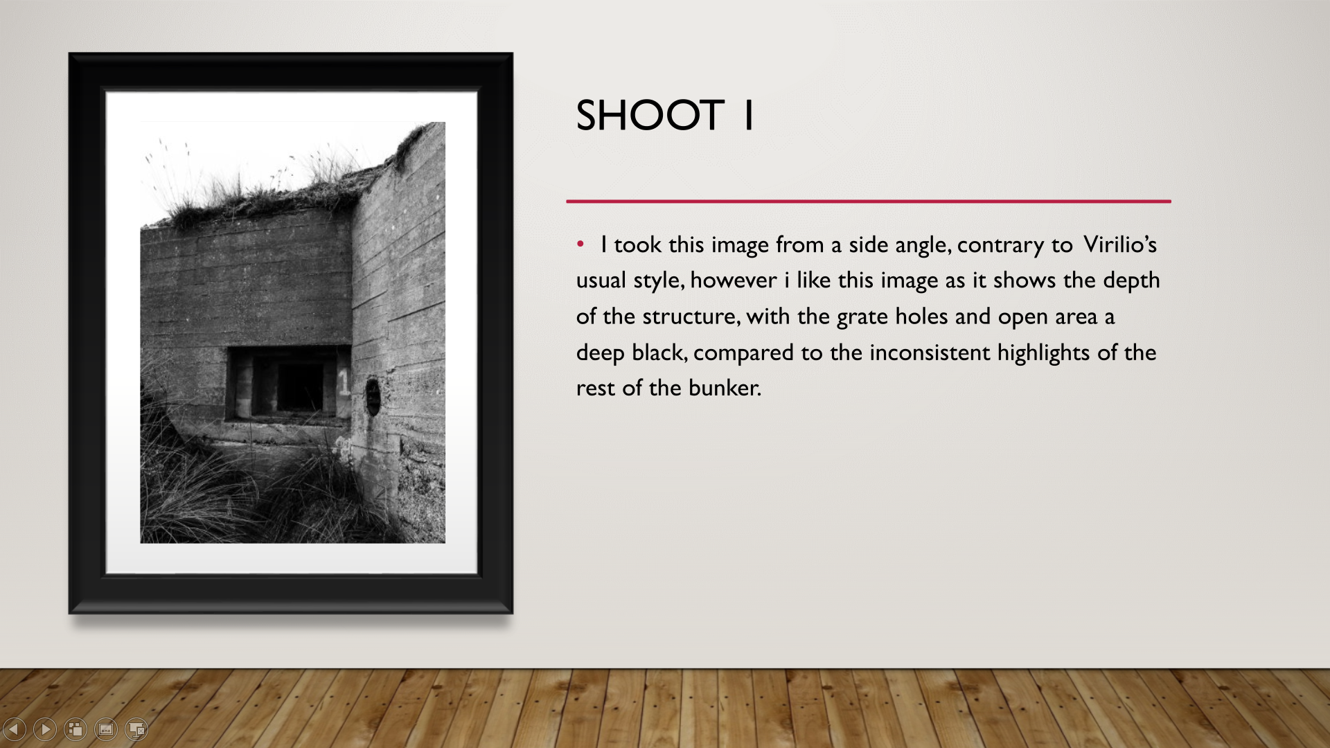
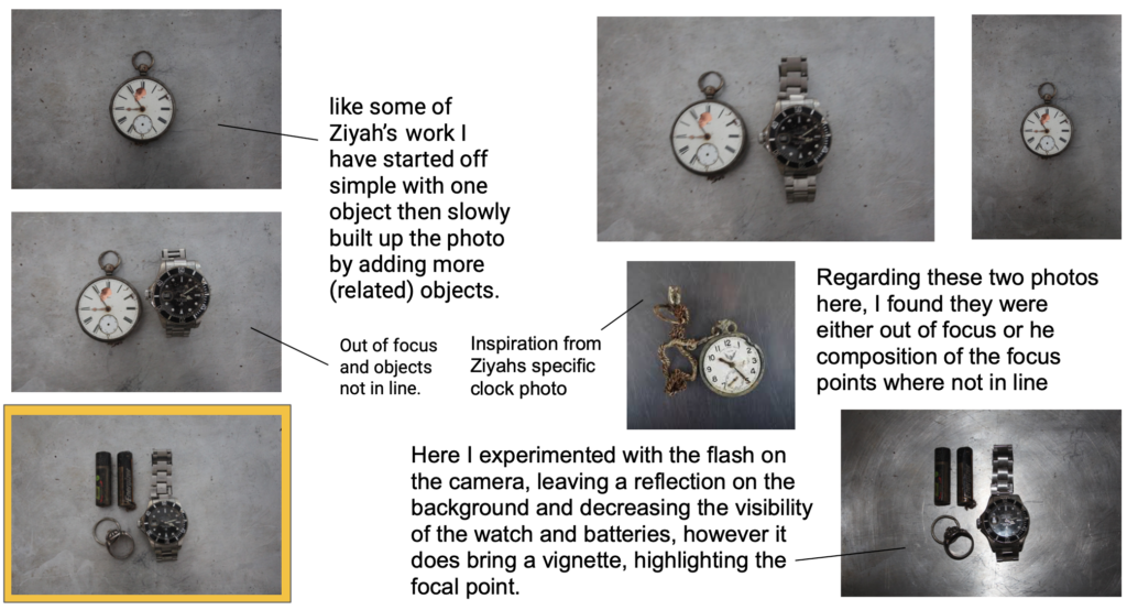
Deciding on the photos with the correct focal points, and the least shadows to make the image look more in proportion, I proceeded to edit them, in the photo below (taken from my second shoot) I made sure that the contrast had been increased and exposure lowered. This edit is inspired by the ‘authentic’ approach to old photos, with no colour, I accomplished this with the use of a filter aswell.
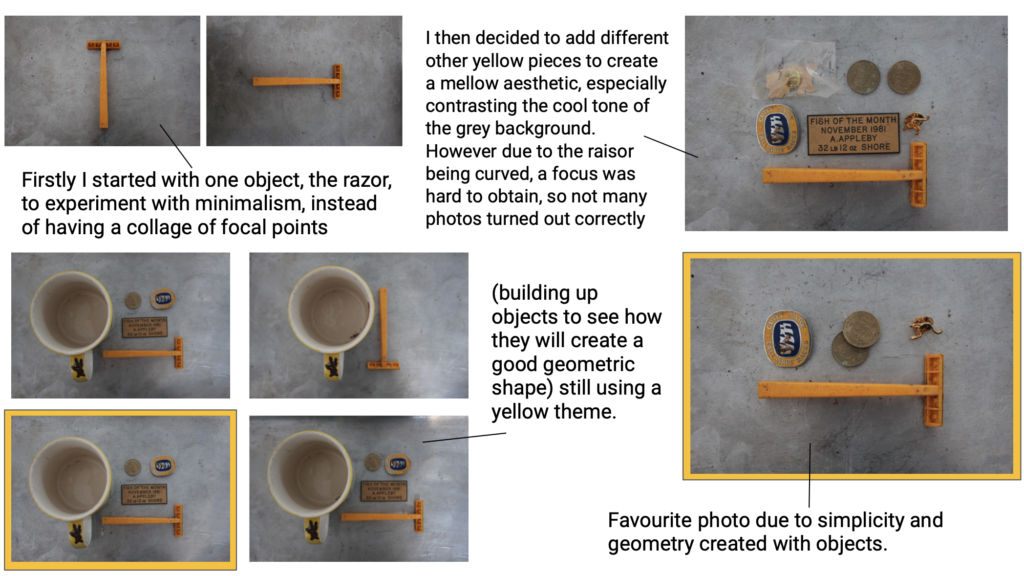
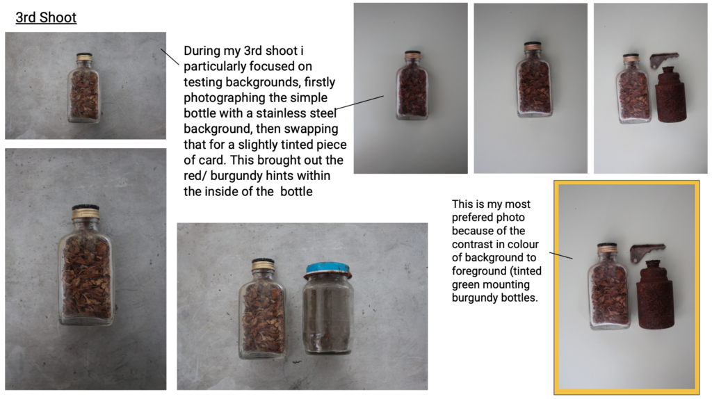
Due to the mass of yellow as the focal point of the photo, I slightly increased the yellow to make to foreground even stronger. By also increasing the contrast and shadows it evened out any odd shadows that were breaking the form in the background. As well as the I made sure that the items were in the correct place using grid lines. This along with cropping the image made sure for a evenly centres focal point.
To edit I have used VSCO, a simple photo editing app. In this photo I have enhanced the contrast and exposure to lighten yet keep the objects definition. As well as this i simple cropped and straightened the photo in order to align the sides with the form of the items in focus.
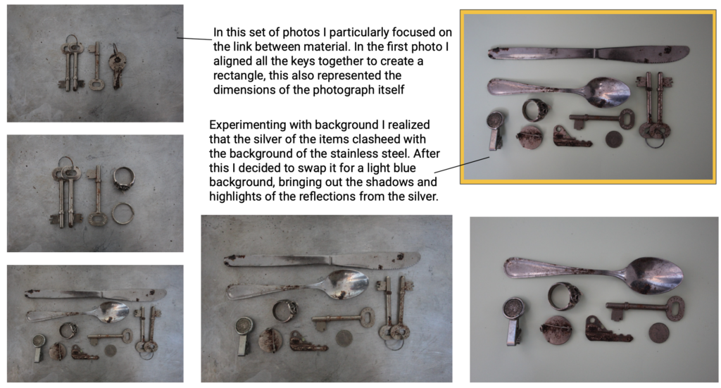
In this photo I also straightened and cropped the image, however due to the two metals (background and foreground) I increased highlights and shadows, making it more clear to view. I furthermore softened the tones of the colours, cooling the image to create a blue/ silver theme.
FINAL PHOTOGRAPH
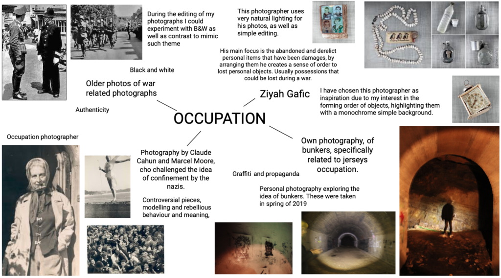
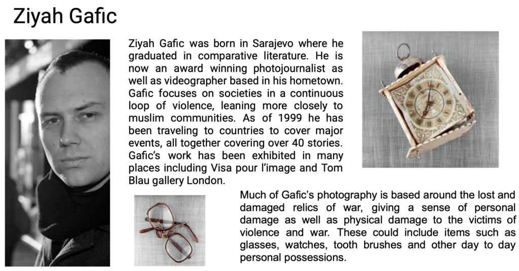
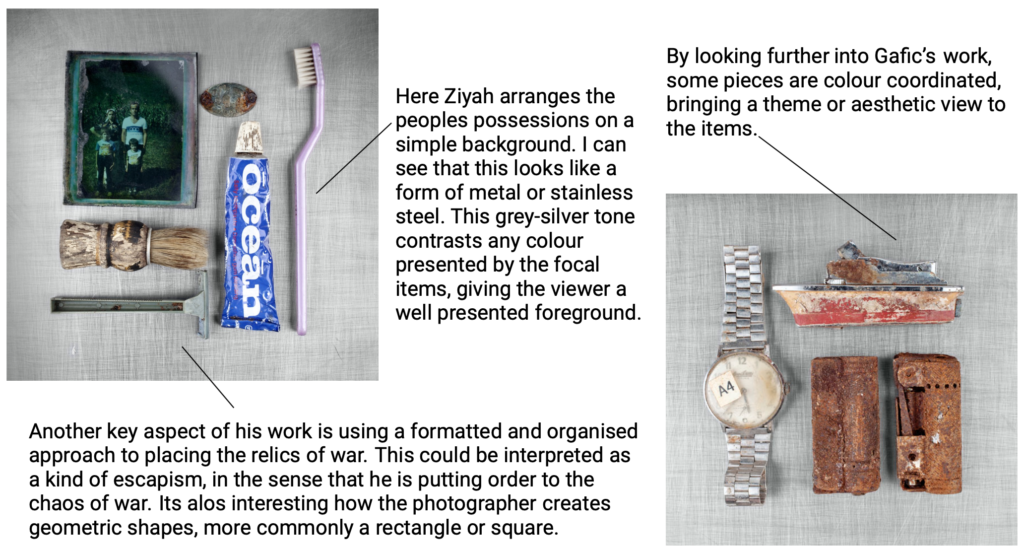
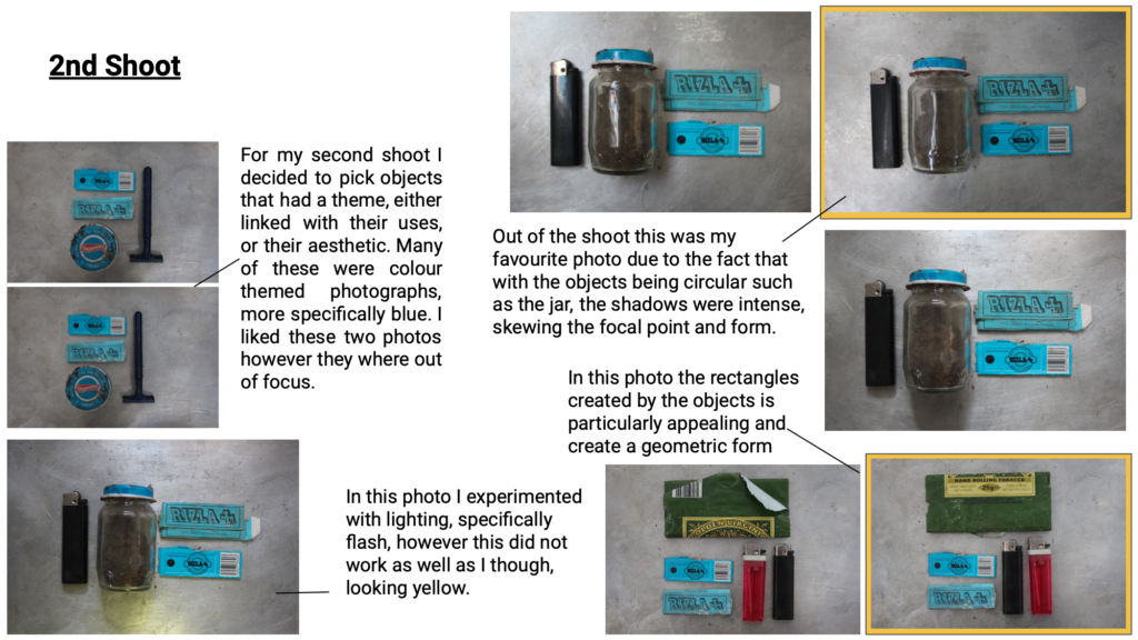
This is my chosen photo from my 3 shoots, due to the fact that it firstly represents the object’s that would be in personal use, much like the ones in the photos taken by Ziyah Gafic. This is personally my favourite due to the link between each item, being silver. This means that every item reflected in a similar way. Furthermore, even though most of the objects are rounded, I like the way they create a rectangular form. I also think that the editing of B&W improves the contrast the the background, making the focal points more visible.
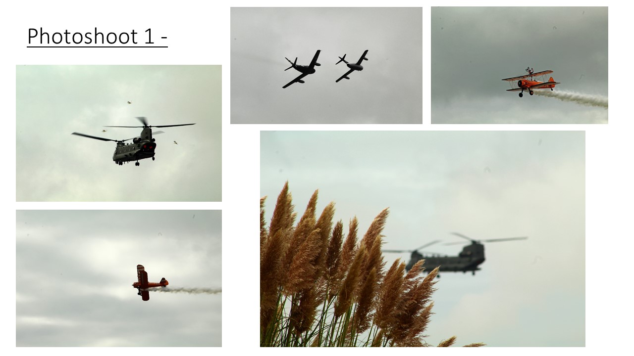
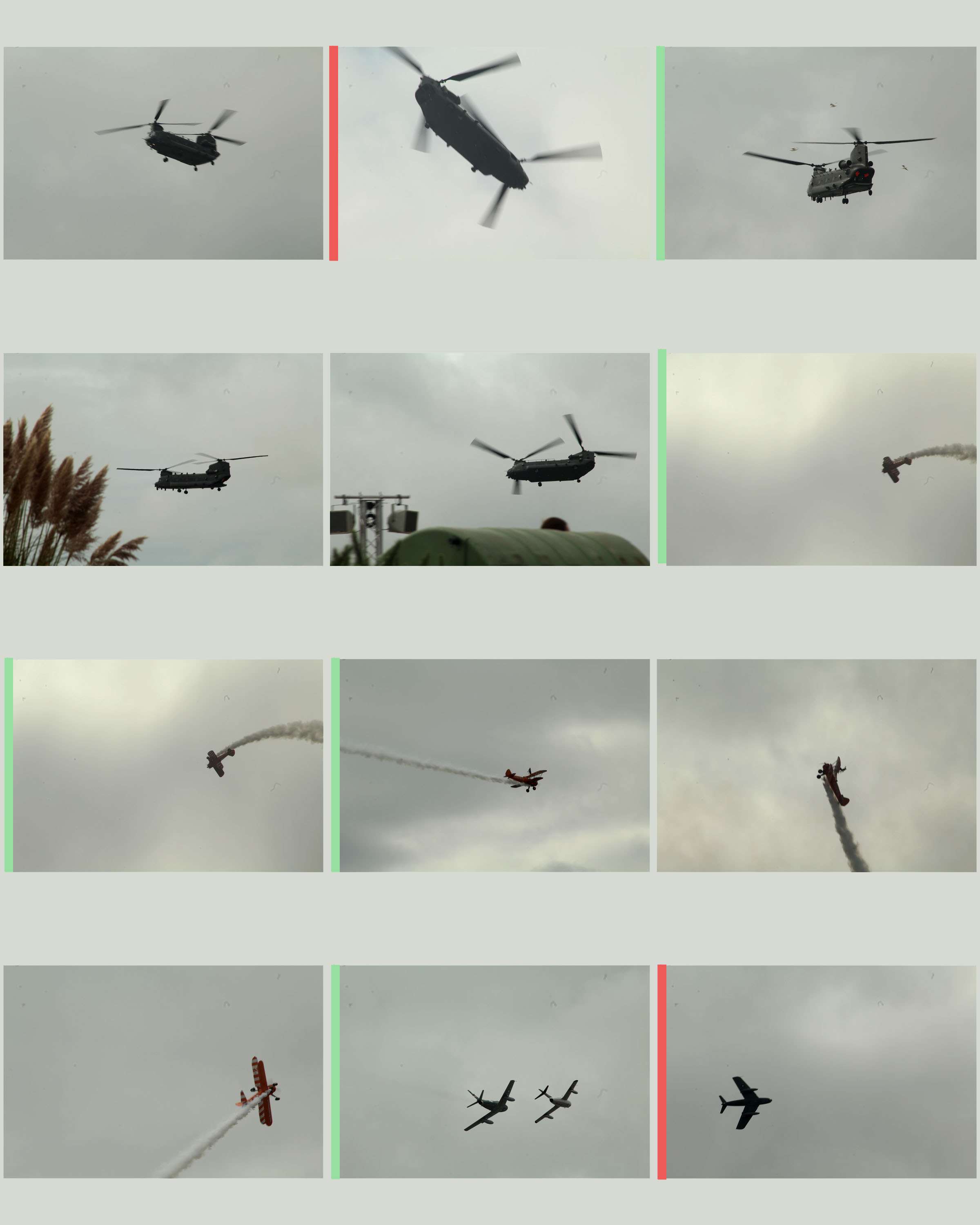
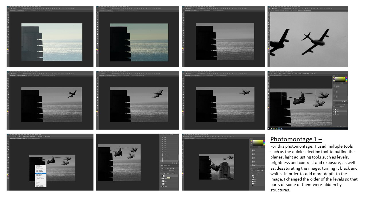
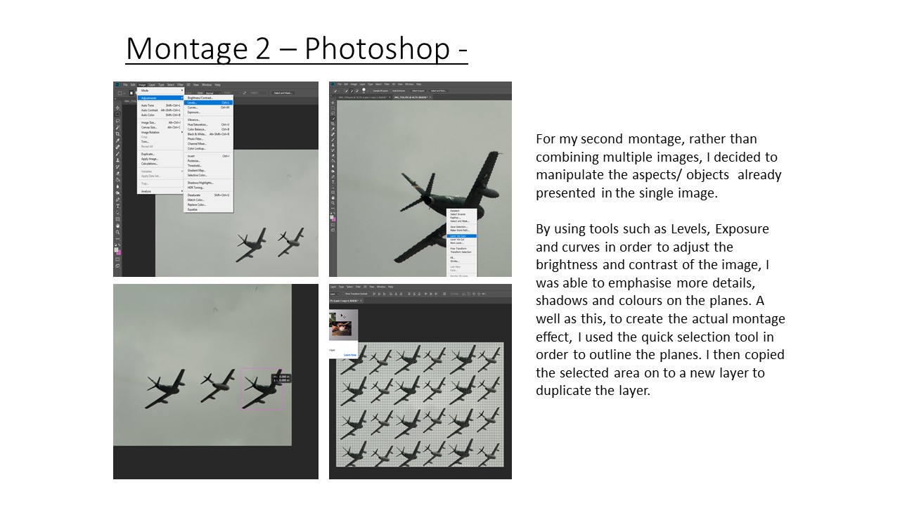
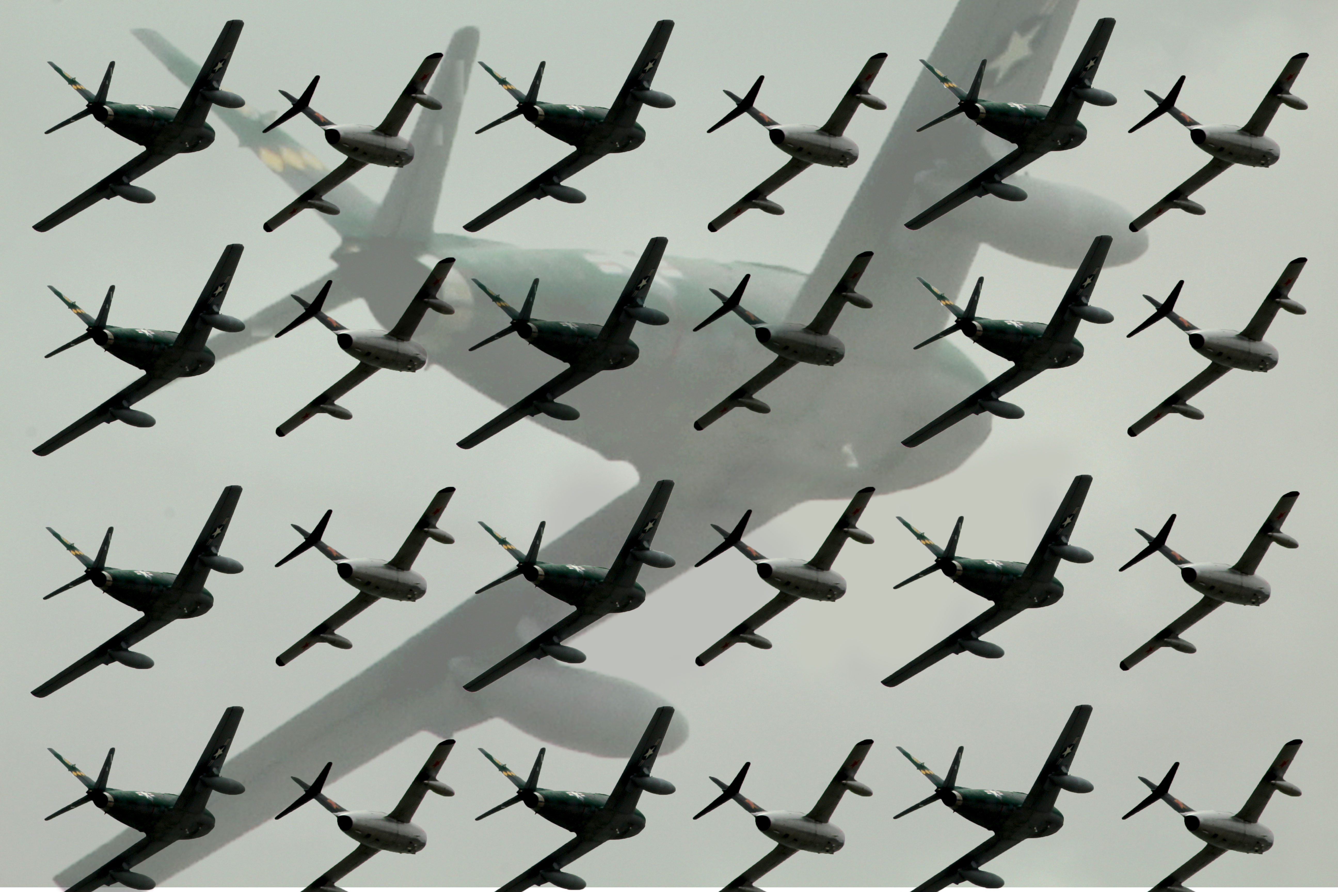
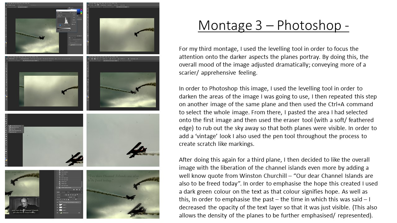
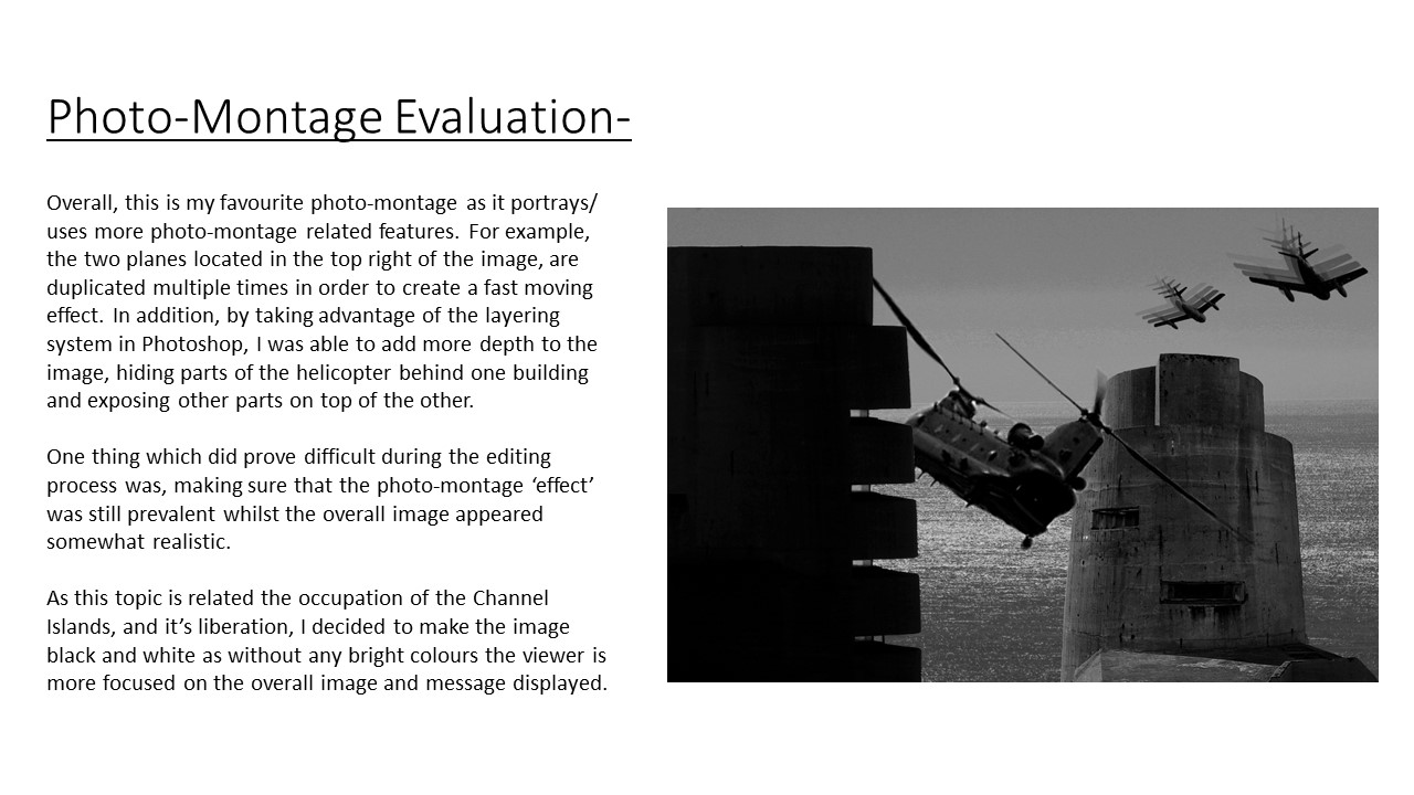
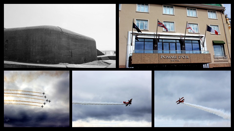
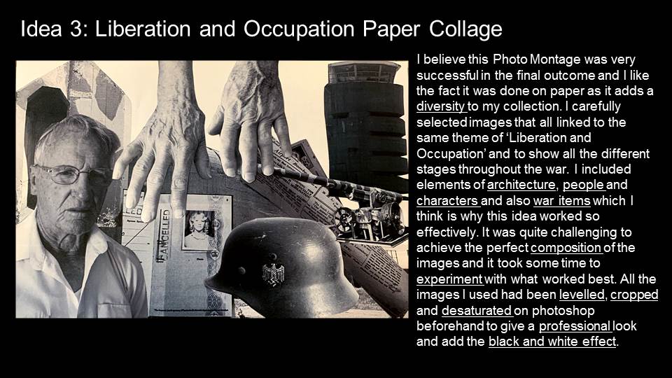
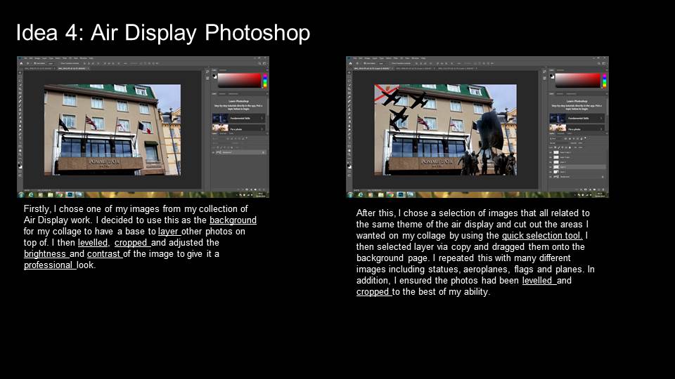
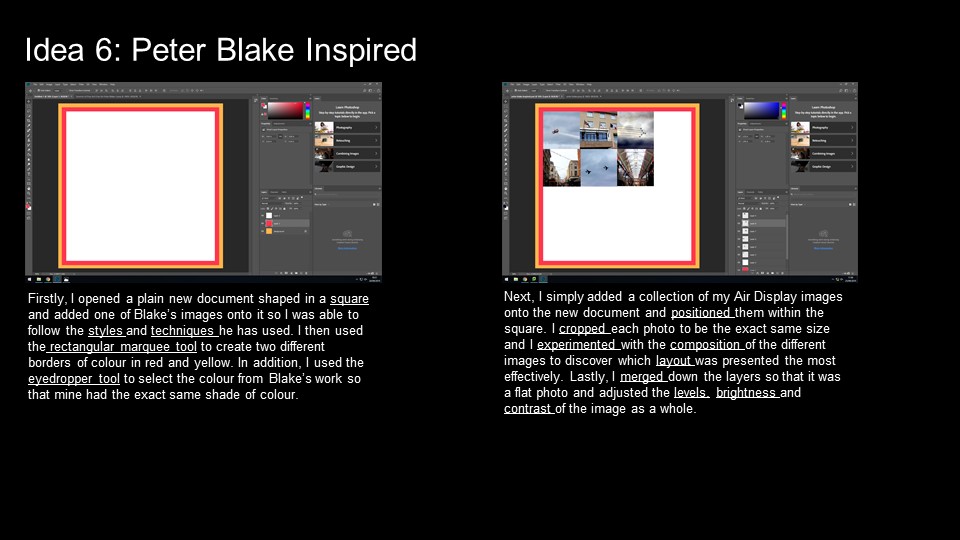
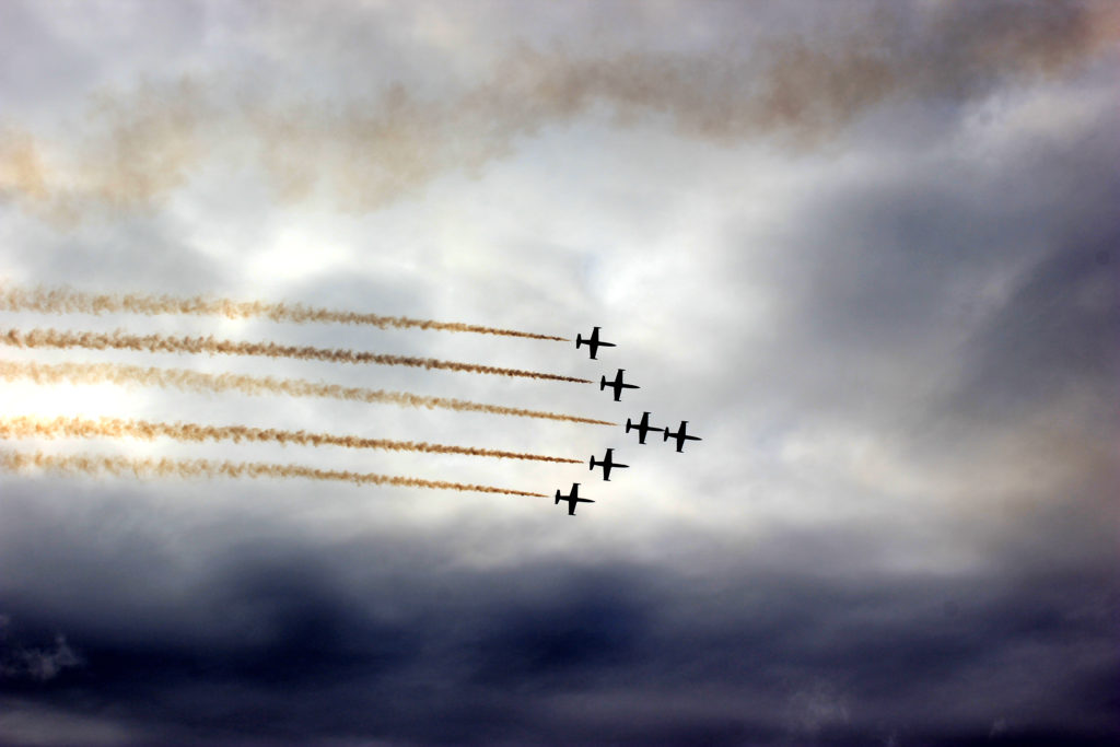
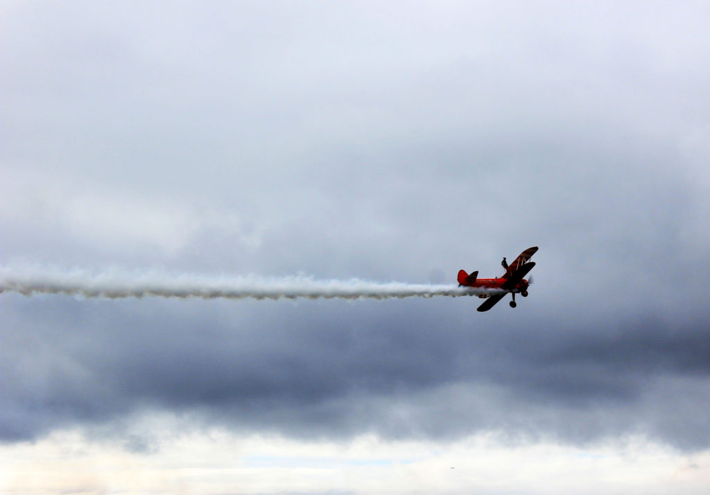
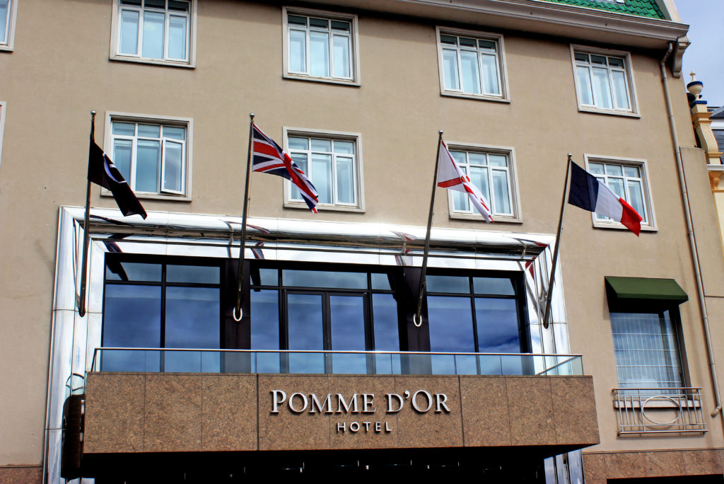
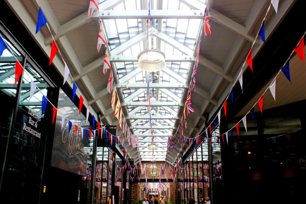
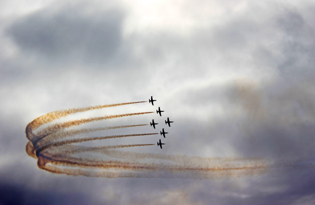
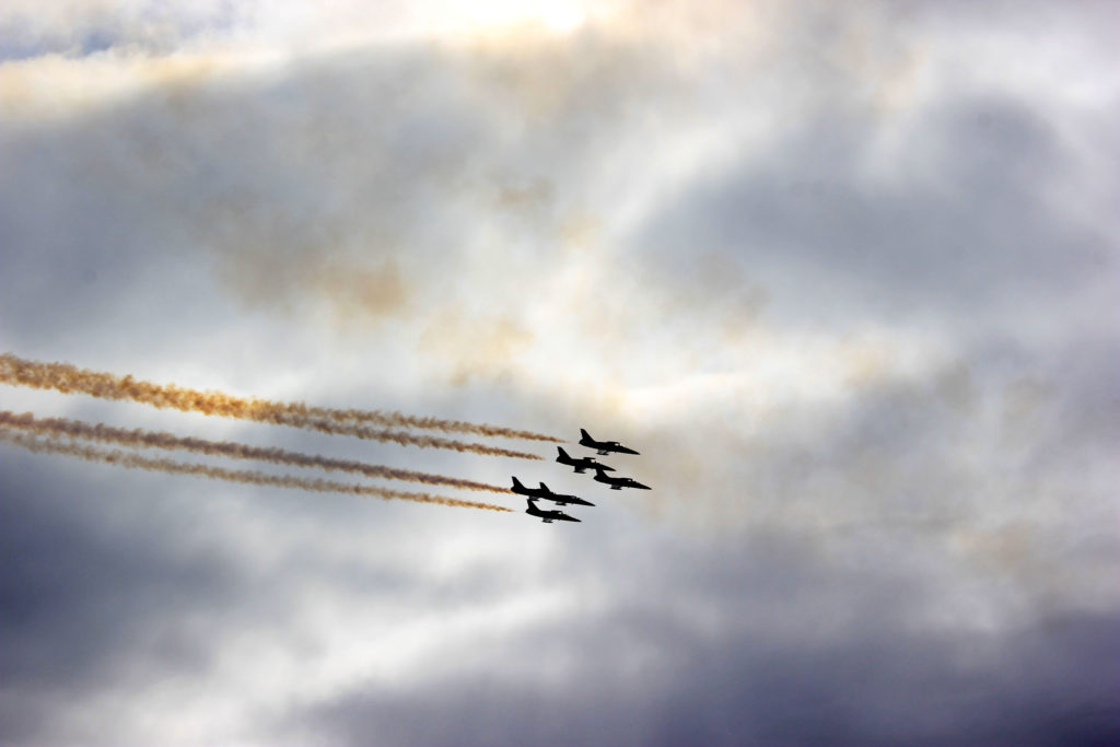
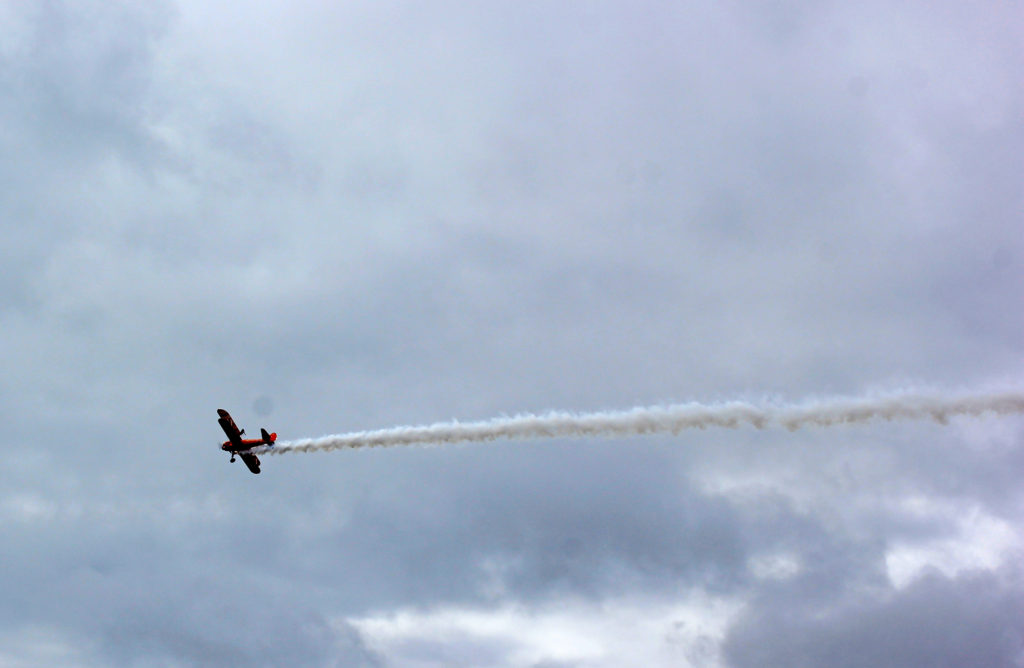
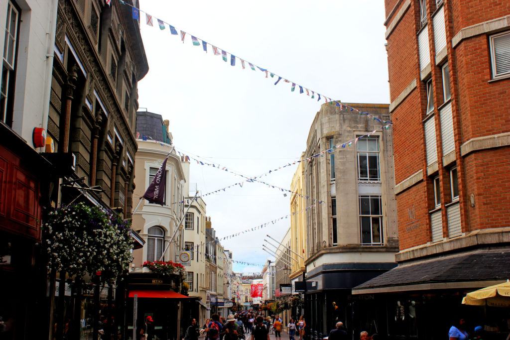
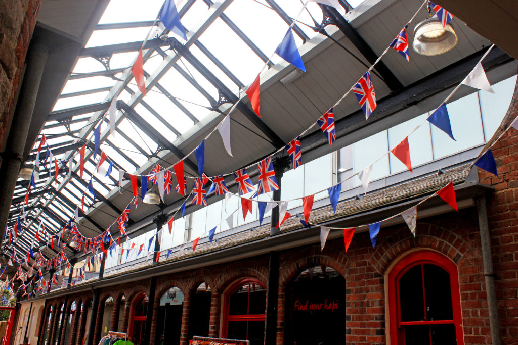
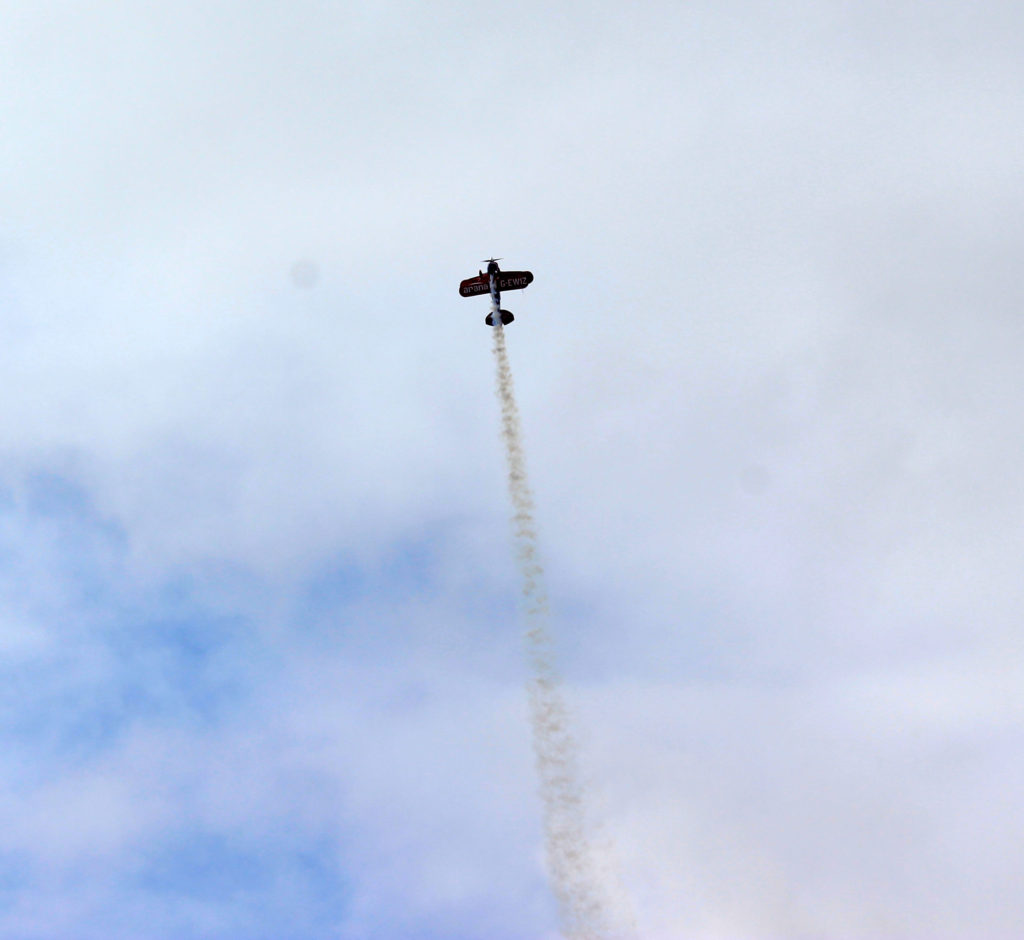
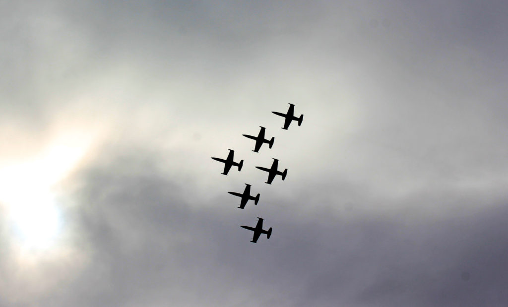
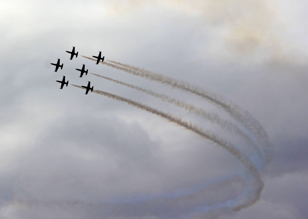
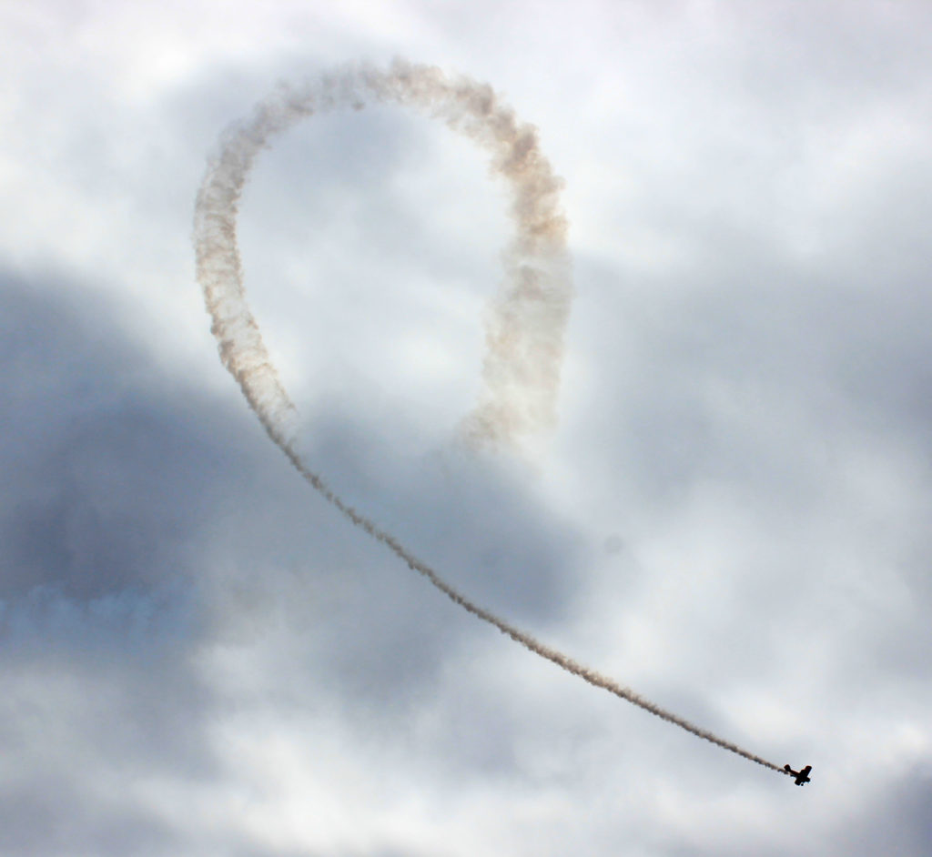
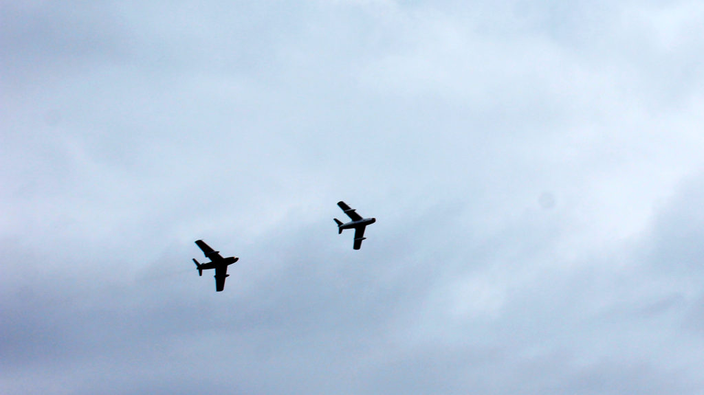
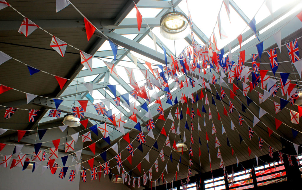
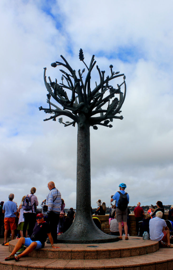
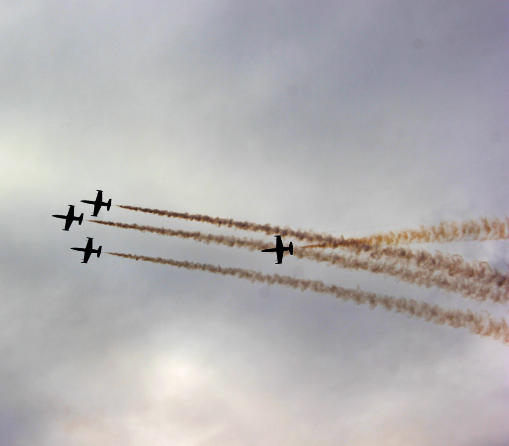
I used Adobe Photoshop to edit a selection of my air display images to achieve a professional style. The tools I mainly used were the cropping, levelling, brightness and contrast, shadows and highlights and saturation tools. Using a combination of these enhanced the colour and lighting of my images to ensure they are presented to the highest quality.







You have 5 minutes to research this image and present your findings as a group…
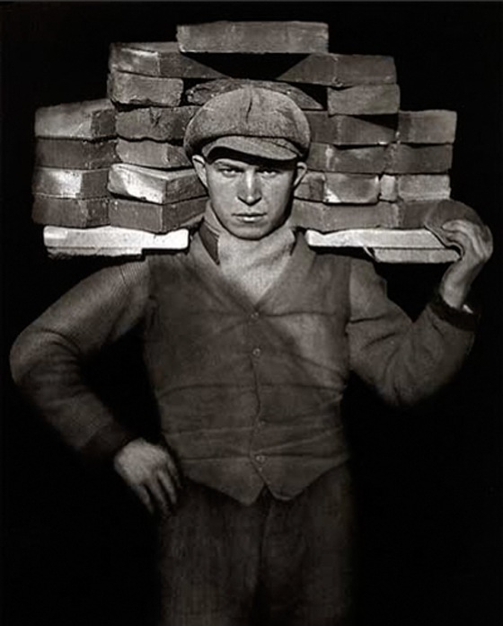
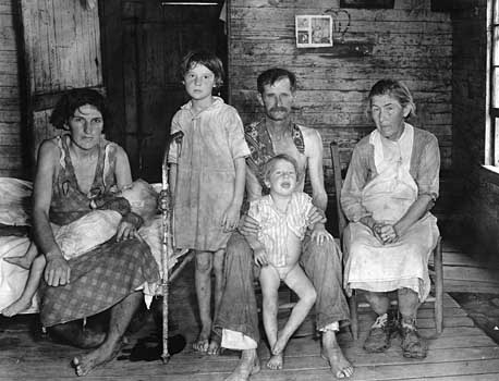
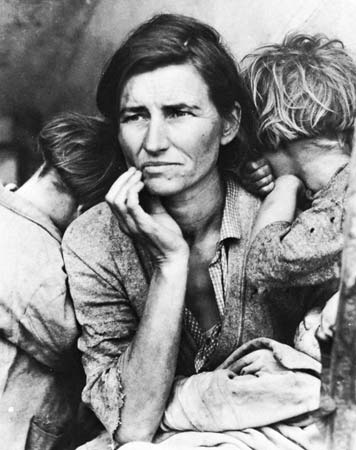
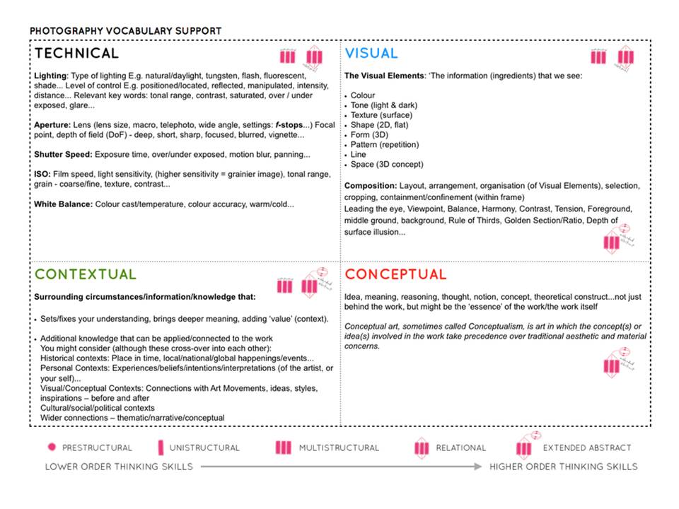
Select one key image and apply Technical | Visual | Contextual | Conceptual analysis


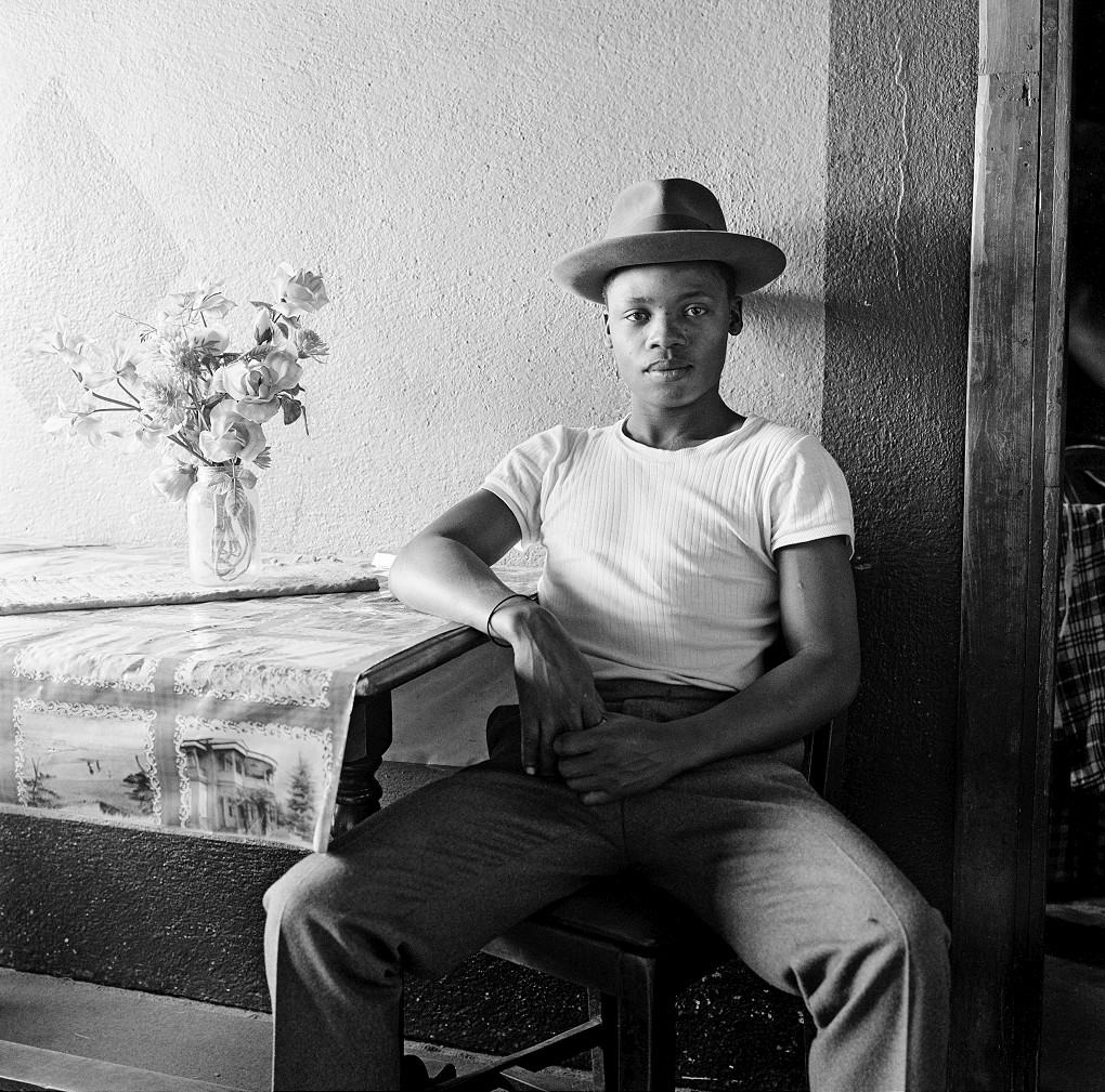
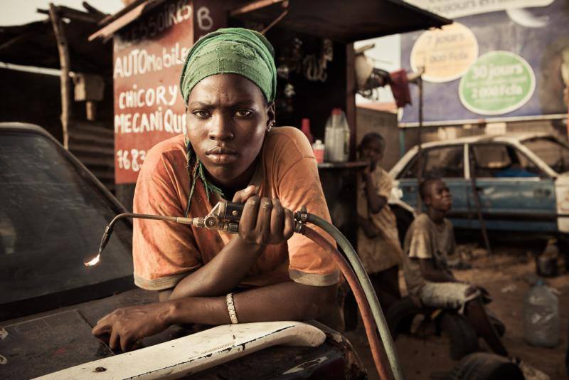
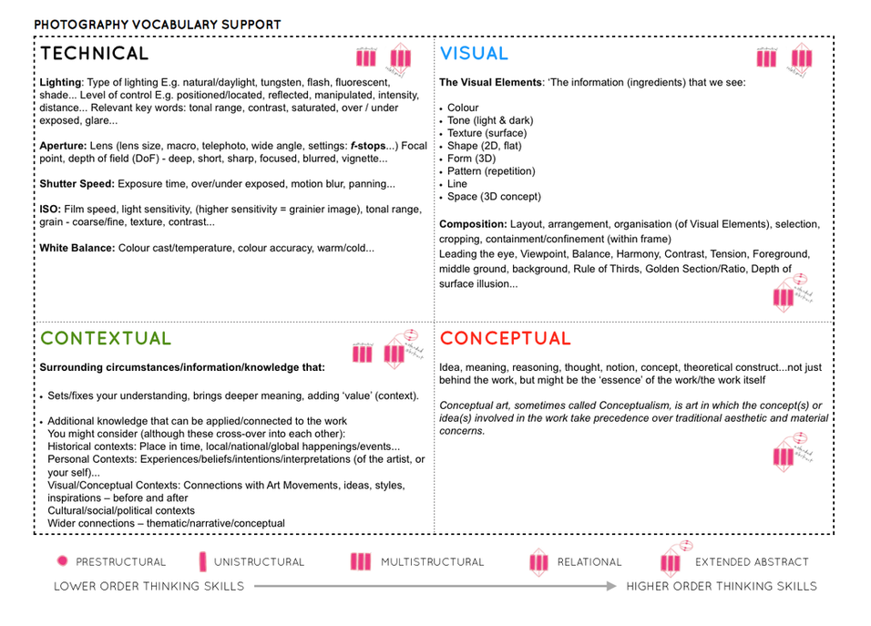


Remember to show your Photo-Shoot Planning and clearly explain :

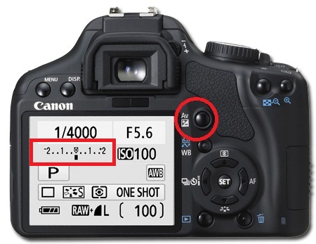
Please refer to this resource to help you navigate your camera’s function and settings. You will learn how to apply these skills learning to various photo-shoots over the next few months…and you should aim to provide evidence of these skills throughout your coursework.
Remember to practice and experiment. Use your eyes and look. The more you look, the more you will see. How you see the world will determine what kind of photographer you will become.
A camera is only a tool, and it is down to you to get the best out of your equipment by becoming confident and comfortable
https://canon.ca/CanonOutsideOfAuto/learn
You must experiment with each of these skill areas as we move through our sequence of photo-shoots. Remember to include / produce a blog post on each that includes evidence of your experiments and successes…
Remember to use What / How / Why / When when describing and explaining what you are experiencing and achieving with each of these…
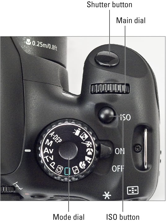

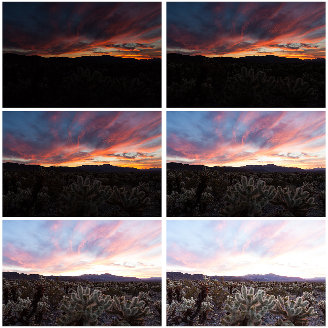
Many digital cameras include an Auto Exposure Bracketing (AEB) option. When AEB is selected, the camera automatically takes three or more shots, each at a different exposure. Auto Exposure Bracketing is very useful for capturing high contrast scenes for HDR like this…
…by taking the same photograph with a range of different exposure settings
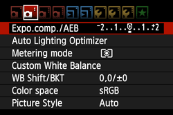
You can use Exposure Compensation to quickly adjust how light or how dark your exposure will be using these controls…

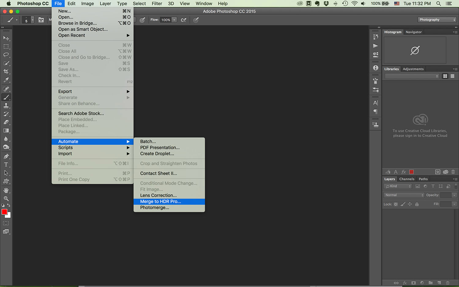
Then you can create your High Dynamic Range images by using this process in Adobe Photoshop…
Understanding Composition
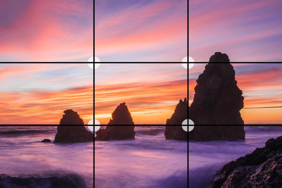
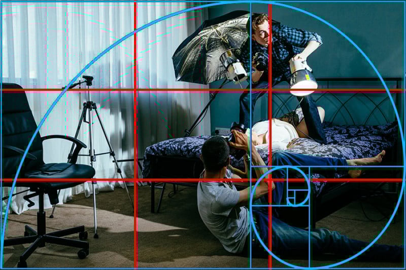
2. Fibonacci Curve
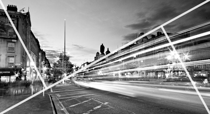
3. Triangles / angles / Golden Section
Cropping / framing

Understanding Lenses and Focal Length

Perspective and Depth


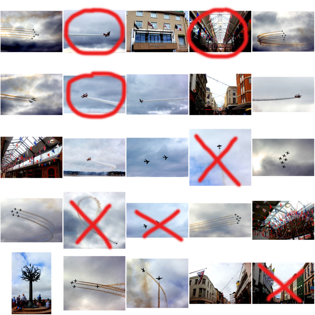
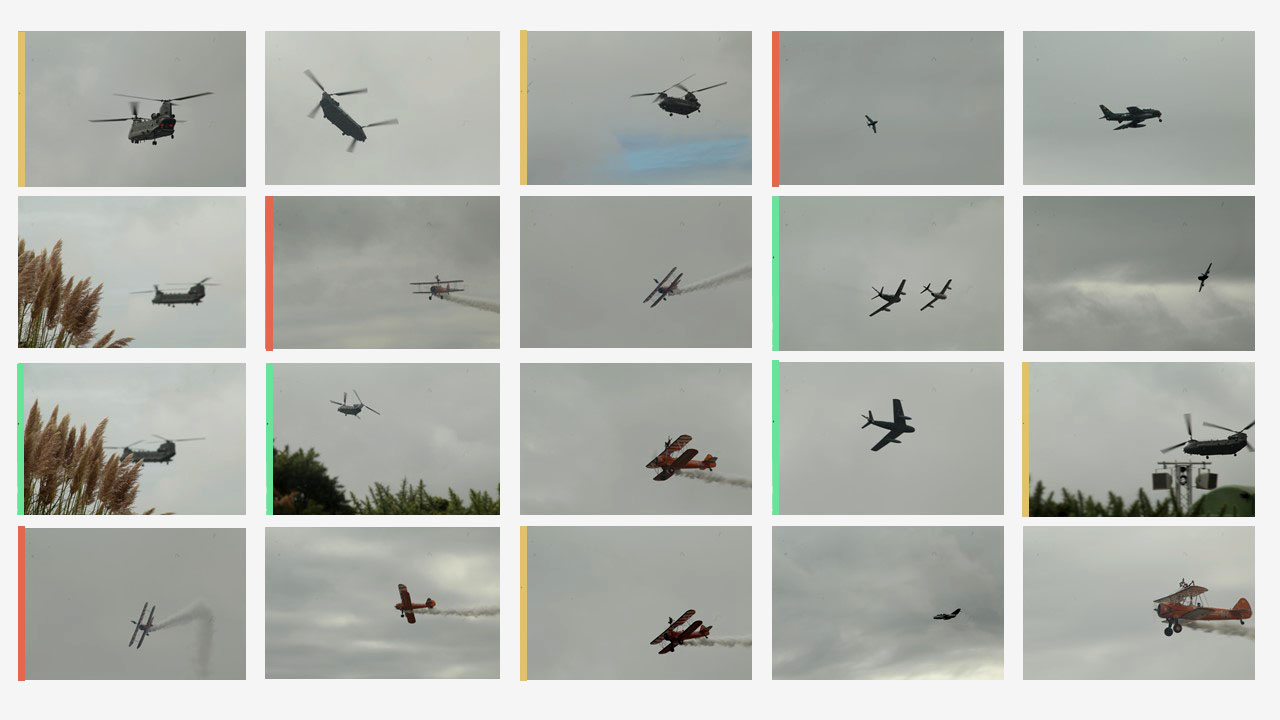
I have displayed a collection of my Air Display images into a large contact sheet using Photoshop, so I was able to compare each image and decide which ones were my best outcomes. I used the pen tool to cross and circle what I believe are the best and worst images in this series, and which ones I will be using again. My reasons behind the crossed out images were mainly to do with the lighting, lack of clarity, composition and view. For example, the planes were very far away, making the image unclear, or the positioning of them wasn’t aesthetically pleasing in my image.