All posts by Thomas L

Filters

Author:
Category:

ROBERT ADAMS

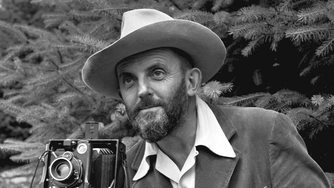
Image result for robert adams portrait

Not to be confused with the other landscape photographer, “Ansel Adams

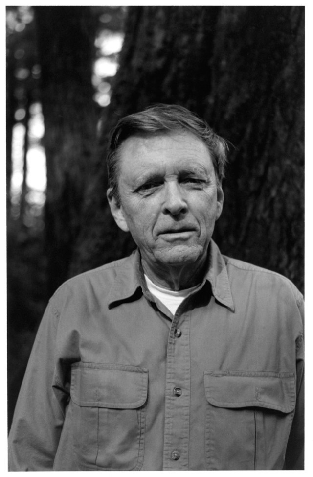
Robert Adams is an American photographer who has focused on the changing landscape of the American West. His work first came to prominence in the mid-1970s through his book The New West and his participation in the exhibition New Topographics: Photographs of a Man-Altered Landscape in 1975

Image result for ROBERT ADAMS

Robert Adams was born in Orange, New Jersey, in 1937. His refined black-and-white photographs document scenes of the American West of the past four decades, revealing the impact of human activity on the last vestiges of wilderness and open space. Although often devoid of human subjects, or sparsely populated, Adams’s photographs capture the physical traces of human life: a garbage-strewn roadside, a clear-cut forest, a half-built house.
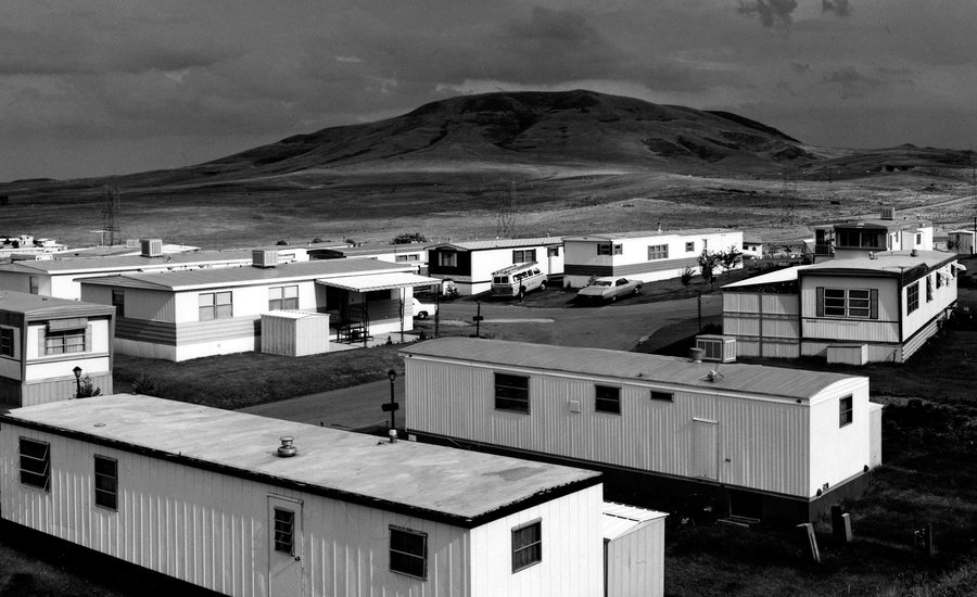
Image result for NEW TOPOGRAPHICS

An underlying tension in Adams’s body of work is the contradiction between landscapes visibly transformed or scarred by human presence and the inherent beauty of light and land rendered by the camera. Adams’s complex photographs expose the hollowness of the nineteenth-century American doctrine of Manifest Destiny, expressing somber indignation at the idea (still alive in the twenty-first century) that the West represents an unlimited natural resource for human consumption. But his work also conveys hope that change can be effected, and it speaks with joy of what remains glorious in the West in which he now lives and works in northwestern Oregon.
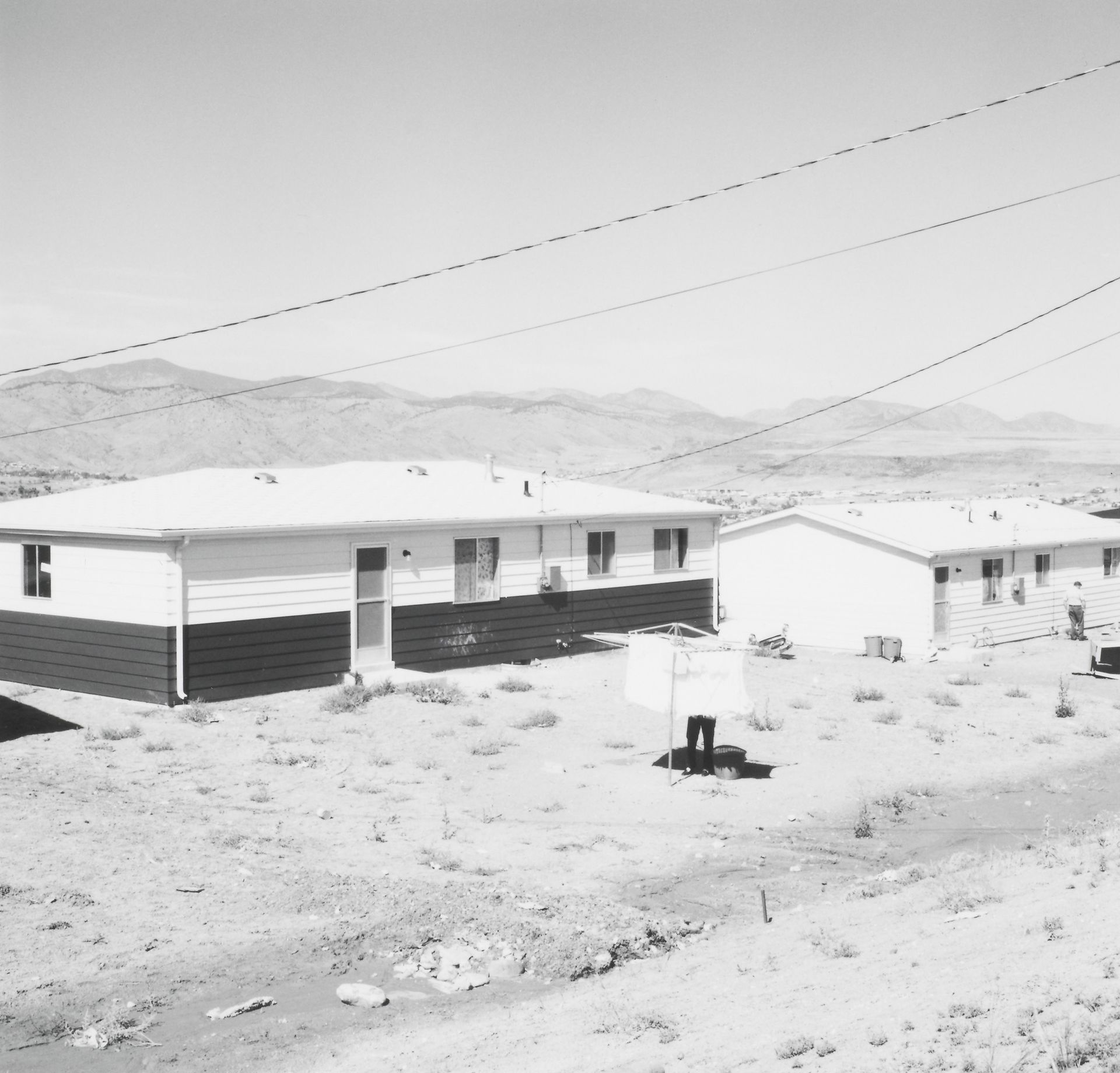
Image result for ROBERT ADAMS

Adams received a BA from the University of Redlands in California and a PhD in English from the University of Southern California. He has received numerous awards, including a John D. and Catherine T. MacArthur Foundation Award (1994); the Spectrum International Prize for Photography (1995); and the Deutsche Börse Photography Prize (2006). Major exhibitions include San Francisco Museum of Modern Art (2005); Yale University Art Gallery (2002); Denver Art Museum (1993); Philadelphia Museum of Art (1989); and the Museum of Modern Art, New York (1979).

Image result for ROBERT ADAMS

URBAN LANDSCAPE PHOTOGRAPHY

Image result for city landscapes black white

Urban landscapes today feature spaces that focus on preserving natural resources while creating environments that are inviting to human and wildlife populations. This is especially important in this time of global change. Urban landscapes must be designed to meet the needs of today and the growth of tomorrow.

TYPOLOGIES

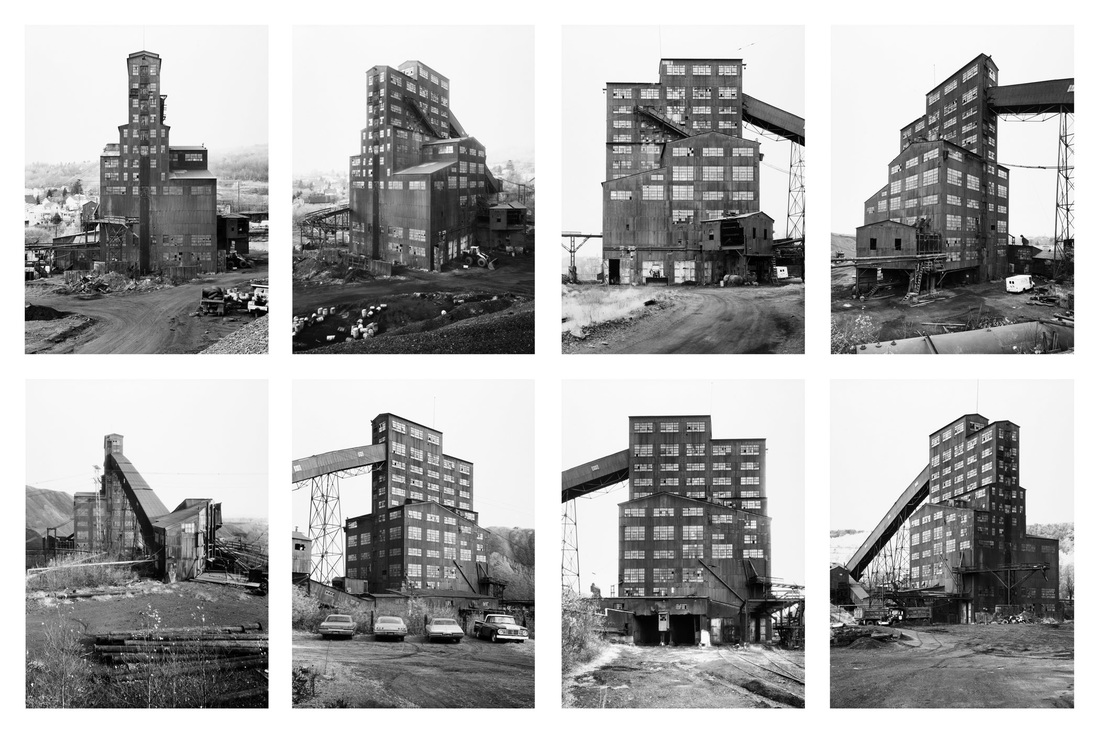
A photographic typology is a study of “types”. That is, a photographic series that prioritizes “collecting” rather than stand-alone images. It’s a powerful method of photography that can be used to reshape the way we perceive the world around us.

Image result for typology photography

One of the first photographic topological studies was by the German photographer August Sander, whose project ‘People of the 20th Century’ (40,000 negatives were destroyed during WWII and in a fire) produced volume of portraits entitled ‘The Face of Our Time’ in 1929. Sander categorized his portraits according to their profession and social class. 

Image result for typology photography

The term “typology” however, was first used in 1959 when Bernd and Hilla Becher began documenting their architectural photographic series. Depicting decaying urban landscapes, each photograph was taken at exactly the same angle, from the same distance, with the same exposure settings. With the aim of recording a landscape in flux, the Becher couple described their subjects as “buildings where anonymity is accepted to be the style”.

NEW TOPOGRAPHICS

New topographics was a term coined by William Jenkins in 1975 to describe a group of American photographers (such as Robert Adams and Lewis Baltz) whose pictures had a similar banal aesthetic, in that they were formal, mostly black and white prints of the urban landscape.

This term would later go on to be a type of landscape photography under the category of urban photography as it explores as it captures human development and expanding urban landscapes showing scale and detail about cities and populated areas.

Image result for NEW TOPOGRAPHICS

Some of the photos above show natural landscape behind the urban man-made structures which shows contrast in man/nature, often showing that mankind is expanding too fast and destroying the Natural Landscapes. This shift from Natural Landscape Photography to Urban Landscapes showing natural elements (Natural Landscapes in the background) shows how over time the world has and could well become more/overly urbanized if little is done to slow or halt man from expanding cities and urban areas across the many beautiful Natural Landscapes that Photographers like Ansel Adams captured so greatly. These images als show a juxtaposition because of the ordinary everyday architecture that is placed in amazing beautiful scenery. This could be controversial because of the personal perception of the images.

ROMANTICISM DESIGN AND OUTCOMES

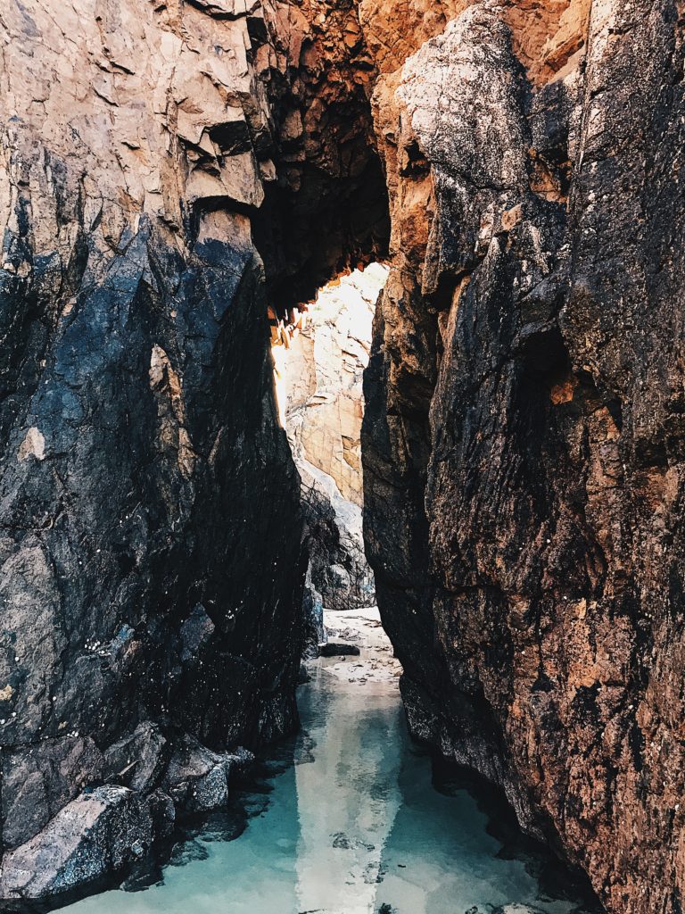
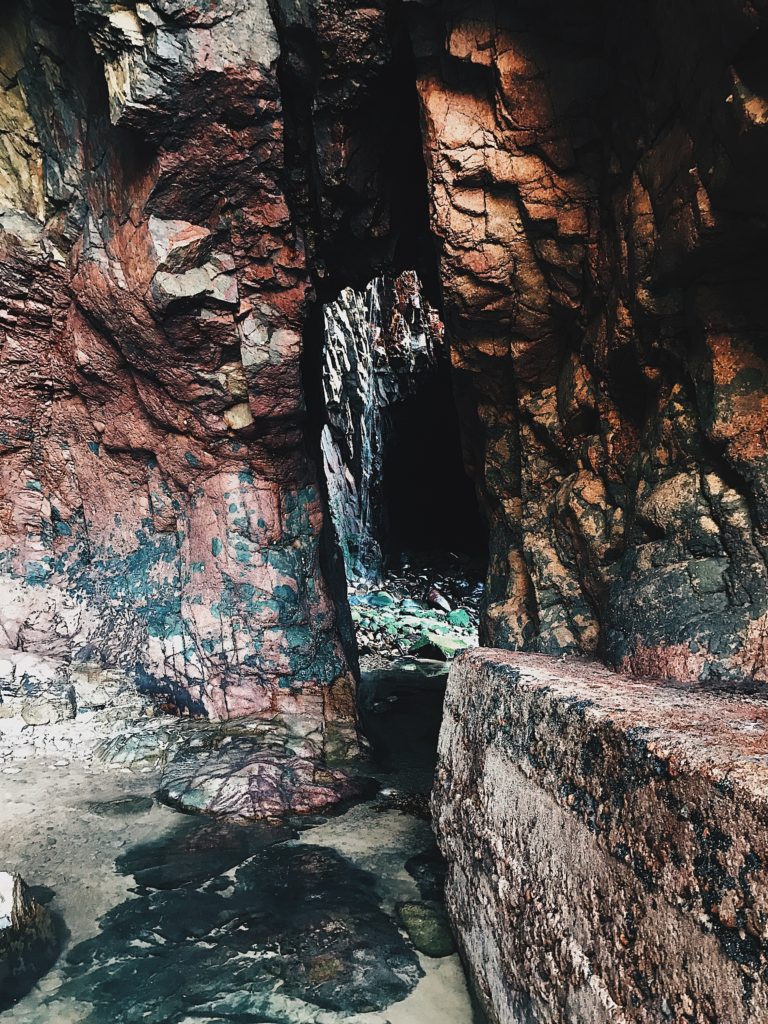
Processed with VSCO with hb2 preset

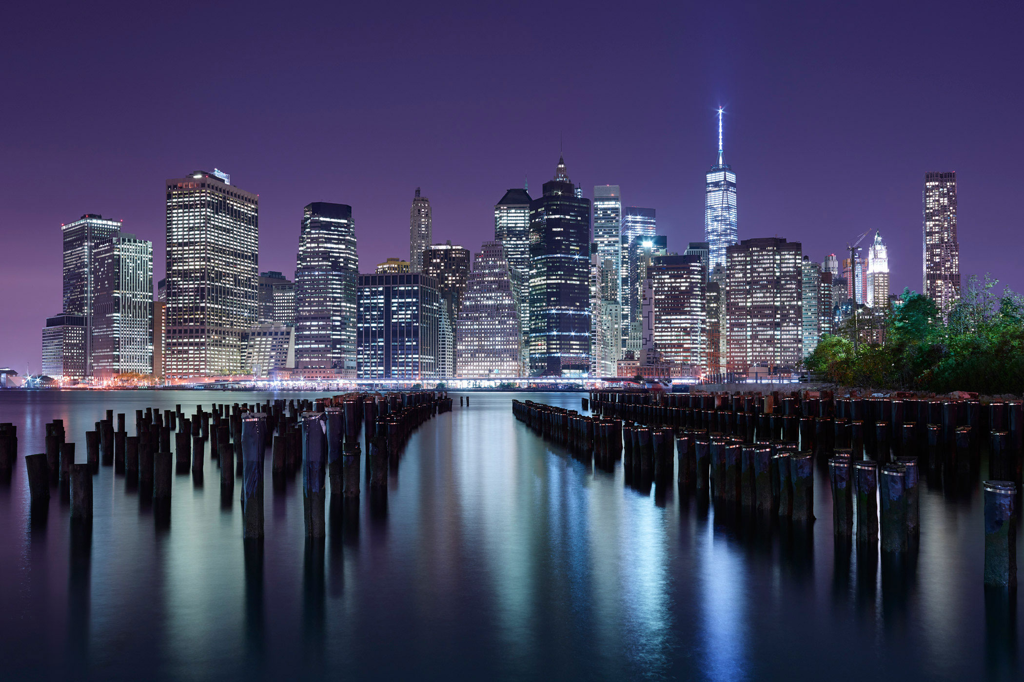
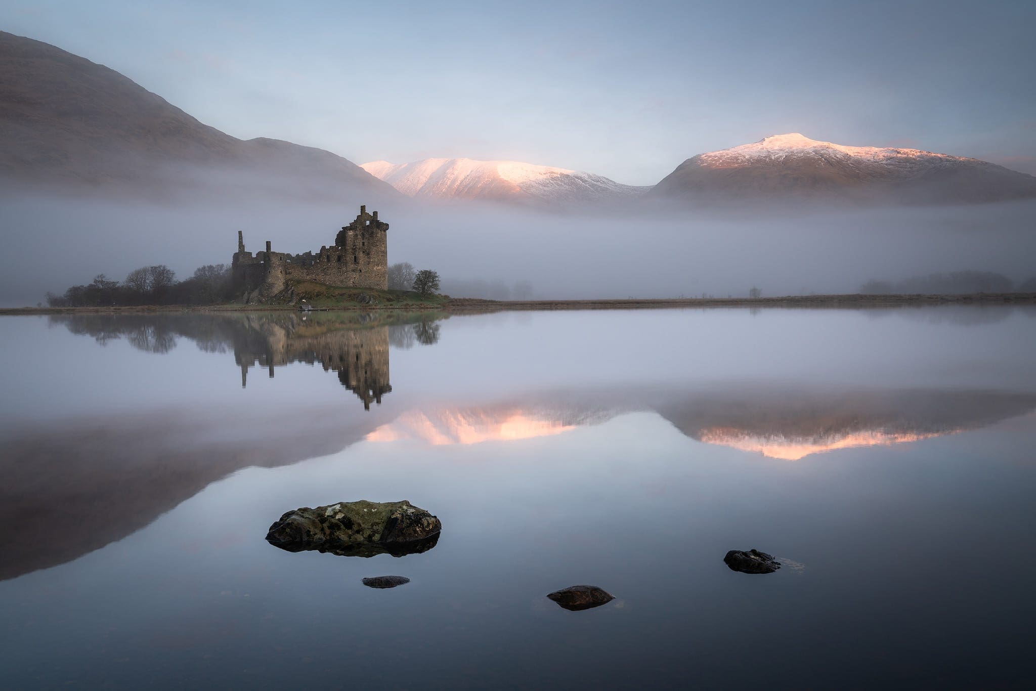
With these photos, I used the VSCO app and altered them in many various ways. For example, in all three, I edited them using a filter named ‘HB2’ which helped bring out the blue tones within the image, giving them a cooler look. Furthermore, I cropped the photos in order to best fit around the focused parts of the image, and then I centered them and adjusted them in order to create a more symmetrical and composed image composition. To add to that, I then increased contrast to add to the sharpness within the photo, then I lowered exposure to give it a darker, greater contrast look as well as increasing the depth and intensity of the shadows to help make the rocks stand out more with their lighter yellow/pink tones.

Overall, I’m very pleased with my final outcomes as not only do they look of a sufficient resolution, but also have symmetrical compositions that in my opinion are pleasing to look at. In addition, the photos link in well with some of the artists I have researched, displaying careful thought and planning of processes involved in order to achieve capturing these photographs.

EXPOSURE BRACKETING

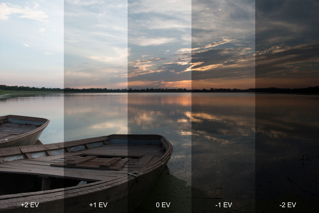
Bracketing is the process of photographing a group of the same image however changing a single setting such as the exposure or ISO for each picture taken.

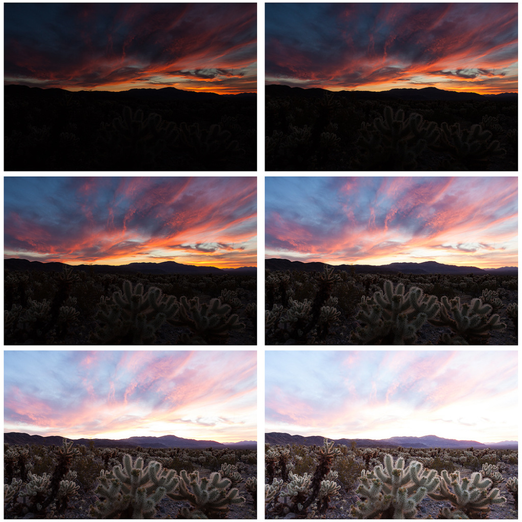
The human eye can detect and process a larger range of light than any camera could at a single exposure. This means that Longer/shorter exposures alongside the combination of multiple frames can bring cameras, and the images they produce, up to the similar complexity of the human eye and in some cases, can even have an advantage over human eyesight. 

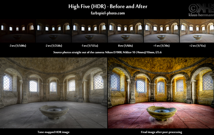
This technique is essential in photography as the all the different exposures from all the separate shots highlight colours and detail in certain areas of each, but when combined together, can create unrivalled contrast with a large range of depth in tones throughout the image by blending in all the correct exposures from different shots which gives the image ‘high dynamic range’ or HDR.

MANUAL EXPOSURE BRACKETING

Exposure bracketing is most commonly carried out by adjusting either the ISO or the shutter speed of the camera, which is what regulates the amount of light that enters the sensor of the camera, by timing how long the shutter is open for, creating different exposures.

ISO and Shutter Speed settings on digital display of a Canon Camera, (can be found on swivel wheel at the top of many typically older cameras).
Additionally, exposure bracketing is best achieved with the use of a tripod due to the risk of camera shake when using a slower shutter speed, which can result in blurry images that do not compliment each other when blending or merging when exposure bracketing. This is because blurry images aren’t useful to edit or pleasing to look at, as well as the problem that subtle differences in the images’ focus, or field of view may alter the images too much to undertake the exposure bracketing successfully in the first place. Tripods thus make sure the camera’s view is stable, preventing trouble later if you want to combine frames.

Tripod in use

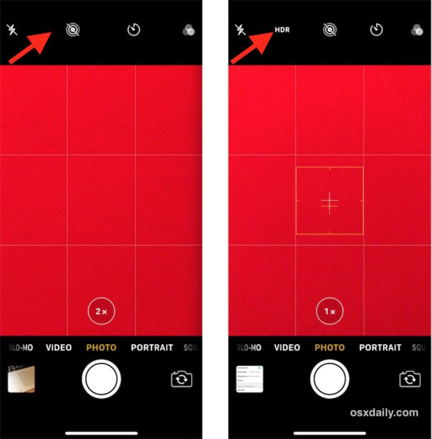
Most modern phones and cameras can achieve HDR images instantaneously by automatically gathering many different exposures of the same picture simultaneously, minimising photographic skill required both in photo shooting and editing as the exposure bracketing has been achieved with little-to-no effort.

Auto Exposure Bracketing on a Canon camera.
HDR setting as seen on iPhone’s default camera app.

HDR can be achieved by using various software, such as Lightroom, Photoshop or other third-party software. A benefit of using HDR is that it’s a fast process, allowing for the completion of bulk work at a fast rate. It also involves the technique of ‘tone mapping’, which allows you to control the range of shadows and highlights. Landscape photographers often rely on and benefit from HDR. However, if HDR is done incorrectly it can result in images that look ugly, with harsh, high contrast colours and tones. Additionally, the finished product may also be lower quality than images produced through compositing. 

An example of ‘Ugly’ HDR with too high contrast and harsh exposures.

COMPOSITING

Compositing produces images that are much more realistic, high quality and provides more control over the range of tones within the image. A downside is that it’s extremely time consuming and requires a basic understanding of layers and layer masks. 

ROMANTICISM PHOTO SHOOT PLANNING

WHAT:

Landscape environments highlighting the theme of romanticism.

Cliff faces, caves, woodlands, sea, sand (beaches), hills, fields.

WHEN:

Late afternoon, leading into evening – avoids harsh light from the middle of the day and allows for a different atmosphere and setting when the sun begins to set.

WHERE:

Possible locations include:
Sorel point, L’Etacq, Grosnez, Plémont Beach, La Corbière, Blanches Banques, La Pulente, Bouley Bay, Bonne Nuit Bay.

WHY:

I’ve chosen to do this photo shoot with these locations to relate it back to the research and topic of Romanticism within landscape photographs we’ve been studying. I’ve chosen a variety of natural environments for my shoot in order to cover the different emotional responses that come from the power of nature and the sublime.

HOW:

Equipment:
-Phone
-Tripod

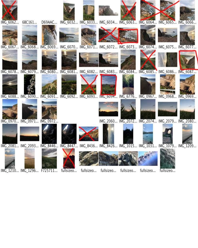
Use of a tripod to help keep the camera stable while using slower shutter speeds as well as keeping the camera view the same while exposure bracketing (to create HDR images). Additionally, I will be experimenting with different exposures to create a contact sheet of images to use for exposure bracketing to produce HDR images.

I’m aiming to purposely over-expose and underexpose a group of images to build up layers to produce HDR images. It will be beneficial to check the weather forecast (Wind strength, sun set, tides etc.) to work out the optimum time to photograph certain locations to maximize the effect in my photos.

ANSEL ADAMS IMAGE ANALYSIS

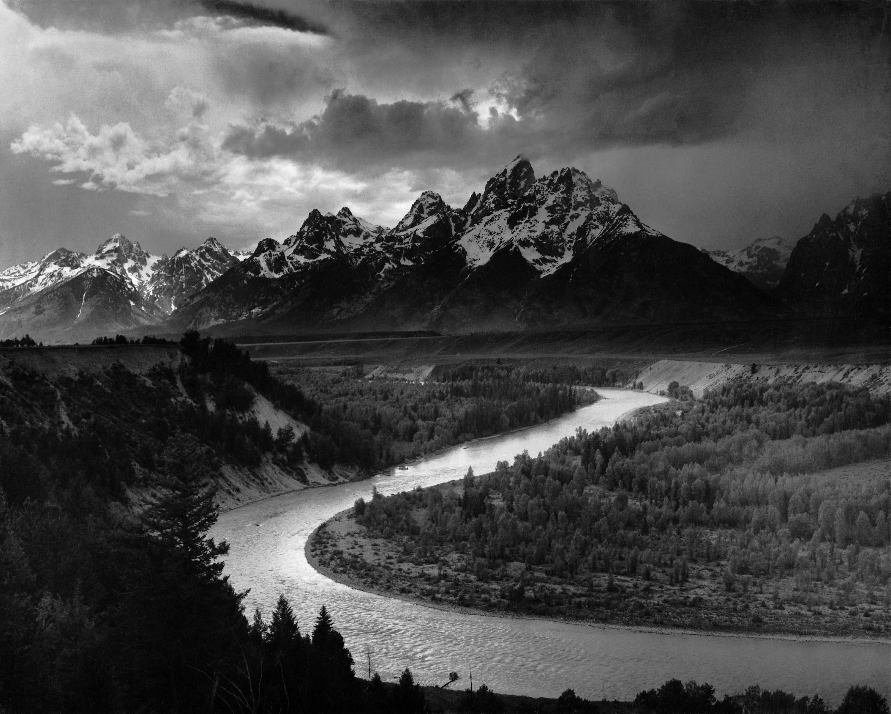
The Tetons and the Snake River (1942) Grand Teton National Park, Wyoming

TECHNICAL

Adams uses grayish colours ranging from deep, dark blacks to more forgiving natural whites as was created with help of his own light grading system in order to implement a grey-scale image. He uses natural lighting extensively, accompanied by a high tonal range to present a highly contrasted image that highlights the darker areas with use of low exposure, however still retaining detail throughout the image, even in the dark shadows as a result of the dull, overcast skies above.

This contrast/tonal range as perceived in the photo helps add an intense, fierce tone, adding to the idea of the mountains seeming rather formidable which in turn gives the landscapes an austere and intimidating perception, helping demonstrate its size and beauty to the observer effectively. The high tonal range additionally causes the sunlight reflecting off the river to stand out due to its bright grayish colour, as well as the abrupt increase the shadows in the dark rock on the mountains and the darker trees in the foreground which create this extraordinary contrast.

To achieve this, he has most likely used a tripod to help keep his photos stable in order to avoid blur and loss of focus in his images, which we can see has worked wonders. As well as this, he probably used a slow shutter speed in order to capture the significant detail and to be able to focus the entire image with both the foreground and background being of high resolution, creating the high tonal range that can be distinguished here.

VISUAL

This image has a plethora of different textures as can be observed from the bright, glimmering water in the river to the dark, rugged, hard rock mountain range in the background as well as the trees and scrub-land which subtly break up the contrast. Furthermore, the overcast skies made up of grey clouds, just like the trees, create a balance of colour and shades throughout the image and is a perfect example of the theme of nature and its beauty which is what Adams as well as many other romanticist photographers strove to photograph.

CONCEPTUAL

The ideals of Romanticism in art and photography are that nature is powerful, beautiful and unpredictable. This is highlighted by the sky with occasional breaks where sunlight pierces through as well as the angelic light coming from behind the mountain, which imposes over the whole scene and creates a sense of superiority, emphasizing it’s bold and striking appearance.

CONTEXTUAL

In context, Adams himself spent a large portion of his life taking photographs in the West of America, especially in Yosemite and other parts of the Sierra Nevada mountain range. This was the core to what inspired him to excel in his photography, representing the untouched landscapes and the power of nature found in these places through his unique photography and his desire to show others, as best he could, the true essence and awe he felt when in such areas by capturing what he saw through his very own eyes.

Adams was also the co-founder of Group f/64 for which he invented the Zone System, (a technique of translating light into specific densities onto negatives and paper), giving photographers better control over their finished photographs. Adams is also known for promoting the idea of ‘visualization’, in which the photographer ‘sees’ in their mind’s eye the final photo before it is taken. This helped the photographer to achieve all of their desired aesthetic and mechanical effects in his photography as outlined previously.

ANSEL ADAMS

Ansel Adams was born in San Francisco, California in February 20, 1902. Initially, he was first drawn to landscape photography when going out to national parks where he decided that he wanted to capture the way he saw the beautiful landscapes and wanted others to be able to envision what he saw first hand .

At the time of which Adams was taking these images, there wasn’t the technology to allow for any sort of compact form and so he had to hike up mountains while carrying a multitude of heavy, bulky equipment just to capture his ideal/perfect image hence why Adams’ work is very famous to the present day as his work separates him from other photographers of the era due to his incredible attention to detail as well as the perseverance to capture them throughout his images.

Adams also created his own light grading system which provides much more depth in his images by creating different light levels in the photograph resulting in contrasts within the image as your eyes react to the different lights.

INTRODUCTION TO LANDSCAPE PHOTOGRAPHY

“Landscape photography shows spaces within the world, sometimes vast and unending, but other times microscopic. Landscape photographs typically capture the presence of nature but can also focus on man-made features or disturbances of landscapes. Landscape photography is done for a variety of reasons” – Wikipedia

Landscape photography explores places in the world that are usually seen as continuous and never ending by implementing sublime, detailed landscapes in conjunction with beautiful skies that set a mood with a phenomenon known as pathetic fallacy. Some photos may have dark, dull and high contrast skies made up of dark blues, grays and blacks to set a negative mood/tone, whereas others may be brighter and happier in tone with the implementation of natural sunlight, often being used at dawn or dusk when the light is less harsh and makes for cooler, more vivid colours with hints of yellow, orange, red, pinks and purples adding to the photos colour palatte. This makes it possible to tell stories through landscape photography, often having many underlying meanings for the observer to decipher.

Most of the time, this type of photography is meant to show the presents of nature, but it can also contain man-made features that have disturbed the nature such as city skylines.

However, landscape photography doesn’t normally show much human movement and mostly focuses on the pure signs of nature and extreme weather. Photographers are inspired and challenged by the beauty of nature ever since the begging of the landscape photography up to this day.

WHAT IS ROMANTICISM?

The Romantic era was an artistic, musical and intellectual movement in Europe towards the end of the 18th century. Romantic era lasted approximately from 1800 to 1850. The movement of art/intelligence showed intense emotions such as terror and fear. All of those emotions were shown by the perfection and the beauty of nature.

PHOTO MONTAGE DESIGN AND OUTCOMES

PHOTO ONE

I originally started with one of my favorite photos from my bunker shoots as part of my summer task. The photo has a lot of potential thus creating many ideas for me to experiment with.


Firstly, I used the quick selection tool on Photoshop to quickly select the foreground with the bunker, and remove the background, mostly made up of sky. Then I added a layer underneath the bunker image with Nazi propaganda as seen above. The subtle yellow contrasts really well with the black and white foreground, and the positioning of the photo with Hitler’s eyes just peaking above the bunker adds a sense of style that makes the image seem “living” and thus come alive, bringing out this comedic effect.

Then, I started to try a different technique, trying to paste an image off the internet and “skewing” the image on Photoshop in order to make it look realistic and as part of the wall, sloping with the angle at which it comes across on the camera.

Here, I improved on the last photo and tried to create this abstract and unique design, using images of Nazi propaganda posters off the internet, pasting them onto this image and skewing them, trying to compliment the angles of the walls in order make them look as part of the bunker while trying my best to keep the original shape of the bunker and cover every visible wall/angle possible.

PHOTO TWO

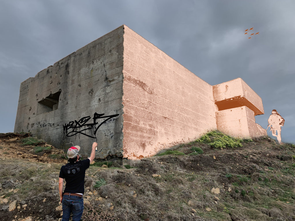
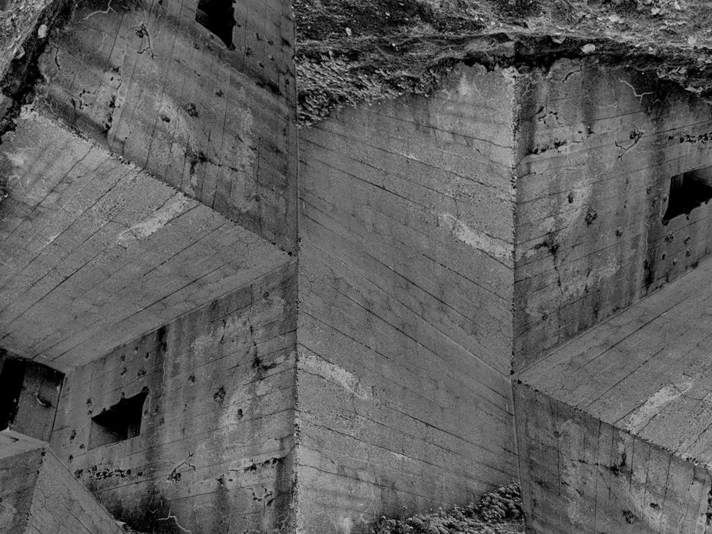
I now chose a new photo to experiment with and ended up with this rendition after much experimentation. I like it as it has that typical photo montage style as well as incorporating many different themes all in one. The graffiti on the side of the bunker wall took a while to edit, especially considering that I had to “skew” it on Photoshop to best match the angle of the wall, (the same process used in “photo one”). Additionally, I duplicated the original layer and added a new colour to it, and then removed the other side with the quick selection to create a sense of time gone by and a contrast as seen in the image, highlighting the differences between the past and present.

After that, I tried a new style of photo montage with a the same image as “photo two”, where I copy and pasted the same image and try to create a new image out of it. I experimented by rotating duplicated layers of the same image in different ways until I ended up with this photo, that is rather confusing yet pleasing to look at, a bit like an optical illusion… it’s quite hard to make sense of, and that was the aim.

A bit of altering later I ended up with a slightly different image.

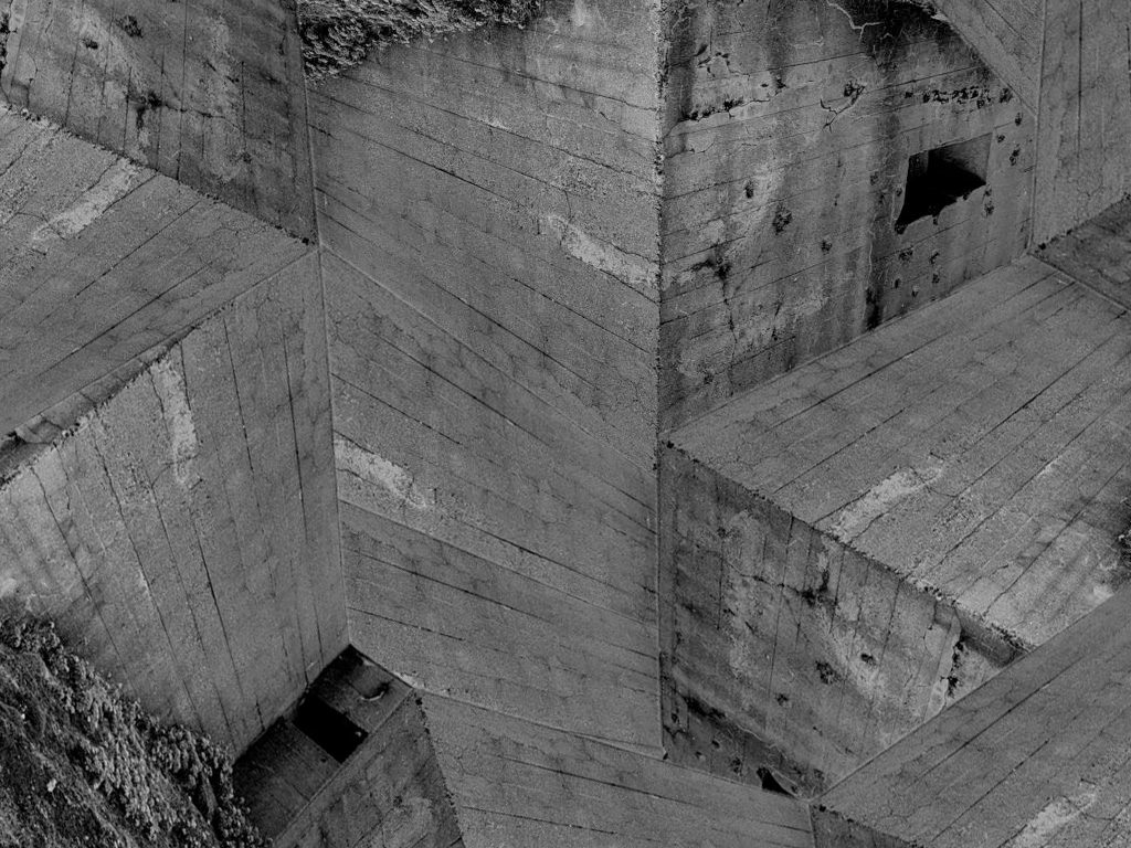
Lastly, I flipped the photo and changed it ever so slightly just to maximize the amount of concrete visible on screen, however keeping some of the bunkers unique and original features such as the observation and bullet holes meanwhile keeping the photo as aesthetically pleasing as possible as I had very little to work with.

Overall, I enjoyed this new element of photography, conducting some photo shoots, new styles of editing and researching the history and evolution of the photo montage style. Throughout the task, I think I have successfully experimented with different processes of editing, using lot of trial a error to end up with the final images I have ended up posting on this blog. Personally, bias aside, I think my photo montages successfully capture a sense of “remembrance” and the war-themed genre as a whole, imitating the work of Hannah Hock, Raoul Hausmann and other influential Dada and photo montage artists. The theme of these photo montages that we researched and imitated often related to pre and post war ideas, which was the theme of the topic and a good foundation for me to build up on as I already had plenty photos from previous photo shoots for similar themed tasks such as my AS Summer Task.