All posts by Thomas L

Filters

Author:
Category:

LOVE AND REBELLION: FILM MANIFESTO

3 WORDS

Irrational

Everyday

Collaboration

Intentions:

Our idea is to create a film which explores the impact of coronavirus and lockdown on teenagers. The film is going to show the impact on all teenagers and their mental health. It is not going to follow one character/ protagonist in particular as it will act as a way to show the impact on all people in our age group. The film will be based on our experiences and that of our peers.

We are presenting the theme of rebellion through the use of anger we are going to portray in the film, showing the overall wanting to rebel and ignore the seemingly pointless government rules. Frustration and irrationality our some of our main themes in the film.

As the film progresses we show the change in society through the eyes of teenagers. Jake and myself both want to tackle this theme as it is a very personal topic to us both as it greatly impacted how we lived our lives this year and still does to this day.

Sound will be extremely important in our film as we plan to have much of the pace, emotion and setting reliant on the atmosphere we create with the audio. We are going to do lots of sound scaping and layering.

Story Board

Start:

The pandemic starts – Film loads of news sources from different peoples perspectives (off of phone, tv, laptop etc) – Stitching loads of news articles together (overlaying sound)

End segment with quote from Prime Minister: “The Nation is going into lockdown” – quick into to black (thud)

Part 2:

Record empty and messy streets/ roads (dystopian theme)

Record peoples heads watching TV (no faces)

Person doing push ups in corner of room (bored idea, dark lighting)

Amazon package arrives … unboxing

Making coffee and biscuits

News quote: “restrictions being eased” – again from TV or phone

(SLOW DOWN PACE HERE) opening front door, zoom into person seeing chest relax (one shot – follow them getting into the car, zoom into dash then drive off as zooming out.

Part 3:

Film people socialising

People hugging

Pubs, people drinking again

Busy streets in town (timelapse)

Cars + bikes driving on the roads (The Audi, fancy while driving shots – make sure not to have too long of a clip of driving)

Ending:

Film someone looking at their phone watching cases go up on the rise again…. fade to black.

Editing

Visual:

The majority of the video will have a grey, dull atheistic to it, giving the overall film an impactful and negative effect. The video will be used to show the impact of the pandemic on teenagers using a lot of Jake’s and my own experiences. The shots will be taken on darker days with a naturally grey tone or at night. The dark colours act as a metaphor for the negativity the pandemic has brought.

The film we be shot, mostly free hand on a Nikon DLSR camera. We are shooting the film free hand as we want to capture a natural and more relatable documentary style film. However some shots will be taken on a tri pod, perhaps even a gimble, using props like skate boards to get straight panning shots if necessary.

The shots will be moving images not still images.

None of our models/subjects in our film will show their face. We want the film to appear anonymous and able to relate to anyone. A large focus will be on the behaviour of a person, their hands and their actions.

The film will be cut scenes, flashing through one another, possibly only having screen time for a seconds rather than one continuous shot.

The narrative is a cyclical narrative, as in it starts how it ends: Someone looking at their phone watching the news – the cases going up.

Sound:

Sound is going to play a very important role in the film with much of the pace, emotion and setting relying on the audio. We are planning to use lots of sound techniques and lots of audio layering. This is because by doing this will be able to create atmosphere in the film, such as on an empty street with just the sound of the wind or the sound of laughter and chatter in a pub or resturant.

The sound is also going to be used to portray some of the most impactful events over the past year and we will be using audio clips from new reports, radio broadcasts and other media in our film, (such as the lockdown announcement on the news). The sound will provide the most change and contrast in the film and will impact the visual element the most, making the film much more impactful and personal on the viewer.

We will not be using music in this film, unless it fits the environment but even then it will simply sit in the background and not the main focus of the scene.

It is likely we will be using audio from the website ‘freesound.org’, from the clips but mostly, specifically recorded sounds to add into the video. This will make the video seem much more professional than just using audio from the clips. This also gives us the opportunity to remove wind noise. For example clips such as the empty street clip we plan to capture will have no audio from the original video as that part of the film will be silent.

Title Ideas

The New Normal

Changed

A Teenage view of the Pandemic

Guidelines

Lockdown

Roles

Producer: Thomas Le Maistre and Jake Dupre

Photographer/Videographer: Thomas Le Maistre and Jake Dupre

Editor: Thomas Le Maistre and Jake Dupre

This film is a collaboration of roles and effort.

NARRATIVE AND DESIGN

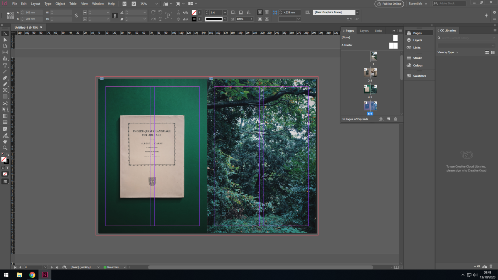
Here I will guide you through my thought process and why I laid out my Zine the way I did, explaining context and reasoning behind each and every photo.

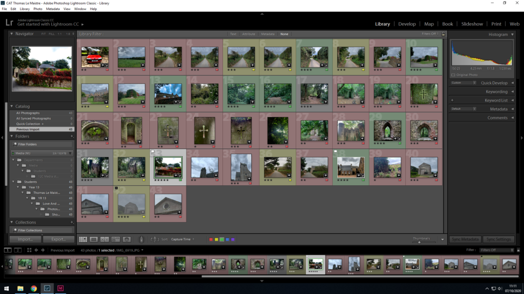
In all my three photo shoots, for my first editing process, I used the 5 star rating feature of Lightroom Classic CC to rate all my photos. Then, based on these ratings that i gave my photos, i decided whether they’d be used or not by filtering through using the p key on the keyboard to approve photos as demonstrated by the small white flag in the upper left hand corner, and alternatively used the x key on the keyboard to disprove photos as shown by the black x symbol in the upper right-hand corner.

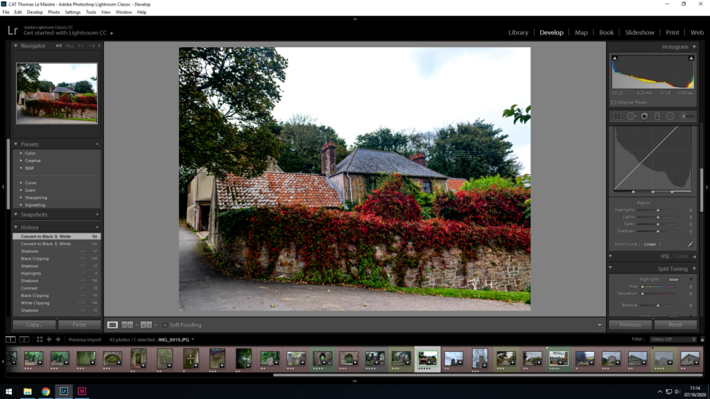
After I chose my best set of images, I proceeded to edit almost every aspect of each of my chosen photos with the ‘Develop’ tab as can be seen in the photo above to the right-hand side. Here I could edit the exposure, contrast, blacks/whites, shadows and highlights of each and every photo, also adding a darker border in the corners known as vignette to draw the eyes towards the centre of the photo highlighting the subject, whether it be a person, object or building.

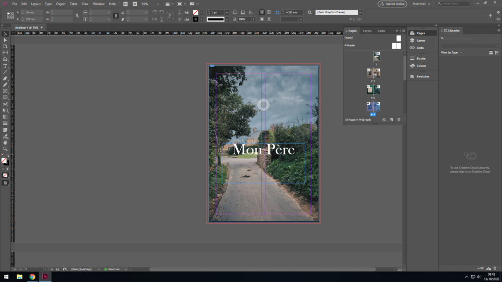
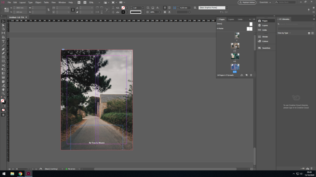
For my front cover, I needed a bold and eye catching photo, however not too “in your face” so to speak. I wanted to go for a more chilled out, relaxed, nostalgic vibe, nothing too abstract or aggressive as that doesn’t fit the story of my zine very well. The photo in question had been chosen mainly because it is very significant as it was the house my father was brought up in from a young age. I like the colours as they aren’t too punchy, however deliver a nice contrast in places and highlights Furthermore, the title is fitting as it translates ‘My Father’ to french. In addition to simply explaining what my zine is about, it’s also written in french as both me and my dad and his whole side of the family have close links with France, with my dad being half French making me Quarter French.

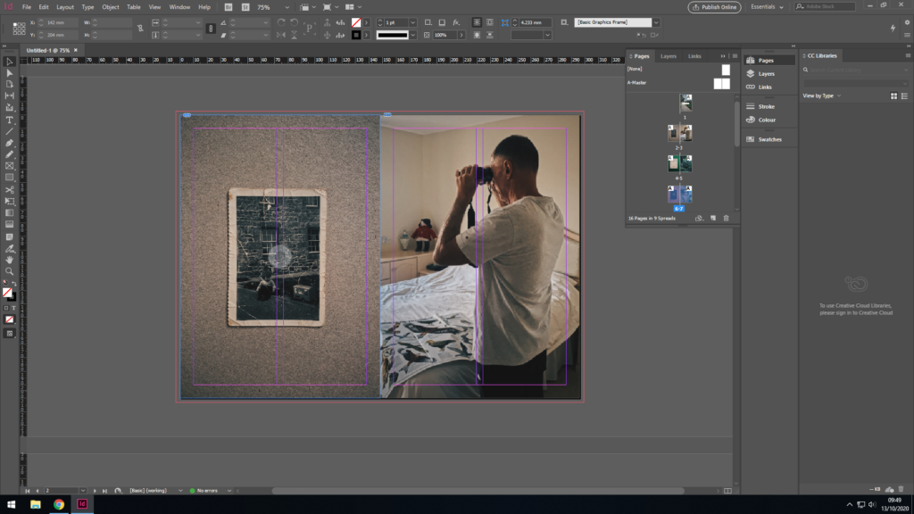
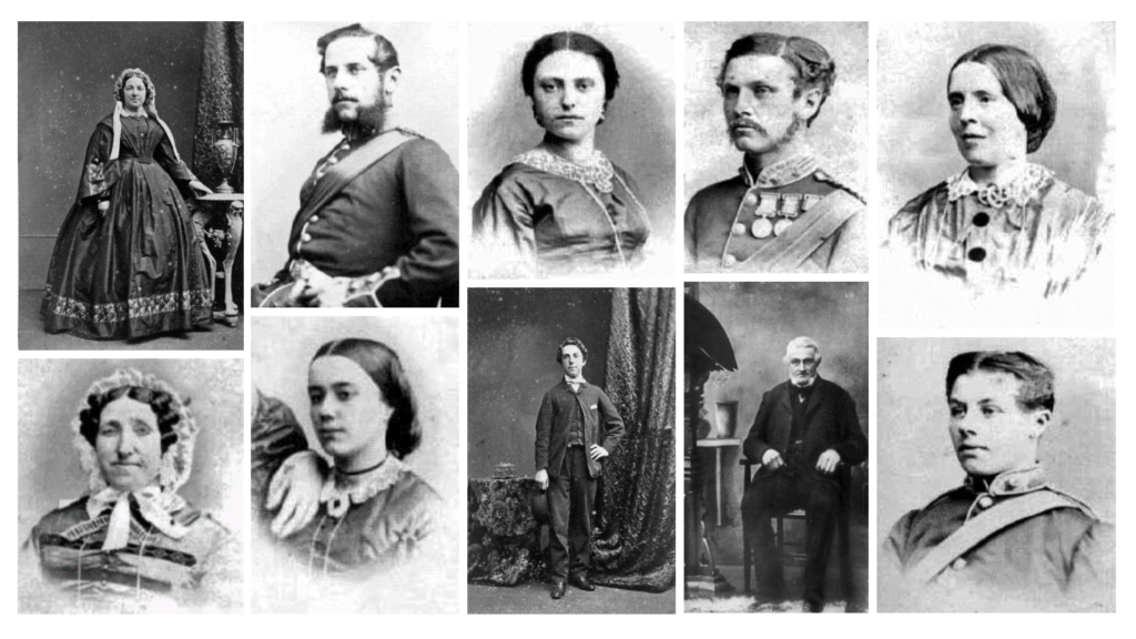
For the second and third page, I thought it was only fitting to include the subject of this entire story, my dad. To achieve this, I wanted to include a childhood photo of his compared to a very recent photo of him. Firstly, the childhood photo of him was placed first as it is essentially puts both photos in chronological order, as it came many years before the next photo of him in the present day at the age of 67, which also creates a stark contrast as both photos have been taken around 65 years apart. Furthermore, both photos my dad is entertaining himself with a hobby, both photos fit together as they essentially highlight his curious side, and potentially his childish side too. Lastly, both photos are comprised of a similar colour palette of beige, browns and whites, which results in similar, matching photographs that fit together hand in hand to make a satisfying double page spread for the observer to look at.

For the second page, I wanted to mix it up a bit, so rather than carry on with photos of my dad, I wanted to add something much different, however relevant to the story at the same time. To the left, there is the Jersey-French dictionary which my dads uncle published and is quite famous and significant to Jersey’s history even to this day. I placed the book on a green background as the colours contrasted nicely aswell as complimenting each other in a subtle way, as the book has a tint of green to it. I centred the photo of the book in lightroom to make it symmetrical and matches the previous page where there is a childhood photo of my dad instead.

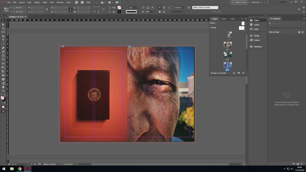
Yet again, I wanted to match colours between the two photos where the background that compliments the book on the first image, also compliments my dad’s skin tones, with vibrant hints of oranges and yellows making up the majority of the colour palette on this double page spread. The first image as previously is a book and also has been centered with the aim of symmetry and continuity. It follows a theme with the past 2 photos where a random (although significant to the story) object has been placed on a colourful , contrasting background. The photo on the second page (to the right) is a zoomed in photo of my dad who is the main focus of this story and whole zine, where his eye is in the centre of the page.

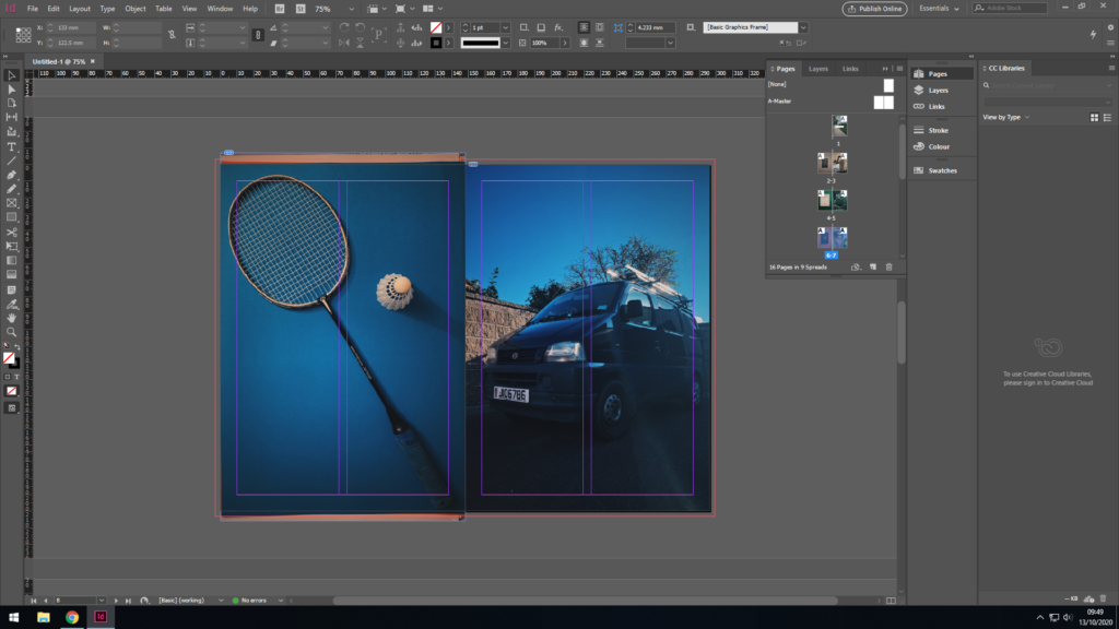
Again, the theme carries on with the animate object to the left. My dad enjoyed badminton much as a kid, teenager through to his adult years and played it often with his mates. It’s also meaningful to me as he taught me badminton with that exact raquet, the same one he used from a young age. To the right, there is a photo of my dad’s work van, he is very hard working and has become very successful as a result. Both photos as symmetrical as per usual throughout this zine, as well as both sharing the blue tints throughout the photo, hence why i placed them together. Also, one could say the first photo shows my dad’s playful and childish side, the other shows his serious, hardworking side, adult side which provides a nice contrast between the two, and highlight the type of person my dad is.

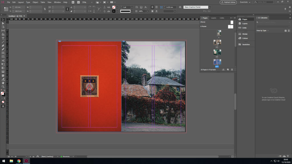
Sticking with the theme, a close up photo of a Jersey stamp with my families’ (Le Maistre) name and crest on it. These were a series of Jersey stamps made after the original Jersey family names and has much historic importance, as well as having great significance to my story. Furthermore, the colours match between the two photos in a subtle way, as well as the having the flower in the crest on the stamp coinciding with the flowers in the photo adjacent to it. Everything has a meaning and everything has been placed intentionally where it is.

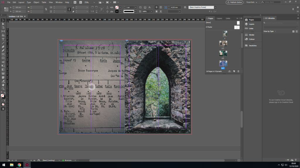
Here you can see me and my dad’s family tree paired up with an image of an old Jersey folly located in a forest. The family tree dates back to the 1500s however said to be even longer, however less documented, making us apart of one of the original Jersey families. This links back to the previous pages where the photo of the stamp resembles this strong family heritage.

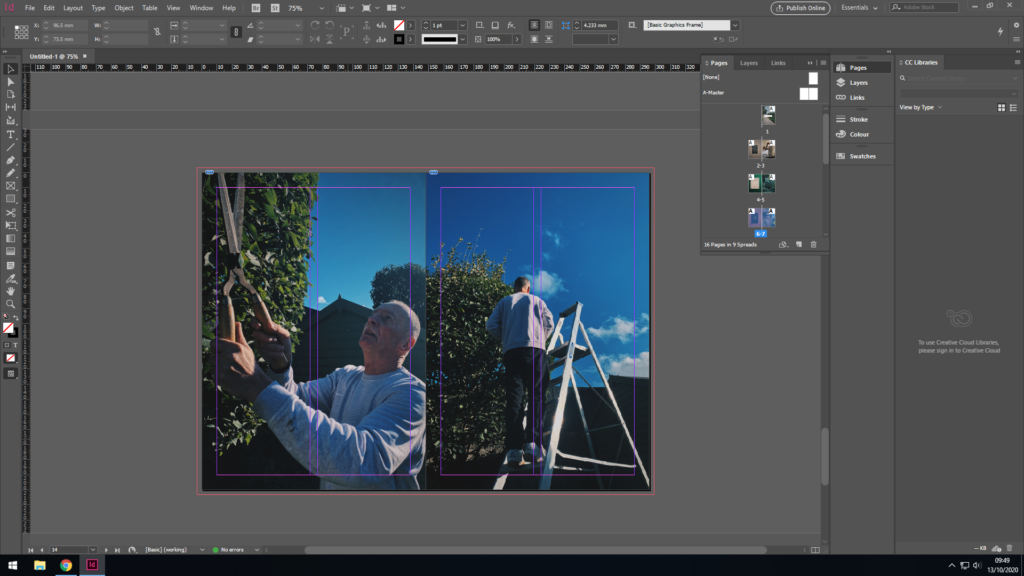
The last two pages highlight my dad in the present dad, hence why they came last in the zine as I aimed to have it laid out in chronological order. The colours and composition match in both photos, as you can see my dad hard at work maintaining the garden. He really does have a good eye for detail.

For the back cover, I wanted to chose a photo similar to the front cover, as well as still sharing some significance to my dad’s past. The photo I’ve chosen is my dads next house which he moved to after and spent his teenage years growing up in. Furthermore, both photos share similar colours so match when the book is closed, as well as also being in chronological order, i.e. his first house comes first in the book, the next house comes last.

ZINE FULL PLAN

Shoots

Shoot 1 – Buildings/objects of significance

Shoot 2 – Archival photos/portraits

Shoot 3 – Portraits of family members in the present day (environmental and candid portraits)

Layout

Use bleed on good images that are high quality. The quality of the photos must be high throughout as the zine may be opened on any page, and thus interest for the reader/observer must be maintained throughout. Portraits of people will remain on the right side page, and the left reserved for an abstract object with no context, however has a special meaning ti the person photographed next to it, some form of significance to them which allows the reader to make assumptions and try and piece together clues and similarities and thus make sense of the story I am trying to tell.

SHOOT ONE

WHERE: Various Locations

WHO: I am going to photograph places/buildings of significance to my family ready for the zine. This will include previous places of residence for my grandparents. This shoot will be purely focused on places of significance, not portraits of people just yet, that will be reserved for my next shoot.

EQUIPMENT/ LIGHTING: Natural light as they will be predominantly outdoors. Natural light on a sunny day will allow for a more authentic look.

COMPOSITION: There will be multiple different angles

This image has an empty alt attribute; its file name is Screenshot-30-1-1024x576.png

SHOOT TWO

WHERE: In a studio or well lit room

WHAT: Photos of old pictures/photographs or old places of residence and old portrait photos from archive/family albums

EQUIPMENT/ LIGHTING: Studio lighting and use of camera flash, holding camera on a tripod above the photo facing down to create an overhead shot. Hopefully no blurs or shine will show up in the photos taken as I want to maintain high resolution and detail focused all around the image.

COMPOSITION: Symmetrical, overhead shot made to fill the frame or with large, chunky white or coloured borders depending on the image.

SHOOT THREE

WHERE: At home or work, potentially could make a tableaux and create a story through a staged photo shoot, or candid photographs of him in the garden or garage working.

WHAT: Portrait photos of my dad both candid and environmental.

EQUIPMENT/ LIGHTING: Natural light as they will be predominantly outdoors. Natural light on a sunny day will allow for a more authentic look.

COMPOSITION: There will be multiple different angles and compositions as there will be many different things I will be photographing.

MY SPECIFICATION

STORY: What is your love story?

  • 3 words – father
  • A sentence – following the life of my dad
  • A paragraph – learning and documenting the life of my dad, taking photographs of significant places, things or moments in his life.

NARRATIVE: How will you tell your story?

  • Images > of my dad and possibly his siblings/relatives who were my grandparents children, possibly imitating past photos in same locations and highlighting similarities in looks and characteristics in close up portraits. Taking photos of previous houses/farms they lived in and comparing them to what they look like present day. Aiming to capture real Jersey/French roots aswell as showing our families strong history.
  • Archives > old photos from family albums and SJ/Jersey archive, family trees
  • Texts > letters, documents, poems, text messages

AUDIENCE: Who is it for?

Everyone and anyone of any age, but mainly myself, for my personal interest but also for anyone who shares the same situation of never meeting their grandparents. Possibly also for my family, which would bring a sense of nostalgia back to them.

IDEAS: What am I planning to do?

  • A focus on the families strong history and individuality
  • Capture differences and similarities between relatives who have deceased and those who are still around today.
  • Keep it interesting and maybe even weird, use metaphors
  • Don’t just do portrait images, also aim to photograph the family tree, archival images and also buildings/places of residence, whether it is now or was previously, or places they frequently visited, or had a close connection to, local church, local pub, local beach, parish hall, but also photograph objects of potential heirlooms, objects that have a special meaning to someone, all in the aim of adding context to my families unique story.

IMAGE IDEAS: How am I going to tackle this?

  • Portraits of my dad or other siblings/relatives of his/mine
  • Archival imagery of people such as my grandma and grandad as well as significant/relevant places/buildings
  • Candid Images of my dad just being himself in his daily life, unstaged, unprepaired and natural. (Images of him working, doing chores, or enjoying life/pastimes and hobbies)
  • Tableuax images, of him posing the same way as his dad to reenact an old photo
  • Close up images, abstract images, hand images. (I want to stay away from the overused abstract theme, I want my story to be more clear and emotional as a pose to confusing and mysterious as I am trying to learn and share my families history
  • Images of environment/buildings/areas of significance/local places
  • Unexpected images
  • Surprise photographs
  • Standard Iphone photographs, use images from my camera roll from the past year
  • DSLR camera photos for higher quality/better resolution photographs

LOVE AND REBELLION INTRODUCTION

WHAT IS LOVE?

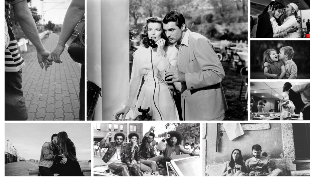
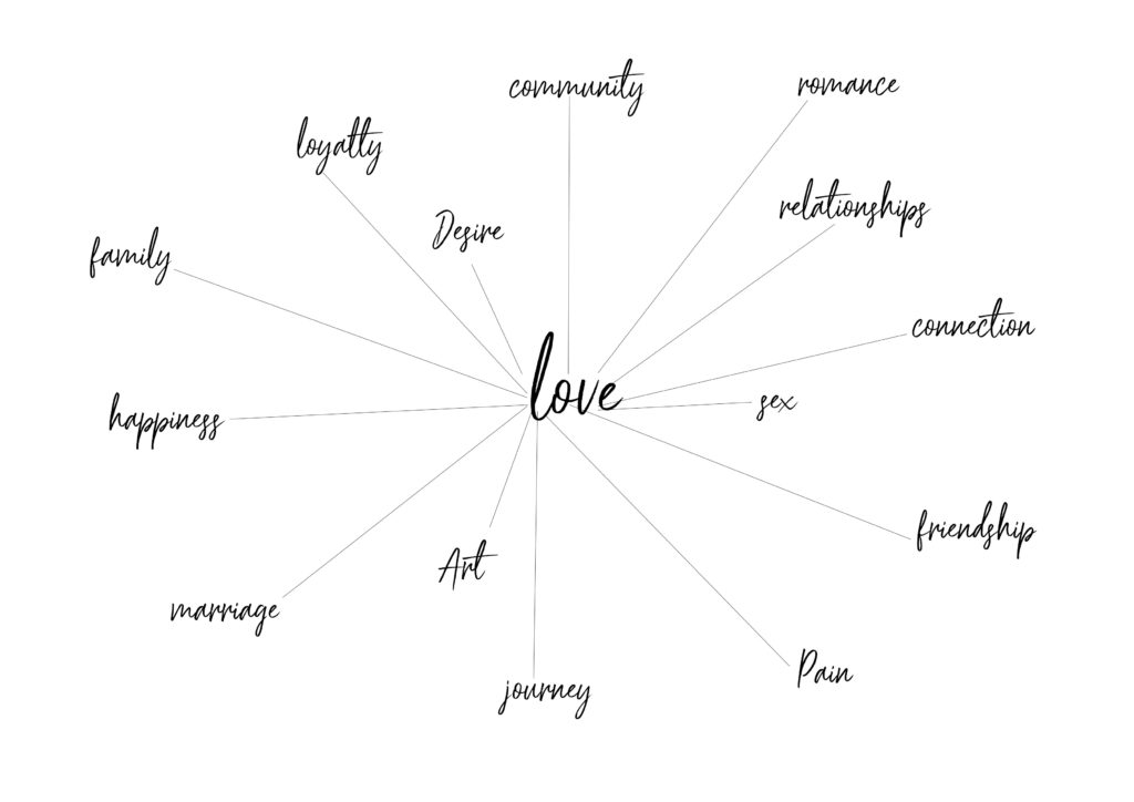
Love Mood Board

LOVE

When we love someone we experience the same positive thoughts and experiences as when we like a person. But we also experience a deep sense of care and commitment towards that person. Being “in love” includes all the above but also involves feelings of sexual arousal and attraction.

Romantic Couple Love Black and White Free HD desktop wallpaper : Widescreen  : High Definition : Fullscreen

Love is a very vague, broad and complicated feeling, that can be felt by everyone in many various different ways towards many various different things. Below are the different types of love one can experience…

  1. Agape — Unconditional Love – Often referred to as the ‘highest’ form of love. It’s given without any expecting a reward or something in return.
  2. Eros — Romantic Love. – The most primal form of love experienced in each person. (displayed through physical affection)
  3. Philia — Affectionate Love. – Love without romantic attraction. It occurs when both people share the same values and can respect one other.
  4. Philautia — Self-love. – Recognising self -worth and attending to personal needs.
  5. Storge — Familiar Love. – This is naturally occurring between parents, children and best friends. It’s love built upon acceptance and deep emotional connection.
  6. Pragma — Enduring Love. – This matures over many years between a couple that puts equal effort into their relationship and has both commitment and dedication to one another.
  7. Ludus — Playful Love. – The immature and early stages of intimate love.
  8. Mania — Obsessive Love. – An unhealthy obsession with another person, leading to codependency. Usually found in insecure individuals who need their partner to find a sense of self-value.

STUDYING PORTRAITURE: ARTIST STUDY OF HENRY MULLINS

Henry Mullins was a British photographer who moved to Jersey in the 1800s, and opened a studio photography business in St Helier. He stayed for 20 years where he photographed over 9000 islanders out of Jersey’s entire population of 55,000 at the time. His main focus was on portrait photography in which he succeeded very well in, of which he tried many styles including candid, environmental and headshots. To be precise, Mullins started working at 230 Regent Street in London in the 1840s and moved to Jersey in July 1848, setting up a studio known as the Royal Saloon, at 7 Royal Square. Initially he was in partnership with a Mr Millward, about whom very little is known. By the following year he was working alone and he continued to work out of the same studio for another 26 years.

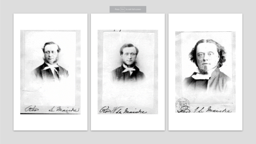
All these images above are examples of Henry Mullins work, taken during his years on the island: Portrait of Miss Rocke (Top left), Portrait of Mr S Sauer (Top right), Portrait of Mr Oldfield (bottom).

For a brief period in the 1860s he also worked in London, but judging by the collection of his photographs which is now held by La Société Jersiaise, he found plenty of willing sitters in the island prepared to pay half a guinea (promoted as “one half of that in London”) to have their portrait taken by him.

Here we can see 3 photos taken by Mullins in his studio in the 1800s . Ironically, I’ve chosen these photos as they all share my surname and thus means i am distantly related to them showing evidence of his work in Jersey a couple centuries ago.

Each of the images has been set up in a very formal classical format, stereotypical of the time. The images are taken very simply, with a clear focal point, being the models face, in every image. There is minimal depth of field as the background is relatively empty, being taken in a studio, therefore again placing a main emphasis on the model. The low resolution and poor quality of the images, compared to modern photography, are due to the cameras at the time being the first cameras invented. The exposure and capture time would take an excruciatingly long time to produce an image, hence the models neutral facial expression and standard upright position.

By studying Mullins work I intend to be inspired by his portrait images, particularly in the way he frames his environmental portraits, however, I do not intend at this point to follow his classic style of imagery as I want to create images linked more towards modern portrait photography, merely using Mullins images as a way to learn about the art.

MORE ON ABSTRACTION V FORMULATION

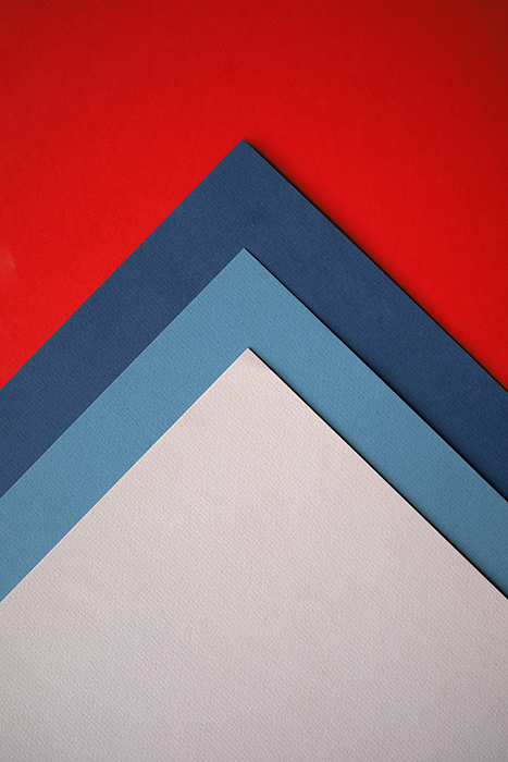
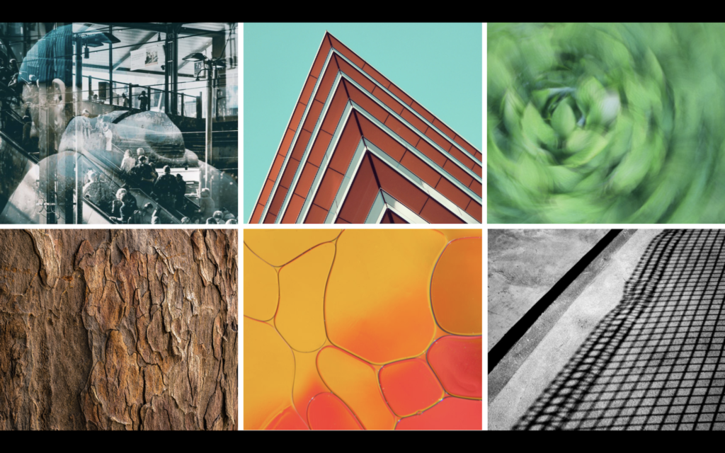
An abstract composition of red, blue and grey colored paper - creative abstract photos ideas

Abstract photography is a style of photogrpahy which encompasses a rather broad array of image capturing. To be abstract, it can include any subject or environment and becomes such depending on the way it’s captured. In addition to that, abstract and formulaic photography can be both colourful and vibrant, as well as greyscale and dull all in order to achieve different effects/moods, which is one of many ways in which many artists separate themselves with their unique styles.

It takes both a watchful eye that can decipher what could often be regarded as questionable or meaningless photos as well as having the creative imagination and concept in order to be able to capture such subjects in an abstract way.

You are only limited by your vision and ideas. Changing your usual perspective of the subject helps to create abstract images. Shooting from up-down could allow you to focus on its shape and form. This changes the subjects’ meaning and purpose. You could even create something from scratch. Photographing an item relying on your off-camera creativity.

EXEMPLAR PHOTOS

ABSTRACT ARTIST – Paul Strand

Biography of Paul Strand | Widewalls

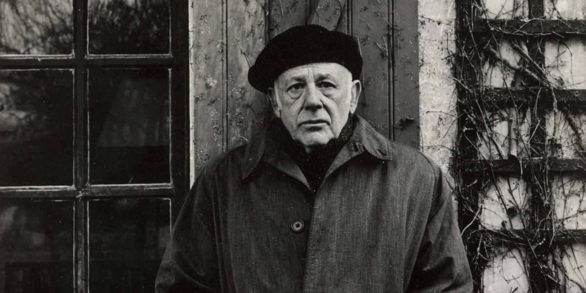
Paul Strand was an American photographer and filmmaker who, along with fellow modernist photographers like Alfred Stieglitz and Edward Weston, helped establish photography as an art form in the 20th century.

He was born in New York to German-Jewish parents in 1890, where twelve years later, his father presented him with his first camera. Strand’s interest in photography wasn’t to blossom until he had left high school in 1907. Strand decided on his future following a club field trip to Alfred Stieglitz and Edward Steichen’s 291 Gallery. Inspired by the visit, it was a pivotal moment for Strand who, aged 17, declared his intention to become “an artist in photography”. 

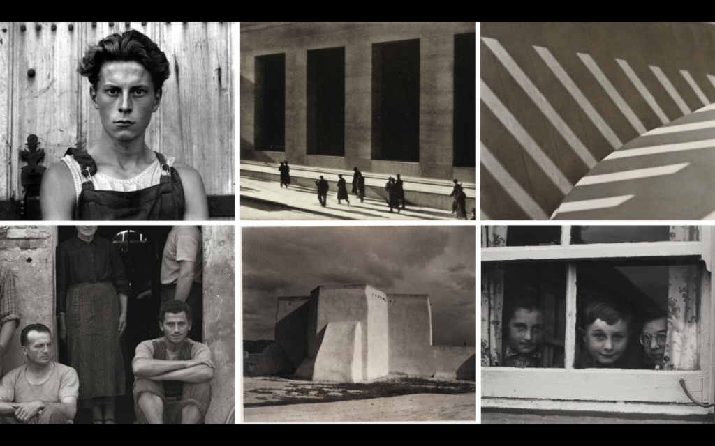
Paul Strand perhaps carved out the most unique position amongst the most important photographic pioneers of the 20th century. He is often discussed as the architect of the so-called ‘Straight Photography’, which is a pure photographic style that utilised large format cameras to record, and bring new perspectives to ordinary subjects in the name of fine art. Strand’s aesthetic proved so persuasive that it was adopted by other luminaries in the photographic circle. Yet Strand pushed even more forward by extending the aesthetic to the field of documentary and he became highly regarded, and something of a standard-bearer, for those in pursuit of social and political redress through both the still and moving image. 

EXEMPLAR WORK OF STRAND’S

INTRODUCTION TO ABSTRACTION V FORMALISM

Abstract Portfolio

Abstract photography is a non-objective, experimental form of photography, which can be perceived as being either conceptual or concrete. Abstraction is a means of depicting a visual image that does not have an immediate association with the object world and that has been created through the use of photographic equipment, processes or materials according to Wikipedia. Abstract art has its origins in the 19th century. The period characterized by so vast a body of elaborately representational art produced for the sake of illustrating anecdote also produced a number of painters who examined the mechanism of light and visual perception.

On the other hand, formalism is the study of art based solely on an analysis of its form, essentially looking at the way it is made and what it looks like. Formalism dominated the development of modern art and photogrpahy until the 1960s when it reached its peak.

During this upcoming project, I will explore different aspects of abstract/formalist photography, researching different artists and recreating their work.

IDENTITY PROCESS AND FINAL OUTCOMES

Contact Sheets

These are my contact sheets that I have organised from 3 separate photo shoots. My aim was to explore like Markosian, geographical identity taking photos of my best mate who was Jersey born and bred. I aimed to show his lifestyle on the small island of Jersey, his hobbies and thoughts of living on such a small island through my photos, and raise questions such as… “is Jersey a claustrophobic’s nightmare” or “how does Jersey’s youth make the most of what little space there is?” and so on.

The Process/Final Outcomes

During the shoots I decided to take on a similar mindset such as Markosian which is to “get as far away from the photo herd as possible. Go your own way.” By embracing this mentality and after extensively looking at their work, their images all have a similarity, which is the focus on environmental portrait photography. These are my final chosen images that i am going to display for my identity project. I think they are all the most effective at showing all the little details of each shoot and look most similar to Markosian’s work.

Jersey Boy – Reflection

I like this photo as it highlights a young mind’s desire to be free, spread their wings and discover more. This is a common topic among teenagers, especially so in Jersey, a small and arguably overpopulated island with arguably too little to do. The photo pictures Dylan, a “Jersey Boy”, where he is about to ride his motorcycle in an attempt to spread his wings and escape the day-to-day boredom that many claim the island brings.

Like Markosian, I have told a brief story that relates to the geography of the area I have photographed and how it affects the people living there, with the theme of realism in mind. I’ve tried as best I could to imitate her style of work, noticing how she likes to use lots of contrast in her photos, which i have replicated here by increasing contrast and simultaneously lowering the exposure. Furthermore, too add detail in the foreground, I altered the levels/tones and tweaked about with the ‘curves’ feature on Photoshop. I additionally used the blur tool to blur the background as I have seen in some of Marksoian’s work, but also to help emphasize the foreground and give the photo some depth, as the mirror didn’t pop, but rather blended in with the cluttered background in the original photo. Lastly, I sharpened the photo as well as using the lighten tool to help lighten the centre with the mirror and the subject in order to highlight the main aim of the photo. I especially like the composition of this photo as it is centred well, and symmetrical, thus appealing to the viewer as well as the photo generally being good quality/resolution and in focus.

Here, unlike Markosian, I decided to experiment by adding noise in order to add a distinct vintage vibe to the photo as an attempt of experimentation out of pure curiosity. I thought the photo looked really good, thus decided to post it on here as an edit.

Jersey Boy – Garage

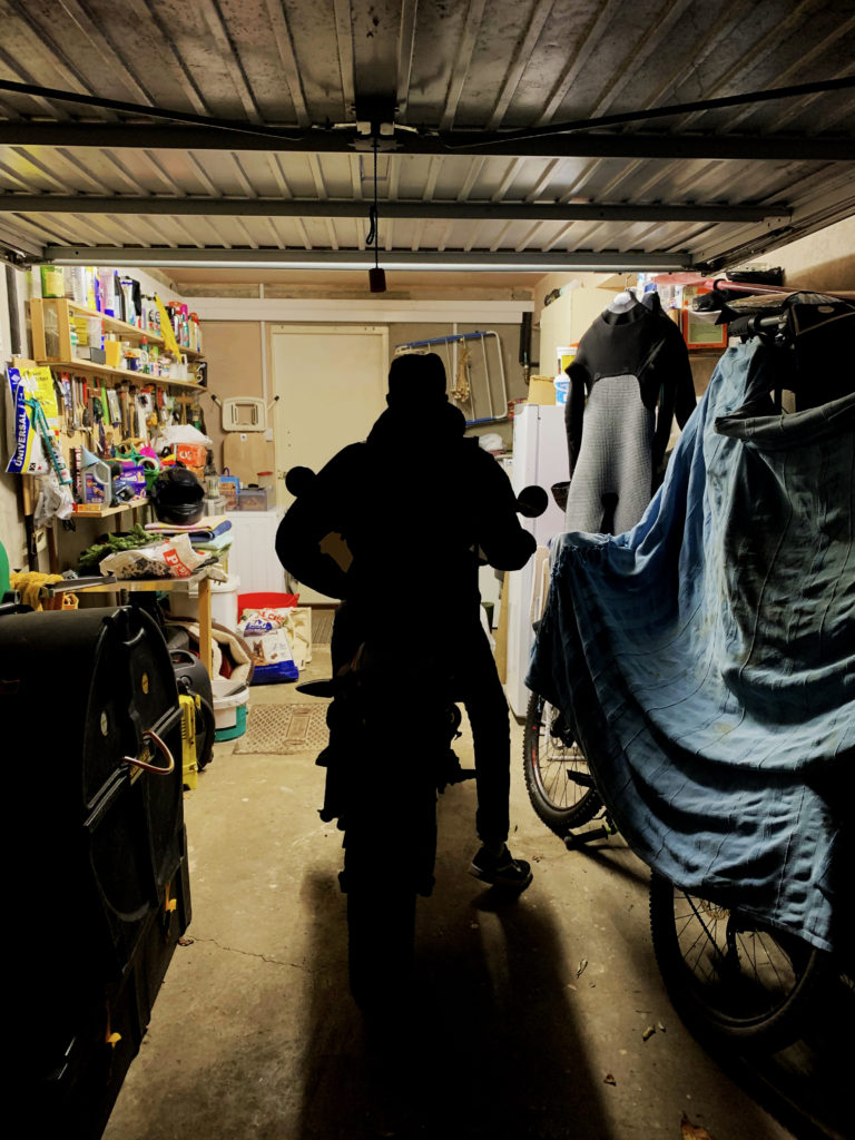
In this photo, I positioned myself behind Dylan as he departed the garage about to embark on his ride. Yet again, I tried imitate her previous work, using high contrasts and low exposures to best bring out the theme of realism. I changed the levels and curves slightly to emphasize the shadows more, and help distinguish a clear subject in the middle. To finish it off, I increased the colours and slightly altered the saturation in the image using Photoshop’s “vibrance” tool in order to separate the background from the dark tones in the foreground and add a bit of colour to spice up the image. The image is similar to some of Markosian’s work in respect to the fact that the subject isn’t facing the camera and is minding his own business, an example of candid photography with the theme of realism in mind, often explored by photographers such as Markosian.

All the techniques as mentioned in the previous images were also used in my third final outcome as seen above. This photo incorporates similar meanings as with the others, still including the theme of realism and exploring the inquisitive and adventurous minds of young people, and how they source the knowledge and life experience on this small island.

IDENTITY

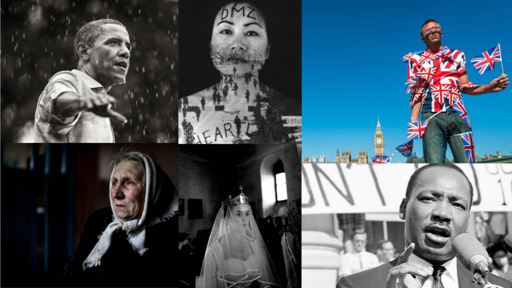
Image result for political photography"

What is Identity?

The definition of identity is who you are, the way you think about yourself, the way you are viewed by the world and the characteristics that define you. An example of identity is a person’s name, however a deeper meaning of identity could imply the qualities, beliefs, personality, looks and/or expressions that make a person or group. Categorizing identity can be positive or destructive. A psychological identity relates to self-image, self-esteem, and individuality. Since its origins photography has enabled people to make sense of themselves and their environment. In one sense all photography, whether it is directly about the photographer or not, is an exploration of identity and/or place and can be separated in the following categories…

Geographical/Political

…translates as being based on or derived from the physical features of an area but can also relate to cultures, races, and traditions that are accustomed to such areas, regions or countries. Political on the other hand defines as relating to the government or public affairs of a country. Both categories are similar in some respect and merge together well as one theme for this project.

Gender Identity

…is the personal sense of one’s own gender. Gender identity can correlate with assigned sex at birth or can differ from it. All societies have a set of gender categories that can serve as the basis of the formation of a person’s social identity in relation to other members of society.

Culture

is an umbrella term which encompasses the social behavior and norms found in human societies, as well as the knowledge, beliefs, arts, laws, customs, capabilities and habits of the individuals in these groups.

Society

…can relate to a group of individuals involved in persistent social interaction, or a large social group sharing the same spacial or social territory, typically subject to the same political authority and dominant cultural expectations

Loss of Identity

…can be perceived as personal psycho-social conflict especially in adolescence that involves confusion about one’s social role and often a sense of loss of continuity to one’s personality.

The Project

For my project, I have chosen to explore the theme of geographical/political identity, aiming to take photos with the intent of expressing geographical aspects such as race, culture and how places/environments can affect lifestyles and the outcome of people and its influences on their success in life, whether it be high or low. In addition to that, I will try to also include political themes, capturing the political views of people, and the effect it has on them and others around them, as well as similarly to the geographical aspects, highlighting different races, cultures and how politics affects them as well as how society both shapes and perceives them.

The definition of identity is: the fact of being who or what a person or thing is, a close similarity or affinity. I am inspired by this definition because it will enable me to look at a variety of photographers and will prompt me to question my own identity. During this project I will explore the works of other individuals who inspired me and photographed similar themes of identity and aim to express these elements through a variety of photographic techniques.

Inspiration – Diana Markosian

Image result for diana markosian"

Diana Markosian is an American and Russian artist of Armenian descent, working as a documentary photographer, writer, and filmmaker. She is known for her photo essays, including Inventing My Father, about her relationship with her father, and 1915, about the Armenian genocide. Her work has inspired me to take a similar approach in my photography during this part of the project, aiming to highlight geographical and political aspects through my photography just like hers. Diana Markosian is an artist known for her experimental approach to storytelling, using photography and video. Her work is both conceptual and documentary and can be found in publications like National Geographic Magazine, The New Yorker and The New York Times. She holds a Master of Science from Columbia University in New York.

“My commitment and passion for this profession doesn’t come from simply creating images. It comes from building relationships. You have to be a person before you are a photographer.”

Markosian was born in Moscow. In 1996, she moved to California with her mother and her brother, while her father remained in Russia.She had no contact with him until 23, when she found her father in Armenia, after 15 years of being apart. Markosian graduated from the University of Oregon with a bachelor of arts in history and international studies in 2008, and earned a Master of Science from Columbia University’s Graduate School of Journalism in 2010 at the age of 20.

Her Work

This is a brief introduction to Markosian’s work, a handful of selected images that I thought best fit the theme of geographic/political identity. These photos as well as many more can be found on Markosian’s personal website where you can find her portfolios for different projects she has completed over the years as well as commisions for world renowned news outlets such as National Geographic, the BBC, The New Yorker and The New York Times.

Her work is often presented in a photo-essay style, where she posts a handful of her best images she has taken along her journey, and gives them very brief descriptions of context below, often describing her journey and what she has found, recalling accounts of local people and always sharing a moral of a story. These stories usually relate to the theme of cultural/geographical/political identity. Great examples of her photo-essays are…

 A couple on a date in the village of Serzhen-Yurt. Couples must meet in public and sit a distance from one another. All physical contact is forbidden before marriage.

In Chechnya, (a Russian republic explored by Markosian in one of her projects), she says how “couples must meet in public and sit a distance from one another. All physical contact is forbidden before marriage”. This highlights cultural and regional differences, as a result of many factors, geography and politics often being the main reason for these.

 Chechen girls after school in front of the Heart of Chechnya mosque, the largest in Europe.

Markosian is a skilled artist, her photos have a clear meaning and intent. This photo simply shows the cultural and religious differences of Chechnya, placing herself right in front of the Heart of Chechnya mosque, the largest in Europe, highlighting Chechnya’s Islamic beliefs, a contrast from the country of Russia which mainly practices Orthodox Christian.

 Mary is a magnet for the young and old. On August 12, during a mass celebrating her assumption into heaven.

Most of her photos capture differences that can be observed worldwide, often religious, political and always geographical. Through her photography, cultural anomalies shine through, and thus makes her photography not only unique, but very interesting to glance at.

 Worshippers gather outside a monastery in Minya in anticipation of an apparition. Together they watch as doves, representing the Holy Spirit fly in the sky.

Aspects of Markosian’s Photography

Technical

The images purposefully doesn’t use loads of clever techniques in order to create a sense of realism, instead they use natural light which creates this darker tone to the image with higher contrasts. To add to that her images often seem to have short exposures which also further adds to the dark, contrasts seen in her photos. The images also often have some depth of field which creates a distinguishable foreground and background to the image. Additionally, the composition of her photos are often symmetrical, as as well as generally being very well focused, highlighting detail in the foreground and a subtle blur in the background, however the blur isn’t always used by Markosian.

Visual

Her images vary considerable throughout her work. In the photo above, the dark tones are also apparent due to the lack of lighting, with faint yellows coming through from the background lighting, adding variety to her photographs. The composition is very natural, and fits with her style of realism as the photographer didn’t set the image up and so the image has the appearance which works very well with their project.

Contextual

This photo was taken as part of Marksoian’s project, “The Virgin Mary” which she completed in 2015 and can be seen here… http://www.dianamarkosian.com/the-virgin-mary

In the photo, Markosian finds herself in the middle of worshipers gathering outside a monastery in Minya in anticipation of an apparition. The project was to discover what occurs in religious pilgrimages and the people who part-take i them.

Project Ideas

For my exam piece I was thinking of getting a plain book and presenting my final photographs of which I hope to have at least 10 in chronological order in a photo-essay style as famously presented like Markosian’s work. I will organise them into these mini stories made up of primarily photos with small, concise descriptions of context underneath, just like Markosian. I will also base it on the people’s life experiences of coming to the island from abroad or those who were born and bred on the island and their political views on immigration and similar topics as explored by Markosian.

These photos will be inspired by Markosian’s style of photography, exploring the theme of realism and implementing similar photographic techniques with the intent of showing cultural/geographical/political differences within the small island of Jersey to show the diverse community we live in. This is not purely about showing different ethnic groups, religions and cultures, but also aims to manifest the thoughts, and political views of such individuals too.

Photo Shoot Plan

WHO:

Take photos of friends, showing different cultures, race, religions, political views and ethnicity that may flourish from such individuals, with the intent of highlighting diversity within the population. I’ll also try to photograph certain events that link to any of the criteria above, such as cultural festivals, religious events, political movements/protests etc.

WHAT:

The images I am going to create will be in the Markosian’s style of identity photography which has heavily inspired me.

WHERE:

In Jersey, it’s quite vague to distinguish one particular spot to photograph any of the criteria as it can be found everywhere.

WHY:

I am taking the images to explore the idea of identity, whether it is cultural, religious or geographical identity and as an effective set of identity images for my exam.

HOW:

With a DSLR camera placed on a tripod or mobile phone, which will be taken in various environments to give a suitable background/backdrop.

TABLEAUx VIVANTS

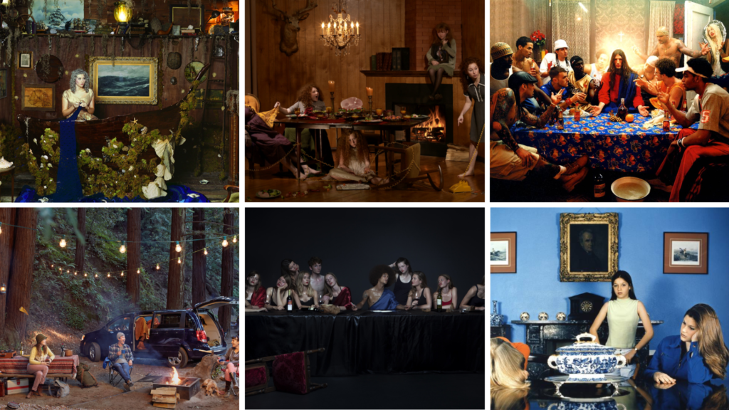
A Tableau Vivant, French for ‘living picture’, is a static scene containing one or more actors or models. They are stationary and silent, usually in costume, carefully posed, with props and/or scenery, and may be theatrically lit. It thus combines aspects of theatre and the visual arts. The creator of Tableau photography was a French man called Jean-François Chevrier, he used it in relation to a form of art photography. It began in the 1970’s and 1980’s.

Jeff Wall

Jeff Wall is a Tableau photographer who recreates pieces with many plain and bold colours. He is a Canadian artist best known for his large-scale back-lit cibachrome photographs and art history writing. Wall has been a key figure in Vancouver’s art scene since the early-1970s.

Image result for jeff wall

The colours in the photo are very plain consisting of beige, subtle yellows and browns as well as darker, bolder, blue and black tones with very hints of bright, striking colours such as the reds and oranges dotted around the photo adding a contrast which further adds variety to the photo making it an interesting composition.