All posts by Thomas L

Filters

Author:
Category:

1950’S JERSEY TRANSITION – SHOOTING, EDITING PROCESS and evaluation

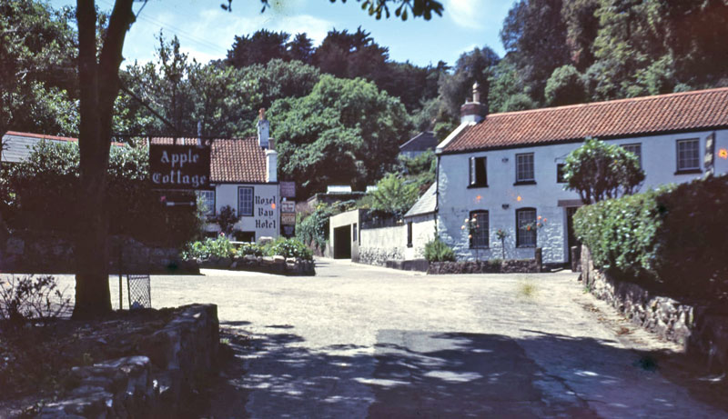
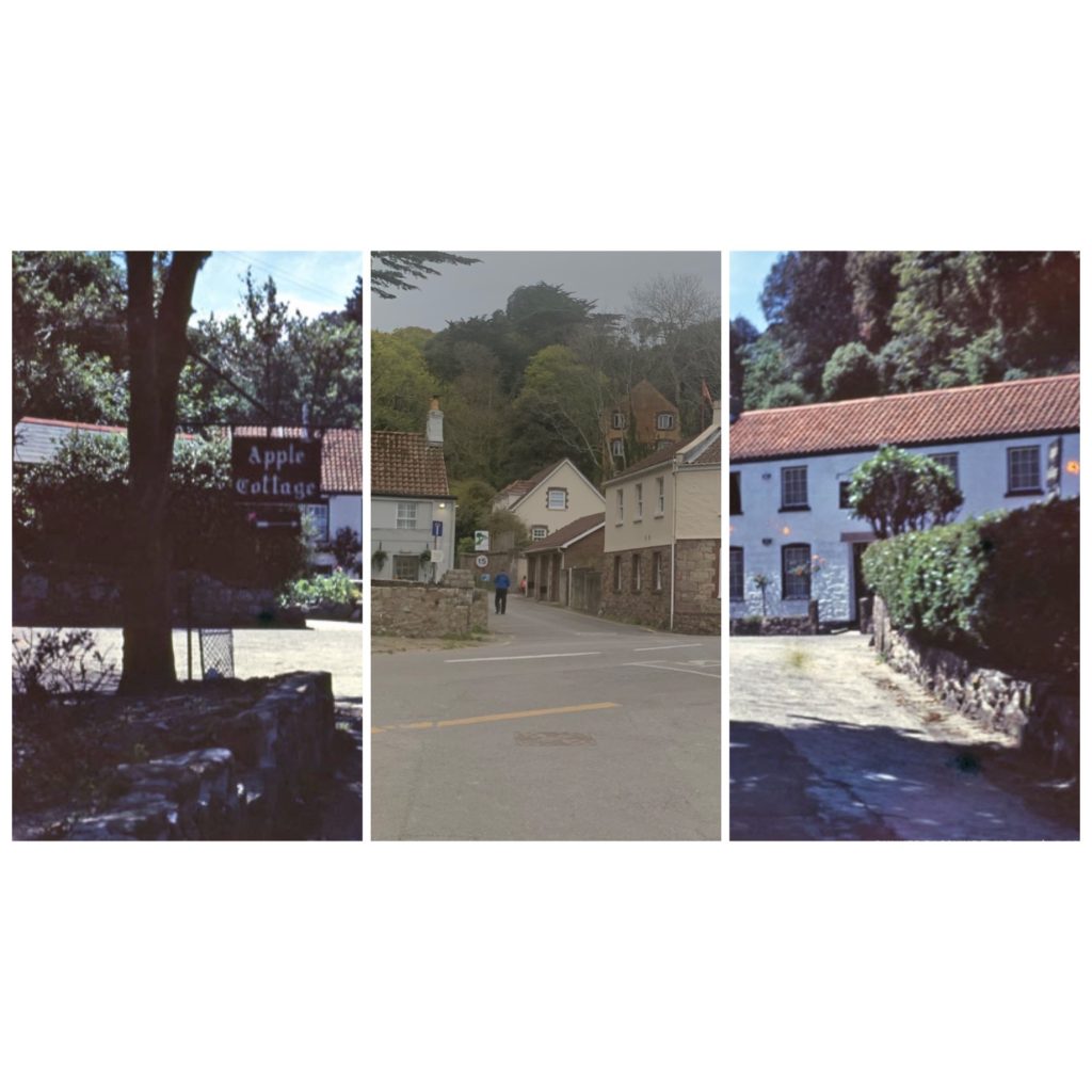
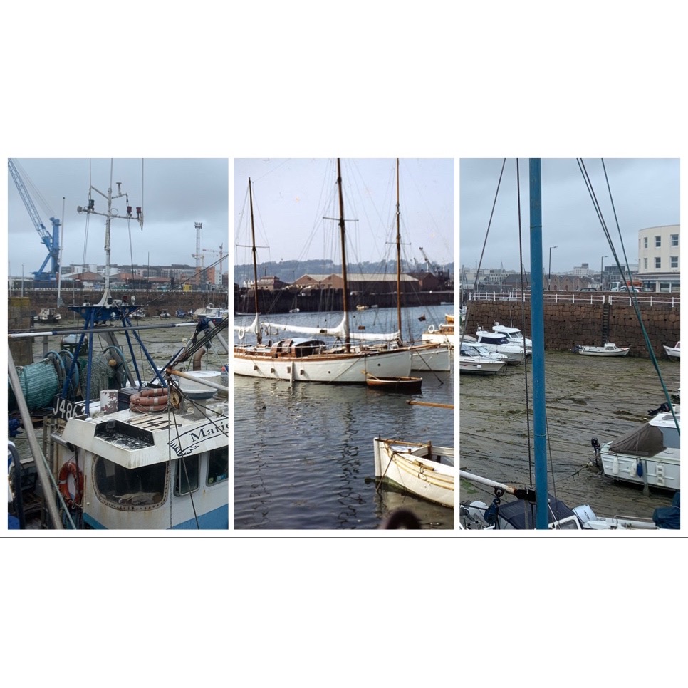
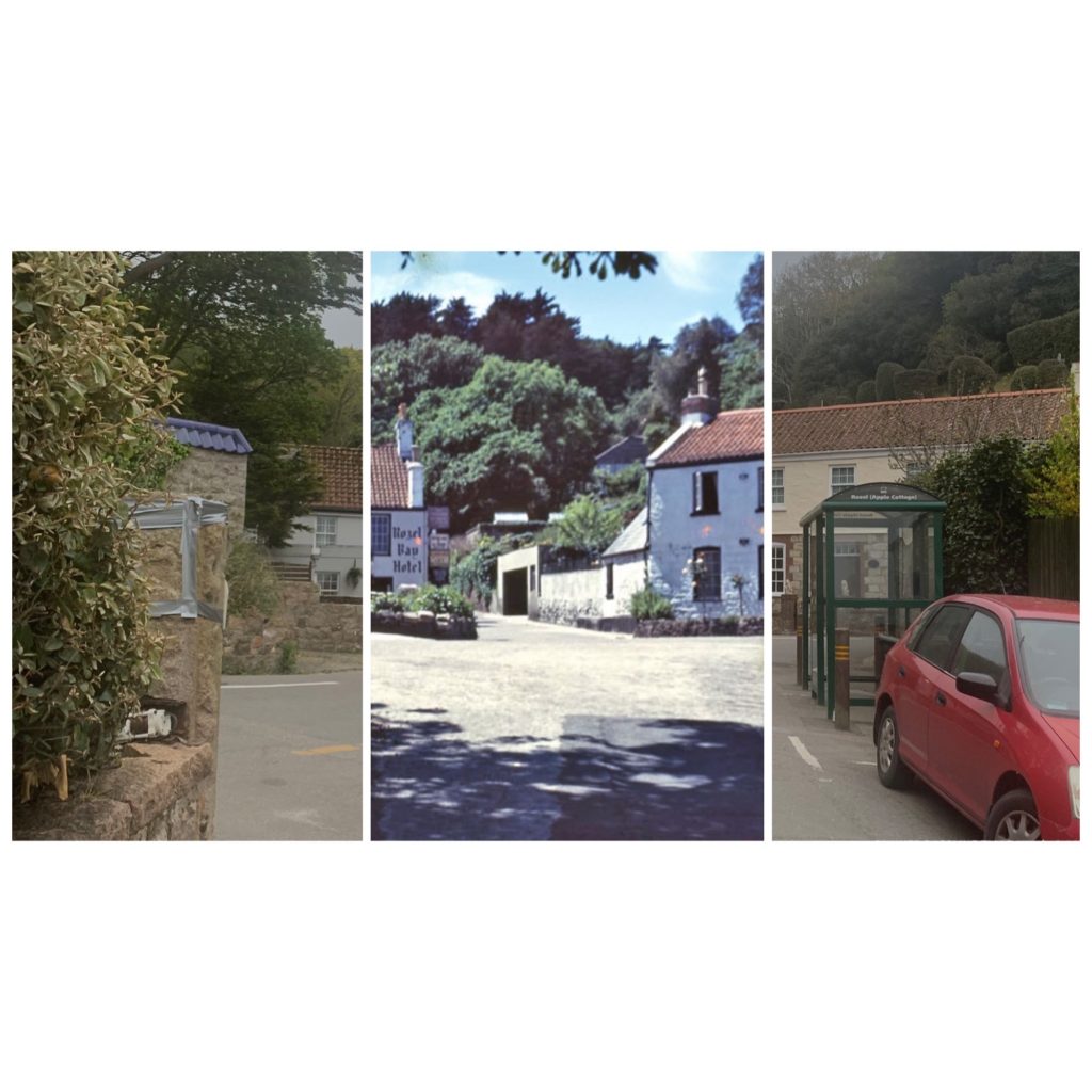
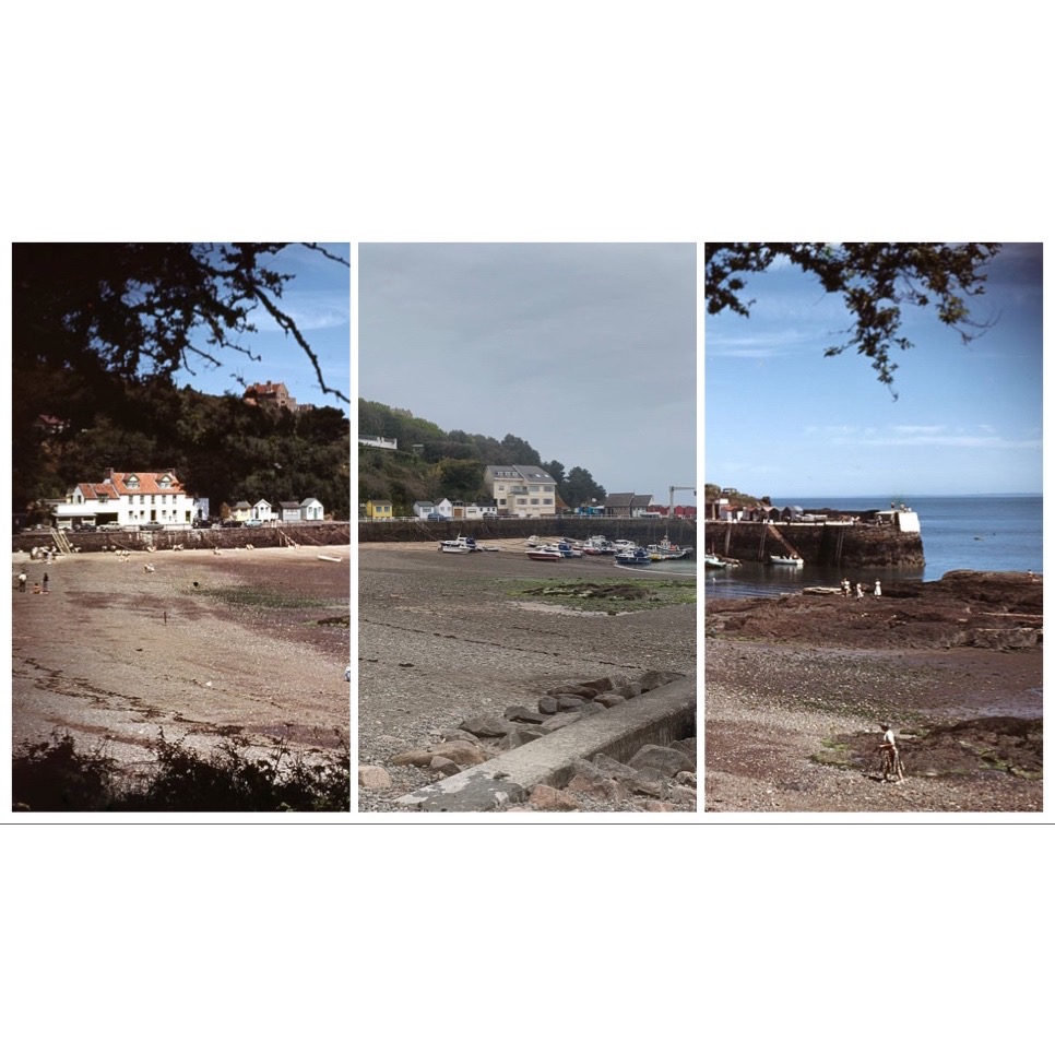
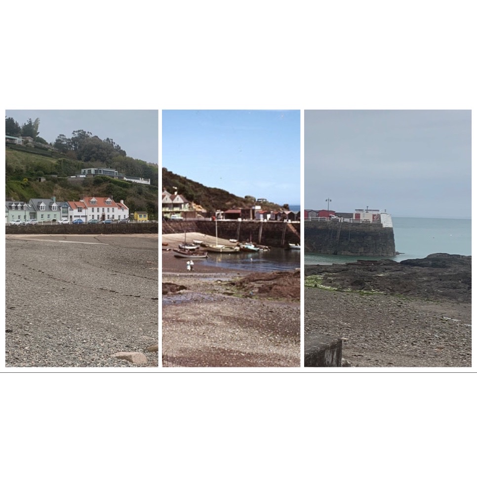
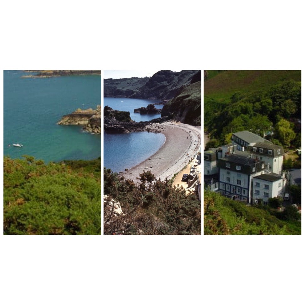
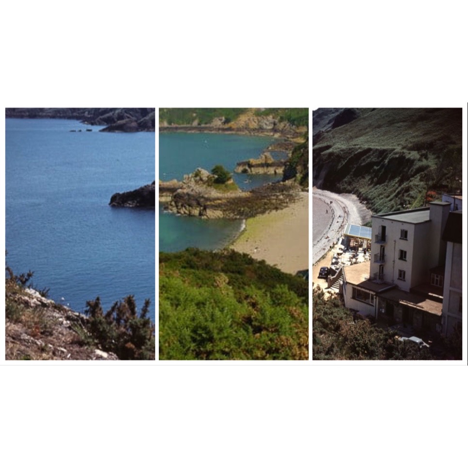
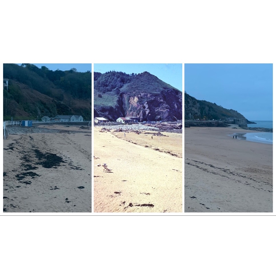
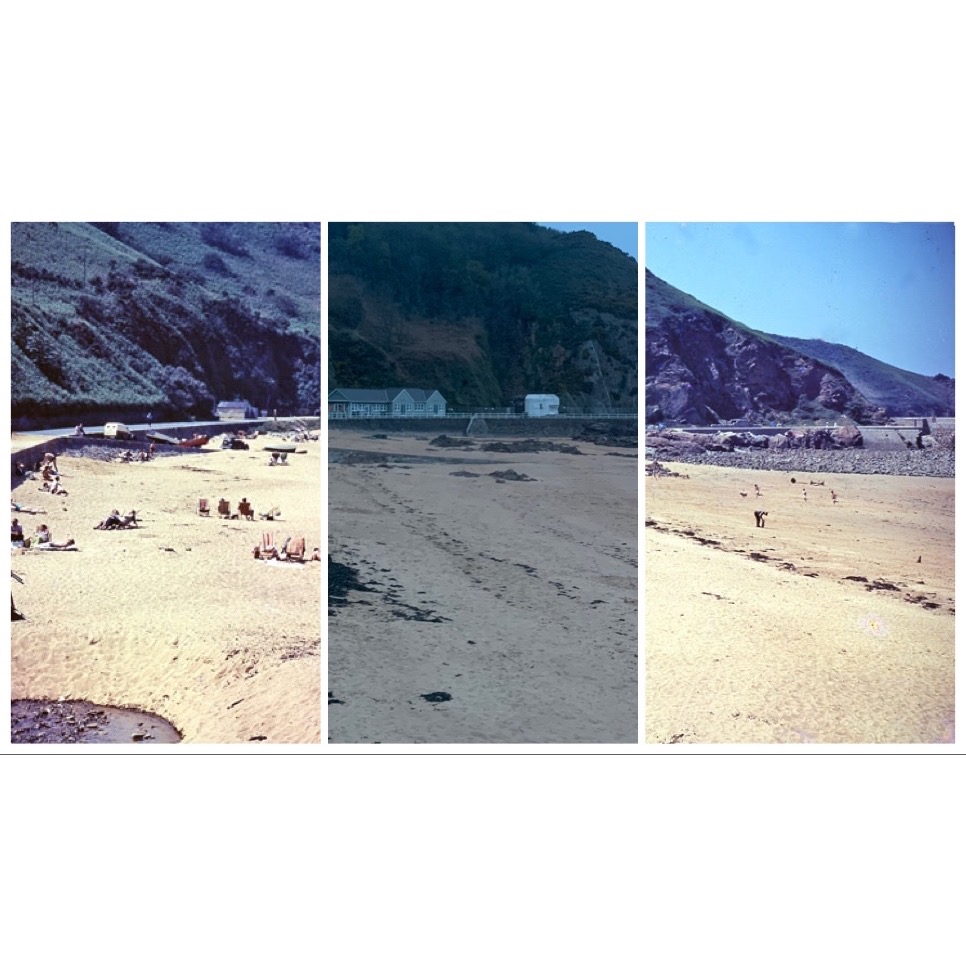
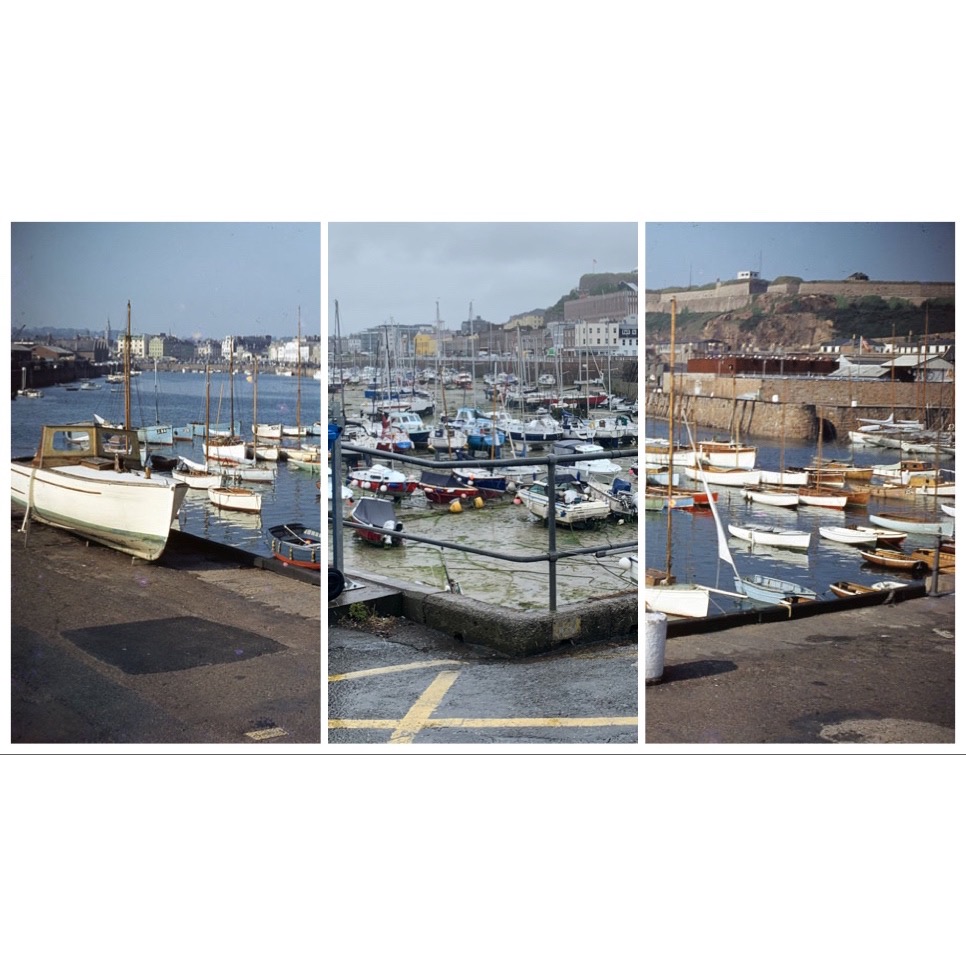
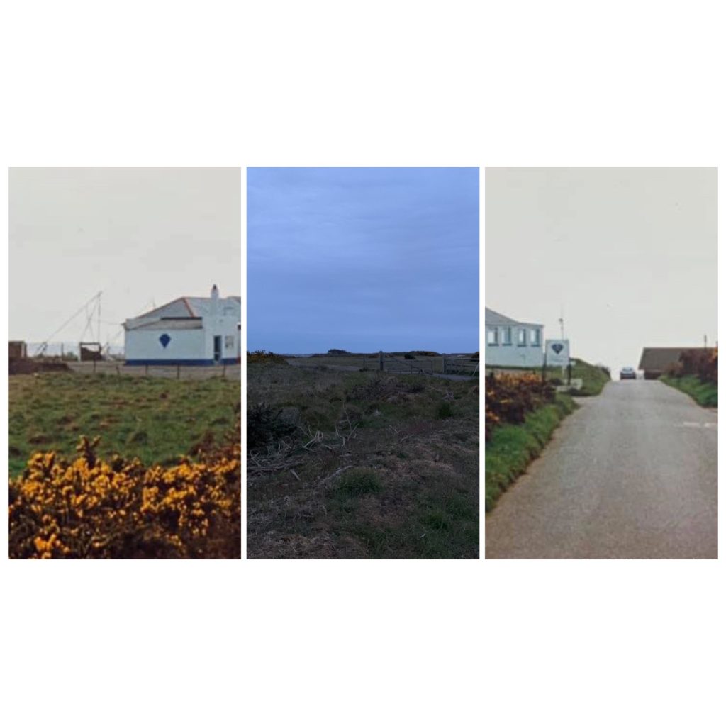
The photos I used in my project from an archive of imagery dating back from the 1950’s available on the ‘Jerrepedia‘ website. These superb quality colour photographs of Jersey n the 1950s were taken on Selochrome – a transparency film first introduced in the 1930s. These photos allow me to explore the theme of transition, by comparing and contrasting the differences between the photos through time, similar to Iglesias Maurer.

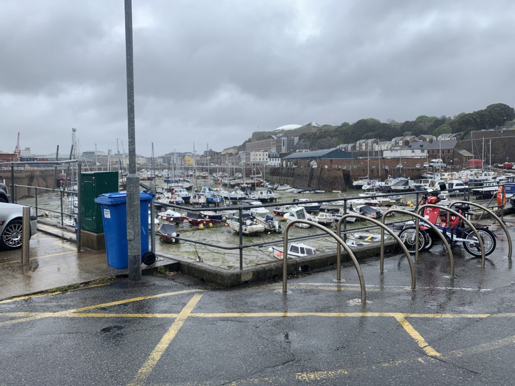
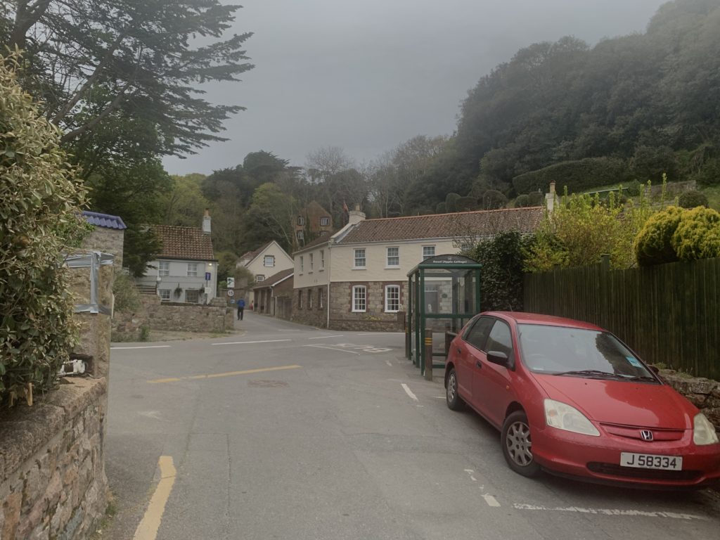
Firstly i took photos of the same locations as from the archives, trying as best as possible to imitate the photo as similarly as possible by positioning myself in the exact same location, and taking the photos from the same angle/zoom. This was difficult as I had to try and position myself in the exact same spot as best to my knowledge, as I had no prior information to wear the original photographer stood, thus I had to look, analyse and interpret the photos so I could best replicate them. The photos in the archive also lacked information on their original whereabouts, which meant that I had to observe and locate the exact location. Eventually though, I located each spot to the best of my ability which in my opinion allowed for satisfactory results, as when the images were stitched together, they blended seamlessly.

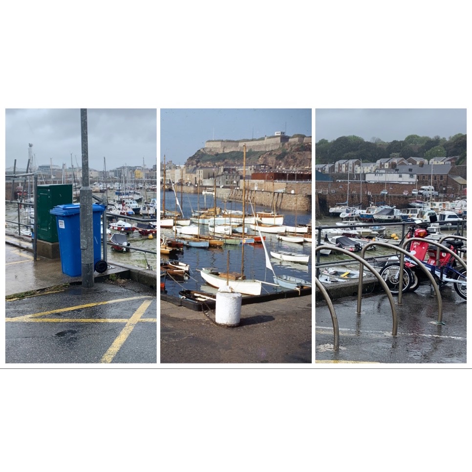
I took the photos with my camera using a stock lense. No tripod was used as the photos came out really well with a good, strong focus all round and minimal blur. The photos had a landscape aspect ratio which allowed me to divide the photos into thirds. This meant I could stitch the photos from the archive and contrast them with my modern day interpretations seamlessly to highlight any differences through the years.

I would then proceed to stitch the photos manually on Photoshop CC, by simply downloading the photos off of an SD card and dragging and dropping on Photoshop CC, manually resizing them to make sure all the angles and buildings/roads fit together seamlessly, which was quite tedious, then flattened the images to create one image split into thirds.

As you can see, the photos I captured looked quiet dull as a result of the weather on the day the photos were taken, unlike the original photos which were evidently taken on clearer, sunnier, summer days. This could’ve been changed if I had decided to take the photos simply another day, however the weather wasn’t very fortunate for a few weeks when my shoots had occurred, so there wasn’t much in my power that I could do. What I did was I edited the photos ever so slightly as I didn’t want the photos looking too artificial with too much contrast/highlights or hue/saturation as it would deviate away from the original aim of this project, but also look vastly dissimilar from the original photos, which wouldn’t be ideal as I wanted them to look rather similar, however not too similar as I still wanted change/transition to be visible. I increased all my photo’s contrasts, exposures and highlights, but made sure it was subtle so it wasn’t too noticeable. However, once edited, the photo allowed for a good final product, especially when embedded within the other photos from the archive.

The photos included locations from St Helier harbour, most notably the old harbour, as well as Greve De Lecq, Bouley Bay, L’Etacq and Rozel. Some of the locations have more than one photo in the archive that I have tried replicating. Each of the photos included has two versions, one with both archival images either side, and one modern photo taken by me in the centre, and the other version being the simply being opposite to add variety and show more transition, with one archival image in the centre, and my modern replica photo either side. This makes a nice picture frame style with all the buildings, roads etc. blending in to one another even though they are different photos taken at different times. This helps highlight the differences/transition through time of places but also helps identify the similarities as you can see common things such as houses extending from archival to modern photos with minimal change. This is very significant and opens up many deep thoughts such as are things eternal?

Evaluation

Overall, I am quite happy with my images. I feel as if I used my time before creation well and I managed to make great use of my research into Paul Iglesias Maurer and also of my general photographic research over the past years. I feel like my research allowed me to be more free with my ideas and not be scared to try something different. I like how some of the photos in particular really well demonstrate the changes through time, and have the images blend seamlessly together. I also love the theme behind the photos, the thoughts it conjures up, how things change always and nothing is forever, which is a stark, yet awakening thought, which gives the photos a lot more meaning behind them On the other hand, the main thing that i feel like i could have improved on is the quality of images and maybe the contrast of images. I feel I could’ve improved the overall quality of my book by integrating some possibly higher resolution photos, but also taking more in the first place, although the archive in which I was using photos from had a very narrow selection, almost all of which I had used. Lastly, some of the photos could have done with better adjusting when combining the photos. As the photographer/editor, I cannot help but notice tiny imperfections in some of my photo pieces, where a small building or road didn’t line up or anything.

1950’s JERSEY TRANSITION – FINAL IMAGES

Here are my photos, taken with the theme of transition in mind. Inspired by Pablo Iglesias Maurer’s work on transition of buildings and places through time, I used the Jerripedia’s archive of “coloured 1950s photos” to compare and contrast the changes through time, highlighting the transition in each of my edited photographs. The photos include locations such as St Helier harbour, most notably the old harbour, as well as Greve De Lecq, Bouley Bay, L’Etacq and Rozel. These are well renowned Jersey beauty spots, some of which haven’t changed what so ever in the past 70 years, as evident in some of the photos. This appeals to conservationist and conservative views, which dislike change and aim to preserve history, and how things used to be. The only real transition we can see with ease, is in the first two photographs of St Helier’s old harbour, where the development of high-income residential property and the construction of many large office buildings can easily be observed.

A2 PHOTOGRAPHY EXAM – ARTIST STUDY

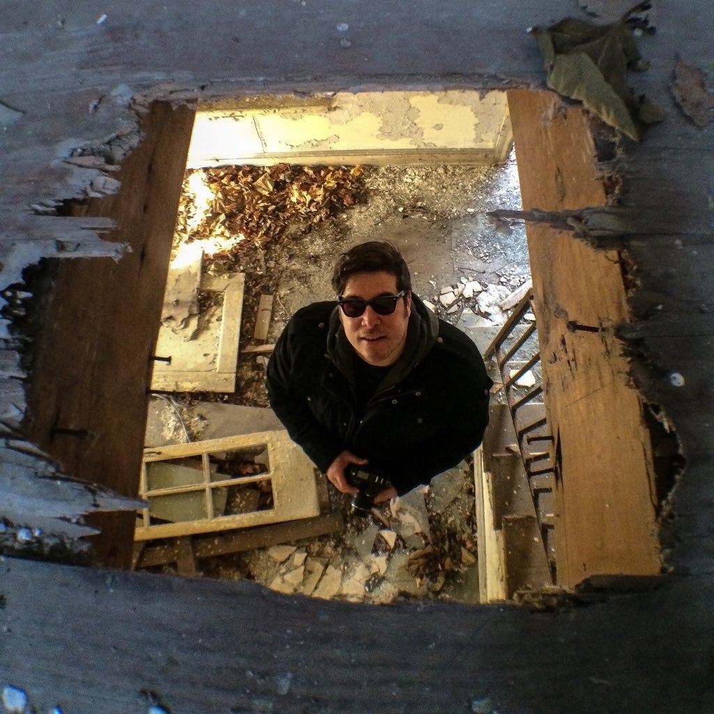
Pablo Iglesias Maurer is an author/photographer based in Washington DC. He is best known for his work photographing abandoned places and empty dilapidated spaces, mentioning how it was a hobby since he was a kid who would often find himself walking down railroad tracks and/or exploring buildings that he claims often had a “pull” to him, a sense of curiosity.

Pablo Maurer (@AbandonedStates) | Twitter

He has captured abandoned theatres, churches he’s and shopping malls. One of his more famous work was when he did an article, documenting through his photography the deterioration and eventual demolition of on the Pontiac Silverdome stadium in Michigan, USA.

Abandoned States

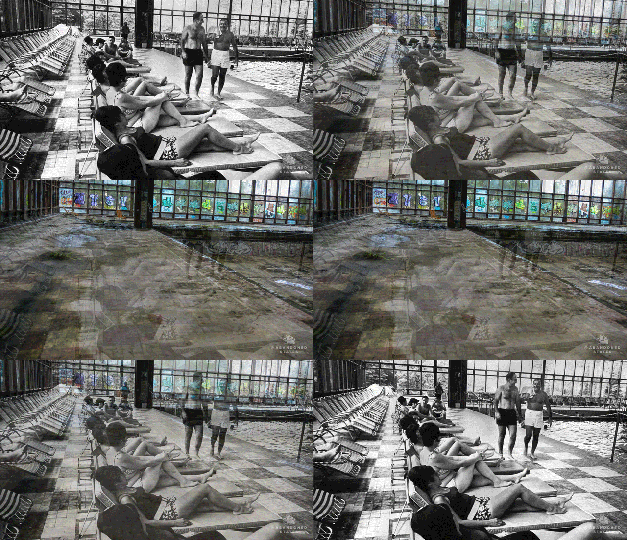
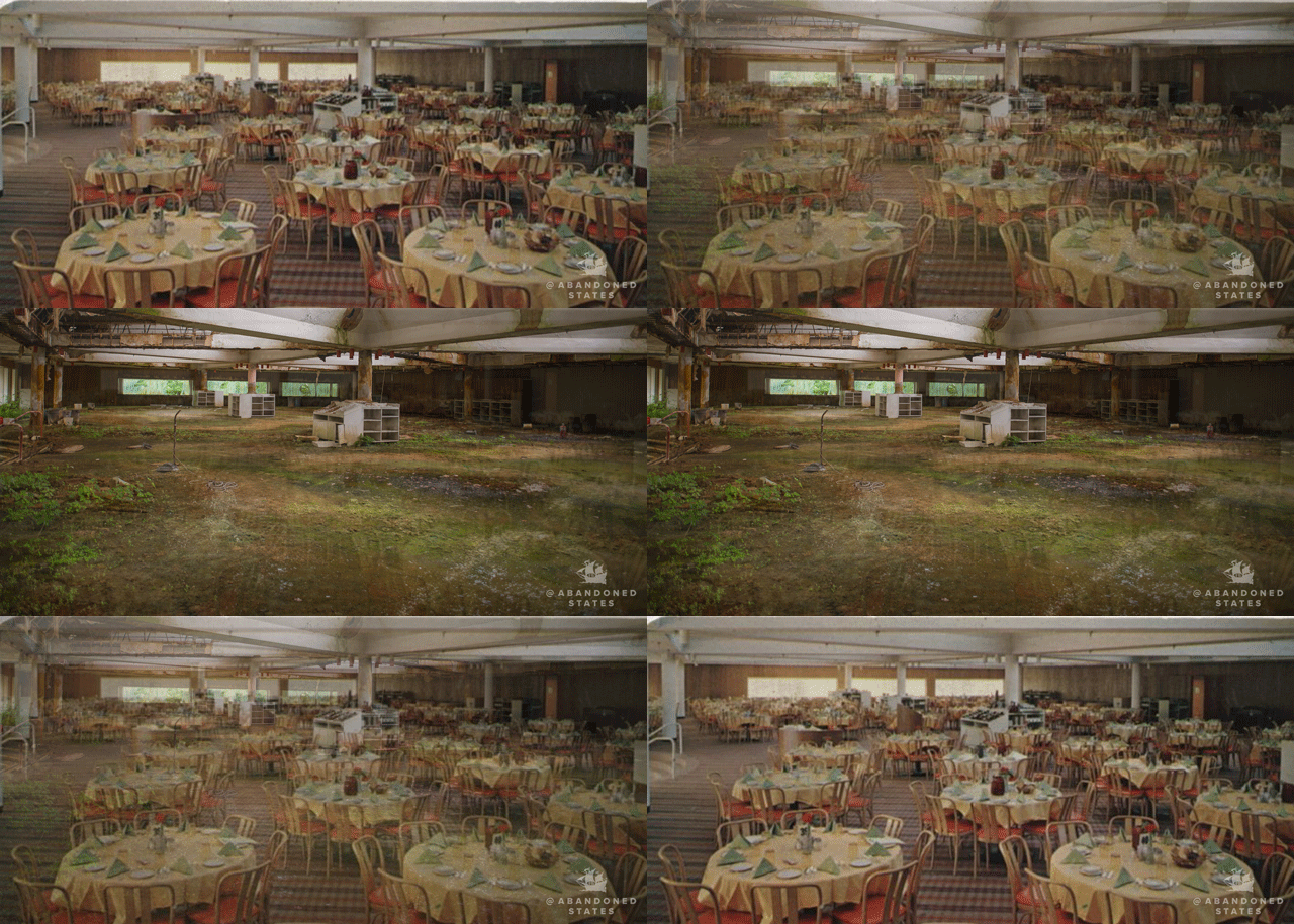
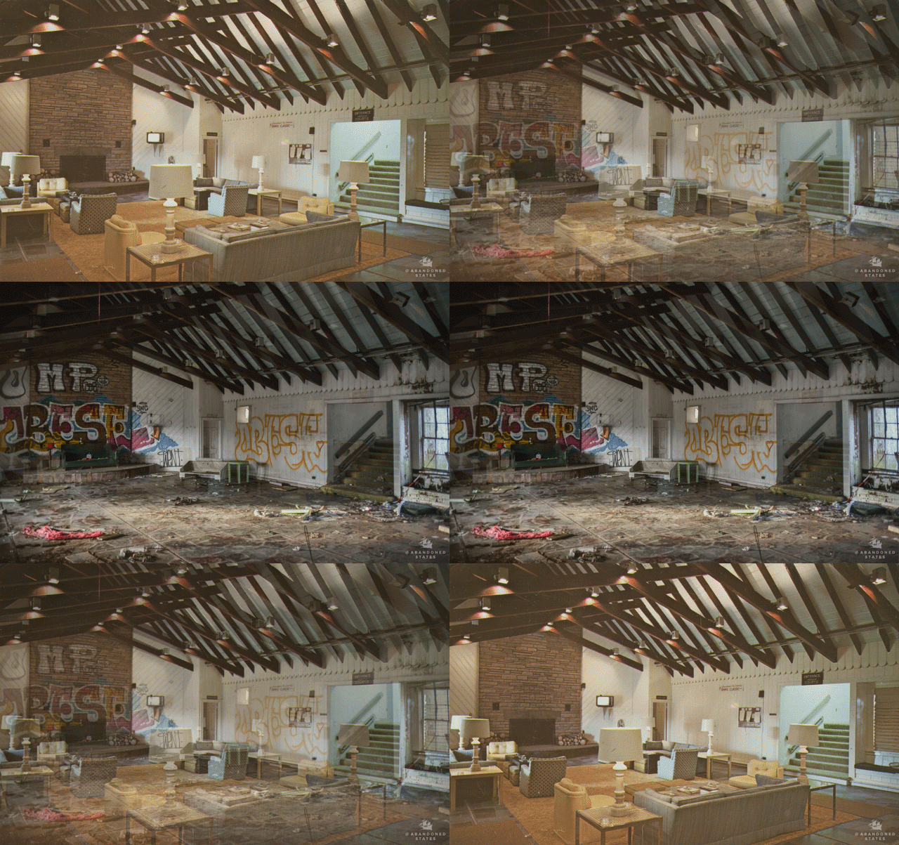
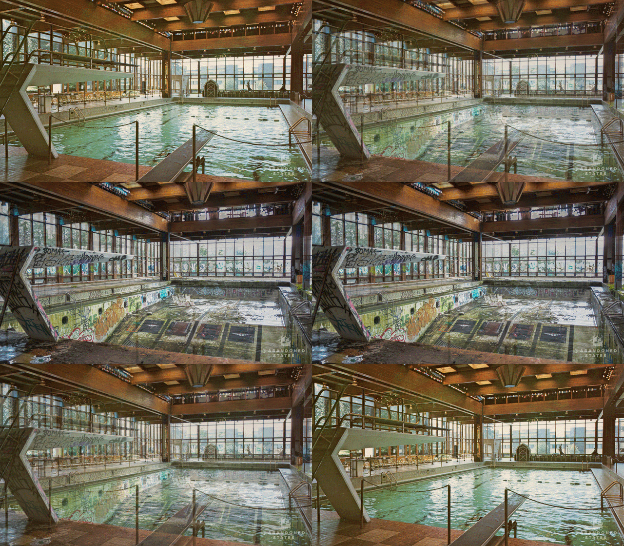
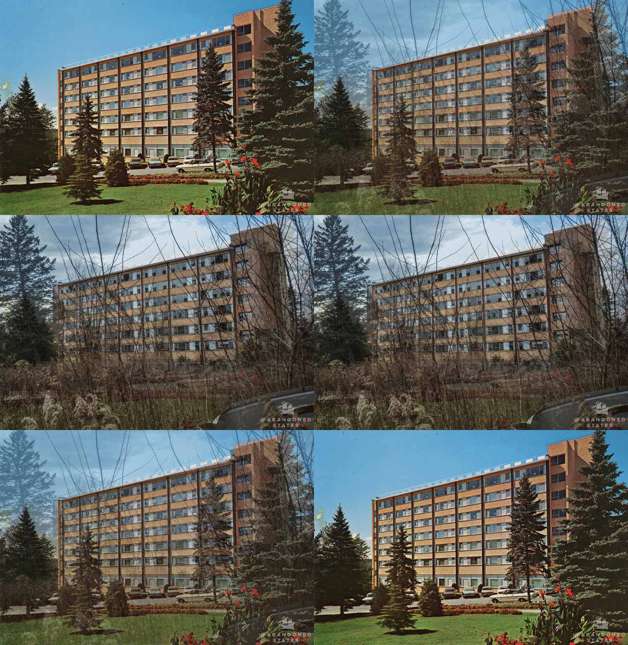
Not long ago an old matchbook laying on photographer Pablo Iglesias Maurer‘s desk caught his eye. Or rather, it was the postcard-like picture on it, of a resort complex built in the 1960s. It got Pablo wondering how the place looked now, and the answer has led him to make an amazing photo series called ‘Abandoned States‘. The picture came with the title How to Run A Successful Golf Course, but when Maurer got to the place, it was clear the owner of Penn Hills Resort didn’t follow that advice. He pointed the camera at the decaying building at roughly the same spot and did a ‘5-decades-after’ shot of the place. Ever since then, Pablo was hooked. He ordered more 60s postcards from eBay and started going around the country capturing these once beautiful buildings that now stand abandoned only as faint memories of what once was…

Abandoned States
Abandoned States

Using these antique photos, Maurer then hunted down the original locations and created before-and-after comparisons. Each of the abandoned places and rooms that Maurer explored had its own personal significance to Maurer, he explained, but one room in particular seemed to resonate more than the others.

Abandoned States
Abandoned States

Maurer enjoys exploring abandoned places. He says his method for finding forgotten structures is simply to get in his car and drive. While exploring an abandoned office at the former Penn Hills Resort, he found a matchbook with a picture of an indoor swimming pool on the cover. Exploring the resort further, he was able to find the angle at which the original photo was taken, align his camera, and capture the same image decades later, similarity to what I want to replicate to somewhat degree in my own project.

Photographer Finds Locations Of 1960s Postcards To See How They Look Today,  And The Difference Is Unbelievable | Poconos resort, Poconos, Abandoned  places

“I came up with the idea to find other ephemera from that era. I picked up postcards from eBay and area antique shops”

Photographer finds 1960s postcard locations and captures how they look  today: the difference is incredible

“The bowling alley,” he says, was an attraction in the Homowack lodge in the Catskills. “I was there on Christmas day when my family was out of town, and I had nothing to do. I went up there and bowled. It was one of the most surreal moments of my life… It felt like it had been recently lived in.”

Photographer finds 1960s postcard locations and captures how they look  today: the difference is incredible

Since publishing his work, Maurer has received emails and messages from people who say they once spent their summers in these broken-down resorts.

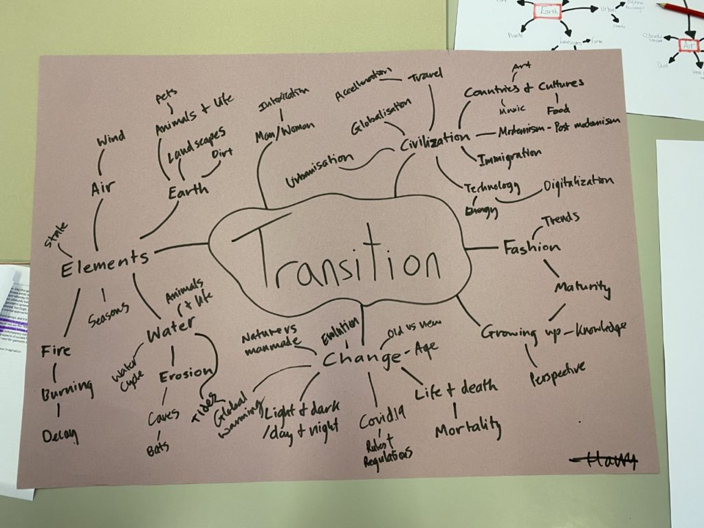
A2 PHOTOGRAPHY EXAM – MIND MAP AND statement of intent

Theme: Transition

The topic I have chosen for this exam is the theme of transition, whereby I will explore deterioration of things over time, how time is the greatest factor influencing change, and how time is an formidable force that cannot be paused or re-winded. As a result of time, things move forwards, whether they evolve into better things or deteriorate. Nature is thus in a constant state of change and transition, as day changes into night, autumn into winter. The process of time and the decay it brings along with it, is a great example of transition, and superbly demonstrates the fragility of human life and accomplishments, as nothing seems to be eternal, nothing/nobody is immortal, except time, that never changes, never slows, never dies, we as a species only account for the most minuscule fraction of all time to have ever passed, something even now we still cannot determine.

Possible things I could take photos of would include derelict buildings, broken classic cars, rotting wood, deteriorating objects, abandoned places, older people.

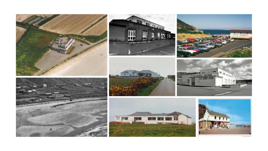
Mood board relating to Transition: Jersey’s deteriorating nightlife industry

Example of Transition: Chateau Plaisir

I have many ideas of things I could try to capture in my photography to explore the theme of transition, however, my favorite topic to delve into seems to be documenting and photographing changes of buildings and landscapes through time, such as the slow yet steady decline in Jersey’s tourism sector that is only a minuscule fraction in the 21st century of what it was back in the 60s, 70s and 80s before cheaper flights to Spain and a growing interest in other sectors such as finance killed the bustling industry that used to flourish on this little rock. Below is an example of something I could take photos of, as the example below is one of many incidents of a dwindling tourism sector that has occurred in Jersey over recent years, which I aim to document.

Index of /images/thumb/d/dc/ChateauPlaisir1962.jpg
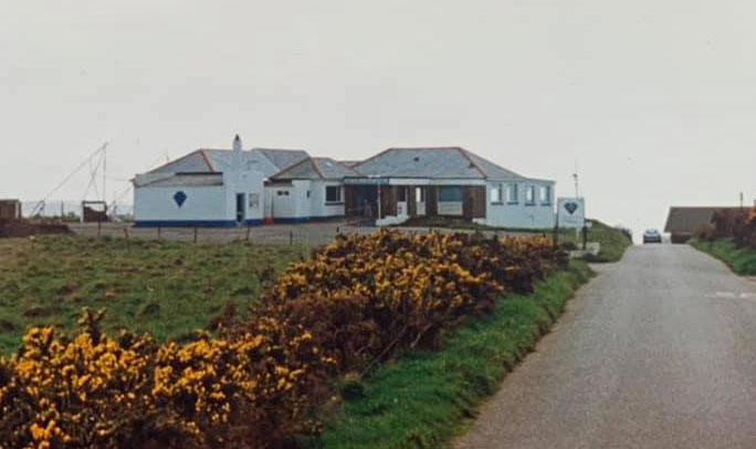
Back in its hay-day, Chateau Plaisir was one of the largest nightclubs/bars along the tourist infested waterfront of 60s, 70s and 80s Jersey.
St Ouen was once a busy destination for clubs and bars - what happened? |  Jersey Evening Post
It was derelict and unused for many years, until it was knocked down in recent years to pave way for new, luxury housing.
Chateau Plaisir | JecoHomes
4 new luxury accommodation were built in the original bars’ place, fetching well over a couple million Great British Sterling
Chateau Plaisir | JecoHomes
The final result, although somewhat controversial during their construction, the houses offer the best Jersey has to offer when it comes to housing, integrating modern design and construction (a polar opposite to what was situated here previously) combined fantastic sea views combined with an overall beautiful location.

PHOTOBOOK LAYOUT EXPERIMENTATION AND EVALUATION

Photo-shoots & Editing

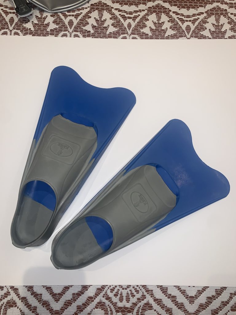
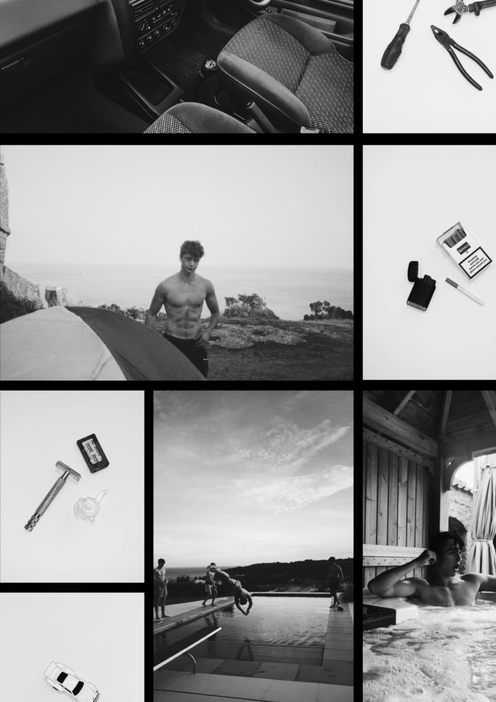
My photobook project was largely based on archival imagery accumulated over the past year both on my phone and camera, with many also being taken specifically for the project. All the images with the objects on a plain white background were also taken as part of a couple photo-shoots specifically for the project in order to compliment the portrait photos you will see. These have a significant meaning behind them and are up for interpretation by anyone who reads my book.

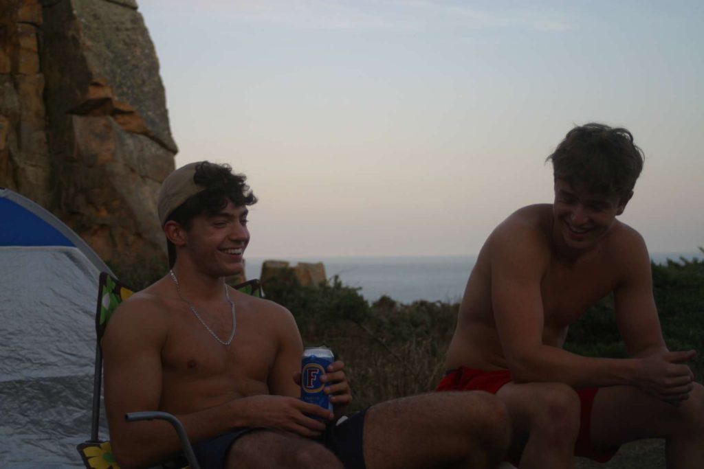
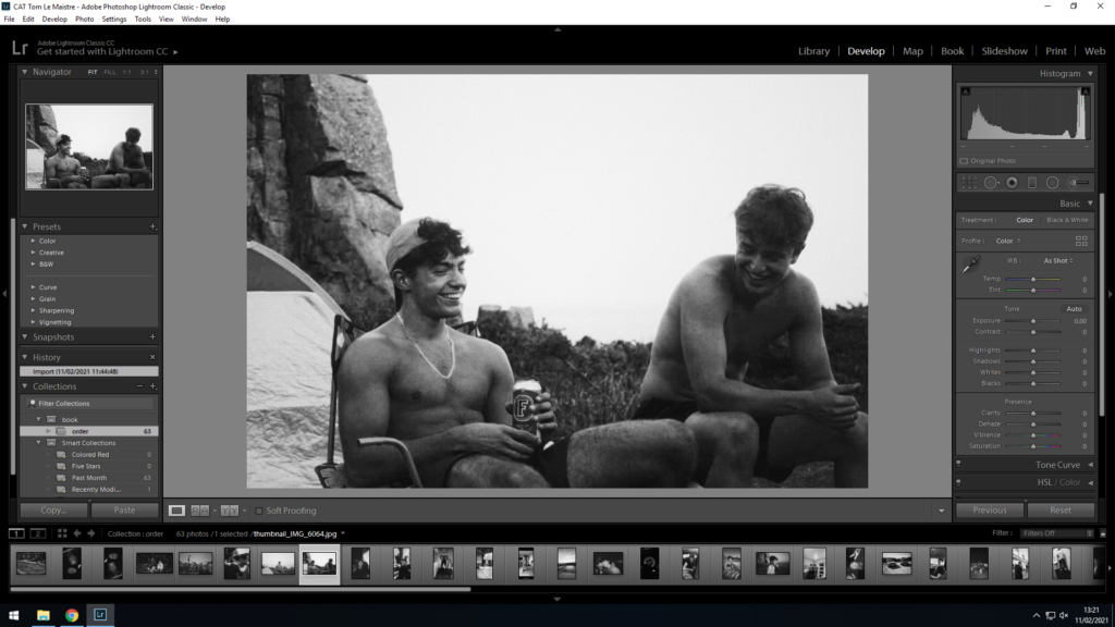
The photo above was taken on a night out camping. The photo was taken on a DSLR camera for memory in the future when we look back at the photos. This exact photo is one of only a handful or archival imagery but suited the job perfectly. The exposure from the onset was very low, especially considering that it was taken during sunset. For my photo book, I wanted black and white as a strong and reoccurring theme, so I used Photoshop CC, adjusting the integrated ‘levels’ and ‘black and white’ feature, with a bit of contrast and grain increased to give it that vintage, Mapplethorpe and Weinberger style. The exposure and highlights were tweaked more heavily in order to alter the darkness of the original photo, and allow it to “pop” more in the final prints.

The photo below is one of the many left hand-side pages where I took photos of objects with significant relevance to the portrait photo adjacent on the right hand-side page. It was taken well so I didn’t need to crop it, rotate or re-scale it at all. Again, as previously mentioned, all this photo needed was to be edited on Photoshop CC to be made black and white using the ‘levels’ and ‘black and white’ feature, with a bit of contrast increased, as well as grain and exposure increased but only minimally to give it that vintage, Mapplethorpe and Weinberger style.

As one can observe in the photo taken below, some photos needed cropping as the items/objects were too large to fit in the normal aspect ratio, so needed to be cropped into a square later on in Photoshop CC.

Book Layout

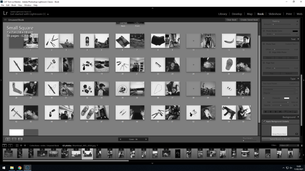
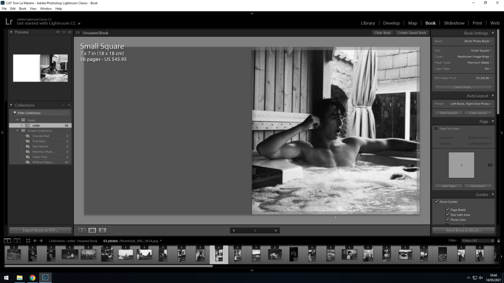
For the photobook project, I decided it would be best to use Adobe Lightroom Classic CC and its integrated “book” feature that collects all your edited images at once and presents them in the form of a book, where it enabled me to edit and move photos further in order to have the book to my liking, in chronological order and laid out in a way that makes sense.

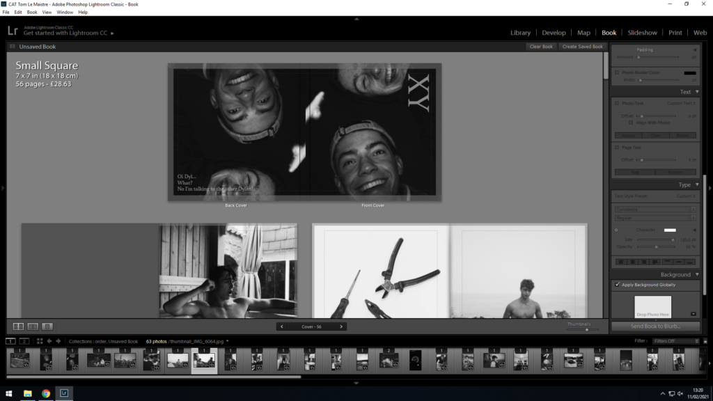
As you can see, the book follows a similar theme throughout. Every first page on a double page spread has a unique white background with an item positioned in the centre of the photograph. Normally, but not always, the photo has either some relevance to the photo adjacent, however not always, which keeps the reader/observer guessing the meaning behind each photo and the book/story as a whole, which makes for a more interesting book.

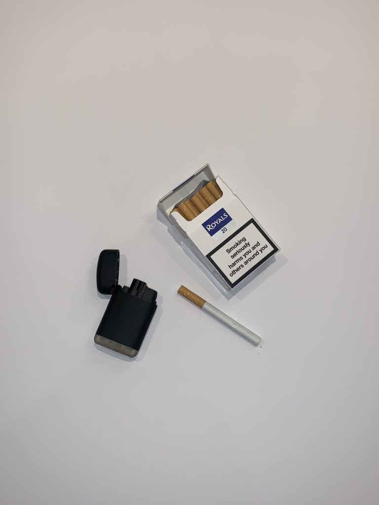
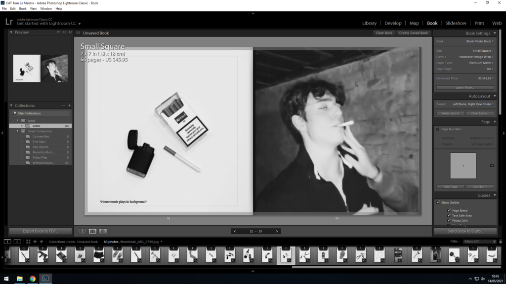
Sometimes, such as the screenshot above with the cigarette, the photos of the object on the left-hand page include an item that was included in the photo first-hand. Other times however, the object is someone’s dear possession, an item they cherish or wear, be it in the photo or not.

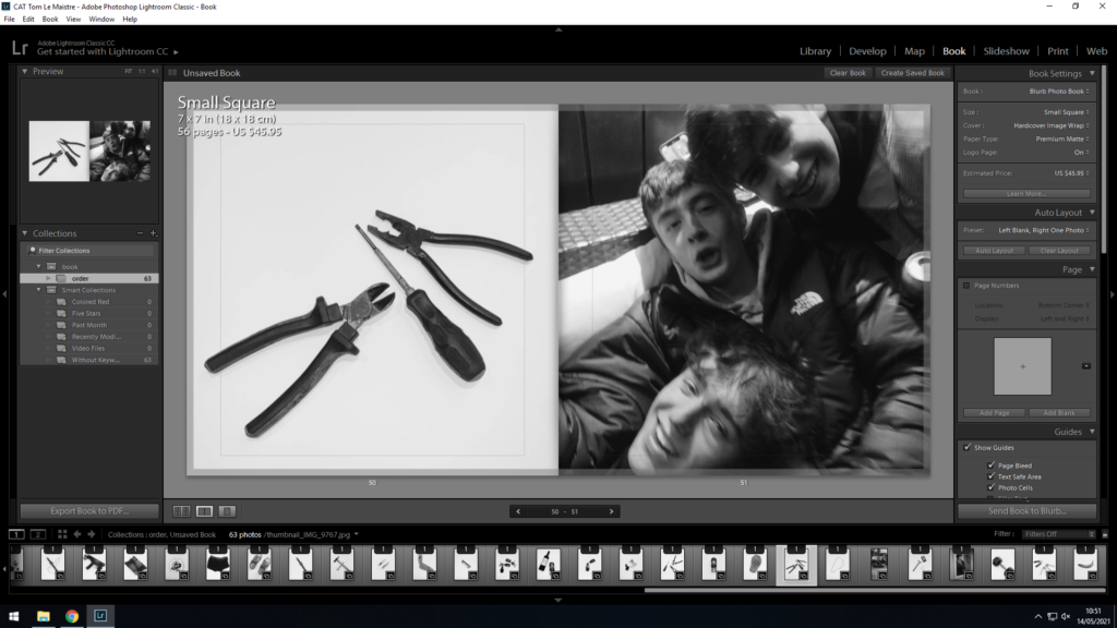
Occasionally, for example with the screwdrivers and tools, the items have no relevance to the photo, (although this may be up for interpretation), except for the fact that the items have been positioned to resemble the people or subject in the photo. As you can see, I you look closely, the tools are made to resemble each one of my mates. Some may also suggest that I’m referring to my mates as ‘tools’… you wouldn’t be wrong.

These photos were taken simply on white A2 paper, with camera flash enabled as well as including lights from all angles except from above, in order to highlight all the minute details but also no light beaming down from above to avoid ugly shadows. The light from the sides had to cover every angle/perimeter of the photo in order to enable complete light coverage and the minimization of shadows. This allows for a great contrast and makes for striking photos, that contrast well with the following photos that are normally darker toned environmental portraits, not staged objects in studio lighting, which allows for a great disparity between the two. This makes the book less repetitive and thus ore interesting for the reader/observer.

Furthermore, you may observe the occasional grey page as shown in the screenshot above, initially where photos had ran out but also a “happy accident” I guess, as they allow pages act as a sort of division in the book, signifying a new chapter per se, but also a breaking up the book and preventing repetition, as these pages occur around every 12-16 pages.

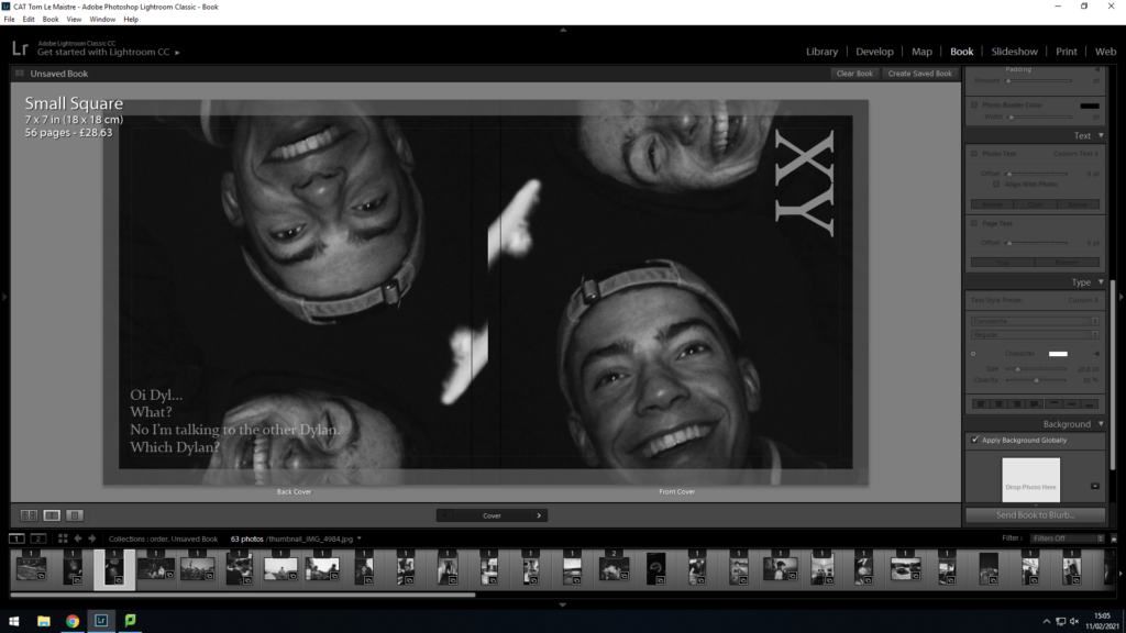
Lastly, the front and back of the book also had much thought considered during their creation. The photo included on the front cover was easily chosen as it just made the perfect cover. I love how the photo not only is archival, but taken by accident, with both me and my mate sharing a strong happiness that many people unfortunately struggle to find nowadays. This happy and colourful vibe contrasted with the dark tones of the summer night, makes for an interesting photo, where the happiness beams back at the observer as it stands out from the darkness of the background, suggesting it’s a cheerful, jokey, typically teenage book of stupid and cocky adolescents.

To me, it made sense to repeat the photo on the backside of the book too, as this means there is no border between the photos as the dark colours mean the book’s front and back page blend seamlessly with its dark colours and therefore allow for a smoother looking, well put together book. The back page also has a small, goofy quote written in order to segregate the two pages but also add a bit more interest. The quirky quote is often heard from both my mates simultaneously and is a mention to the fact that both my best mates share the exact same forename, hence every time I say their name to one of them, neither of them knows which I’m speaking to. The quote can be regarded as funny, and a little bit odd, and without context, seems to fit in perfectly with the books theme as a whole. As a result, I’ve finally resorted to referring to them by their surnames to avoid confusion.

Evaluation

Overall, the book went exactly the way I envisioned. My ideas and thought processes all came to reality, and the book turned out exactly how I wanted it. My only criticism would be that the picture quality in most of the pictures could do with being a higher resolution which mainly boils down to the original camera’s resolution being sub par. This was mostly fixed in Photoshop CC where I increased the size and resolution of the images and exported them at the highest quality possible. Despite this however, I’m happy with the way the majority of the photos turned out, especially the ones with the white background which I was surprised to how well they turned out in the book especially.

ESSAY

How do Robert Mapplethorpe and Karlheinz Weinberger portray ‘Lad Culture’ through the medium of portraiture?

As Robert Mapplethorpe himself quoted; “I am obsessed with beauty. I want everything to be perfect, and of course it isn’t. And that’s a tough place to be because you’re never satisfied”. I share the same desire for perfection in my own appearance, both mentally and physically. This need for perfection comes as a sort of validation, a purpose in my eyes hence why in my personal investigation, my area of study will look at masculinity, what it means to be male, more specifically looking at how adolescence shapes us as men, conflicts men often face such as body dysmorphoria and a desire to fulfil a certain mould, a mould set by society to look and act a certain way, to be the breadwinner and the hero they dreamt of being as a child. The aim is to show that you should love yourself, even if your mind wants to rebel against that. To achieve this, I will be studying both the works of Robert Mapplethorpe and Karlheinz Weinberger as well as analysing their works on male photography and the male gaze, and how lad culture is ever present in their photography.

‘Lad culture’ according to Wikipedia is a “British and Irish subculture initially associated with the Britpop movement. Arising in the early 1990s, the image of the “lad”—or “new lad”—was that of a generally middle class figure espousing attitudes typically attributed to the working classes”. This is a commonly captured stereotype, often linked with aggressive, confident and competitive behaviour, typical of alpha males and even male animals in the wild, with common themes such as excessive alcohol and drug use as well as settings often being set in pubs and club scenes globally, where party life brings out such characteristics in men.

Much of this was captured in the 60s, 70s and 80s and no doubt would’ve strongly influenced both Mapplethorpe’s and Weinberger’s photographic work. Beginning in the mid-1980s, a secret underground culture was formed by a revolutionary group of self-proclaimed “queers” who were less concerned about mainstream acceptance of their sexuality and more geared toward creating unconventional spaces where they could be themselves. Places where, essentially, someone could be gay without liking stereotypical “gay things.” in the 1970s AIDS broke out which is a disease of the immune system, caused by the virus HIV, leading to death from infections that the body is no longer able to resist. The disease had a devastating effect on the gay community in the 1980’s and many of Mapplethorpe’s friends and acquaintances were victims of the disease. Mapplethorpe died from an AIDS-related illness in 1989.

ROBERT MAPLETHORPE

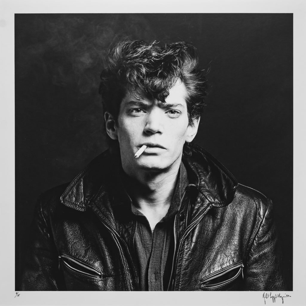
Image result for robert mapplethorpe self portrait
Self portrait of Robert Mapplethorpe by Robert Mapplethorpe. © Robert Mapplethorpe Foundation Image courtesy of https://news.artnet.com/art-world/robert-mapplethorpe-1723221

Robert Michael Mapplethorpe was an American photographer who was most famously known for his work with black and white photographs. His photographs featured a large array of subjects, including celebrity portraits, male and female nudes, self-portraits, and still-life images. Additionally, Mapplethorpe as mentioned was queer, hence this was a common theme in his work as many of his models either recreated or were homosexual themselves. These photos were often aimed to capture ‘lad culture’ through the style and behaviour of men as well as the male gaze. Essentially, the male gaze is the act of depicting women and the world from a masculine, heterosexual perspective that presents and represents women as sexual objects for the pleasure of the heterosexual male viewer.

In Mapplethorpe’s work, one of his major exhibitions named ‘The Perfect Medium’ which was featured at the Art Gallery of New South Wales in 27 Oct 2017 – 18 Feb 2018, showcased a broad selection of his work, from portraits of his contemporaries to self-portraits, floral still lifes and erotic imagery. Mapplethorpe heavily explored ways identity could be captured and expressed by the camera with a certain style of black and white still portraits, almost always taken in a black or white studio and set up with the models or himself creating or imitating poses in front of the camera. Often, his traditional style of portraiture had a clear subject, and this was often the male physique as he tried highlighting both the beauty and form of the ideal male physique (virtruvian physique as mentioned in this blog post). He often captured the brutish, male image, highlighting different appearances that so-called alphas could have, however these characteristics were usually the muscular, confident ‘lad’ stereotype so to speak. Through his self-portraits, he strategically crafted a public image for himself. He often took photos of himself as well as the models that fit the roles of alpha males, and by using the styles as mentioned above, he often challenged gender stereotypes and lad culture, which is a similar theme to my personal study.

Robert Mapplethorpe explored the male anatomy to a significant degree. Image courtesy of https://www.tate.org.uk/art/artworks/robert-derrick-cross-ar00194 © Robert Mapplethorpe Foundation

The photo above is a studio portrait of Derrick Cross in 1983, a model Mapplethorpe photographed numerous times and included in a couple of his works. This is one of many photographs in which Mapplethorpe focuses on a part of the body. The surrealist artist Man Ray had taken similar photographs of a torso, but had given greater emphasis to the face-like appearance of the body with nipples as eyes and navel as mouth. Mapplethorpe’s photograph is much more a study of muscular form and male beauty and aesthetic. With the draped fabric around his waist, similarities can also be drawn with classical sculpture. The photo was produced on gelatin silver print that gives it the clear, silver and black tones. Additionally, the photo has high contrast as a result of the models’ skin tone when compared to the very pale grey background, which emphasises the significant muscularity of the model. Furthermore, the composition is close up, with the model comprising most of the photograph, in particular his well developed mid-section/torso which evidently, Mapplethorpe is trying to emphasise and highlight the beauty of, especially considering the model has posed similar to Greek statues. Robert himself also photographed many Greek statues and compared them to the male physique, potentially taking inspiration from the philosopher Plato’s study on aesthetics who is considered by many to be “the most important philosopher who ever lived”. He is known as the father of idealism in philosophy and his new (at the time) ideas were elitist, with the philosopher king the ideal ruler. Essentially, the very phrase “Plato’s aesthetics” refers to an anachronism, given that this area of philosophy only came to be identified in the last few centuries, however even those who think of aesthetics more broadly find something exploratory in Plato’s treatments of art and beauty. He might be best described as “seeking to discover the vocabulary and issues of aesthetics”. For this reason Plato’s readers will not come upon a single aesthetic theory in the dialogues. For the same reason they are uniquely situated to watch core concepts of aesthetics being defined: beauty, imitation, inspiration. Tangent aside, Robert Mapplethorpe and his obsession with aesthetics is very evident as he clearly was more concerned with male beauty and aesthetic and sexualising males through homo-erotic staged photos in studio lighting.

KARLHEINZ WEINBERGER

Karlheinz Weinberger is another artist that shares a similar style in photography to Mapplethorpe. Karlheinz Weinberger was born on 10 July 1921 in Zurich’s “Chreis Cheib” district, a nickname derived from the Swiss German expression for ‘carcass.’ A few years later, Zurich became a centre for left-wing ideology also known as “Red Zurich” after the Social Democratic party won an absolute majority for the first time in 1928. His imagery shares the similar black and white tones as can be observed in Mapplethorpe’s work as well as sharing a similar theme where by both artists aim to capture ‘lad’ culture, although in Weinberger’s work, it is less sexualised. A striking resemblance in both artist’s work is the inclusion of male models in their portrait work, often either topless or re-enacting “masculine” things. ‘Lad culture’ is ever present in Weinberger’s work, with many of his subjects often being muscular and rather good-looking, taking the role of the confident alpha male type.

Karlheinz Weinberger’s day job may have been relatively uninspiring having worked in a Siemen’s warehouse, however the photos he took in his spare time are anything but that. Weinberger’s passion, and the focus of this book, is the rebel youth of 1950s and 1960s Switzerland, who took inspiration from American rock-’n’-roll culture and made it their own with their rolled-up jeans and denim jackets, bouffant hairdos, striped T-shirts, and customized belts. Weinberger’s free-spirited and self-confident portraits typical of alpha male/lad culture possess the defiant attitude of youth and rebellion as a response to the conservative post-war era. His book ‘Swiss Rebels’ also includes erotic images of queers, who dress as rockers, bikers, construction workers and athletes, many of whom occupy positions outside of social norms.

Image result for karlheinz weinberger photographs
Image courtesy of http://kvadratinterwoven.com/foto-jim-zurich Photographer: Jim, published in Club 68, Issue 11, 1970 © The Estate of Karlheinz Weinberger, courtesy Galerie Esther Woerdehoff, Paris

The photo above is a candid environmental portrait, (a common theme in Weinberger’s work) and was taken by Weinberger in 1970 and is of a Wrestler in a sports club named ‘Box-Ring Zürich’ where he started to work as a freelance sports photographer for Satus-Sport, a national workers’ sports and gymnastics federation. In 1969, the photo taken above also first appeared in an underground gay magazine, called Club 68. The photo incudes a very alpha looking subject with the photo comprising of the typical black and white theme similar to Mapplethorpe’s works. Visually, the photo is black and white, with darkish tones in the background, cleverly segregating the subject in the fore ground and stopping him from blending in too much. Furthermore, there is a rough texture with the subtle grain typical of cameras of the time unlike Mapplethorpe’s work that was often very clear, although, much of Weinberger’s photography was also very clear too with minimal/to no grain what so ever. The composition is a strong one, symbolic of the alpha male/lad culture vibe and is in the form of a candid portrait that looks semi-staged and the subject is centred making for a pleasing symmetrical image that is satisfying to look at and matches the golden ratio. The exposure is a little higher in order to cancel out the shadows from dominating the image and ruining the clarity, as here the photo is very clear signifying great balance and harmony between the limited shades within the photo. Technically, it is unknown if Weinberger used natural or studio (indoor) lighting nor is it possible to determine what camera/lens he used although I would hazard a guess and say her may have used a 35mm film camera, typical of the era and likely the cause of the grain. Unlike Mapplethorpe, Weinberger isn’t asking his subjects to make poses symbolic of Greek gods, however opting for a more candid approach. Furthermore, another difference between the two artists approach to photographing males and portraying lad culture is rather than trying to highlight the aesthetic of the male physique in it’s greatest form, Weinberger finds an aesthetic in men doing manly things as a pose to looking overly muscular and posing as such. Evidently, Weinberger was more concerned with highlighting lad culture through environmental photos of men whereas Mapplethorpe was more concerned with male beauty and aesthetic by sexualising males through staged photos in studio lighting. Therefore, notice how when I referred to both artist’s work, with Weinberger I mentioned how he used ‘subjects’ and with Mapplethorpe how he used ‘models’. That’s the key difference here.

Overall, both artists capture the male gaze, however go about it in a slightly different way. Granted, both often photographed queer culture and the surrounding community, however as mentioned, Mapplethorpe used this to create more homo-erotic imagery that explored the male body’s natural beauty and form, most notably seen in his work with Derrick Cross, whereas Weinberger preferred the less staged, more natural/candid approach where photos of groups of males doing certain activities were more his kind of niche. Weinberger was more concerned with highlighting lad culture through enivonamntal photos of men doing ‘manly’ or ‘lad culture’ things, (boys being boys essentially), as he worked in a factory for Siemens which was full of these ‘stud-like’ masculine characters that weren’t afraid to get hands on and dirty. On the other hand, Mapplethorpe as mentioned, sexualised males and explored the more flamboyant, fashion side of lad-culture. This makes for a great contrast between the two artists, as both their work looks very similar in style from first observation, however can be interpreted in entirely different ways.

Image result for Karlheinz Weinberger
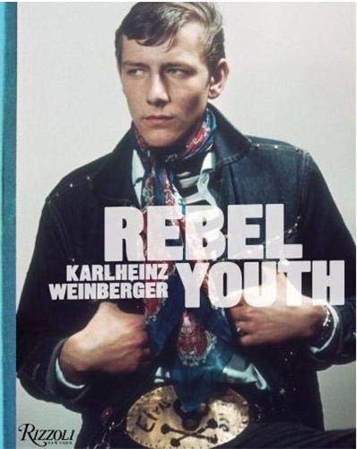
Karlheinz Weinberger’s work heavily correlates with my topic of study, ‘Love and Rebellion’. Image courtesy of https://www.abebooks.co.uk/9780847836123/Rebel-Youth-Weinberger-Karlheinz-0847836126/plp

Bibliography

https://aperture.org/reviews/karlheinz-weinberger-rebels-without-a-cause/

https://news.artnet.com/art-world/robert-mapplethorpe-1723221

https://www.tate.org.uk/art/artworks/robert-derrick-cross-ar00194 © Robert Mapplethorpe Foundation

https://plato.stanford.edu/entries/plato-aesthetics/#:~:text=To%20the%20literal%2Dminded%20the,in%20the%20last%20few%20centuries.&text=For%20the%20same%20reason%20they,%3A%20beauty%2C%20imitation%2C%20inspiration.

https://www.artsy.net/article/artsy-editorial-photographer-captured-switzerlands-biker-boys-elvis-look-alikes

http://kvadratinterwoven.com/foto-jim-zurich
PHOTOBOOK RESEARCH

In order to aid me in my photo book creation, i want to take a look at other photobooks and photobooks in general. A photobook is a book in which photographs feature hugely and contribute to the most of the overall content. There are many different ways that photo books can be used to tell a story. Some people use them to tell a personal struggle, some to tell a view or opinion, some to show a family holiday and many many others. They have had a whole range of different styles which has showed me that there is no limitations and your own conceptual meaning can be portrayed to the viewer in any way you would like. I hope to implement these ideas into my photobook and i hope to remember that there are no limitations.
MASCULINITIES / LIBERATION THROUGH PHOTOGRAPHY

Masculinities Exhibition Catalogue – Barbican Shop

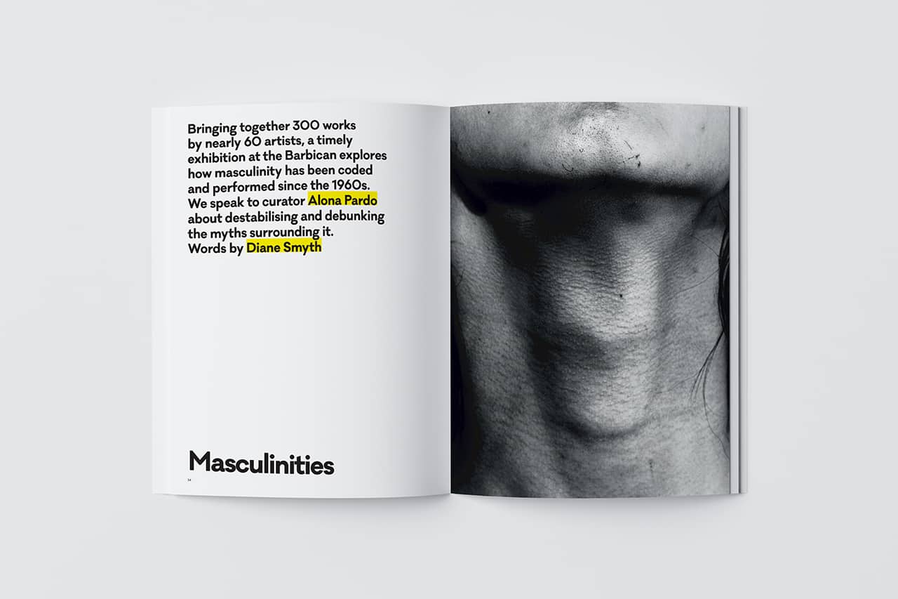
This photographic exploration comes in the form of a well crafted photobook and draws together the work of approximately sixty artists of different ethnicities, generations, and gender identities to look at how ideas of masculinity have evolved since the 1960s. Each of its six themed chapters features bold and arresting work “by some of the world’s most celebrated photographers” one of which being Robert Mapplethorpe (my chosen artist of study) and combining various other artists of all genders, ages and backgrounds and offer a 21st-century perspective of maleness through the lens of immigration and global politics. Each chapter in the book opens with an essay by a key thinker in the worlds of art, history, culture, and queer studies. Spanning decades and continents, this exploration shows how increasingly difficult it is to define masculinity.
Issue #7892: Masculinities | 1854 Photography
Rotimi Fani-Kayode,  Untitled , 1985.

PHOTOSHOOT PLAN

What

For my first photoshoot, as mentioned, I will try and capture masculinity through the lens, and will do this by taking photos of objects often associated with masculinity, such as toolboxes, tools, cars, weights, etc.

Where

At home in the garage which is a great setting, symbolic of “the man cave” but also at my work which is also a garage.

When

I am planning to go in the late afternoon/early evening, winter sunset so around 4pm-5pm.

Why

This will allow for great low light with orange tint which will translate well to black and white photos, similar to Mapplethorpe and Weinberger. I am going at that time so that the lighting for my photos is clear and hopefully before the cloudy skies and rain which is what the weather is usually like in the afternoon.

How

I will be using my Canon77D camera to take these photos and I will choose a high ISO and medium exposure so the photos are clear and not too dark, as most of the darkening will occur in the editing process when I will increase shadows and darkness as well as vignette in the photo. Furthermore, having brighter photos means there is more to work with when it comes to editing on Adobe Lightroom CC as the photo has more detail due to more light highlighting more aspects in the photo in higher detail. I will also adjust the settings accordingly depending on the changing weather.